 7th March 2018 | IN PROJECT OF THE WEEK | BY SBID
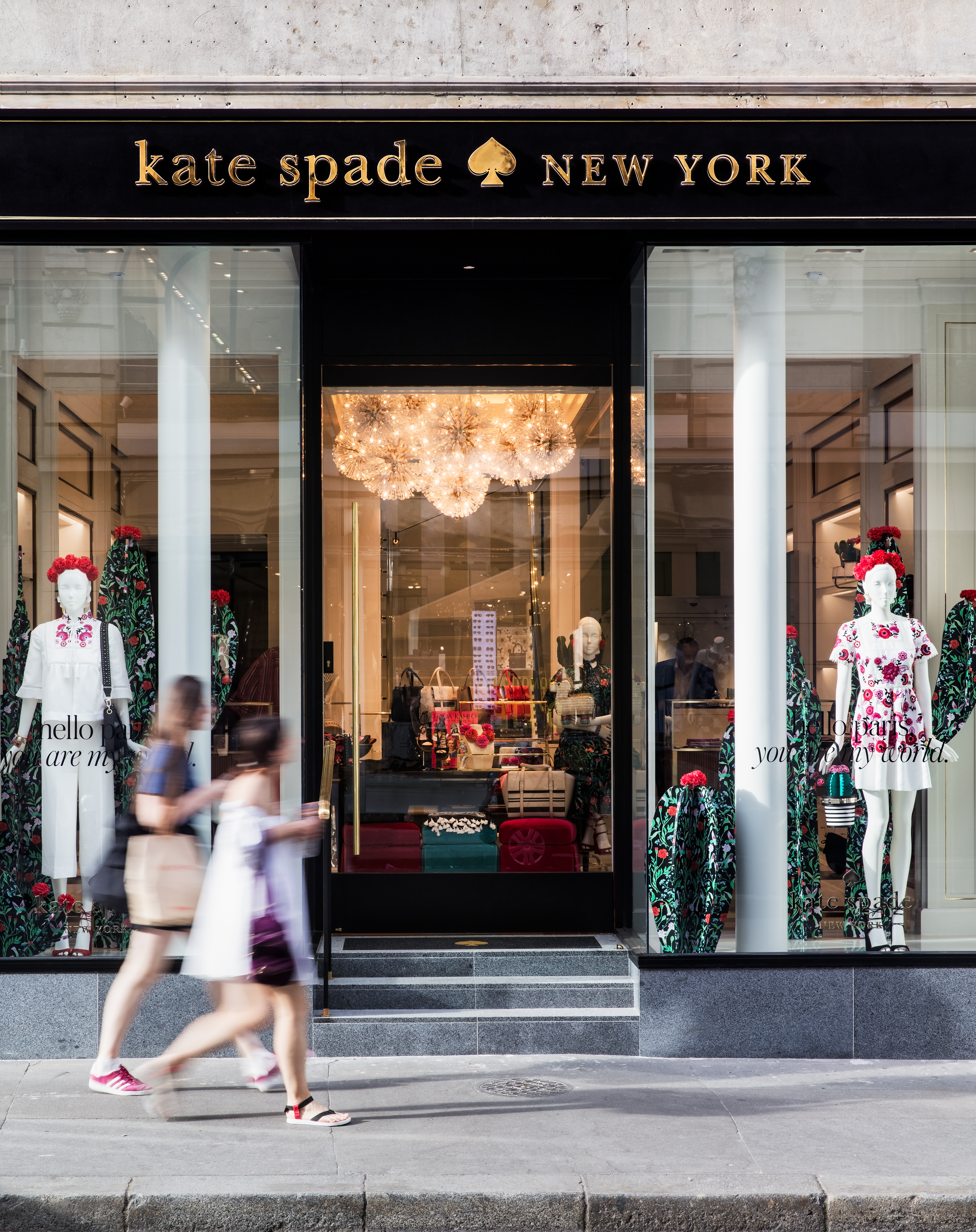
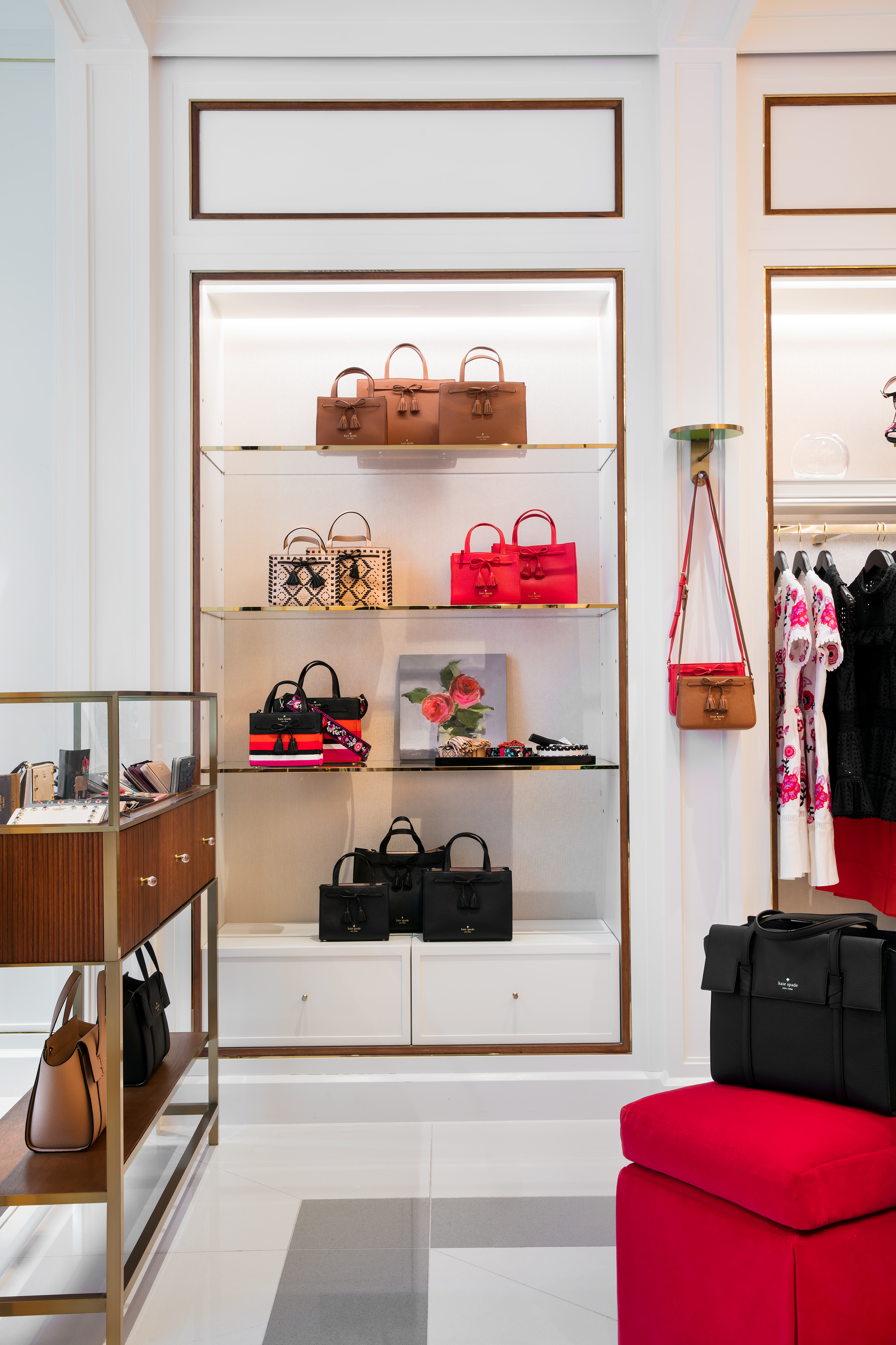
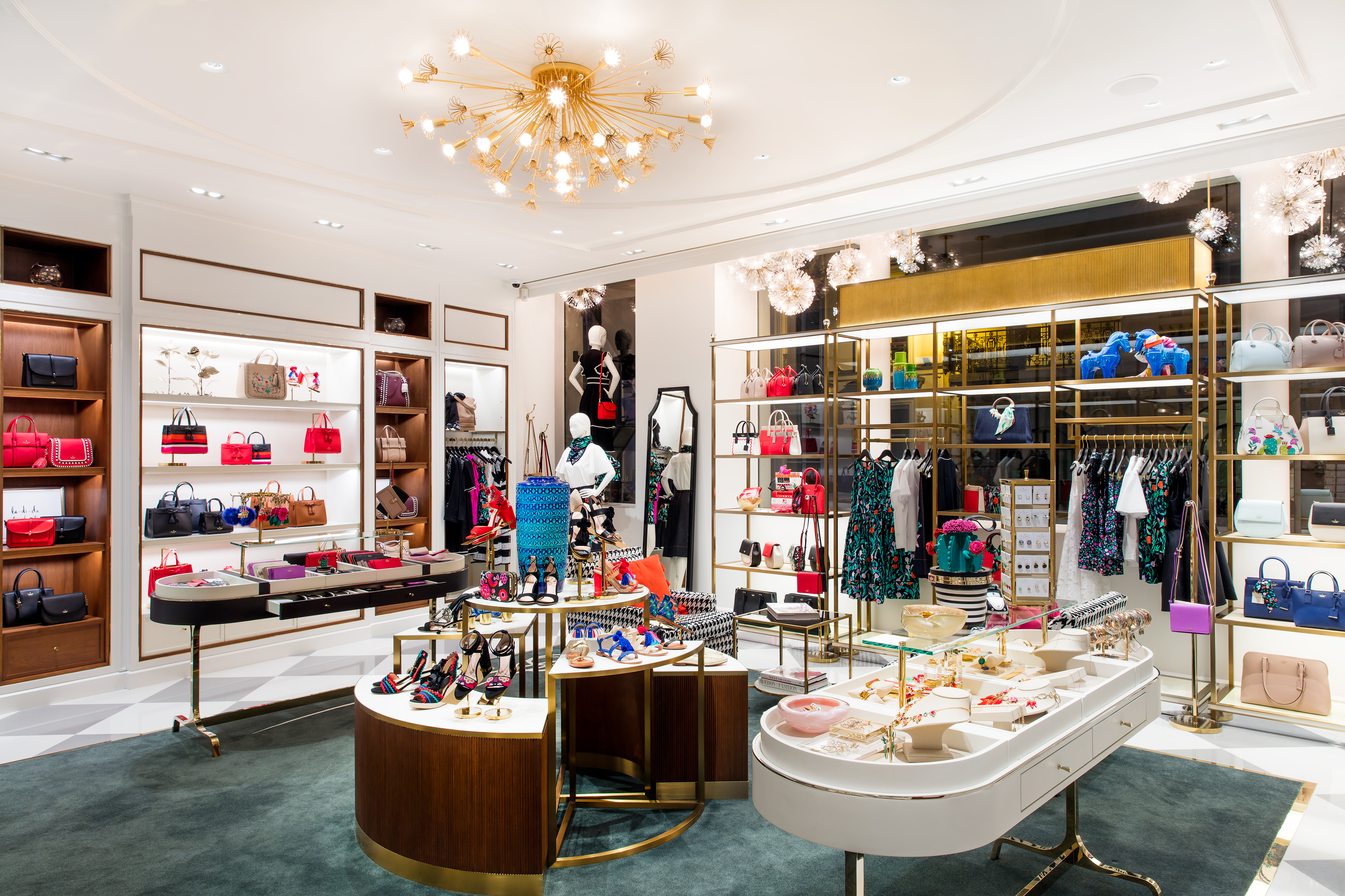
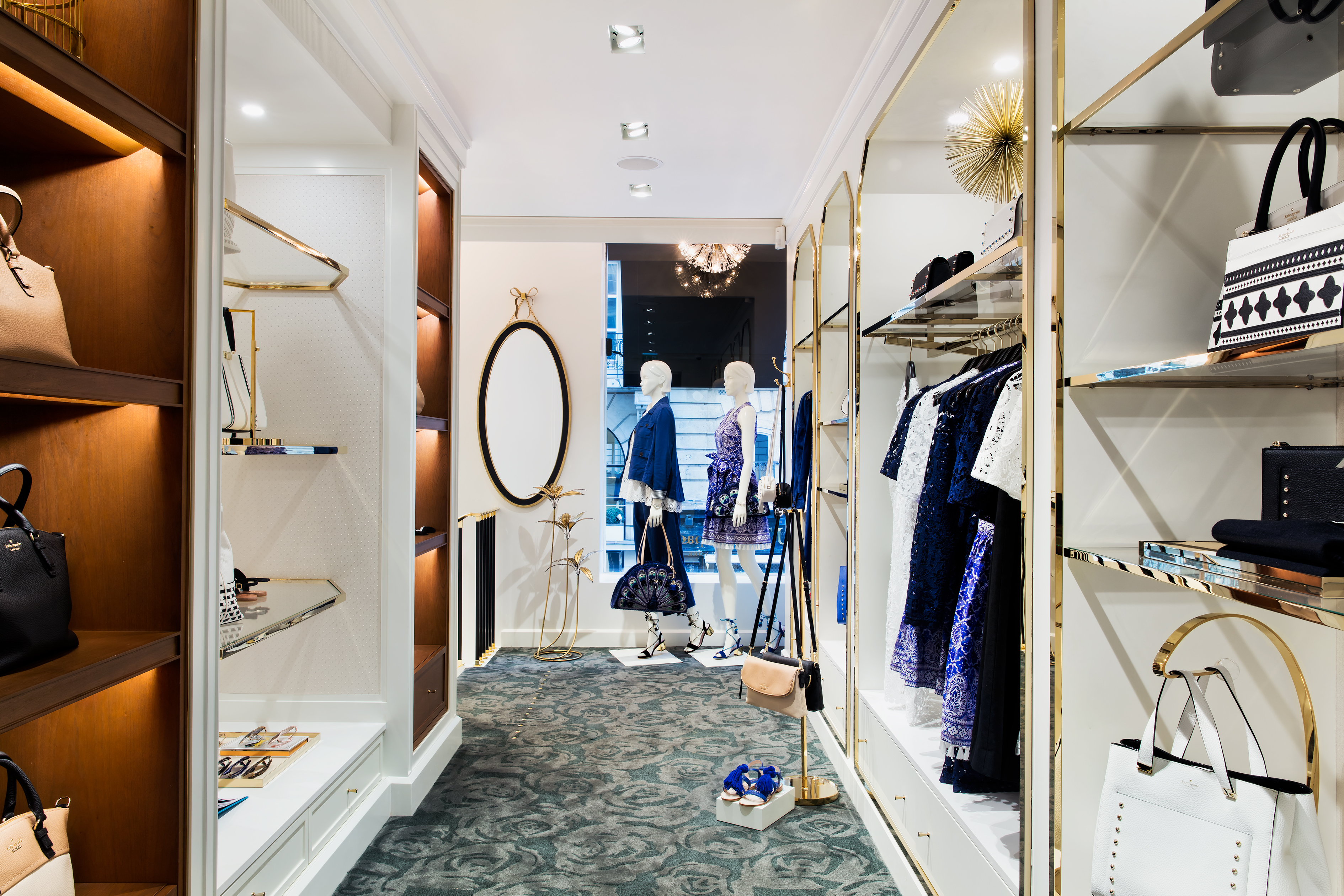
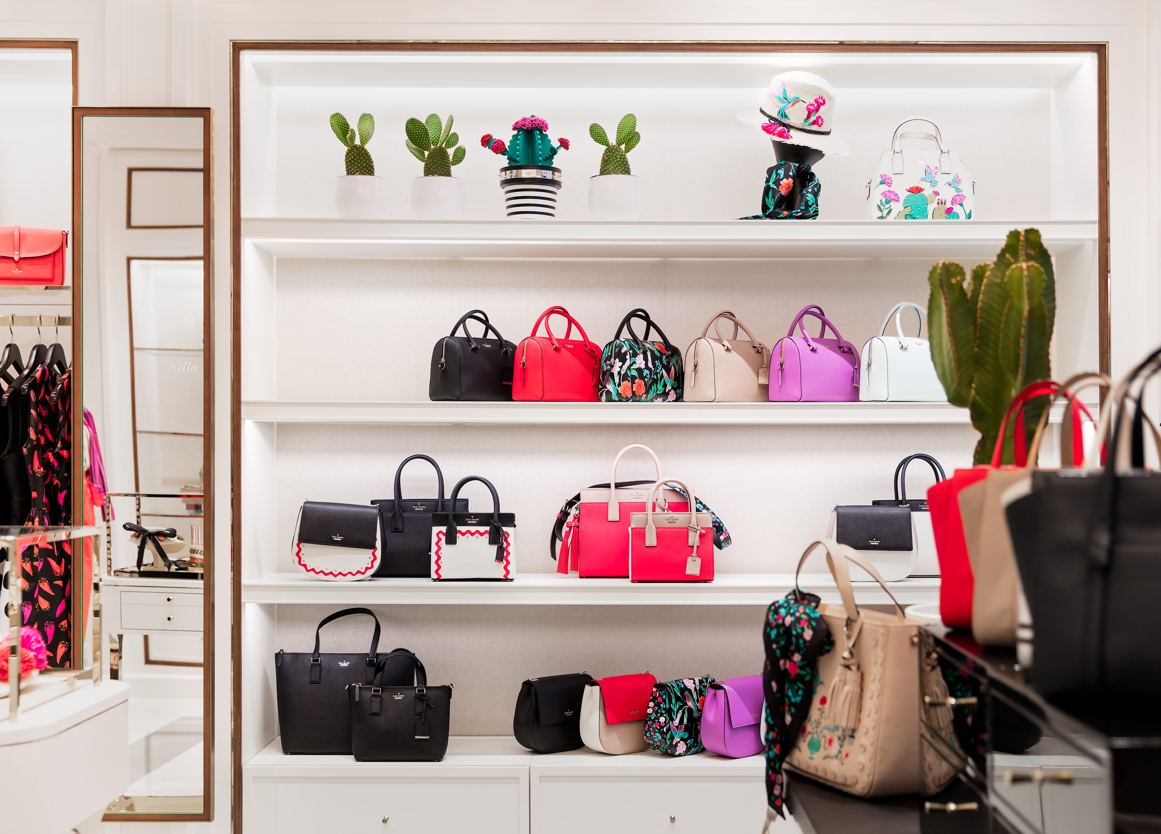
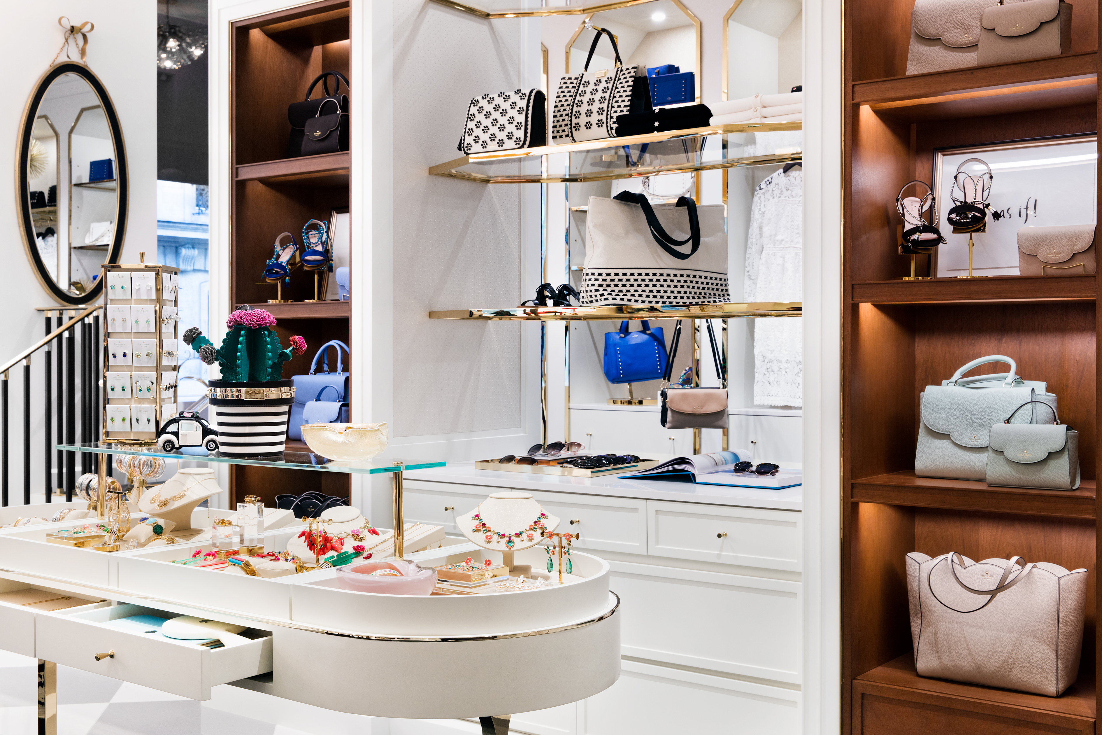
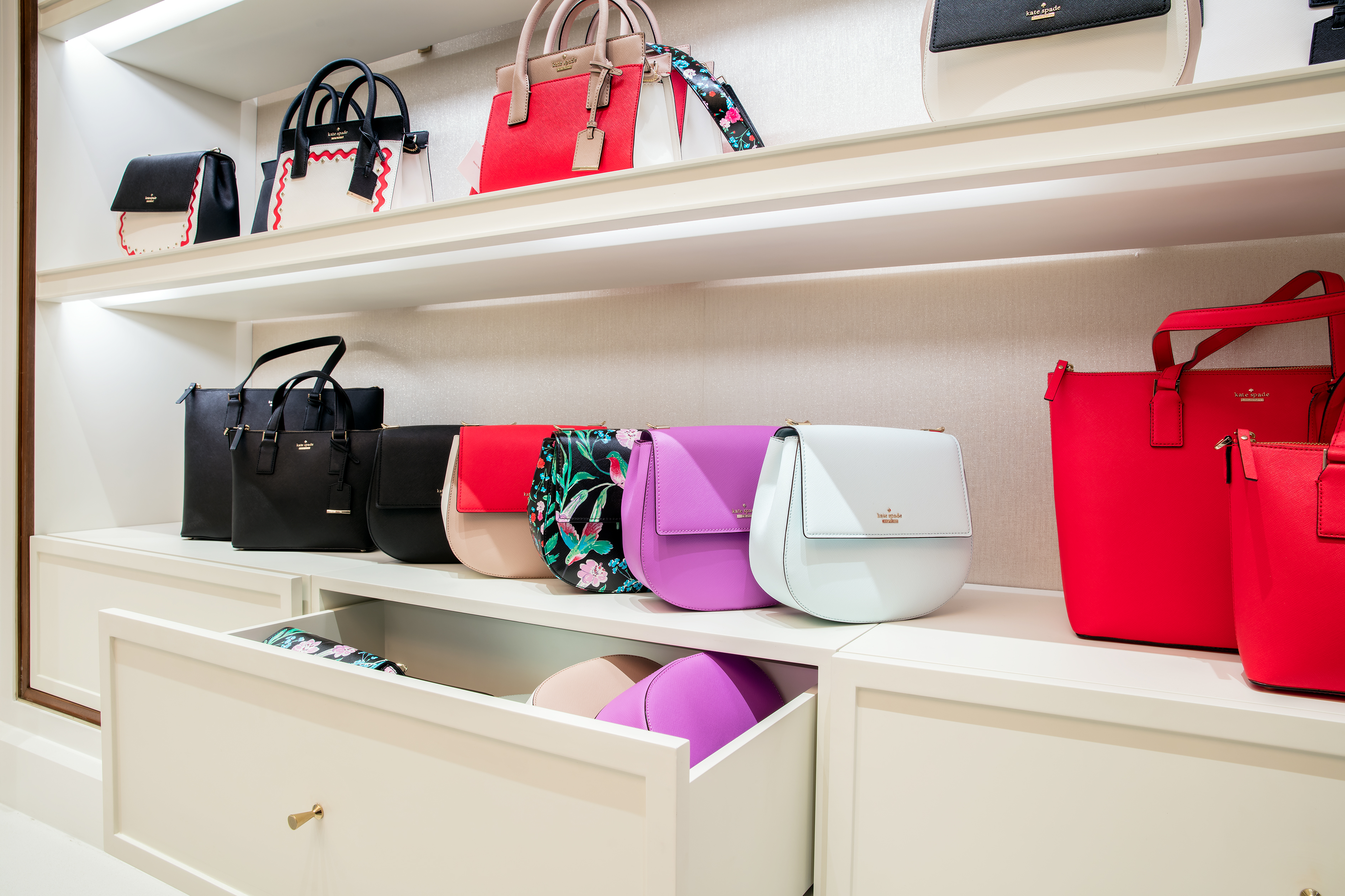
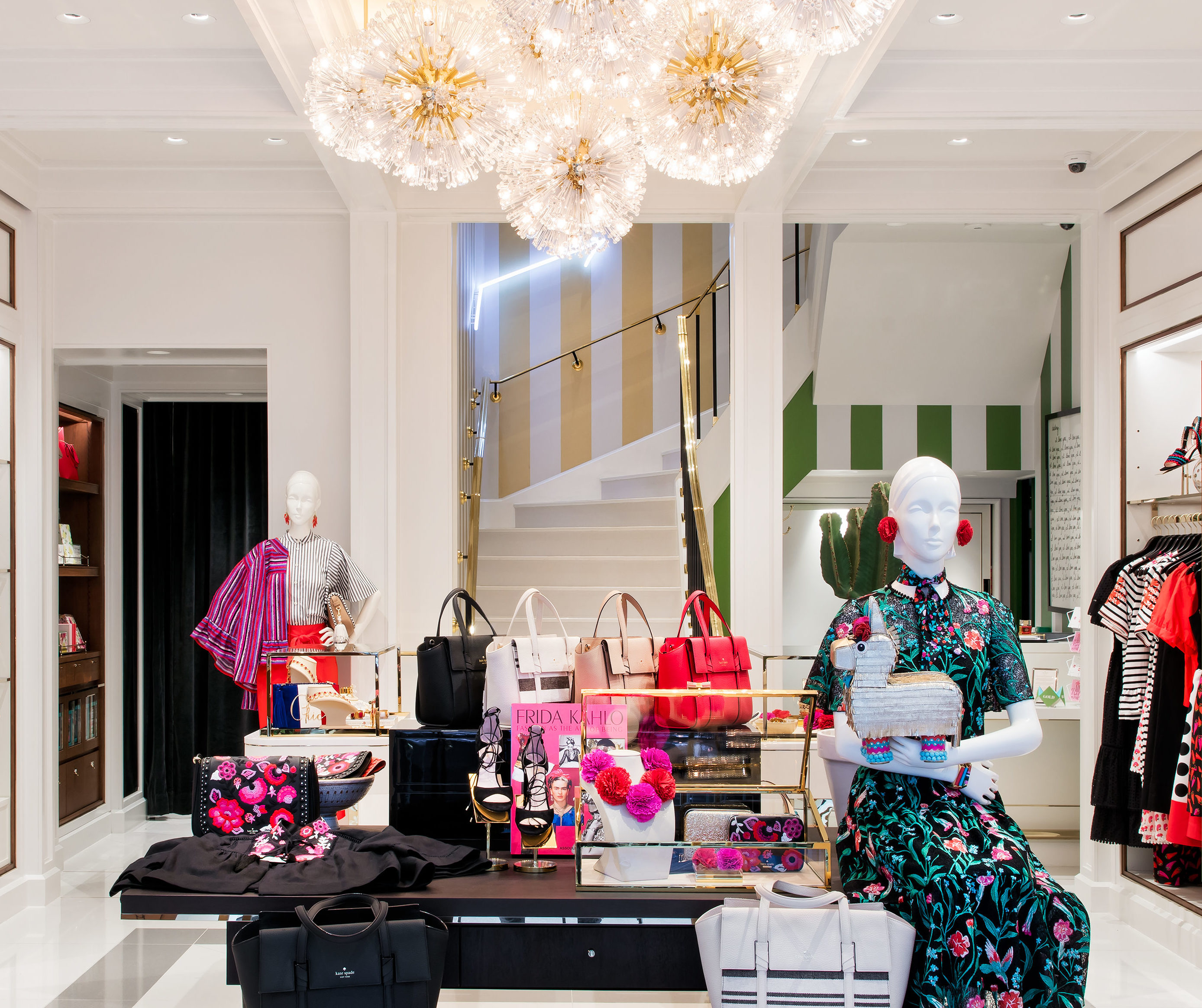
This week’s instalment of the #SBIDinspire interior design series features the modern luxury accessory and lifestyle brand, kate spade new york, in Paris. The market leading specialists, Portview Fit-Out, were called upon to complete the interior design work on the brand’s new flagship store to mark kate spade’s celebrated arrival into France, following the successful launch of their Regent Street store in London last year. Located at 418 Rue Saint-Honoré and measuring 185 square metres over two floors, the design scheme created by kate spade new york and Hyphen radiates opulence, with contrasting white and grey terrazzo tiles, polished brass inlays and railings, and high gloss counter tops. The sophisticated white colour palette cleverly draws the eye towards the colourful assortment of product categories including handbags, ready-to-wear and fashion accessories whilst boasting an air of Parisian finesse.
Company: Portview Fit-Out
Project: Kate Spade, Paris
Project Location: Paris, France
What was the clients brief?
The design of the flagship sought to embrace mid-century modern influences while maintaining the authentic aesthetic of the neighborhood. The store’s two-level façade was inspired by a traditional Parisian storefront, incorporating painted wood and dark stone accents. Furniture from the kate spade new york home collection is blended into the overall store design, allowing customers to immerse themselves in the world of kate spade new york.
Our goal was to make the clients’ creative vision a reality and that’s exactly what we’ve done here. The integrity of the kate spade new york brand is present throughout, with subtle splashes of colour and signature Sputnik lighting, and is integrated with Parisian elements to give the store individuality and cultural context.
What inspired the design of the Project?
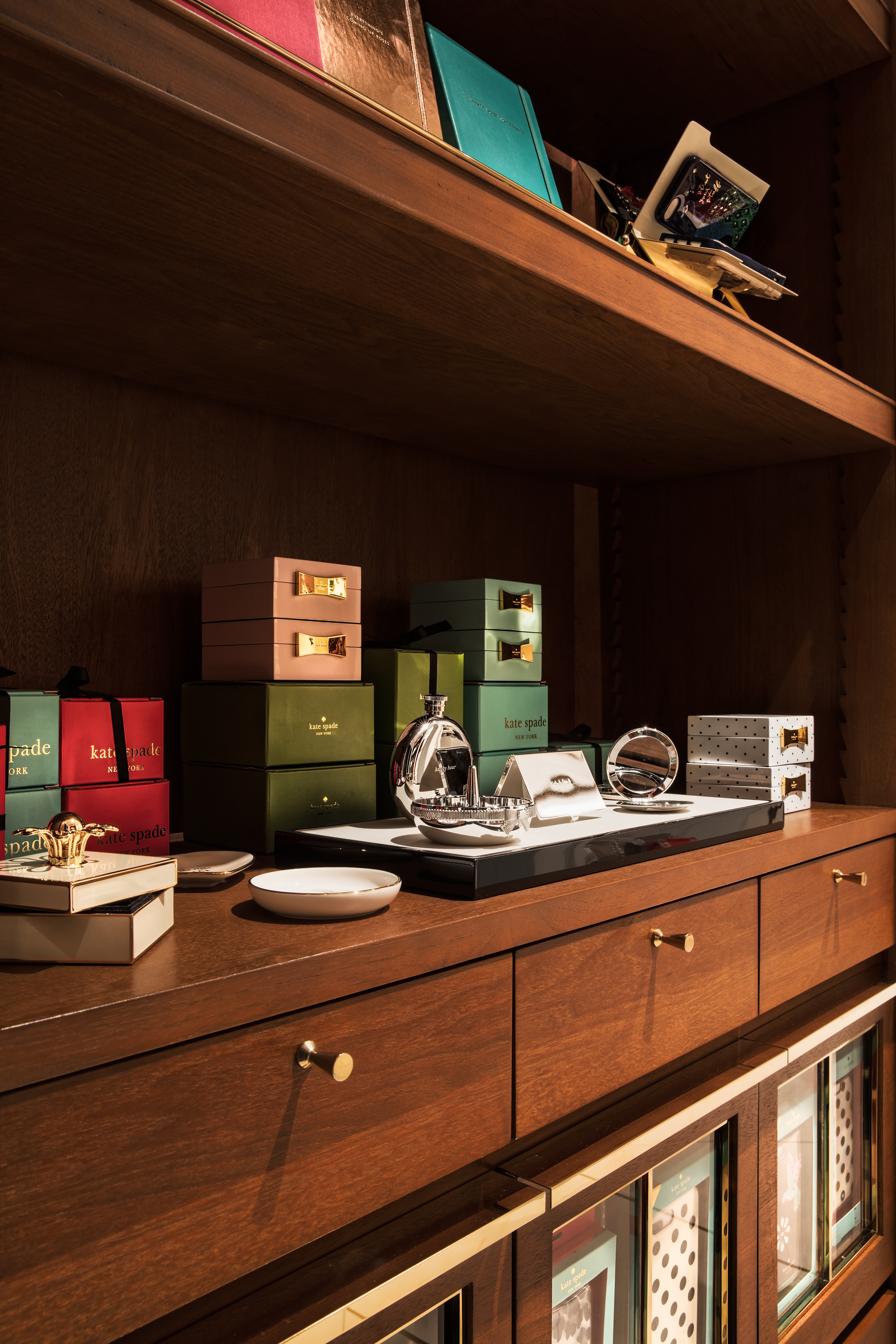
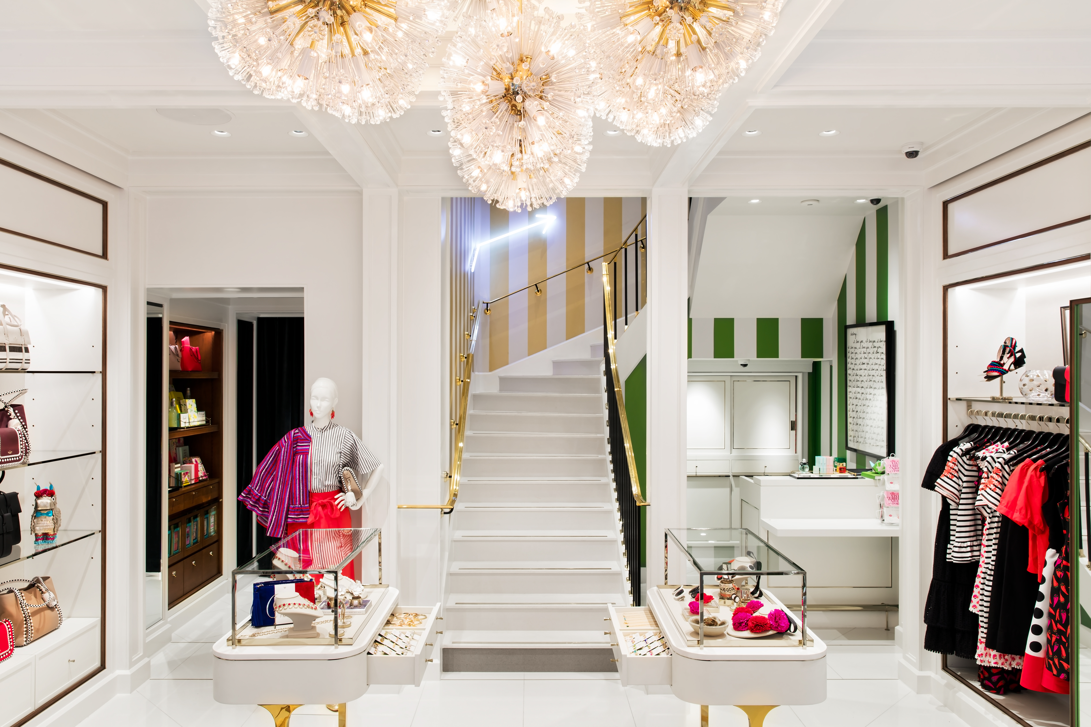
Undoubtedly it was the surrounding Parisian architecture that played a huge part in the design of the store. The design of the two-storey boutique is distinctive and individual, with features ranging from neon signage and iconic patterned wallpapers, through to crown mouldings and crafted pilasters. The overall look combines kate spade new york’s trademark playful aesthetic with classic Haussmann-esque mouldings and detailing that are typical of Parisian architecture.
The joinery and cabinet work were designed in the U.S. and fitted by ourselves. The unique lighting scheme sourced “Sputnik” fittings from the U.S. which were rewired for local currents, giving the store a distinctive American ambience.
What was the toughest hurdle your team overcame during the project?
This store was a unique site in a landmark location, and the team overcame a number of challenges to ensure a successful delivery. Working on one of the most exclusive streets in Paris, came with complex local regulations that contrast vastly with those in the UK. For example, when it came to navigating the Parisian planning processes we needed to work closely with the local authority to adapt the shopfront design to meet their requirements. This involved a lengthy 16-week consultation process, which resulted in the commission of a black, high-gloss painted lacquer finish with gilded detailing, which gives the shopfront a signature look that is both classic and chic.
To work our way around the language barrier, we have a number of multilingual employees who are fluent in French and were able to communicate effectively with the local representatives.
What was your team’s highlight of the project?
Working in partnership with kate spade new york and Hyphen was a delight, largely thanks to our shared passion for creating exceptional spaces, experiences and solutions for people to enjoy.
This is the second retail project we’ve fitted for kate spade new york, with the completion of the Regent Street store in London in 2016 and the Paris flagship location last summer. It was a real team effort from our outstanding employees and we take great pride in having completed another standout project in one of the world’s fashion capitals.
Why did you enter the SBID International Design Awards?
The SBID Awards sets the precedent for design excellence and are hugely influential in curating new trends and industry standards, which we should all aspire to.
At Portview we pride ourselves in delivering exceptional interiors that are world-class. To be recognised on such a global scale by the industry’s most respected organisation, would be a huge achievement for us and one which we would cherish. Last year we were shortlisted for our fit-out of Harvey Nichols’ Menswear and Beauty Lounge departments in Knightsbridge, which was a brilliant experience and one which we hope to emulate again this year.
Questions answered by Simon Campbell, Managing Director at Portview Fit-Out
To ensure you are kept up to date with the latest design inspiration sign up for our newsletter and follow us on Instagram @sbiduk
If you missed last week’s Project of the Week with the charmingly opulent, French-inspired eatery by DesignLSM, click here to see more.
Entries were received, finalists deliberated and the winners of the SBID International Design Awards 2017 have been announced! Click here to see the full list.
We hope you feel inspired! Let us know what inspired you #SBIDinspire
Portview Fit-Out | SBID International Design Awards 2018
