 19th June 2019 | IN OFFICE DESIGN | BY SBID
Project of the Week
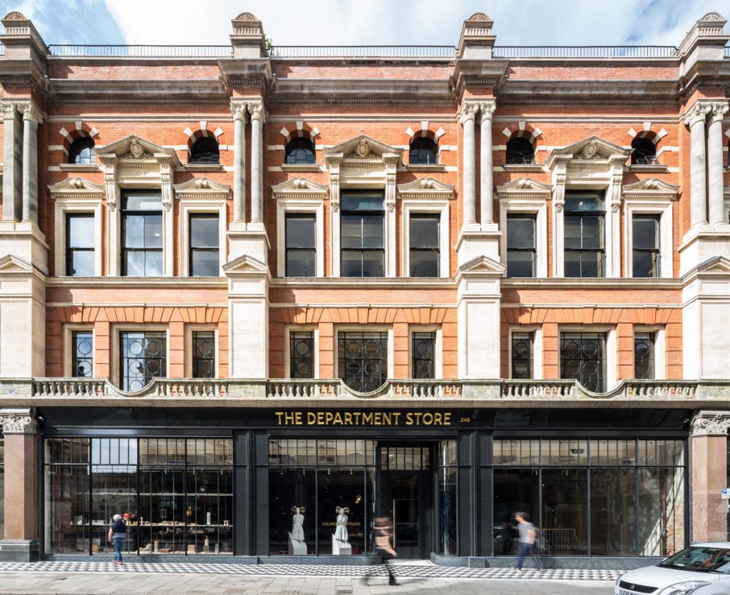
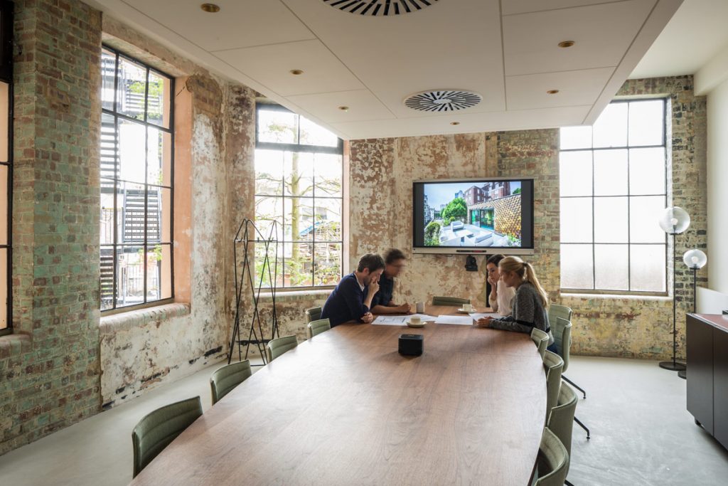
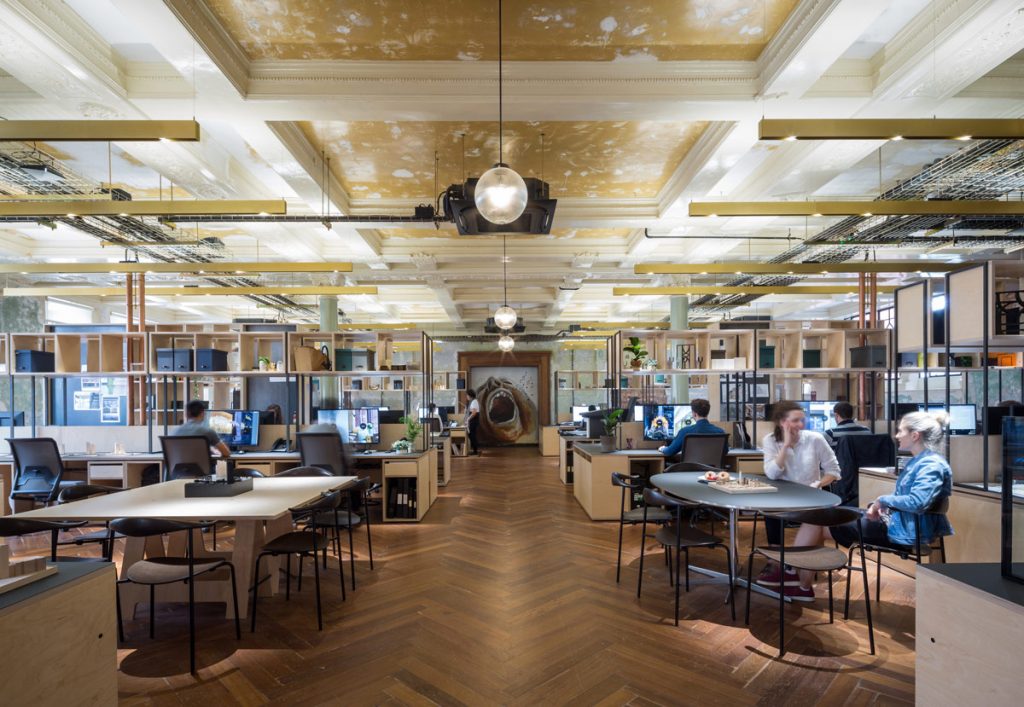
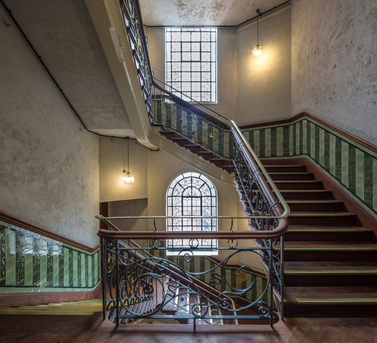
This week’s instalment of the #SBIDinspire interior design series took a dilapidated former department store from 1906 and re-imagined it to create an inspiring and multi-disciplinary architecture and design practice. The building was stripped of years of incremental additions to reveal original features. Existing interiors were assessed to ensure that elements such as 111-year-old Burmese teak flooring, a grand tiled-staircase and historic colours were preserved, as well as artworks created by squatters dating from the 1990s.
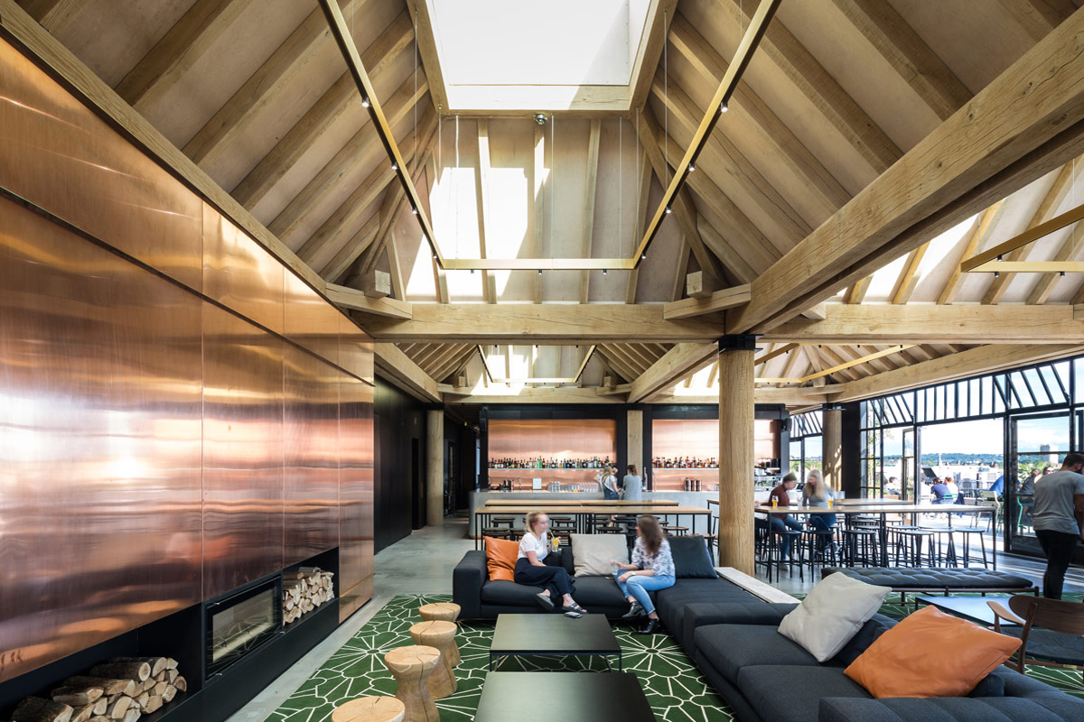
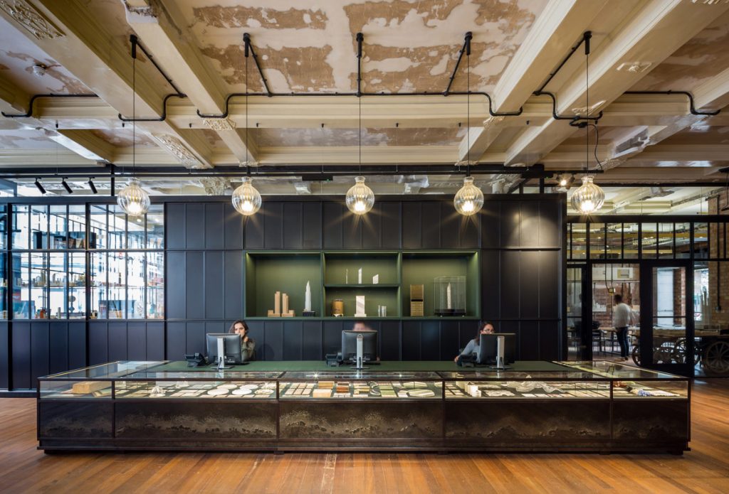
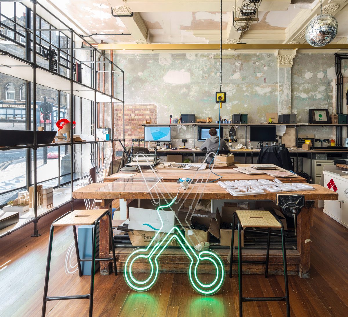
Voids cut through the building, provided volume and connections between levels. A striking reception and model-shop animate the ground floor, while a large basement event space includes cycle storage, changing-rooms and showers. Open-plan office design concepts were used to create workspaces and meeting areas which are also located on first to third floors. Topped by a new rooftop bar/restaurant for staff and the public, comprised of a series of oak-framed pavilions and a bespoke glazed dome that marks the end of a south-facing terrace.
Sector: Office Design
Company: Squire and Partners
Project: The Department Store
Project Location: London, United Kingdom
What was the client’s brief?
Our brief was to take an unoccupied, dilapidated former department store from 1906 and re-imagine the building to create a series of inspiring office design which serves as work and social spaces for our multi-disciplinary architecture and design practice.
We sought to sensitively restore the Edwardian building, retaining and recycling as much of the building fabric as possible to bring it back to life, whilst also delivering a workplace that meets current and future needs in its offering of excellent facilities, with a forward-thinking approach to sustainability and wellbeing.
What inspired the interior design of the project?
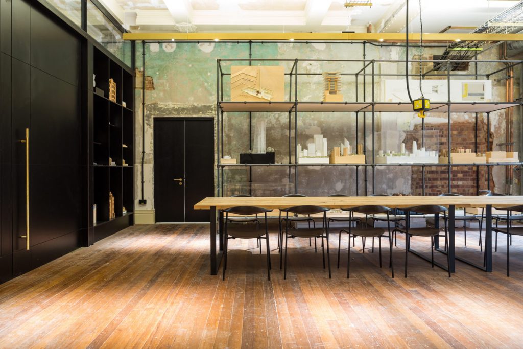
Stripping the building back to its raw state revealed a decayed grandeur and an extraordinary commitment to craft and detail by the original artisans. We looked to reveal and highlight these elements, in their found state, as well as exposing remnants left by more recent inhabitants, whilst adding a series of contemporary interventions in order to re-purpose the building as an inspiring modern workspace.
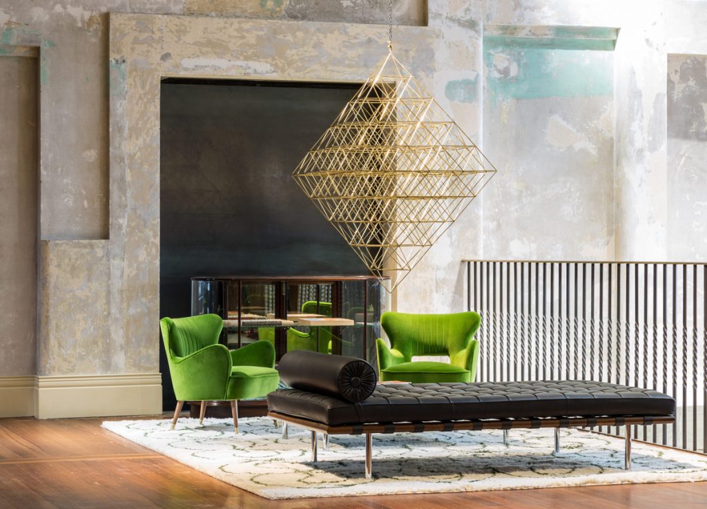
All aspects of the building’s history have been revealed, from its grand beginnings through to periods of misuse and decay, including a decade of use as a squat. Original graffiti sits alongside high end finishes, and modern furniture pieces co-exist with antique retail display cases in a highly curated interior filled with crafted curiosities which span the lifetime of the building.
What was the toughest hurdle your team overcame during the project?
Working with an existing building that had remained unoccupied (aside from squatters) and neglected for 40 years was challenging given its state of dilapidation. However, the building was of a robust construction, and after investigations it was decided that enough of the original fabric and character remained to provide a glimpse of its illustrious past and inform the approach of the new design, where possible embracing and capturing the building’s mistreatment over the decades.
A challenge during the restoration process was communicating to the build team the level of rawness and the overall aesthetic we wanted to achieve, as it was a non-standard finish and often a process of trial and error. During construction it was harder to see when surfaces were at their desired level of finish – we had a strong presence on site throughout the process and would stick signs to walls saying ‘this is finished’!
What was your team’s highlight of the project?
Re-activating the street level, which comprises a series of creative and retail units for local businesses, including an independent coffee roastery, café and record shop and a new home for the community Post Office. The café/bar at The Department Store’s apex is in the spirit of Café de Floris in Paris, which supported the original Bon Marché.
Squire and Partners’ own windows are utilised as a platform for creative arts within the local community, with a rolling programme that ranges from work by established and emerging artists to collaborations with local school children, as well offering views into the dedicated Downstairs events space used year round. These animated uses have transformed the building’s existing impermeable and hostile frontage into a friendly and open part of the community, bringing the building back into their hands following years of neglect.
Why did you enter the SBID International Design Awards?
The chance to be recognised by the SBID International Design Awards is a chance to be recognised internationally, by industry experts, and alongside the world’s leading designers of interiors.
Questions answered by Tim Gledstone, Partner at Squire and Partners
If you missed last week’s Project of the Week featuring a traditional Cape Dutch style house inspired by South African street art, click here to see more.
We hope you feel inspired by this week’s office design! Let us know what inspired you #SBIDinspire
Squire and Partners | SBID International Design Awards
