 17th July 2019 | IN PROJECT OF THE WEEK | BY SBID
Project of the Week
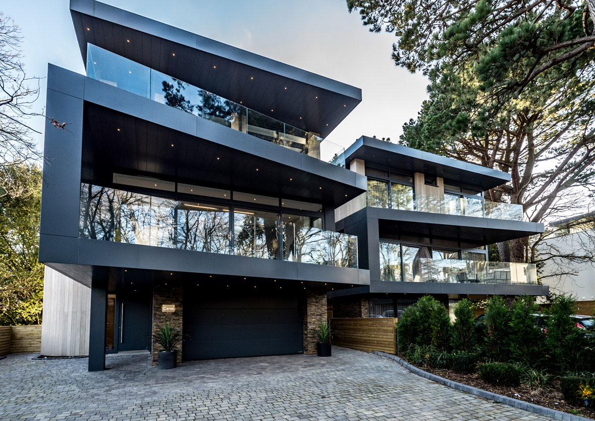
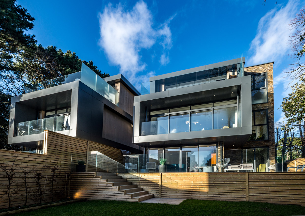
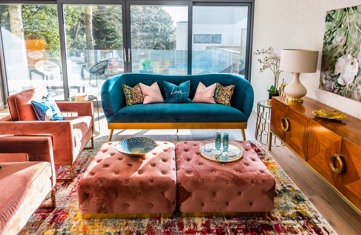
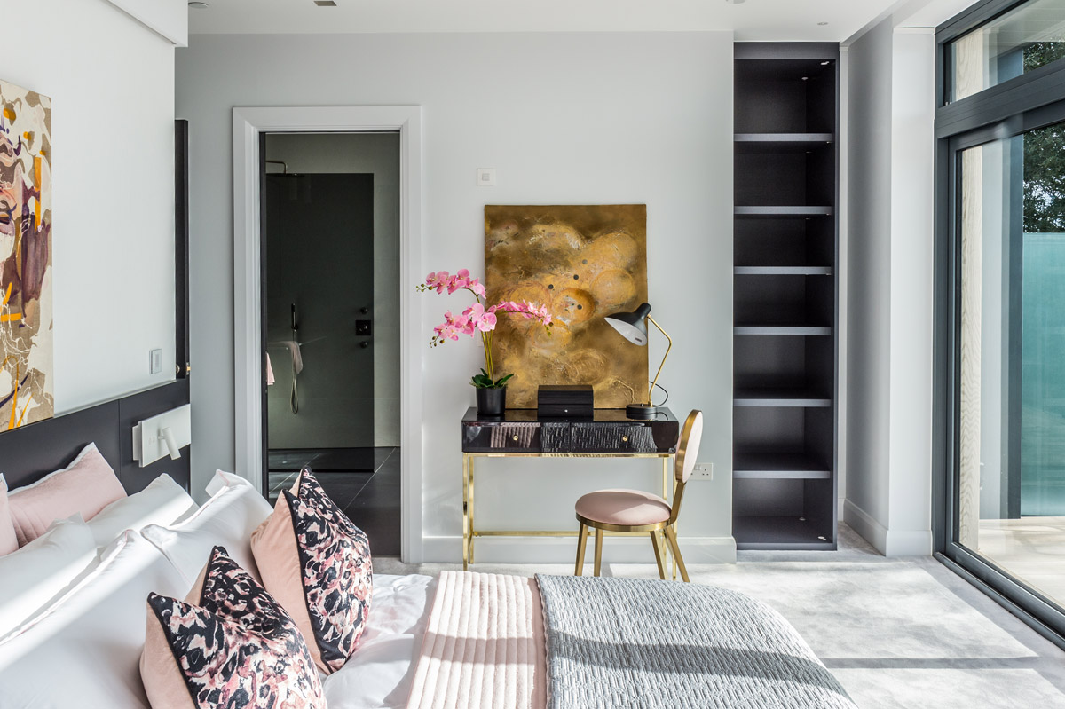
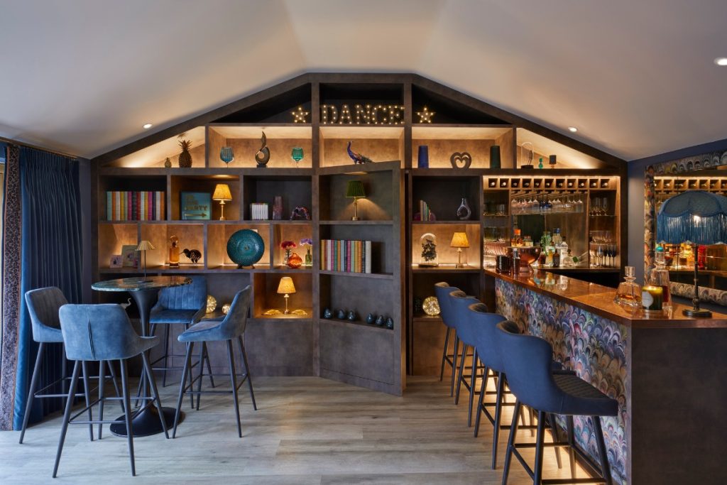
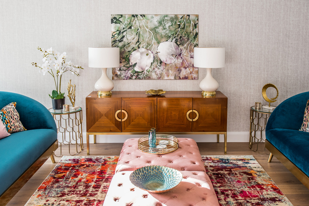
This week’s instalment of the #SBIDinspire interior design series features a glamorous and modern California-esque show house in Poole with three storeys of striking angles and imposing architectural features. From a blank canvas finished in a palette of neutral grey and white tones, Nykke Jones Interiors injected the property with splashes of vibrant colour and contrasting materials in their choice of art deco soft furnishings, contemporary artwork and retro inspired furniture. The interior scheme brought the property to life with an abundance of colour, personality and character – no mean feat for a soulless and (temporarily) un-lived in show house!
Sector: Show Flats & Developments Design
Company: Nykke Jones Interiors
Project: Ceres
Location: Sandbanks, Poole
What was the client’s brief?
The brief was very simple. And serendipitous! But long story short…I was contacted by Dimitri with the furniture company MY Furniture, based in Nottingham. He had a marketing idea that he wanted to run past me. ‘’How would I like to design and stage a showhouse using his furniture collections?’, and he would lend it to me for free! The only stipulation was, I had to let him take photos of the property for marketing, print and social media purposes. And have a big open day. It was a no brainer! I contacted Shan at Amirez Developments, in Poole, and asked if he had a show house in need of designing & dressing. Sure enough he did! The timing was sheer perfection! Ceres is based in the superb Sandbanks area of Poole; and simply needed dressing with furniture – and lots of it – it’s a big house. I wanted to fill it with contemporary pieces, and lots of lush soft furnishings. It needed warmth, colour and character. I wanted to create a home.
What inspired the interior design of the project?
Ceres is stunning. Three storeys of striking angles, and imposing architectural features. Typically modern for the area, with a nod to that California hilltop facade. The property is surrounded and almost hugged by trees, tall, tall trees, and it’s just beautiful. Upon first inspection inside the property; which at this stage was already done as far as the finishes were concerned. It was essentially a blank canvas. Ready to go!
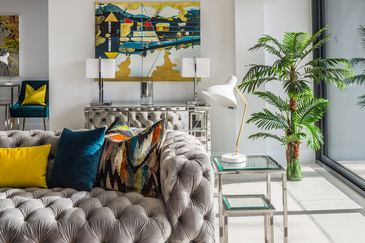
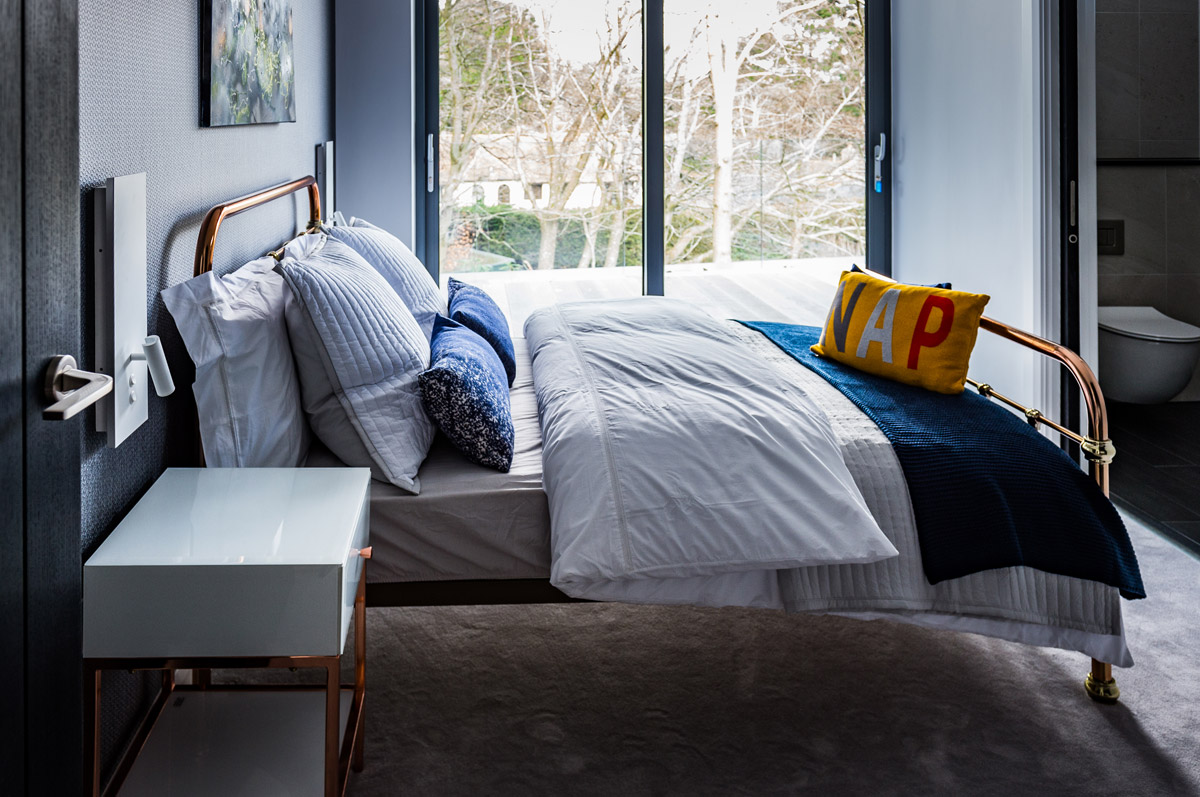
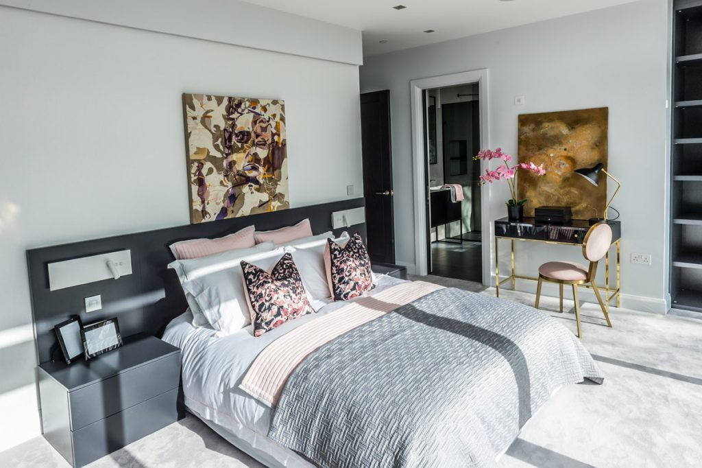
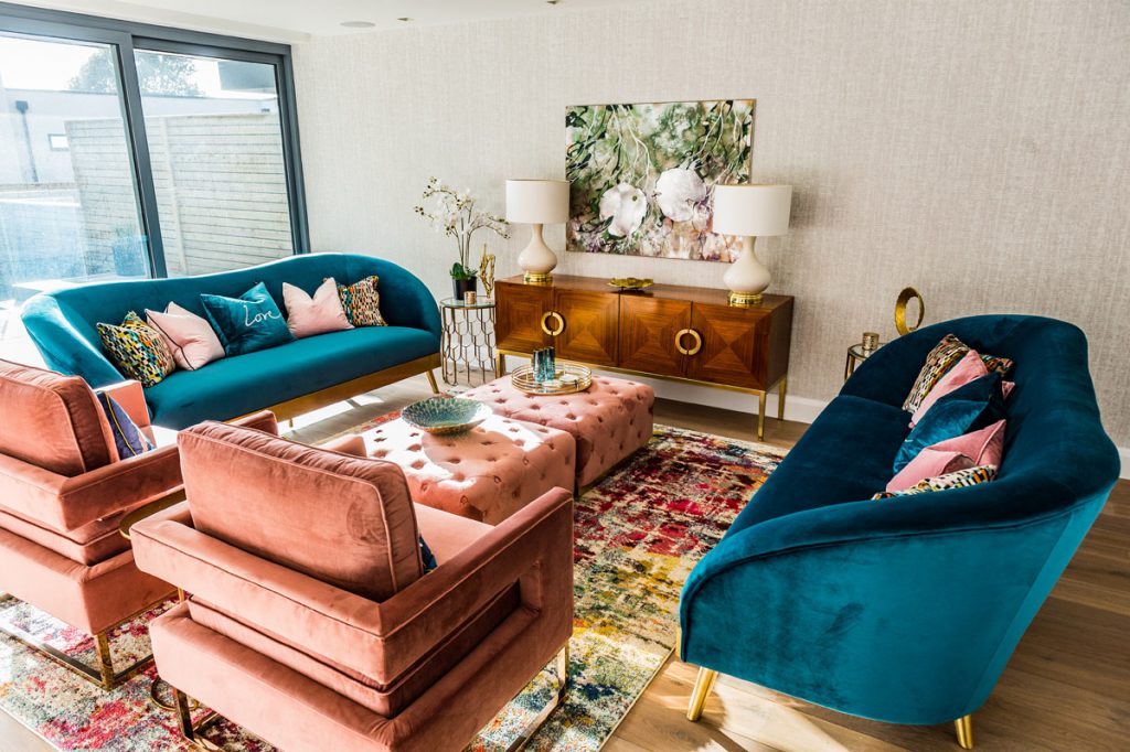
Instantly your attention is brought to a generous sweeping staircase that winds up the three floors to the master bedroom, which bestows the best sea views. Rain, hail or shine, the views are wonderful, in any kind of weather. I knew I wanted to add colour. I didn’t want to be safe. I wanted to create a space that said, ‘this is a happy joyous place’. I took my initial inspiration from the actual house. The style, and architectural features said a hint of art deco, coupled with 1950s retro. The trees outside, the colours of the leaves, and bark, the sea in the distance. The changing colours of the sky. A house talks to you if you listen. All the surfaces were perfect shades of grey, which was the ideal backdrop for my colour scheme, which quickly became Peacock Blue, Blush Pink, Navy Blue, Moody Grey, and Mustard Yellow. They don’t sound like they’d work, but they really did – I wanted to stay away from just grey.
I believe the colour scheme in a home should marry in with each other from room to room. Each should in some way, connect to the other. That way the house flows, and there’s unity in the design. Each room compliments the other without being the same. It’s a pleasant transition from space to space. It’s calming and comforting. It brings it all altogether.
What was the toughest hurdle your team overcame during the project?
The main hurdle with a project like this, is how to ground the design. Even with a big grown up serious property such as this, I wanted the design to be joyous, happy, fun even. And to ground it I had to ensure the theme of the furniture, along with all the colours, were working together as one. So I added deco style pieces, and retro 50s pieces together. This included the use of materials, so lots of silk and velvet were used in the fabrics. They’re both very tactile materials, you can’t help but reach out and touch them, especially the velvet which has seen a massive revival. One can’t help but caress the fabric pile. It’s so warm to the touch and ever so relaxing and sumptuous. I like the idea that an interior can stimulate all your senses. The visual, the touch, the sounds, the smell and taste. All this should be home. Instantly recognisable and safe.
Another hurdle, is how to pull the scheme together? It’s one thing to introduce a beautiful selection of furniture to a space, it’s another tying it altogether to make it pop and come alive. This is simply done by adding all the little elements that create a home. Personality. Character. Whilst it’s often difficult to do this in a show house, as there are no personal items as such, one can still achieve this by cleverly adding lots of accessories that bring the design together; cushions, artwork, books, candles, treasured pieces from your travels, antiques, recycled items, upcycled items.
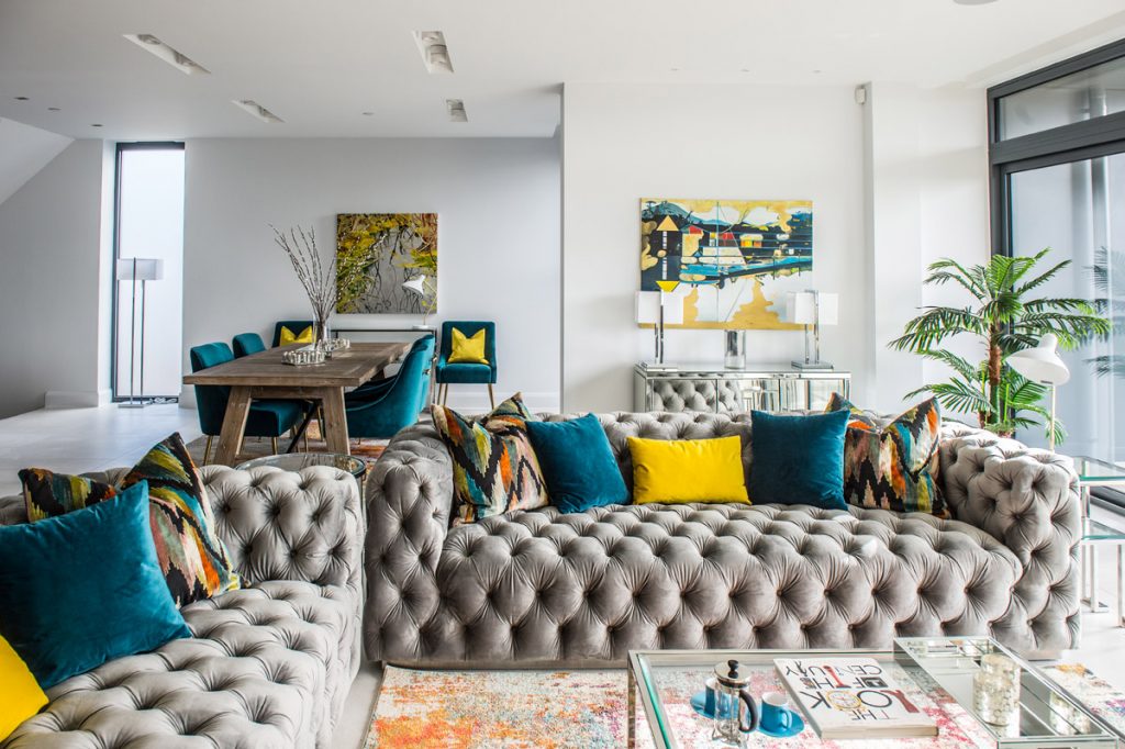
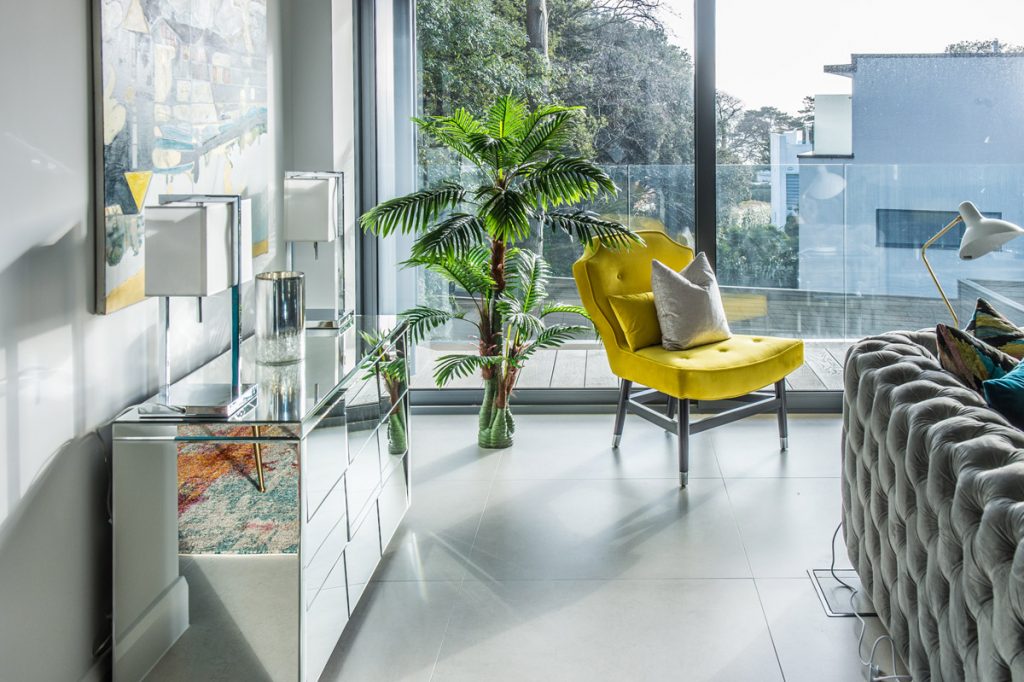
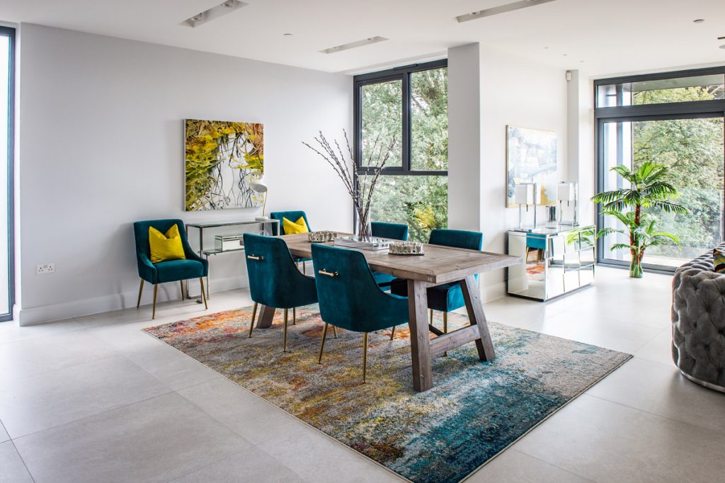
I added what seemed like a ton of cushions to the sofas. They brought together the colour scheme in the big family room on the first floor perfectly. Resting with pride position on the plush grey modern chesterfield style sofas are the most gorgeous, big feather filled, flame stitch design cushions in cut velvet. The base colour is black with blades of teal, yellow, orange, pink, and turquoise. Grouped with soft velvet peacock blue cushions, and the rectangular accent cushion is mustard yellow. These simple cushions bring all the colours of the room together in one hit. The large area rug is awash with all the colours. like a painting. and sitting all alone by the window is the grooviest, big bright mustard yellow chair, that says ‘’yes I’m the statement piece’’ ‘’aren’t I fabulous!’’. On the far side of the room there’s a big, beaten-up, washed grey oak dining table, teamed with funky 1950s style dining chairs in soft teal velvet. Silk yellow cushions adorns the side chairs, and all sitting pretty on a rug that is like a beautiful piece of abstract art.
What was your team’s highlight of the project?
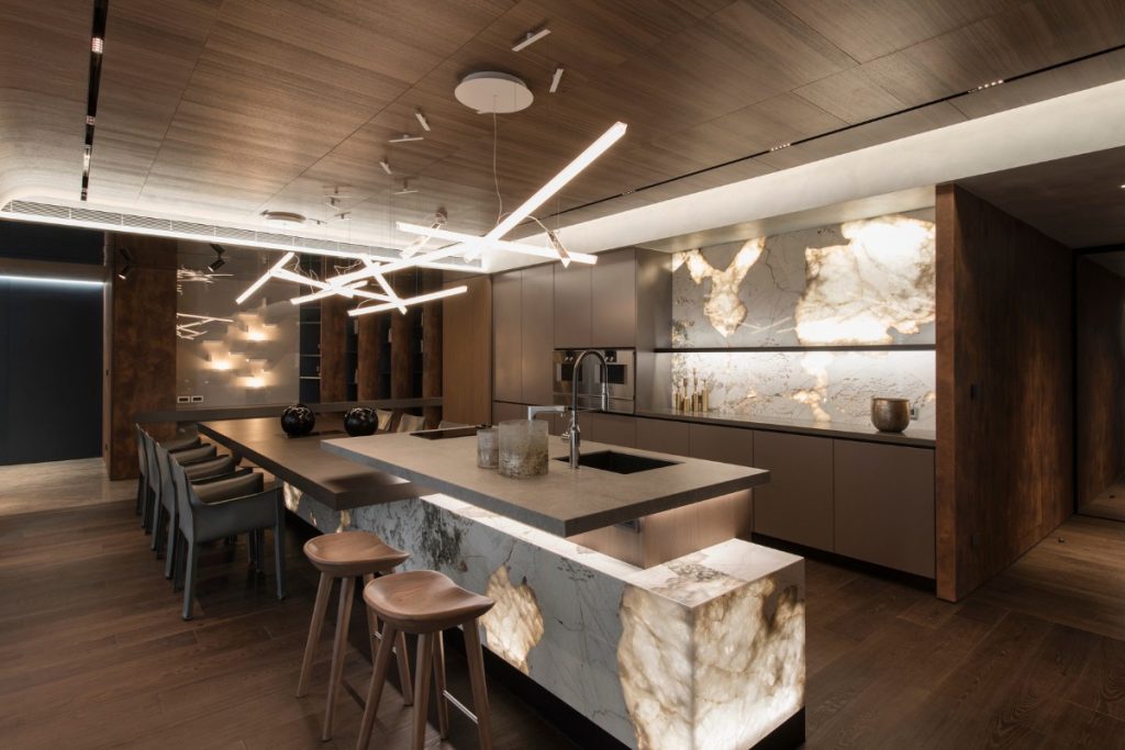
Difficult to pinpoint any one area that highlights the project, however, I do love the kitchen dining area. The big beaten-up grey oak table works so well with the 50s velvet chairs, it shouldn’t…but it does. And I like that. Mismatched pieces. I don’t like ‘matchy-matchy’. I don’t want anything I do to look like something out of a catalogue. What’s the point of a show house? To sell it of course. But in the process, by dressing and staging the property to look and feel like a home, visitors can glean some inspiration of their own. And ultimately go away and think about their own interior design ideas. The best highlight of the project, Ceres sold, and the icing on the cake it that it sold with all the furniture too! So a job well done by everyone.
Questions answered by Nykke Jones of Nykke Jones Interiors
If you missed last week’s Project of the Week featuring a timeless residential design inspired by classic, art deco architecture and interior style, click here to see more.
We hope you feel inspired by this week’s show flats and developments design! Let us know what inspired you #SBIDinspire
