 18th March 2020 | IN HEALTHCARE & WELLNESS | BY SBID
Project of the Week: SBID Awards Finalists 2019
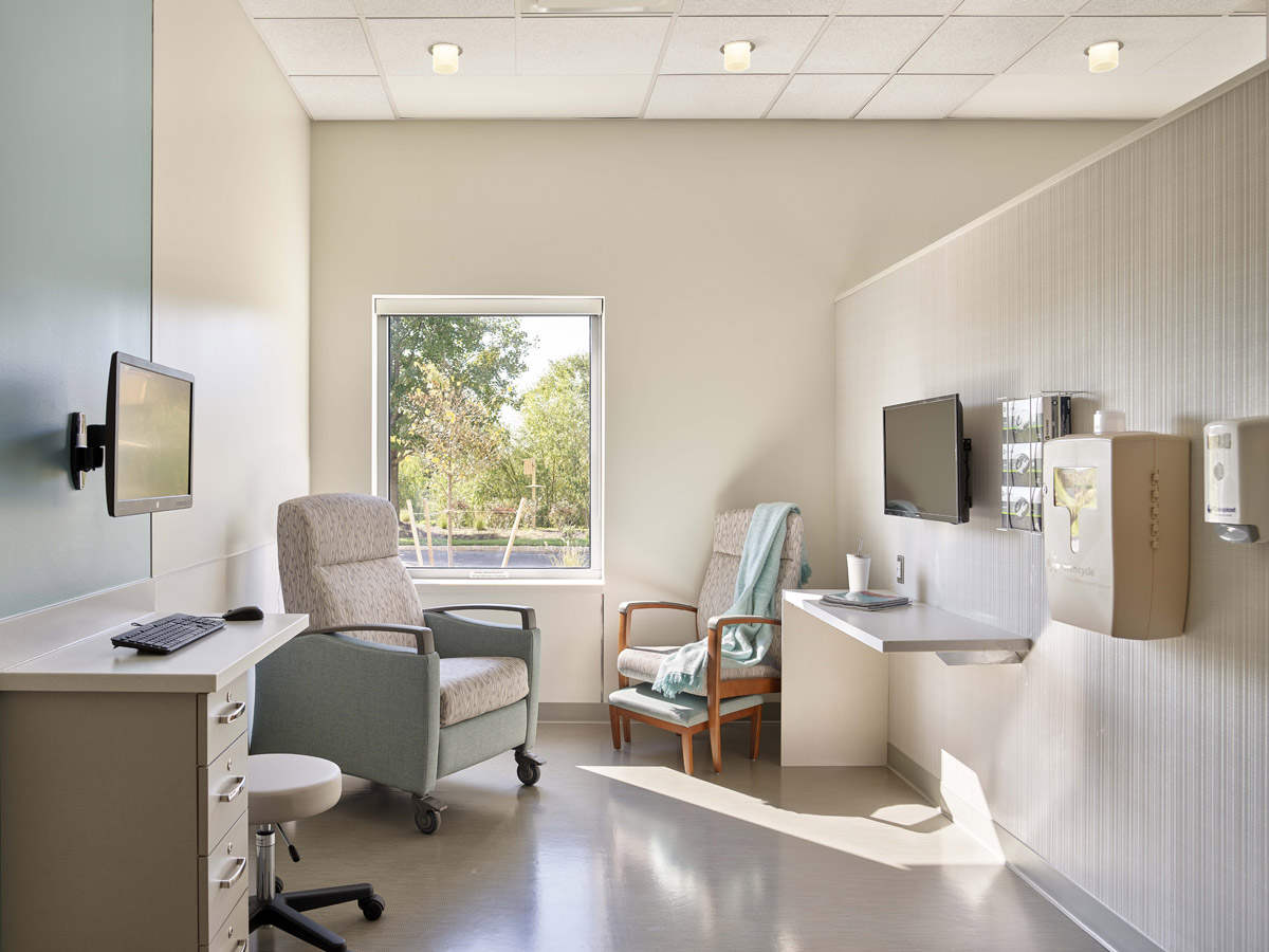
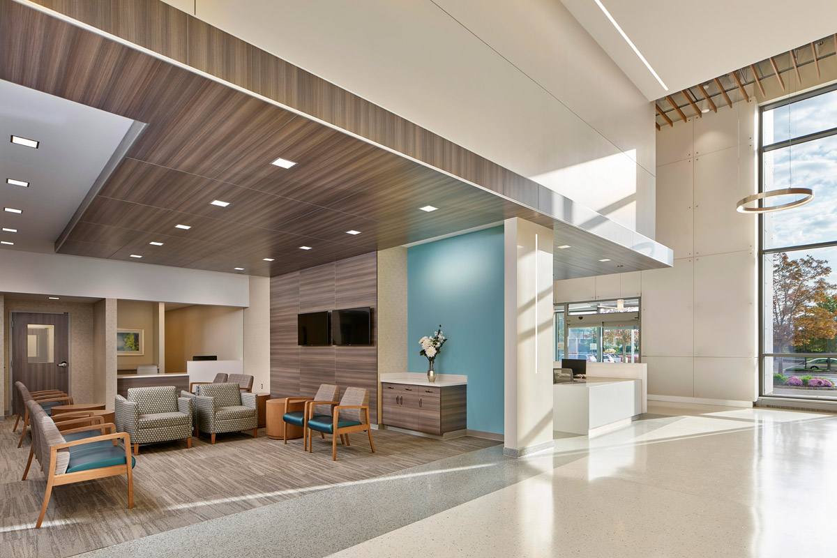
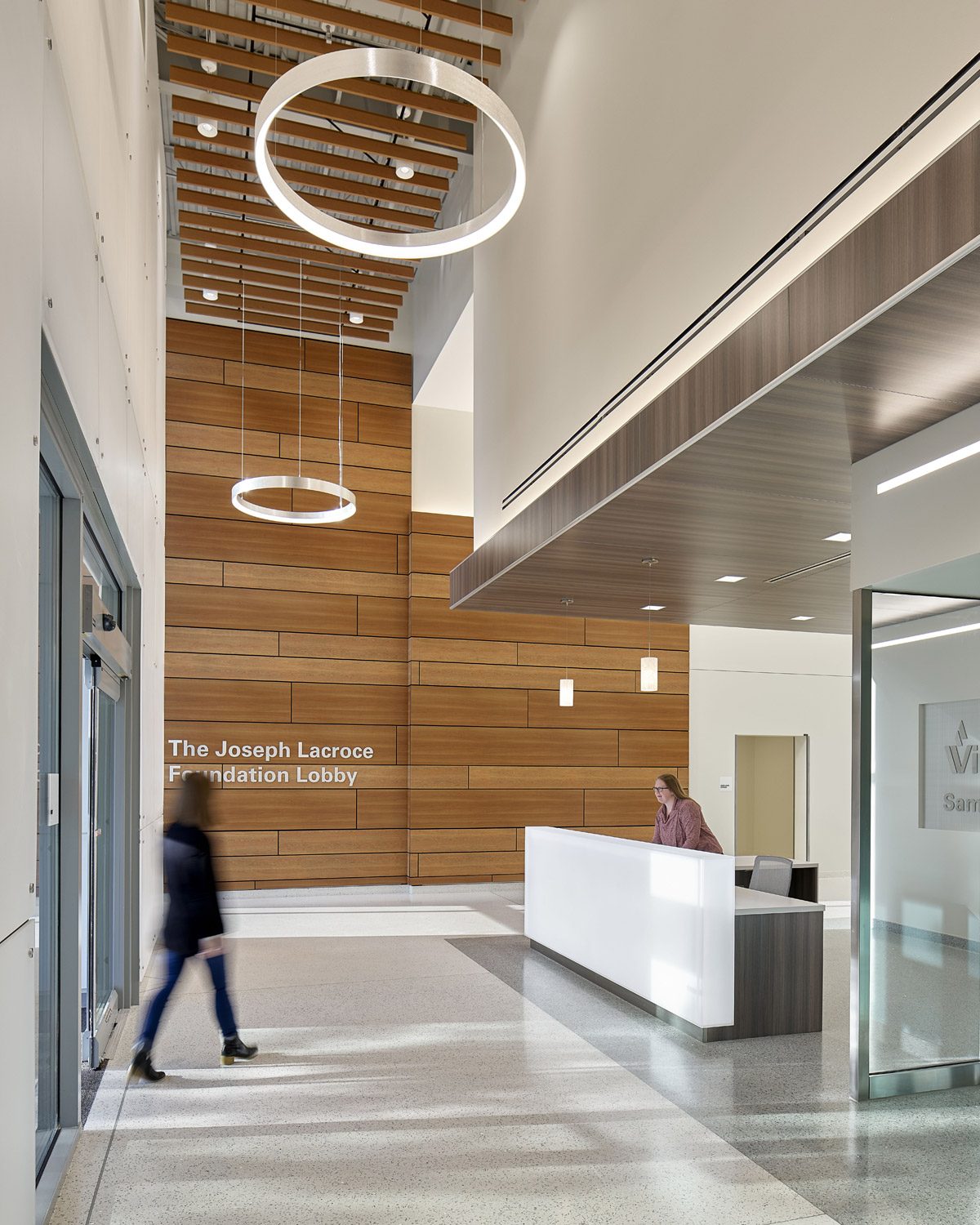
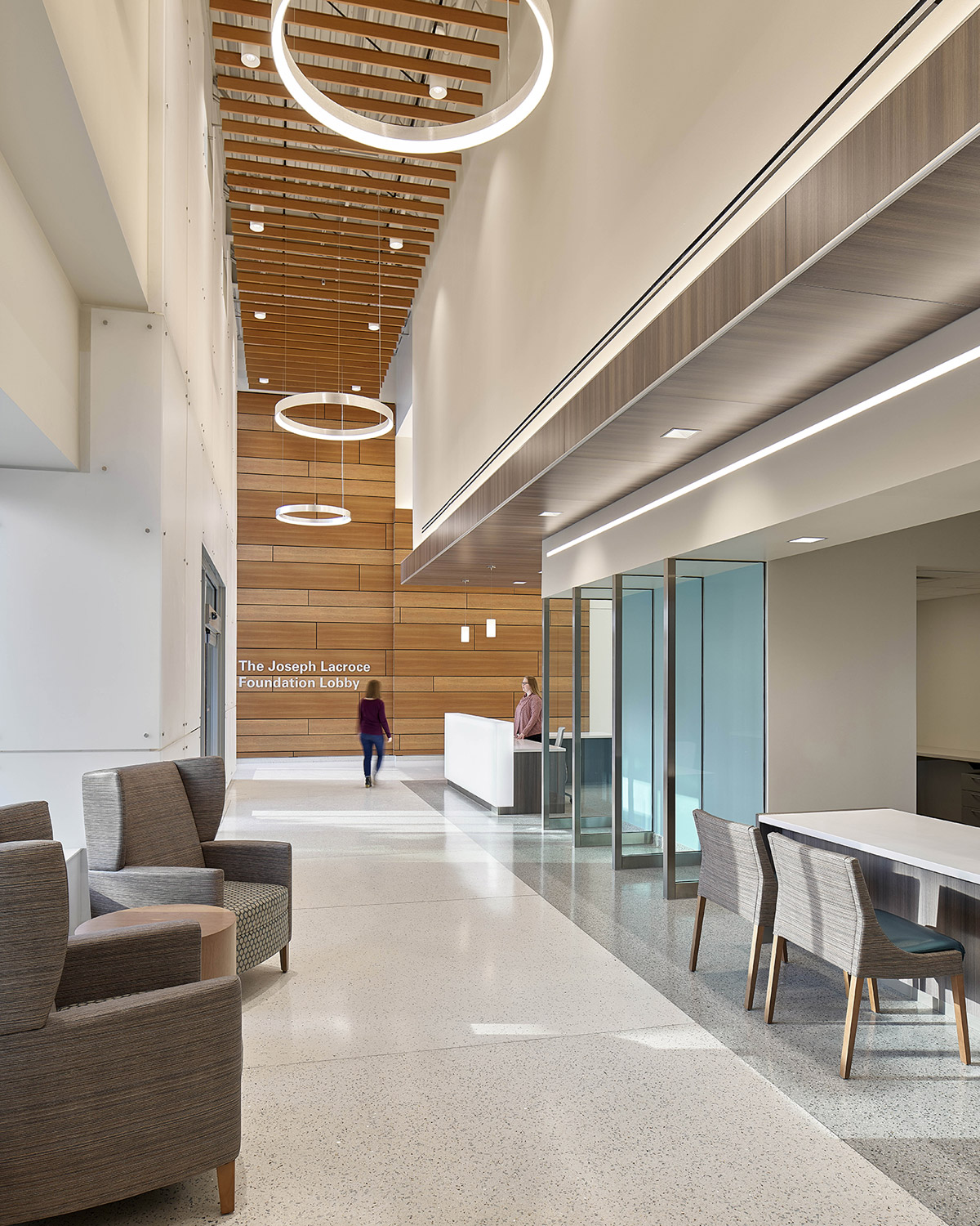
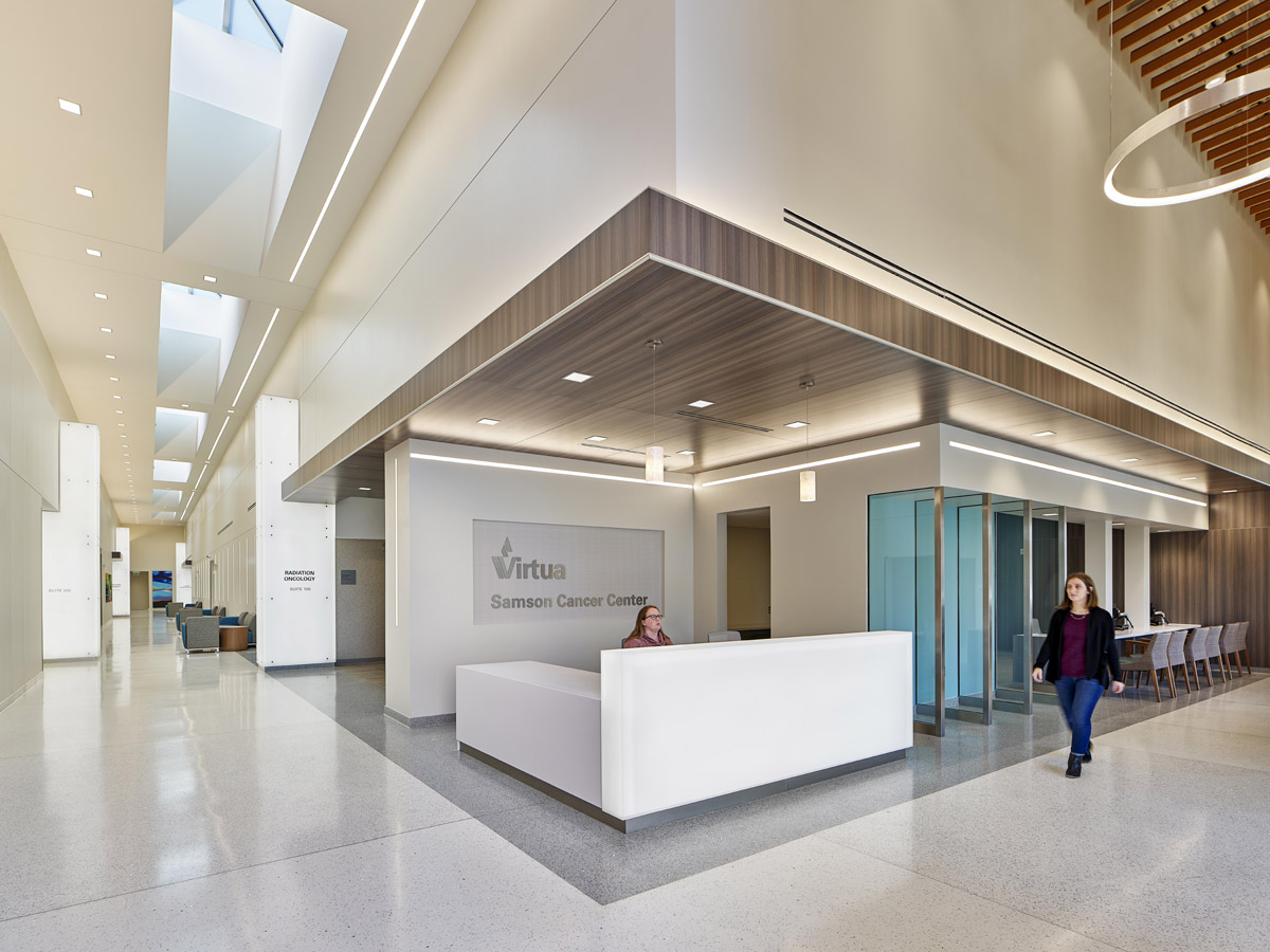
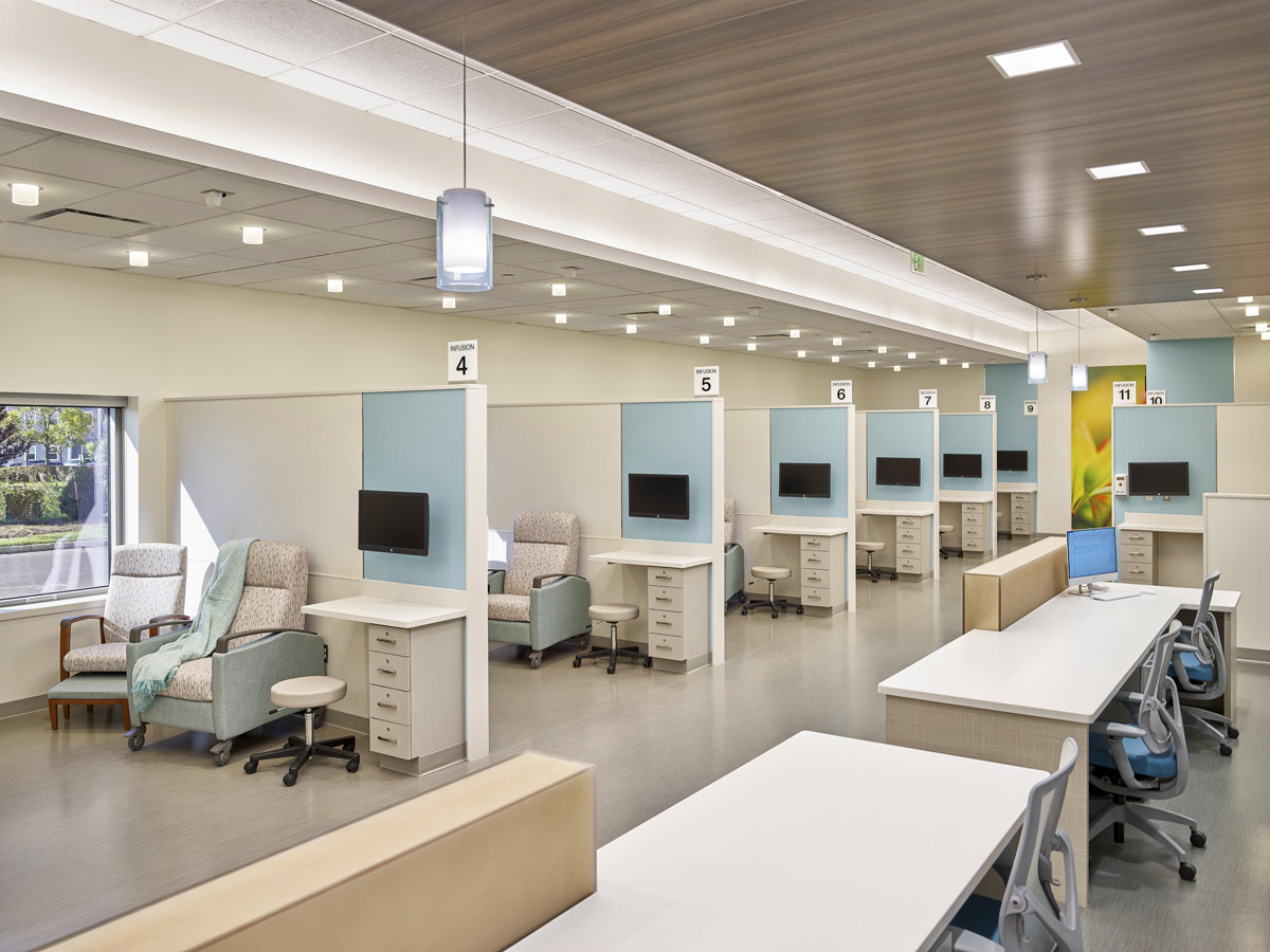
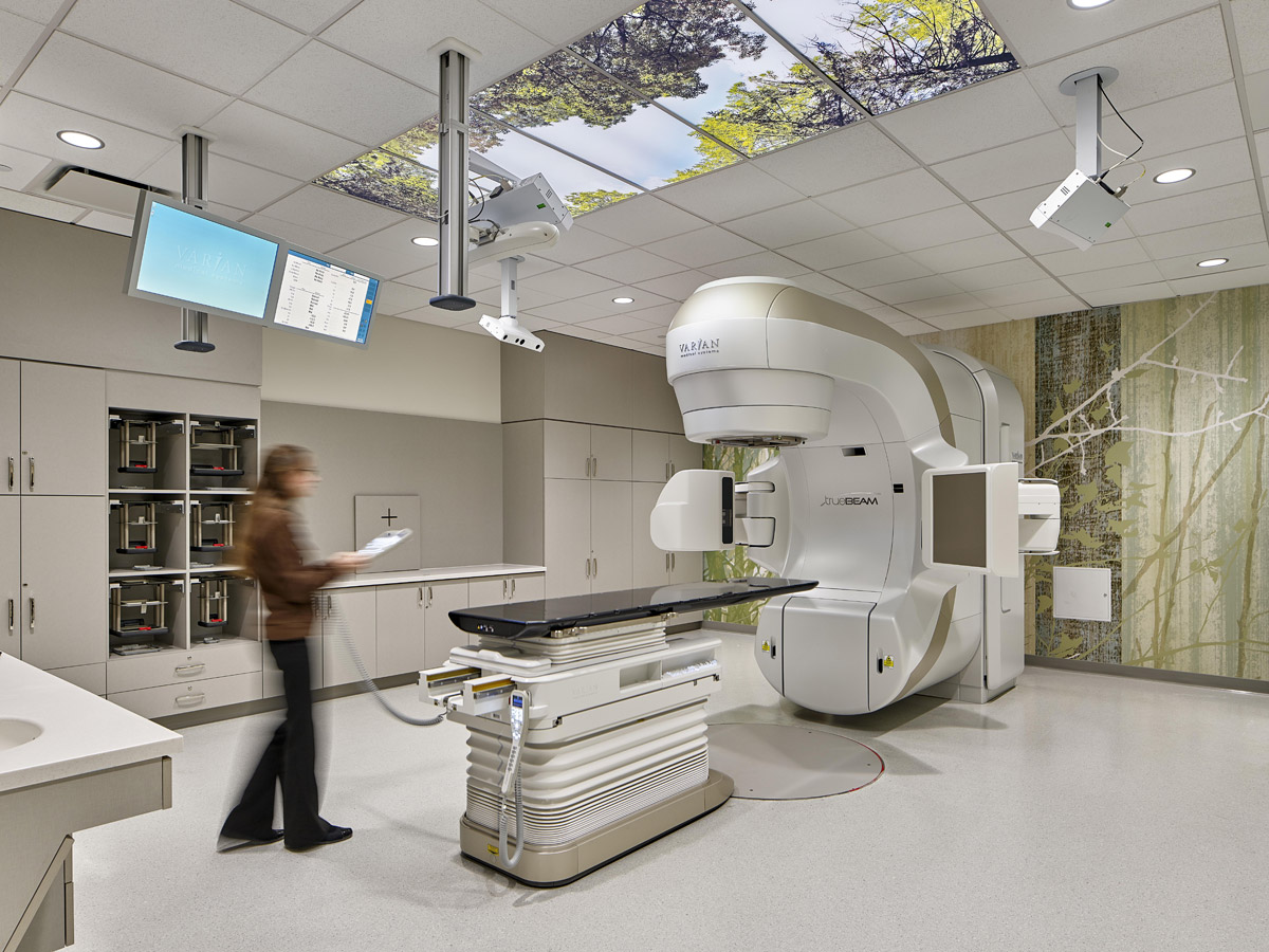
This week’s instalment of the #SBIDinspire interior design series features a comforting, patient-focused healthcare design. Needing a new Cancer Center, Virtua Health chose an old Acme Supermarket adjacent to their new Health & Wellness center for the project site. FCA Architects reimagined how that old Acme Supermarket could be re-purposed as a bright, warm place of healing. Creating easy-to-navigate paths through the space with a central gallery, which serves as a landmark for patients and families. This concourse then leads to smaller intimate waiting spaces that provides a more personal scaled spaces to interact with clinicians and staff. By reframing a former basic retail box for ambulatory oncology, they not only provided a community setting for a needed service, but avoided the decay of a structure that still has viable physical life. The new Cancer Center is an inspiring, patient-first facility that accommodates radiation oncology, an infusion treatment suite, and a cancer administrative suite.
SBID Awards: Healthcare & Wellness Design finalist sponsored by Stone Federation
Practice: FCA Architects
Project: Virtua Samson Cancer Center
Location: New Jersey, United States
What was the client’s brief?
Virtua wanted to relocate their Cancer Center from an outdated existing hospital to a new facility that would incorporate the latest technology; a facility that would improve the delivery of cancer treatment to patients as well as provide a community health care resource. They wanted to provide community-based cancer care to their patients in a way that would be deeply accessible to the surrounding community.
What inspired the interior design of the project?
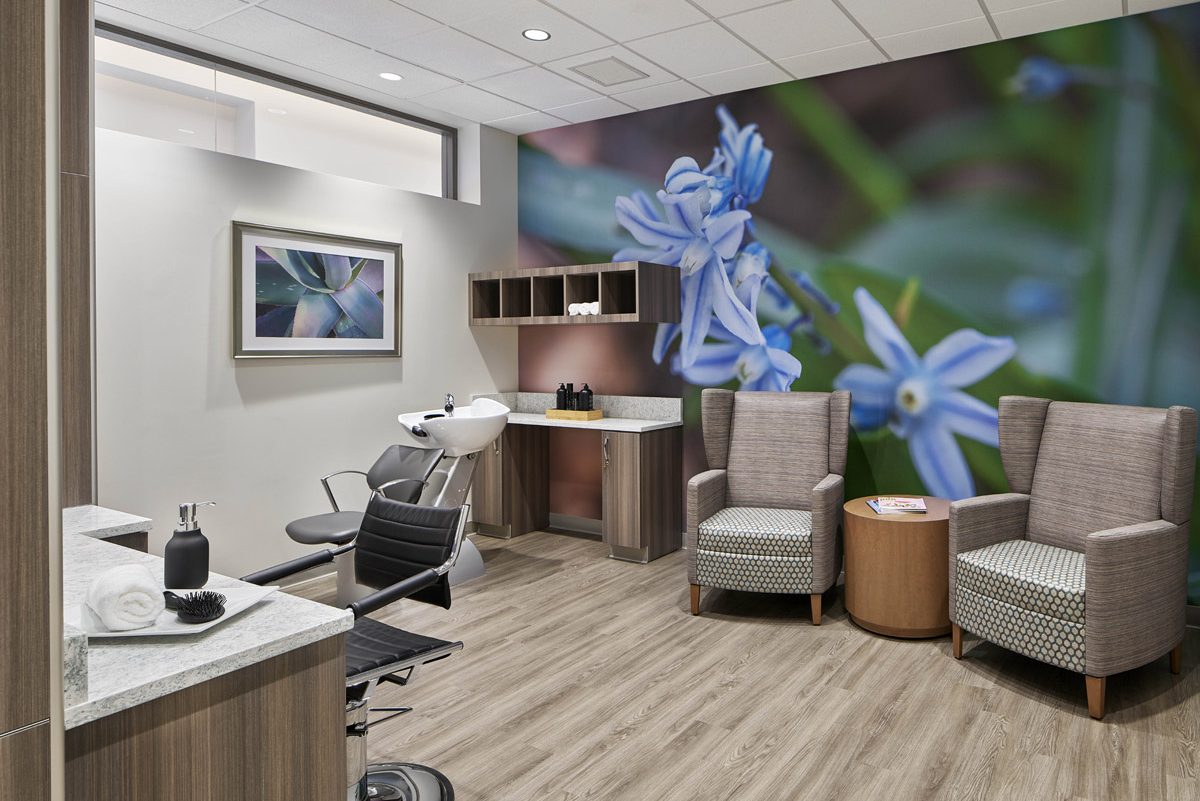
The main design goal was to provide a soothing patient experience within a very large footprint without overwhelming patients and their caregivers. For the interiors, the Design team emphasised access to natural light and views to provide a sense of place and orientation. A long skylight was created within the existing solid roof to provide an organising circulation element above the Main Gallery. For the exterior, starting at the front door, the White Box of the entrance is an off-balanced entry point: it reminds the visitor that, though cancer is not normal, it too is something we can pass through.
What was the toughest hurdle your team overcame during the project?
Virtua selected an old Acme Supermarket adjacent to their new Health and Wellness center as the project site. The existing facility was built to suit the intended supermarket retail function with a very large footprint to perimeter ratio and very high floor to ceiling height, as well as poor access to natural light. The new proposed Cancer Center program consisted of smaller rooms that required acoustic privacy and regular ceiling heights, and warm natural light.
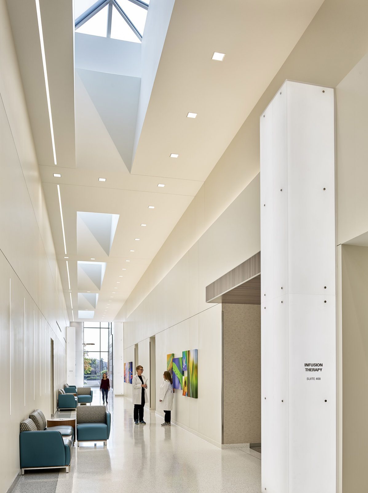
The design team strategically placed treatment rooms to serve both patients that are sensitive to natural light versus those that aren’t impacted by natural light. Skylights were installed above the Main Gallery to provide diffuse, controlled light that eases the deep distance of the gallery through the centre of the building’s footprint. The site’s high ceilings led to the Main Gallery being designed to prioritise the access to natural light to improve patient experiences during visits and to provide clarity of circulation to the interior. It also prompted a challenge for smaller rooms that require acoustical privacy: in these cases, a substructure was implemented to allow the ceiling and lighting to be suspended, minimising the need to construct full-height walls to the full height of the structure.
What was your team’s highlight of the project?
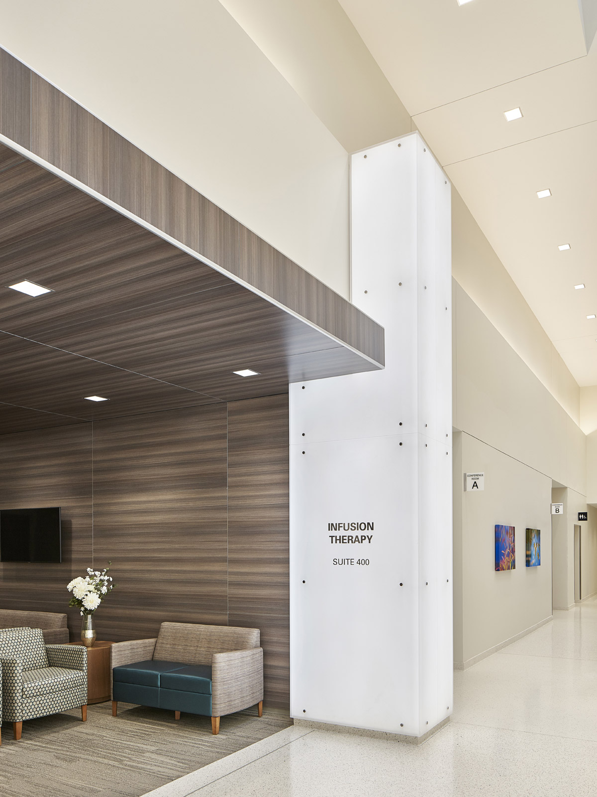
The White Box: a monumental entry dressed in semi-opaque white panels, its elevation slightly at odds with the sidewalk. The mass is “supported” by three white column legs, an implied fourth leg absent. This is because cancer is not a normal event. It is disruptive. The White Box is not an everyday, straightforward entry point – it’s off-balance. But it is also a beacon: bright, warm, and uncluttered. It reminds the visitor that, though cancer is not normal, it is something we can pass through. At the bottom of the White Box, and above the columns, is a canopy. From a distance, the canopy and columns appear as a pair of hands, shielding visitors. From outside the building, the Main Gallery is visible through a full-height glass opening that allows visitors to orient themselves before entry. Beside this glass opening is a wall clad in the same material as the canopy, which is repeated in the entryway, transitioning the visitors through the White Box, into the Cancer Center. This serves as a visual connection between the white Box and the interior. These wayfinding elements go beyond functional necessity – they serve as opportunities to both differentiate the facility and make a brand statement, emphasising that cancer patients’ needs require a unique design sensitivity that differs from other patients.
Why did you enter the SBID Awards?
The opportunity for our work to be recognised by a larger audience of our professional and international peers.
Questions answered by Jennifer Kenson, IIDA Principal of FCA Architects
We hope you feel inspired by this week’s Healthcare design! Let us know what inspired you #SBIDinspire
If you missed last week’s Project of the Week featuring a boutique townhouse in Notting Hill with bespoke luxury detailing, click here to see more.
SBID Awards 2019 | Healthcare & Wellness Design finalist sponsored by Stone Federation
