 9th November 2021 | IN COLOUR | BY SBID
Colours may be complex but they’re crucial to a successful interior design. Before choosing your colours, however, it’s important to understand colour terminologies, how colour affects your mood and the three types of palettes. This guide breaks down these terminologies, moods, and palette types so that you can make decisions that accurately reflect what you want from your interior space.
Interior Design Colour Terminology
Primary Colours: Red, blue and yellow are the primary colours and they can’t be made by mixing other colours together.
Secondary Colours: Orange, green and violet are the secondary colours and they can be made by mixing primary colours together.
Tertiary Colours: When they’re mixed together, primary and secondary colours create tertiary colours like blue-violet and yellow-green.
Tone: This denotes the brightness and deepness of a colour, which can be altered by adding grey.
Tint: By adding white, a colour can have a lighter tint and seem paler.
Shade: Shades are colours that have black added to them to create a darker finish.
How Colour Affects Mood
It’s important that you carefully consider what kind of space you’re intending to recolour because it’s scientifically proven that colours evoke particular moods and emotions. Therefore, selecting the appropriate colour for the right type of space is crucial.
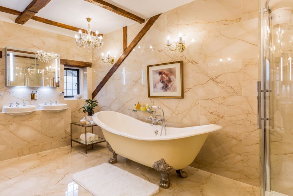
Warm Colours are the red, orange, and yellow sides of the colour spectrum and they’re associated with warmth and comfort. They’re generally associated with passion, playfulness, and joy, which makes them a good option for bedrooms and other intimate spaces.
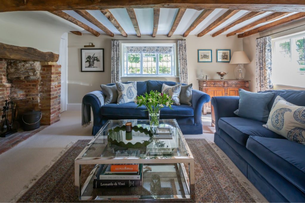
By contrast, cool colours are the blue, purple, and green sides of the colour spectrum. They’re more calming and soothing than warm colours and blue is often used for confidence whereas purple is used to evoke creativity. This makes them good colours to use in kitchens, dining rooms, and studies.
Three Types of Palletes
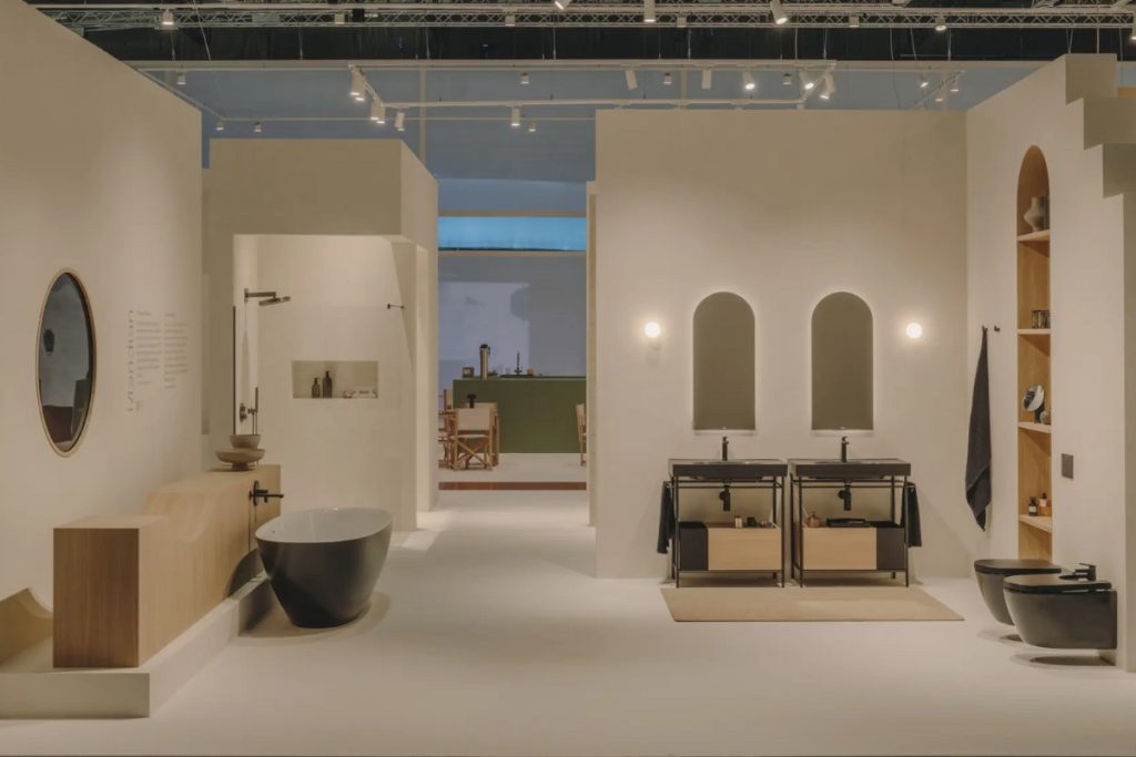
Monochromatic Colours: An increasingly popular option, monochromatic palettes use various shades of the same colour. Only one part of the colour wheel is used, though this can be any type of colour, and it’s a great option for minimalistic styles.
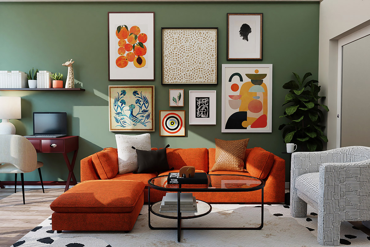
Complimentary Colours: This term denotes a pair of colours, usually a primary and a secondary, that cancel each other out when they’re mixed together by producing a white, grey, or black. They can also be called ‘opposite colours’ and they’re usually a bold combination.
Analogous Colours: This type of colour scheme is made up of three colours that are next to one another on the colour wheel, with one being a tertiary colour. This creates a rich, monochromatic look to a given palette and examples include red, orange, and orange-red, or green, blue, and blue-green.
Colours are beautiful, complex, and crucial to designing the right interior space. This guide has explained the broad terminology relating to colours, how warm and cool colours affect your mood, and the three types of palettes that you should be aware of. With this information, you can piece together the perfect palette with the right colours to fit your requirements.
Do you need specific expert colour advice for an upcoming project? Our accredited interior designers are experienced and certified design professionals who can provide qualified advice for your requirements. Explore the Designer Directory and get in touch today!
If you have any further questions about our interior design accreditation then don’t hesitate to get in touch with The Society of British International Interior Design by calling +44 (0) 207 738 9383 today!
