 15th February 2022 | IN DESIGN ADVICE | BY SBID
If you’re just starting out in the industry, the job is relatively small, or you just want to get some Instagram-worthy snaps, you’ll likely end up taking on the role of photographer yourself. This doesn’t have to stand in the way of capturing impactful photos of your work which will be sure to impress prospective clients.
With these tips from the Society of British & International Interior Design, you’ll have enough tricks up your sleeve and knowledge under your belt to shoot a portfolio of images you’ll be delighted to share with the world!
Shoot in natural light
Artificial lights can create harsh shadows, glares and yellow hues, which won’t produce the best photo. For best results, natural light is the way to go – it will make for a cleaner, more realistic, and more flattering shot. The weather is also important. Bright sunshine can result in very harsh light, overly bold shadows, and unpredictable glares. The best weather for photographing interiors is cloudy weather, as it provides more balanced lighting and makes shadows appear softer.
Straighten your lines
Regardless of the shot, everything needs to be properly lined up – walls must appear straight, shelves must appear level, and wall-mounted artworks must be perfectly positioned. If they aren’t aligned, the image can seem distorted and disorienting. Gridlines are helpful, if your phone or camera has this feature, or you can just use a wall as a guide.
Choose the right lens
The lens you choose depends on the space and the shot. Small rooms may require a wider lens, but super wide lenses can distort the image so try to avoid them. You may have seen this warped effect before: estate agents often use very wide lenses to make rooms appear more spacious.
Alternatively, large rooms can appear unwelcoming if photographed using the wrong lens. Tighter lenses will make bigger rooms feel more intimate, which is sometimes preferable to showing off its size.
Perfect your positioning
Make sure that objects are properly positioned within the shot. They should be clearly visible and easily defined, rather than being hidden or randomly placed. Keeping space between objects or overlapping them slightly can help make their shapes clear and defined.
When deciding where to position the focal point of the shot, don’t just go for the middle – instead, refer to the Golden ratio technique. Use a seashell spiral as a guide; position the focal point in the tight central curl of the spiral and fit the rest of the composition around the curve.
These tips will help interior designers of any level take quality photos that effectively promote their work and boost their reputation within the industry. Whether you’re looking for new clients, want to develop your skills through CPD training, or would like to become SBID Accredited, the Society of British & International Interior Design can help. For more information on what we can do for you, visit our website or contact us today.
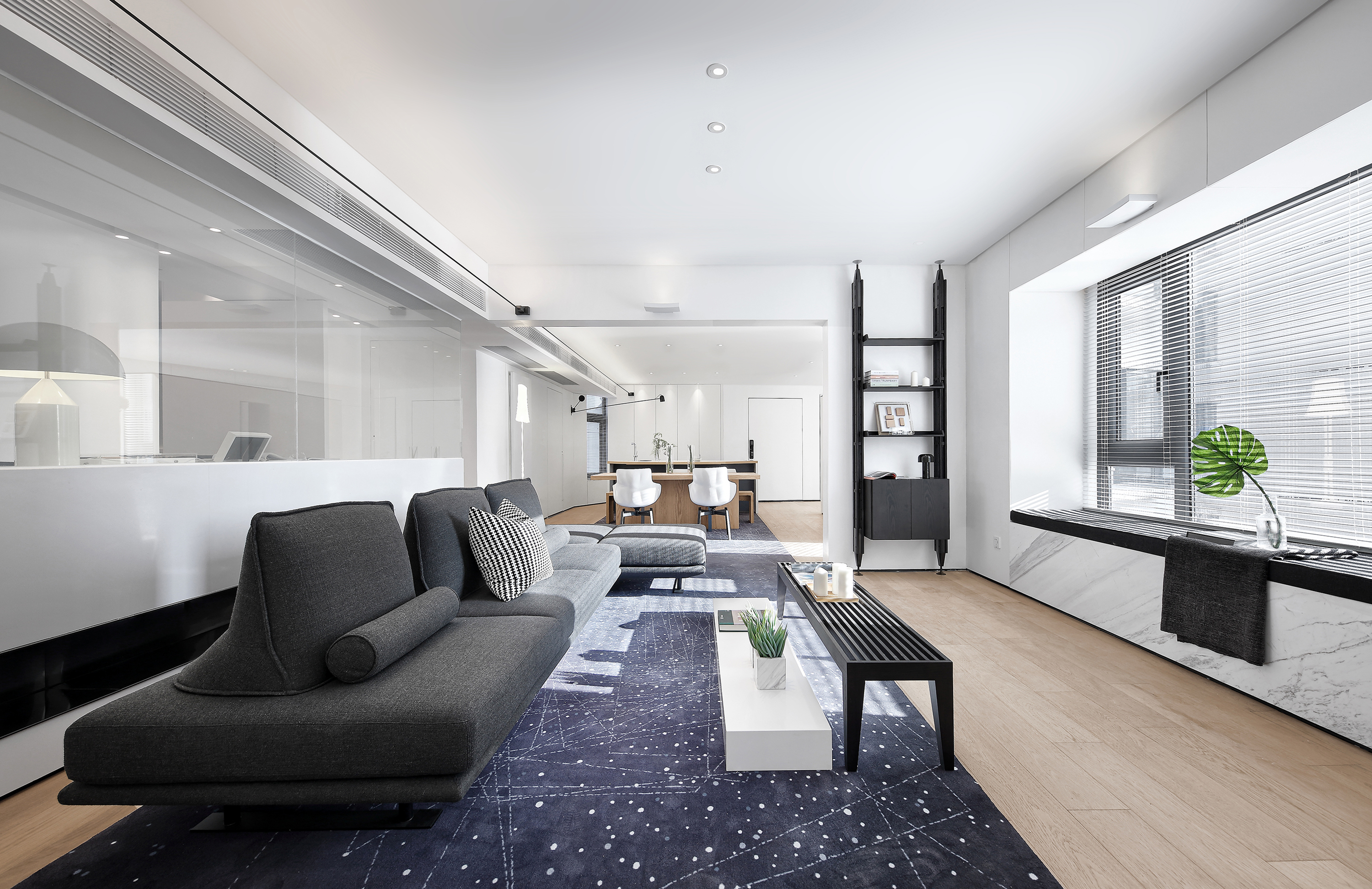
Cover image credits: Evans Lee Design – Guangzhou Artistic Residence Reformation


