 25th May 2022 | IN KBB DESIGN | BY SBID
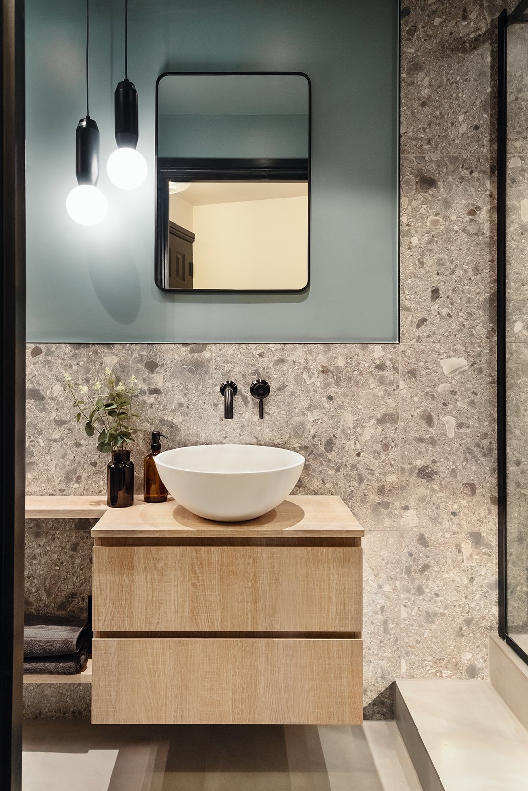
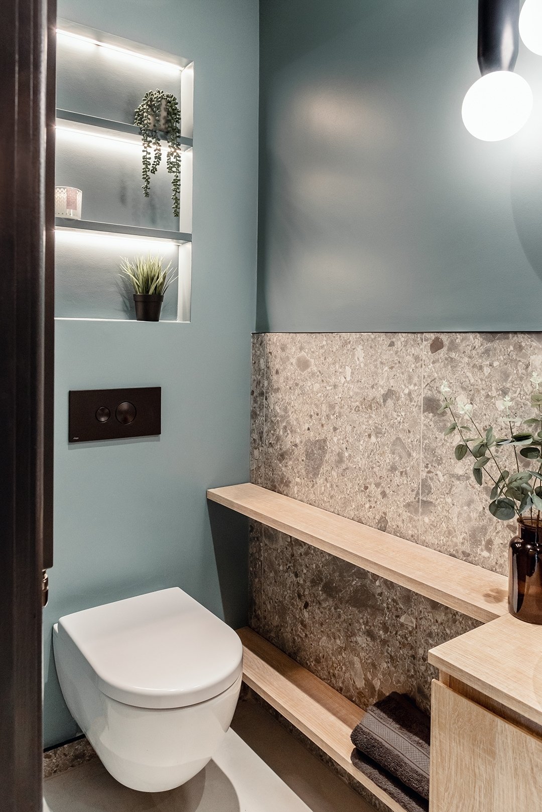
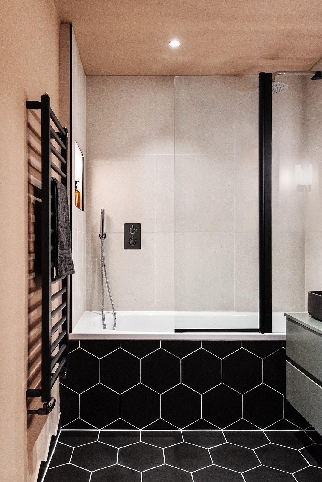
This week’s instalment of the Project of the Week series features modern and fun bathroom designs for a contemporary apartment by 2021 SBID Awards Finalist, Studio Modha.
SBID Awards Category: KBB Design
Practice: Studio Modha
Project: Royal Docks
Location: London, United Kingdom
What was the client’s brief?
The client wanted a complete refurbishment of his flat, opening up the space as much as possible, drawing inspiration from hotel suites and nature around it.
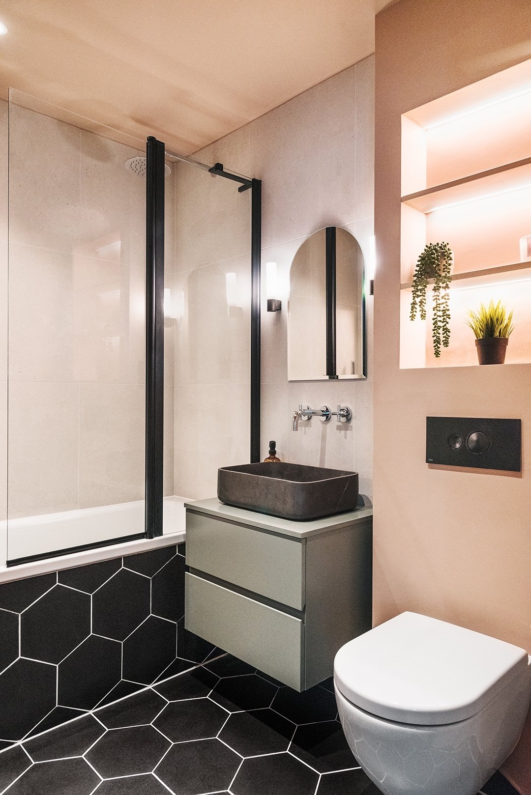
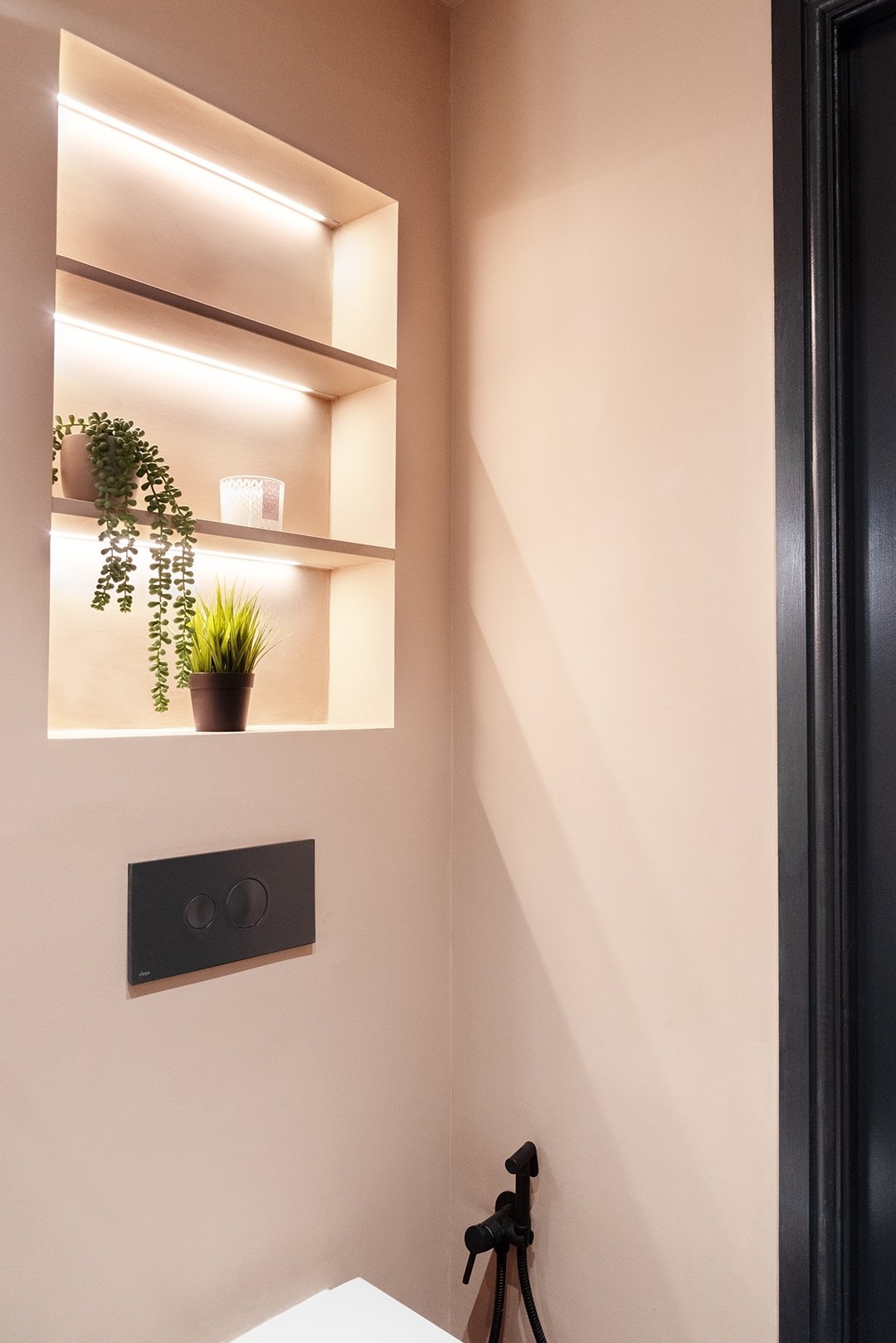
This flat had not been updated in over 10-15 years. We completely refurbished the flat, transforming it from a two bed, one bathroom and one wc to a three bed property with two full bathrooms. The client requested a modern and fun scheme, which we layered with complimentary colours and features. We revamped the whole apartment, from the kitchen to sanitary ware, flooring, lighting, window treatments and hardware.
What inspired the design of the project?
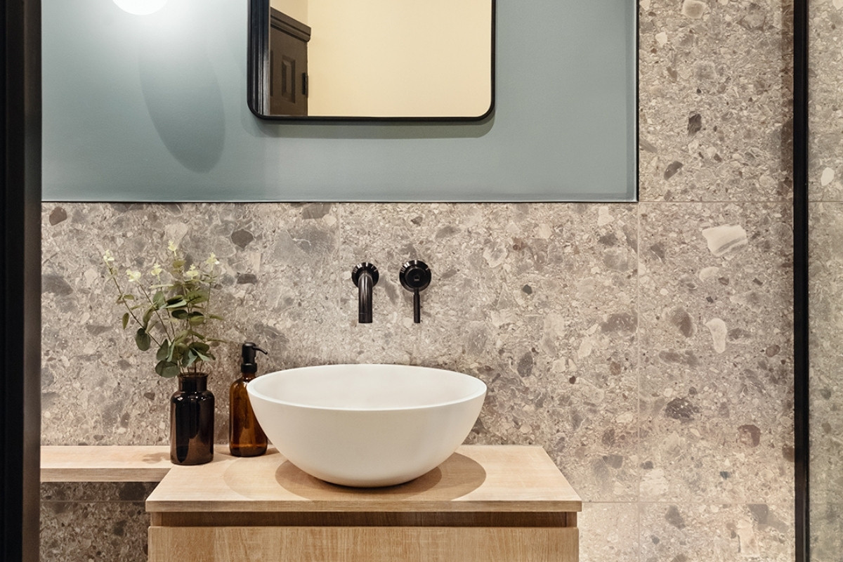
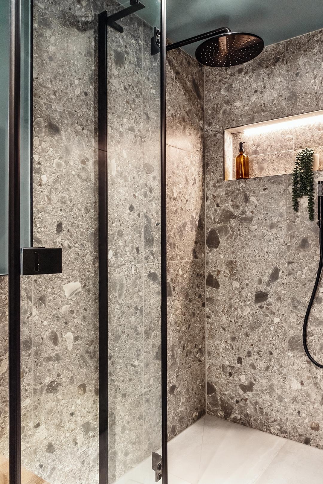
The Project was based in the docklands, surrounded by so much nature, e.g. river Thames and local parks. We wanted to bring in the earthy tones and textures, for example with the terrazzo effect tiles and the warm greys, browns and blues throughout. In addition, the client wanted to feel like he was in a different space through-out the property so we used different colours and textures in each space, including dead salmon from farrow and ball. Not a colour we get to use often and definitely a brave one!
What was the toughest hurdle your team overcame during the project?
We had a soil pipe that was really far off the ground in the guest bathroom, and because it was in a flat we couldn’t move it! This created a huge issue as the client had his heart set on a wetroom shower. We ended up having to raise the floor significantly (a whole 25cm) which brought up the issue of ceiling height (which wasn’t huge in the first place). We ended up having to increase the height of the shower head and create 2 step ups instead of 1 to make it look like the ‘step up’ was intentional. Luckily it all worked out in the end and made the shower area feel even more lux!
What was your team’s highlight of the project?
It’s got to be overcoming the hurdle I described in the previous question, we went back and forth for weeks thinking of a solution so you can imagine the joy when we finally came up with one. Another thing to mention is that our client didn’t want to see any of the progress on site, so the look on his face when he saw it all finished was really rewarding to see.
Why did you enter this project into the SBID Awards?
Honestly, it was Studio Modha’s first year running and one of the first projects we completed. I have always admired the caliber of designers/studios and projects within the awards and only dreamed of being a part of it. It was a huge shock when I received the congratulatory email!
Questions answered by Neha Modha, Director, Studio Modha.
