 25th September 2024 | IN PROJECT OF THE WEEK | BY SBID
This week’s instalment of the Project of the Week series features a playful and whimsical public space design by 2023 SBID Awards Finalist, Lulie Fisher Design Studio.
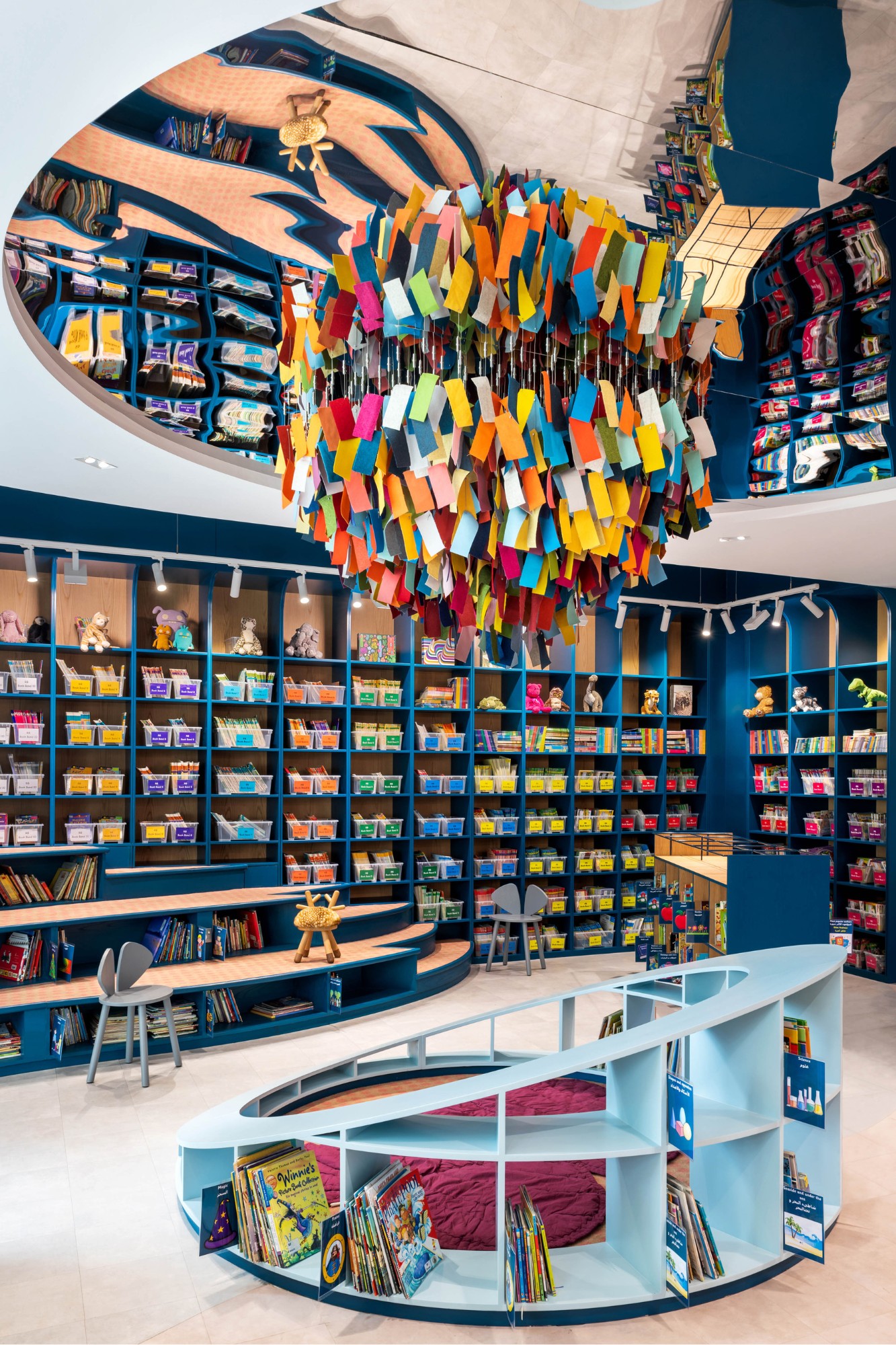
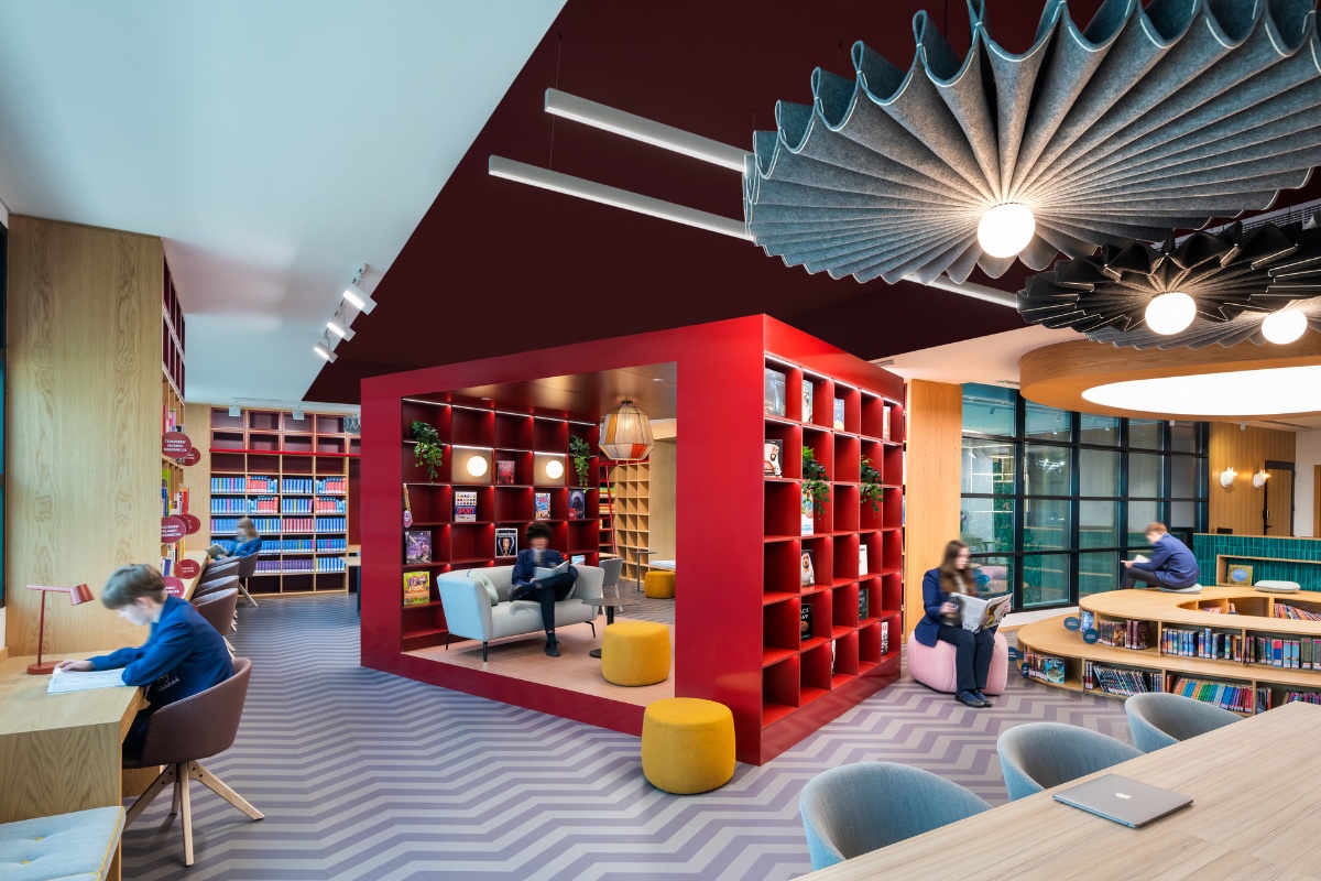
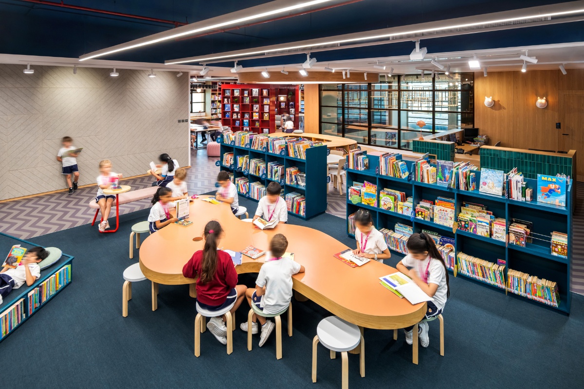
Lulie Fisher Design Studio was commissioned by Regent International School Dubai to convert areas of the school into Primary, Secondary and Early Years Libraries. The Early Years library is based around the theme of an enchanted whimsical forest which encourages exploration and captivates the child’s imagination. A central reading circle with mirrored ceiling creates a curious environment. In the Primary and Secondary library zones are defined to appeal to both age groups by creating petrol blue surfaces and joinery in the primary zone and a dark red ceiling with a central red “living room” in the secondary.
SBID Awards Category: Public Space
Practice: Lulie Fisher Design Studio
Project: Regent International School Libraries
Location: Dubai, United Arab Emirates
What was the client’s brief?
The project brief was to convert areas of the existing school into Primary, Secondary and Early Years Libraries. The Early Years Library at Regent International School was located in a small, tired and uninspiring classroom and our brief was to convert an existing gym into a dedicated Library for the school’s Early Years students aged from 4 to 7 years. The existing Primary and Secondary Student Library which dated back to 1993 was too small and out-dated for current needs and we were tasked with creating a fun environment that supported learning, collaboration and discovery. To expand the footprint, an adjacent staff room, pantry and corridor were amalgamated into the new library creating an L-shaped space which then lent itself to a natural division into two main zones: the primary students’ zone and secondary students’ zone, each tailored to the students’ age group, aesthetic and their dedicated book collections and study materials.
What inspired the design of the project?
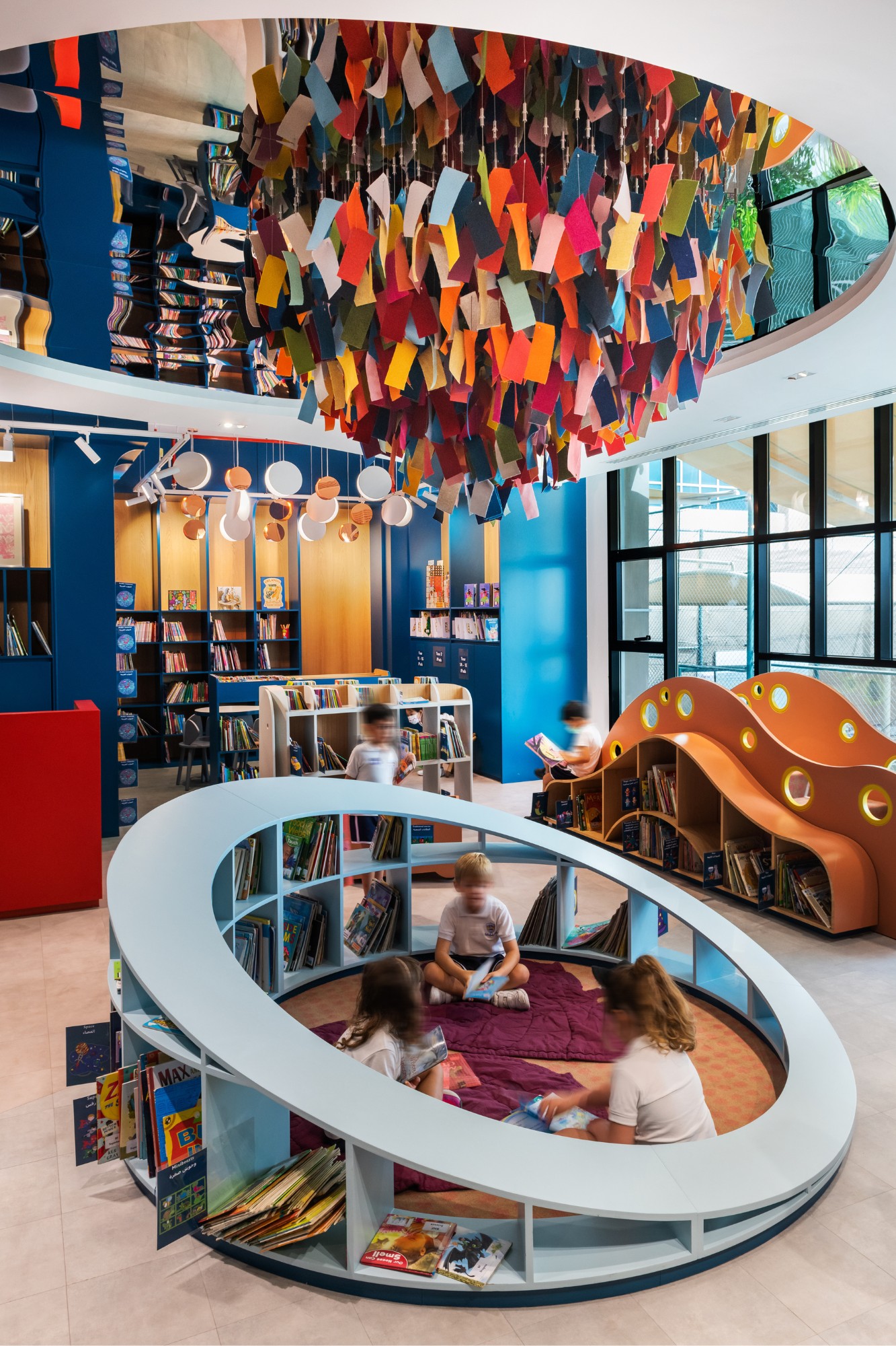
The Early Years library is based around the theme of an enchanted and whimsical forest, aiming to encourage exploration and captivate the imagination. The elements and materials employed create a warm, welcoming yet exciting environment. Alongside this, the layout and forms of the space were based on the topical forms of an ordinance survey, adding a 3D dynamic to the library. Unlike many spaces designed for children, the expected use of bold primary colours have been eschewed in favour of a base palette of neutral and earthy tones employed across a variety of surfaces including a robust vinyl plank on the floor cut into waves of soft greys, browns and greens to mimic the forest floor, a soft polka dotted rose toned inset carpet invoking the coat of a whimsical animal and a soft mushroom colour for the exposed ceiling surfaces and services. Blue/green lacquered shelving lines the perimeter, softened with back panels in warm oak. Although small in size, every corner of the library has been carefully imagined and designed to its full potential. The space is divided into three zones: the centrally located Story Time Circle; the Communal Activities Corner; and the gently stepped and striated Shelving and Reading Platforms resembling the topographical contours of an ordinance survey map. These functional and ergonomic feature elements have been custom designed for these zones to enhance learning and participation and to spark the imagination.
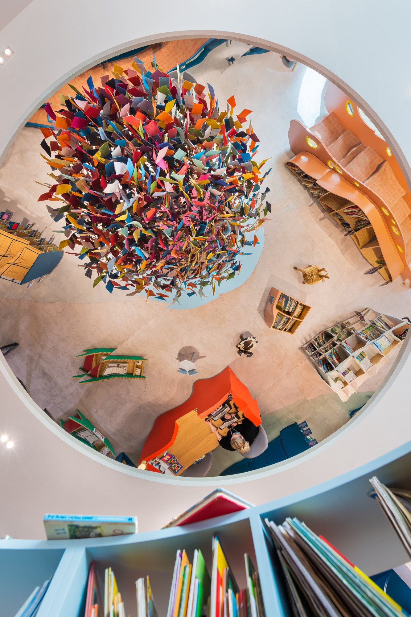
The experience is further magnified by a mirrored ceiling, creating the illusion of endless volume. Special attention has been paid to the treatment and design of the ceiling as young children are most comfortable lying on their backs when reading. The Early Years library is a calming and enchanting space which through its carefully considered layout, colour scheme and both functional and whimsical design elements, encourages curiosity, discovery and learning.
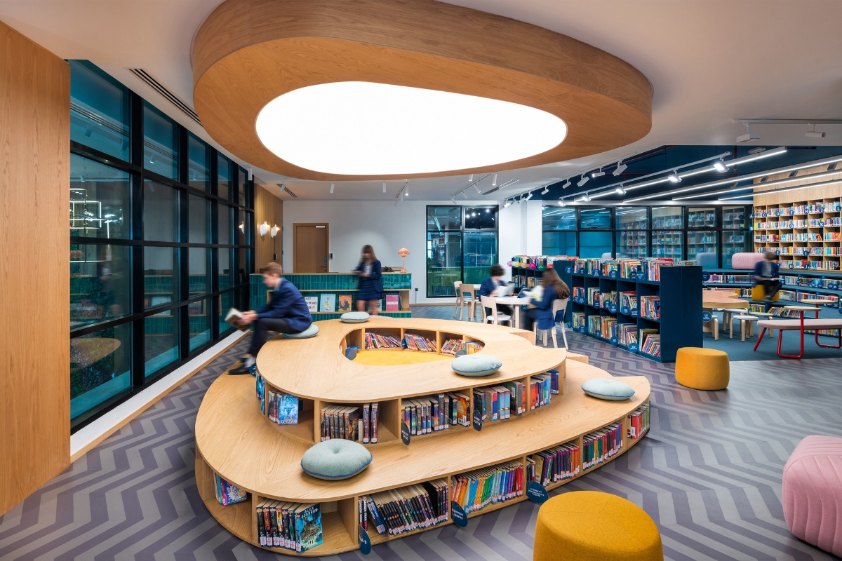
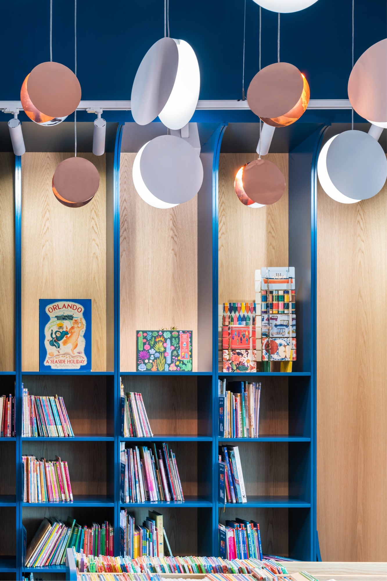
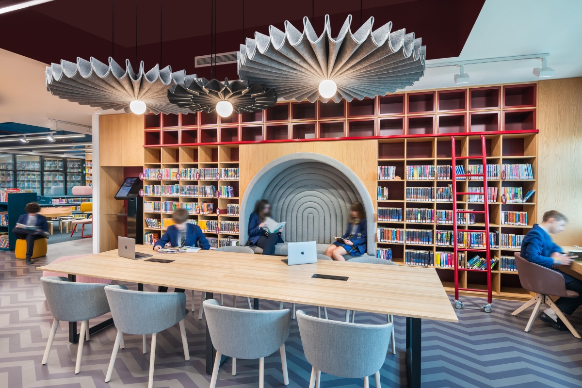
In the Primary and Secondary library there was a need to clearly define each space to ensure they appealed to each age group. The primary students’ zone on the right at entry is clearly defined by a petrol blue ceiling, walls, carpet and joinery elements. An exciting yet functional series of bespoke, tiered platforms, create an interactive versatile environment for students to sit, gather or recline while reading. The books are integrated within the risers of the steps and are mindfully grazed with soft LED lighting. A large, custom-designed, organic-shaped table anchors the space centrally and is used as the main gathering point for communal activities under the delicately preserved indoor tree.
The secondary students’ zone on the left, is defined by the dark red exposed ceiling and the red “living room” in the centre of the space which is flanked by long communal work tables either side. The “living room” element is a self-contained room with raised floor, walls and ceiling which has been created as a device to transport the students into a cosy residential environment where they are surrounded by warmly lit bookshelves, comfortable lounge seating, rug, pendant and glowing wall sconces.
What was the toughest hurdle your team overcame during the project?
Early Years Library: The requirements for the library were as large as the given space was small. A large volume of varied book sizes had to be stored whilst ensuring accessibility to little readers. Rather than line the space with shelving, we wanted to create various zones for play as well as study. Being able to store books within the raised platforms and animal shaped bookshelves helped take care of this factor along with storing large books within playful low level mobile storage units. The custom joinery had to be carefully studied and ergonomically designed to suit the young readers.
Primary and Secondary Library: The library needed to house a set volume of books together with future expansion potential while creating a welcoming environment for collaboration, self-study, group study, presentations and lectures for two very different age groups. It was a challenge to zone and balance the space for these various functional requirements along with visual focal and this was overcome by the clever use of materials and colour blocking.
What was your team’s highlight of the project?
Early Years Library: As the children enter the library, they are drawn towards the striking central feature – a pale blue story circle surrounded by books, acting as a cocoon with a soft carpeted floor, cosy leaf shaped blankets and crowned by a vibrant and enchanting rain cloud feature composed of colourful felt interspersed with twinkling rain drop shaped pendants. The experience is further magnified by a mirrored ceiling, creating the illusion of endless volume. The contoured reading platforms nestled into one corner of the library contain books tucked below the steps and this element acts as a connection to the story time circle, creating spill out for larger groups to congregate around the teacher and different seating and reclining options.
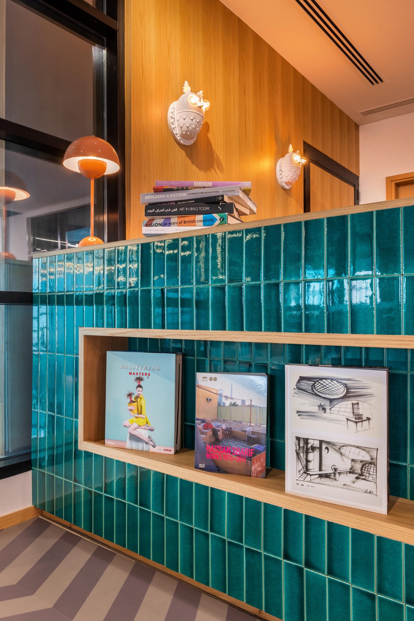
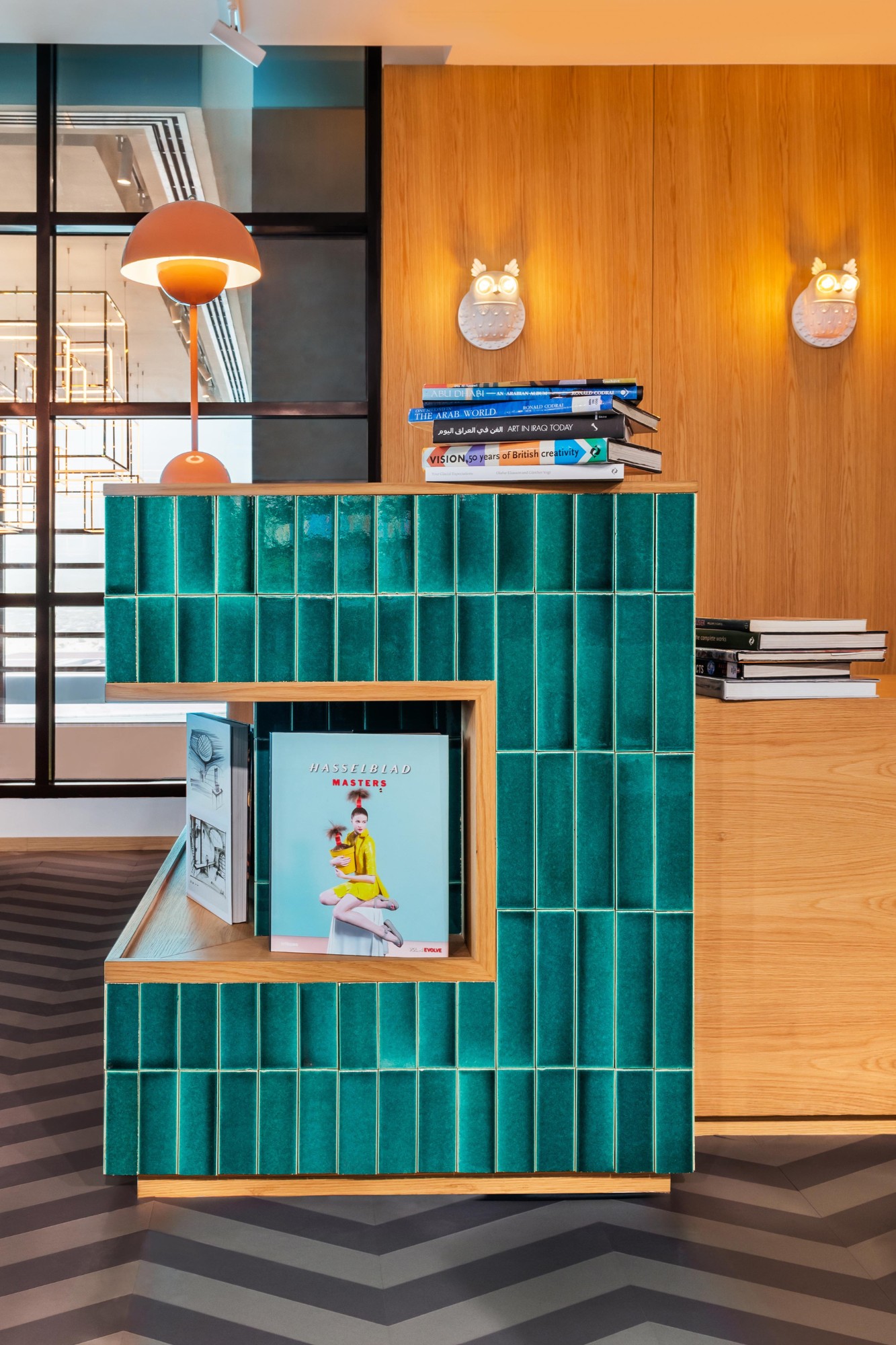
Primary and Secondary Library: For the Primary area, an exciting yet functional series of bespoke, tiered platforms, create an interactive and versatile environment for students to sit, gather, or recline while reading. The books are integrated within the risers of the steps and are mindfully grazed with soft LED lighting. Decorative wall panelling and oversized pendant lighting not only help to contain any noise generation and disturbance at source but also add softness. The reception desk is clad in rich, turquoise-glazed tiles, acting as a focal point for young students who need the librarians’ support to administer the book check-in and check-out system. Two wall sconces in the form of owls (which have long been associated with knowledge and wisdom), look on from behind the desk, providing a quirky and humorous design element.
The “living room” element in the Secondary space is a self-contained room with raised floor, walls and ceiling which has been created as a device to transport the students into a cosy residential environment where they are surrounded by warmly lit bookshelves, comfortable lounge seating, rug, pendant and glowing wall sconces.
Why did you enter the SBID Awards?
We are a small, friendly and dedicated team continuously striving to weave our passion and enthusiasm to create unique captivating spaces. SBID Awards serves as an international platform for recognition amongst a wide spectrum of leading design studios and consists of a broad range of award categories. Being part of SBID can attract new clients who are specifically seeking out innovative and exceptional design.
What has being an Award Finalist meant to you and your business?
Being an Award Finalist with SBID can have a wide-range of positive impacts, from boosting reputation and credibility to attracting clients seeking innovative design solutions and to fostering growth by increasing team members morale. Award ceremonies and events offer excellent networking opportunities as well and can lead to new projects and partnerships.
Questions answered by Lulie Fisher, Design Director and Founder of Lulie Fisher Design Studio.
