 29th April 2020 | IN OFFICE DESIGN | BY SBID
Project of the Week
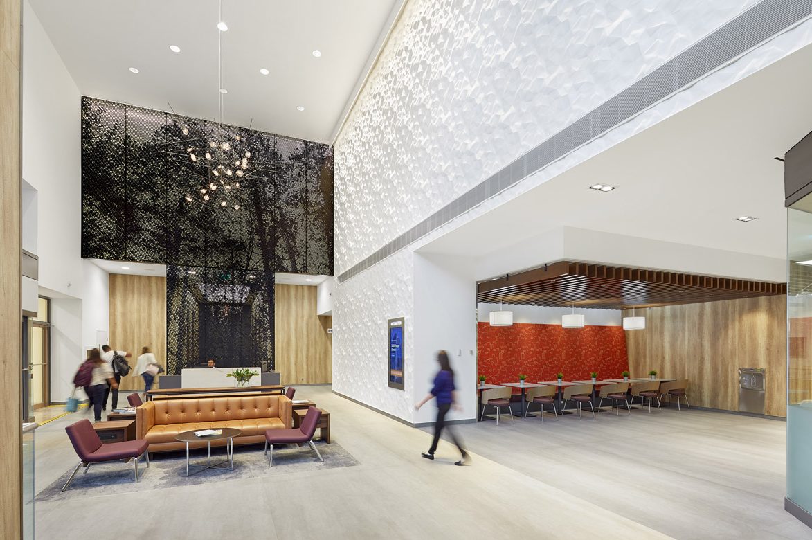
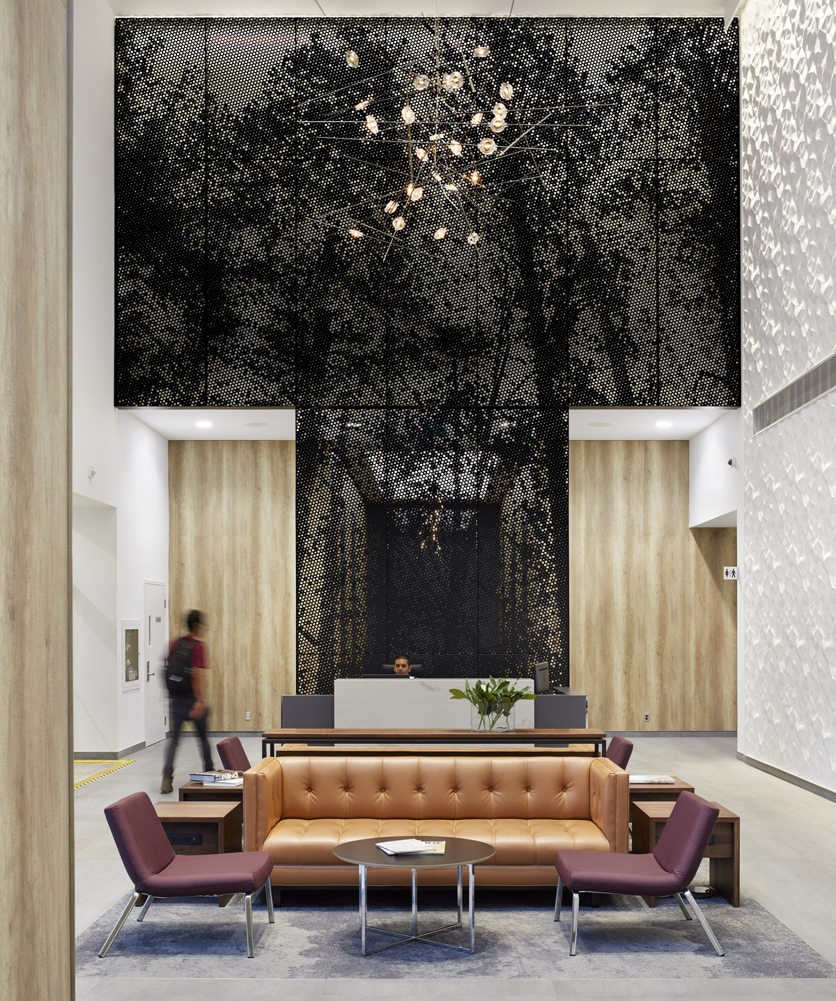
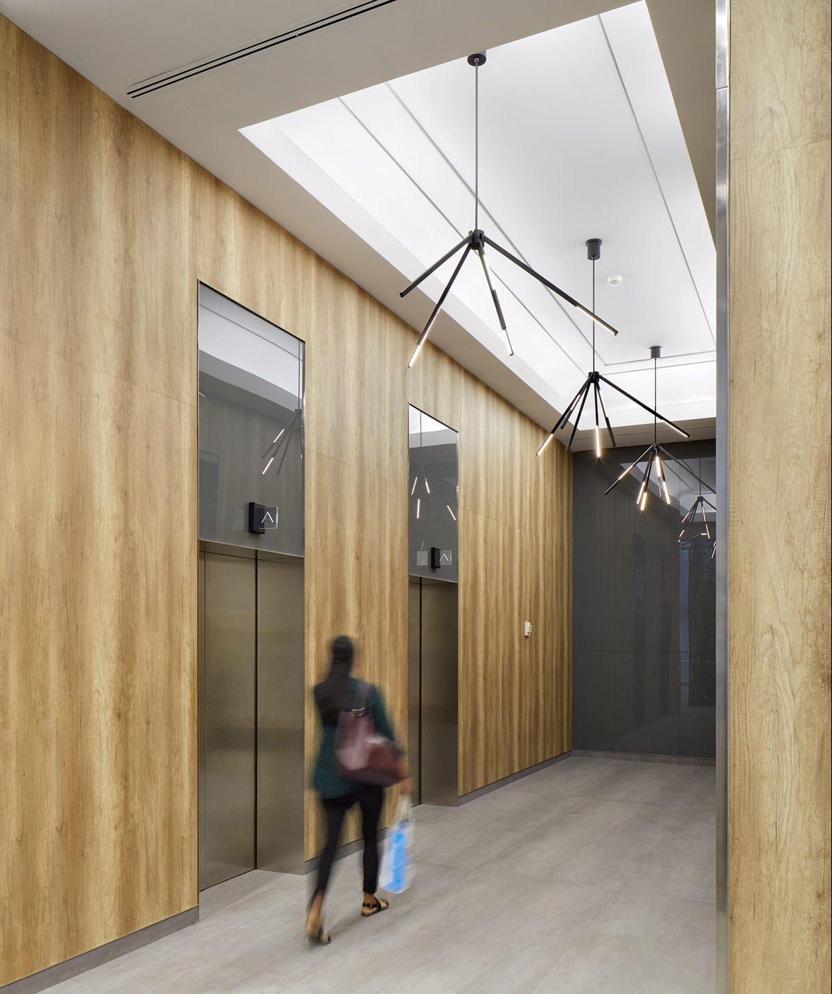
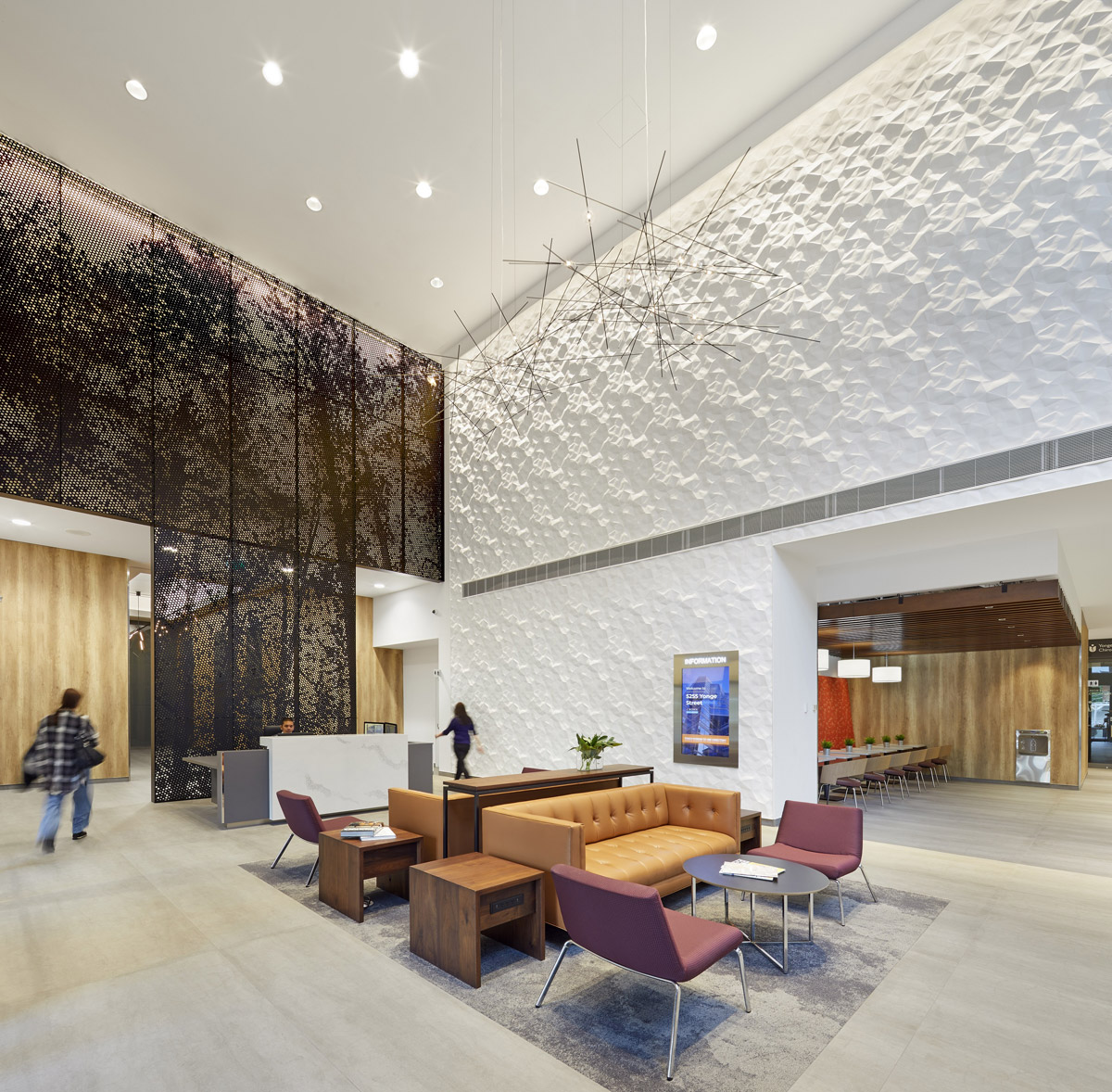
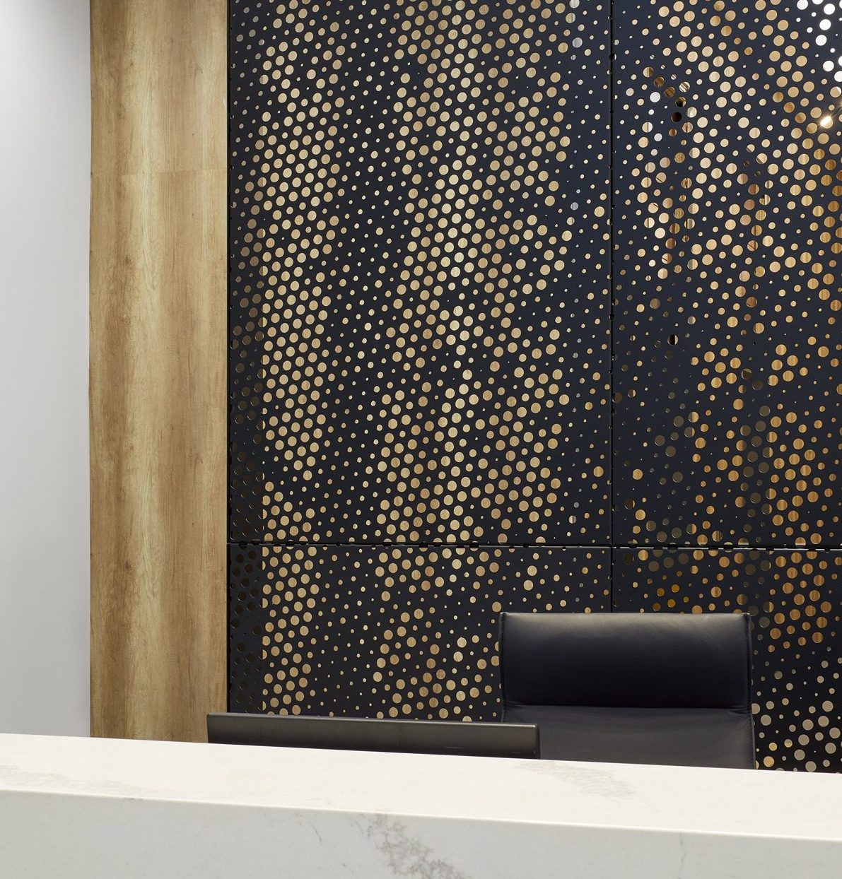
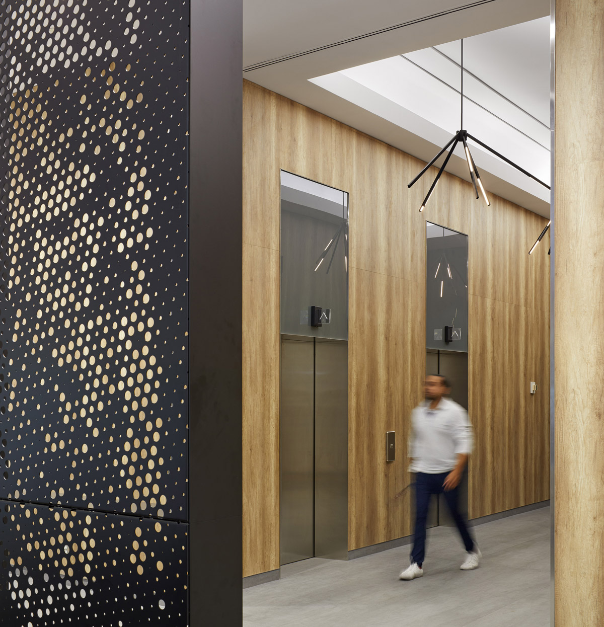
This week’s instalment of the #SBIDinspire interior design series features the complete transformation of the lobby area of a 30-year-old office tower. Once a series of dark, awkward spaces lacking in a clear axis or flow of movement, the lobby is now a bright and airy volume defined by a graphic screen that emphasizes 30-foot-high ceilings. Toronto designers Bartlett & Associates were commissioned to reimagine the space as a welcoming amenity that would attract a stable of noteworthy new tenants. The design team took an architectural approach to the project; removing a disused storage space made way for a public café, while the custom-designed screen was added to anchor the front desk and delineate the elevator bay. The striking black sculptural screen plays off against a dazzling white wall with a surface of subtle peaks and architectural texture.
Practice: Bartlett & Associates
Project: Crown Lobby – 5255 Yonge Street
Location: Toronto, Canada
What was the client’s brief?
The mandate from our client, Crown Realty, was to reposition a dated office tower’s lobby for the 21st century. The building is right on Toronto’s north Yonge Street, a prime location that offered the potential to create a significant destination. Crown wanted a space that would inject new vitality into this rather tired building and position it as a desirable location for a more vibrant class of tenant. Our design transformed the lobby from an uninspiring entrance to an energetic amenity that makes a compelling impression on visitors – including prospective leaseholders.
What inspired the interior design of the project?
It’s the challenges of a project that typically inspire the best ideas and in this case we were dealing with a modest budget and an awkward space that was completely covered – all the floors, all the walls – in a very dated and dull granite. Tearing it out was cost-prohibitive, so the new surfaces were something we put a lot of thought into. Nature is also a constant source of inspiration for us and adding biophilic elements is something we try to do with all of our projects. As we spend more and more time in our urban office buildings, immersed in digital worlds, it feels increasingly important to make those connections to nature wherever possible. This is often achieved through very subtle interventions, but with this project the scale of the space presented an ideal opportunity to do something big – something a bit more direct, really impactful. So of course that was the screen, and beyond that we used a lot of wood- and stone-look low-profile surfacing that was applied right over the granite to avoid spending a lot of time and money on demolition and to avoid creating a lot of waste.
What was the toughest hurdle your team overcame during the project?
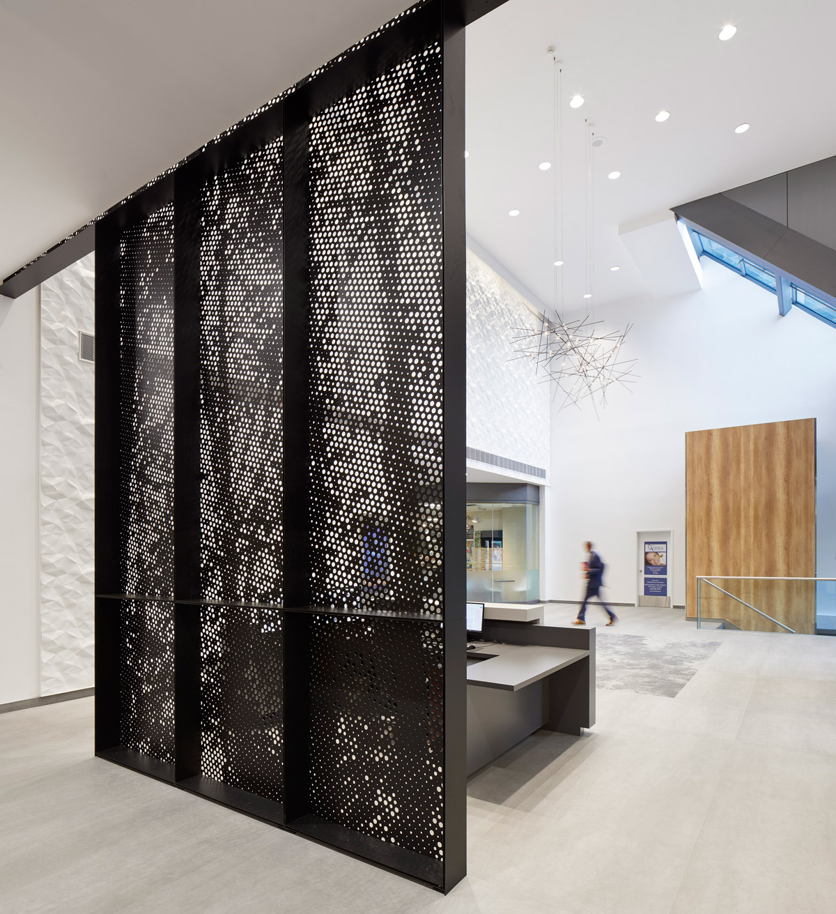
Resolving the awkwardness of the space while keeping the budget in check was huge. Originally the effect of the high ceilings was all but obliterated by this bulkhead wall that sort of cinched the walls inwards about a third of the way up. It loomed over the elevator bay, feeling very heavy with its stone cladding, and made that space feel a bit ominous. And then the corridor running off the east wall was this dark, narrow tunnel – it was all very uninviting. In the end we tore out a single short, angled wall to open up the corridor and make space for a public café. Then the screen was an amazing solution that both masks that bulkhead and transforms the elevator bay into a cozy little annex. Walking behind the screen to access the lifts offers this sense of discovery, which is a much nicer way to start your work day than trudging through a dark hall. Overall it feels like a cohesive sequence of usable space now, rather than a patchwork of hallways that were strictly for moving through, not for stopping or spending time in.
What was your team’s highlight of the project?
The screen is definitely the highlight for us – it won an award for the project before the space was even finished and it was also reimagined as an installation piece for the Design TO festival, which is part of Toronto’s Design Week in January. It’s obviously a stunning feature that is also functional, but there is a bit of hidden genius going on there as well: Not only does it hide that awkward bulkhead, but it’s actually supported by a mounting system originally installed for the granite cladding. Most of the granite was left intact and simply covered with low-profile materials, but by removing a bit of stone from the bulkhead, we were able to avoid creating customized brackets to hold the screen. That was a big cost-saver and just one of those eureka moments that you want to have on every project.
Questions answered by Inger Bartlett, lead designer and president, Bartlett & Associates.
We hope you feel inspired by this week’s Office design! Let us know what inspired you #SBIDinspire
If you missed last week’s Project of the Week featuring a contemporary loft apartment situated above the famous Soho Theatre, click here to see more.
