 28th October 2013 | IN DESIGN EVENTS | BY SBID
It’s slightly unnerving to see familiar, everyday objects such as furniture and chairs in a museum or art gallery setting. I was reminded of this when I strolled around the Pop Art Design show at the Barbican.
But it also gives a sense of familiarity that I can spot items that wouldn’t be out of place in a Heal’s shop window or indeed any high-end furniture retailer. It’s also important to know where the original ideas and designs came from, as it gives a sense of history, continuity and respect for early designs.
Pop art exploded onto the scene in the late 1950s to early 10970s and it’s hard to imagine now the impact it had on the art and design world. Previously, much of what you found in the home was pretty drab, conservative and a grown-up’s idea of what good interior design should be.
The new movement of Pop didn’t give a damn. It was bright, fun and playful. The protagonists including Achille Castiglioni, Charles and Ray Eames and George Nelson threw caution to the wind, using the primary colours of childhood – bright reds, yellows and blue colour palettes.
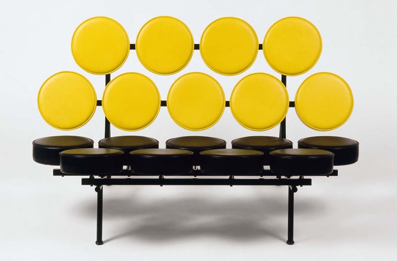
Just looking at George Nelson’s Marshmallow sofa from 1956 () is so pleasing to the eye, with its vivid custard yellow and classic black colour scheme – and you just want to sit on it – which is surely the prime function of any sofa.
Pic 2. Evelyne Axelle, Ice Cream 1, 1964
The delightful image by Evelyne Axell, a Belgian Pop painter, takes us back to halcyon days when the highest form of pleasure was slurping on an ice cream – and not to imbue it with Freudian overtones. Sometimes licking an ice lolly is just that.
This is when we see the beginnings of the cult of celebrity and commodity fetishism. We also see the rise of sexual politics in furniture and design. Allen Jones’ Chair, 1969, of a woman in high heels, which you sit on, is probably the least offensive of his series of ‘furniture sculpture’. Personally, I want to take a hatchet to it, partly because it is demeaning and objectifies the female form, but also because it’s downright ugly.
The baton for the best ideas in Pop art has been passed on to new designers and artists, such as Kate Jenkins, who crochets a range of Pop art items including ketchup and mustard bottles as well as coke cans. It’s good to see that the influence of Pop art remains alive and thriving today.
What I do like about Pop is its play on words, the questioning of what makes for good interior design, as in Richard Hamilton’s 1956 collage Just what is it that makes today’s homes so different, so appealing? It blows the lid off the seriousness and lack of humour that was all the rage in the design world previously.
Author Fiona Keating, Editor at Inside Property


