 3rd April 2018 | IN PROJECT OF THE WEEK | BY SBID
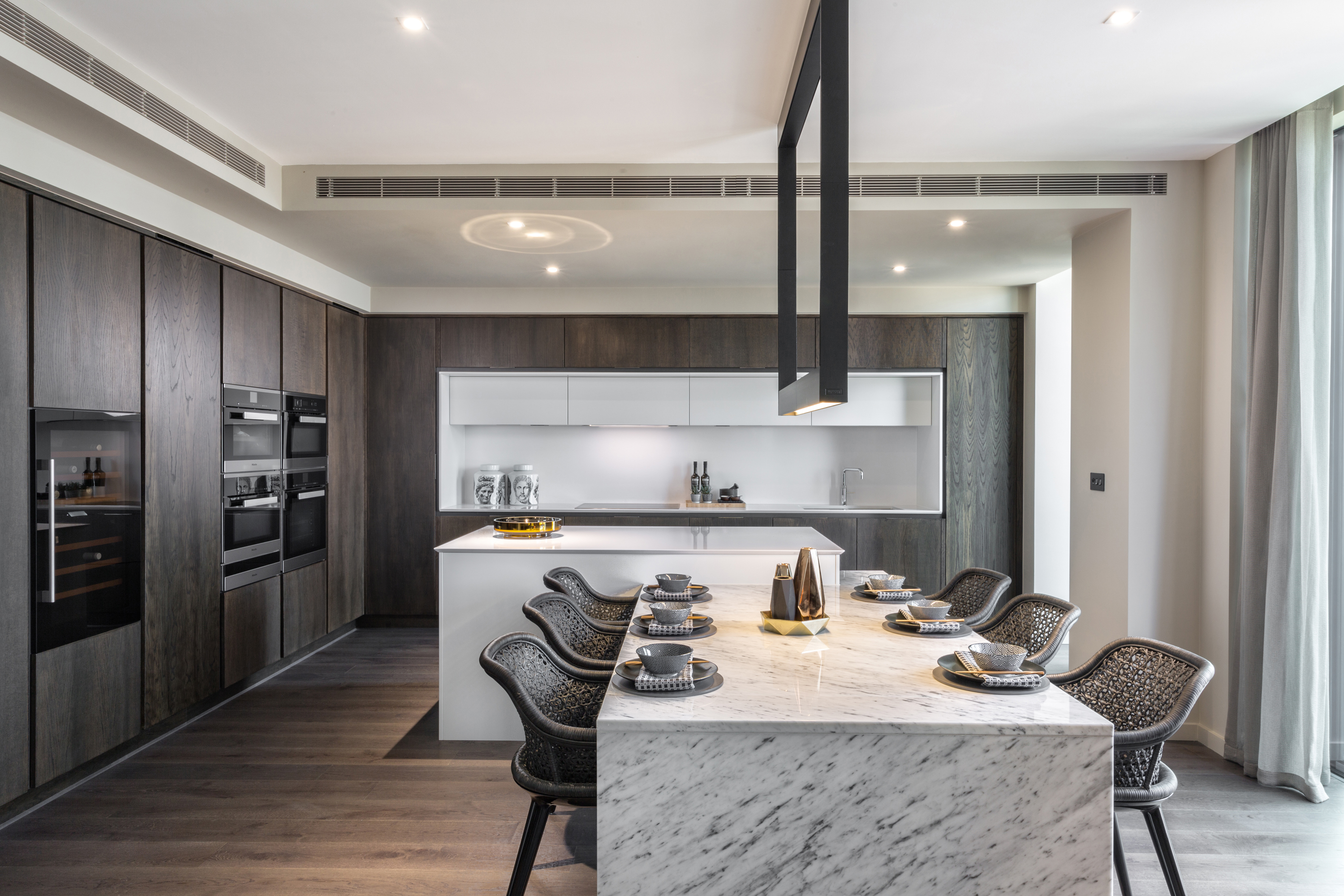
This week’s instalment of the #SBIDinspire interior design series features the interior specification design for the Dollar Bay Penthouses located in Canary Wharf, London. Suna Interior Design was selected by Mount Anvil and Citystyle (One Housing) to translate the faceted and linear qualities of this unique building in different ways throughout the property. Complimenting the striking architecture and creating a harmony between the exterior and interior elements were integral to the style and design of this luxury residential development. Dollar Bay sits in a glamorous enclave where elite fashion brands, high-end dining, leisure and charismatic nightlife come together to offer a cultured and cosmopolitan lifestyle. Suna Interior Design carefully considered every design decision to reflect this aura of affluence and style, typified by the building’s opulent surroundings.
Company: Suna Interior Design
Project: Dollar Bay Penthouse
Project Location: London, United Kingdom
What was the client’s brief?
When we work with developers on any specification work, we take into account many contributory factors.
- The clients brief, brand identity and desire for the development.
- The potential market for the product, in this case looking to the local and oversea purchasers.
- The architecture of the development, we are keen to make sure there is a harmony between the exterior and interior of the development.
In this instance, we were working on only two apartments but they were the jewel in the crown of this development as they were the triplex penthouse units atop the striking Dollar Bay development for Mount Anvil. The penthouse apartments offered a truly unique space as the interior was spread across four floors finishing with an impressive multifunctional area consisting of a spa, dining and lounge area with triple height glazing and views across the docklands landscape.
As with all penthouse designs, the client needed us to come up with a design for the interior which would impress their potential buyers and maximise the space within. When specifying interiors that need to stand the test of time it is important to select finishes that will not date and choose products that have a long aesthetic lifespan. We combine this with adding in individual design details to add some identity to the interior and touch points to link it to the architecture.
What inspired the design of the Project?
The fundamental starting point for all of the design was the architecture of the building. The external glazing facets in and out which ran all the way up the structure created a truly impressive and dramatic design aesthetic. This influenced many key features of the interior design. Specifically the internal doors and ironmongery were bespoke, designed to incorporate the same faceted and angled designs to mirror the rest of the property. Having a direct correlation between the interior and the exterior creates an intelligently curated overall aesthetic with synergy between all areas.
What was the toughest hurdle your team overcame during the project?
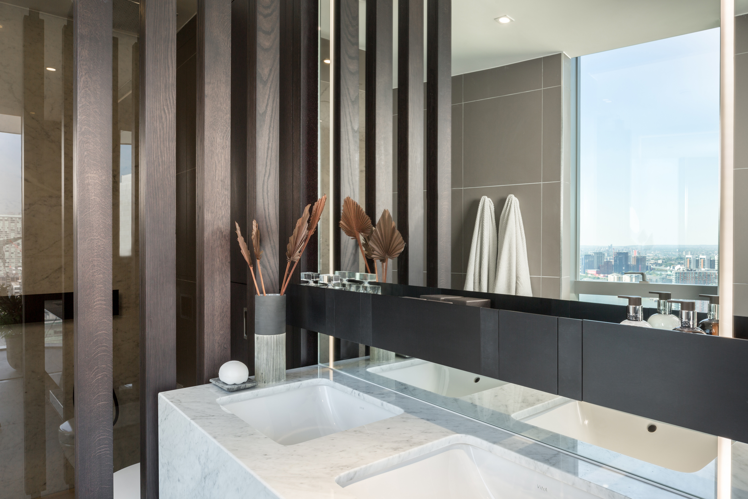
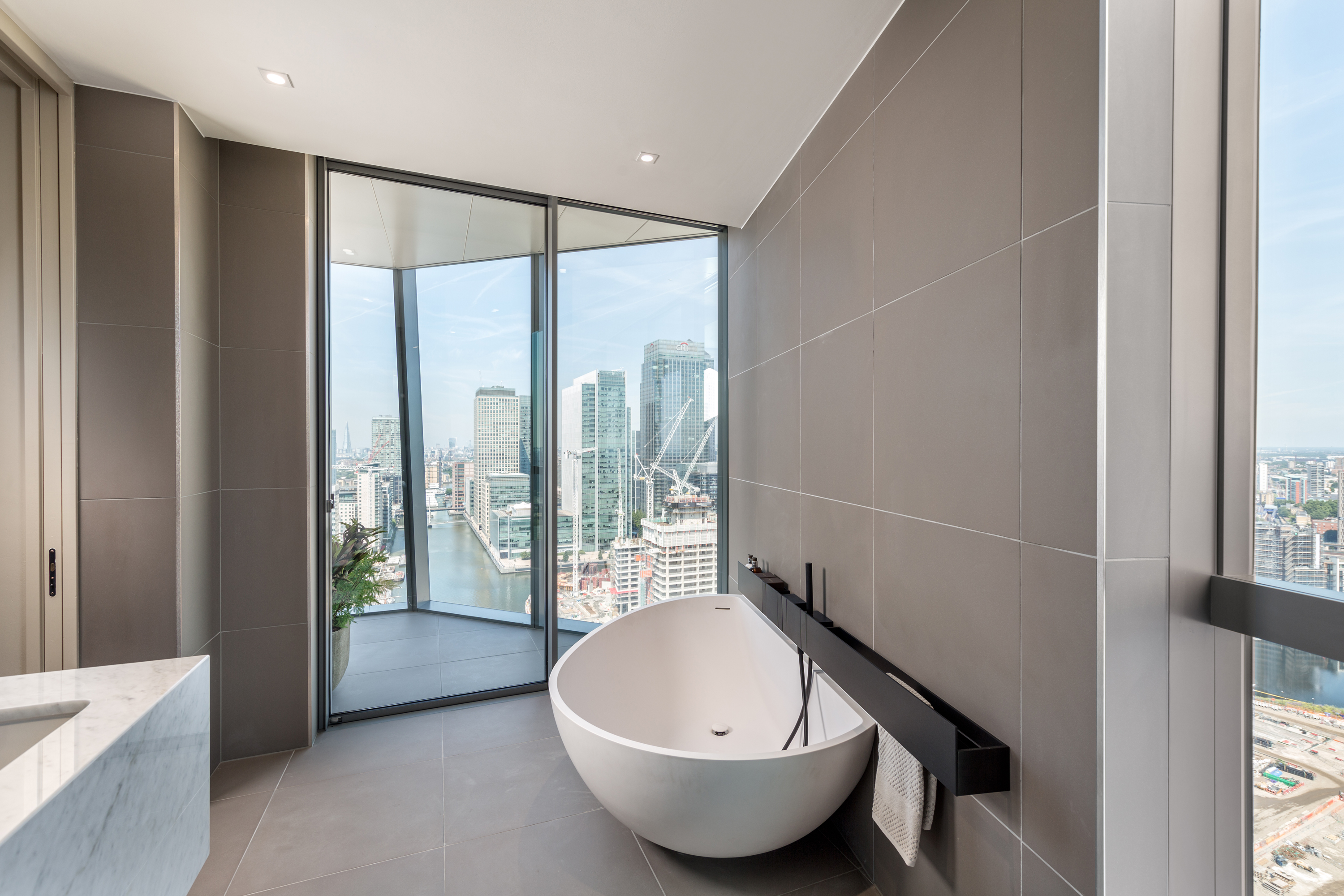
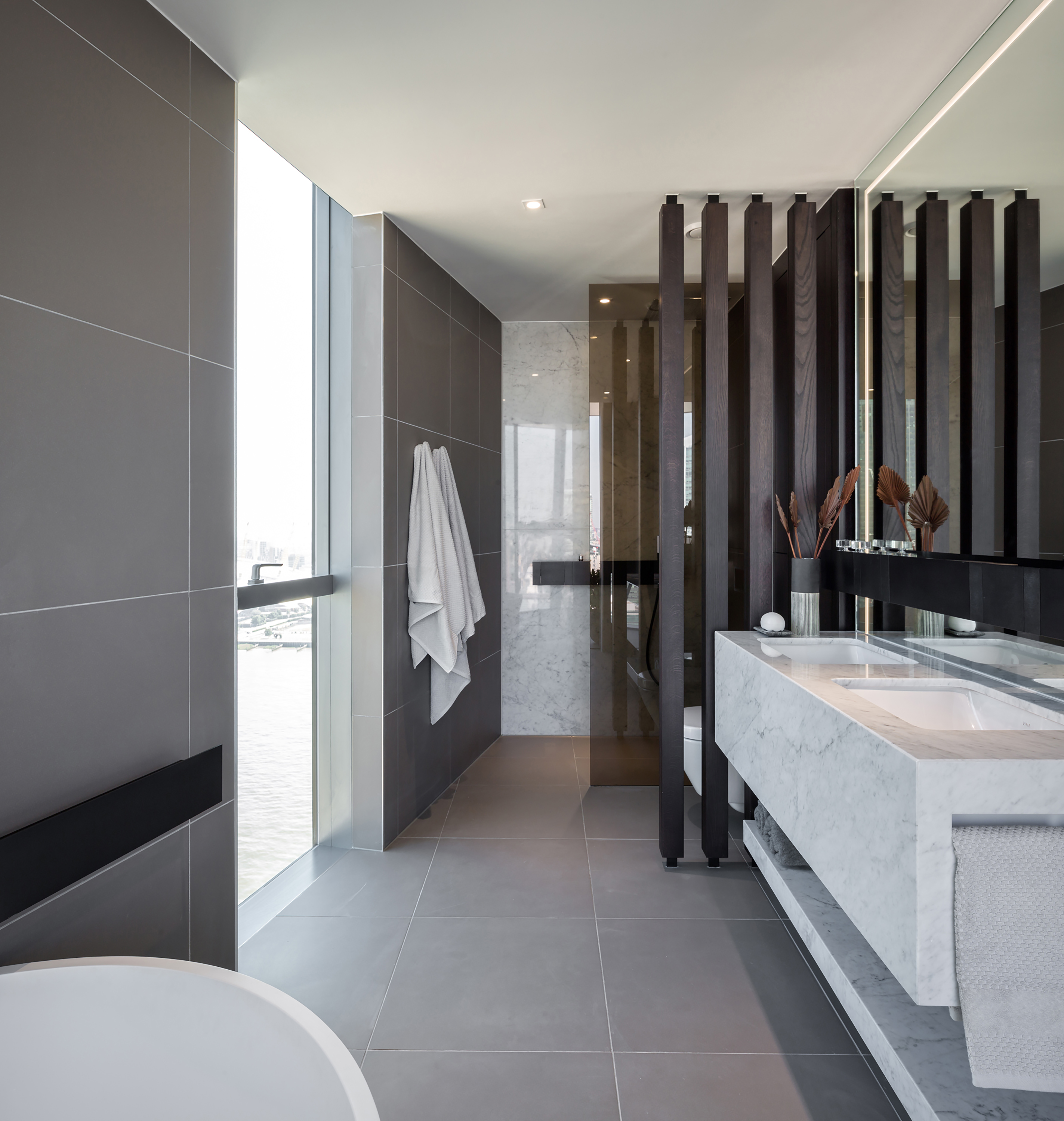
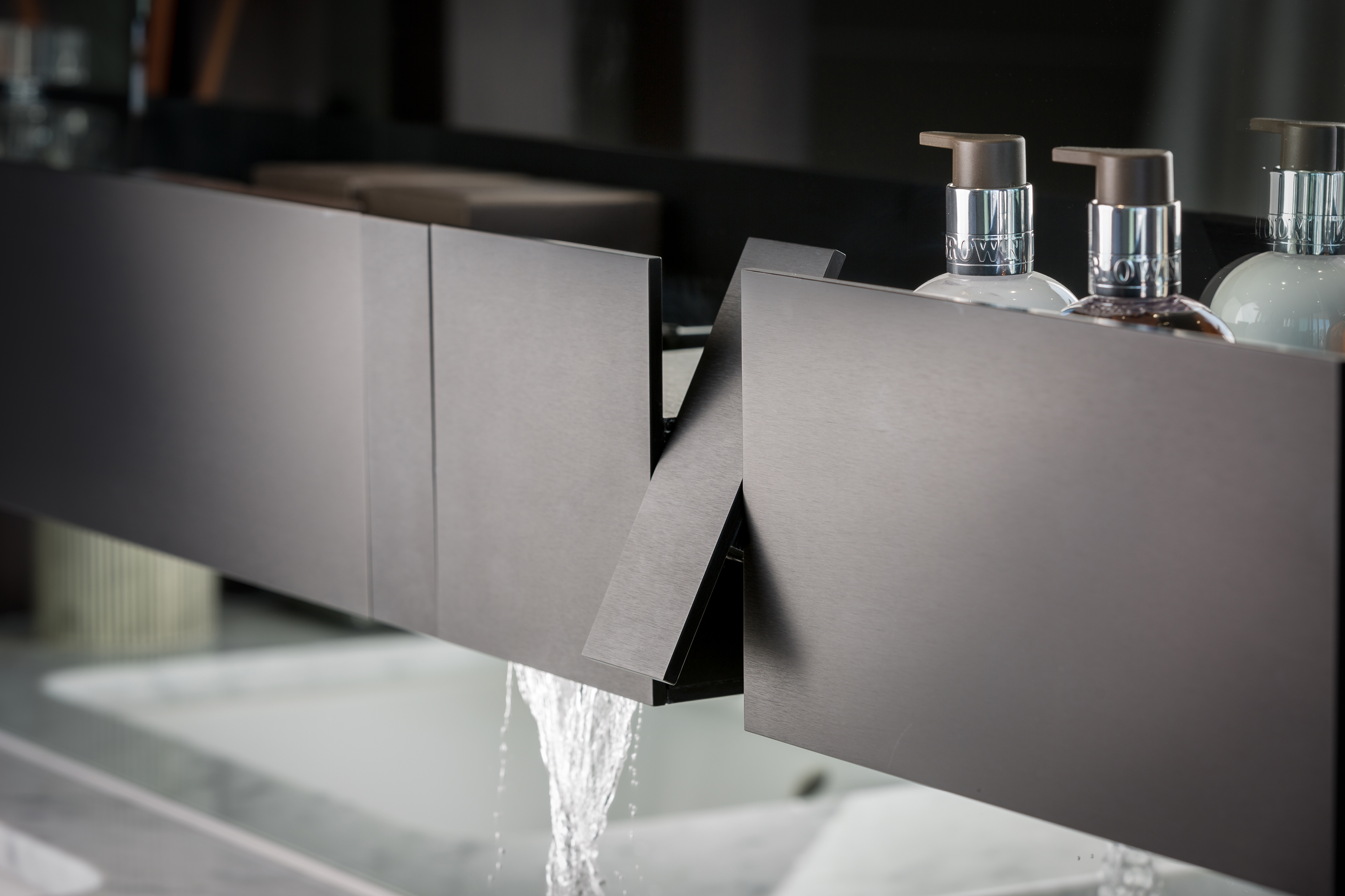
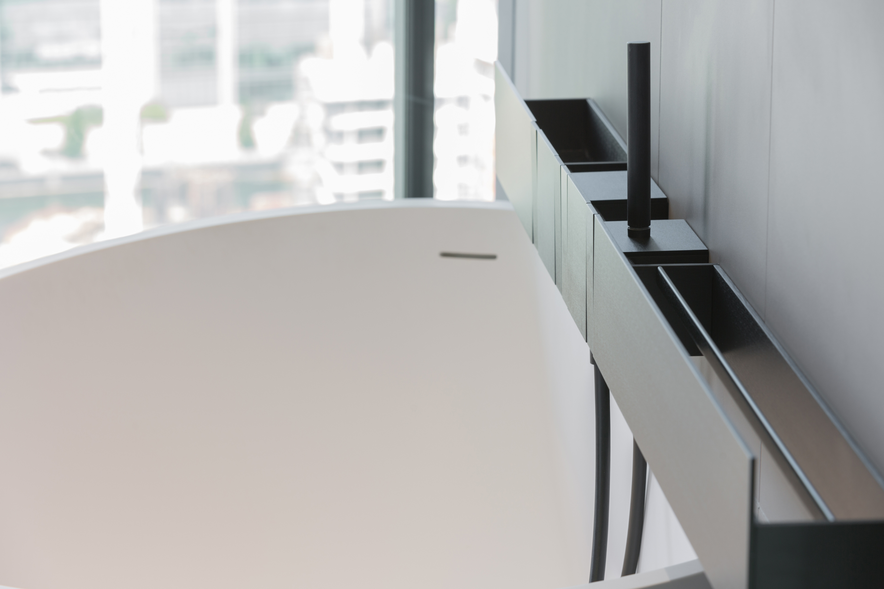
One of the hardest areas to design was the master ensuite due to the layout of the room and the desire to create an impressive addition to the master bedroom. The area we were working with reflected the angled features of the architecture. The unusual space with large glazing panels displayed incredible views across Canary Wharf and linked the ensuite to the generous winter garden which wrapped around the perimeter of the rooms. The angled shape of the space ended up working to our advantage, allowing us to position the shower enclosure to the rear, hiding the WC between the smoked shower screen and a bespoke slatted divider beside the vanity unit. The double basin vanity was a truly impressive feature with a bespoke marble vanity unit and shelf that bisected a full height mirror with integrated Led lighting. We used the Agape Sen range of brassware that followed the linear lines of the vanity and finished off this area perfectly. We sourced a unique slash sided freestanding bath that butted to the angled wall and provided a luxurious bathing area with fantastic views.
What was your team’s highlight of the project?
The most impressive area within the apartment is the last one you come across. At the top of the building there is a 3 storey open spa which links the dining room and an upper open floor as a second lounge. We knew when we started looking at this impressive space that the large wall that forms the backdrop to the spa area needed to have impact. As it is such a large wall area we wanted to add product which would break it up and add interest. We selected a tile product that was available in multiple sizes and surface finishes so that each one would catch the light differently. In addition we added in recess strip lighting to the wall in specific areas so that the whole area would transform from day to night.
Why did you enter the SBID International Design Awards?
We hold the opinions of those at SBID very high as we know they have high expectations and broad industry experience. Achieving success at these awards would be an accolade we would be immensely proud off and a testament to the work we have produced.
Questions answered by Helen Fewster, Director at Suna Interior Design
To ensure you are kept up to date with the latest design inspiration sign up for our newsletter and follow us on Instagram @sbiduk
If you missed last week’s Project of the Week with the virtual reality theme park inspired by the vibrant cityscape of Dubai, click here to see more.
The 2018 edition of the SBID International Design Awards is now officially open for entries! Click here to register or enter your project!
We hope you feel inspired! Let us know what inspired you #SBIDinspire
Suna Interior Design | SBID International Design Awards 2018
