 31st October 2018 | IN HOTEL DESIGN | BY SBID
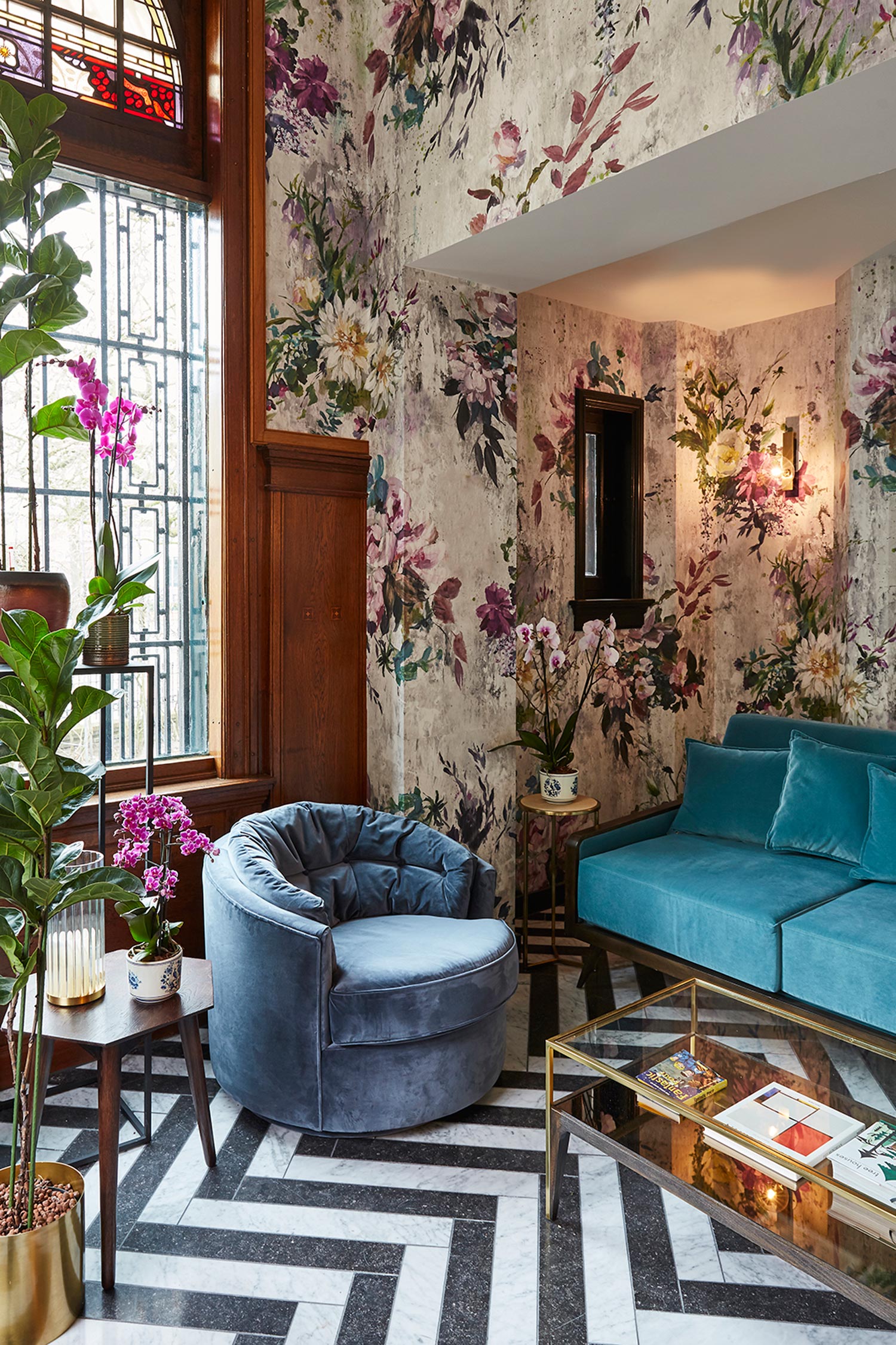
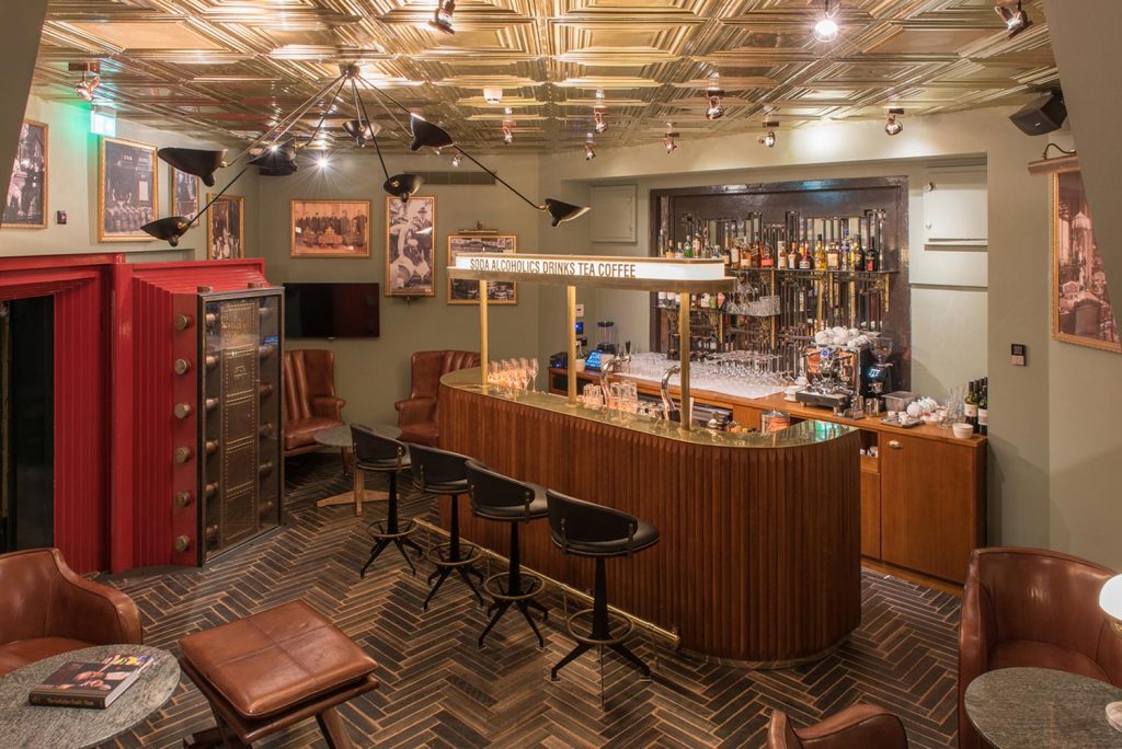
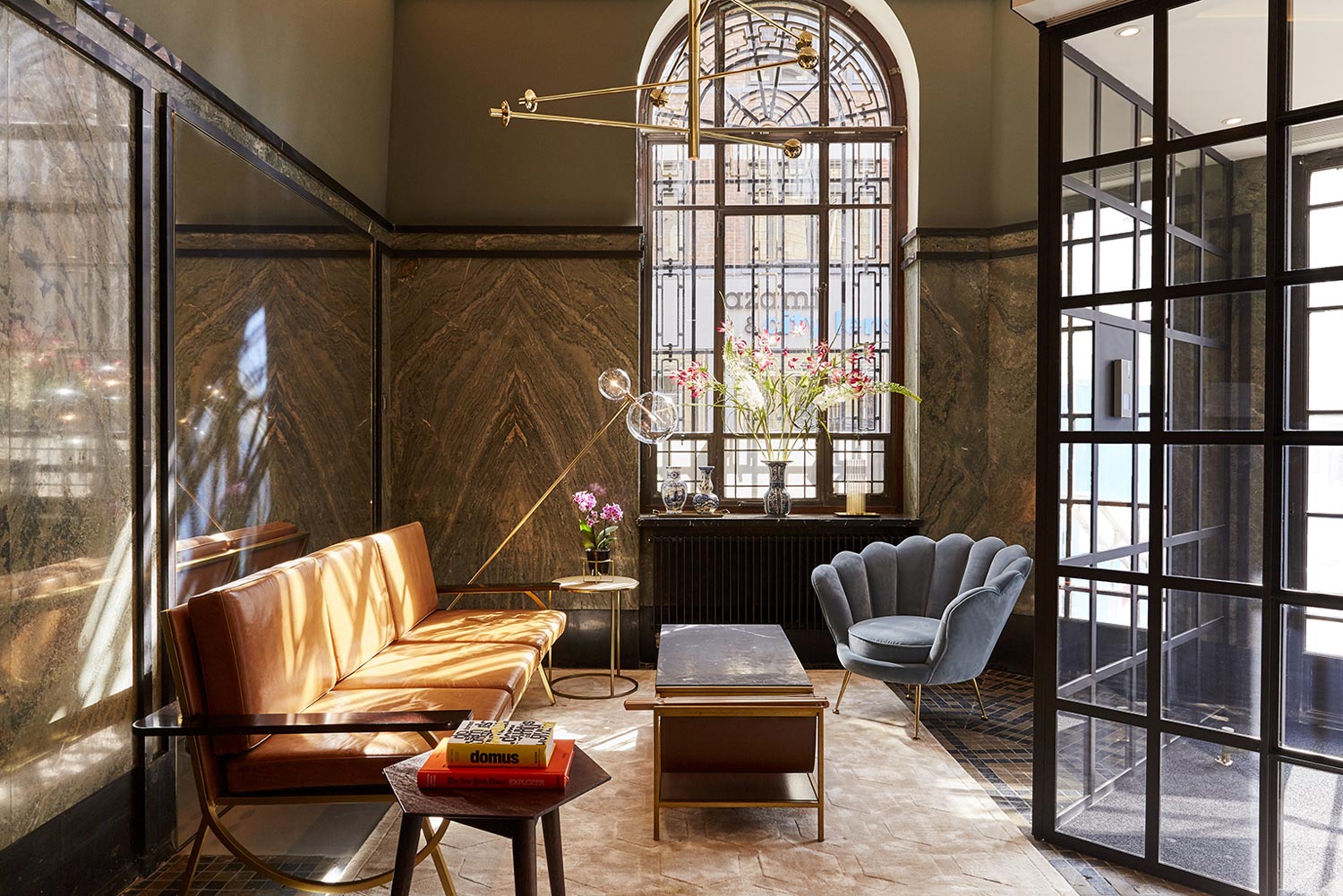
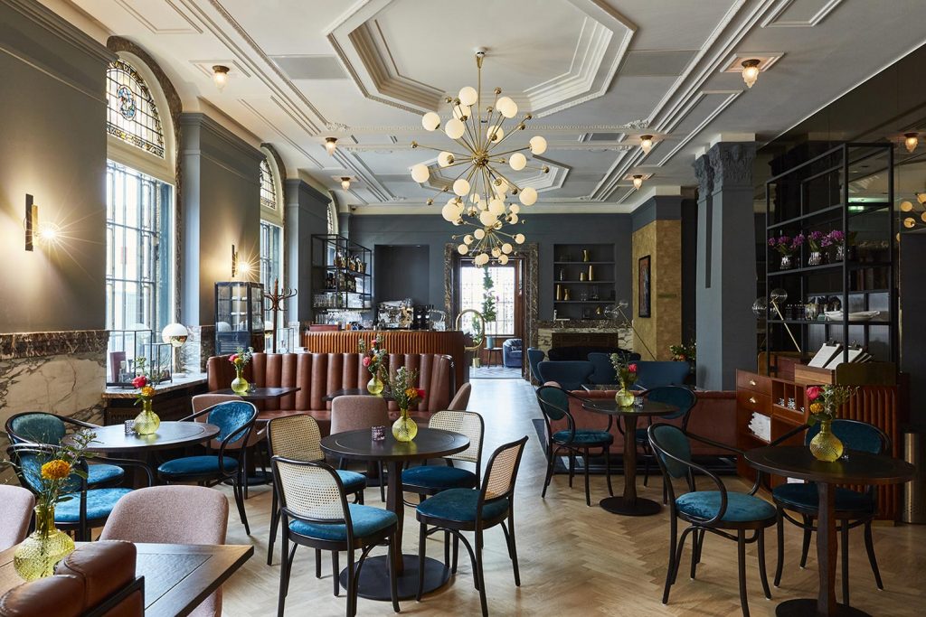
This week’s instalment of the #SBIDinspire interior design series features a heritage conversion property rich in original detailing and upscale interest. Situated opposite the Dutch Royal Palace and once a bank, Hotel Indigo The Hague – Palace Noordeinde wears its prestigious heritage proudly. Complete with underground speakeasy which was once the banks vault, the hotel is a true icon of the city, and exemplifies The Hague’s prestigious royal and political connections. Portraits inspired by royalty adorn the walls, and original mouldings and light fittings have been carefully restored by local craftspeople. Art Déco stained glass, aged brass lamps and original green marble columns evoke the luxury world of private banking. A carefully curated selection of bespoke furniture choices cater for both hotel guests and well-heeled locals, be they there for a fresh morning coffee in the all-day Stocks & Bonds brasserie or a late night cocktail in The Gold Bar.
Company: HUGO interior design
Project: Hotel Indigo, The Hague
Project Location: The Hague, Netherlands
What was the client’s brief?
Hotel Indigo The Hague needs to communicate the unique cultural and historic offerings of this unique Dutch city of power, wealth and government. A sense of prestige and exclusivity should be celebrated within the hotels design.
What inspired the design of the project?
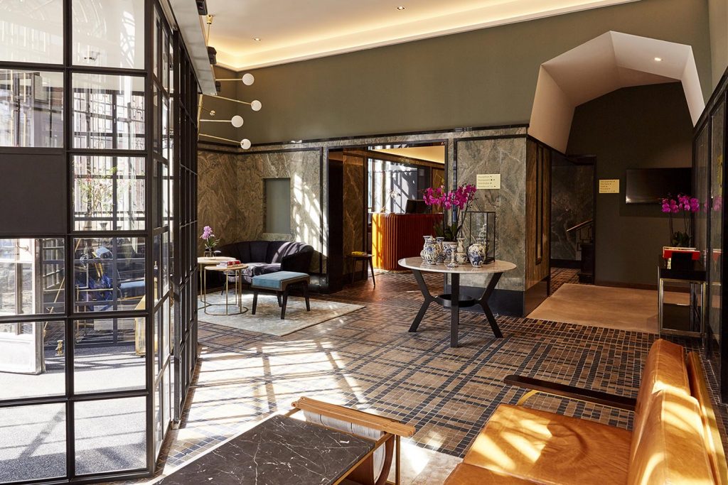
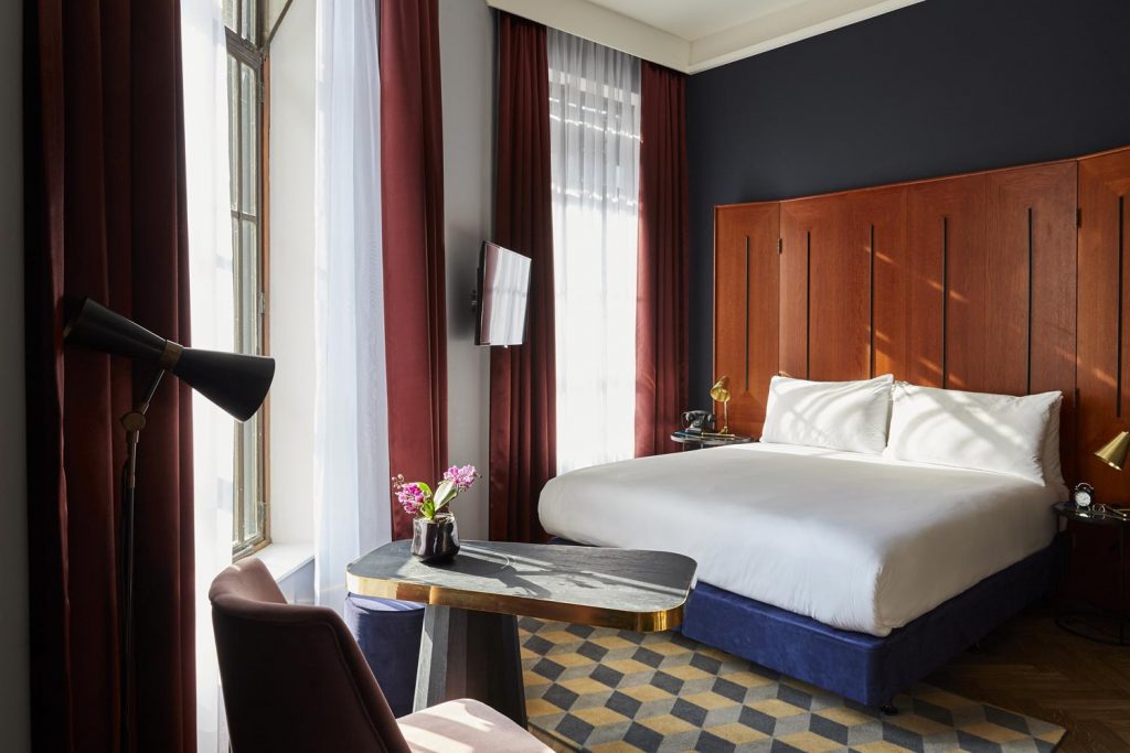
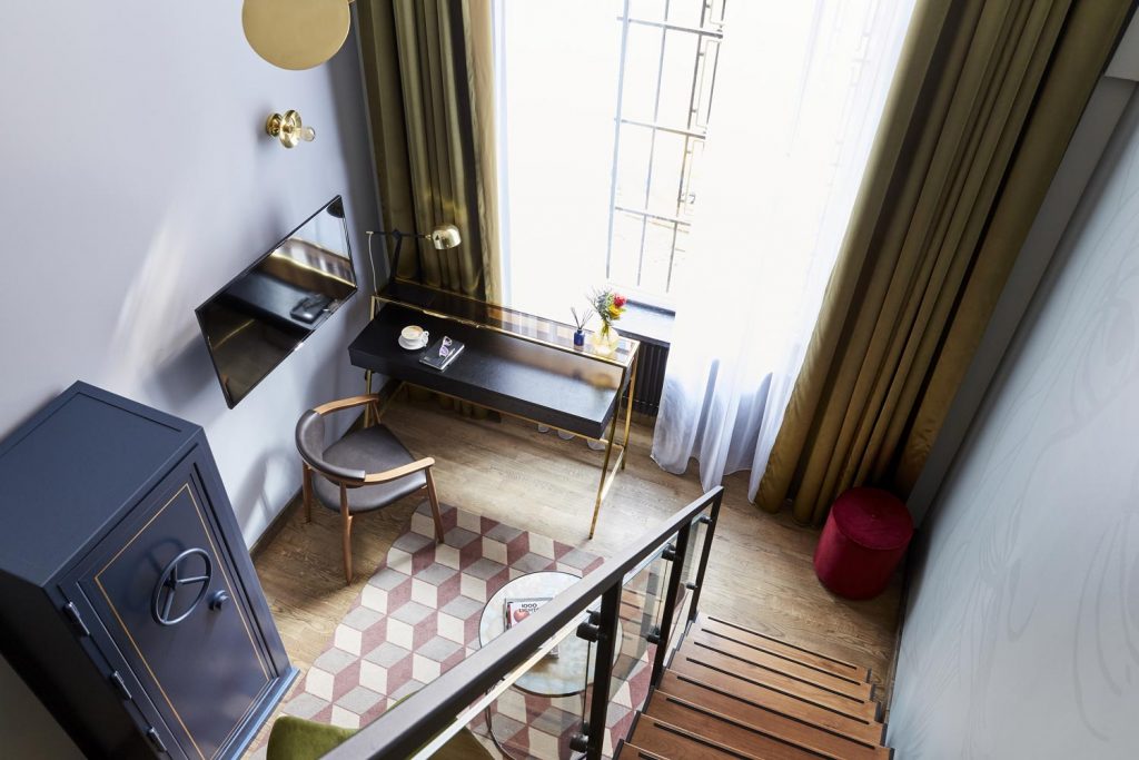
HUGO interior design was inspired by the most unique and important buildings in the neighbourhood, such as the Royal Palace, Dutch government and International Court of Justice. The hotel is situated on Noordeinde street, directly opposite the Royal Palace. As a result, hotel rooms on Noordeinde side have a unique view on the palace. The chic Noordeinde district is primarily known for its distinctive fashion boutiques, galleries and art and antiques dealers, located in beautiful art nouveau buildings. With this neighbourhood story the design of the hotel should be sophisticated and high-end, where guests experience a royal and wealthy feeling. Wealth and royalty were key words in the design of Hugo Broeders, since the Royal family and the Nederlandsche Bank are inextricably linked to the history of this building. One of the most important starting points in the design was the building itself, with its historical and architectural elements such as the various marble, glass, mosaics, ornaments and woodwork. Characteristic materials for that time for buildings with a purpose like this. Hugo Broeders: “We have had the beautiful panelling disassembled, because we wanted to make headboard of this. We reused cupboards and steel doors, especially in the public areas where guests can experience them. We have implemented the patterns of the old woodwork in the new interior components such as the doors and carpets. Artwork is mostly inspired by coins and banknotes. And because the vault plays such an impressive role in the building, we have designed a multifunctional safe that will have a place in every room. We wanted all guests to have their own safe, so we designed a multi-functional steel safe that is positioned in each room. The safe contains a safe (of course), a minibar, coffee and tea making facilities and storage space. It seems and works like a real vault, you have to turn the wheel to open it. It is a feature that embodies the history of the building.
What was the toughest hurdle your team overcame during the project?
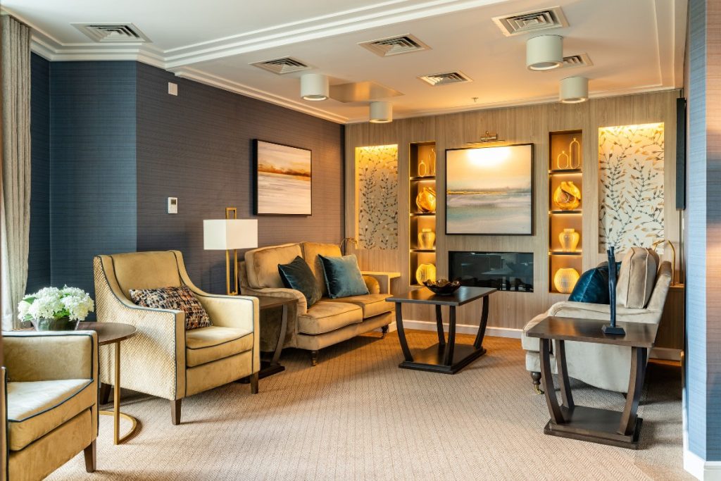
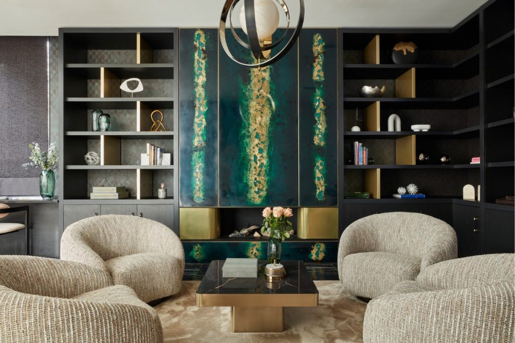
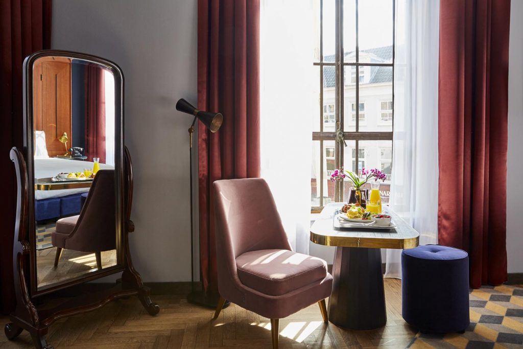
Every space, every room is not only unique in size, but also in form. Working on a property like this, you have to detail everything because every part of the building is unique and different from another part. Although you have the most wonderful materials to work with, you’re limited in possibilities. What you see is what you get, so you have to be very creative to make sure you get the most out of what’s available. You need to create spaces and add materials that are complementary and meet up to the standards of modern day regarding comfort, look and feel. To celebrate this uniqueness and work with the challenges, the idea was that guest should have a unique experience, even if they visit the hotel multiple times. That means three room types were designed, all different in atmosphere and appearance: Royal Residence – street facing rooms with Palace view, experiencing the feeling of residing in a prestigious street in a room with stained glass windows, high ceilings, wood panelled walls and headboards and a dark red and blue grey colour palette with warm velvets and antique brass details. Court Capital – the feeling of wealth comes across in these (some split-level) rooms. Using leathers and a light and dark green colour palette with polished brass details, guests feel the power and history of the building and the city. Loft Living – more contemporary rooms on the top floor and in the attic, combining old beams and slanted ceilings with concrete flooring and rooms in the newly build part of the hotel with large glass curtain walls on the backside of the hotel. Adding variations in grey and an ocre colour palette, soft fabrics and satin brass details, this room feels like modern Dutch living in the city. The combination of this property and the concept of diversity in rooms was challenging. Procurement was difficult, chances of making errors are big and it took a lot of time to make sure the results are as intended.
What was your team’s highlight of the project?
When the bank closed its doors in 1994, it was impossible to remove the massive doors from the vaults where the gold stock was previously kept. The round safe door is still one of the most impressive elements in the building. The vaults are in the basement, if there is no need to go down they are not seen by guests. Wanting to make sure that guests would experience these special spaces, a speakeasy was created here. The story goes that the bank was once connected to the Palace through a corridor. Everything indicates that this came out in the space that we transformed into this speakeasy. From the lobby you have easy access to the speakeasy, making it possible for everyone to have a drink at this very special “Gold Bar”.
Questions answered by the Founders of HUGO interior design, Hugo Broeders and Debby Wentink.
If you missed last week’s Project of the Week featuring an innovative hotel design which strives to redefine the concept of luxury, click here to see more.
We hope you feel inspired! Let us know what inspired you #SBIDinspire
HUGO interior design | SBID International Design Awards 2018
