 25th December 2019 | IN PROJECT OF THE WEEK | BY SBID
Project of the Week: SBID Awards Winners 2019
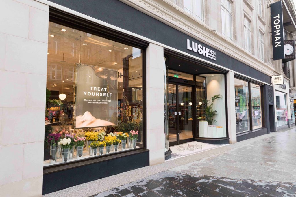
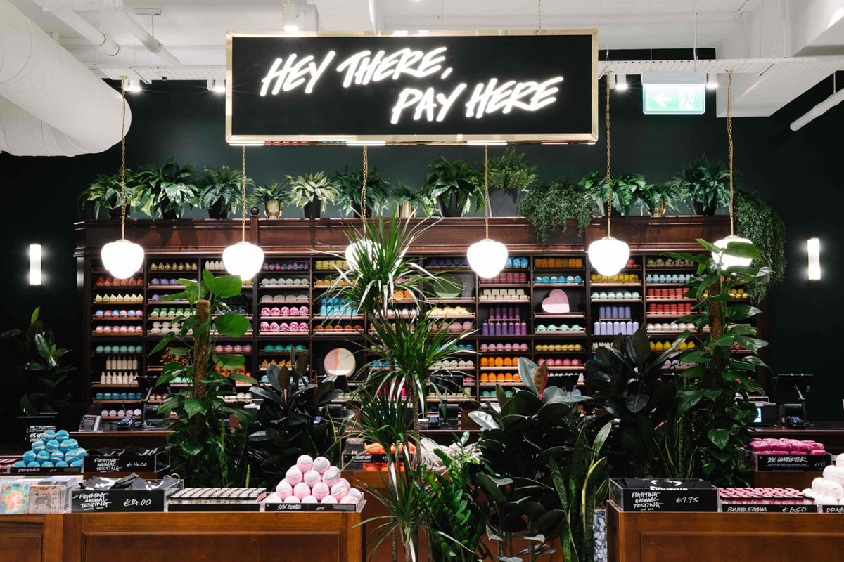
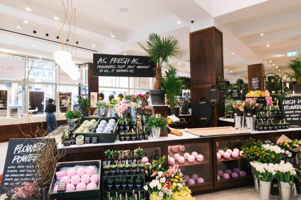
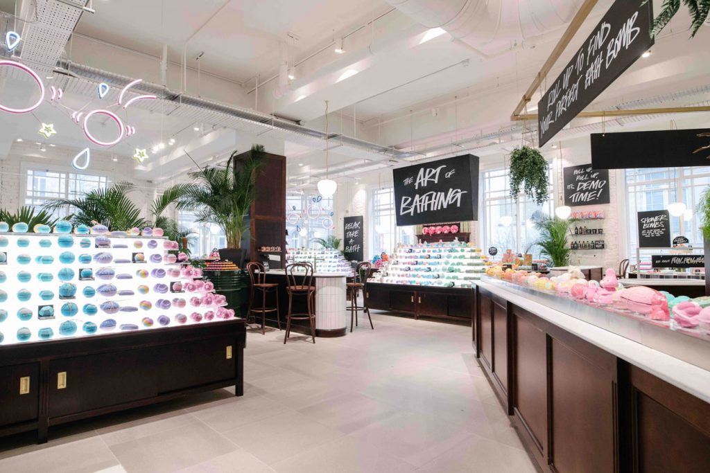
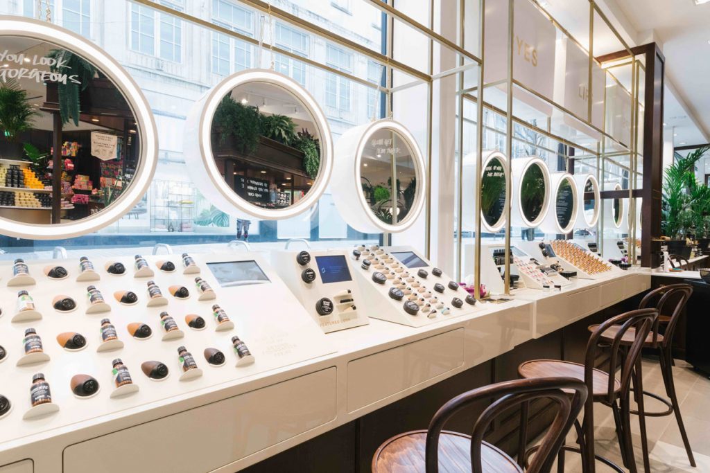
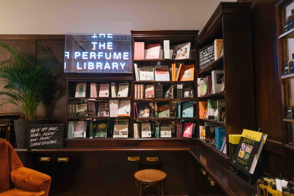
This week’s instalment of the #SBIDinspire interior design series features the SBID Award winning project for Retail Design with leading fit-out specialist, Portview, after completing the retail design for the biggest Lush Fresh Handmade Cosmetics store in the world. Situated in the heart of Liverpool, Lush Liverpool opened its doors after a nine-month transformation into the biggest Lush in the world. Five times bigger than the previous store and spread over three customer-facing floors, the new Lush Liverpool boasts 1,380 sq m of retail space that’s big enough to fit over 9 million of its famous bath bombs. The characterful scheme created by Lush’s in-house Design team with international architecture firm, Hyphen, was executed by Portview with an emphasis on enhancing the building’s original features to achieve a look inspired by the character of traditional departments stores and be both sustainable and synonymous with the cosmetic brand.
SBID Awards: Retail Design winner sponsored by BloomsArt
Company: Portview Fit-Out
Project: Lush Liverpool
Project Location: Liverpool, United Kingdom
What was the client’s brief?
The brief was to marry the old with the new by creating a space that was reminiscent of a traditional department store, whilst incorporating new materials and services that have never been seen before in a retail setting.
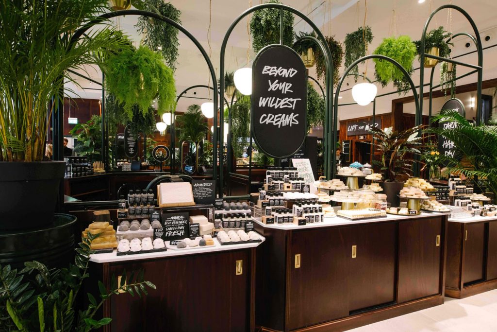
There was a huge focus on using sustainable materials such as reclaimed FSC certified timbers, brick, and cradle to cradle silver tiles to keep our carbon footprint down to a minimum. We also introduced cherry wood style panelling to give the space a sense of warmth and sophistication, with the fresh, citrus colours of the 300 new products on display giving it a modern twist. The carefully crafted, contrasting textures of new and old furnishings help to add visual weight to the space and create an overall feeling of wholesomeness.
The goal was to create a destination store that brings more innovation and creative personal experiences than ever before to the high street.
What inspired the interior design of the project?
The design was inspired by a photograph of an old section of a department store, similar to that of Lush’s building in Church Alley.
We worked closely with Lush’s in-house design team and international architecture firm, Hyphen, to execute a characterful scheme that enhanced the building’s original features by playing on the character and charm of traditional department stores, whilst staying true to Lush’s strong environmental ethos.
What was the toughest hurdle your team overcame during the project?
Paradoxically, when working with old, historic buildings you will always be faced with new challenges. In this case, we had to install two new lifts, refurbish the existing 1920s-style staircase and replace the whole of the ground floor level façade – all within a tight programme. The central stairway was added late in the project and was our most challenging task, involving an oak over-clad of the existing old stone, with relining of the open string and soffit, along with a new steel balustrade complete with curved cherry timber handrails. The stairwell also required secondary fire glazing of the existing windows, with bespoke moulded architrave details scribed from original profiles on site. The whole stairwell needed to be lined and fitted with period doors and cherry wall panelling to the lower level.
Overall, there was a huge amount of construction before the fit-out could even commence, including the manufacturing of columns clad in Portland stone to enhance the 60m long, anodised bronze shopfront. This required very detailed surveys of the existing stripped façade to allow us to draw and schedule with complete accuracy the Portland stone, granite, structural steel and shopfront glazing system, so all could be produced in parallel and fit together without a hitch.
Another challenge was executing the design of all the individual service areas – such as the spa, hair lab, florist, perfumery and shop floor – under the one roof, without it looking disjointed or disturbing the natural flow of the overall space. The design was continuously evolving with various teams working on each area, so a holistic approach to communication and client engagement was absolutely key in ensuring everything came together in a cohesive and collaborative way.
What was your team’s highlight of the project?
We worked in close collaboration with both the client team and Hyphen to ensure that Lush’s high environmental standards were upheld at each stage of the process, from the sustainable design choices through to the responsible sourcing, restoring and repurposing of recycled materials to help reduce our environmental impact and this has been both hugely rewarding and enlightening.
This has been one of our most iconic retail projects to date and it’s a proud moment for us to see it come to life.
Questions answered by Simon Campbell, Managing Director of Portview Fit-Out
If you missed last week’s Project of the Week featuring the SBID Award winners for KBB Design with a fusion of Oriental and commercial modernity for a contemporary New Zealand home, click here to see more.
We hope you feel inspired by this week’s Retail design! Let us know what inspired you #SBIDinspire
SBID Awards 2019 | Retail Design Winner sponsored by BloomsArt

