 23rd October 2019 | IN PROJECT OF THE WEEK | BY SBID
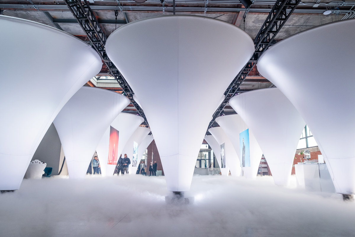
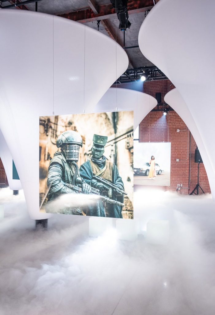
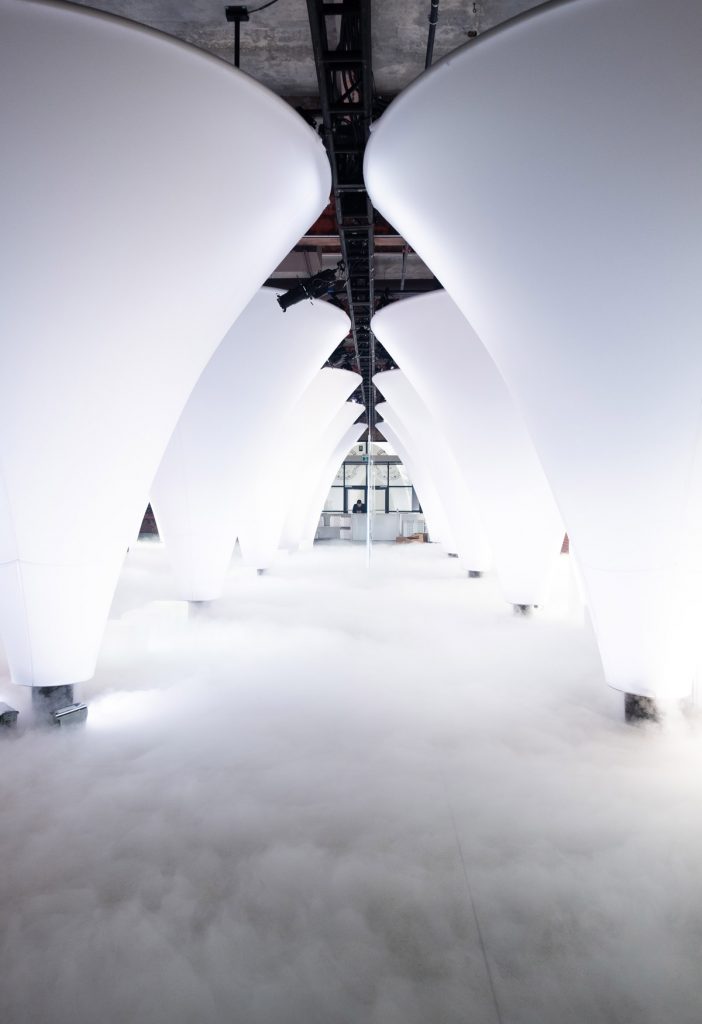
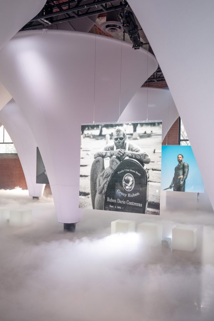
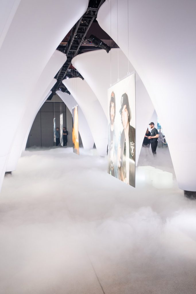
This week’s instalment of the #SBIDinspire interior design series features the first photography exhibit for famed Toronto photographer, Elie Kimbembe who became personal photographer to The Weeknd, Travis Scott, Banks and Selena Gomez. Stacklab collaborated closely with Elie on the design of the ‘Solo’ exhibition which combined themes such as discovery and immersion, creating a sense of intimacy and interpersonal connection. The main gallery features a series of vaulted chambers, made up of a regular arrangement of diffusely lit fabric wells.
Sector: Public Space Design
Company: STACKLAB
Project: #Solo
What was the client’s brief?
We collaborated closely with acclaimed photographer, Elie Kimbembe on the design of his first solo exhibition. A social media icon, Elie was interested in creating a new gallery ‘type’ that offered a contemplative and interactive art viewing experience for the digital art consumer (in contrast to the ephemeral and solitary way his art is typically consumed). #Solo combined themes like discovery and immersion with intimacy and interpersonal connection.

What inspired the interior design of the project?
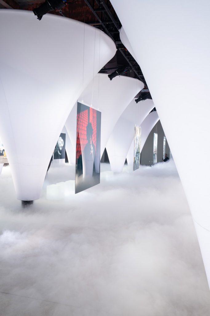
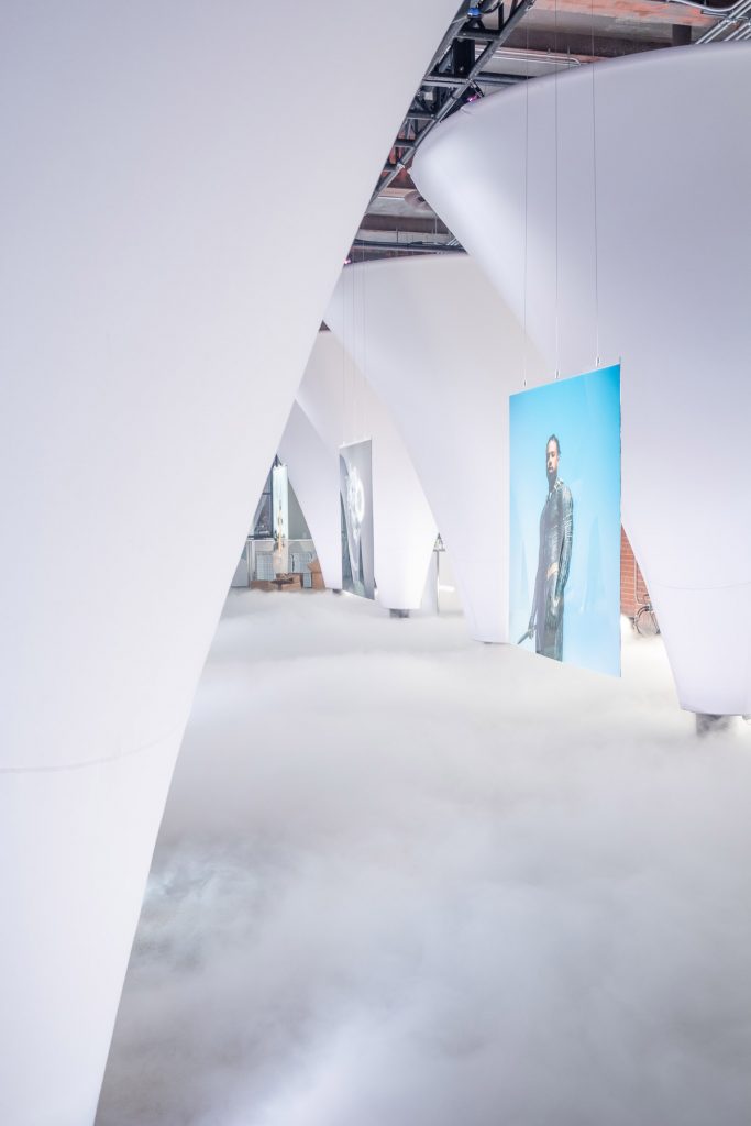
The main gallery featured a series of eight vaulted chambers, made up of a regular arrangement of fifteen diffusely lit elastane wells. Harnessing Einstein’s theories on the curvature of space, each ‘well’ appeared to have been stretched from the top-down, emitting a deluge of ultrasonic mist across the luminous floor plane. Contrasted against the gravity of the conic piers, Sixteen of Elie’s photographs hung, back-to-back, in the quiet, vaporous space between them.
The bold, tectonic wells, each measuring 13 feet in diameter, framed and illuminated Elie’s photographs while obstructing others outside of the viewer’s direct sight line. This served a dual purpose of compelling the viewer to circulate the exhibit and created moments of intimacy between themselves, the art, and other observers.
In addition to carrying diffuse light throughout the exhibition space, the ultrasonic mist served two key, performative roles. Firstly, the mist elevated the visible ground plane to further frame the photographs within the vaults. Mostly, however, it precipitated a slow and calming pace to the circulation of viewers within the space. We designed this temporal aspect of the exhibition to answer one of the artist’s primary objectives – “to give people a chance to really interact with the work, and each other”.
What was the toughest hurdle your team overcame during the project?
The toughest hurdle was time. The quality of the effect we created was significantly improved on thorough iterative prototyping over a very short period. #Solo was fabricated in less than 30 days. On-site installation took a group of six two days, including calibrating the mist medium to the space. Take down took 12 hours, as will re-installation for subsequent uses.
What was your team’s highlight of the project?
Achieving specific cost targets, addressing the nuances of the artist’s brief, and (specifically with respect to mist) referencing our project sponsor, Up Cannabis’s signature medium- vapor – as a gateway to creativity were our key highlights of the project.
Questions answered by Jeffrey Forrest, Founder of STACKLAB
If you missed last week’s Project of the Week featuring a kitchen design inspired by clean and minimal styles from Scandinavia, click here to see more.
We hope you feel inspired by this week’s Public Space design! Let us know what inspired you #SBIDinspire
