 1st July 2020 | IN KBB DESIGN | BY SBID
Project of the Week
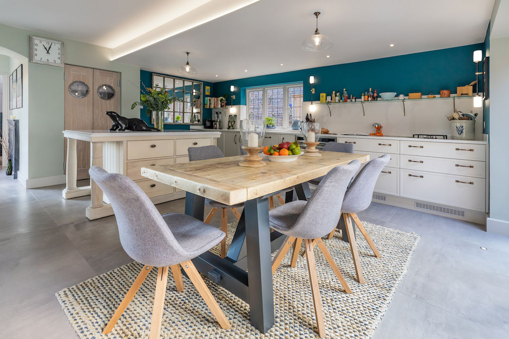
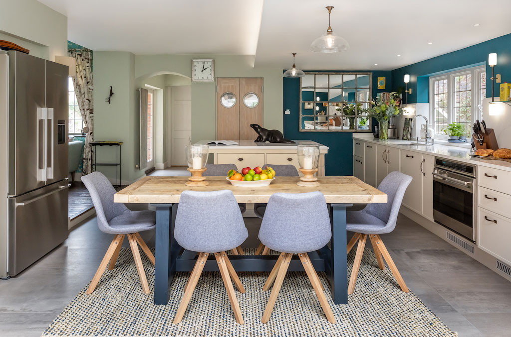
This week’s instalment of the #SBIDinspire interior design series features a residential kitchen design. The client wanted a space that seemed large and really easy to move around in, without feeling too empty, and definitely not too grand. Mark Taylor Design worked on this project for 12 weeks, inserting beams, building a glass wall, moving all plumbing and fitting a kitchen. This included designing, building and fitting a mobile island as well as flooring. The end result transformed the existing, dark kitchen into a light, open-plan area fit for entertaining and relaxing.
2019 SBID Awards Category: KBB Design Sponsored by: Vitra UK
Practice: Mark Taylor Design
Project: Skinny Shaker-style Kitchen
Location: Buckinghamshire
What was the client’s brief?
The clients wanted a space that seemed large and really easy to move around in, without feeling too empty, and definitely not too grand; a modern look, but not flat, or minimalist. They also wanted an island, but one for many people to stand around, not something small. It should almost create a showpiece for the kitchen. There was some debate about exactly where this should be. They wanted a table that would seat 8 to 10 people max, near the patio garden at the back of the kitchen. It was important to create a sense of light in what was a really dark space, with low ceilings and not a lot of sun. They wanted a pantry, to avoid food in cupboards, and if possible, wanted a french larder fridge, if it would fit. Ultimately, they wanted to use a combination of paint in the kitchen area and wallpaper in the sitting area, to differentiate the spaces.
What inspired the interior design of the project?
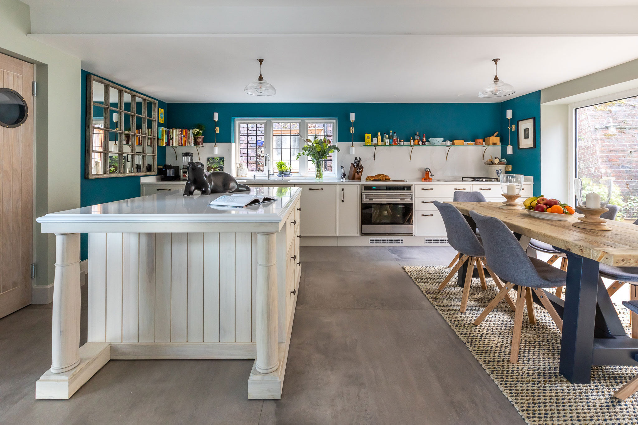
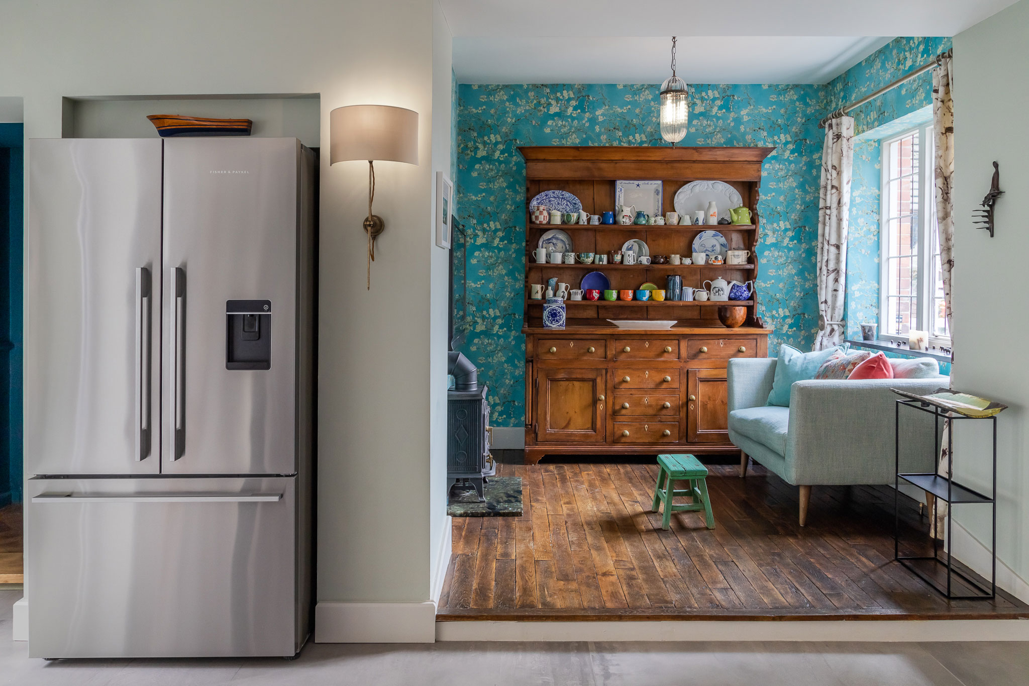
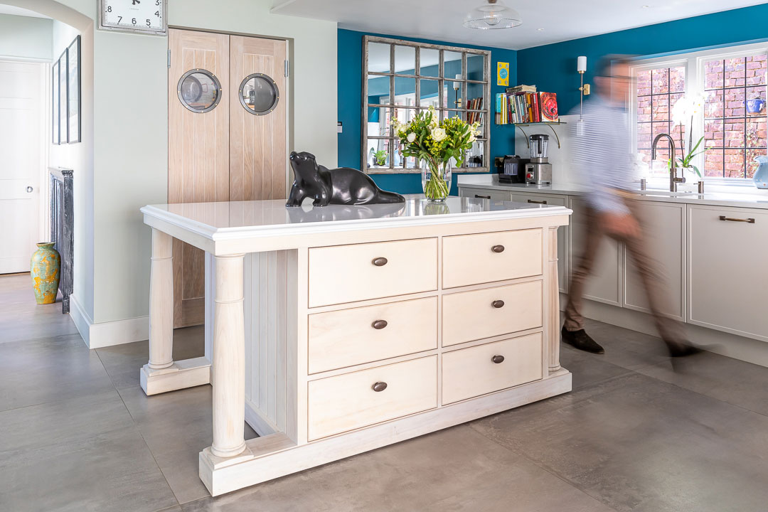
A couple of things; a photograph of a 150-year-old french furniture piece which the client fell in love with, and which formed the basis of the moveable island, and the feeling of space and cleanness that a flat, concrete style floor provides in good industrial working kitchens. Just these 2 elements set us off. We had also recently designed a skinny shaker door and wanted to include this on the base units. Finally, to try and create different spaces that complimented each other. We looked at the romantic nature of a Welsh dresser, dating back 250 years, that was already in place in the old kitchen and created a warm, wallpapered area around that.
What was the toughest hurdle you/your team faced during the project?
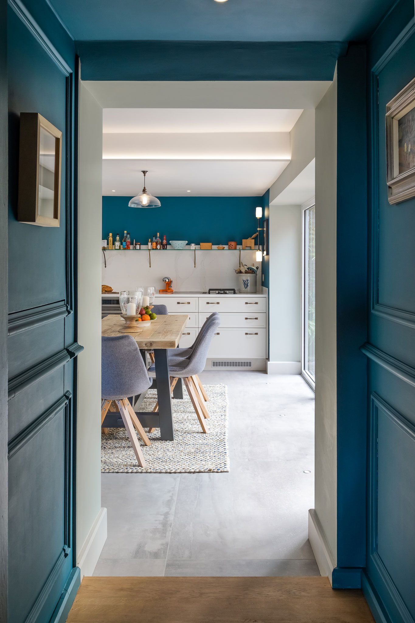
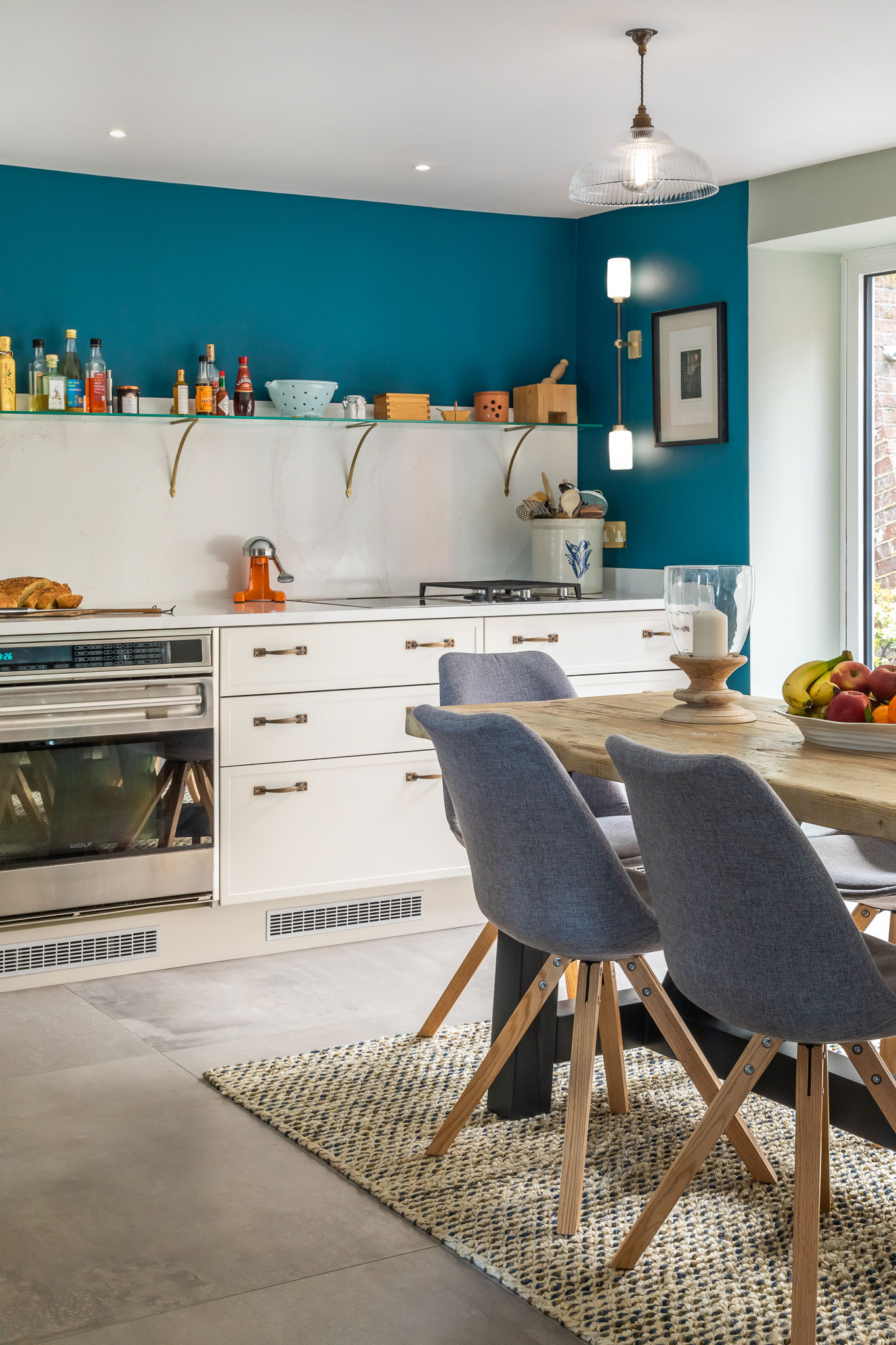
Poor light and different, low ceiling heights made lighting a challenge. We put in place 5 different levels of lighting; floor lights to illuminate the walls and reflect off the white ceiling, mid-level lighting on the walls for creating a warm, soft ambience, task lighting placed in the ceiling above the work surface, LED linear lighting recessed into ceiling lighting channels to cast an even light across the ceiling, and; a window wall comprising 2 sets of bifold doors at the back of the kitchen, where the maximum amount of natural light could be brought into the dining space.
We were also tasked with positioning the french larder fridge in an under-stairs recess which was slightly too shallow. Our builders cleverly removed a small portion of the stair winder to accommodate this and it looks made-to-measure as a result. Another challenge was getting light into and through the walk-in pantry, so that it would feel separate from, but connected to the main kitchen was achieved by using two porthole windows in the swing doors.
What was your highlight of the project?
Completing the project, including building work to insert beams and build a glass wall, moving all plumbing to create a new utility room and larder, building a snug, designing, building and fitting a kitchen, including a mobile island and flooring – all in 12 weeks, ready for Christmas!
Did you enter the project into the SBID International Design Awards? If so, why?
Yes. Our Skinny Shaker-style kitchen is the newest addition to our MeThD custom kitchen collection and it features a beautifully modern take on a Shaker-style door. Opting for base units along one wall without any wall units created a stylish kitchen with clean lines and a more modern look. To add to the look, we designed and created a bespoke movable island unit. The end result transformed the existing, dark kitchen into a light, open-plan area where entertaining and relaxing would be key.
Questions answered by Mark Taylor, Director at Mark Taylor Design.
We hope you feel inspired by this week’s residential design! Let us know what inspired you #SBIDinspire
If you missed last week’s Project of the Week, featuring a Parisian-inspired hotel public space, click here to see more.
