 8th April 2021 | IN HOSPITALITY DESIGN | BY SBID
Hitzig Militello Architects share the inspiration and process behind their high-end Buenos Aires cocktail bar and restaurant project; Osten.
Osten, the high-end cocktail bar and restaurant, is located in Puerto Madero’s distinguished neighbourhood in Buenos Aires. The generating idea and initial design concept stems from the era of the economic crash in 1929. Inspired by the novel The Crack-Up by Scott Fitzgerald, and the decadence of glamour from The Great Gatsby.
At first glance, a large corridor is built with scaffolding and the name Osten hangs on perforated metal located in the main entrance that also functions as a waiting room. This sets the scene and atmosphere in an alluring effect to inspire desire to discover the space step by step.
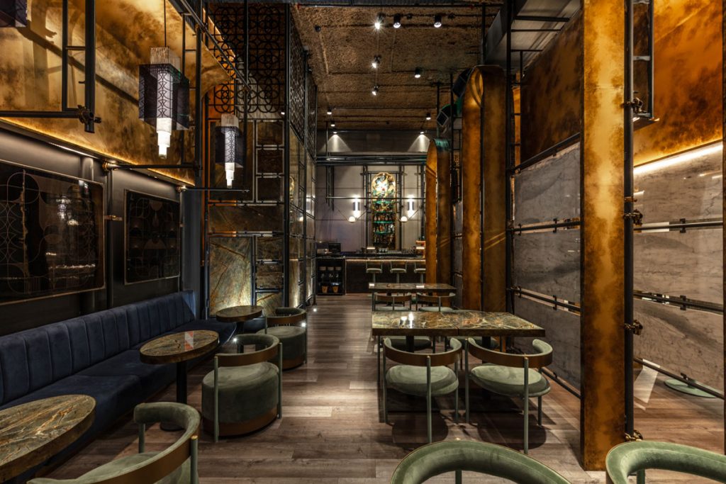
The corridor has 6 different accesses to the general space – this was fundamentally designed so each of the areas can be made independent to divide the areas as private spaces when required.
Access to the bar is at the end of the corridor, crowned by metal perforated structures to frame the identity and design of the bar. The corridors separate the entire space into two large areas of use against the backdrop of this large, statement bar.
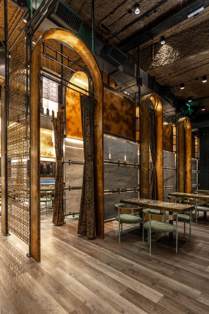
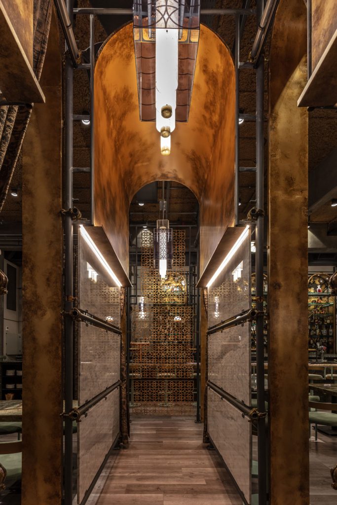
The presence of scaffolding acts to support the design theme, representing the era that could no longer support itself. The essential characteristic of scaffolding devices throughout the scheme is ultimately the temporality of their use, and it is this word “temporality” that defines the end of that era of over indulgent elegance. These scaffolds underpin large sheet metal arches painted in gold, but without the glitz or bombast, their appearance is instead rather aged.
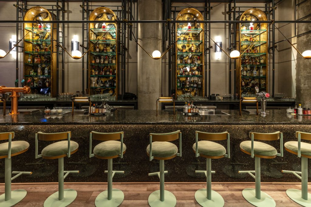
The language of the arches is carried throughout and used house all the most representative areas with the bar at the epicentre; the access through a large corridor, the bar itself and its setting, as well as the staircases and perimeter seating area. Knots hold each encounter of the aged scaffolding with old bronze paint.
Modernity is essentially represented by the inner skin, built with cementitious plates and marble organised in pieces in different areas. These marble slabs are arranged in between the scaffolding structures, seeking a relationship between the elegant and the temporary. All Carrara and dark green marble slabs are arranged linearly and held in an ethereal way.
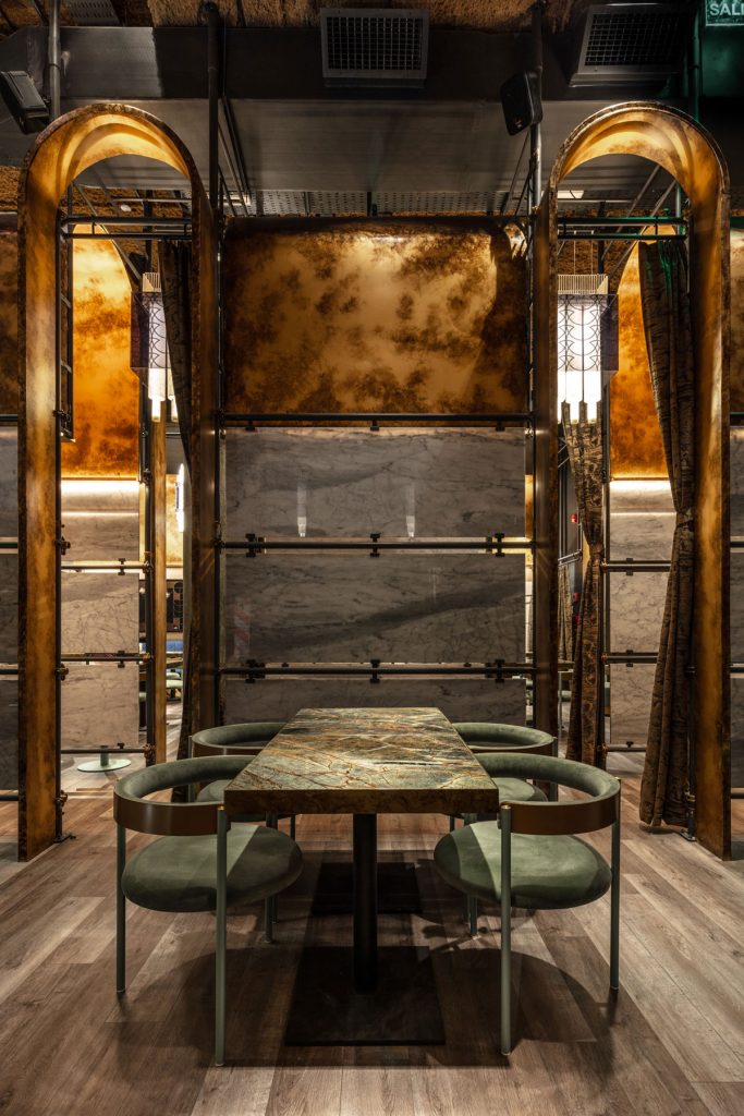
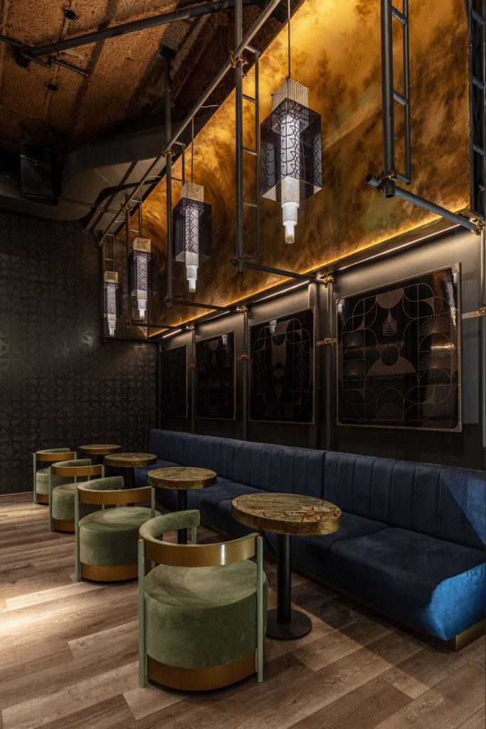
Modernity also makes an appearance through the acrylic tubes that are part of the lighting system where the two worlds are combined; the modern and its acrylic packaging with art deco drawings. In the same way, large lamps that simulate spiders, hang with acrylic tubes and chains representing the beads.
The graphic identity developed from the naming typography was applied in different spaces, in the form of a stencil on walls and through cut-outs in plates to achieve devices that function as dividers. As a result of typographic development, graphic pieces of feminine profiles have been developed and applied in the form of artistic paintings held by the scaffolding system.
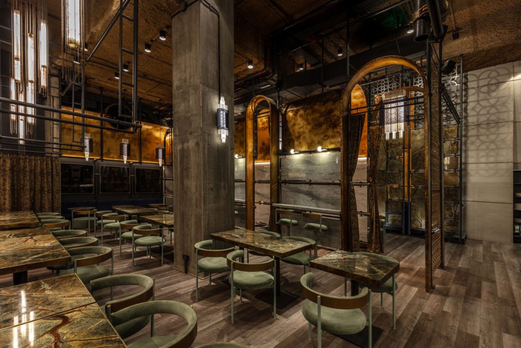
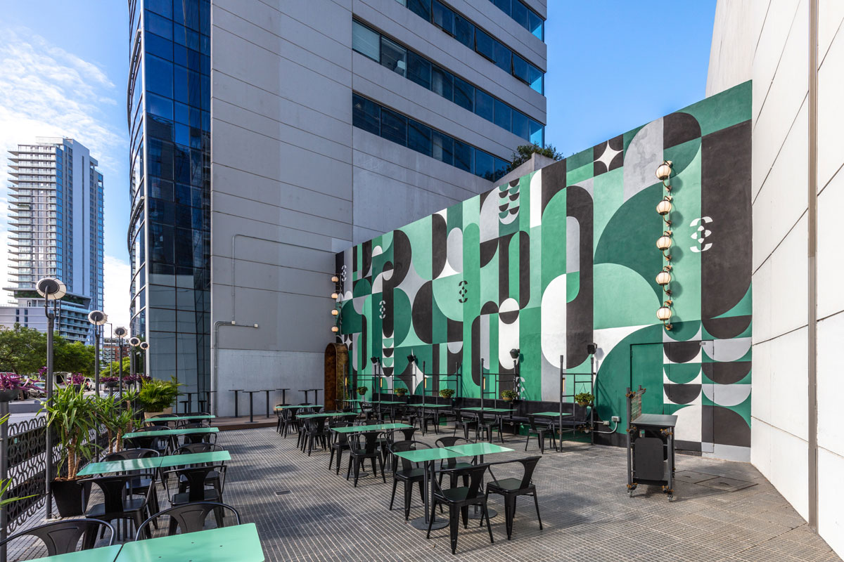
The scaffolding system extends to the outdoor spaces to support the seating area, with a large mural designed by the branding team through the development of the typeface family. The tonality of the old bronze, dark green, light and blue was the result of a sober and elegant composition.
