 19th December 2018 | IN DESIGN EVENTS | BY SBID
The annual SBID Awards serve to recognise, reward and celebrate design excellence across a broad range of categories. The winners of the SBID Awards were announced on Friday 26 October – and what a line-up it was! This year’s winners represent, as ever, mind-blowing design across a broad spectrum of sectors. While it can’t be denied that the victorious projects are a feast for the eyes, we know that excellent design must also be effective and enhance lives. Therefore, it’s really satisfying to know that, thanks to the stringent judging process, every one of these examples of breathtaking creativity is built on a foundation of technical knowledge and experience, with design-conscious public also having their say in voting for their favourite designs!
Overall Winner
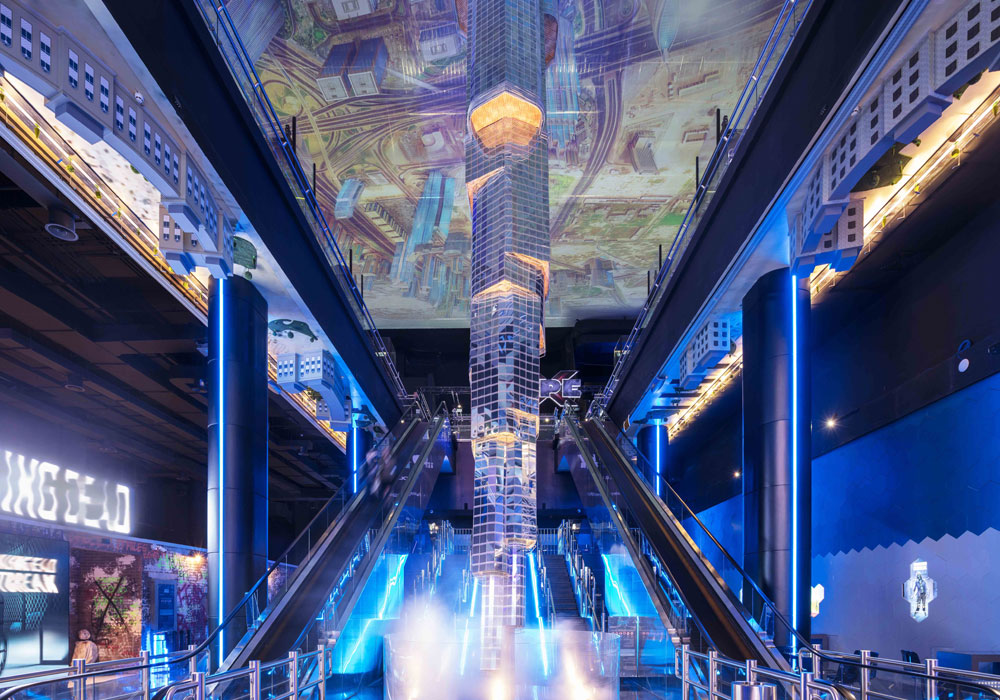
Company: 4SPACE Design
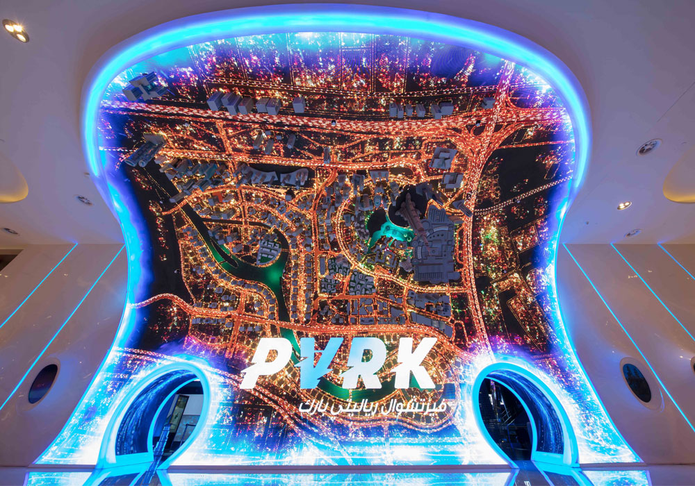
Project Title: VR Park Dubai Mall
Bernard The VR Park is designed to allow visitors to experience an extreme level of virtual reality. The client, Emaar Entertainment, wanted to build a new attraction that had never been implemented in Dubai before. The core concept was to experience the futuristic ambience and elements along with a wonderful journey through the virtual reality world. At the entrance, a huge 90-degree curved LED display screen panel along with complete cityscape buildings of Dubai downtown bent upside down highlights the magnificent experience that awaits visitors. The focal point of the theme park interior is a giant model of Burj Khalifa, hanging upside down from the ceiling to floor. 4SPACE collaborated with the theming company to get the correct proportion, finishes, look and feel of the actual Burj Khalifa. From the initial concept down to the minute details, VR Park is an example of unique and innovative design.
CGI & Visualisation
Company: Alena Zhernovaya Interior Design
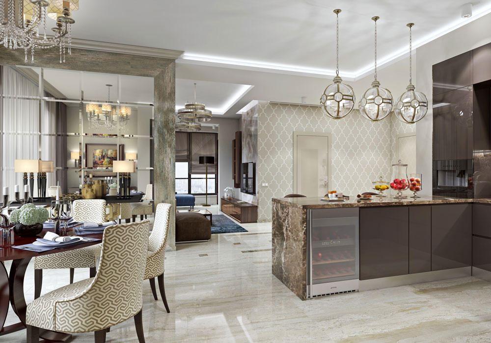
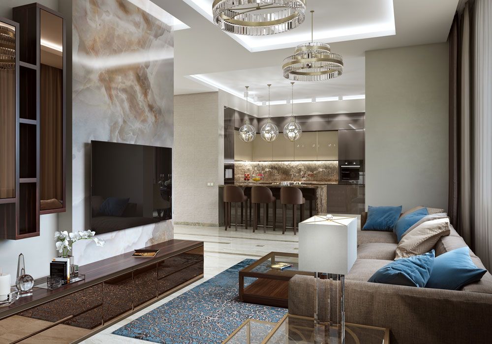
Project Title: RiverStone
The 130 square-metre apartment is located in the RiverStone residential complex. The clients wished for a modern, eminent interior. The cooking area was merged with the living room in line with current trends. A mirror panel and special lighting highlight the dining area. The relaxation area stands out separately with a bay window. The master bedroom, bathroom, and the children’s room are private areas of the apartment connected to living room. A spacious walk-in closet and a large bathroom are essential parts of a modern interior. Natural stone, mirrors and porcelain stoneware create a convivial atmosphere, which you sense from the moment you enter the apartment. Wood wall panelling in the bedroom further underpin the concept.
Club & Bar Design
Company: IHG
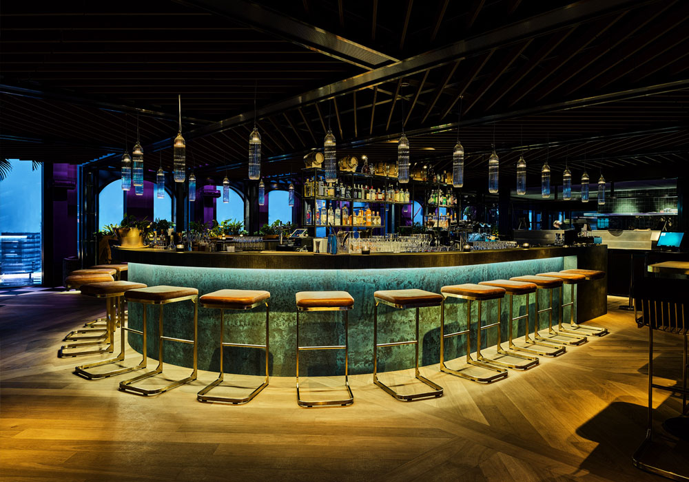
Project Title: Juniper & Kin at The QO
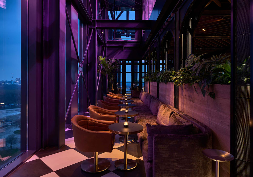
As you enter through the concrete lift area, there are brass installations that make the light sparkle. The design team wanted to bring the feeling of a bright starry night to the bar as it is on the 21st floor. The colour scheme is black and white with dark green which the design team kept warm by using dark wood and velvet. The layout was designed to create different feelings within the space. The middle area, where the bar and kitchen are located, is raised to give them the spotlight and more of a buzz. The lower levels are where all the sofas are set for a more intimate experience. Somewhat unusually, the floating greenhouse above the bar gives off a deep pink glow that helps the plants glow but also adds an intimate and moody ambience to the place, a great example of where the QO’s eco credentials and atmosphere collide to create a truly memorable experience.
Healthcare and Wellness Design
Company: Francis Cauffman
Project Title: Brooklyn Health Center
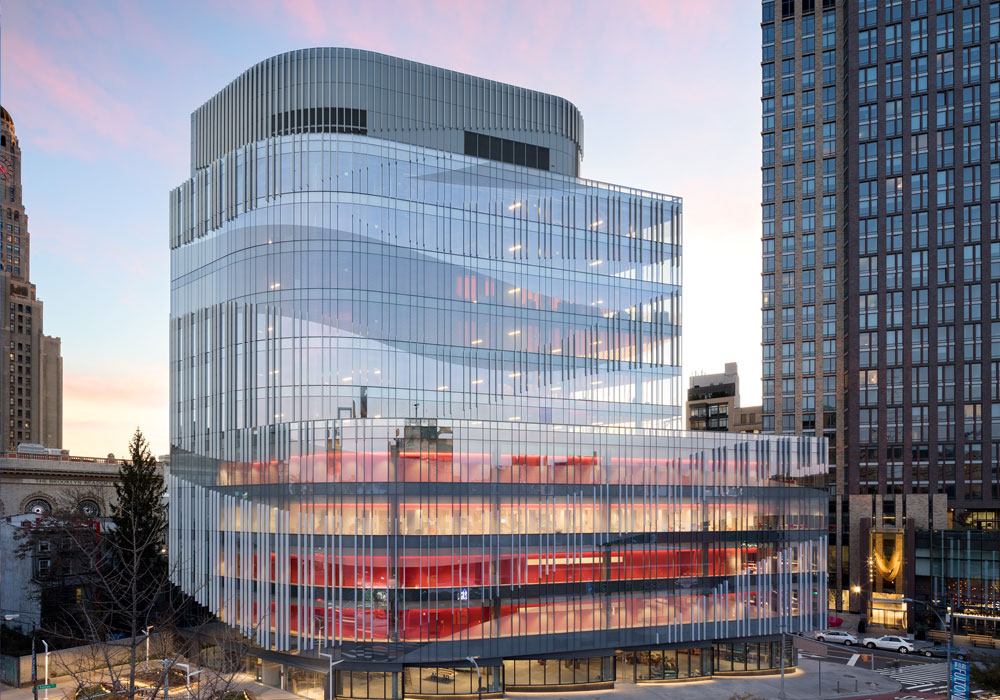
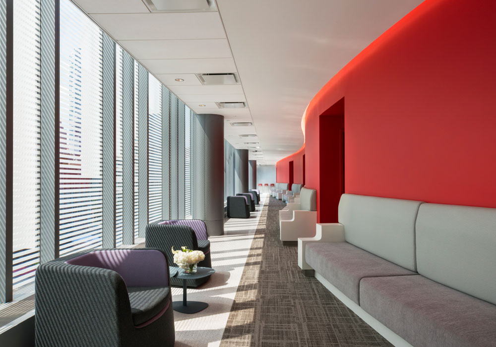
The designers were asked to deliver a new, distinctive health centre. They delivered a four-storey health centre as the beating heart of an innovative glass-faced eleven-storey mixed-use building. Upon reviewing the site, they immediately understood that they could dramatically expand the square footage by using a privately owned public space (a 2,000-square-foot park, built for public use and maintained by the owner of the building), which would allow for leasable spaces to defray the cost of the building over time. As not to allow the health centre to become lost in the building, the senior designer conceived of it as a red object encased in glass—the building’s beating heart. Its teardrop-like form was designed to complement the vibrancy and ingenuity of downtown Brooklyn. Its external design takes advantage of the unusually shaped site to create a lively façade that reflects the eclecticism of this culturally diverse neighbourhood.
Hotel Bedrooms & Suites Design
Company: Artichoke
Project Title: Mombo
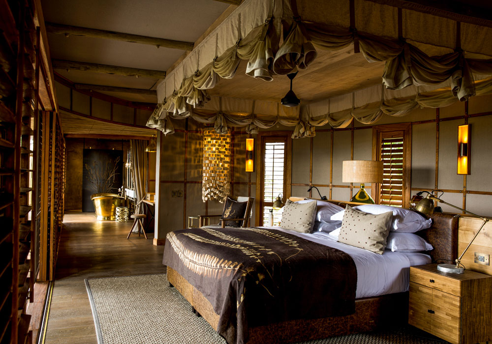
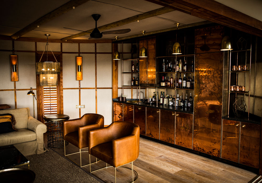
The design combined traditional and vintage elements with a modern elegance that truly embraces the real essence of Mombo. Deconstructed furniture in classic styles, antique brass finishing, vintage leathers, copper lighting combined with marble and oak floors were all used. A tonal colour palette throughout reiterates the longevity of the interior design. A mix of mismatched – yet complementary – wooden furniture all works together to feature a collection of pieces sourced over the years, resulting in a personalised feel. Space was also a key factor in creating the new design, with each tented suite now comprising an expansive entrance, a sitting room with a bar unit, a separate bedroom and bathroom with a dressing area, indoor and outdoor showers and a bathtub that creates a sense of indulgence.
Hotel Public Space Design
Company: Wanda Hotel Design Institute
Project Title: Wanda Vista Hefei
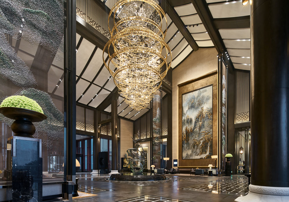
Located on the shore of Lake Chao, one of the largest lakes in China, Wanda Vista Hefei is an urban resort that offers sweeping lake views. The hotel is a hillside building in the neo-Huizhou style with 206 guestrooms. Each room has a balcony from which guests may enjoy 180-degree view of the beautiful lake. The interior design features white walls, black tiles and grey bricks, all of which are typical of Huizhou-style architecture. Respect is given to the aesthetic basis of order and symmetry seen in the Huizhou style. A horse-head shaped wall and the ‘Four Treasures of the Study’ (writing brush, ink stick, ink slab and paper) which have local cultural significance are adopted as design elements to express the ‘Impressions of Huizhou’ design theme.
KBB Design
Company: Celia Visser Design
Project Title: Contemporary Kitchen & Bar
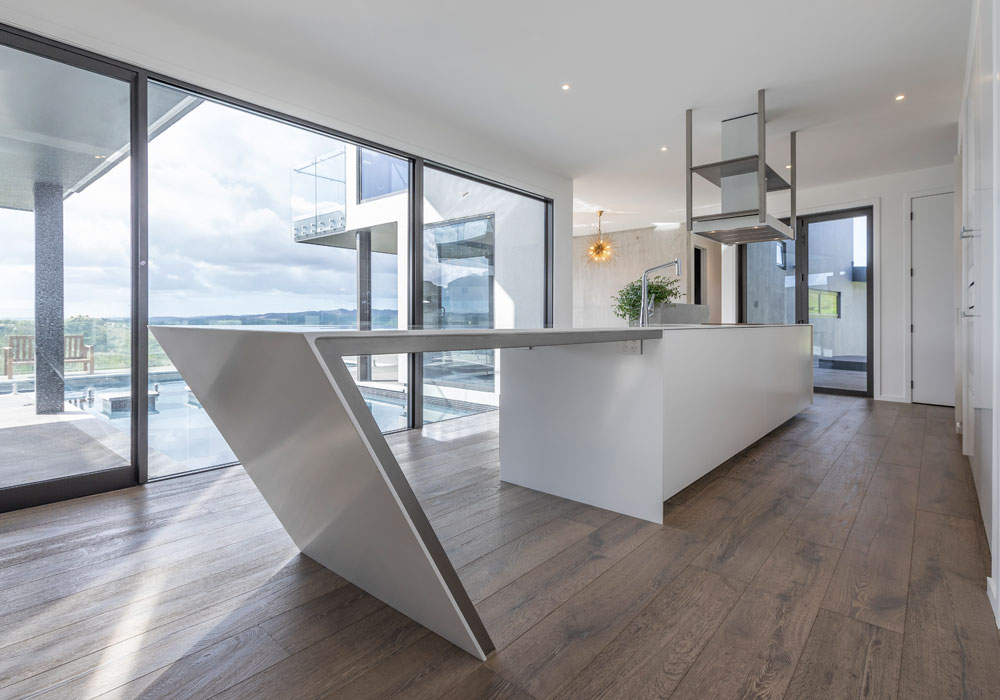
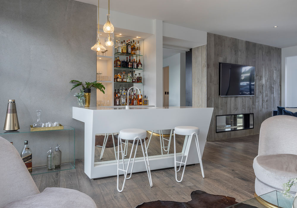
Celia Visser Design created this kitchen and adjacent bar for clients who love to entertain and desired a space that merges seamlessly within their home’s contemporary architecture. They asked for a visual statement that used modern materials, incorporated sharp, clean lines, and had a look that played on bold asymmetrical forms, all using a white palette, with exposed concrete walls as the backdrop. The striking geometric structure of the kitchen features bead-blasted stainless steel which contrasts the white Corian, both under the dramatic angle and display shelving. Corian and angles were also introduced into the design of the bar to meld the two areas for maximum impact. Beautiful timber flooring is a contrast to the monochrome kitchen and bar, allowing the stunning rural and pool outlook to enhance this remarkable kitchen from both sides of the glass. The overall impression is an eye-catching modern piece of art.
Office Design
Company: Paragon Interface
Project Title: Discovery Place
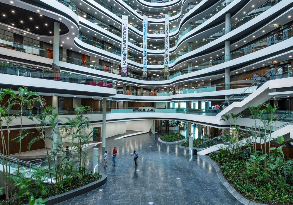
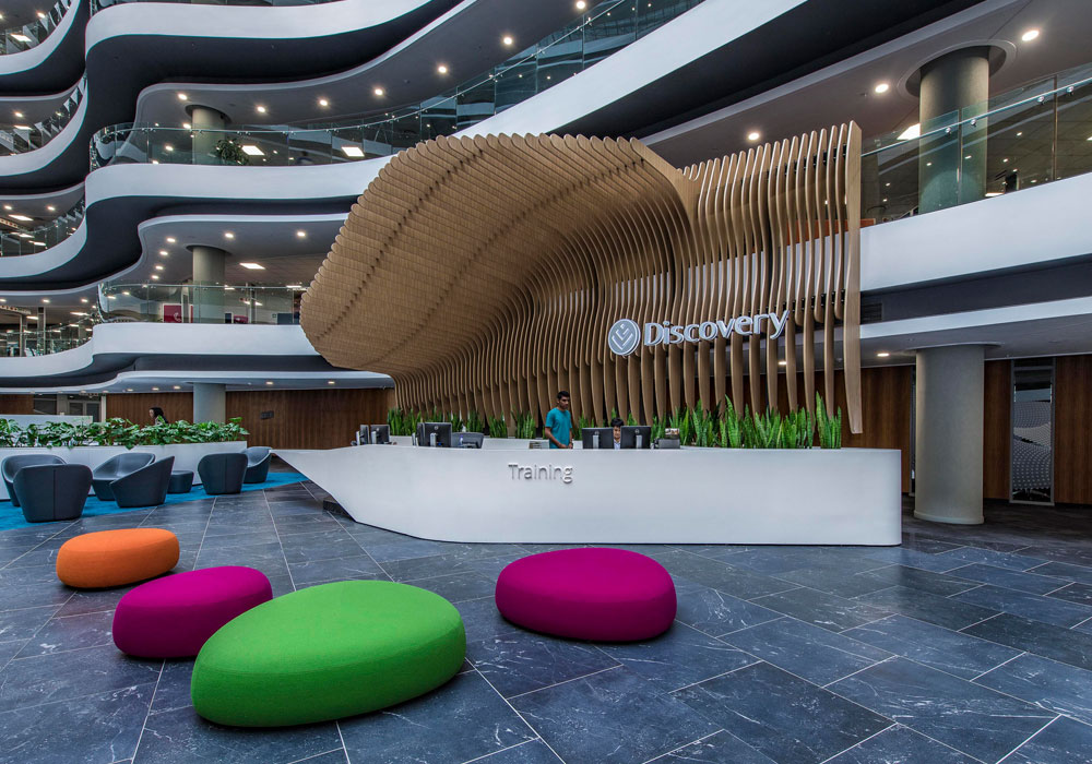
The building is located on a prominent corner entering the business district of Johannesburg. Its main entrance is open and welcoming, to reflect the mores of discovery. Internally the building is divided into three main atria, namely a central atrium, and one each on the left and right side. The central atrium allowed Paragon Interface to explore the concept of a concourse, driven by Discovery’s requirement for the building to be active. This was not only translated effectively into a dynamic design aesthetic, but also into an active public street populated with seating areas, cafés, streetlights and tree canopies. It served not only as the main thoroughfare of the building, but also constituted a welcoming space for visitors and clients. Visitors are encouraged to wander around the ground floor to make use of facilities and also enjoy a snack, meal or cup of coffee.
Public Space Design
Company: Studio MB
Project Title: Triumph Factory Visitor Experience
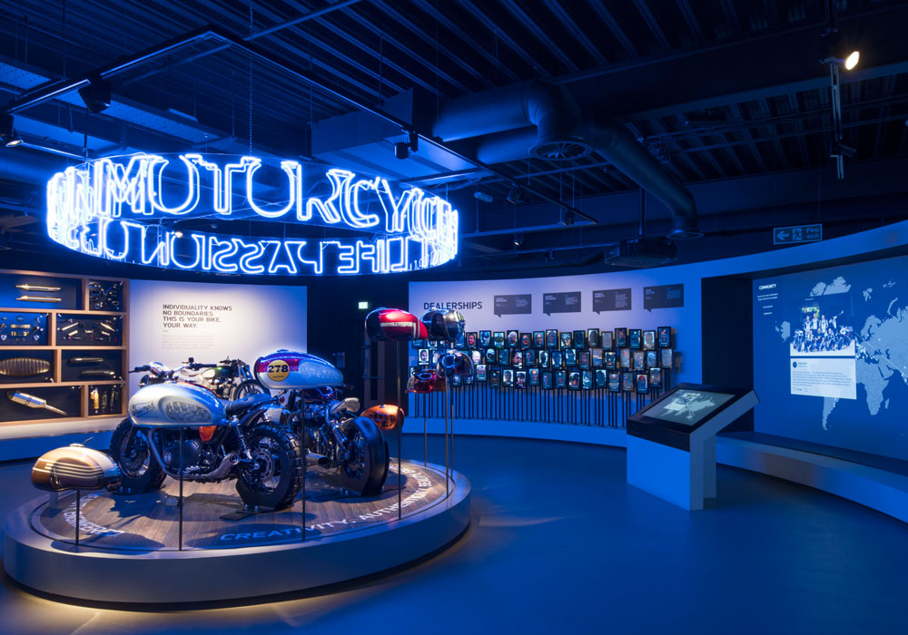
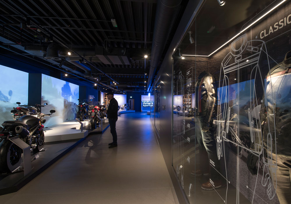
The design consultancy collaborated with Triumph Motorcycles to create a world class visitor facility within the heart of its Hinckley factory in Leicestershire. The Triumph Factory Visitor Experience is a site of pilgrimage for motorcycle enthusiasts and general public, offering an inspiring and informative 1,200-square-metre exhibition and factory tour, including café and shop. The exhibition presents a chronology of Triumph’s historic and contemporary achievements in motorcycle design, engineering and manufacture. It offer visitors a deeper appreciation of the authentic heritage and ongoing success of this genuine British icon and international super brand. The exhibition connects with existing riders and captures the imagination of new customers, telling a passionate story of Triumph Motorcycles by the people who make them and by the people who ride them. Studio MB was responsible for delivering this brand experience, from master planning to onsite completion as a design and build package.
Residential Design Over £1 Million
Company: Regina Sturrock Design Inc
Project Title: Contemporary Manor
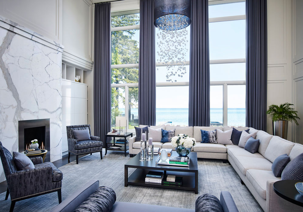
A waterfront home with manoresque proportions and contemporary lines impresses and guides one through classically-framed openings and clear sight lines. Representing a 2.5-year, from-the-ground-up project, this luxury-driven family residence accumulated its intuitive layers over time. A comprehensive scope of work included planning, architectural detailing, custom features, and millwork concepts. Together with all the finer points in interior design and decor, it marked a holistic approach where architecture and art would connect. Upon entering the home, there is an immediate sense of quiet luxury that may best be defined through the subtleties in beautiful materials, classical order and a clean-lined sensibility. The first-impressions great hall, a cocooned inner hall, and the commanding two-storey great room represent an enfilade of harmonic spaces that each play with the sparkling waters of the lake beyond. Together, they provide a successive scene of reflection and undeniable beauty.
Residential Apartment Under £1 Million
Company: Elliot James
Project Title: Cuscaden One
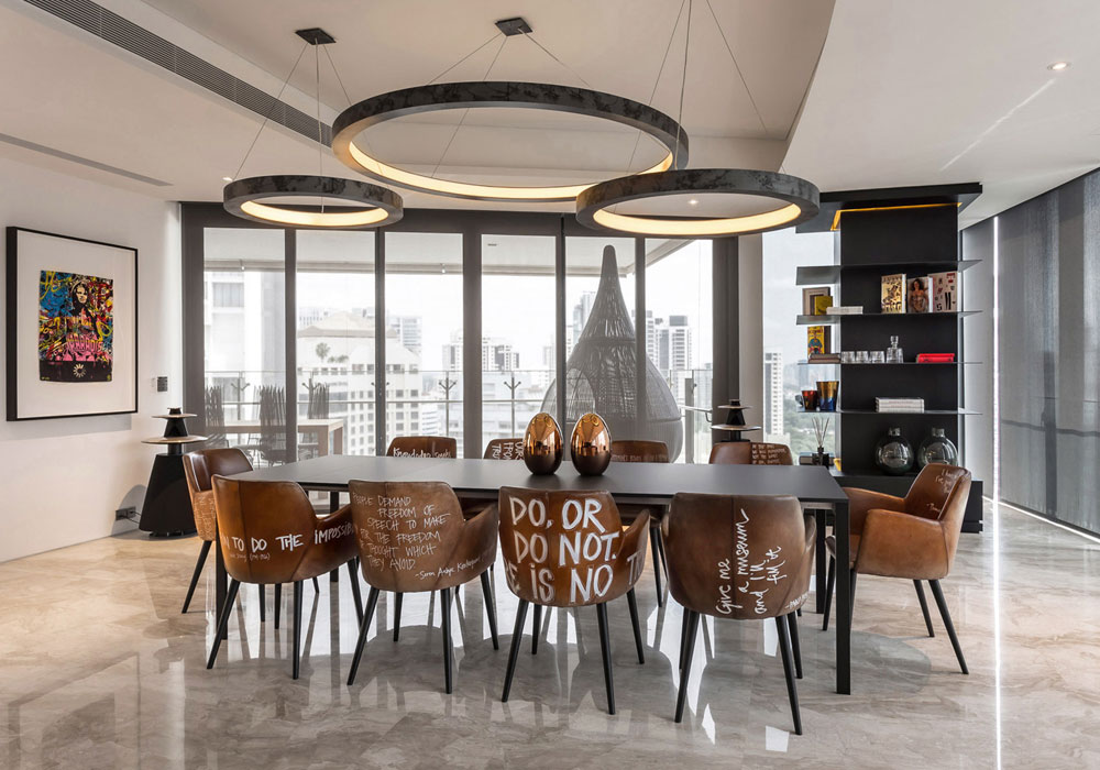
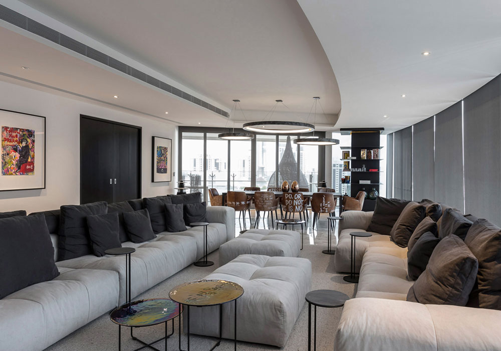
The client wanted the apartment to be relaxed with a funky, edgy style that would cater for his family when relaxing but also allow for larger gatherings with abundant seating and a very informal, welcoming atmosphere. The style for the apartment was to be bold but simple. The design team wanted the apartment to have a clean, monochrome palette throughout to reflect the simplicity in the brief but to also act as a calm, backdrop to the bold shapes, large proportions, bespoke furniture and exciting commissioned artwork throughout. The aim was to create a home that could be warm and intimate for the family but also function to host large gatherings with a fun and informal setting.
Residential House Under £1 Million
Company: NEVERMORE
Project Title: The Irrawady House
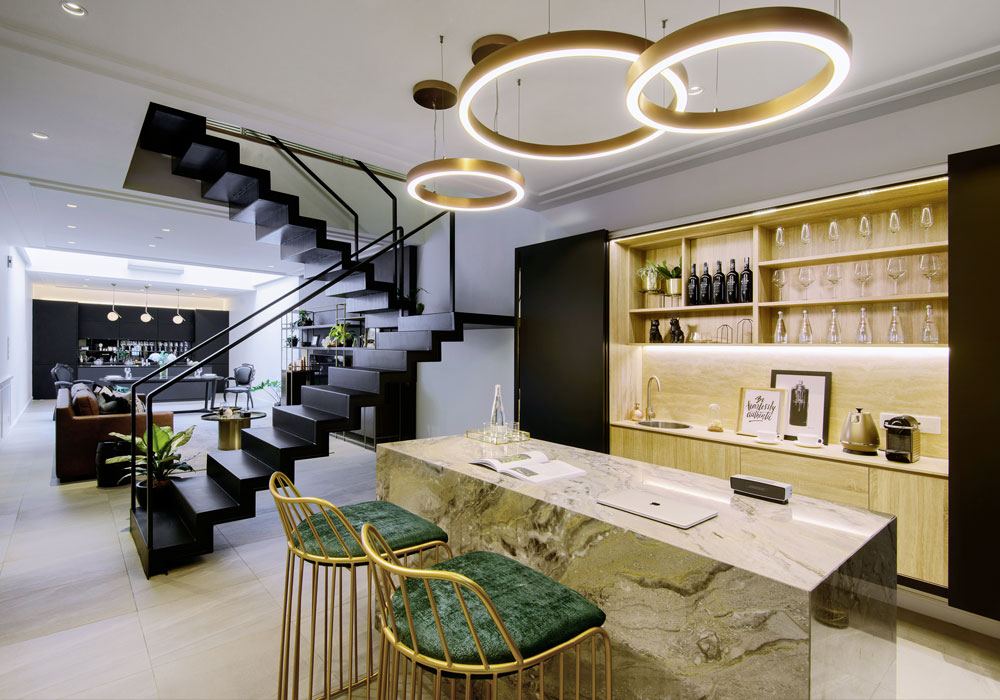
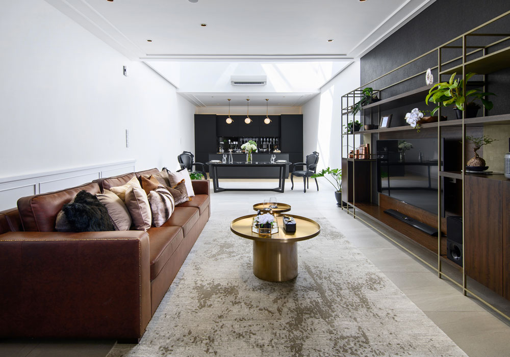
The modern-day luxury home manages to combine both old-school opulence and contemporary cosiness under the same roof. Superior air ventilation incorporated into the interior of this property allows it to feel larger and spacious. a stark contrast to the dark and cramped image of a pre-war house. The elongated living room is connected with the kitchen, dining area and open bar area with the decor featuring a modern twist to classical European design. Including with a daring open staircase, this bold design is further enhanced with the selection of large circular pendants and an imported Italian marble counter. Gold finishes are thrown in to elevate the overall look with a hint of glitz. Meanwhile, the living room, dining area and kitchen enjoy the warm glow derived from the skylight feature, giving these spaces a natural comfort.
Restaurant Design
Company: Goddard Littlefair
Project Title: The Garden
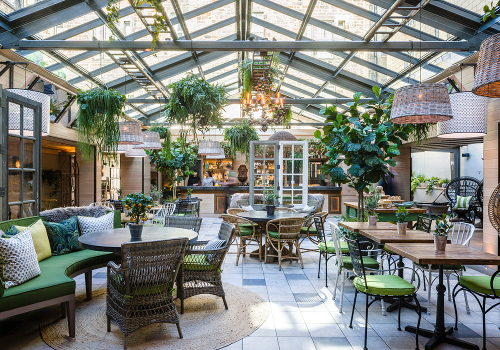
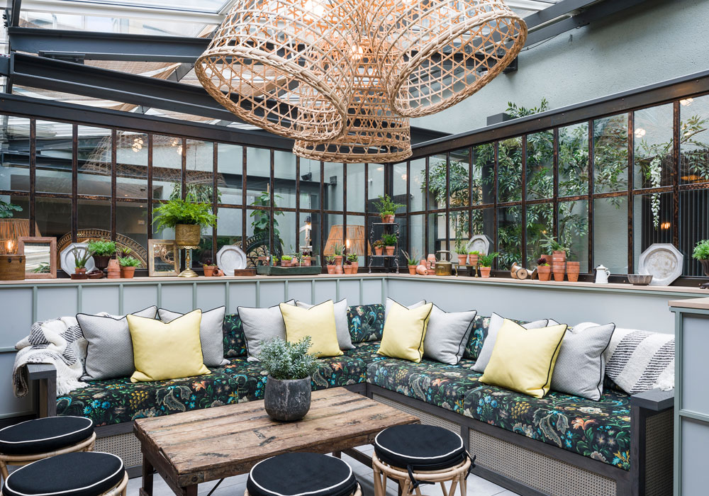
The Garden is a destination all-day food-and-beverage space for hotel guests and local Edinburgh residents, located within the former courtyard of the Principal Edinburgh Charlotte Square. Taking inspiration from the great hothouses and orangeries of historic country estates, Goddard Littlefair was tasked with developing a green heart to the scheme, transforming the previous outdoor space into a year-round dining destination. Filled with plants, trees, hanging baskets and vines, the new space is a biophilic delight, with the new glass roof providing natural lighting and open views of the sky, resulting in the creation of a magical oasis, right in the heart of the hotel.
Retail Design
Company: XYI Design
Project Title: Latitude Sports Park
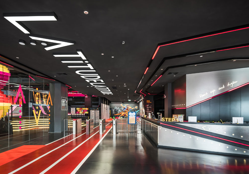
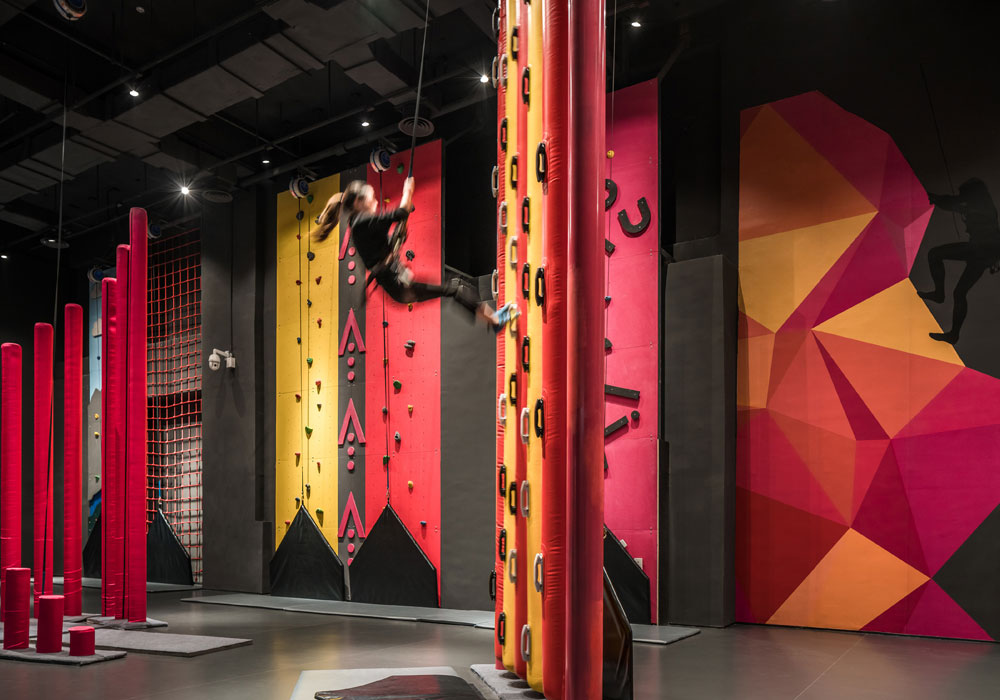
This multipurpose athletic indoor sports space is aimed at young people, family activities, and company outings. The word ‘latitude’ implies space and breadth and the design team has expanded on the original implications of this for the Australian brand to create a multipurpose indoor sports park combined with outdoor topography. ‘Sports for everyone’ serves as the both the style and recreation concept, and it is hoped that the design will inspire everyone who visits to be more active. The design studio aimed to create a visual experience that encourages visitors to have fun while engaging in sporty activities within the park space, ultimately promoting a more active lifestyle that combines activity with leisure time.
Show Flats & Developments
Company: HWCD
Project Title: The Trevista Sales Gallery
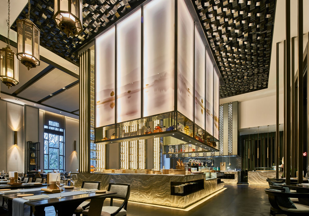
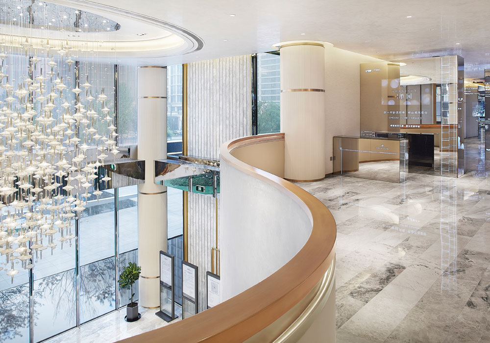
Located in flourishing Hangzhou and surrounded by beautiful natural landscapes, the luxurious Trevista showcases a concept of refined spatial arrangement created through flowing space lines, rich textural materials, and artistic decoration. The design idea originates from the textures of ‘water, mountain and silk’ which all emphasise smooth flow throughout the interior designs to create a unified and pleasing artistic rhythm by manipulating the space, light, and structural order. By playing with light and form, and with the ‘super flat’ architecture style, the project stands out amid the luxury residences in Hangzhou.
If you’d like the chance of winning an industry-acclaimed SBID Award for your projects and think your designs can compete on a global scale with the world’s most esteemed interior designers and design practices, make sure you enter next year!
The SBID International Design Awards 2019 is set to be open for entries in March/April so visit www.sbidawards.com early next year for more information on official opening dates and deadlines.
