 22nd May 2019 | IN KBB DESIGN | BY SBID
Project of the Week
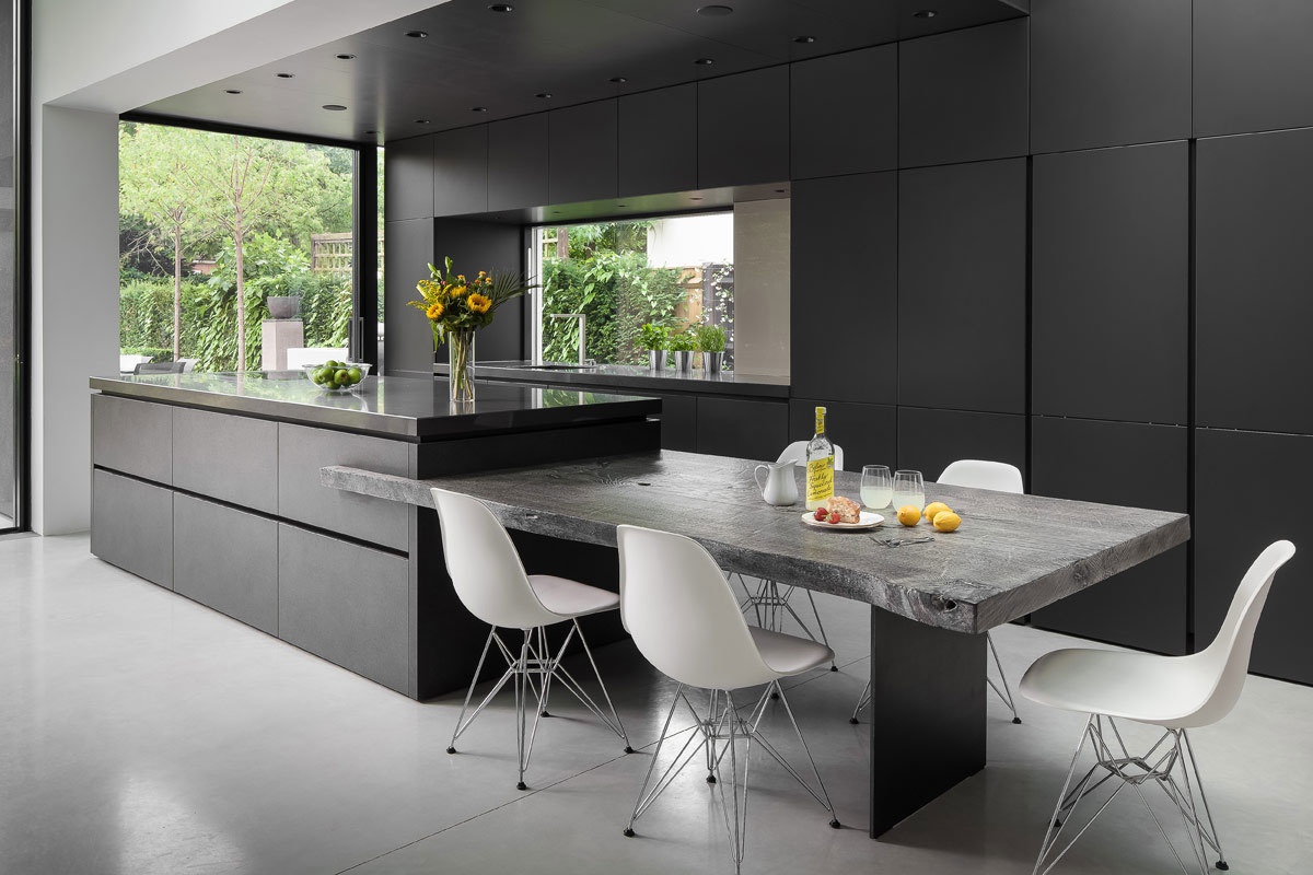
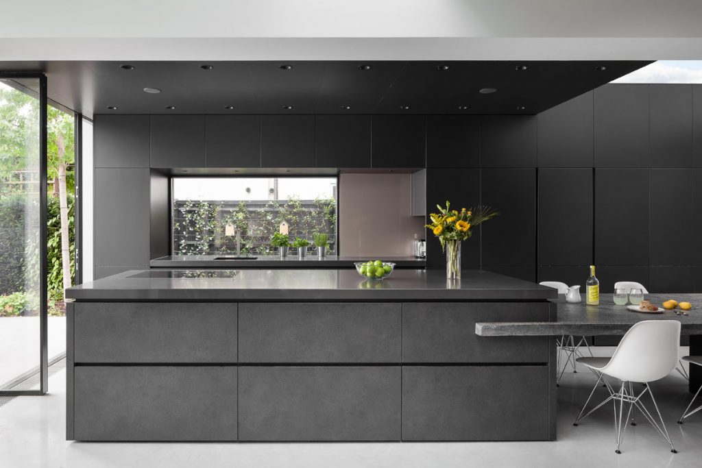
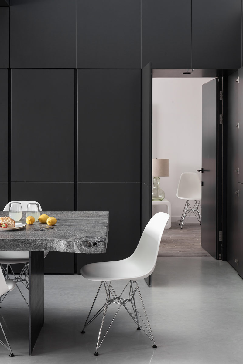
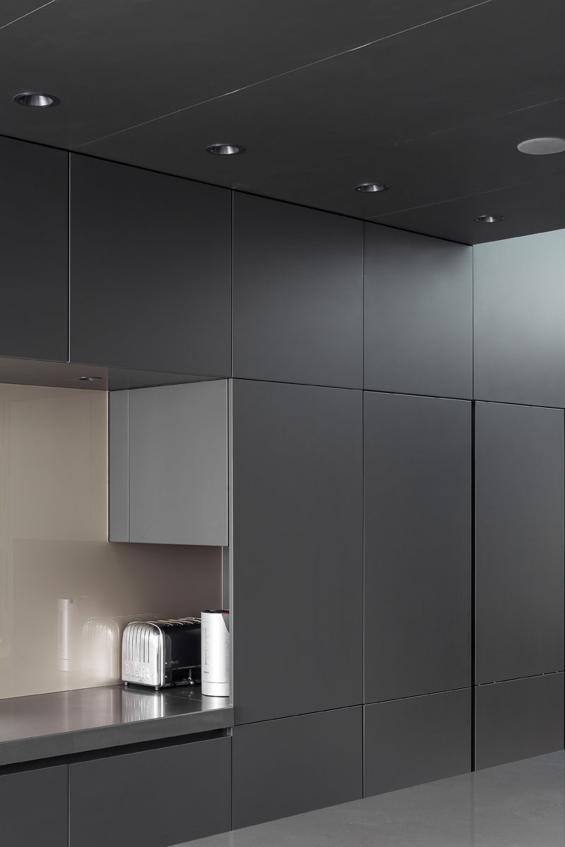
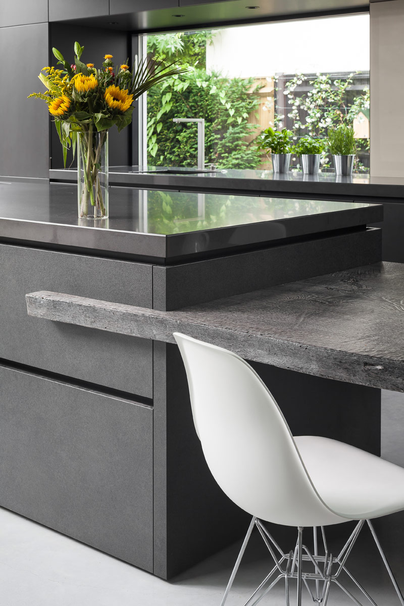
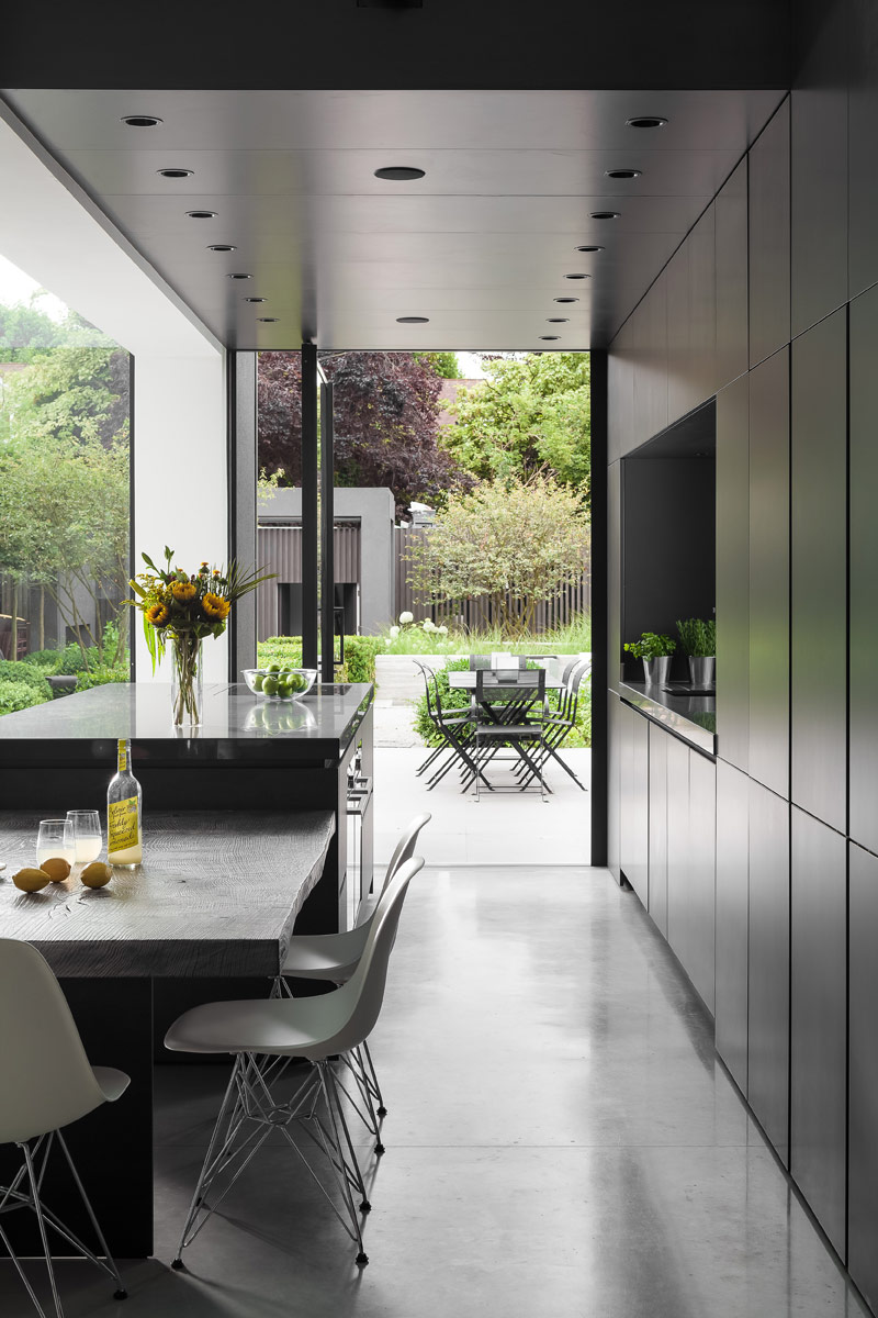
This week’s instalment of the #SBIDinspire interior design series features a contemporary London kitchen design in sleek, bold tones to blend into the distinct style of the surrounding architecture within a recently extended building. Halcyon Interiors designed the kitchen with symmetry and clean lines as this was the client’s desire, yet the architecture of the finished building would be asymmetrical and on differing levels. Along with Architect, Jason Coleman at Robert Dye Architects, Halcyon developed a dramatic, monolithic design in a graphite hue, with wood elements to add warmth. Precision planning of the lines of the furniture and appliances create the desired symmetry of this space. A striking effect, fitting with the bold architectural style of this newly extended home.
Sector: KBB Design
Company: Halcyon Interiors
Project: Warwick Road
Project Location: Pinner, United Kingdom
What was the client’s brief?
Our London-based client briefed us to design a kitchen with symmetry and clean lines to work with the asymmetric architecture of the new building layout, and balance tonally with its surroundings.
What inspired the interior design of the project?
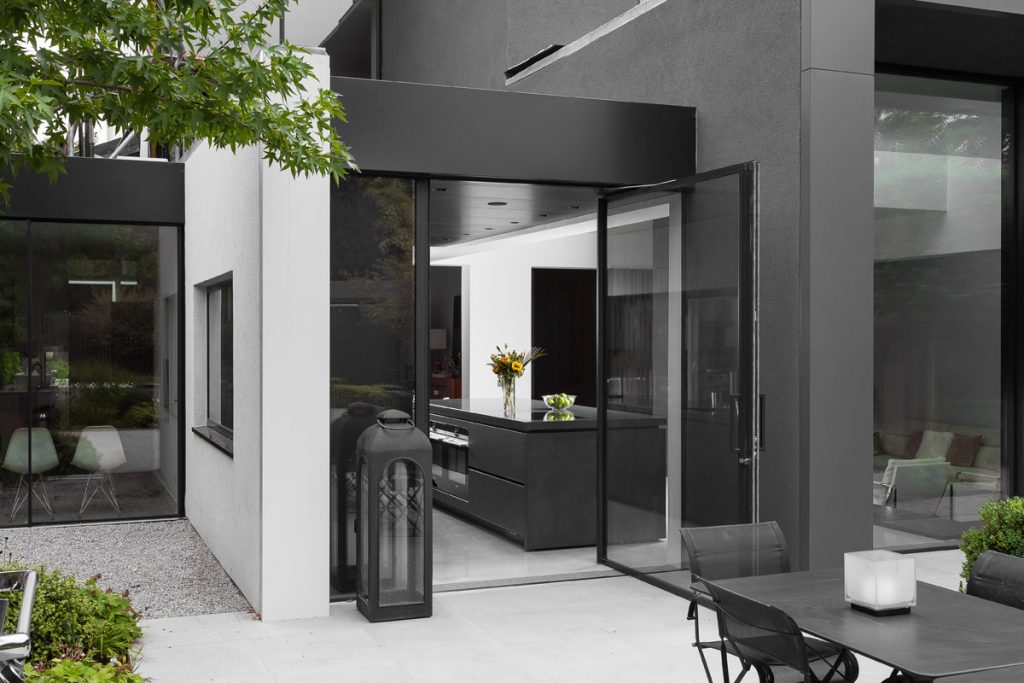
The monolithic look of the kitchen was inspired by the striking architecture of the building, which was instrumental in deciding on the layout and design of the overall kitchen. Working closely with the Architect, Jason Coleman at Robert Dye Architects to develop the design, we achieved the dramatic look we were aiming for by choosing a dark graphite for the wall units and continuing the colour and lines of the design up and over the ceiling and into the skylight, which further emphasised the architectural elements. Over hanging the doors to completely hide the plinth and create a small shadow gap between the doors and the poured concrete floor added further to the striking effect.
What was the toughest hurdle your team overcame during the project?
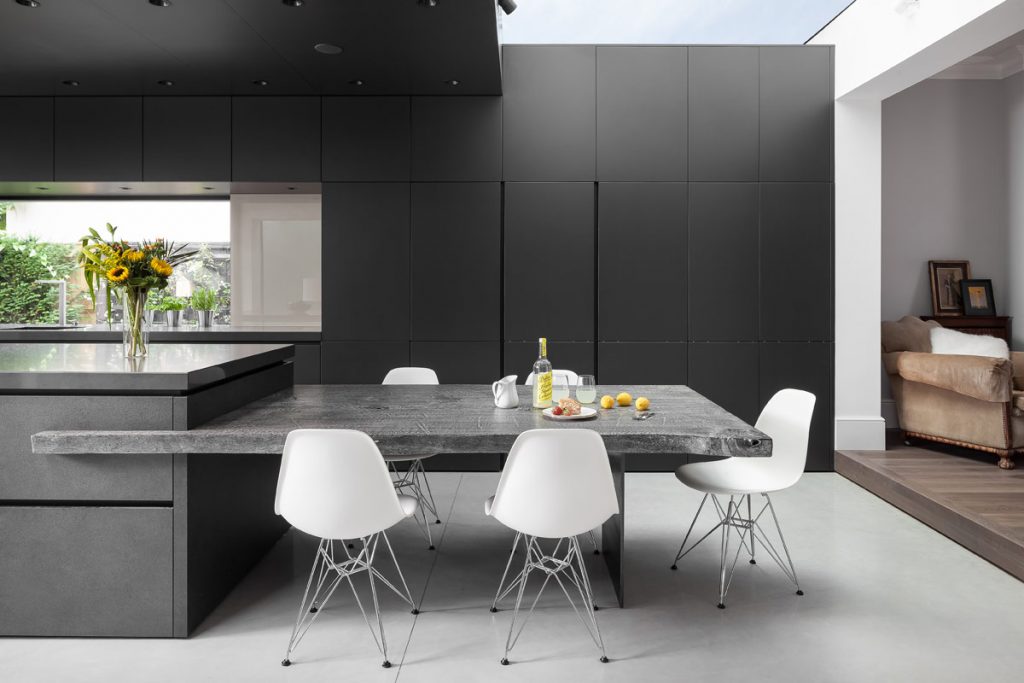
The main hurdle was getting everything lined up. As any designer will know, working with materials such as plaster and brick means there is no such thing as a dead straight wall or perfect angle. It was key to have everything perfectly in line, without this the monolithic look would have been interrupted. We worked extremely closely with the builders and architects working on this project, and were able to ensure the entire project was supremely exact, maintaining the project’s perfectly aligned look.
What was your team’s highlight of the project?
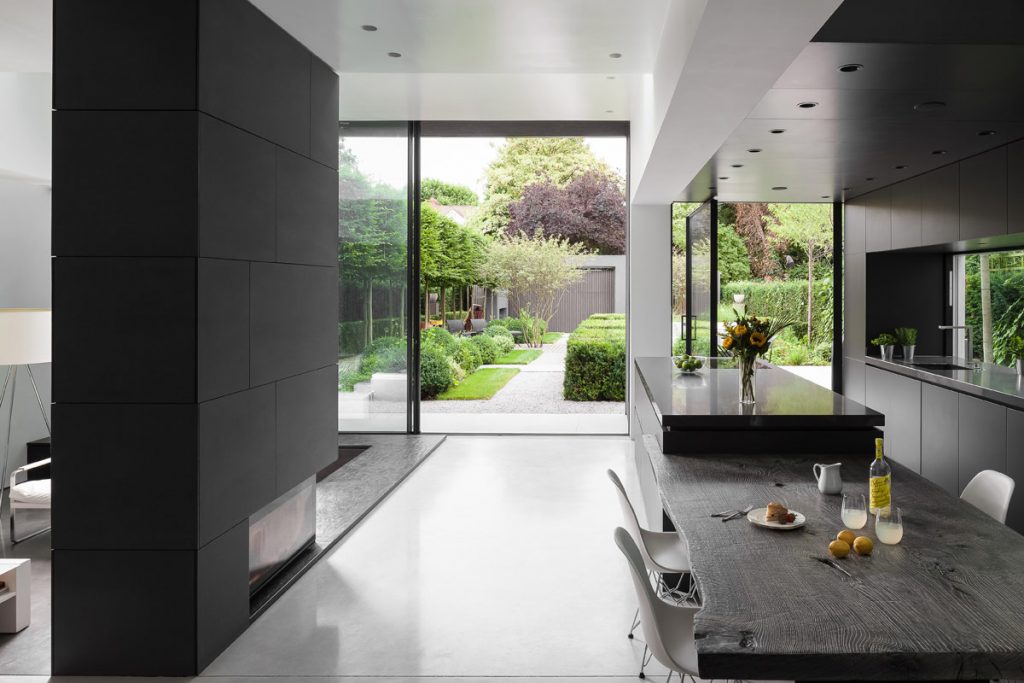
Seeing the final result! As wonderful as CAD images are nowadays it never completely captures the end result in all its glory. Especially once the external details had been completed. It’s not just about seeing our work complete, it was seeing the hard work of the whole team bringing together the completed look. This was such a great project to work on.
Why did you enter the SBID International Design Awards?
We truly believed this was a great project to show our skills as a team. It took a lot of organisational skills, design knowledge and a fantastic fitter to take it from an inspirational design on paper to an inspirational kitchen in real life.
Questions answered by Louise Reynolds, Lead Designer at Halcyon Interiors
If you missed last week’s Project of the Week featuring a luxurious residential refurbishment with an elegant design scheme imbued with character, click here to see more.
We hope you feel inspired by this week’s KBB kitchen design! Let us know what inspired you #SBIDinspire
