 18th February 2020 | IN DESIGN ADVICE | BY SBID
It’s time to talk toilets. Are you wondering what to do with your next guest loo? As the old saying goes, big things come in small packages – and in this case, the toilet! Usually the smallest room of a residential project, SBID Accredited Designer, Richard Dewhurst of Richard Dewhurst Interior Architecture has much bigger ideas. Who said the guest lavatory can’t be just as lavish as the rest of the house? Richard explains why guest washrooms deserve their time to shine and how he has designed these small, often overlooked spaces with maximum impact – making a statement that will leave a lasting impression on any visitor!
Having worked on many residential refurbishment projects over the years, I’ve come to realise that the smallest room in the house can offer one of the best opportunities to get creative and interestingly, it seems that even the most conservative of clients can be convinced that the guest loo is a wonderful way of showing friends and family that they not only have a fun side, but are willing to push the design boundaries, giving them a bit of added kudos to boot.
On many occasions I’ve been able to spend a disproportionally larger budget on this room than anywhere else in the house, allowing myself to try out new ideas, use interesting materials or simply to specify an item I haven’t had the chance to use before. With the seemingly unending supply of new and exciting products coming to market, this room provides a perfect platform to let one’s creativity shine.
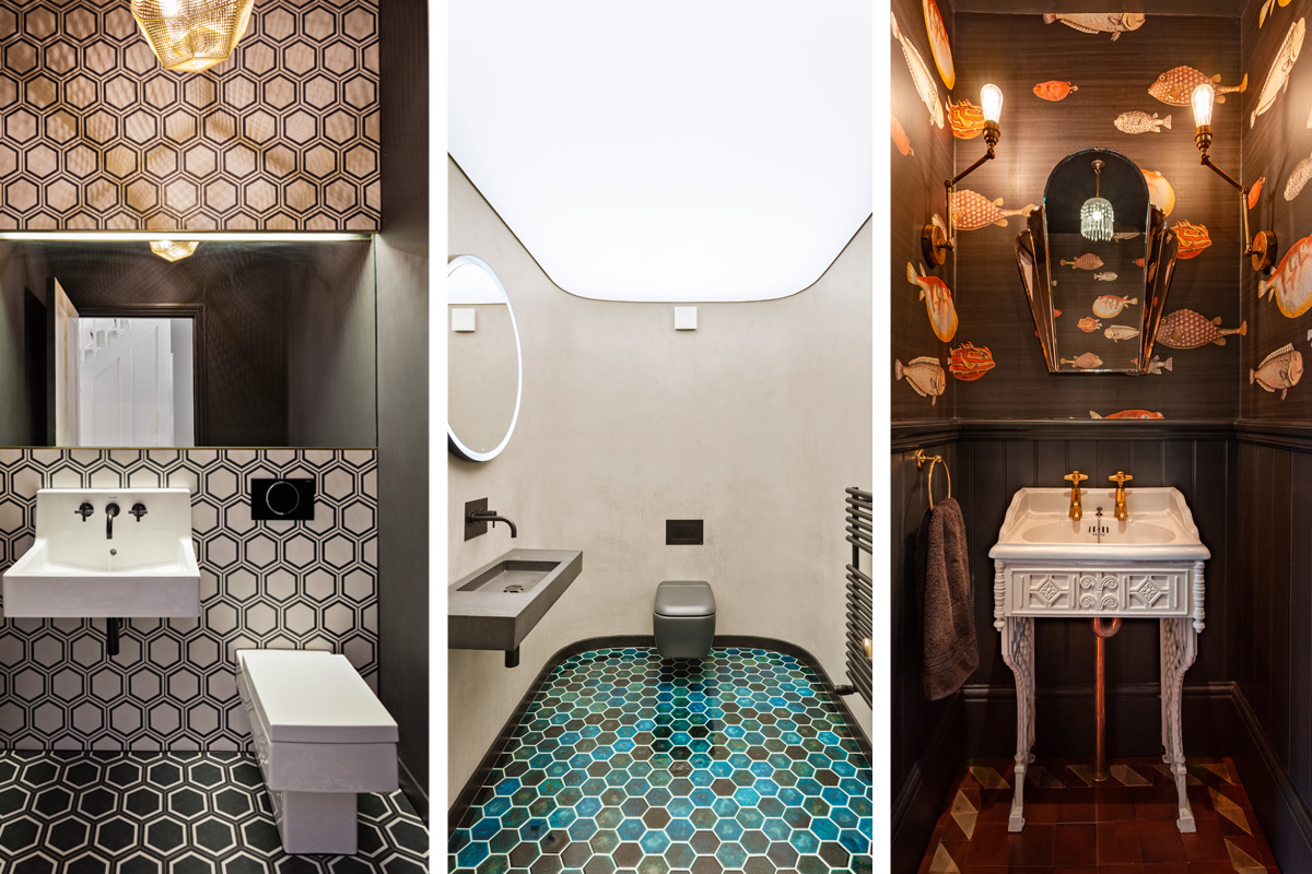
Here are three guest loos I’ve recently designed, which incidentally, are in different but identical houses on the same side of the same street, creating a touch of loo envy between the neighbours!
Geometric Monochrome
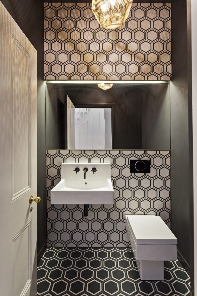
In this room I decided to go for a strong monochrome look, creating a bold and powerful statement by using different versions of the same hex tile from a range by Mandarin Stone. I further accentuated the geometric feel by using Duravit Vero Sanitaryware and a facetted, brushed & pierced brass ceiling light from Tom Dixon. The moody and sultry atmosphere was further enhanced by painting the walls and ceiling matt black and by using a matt black tap by Dornbracht.
Reclaimed and Eclectic
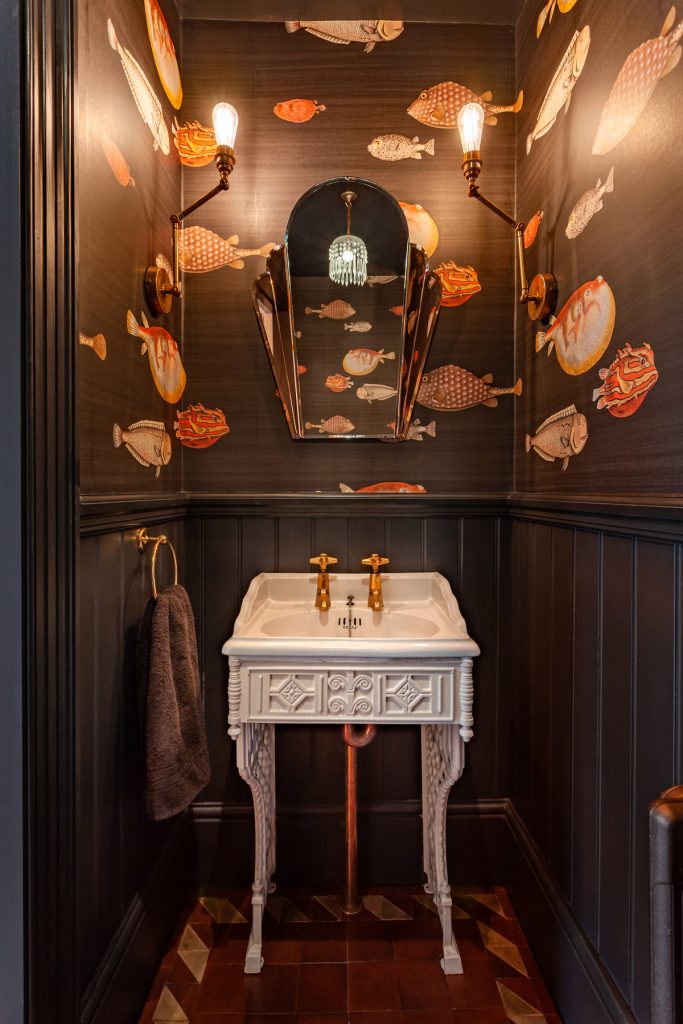
My clients wanted a more traditional look in their loo so I lined the room with new tongue and groove panelling painted in Farrow & Ball Off Black, complimented by a fun but sophisticated Fornasetti feature wallpaper from Cole & Son. The floor was covered in wonderfully patinated Victorian floor tiles salvaged from a recently demolished conservatory and laid in a pattern of my design. I sourced the Victorian sink & stand from English Salvage and after a light restoration, it looked amazing! A pair of lovely art deco taps supplied by Architectural Antiques, a vintage mirror and articulated wall lights by Dowsing and Reynolds completed the look.
Futuristic Modernism
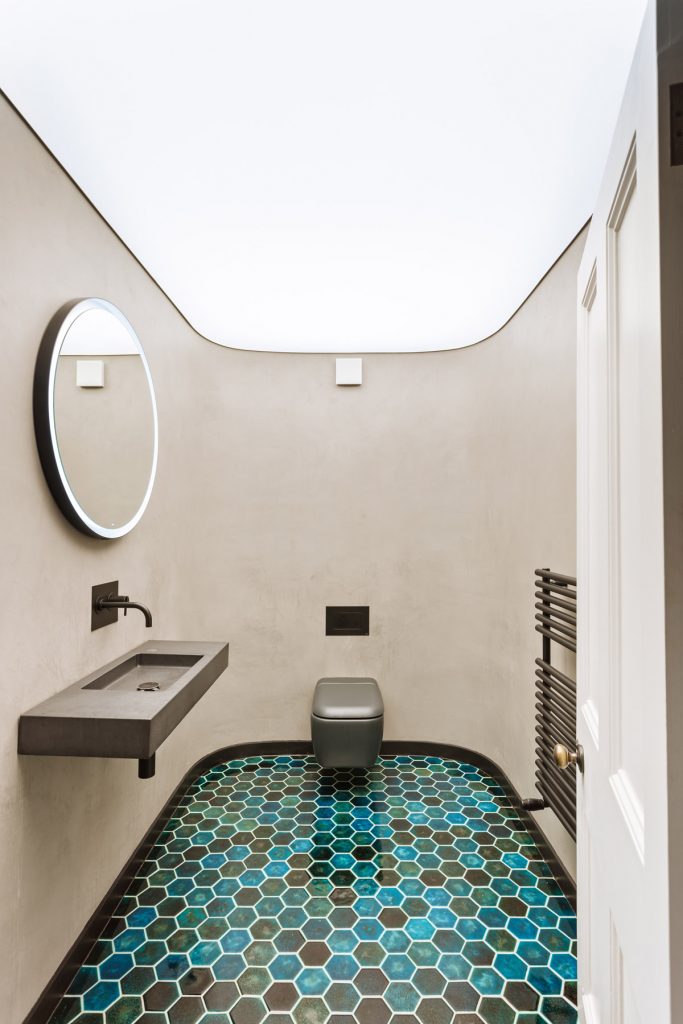
Sometimes it’s fun to design a completely unexpected space and I certainly had the opportunity to on this project. The stunning backlit stretch ceiling by Barisol created a perfectly uniform light spread, and the seamless curved polished plaster walls gave a feeling of spatial infinity. This was offset by the handmade turquoise Czech tiles; adding a burst of deep colour and lushness to the room. The concrete sink was by Kast and space-age looking wall-mounted toilet from CP Hart.
About the Author
Award-winning designer, Richard Dewhurst of Richard Dewhurst Interior Architecture specialises in quality interiors for the residential and commercial sector. After recently relocating his practice to Portsmouth, Richard is now taking project enquiries in the South Coast.
This article was written by Richard Dewhurst of Richard Dewhurst Interior Architecture.
If you’d like to become SBID Accredited, click here to find out more.
