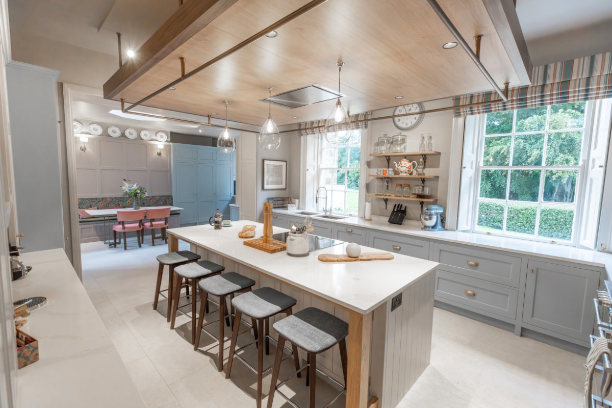
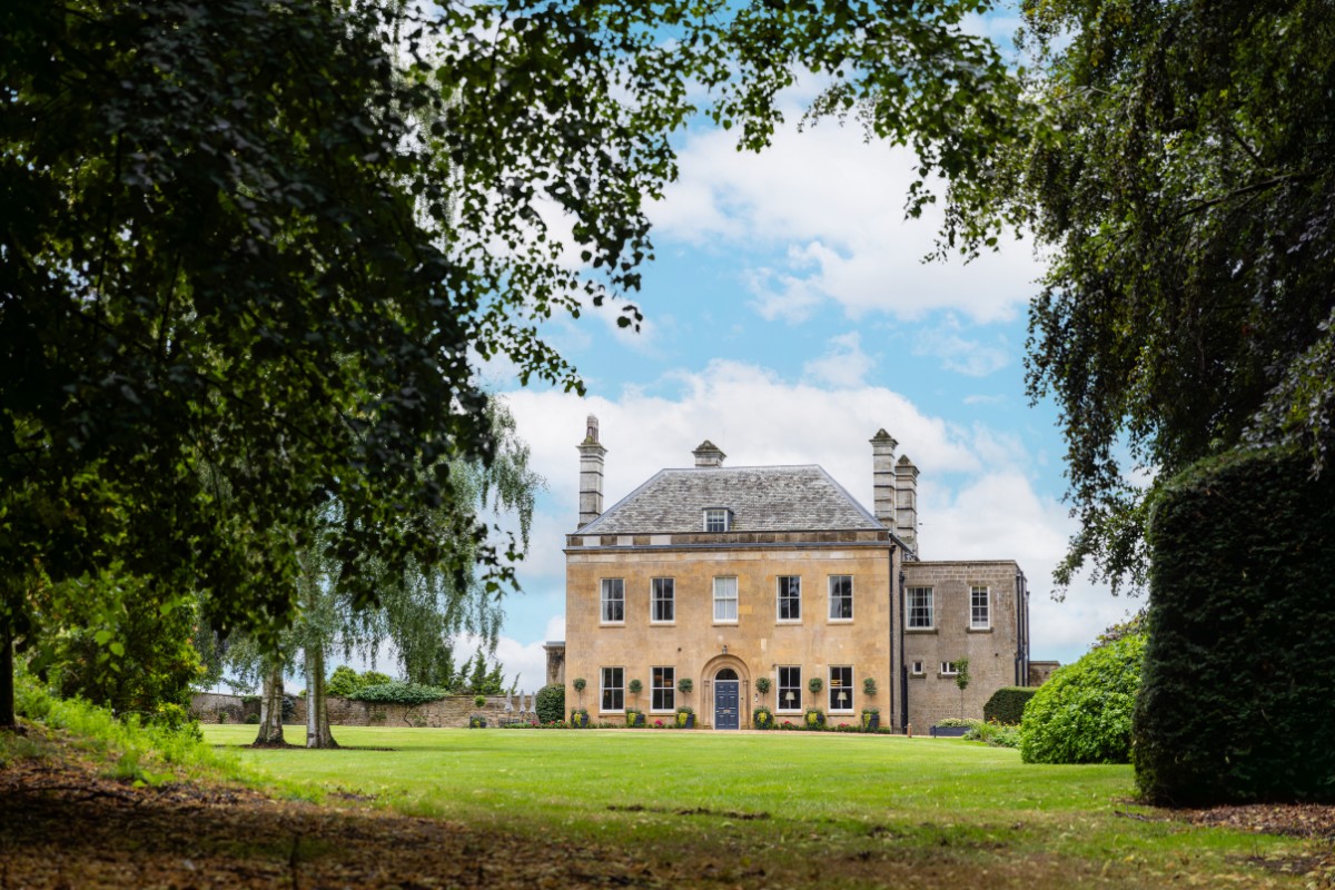
The magnificent Grade-2 listed Georgian Cuckney House on the Welbeck Estate, one of the UK’s largest and historically important country estates, has been given a complete interior makeover by Rachel McLane Ltd.

The three-and-a-half-year project converted the vacant Cuckney House into luxury 15-bedroom holiday and event accommodation.

Rachel McLane Ltd

The 15,000-acre Welbeck Estate on the Nottinghamshire, Derbyshire border near Sherwood Forest has a history that can be traced back nearly 900 years and is run by The Welbeck Estates Company.

As the most prominent House on the Estate, it has been thoroughly but sensitively transformed during the £5m redevelopment project to provide a single high-spec property for extended holiday and event-related stays.

Rachel McLane Ltd

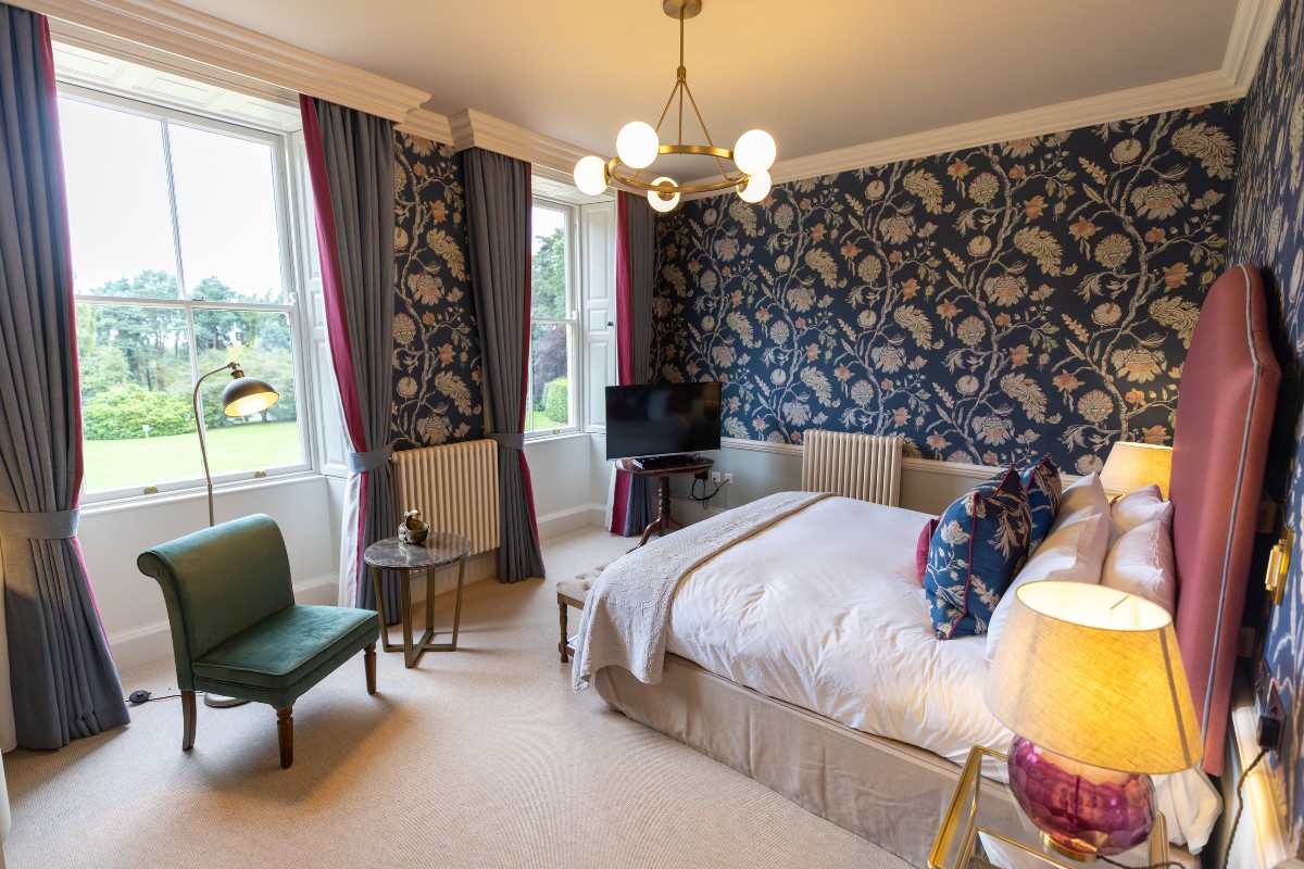
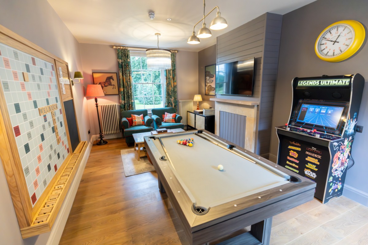
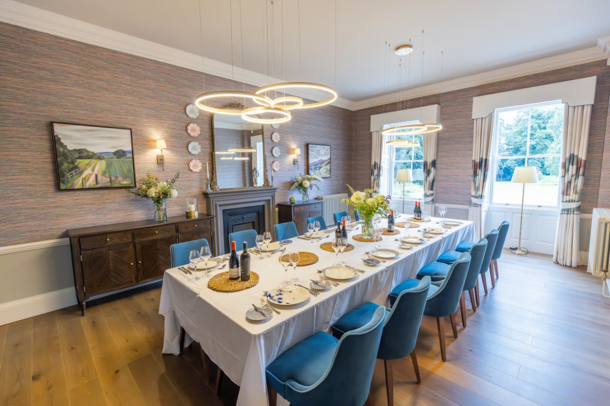
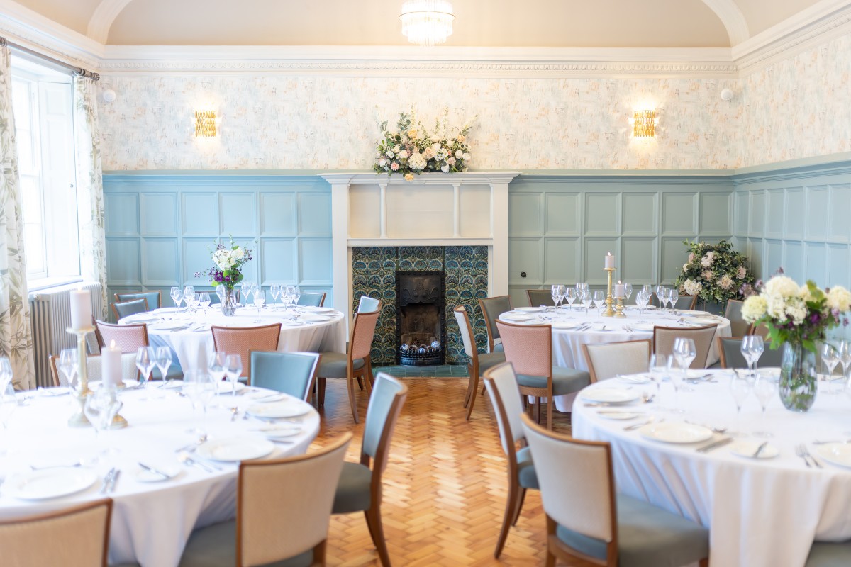
Its 15 bedrooms include family suites and a bridal suite, allowing the House to sleep more than 30 people, and it has three reception rooms, including a 28-seat dining room and a 40-seat function room. There is a large, well-appointed kitchen, games room, snug butler’s pantry, and outside, there is a large terrace with two BBQs and a wood-fired pizza oven, a walled kitchen garden and a tennis court.

The transformation of Cuckney House is part of the long-term Welbeck Project to re-purpose and breathe new life into the Estate’s collection of historic buildings.

Rachel McLane Ltd

The entire project was managed by the Welbeck Estate, which made it run like clockwork as the Estate has incredibly skilled teams across different departments, including stone masons and builders, some of whom lived on-site to see the project completed.

Working closely alongside the Estate team, we managed through internal and external structural design changes that included a reconfiguration of the walls on the first and second floors, complete re-roofing, insulation throughout, refurbishment of all flooring, including reinstated parquet flooring, and the raising of the ceiling height in the top floor rooms, as well as electrical drawings, lighting designs, colour scheme and fabrics.

Rachel McLane Ltd

We could respect Cuckney House’s listed status while giving each room its identity and personality, reflecting the original use of the building as a Manor House.

The design intent was to make Cuckney House feel like it had evolved rather than an overly designed modern interior. The overall look is eclectic and traditional, with a contemporary twist suited to today’s living expectations.

Rachel McLane Ltd

The interior design also features a new art collection that the Rachel McLane team procured to make it look like the collection had evolved. We worked with the Estate’s collections team on scans of artwork from the collections and also with a commercial art gallery, mixing traditional and contemporary artwork on the walls and around the rooms.

An added feel of the area’s landscape also comes from the work of a ceramic artist who rents a studio from the Welbeck Estate and whose work is on display in the House.

Rachel McLane Ltd

The restoration of Cuckney House has also been emphatically sustainable with the provision of electric car charging points, renewable energy heat sources, and solar panels. In place of energy-consuming kettles in each room, each floor was designed with a communal coffee and tea pod.

Nigel Porter, Property & Rural Estates Director, said, “For me, the interior design and the quality of the craftsmanship stand out.”

About Rachel McLane Limited

Rachel McLane Ltd offers a full design service that interprets a client’s brief and delivers their project on time, on budget, and as envisaged. Every client and every project is different, so how we get there is entirely up to the client. Not every project requires internal spaces reconfiguring; not every client has an architect or project manager. However, as a general rule, their project process offers: Feasibility Study – narrowing down your options; Concept Design – sketched visuals of how your space might look; Design Detailing – producing drawings & plans for trades; Purchasing – new, bespoke or repurposed; Fit-Out.

If you’d like to feature your news or stories on SBID.org, get in touch to find out more. 

If you’d like to become SBID Accredited, click here for more information.

A striking retail or hospitality counter is central to an outlet’s design and success – and should always tell a good story. Even better when the story is an ethical and sustainable one, that focuses on recycling waste materials and reducing the carbon footprint of the outlet.

Focused primarily on brands who put sustainability high on their agendas, Edinburgh-based Kenoteq are bringing new aesthetics and a strong circular economy language and style to interiors. The K-BRIQ and the slimmer K-SLIP tile product, are breathing new life into construction and demolition waste, one of the world’s most prolific waste streams – and, most importantly, they are helping to divert them from landfill and convert them into decorative surfaces through a low energy and carbon production process. The cladding products are made from near 100% waste materials, a mix of recycled aggregates (old bricks, old stone and old mortars to headline the main ingredients), with a good dose of recycled plasterboard and recycled pigments to give the colour variety.

Not only is the counter a key point of sale, it needs to attract and hold attention as well as be robust, durable and extol and support the brand or outlet’s style and values.

Kat Antos-Lewis Photography

Kenoteq’s striking bricks and tiles are available in a myriad of both traditional and bold colours which not only look stunning but critically are unfired and so have a tiny carbon footprint compared to traditional bricks and ceramics. But with a comparative durability and strength.

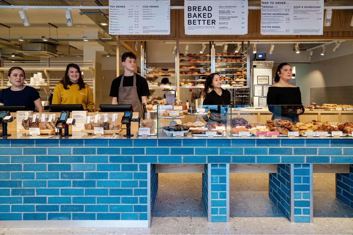
Gail’s Bakery is one of the first nationwide brands to showcase this product to support their ethical ‘neighbourhood bakery’ brand.

Holland Harvey began working with bakery Gail’s nearly 10 years ago, refurbishing the original Hampstead bakery in 2013. They have now delivered over 60 new bakeries in neighbourhoods across the UK and recently used the Gullane Cyan Light K-SLIP to show-off the bakery’s counter items in the Weybridge outlet in Surrey. Bold and fresh, the geometric counter and seating designs in this teal blue are inspired by the historical charm of nearby Brooklands Airfield and the geometric architecture of the existing building.

Photography: Linnemann Design
Kat Antos-Lewis Photography

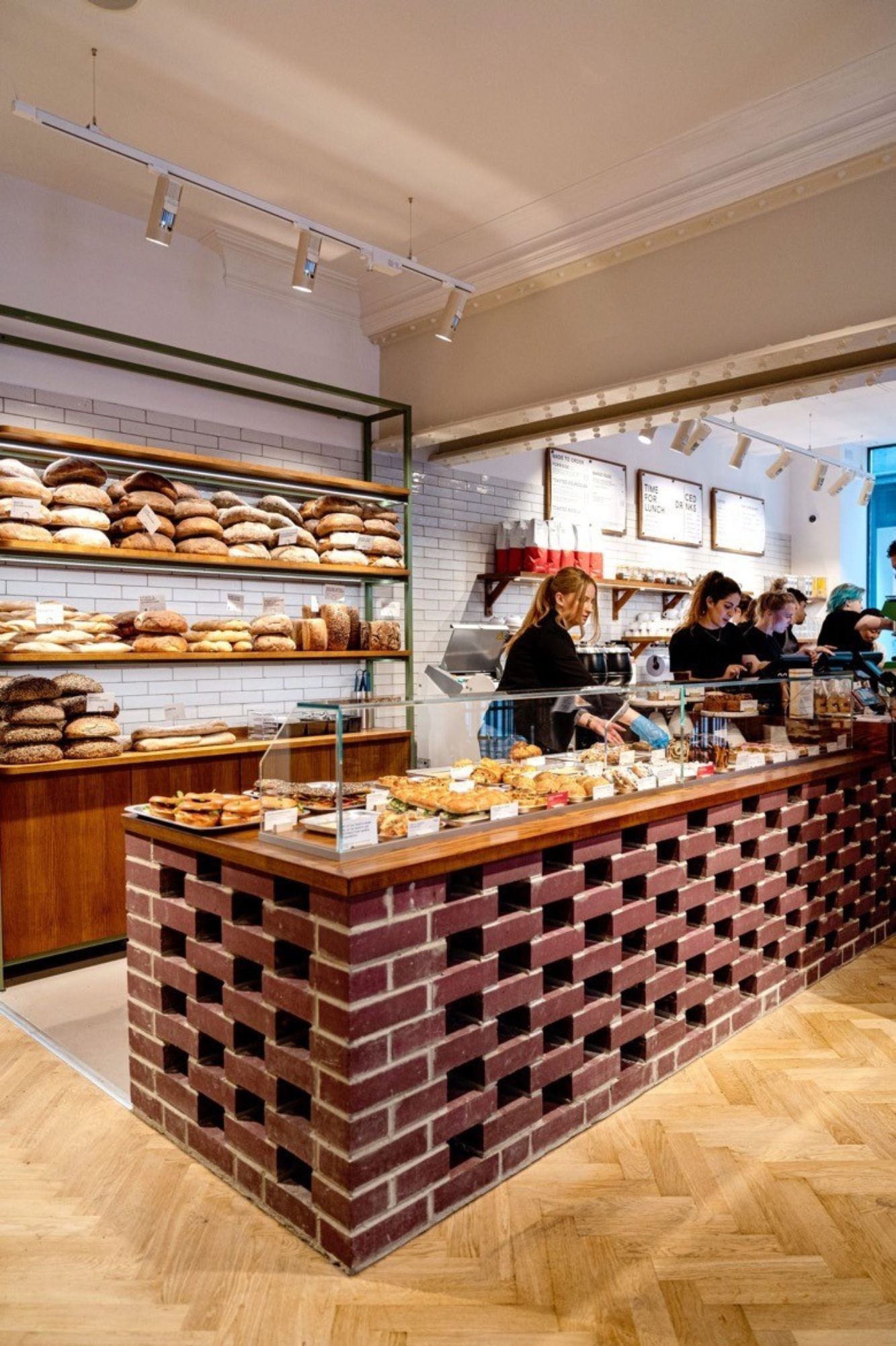
Gail’s Bakery’s Kings Street, Manchester outlet designed by sustainable hospitality specialists, Object Space Place, showcases the magenta K-BRIQ in a striking checkerboard “hit and miss” design – Kenoteq calculated the carbon savings of using the K-BRIQ in this design over a traditional brick to be the equivalent of boiling the water for 100,000 cups of coffee!

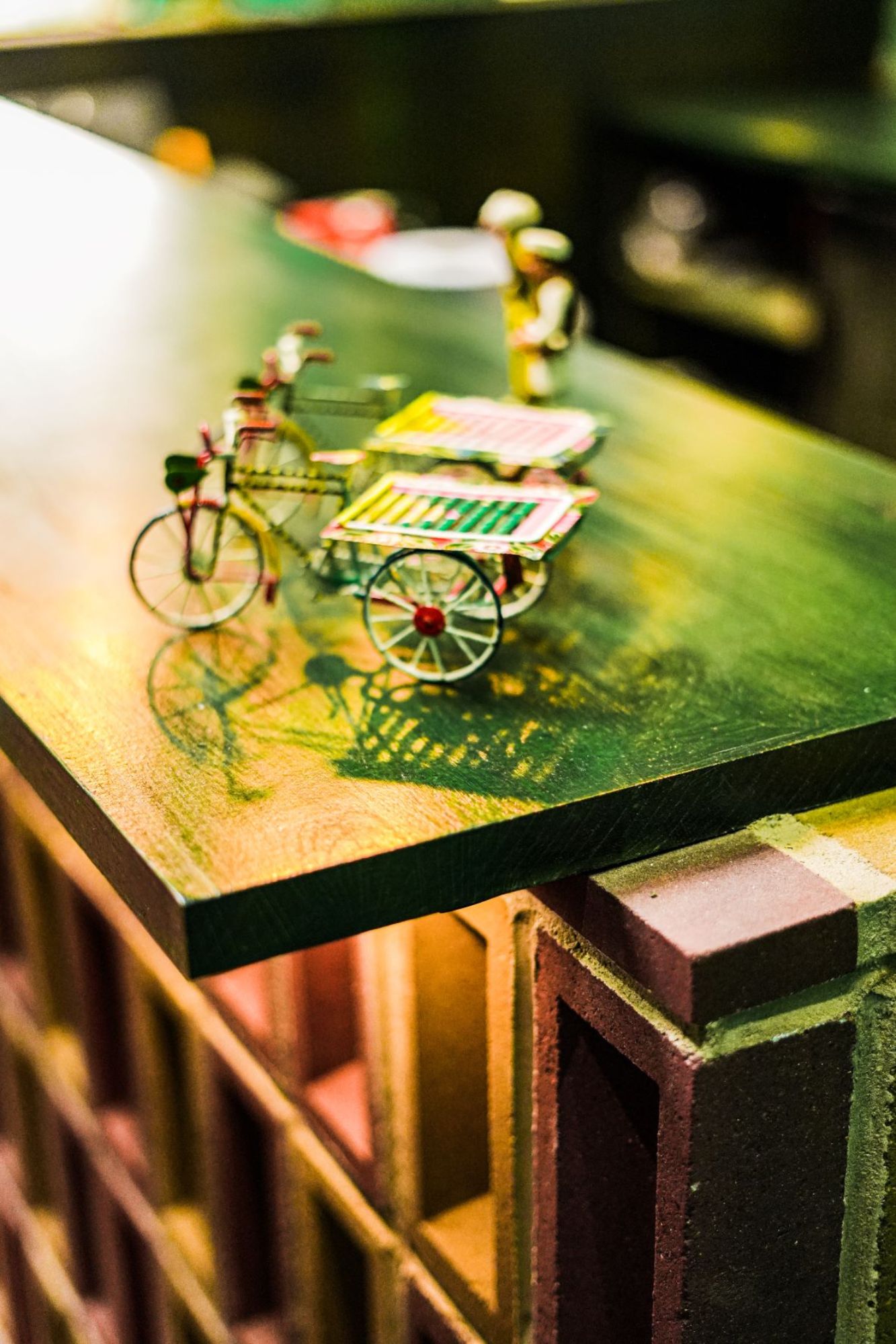
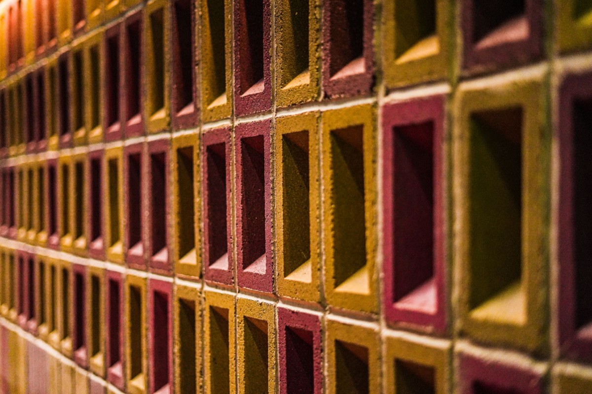
“The world needs to move rapidly towards a more sustainable future and the hospitality sector can take a leading role in this,” says Rizvi Khaleque, CEO of Indian Streetfood Chain, Tuk Tuk in Edinburgh, whose latest vibrant interior design by leading Edinburgh-based interior design firm, S+ Co, puts the Gillespie Magenta and Heriot Mustard frogged K-BRIQs into a statement bar design with a jewel-like quality that is a focal point for diners. It also encases half a tonne of recycled construction and demolition waste. And saves over 130 kg CO2e compared to being built in traditional brick – a keen saving for a still relatively modest counter.

“The interiors for this second Tuk Tuk outlet took inspiration from the vibrant architecture and food found across India,” explains Claire Jones, Senior Interior Designer at S+Co. “S+Co looked to create a space that was welcoming and fun, a playful reflection of Tuk Tuk’s Indian street good culture and the diverse neighbourhood of their new location.”

Photography: Linnemann Design

The K-BRIQ and K-SLIP are fully circular products from the built environment for the built environment. Not only is careful consideration for the environment the story of the materials themselves, the production process uses minimal energy with no firing in the equation to significantly reduce the reliance on fossil fuels in production. Instead Kenoteq’s factory relies on renewable energy sources, biomass and wind power. Finally, the closed loop circular nature of the final product, means that K-BRIQs and K-SLIPs can be safely recycled themselves into recycled aggregate at their end of life – which means of course they can be remade into further K-BRIQ or K-SLIP products.

Good design decisions really don’t need to cost the earth!

About Kenoteq Ltd.

Design without compromise! Kenoteq is a pioneering UK company at the forefront of sustainable materials made from recycled waste. The newly launched first products are the revolutionary low carbon K-BRIQ® and K-SLIP™ currently the world’s most sustainable bricks and brickslips, unfired, made from 95% recycled construction and demolition materials together with recycled pigments, and are 100% recyclable. They are suitable for interior or exterior use and offer a wide colour palette. With a technical specification akin to traditional bricks and brickslips, the products benefit from a carbon footprint 95% less than their traditional equivalents.

If you’d like to feature your news or stories on SBID.org, get in touch to find out more. 

If you’d like to become SBID Accredited, click here for more information.

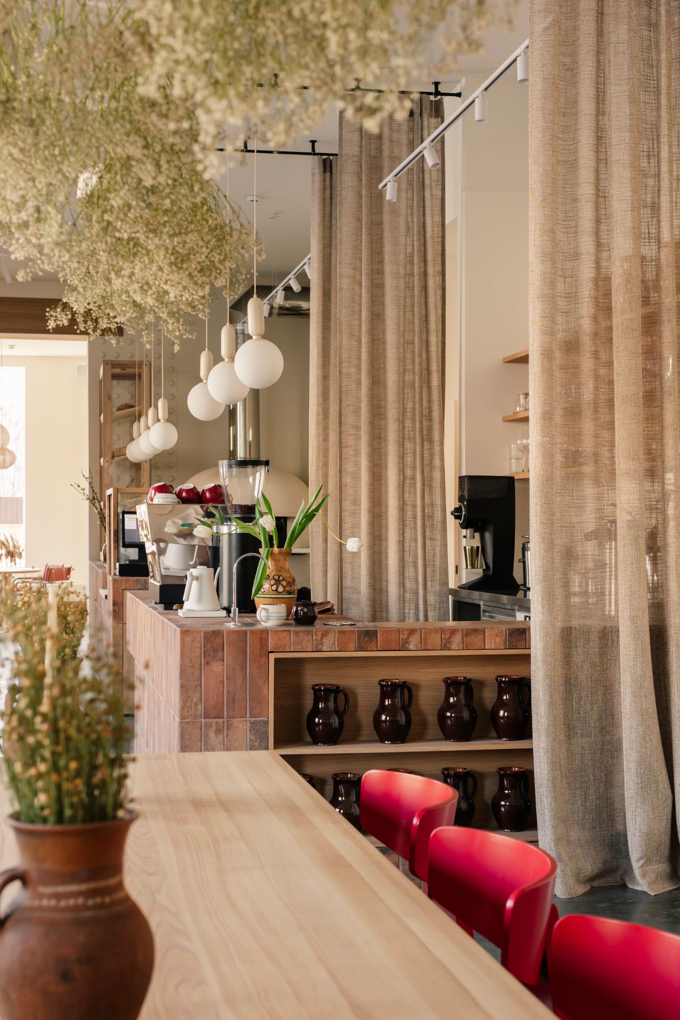
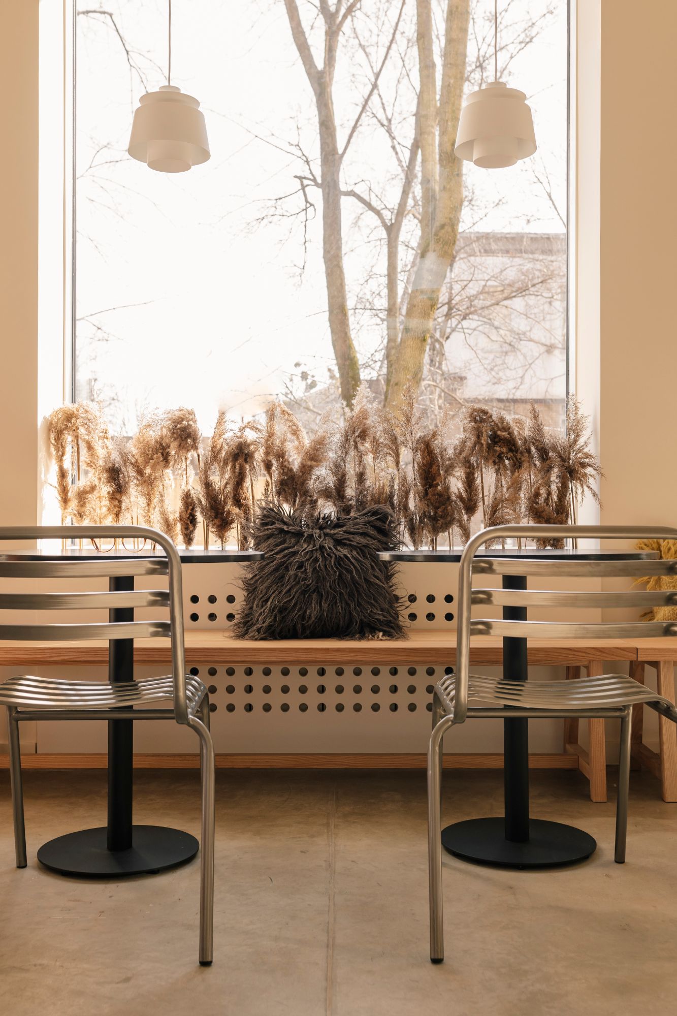
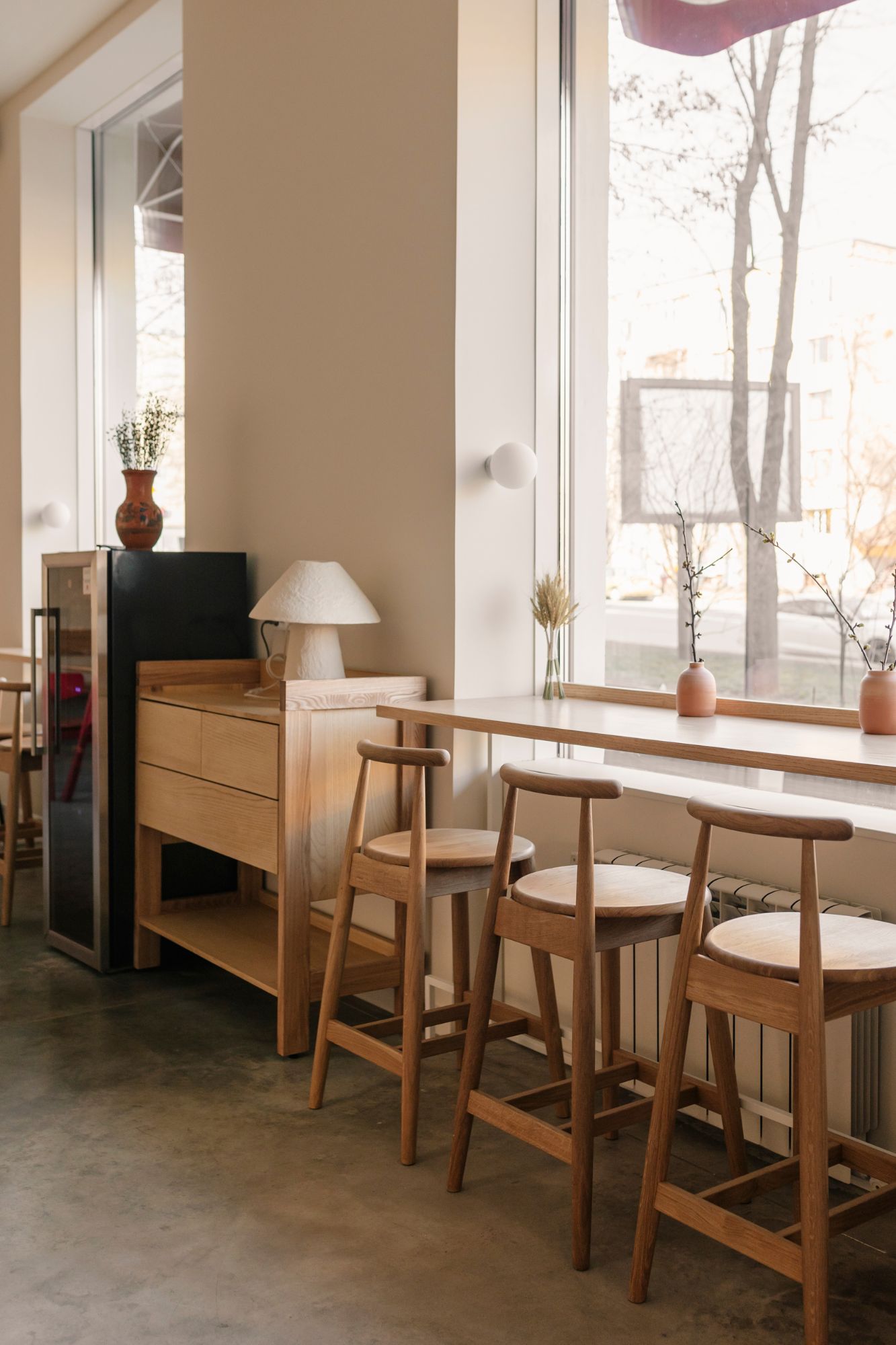
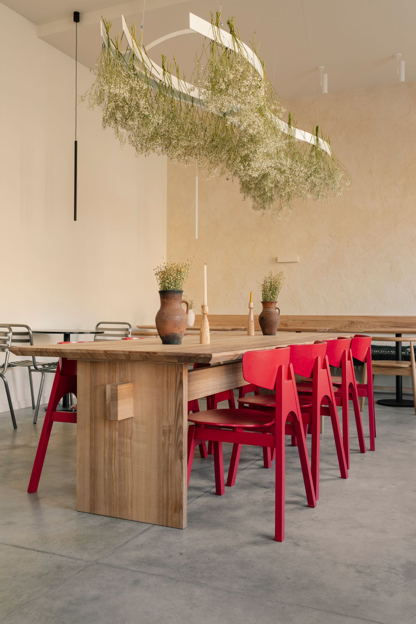
“Snidanishna” is a new story of Ukrainian cuisine in the centre of Kharkiv, which was opened in March 2024. The interior design of “Snidanishna” was realised by the team of the Ukrainian architectural bureau IK-architects.

IK-architects
IK-architects

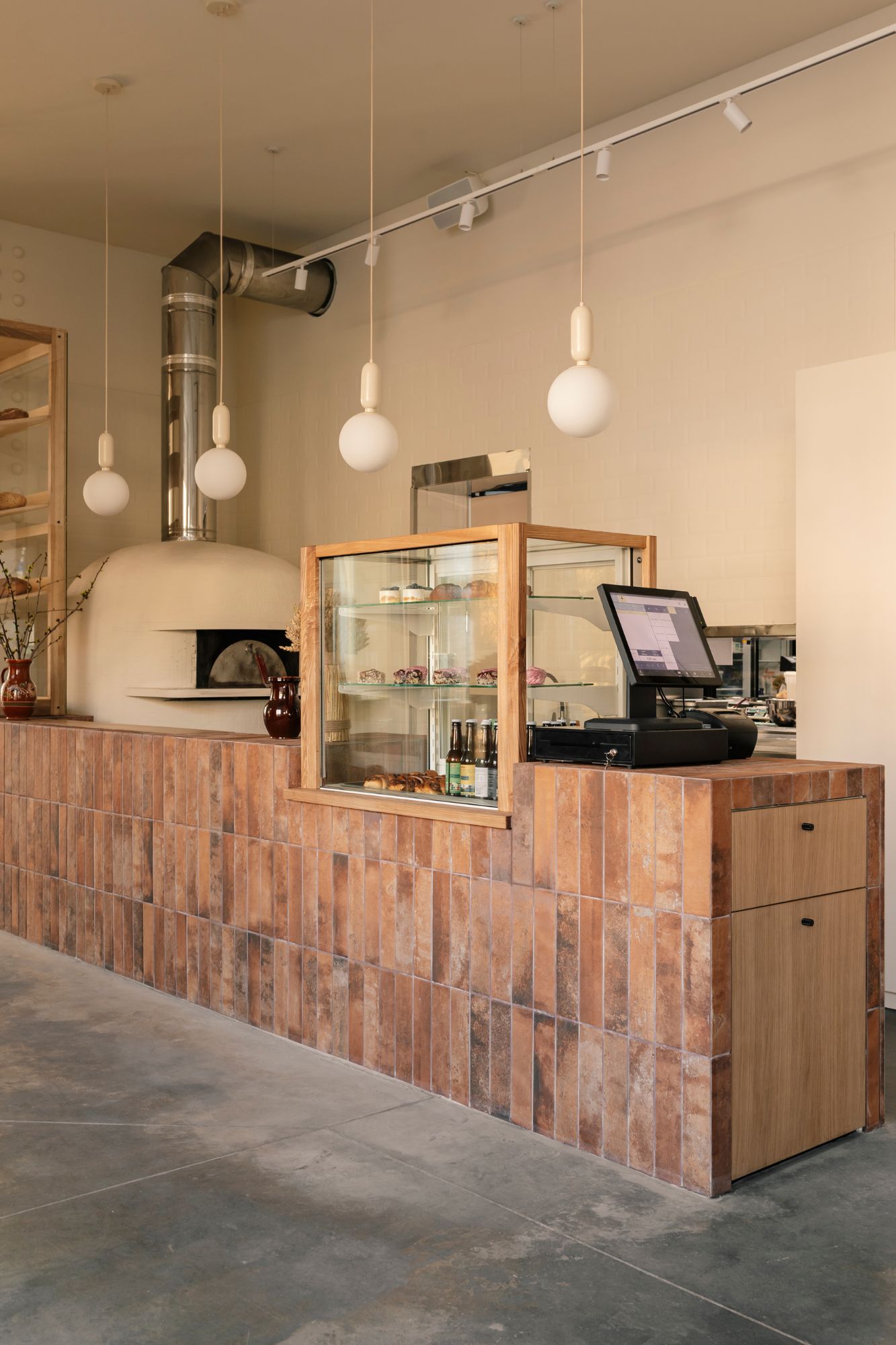
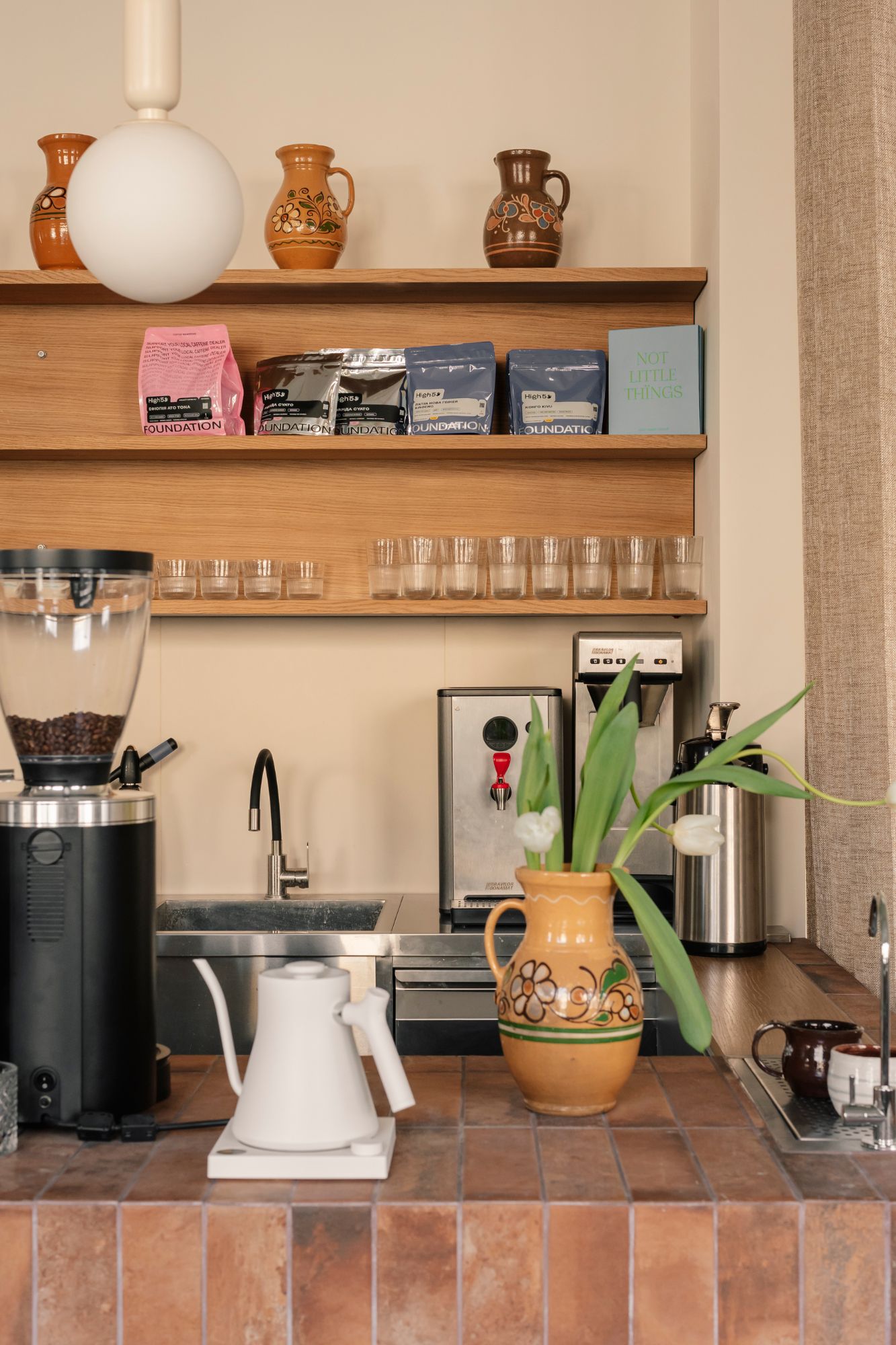
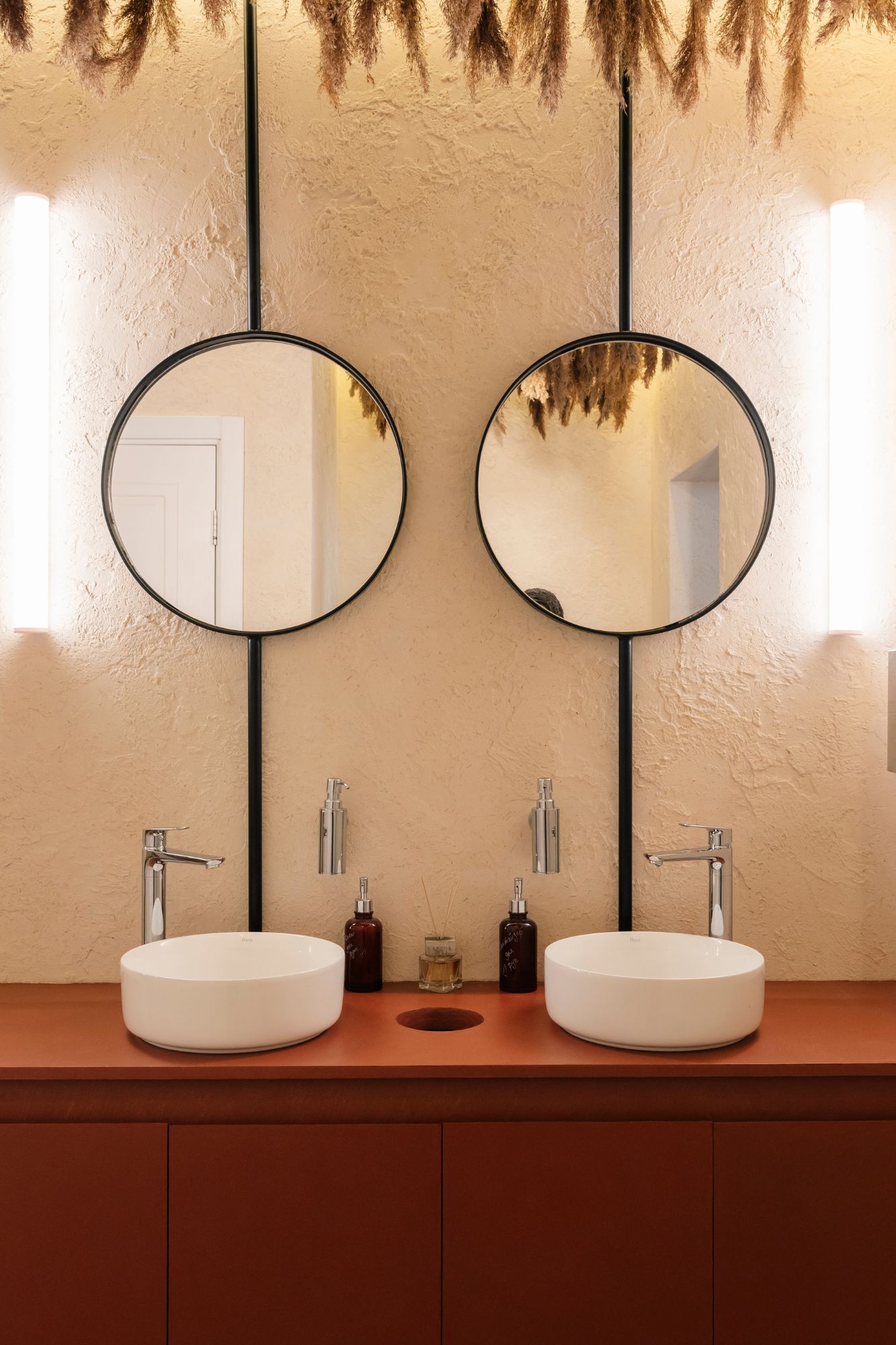
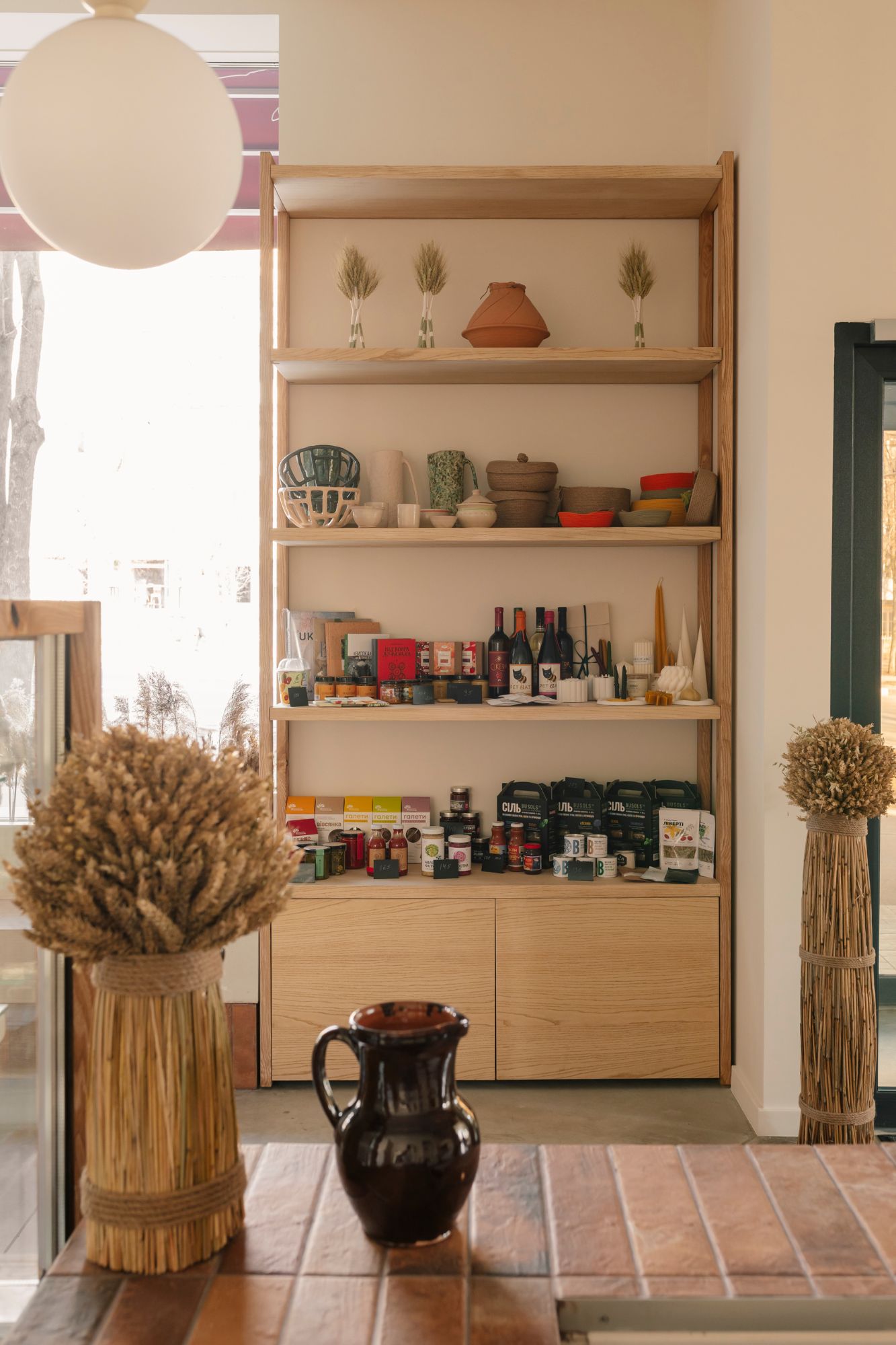
Snidanishna is a story about the gastronomic, cultural, and ethnographic traditions of Ukraine in a modern interpretation. The project aims to popularise Ukrainian culture and enhance Ukrainian flavour in interior design. This is a unique space, which includes a café, bakery, and souvenir shops of local goods. By researching and analysing the traditions of multiple different regions of Ukraine, the IK-architects team found interesting solutions for an environmentally aware interior that cherishes traditions.

IK-architects
IK-architects

Snidanishna is an example of a combination of historical traditions and their modern use. The project is located in a picturesque area of the city of Kharkiv in the east of Ukraine — it is an example of stability, faith, and love for one’s country.

IK-architects
IK-architects

“We followed the principles of traditional Ukrainian house design — with a central entrance, a meeting area and two large rooms-halls on both sides,” says Kateryna Yarova, chief architect of IK-architects, who worked with the team on the interior of the facility.

IK-architects
IK-architects

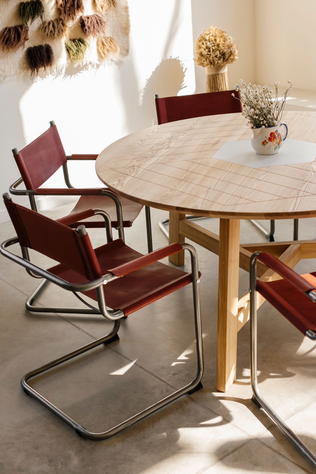
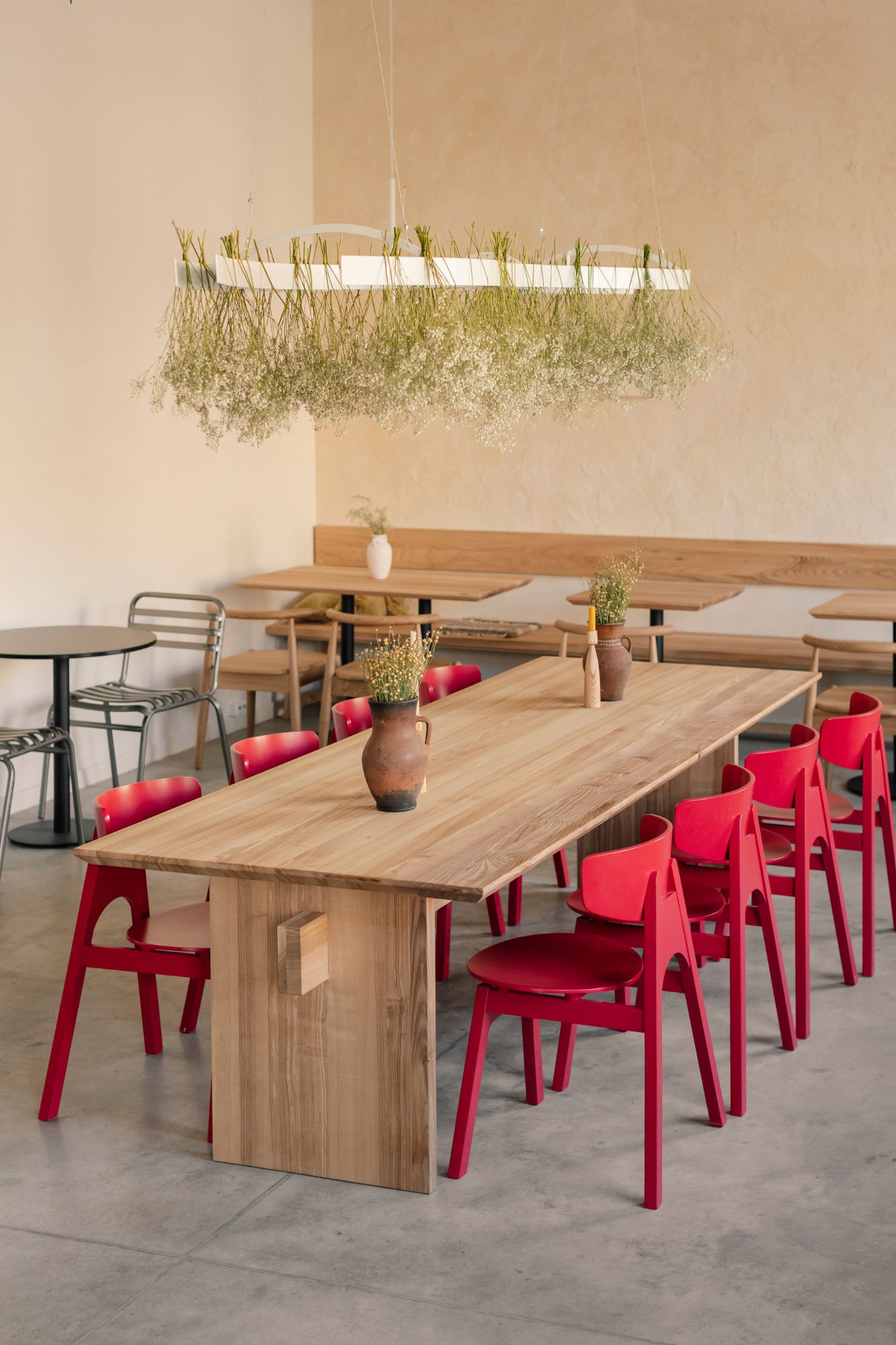
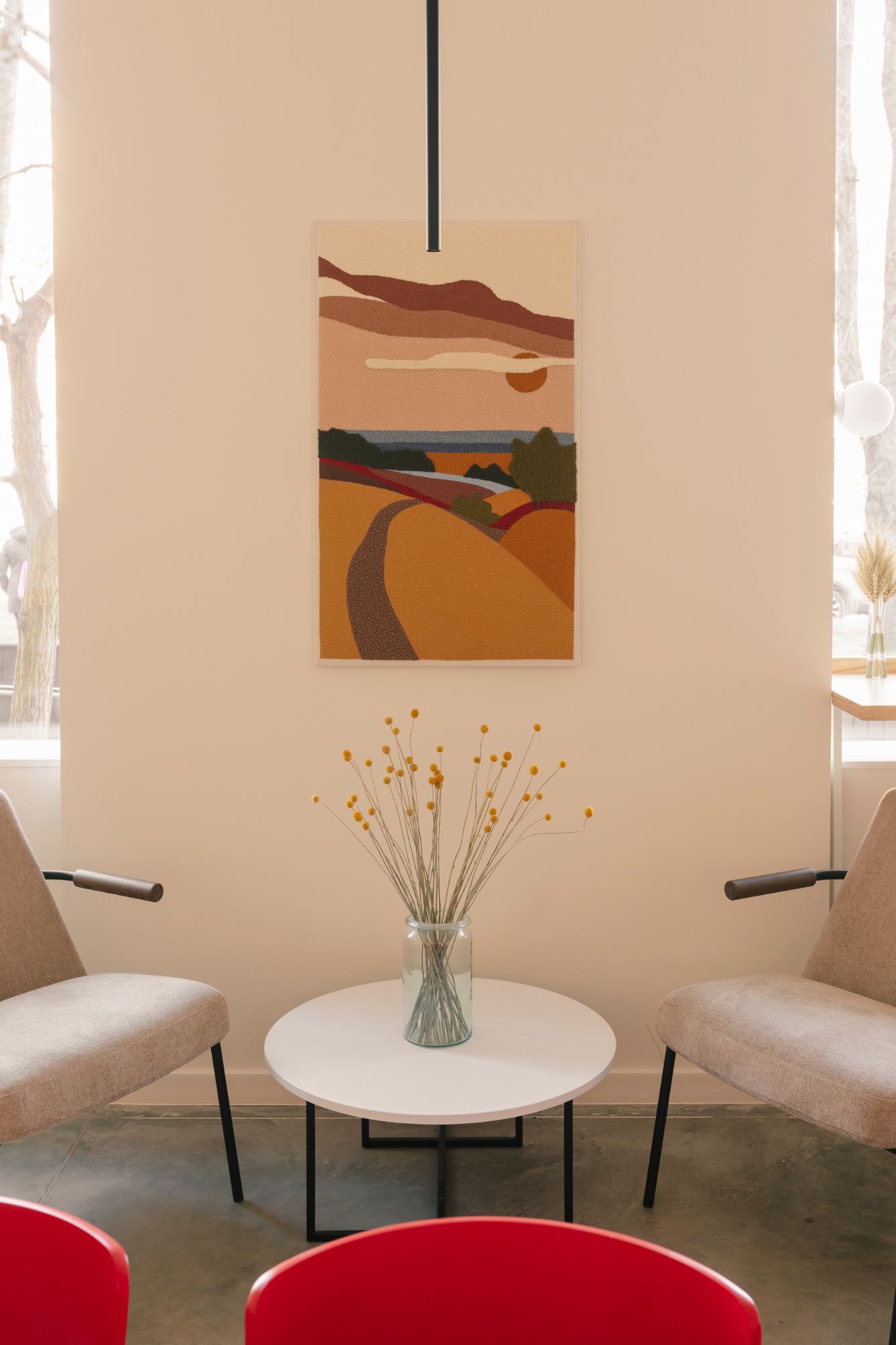
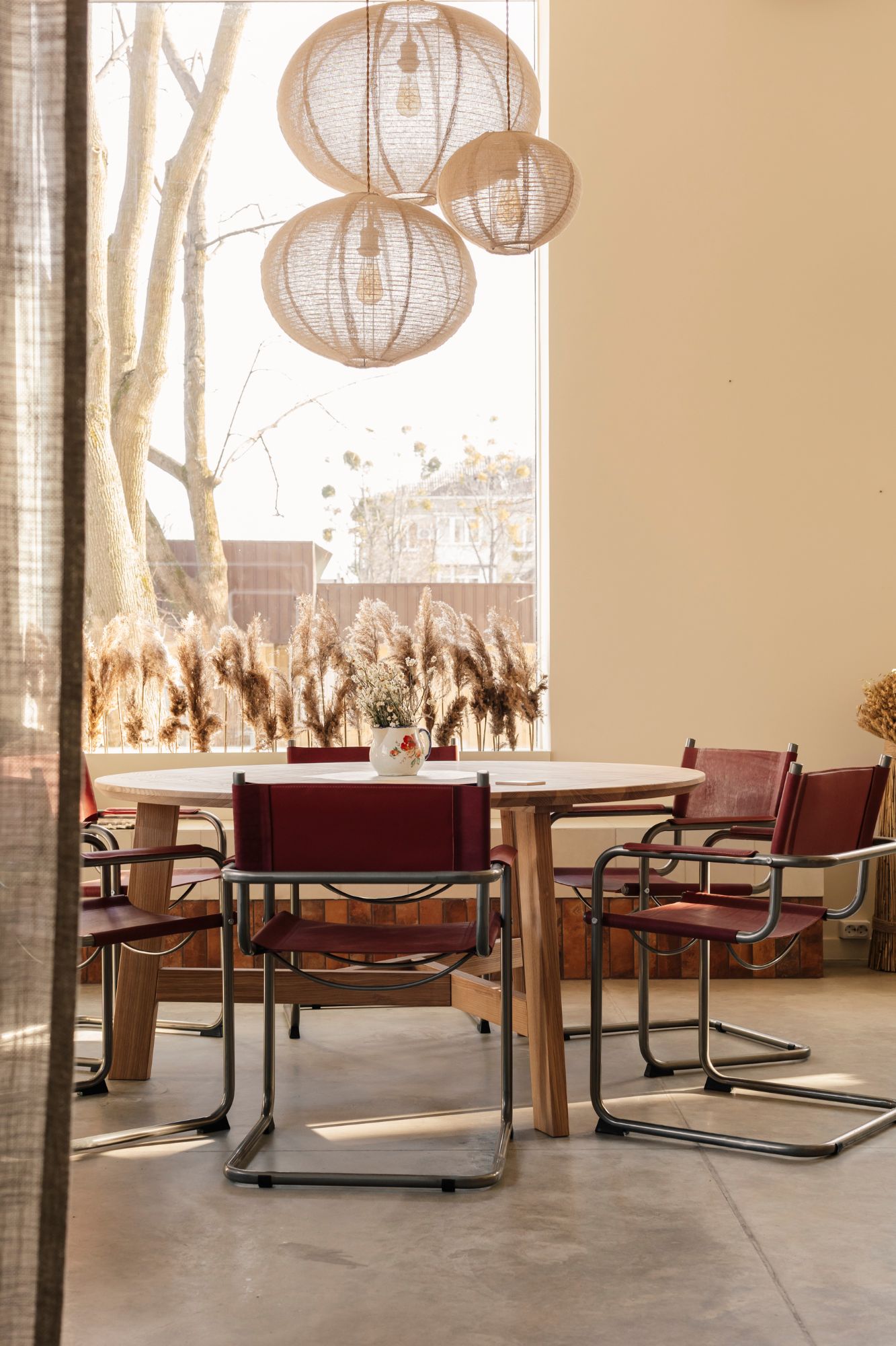
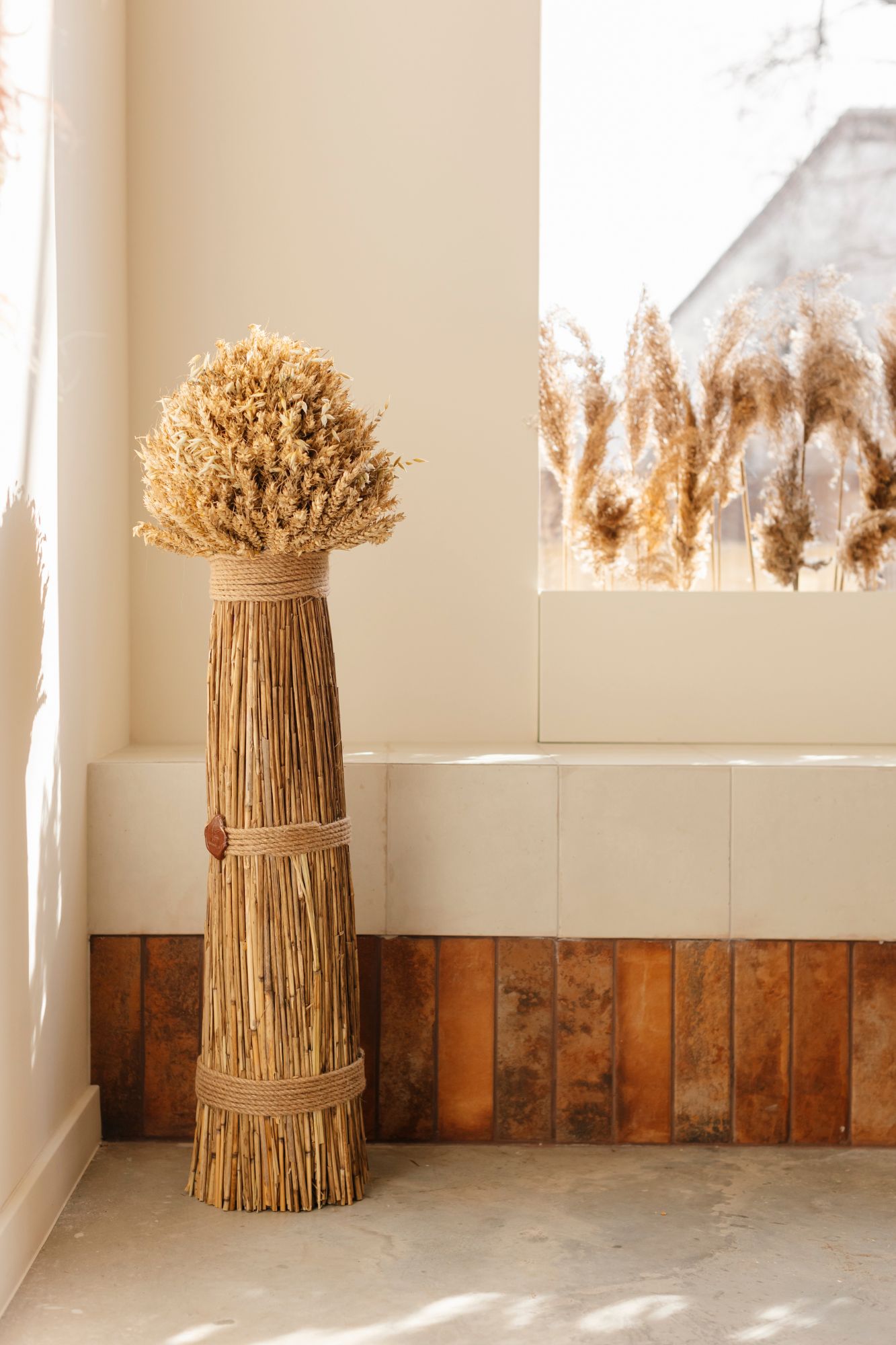
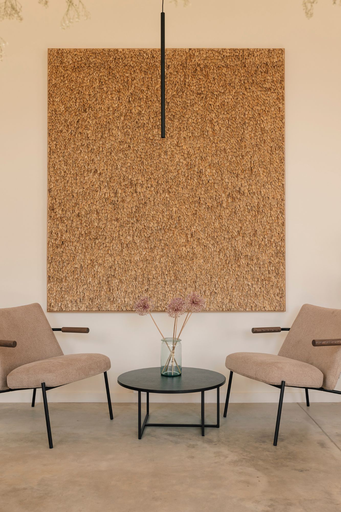
The interior of “Snidanishna” is a collective image of Ukrainian culture, which treats heritage with care and respect, integrating traditions into modernity. Emphasis is placed on changing the functions of using traditional Ukrainian materials. That is how the shingle, the material of the roof, turned into an art object with an oblique cut, and the reed found a second life in the central panel measuring 2 x 1.5 metres. The design was followed by the principles of traditional Ukrainian house design — with a central entrance, a meeting area, and two large rooms-halls on both sides.

IK-architects
IK-architects

Ukrainian colour traditions, such as red and cool-toned green, are intertwined with the latest global colour trends in design. Ukrainian modern minimalism with ethnic elements: a combination of simple, linear forms with traditional Ukrainian colours, motifs, and patterns — our own national identity — we create a modern, high-quality, Ukrainian space in which you want to live and work.

IK-architects
IK-architects

The geography of the institution’s interior items stretches from the East to the West of Ukraine. The reeds for the large panel were taken from Stryi, the tapestry with Zmiyevsky cliffs from the Kharkiv region, the dishes for serving dishes were hand-crafted in Opishnya, Poltava region, and the furniture was made by Ukrainian industrial designers.

IK-architects
IK-architects

“I am proud that more than 90% of our interior was made by Ukrainian craftsmen,” says Kateryna Yarova.

About IK-architects
Good design is not visible, good architecture is imperceptible – it’s just a comfortable state and space for the user; but this is a colossal effort and knowledge for the designer.

If you’d like to feature your news or stories on SBID.org, get in touch to find out more. 

If you’d like to become SBID Accredited, click here for more information.

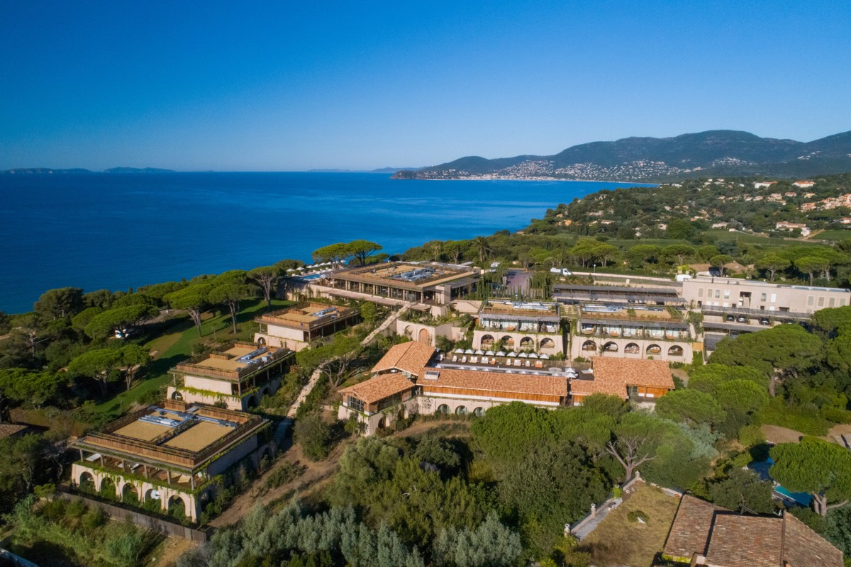
Lily of the Valley is the fruit of a family project, led by Alain and Lucie Weill, father and daughter, with the aim of creating a dream hotel inspiring Wellness and luxury. This is the very concept of the hotel, which offers to its residents an elegant setting in which they are guided in their weight loss goals with the most exclusive Technogym training solutions.

Lily of the Valley

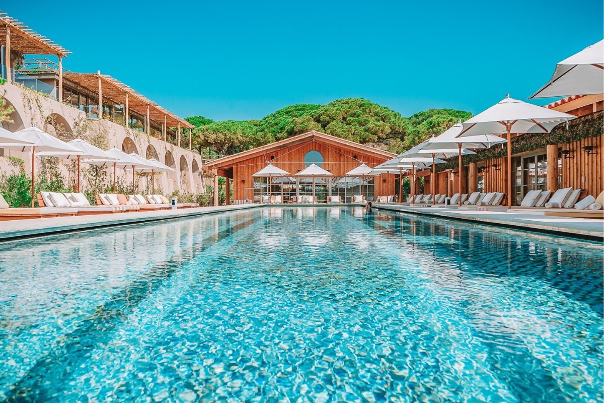
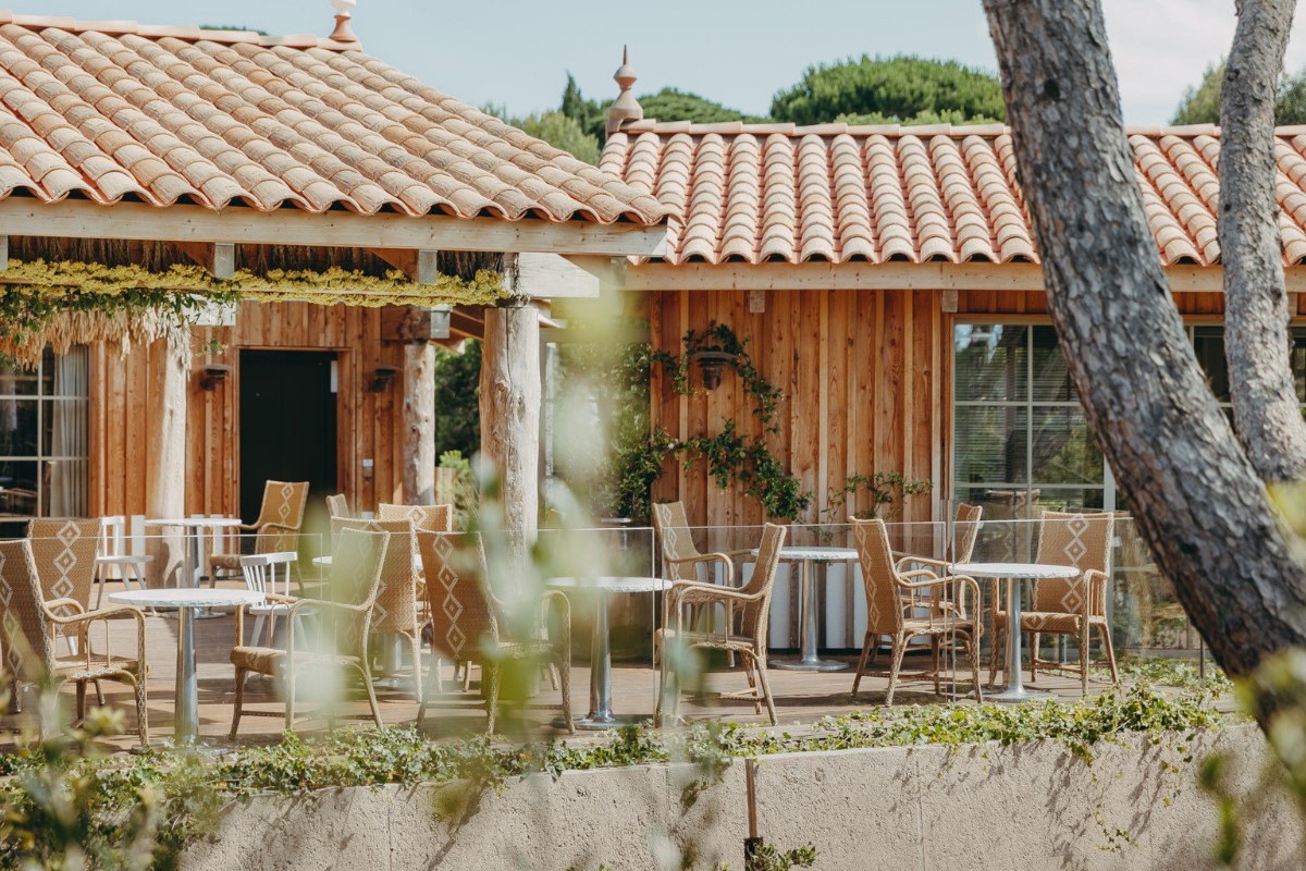
Entirely imagined and designed by the famous designer Philippe Starck, the hotel fits in naturally with the surrounding nature. With an organic architecture, the place opens up to the surrounding light and the vegetation is part of the hotel’s design. He states: “I designed an organic and vernacular village. Everything is so harmonious that it feels like it has always been there. It’s a place that welcomes you at any time of your life, at any time of the season.”

Lily of the Valley

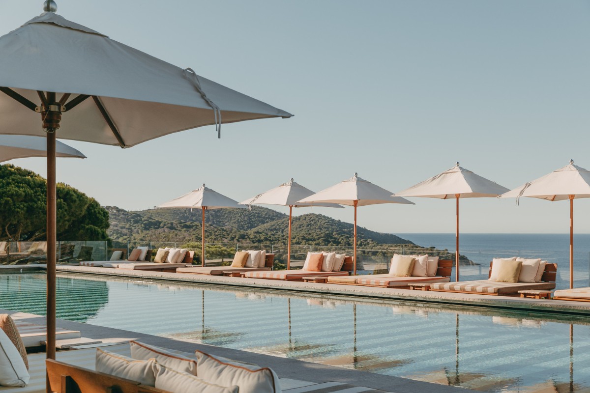
This small “village” inspired by the gardens of Babylon, the architecture of Provençal abbeys and Californian villas, is made up of small Mineral houses with 38 rooms and 6 suites with nature and the Mediterranean as far as the eye can see. 8 pool suites are also part of the picture: these private villas with swimming pool are set in the Mediterranean environment of the French Riviera. Below, the hotel’s own beach with restaurants and bars is available to residents.

Lily of the Valley

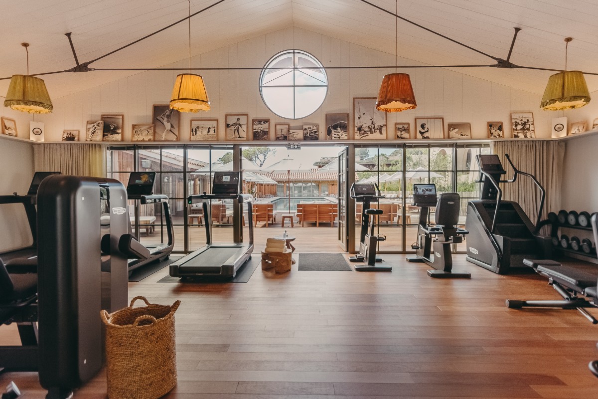
2,000 m² are dedicated to sport and fitness within the hotel, and 3 programmes are available for residents who wish to keep fit, accompanying them throughout the year, over 4, 7, 10 or 14 days:
– Optimal weight & serenity
– Intensive weight loss
– Weight loss & sport

All three programmes are supervised by a team of professionals, using the so-called “TGV” method. Developed by Jacques Fricker, it is said to be in three stages and consists of a “high speed” phase, a stabilisation phase and a full fitness phase; all three allow for rapid and lasting weight loss, particularly appreciated for the flexibility and balance of its approach.

Technogym is partnering with Lily of the Valley in the development of this luxury sports area.

Lily of the Valley

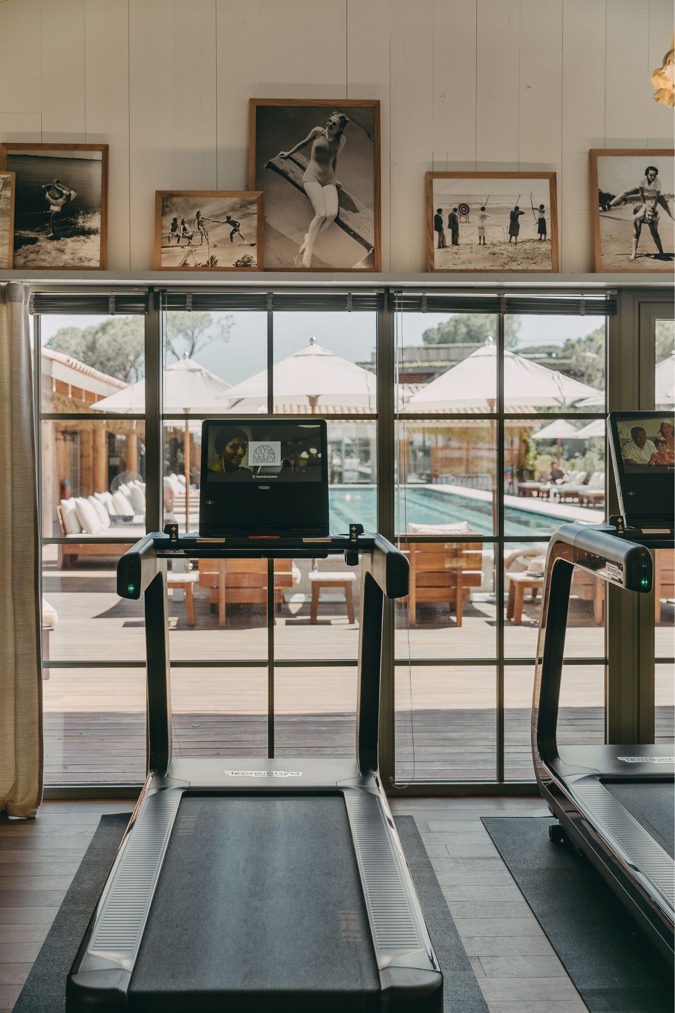
Fitness and coaching, present in each of the fitness programmes of the place, are thus proposed and highlighted thanks to Technogym solutions. The Artis line dresses the hotel and allows residents to live an exclusive fitness experience. From cardio equipment to weight training equipment, Artis offers high-end products with a touch of elegance. With customised workouts and a variety of entertainment options, Artis makes working out more motivating and enjoyable for everyone. Working independently on an assigned program or accompanied by the Technogym Coach through the Technogym Live console, residents have access to a simple and ergonomic training experience that adapts to their needs and goals.

Lily of the Valley
Lily of the Valley

Artis equipment includes Artis Run, the treadmill that combines elegance, technology and connectivity. Designed with attention to detail, it is the essence of indoor running. It adapts to the user’s running style, with a natural feel that makes for the most comfortable training experience.

Lily of the Valley

In addition to the Artis Line, residents can also take advantage of the Kinesis Personal Vision, the Technogym innovation “par excellence”. Perfect for a wide variety of functional exercises, it can be used to improve physical condition, endurance, sports performance or to accompany a rehabilitation process. Kinesis Personal Vision is designed to train while respecting the body’s natural movements, in order to achieve fitness, athletic or health goals in an efficient and personalised way.

Lily of the Valley

For over 35 years, Technogym has been promoting Wellness worldwide, a lifestyle based on regular physical activity, a balanced diet and a positive mental approach. Through its wide range of products, Technogym supports Lily of the Valley in offering high quality fitness solutions to its residents, enabling them to achieve their wellness goals through the best Wellness experience to improve their quality of life.

About Technogym UK

Technogym’s globally renowned products are perfect for both home and commercial gyms. They strive to create gym equipment and accessories that are not only professional and sleek but also adapt easily to every surrounding space. For more than 40 years Technogym have been helping people live healthier and happier lives with a range of products that are exceptional in both function and aesthetics. With modular collections, they offer the ultimate wellness experience anytime, anywhere, at home, in the gym, in the office, or in a hotel.

If you’d like to feature your news or stories on SBID.org, get in touch to find out more. 

If you’d like to become SBID Accredited, click here for more information.

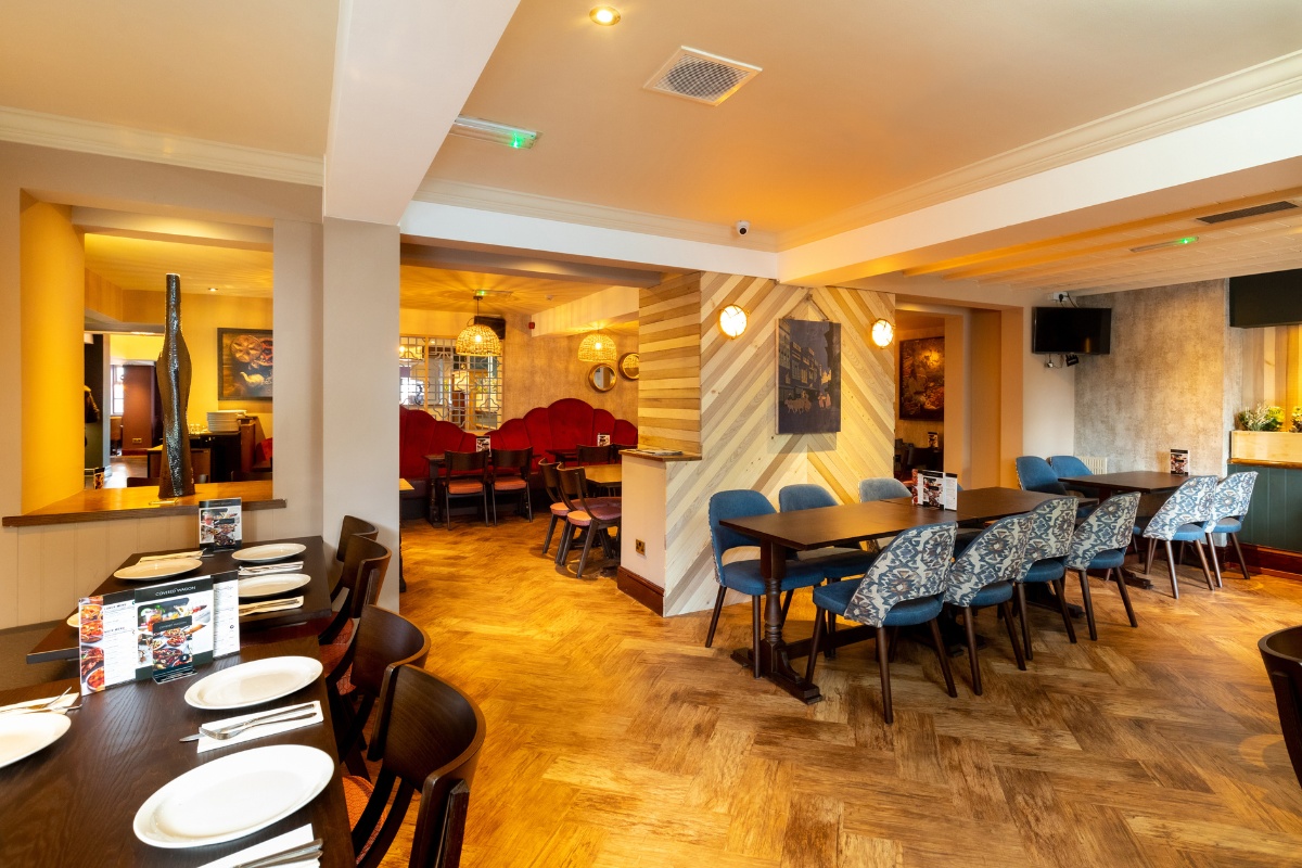
Harkin Walker were appointed by the Covered Wagon to redesign their popular desi restaurant near Moseley. The brief was to create a wow factor, increase the number of covers and zone different areas for dining, drinking and meeting. The existing restaurant was bland, uninviting and desperately needed a refresh.

Harkin Walker - Covered Wagon

Space planning was key in order to maximise covers and we utilised unused spaces around the bar with fixed seating, plus removing sections of false walls to allow for more tables. We added in various sections of fixed seating to break up the space and add softer, more comfortable seating areas. It was also essential that the circulation space was not compromised as this is a very busy restaurant. The layout has been vastly improved with better use of space whilst increasing the number of covers by around 30 people.

Harkin Walker - Covered Wagon

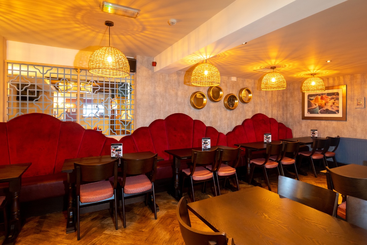
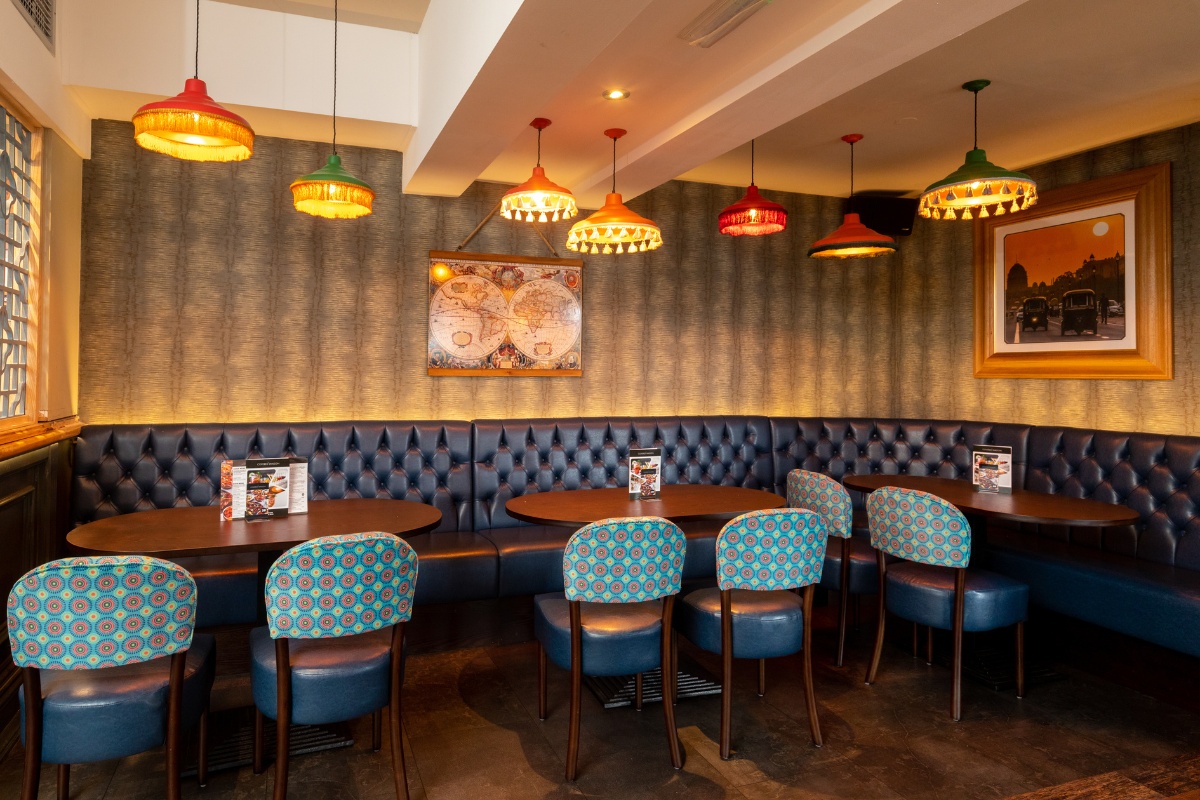
The finishes were layered with different textures, colours and patterns to create a vibrant mix reflective of Indian culture and fashion. From soft velvets in the formal restaurant area to linen prints and leathers in the casual dining and bar, each area was made to feel different to create the zoning of each space. We also improved the artwork and lighting to create more interest and atmosphere. Some of the finer details included fringed pendants, fret-cut screens, rustic timber wall panelling and textured wallpapers which are highlighted with LED strip lighting, further adding to the ambience. The use of traditional patterns, motifs and intricate designs are incorporated into the décor adding to the overall aesthetic.

Harkin Walker - Covered Wagon

The end result is a stunning transformation which was delivered within an ambitious programme. The refurbishment has created an amazing venue suited to all from drinks and snacks through to special celebrations. Four months post refurbishment the Covered Wagon won Best Pub in the Midlands!

About Harkin Walker

Harkin Walker is an Interior Design consultancy specialising in leisure and hospitality projects. Established in 2015 by Kathleen Walker, who has extensive professional ability and experience in the industry, we offer a full Interior Design service from inception through to completion. We pride ourselves on our friendly, professional approach to each project we undertake and building strong relationships with our clients so that we really understand and translate their vision. Our passion is to create beautiful and inspiring environments that enhance the customer experience and provide a venue for our clients to be proud of. We also understand and implement operational and statutory requirements so that we deliver a fully operational, compliant business.

If you’d like to feature your news or stories on SBID.org, get in touch to find out more. 

If you’d like to become SBID Accredited, click here for more information.

What is al fresco dining?

In Italian, al fresco literally means ‘in the cold,’ but in English, it is used to mean ‘outside’ or ‘in the open’. In its native Italian, al fresco also means ‘in prison’. If you tell an Italian waiter that you’d like to dine al fresco, you may get a funny look! The UK now has a thriving outdoor, al fresco dining culture, and al fresco dining spaces are a common sight in many city centres and towns. This is, in part, a result of the Covid-19 pandemic. Outdoor dining has gone from necessary to the norm.

The legal process for al fresco dining

If you have an existing external area within your site, then good news! You’re already halfway there. However, when planning the development of this land, it is necessary to know what you can do without the need for local authority permissions and what will need to go through the planning process. Simple works such as changing of floor finishes, erecting fences and screens (as long as they’re below 1m in height) and the laying out of loose furniture is usually allowable without going through the planning process, however, if your intent is to erect “permanent” fixed structures such as pergolas, fixed seating runs and occasional use outdoor/indoor rooms then seeking local authority planning approval is a necessity, unless you’re willing to risk the wrath of the council, something we never recommend.

If your site is listed or lies within a conservation area, then seeking planning authority and conservation officer approval is vital, as the risk of expensive fines is a headache any hospitality operator should want to avoid.

If you do not have your own external area within the curtilage of your site, you might wish to place furniture on the pavement areas surrounding your building. In this case you will be required to apply for a pavement licence to place tables, chairs, and other furniture on local authority owned land. Rules and regulations can vary from region to region, so you will need to check whether you need to apply for a licence before you get started. You may face restrictions on how big the furniture can be. The furniture you use is required to be removable, not be a fixed structure, and be able to be stored away in the evening. You will also have to leave an amount of pavement space free for pedestrian traffic, and clearly mark the borders of your outdoor seating area. When applying, you’ll need to supply a site plan and a public liability insurance certificate. You may be subject to fines if you fail to meet the requirement or fail to pay the licence fee. If your customers want to eat outdoors, they are likely to want to drink outdoors, too. If you’re planning to start selling alcohol at your restaurant, make sure you’ve got the appropriate licences to do so.

How to plan your al fresco dining space

If you decide to add an al fresco dining space to your bar or restaurant, make sure to follow these top tips for making your outdoor area a lovely place to lounge:

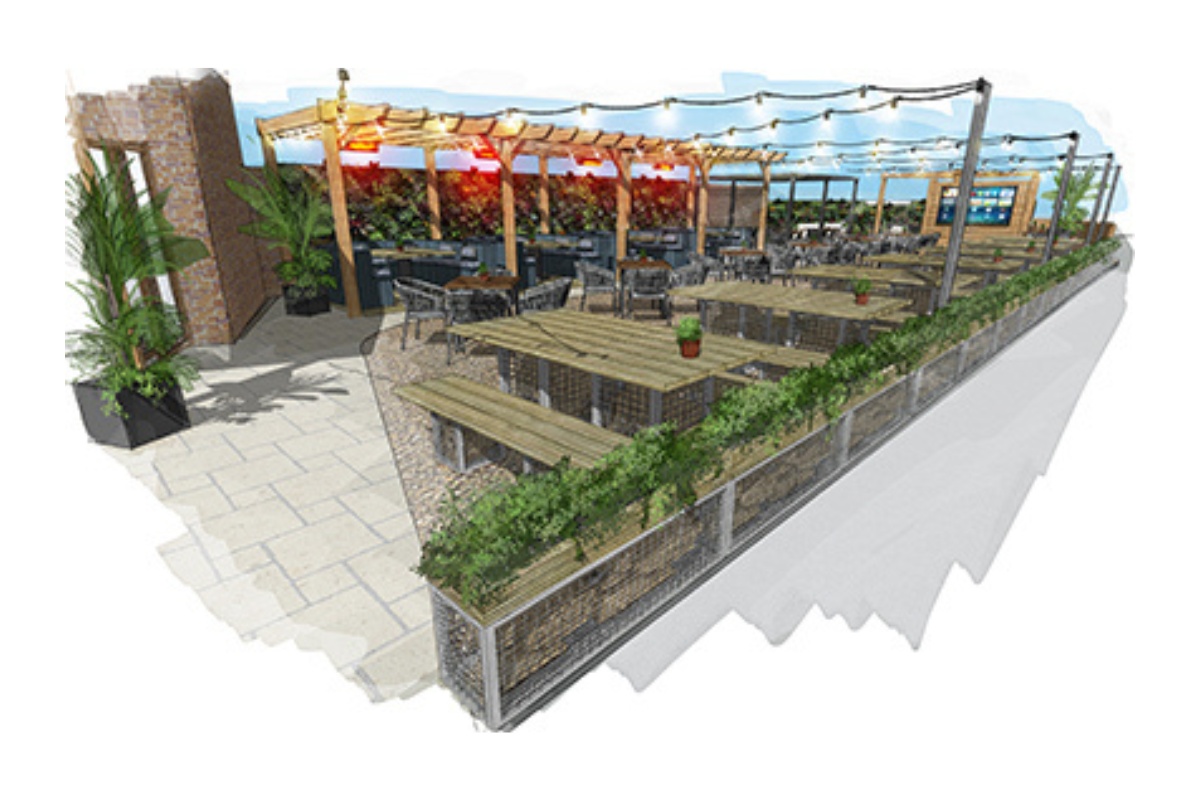
  • Make sure you have the room for it. This space could either be outside your restaurant (possibly overspilling into a pedestrianised street) or making use of space already on your premises – a front or back garden, or a car park.
  • Make it comfortable and inviting. The space you select should be the kind guests want to sit in, far away from any unpleasant sights or smells, and should be spacious enough to ensure your customers are comfortable.
  • Consider how to design your al fresco dining area. Plants add colour, texture and homeliness to any dining area providing they’re properly looked after. However, be careful which plants you choose to place in your dining area; plants that attract insects or cause hay fever will drive customers away.
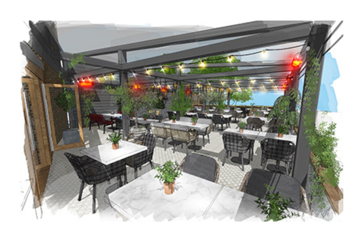
  • Think about the weather. Offering al fresco dining doesn’t mean the rain won’t still pour. If you want to be able to offer outdoor seating in all weather conditions, think about having a sheltered area, or awning in place to protect your customers from the rain. To maximise the number of months in a year you can utilise these areas always consider screening to the sides of pergolas and awning structures. It’s no good having a roof if the wind is blowing the rain sideways. Solutions to screening can include bi-fold or sliding doors, guillotine glazing or just a simple canvas screen.
  • Keep customers cosy. Investing in infrared heaters will warm the entire table area. Alternatively, consider soft furnishings or a hamper containing the humble wool blanket to allow customers to wrap themselves up. Some companies even offer external grade heated benches, which transfer the warmth directly to the customer rather than heating the air with standard infrared external heaters.

It’s always important to have a well thought out floor plan that allows for efficient service and optimal guest satisfaction. With dining having evolved over the years into an al fresco experience, it is now more important than ever to be able to provide this offering as a restaurant, bar, or café owner. Including awnings or outdoor rooms allow you to expand your space and provide the same great dining experience in the open air.

Whilst this expands the number of customers that you can cater for and your revenue, you want to ensure the experience outside is just as good as it is inside. Awnings and canopies allow you to protect customers from the weather and feel comfortable whilst dining outside, however it’s no good increasing the number of covers to your venue if the quality of your service starts to fall. When developing your external area, you must also consider whether your existing service areas (catering kitchen, bar serveries, WC`s etc) and staff numbers are able to cope with the increase in customer footfall.

Not only can awnings and pergolas be used for the day to day running of your establishment, but they are also a great addition to create a feature area for outdoor functions and events to generate additional revenue for the business. An awning is also a great solution to provide a sheltered, comfortable smoking area whilst allowing non-smoking customers to be outside or inside too.

The Benefits of Commercial Awnings and Pergolas for Restaurants, Bars & Cafés

If you decide to add an al fresco dining space to your bar or restaurant, make sure to follow these top tips for making your outdoor area a lovely place to lounge:

  • Make a Statement – Increase your presence against competitors with quality commercial awnings and pergolas. There are a multitude of stylish design options to make your dining area look as welcoming as possible.
  • Maximise Floorspace – By increasing your floorspace, you can achieve maximum revenue for your restaurant, pub, or cafe by increasing the number of customers. However, as well as an exceptional return on investment, you want to ensure customers are truly satisfied for them to return. Maximum comfort means maximum profitability. Commercial awnings and pergolas allow you to add heaters and lighting options to create additional floorspace which is usable all year round.
  • Reinforce the brand behind your restaurant, pub, or cafe – Showcase your eatery to passers-by and your uniqueness amongst competitors with a commercial awning or pergola. With most manufacturers you can tailor your awning to your space with branding options such as signwriting and your company’s logo. There are also an extensive range of fabric choices to find an aesthetic which truly suits your brand identity.


If you need any assistance on designing you al fresco dining experience, do not hesitate to get in touch with MGI. We have a vast portfolio of case studies displaying our experiencing in designing successful outdoor spaces for your establishment.

About MGI Partners

MGI Partners are an award-winning Interior design practice with decades of experience within the hospitality and commercial sectors. Our talented team have honed their skills and specialist industry knowledge to provide beautiful, commercially viable design solutions that meet our client`s specific brief and can be delivered no matter how challenging the project or budget spend is. We always put our clients first and love to work in close collaboration, to guide them through the design and construction processes to ensure we create spaces that their customers will love and want to return to again and again. With a range of services including surveying, site analysis, interior design, Visualisation, Statutory applications, branding and project management we tailor our offer to meet each client`s specific requirements.

If you’d like to feature your news or stories on SBID.org, get in touch to find out more. 

If you’d like to become SBID Accredited, click here for more information.

Looking back at sofa.com’s favourite projects of 2023, it’s clear that boutique hotels are no longer simple nor quaint. We’ve worked with designers who are looking to bring the boutique hotel into modernity, and this starts with a reconsideration of what it is that makes a hotel welcoming, and how hotels can keep comfort and function as a top priority yet experiment more with colour and personality, creating a home away from home for guests.

Interior Designer, Rendall Wright, using sofa.com

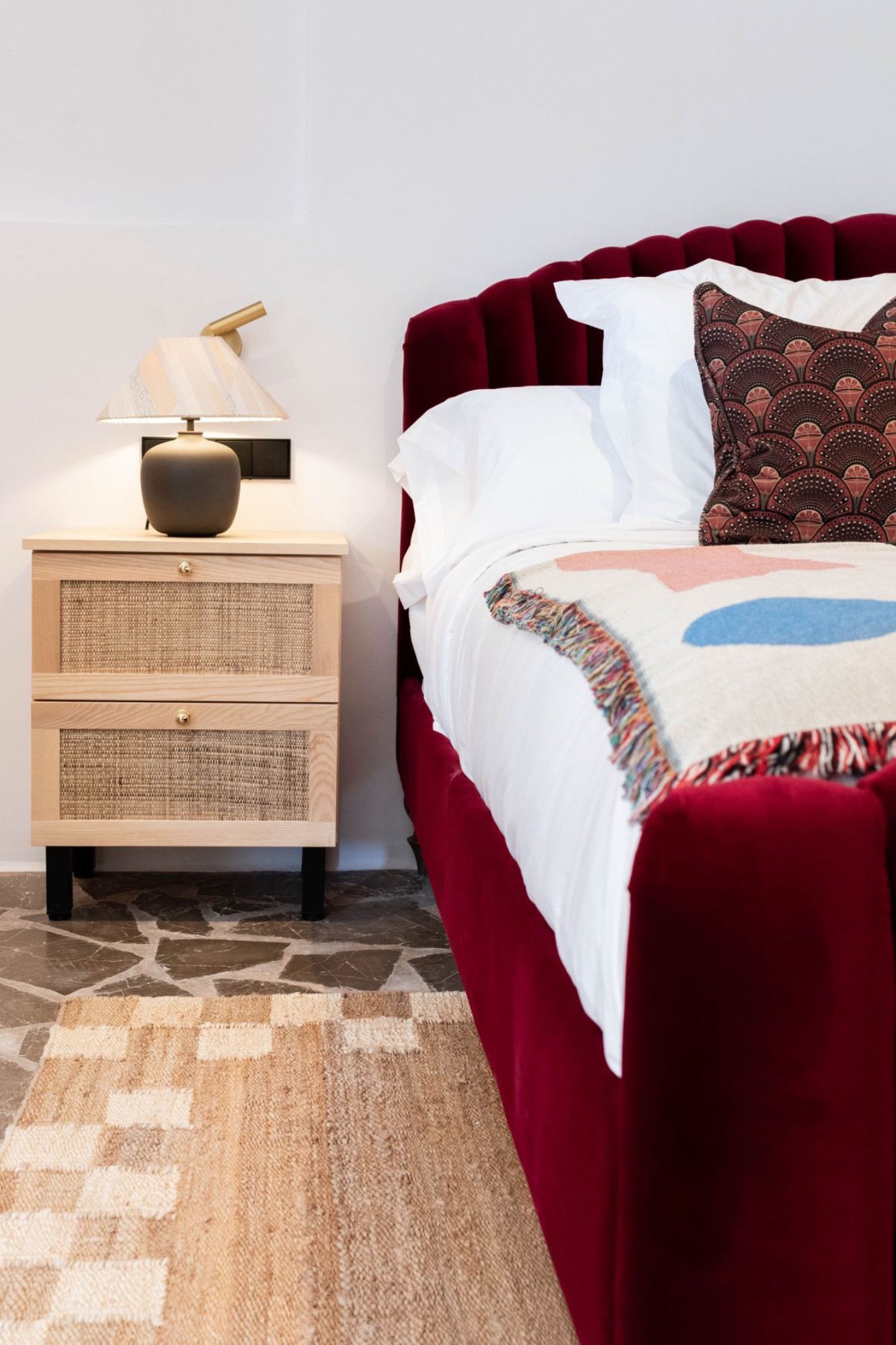
One of the largest projects our dedicated trade team have worked on has been to furnish 9 bedrooms in a new luxury hotel in Ibiza. Perfectly pitched between boutique and mid-sized, Pikes is a project which showcases personality, textural interest and great use of materials. An infusion of colour with beautifully bright upholstered beds and complementary artwork creates an ambient and welcoming environment. Lucinda Swayne, interior designer on the project, comments, “During the renovation, it was vital that the quirky elements were retained to preserve the identity of the hotel. Within the redesign we have created eclectic comfortable rooms with a unique feel, coupled with micro-attention to functionality, so that guests will never want to leave”.

Interior Designer, Rendall Wright, using sofa.com

This focus on functionality comes down to vital design choices: bed size and placement, extra surfaces and storage, and lighting decisions.

A perfectly placed bed should leave ample space on each side, ideally enough for the essential bedside table. While beds are ideally placed centrally within the room, this can be a struggle within smaller spaces, when it comes to allow for storage on both sides. Working with designers at Rendall & Wright on a project in Norfolk, our nifty solution was to incorporate a storage ottoman at the foot of the bed, providing both a place to perch and somewhere to stow away personal effects.

Comfort is paramount, with almost all the designers we work with opting for king size beds, as the ultimate requirement for a great overnight stay, is comfort. The main goal is to ensure each guest has the best night’s sleep. Returning customers is the greatest compliment a hotel can receive, and the comfort levels will heavily influence the reputation of a great hotel.

Lucinda comments that a bedroom should be “a comforting space that provides guests with somewhere they never want to leave. Top of the list is by far a comfortable and statement bed.” For the ultimate in indulgence, beds with velvet headboards are a winner – not only do they look luxurious, but they are also beautifully soft and tactile.

Once comfort levels have been established, lighting is the next crucial element, and should be one of the first things considered. Where is the bed going to be placed? You’ll need bedside lamps or wall lights on a separate circuit to allow for adjustable light levels, and true comfort means not leaving your bed to turn off a light switch. Although inherently practical, lighting is another aspect of the room design that can be a vehicle for introducing colour or pattern.

Very much dispelling the reputation of being twee, it’s clear that smaller hotels are going through somewhat of a design shift. A well thought through and exquisitely executed delivery on all the non-negotiables of a dream hotel stay promises a luxurious escape form day-to-day life.

Interior Designer, Rendall Wright, using sofa.com

About sofa.com

Passionate about outstanding interiors, sofa.com offers a diverse and design led collection of made-to-order sofas, armchairs, beds, footstools and home accessories. With an extensive range of styles and over 100 fabrics to choose from, as well as the option to upholster in your own fabric, the customisable nature of sofa.com’s products make each piece easily adaptable to any interior style – perfect for interior designers and specifiers looking for stand-out pieces for upcoming projects. sofa.com have been delivering expert project solutions for over 10 years and have experience in a variety of sectors in hospitality, residential and commercial disciplines. With a sofa.com trade account, you can enjoy benefits such as industry leading delivery times, bespoke products, furniture packages, a sampling service and a competitive tiered discount structure.

If you’d like to feature your news or stories on SBID.org, get in touch to find out more. 

If you’d like to become SBID Accredited, click here for more information.

Successful spacing through interior design is achieved by the interior designer being involved in choreographing the sequence of a space. By doing this, it ensures that a project reflects a single design approach by a fluent design being fathomed by the architect and designer together. It is essential for all parties involved to understand the relationship between all rooms, plans and the cross section of the building.

Within hospitality design there is a vast number of aspects an Interior Designer should consider, such as, adjacencies (within design, this refers to the connection between two spaces or elements. The term can be used to describe both physical and visual relationships. In a physical sense, adjacencies are determined by how easily one can move from one space to another), catering layout, lighting, acoustics, and furniture to name a few.

As Designers, we ensure that we are familiar with each of these aspects, especially within spatial planning and dimensional criteria for seating layouts. The key to understanding and designing an all-encompassing, fluent, and functional space is to understand a venue’s core concepts. This concept often comes from our team working closely with the client to establish a clear and cohesive experience for the desired customer.

Something as simple as spacing between tables can go a long way to creating an atmosphere within a venue. Restaurants and bars that offer a full dining experience often provide ample space between tables for a more relaxed atmosphere. While a site such as a fast-food restaurant or coffee chain maximise the number of their tables, and therefore customers, to create a bustling, high tempo environment.

Use of different finishes and materials helps to define individual spaces within a venue, hard finishes are more suitable to busy bar venues where materials need to endure the vigour of nightlife trade, whereas softer finishes lend them-selves better to intimate dining situations or more laid-back relaxed drinking venues such as high-end cocktail bars. When it comes to specifying internal finishes, our wealth of experience ensures that all finishes are chosen to satisfy the individual requirements of each project and client. It is of the upmost importance that the highest quality finishes are specified within budget.

Whilst ensuring that materials and finishes are aesthetically appealing, it is of equal importance that the material an Interior Designer chooses must be appropriate for its use. Care must be taken to ensure that the material is correctly Fire Rated, as economically and ecologically friendly as possible and high-traffic areas must have finishes that are more durable to last the test of time. Floor finishes must have appropriate slip ratings for their designated use and the visual contrast between finishes on walls and ceilings must be considered to enable the visually impaired can perceive potential hazards within a space.

Another aspect a designer must take into consideration is the ongoing maintenance and upkeep of specific materials once a project is handed back to the client. It is the responsibility of the interior designer to pick finishes that are easy for the client to clean and maintain, therefore ensuring they get the best value for money and a high standard of finish is maintained throughout the years.

Lighting plays a huge part in creating an atmosphere within a venue and can be cleverly utilised to define spaces or zones within an otherwise open area. Low-level mood lighting can create a fine-dining experience. Whereas brighter and whiter lights a more casual energy. Considering today’s cost of living crisis, venue owners also need to consider the energy efficiency of the lighting specified. It is often favourable for interior designers to specify warm lighting within trade areas, fluorescent flighting is more cost and energy efficient. Therefore, this could be a valuable consideration for back of house and catering areas.

The acoustics in a hospitality venue go together with the concept and desired atmosphere created and in hybrid spaces it may be necessary to define zones with different acoustic qualities. Bar areas can be noisier and livelier whilst dining area may need to be quieter to allow for ease of conversation between diners.

Hard surfaces such as ceramics, wooden tabletops and cold metal finishes can create reverberations throughout a space. To counter this a competent designer may consider the specification of sound absorptive materials such as carpets, soft furnishings, and soft wall panelling, or specialist acoustic solutions such as suspended ceilings or wall panels utilising mineral fibre board wrapped in acoustically transparent fabrics, perforated ply, or timber slats.

Another solution on how to control a space’s acoustics is by separating out sections through screen or stud walls. Through careful consideration of spatial planning this way, diverse types of rooms with different noise levels can invented to accommodate various patrons.
More space planning advice:

Work with what you have got!
Time & money can be saved planning around current features of a building whilst preserving a space’s original features.
Do not forget about storage and back-of house!
Your trade areas may look amazing but are useless if your venue cannot function efficiently. Therefore, when planning out your spaces, ensure you leave enough room in none trade areas too!
Be Flexible!
In smaller venues and spaces, do they need to be adaptable for more than one purpose? If this is the case, loose seating, moveable furniture, and adjustable lighting levels are all successful considerations in creating different atmosphere within the same space.
Prioritise!
Sometimes, however hard we try, everything desired cannot be achieved within the designated space. MGI ensure that they work closely with their clients to understand what is most important for them to have the most efficiently designed, attractive and successful space.

About MGI Partners

MGI Partners are an award-winning Interior design practice with decades of experience within the hospitality and commercial sectors. Our talented team have honed their skills and specialist industry knowledge to provide beautiful, commercially viable design solutions that meet our client`s specific brief and can be delivered no matter how challenging the project or budget spend is. We always put our clients first and love to work in close collaboration, to guide them through the design and construction processes to ensure we create spaces that their customers will love and want to return to again and again. With a range of services including surveying, site analysis, interior design, Visualisation, Statutory applications, branding and project management we tailor our offer to meet each client`s specific requirements.

If you’d like to feature your news or stories on SBID.org, get in touch to find out more. 

If you’d like to become SBID Accredited, click here for more information.

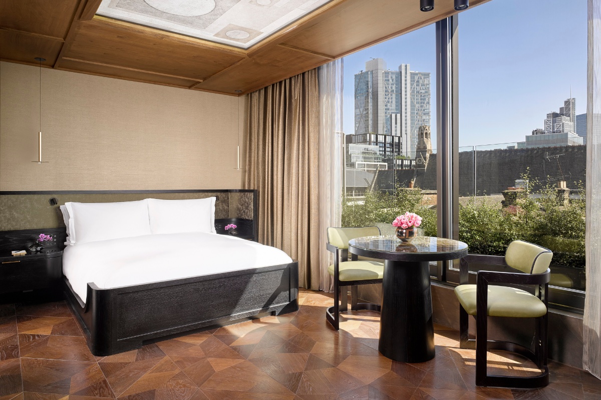
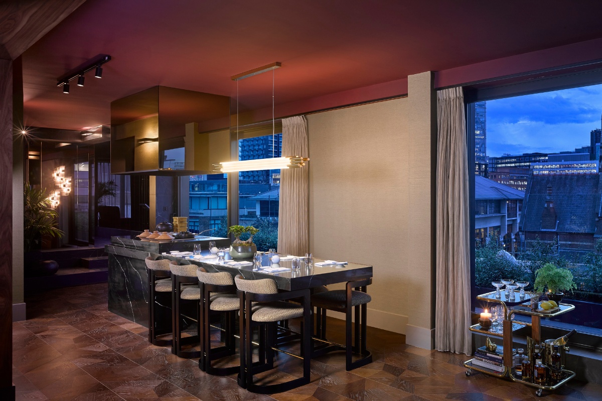
Designing a luxury hotel in one of the most vibrant metropolises means creating functional environments with a refined design, finding solutions capable of ensuring guests the best conditions of comfort, with a focus on sustainability.

Frammenti - Foglie d'Oro

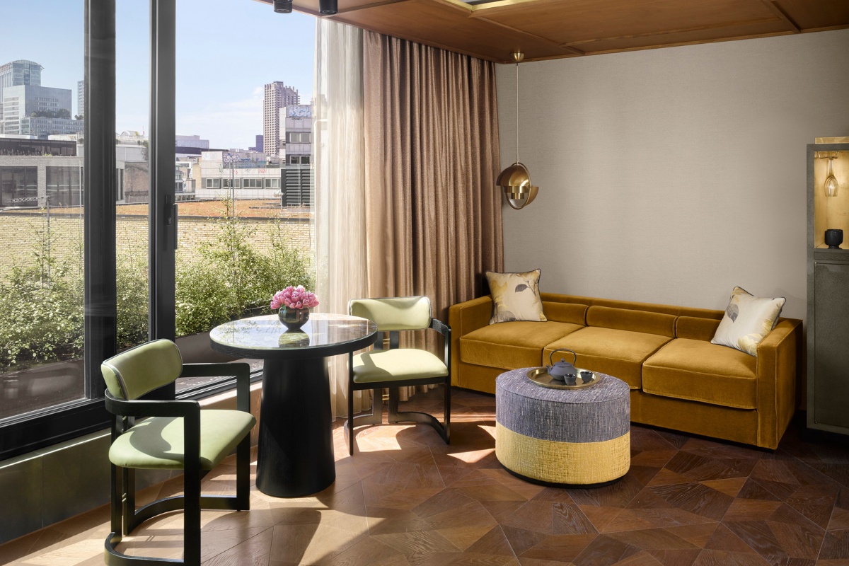
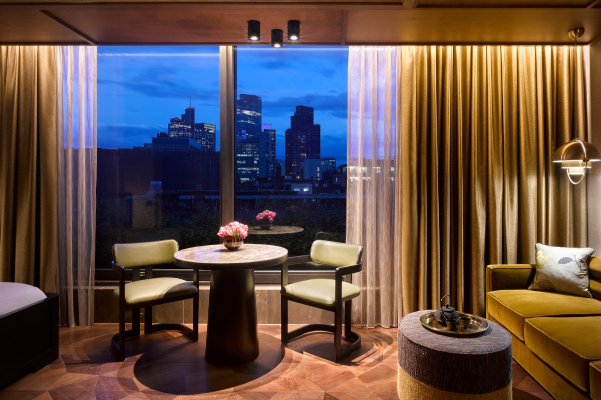
It is with these premises in mind that for the Nobu Hotel Shoreditch, in London, the modular flooring Frammenti was chosen, made of oak from well-managed and responsible forests.

Frammenti - Foglie d'Oro

Thanks to its extraordinary versatility, Frammenti is the perfect solution for every type of environment. The geometric design of the modular floor, which makes it resemble an abstract, contemporary mosaic, is reminiscent of the creative flow and dynamism of the metropolis.

Frammenti - Foglie d'Oro

The customised finish was realised by Foglie d’Oro to indulge the creative intuition of the designer and contribute to building the aesthetic identity of the spaces of a luxury hotel, whose attention to detail is one of its most distinctive aspects.

Frammenti - Foglie d'Oro

The ability to create customised floors, starting from the designer’s drawing and the client’s needs, is one of the reasons why Foglie d’Oro is chosen by architects and interior designers all over the world.

Would you like to choose a Foglie d’Oro floor or realise your own customised solution in both finish and format? Discover more here.

About Foglie d’Oro

Foglie d’Oro is Europe’s leading manufacturer of sophisticated design wood floors, XL wide planks, and American walnut floors. Based in Italy, the company has been chosen by A&D to work on turnkey projects for over 50 years, developing a reputation for excellence all around the world.

If you’d like to feature your news or stories on SBID.org, get in touch to find out more. 

If you’d like to become SBID Accredited, click here for more information.

Award-winning commercial designers, MGI offer their expert insights for designing hospitality spaces and discuss the importance of carving a niche!

When initially contemplating a new hospitality investment (be it a pub, restaurant, hotel or other) it is important to have a clear idea of your vision and where you intend to position the business within the market place. It can be tempting for investors and designers alike to cast their eye across existing businesses in order to gauge what is currently popular and successful and attempt to carve out a piece of that success, however this can be a double edged sword.

Whilst it could be considered a “safer bet” to take cues from current trends when considering your business’s offer (after all, if it ain’t broke, why fix it) this does not necessarily translate into success. It’s important to take into consideration that trends come and go, every “next big thing” only has a limited shelf life before the next thing rounds the bend, and hospitality is, at its core, a challenging industry where success can be gained or lost on the smallest of things. It is known that 60% of new hospitality businesses do not last past the first year and 80% go under within 5 years. For this reason a strong USP (unique selling point) and a firm focus on offer, service and design are key to help ensure that your business is not one of that 60%.

A new business that has many similarities to existing competitors may find it difficult to gain a foothold in the market as their success relies on poaching customers from the more established venues. In this instance the quality of product and service is key. When your drinks and food offers are, for the most part, comparable to your competitors, it is the manner in which your product is delivered to the customer that differentiates you from the competition. Are your staff well presented? Have they been properly trained in bar operations and customer service? Are cleaning and maintenance levels to a high standard? Is your menu well designed and your product (food/drink) well presented when delivered to the customer? All these elements and many more beside will affect whether your business thrives or flounders.

The same thought process can be applied to the design of your venue. Whether intentionally or via a form of mental osmosis, clients and designers are inevitably inspired by what came before. Rarely can a design be thought of as truly original, there are always elements drawn from other sources, albeit applied to a site in a different way, and the hospitality sector follows design trends as much as any other.

For the designers at MGI it is equally important that one eye be kept on what is happening within the hospitality industry and developing trends as it is to draw inspiration from other sectors and sources to ensure that we are able to deliver upon our client’s brief whilst steering our designs, and the client’s vision, toward new ground in order to ensure each completed venue can easily be differentiated from its competitors.

If you’d like to learn how MGI can assist you in every step of the development of your project, please get in touch.

MGI Partners

About MGI Partners

MGI Partners are an award-winning Interior design practice with decades of experience within the hospitality and commercial sectors.
Our talented team have honed their skills and specialist industry knowledge to provide beautiful, commercially viable design solutions that meet our client`s specific brief and can be delivered no matter how challenging the project or budget spend is.

If you’d like to feature your news or stories on SBID.org, get in touch to find out more. 

If you’d like to become SBID Accredited, click here for more information.

Join SBID

Join SBID

Find out more about our flexible membership structure.

Apply Online