B2B business trade events for UK design companies in the UAE
Join the Trade Mission to Dubai and discover new opportunities in this dynamic market and the wider region. Expo 2020 (Oct 2021 - April 2022) creates a seminal moment for UK companies to visit the market and attend the following key tradeshows across architecture, design and wider creative industries sectors taking place between 8 - 12 November:
- CREATE Week at Expo 2020
- Cityscape 2021
- Dubai Design Week
- Downtown Design
The visit offers UK companies operating across architecture, interior design and the experiential sector an opportunity to participate in a tailored programme of B2B activities to promote their expertise to local and regional decision makers as well as key industry contacts.
Members login to register & find out more
Entries open for the 2019 SBID International Design Awards with a new-responsive website, new venue and plans to celebrate SBID’s 10 year anniversary.
Not only have organisers built a brand-new responsive website, they have relocated the Awards to a new venue and have revealed plans to celebrate SBID’s 10th anniversary at the awards in October. The new website has been recreated to not only manage anticipated additional entries, but with improved functionality and enriched responsive content, entrants will be able to seamlessly submit their projects with ease from any device.
Considered as one of the most prestigious accolades in interior design by the design industry, the SBID Awards bring together the world’s finest interior design projects across a range of categories. From hospitality and office design to healthcare and residential, the awards currently represent designers from over 40 countries worldwide, across each continent. Consistent in its quest to recognise, reward and celebrate global interior design, this year’s edition will be bigger and better than ever, with a captivating ceremony to celebrate SBID’s 10th anniversary at the event’s new location; Grosvenor House, Park Lane in London.
Last year saw one of the most globally representative editions to date, with more entries than ever before and an astounding 225,000 unique public votes; industry talent was represented from 46 countries across the globe, with winning projects from the UK, South Africa, China, New Zealand, Canada and UAE.
This year also brings brand new additions to the esteemed panel of judges including Executive Director, Global Experiential Design and Production at MAC Cosmetics; Associate Curator & Associate Director, Curatorial Affairs, Abu Dhabi Project at Solomon R. Guggenheim Museum and Foundation; Construction Director at Nike and Manager for Interior Design at Universal Orlando Resort.
Unlike many industry awards, the SBID International Design Awards are awarded purely on the quality and design of the project. Each entry undergoes a thorough two-tier judging process by panels of leading industry experts for both technical content and aesthetic creativity. Evaluating essential elements such as brief compliance, budget, health & safety and fit-for-purpose design. This is then finalised by a third-tier online public vote, where all finalists’ designs are judged by the public for their favourite projects.
With the responsive new website, interior designers and architects are invited to submit their projects between now and 5pm on Monday 8th July. SBID accredited designers can exclusively enter up to 5 projects free* as part of their membership (*admin fee applies). The finalists will be announced on 16th August and once announced, the public will be invited to cast their vote for their favourite projects online, which will contribute to the overall scores. Winners will then be announced at the Awards ceremony in October.
Previous editions’ finalists and winners are available to view here.
For more information, visit www.sbidawards.com
The annual SBID Awards serve to recognise, reward and celebrate design excellence across a broad range of categories. The winners of the SBID Awards were announced on Friday 26 October - and what a line-up it was! This year’s winners represent, as ever, mind-blowing design across a broad spectrum of sectors. While it can’t be denied that the victorious projects are a feast for the eyes, we know that excellent design must also be effective and enhance lives. Therefore, it’s really satisfying to know that, thanks to the stringent judging process, every one of these examples of breathtaking creativity is built on a foundation of technical knowledge and experience, with design-conscious public also having their say in voting for their favourite designs!
Overall Winner
Company: 4SPACE Design
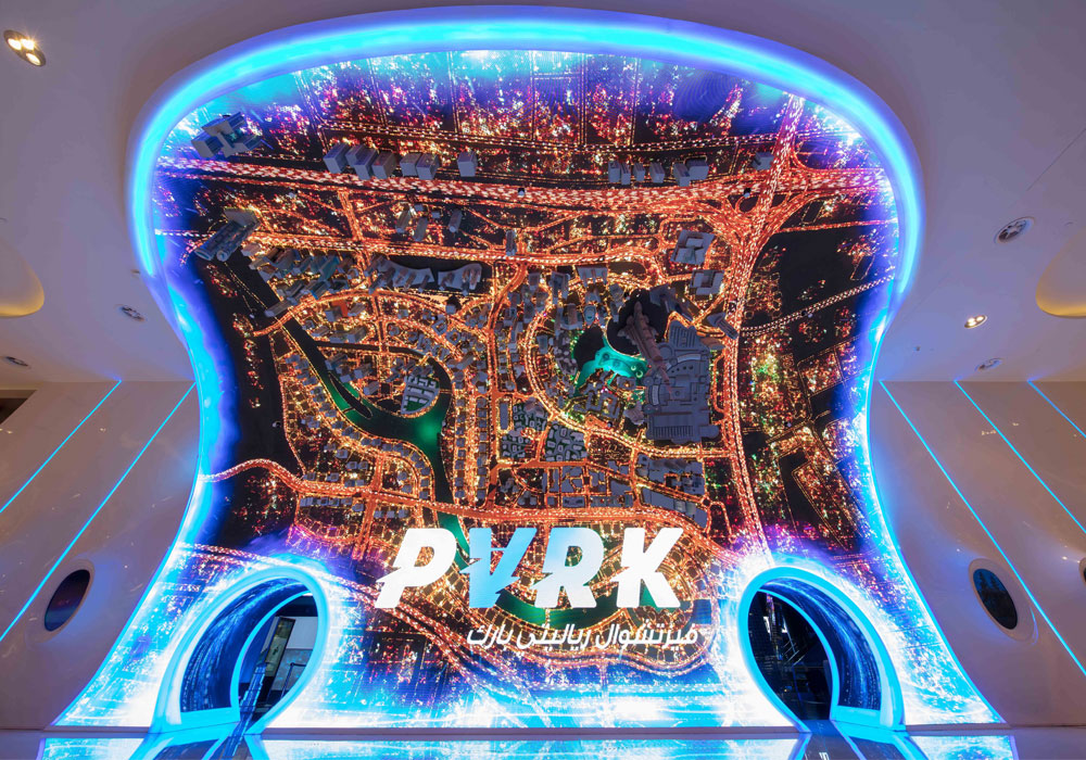
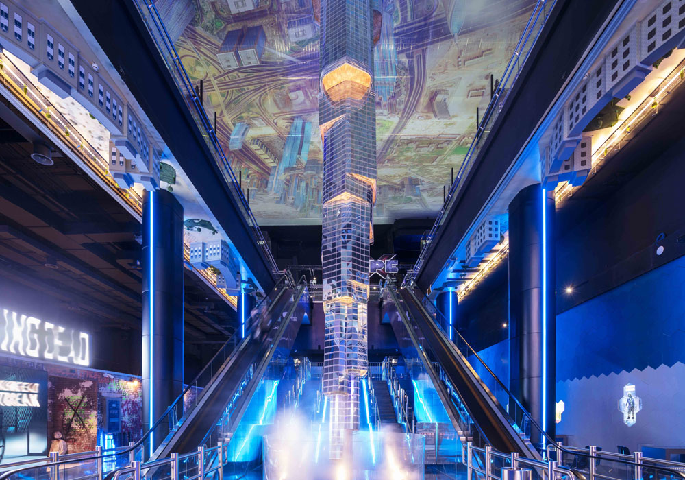
Project Title: VR Park Dubai Mall
Bernard The VR Park is designed to allow visitors to experience an extreme level of virtual reality. The client, Emaar Entertainment, wanted to build a new attraction that had never been implemented in Dubai before. The core concept was to experience the futuristic ambience and elements along with a wonderful journey through the virtual reality world. At the entrance, a huge 90-degree curved LED display screen panel along with complete cityscape buildings of Dubai downtown bent upside down highlights the magnificent experience that awaits visitors. The focal point of the theme park interior is a giant model of Burj Khalifa, hanging upside down from the ceiling to floor. 4SPACE collaborated with the theming company to get the correct proportion, finishes, look and feel of the actual Burj Khalifa. From the initial concept down to the minute details, VR Park is an example of unique and innovative design.
CGI & Visualisation
Company: Alena Zhernovaya Interior Design
Project Title: RiverStone
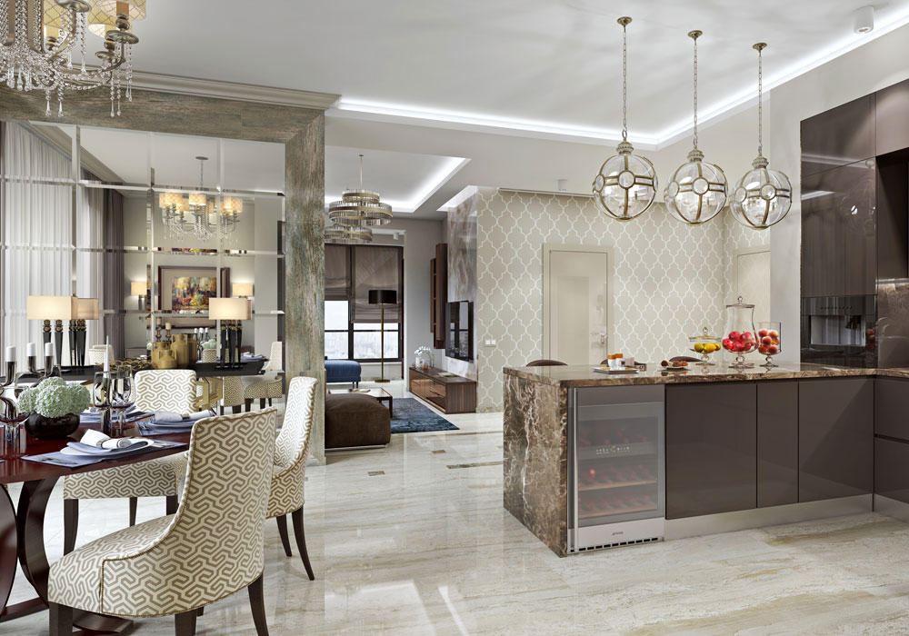
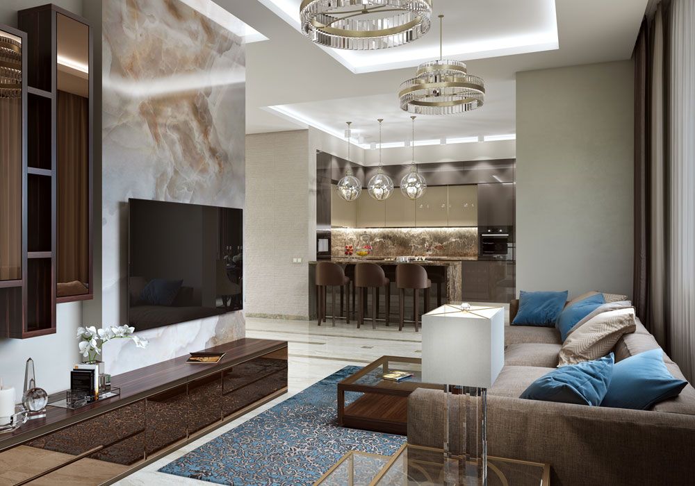
The 130 square-metre apartment is located in the RiverStone residential complex. The clients wished for a modern, eminent interior. The cooking area was merged with the living room in line with current trends. A mirror panel and special lighting highlight the dining area. The relaxation area stands out separately with a bay window. The master bedroom, bathroom, and the children’s room are private areas of the apartment connected to living room. A spacious walk-in closet and a large bathroom are essential parts of a modern interior. Natural stone, mirrors and porcelain stoneware create a convivial atmosphere, which you sense from the moment you enter the apartment. Wood wall panelling in the bedroom further underpin the concept.
Club & Bar Design
Company: IHG
Project Title: Juniper & Kin at The QO
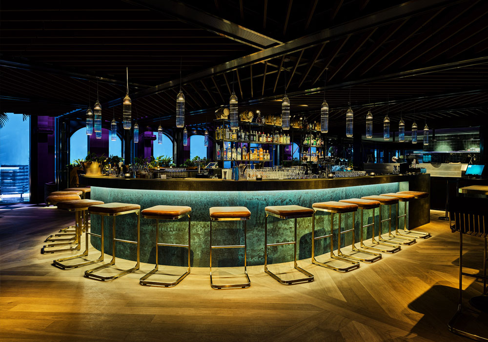
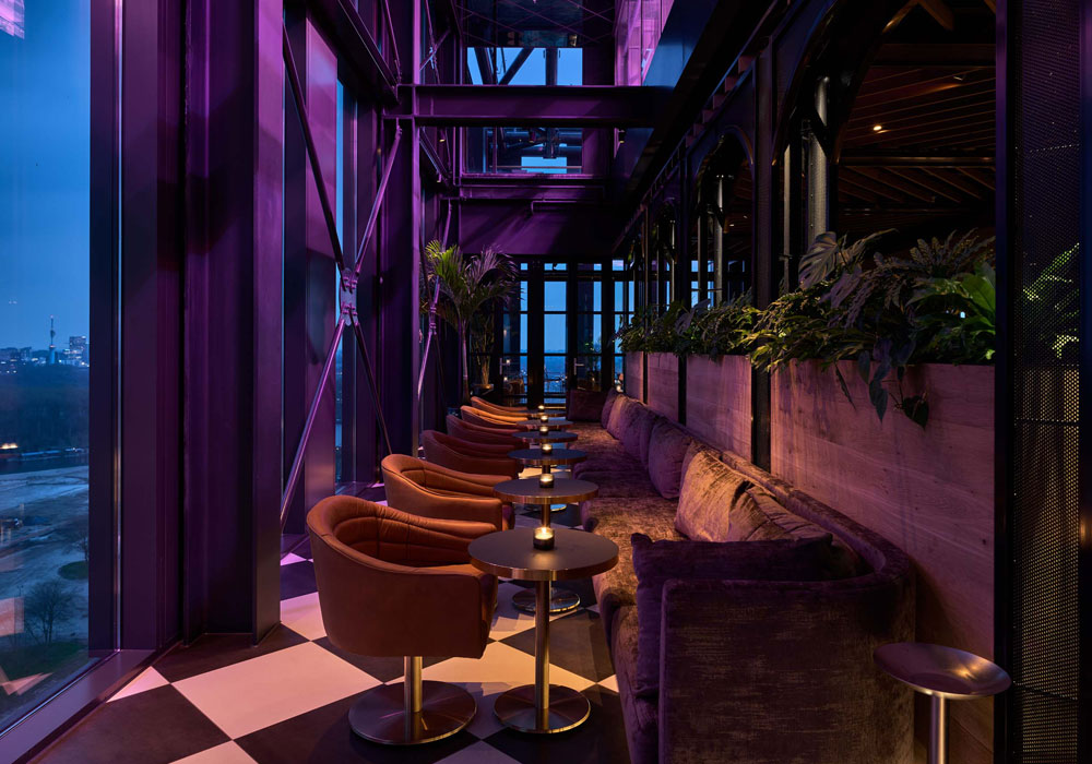
As you enter through the concrete lift area, there are brass installations that make the light sparkle. The design team wanted to bring the feeling of a bright starry night to the bar as it is on the 21st floor. The colour scheme is black and white with dark green which the design team kept warm by using dark wood and velvet. The layout was designed to create different feelings within the space. The middle area, where the bar and kitchen are located, is raised to give them the spotlight and more of a buzz. The lower levels are where all the sofas are set for a more intimate experience. Somewhat unusually, the floating greenhouse above the bar gives off a deep pink glow that helps the plants glow but also adds an intimate and moody ambience to the place, a great example of where the QO’s eco credentials and atmosphere collide to create a truly memorable experience.
Healthcare and Wellness Design
Company: Francis Cauffman
Project Title: Brooklyn Health Center
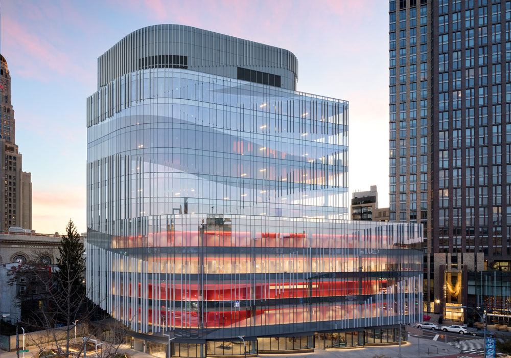
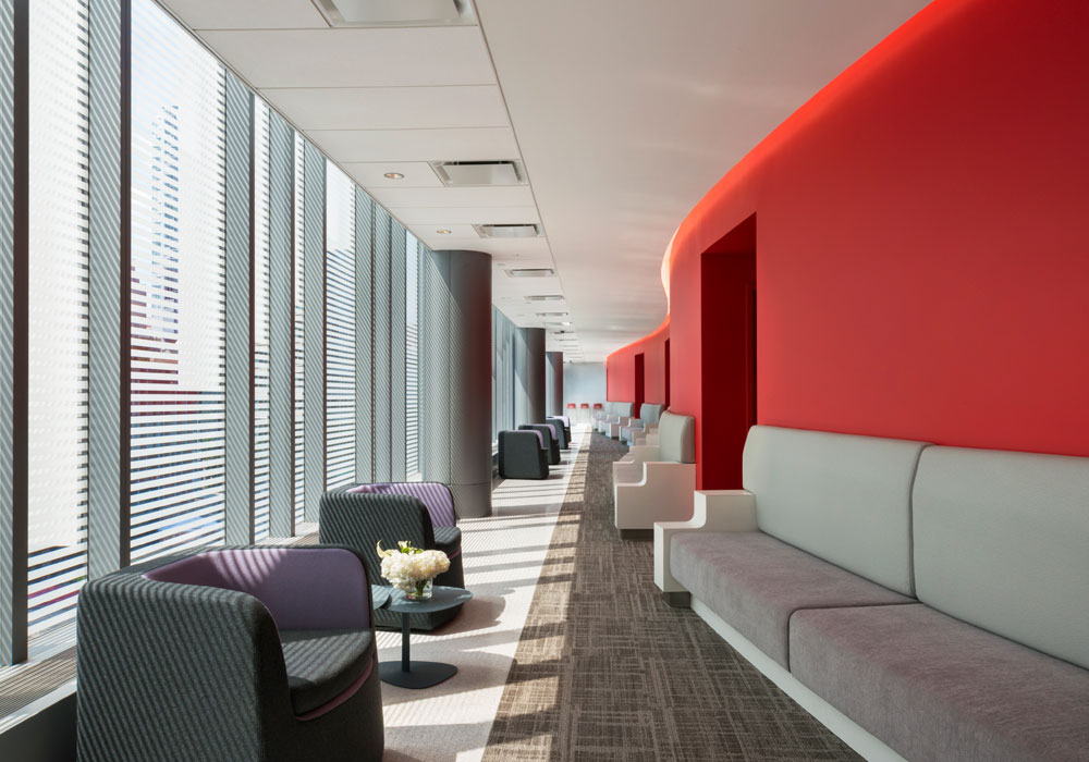
The designers were asked to deliver a new, distinctive health centre. They delivered a four-storey health centre as the beating heart of an innovative glass-faced eleven-storey mixed-use building. Upon reviewing the site, they immediately understood that they could dramatically expand the square footage by using a privately owned public space (a 2,000-square-foot park, built for public use and maintained by the owner of the building), which would allow for leasable spaces to defray the cost of the building over time. As not to allow the health centre to become lost in the building, the senior designer conceived of it as a red object encased in glass—the building’s beating heart. Its teardrop-like form was designed to complement the vibrancy and ingenuity of downtown Brooklyn. Its external design takes advantage of the unusually shaped site to create a lively façade that reflects the eclecticism of this culturally diverse neighbourhood.
Hotel Bedrooms & Suites Design
Company: Artichoke
Project Title: Mombo
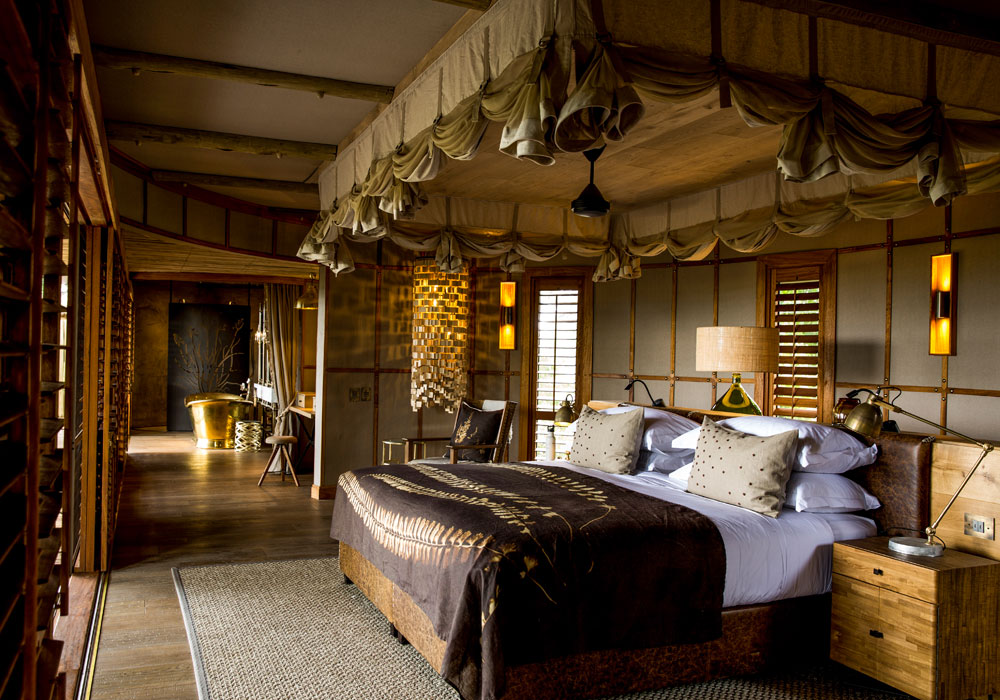
The design combined traditional and vintage elements with a modern elegance that truly embraces the real essence of Mombo. Deconstructed furniture in classic styles, antique brass finishing, vintage leathers, copper lighting combined with marble and oak floors were all used. A tonal colour palette throughout reiterates the longevity of the interior design. A mix of mismatched – yet complementary – wooden furniture all works together to feature a collection of pieces sourced over the years, resulting in a personalised feel. Space was also a key factor in creating the new design, with each tented suite now comprising an expansive entrance, a sitting room with a bar unit, a separate bedroom and bathroom with a dressing area, indoor and outdoor showers and a bathtub that creates a sense of indulgence.
Hotel Public Space Design
Company: Wanda Hotel Design Institute
Project Title: Wanda Vista Hefei
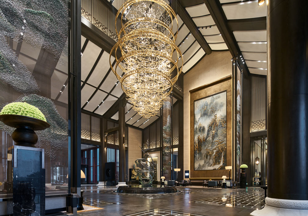
Located on the shore of Lake Chao, one of the largest lakes in China, Wanda Vista Hefei is an urban resort that offers sweeping lake views. The hotel is a hillside building in the neo-Huizhou style with 206 guestrooms. Each room has a balcony from which guests may enjoy 180-degree view of the beautiful lake. The interior design features white walls, black tiles and grey bricks, all of which are typical of Huizhou-style architecture. Respect is given to the aesthetic basis of order and symmetry seen in the Huizhou style. A horse-head shaped wall and the ‘Four Treasures of the Study' (writing brush, ink stick, ink slab and paper) which have local cultural significance are adopted as design elements to express the ‘Impressions of Huizhou’ design theme.
KBB Design
Company: Celia Visser Design
Project Title: Contemporary Kitchen & Bar
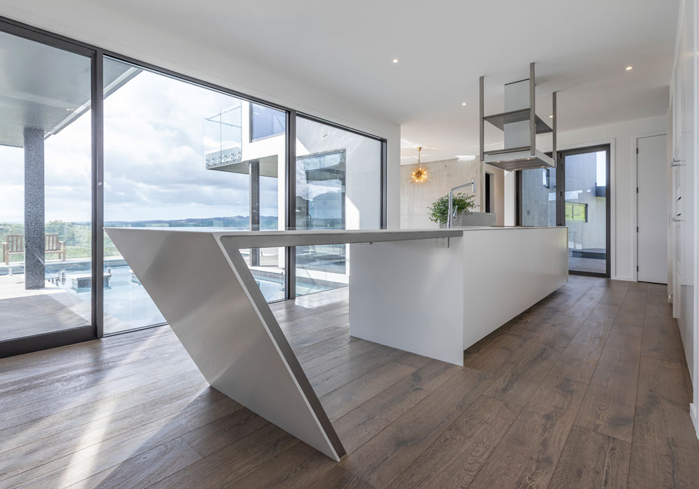
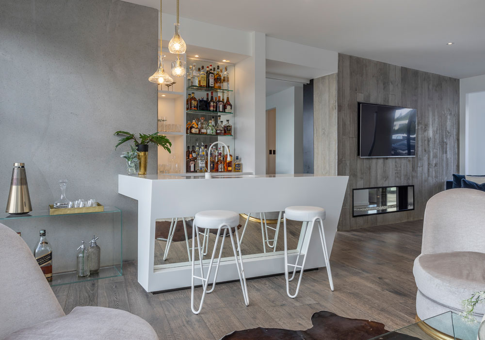
Celia Visser Design created this kitchen and adjacent bar for clients who love to entertain and desired a space that merges seamlessly within their home’s contemporary architecture. They asked for a visual statement that used modern materials, incorporated sharp, clean lines, and had a look that played on bold asymmetrical forms, all using a white palette, with exposed concrete walls as the backdrop. The striking geometric structure of the kitchen features bead-blasted stainless steel which contrasts the white Corian, both under the dramatic angle and display shelving. Corian and angles were also introduced into the design of the bar to meld the two areas for maximum impact. Beautiful timber flooring is a contrast to the monochrome kitchen and bar, allowing the stunning rural and pool outlook to enhance this remarkable kitchen from both sides of the glass. The overall impression is an eye-catching modern piece of art.
Office Design
Company: Paragon Interface
Project Title: Discovery Place
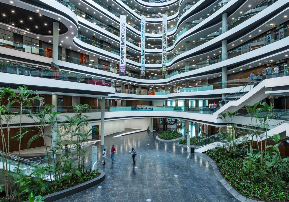
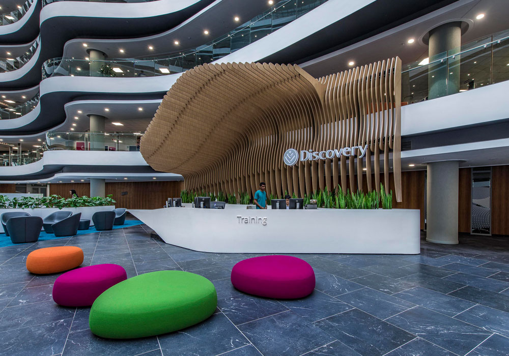
The building is located on a prominent corner entering the business district of Johannesburg. Its main entrance is open and welcoming, to reflect the mores of discovery. Internally the building is divided into three main atria, namely a central atrium, and one each on the left and right side. The central atrium allowed Paragon Interface to explore the concept of a concourse, driven by Discovery’s requirement for the building to be active. This was not only translated effectively into a dynamic design aesthetic, but also into an active public street populated with seating areas, cafés, streetlights and tree canopies. It served not only as the main thoroughfare of the building, but also constituted a welcoming space for visitors and clients. Visitors are encouraged to wander around the ground floor to make use of facilities and also enjoy a snack, meal or cup of coffee.
Public Space Design
Company: Studio MB
Project Title: Triumph Factory Visitor Experience
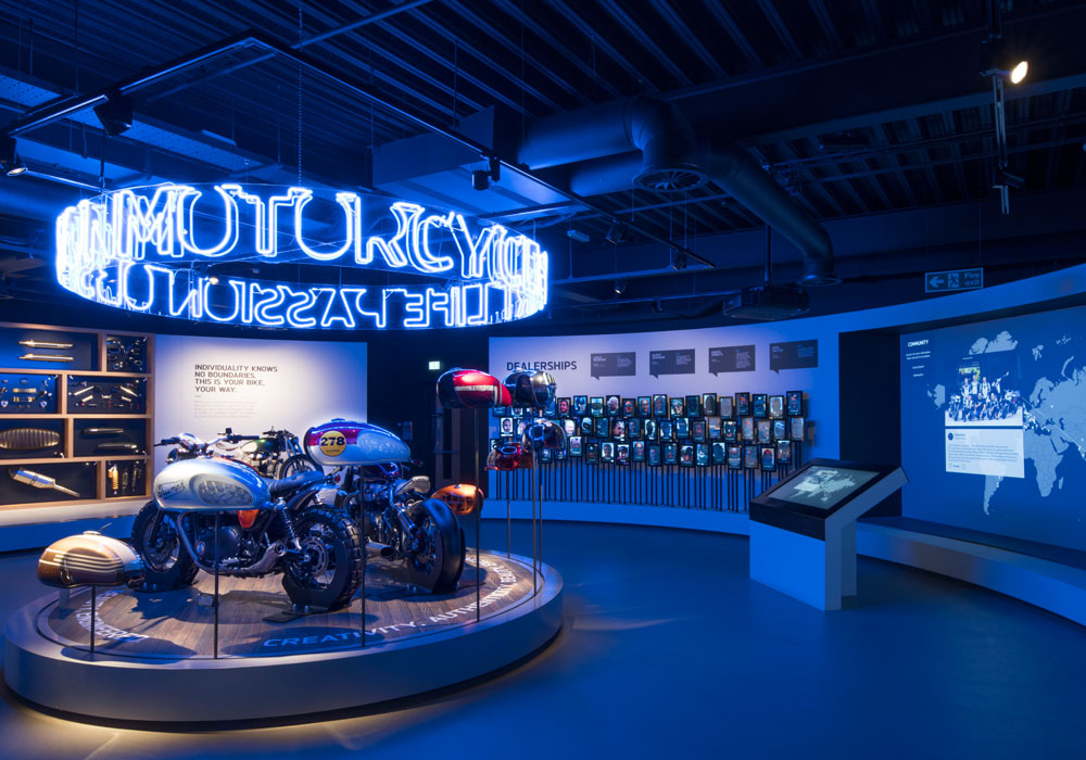
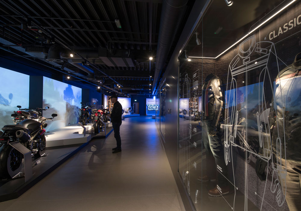
The design consultancy collaborated with Triumph Motorcycles to create a world class visitor facility within the heart of its Hinckley factory in Leicestershire. The Triumph Factory Visitor Experience is a site of pilgrimage for motorcycle enthusiasts and general public, offering an inspiring and informative 1,200-square-metre exhibition and factory tour, including café and shop. The exhibition presents a chronology of Triumph’s historic and contemporary achievements in motorcycle design, engineering and manufacture. It offer visitors a deeper appreciation of the authentic heritage and ongoing success of this genuine British icon and international super brand. The exhibition connects with existing riders and captures the imagination of new customers, telling a passionate story of Triumph Motorcycles by the people who make them and by the people who ride them. Studio MB was responsible for delivering this brand experience, from master planning to onsite completion as a design and build package.
Residential Design Over £1 Million
Company: Regina Sturrock Design Inc
Project Title: Contemporary Manor
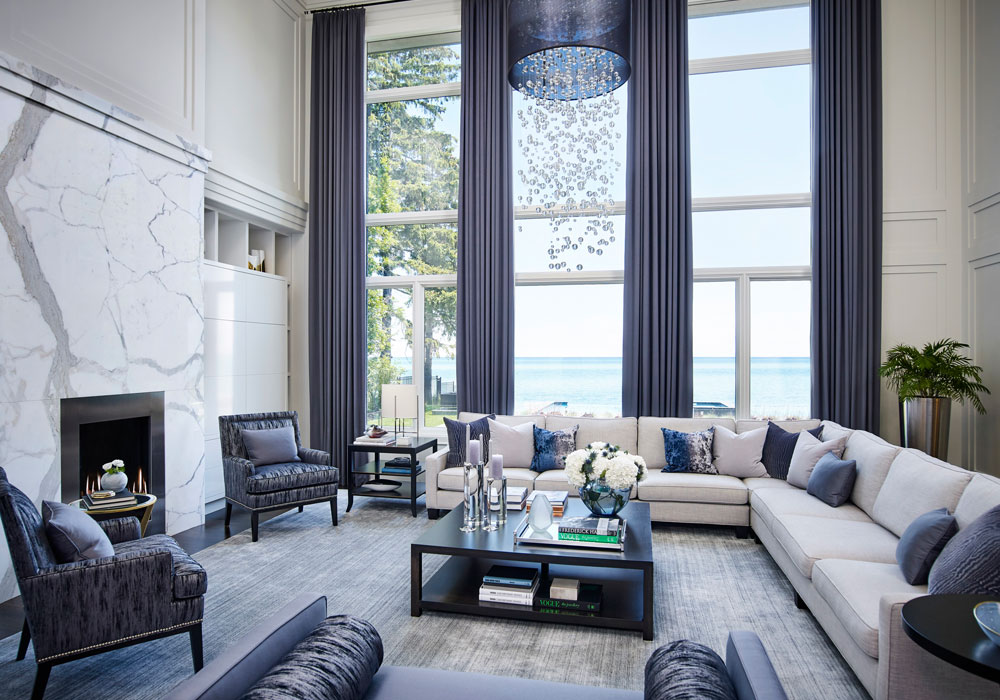
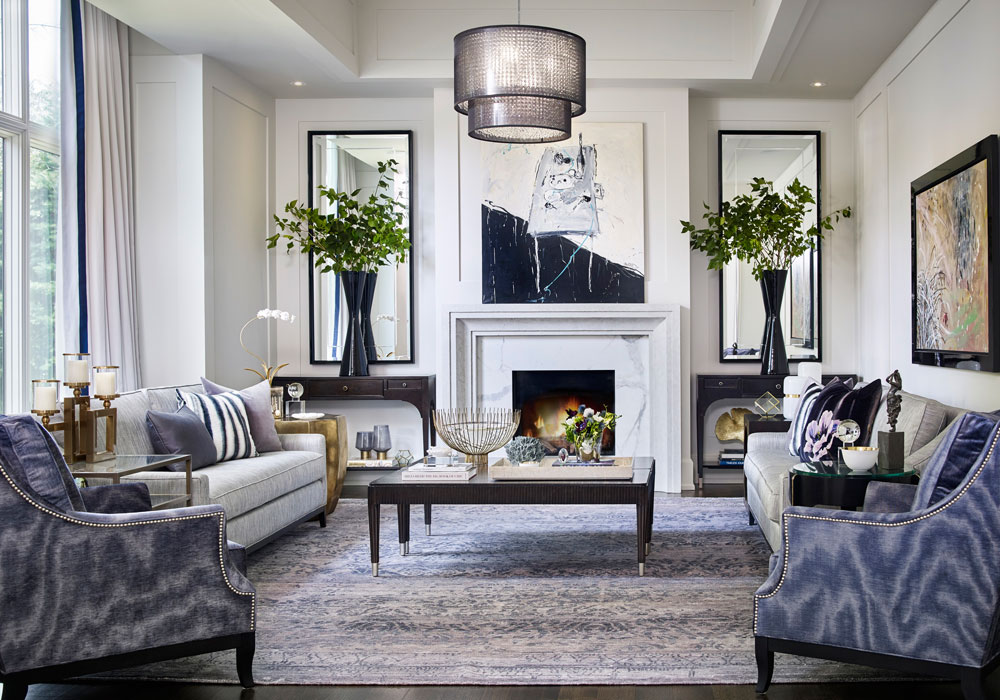
A waterfront home with manoresque proportions and contemporary lines impresses and guides one through classically-framed openings and clear sight lines. Representing a 2.5-year, from-the-ground-up project, this luxury-driven family residence accumulated its intuitive layers over time. A comprehensive scope of work included planning, architectural detailing, custom features, and millwork concepts. Together with all the finer points in interior design and decor, it marked a holistic approach where architecture and art would connect. Upon entering the home, there is an immediate sense of quiet luxury that may best be defined through the subtleties in beautiful materials, classical order and a clean-lined sensibility. The first-impressions great hall, a cocooned inner hall, and the commanding two-storey great room represent an enfilade of harmonic spaces that each play with the sparkling waters of the lake beyond. Together, they provide a successive scene of reflection and undeniable beauty.
Residential Apartment Under £1 Million
Company: Elliot James
Project Title: Cuscaden One
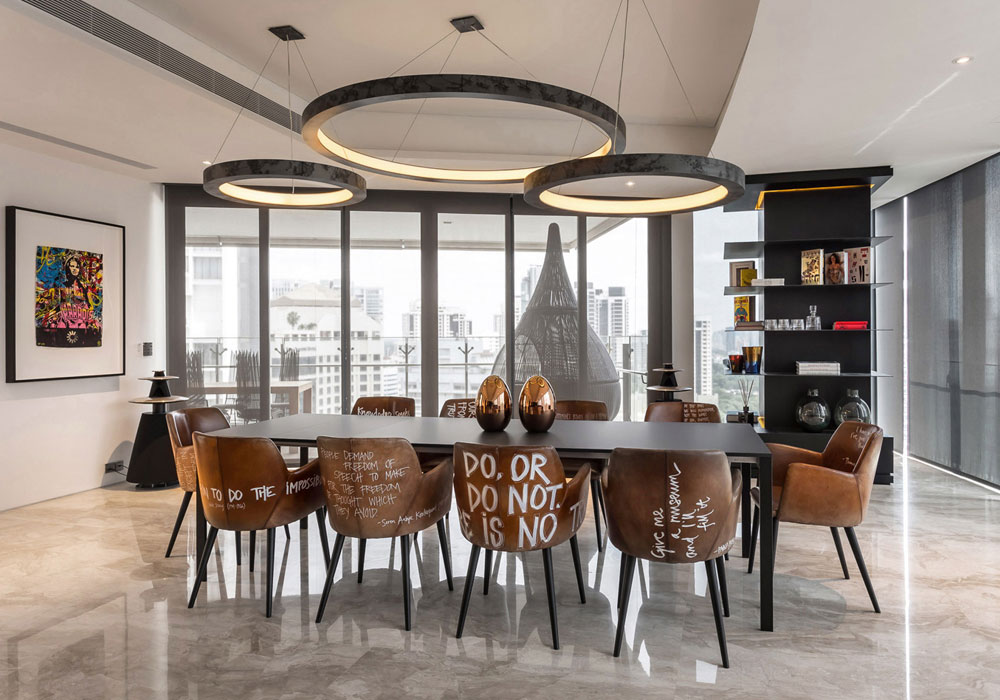
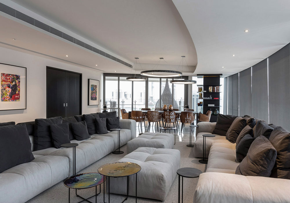
The client wanted the apartment to be relaxed with a funky, edgy style that would cater for his family when relaxing but also allow for larger gatherings with abundant seating and a very informal, welcoming atmosphere. The style for the apartment was to be bold but simple. The design team wanted the apartment to have a clean, monochrome palette throughout to reflect the simplicity in the brief but to also act as a calm, backdrop to the bold shapes, large proportions, bespoke furniture and exciting commissioned artwork throughout. The aim was to create a home that could be warm and intimate for the family but also function to host large gatherings with a fun and informal setting.
Residential House Under £1 Million
Company: NEVERMORE
Project Title: The Irrawady House
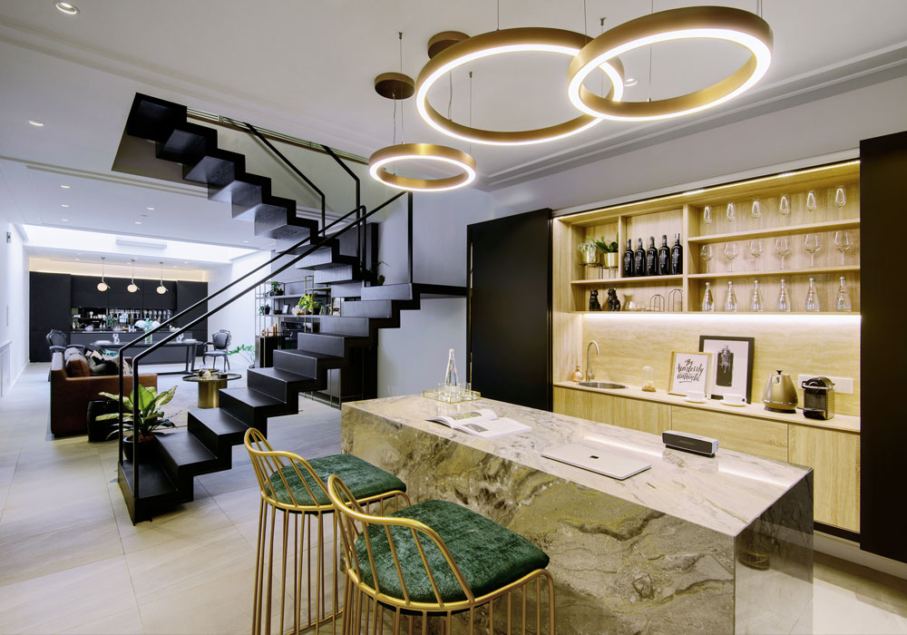
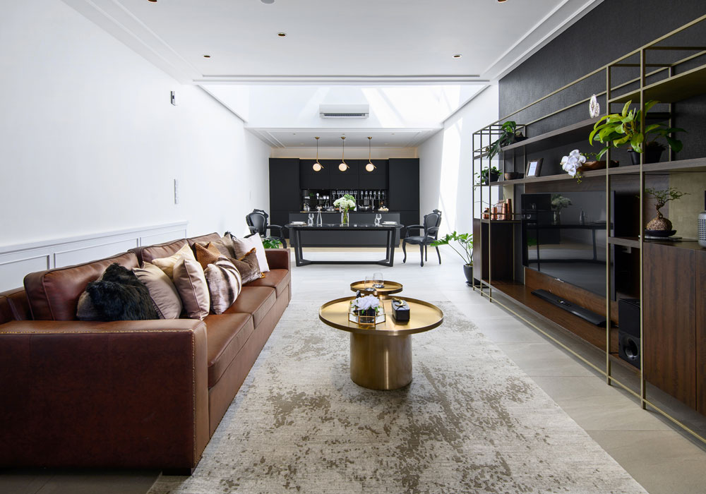
The modern-day luxury home manages to combine both old-school opulence and contemporary cosiness under the same roof. Superior air ventilation incorporated into the interior of this property allows it to feel larger and spacious. a stark contrast to the dark and cramped image of a pre-war house. The elongated living room is connected with the kitchen, dining area and open bar area with the decor featuring a modern twist to classical European design. Including with a daring open staircase, this bold design is further enhanced with the selection of large circular pendants and an imported Italian marble counter. Gold finishes are thrown in to elevate the overall look with a hint of glitz. Meanwhile, the living room, dining area and kitchen enjoy the warm glow derived from the skylight feature, giving these spaces a natural comfort.
Restaurant Design
Company: Goddard Littlefair
Project Title: The Garden
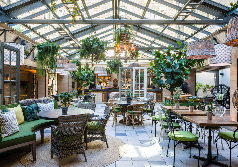
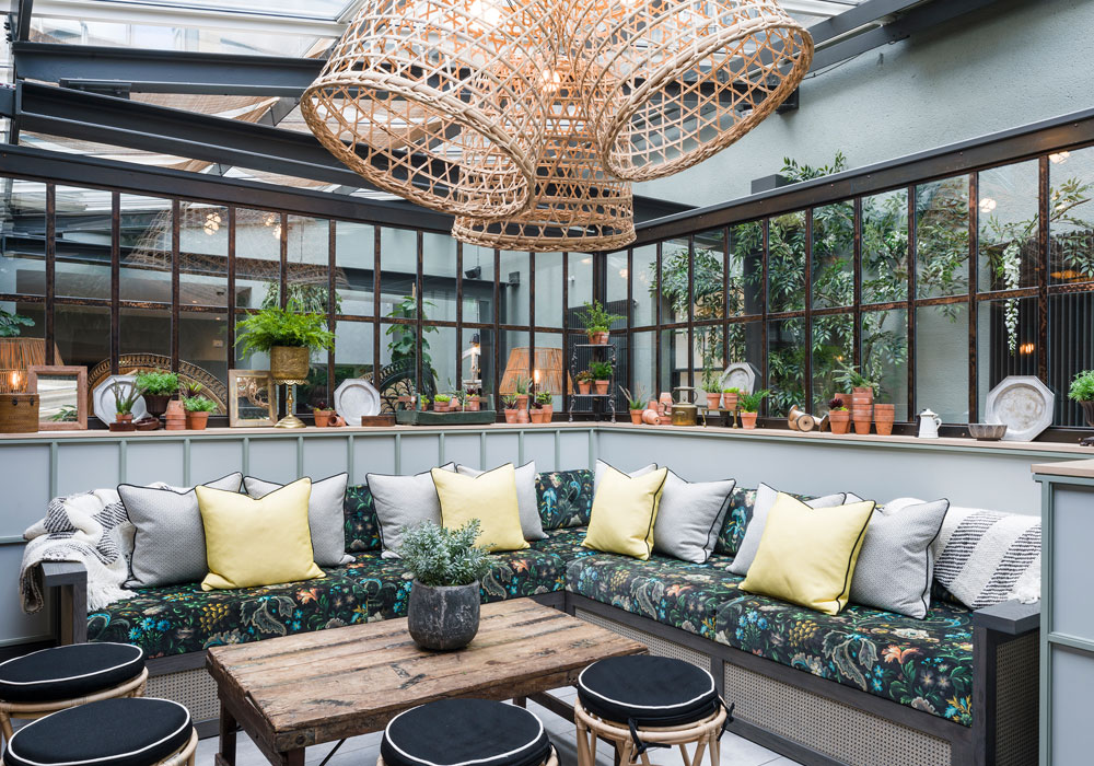
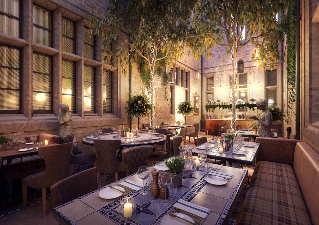
The Garden is a destination all-day food-and-beverage space for hotel guests and local Edinburgh residents, located within the former courtyard of the Principal Edinburgh Charlotte Square. Taking inspiration from the great hothouses and orangeries of historic country estates, Goddard Littlefair was tasked with developing a green heart to the scheme, transforming the previous outdoor space into a year-round dining destination. Filled with plants, trees, hanging baskets and vines, the new space is a biophilic delight, with the new glass roof providing natural lighting and open views of the sky, resulting in the creation of a magical oasis, right in the heart of the hotel.
Retail Design
Company: XYI Design
Project Title: Latitude Sports Park
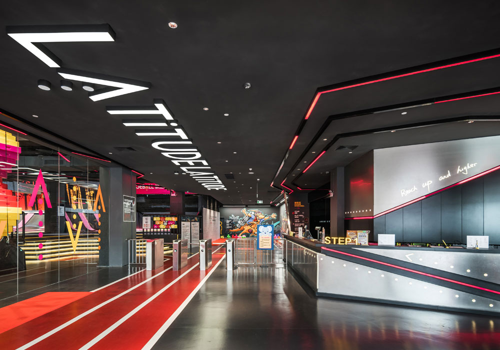
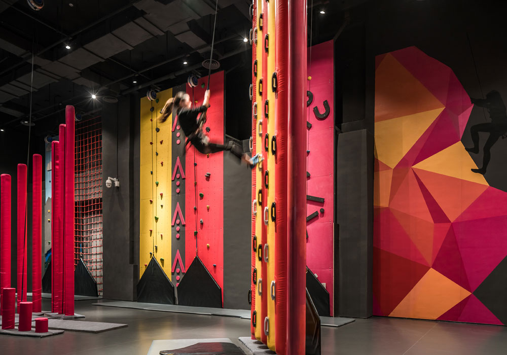
This multipurpose athletic indoor sports space is aimed at young people, family activities, and company outings. The word ‘latitude’ implies space and breadth and the design team has expanded on the original implications of this for the Australian brand to create a multipurpose indoor sports park combined with outdoor topography. ‘Sports for everyone’ serves as the both the style and recreation concept, and it is hoped that the design will inspire everyone who visits to be more active. The design studio aimed to create a visual experience that encourages visitors to have fun while engaging in sporty activities within the park space, ultimately promoting a more active lifestyle that combines activity with leisure time.
Show Flats & Developments
Company: HWCD
Project Title: The Trevista Sales Gallery
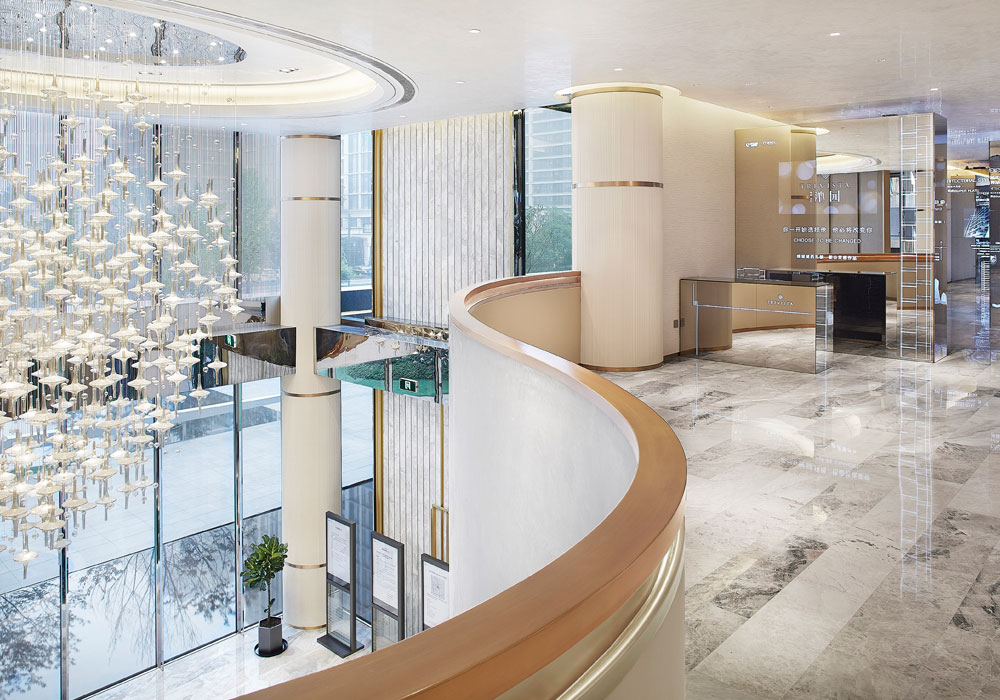
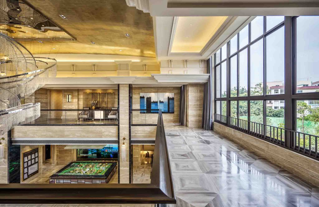
Located in flourishing Hangzhou and surrounded by beautiful natural landscapes, the luxurious Trevista showcases a concept of refined spatial arrangement created through flowing space lines, rich textural materials, and artistic decoration. The design idea originates from the textures of ‘water, mountain and silk’ which all emphasise smooth flow throughout the interior designs to create a unified and pleasing artistic rhythm by manipulating the space, light, and structural order. By playing with light and form, and with the ‘super flat’ architecture style, the project stands out amid the luxury residences in Hangzhou.
If you'd like the chance of winning an industry-acclaimed SBID Award for your projects and think your designs can compete on a global scale with the world's most esteemed interior designers and design practices, make sure you enter next year!
The SBID International Design Awards 2019 is set to be open for entries in March/April so visit www.sbidawards.com early next year for more information on official opening dates and deadlines.
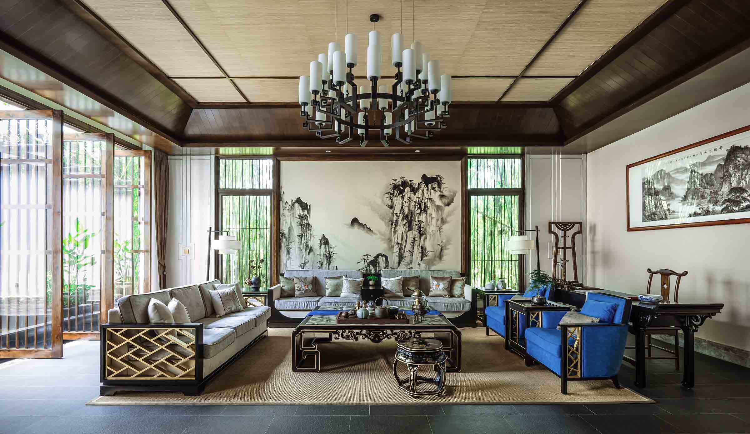
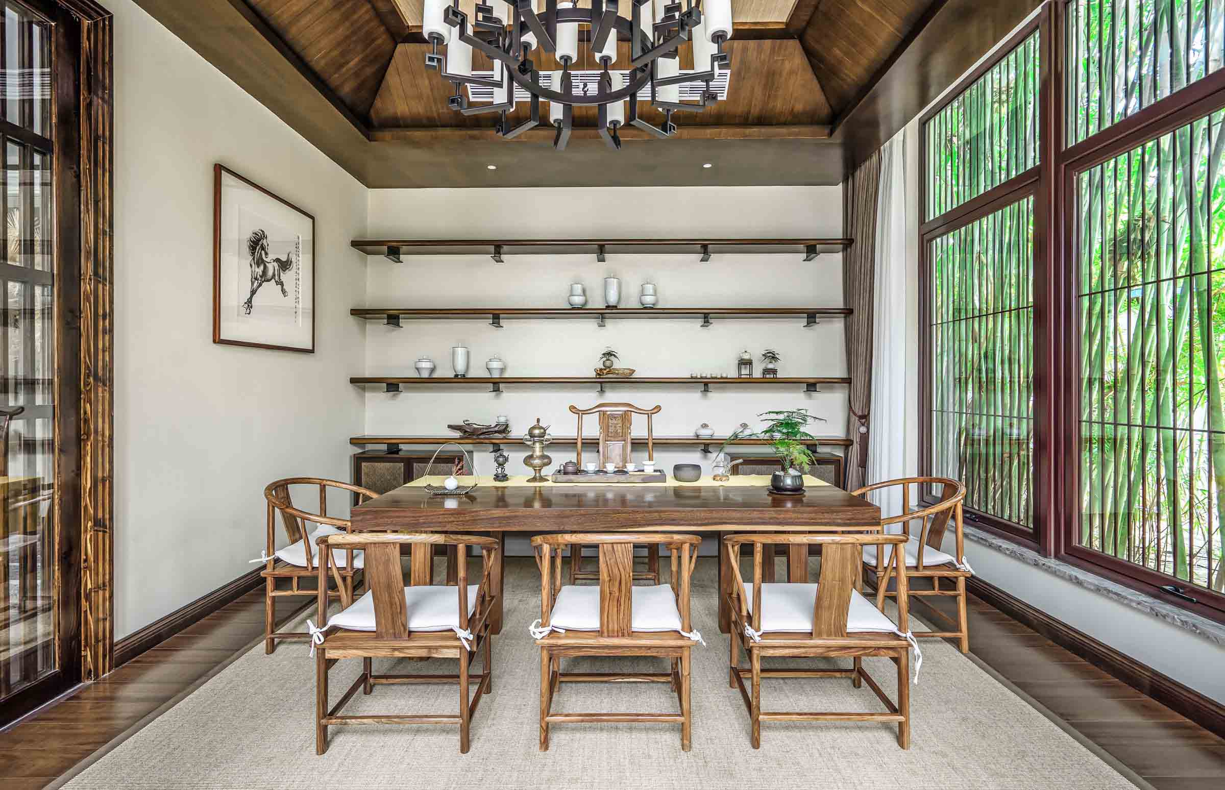
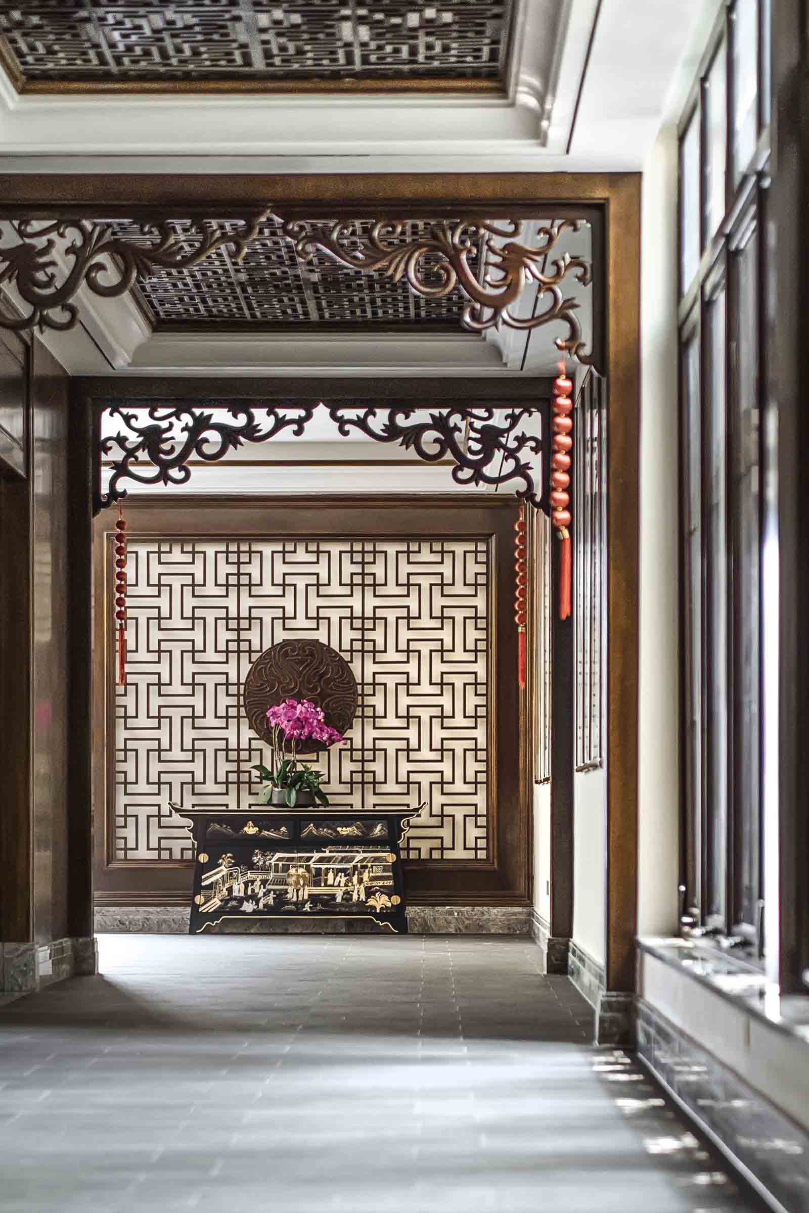
This week's instalment of the #SBIDinspire interior design series features Bamboo Pavilion, a tearoom located in Honey Lake, Shenzhen, situated in a secrete setting hidden in a verdant bamboo grove in the bustling city. Based on the concept of a poetical life which contemporary literati and scholars dream of, the Bamboo Pavilion presents a natural art form by adopting new Chinese garden techniques, to help visitors relax and put them in touch with a deeper sense of harmony and serenity with the natural world and their spiritual selves. The designer understands that in order to achieve the value of culture in life, the project should be a place to relax from body and mind with all redundancies being cast away.
Company: Tsingda Environmental Art (Shenzhen) Design Consultants Co
Project: Shenzhen Nord Club
Project Location: Shenzhen, China
What was the client's brief?
Shenzhen Nord Club is a tearoom located in Honey Lake, Shenzhen, which situates in a secrete setting hidden in a quiet and verdant bamboo grove. Representing natural art and beauty, its' surroundings help to create a refreshing little sanctuary amidst the busy, bustling city. Based on the concept of a poetical life which contemporary literati and scholars dream of, the Bamboo Pavilion's brief was to present a natural art form by adopting new Chinese garden techniques, taking people back to the distant poetic realms where they can relax their bodies and souls.
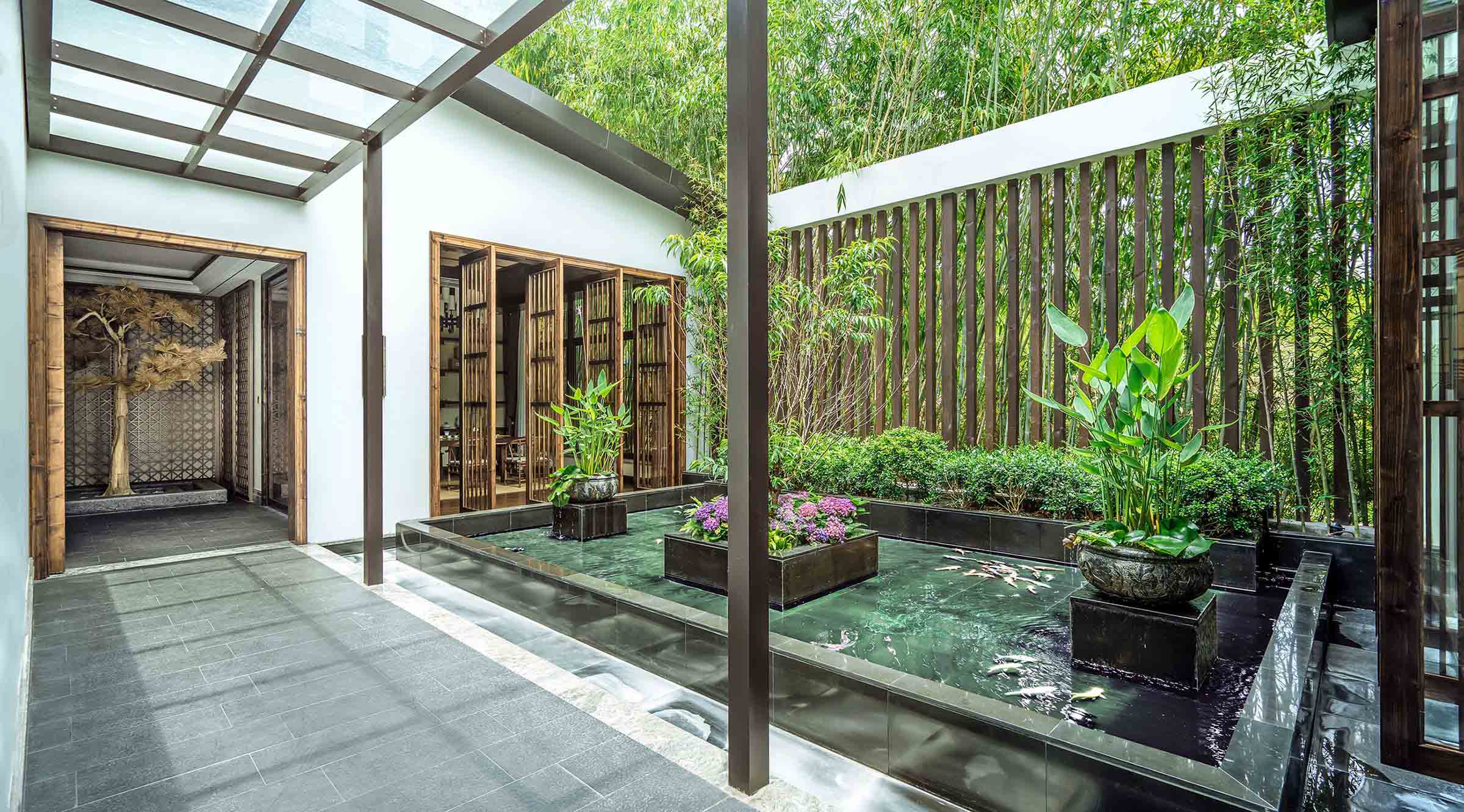
What inspired the design of the Project?
The project and the project's name - Bamboo Pavilion, is inspired by the great ancient Chinese thinker Zhu Xi’s 'New Bamboo': "In front of the window, there are bamboos that I planted, while now they have sprouted. Being freed from the troubles of secularities, I just sit quietly and enjoy the secluded forest." Reading between the lines, we can find the kind of aloofness and loftiness which were typical to many ancient scholars.
Opposite to the tearoom is the restaurant which is squarely shaped in a balanced manner. The beauty and elegance of bamboos is presented in front of the dining table by way of creativity and the utilization of wood materials, exquisite details and lightweight design, which is unexpected but natural and harmonious.
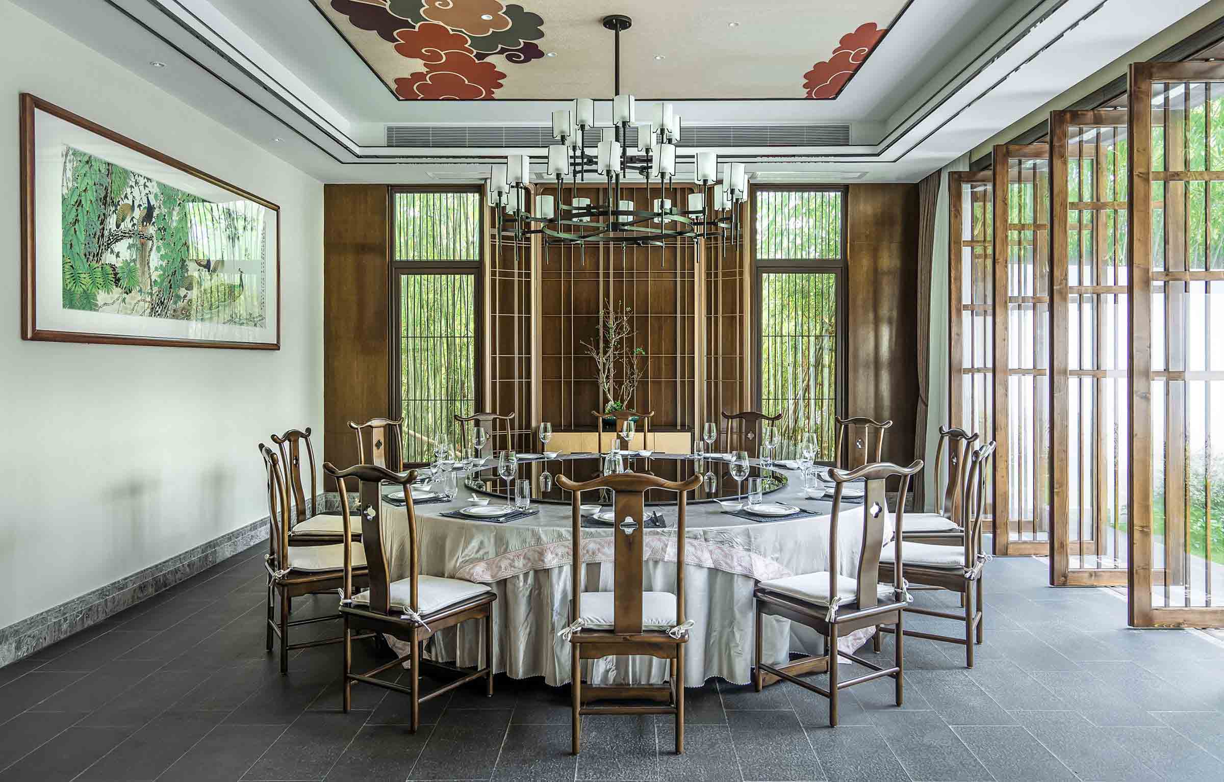
What was the toughest hurdle your team overcame during the project?
The highest form of culture is art. Artists create a line, within which everything can express itself with no restraint. According to Zhong Yao, a famous calligrapher in ancient China, “beauty comes from mind”. Beauty comes from “mind” reflects the rhythms implied in the images of everything. The designer understands that in order to achieve the value of culture in life, this should be a place to relax from body and mind with all redundancies being cast away. Balancing these notions of Chinese traditional literacy, culture and art whilst maintaining the designers vision and meeting the project brief to create a space to bring these sentiments together was the biggest challenge.
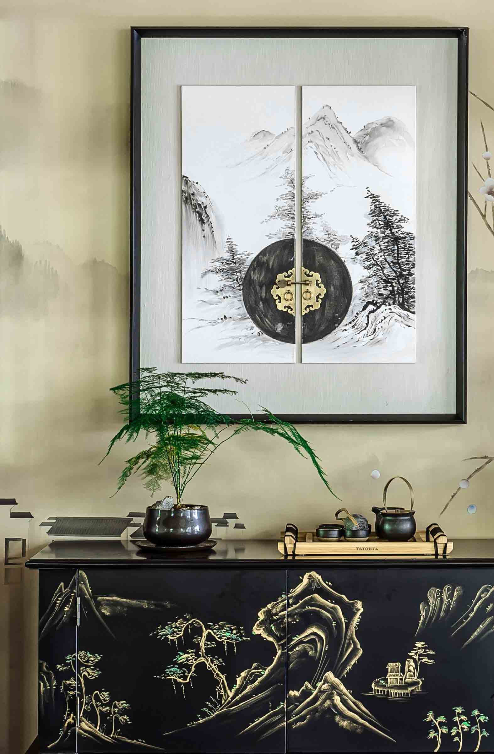
The tearoom is laid out in the traditional way of enclosing. Modern-style dark-hued sofa and finely ornamented tea table render balance and comfortability in proportion and sentiment. A Chinese ink and wash painting with poetic and lively imagery introduces artistic quality into the space. Through the hollowed-out back ground wall, bamboos appear in sight, dancing in the wind airily. All of these help to present the gracefulness and aesthetic charm of new Chinese landscape styles so that both the environment and the soul achieve an inspiring and peaceful state and are fulfilled to artistic endeavor.
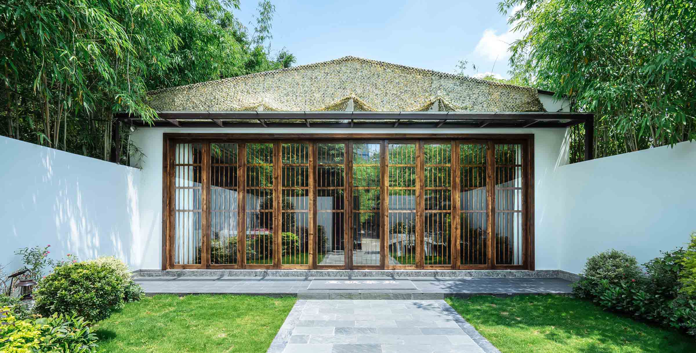
What was your team’s highlight of the project?
With borrowed view (a landscape technique usually used in traditional Chinese garden) introduced, uniquely shaped scenery is checkered with sunlight and shadow, by which the designer creates the artistic conception of “layered doors stand still in deep court, grass grows green in front of the steps”. Seeing the design vision come to fruition to embrace the poetic nature and serenity of the property's unique landscape was the most rewarding aspect of bringing this project to life.
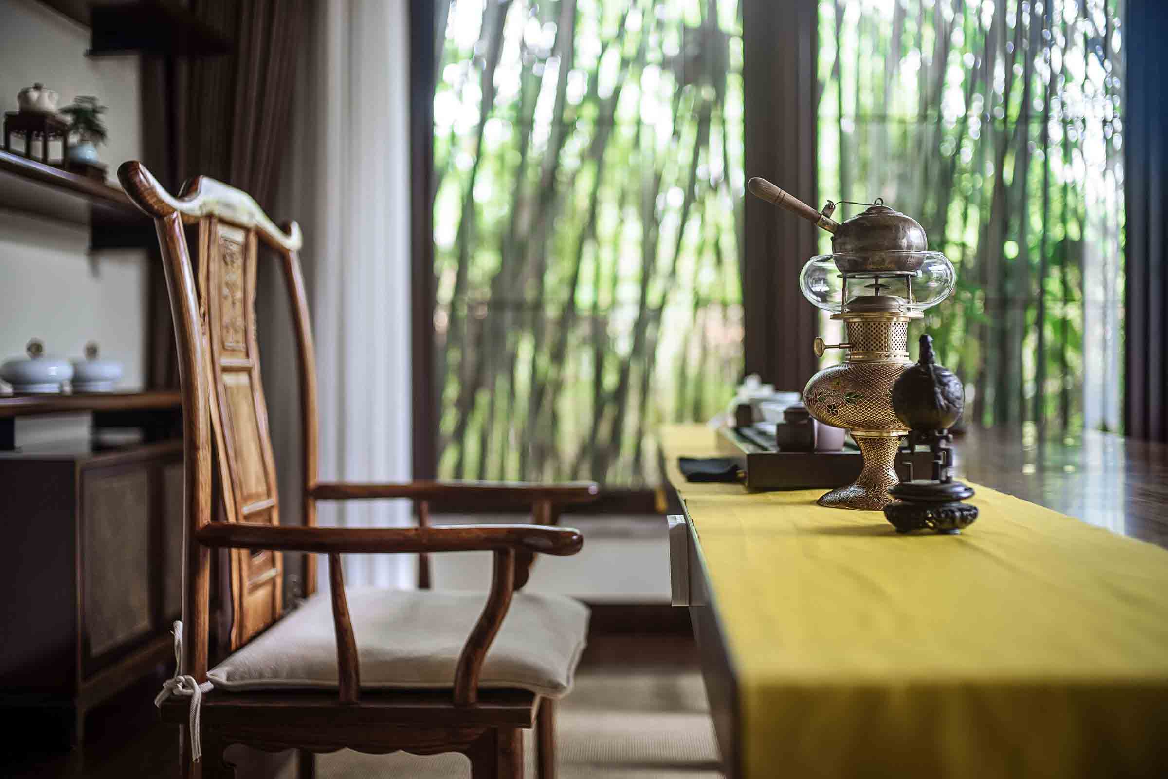
Why did you enter the SBID International Design Awards?
As an impartial international interior design award, SBID has a worldwide effect on interior design industry including China. We firmly believe in SBID and the profession and hope to make our design known to more people in and outside of China.
Questions answered by Bin Long, Chief Creative Director of Tsingda Environmental Art (Shenzhen) Design Consultants Co.
To ensure you are kept up to date with the latest design inspiration sign up for our newsletter and follow us on Instagram @sbiduk
If you missed last week's Project of the Week featuring the contemporary workspace with a fun, fresh and flexible co-working concept in Paris, click here to see more.
The 2018 edition of the SBID International Design Awards is now officially open for entries! Click here to register or enter your project!
We hope you feel inspired! Let us know what inspired you #SBIDinspire
Tsingda Environmental Art (Shenzhen) Design Consultants Co | SBID International Design Awards 2018
The annual SBID Awards serve to recognise, reward and celebrate design excellence across a broad range of categories. Winning an SBID International Design Award is a highly regarded and well respected achievement among the design industry. Each project is evaluated by leading industry experts for their technical content and aesthetic creativity, while the design-conscious public also have a say in voting for the designs they find the most inspiring.
Today, the design industry can take a sigh of relief as the SBID Awards has just announced its' official deadline extension! Designers now have until Friday 6 July 2018 to get their projects submitted for the chance to receive international recognition of design excellence. Continuing on from last week's Category Winners Part 1 from 2017, we continue to reflect on last year's worthy winners from the more commercial aspects of the interior design industry, whether it be an ultra luxurious spa, a Michelin-starred restaurant or a high-end medical centre.
Hotel Public Space Design
Company: Wanda Hotel Design Institute
Project Title: Wanda Reign Chengdu Hotel
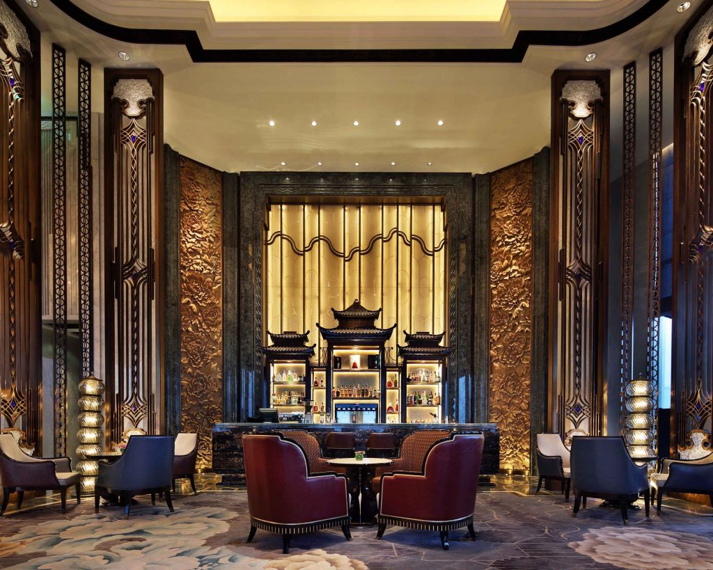
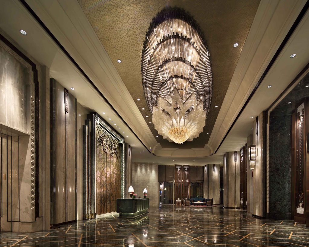
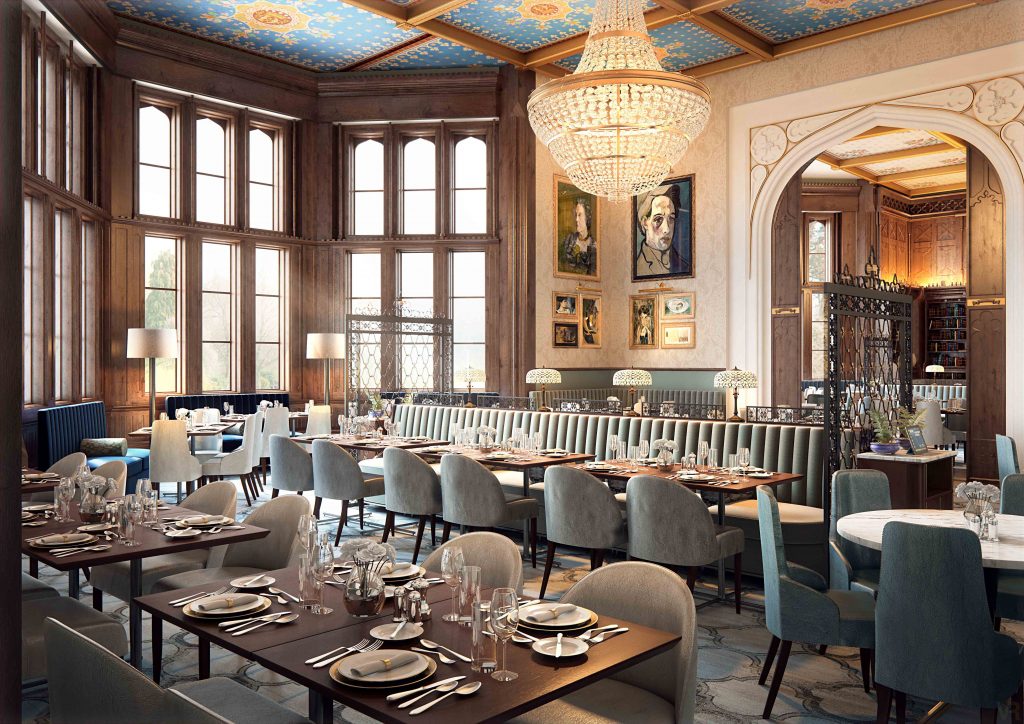
The hotel is situated in the heart of Chengdu's exclusive CBD, at the affluent intersection between Renmin South Road and the Jin River. This spot was also historically a point of convergence for goods and merchants setting off on the Ancient Tea Horse Road. The hotel's sky lobby is located on the 41st floor, overlooking Chengdu's landmark Tianfu Square to the north and boasting pleasant views of the Jin River to the south. Guests are treated to a panoramic view of Chengdu's urban landscape. The hotel's interior design concentrates on giving voice to local characteristics. Another name for Chengdu is “Confederate Rose City” so, from the very beginning, the designers were intent on having the city's official flower as a theme running throughout the hotel space.
Retail Design
Company: LXA
Project Title: Intersect by Lexus
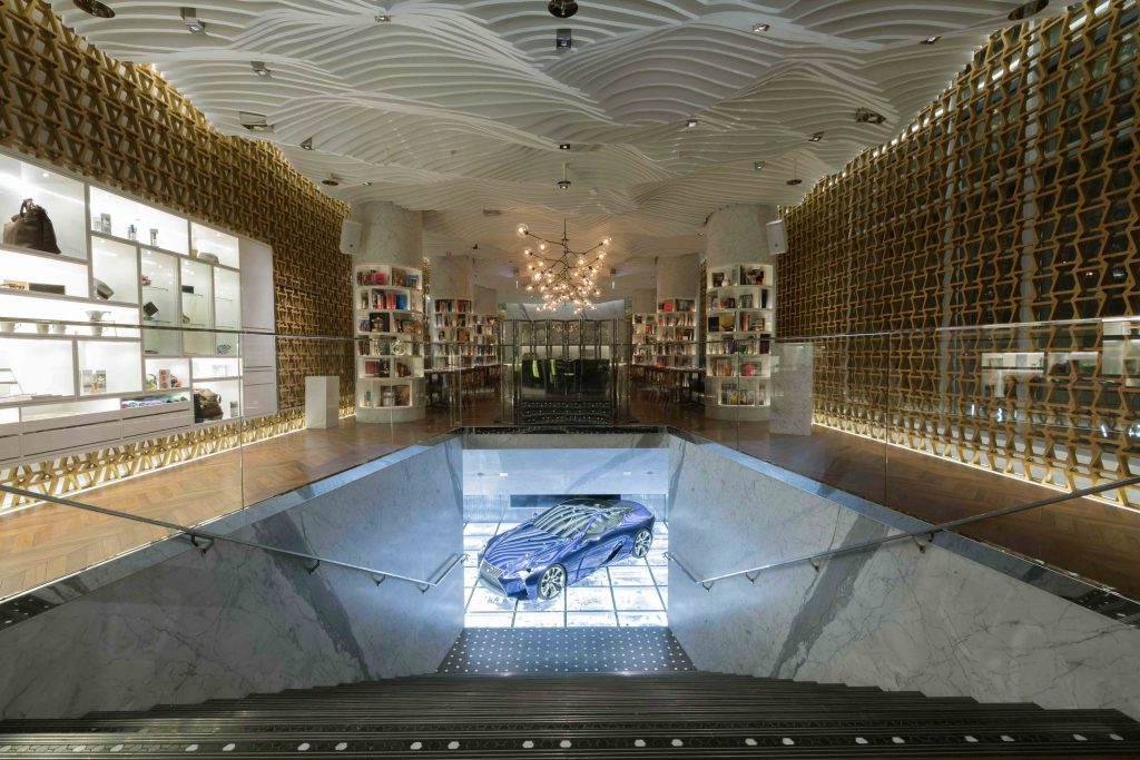
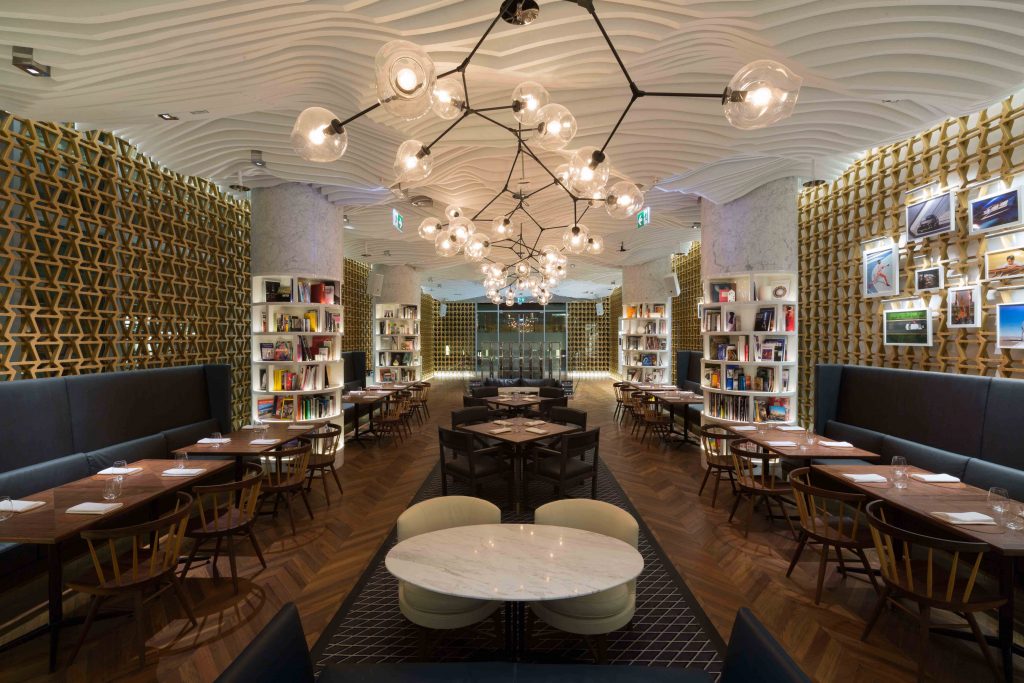
Conceived in Tokyo, Japan, Intersect by Lexus is a concept store located in DIFC, Dubai. The space offers a relaxing yet stimulating space for people who are seeking diverse luxury lifestyles enriched by design, art, fashion, culture, film, music and technology. Devised by renowned Japanese designers Wonderwall for Toyodo, the concept is described as ‘neither a dealership, nor a traditional retail space, INTERSECT BY LEXUS is a third space between home and work for our guests to experience the Brand without getting behind the steering wheel of one of our cars.’ LXA successfully partnered with Wonderwall Inc, and Al Futtaim Motors to deliver the second Intersect concept, in DIFC, Dubai.
Public Space Design
Company: Bluehaus Group
Project Title: Orbi Dubai
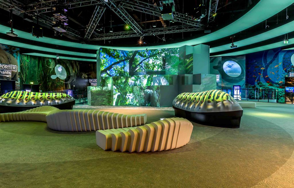
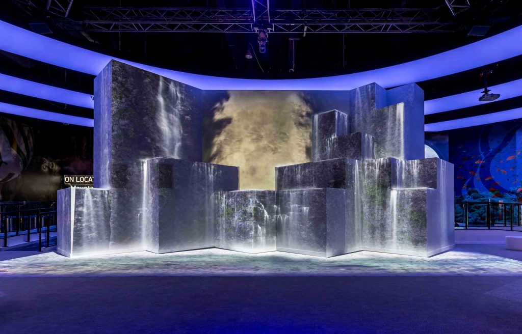
Orbi is conceptualised to offer an amazing digital experience to its visitors and the entire space revolves around interactive technology. The space is designed for people of all generations and different walks of life to share the fascination with nature, and Orbi will astound them. Orbi Dubai fuses BBC Earth’s world-renowned Natural History content with SEGA’s innovation and plunges visitors into the heart of the natural world! From the heat of the Dubai desert, visitors can experience the chilling temperatures of Mount Kenya at -25°C. This multi-part experience takes the guest who dares, into freezing Polar environments where they experience the sensation of Antarctic cold and blizzard conditions. The space is equipped with real time thermal image of guests as they react to the freezing Polar conditions, all displayed on a monitor.
CGI & Visualisation
Company: Virtual Resolution
Project Title: DeVere Tortworth Court Hotel Re-Development
Tortworth Court is an elegant and sophisticated hotel surrounded by enchanting scenery just outside of Bristol dating back to the 11th Century. Over 12 months the hotel had undergone a lavish refurbishment as part of the DeVere property refurbishment programme. Virtual Resolution was working alongside DeVerve and its design/development teams to visualise the proposals for Tortworth Court, Wokefield Estate, Latimer Estate and Wotton House.
Office Design
Company: Elkus Manfredi Architects
Project Title: Potamus Trading
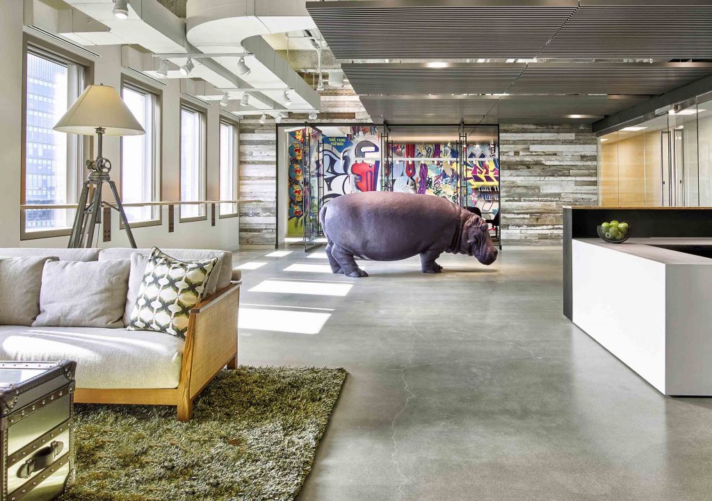
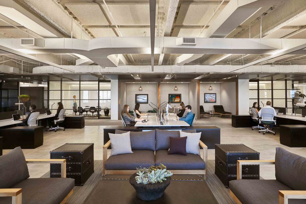
The design of the new, 15,000-square-foot Potamus headquarters supports the firm’s intensive, collaborative culture and serves as a recruitment tool, all while embodying the mix of sophistication, energy, and spirit unique to Potamus. At reception, a life-sized fiberglass hippo – the Potamus symbol representing strategic edge – greets visitors. The hippo’s sub-Saharan habitat inspired the materials, textures, and colors, which converge with safari-style furnishings to make a relaxed but professional environment. At the heart of the office, the trading floor – lined with oversized windows offering views to Boston Harbor – provides varied seating options near trading stations, from private conference rooms and offices to comfortable living-room-like seating areas, to support different individual work styles. The sunlit residential-style kitchen is in constant use for meals, impromptu parties, and client entertaining. A wall-size video screen, reception desk that doubles as a DJ booth, and acoustically separate gaming room help employees unwind.
Club & Bar Design
Company: Hirsch Bedner & Associates
Project Title: Ultima
The designer was tasked with designing a clubhouse for a leading local developer as part of a package that also included standard provisions for lift lobbies, bathroom and kitchens in the six tower complex and adjacent houses. The clubhouse, a three storey, 3,995 square metre space, is situated in the podium below the towers. The programme encompassed front of house areas including a lobby, fitness centre, spa, indoor ball court, indoor and outdoor swimming pools, library, bar, billiards room, private dining rooms and all supporting back of house areas. The clubhouse’s position on a hill in southeast Kowloon commands unobstructed views of Victoria Harbour and Hong Kong island beyond.
Restaurant Design
Company: External Reference
Project Title: Alkimia
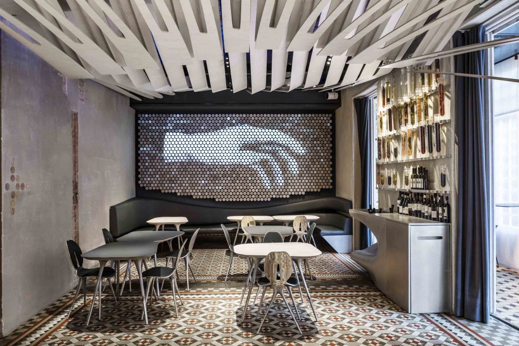
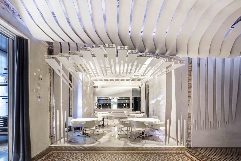
The restaurant, Alkimia, is located in the city center of Barcelona, on the main floor of a modernist building (dating back to 1864) left unoccupied for 40 years. The project design has been carried out taking into consideration two elements: the pre-existing architectural context (including its old patina and typology) and the specific gastronomic offer of the Michelin-starred restaurant Alkimia (which is 80% based on fish). The design was conceived of as a continuous scenography fostering a seamless sensory experience. The different parts of this scenography feature sea life-inspired skins, art installations and custom-made furniture which establish a unique relationship with the surrounding space.
Healthcare & Wellness Design
Company: Csiszer Design Studio
Project Title: Apheresis Centre
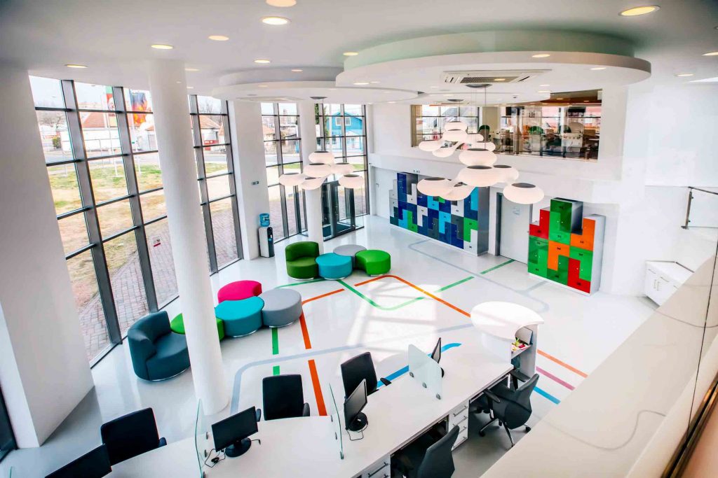
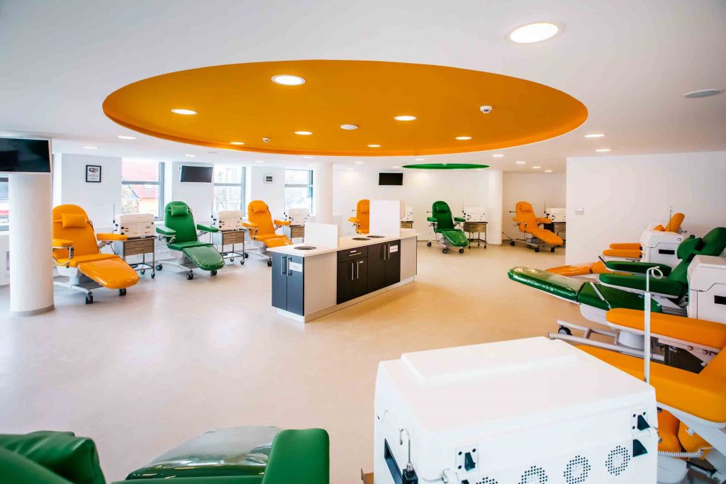
The Apheresis Centre in Székesfehérvár was designed by Csiszér Design Studio to contribute to the welfare of countless people with severe illnesses. Platelets are collected here during a special type of blood donation called apheresis. The interior design of this 800m2 health care institution focused on hygiene and attracting donors. Spotless with a friendly ambience but without the rigorous atmosphere of usual health care spaces were the demands, which were fulfilled in the choice of colours, materials and spatial qualities. Colourful seats, glossy lockers arranged in a tetris shape, and the 28 therapy chairs of vivid colours are all in the service of welcoming and making people comfortable.
If you're interested in entering a project, make sure you enter before Friday 6th July for the opportunity to showcase your projects to an international audience, and receive global recognition for interior design excellence. Register to submit an entry or view all of our award categories before it's too late!
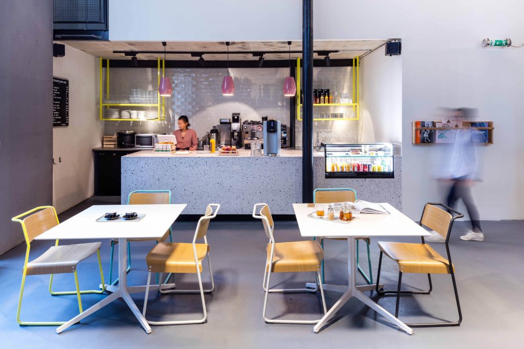
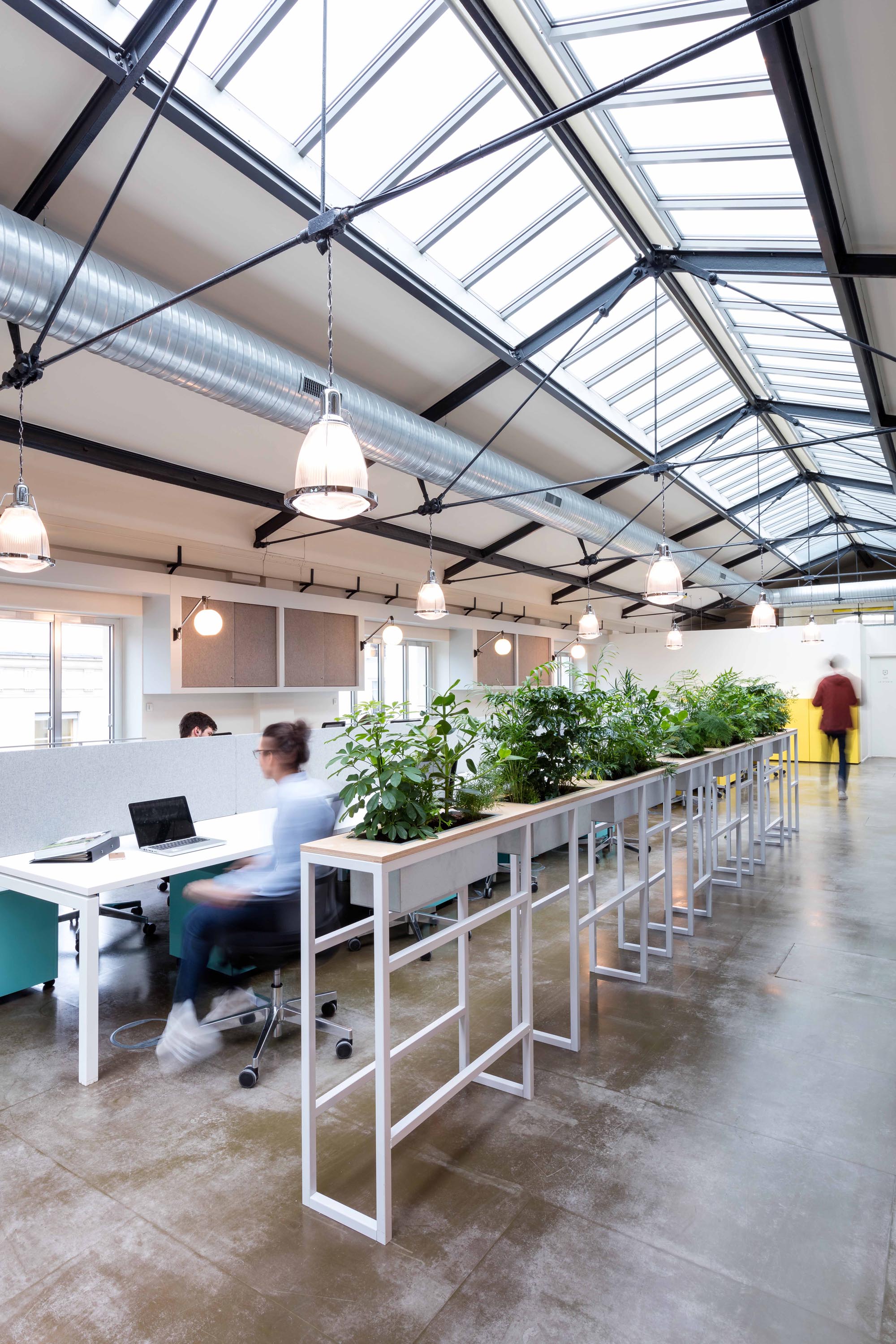
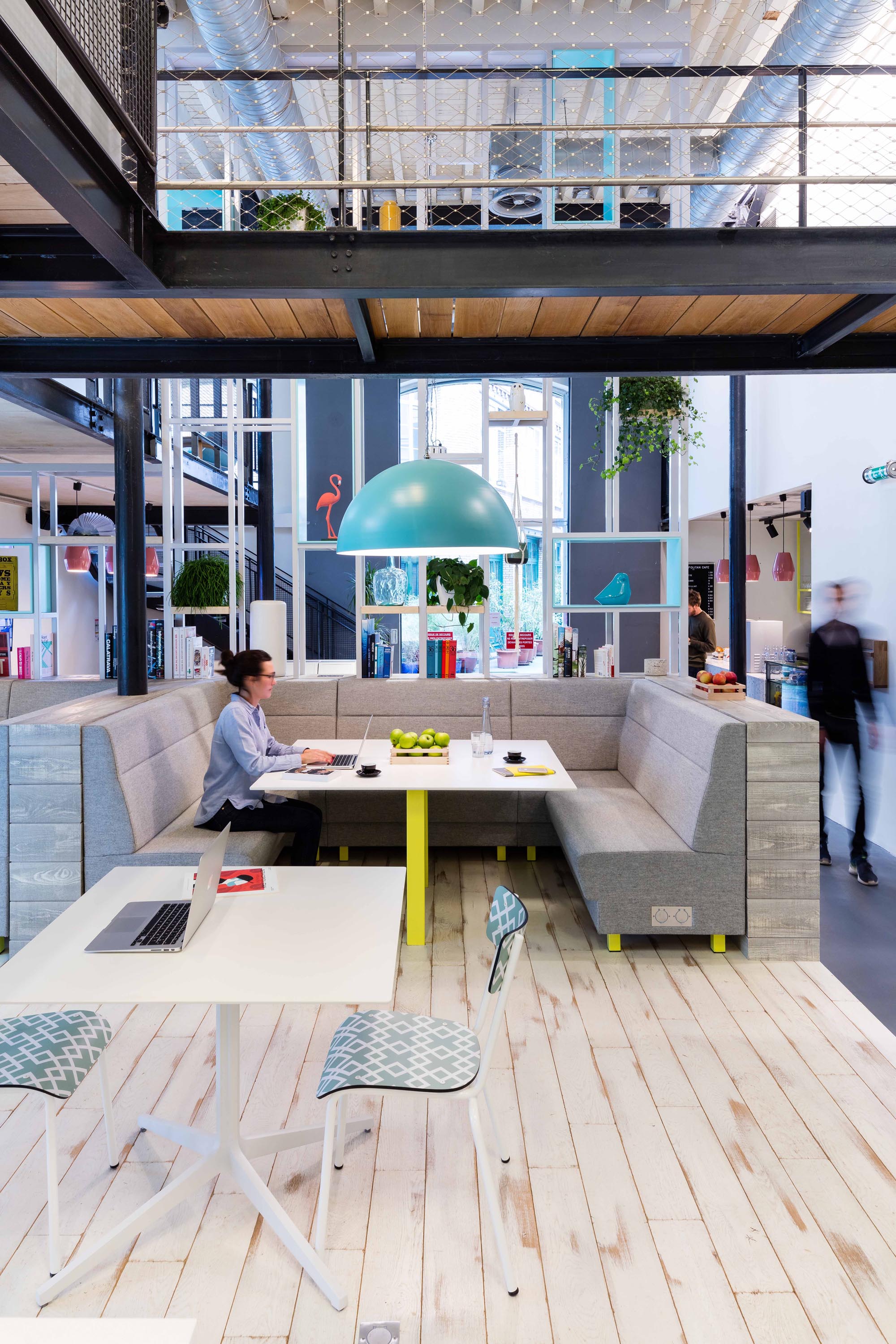
This week's instalment of the #SBIDinspire interior design series features the first global co-working concept for new office brand, Deskopolitan, which has launched at 48 rue Chateau d’Eau, Paris. The space offers a diverse and progressive work environment to appeal to start-ups and small businesses – a revolutionary concept for the French market. MoreySmith were entrusted to establish the global design strategy for Deskopolitan’s new brand concept. The strategy enables the brand to evolve in different locations throughout Europe, and offers a range of workspaces to cater for its members. These include a range of assigned workspaces and flexible work settings to support drop in sessions, as well as artist studios, health & beauty suites, and spaces for open group collaboration and networking events. This contemporary approach to workspace design brings a fresh new look to the European market.
Company: MoreySmith
Project: Deskopolitan
Project Location: Paris, France
What was the client's brief?
Deskopolitan, a new lifestyle focused serviced-office company based in Paris, selected MoreySmith to establish their global design strategy and concept, demonstrated in its first venture, Château d'Eau. At the heart of the brand is the vision to host a likeminded community of people, sharing both space and values, in a flexible and inspiring environment with a unique range of on-site facilities promoting work/life wellbeing.
The interior design brief included the following key challenges and opportunities:
- Develop a global design strategy and concept including branding for Deskopolitan’s first and future ventures
- Redesign 48 Rue du Château d’Eau, an historic former factory building located in the 10th arrondissement
- Move away from the monotonous working environment inherent in traditional offic s and rethink and reimagine workspace design
- Appeal to start-ups and small businesses seeking creative and flexible workspace in central Paris
What inspired the design of the Project?
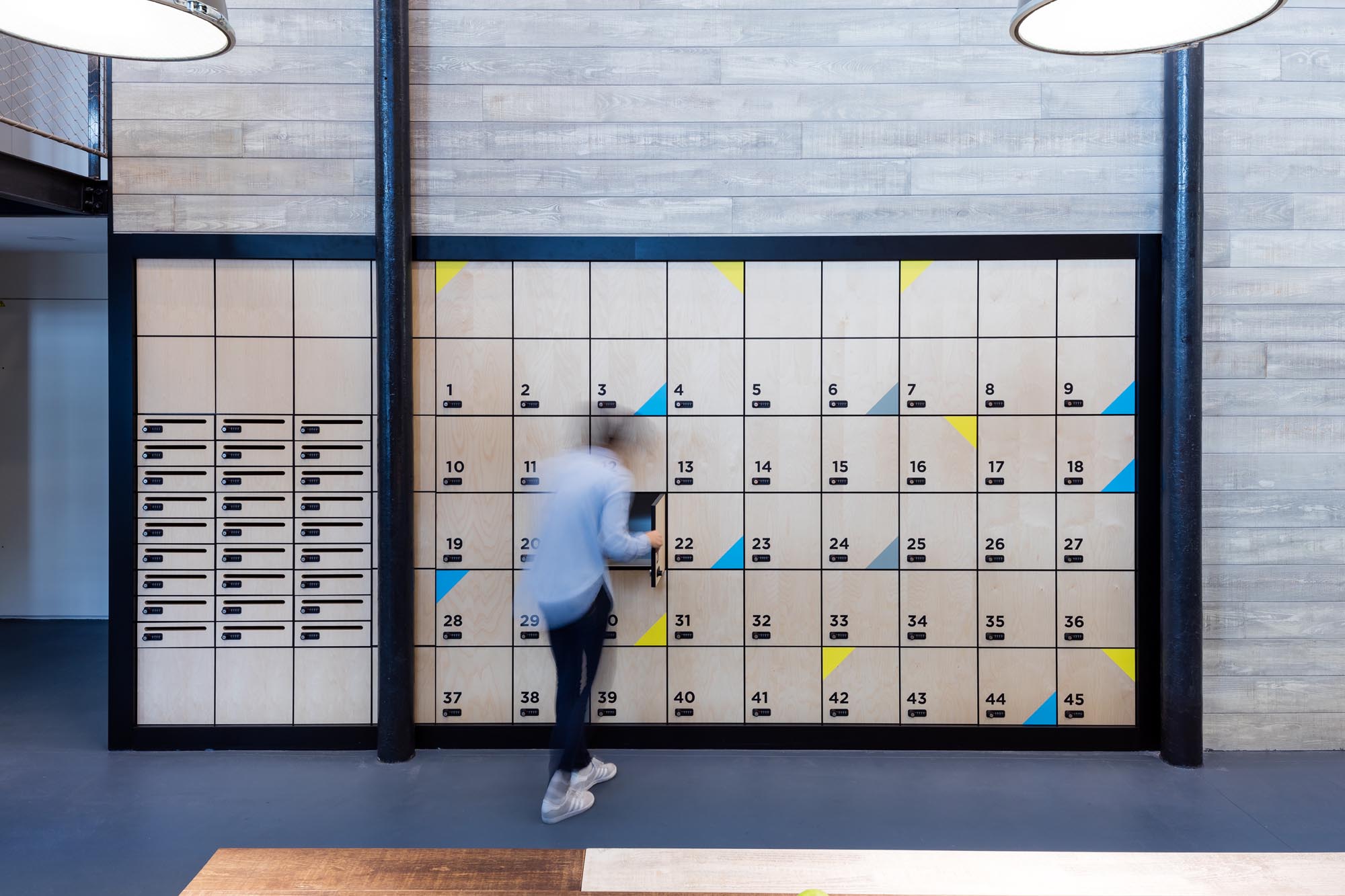
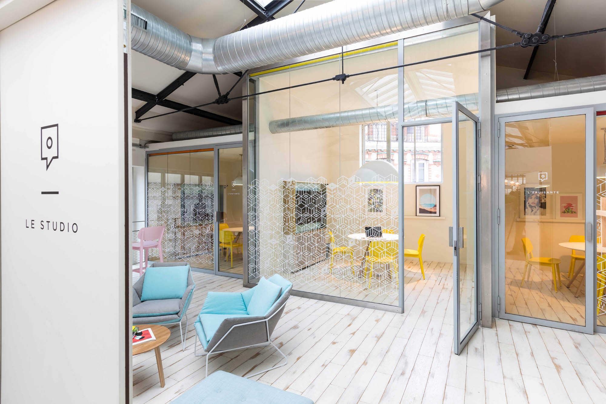
Château d’Eau spans 13,500 sq ft over three floors (ground with mezzanine, first and second), with 120 hot desks, 45 open desks, six club offices, and five meetings rooms. MoreySmith worked closely with Deskopolitan to develop the company’s global design strategy and concept, and establish the branding for the building –a graphic inspired by the circular geometry found within Deskopolitan’s flagship venture, Voltaire (located in the 11th arrondissement and due to open in 2018) which translates throughout.
MoreySmith’s redesign has transformed the former factory building into a lifestyle focused co-working environment which challenges the traditional office concept, with innovative and interactive spaces supported by state-of-the-art facilities.
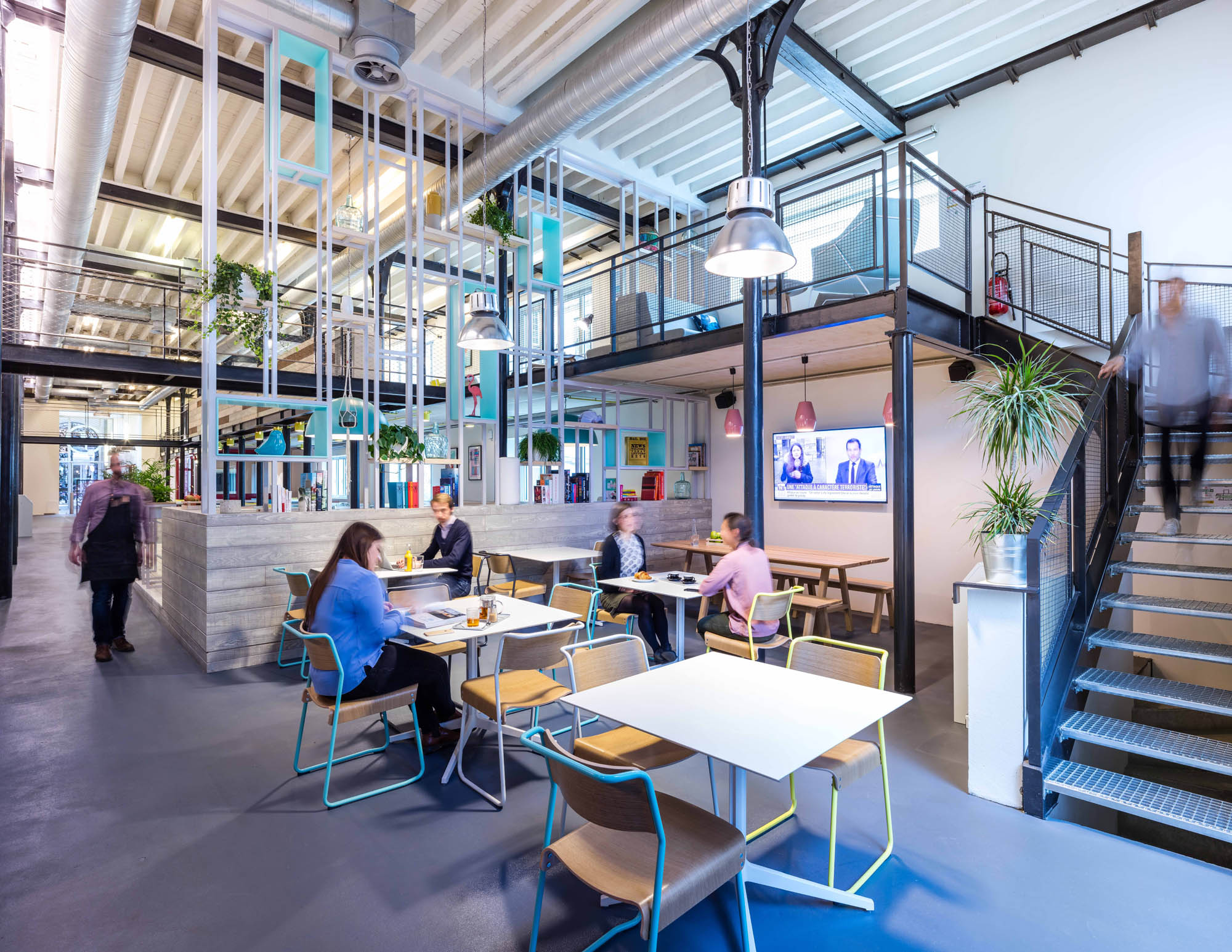
The main entrance at street level opens into a light and airy double height space featuring a vibrant café with access to an external courtyard and informal touchdown positions at mezzanine level. Each floor offers co-working members a range of flexible working environments including open-plan desk areas, private phone booths, touchdown work positions, video conference and AV meeting rooms, collaborative informal meeting and social spaces. The double height space is purposely designed to promote “collision” culture and allow members to interact across the community building networks and connections. Movement and transparency are also key to successful collaboration, so MoreySmith designed the space to maximise natural light and encourage the flow of people around the building.
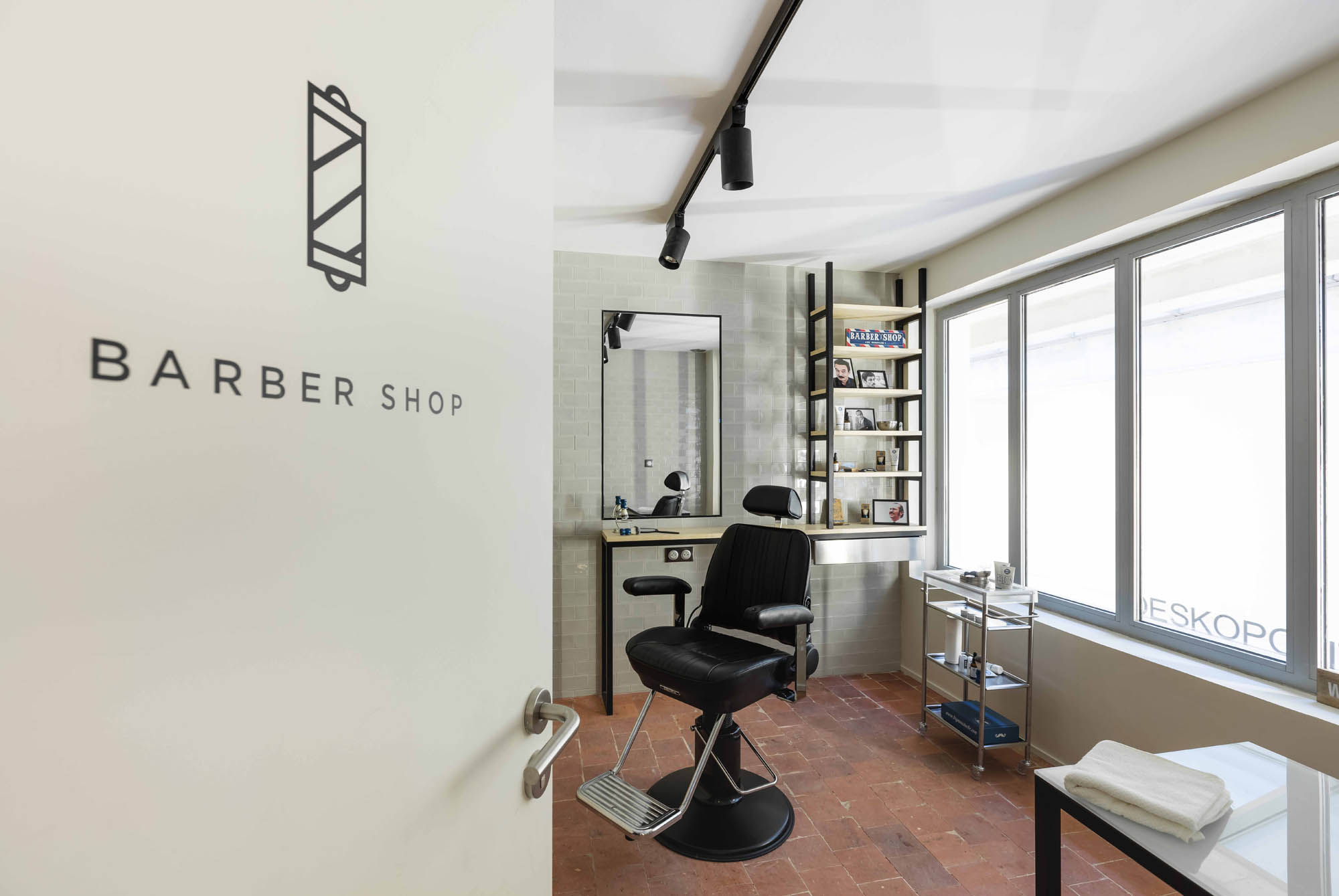
The upper floors offer open, light and modern workspace, with flexibility to adapt to client requirements. The first floor provides dedicated enclosed spaces for small businesses, and the second floor provides an open plan environment. Quiet rooms and phone booths allow focused working and privacy for calls. The on-site facilities include a café, concierge, heritage style barbershop, nail bar, and bike store with shower and facilities.
What was the toughest hurdle your team overcame during the project?
MoreySmith enjoy the challenge of working with heritage buildings for the creative opportunities and sense of transformation that can be achieved. The interior design aesthetic is a contemporary take on the building’s industrial history, mixing materials such as glazed brick tiles, exposed concrete, reclaimed timber, plywood, terrazzo and burnished brass, and complementing this with fresh, bright colours. This is juxtaposed with the addition of plants throughout the space, which provide balance, calm and comfort.
What was your team’s highlight of the project?
This interior design scheme of this fresh space challenges traditional perceptions of office culture, successfully blending modern life/work and lifestyle aspirations.
Questions answered by Nicola Osborn, Design Director at MoreySmith
To ensure you are kept up to date with the latest design inspiration sign up for our newsletter and follow us on Instagram @sbiduk
If you missed last week's Project of the Week featuring the Art Deco inspired restaurant with a quirky, contemporary and traditional design aesthetic in Manchester, click here to see more.
The 2018 edition of the SBID International Design Awards is now officially open for entries! Click here to register or enter your project!
We hope you feel inspired! Let us know what inspired you #SBIDinspire
MoreySmith | SBID International Design Awards 2018
An impressive 34,060 visitors from 73 countries descend upon the heart and home of London’s design destination in Clerkenwell for arguably the most important commercial design festival that the capital city has to offer. The ninth edition of Clerkenwell Design Week (CDW), sponsored by Armourcoat Acoustic, delivered huge benefit to London’s creative hub with over 65,757 new business leads generated during the three-day festival – a 14% increase on 2017. With more than 200 brands exhibiting across the 7 venues and 100 showrooms, CDW injected life to the area from 22 -24 May and further cemented the festival as a key event on the international design calendar. We’re sharing a few of our favourite festival finds, initiatives, or new designs which emerged at Clerkenwell, starting with the most must-see installations.
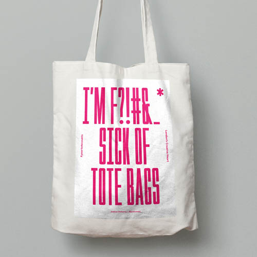 #YourToteCounts
The design industry at large is increasingly acknowledging the global sustainability crisis, so it comes as no surprise that sustainability initiatives became another hot topic at Clerkenwell Design Week as the pursuit of sustainable solutions becomes the focal point for many.
Chelsea College of Art is no exception; conversely to the nationwide mission to combat the plastic pandemic which has been headlining the news since the government introduced a law for large retailers to charge for all single-use plastic carrier bags, the Your Tote Counts campaign instead attempted to address the overwhelming surplus of tote bags which are intended to replace the excessive and unsustainable use of plastic bags. Interestingly, and surprisingly, canvas bags may cause more detriment to the environment than the plastic ones they are designed to replace. In 2008, the UK Environment Agency (UKEA) published a study of resource expenditures for various bags: paper, plastic, canvas, and recycled-polypropylene tote bags whereby cotton tote bags exhibited the highest and most severe global-warming potential since they require more resources to produce and distribute. The study revealed that the ecological footprint of a cotton tote bag is actually 327 times worse than a regular plastic bag. A Screen Press installation at CDW encouraged the upcycling of tote bags and allowed visitors to bring unwanted totes to be customised with designs created by graphic design students from Chelsea College of Art, in collaboration with the Print Club London. Re-purposing unwanted totes with a fresh new design intended to enlighten audiences and address the issue whilst encouraging us to reuse and recycle when we can. Visitors could also make donations with the proceeds going to CDW’s official charity partner, Maggie’s.
Reform by TDO Architecture, Studio 8Fold and Studio DA
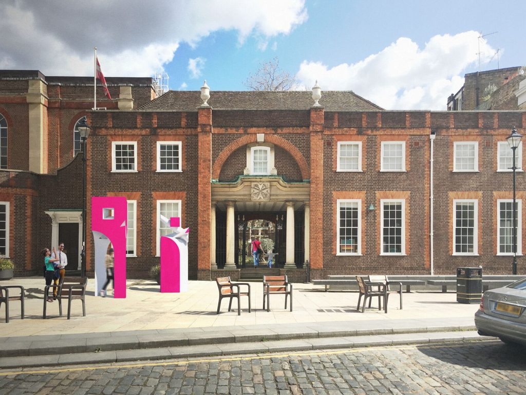
In the theme of confronting misleading discourse about sustainability and shedding light on common misconceptions about what materials are considered sustainable and which ones are truly harmful to the environment, TDO Architecture, Studio 8Fold and Studio DA were commissioned to create way-finding sculptures in polystyrene to be situated around Clerkenwell during the week. The sculptures were produced by Bakers Patterns who specialise in polystyrene model making and manufacturing.
Creative Director of CDW Max Fraser says,“Polystyrene is considered one of the ‘bad’ materials of our time as it can’t be recycled through regular municipal recycling schemes. However, if the material is sent back to the manufacturer, it is 100% recyclable (98% of it is air). So we are commissioning these beacons at CDW with their end-of life destination fully diverted from landfill.”
Behind Closed Doors by Hakwood
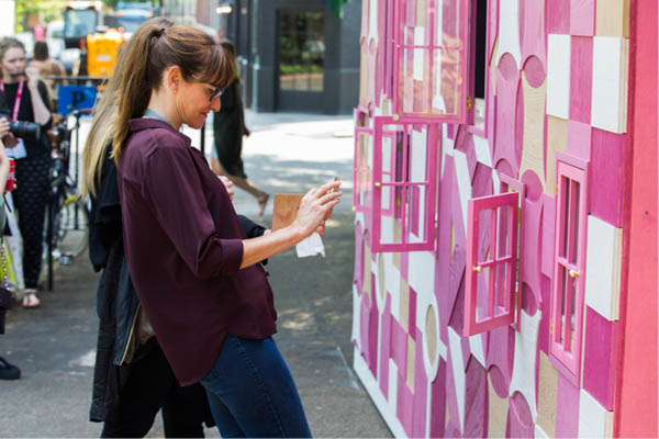
The Dutch bespoke wood manufacturer Hakwood and Shape London collaborate to create an interactive installation. Hakwood’s ‘Behind Closed Doors’will be a 3.2m high installation designed and fabricated by Shape London. A miniature street-scape was constructed to that draw inspiration from the Dutch townhouses, with each house including a small door which reveals a series of miniature interiors designed by various architects from Shape’s Dragon Fly Place Collective. The installation was designed to demonstrate that any interior design or form of décor is an open door for creative inspiration.
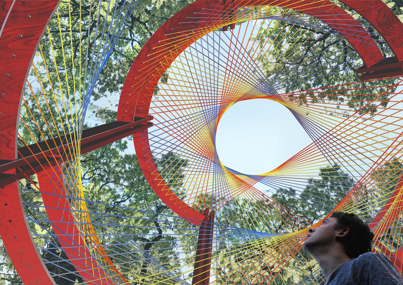 Scale Rule Next Generation Design Pavilion
For the third consecutive year, Scale Rule gave St. James’ Churchyard a new focal point by implementing a pavilion design conceived by GCSE students from around London. This year’s winning concept responded to the theme of sustainability by proposing a sensitive metaphor: layers representing past, present and future will create a kaleidoscopic oculus, inviting visitors to take a moment to direct their eyes up an become more aware of the key natural elements around them.
Product Highlights
Loll Designs
Modern eco-friendly furntiure manufacturer, Loll Designs, showcased the most popular pieces, from the classic Adirondack lounge chairs to the new outdoor furniture Fresh Air collection. Not only does their modern outdoor furniture add a unique and contemporary aesthetic to outdoor spaces, but all of Loll's products are mindful of the environment, using 100% recycled and recyclable material – mostly from discarded plastic milk bottles. To date, Loll has helped upcycle over 70 million milk bottles!
The Cabinet
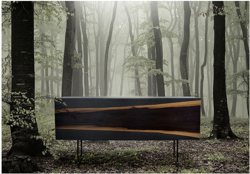
Mark Saward, founder of The Cabinet debuts 'The Sideboard' which takes it’s influence from nature, contrasted with contemporary materials and construction techniques. Raw smoked oak veneer is inlaid on to stone textured Valchromat to stunning effect. Adopting a minimalist approach with maximum impact by showcasing nature in it’s natural state. Each piece is bespoke as no one tree-cut edge veneer is the same. Utilising a soft close vertical lift hinge system, the opening of The Sideboard adds to the overall drama of this standout statement piece.
New For 2018: Lighting & Elements
Light
London based Leather Architectural Ironmongery and Leather Products Design firm with a pro
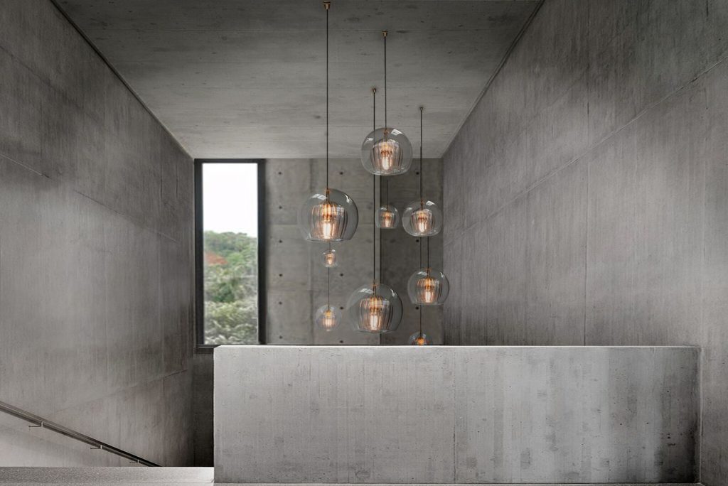
This year saw a new, exciting exhibition dedicated to light. The brick vaults of nightclub, Fabric, featured an exhibition of top international lighting brands unveiling their latest cutting-edge collections and innovative new products presented as spectacular stand-alone lighting installations. Exhibitors included Bert Frank with a striking range of luxury, mid-century inspired lighting, which has already won a string of industry awards. Rich Brilliant Willing, Brooklyn-based studio that designs and manufactures LED fixtures for hospitality, workplace, and residential projects. Marc Wood Studio presented its debut lighting collection, Pleated Crystal which comprises of ceiling pendants, a side light and a floor standing lamp. Handmade in Bohemia and London, the collection draws upon Marc's love for Czech artisan glass work and British engineered detailing.
Elements
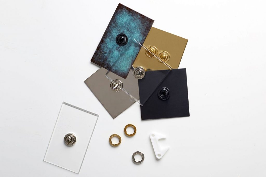
Also new this year, CDW brought together a leading selection of ironmongery, hardware, switch plates and architectural accessories within a street-market style pavilion on St Johns Square, becoming the go-to destination for designers looking for the perfect finishing touches. Brands included the London-based leather ironmongery and product design firm House of Eroju, and the specialists in decorative metalwork and door hardware solutions for luxury hotels and residences, Carrson International, among many others. British light switch company, Forbes & Lomax introduced the Aged Brass light switch to their existing Invisible range. The new collection which adopts an antique aesthetic has been left unlacquered, allowing it to patinate even more over time for an aged and rustic effect.
To see more from Clerkenwell Design Week 2018 or find out about next years event, click here.
The annual SBID Awards serve to recognise, reward and celebrate design excellence across a broad range of categories. Winning an SBID International Design Award is a highly regarded and well respected achievement among the design industry. Each project is evaluated by leading industry experts for their technical content and aesthetic creativity, while the design-conscious public also have a say in voting for the designs they find the most inspiring.
As we approach the deadline to enter the SBID Awards 2018 on Friday 15 June 2018, our attention turns to last year's event as we take a look back across some of the category winners from 2017. With a total of 14 categories designed to encompass the broad spectrum of the interior design profession and welcome diverse projects from all realms of interior design, we're sharing last year's worthy winners from the residential side of the industry whether you're looking for project inspiration for your kitchen, bedroom or bathroom.
Residential House Under £1 Million
Company: Bernard Interiors
Project Title: Park Terrace
Bernard Interiors was appointed by a private client in 2014 to oversee all interior renovations of a Category A Listed building in the heart of Glasgow’s Park District. The imposing five-storey sandstone townhouse, situated in one of Glasgow’s most sought after areas, majestically overlooks Kelvingrove Park with stunning views across the city. The townhouse had lain derelict for over 5 years, used as office space throughout the 90’s, and fallen into disrepair. Bernard Interiors were challenged to create a design, which was contemporary yet sympathetic to the historic and period features which run throughout the building. Bernard Interiors also worked alongside the developer for three years to win planning permission to convert the building back to a residential dwelling.
Residential Apartment Under £1 Million
Company: DAR Designs
Project Title: Parkview Residence
DAR Designs completes the interior design of a luxury apartment in New Cairo, successfully integrating home automation technology with a sophisticated modern design. Seeking to create harmony between the traditional and contemporary worlds, the apartment prides itself on its high-end ritzy look while maintaining its cultural connection with its Arab roots through displaying local handcrafts. This residence is also made to cater to its client’s active social lifestyle by creating an interactive public space which includes the kitchen, guest living room, and dining room all as one zone. Overall, the apartment was designed to be a huge step forward in the sustainability and energy efficiency, with its advanced home automation system designed to automatically shut off lighting and air conditioning when occupants leave a room
Residential Design Over £1 Million
Company: Fenton Whelan
Project Title: Greybrook House Penthouse
Fenton Whelan designed a multi-unit, boutique, residential development in Mayfair blending the art déco style of the building with contemporary living to deliver a timeless legacy. Entering into the living space, bespoke furniture is framed by stained glass windows. Adjacent, the Bulthaup kitchen juxtaposes with the cool green breakfast room upholstery creating an iconic entertaining space with a sumptuous bar area with backlit onyx. The refined elegance of the master suite can be seen in the lacquered finished wardrobes and the Alcantara upholstered headboard. The master ensuite is framed by the Noir Saint Laurent book matched feature wall and marbled pattern flooring. A beautiful marble staircase leads to access to a private roof terrace with views of London’s iconic skyline framed.
KBB Design
Company: Oakeve Interiors
Project Title: Hurlingham
Oakeve Interior Architect Design Practice were involved in every aspect of the interior design of Hurlingham in Beaconsfield, Buckinghamshire. This imposing, new build ‘Manor House’ style country home married together a traditional façade with a contemporary and sumptuous interior, comprising of over 9,239 square feet of living space. This magnificent residence of grand proportions effortlessly combined opulence with practicality and comfort, responding directly to the design brief. The integration of sensible, user-friendly technologies, combined with a luxurious interiors scheme, which included statement pieces of iconic artwork and sculptures, created a home that sold to clients that bought into the ‘aspirational lifestyle choice’
Show Flats & Developments
Company: David Chang Design Associates International Ltd. (DCDA)
Project Title: Grand Influx Presentation Center
The Grand Influx Presentation Centre is located in the city of Foshan in the central Guangdong Province of southeastern China. This thriving metropolis is steeped in the history and culture bequeathed from the Ming Dynasty and Foshan’s renown ceramic artisans. Balanced symmetry, bold clean architecture and cultural referencing are fused together in this 1460 square meters Presentation Centre to captivate prospective purchasers. Artful contemporary duplications of iconic Ming Dynasty furniture, motifs and patterns are selectively distributed throughout the project, helping to establish “sense of place” geographically and historically.
Hotel Bedrooms & Suites
Company: BAR Studio
Project Title: Grand Hyatt Hong Kong - Ambassador Harbour View Suite
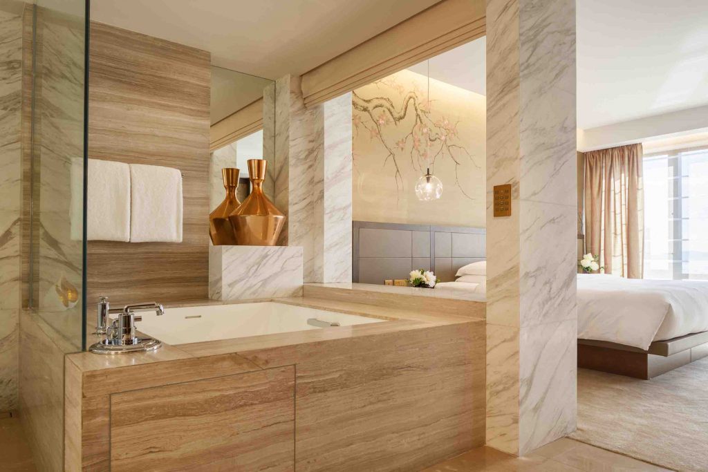
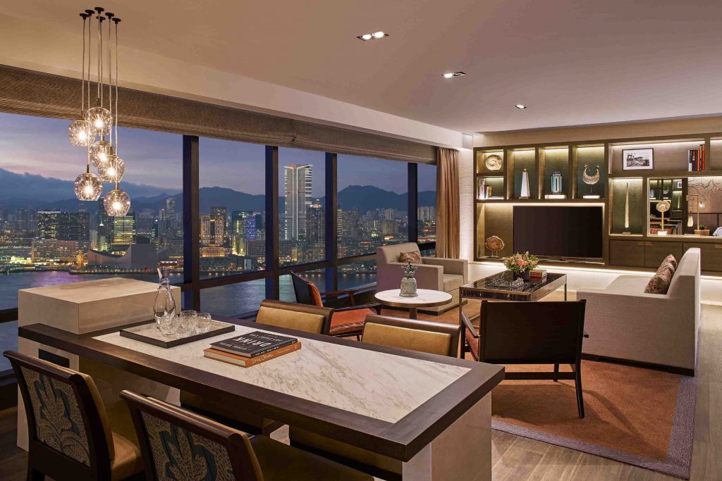
Grand Hyatt Hong Kong has a loyal following of guests and the hotel forms a part of many people’s history and memories. The brief required BAR Studio to retain what was great from the original hotel, thereby preserving the hotel’s appeal to the people who already love it, but also redefine the hotel in order to appeal to the next generation of visitors. The challenge of the brief was to weave the old and the new threads together. Consequently, the finished Ambassador Suite is a contemporary design but one that is underpinned by the spirit and history of Grand Hyatt Hong Kong.
If you're interested in entering a project, make sure you enter before Friday 15 June for the opportunity to showcase your projects to an international audience, and receive global recognition for interior design excellence. Register to submit an entry or view all of our award categories before it's too late!
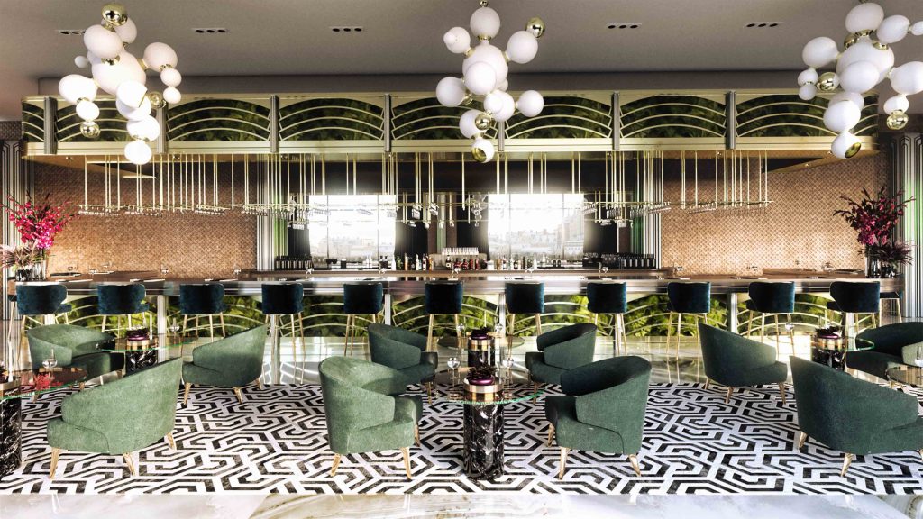
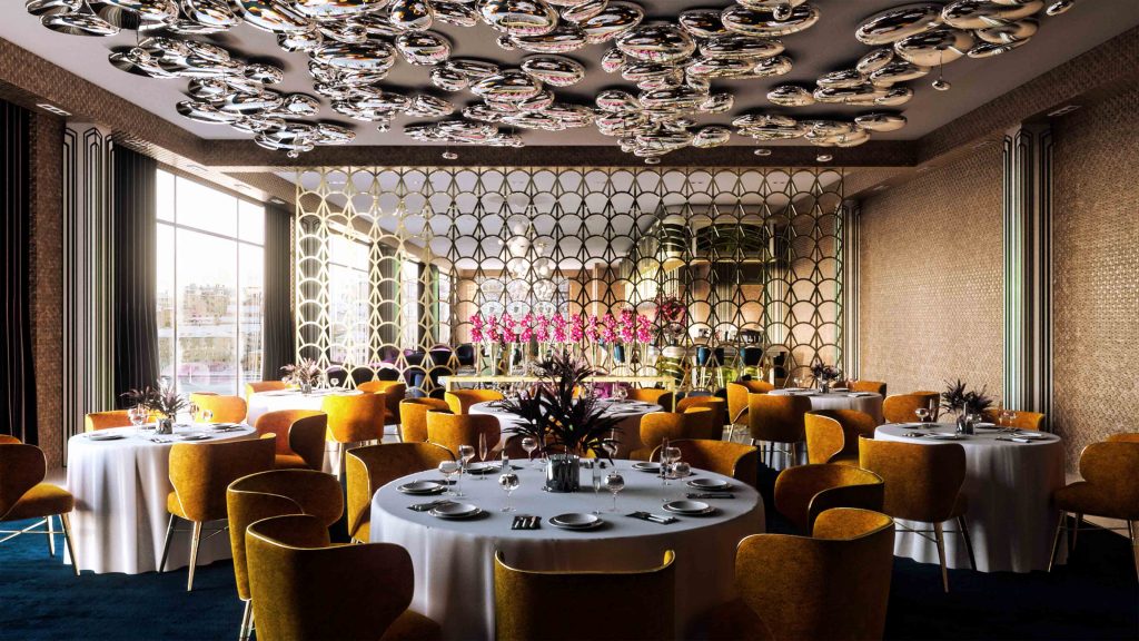
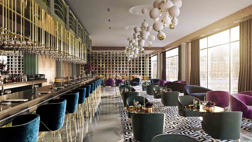
This week's instalment of the #SBIDinspire interior design series features the original CAD visualisation of an interior design scheme designed by YA Interiors to aid their clients visual understanding of the Art Deco inspired restaurant project which is currently in development. The Sheridan suite is a venue that hosts a diverse range of corporate and private events for up to 1800 people with 2323 square meters of space. Based on the ambience of Harrods food hall, the flexible venue was designed to capture the quirky, contemporary and traditional aesthetics which is a regional favourite for Indian Brides and Grooms located in East Manchester.
Entering through the brass curved reception area, the calm atmosphere of the cocktail lounge is the focal point with its illuminated columns. The 14 meter bespoke bar features a brass wine gantry and scallop fret work panels accessorised with teal blue velvet stools. Atom chandeliers hang above the lounge area by Portuguese designer Delightful, brass fret work screens separate the cocktail lounge from the formal dining area. The fine dining room walls are clad in beaten copper panels with space-age pebble lights suspended on the ceiling by Italian designer Artemide.
Company: YA Interiors
Project: Sheridans
Project Location: Manchester, United Kingdom
What was the client's brief?
Our interior design brief was to capture the essence of the original Art Deco inspired style of the iconic Harrods food hall whilst creating an elegant, modern and stylish fine dining destination.
What inspired the design of the Project?
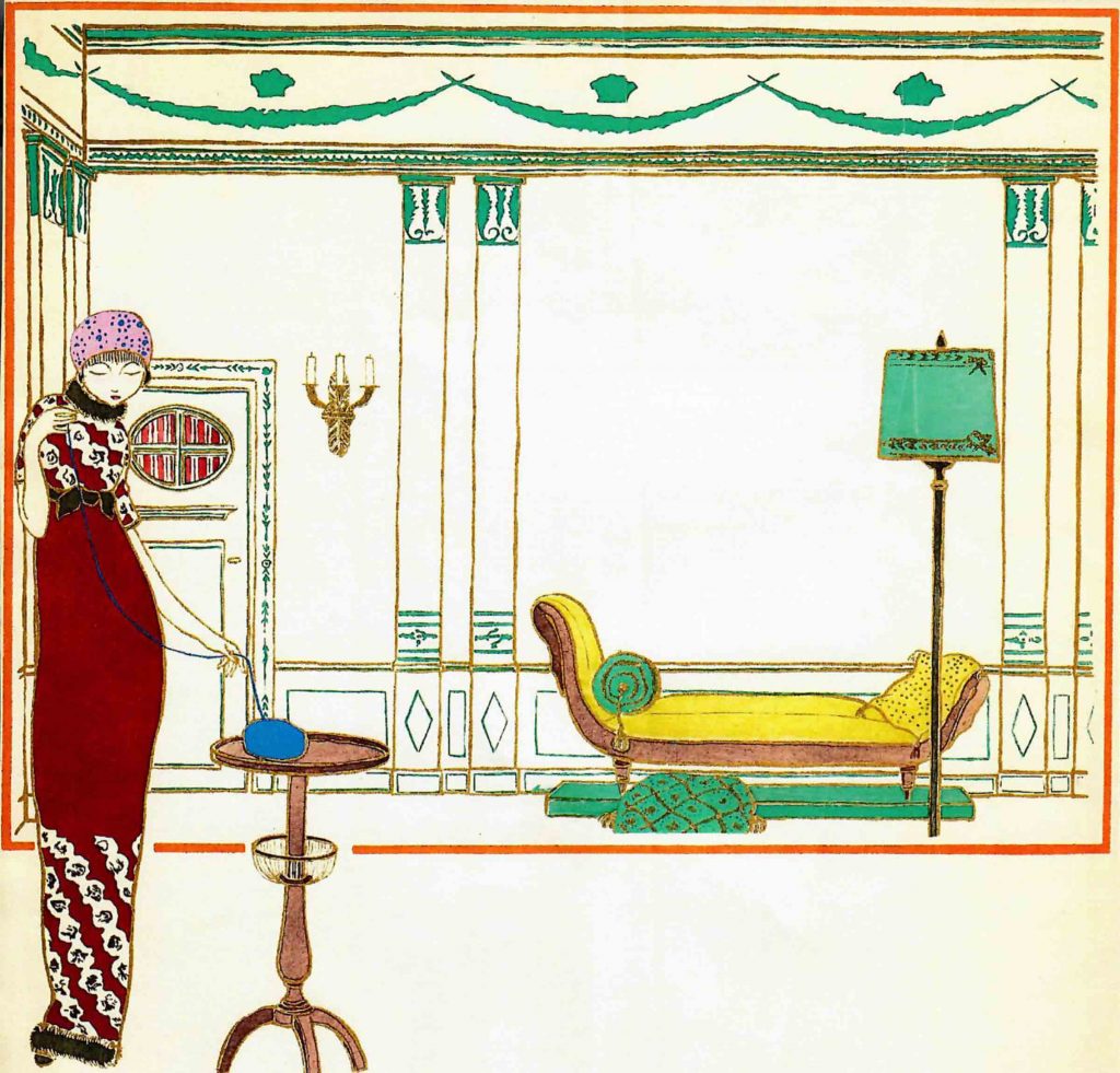
For the interior design, furniture selection and styling we looked at the fashion plates of Couturier Paul Poiret at the turn of the 19th century. The French couturier was the most fashionable dress designer of pre-World War 1 Paris. Poiret was particularly noted for his Neoclassical and Orientalist styles. One of his great achievements was to free the female form from the rigid corseted structure. Inspired by the designers illustrations in the Gazette du Bon Ton (below) we decided to incorporate the opulence of the sketches into the interiors styling. Creating a stylish and feminine design aesthetic with signature touches alluding to Mr Poiret’s orientalist fantasies.
What was the toughest hurdle your team overcame during the project?
Winning the client over with our proposal of Paul Poiret and his orientalist fantasies was the biggest hurdle - eventually a Poiret/orientalist light aesthetic got the client on board. In addition the budget constraints for the project have been challenging as we're having to maintain design integrity and also manage the clients expectations.
What was your team’s highlight of the project?
Seeing endless discussions and design development finally coming to fruition. Sheridans is going to be unique to the area - there really is nothing quite likes it in Manchester.
Why did you enter the SBID International Design Awards?
The SBID award is a fantastic platform for designers to showcase their work to the industry and to other fellow creatives. We felt the design and visualisation for Sheridans is a proud moment for us as a design practice, we feel we have designed and cultivated something very unique here and wanted to tap in to our fashion backgrounds in designing and implementing this beautiful scheme.
- Questions answered by Aseef VAZA, Creative Director at YA Interiors
To ensure you are kept up to date with the latest design inspiration sign up for our newsletter and follow us on Instagram @sbiduk
If you missed last week's Project of the Week featuring aquatically inclined Australian luxury spa inspired by the serene blues and tranquil textures of underwater landscapes, click here to see more.
The 2018 edition of the SBID International Design Awards is now officially open for entries! Click here to register or enter your project!
We hope you feel inspired! Let us know what inspired you #SBIDinspire
YA Interiors | SBID International Design Awards 2018
 Managing Director of luxury home interiors company Kings of Chelsea, Theo Mance, speaks about the merging worlds of interiors and fashion as fashion brands branch out into the homeware departments.
It has recently been difficult to escape the current high profile trend for fashion brands to enter the homewares market. From Dior to Zara, the high street and the luxury boulevards are showcasing textiles, accessories and furniture alongside jackets, shoes and skirts. The integration of the home divisions of these globally recognised marques is tremendously variable in terms of the level of connection to the DNA of the brand. Much like fashion, the addition of a badge or logo to a simple shape or silhouette may be the only distinguishing feature of a brands influence. The best known names in the industry, those with a heritage of over twenty years or so have established a precedent of ready made “trend” or “taste” simply by the addition of the brand to an interior. Fashion is a fast paced, transient and reactive sector whereas furniture has traditionally been firmly rooted in heritage, time and to a certain extent, craft. The speed of change in the fashion marketplace is greater than ever before and the homewares sector has had to raise its' game to keep up.
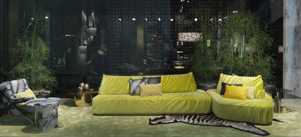 Changes in technology, the supply chain and distribution have allowed the interiors market to become more in tune with the cycles of the fashion world and this is where the newest additions to the list are beginning to take advantage. The major barometer of the interiors market comes every April in Milan at the Salone del Mobile. There may be bigger shows in terms of sq ft in the USA but in terms of fashion and trends in the industry, Milan is still the overarching benchmark. The number of high end luxury fashion brands working either directly with or in association with manufacturers is steadily growing. Certain furniture manufacturers have also even taken their leads from the fashion industry and re-branded using the same methodologies as clothing brands
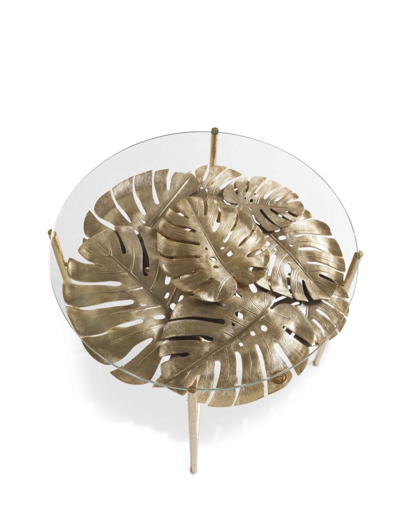
Kings of Chelsea has the great pleasure of working alongside Roberto Cavalli Home Interiors as the sole UK dealership. Launched as recently as 2013 the furniture and furnishings division is inextricably linked to the fashion side of the business. At the head office in Florence Paul Surridge, the incumbent creative director, works alongside a team of specialists who provide technical detail of how to apply print, shape and form to furniture, tableware, linens, tiles and wallpapers. The Roberto Cavalli Home division offers a fully immersive lifestyle experience, directly linked back to the DNA of the brand. Unlike other fashion furniture brands the creative process is fully rooted in the design studios of the Maison itself.
Of course this creates huge pressure on the process, as keeping up with the fashion seasons cycle means being ahead of or at least equal to the collection launches. The solution is to create capsule and classic collections so that the ranges are available to both those who value contemporary trends and those who require something more timeless. Within the ranges are the possibilities to specify finishes, leathers and fabrics until the piece is unique to the individual. When a brand is new to the market this invariably means this will be the very first time each order has even been produced. Just like the very finest fashion, these orders are in effect “couture” furniture. With an increasingly demanding, knowledgeable market, this is an incredibly valuable feature. Bespoke and fully personalised goods and experiences can now be found within most luxury categories (watches, automobiles, holidays, hotels) and it was only a matter of time before interiors stepped up and took their place at the table. Recent additions to the roll call have included Bottega Veneta, Hermes and Gucci so it is clearly a trend that is unlikely to end soon.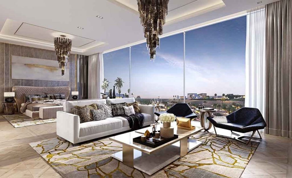
Fashion brands carry enormous value to a global HNW (high net worth) community and add both an increase in selling and rental values to real estate. Cavalli is currently working with developers in both Dubai and Saudi Arabia on fully branded projects, and the trend seems to show no sign of slowing down with Versace, Fendi, Bulgari and Bentley amongst a number of brands also involved in current schemes. Predominantly, from Middle Eastern and Asian interests, the arrival of these type of developments in the UK is a growing market and likely to be more and more noticeable in the next few years as the purchasing power of these nations investing in real estate in the UK shows little signs of diminishing. Fashion brands are seemingly craving the way for prosperous future in the realm of interior design as the two worlds are continuing to merge at an unprecedented rate.
Written by Theo Mance, Managing Director at Kings of Chelsea.
