The Abel Heywood sits proudly in the Bustling Northern Quarter of Manchester City centre and has been a popular destination since it was first developed in 2015, from a derelict and fire damaged cotton warehouse, into a stylish pub and boutique hotel. After tirelessly serving its loyal customers for the past 9 years, the site’s owners, Hydes Brewery, appointed MGI to develop and project manage a refurbishment scheme that will ensure the site will maintain its status as a landmark of the Manchester hospitality industry into the future.
The brief given by Hydes’ Managing Director was to move the site from its previous industrial leaning design toward a modern-traditional public house whilst paying tribute to the history of Hydes Brewery and to Manchester's iconic music heritage.
MGI proposed the introduction of feature wallpapers, Victorian tiling and bright heritage colours in order to create a light and airy atmosphere away from its previously scumble glazed ceilings and worn plaster effect walls. All industrial light fittings were replaced with new antique brass period lighting and industrial shelving units and back fittings removed in favour of new timber back fittings and antique Victorian wall shelving.
Much of the existing furniture was given a new lease of life through refurbishment and reupholstery, with new feature furniture introduced to compliment the proposed layout changes. Feature cast resin tables with vinyl records from Manchester`s most famous bands, or Hydes' brewery beer clips were included to provide points of interest and conversation points for visiting customers. New music and local interest themed bric a brac adorns the walls and compliments the overall finish of the site.
Layout changes to the ground floor were kept to a minimum with only the removal of existing face to face booths and introduction of new horseshoe booths and mid-height fixed seating.
The underutilised first floor of the pub was redesigned to encourage dining whilst the ground floor area remains focused on drinking and light bar snacks. The introduction of bi-fold doors to close off an area of the first floor provides a contained function room space for parties and meetings.
Feedback from the client and customers has been unanimously positive and MGI are confident that The Abel Heywood will continue its reign as king in the north(ern quarter) for years to come.
About MGI Partners
MGI Partners are an award-winning Interior design practice with decades of experience within the hospitality and commercial sectors.
Our talented team have honed their skills and specialist industry knowledge to provide beautiful, commercially viable design solutions that meet our client`s specific brief and can be delivered no matter how challenging the project or budget spend is. We always put our clients first and love to work in close collaboration, to guide them through the design and construction processes to ensure we create spaces that their customers will love and want to return to again and again. With a range of services including surveying, site analysis, interior design, Visualisation, Statutory applications, branding and project management we tailor our offer to meet each client`s specific requirements.
If you’d like to feature your news or stories on SBID.org, get in touch to find out more.
If you’d like to become SBID Accredited, click here for more information.
This week’s instalment of the Project of the Week series features a warm and earthy salon design by 2023 SBID Awards Finalist, Layrd Design.
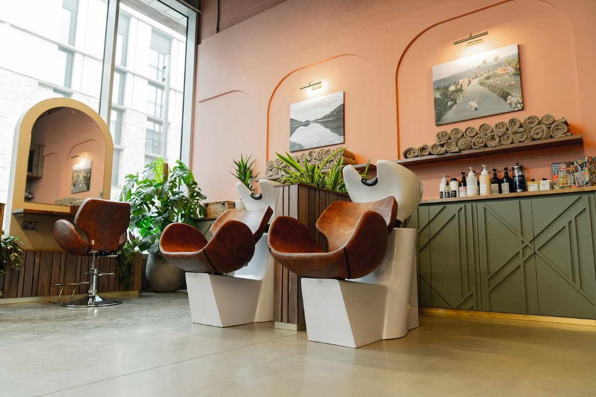
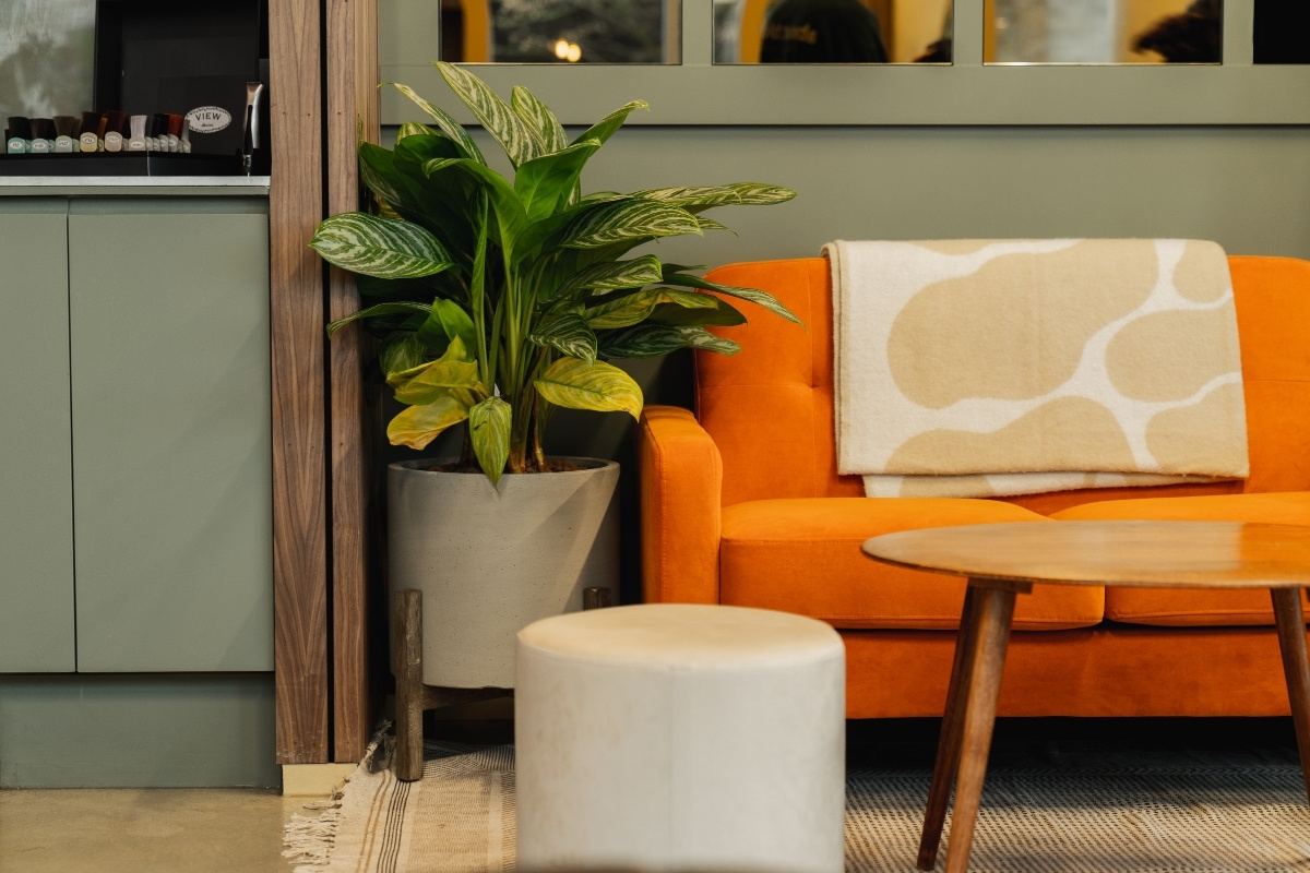
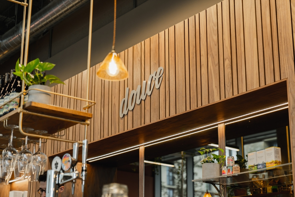
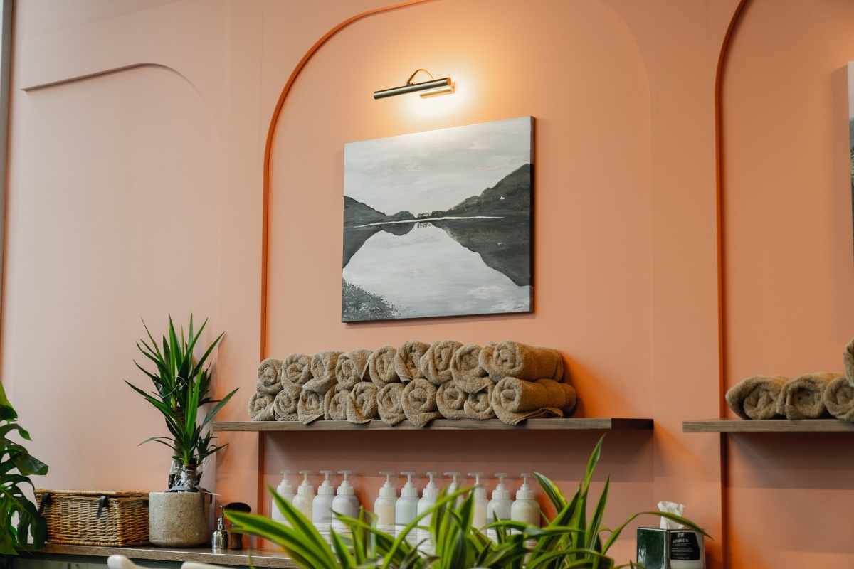
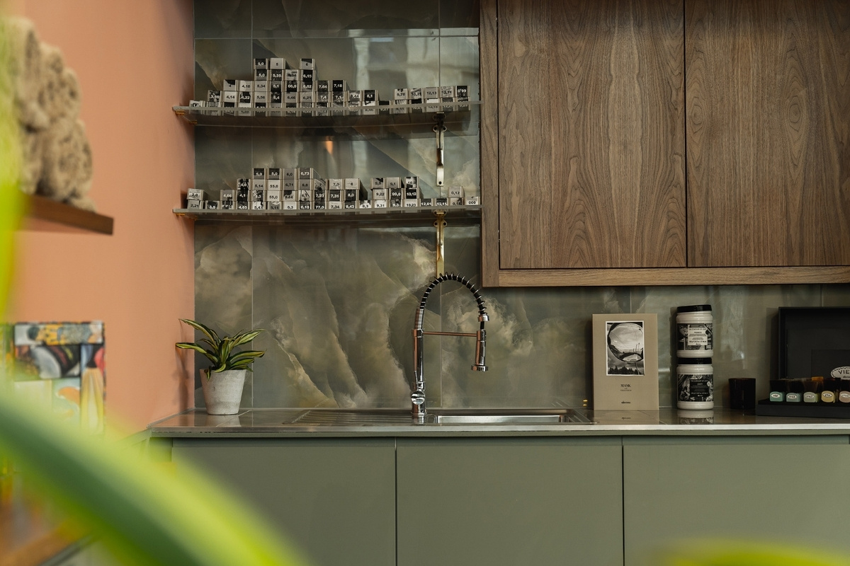
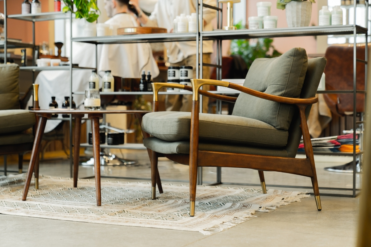
Layrd Design completed this bespoke salon scheme for Douce. Douce is a 5 seat Salon, Cafe and Bar, this is a truly unique offering for Cambridge. The space is very welcoming with warm earthy tones throughout, from the walnut surfaces, concrete floor, dusty pink, deep greens and coffee colours. They designed a curved bar that was compact and functional to allow for both coffee service and alcoholic drinks. The front of this is clad in stainless steel as a nod to the former Air-Stream that was converted as a mobile salon and was located near to the new space.
SBID Awards Category: Retail Design
Practice: Layrd Design
Project: Douce
Location: Cambridge, United Kingdom
What was the client's brief?
The brief was to take the clients vision for the space and turn this into a feasible and achievable scheme withing their budget. We were tasked with creating a unique salon space that also encompassed a small café/bar space which didn’t overlook or make the salon customers feel uncomfortable. Douce were looking to create a warm and welcoming setting so natural tones and earthy red and green tones were incorporated into the space.
The existing salon space was a mobile airstream located close to the new salon, they wanted the airstream to be included in the design in subtle ways as a hint to the heritage to the company.
What inspired the design of the project?
The existing airstreams and the values of Douce were big inspirations for the design. The need to create a calming, welcoming and timeless interior space.
What was the toughest hurdle your team overcame during the project?
The client had an incredible vision for their concept store. Creating this clear vision into a functioning design that met all of the necessary regulations, within budget, was a hurdle. Also creating a space that worked as a salon and a cafe at the same time and felt cohesive.
What was your team’s highlight of the project?
Seeing the bespoke Joinery elements all come together and work as they had been designed to work. There is a lot of bespoke elements to the space and you only see it all come together when they are installed.
Why did you enter the SBID Awards?
We have been finalists on two other occasions and the recognition and awareness from this is really great for our company growth and exposure. Company and team recognition for the completed project, as well as awareness of the concept store itself, Douce.
What has being an Award Finalist meant to you and your business?
We are immensely proud to be nominated for the third successive year, it has elevated our profile and brand exposure massively and contributed to our growth as a company.
Questions answered by Will Mayes, Director of Layrd Design.
Offering a one-stop solution for sanitaryware and surfaces that turn an average golf club into a luxurious sports and leisure retreat, RAK Ceramics has helped transform the Cambridge Country Club into a health and wellness destination, as part of a multi-million-pound development.
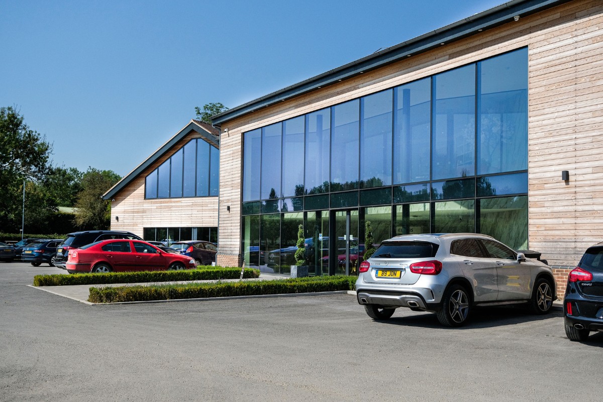
Partnering with interior architect May Fawzy of MF Studio, RAK Ceramics supplied surfaces and sanitaryware for use throughout the newly built Country Club. Making first impressions count, large format Calacatta Gold tiles feature in the venue’s main entrance and reception area.
“The selection of finishes was meticulously aligned with the original brief, emphasizing the creation of a premium space for club users,” explains Fawzy. “We carefully handpicked materials and textures that not only met our aesthetic aspirations but also embodied enduring quality.”
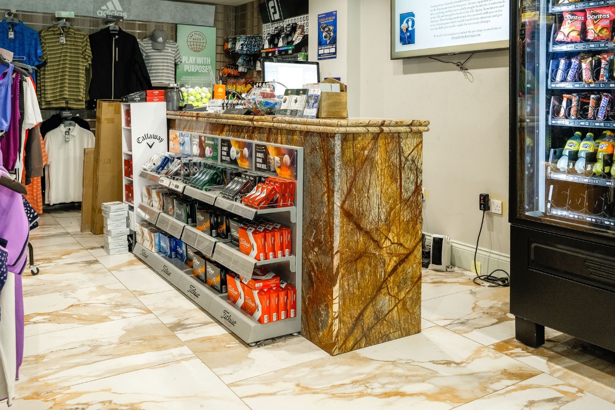
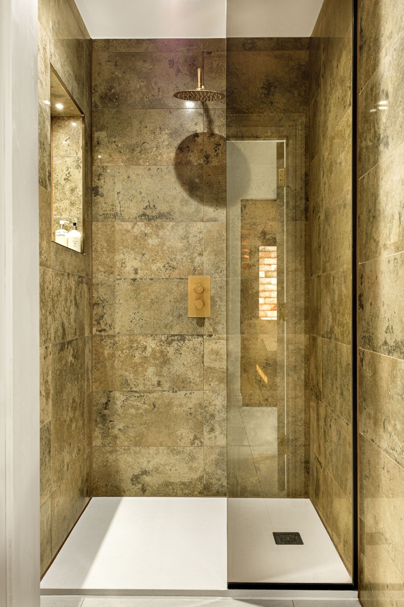
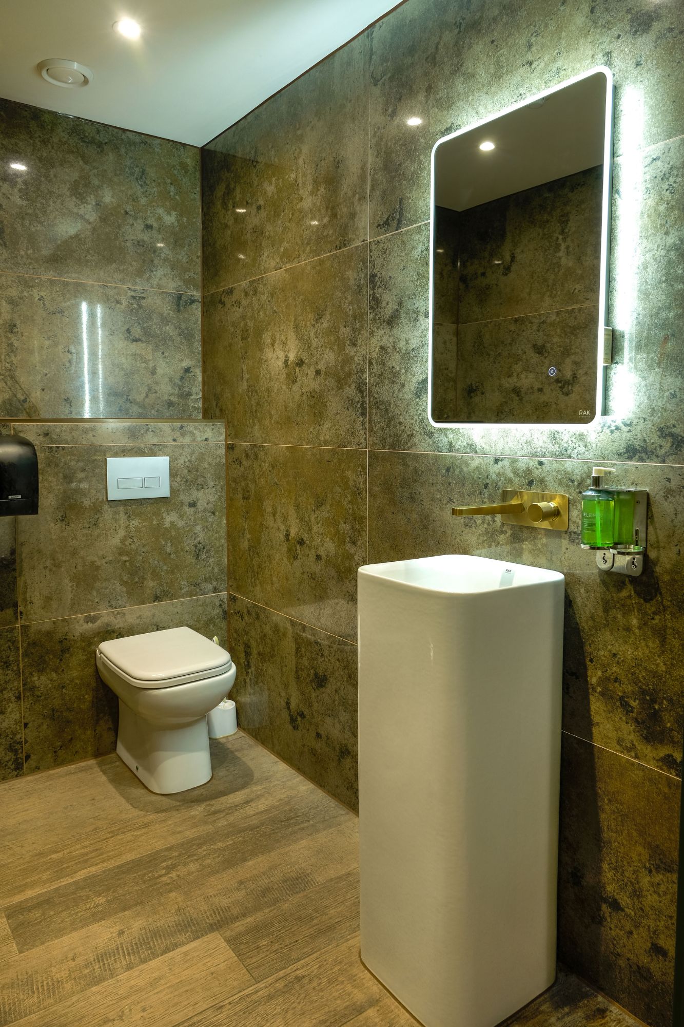
RAK Ceramics surfaces feature throughout the location, from the RAK Revive floor tiles in the lavish spa and shower rooms and nature-inspired flooring in the bar and restaurant to RAK Detroit metallic finish tiles in the pool area and changing rooms and porcelain flooring and countertops in the golf shop.
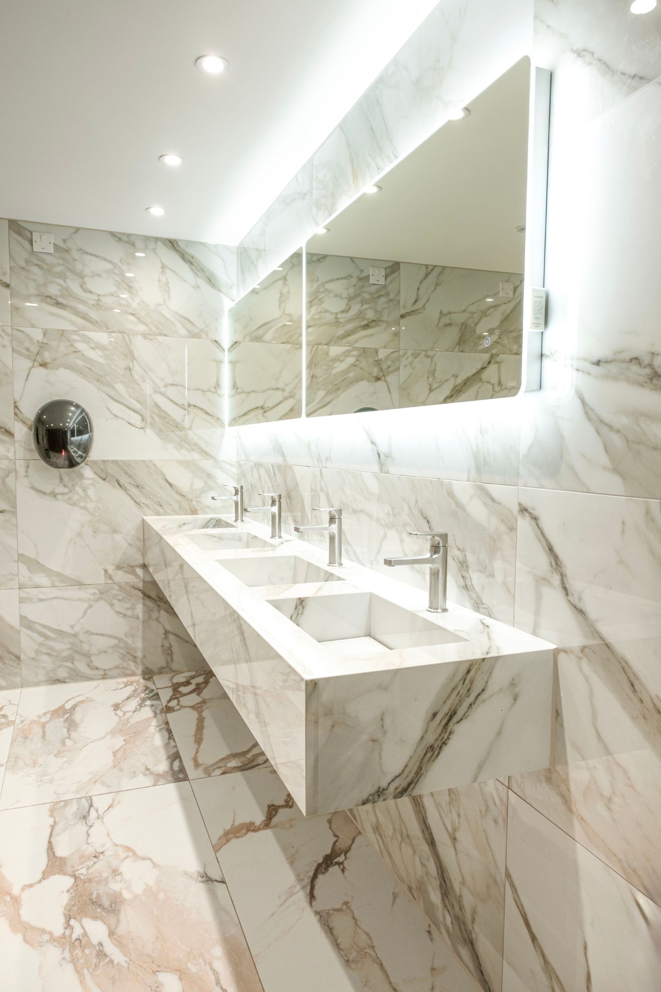
Sanitaryware from the leading brand also features, with the designer collection RAK-Petit floorstanding washbasins featuring in the WCs and the public bathrooms all finished with RAK-Precious basins teamed with matt black brassware. “Our objective was to source products that seamlessly merged aesthetics with durability,” continues Fawzy. “We pursued a minimalist design infused with a touch of opulence, a quest that led us to the exquisite offerings within the RAK Ceramics collection.”
Commenting on the finished project, the club’s General Manager, Ben Evans, says: “The new club was created for the Cambourne community, which until now has lacked anything like it in terms of leisure facilities. It’s quickly become a go-to lifestyle destination for our members and their families.”
About RAK Ceramics Ltd
RAK Ceramics products feature in some of the most iconic buildings in the world. Known for a wide product range and the ability to produce bespoke solutions for both small and large scale projects, RAK Ceramics enable clients to bring their ideas to life. They respect, inspire, improve and deliver; today, tomorrow, no matter the ambition, no matter the challenge, RAK Ceramics take care of all the details, so you don’t have to. Their passion and expertise combined with a careful attention to detail means they can provide you with a range of integrated ceramics solutions, allowing you freedom to be creative and plenty of room for imagination.
If you’d like to feature your news or stories on SBID.org, get in touch to find out more.
If you’d like to become SBID Accredited, click here for more information.
This week’s instalment of the Project of the Week series features a charming and historic KBB design by 2023 SBID Awards Finalist, Arsight.
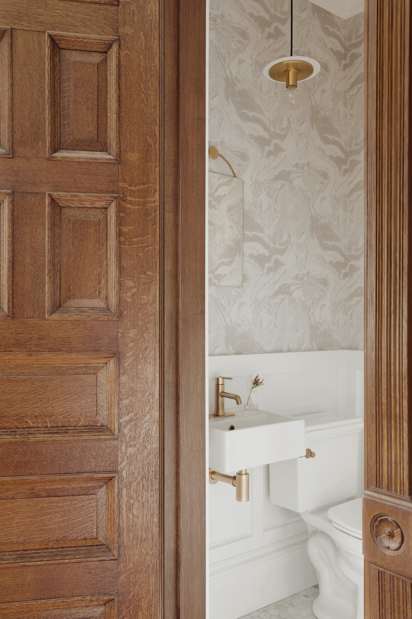
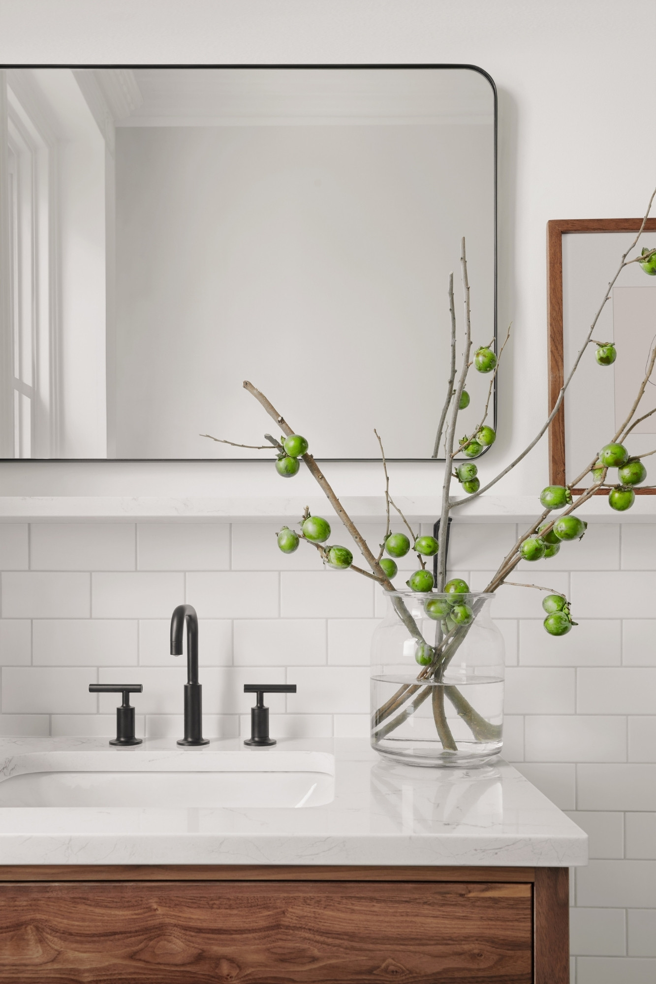
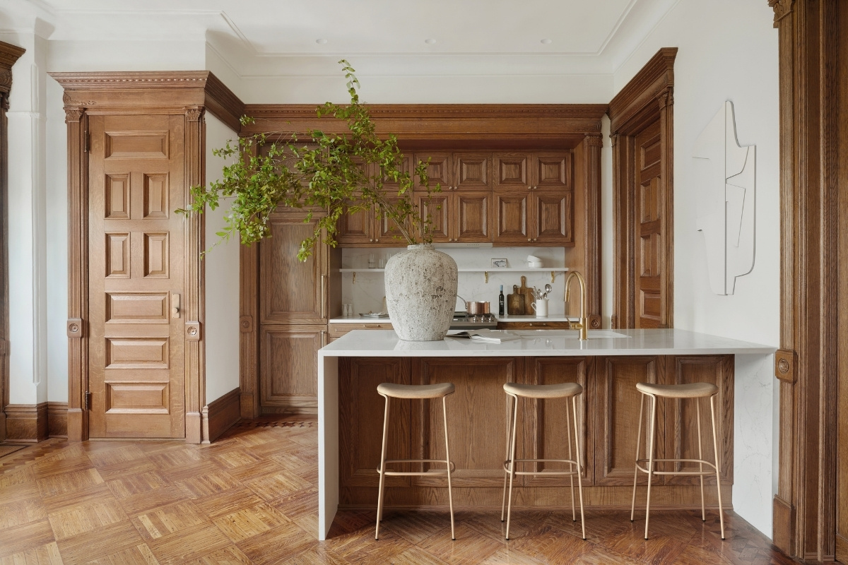
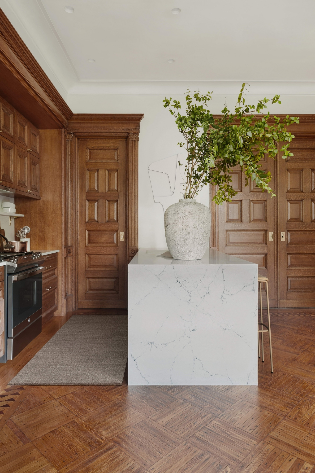
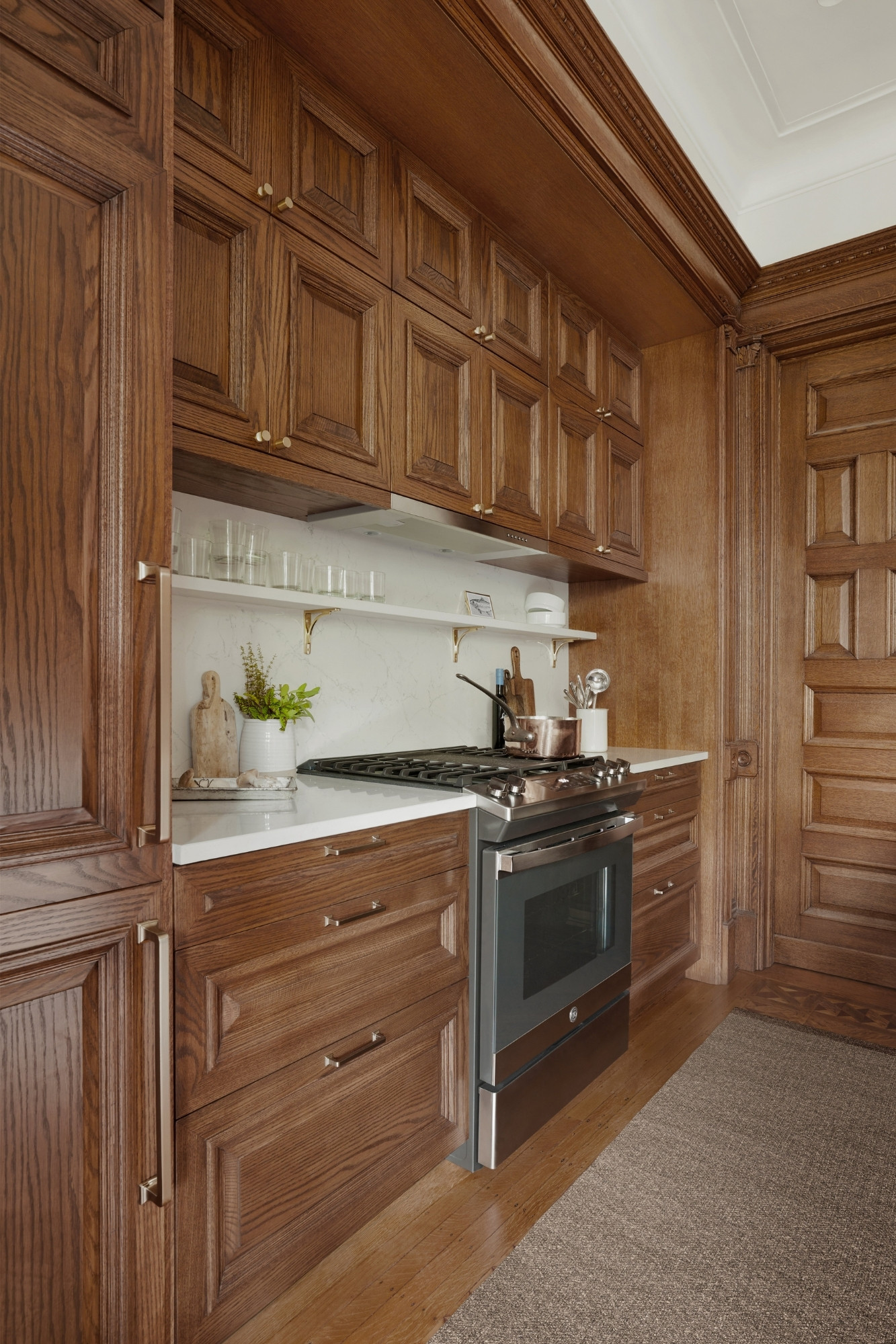
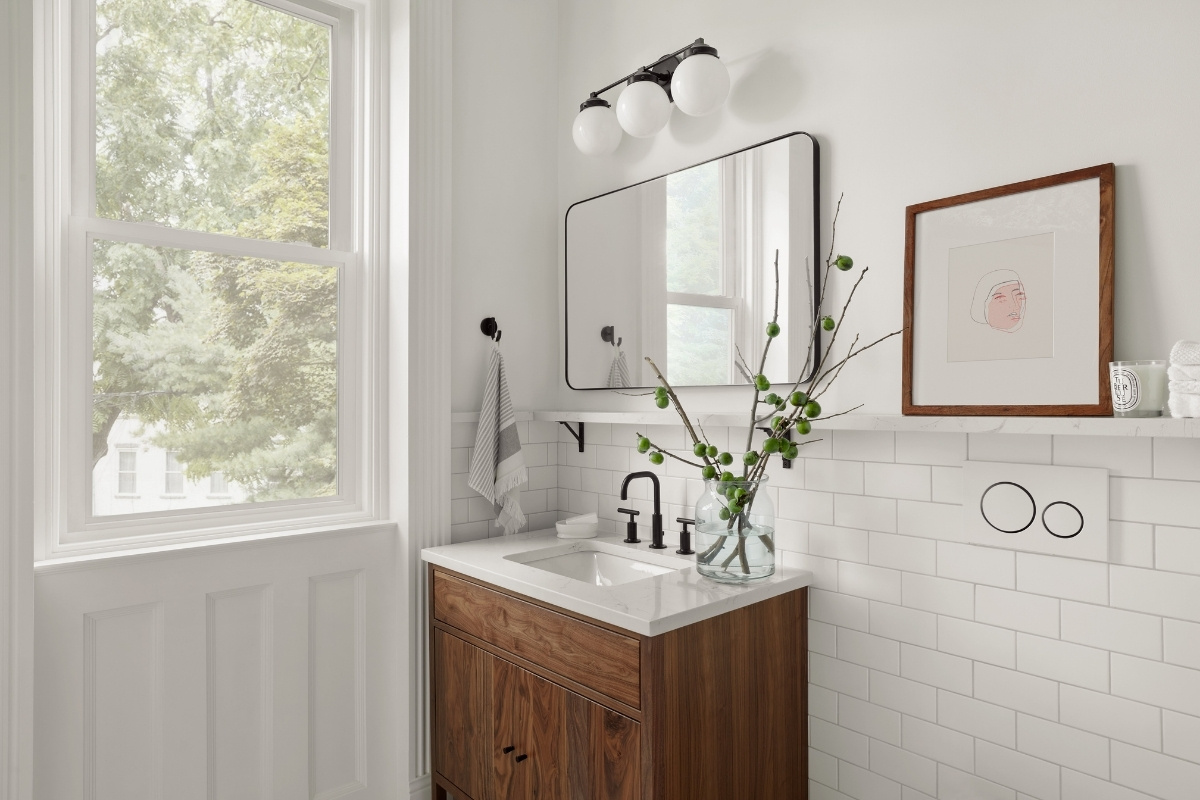
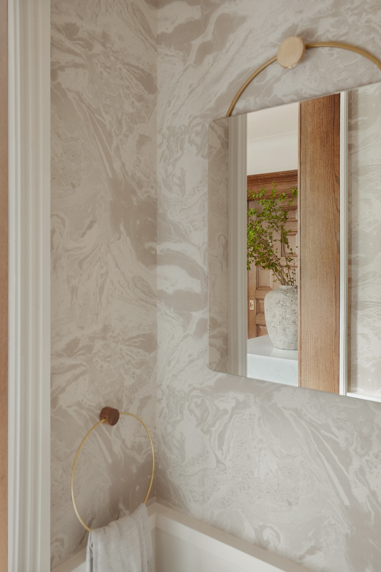
Artem Kropovinsky, of Arsight Studio, masterfully reimagines a 120-year-old Brooklyn brownstone, infusing Scandinavian-inspired design elements. The renovated kitchen and bathroom seamlessly blend historic charm with modern comfort, integrating cutting-edge technology while preserving original details. Custom woodwork, brass hardware, and eclectic wallpaper create a harmonious visual flow. Underlying the design is a strong commitment to sustainability, with restored original features, locally sourced materials, and energy-efficient appliances, demonstrating that luxury and eco-consciousness can coexist.
SBID Awards Category: KBB Design
Practice: Arsight
Project: Brooklyn Brownstone Revival
Location: New York, United States of America
What was the client's brief?
The client desired a blend of the Brooklyn brownstone's rich 120-year history with cutting-edge modern technology. Their goal was a harmonious marriage of the two, focusing on the custom kitchen and bathroom. They wanted these spaces to pay homage to the property's heritage while providing the modern conveniences and features expected in a high-end property today.
What inspired the design of the project?
Our inspiration was twofold. First, the inherent charm and architectural beauty of the Brooklyn brownstone acted as our canvas. Second, we were inspired by the potential of cutting-edge technology to enhance daily life. Drawing on minimalist Scandinavian aesthetics, we combined earthy tones and minimalist finishes with state-of-the-art technology, like voice-activated assistants and adaptive lighting, to craft a space that's as smart as it is stunning.
What was the toughest hurdle your team overcame during the project?
Beyond marrying the old with the new in terms of design, our challenge was seamlessly integrating modern technology without disrupting the brownstone's historical integrity. Introducing smart appliances, retractable range hood, and sensor-driven lighting into a setting that boasts carefully restored stained glass windows and original woodwork was a delicate task. It required a perfect blend of innovation and respect for history.
What was your team’s highlight of the project?
The custom wood kitchen was a crowning achievement. It wasn't only the aesthetic harmony we achieved, but also the integration of modern tech features like smart appliances, voice-activated assistants, and centralised control panels. This kitchen isn't just a treat for the eyes; it's a hub of modern convenience, with every technological addition designed to enhance user experience, from adaptive lighting to an integrated sound system.
Why did you enter the SBID Awards?
The SBID Awards represent the epitome of interior design innovation and excellence. We believed our project, with its unique blend of historical aesthetics and advanced technological features, was emblematic of the pioneering spirit SBID celebrates. Participating in the SBID Awards was a chance to spotlight our commitment to pushing the boundaries of design.

What has being an Award Finalist meant to you and your business?
Achieving Finalist status at the SBID has been both an affirmation of our dedication to design and innovation and a tremendous boon for our brand's reputation. It's not only about being recognised but also about showcasing our approach, which deftly balances reverence for history with the exciting possibilities of modern technology. The acknowledgment has reinforced our reputation as innovators in the world of interior design.
Questions answered by Artem Kropovinsky, Founder & Principal Designer at Arsight.
This week’s instalment of the Project of the Week series features a peaceful and earthy apartment design by 2023 SBID Awards Finalist, RS Interiores.
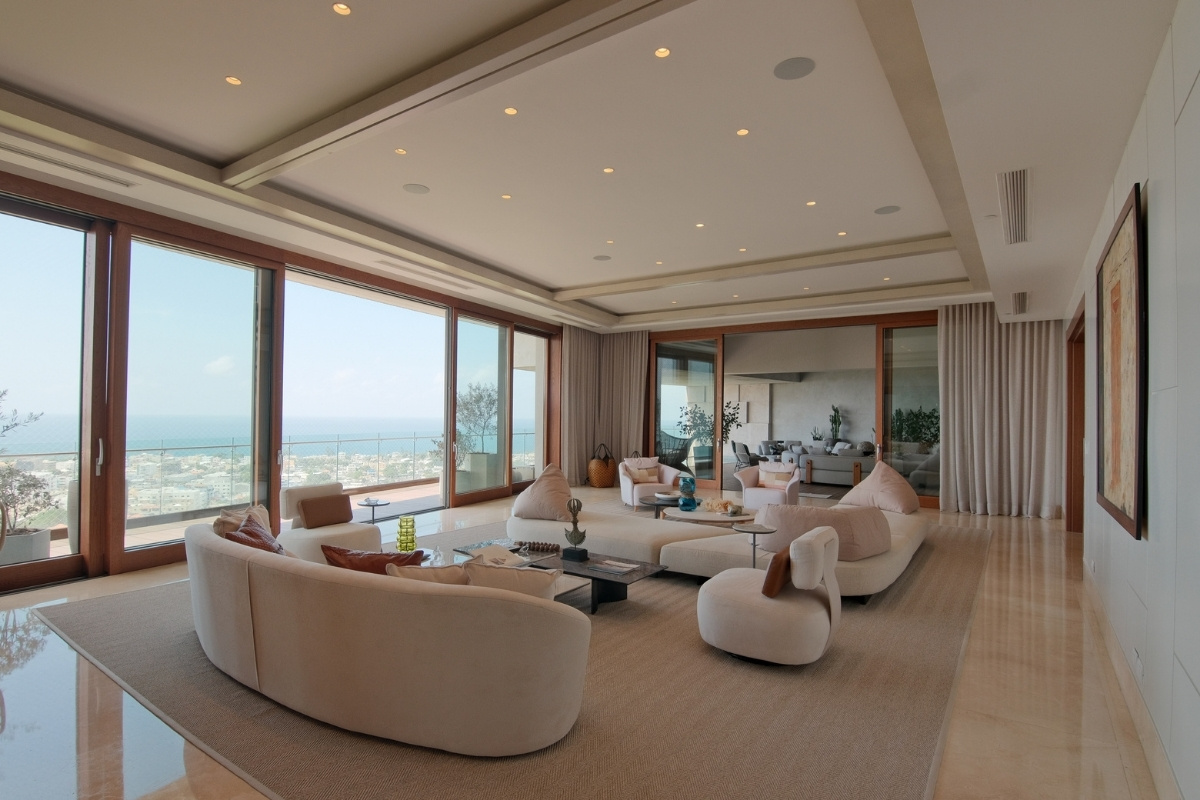
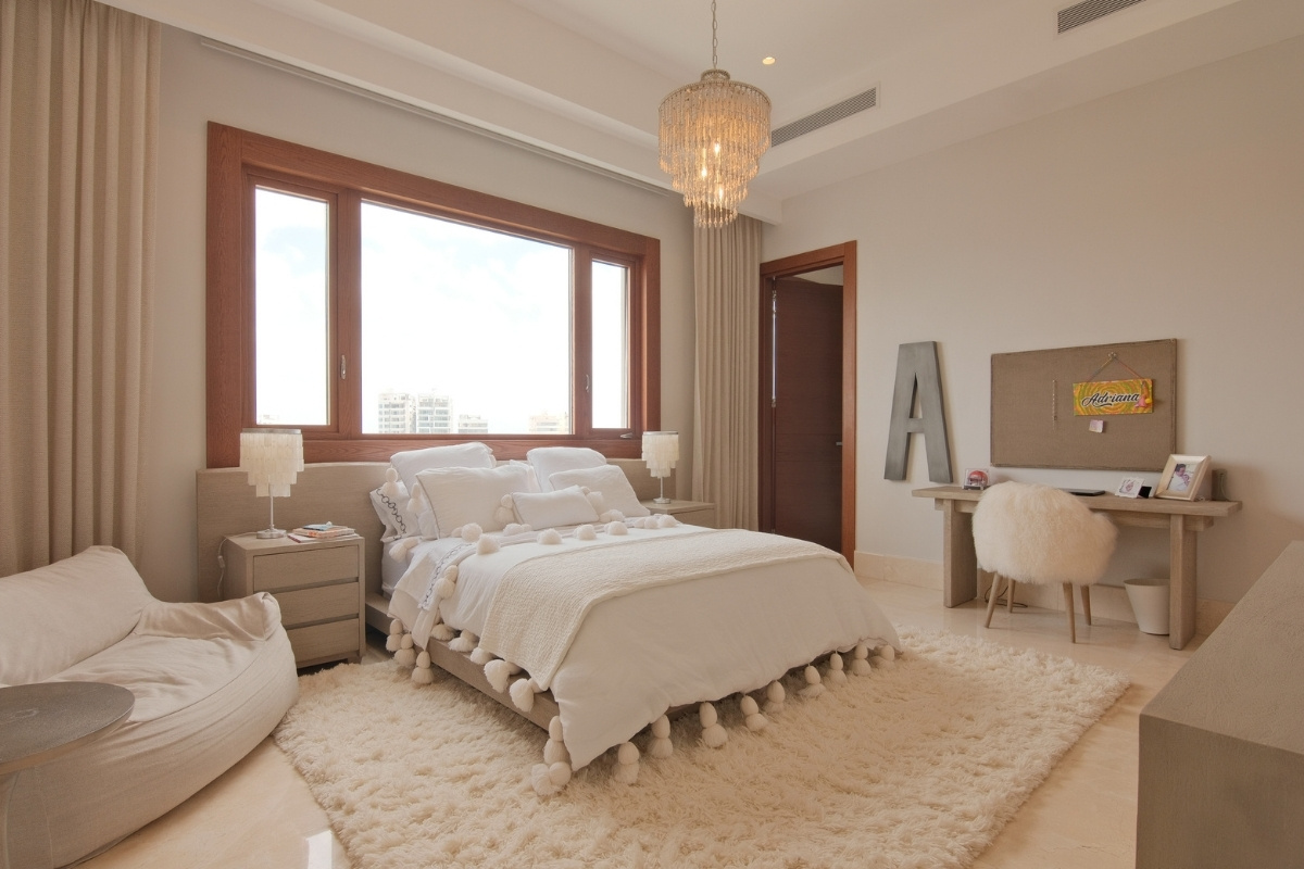
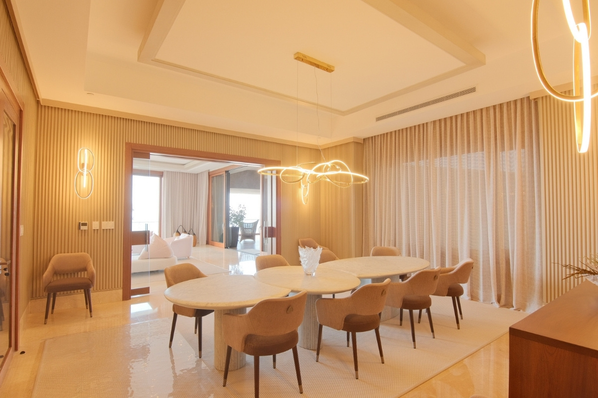
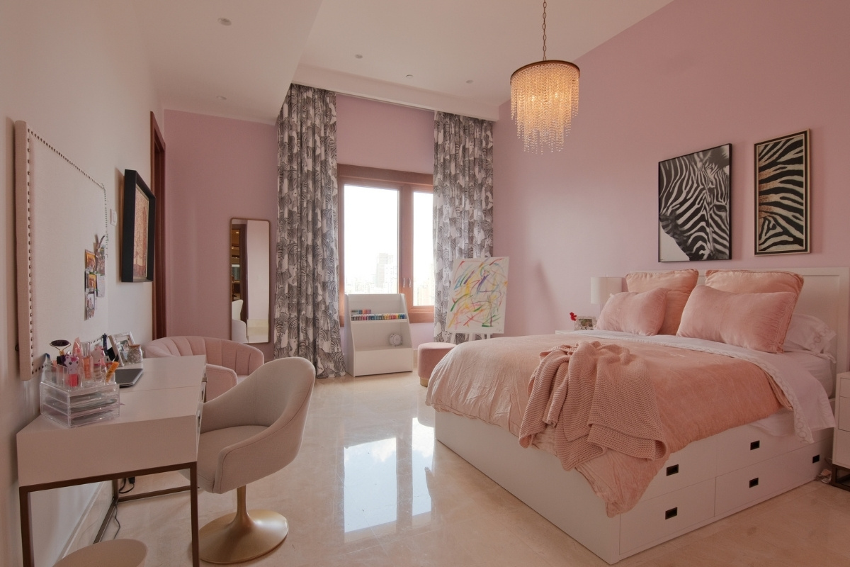
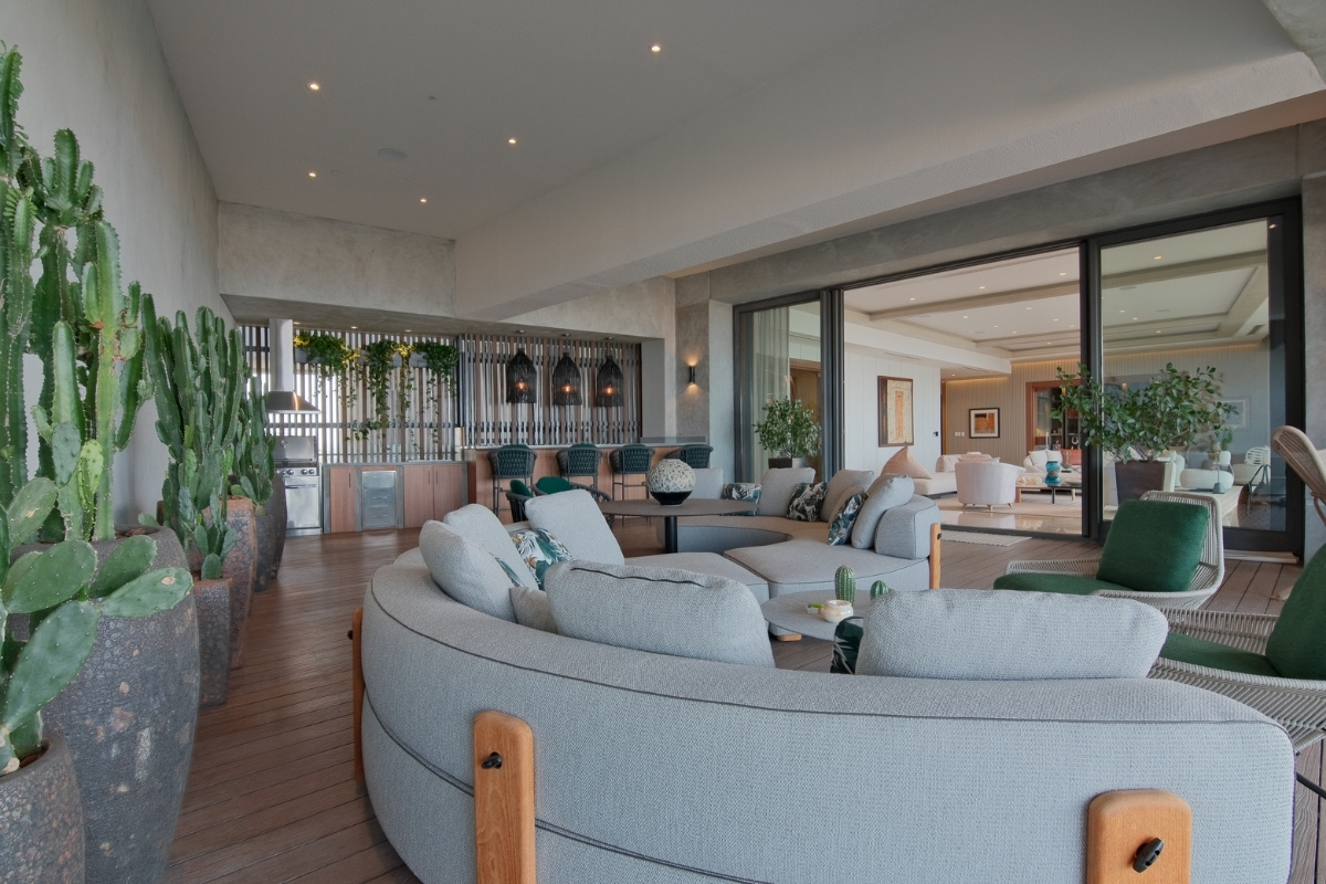
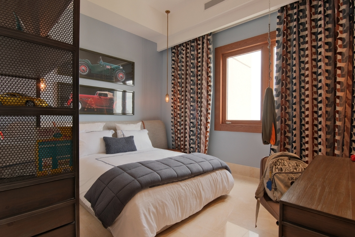
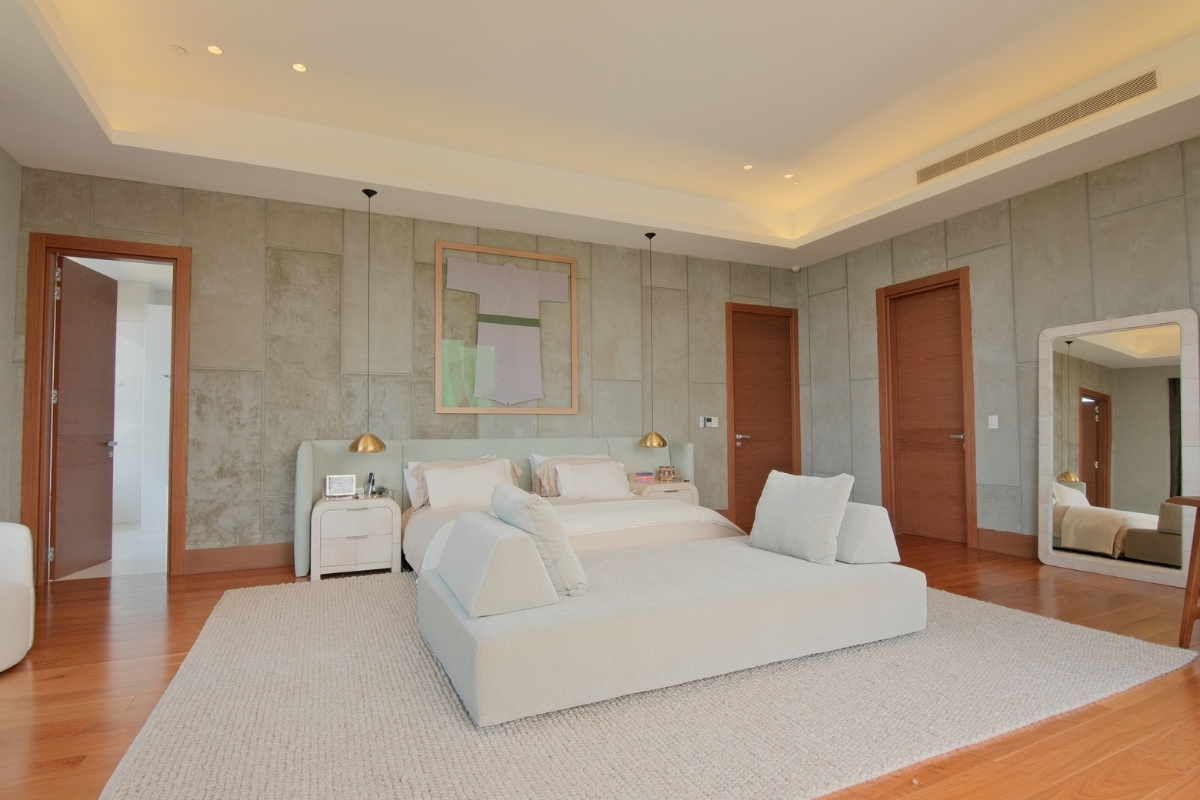
Udo means peace in Hindu, just the name Rosadela Serulle had been searching for this project, since its exactly what is reflected in its ambiance. She describes it as a symbol of amplitude, where the unity of colors come together in perfect harmony. All the spaces in Casa UDO have elements of design that forces its visitors to admire them. The simplicity in the entrance and its complicity with the grand living room. These spaces are in earthy hues to create the sensation of lightness and tranquility it offers.
SBID Awards Category: Residential Apartment Under £1M
Practice: RS Interiores
Project: UDO
Location: Santo Domingo, Dominican Republic
What was the client's brief?
The client's brief was simple, they wanted a residence that transmitted peace. After that I was given full freedom of design, which is every designer's dream.
What inspired the design of the project?
The inspiration for this project came from the first conversation with my client, where we sat down and just spoke about life, their expectations and desires for their home. This is where UDO was born. Udo, means peace in Hindu, just the name I had been searching for this project, since its exactly what is reflects in its ambiance.
What was the toughest hurdle your team overcame during the project?
The toughest hurdle we overcame was definitely time, we had a specific goal to completed this project within a few months, from a blank canvas to what we accomplished, and our team delivered, we completed UDO within 6 months. This includes all of the wood works, tapestry, wall finishing, curtains and all furnishings.
We aim to please our clients and this project met all the expectations.
What was your team’s highlight of the project?
Our highlight of Casa UDO, was definitely composing a home worth of this family, we met all of our clients expectations. Our designs, color, lighting and furnishing came together in a wonderful way.
Why did you enter the SBID Awards?
I entered SBID awards as we have done for the past years, I believe in excellence and recognition, and you can always find this in SBID.
What has being an Award Finalist meant to you and your business?
It truly meaningful to be recognised at this stage as a finalist to this prestigious award. We strive to produce designs that create a unique identity, that truly represents our clients way of life.
Questions answered by Rosadela Serulle, Founder of RS Interiores.
Ana Moisin, Creative Director at Anamo Design Studio, has given her insights into the industry. With over a decade’s experience in Interior Design, Ana Moisin - the Creative Director and Founder of Anamo Design Studio seeks to deliver the highest creative solutions with outstanding professionalism, revitalising the hospitality scene through game changing design. After graduating in Interior Design, Ana has been leading premium and high-end Hospitality, Leisure and F&B projects from the very early concept stages to on-site completion. She has an enormous passion for design, phenomenal attention to detail and thorough technical knowledge including FF&E and finishes. During her career so far, Ana developed unique design schemes for clients such as: F1 Arcade, The Cadogan Hotel, Aviary Roof Top Bar, Jason Atherton, The Goring Hotel and Puttshack.
Ana’s international education and experience enabled her to draw inspiration from a vast range of subjects such as intricate geometry and rich cultural heritages, combined with an eclectic approach to textures and patterns. Following a number of successful positions at renowned interior design firms, Ana established Anamo Design Studio, an international practice focusing on a multidisciplinary approach to deliver a complete guest experience.
Why did you want to work in the interior design profession?
My passion for art and design started at a very early age, so my family was very supportive of me pursuing an Art and Music School in parallel with my Primary and Secondary Education. In High School, I developed a long-standing passion for mathematics and logical skills which evolved into a love of geometry, technology and 3D spatial exploration in Academia. Having this strong foundation, I was able to seamlessly combine art and mathematics, which I consider to be the foundations of interior design, ultimately enabling me to optimise the potential of any space.
Which elements of your profession do you enjoy the most?
From my point of view, the most fulfilling aspect of the Interior Design career is navigating all design stages of a project and witnessing the evolution of initial concepts, culminating in their realisation. I find great pleasure in tackling the initial challenge, brainstorming concepts, and uncovering the grand design idea. At Anamo Design Studio we believe no two projects are the same, so we offer our projects a sense of uniqueness and individuality by re-imagining the design every time.
Another incredibly rewarding experience for me is the first Client design meeting of a new project, as it acts as a catalyst for the big creative ideas and a platform for generating excitement within the team. Interior Design as a profession is creatively rewarding and comes with a strong sense of fulfilment, as each day unravels unique experiences and challenges.
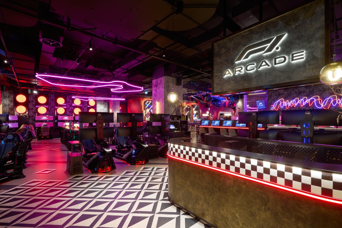
What has been your most memorable career highlight from the past year?
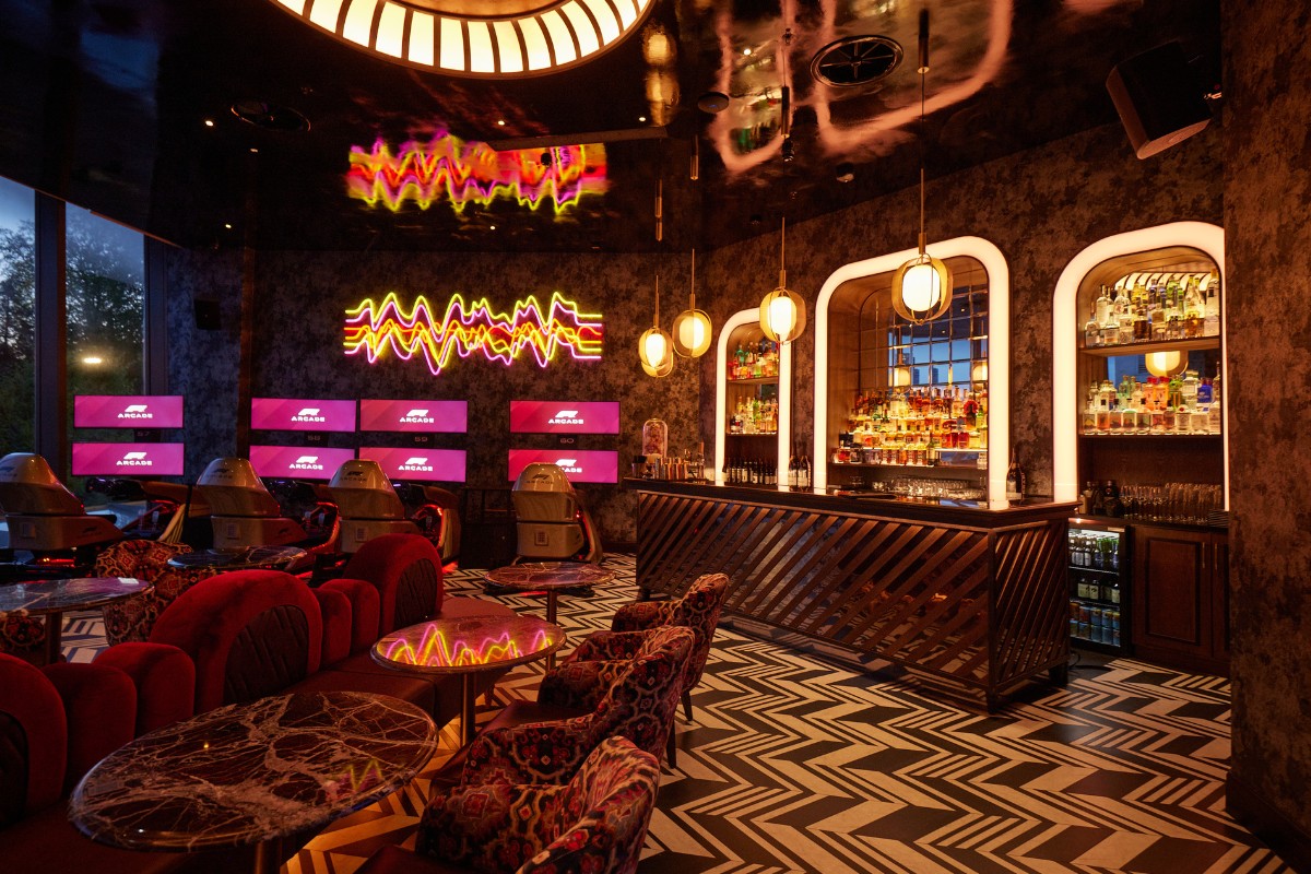
One standout moment from the past year is the launch of our latest project - F1 Arcade Birmingham. Marking the creation of F1 Arcade’s second venue, this unique, one-of-a-kind environment that beautifully blends the premium and glamorous Formula 1 lifestyle with the high-tech, energy infused Formula 1 racing, showcases a modern industrial language with touches of glamour layered throughout the space. In parallel with this opening, we have been actively shaping innovative concepts within the realm of experiential hospitality, details of which we can hopefully share with you very soon.
Furthermore, we've reached significant milestones with the completion of High-End residential projects that have been in development over recent years. Over the past year, we have successfully expanded our team and integrated additional design disciplines in-house, effectively enhancing our multidisciplinary approach to projects —a source of profound pride for me.
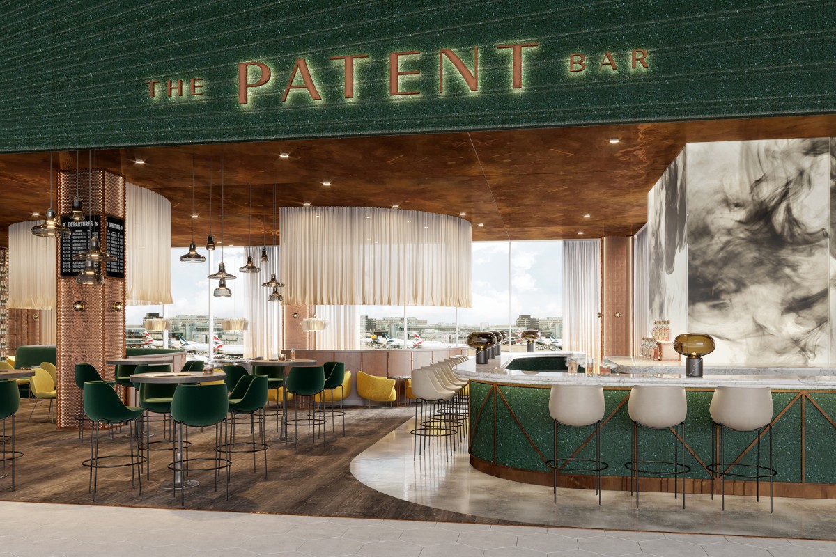
What are your favourite types of projects to work on and why?
I am particularly drawn to Experiential Hospitality and F&B projects, as they bring a dynamic energy, fast-paced atmosphere, and the chance to explore innovative and groundbreaking ideas. Typically, we see such venues wanting to open their doors to the public as soon as possible after the design is agreed, giving us a great opportunity to follow the project closely throughout the duration of the build.
Another type of projects I am particularly drawn to are High-End Residential and Hotel schemes, as both require meticulous attention to detail and offer ample opportunities for creative expression through a variety of textures and patterns available for use.
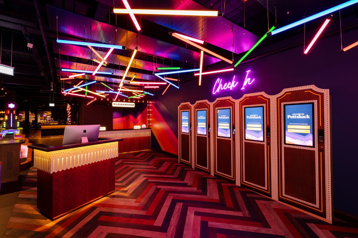
What are the most challenging aspects of working in interior design?
I find that the most rewarding aspects often coincide with the most challenging ones. Aligning the Client's vision, guest expectations, and our creative design flair to achieve an extraordinary outcome is no small feat and requires cohesive collaboration. Apart from ensuring all stakeholders are aligned when it comes to design, one of the biggest challenges in this industry is delivering great designs on budget. This is why, at Anamo Design Studio, we like to be involved in the project budgeting from the early concept stages to ensure we safeguard the design elements that will create the most impact. In addition, this enables us to manage expectations and maintain transparency regarding the project's outcomes and success.
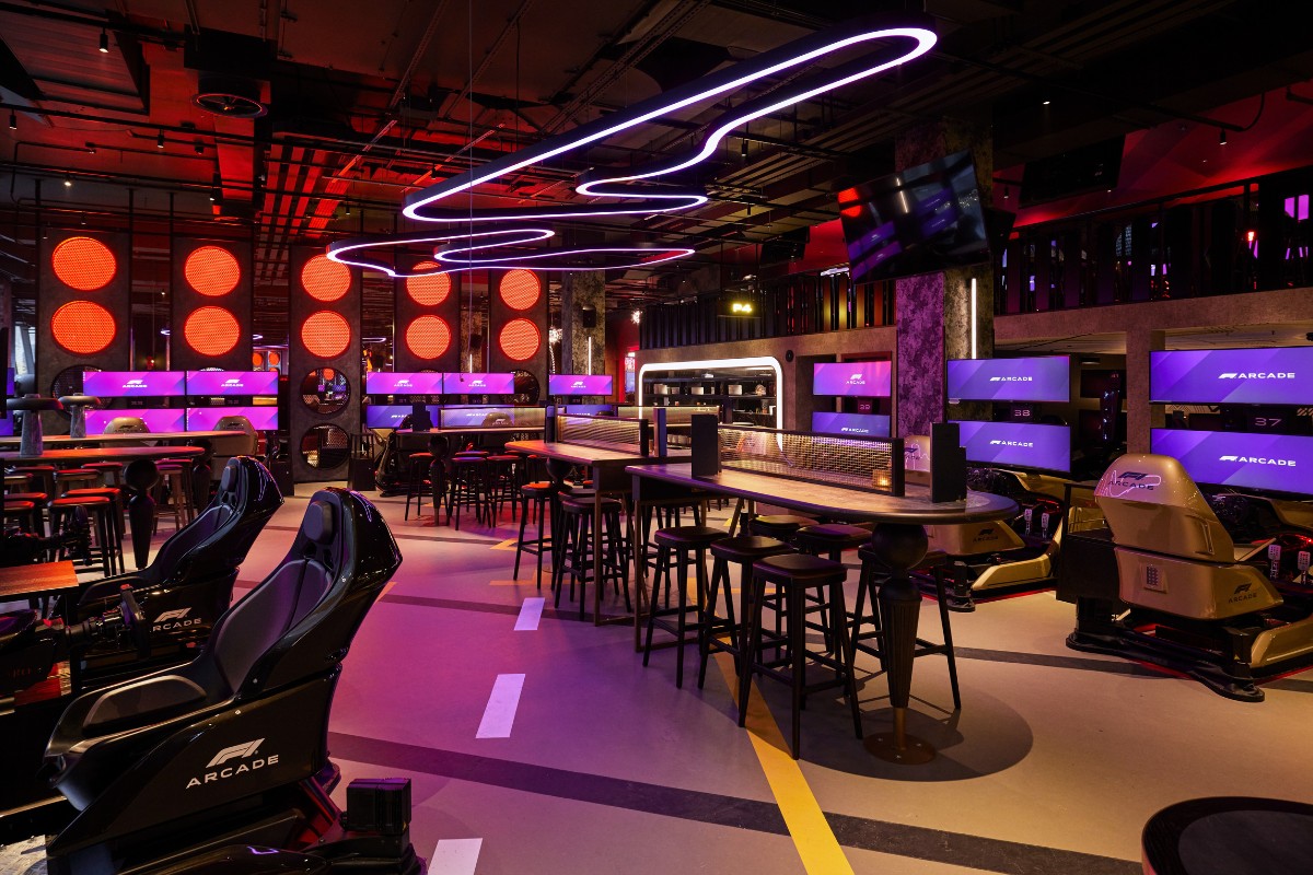
What do you wish you knew before working in the field?
The biggest learning for me was the expanse of the field; Interior Design is more than just design, it combines a wealth of knowledge such as technical acumen, creative presentation skills, accurate budgeting and constant research into expanding the use of the application of finishes and textures. Furthermore, understanding the differences between Interior Decorator, Interior Designer, and Interior Architect is important because each role entails specific skills, qualifications and responsibilities. Knowing these distinctions helps clients and professionals alike to ensure that the right expertise is sought for the task at hand. Additionally, it fosters clarity and effective communication within the industry, leading to better collaboration and outcomes in interior design projects.
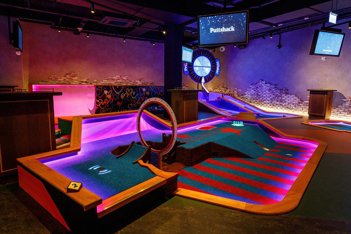
If you could give one tip to aspiring designers, what would it be?
The best advice for aspiring designers is to embrace flexibility early on in your career and willingness to learn from various disciplines such as architecture, graphic design, engineering, and project management. This will transform you into a versatile, highly sought-after designer, instilling the confidence to present your own ideas and lead projects from concept to completion.
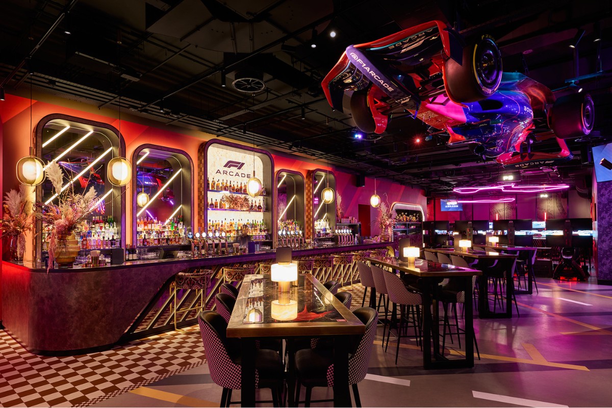
How do you see the interior design industry evolving in the year ahead?
As creative brands continue to launch hospitality venues and guests become increasingly design-conscious, we have noticed the significance of design in choosing leisure destinations increased significantly compared to few years ago. This year, I see the industry pushing the limits of creativity, aiming for impactful ideas and a wow factor in design. This presents an excellent opportunity for creative agencies to showcase their expertise and craft captivating, standout designs.
In addition, I have noticed an increased awareness within the Interior Design industry as a whole around the significance of lighting and its role in interior design, which I believe will have a notable impact on the projects completed over the next few years.
What does being an SBID Accredited Interior Designer mean to you?
Having the accreditation as an SBID Interior Designer significantly boosts the studio's visibility and aligns us with top-tier designers, facilitating valuable idea-sharing and continuous learning within the Interior Design field. The membership allows us to access exclusive resources such as the SBID Design Awards and the Interior Design Directory, elevating our reach to worldwide clients seeking our services. Both the awards and directory raise professional standards in design year on year and empower designers to elevate the outcome of completed projects.
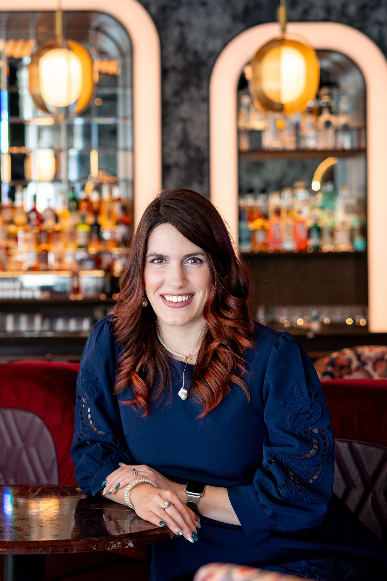
One of the many things we appreciate at SBID is their passion for regulating the interior design industry, which helps potential Clients distinguish between hobbyists, Interior Decorators and Interior Designers.
About Anamo Design Studio
Anamo Design Studio is an International practice based in London. Specialising in Hospitality, F&B and Residential Design our multi-disciplinary team of highly skilled designers, FF&E experts and creative technical architects is focused on hand-crafting a timeless personality for each project. At the heart of our studio is an immense focus on quality and detail, ensuring our designs are as durable and long lasting as they are aesthetically pleasing. We aim to reflect each Client’s personality and passions into the spaces we design, through a combination of hospitality-forward design solutions and an outstanding technical acumen.
If you’d like to feature your news or stories on SBID.org, get in touch to find out more.
If you’d like to become SBID Accredited, click here for more information.
From conception to completion, Elementi Cucina’s Creative Director, Katie Lusty, was on board with this new build project working hard with the clients to create their dream home.
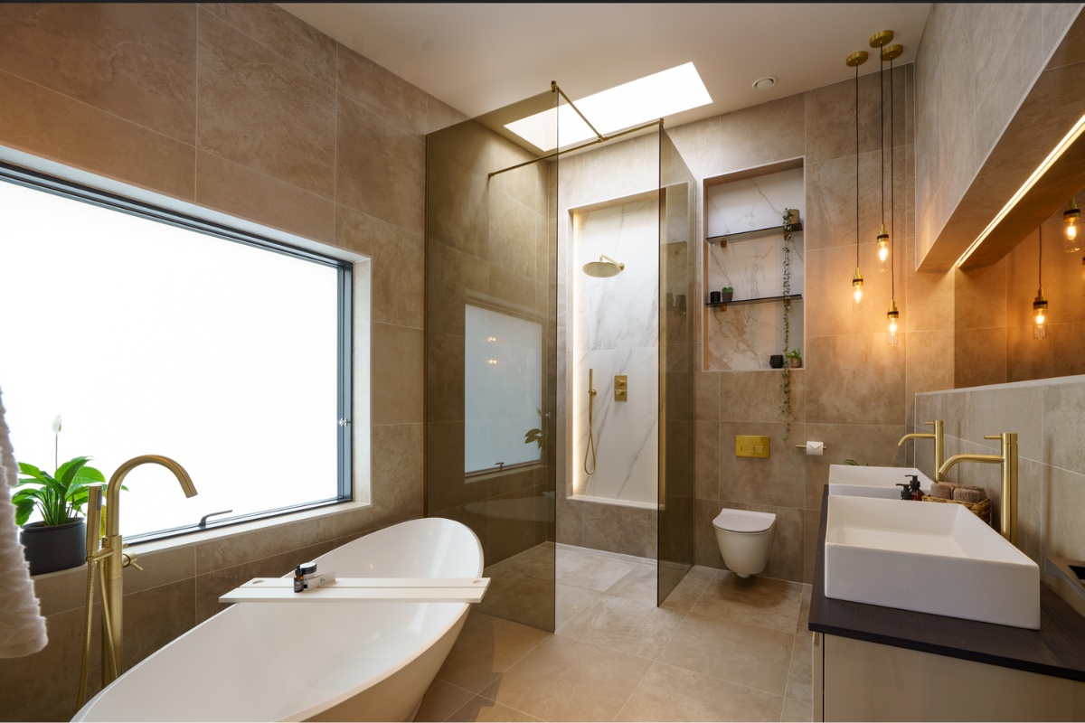
The clients were a young family with uber cool taste who didn’t just want a standard boring kitchen, wardrobes and bathrooms, like many they had seen, but were looking for something completely different, a statement, a reflection of their personalities as a family, quirky, fun yet functional for their lifestyle, which in a day could involve messy breakfasts, hordes of kids running around, the space being used as a family gathering place and sophisticated evening adult soirees. The clients were totally open to ideas, the more individual the better, they put their trust in Katie and were a designers dream client...
The kitchen space was very large, and the clients wanted it to look contemporary but with personality, cutting edge appliances were a must along with a stunning selection of materials. The space needed to wow but also work as a functional family kitchen, they love cooking and entertaining, and the appliances and extraction needed to be able to handle this, the kitchen had to be easy to maintain and navigate also. A focal point and copious worktop space for the family to congregate were a must!
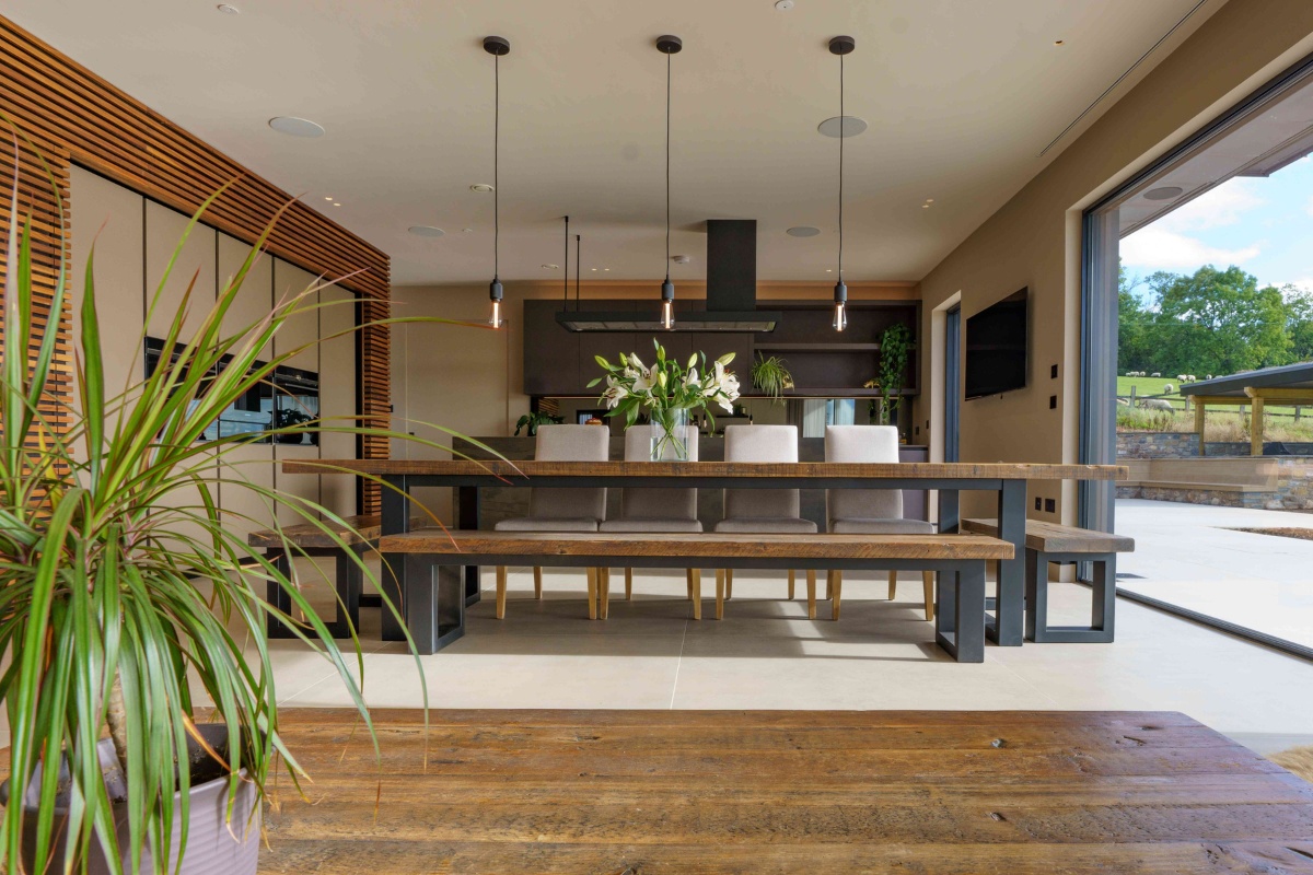
The kitchen ergonomics were considered first, followed by the finishes (no insipid colours allowed), a beautiful sultry, dark door gave the whole design depth and texture. The layout was key, so Katie designed a tall wall run encompassing in beautiful organic strips of wood, refrigeration appliances were hidden and a pantry/breakfast area behind secret doors in the strip wood was designed in (to hide the toaster and clutter if required) and finally tall units for ample storage. The sink run included a beautiful stone sink and a must have Quooker tap system. The oven appliances were strategically placed for cooking with set down space directly opposite.
The island really was the focal point and practically gave the clients a central beautiful working space, with acres of clear worktop run for cooking up a storm and plenty of large pull-out drawers for storage. Dekton worktops add to the depth of the room scheme, the stone encases the back, island worktop and sides giving a monolith effect. The kitchen is a truly unique and stunningly original installation, and our fantastic suppliers who supported us throughout the project, especially the team at Classico Marble who really did go above and beyond with the intricate stonework (caused a few sleepless nights for sure).
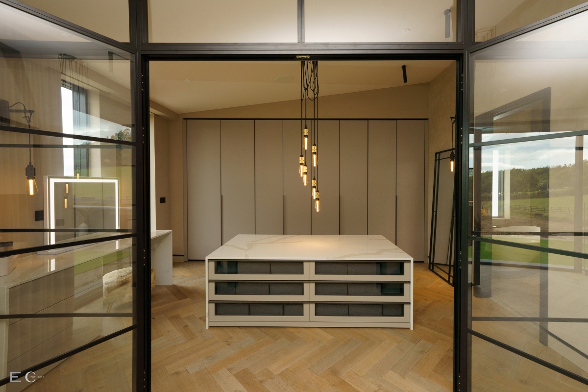
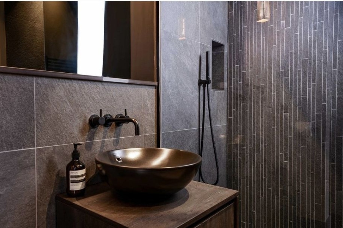
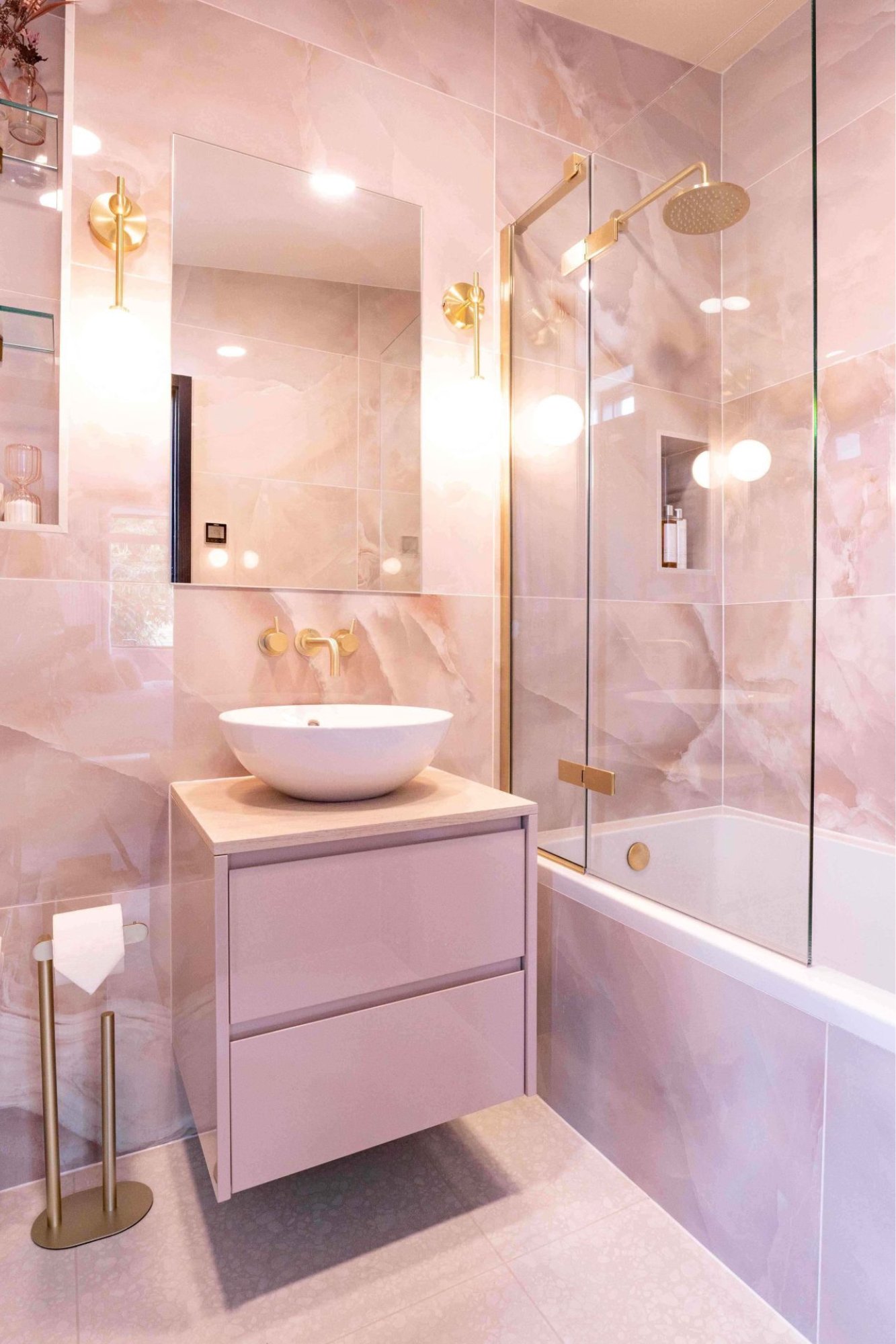
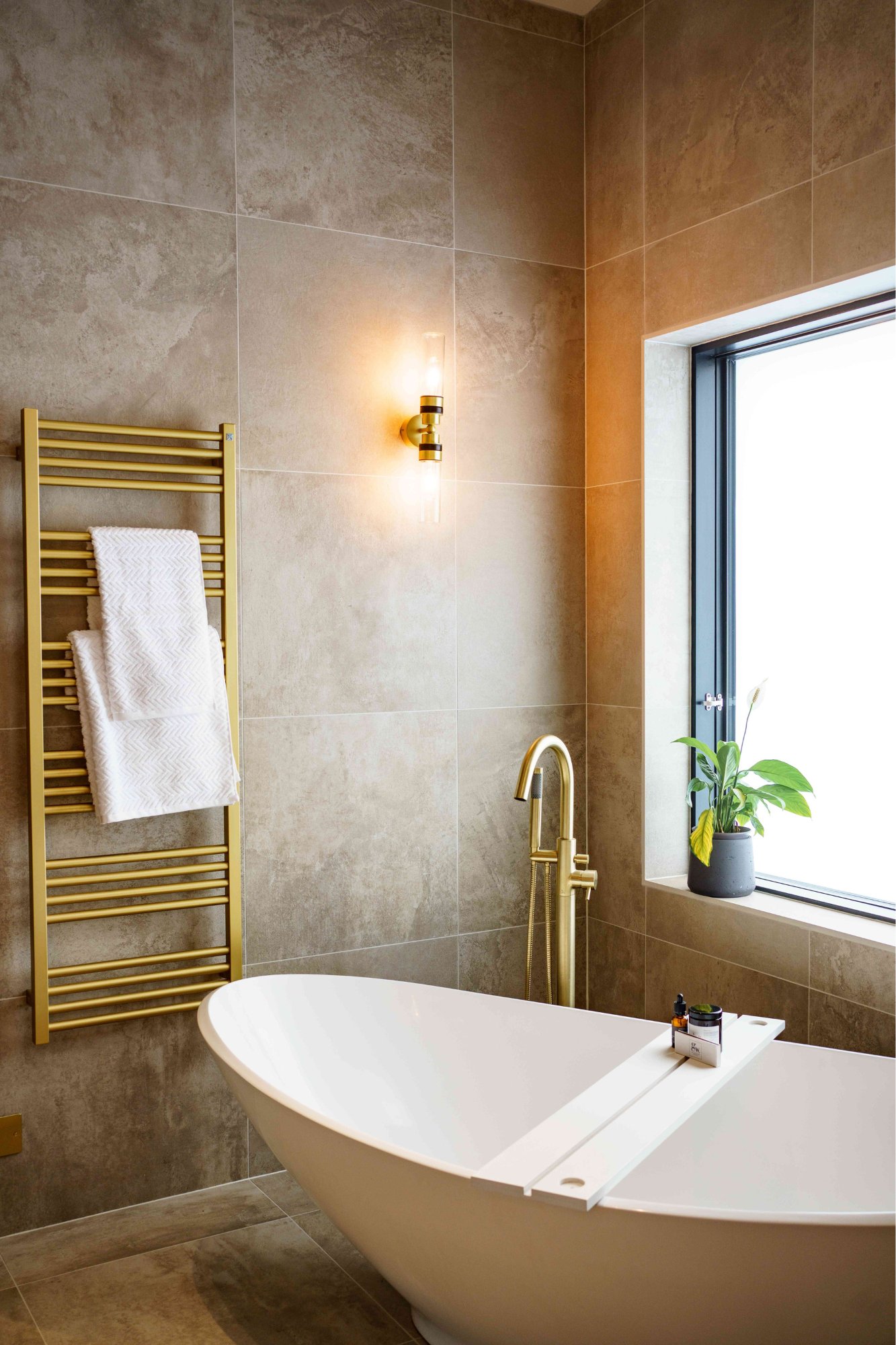
Once the kitchen was designed, bang on budget the bathrooms and wardrobes came next, again working closely with the clients to create unique, individual, and stunning spaces. The Master En-Suite and dressing room showcase a calm, soft yet incredibly chic design, perfect for this fashion loving client and her husband. The children’s en-suites were designed to grow up with them, the girls bathroom features a stunning rose quartzesque tile and gold brassware whilst the boys bathroom is totally batcavesque whilst being stylish and classic.
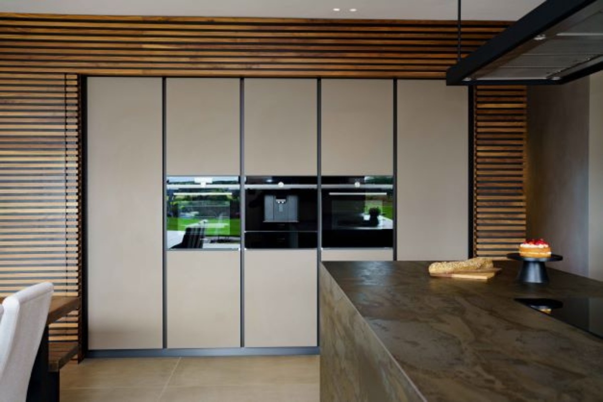
The challenges faced on this project were mainly down to supply chain issues however we worked hard as a team to manage this and can happily say the project was a success and the clients delighted. True Elementi Cucina teamwork at play, all pulling together to leave the clients with their house, like no other.
About Elementi Cucina LTD
Here at Elementi Cucina we create beautiful bespoke Interiors for your private residence, development, retail space or show home. Working with the finest kitchen, bedroom and lifestyle furniture manufactures, we can create timeless interior solutions for your home. Renowned worldwide for their design flair we believe that luxury Italian furniture & kitchen brands have it all. Flexibility in manufacturing, colour palette, veneers and high end quality. As designers, this gives us the ability to create truly unique spaces. As an addition to this Elementi Cucina has its own Taylor Made solutions made in the UK. By working closely with our design team and our highly skilled craftsmen/women we can produce one off creations for your space.
If you’d like to feature your news or stories on SBID.org, get in touch to find out more.
If you’d like to become SBID Accredited, click here for more information.
Erwin Ereno Design Studio shares a story of immense pride and gratitude, reflecting on their collaboration with HH Sheikha Maryam Bint Mohammed Bin Salman Al Khalifa. Guided by Her Highness's vision, the design team poured their dedication and creativity into every detail of the project. The final outcome – a breathtaking transformation – stands as a testament to the power of shared vision and unwavering trust.
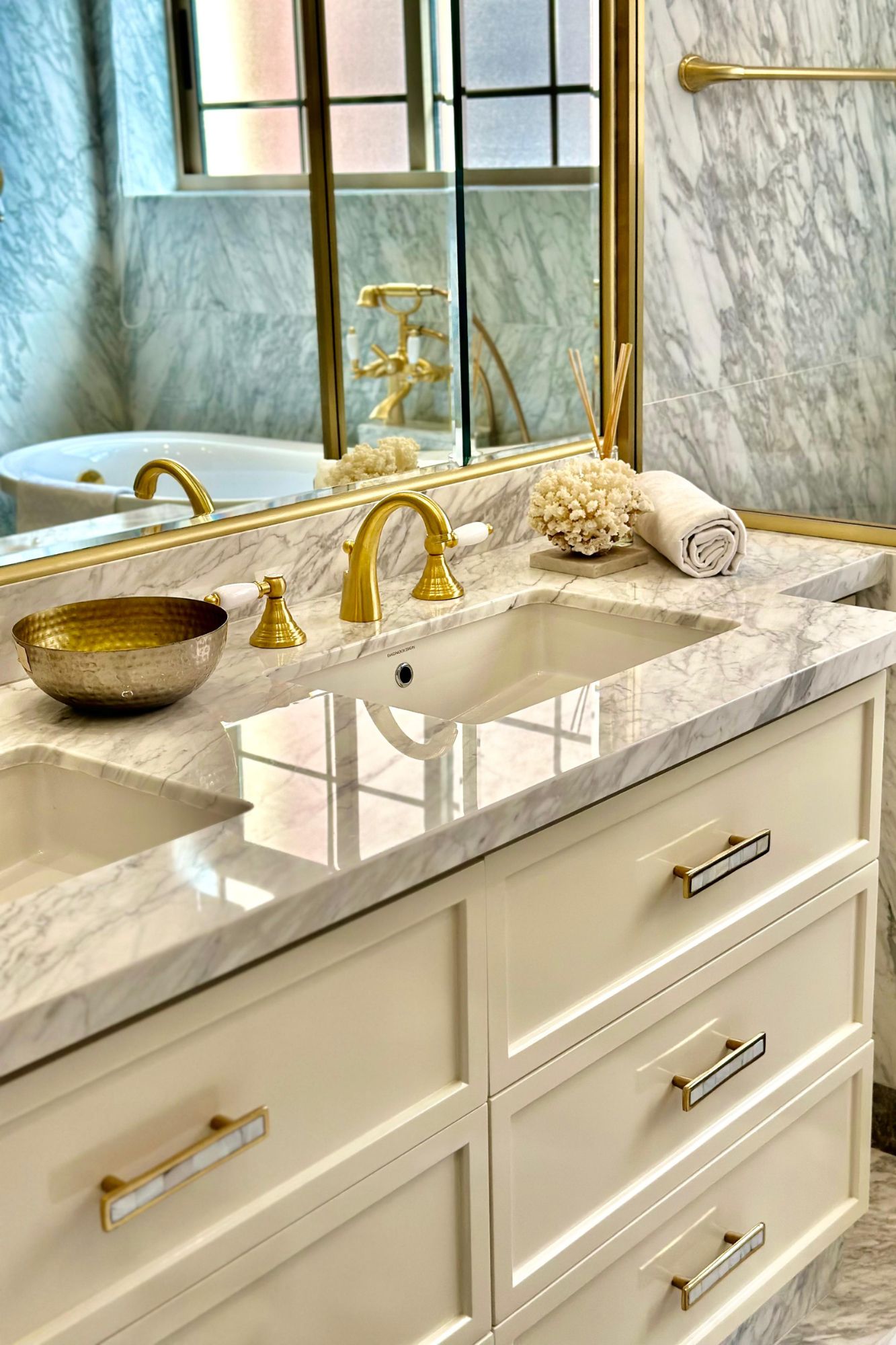
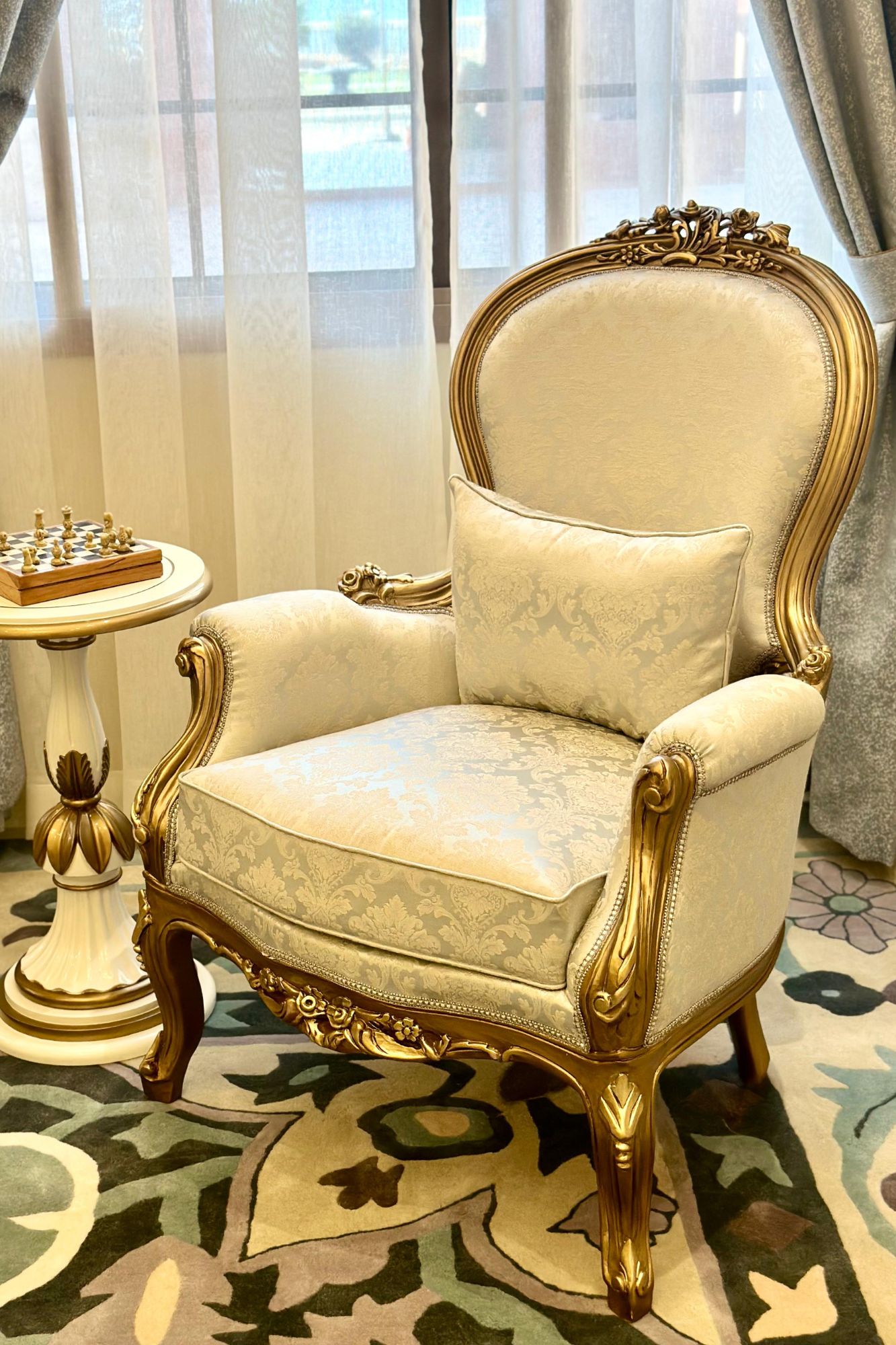
The project narrative is a heartwarming journey of collaboration. HH Sheikha Maryam Bint Mohammed Bin Salman Al Khalifa's vision served as the guiding light, and Erwin Ereno Design Studio meticulously translated that vision into reality. The design team's dedication and creativity shone through in every aspect of the renovation, from conceptualisation to execution.
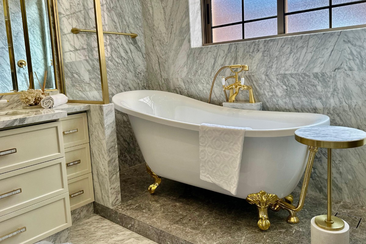
Witnessing Her Highness's satisfaction with the final product filled the design team with immeasurable joy. To not only meet but surpass her expectations is a significant achievement, underscoring the importance of shared vision and trust in the design process.
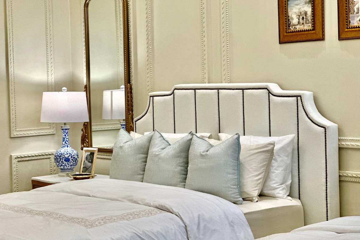
The after photos speak for themselves. The once bland space has been transformed into a luxurious and inspiring guest suite. The transformation is a beacon of successful collaboration, proving that when trust and vision meet, truly remarkable things can be achieved.
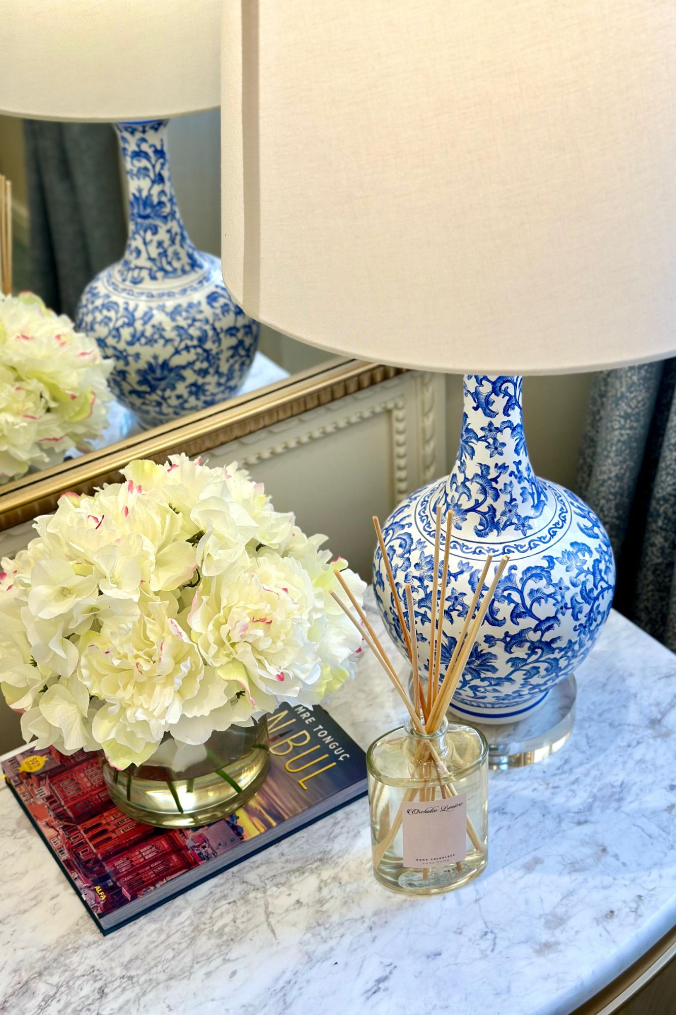
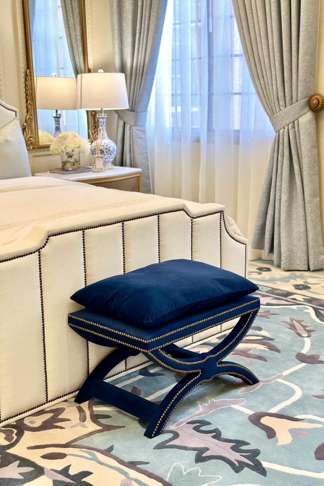
Erwin Ereno Design Studio is honored to have been a part of HH Sheikha Maryam's journey. They look forward to continuing to create beautiful spaces that inspire and delight, fostering more collaborations like this one in the future.
About Erwin Ereno Design Studio
Erwin has been working in the field of interior design for two decades now. In that time, Erwin has completed projects ranging from residential, hospitality, corporate, and commercial spaces in Bahrain. Erwin’s expertise in designing spaces that are both functional and beautiful, he loves working with clients who want to add a little bit of aesthetic flair to their space without sacrificing functionality. What sets apart Erwin Ereno Design and Co. is that we take pride in our ability to listen to our clients’ needs, and then design spaces with them in mind. We believe that a great design should be both functional and beautiful—and we work hard to make sure that both are taken into account when we’re designing your space.
If you’d like to feature your news or stories on SBID.org, get in touch to find out more.
If you’d like to become SBID Accredited, click here for more information.
This week’s instalment of the Project of the Week series features a rustic and urban residential design by 2023 SBID Awards Finalist, Arsight.
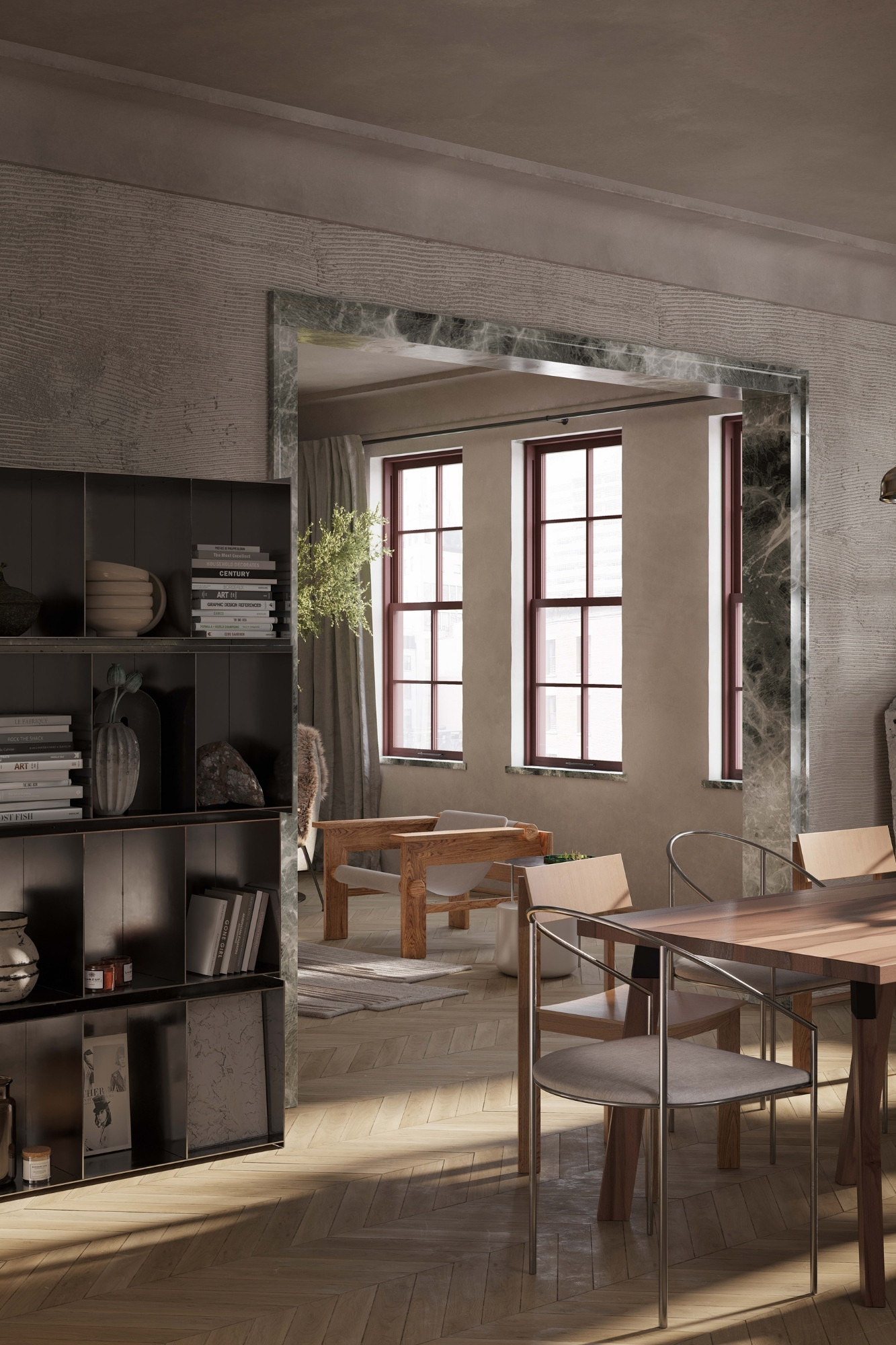
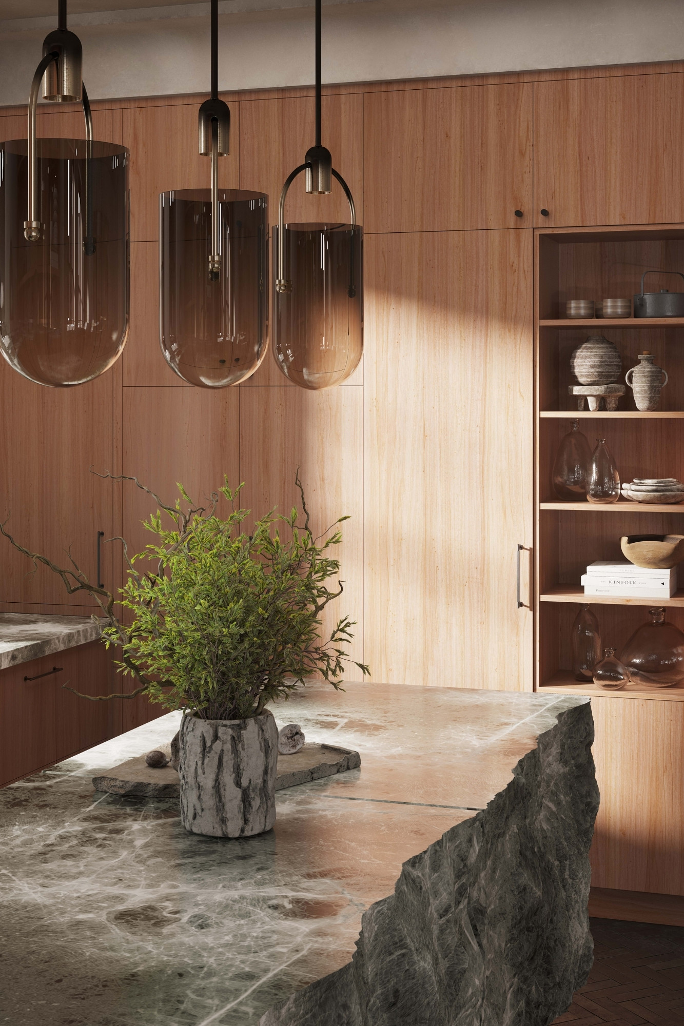
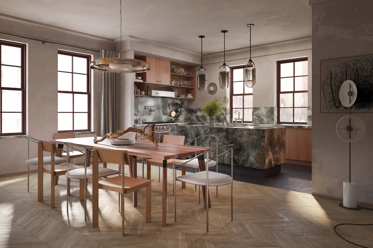
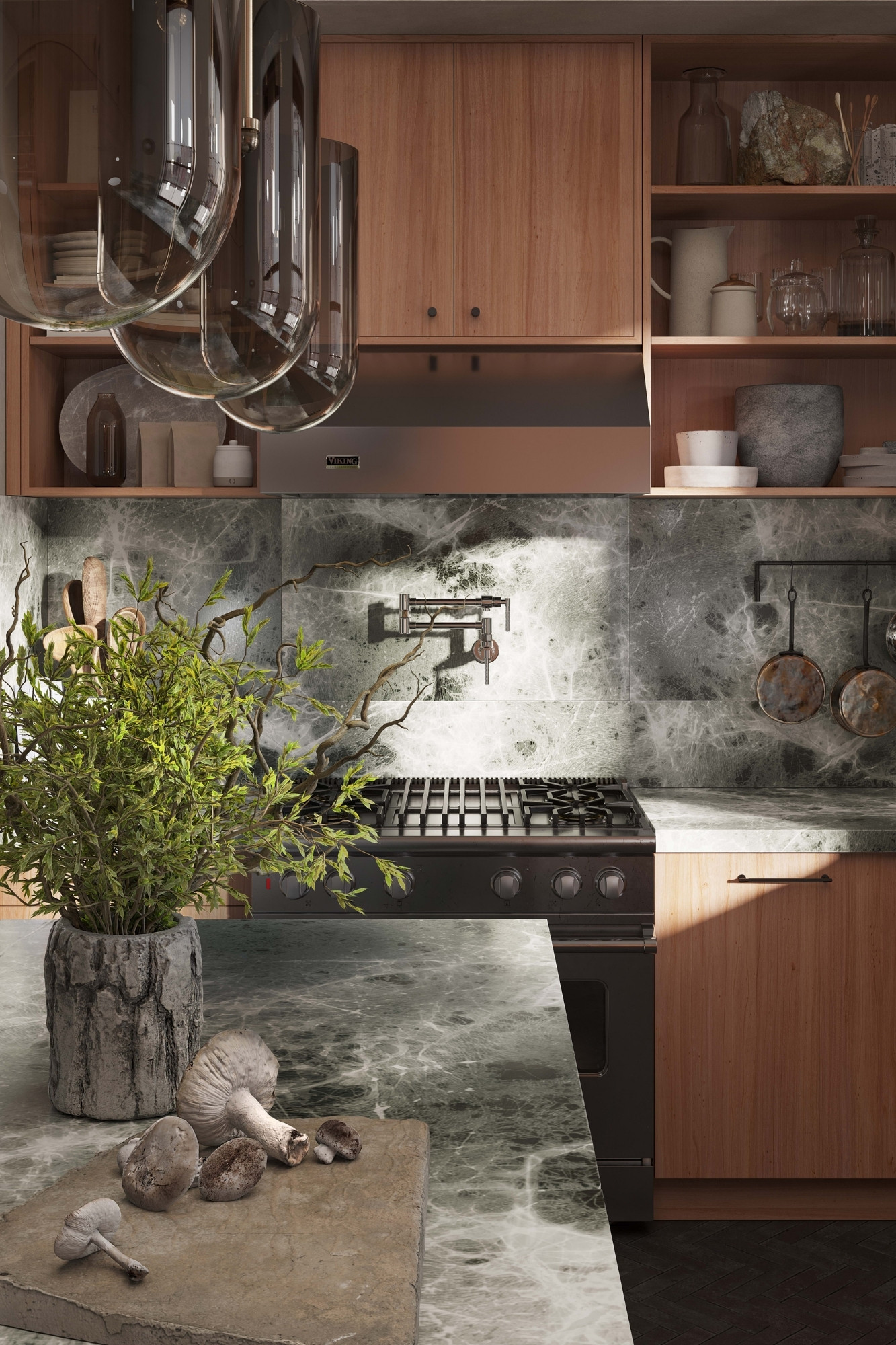
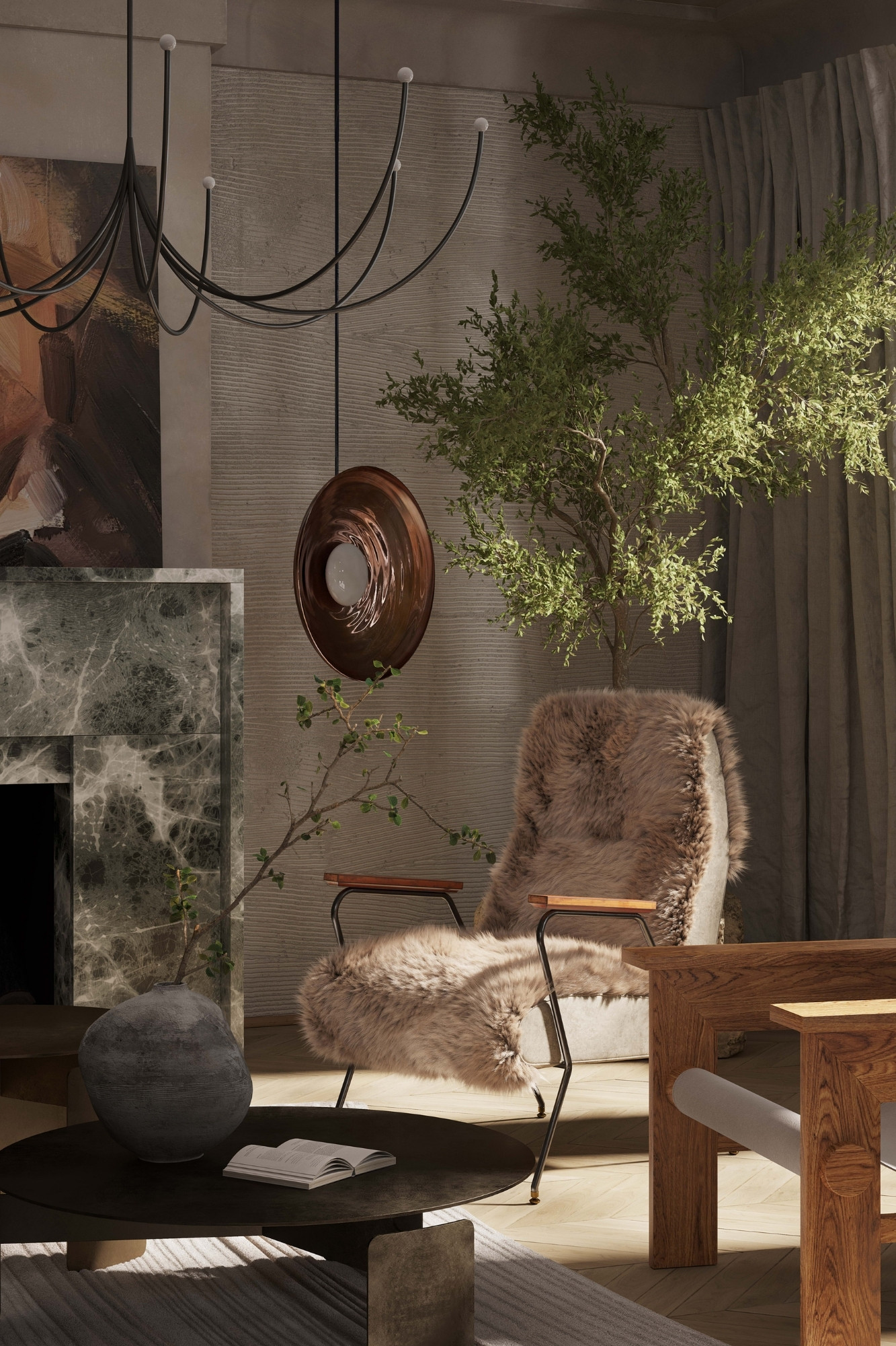
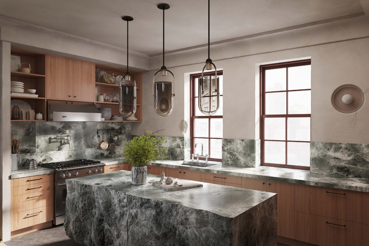
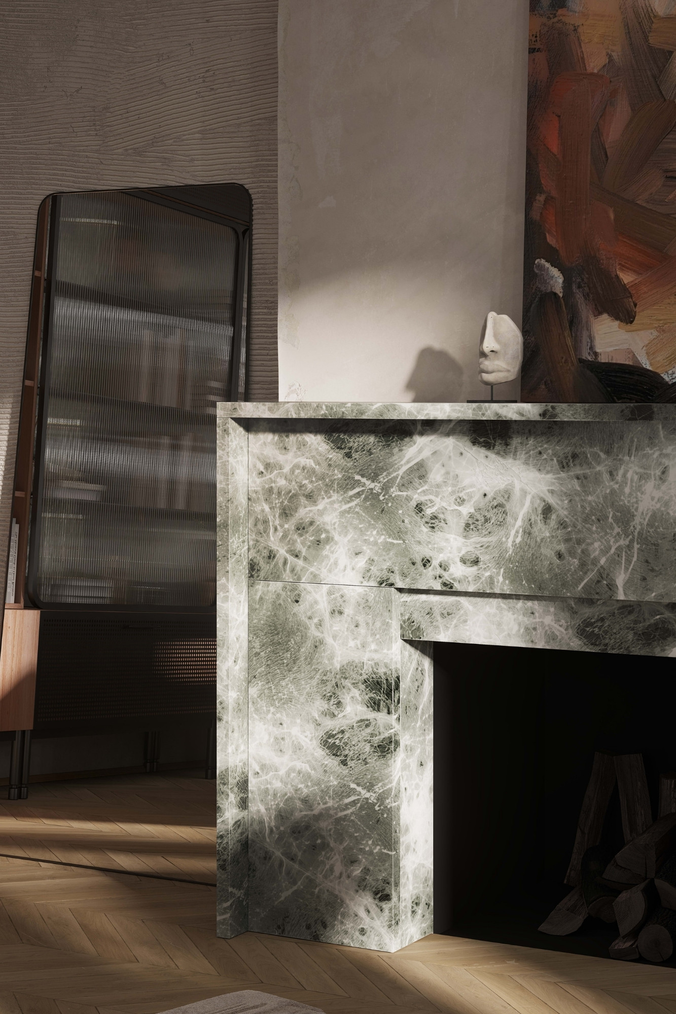
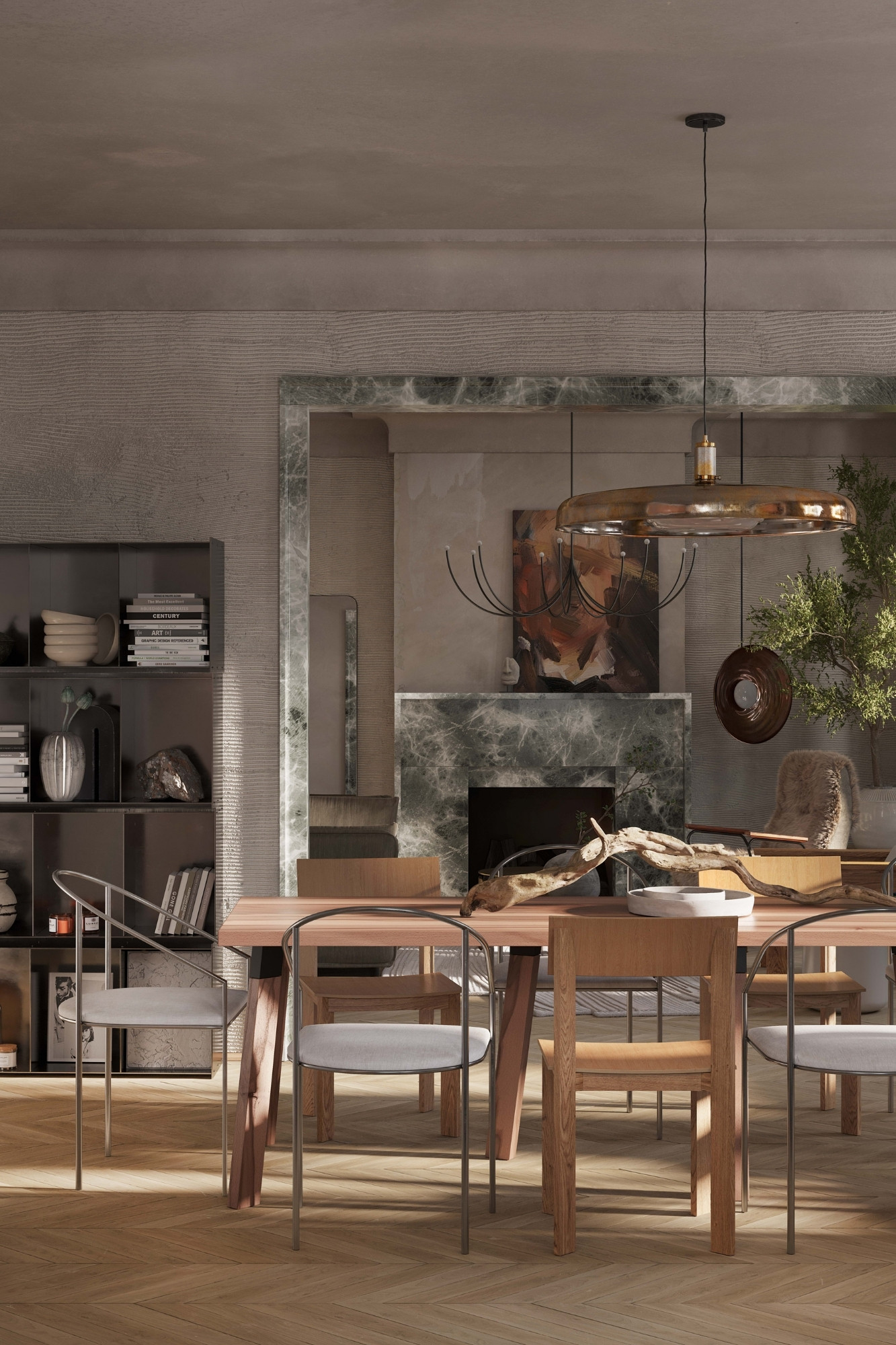
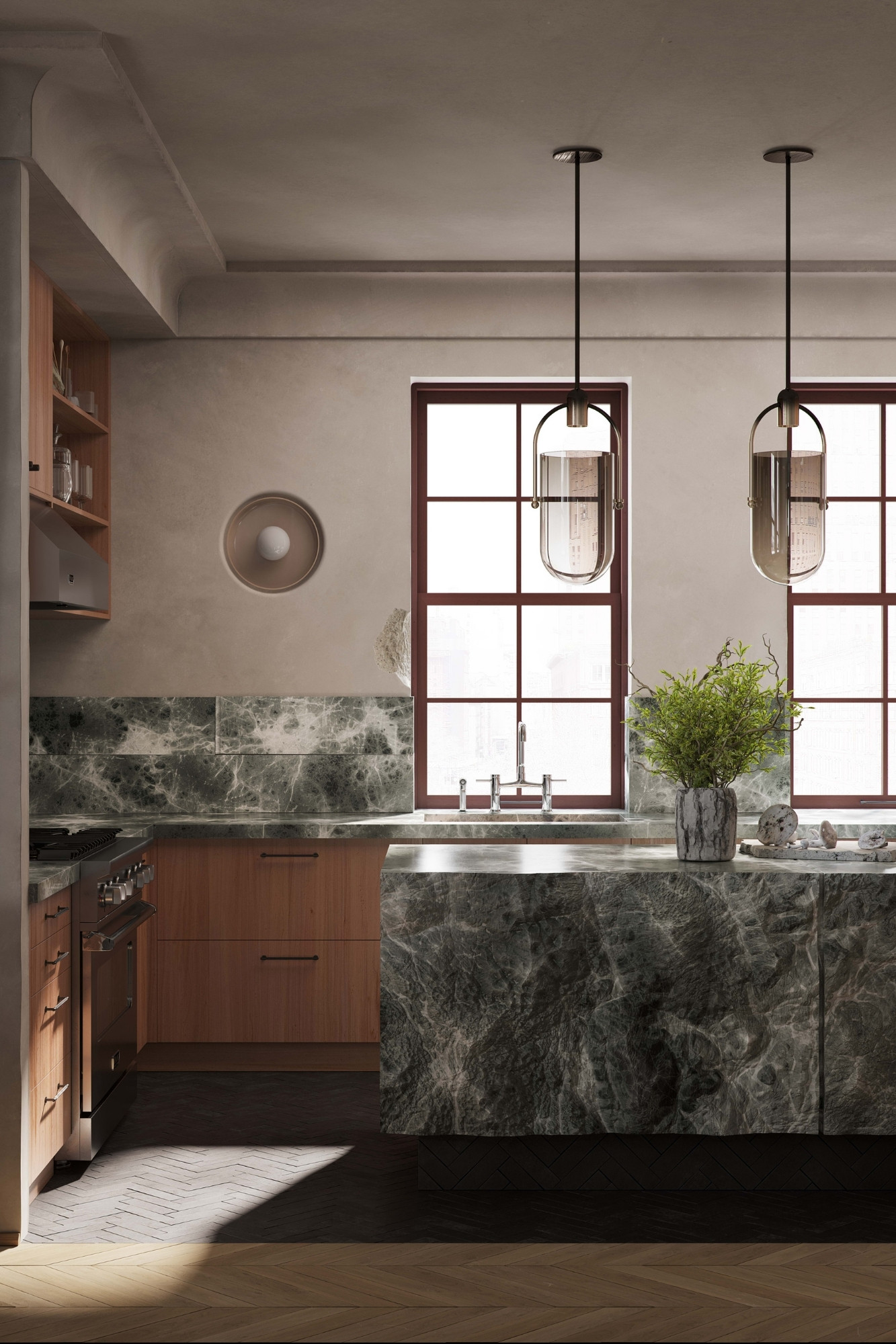
Designed by Artem Kropovinsky of Arsight, this interior project in Tribeca curates an intuitive and personalized living space that beautifully interweaves the rough charm of natural materials with high-end features. A testament to creative craftsmanship, the apartment is imbued with unique elements such as hand-troweled fluted plaster walls, a hand-carved kitchen island, and heavyweight linen curtains. The design, valuing authenticity and embracing imperfections, tells a compelling story of human touch and history. This innovative fusion of refined elegance and rustic appeal, underscored by a commitment to sustainability, offers a refreshing divergence from prevailing trends.
SBID Awards Category: CGI & Visualisation
Practice: Arsight
Project: Imperfect Tribeca Harmony
Location: New York, United States of America
What was the client's brief?
The client's brief was wonderfully open-ended and truly allowed us to connect with our deepest design inclinations. They sought an interior space that drew inspiration from the heart of nature, a setting that would be not just a living space, but a narrative – a reflection of nature's unparalleled beauty. They envisioned a space that would harmoniously blend the raw beauty of the outdoors with the comfort of an urban dwelling.
What inspired the design of the project?
Our primary inspiration for this design was the enchanting allure of nature itself. This wasn't just confined to theoretical concepts; we actively ventured into the wilderness landscapes of Connecticut. Here, we were particularly moved by the timeless beauty of driftwood and stones that had been molded by nature over millennia. These elements, in their most authentic form, became vital components in our design, serving as a tangible bridge between the natural world and the constructed urban environment.
What was the toughest hurdle your team overcame during the project?
The most challenging aspect of this project was ensuring that the raw, natural elements we introduced, such as driftwood and stones, seamlessly integrated with the modern features of the apartment. This meant balancing the ruggedness of these elements with the refined aspects of modern design without losing the authenticity of either. It was essential that the space felt both luxurious and raw, opulent yet genuinely connected to the natural world.
What was your team’s highlight of the project?
One of the most rewarding moments was seeing the hand-chiselled kitchen island, an epitome of our design philosophy, come to life. Witnessing raw stone transform into an exquisite functional and artistic centrepiece was a validation of our vision. This island epitomized the harmony between rough and refined, and watching it anchor the space was truly a joy.
Why did you enter the SBID Awards?
We entered the SBID Awards because we genuinely believe in the integrity and authenticity of our design. The SBID represents the pinnacle of interior design recognition in our industry. It’s not just about accolades; it’s a platform that recognizes dedication, innovation, and true excellence in design. We felt that our project, with its unique blend of nature and luxury, resonated with the values that SBID champions.
What has being an Award Finalist meant to you and your business?
Becoming an Award Finalist at the SBID has been an immense honour. It is not just a testament to the hard work and dedication our team has poured into the project, but it also offers validation from a community of esteemed peers. For our business, this recognition has bolstered our reputation and credibility in the industry.

Questions answered by Artem Kropovinsky, Founder and Principal Designer at Arsight.
This week’s instalment of the Project of the Week series features a colourful, Armenian-inspired restaurant design by 2023 SBID Awards Finalist, 4SPACE Design.
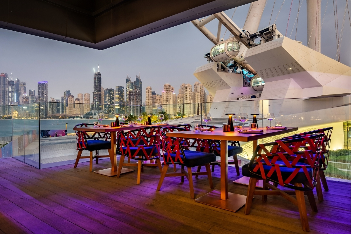
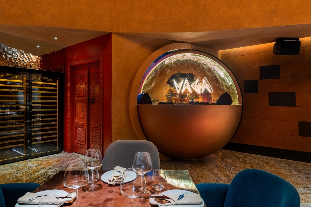
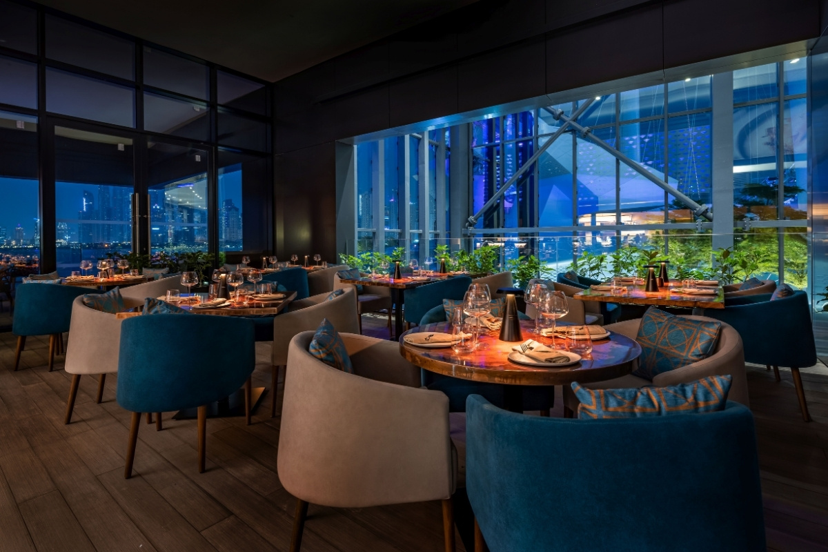
The name “VAGA” comes from the word “vagabond,” which means “nomad” and serves as the inspiration behind the concept. 4SPACE created a world-fresh time-traveler vibe that takes you on a journey through traditional Arabic cuisine and colorful Armenian culture – a lifestyle destination that embodies the wandering, explorative nature of the vagabond. The restaurant offers exceptional views of Ain Dubai and a contemporary design that takes your dining experience to the next level. Revelers looking for secrecy can enjoy the private room that offers a world of speakeasy fantasy, perfect for those looking for a little adventure to their dining experience.
SBID Awards Category: Club & Bar Design
Practice: 4SPACE Design
Project: VAGA
Location: Dubai, United Arab Emirates
What was the client's brief?
The client's brief for VAGA Restaurant and Bar, designed by 4SPACE, was to create a contemporary dining destination that harmoniously blends Arabic and Armenian cultures. The restaurant was envisioned as a space where diners could embark on a captivating journey, experiencing the fusion of these two vibrant traditions. The goal was to design a restaurant that pays homage to both cultures while providing extraordinary views of Ain Dubai, the world's biggest and tallest Ferris wheel, on Bluewaters Island.
What inspired the design of the project?
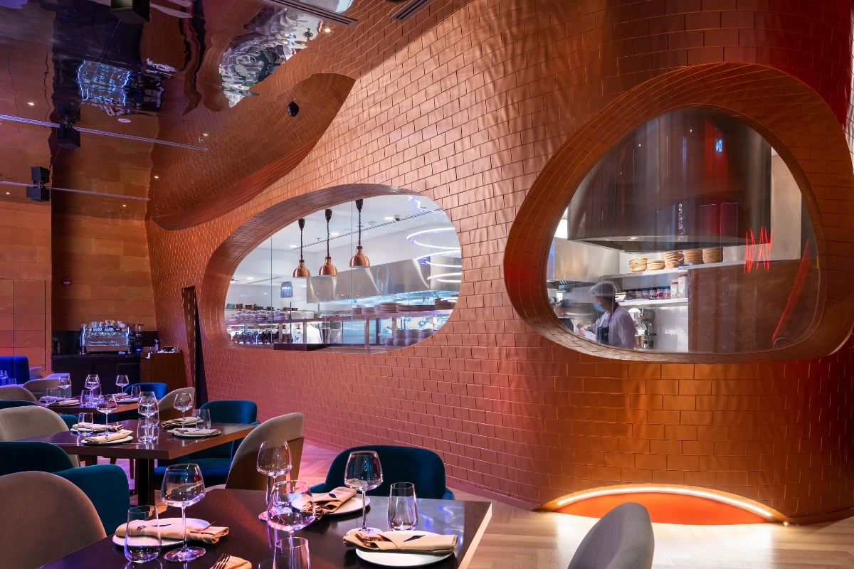
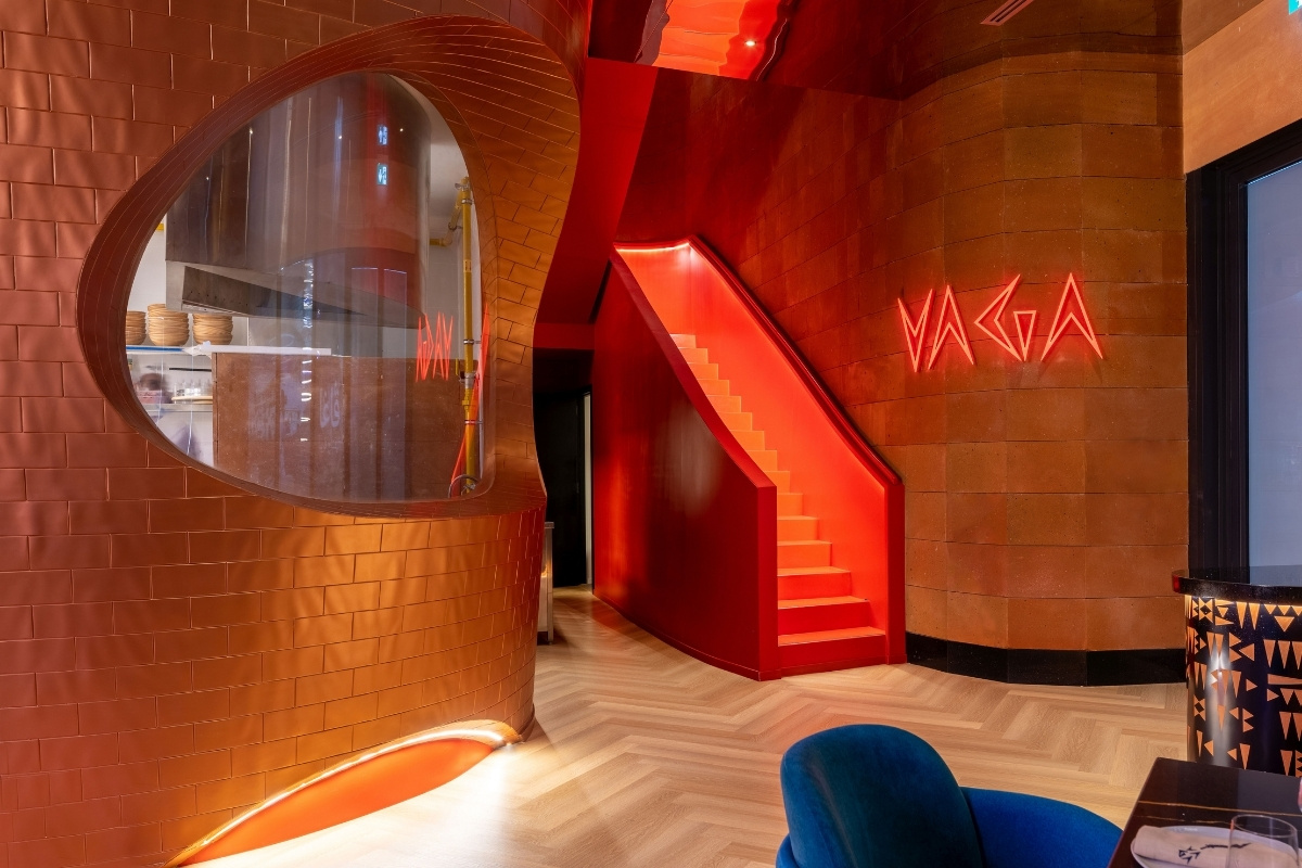
The design of VAGA was inspired by the concept of a magical vagabond, a time traveler who traverses different eras and worlds, experiencing grand adventures along the way. This inspiration led to the creation of a space that beautifully weaves together Arabic and Armenian elements, with a focus on kitchen drama, textures, and reflective surfaces. The design represents the wanderlust and explorative nature of the vagabond, capturing the essence of discovery and wonder.
What was the toughest hurdle your team overcame during the project?
The toughest challenge that 4SPACE overcame during the VAGA project was designing and connecting two distinct spaces that represent Armenian and Arabic cultures, while still maintaining a sense of harmony and unity. Creating a seamless transition between the ground floor, which reflects Armenian influences, and the first floor, which is inspired by Arabic aesthetics, required careful design and meticulous execution.
What was your team’s highlight of the project?
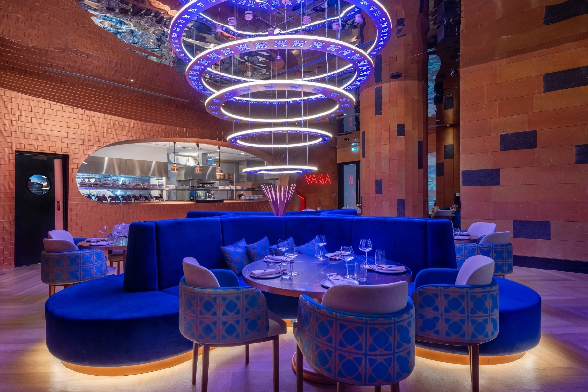
The highlight of the VAGA project for the 4SPACE team was the creation of the impressive chandelier on the ground floor. Comprising large metallic rings intricately adorned with the Vannic alphabet, this chandelier is a stunning focal point that captures the essence of the restaurant's concept. Additionally, the unique DJ booth, which becomes the center of attention for diners and late-night revellers, added a dynamic and interactive element to the space.
Why did you enter the SBID Awards?
4SPACE entered the SBID Awards to showcase the innovative and culturally rich design of VAGA. The project's successful fusion of Arabic and Armenian influences, along with its captivating design elements and attention to detail, made it a compelling contender for recognition within the design industry.
What has being an Award Finalist meant to you and your business?
Being an Award Finalist in the SBID Awards held significant meaning for 4SPACE and their design business. It affirmed their ability to merge diverse cultural influences into a harmonious and visually striking space. The recognition from the awards highlighted their expertise in creating immersive and experiential environments, enhancing their reputation in the design community and among potential clients.
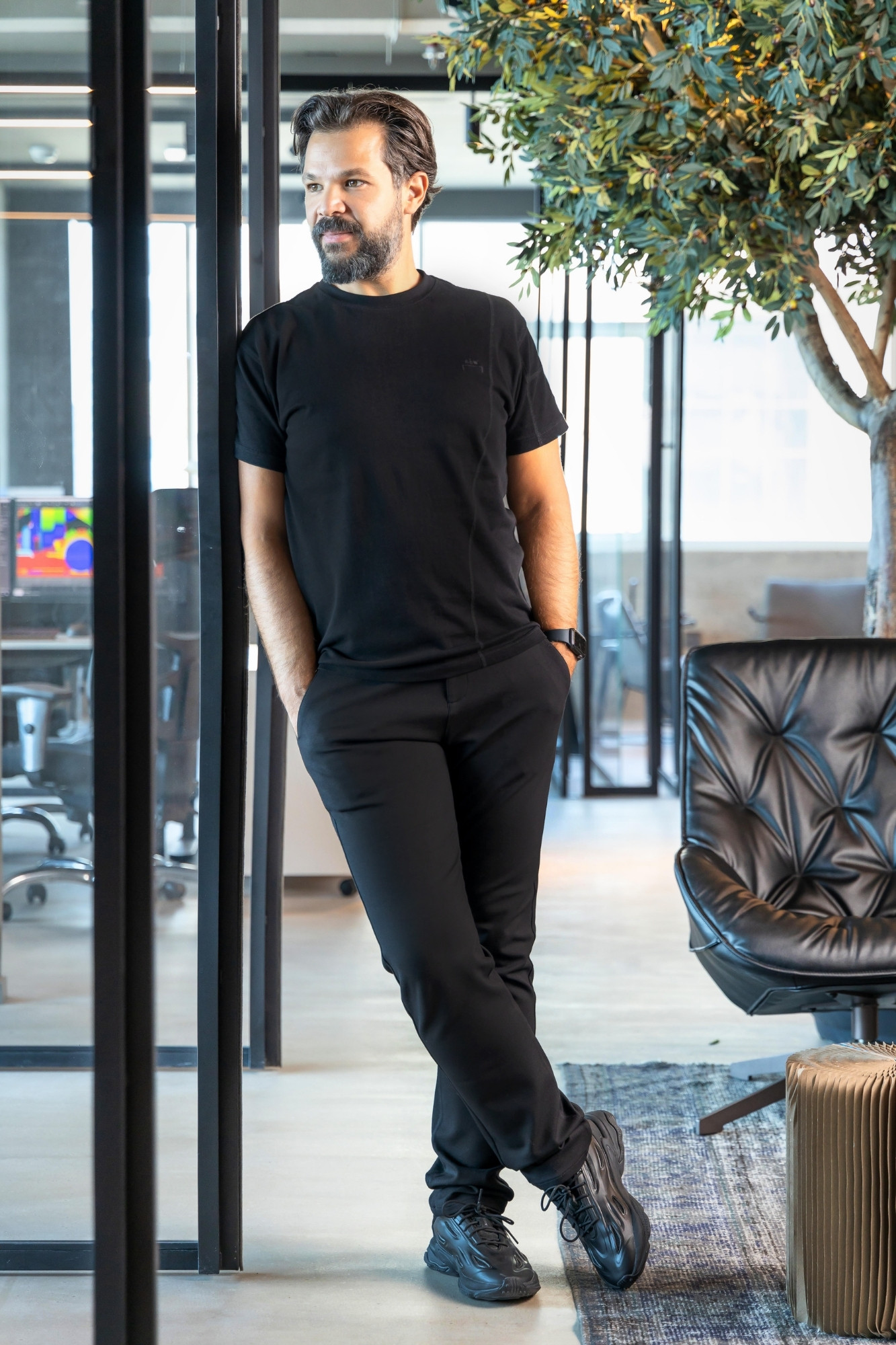
Questions answered by Firas Alsahin, Co-Founder and Design Director at 4SPACE.
