Celebrating 35 years of luxury design, Arteriors is thrilled to announce the launch of its latest collaboration collection with renowned American interior designer, Jay Jeffers. As part of the brand’s successful Guest Designer programme, Arteriors welcomes Jay back for a third collection. The range features 28 new furniture, lighting and accessory designs launched as part of their Autumn 2022 collection, debuted at Focus/22.
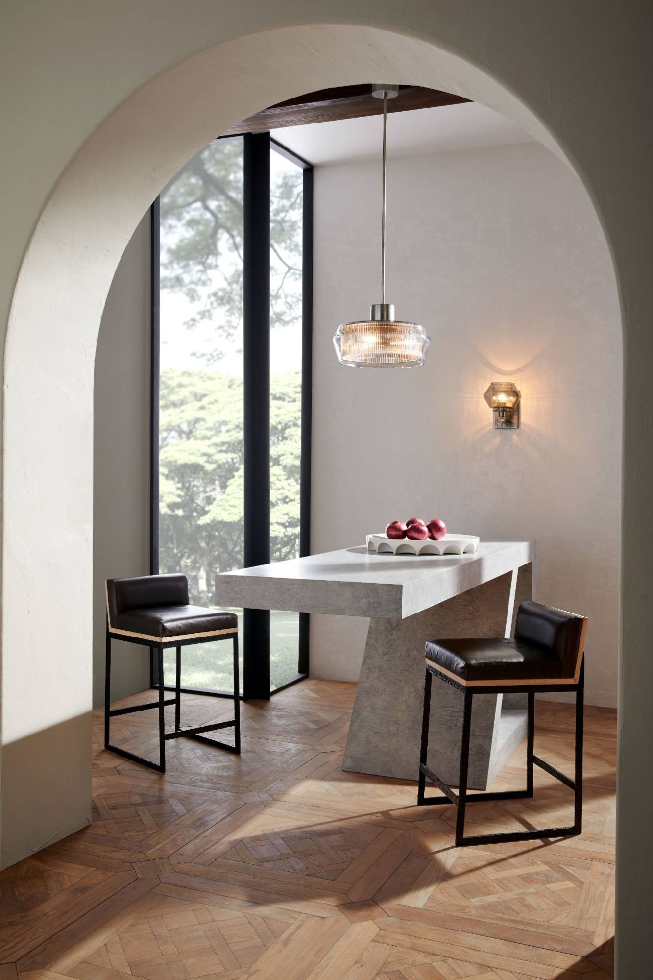
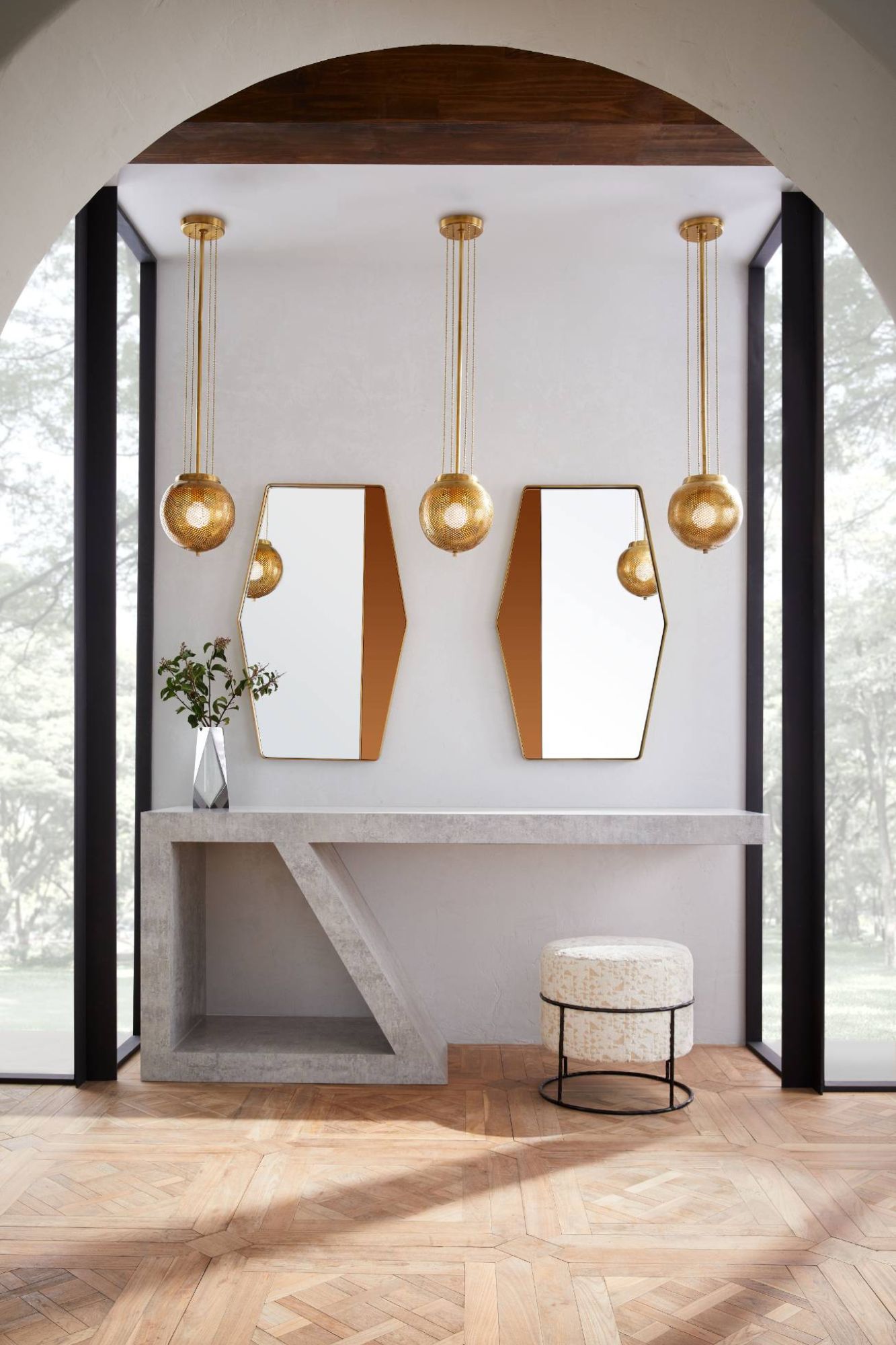
Jay’s collection prioritises versatility while embodying his “liveable luxury” approach to interior design. Influenced by mid-century décor, from designers including Carlos Scarpa, Franco Albini and Jena-Michel Frank, the collection embraces classic masculine elements including antique and polished brass and pairs them with etched glass and pierced metals.
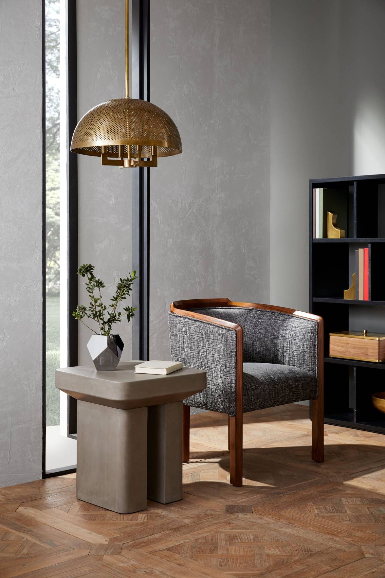
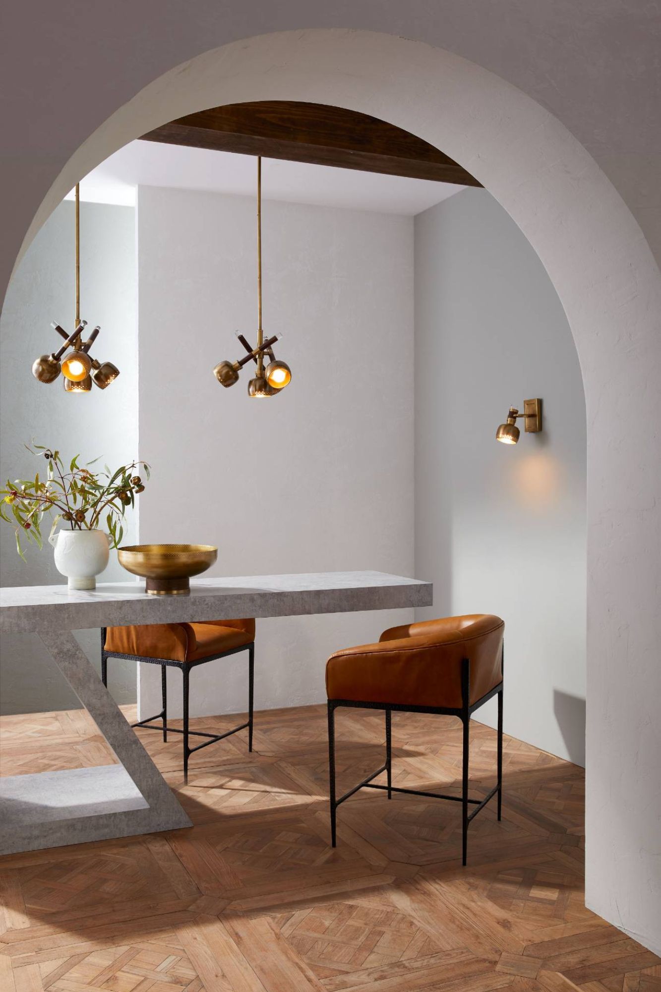
“With each collaboration, I prioritise quality and craftsmanship. This third collection with Arteriors reflects the skill of their network of artisans that make each product come to life, a hallmark I wanted to celebrate as part for the 35th anniversary. Each piece is handcrafted and meant to feel collected over time. This new offering introduces lighting and accessories that are adaptable to different environments, whether it be a sprawling luxury resort or a compact apartment.” - Jay Jeffers, speaking on the collaboration.

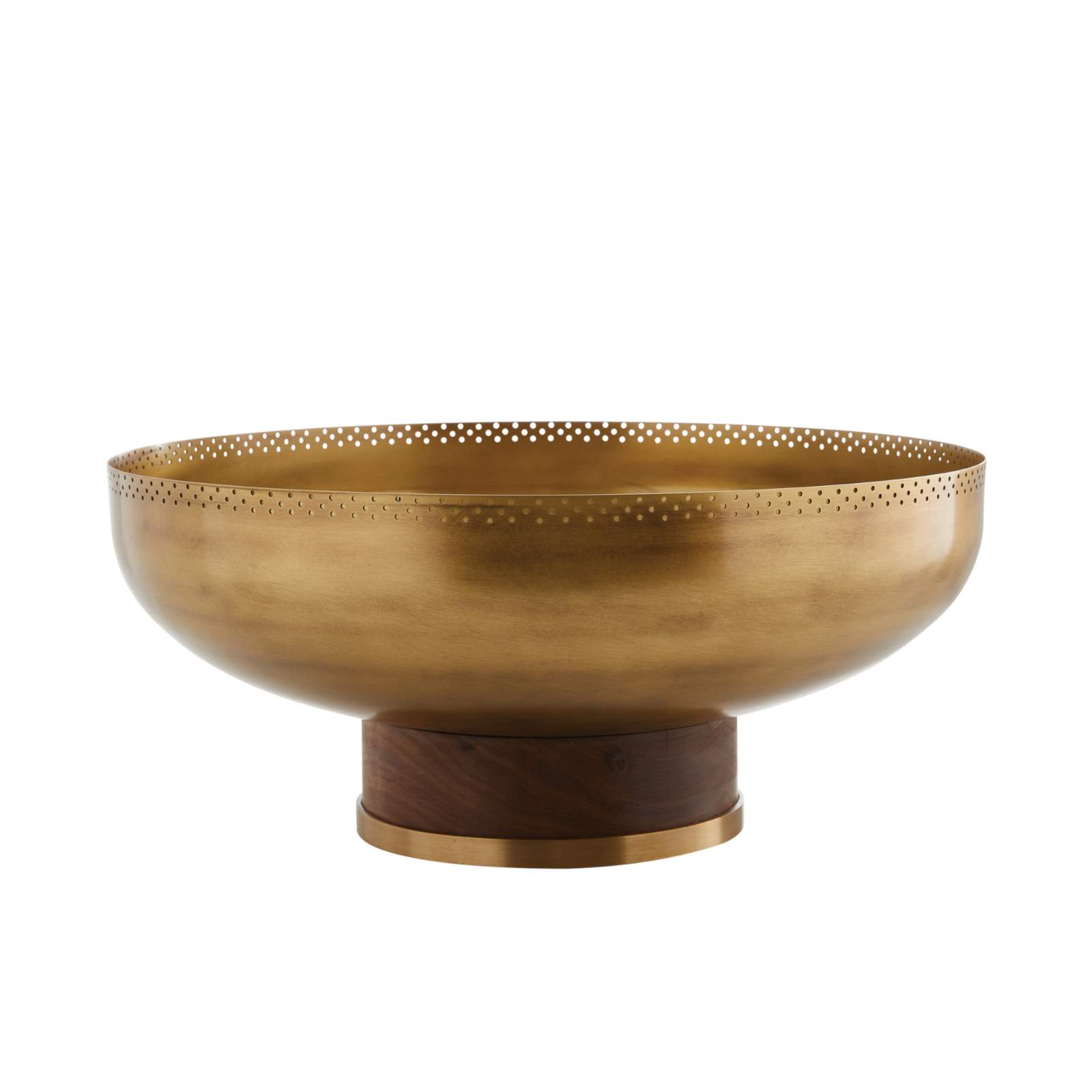
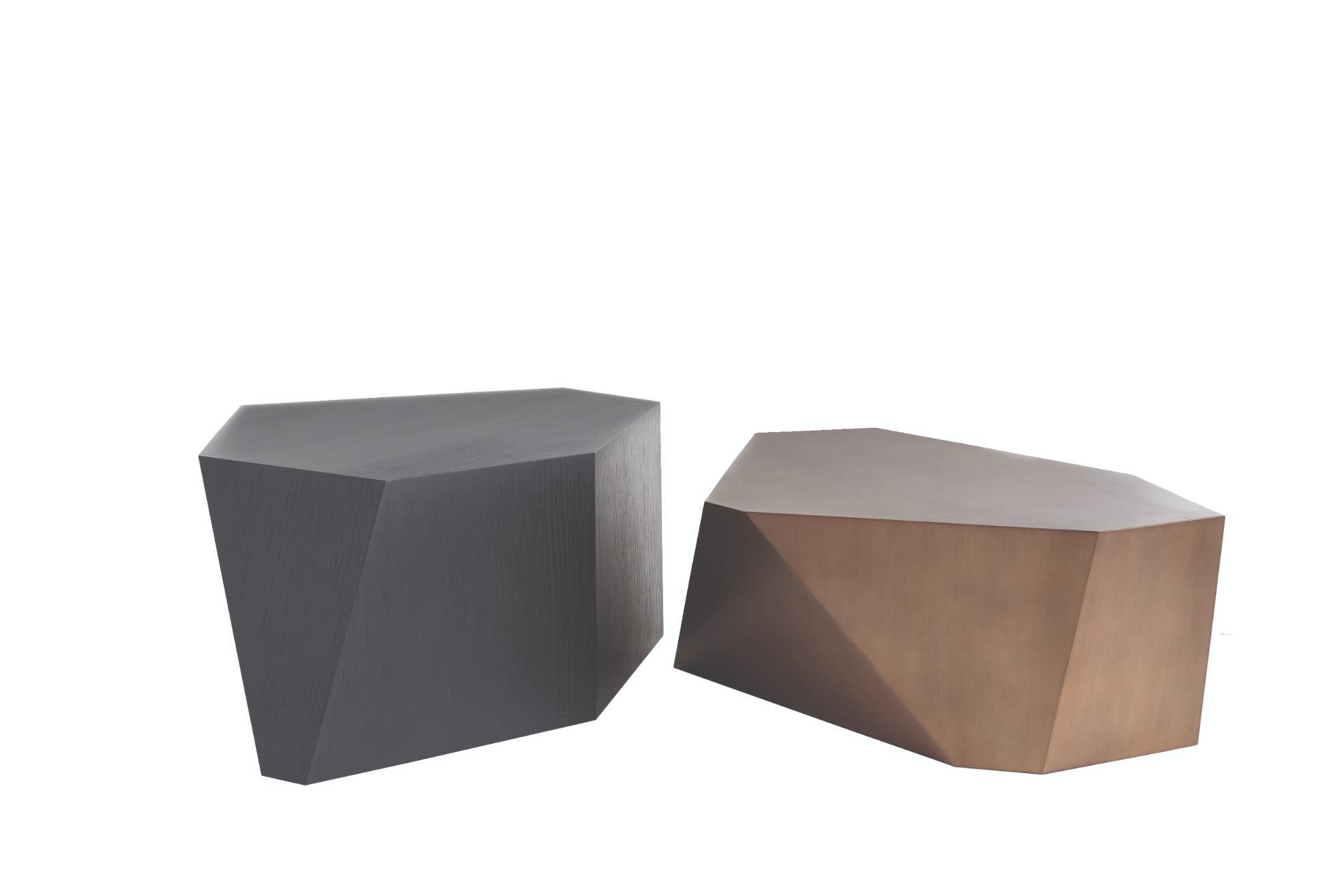
The final result is a beautiful mix of sculptural silhouettes, vintage metal elements, and 20th century inspired design. Expanding on his past two collections, Jay and Arteriors developed new pieces across a variety of categories, including furniture, accessories and lighting created with signature Jay touches.
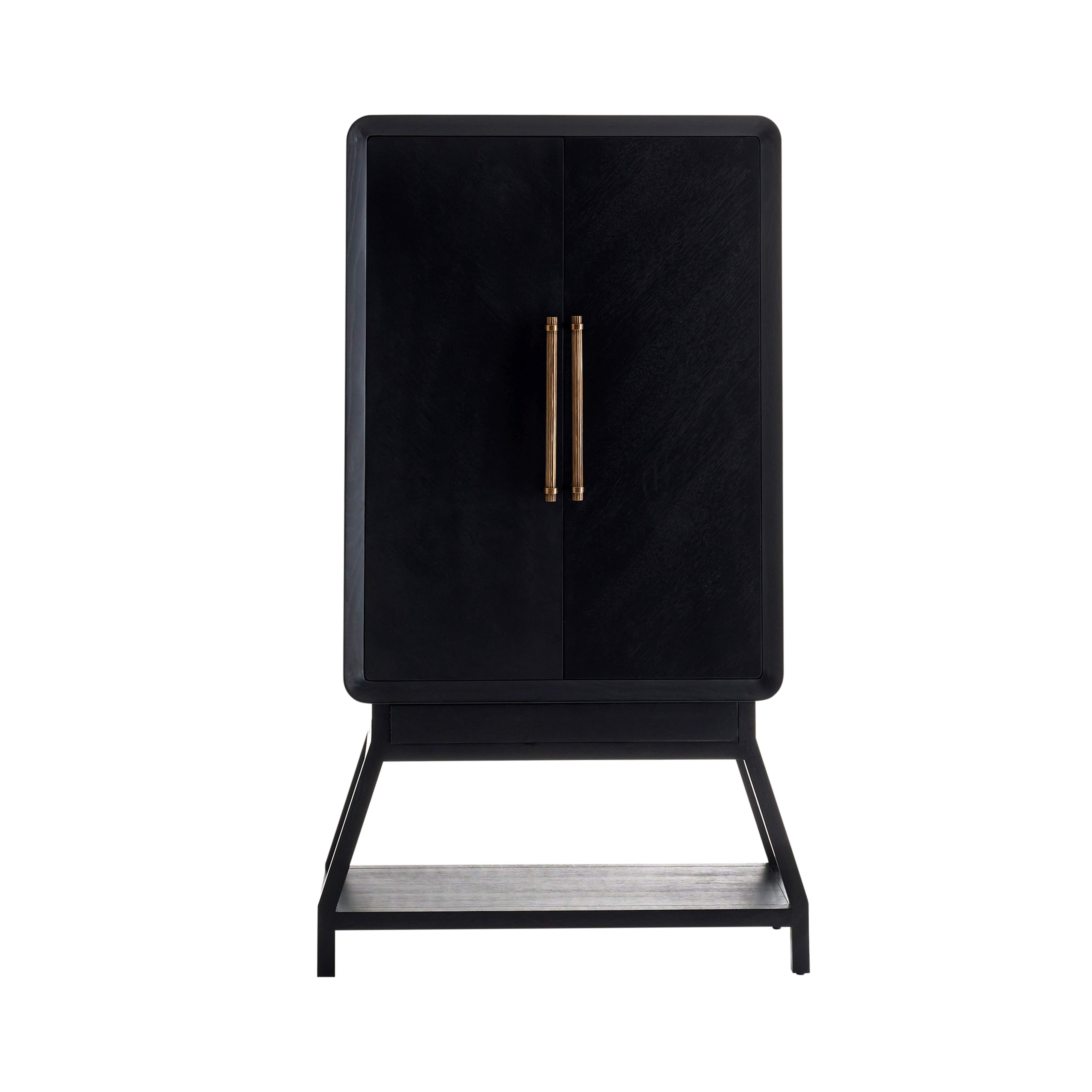
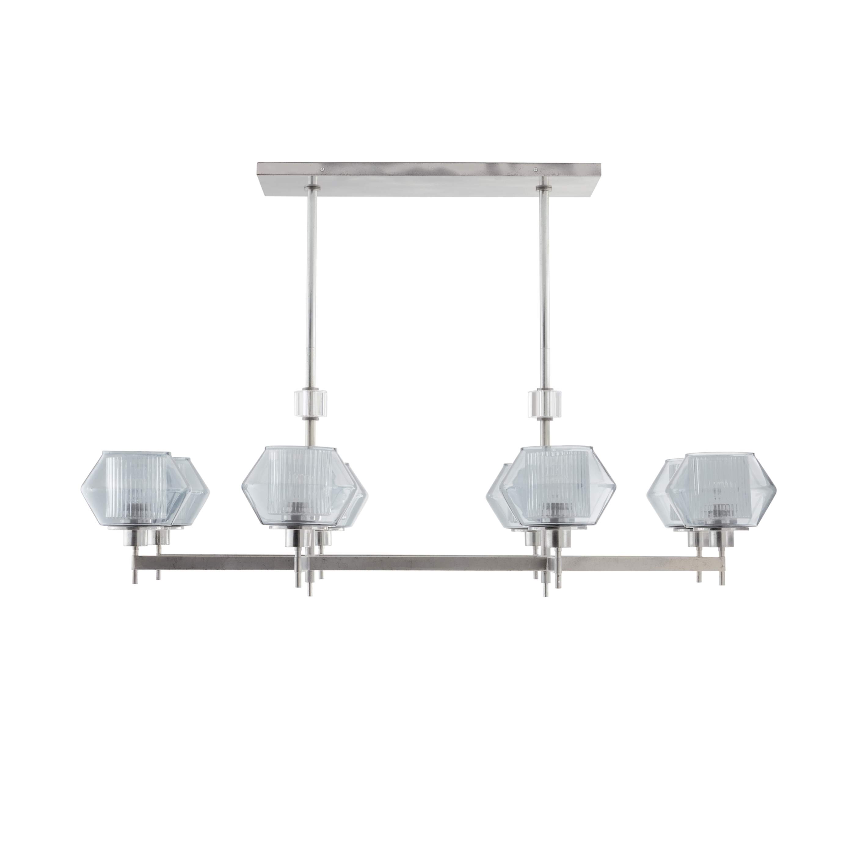
These design elements can be found throughout the collection, notably in the Trento Mirror, crafted with hand-formed brass, and the Holm Sconce, created with two separate layers of glass for a beautiful diffused light. The Carl Pendant blends smoked glass with pewter and multiple layers of glass for a fixture that can be shown long over a kitchen island or shortened for hallway or bedroom fixture. Finally, the handsome Cantu Cabinet boasts a rich ebony stain and tapered legs for a beautiful addition to an entryway or living space.
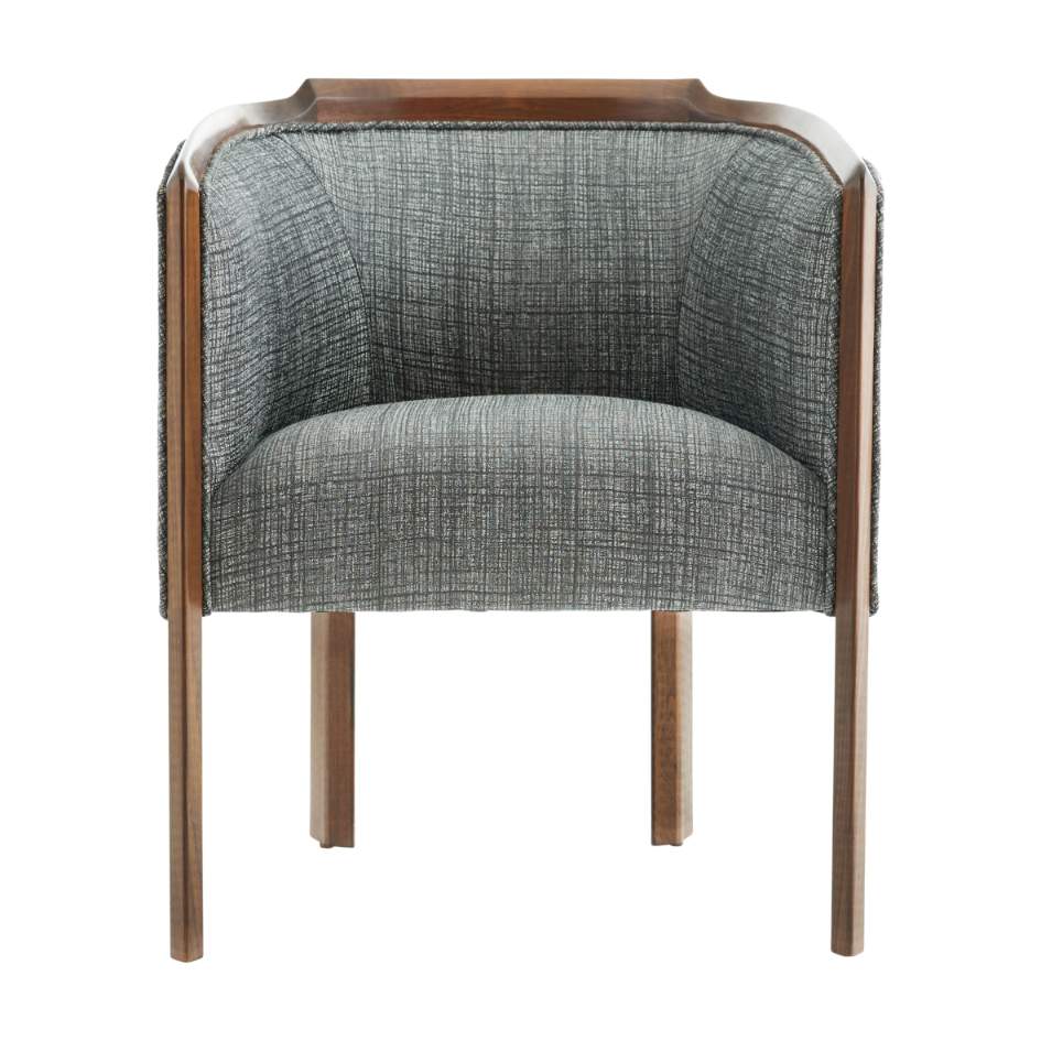
“We are thrilled to have Jay return as a guest designer. What better way to celebrate our 35th anniversary than with one of our longest-standing collaborators?” says Barb Fuller, Vice President of Marketing & Visual Merchandising for Arteriors. “Jay’s eye for designing entertaining spaces can be seen across his three collections for Arteriors, from accessories to seating and casegoods designed for comfortable and stylish gatherings at home. For this newest assortment, we worked together to expand on this theme with lighting that creates a warm ambiance and accessories that offer chic touches to interior spaces.”
About Arteriors
For over 30 years, Arteriors delivers impeccable style and artisanal quality craftsmanship within the lighting, furniture, wall décor and home accessory categories to discerning customers worldwide. This three-decade journey in pursuit of extraordinary product – from the understated to the unexpected – had been and remain at the core of what Arteriors do each day. Arteriors’ business has matured and expanded into a timeless lifestyle brand that has become premier resource for interior designers and retailers worldwide.
Today, Arteriors continues to reinterpret materials, forming objects of perfect proportions and scale, resulting in bold interiors that bring ease to everyday luxury.
If you’d like to feature your product news here, get in touch to find out more.
If you’d like to become SBID Accredited, click here for more information.
This week’s instalment of the Project of the Week series features a minimalist monochrome residential design by 2022 SBID Awards Finalist, MOON bureau.
SBID Awards Category: CGI & Visualisation
Practice: Moon Bureau
Project: The Hills
Location: Odesa, Ukraine
What was the client's brief?
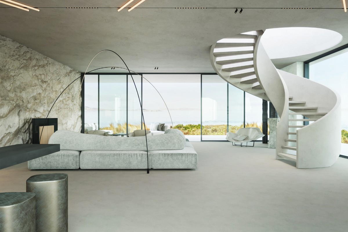
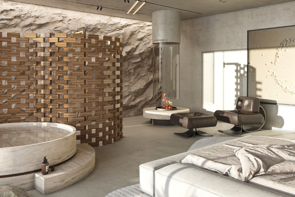
"THE HILLS" is a home project for a young family of programmers who love to travel around Africa. The main design challenge was to create a barrier-free space with plenty of natural light. The clients wanted the atmosphere of their home to be reminiscent of their travels in Africa. They also wished for a monochrome interior with natural materials in mind and a minimum amount of furniture.
What inspired the design of the project?
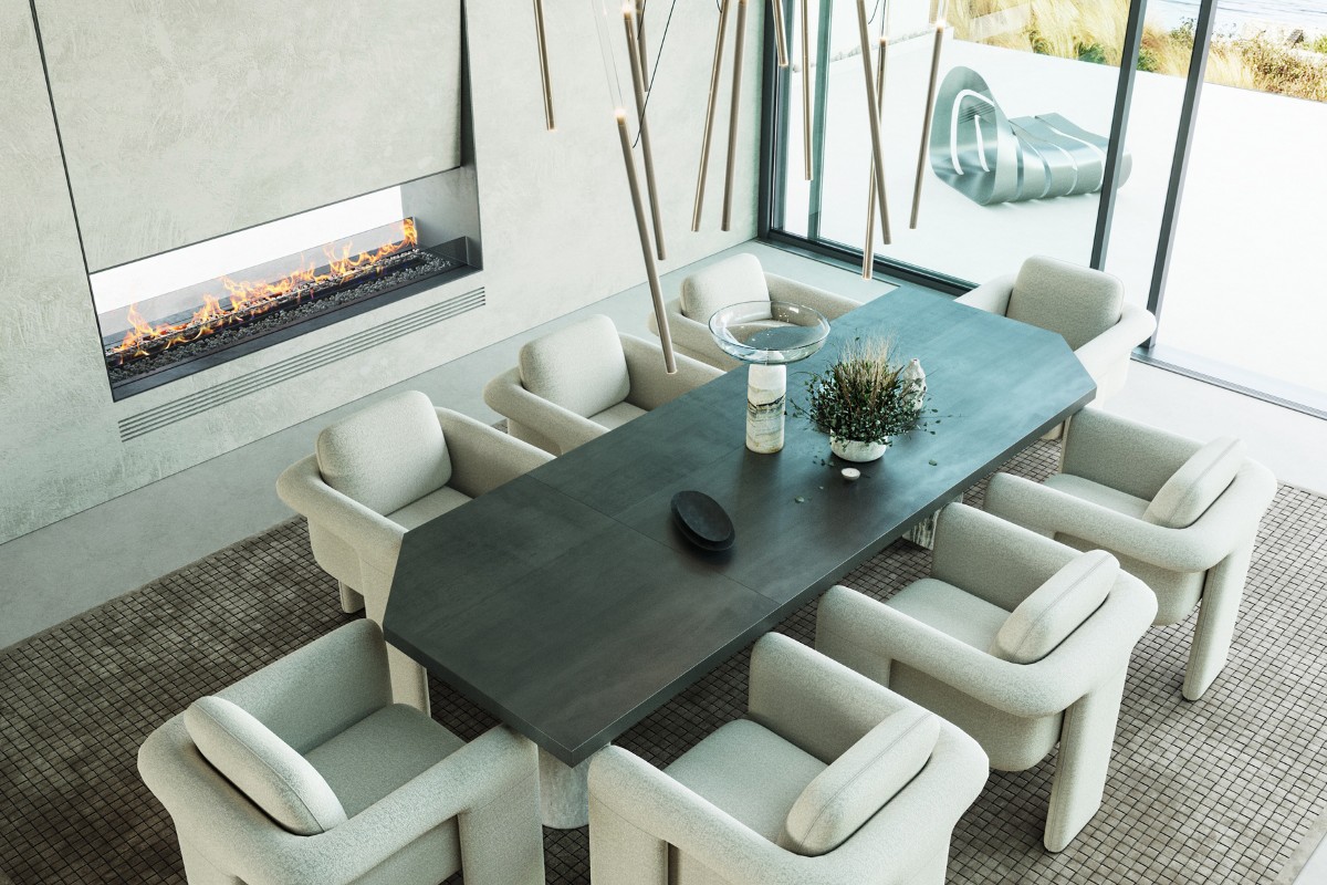
We were inspired by photographs and stories about the magnificent nature of Namibia, where the endless ocean borders the desert. Our team has recreated this mesmerizing atmosphere within the interior design. The entire interior is made in pastel colors that resemble dunes and do not distract from the beautiful view outside the window. An original palette of natural shades, materials and panoramic glazing has erased the boundaries between the living room and the surrounding landscape. In this endless space, we have located a cozy lounge area, combining it under the dome of an ultra-stylish, modular Pole lamp.
What was your team’s highlight of the project?
We used kitchen model Artematica. Materials such as decorative plaster, glossy glass facades, brushed metal and natural stone were used. The central part of the working surface is closed by a lifting mechanism. In the center of the kitchen is a multifunctional island. We represent how pleasant it will be to meet the first rays of the sun with a cup of freshly brewed coffee.
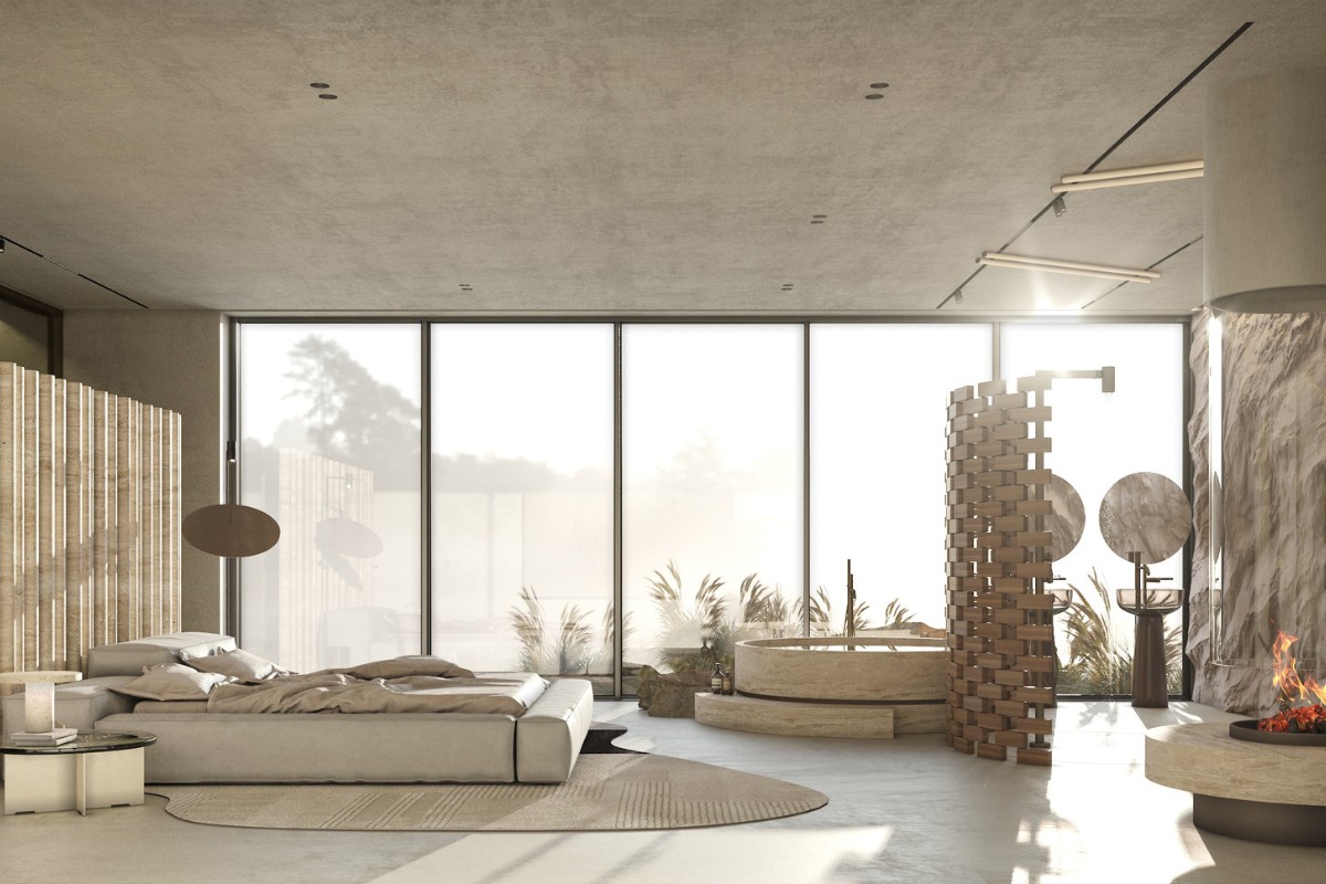
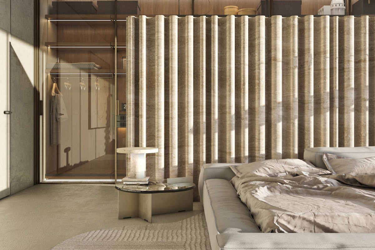
In the bedroom in we used textured travertine and decorative plaster, and in the dressing room - transparency changing smart-glass panels. Smart glass is a multi-layer product in which the middle layer is made of a liquid crystal film. When the smart glass is impacted by electricity, the glass instantly becomes transparent.
Why did you enter this project into the SBID Awards?
I decided to take part in the competition because I wanted to show the creativity and talent of Ukrainian designers to a wider audience. It was an internal challenge to compare myself with modern European designers, to see how my work stands in the context of the current world design.
Questions answered by Tetiana Sytova, Founder and Chief Designer, MOON bureau.
Angel O'Donnell were asked to interior design a penthouse and sub-penthouse inside One St. John’s Wood, a new luxury development in NW8. Both residences enjoy the rarest of London views: big skies, treetops as far as the eye can see, golden sunrises, showstopping sunsets and, of course, the legendary Lord’s Cricket Ground.
This happy blend of nature and iconic architecture inspired many choices – from hand-drawn floral motifs to sculptural furniture and geometric patterns. Each apartment, while different, feels part of an exclusive collection, something our client was keen to achieve.
In full flow
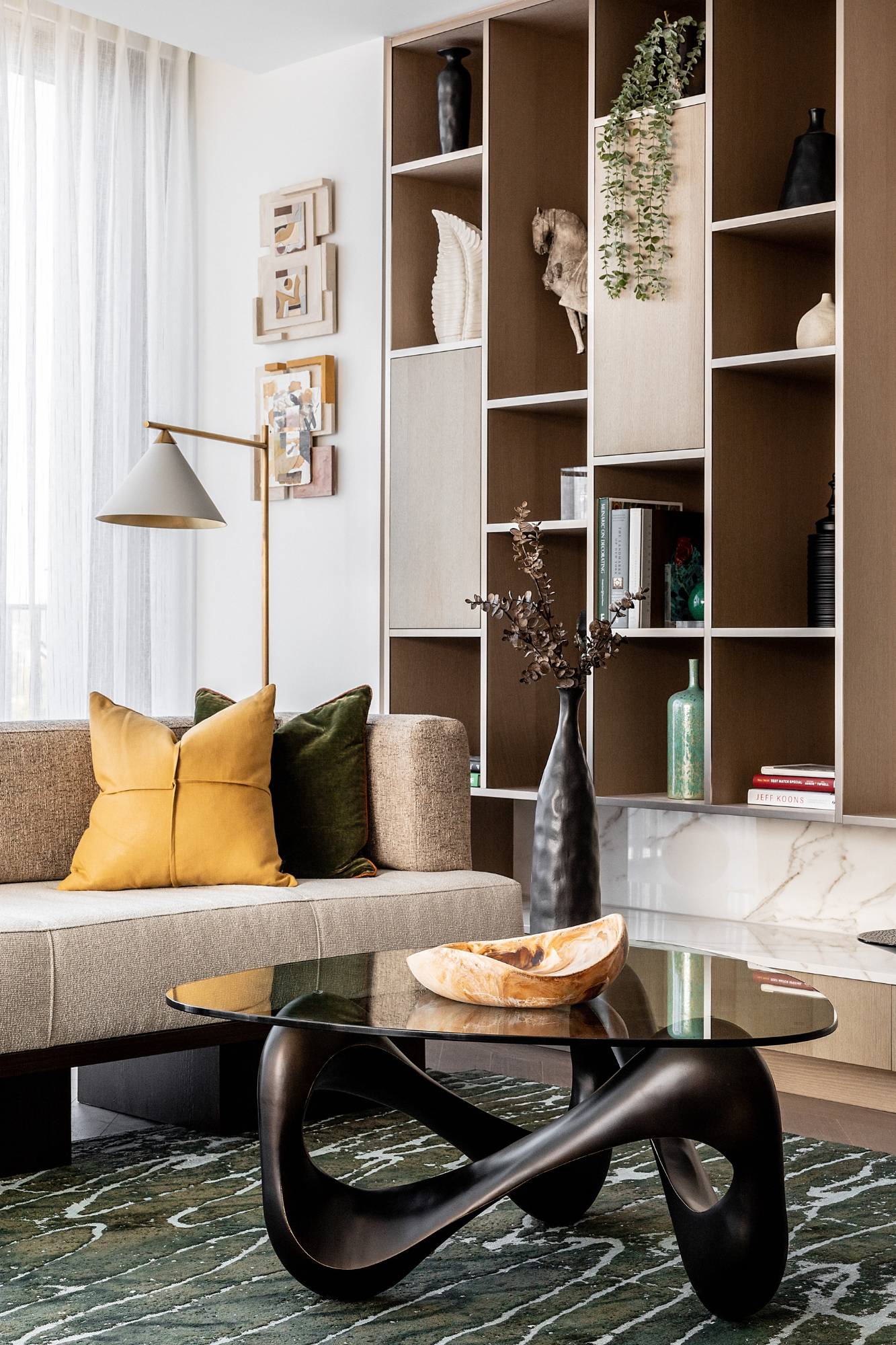
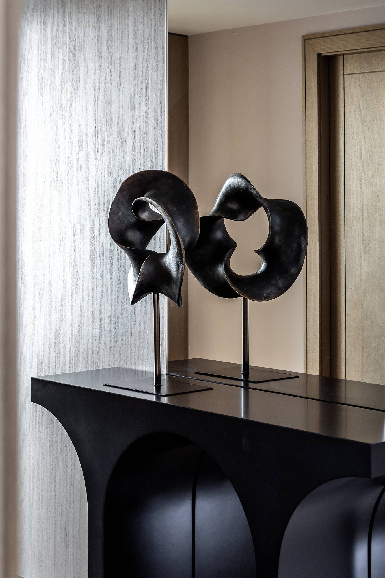
The rippling bronze coffee table base. The oscillating lines on the rug that resemble light-dappled water. The dimpled vase. The curled wooden bowl. Even the folds and twisted leather piping on the cushions. These fluid and irregular shapes balance the clean-lined simplicity of the joinery.
While the sofa Angel O'Donnell designed – with its walnut plinth base and mix of textured linen and multi-yarn weaves – is low-slung to maximise the views outside.
Making a splash
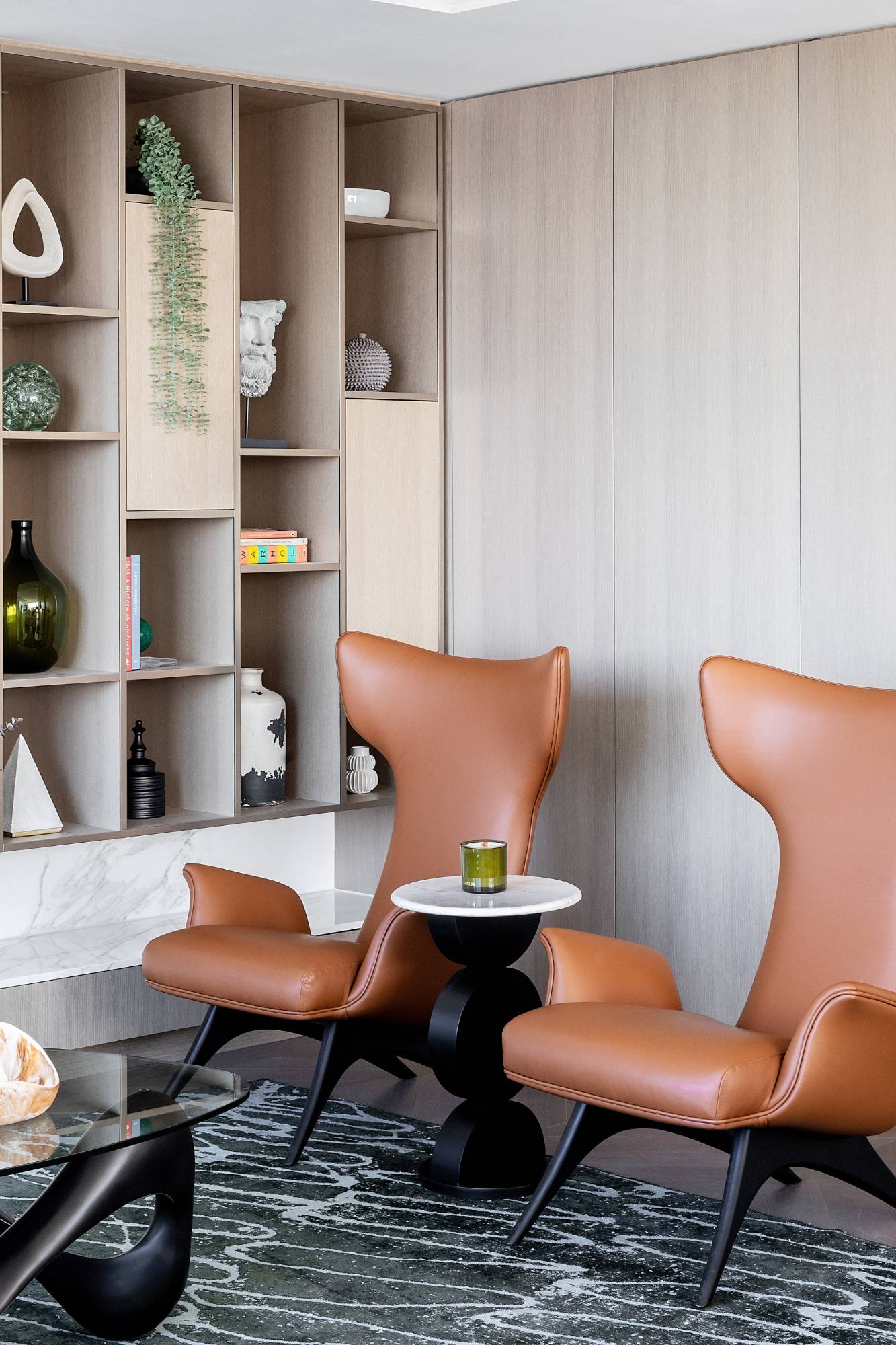
The designers upholstered these two Vladimir Kagan armchairs in a soft Edelman leather. They love their shape, like the flukes of a whale’s tail emerging from the watery deep.
In the mix
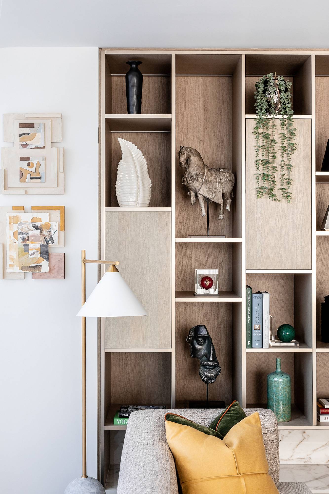
Arranging shapes, textures and colours is a way of forging relationships between seemingly disparate objects. It could be a conical lampshade paired with a pyramidal sculpture. Or a set of mixed-media collages that share tonal similarities with wood, brass and marble finishes. By selecting pieces with commonalities, the team brought an unsuspecting corner of the living room to life.
Cushion the blow
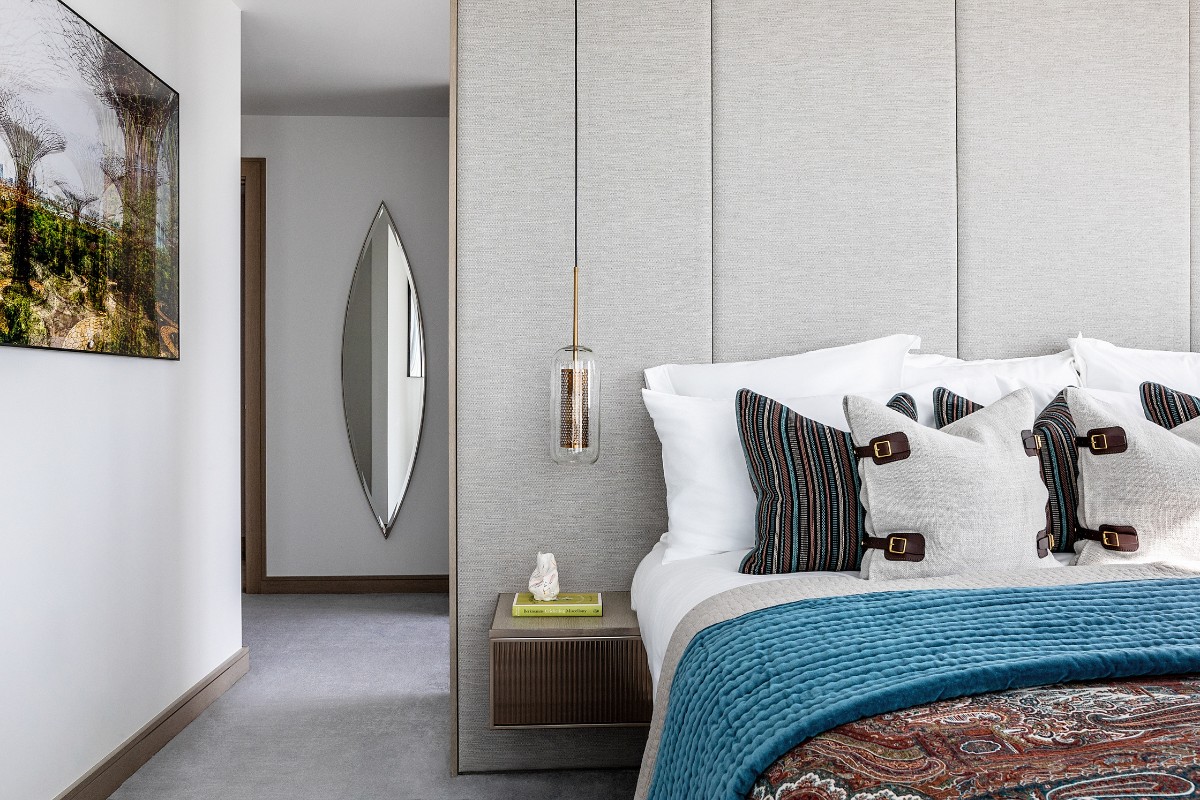
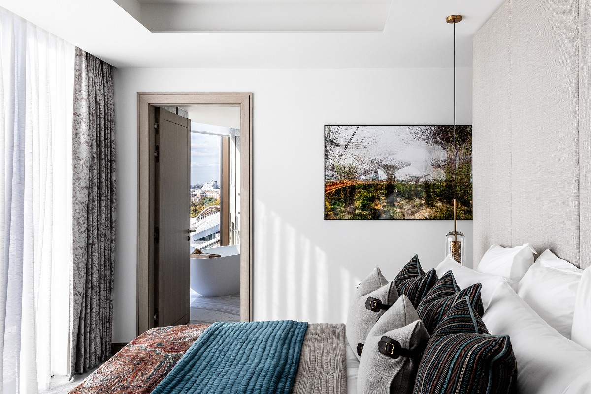
Striped cushions of multi-coloured linen yarns. Stone-washed cushions with handmade leather straps. And a superabundance of pillows and throws. It’s what every bedroom deserves.
Artwork depicting Singapore’s Garden City – with its intersecting lines and architectural supertrees – complement the elliptical shapes and parallel lines elsewhere in the room.
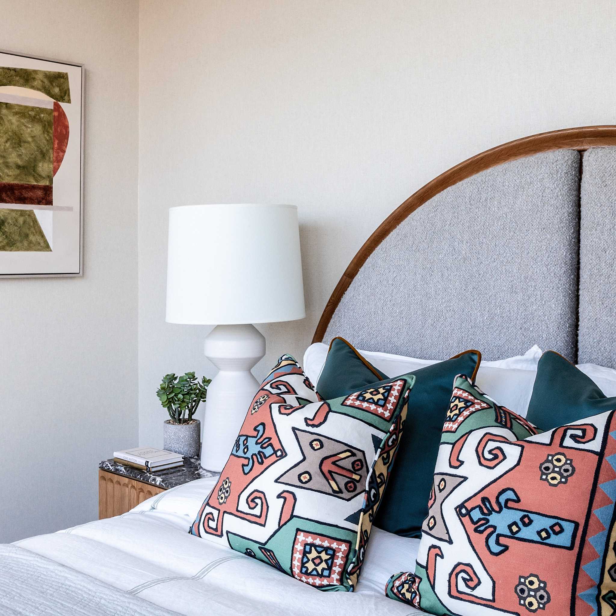
Go native
Against the cool calm of the white cotton sheets, dove-grey headboard and evergreen cushions, sit two bold fabrics inspired by Native American iconography. The mix of print and embroidery, geometric motifs and bright colours invigorate the warm neutrals in the scheme.
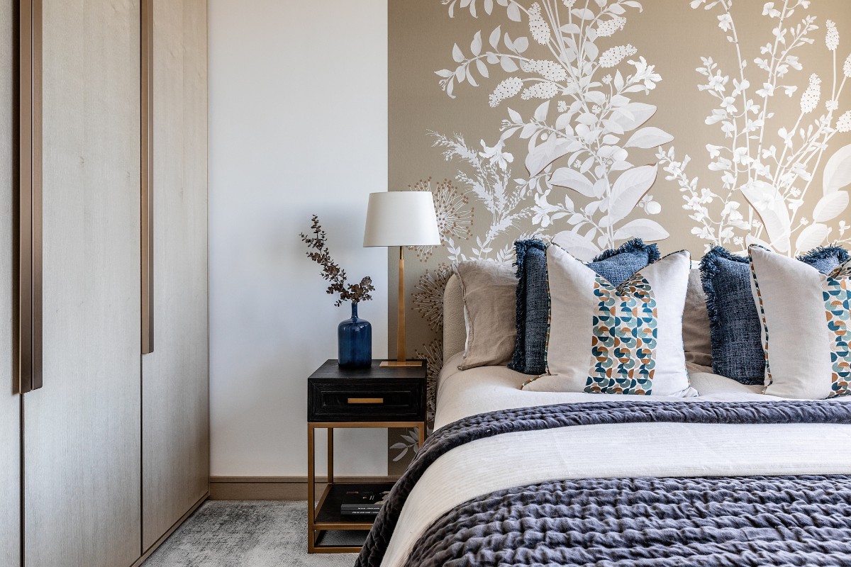
Turn over a new leaf
The flourishing mural of large leaves, delicate pods and long grasses has been hand drawn and printed onto panels. The design is exuberant and life-affirming – and a pleasing counterpoint to the measured fumed oak side tables, and cushions with their neat arrangement of teal, mint and ochre circles and crescents.
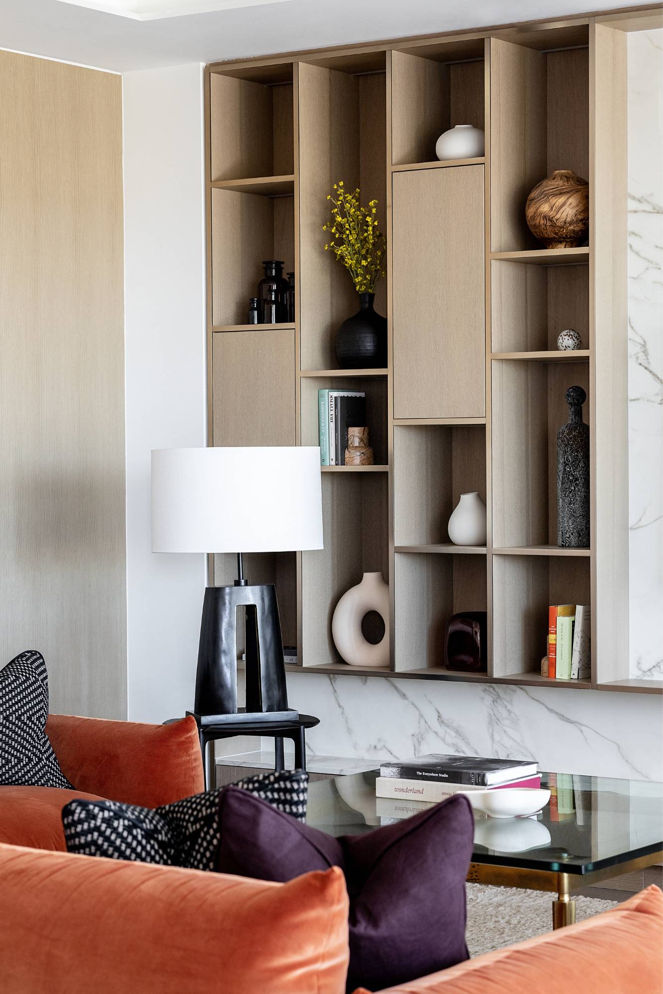
In good shape
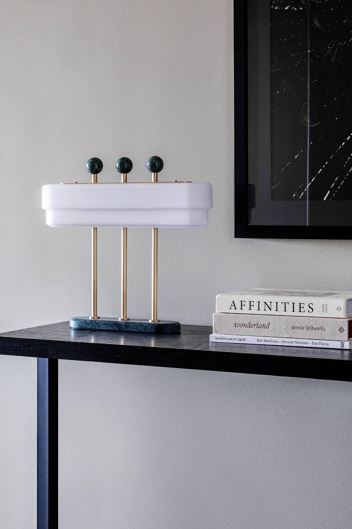
The large bronze table lamp resembles a Stonehenge monolith. Its substantial frame provides a visual backbone to the mix of soft, plump and lean shapes in the room. Whether it’s the reassuringly rounded profile of the Marenco sofa or the shiny accents of the glamorous Hollywood Regency coffee table – there’s plenty to savour.
Lean into it
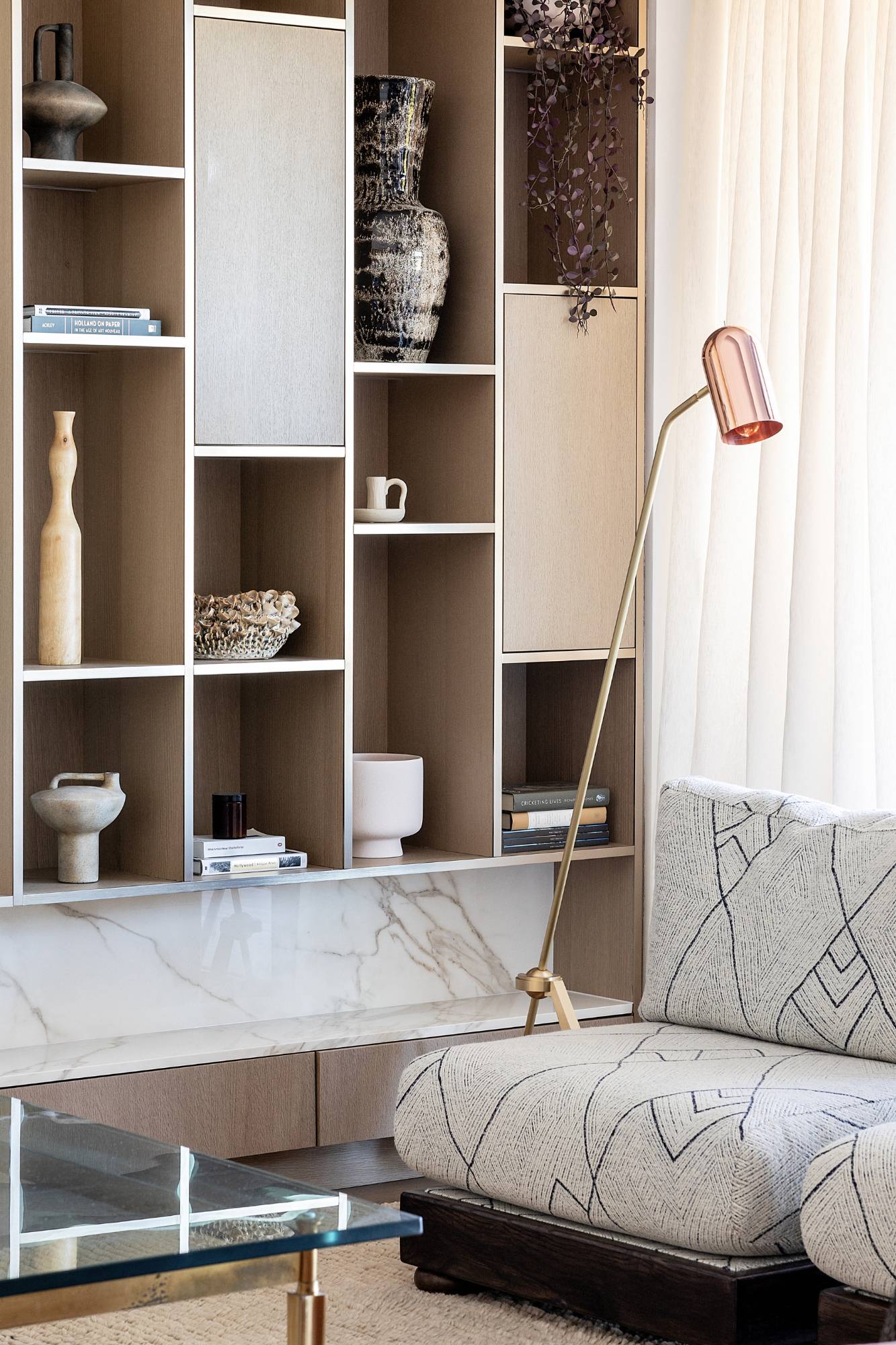
Like Disney’s Pixar lamp, our thin-stemmed floor light has an animated quality. As it leans over the two bespoke lounge chairs, its posture appears inquisitive. Its reflective copper shade mirrors the gleam of the coffee table. While its angled rod echoes the diagonals in the wool, mohair and alpaca fabric of the chairs.
All clear
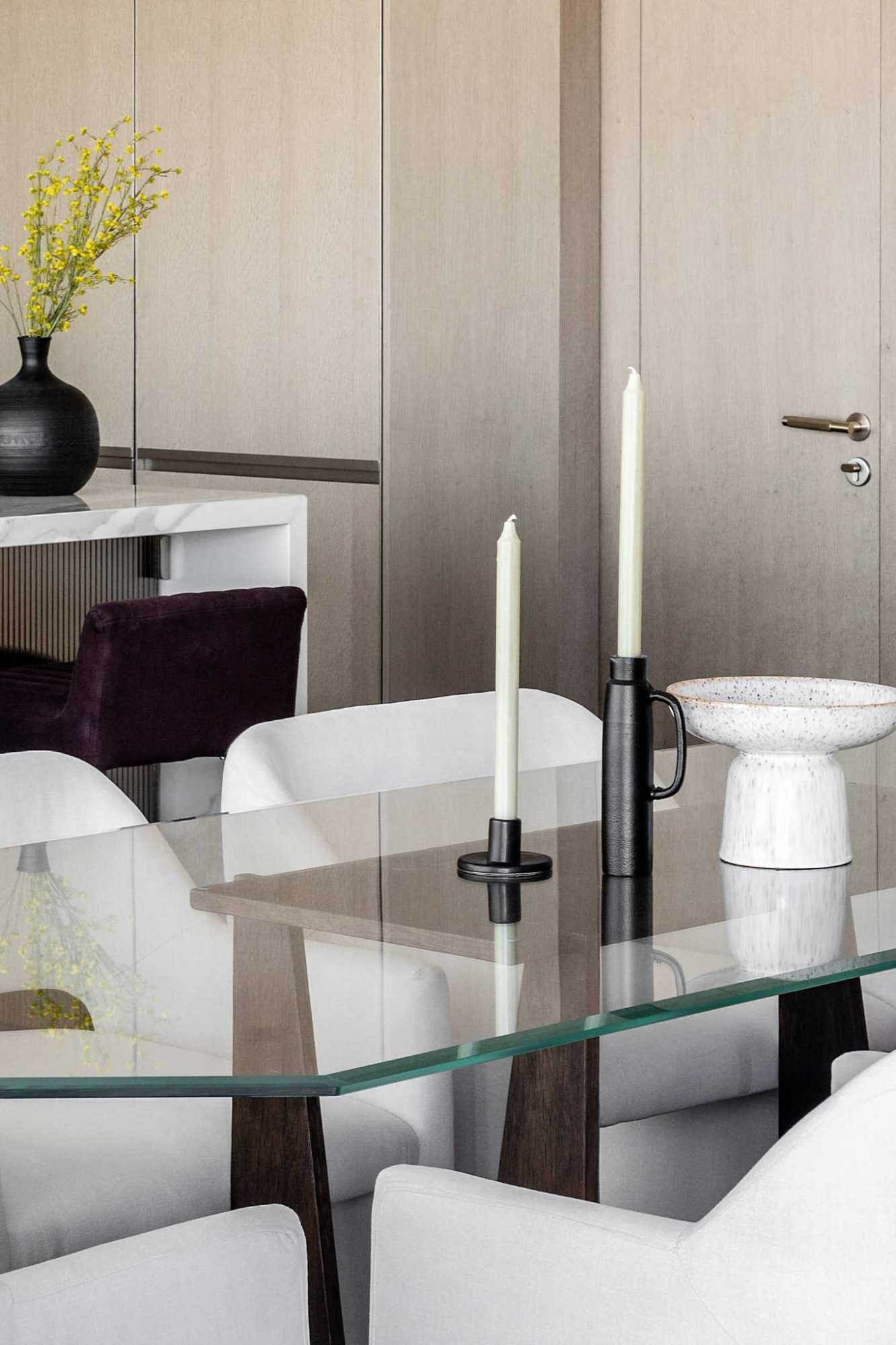
The glass- and ash-wood table was designed in-house. The base, which pays homage to miyadaiku Japanese carpentry, is cunningly simple. No bolts or nails. Just five interlocking pieces of wood that form a top with four triangular legs. It looks architectural, skeletal even. The precision of the half lap joints combined with the drama of the scorched wood are beautiful to behold.
Looking sharp
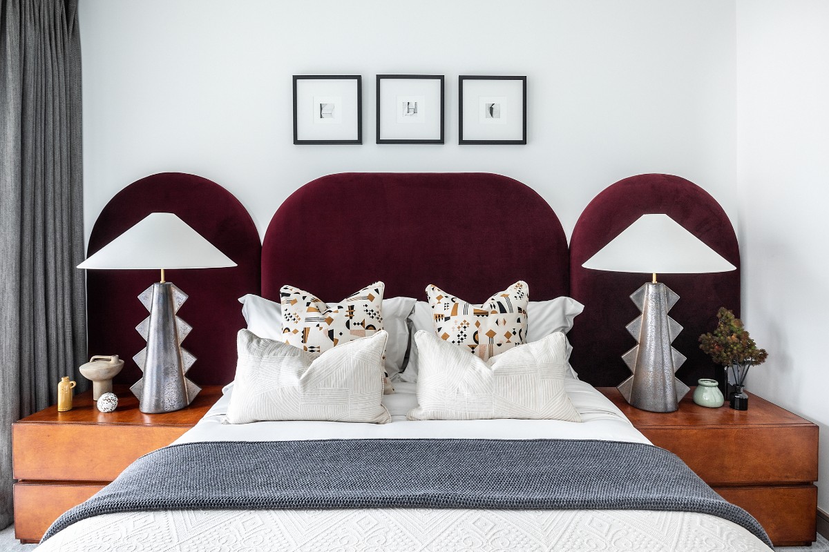
Structural forms and materials continue to flourish throughout the apartment. In particular, the Roman-like arches of the headboard and the ziggurat-inspired shape of the lamps. These speak to the riot of architectural genres found in the neighbouring Lord’s Cricket Ground. We especially love how the lamps’ teeth look wincingly sharp against the smooth, burgundy velvet.
Butter wouldn't melt
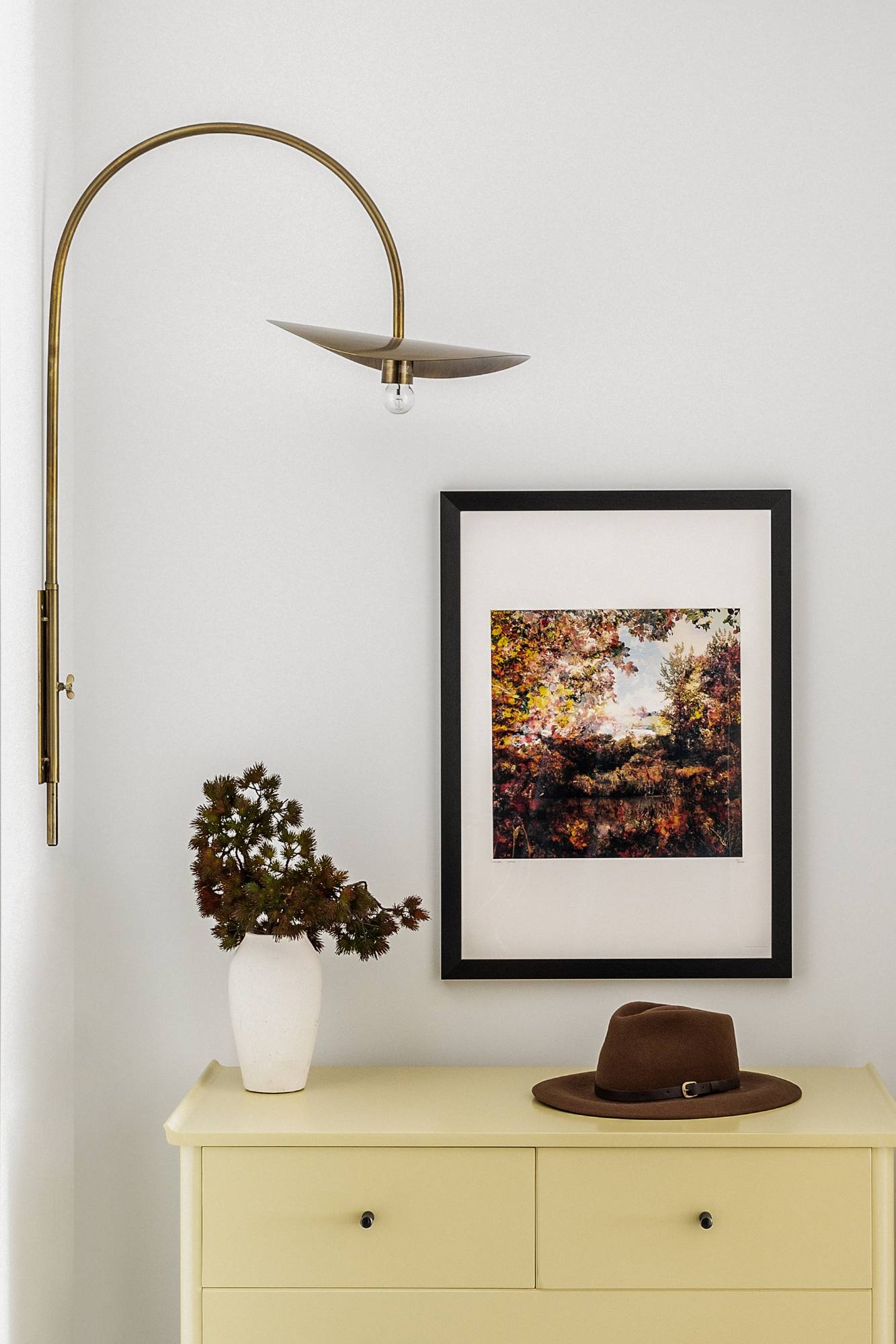
In the same bedroom, vintage drawers painted a pale buttercup, a flower-like wall light and an impressionist landscape create a bucolic scene. It’s a surprising contrast to the industrial-looking lamps diagonally opposite. And that’s what St. John’s Wood is all about: village sensibility mingled with a little raw-edged urban style.
Green to be seen
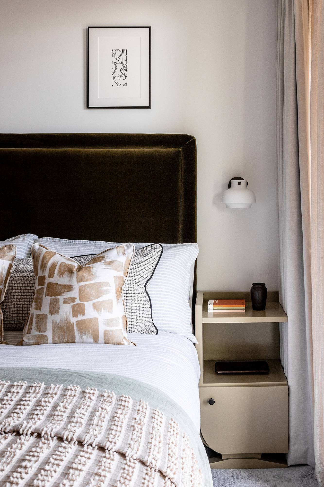
A dark, moss velvet headboard further endears us to nature. So, too, do the opal-glass wall lamps and chunky hand-knotted throw. There’s a soft, rounded wholesomeness to these pieces, which is gently counterpointed by the geometric patterns of the cushions, and sharp detailing of the art deco bedsides.
In the frame
A large piece of art – coppery, elemental, strong – provides a striking focal point in a room filled with houndstooth and lightly stippled pear-hued cushions, linen and lambswool throws, and pale grey upholstered walls.
Just as nature ages, the pleated brass pendant lights will patina over time and develop some of the dark, rich tones present in the artwork.
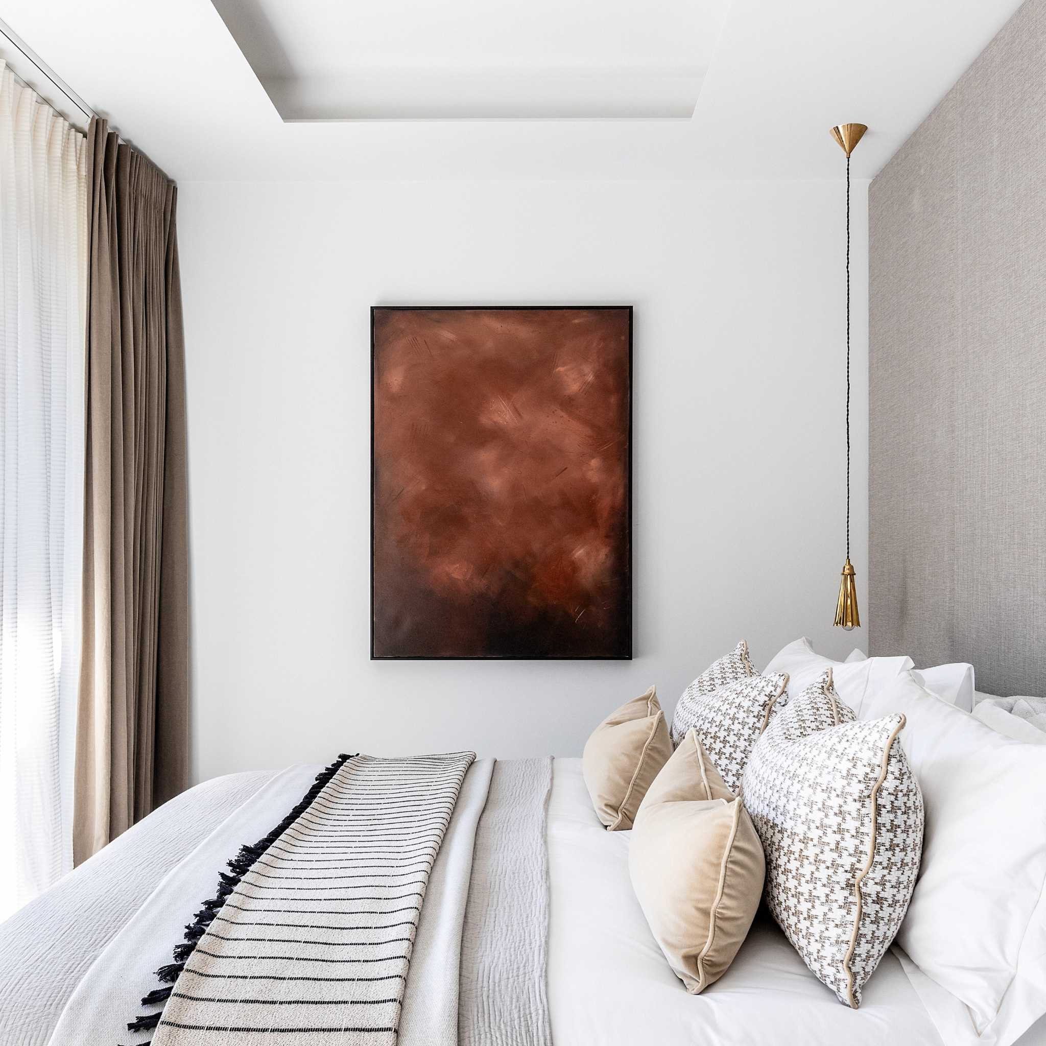
Photo credit: Taran Wilkhu
About Angel O'Donnell
Since launching our London interior design studio in 2018, Angel O’Donnell has won a variety of international awards – both for our designs and for our outstanding client-focused work ethic. Our portfolio features a diverse mix of projects – from Deco-inspired penthouses and traditional country retreats to contemporary Greek villas, modular student accommodation and luxury show apartments in multi-unit developments, including the rapidly popular Build to Rent sector. And that’s what we’re all about: creating an assortment of styles that elevate, enhance and embolden every project we do. There’s no signature look. Just exquisite design and impeccable quality.
If you’d like to feature your project news here, get in touch to find out more.
If you’d like to become SBID Accredited, click here for more information.
The Rigby & Rigby Interior Design Studio are one of six standalone departments that form Rigby & Rigby, a multi award winning design and delivery Studio based in London. Led by Studio Director, James Ashfield has over seventeen years of international experience in the Luxury Residential sector.
![James Ashfield B&W [HR] (4)](https://www.sbid.org/wp-content/uploads/2022/12/James-Ashfield-BW-HR-4-1-e1670517048685-1024x1024.jpg)
The Rigby & Rigby Interior Design Studio has gone from strength to strength and James has been instrumental in the successful growth and creative vision of the department.
We interviewed James Ashfield, Studio Director of Interior Design at Rigby & Rigby to find out more about his background and insights on the residential design industry!
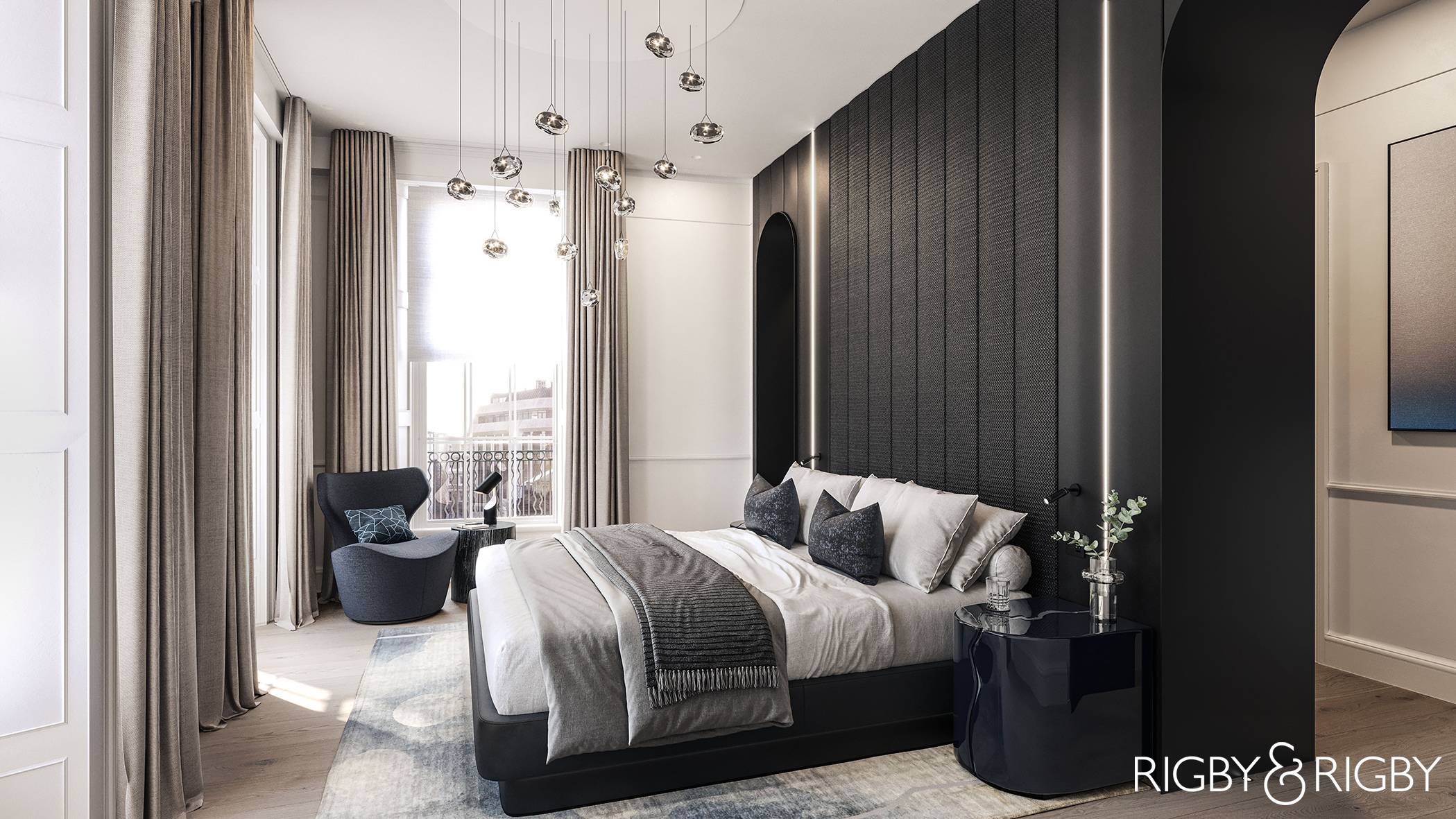
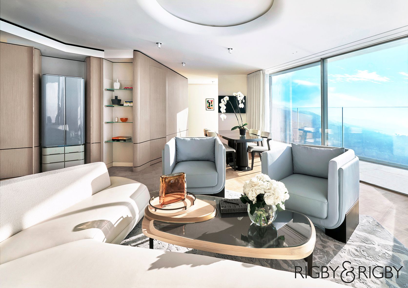
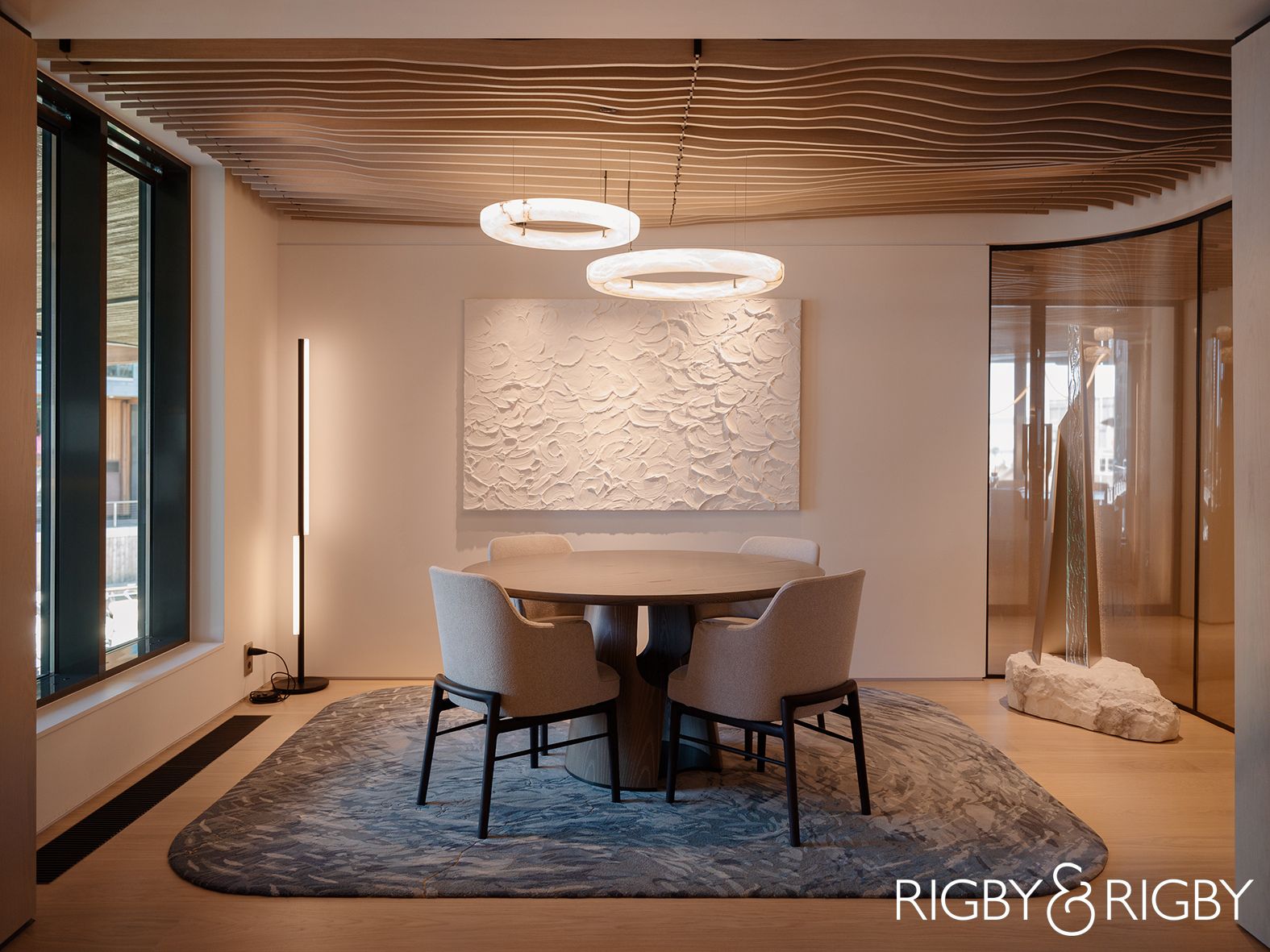
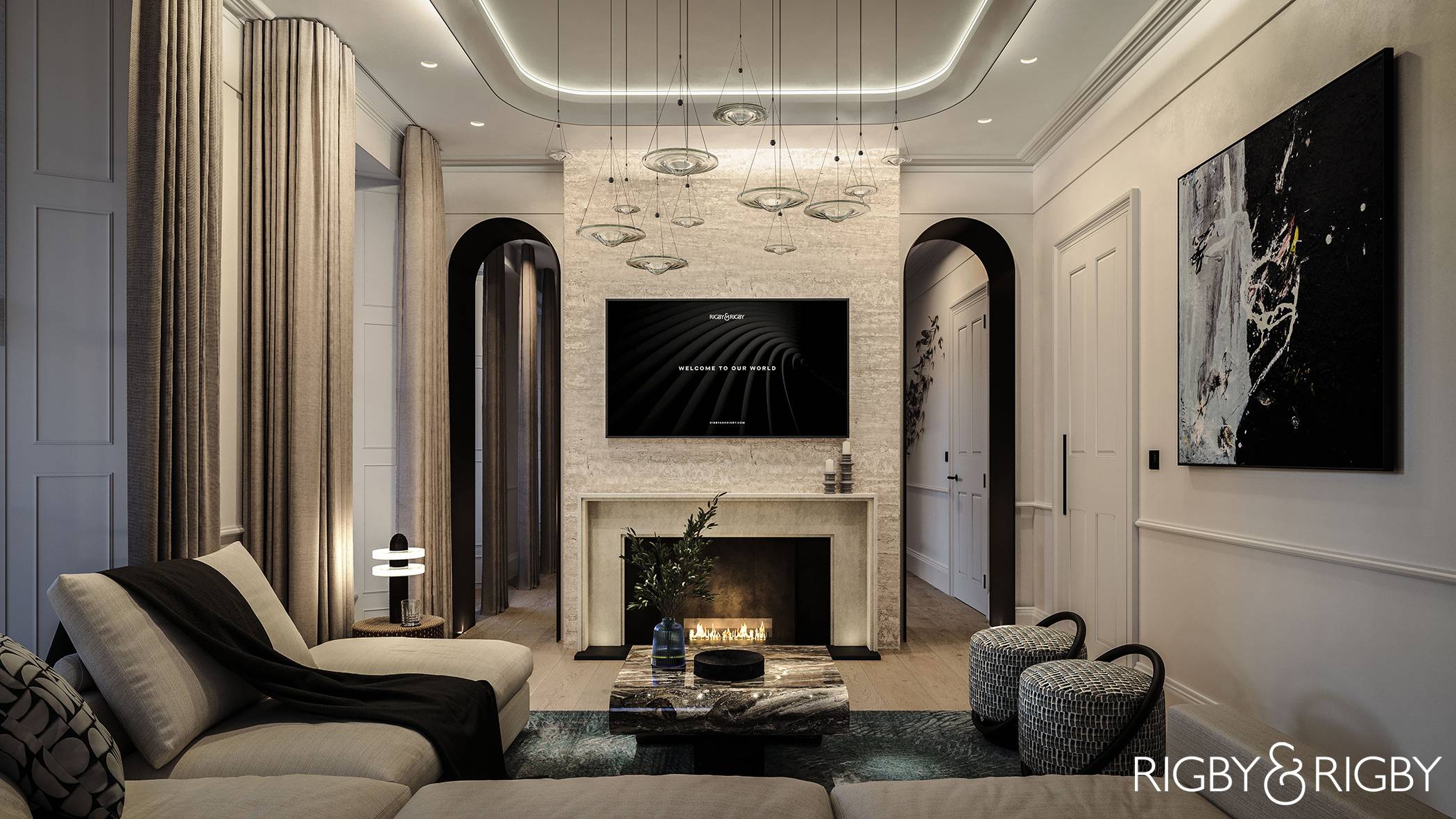
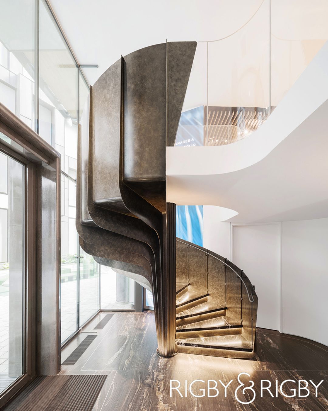
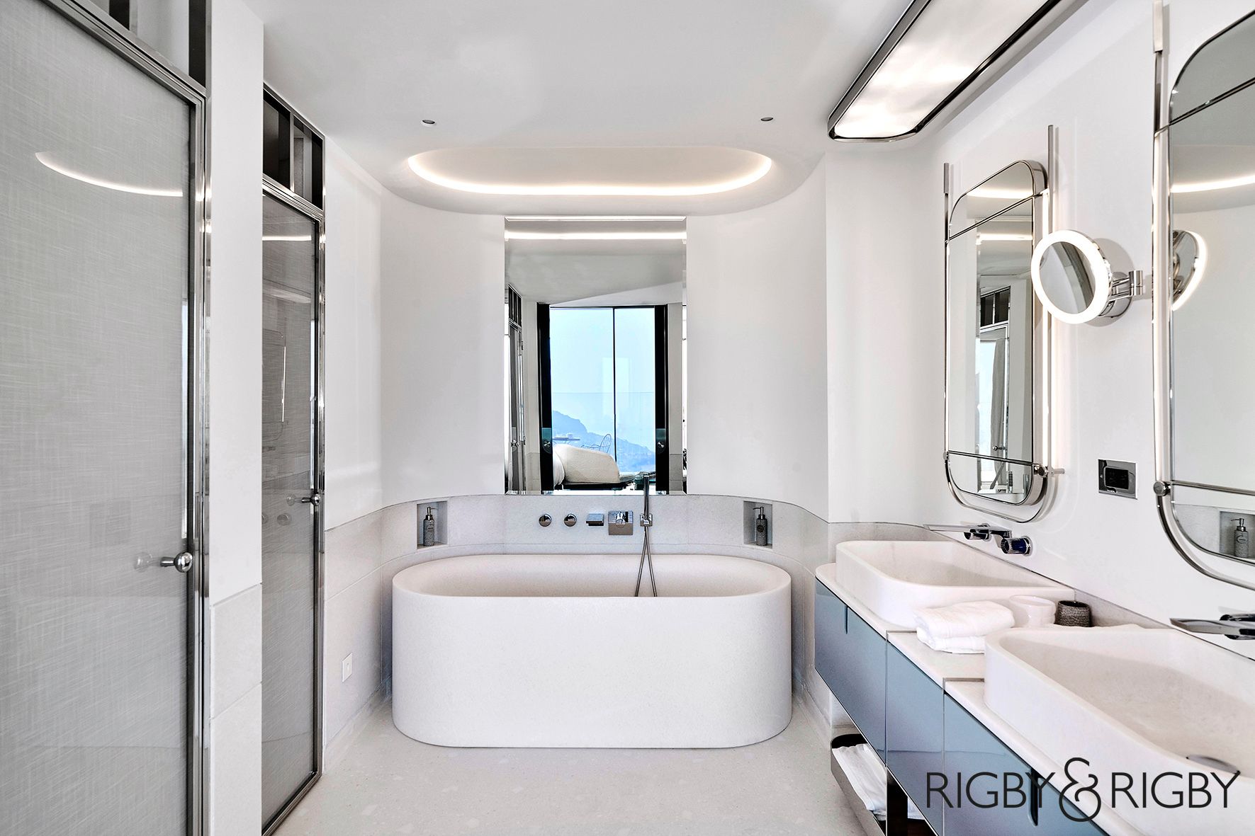
Rigby & Rigby Interior Design projects are detailed and diverse and the Studio has an impeccable reputation with many confidential ‘under radar’ projects. These leading international projects include a flagship residential development Lancelot House in Prime Central London; two Ski Chalet’s in Lapland, Finland; The Maybourne Riviera Hotel in the South of France and a recently completed award winning Private Family Office in Oslo, Norway.
What are the origins of the Rigby & Rigby Interior Design Studio?
Rigby & Rigby started as a developer in Prime Central London, and we have since become an internationally acclaimed design and delivery studio. The business was predominantly architectural and used to work with external interior designers but quickly realised the streamlined benefit of an in-house interior design team. Since then, Rigby & Rigby expanded, and now we offer six stand-alone departments that operate as individual services or one combined turnkey solution. Our teams still work with external consultants, for example the Rigby & Rigby Interior Design Studio is working with an external architect and contractor on two apartments in Mayfair. We’re one big family and we design and deliver projects together or with other families too.
From a design perspective, our style has evolved from the architectural origin. We believe that simple, refined and well executed design is the foundation for creating beautiful and luxurious interiors.
How do you keep up to date with the ever-changing world of Interior Design?
I regularly attend SBID CPD’s and supplier events to see, hear and experience the latest products and technology. I also enjoy expanding my design knowledge via theory and research. My team and I share regular design articles on a wide variety of subjects such as design movements, specialist luxury spaces, lifestyle practices, product design and unique materials and finishes.
How did you first become involved in the world of design? Tell us your story.
As a small child I was fascinated with stained glass windows in churches - the combination of colour, a story and light in a grand oversized setting grabbed my attention. Through school, college and university I loved drawing and technology, and I made choices that pointed towards architecture and design. I joined a small architecture, interior and development practice that was very forward thinking and gave me the opportunity and confidence to test and experiment with design. Since then, I’ve been very lucky and led some incredible projects across the globe and I’ve enjoyingly experienced different cultures. It’s great when design has a context and thought, this is very much connected to where it all began for me with the stained glass windows and the colour, story and light.
What are the main ingredients of a luxury residential project?
The main ingredient is time, we streamline the project process and provide a space that answers our clients brief. All of our clients define personal luxury differently, so once we understand what they really want, and how we can help them to achieve it, we can strive to create an elegant environment where they can live an efficient and happy life.
How is the luxury residential market changing?
The market is continuing to grow with major new luxury developments such as Battersea Power Station in London, UK and Atlantis The Royal Residences, Dubai, UAE, to name two.
At a micro scale, we have seen an influx of technology into the home. Everything can be controlled and monitored from afar and technology is affecting the way we create spaces too. Its use is beneficial to the environment, with greater control and efficiency of utilities and systems.
The use of 3D design and Virtual Reality has enhanced our process and changed the way that we develop and present a project. Within our team we recruited 3D designers to model space and product, streamlining our offering and further engaging the client in the design process.
At a macro scale, the world has a vast abundance of development happening across the globe. With so much development and strain on the environment it’s critical to implement good design and avoid unnecessary waste. Quality and craftmanship are everlasting. Colour and trend are transient. If the bones of a project are well considered and efficient, and a combination of good quality and sustainable products are used, then our impact on the planet is minimised.
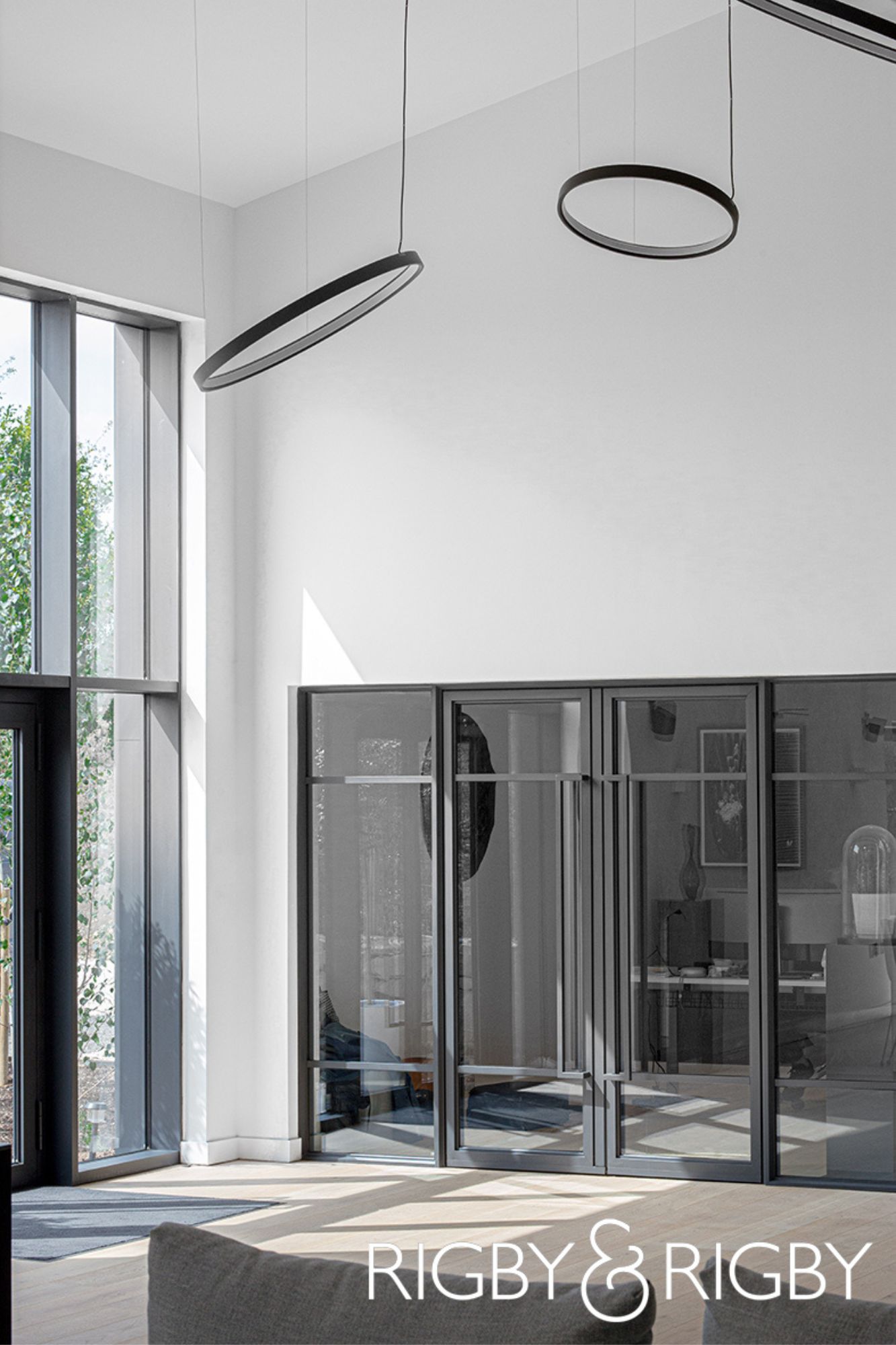
UHNW clients' tastes have changed too. There is more appreciation of ‘less is more’ and a greater concentration on quality and attention to detail. We curate interiors that combine both custom and branded furniture. When installing a sofa from a top Italian supplier we buy into the history and culture of furniture making, and the years of experience that have gone into designing and manufacturing a perfectly executed product. The elements adjacent to the sofa, such as the rug, tables and artwork, are products we custom design to create a truly unique product and arrangement. This same principle is applied across a project, and this creates a new luxury, one that is personal, refined and less pretentious.
What inspires you?
I’m inspired by so many people, places and objects. I’m particularly fascinated with Brazil, its outdoor lifestyle and the rich abundance of design. I love the sea, sun and sand. Brazil is a country of continental proportions, with regional differences in biodiversity, society, economy and industrialization. From Oscar Niemeyer’s architecture to The Campana brothers reclaimed furniture, the multiple interpretations of function and beauty, along with the manufacturing processes, result in a varied production of design.
What are you excited about in luxury residential design this coming year?
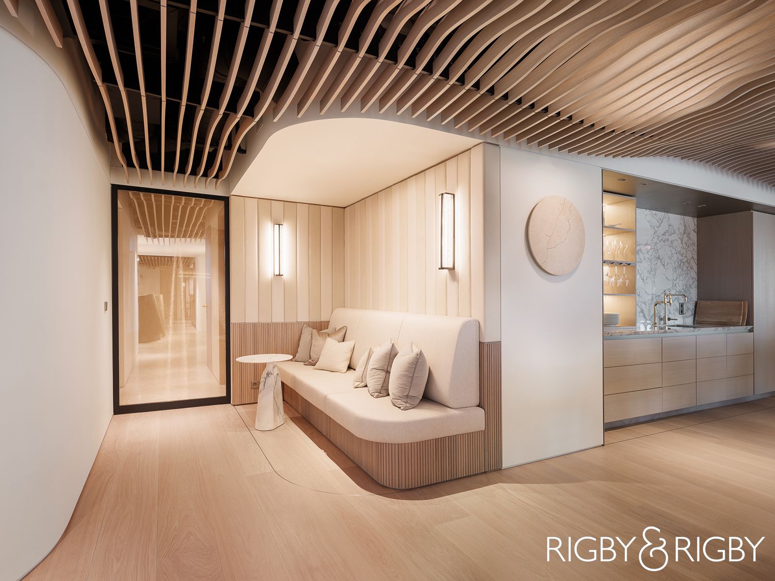
Our interior design studio has a strong year ahead with some incredible projects coming live next year. One of our flagship projects, Lancelot House, a one-minute walk from Harrods in Knightsbridge, is due for completion. This project has been in our department for five years so I’m very excited to see it realised. We are also delivering a number of UK projects, two apartments in Knightsbridge, two show homes in Mayfair, a townhouse in Chelsea, and our international projects too, a villa & two apartments in Dubai, UAE, and a residential development in Tokyo, Japan.
This is a very exciting period for our team and it will build on the success of the award-winning projects we’ve delivered over the past year.
What’s the one thing about you that will surprise most people?
During my stay in the Middle East I dedicated time to an animal welfare charity and rescued stray and injured animals – at one point I had 12 rescued animals in my home and then returned to the UK with three pets, Vanilla, Pudding & Pie, who are all formerly strays.
Questions answered by James Ashfield, Studio Director, Rigby & Rigby.
About Rigby & Rigby
Rigby & Rigby is an award-winning multi-disciplinary design and delivery studio based in London. With full-service capabilities spanning across development management, architecture, interior design, construction, and private client services, Rigby & Rigby offers clients a complete turnkey solution from concept through to completion.
If you’d like to feature your project news here, get in touch to find out more.
If you’d like to become SBID Accredited, click here for more information.
This week’s instalment of the Project of the Week series features a creative restaurant and bar venue design by 2022 SBID Awards Finalist, DesignLSM.
SBID Awards Category: Restaurant Design
Practice: DesignLSM
Project: The Alchemist (Spinningfields)
Location: Manchester, United Kingdom
What was the client's brief?
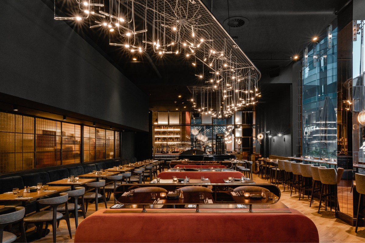
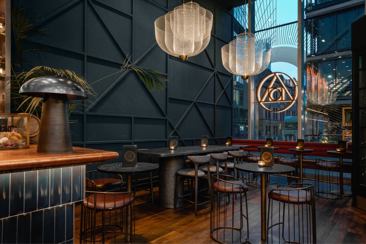
The Alchemist, an experiential British restaurant and bar group founded in 2010, wanted to create a fresh, new look for their original site located in Manchester’s dynamic Spinningfield’s district.
DesignLSM were tasked to create a visually compelling design that enabled the drinking and dining venue to seamlessly transition from day to night, reflecting the evolution of brand, and invigorated the space with a welcoming and energising ambiance.
What inspired the design of the project?
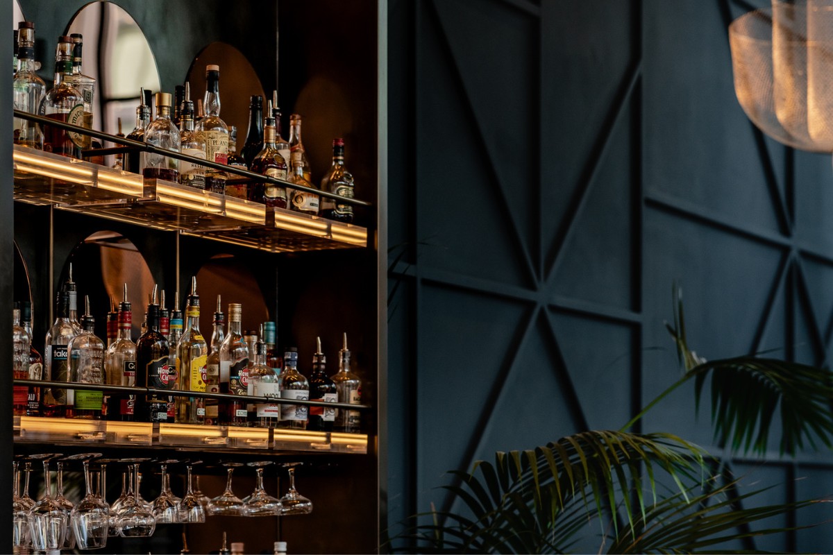
The design of The Alchemist draws inspiration from the origins of the universe - creating an immersive experience for guests that is influenced by the search for the elixir of life and humanity’s continual fascination with our own origins and the subsequent exploration of the universe.
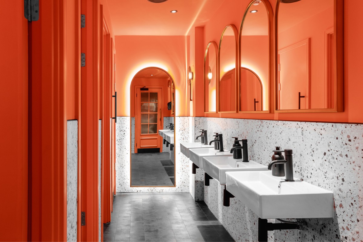
The colours running throughout the design reference the tones created through supernovas and swirling gasses, intertwined with patterns and shapes of orbital pathways of pathways of planets that are represented through curated bespoke furnishing and lighting features.
What was the toughest hurdle your team overcame during the project?
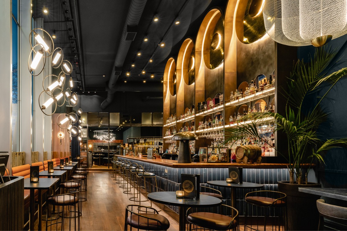
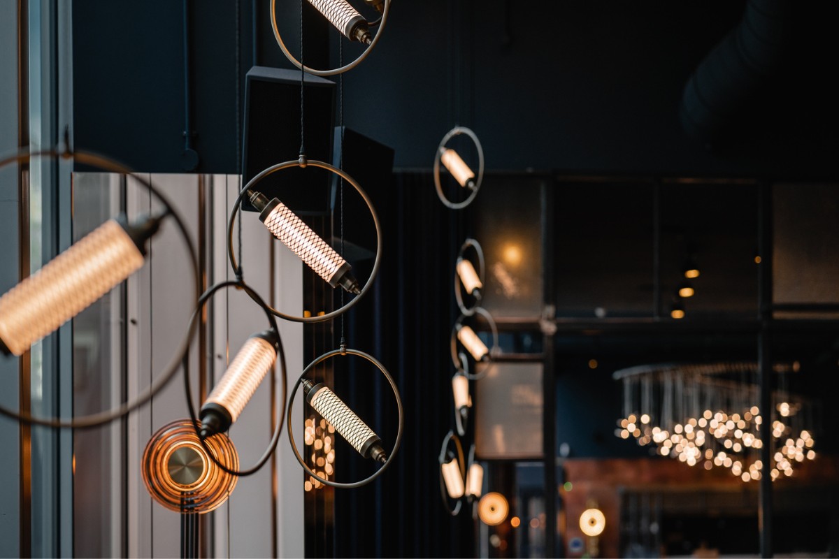
We were very aware that, due to the height of the ceilings, we needed to create big scale dramas in the space otherwise the design would get lost.
We overcame this by integrating striking lighting features throughout that had been carefully curated from both an atmospheric and design narrative perspective. Each sculptured pendant is influenced by the cosmos, the orbits of planets and satellites. The collective groups are hung in specific positions to create dramatic focal points which enhances the changing ambience of the day and creates dynamic zones within the open plan space - sculptural statements in the day to luminous masterpieces at night.
What was your team’s highlight of the project?
From the get-go, the concept was well interpreted and we’re extremely proud of the space and new direction that we have delivered for The Alchemist. Since re-opening, we’re thrilled with the positive feedback received from both the client and the public. Despite there being a vast selection of drinking and dining destinations in the city, The Alchemist continues to set itself apart and remains as one of Manchester’s most renowned and vibrant social hot spots.
Why did you enter this project into the SBID Awards?
The work we completed for The Alchemist went beyond the creation of just a beautiful design, it transitioned the brand into a new era of what they represented, evolving their core DNA. The striking space has cemented The Alchemist as the go-to hot spot in Manchester drinking and dining’s scene, receiving a hugely positive response from the public, press, and the client. The SBID Awards are renowned for celebrating the best of interior design and as we are incredibly proud of what we achieved, we hope this project has earned its rightful place in the running as one of Manchester’s most vibrant new openings.
Questions answered by Yasamin Nikoosimaitak, Marketing Manager, DesignLSM.
This week’s instalment of the Project of the Week series features a luxurious hotel suite design by 2022 SBID Awards Finalist, Kristina Zanic Design Consultants.
Kristina Zanic Consultants has designed a royal welcome for guests of the presidential Amiri Suite at St Regis Kuwait hotel. Newly rebranded from its previous Sheraton brand, the property has been the hotel of choice for royalty, diplomats and celebrities in the Middle East since 1966.
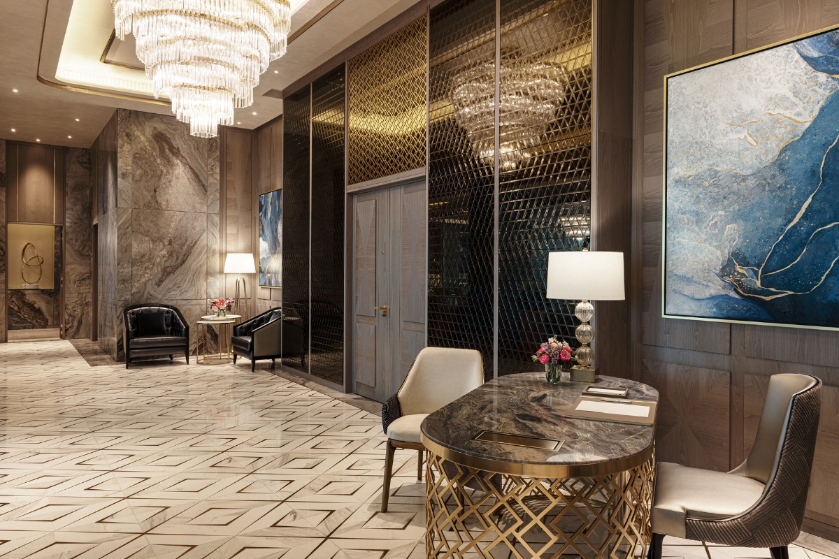
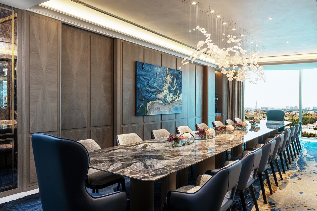
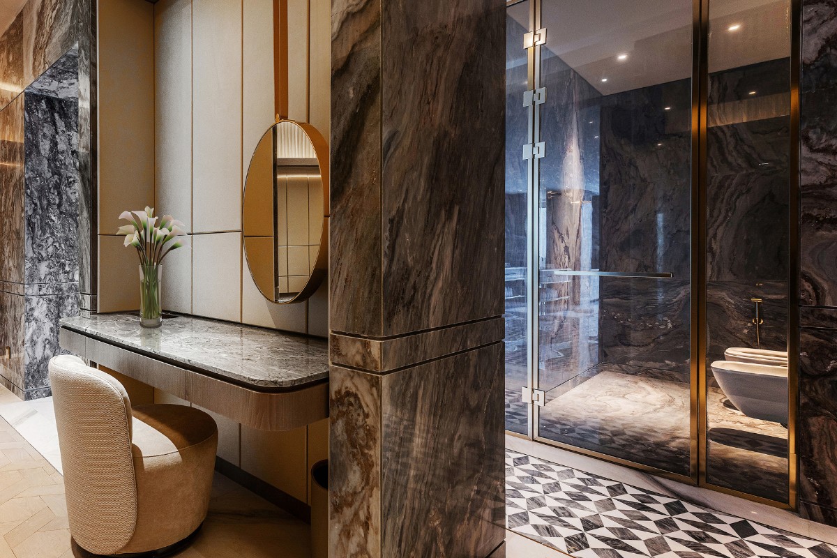
The Amiri suite features a 450sqm area that includes a reception area, lounge, dining/ boardroom, meeting rooms, master bedroom and bathroom, walk-in wardrobe, gym, barber/hairdressing station and spa suite.
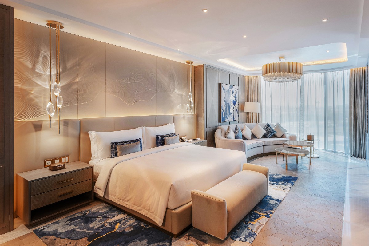
A striking palette of royal blue and cream greets the guest. Blue accents in the furniture, art, carpeting and wall panels add the right amount of 'oomph' to the otherwise restrained palette.
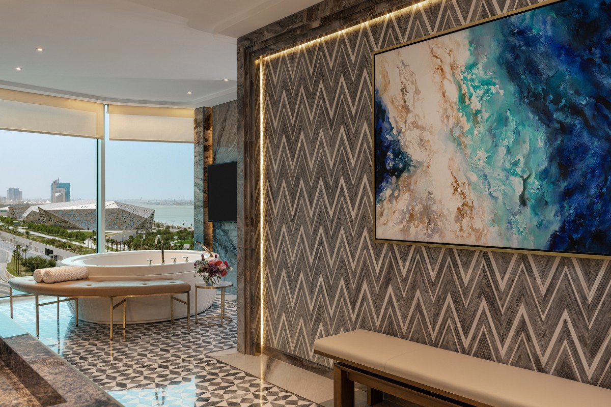
Brass fretwork together with lacquered wall paneling and a sunburst timber detail create a luxury residential ambience. A bespoke embossed leather headboard offers the perfect backdrop in the bedroom, serving as a neutral but richly textured piece of art. The flooring features a multitude of luxury material and patterns, basket-weave timber parquet, bespoke carpet designs, and layered inlaid marble tile.
Sophisticated furniture with rounded forms, rich fabrics and accessories blend luxury with comfort and practicality, reflecting an attention to detail and personal touch. Bespoke crystal chandeliers layer on the luxury, while art pieces play with abstract geometric and arabesque graphics, with no two pieces alike.
The result is an elegant space, with a restrained neutral base palette with injections of colour, and quiet opulent finishes.
SBID Awards Category: Hotel Bedroom & Suites Design
Practice: Kristina Zanic Design Consultants
Project: St Regis Kuwait – Amiri suite
Location: Kuwait City, Kuwait
What was the client's brief?
The Sheraton hotel in Kuwait was very much in need of a makeover due to its very outdated interiors. The client was looking to find the right balance in creating a reinvented luxurious hospitality space while staying true to the hotel’s 50-year heritage.
The property was the first five-star hotel in the Middle East, and has enjoyed landmark status for the past five decades. The design needed to be sensitive to its history and to deliver a high-end luxury interior that would be appealing to its distinguished clientele, while also aligning with its new St Regis brand identity.
We provided the interior design consultancy for the full refurbishment of the hotel. The first phase involving guestroom and suite floor refurbishment was completed in November 2021, and the second phase of refurbishment for public areas of the hotel is expected to be completed in 2024.
What inspired the design of the project?
The direction we chose was to ‘look back in order to look ahead’. In the 1960s, the hotel defined luxury hospitality in the region, catering to the local high society and reflecting a progressive country to visitors. Working within the new St Regis brand guidelines, we set out to reinforce that position and reflect what luxury means today in Kuwait.
The concept centers on creating a home away from home, a place to indulge in every sense. The aim was to create a bespoke and timeless look, with opulent finishes and classic details in the suites.
What was the toughest hurdle your team overcame during the project?
The biggest challenge lay in remotely managing the project at the peak of the pandemic crisis. Following initial visits to the site before lockdown, the major part of the project involved lots of online coordination with the client and virtual site visits and material inspections.
We had to be extra careful with monitoring the project and faster with our responses, but thankfully had plenty of support from the client and contractor who regularly shared photos and videos of the site’s progress.
What was your team’s highlight of the project?
There are a number of features that stand out in this project. The first is the smooth flow that was achieved within the various spaces in the suite, really creating a sense of home for the guest.
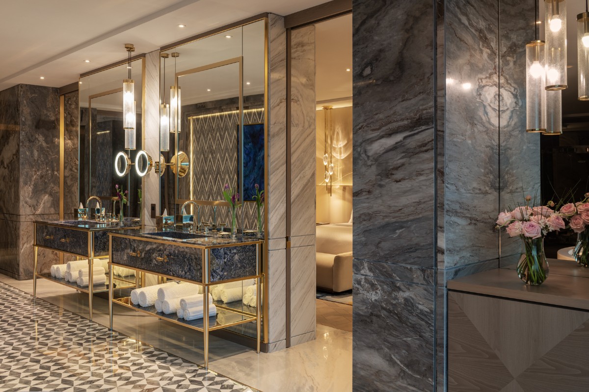
The suite also features a generous use of sophisticated materials and finishes, like inlaid marble, leather and timber wall panels, hand-blown crystal lights, and curated art.
The suite’s lavish amenities offer guests the ultimate experience of relaxation and indulgence. Of particular note is the bathroom and spa area that developed into an oasis of luxury and comfort, with double vanities in grey marble, double jacuzzi, grooming station, sauna, spa treatment room, and gym.
Why did you enter this project into the SBID Awards?
It’s always gratifying to get industry recognition for the immense effort that goes into our work, especially a large and complex project like the St Regis Kuwait.
We took a very studied and sensitive approach to the renovation of the hotel, and couldn’t be happier to see our work resonating with the judges.
Being selected as an SBID award finalist among hundreds of entries is really an acknowledgement of the team’s hard work, as well as a fantastic opportunity for international exposure for the hotel.
Questions answered by Lara Elhani, Design Director, Kristina Zanic Consultants.
As biophilic design grows in popularity (no pun intended!) so does the number of interior projects where clients request a green ‘infusion’ in their refurbished homes.
Biophilia, or the love of nature, provides a connection to the natural world and instils a sense of wellbeing through the creation of a healthy environment. The air quality in a city dwelling is said to improve, through the air-purifying potential of plants, with certain varieties able to remove many pollutants. No small feat, considering indoor air quality is often inferior to outdoor, with residents breathing in all sorts of undesirable pollution.
The Royal Horticultural Society also reports that the potential psychological and physical benefits of indoor plants include improved mood, reduced stress, better productivity, longer attention span, quicker reaction times on computer tasks, lower blood pressure and a significant reduction in fatigue and headaches. Undoubtedly, this need for repeated and sustained connectivity to nature and its positive impact on people in general, is becoming increasingly important in our busy, urban lives.
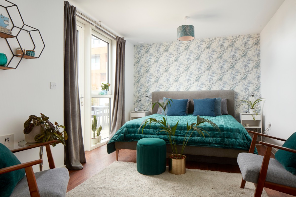
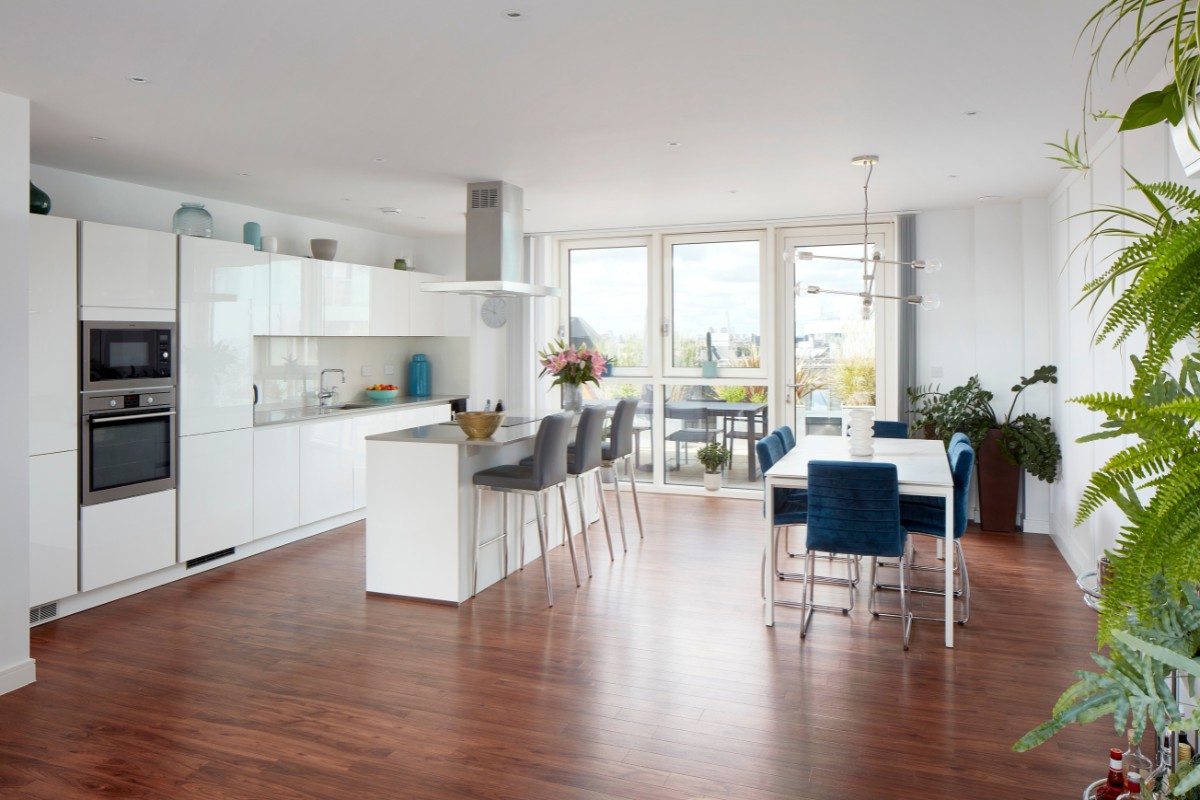
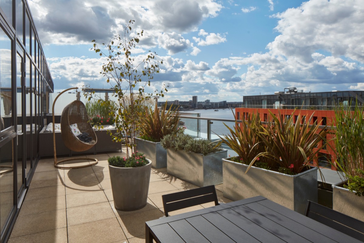
The brief then, for this penthouse perched on the River Thames, was to incorporate a biophilic aspect into the space in order to make it a restorative refuge. Other than the views, it was originally an uninspired space and the two large terraces empty and unused. With cohesive vision and contemporary furnishings, it was transformed both inside and out into an attractive and harmonious home. The copious amounts of greenery that were added, including a living wall, together make the space incredibly calm and congenial. The residence now ticks all the boxes with close proximity to work in the Wharf, whilst infusing a sense of spaciousness and serenity. Who wouldn’t want to relax and rejuvenate on a lounger surrounded by vegetation gently rustling in the breeze?
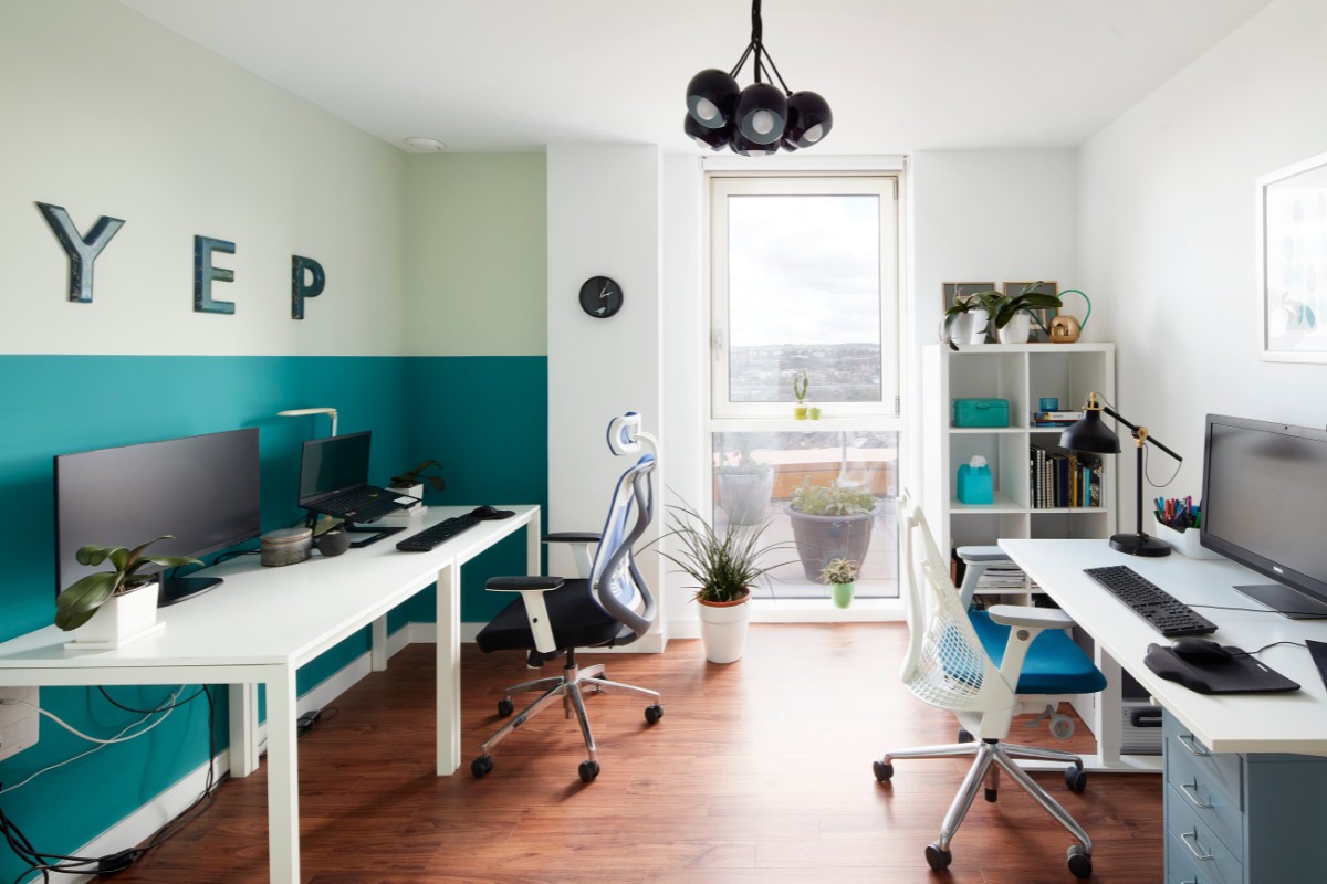
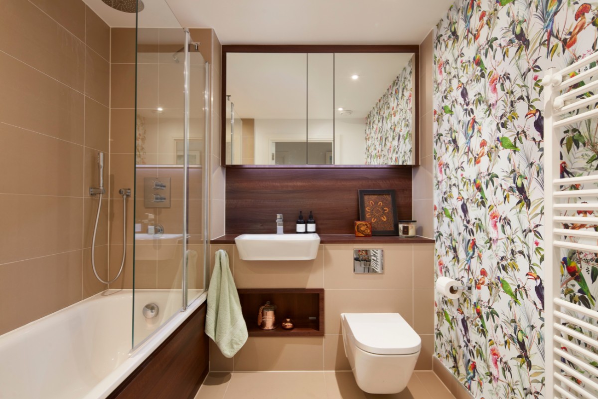
As a biophilic design studio, Oudejans Interiors feels it’s vital to live more sustainably and regularly draws upon the proven benefits of nature as a key design element to create exquisite and enduring residences.
About Oudejans Interiors
Oudejans Interiors, a leading biophilic design studio, draws upon nature, with its many proven benefits, to create beautiful, enduring spaces that engender wellbeing. Our ethos is to live sustainably, increasingly connected to the natural world. When designing interiors, we instil this organic connection to enhance clients’ lifestyles.
If you’d like to feature your project news here, get in touch to find out more.
If you’d like to become SBID Accredited, click here for more information.
From premium bathroom retailer, C.P. Hart, comes three exclusive brassware ranges: Original, Epoch, and Spillo.
Exclusively designed and manufactured for C.P. Hart, each range is available in various luxurious finishes, presenting brassware options to suit both classical and contemporary schemes.
Epoch
Epoch is an award-winning, classical brassware range designed exclusively for C.P. Hart and manufactured in the UK. The collection combines facetted spouts, soft crosshead handles, and stunning etched indices, showcasing quality craftsmanship with timeless charm.
Inspired by the glamour of the Art Deco era, Epoch brassware is available in eight finishes, including Chrome, Polished Nickel, Gold, and Living Brass – a finish that ages beautifully with time. Though classical in design, the Epoch range also complements a contemporary setting.
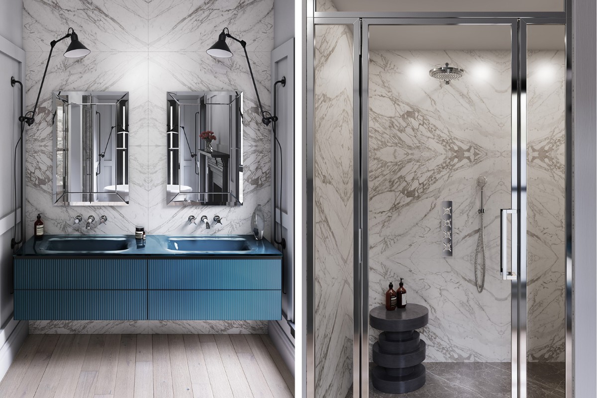
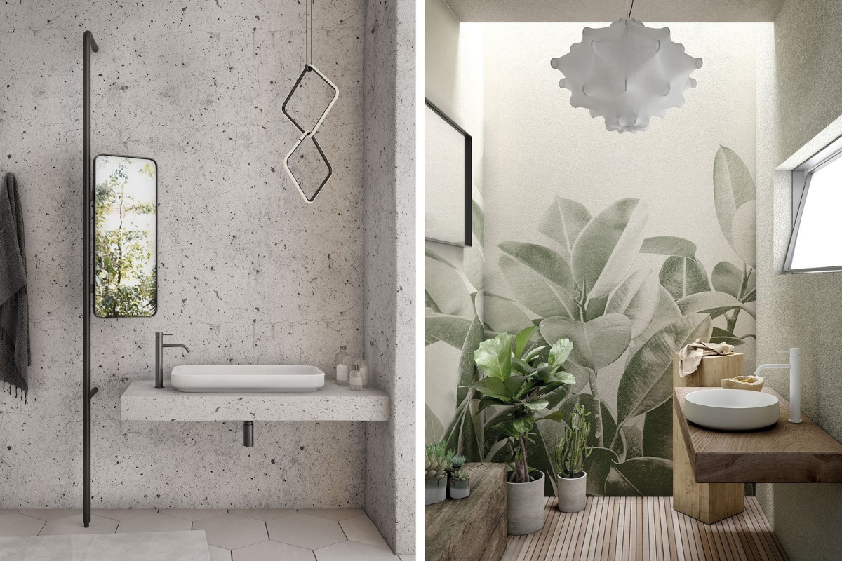
“To create the below suite, we paired Epoch brassware with Artelinea’s eye-catching, fluted Monolite Vanity Unit, combining its elegant modernity with Epoch’s timeless appeal,” explains the C.P. Hart Design team.
Explore Epoch range.
Original
Designed by John Hart, the son of C.P. Hart’s founder, the exclusive Original collection celebrates the company’s heritage, combining classic Edwardian proportions with modern quarter-turn technology.
Precision-manufactured in the UK, Original brassware ensures authenticity, durability, and a flawless finish. Each item is available in Chrome, Incaloy Gold, and Nickel.
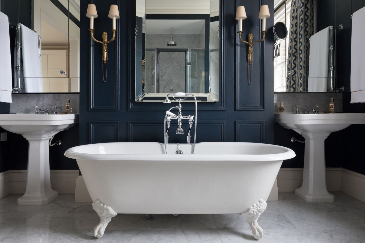
“C.P. Hart supplied Original brassware as part of the transformative renovation of Moore House, featured below,” says the C.P. Hart Design team. “We paired the Original Bath and Shower Mixer with C.P. Hart’s freestanding Winchester Freestanding Bath, both exclusive to C.P. Hart, to breathe classical elegance into the modern-classic aesthetic.”
Explore Original range.
Spillo
C.P. Hart’s most comprehensive brassware range, Spillo, is manufactured exclusively for C.P. Hart in Italy. The collection’s slim, minimalist form is present in every piece, including a full range of basin, bath, and shower fittings, as well as an extensive accessories range. Engineered from low-lead brass and packaged in recycled boxes, Spillo is an eco-friendly brassware option, available in 10 polished and hand-brushed finishes.
Also available from C.P. Hart are the Spillo Steel and Spillo Tech ranges. With the same design ethos as Spillo, Spillo Steel is manufactured from marine-grade stainless steel, one of the most durable materials for a wet environment. Featuring three styles of faceted handle design, Spillo Tech highlights the extraordinary engineering of Italian manufacturing, providing a unique look for every bathroom style with its range of polished and hand-brushed finishes.
“The Spillo Steel Tall Basin Mixer complements the monochrome scheme, whilst the Spillo Single-Lever Basin Mixer in matt white boasts a unique finish that beautifully contrasts the bathroom’s wooden textures.”
Explore Spillo, Spillo Steel and Spillo Tech ranges.
Visit a C.P. Hart showroom here.
About C.P. Hart
Leading bathroom retailer C.P. Hart has an outstanding reputation for the best in design and innovation, with products sourced from designers and manufacturers worldwide, many exclusive to C.P. Hart and unable to be purchased elsewhere. C.P. Hart has 15 showrooms across the UK, including its impressive flagship at London’s Waterloo.
If you’d like to feature your product news here, get in touch to find out more.
If you’d like to become SBID Accredited, click here for more information.
Lalique has unveiled a new collaboration with American artist James Turrell who is famed for working with light and space to create artworks that engage viewers with the limits and wonder of human perception.
It is the first time the celebrated light artist has worked on small scale pieces. This unique coming together of two ‘artists of light’ is the result of over four years of close collaboration. It comes at a time when Lalique celebrates its Alsatian factory’s 100-year Anniversary. The collaboration, which consists of 42 crystal light panels and two perfume bottles, each in a limited edition of 100, was presented at Paris+ par Art Basel on 20-23 October 2022. It is the first time Lalique Art was an official partner of the world-renowned art fair.
The bottles
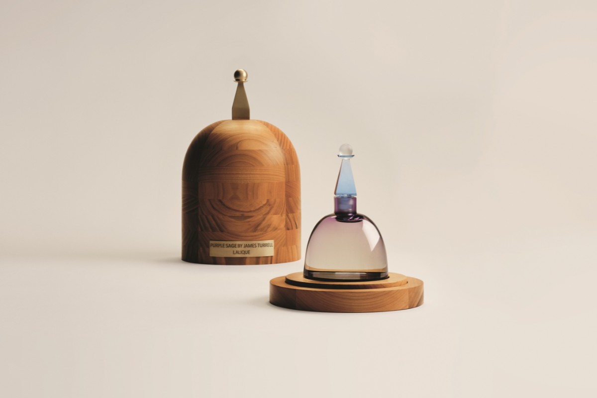
James Turrell began the collaboration by designing the two perfume bottles. Fascinated by Egypt and the stupa shapes found in Asia, Turrell used their architectural structure, monuments of high spiritual value in which light plays an essential role, as inspiration.
Combining artistic and olfactory sensibilities, the two flacons Range Rider and Purple Sage are inspired by Zane Grey’s ‘Riders of the Purple Sage’ and the artist’s desire to recreate the beauty of the American West. The striking result: prisms that diffuse and diffract the light. Entirely handmade, the design presented a major challenge for the Lalique artisans – obtaining crystal of a uniform thickness, to ensure the correct density of colour and homogeneity.
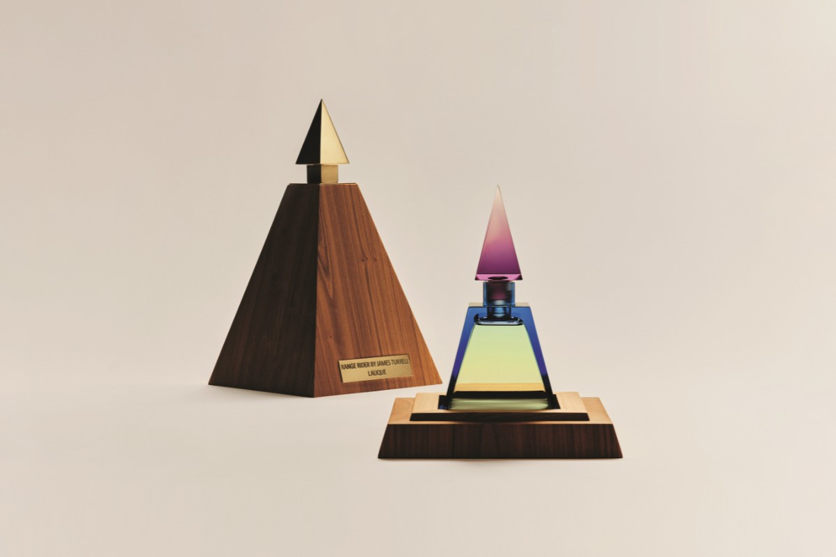
Working closely with Lalique’s perfumers, the collaboration also sees the first scent ever co-created by an artist for Lalique. A first scent, Range Rider, captures the natural fragrances of the artist’s land, Arizona, including sage-scratched leather chaps, pepper, amber, and citrus. It is an olfactory architecture that speaks of sun-drenched Western ranching.
A second scent, Purple Sage, named after this delicate, queen of plants that blooms in Arizona, offers a different interpretation of Turrell’s relationship with the American West, undulating between delicacy and strength. The bottle, with its soft curves, is a tribute to the eternal feminine form. The perfume has a delicately fruity, musky scent, revealing notes of purple sage, mandarin, grapefruit, and rhubarb.

The panels
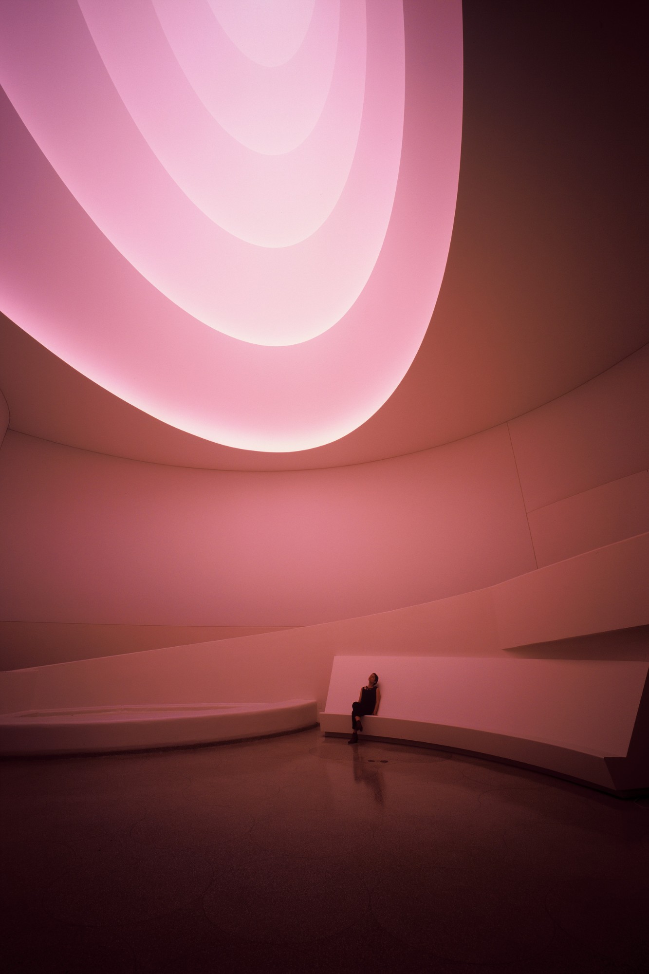
The 42 light panels, named Crystal Light, are inspired by an image of James Turrell’s Aten Reign installation, exhibited at the Guggenheim in 2013. Originally planned in colours, the panel was finally produced in clear crystal. The rippling colours were then produced using a screen placed behind the work. The design offers a hypnotic visual effect between the third and second dimension – similar to a trompe l’oeil, with intriguing depth.
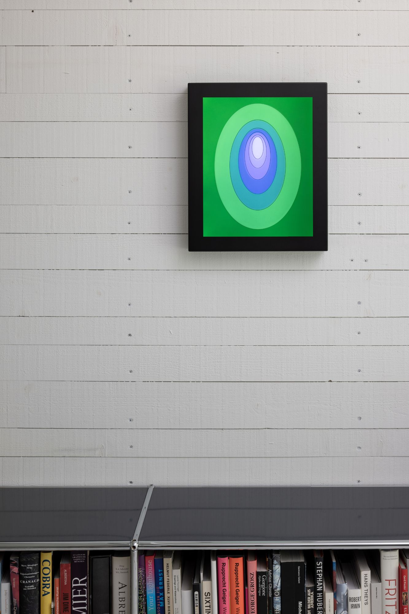
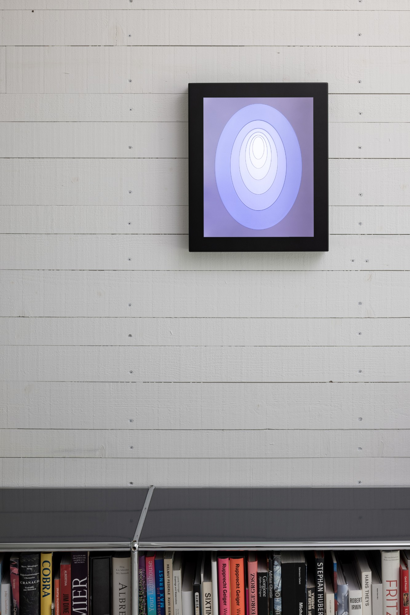
The artists
The collaboration was first born from a meeting between the artist and Silvio Denz, Chairman and CEO of Lalique, “I immediately thought there should be a collaboration between Lalique and James Turrell – the light artist. It makes perfect sense when you recall that René Lalique was known as the ‘sculptor of light’.”
“This is a profound artistic adventure whose result expresses a rare elegance and modernity. A seemingly impossible challenge. I am both proud and very happy that this great name is joining the prestigious circle of Lalique’s contributing artists.”
James Turrell added, “The nature of my work is the shaping of light. Light is the material; perception is the medium. I knew of René Lalique, but I didn’t know the extent of his creativity. At the Lalique factory, when I watched the master artisans, I was fascinated by their technical virtuosity. They are truly artists.”
“This is the first time I have designed perfumes and made crystal pieces. The olfactory sense elicits memory more so than any other sense and it was with Lalique and the perfumers, that I was able to do this. Creating a perfume is a bit like creating a world you have known.
“Like René Lalique, I seek light and will continue to seek it.”
About Lalique
Founded in 1888 by renowned and avant-garde artist René Lalique, Lalique is one of the crown jewels of France’s crystal glass houses. Lalique is a symbol of unique know-how and craftmanship, a lifestyle luxury brand with an immediately recognizable style. Lalique enriches our everyday lives, bringing artistic style to singular creations in six areas: decorative items, interior design, perfumes, jewellery, works of art and hospitality.
If you’d like to feature your product news here, get in touch to find out more.
If you’d like to become SBID Accredited, click here for more information.
This week’s instalment of the Project of the Week series features a light and airy kitchen design by 2022 SBID Awards Finalist, Bocchetta Interiors.
SBID Awards Category: KBB Design
Practice: Bocchetta Interiors
Project: The Slipway
Location: Dorset, United Kingdom
What was the client's brief?
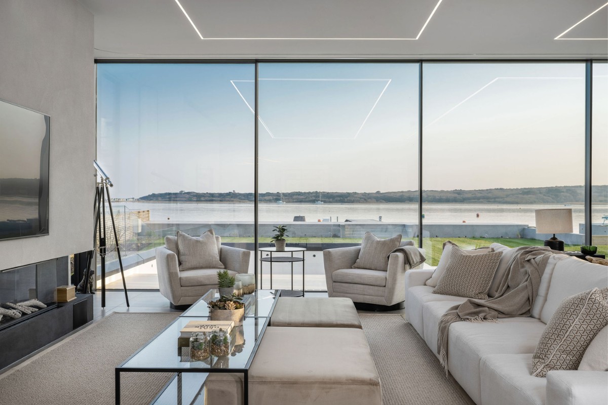
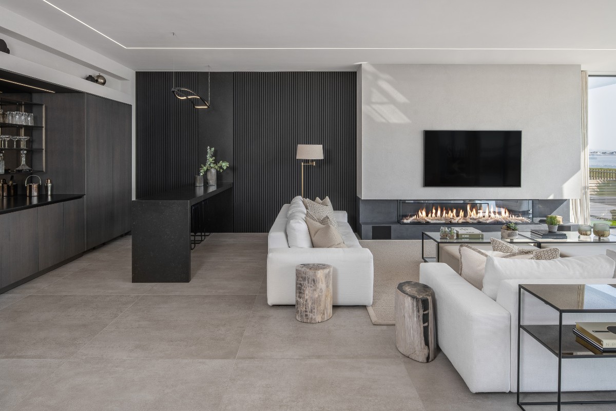
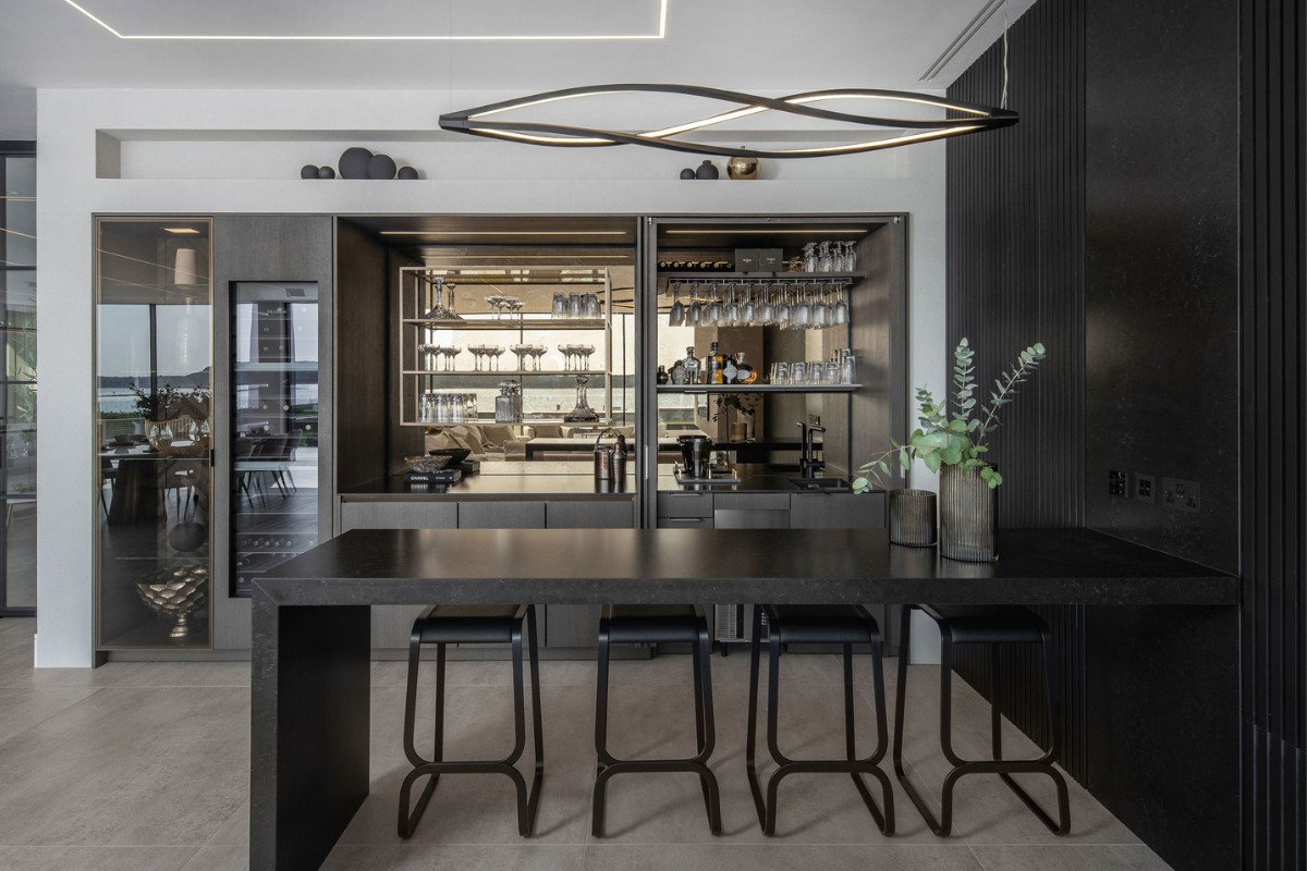
The Slipway is a modern new build home in a tranquil setting by the sea. The owners already had a very clear idea of what style they wanted their home to have, but they commissioned Bocchetta Interiors to pull a cohesive scheme together. They liked the idea of each room flowing from one room to the next with beautiful, quality materials, lighting and FF&E. The main large open plan kitchen and living space was the most important room to them and needed to have the ‘wow' factor, especially as it has the most enviable Harbourside views.
What inspired the design of the project?
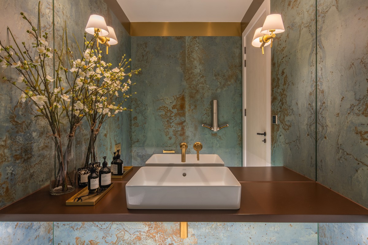
The inspiration was the amazing location. We needed to encapsulate the calmness of living by the sea and hearing the water and clinking of boats. We wanted to keep a light and airy feel with subtle hints of luxury and pops of coastal colour and artwork. The builder/developers Ash Haus and Glass Harbour Group were such a pleasure to work with. Nothing was too much trouble, even if it meant adding a last-minute steam room or intricate wall paneling with hidden door.
What was the toughest hurdle your team overcame during the project?
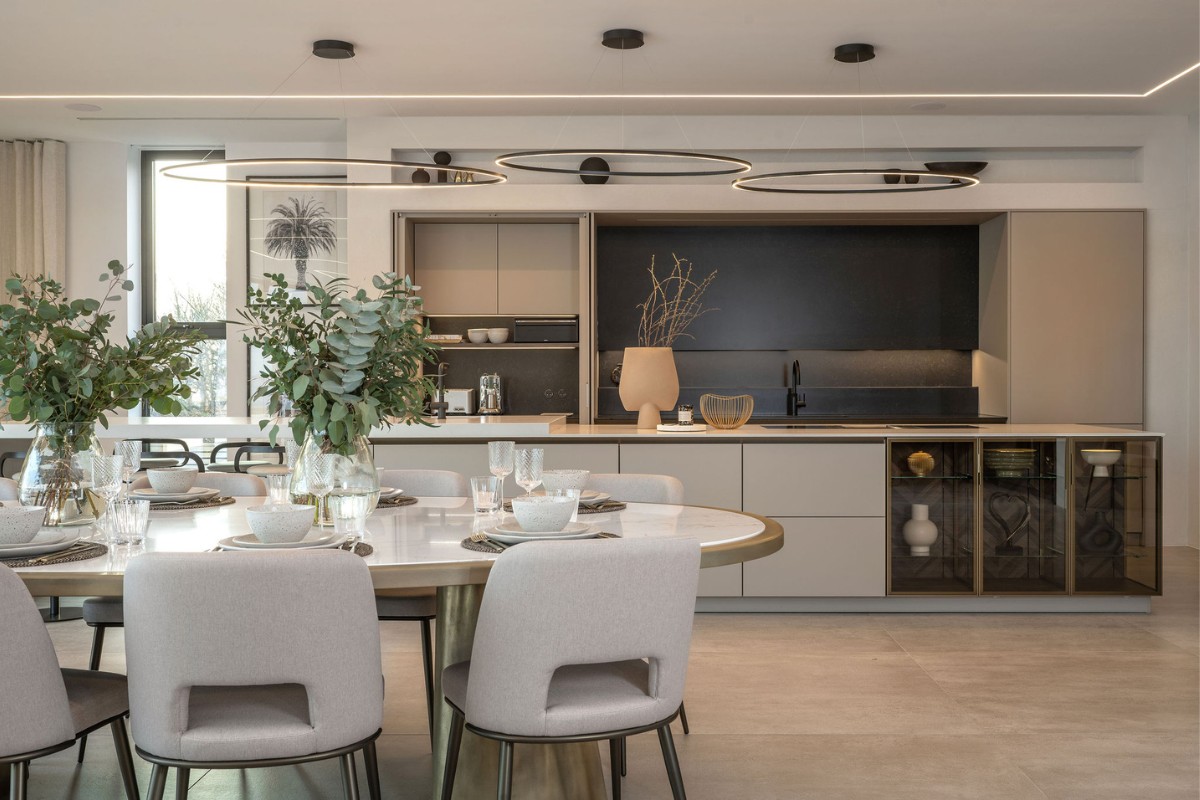
I think the trickiest part was getting a kitchen layout to work with the breadth of space. The wrong kitchen design could have easily ruined the space and been too dominant. The developers and clients were delighted when Siematic Chichester came on board and produced a truly stunning kitchen design that seriously impressed whilst still being sympathetic to the surroundings and other elements in the room.
What was your team’s highlight of the project?
One of our favourite commissions was to design a custom made 3.4-meter-long dining table with hand polished metal gold base and Silestone top. We worked with the clients to make sure the shape was just as they wanted, oval and wide in the middle to make conversations with everyone around the table easier. The gold of the table perfectly matches the gold trim in the kitchen and further gold pieces around the room.
Why did you enter this project into the SBID Awards?
We have been a member of the SBID for many years, so we know that their awards are well respected within the industry. It was also the perfect opportunity to showcase work that we are very proud of.
Questions answered by Lucinda Bocchetta, Owner and Founder, Bocchetta Interiors.
