The Vintage collection by GRAFF Designs, a unique range marrying industrial style with rich heritage. Inspired by the Chicago Fire Department’s heroic role in extinguishing the state's Big Fire of 1934, GRAFF Designs pays homage with this tactile and vintage style brassware.
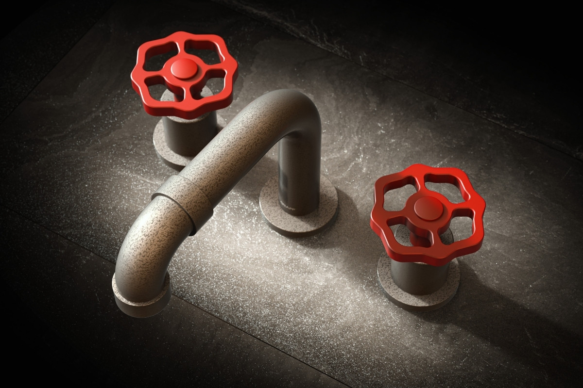
Reminiscent of the iconic fire hose valve silhouette and mirroring the red logo of the Chicago Fire Department, the collection boasts exquisite craftsmanship and detail, from its architectural elements to its modern take on traditional design. Comprising 140 stylish products including bath and basin mixers, showerheads and rails, as well as an accompanying accessories range.
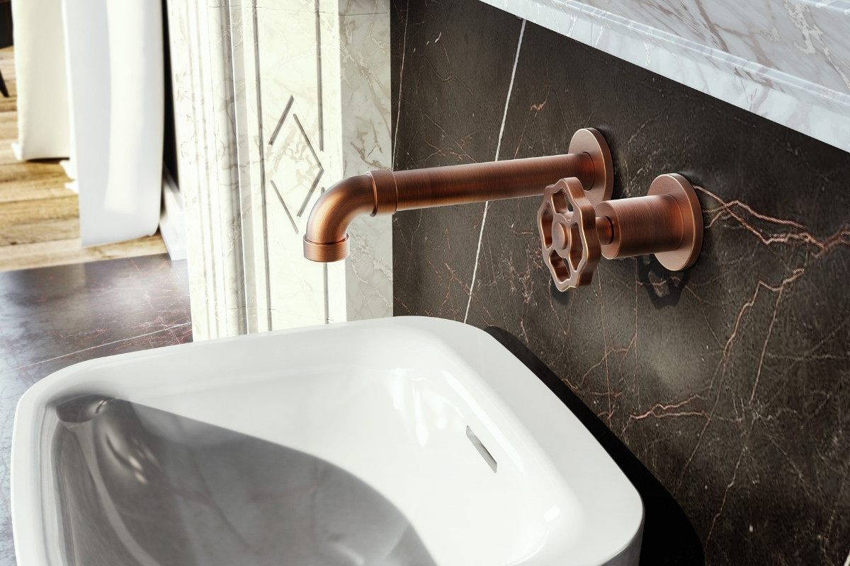
Formed with precision engineering and premium-quality materials, the Vintage Collection is available in 21 luxury finishes including 24K polished gold, vintage brushed brass and the classic limited-edition red.
Available to buy now in the UK with prices starting from £500 for a basin mixer in Chrome, up to £5,500 for a 24K Gold freestanding bath shower mixer.
For more information, expert comment or imagery, please contact the team at graff@hillgatepr.co.uk
About GRAFF
GRAFF’s luxury taps and shower collections elevate the bath space with designs that are both timeless and cutting-edge, complementing endless architectural and interior styles. Available in 21 luxury finishes such as Brushed Brass, Polished Nickel, and 24K Gold, and with a choice of three Tuscan marble inserts, GRAFF basin mixer or shower controls offer bespoke and unique customisation possibilities. Backed by a rich heritage of European artisanship, GRAFF products transform the bath space into a masterpiece of tranquillity, wellness, and spa like experience. With a focus on design, sustainability, and high technology, GRAFF caters to the senses with features such as chromotherapy, bringing bath and shower experiences to luxurious heights.
If you’d like to feature your product news here, get in touch to find out more.
If you’d like to become SBID Accredited, click here for more information.
This week’s instalment of the Project of the Week series features a modern and functional family apartment design by 2022 SBID Awards Finalist, Bajer Sokol.
SBID Awards Category: Residential Apartment Under £1M
Practice: Bajer Sokol
Project: Black in Warsaw
Location: Warsaw, Poland
What was the client's brief?
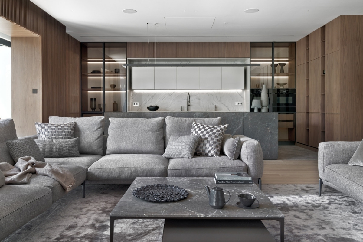
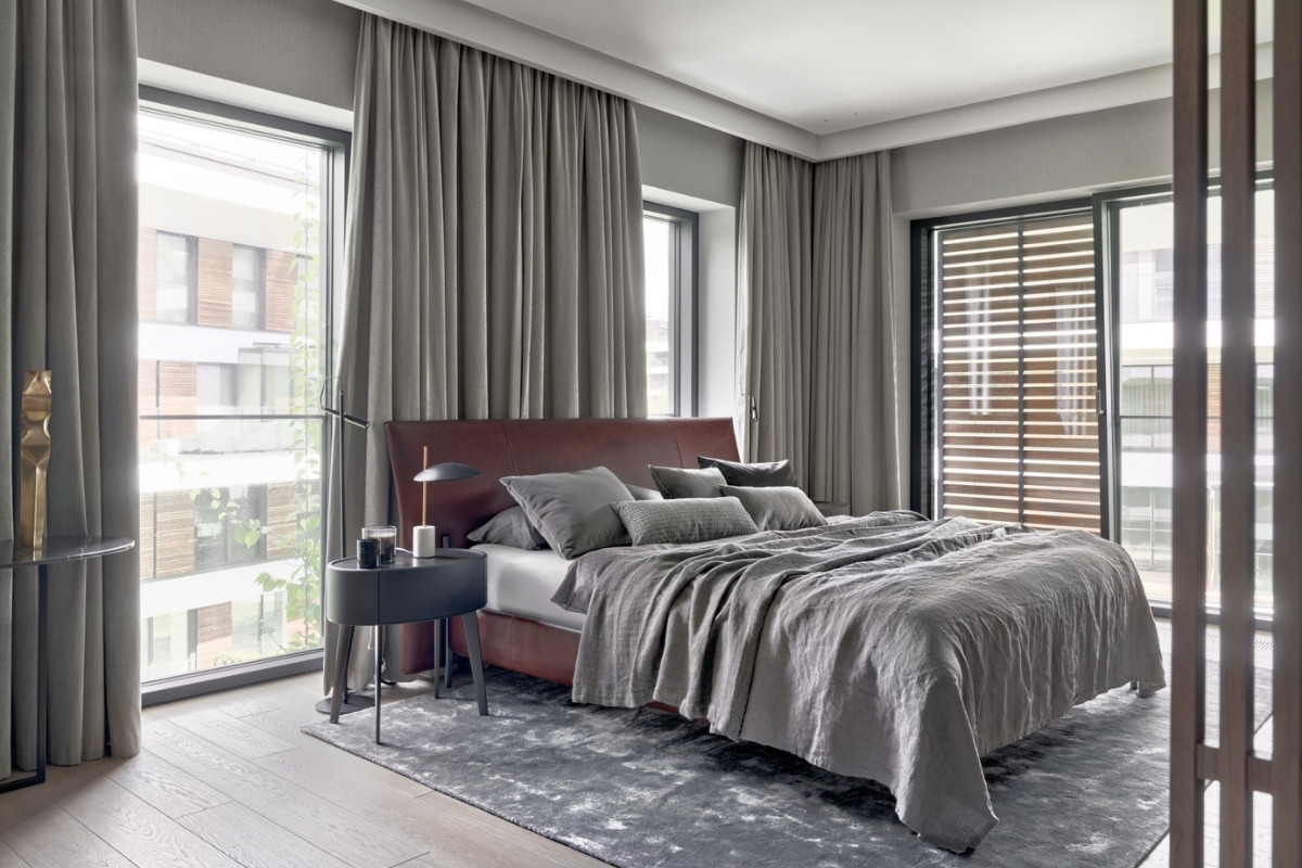
The Black Apartment is located in the center of Warsaw. It's a 220 m2 space for a married couple with an adult child and a guest room. The owners bought the apartment that at the time of purchase was an open space, without any partition walls inside. After we were provided with guidelines for the division of rooms, we created 7 versions of the functional layout. The apartment is named Black because it was supposed to be dominated by dark colors, but in the process of selecting materials, the interior has been slightly brightened and made warmer. However, dark materials still dominate inside it. The intention was to use materials of very high quality and to equip it with the best modern furniture brands. The budget closed at around £ 2,000 / m2. The project is very detailed, and its implementation shows high manufacturing quality in many details, such as handles, joining materials or stone finishes on furniture.
The implementation took 9 months and we managed to carry it out in accordance with the schedule. Customers expected a high-quality execution and us keeping to the set deadlines. They now enjoy spending time in an apartment already put into use.
What inspired the design of the project?
We had 7 versions of the functional design of the apartment. The clients really wanted to achieve the right balance between aesthetics and functionality, while also keeping huge windows and a view of the surrounding park, planning the rooms in a way that would not sacrifice the space. The final outcome was an apartment that was meticulously designed, where even the laundry room has hidden details proving a comprehensive approach to design.
What was the toughest hurdle your team overcame during the project?
The best thing about this project was the cooperation with the client! From the start they knew what they wanted to have in the apartment, and it was exactly the design we love. Therefore, we had no problems with the project and cooperation with the client.
What was your team’s highlight of the project?
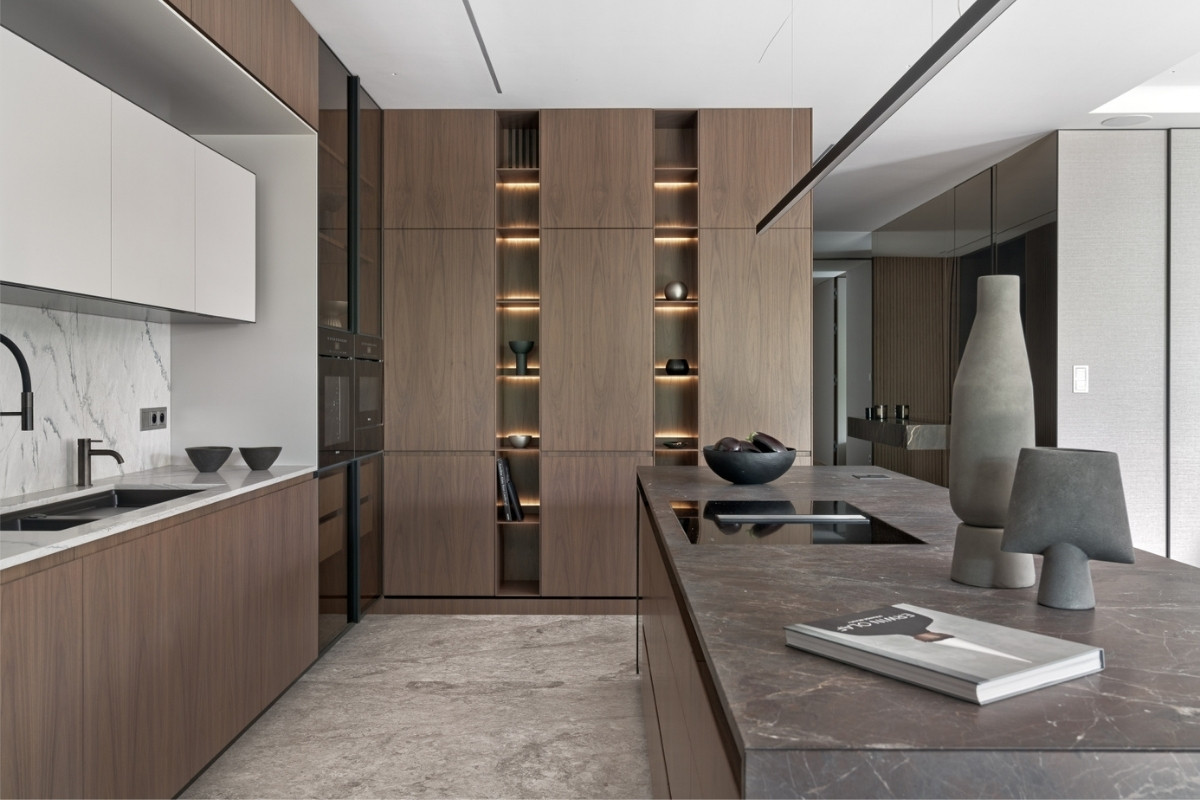
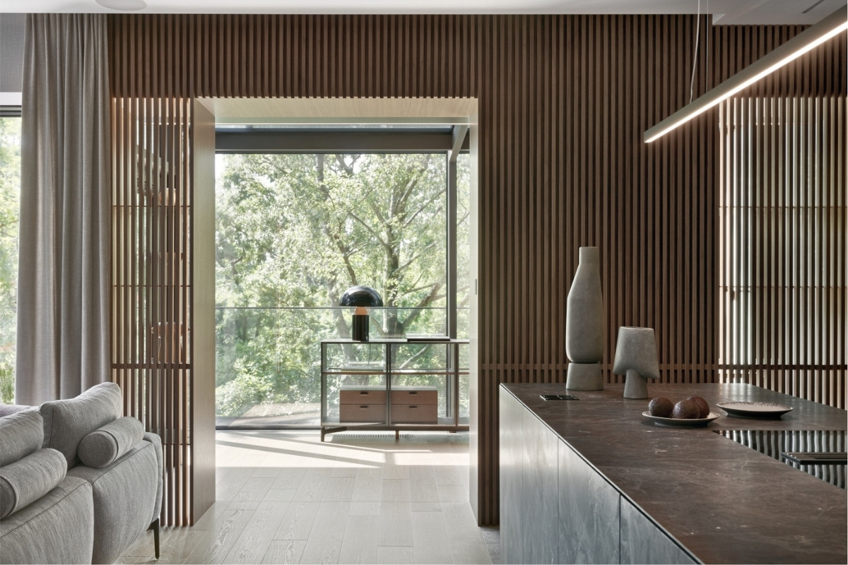
The kitchen is the essence of the details in this apartment. All pieces of furniture, handles, shelves and lighting are the result of the collaboration of many contractors and our studio. Nothing here is ready made or coming from a catalog. Shelves are of 4mm veneered aluminum and the whole island, together with the fronts is made of solid stone plates, not sinter. Each handle has been designed in such a way to fit a drawer, dishwasher, refrigerator, or an ordinary cupboard. There are no visible cables or random sockets here. Wardrobes and doors are always the elements of a bigger structure of furniture. The wardrobes are embedded within large built-in panels, doors are always hidden in walls and marked only by door handles. The only doors that have a decorative function are glass Rimadesio built-in doors leading to the night area, or master bathrooms.
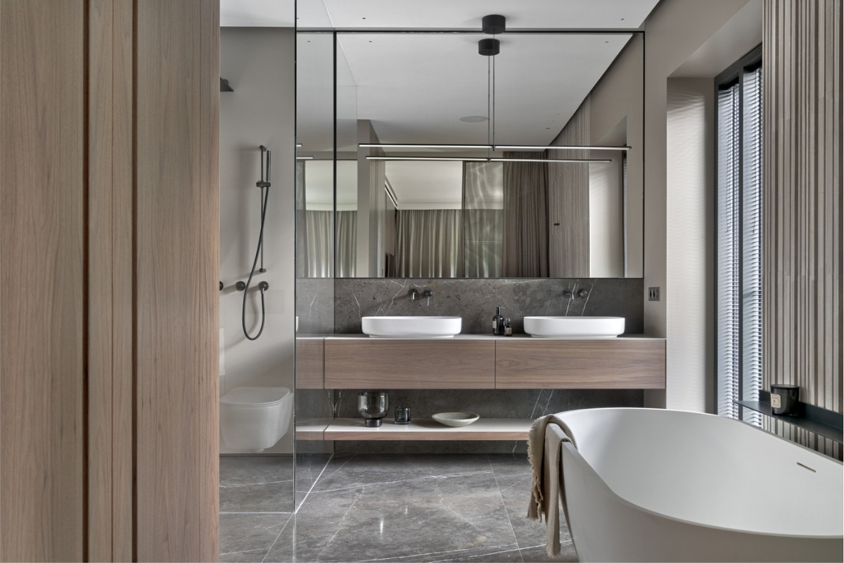
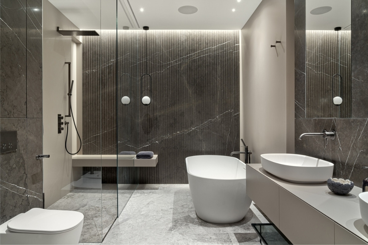
In 3 bathrooms of the apartment, you can see the same principle - nothing is accidental! The same stone was used on the floor, walls, or fronts of cabinets. Large format plates with planned divisions. Glass built-in furniture with hidden hinges or mounting profiles. Every visible element is supposed to decorate, be a part of the composition and not random. Equipment by Antonio Lupi, Gessi, Flos or Viega with the gunmetal or satin type finishes harmonize with ceramics and metal elements.
Why did you enter this project into the SBID Awards?
The SBID society is the biggest and best ID organisation in Europe, therefore, to receive an award from you is the biggest achievement for our company and a confirmation that it is of the best quality and approved by you.
Questions answered by Hanna Bajer, Main Architect, and Pawel Sokol, Architect, Bajer Sokol.
Photo credits: Tom Kurek
Cosentino Group, global leader in the production and distribution of innovative and sustainable surfaces for architecture and design, presents Dekton® Onirika, the latest collection of its leading innovative ultracompact brand surfaces. Cosentino and international interior design powerhouse, Nina Magon, have come together to create a one-of-a-kind Dekton® collection.
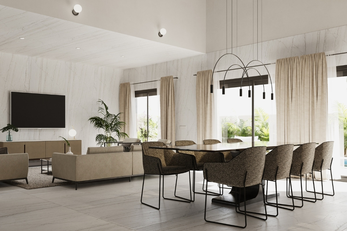
Inspired by marble patterns and immersive living, the stunning series showcases eight daring colours: Awake, Lucid, Somnia, Neural, Trance, Vigil, Daze and Morpheus, that represent the ethos of both brands: sustainability, forward-thinking innovations, and timeless elegance. Onirika represents a powerful journey of a detour in our dreams where boundaries between dreams and reality vanish.
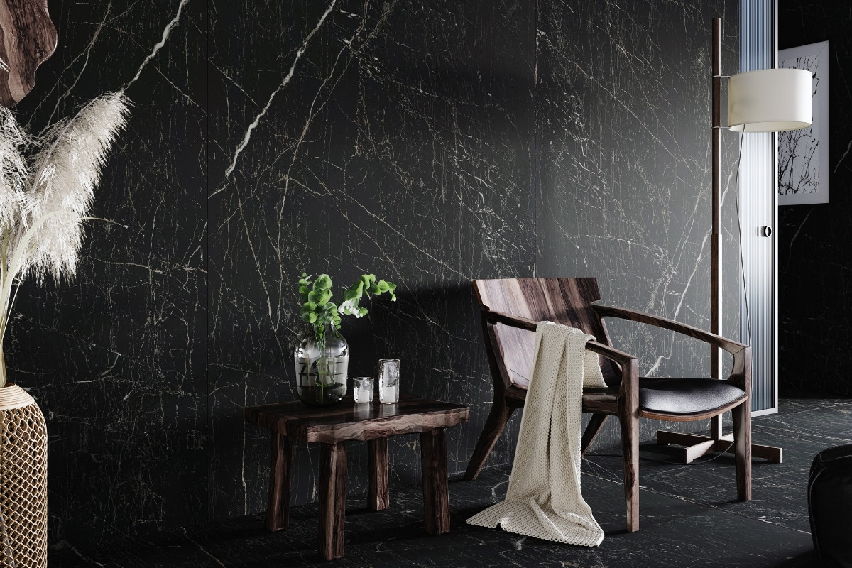
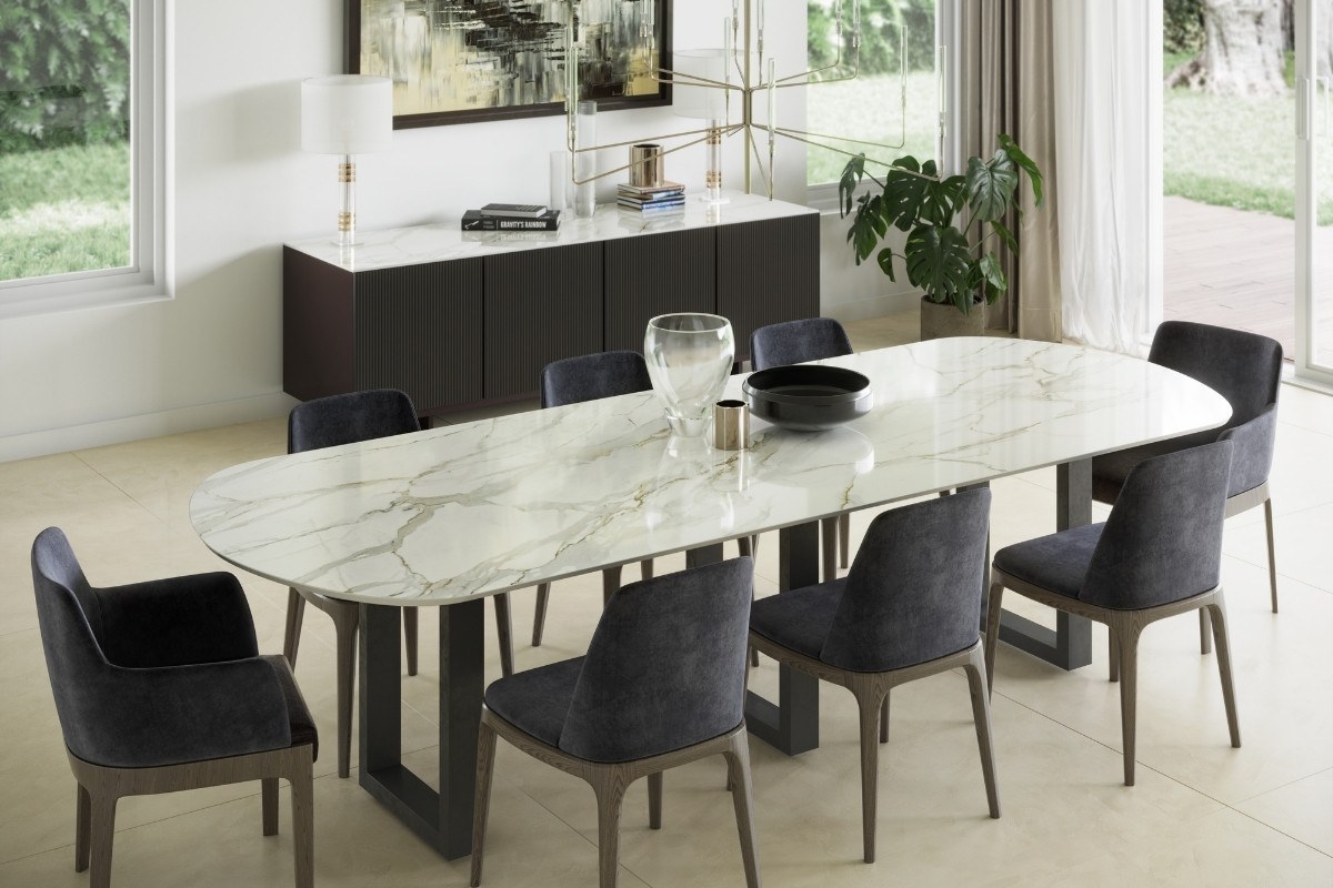
Neural combines elegance and structure to bring peace and joy, calm sensations, and an overall feeling of wellbeing into a space. With fine, pale veins’ crossing the marbled pattern - the design creates a fascinating neural network, which teleports us into a white dream. It is best suited for bright, neutral spaces with soft textures, light colours, and wooden or metallic accents.
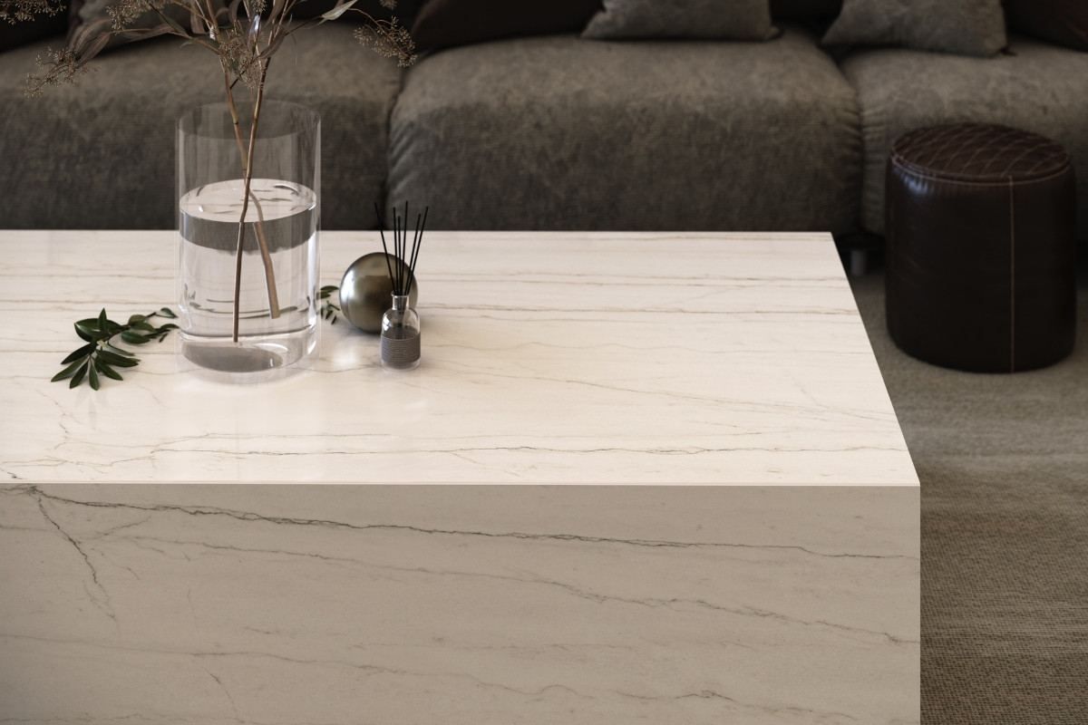
Lucid displays many shades, reflections, and glints of colour to create an illuminative perception of colours best combined with wood, grey and gold shades, and frosted glass.
Morpheus - the name of this same Lucid tonality but in Dekton® Velvet Texture finish.
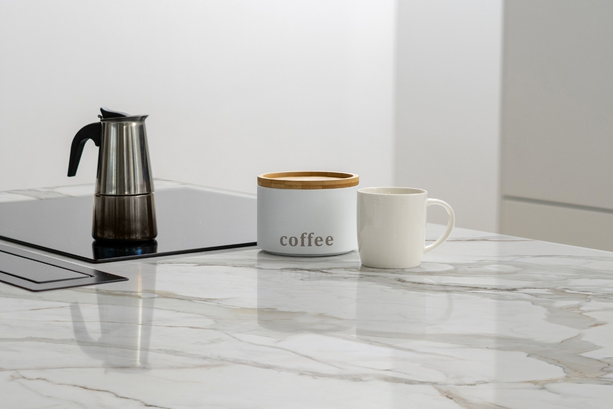
Awake is a re-interpretation of the precious Paonazzo stone. It features thick veins of light greys, exquisite oxide terracotta, and a hint of subtle, inky blues. This iteration pairs beautifully with white, neutral tones, lightwood, and golds of any shade.
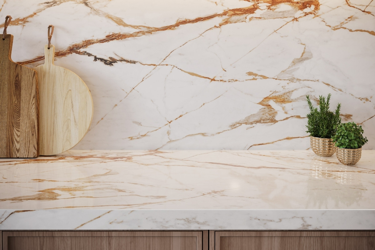
Trance features warm fine streaks that move between oxides and fade to reddish gold, combining perfectly with reddish oak wood and darker walnut tones. Blue furniture and warm golds in pale finishing bring sleekness to this vibrant colour.
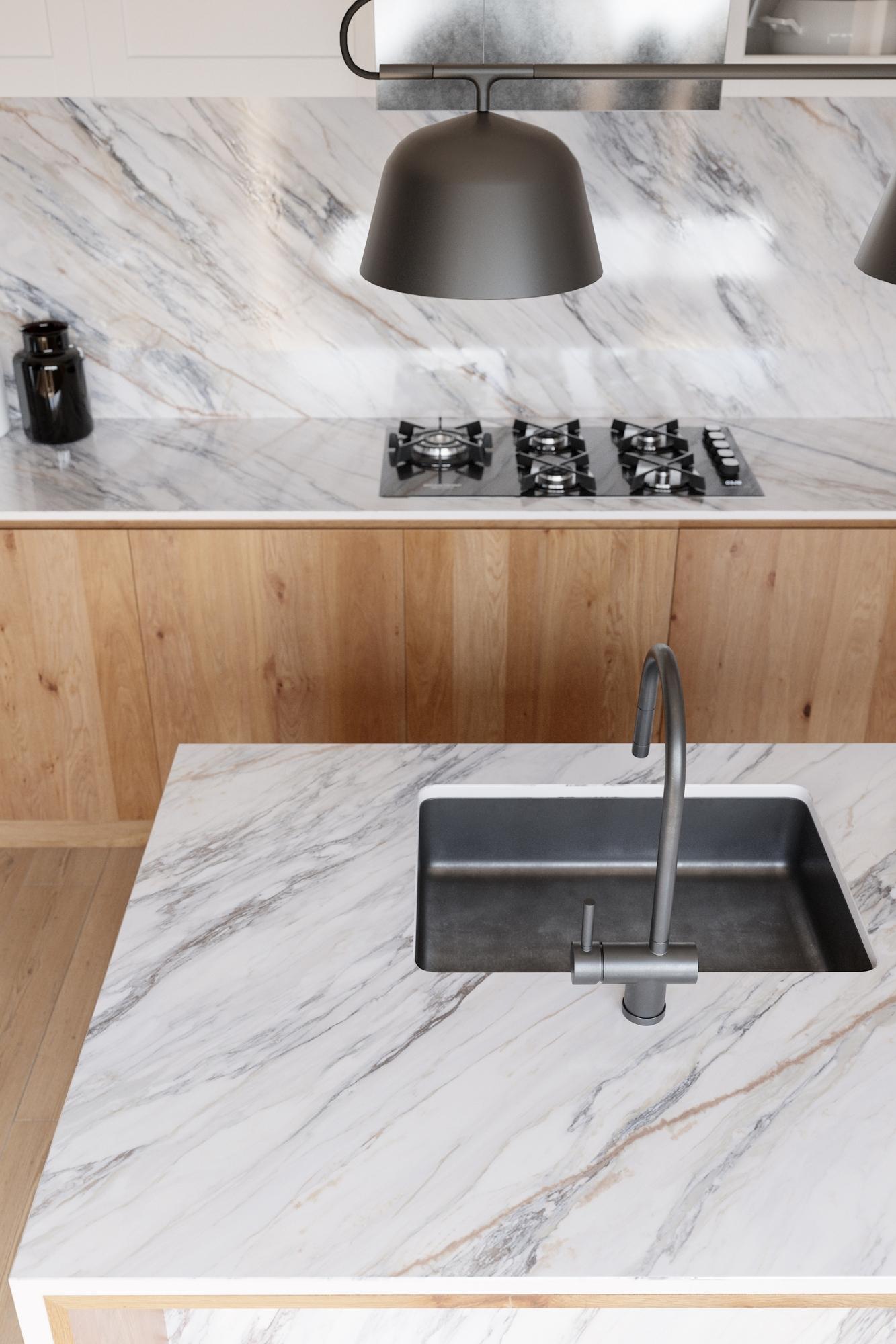
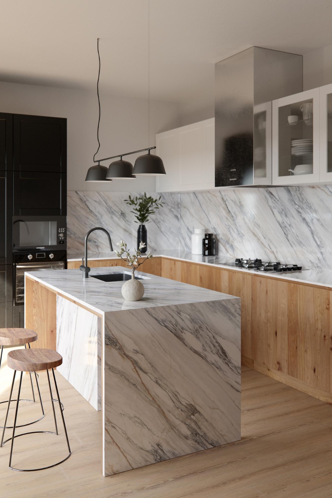
Somnia boasts captivating details of warm oxid browns and whites that merge under a grid of think lines that create a sober texture. Somnia is perfect with warm dark woods, frosted glass and textured metal surfaces such as copper.
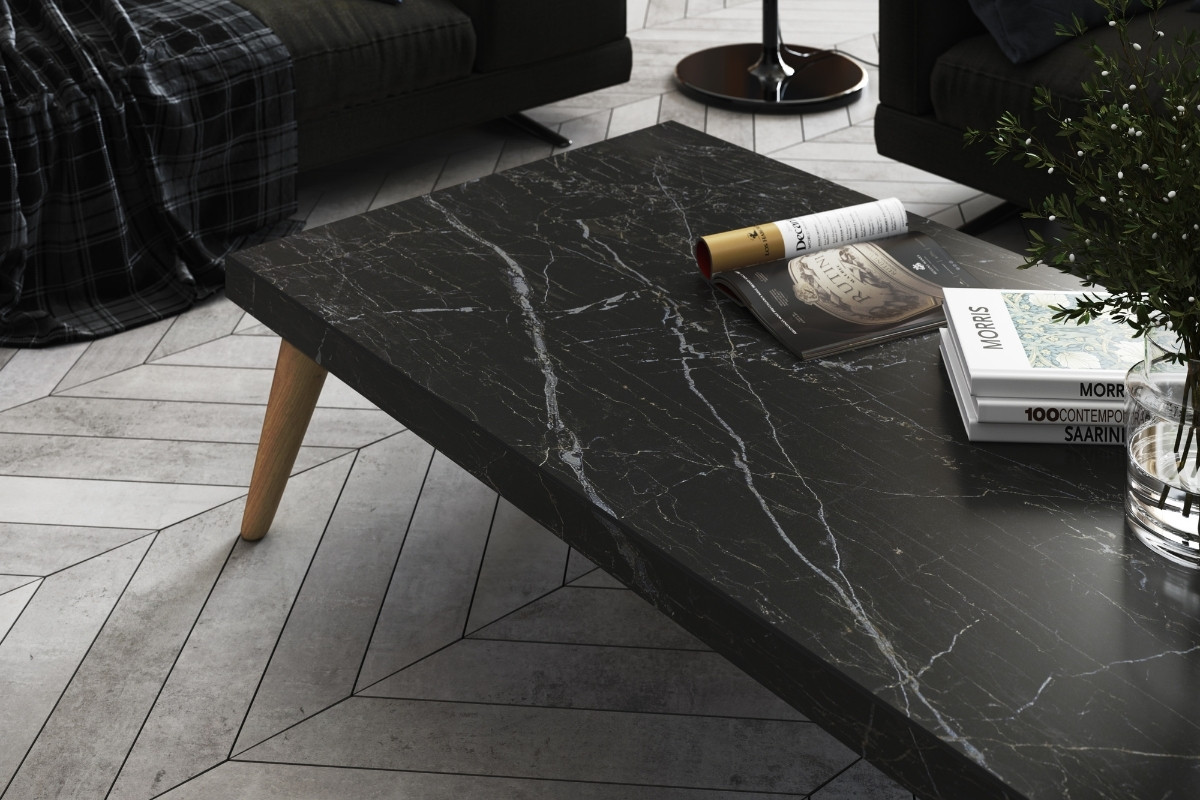
Vigil recreates a strong Calacatta structure with thick veins in gradients of light and dark greys, matched with a subtle touch of gold. This is a classic colour that is easy to combine with warm and cold hues, wood metal, and clean concrete.
Daze - the name of this same Vigil tonality but in Dekton® Velvet texture finish.
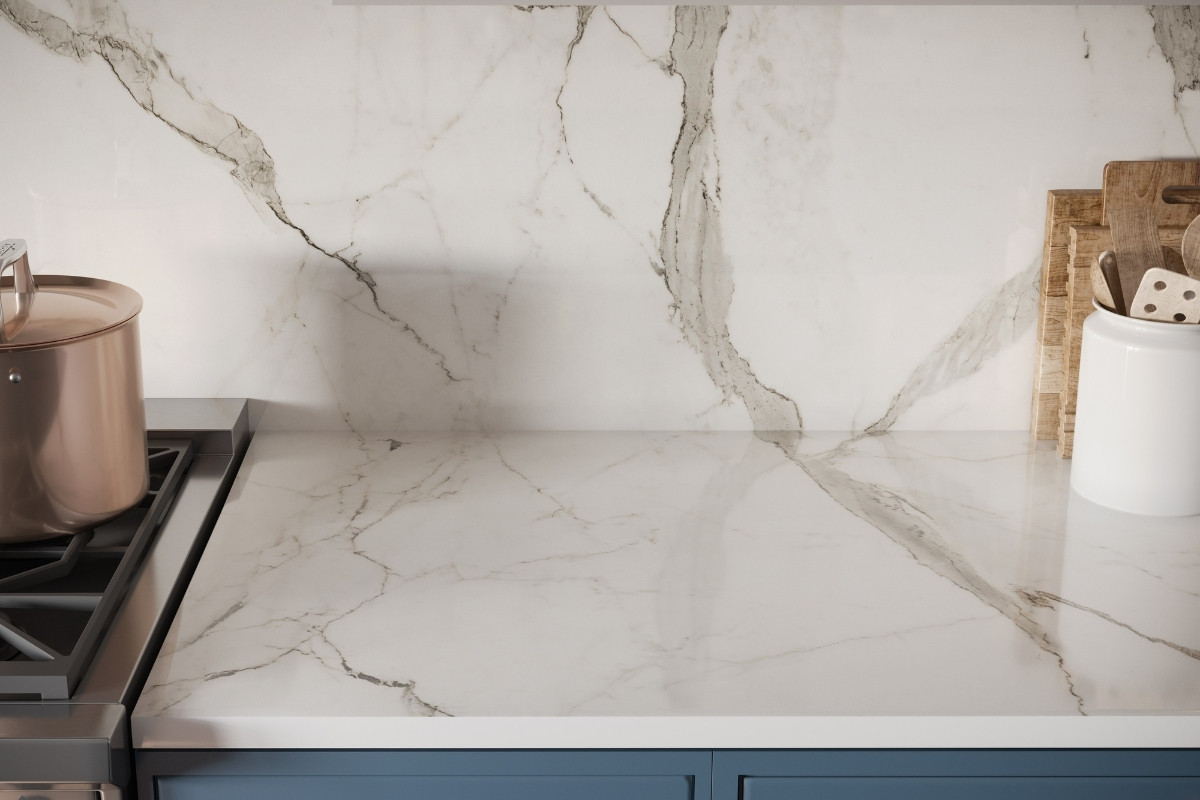
Onirika is a collection that unites the poetic and unique beauty of stones harnessed by Dekton® technology, just as those dreams where we observe and vaguely feel in control but only the deepest part of the mind truly understands. The collection is named in honour of the lavish inspiration of the two worlds conveyed in marbled colours to captivate the eyes and bring to any space a feeling that is understood but cannot explained.
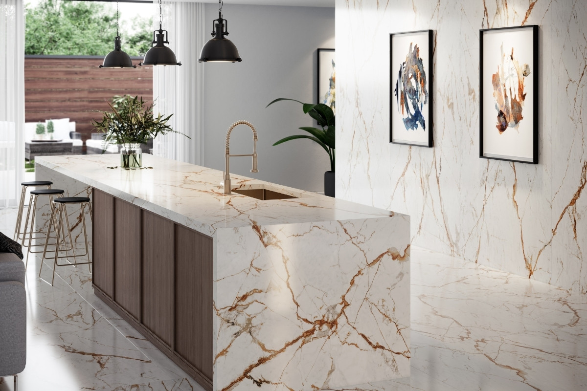
“When working with product development team, we realized we’re not attempting to mimic any existing natural stone. With Dekton technology, we can create our own colours and structures, bringing to life something that is unique, beautiful and irreplaceable. The purpose of Onirika is to showcase the versatility of Dekton. We want all designers, architects, and people around the world to see that the product is not only a book matched worktop with a waterfall, but can also be used on walls, ceilings, facades, outdoor spaces, and more”, says Nina Magon.
About Cosentino
Cosentino Group is a global, Spanish, family-owned company that produces and distributes high value innovative surfaces for the world of design and architecture. It works together with its clients and partners to provide with solutions that offer design and value, and inspire the life of many people.
Dekton is Cosentino's innovative, ultra-compact and high-performance surface that offers endless design possibilities for outdoor and indoor spaces.
If you’d like to feature your product news here, get in touch to find out more.
If you’d like to become SBID Accredited, click here for more information.
Arteriors’ F22 collection offers interior designers an array of location-inspired design aesthetics, with influences from Monaco and Berlin, previewed as part of the showroom reset ahead of Focus/22. Informed by traditional techniques and use of materials from across the globe, intertwined with Arteriors’ statement flair, these collections are designed to create a timeless, contemporary scheme with accents that add visual interest and inspire awe.
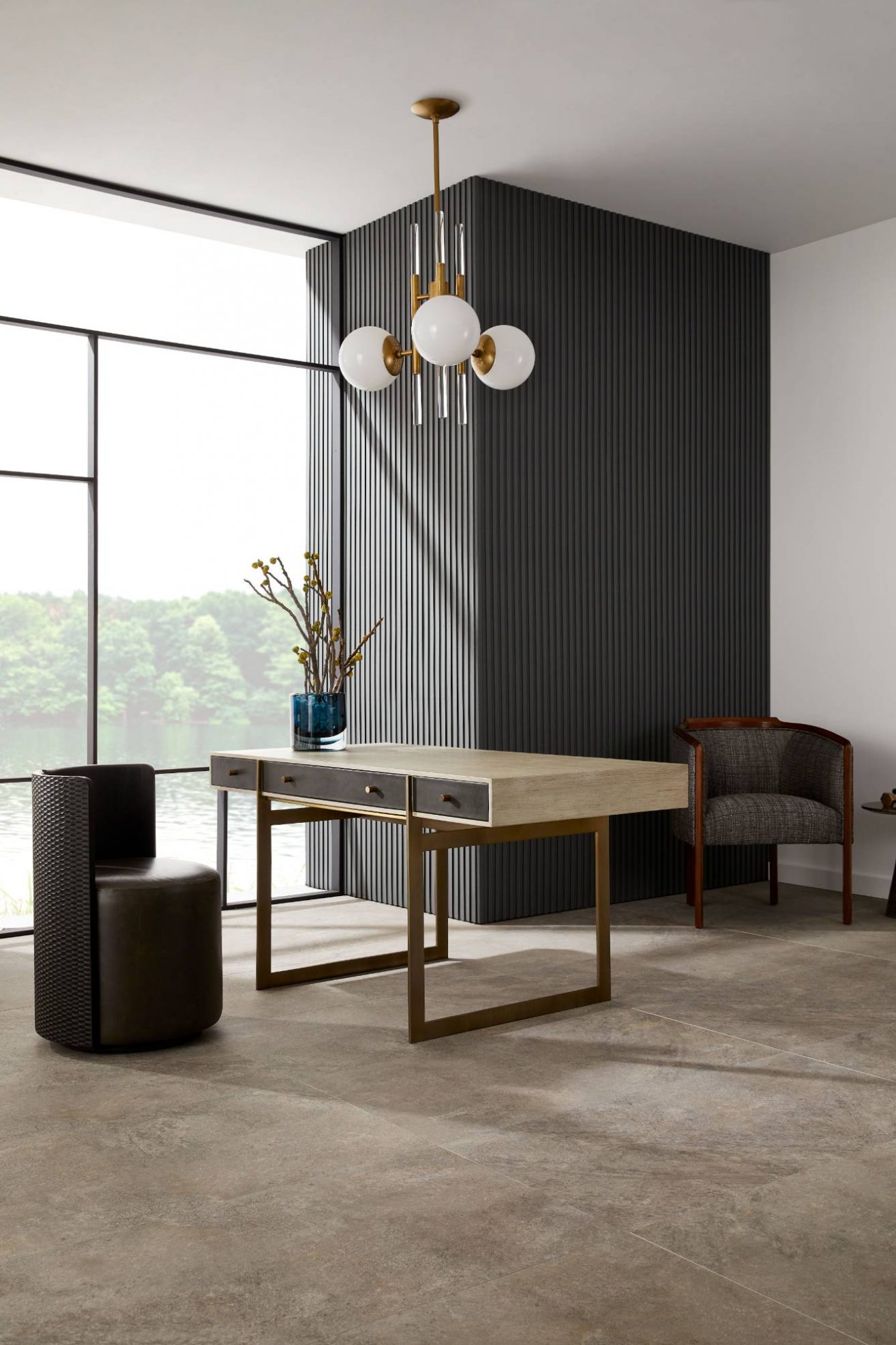
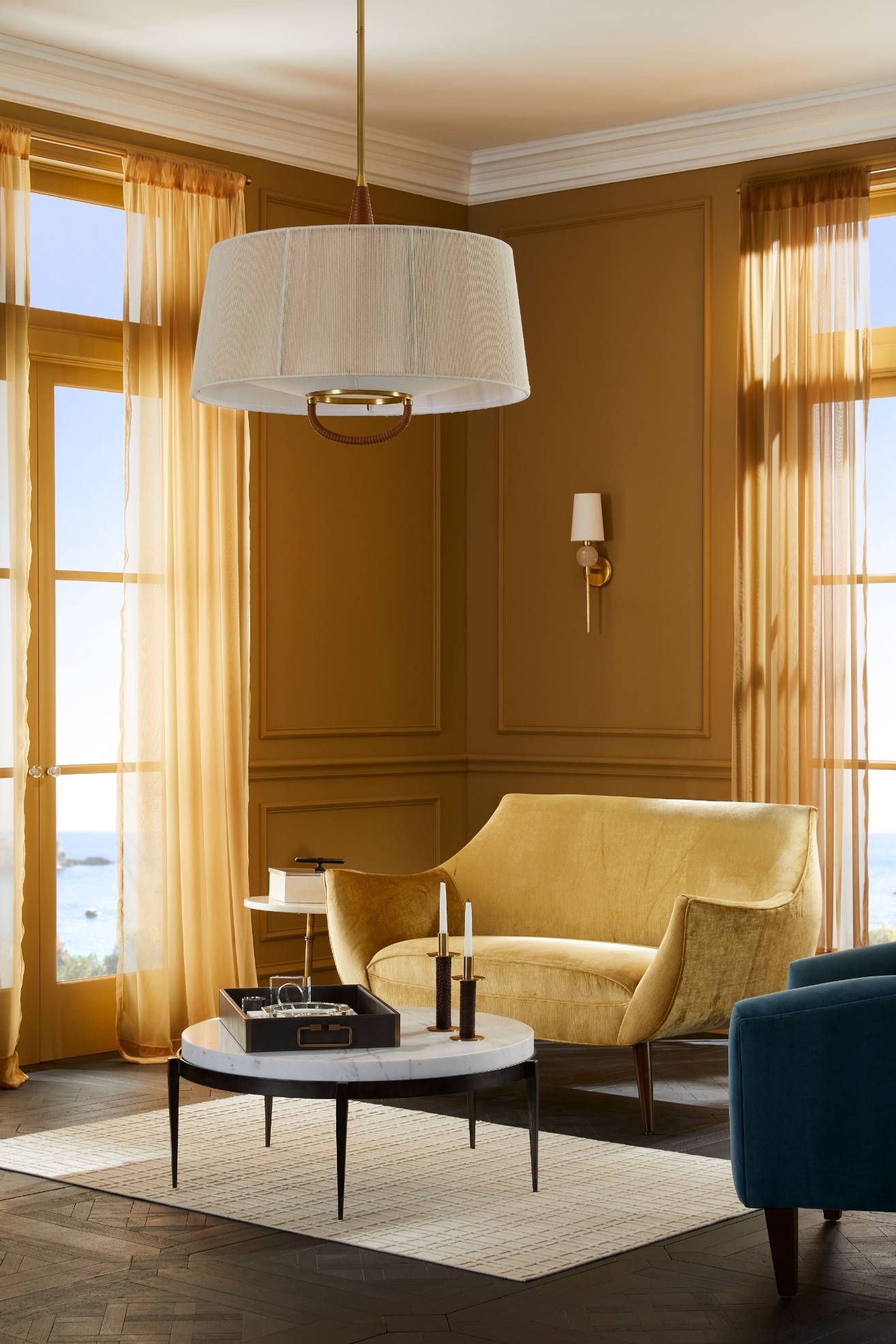
Monaco Glamour
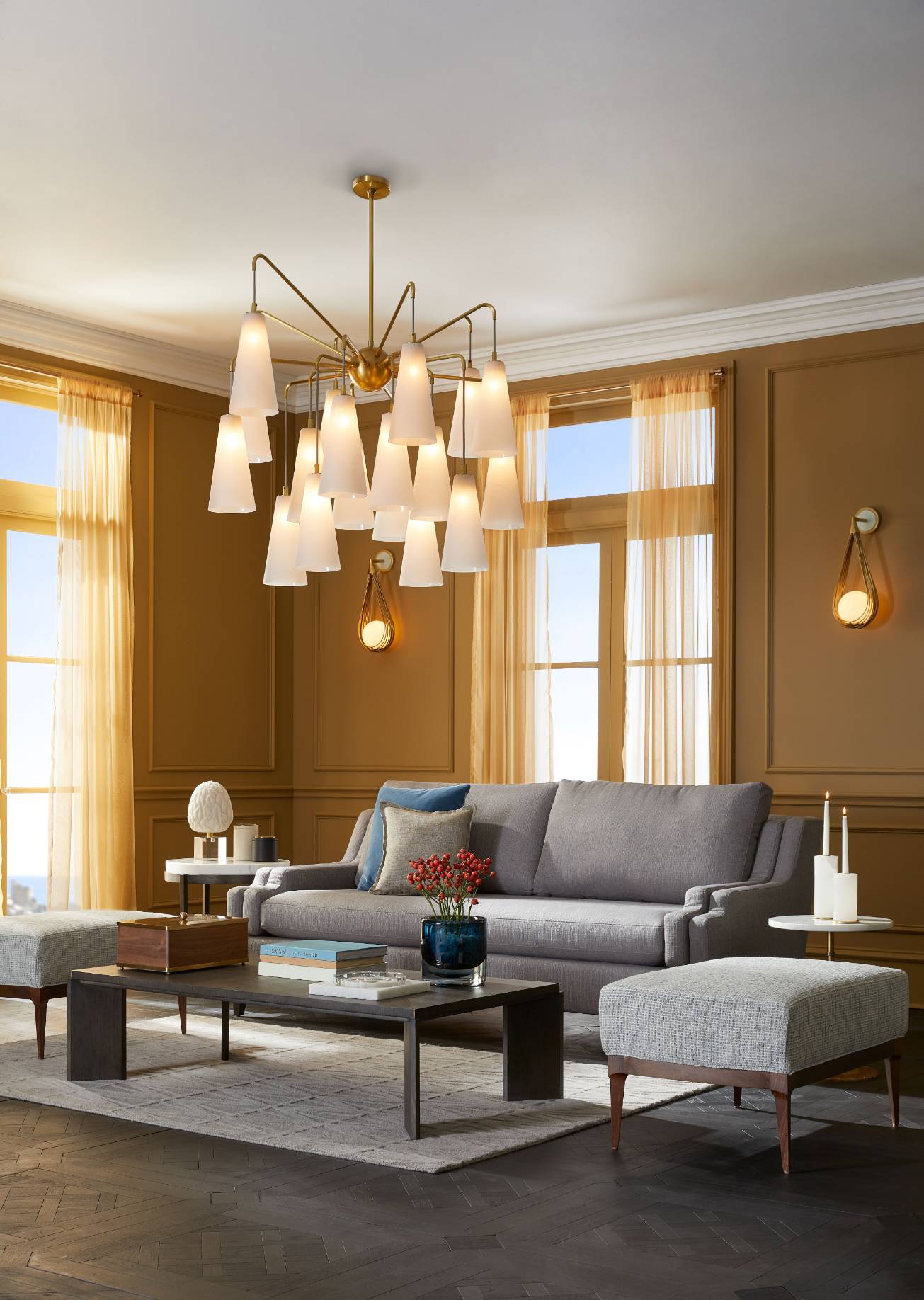
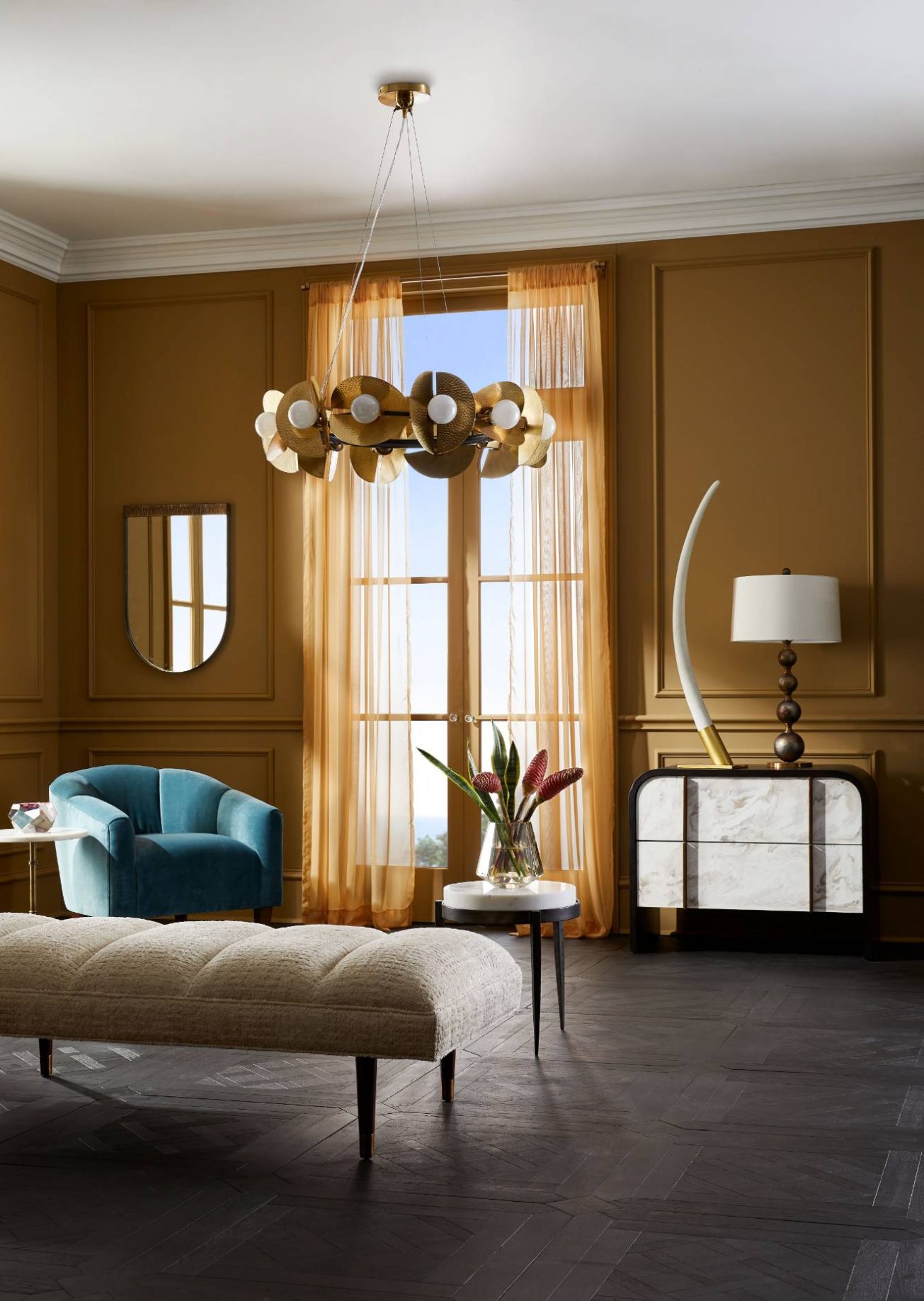
The most traditionally luxurious of the two aesthetics brings the warmth and richness of colour of Monaco to life. Opulent and extravagant, this is a dream scheme that combines the crystal hues of the ever-blue sky and sea, with shades of golden yellows. The selection of furniture, lighting, accessories, and wall décor that make up the collection feature plenty of jewel tones, decadent marble detailing, and glamorous gilded-gold designs, with each piece epitomising grandeur. Indulge in sumptuous velvet seating, incorporate lavish lighting, and finish with accessories that complement the myriad of colour-rich tones.
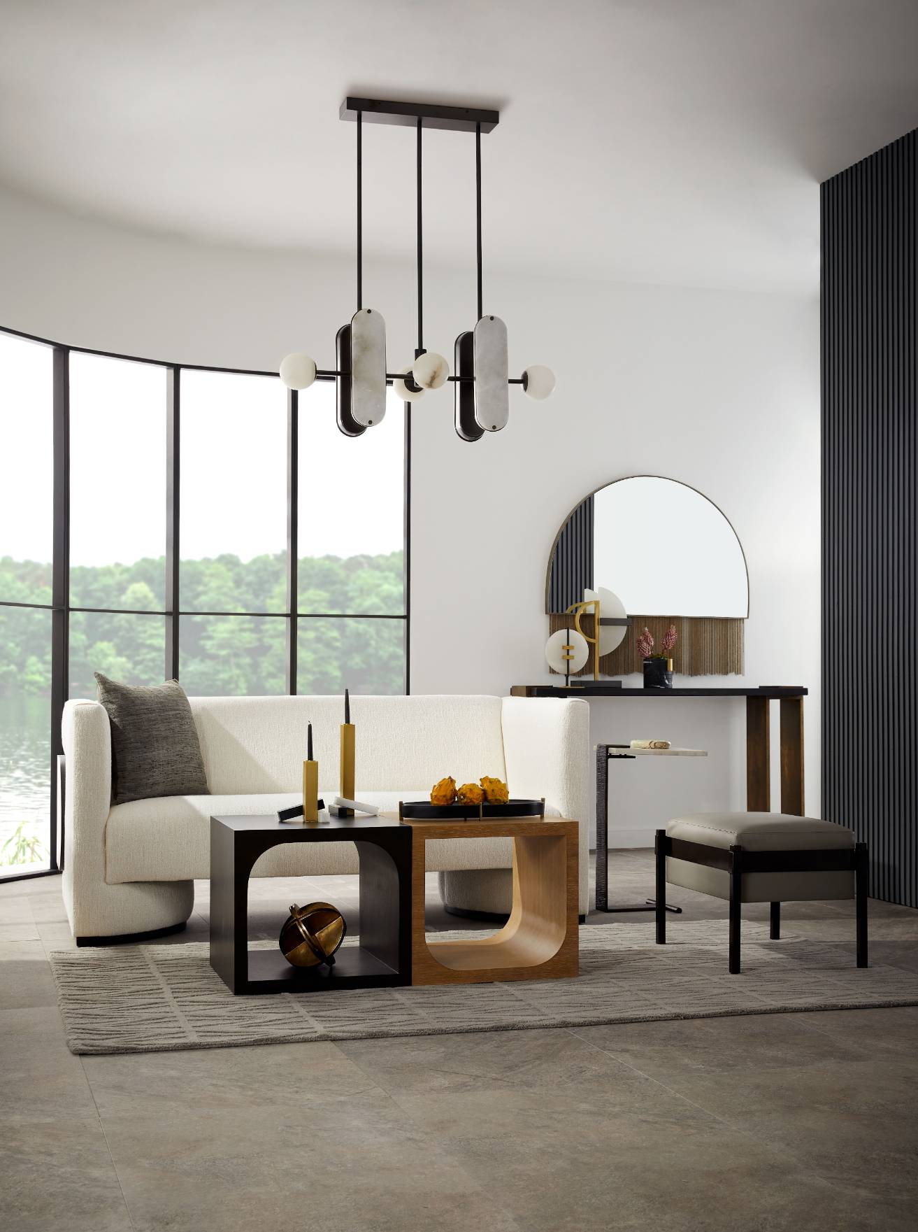
Berlin Bauhaus
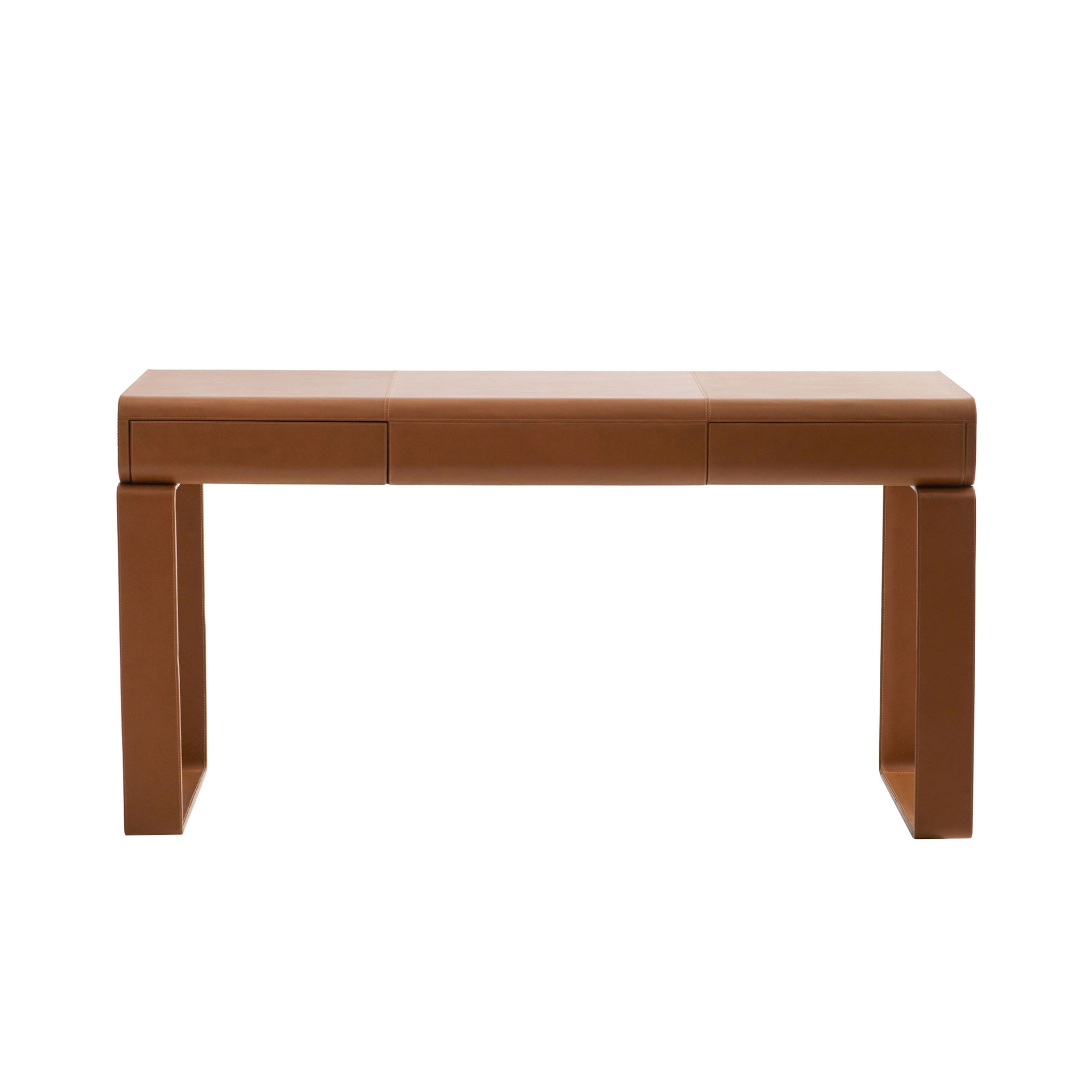
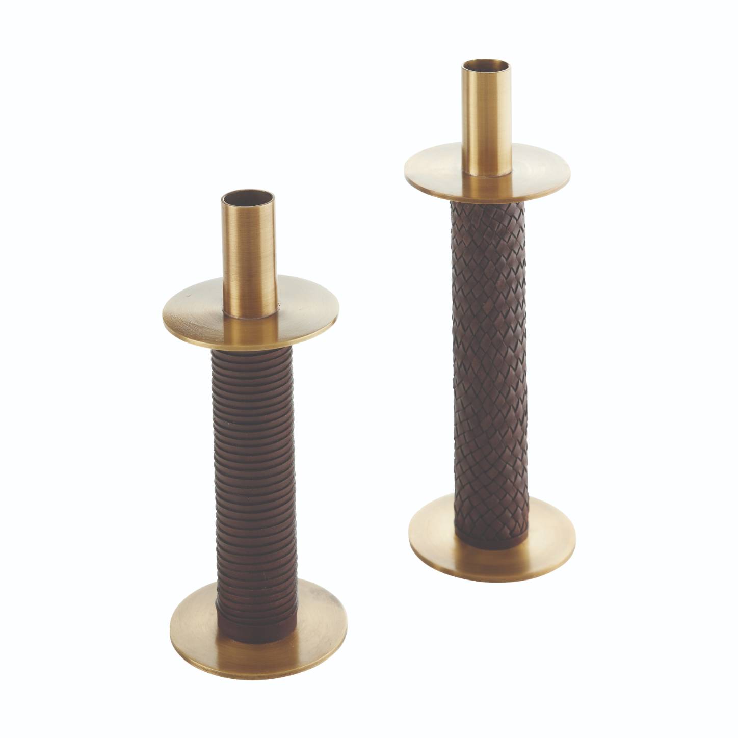
A nod to mid-century design, the selection of products featured within the Berlin Bauhaus collection utilise strong lines and geometric accents to create a more contemporary look. Unique material choices run through the range of home furnishings with a particular focus on leather detailing on upholstered items, accessories and as part of lighting designs. The juxtaposition created by featuring a material ordinarily used to create a more traditional aesthetic but incorporated into furnishings with sculpted and soft design fashions a more contemporary look. An unexpected and distinctive material choice complementary to woods, metals and marbles, Arteriors designers predict leather pieces to be the next ‘it’ material t inspired modern interior schemes for seasons to come.
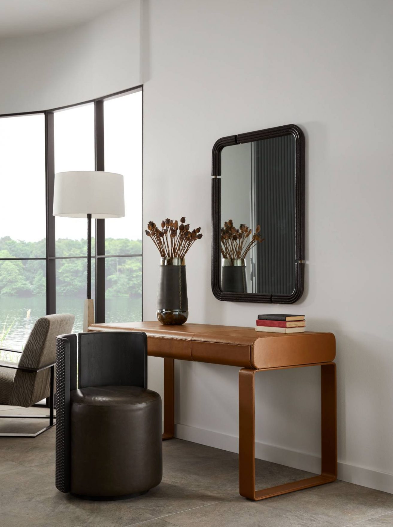
Pop into the showroom in Chelsea Harbour’s Design Centre to view the complete showroom transformation with new product across all categories, featuring items inspired by Monaco, Berlin and beyond.
About Arteriors
For over 30 years, Arteriors delivers impeccable style and artisanal quality craftsmanship within the lighting, furniture, wall décor and home accessory categories to discerning customers worldwide. This three-decade journey in pursuit of extraordinary product – from the understated to the unexpected – had been and remain at the core of what Arteriors do each day. Arteriors’ business has matured and expanded into a timeless lifestyle brand that has become premier resource for interior designers and retailers worldwide.
Today, Arteriors continues to reinterpret materials, forming objects of perfect proportions and scale, resulting in bold interiors that bring ease to everyday luxury.
If you’d like to feature your product news here, get in touch to find out more.
If you’d like to become SBID Accredited, click here for more information.
What was the client's brief?
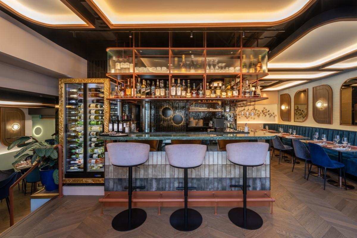
Our client and their executive chef had already established a successful restaurant group in India, and now they want to break into the lucrative British hospitality industry.
When the COVID pandemic hit the United Kingdom, it impacted negatively on the restaurant industry, but our patrons were fortunate enough to stumble onto this beautiful St. Johns Wood venue. To showcase the seasonal food of the Indian subcontinent, the brief read, "build a destination Mayfair restaurant in St. Johns Wood."
What inspired the design of the project?
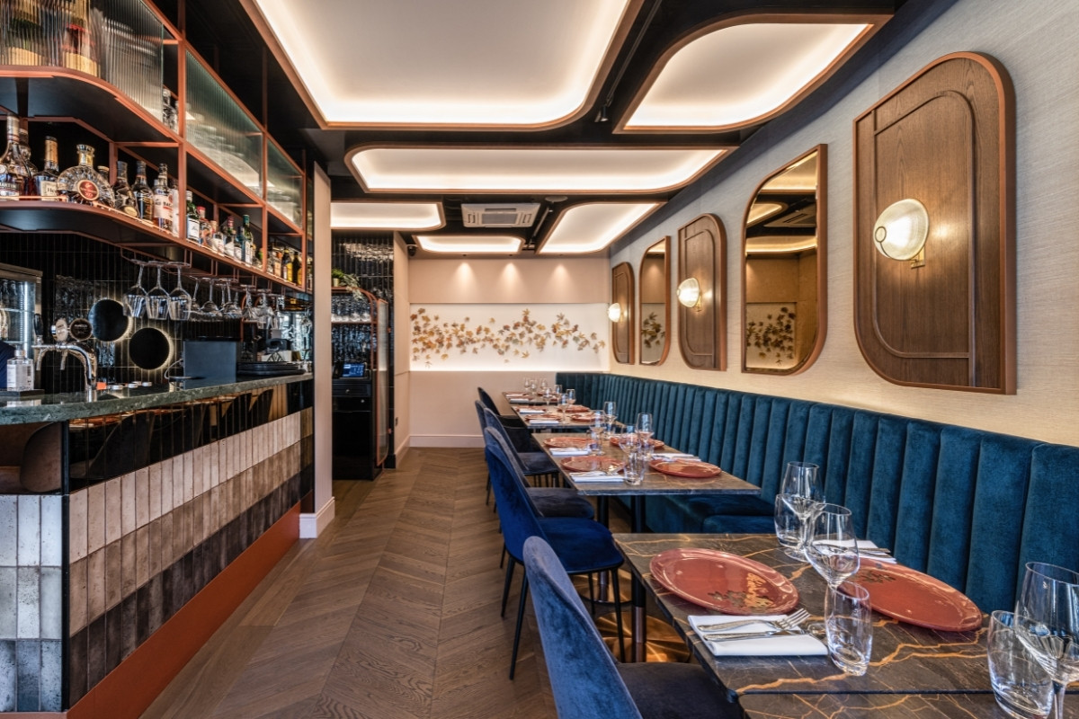
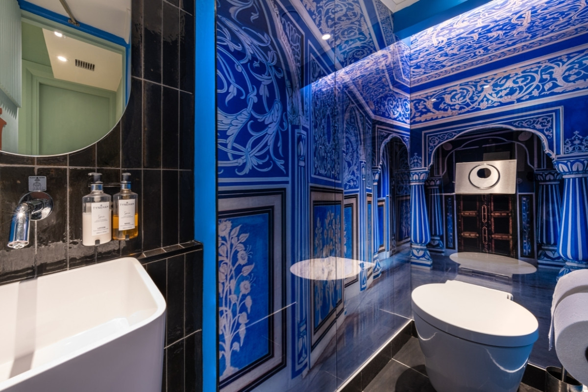
As designers, we take pleasure in hearing the stories our clients have to tell via the environments we create for them. Our client desired to highlight contemporary Indian cuisines that reflected the diversity of India's seasonal produce. We used this concept as a foundation for the restaurant's branding and ambiance, which we then reflected through the use of a variety of features, including but not limited to lighting, installations, art, the ceiling, etc.
We found a lot of inspiration in the notion of "Ritu" (means seasons). Whether it's the colour distinction between the areas of seating, an attempt to re-create the verdant scenery of southern India, the setting sun over a wheat field in the north, or the winding dunes of the Rajasthani desert, every detail has been carefully considered. The logo's six-sided motif was inspired by India's diverse seasonal patterns and reinterpreted to fit the western four-season format.
What was the toughest hurdle your team overcame during the project?
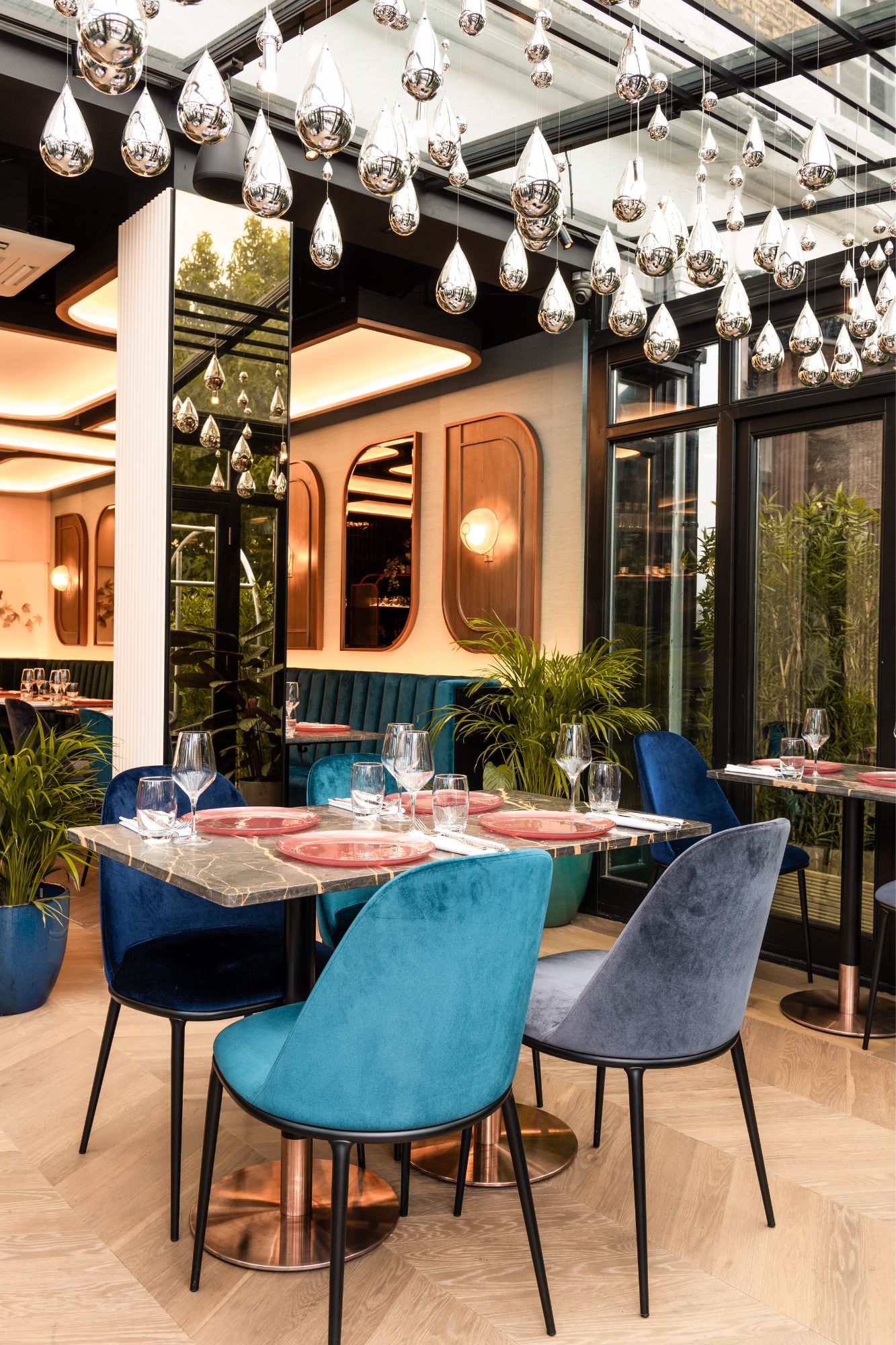
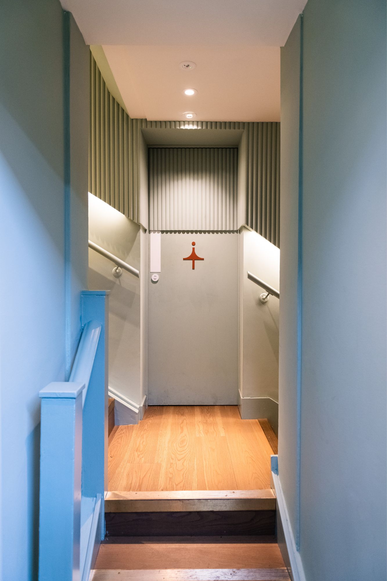
We believe the difficulty is in developing a coherent plan for the restaurant's future given its history of shifting uses. The isolated location of the bar on a lower level, the low ceiling in the lobby, and the prevalence of transitional spaces all led to a feeling of disconnection.
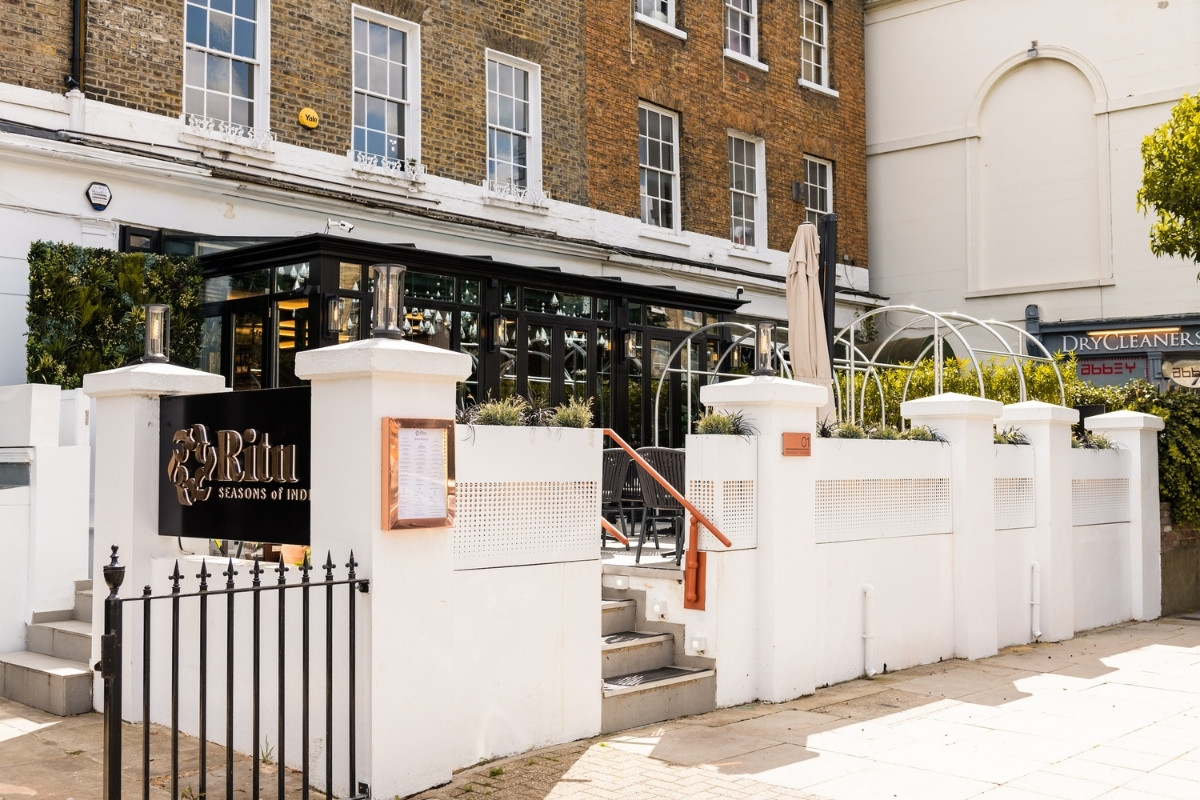
We moved the entrance to the front of the building and installed a raindrop chandelier to make the space more inviting. It's highly unlikely that regulars will recognise the eatery from its former incarnation. A primary focus of our interior design firm is the development of fully immersive environments. Mr. Srivastava, the owner, has shown tremendous confidence and support in us during this process.
What was your team’s highlight of the project?
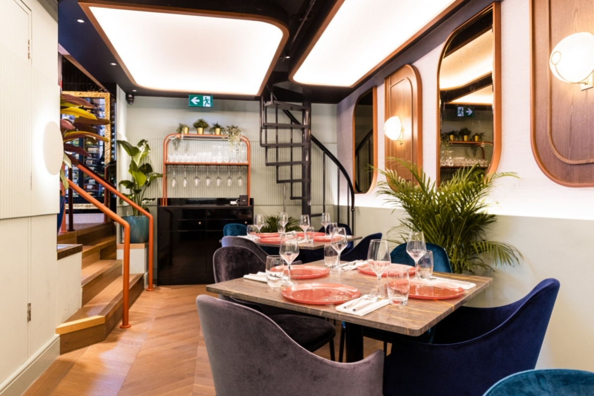
The foundation of our interior design studio is the creation of interactive and narrative environments. To be able to do so in a small space while also creating a visual connection that celebrates the hospitality culture.
We'd like to highlight and offer our special thanks to Jaysam contractors for their lovely feature ceilings, Luum for the gorgeous Indian monsoon chandelier in the conservatory, Michele McKinney for her meticulous leaf installation, and Phillip Jeffries, Ted Todd, and Domus for the impeccable final touches (and not restricted to).
Why did you enter this project into the SBID Awards?
An entry into awards is to recognise everyone who contributed to the successful completion of the project. To be recognised as an SBID finalist is a testament to the faith that the client placed in us to carry out their vision.
Questions answered by Ravi Kotak, Founder & Design Director, Kotak Design.
The annual unveiling of the Dulux Colour of the Year is a culmination of months of trend analysis from visiting exhibitions and design fairs, as well as keeping an eye on the social, cultural and economic trends to decipher the tones that capture the moment. We caught up with Heleen Van Gent, Creative Director Global of AkzoNobel’s Aesthetic Centre that is responsible for coming up with the Colour of the Year, to find out more about her role and the process behind choosing the famous Dulux Colour of the Year.
What is The AkzoNobel Global Aesthetic Centre?
Based in the Netherlands, the AkzoNobel Global Aesthetic Centre is our hub for colour trend analysis, colour research and design and art direction. For the past 30 years, the team has worked year-round, translating social trends into colour trends for the 150 countries where AkzoNobel operates.
How long have you worked at AkzoNobel and what was your path to your current role?
I have worked at AkzoNobel for just over 13 years and I am the Creative Director of the Global Aesthetic Centre.
My journey started in the magazine industry in the Netherlands. I had worked in partnership with AkzoNobel on a project and this gave me my first glimpse of the Global Aesthetic Centre. From then on, I knew that this was the job for me.
I have always had an interest in making the everyday beautiful and helping people introduce wonderful things into their living environment. I think the effect colour can have on your mood and emotions is often underestimated. A lick of paint is an excellent and relatively inexpensive way to make a tremendous impact on our lives.
Who was involved in choosing this year’s colour?
Aside from our team at the Global Aesthetic Centre, we bring together a panel of design experts from across the globe. Each member brings with them insights from their culture, way of living and how they see the year ahead.
To ensure objectivity, we look to design experts who are connected to AkzoNobel in some way but are not key customers. This is important as we need to obtain their honest professional opinions and insights to ensure that the colour chosen works in all the countries we operate in.
Why is ColourFutures such an important part of the AkzoNobel calendar?
When designing the Colour of the Year we try to capture the moment in just one colour, which, as you can imagine, isn’t a simple task. It takes almost a whole year to design the final colour, with input from all global outposts of AkzoNobel before a final decision is made. While the process is largely confined to the Global Aesthetic Centre, we do see it as a team effort for the whole company and professional panel.
What is the process for choosing the Dulux Colour of the Year?
The process of choosing the Colour of the Year is constant. Our in-house team and the design experts we work with are out visiting exhibitions and design fairs, as well as keeping an eye on the social, cultural, and economic trends. We then come together for a three-day session where we discuss what we’ve seen and share what we believe will be influential over the coming year.
We start the three-day process by asking the team questions like what keeps them awake at night or what makes them happy (since they are just as much consumers as anyone else).
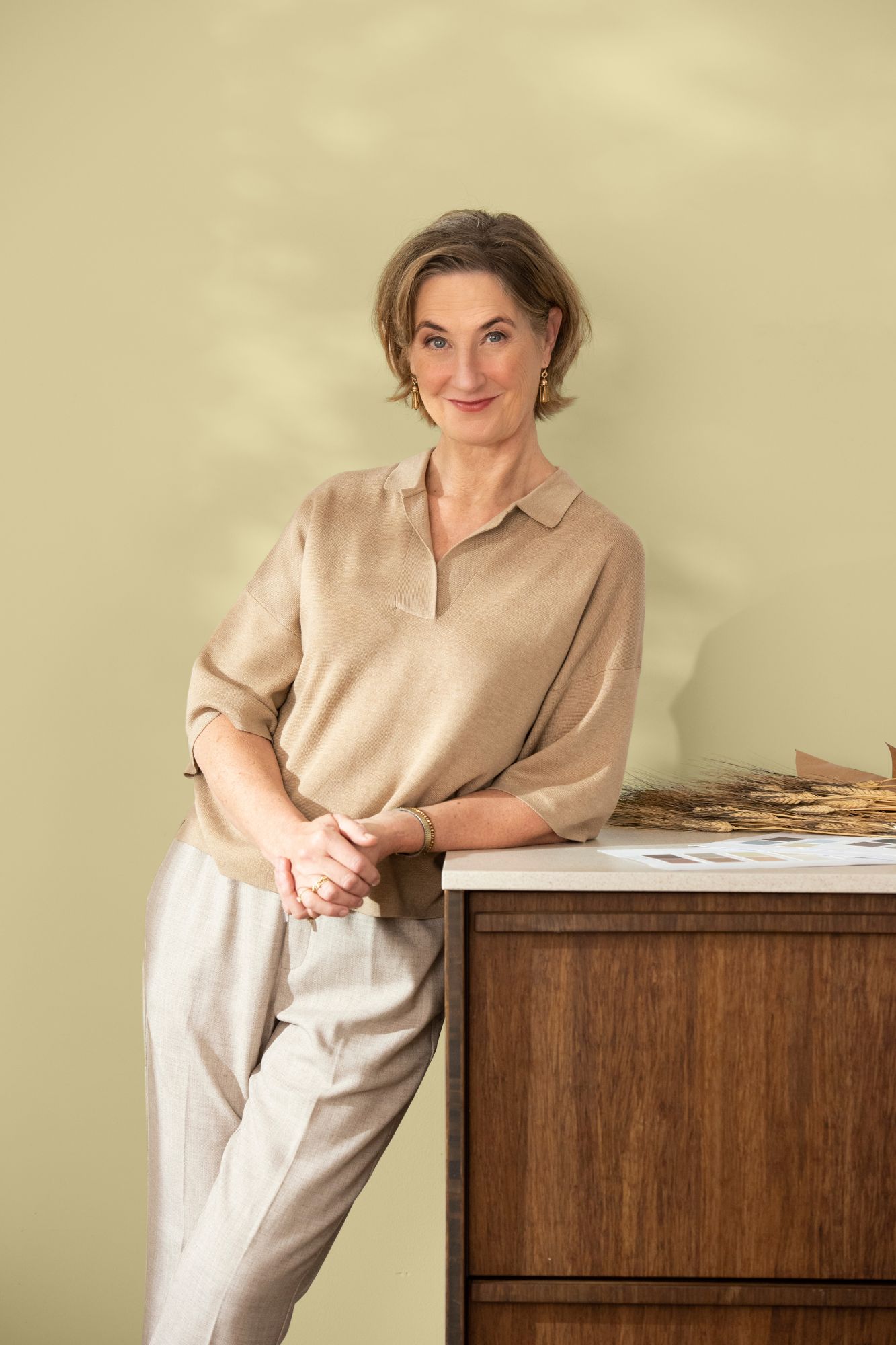
This helps us to get to the root of the issues that the world is facing today. This year, we were inspired by Mother Nature fighting back – with floods and drought featuring heavily in current affairs and nature being used to inspire popular interior designs.
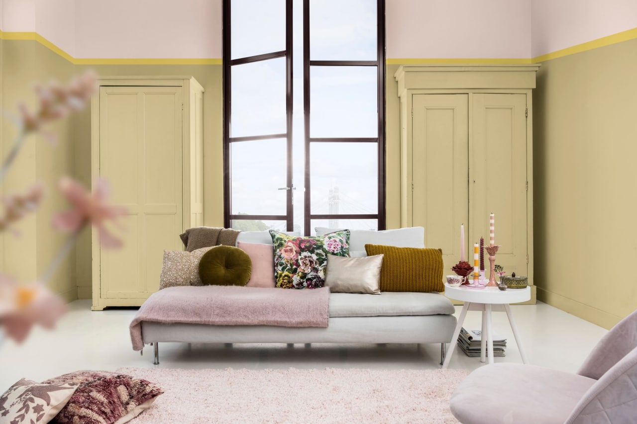
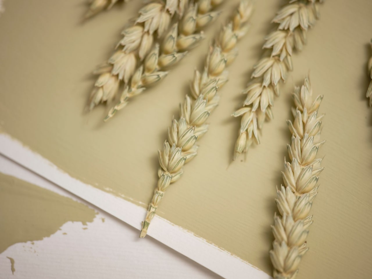
The discussions also led us to see that yellow was dominating. We therefore knew that this would be the base of our Colour of the Year 2023 – we just didn’t know the exact shade. Based on this insight, we came up with Wild WonderTM: a positive, glowing natural tone that connects us with nature. We see this colour as a soft gold with hints of green inspired by fresh seed pods and harvest grain.
Our discussions also help us create the four colour palettes that we launch alongside the Colour of the Year – identifying complementary shades that are all inspired by the same insight and behavioural trends. This year our four colour stories are:
- Lush palette - has a mental health focus with colours inspired by plant-filled habitats of gardens, forests and woodlands
- Buzz palette - inspired by collective thinking, celebrating diversity and adding joy, unity, and connectivity
- Raw palette - draws from bio-inspiration and what nature can teach us and reflects on the richness of resources that nature offers
- Flow palette - focuses on the cycles of life and brings a feeling of fluidity, freshness and equilibrium
Where do you see the colour being used in practice?
We make sure that the Colour of the Year and its complementary palettes can be used in any setting – from the domestic home through to commercial premises across education, healthcare, hospitality, office and residential sectors. For example, this year’s Buzz palette with its rich, diverse and joyful colours is perfectly suited for the hospitality sector. We think a hotel room or lobby painted in this bright palette will be sure to bring a smile to someone’s face.
Flow on the other hand has more subtle and timeless colours that perform well in the education sector. Both early year education settings, up to teenagers and university students can benefit from this palette thanks to its roundness and friendliness.
What was your favourite moment from this year’s Colour of the Year process?
This answer is twofold. The first moment is when we’ve settled on a story. This is no mean feat, as we have to make sure that everyone is on board and aligned with the vision.
The second moment is our "country call” where we present our new colour palette, way of thinking and messaging map to our AkzoNobel colleagues around the world. This is an opportunity for them to push back if they think the colour might not work in their region which always makes me nervous. However, when I saw everyone nodding their head and buying into the colour story, I knew we’d cracked it and found something that resonates with everyone.
For more information about Dulux’s Colour of the Year, please visit: www.duluxtrade.co.uk/COTY23
To download the ColourFutures™ 2023 Specifier Brochure, click here.
Questions answered by Heleen Van Gent, Creative Director, AkzoNobel’s Global Aesthetic Centre.
About AkzoNobel
AkzoNobel deliver the sustainable and innovative solutions that our customers, communities – and the planet – are increasingly relying on. As experts in making coatings, chances are you’re only ever a few meters from one of their products. Active in over 150 countries, they’ve set their sights on becoming the global industry leader. It’s what you’d expect from the most sustainable paints company, which has been inventing the future for more than two centuries.
If you’d like to feature your product news here, get in touch to find out more.
If you’d like to become SBID Accredited, click here for more information.
Nora Chou is a luxury interior designer working on projects internationally in both the residential and hospitality industry. Focusing on creating layered moments through design, her mission is to create a sense of warmth, life and texture into her designs. Having grown her roots in Hong Kong and proceeding to live in equally vibrant cities including London and New York, she offers a certain cultural and lifestyle sensibility to the way she approaches creating interiors for her clients.
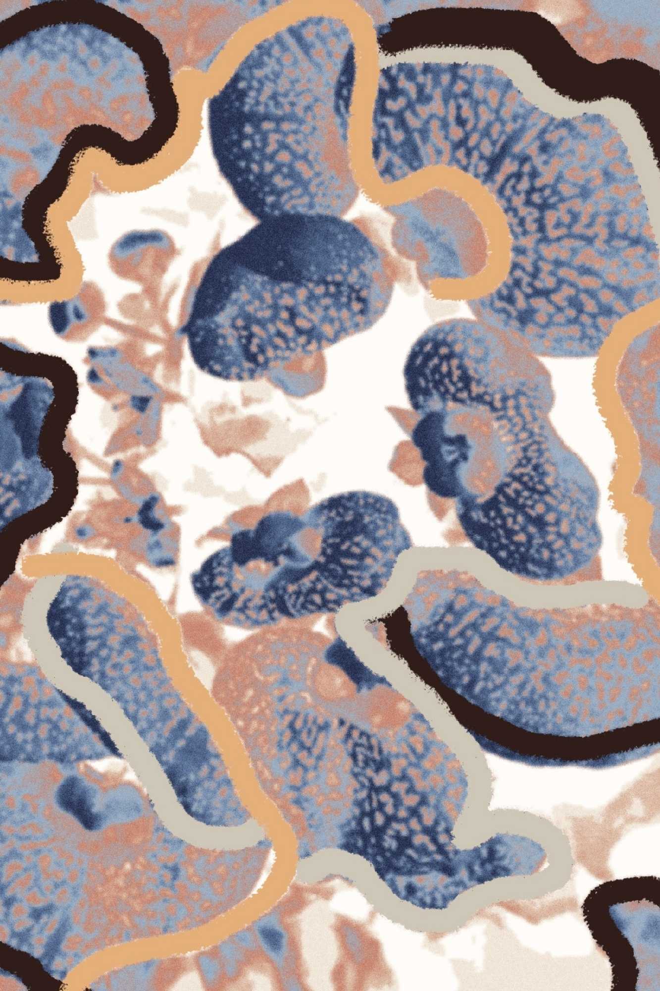
Sky and Earth is a rug collection inspired by colours, life and energy we find in the great outdoors. The handpicked palettes by Nora Chou (“Sunrise”, “Dusk” and “Terra”) encourage colours to be brought into our interior spaces.
Bring in your outdoors.
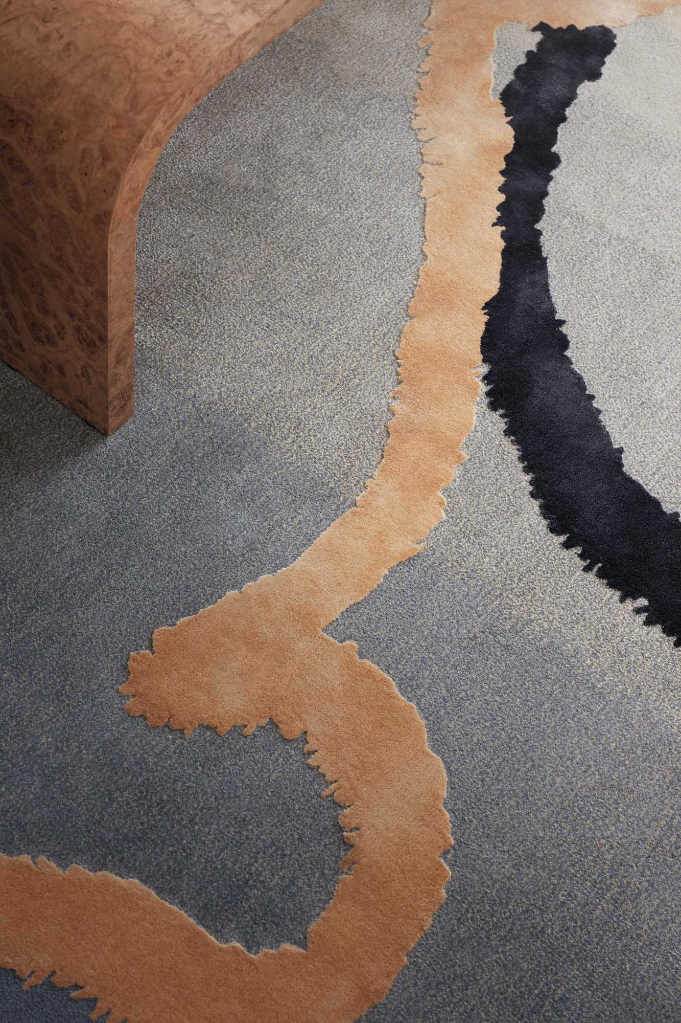
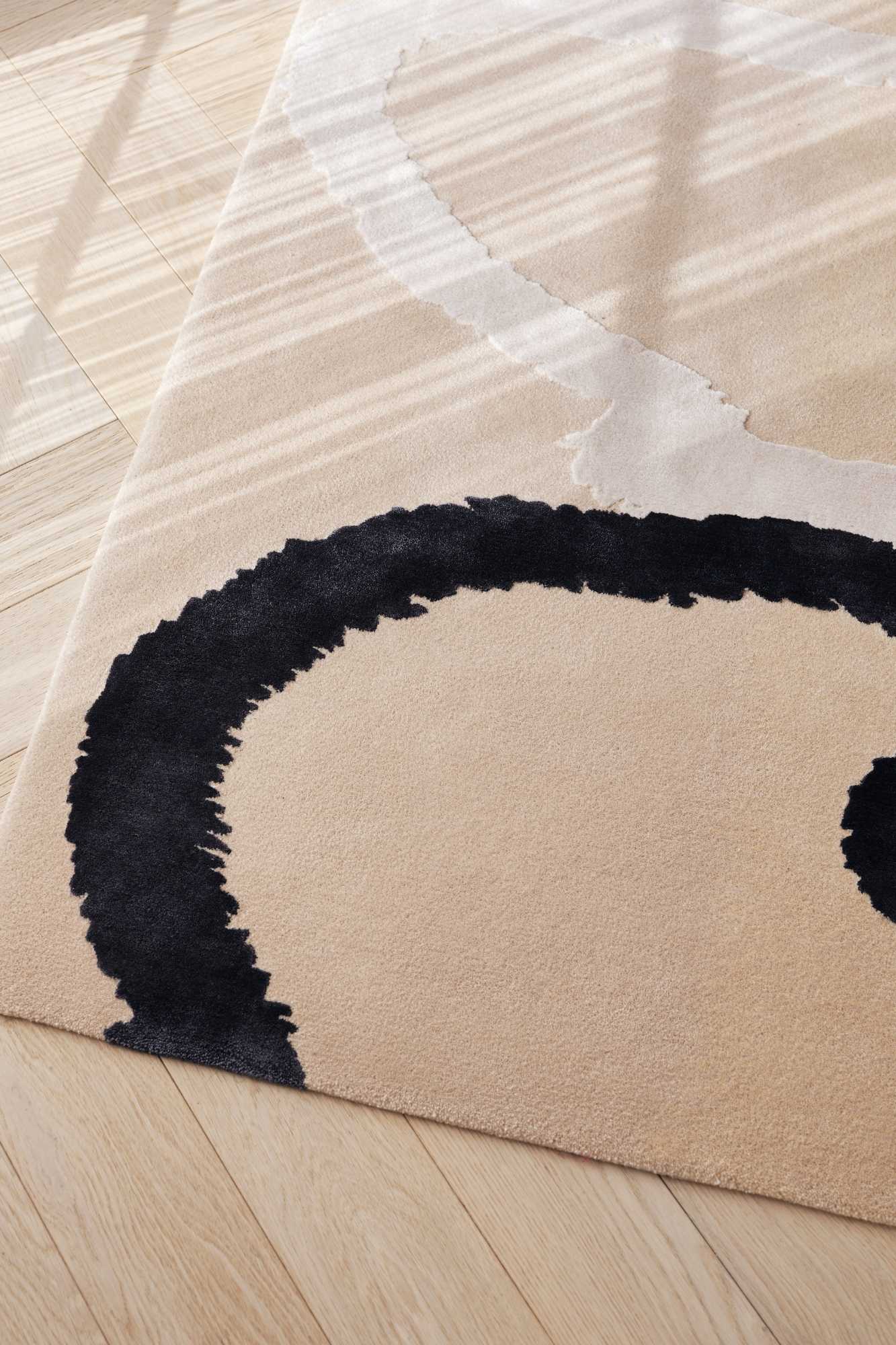
What was the process of designing Sky & Earth?
When I was first approached by Jeff, the managing director of Silk Avenue, to design a rug for their designer profile range, there were many ideas that came to mind. I find rugs often help ground a space by connecting the interior palette of your chosen furnishings or to make a new statement through colour and texture. From an aesthetic perspective it's quite similar to how paintings interact with spaces. However, rugs add an additional softness into interiors.
Sky & Earth came to fruition during the Covid lockdown period. Inspired by the Great Outdoors, it is a rug collection that is all about bringing the colours and textures from nature into our interior spaces. From the get-go, I knew that I wanted to create a collection to include a broad range of designs that would fit within different settings whether it be a traditional country house, or a contemporary set up in a high-rise apartment. During the creative process, I found it important to create a collection that is a family of designs and a continuation of the narrative, allowing me to develop and experiment with the creative direction.
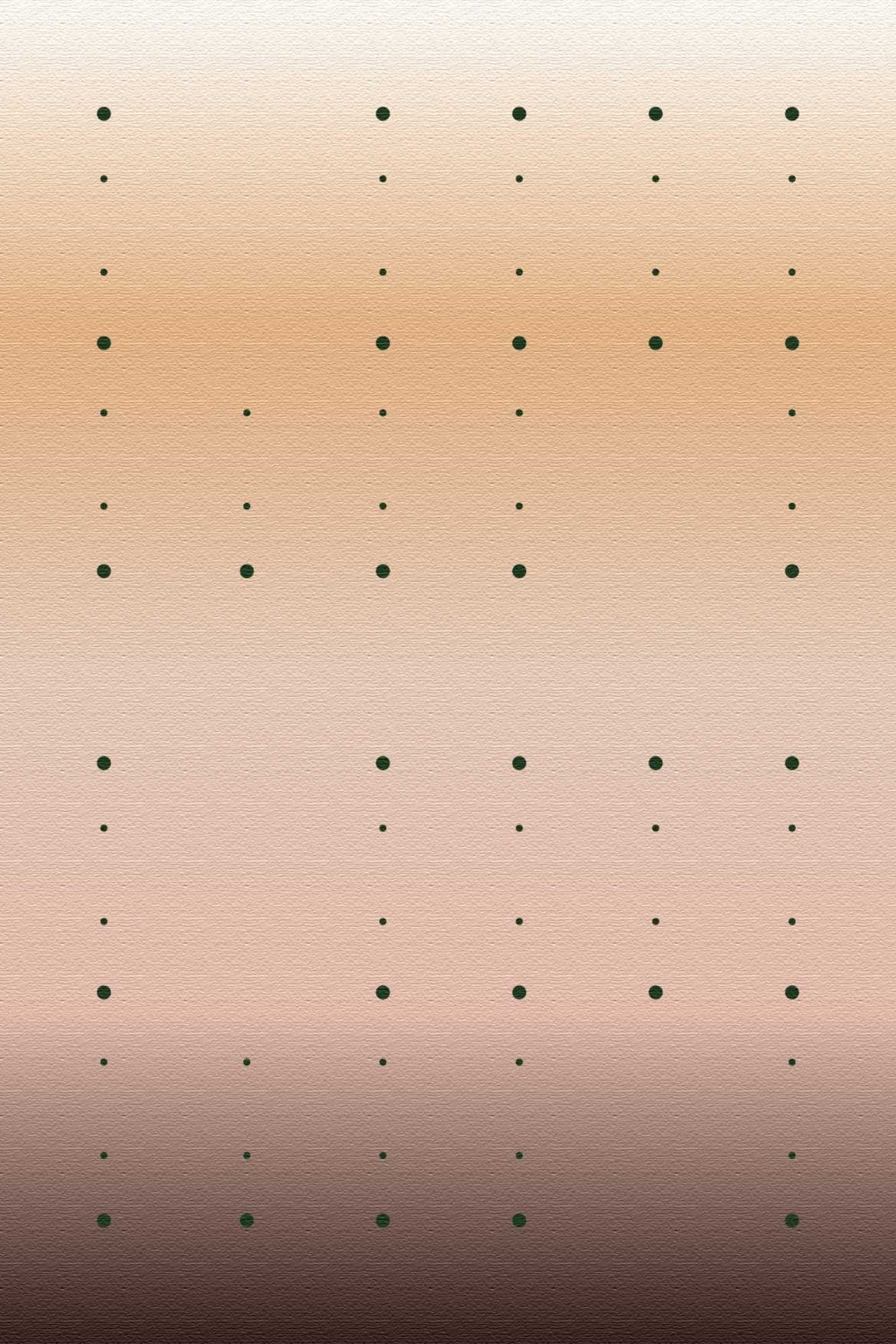
The 6 designs from Sky & Earth are captured moments that can be layered into interiors through the hand-picked palettes I have personally selected ("Sunrise", "Dusk" and Terra"). The designs can also be completely customized to a palette of your choosing.

Is there anything else we should know about the rugs?
Silk Avenue manufactures the hand-tufted rugs in Nepal and handles all shipping internationally.
The designs from Sky & Earth are constructed of various compositions. For example, "Spring Buds" has a composition of 100% hand-tufted wool, which is great for hospitality settings and households with children. Generally speaking, wool is low maintenance, bounces back into its original state after being walked on and is typically less flammable than other fibers. The matte finish of wool also allows the colours of the rug to appear richer and deeper.
There are also other designs from the collection with a combination composition of wool and bamboo silk. - "Petals", "Hydrangea", "Flow Ombre" "Flow Solid" and "Dots Play". In these designs certain areas of the rugs are accentuated with bamboo silk and raised pile heights. The slight sheen against the matte background mimics the way light is often reflected through nature and is a play on both texture and surface.

Do the rugs come in different sizes?
All of the designs can be customized to any size to suit your interiors. However, we do have standard sizes with the latest pricing that can be found at: www.norachou.com/collection


How can someone place an order?
Send an email to info@norachou.com and info@silk-avenue.co.uk specifying the design, size and palette of your choosing. Silk Avenue will guide you through the process from there!
Photo Credit: Felix Speller
About Nora Chou
Luxury Interior Designer based in London with a focus on Residential and Hospitality Design. Working on projects internationally, they offer interior design services including but not limited to project management, space planning, sourcing and creating designs that are custom to every project.
If you’d like to feature your product news here, get in touch to find out more.
If you’d like to become SBID Accredited, click here for more information.
This week’s instalment of the Project of the Week series features a historic hotel suite design by 2022 SBID Awards Finalist, CHIL Interior Design.
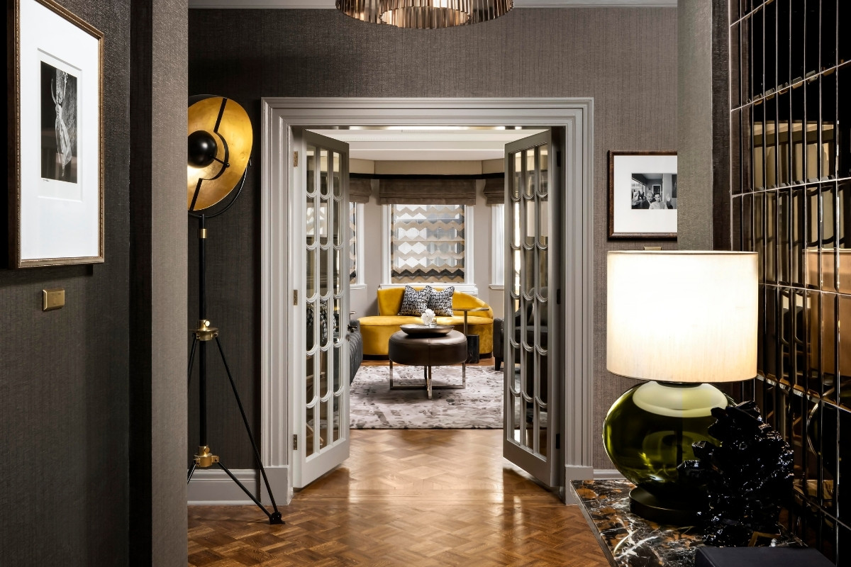
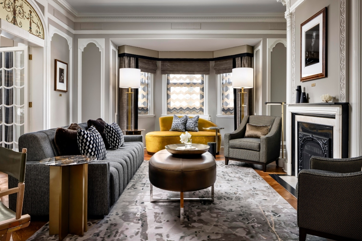
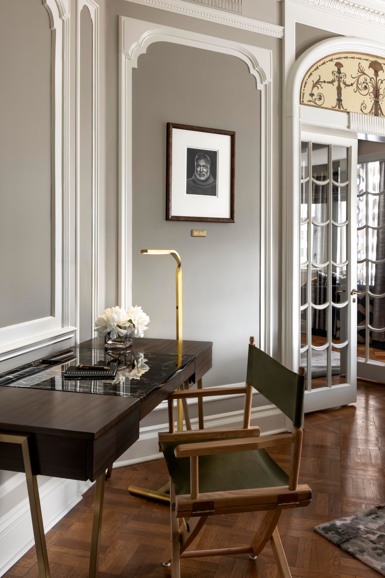
Known as Ottawa's Castle, Fairmont Château Laurier’s historical presence towers over the Canadian city. CHIL Interior Design was commissioned to bring the historic Karsh Suite into the new century. The suite was named after Yousuf Karsh, famed photographer who maintained his studio and residence in the hotel for many years, we drew direct inspiration from this visionary to create a design for the suite that is as bold and unforgettable as the icon himself. Special attention was necessary to respect the original early 20th century historical details of the hotel, while delicately positioning this suite in a more forward looking aesthetic. Of the highest importance, the new interior renovation, celebrates the unique character of this local landmark while, in the same breath, accentuates the beautiful and luxurious details that portrays “Canada’s tradition of grandeur”.
SBID Awards Category: Hotel Bedroom & Suites Design
Practice: CHIL Interior Design
Project: Karsh Suite at Fairmont Château Laurier
Location: Ottawa, Canada
What was the client's brief?
The client wanted the design to fit the Fairmont brand standard on aesthetic, quality, and functionality. In addition to basing the concept on the legendary icon that the suite was named after, photographer Yousuf Karsh, the client also highlighted the need to respect the wishes of Yousuf Karsh’s wife Mrs. Estrellita Karsh on the suite design. It was also important to the client to bring the suites into the 21st century while keeping a strong respect and inspiration for the early 20th century.
What inspired the design of the project?
Famed photographer Yousuf Karsh who maintained his residence and photography studio in that exact suite for many years: his viewpoints on art, as well as his lifestyle.
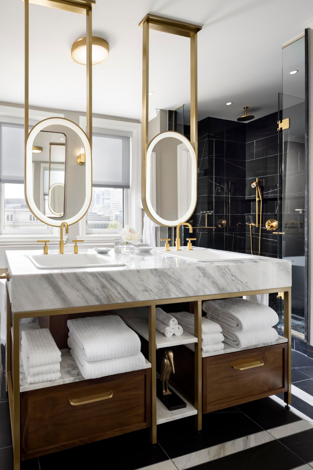
What was the toughest hurdle your team overcame during the project?
Due to the hotel being a heritage building as well as respecting Mrs. Estrellita Karsh’s wishes to keep all the original framing and positions of the Karsh portraits, there were lots of restrictions to the layout. However, in order to bring modernity into the suites, we designed the layout to revolve around these challenges, such as completely redesigning the primary bathroom and expanding that footprint to cater to modern travellers’ needs.
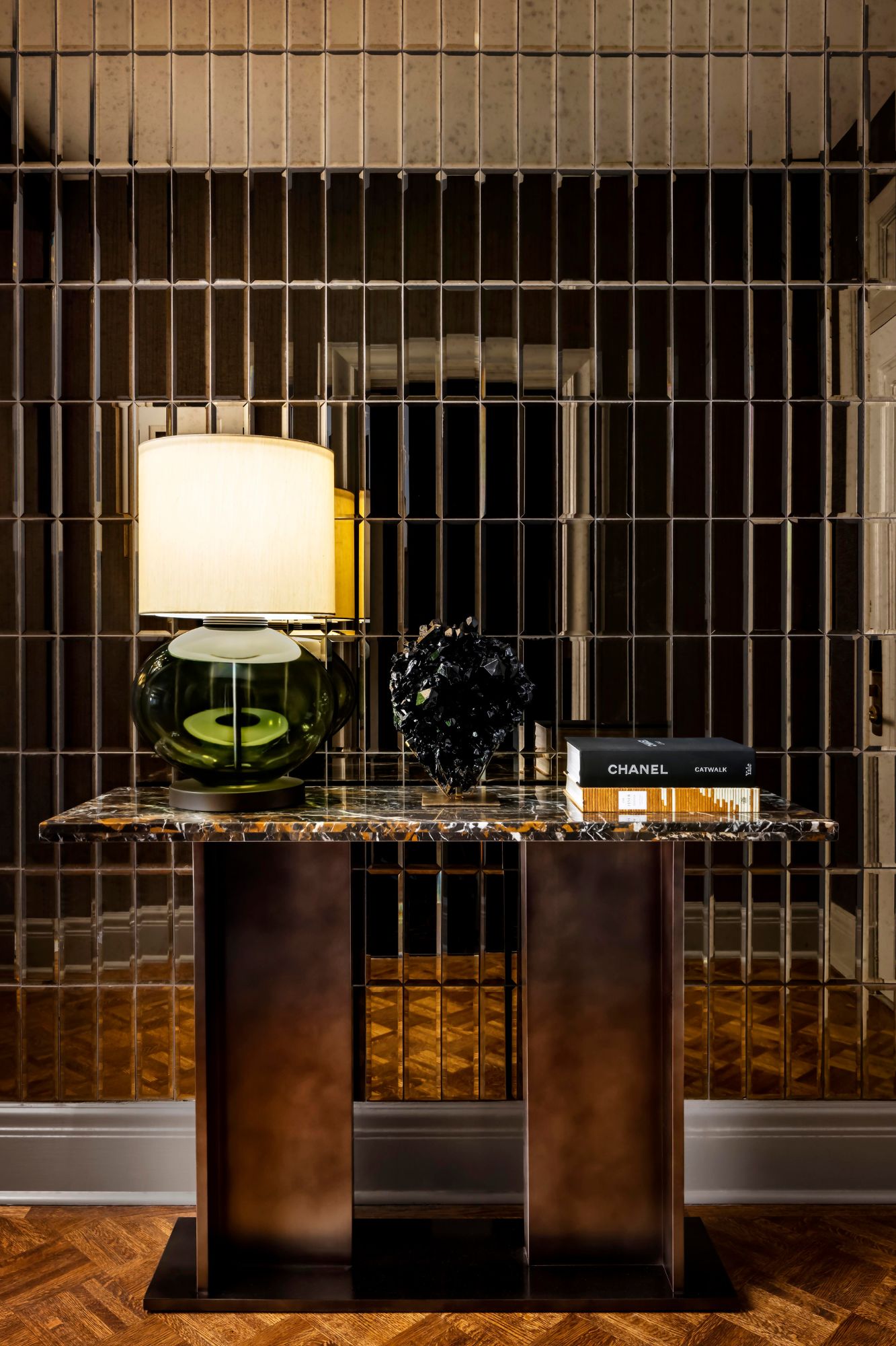
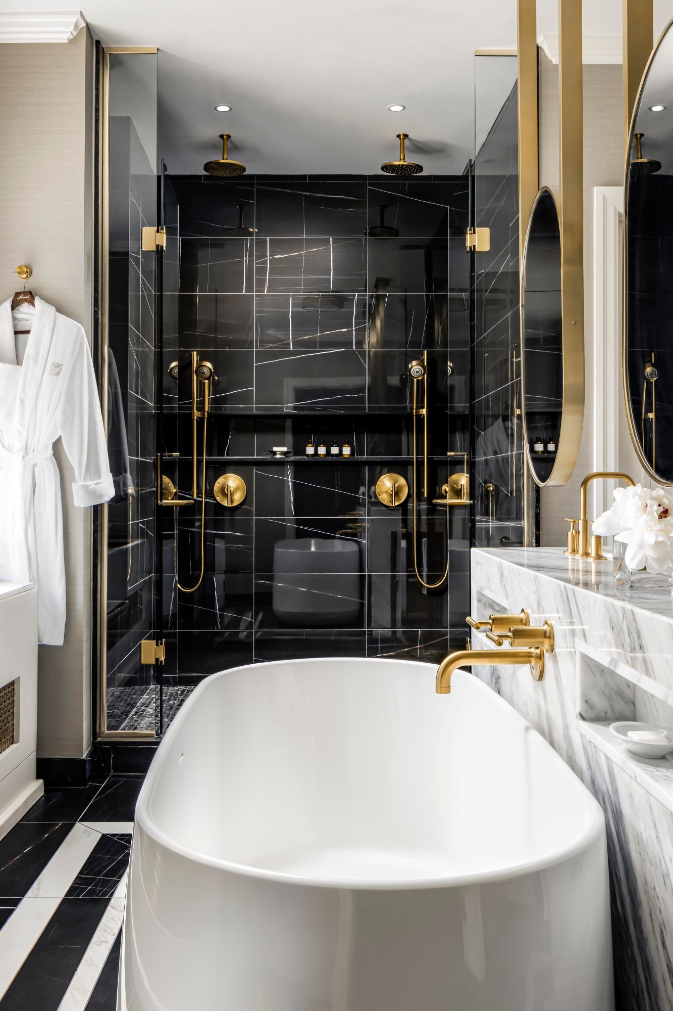
What was your team’s highlight of the project?
Close collaboration with the Fairmont brand and client allowed us to achieve a desired outcome that fits well with the hotel brand aesthetic despite the pandemic starting in the process of renovation – it’s a highlight to know our emphasis on clear design and communications is especially appreciated as we work remotely.
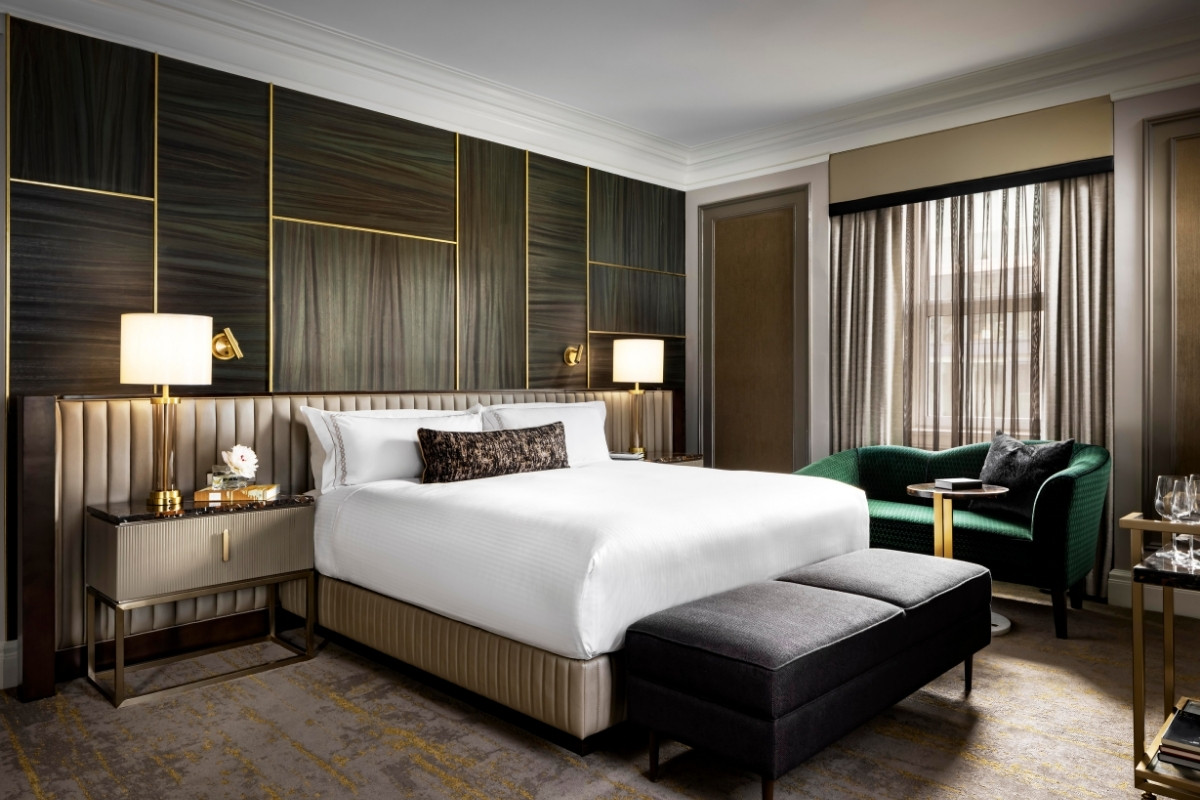
Why did you enter this project into the SBID Awards?
The SBID Awards is one of the most prestigious international interior design awards. It is always an honour to be recognized by such a high calibre of industry expert panel and we look forward to submitting our entries every year.
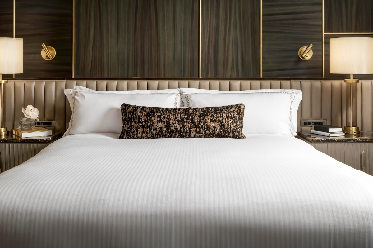
Questions answered by Karen Wong, Senior Associate, & Adèle Rankin, Principal & Global Design Lead, CHIL Interior Design.
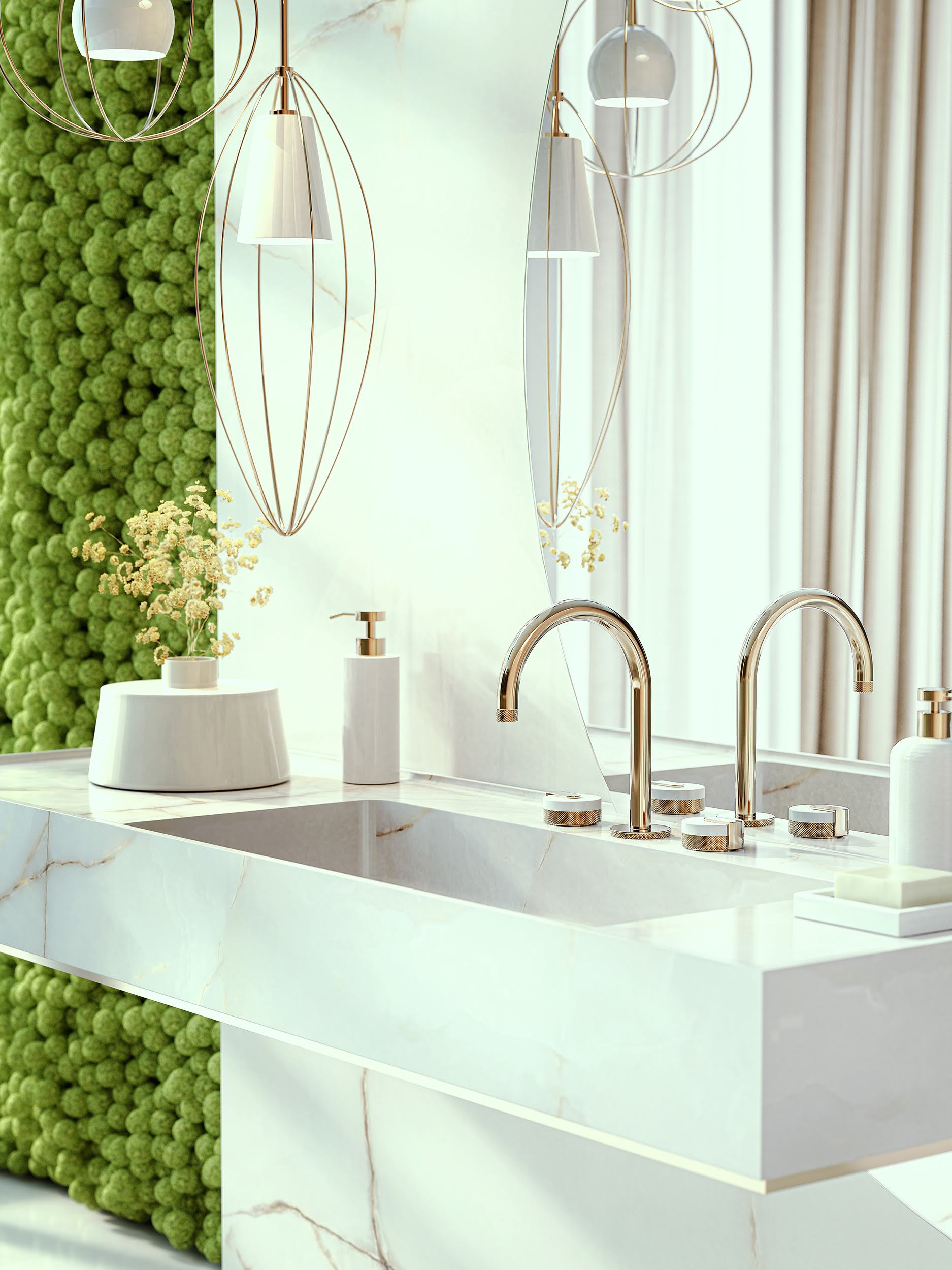
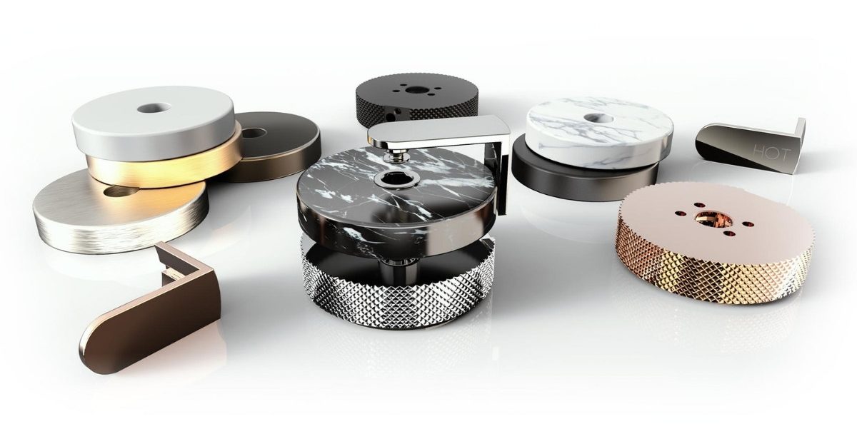
MOD+ by GRAFF Designs, a rich and diversified modular collection that offers endless customisation possibilities. Allowing a high degree of creative freedom with luxury custom finishes, materials and configurations, MOD+ unlocks up to 65 000 possible combinations - a collection like no other.
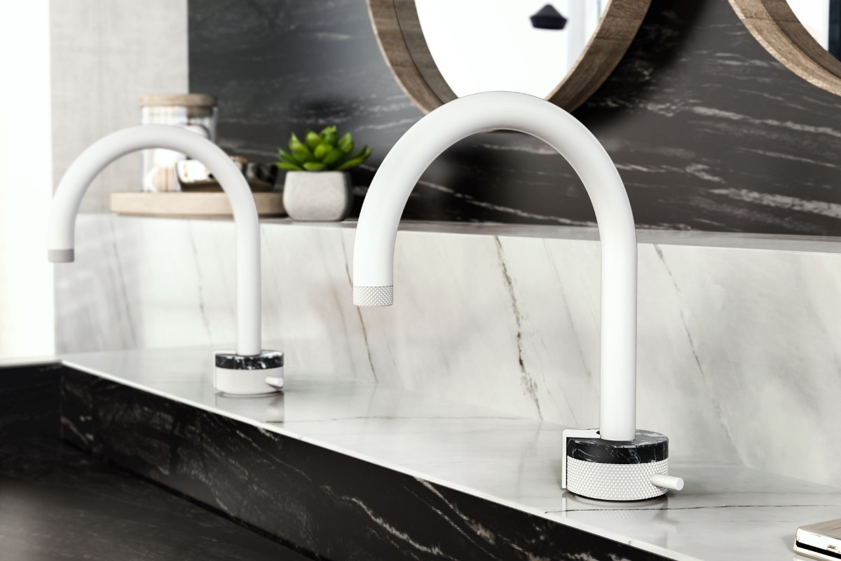
Comprising 55 bathroom products for the washbasin, bathtub and shower areas, in which each element can be completely customised GRAFF has created its MOD+ Collection Configurator to fully exhibit the collection’s potential. An online tool to help design and specify, personalisation options include handle detailing, finishes, materials, spout size and mounting type.
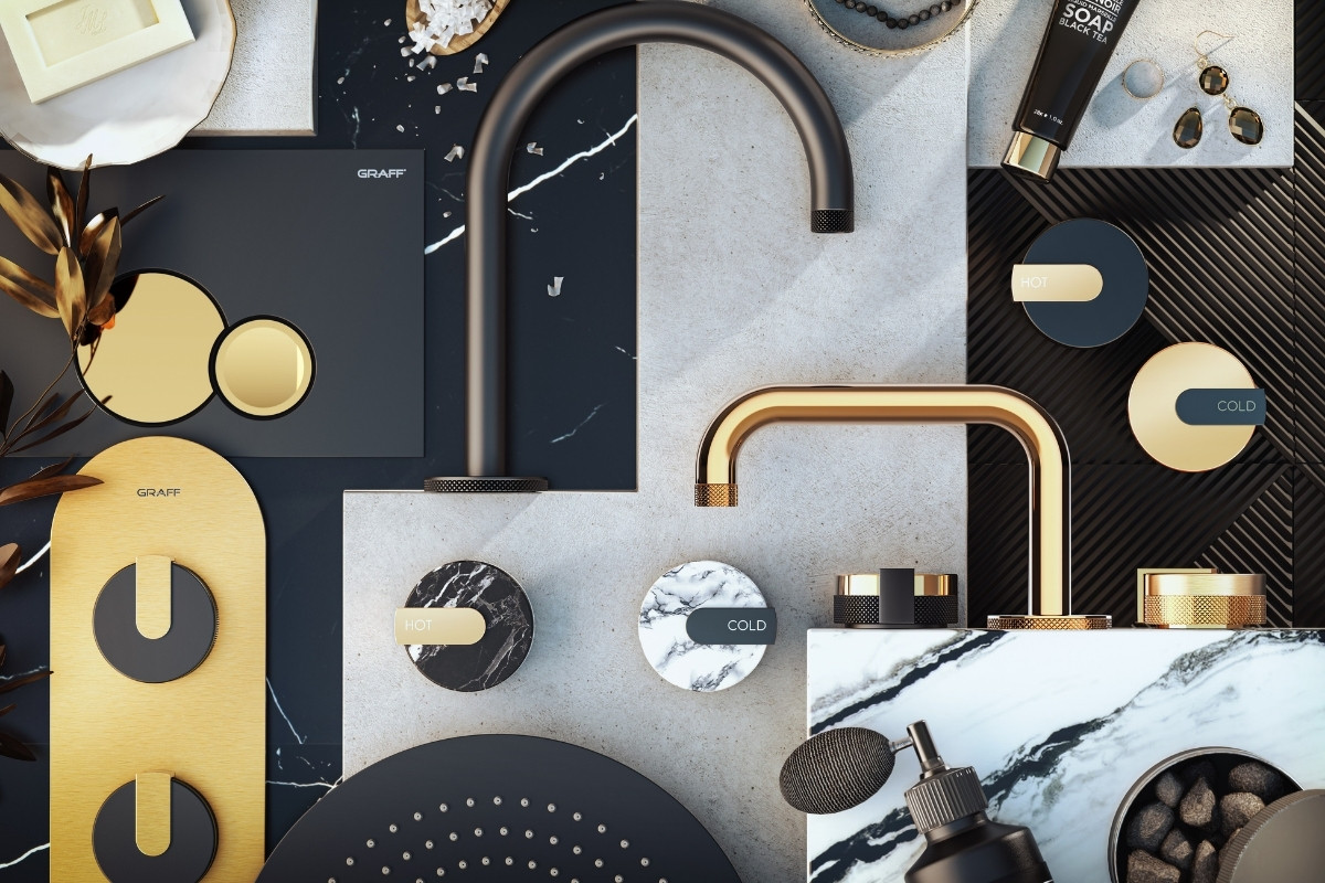
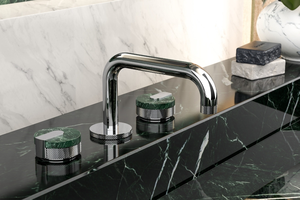
MOD+ offers 20 unique finishes, including Gunmetal, Matt White or Vintage Brushed Brass, or for that extra special touch, a unique 24 K gold finish. Handles materials include variations of Tuscan marble including Storm Black, Forest Green and Smoky White.
President of GRAFF Designs, Ziggy Kulig comments: “GRAFF is committed to presenting the best bathing experiences in the personal space of your house with exceptional style and selection of precious raw material innovations in a way that exceeds expectations.
To see the full collection and try the online configurator, visit www.graff-designs.com/en/catalog/configurator/
About GRAFF
GRAFF’s luxury taps and shower collections elevate the bath space with designs that are both timeless and cutting-edge, complementing endless architectural and interior styles. Available in 21 luxury finishes such as Brushed Brass, Polished Nickel, and 24K Gold, and with a choice of three Tuscan marble inserts, GRAFF basin mixer or shower controls offer bespoke and unique customisation possibilities. Backed by a rich heritage of European artisanship, GRAFF products transform the bath space into a masterpiece of tranquillity, wellness, and spa like experience. With a focus on design, sustainability, and high technology, GRAFF caters to the senses with features such as chromotherapy, bringing bath and shower experiences to luxurious heights.
If you’d like to feature your product news here, get in touch to find out more.
If you’d like to become SBID Accredited, click here for more information.
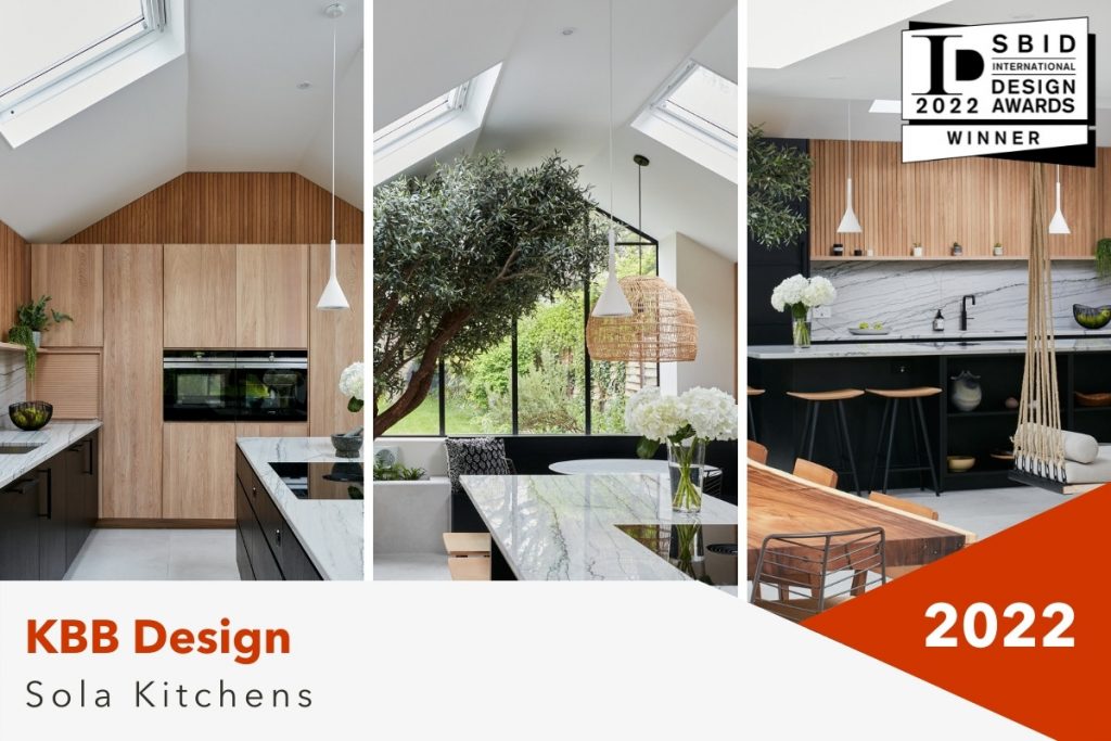
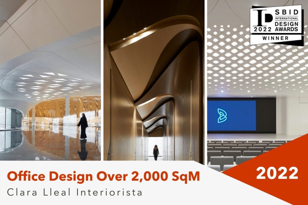
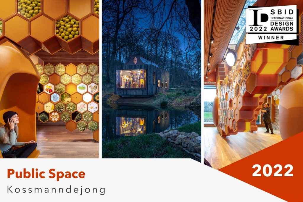
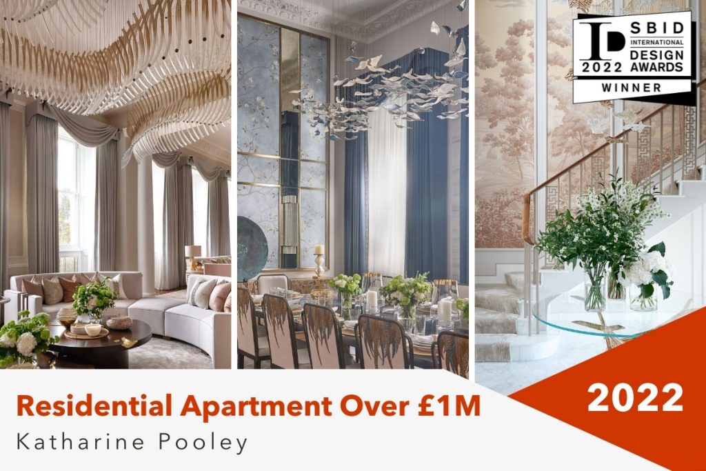
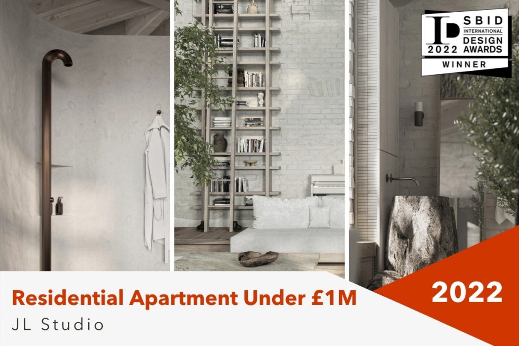
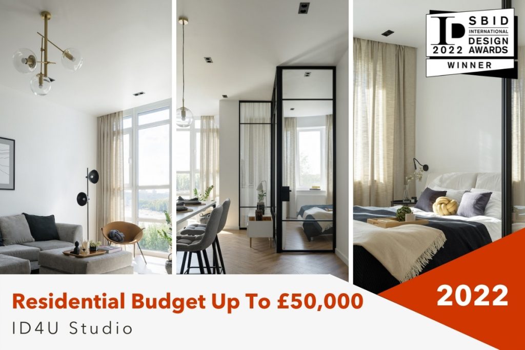
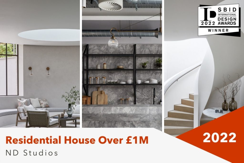
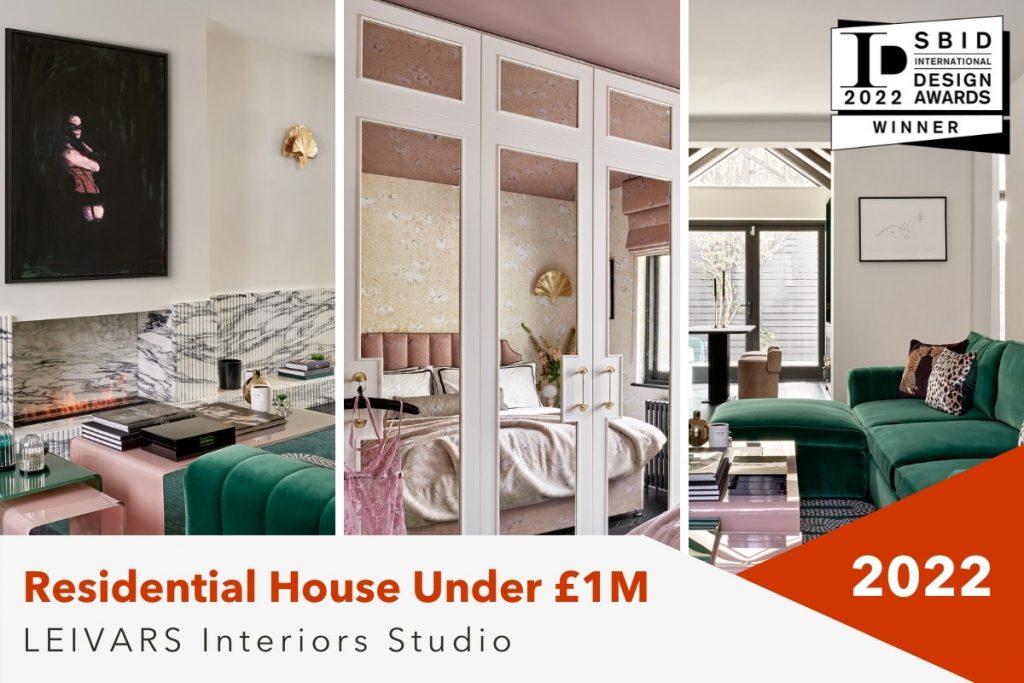
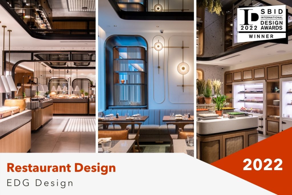
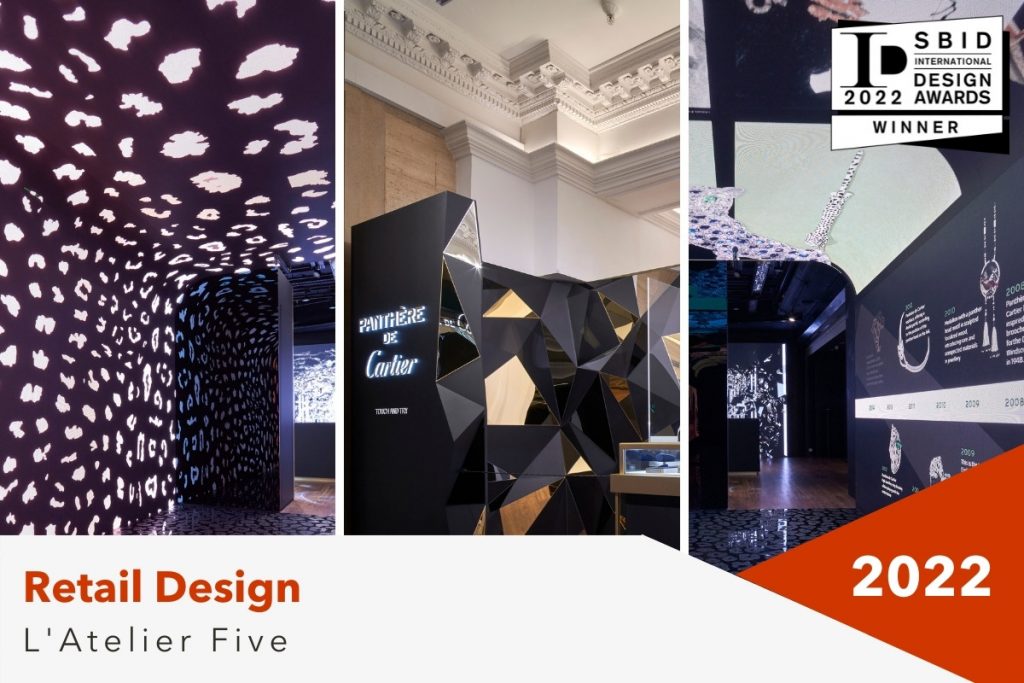
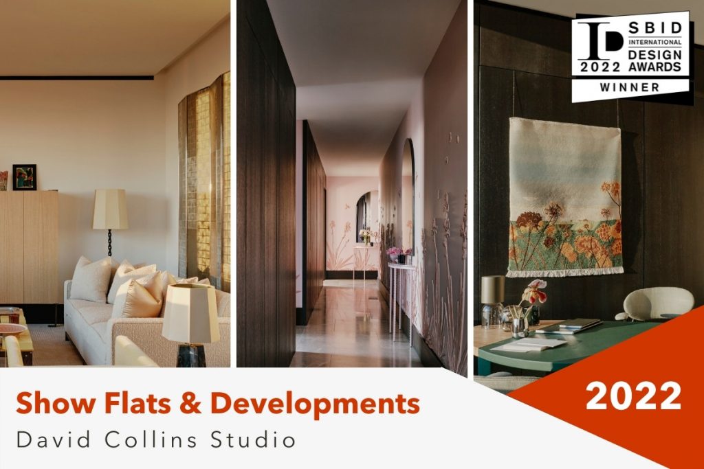
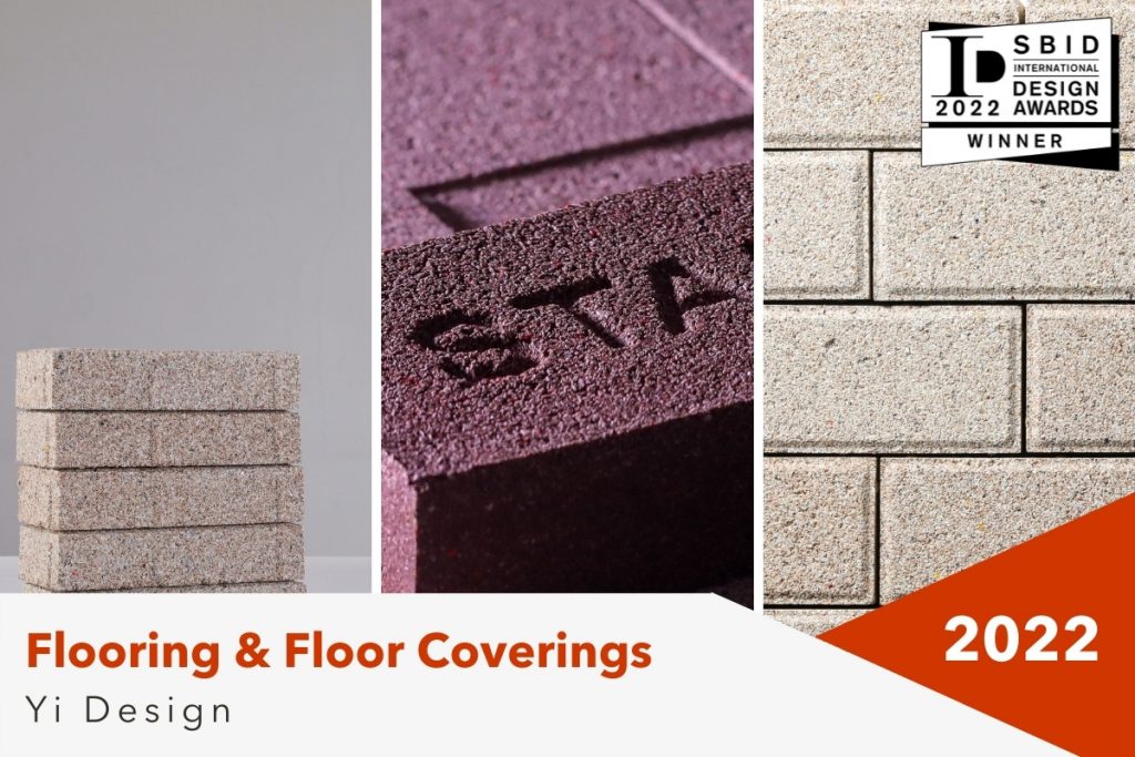
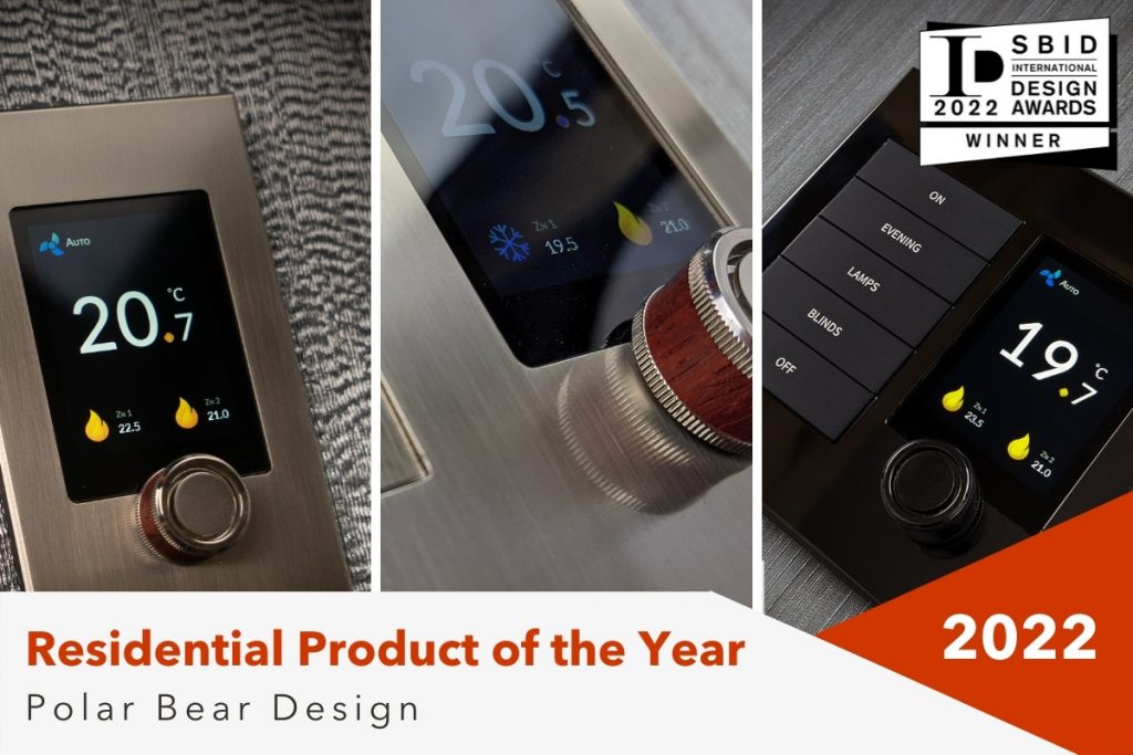
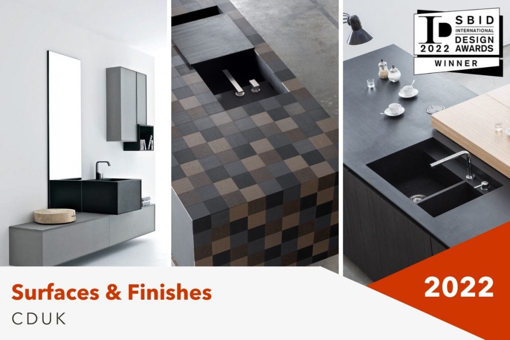
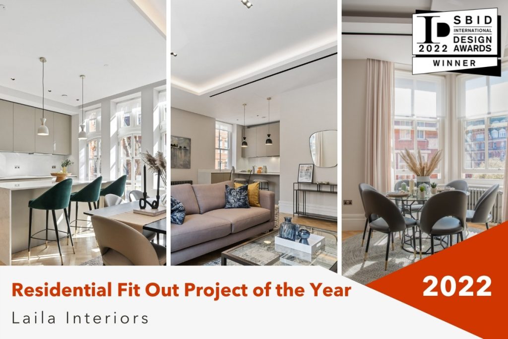
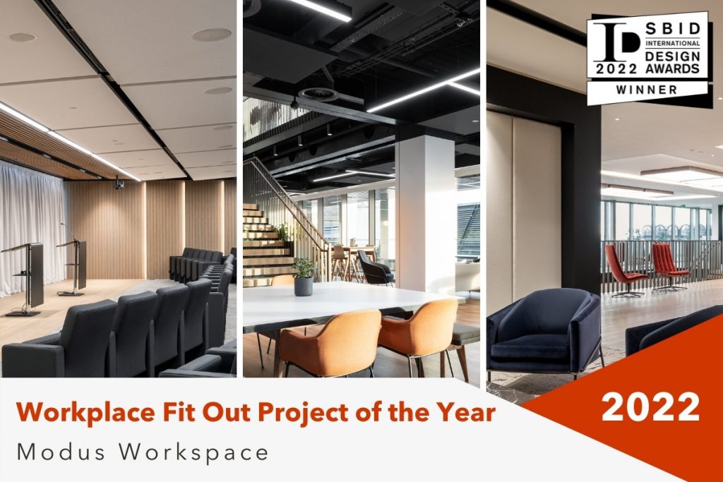
The SBID International Design Awards winners for 2022 have been revealed!
On the 21st October the talented A&D community gathered together at the luxurious London destination, InterContinental Park Lane to celebrate the industry’s extraordinary achievements from the past year and shine a spotlight on the brightest design talent across the profession.
Explore the winners of each category below!
Interior Design Awards:
The Overall Winner
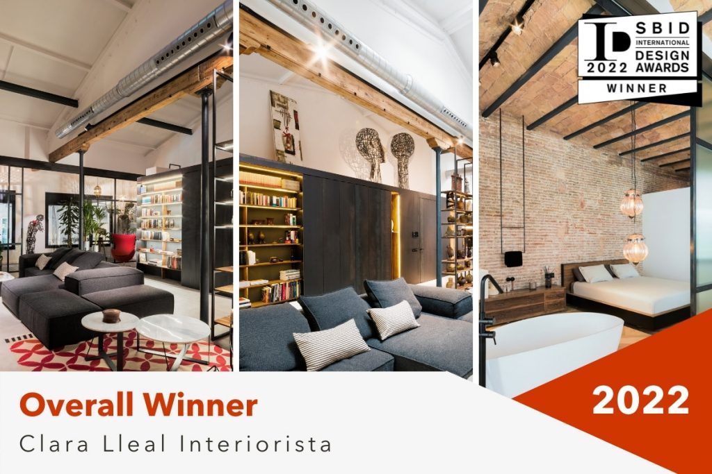
Project: Art Gallery House
CGI & Visualisation
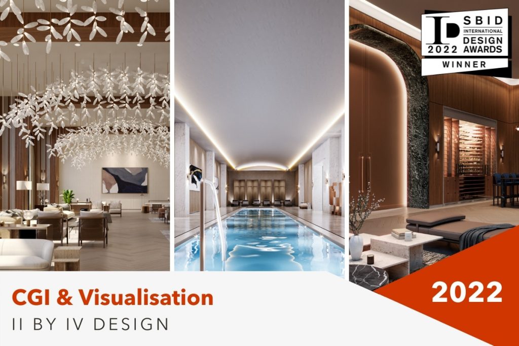
Project: The Residences of Central Park
Office Design Under 2,000 Sq M
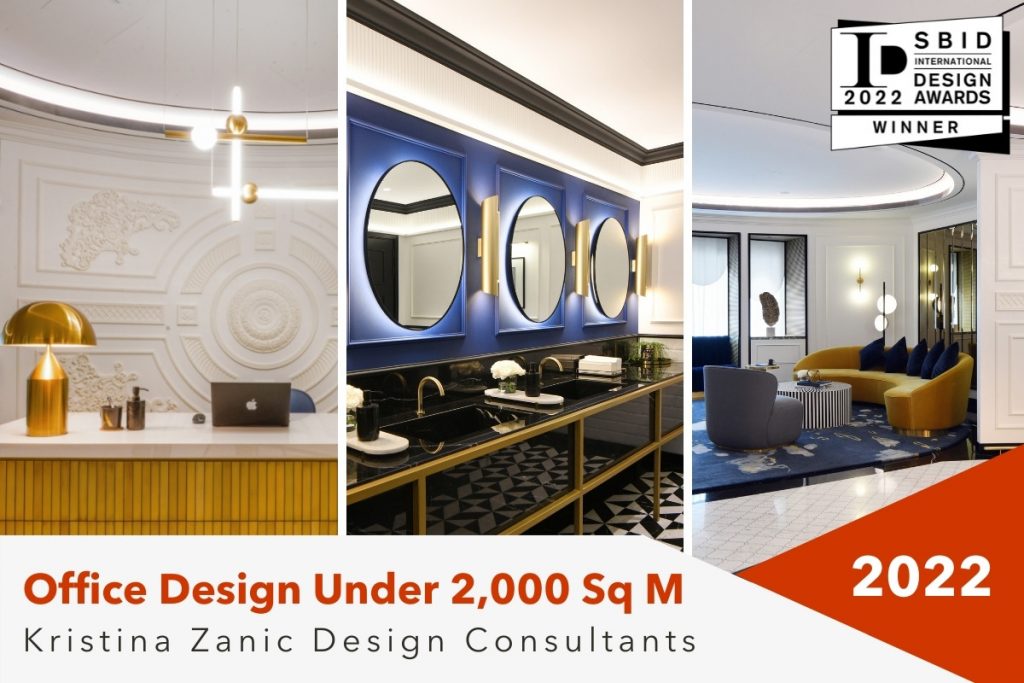
Project: Accor headquarters office for Middle East, Africa, Turkey
Fit Out Awards:
Contract Fit Out Project of the Year
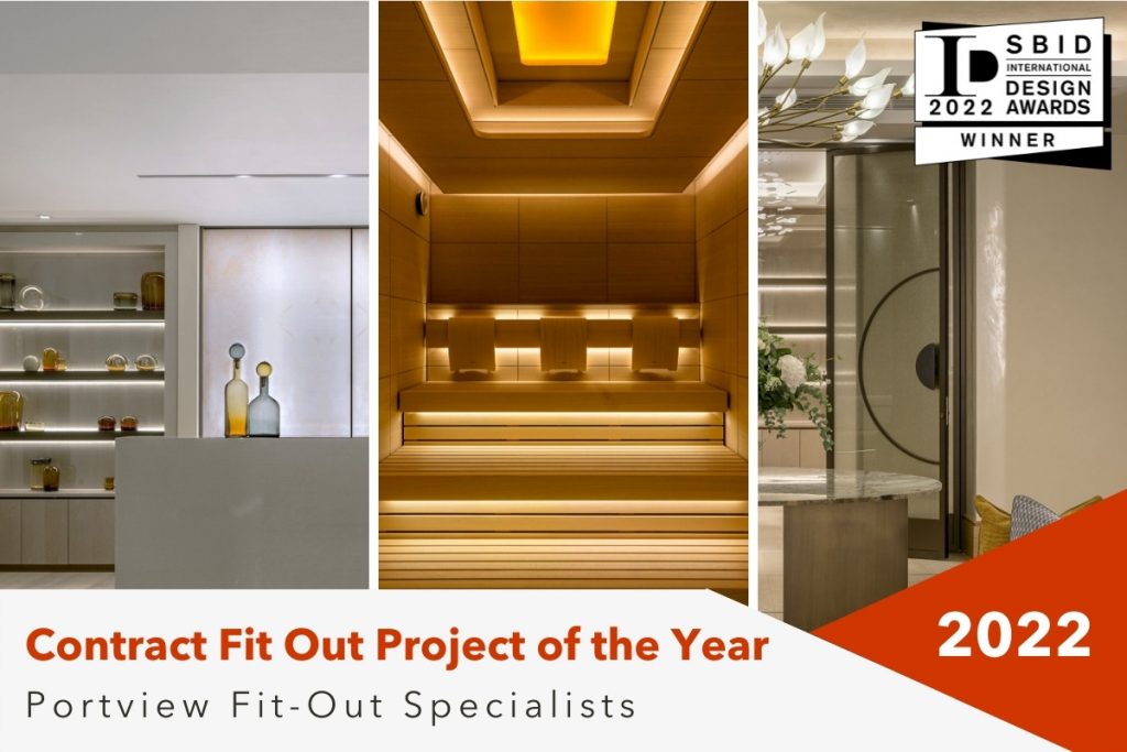
Project: Southbank Place Spa & Fitness Suite
