Ledbury Studio creates kitchens that are uniquely personal to every client – a point happily noted by the owners of this stunning home in Poole. “It was love at first sight when they saw the eclectic range of materials on show at our studio in Notting Hill,” says Ledbury Studio founder Charlie Smallbone. This, coupled with Ledbury Studio's skill for mixing and matching these beautiful materials to create truly bespoke designs was perfectly aligned with the clients vision for a contemporary kitchen that oozes wow factor.
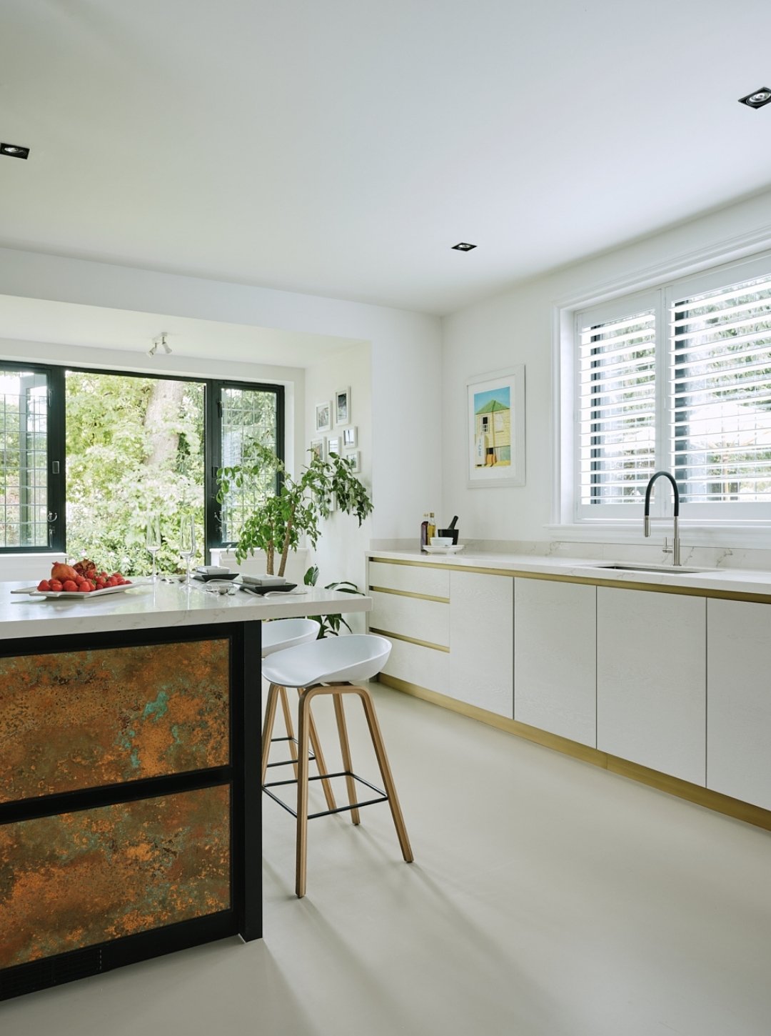
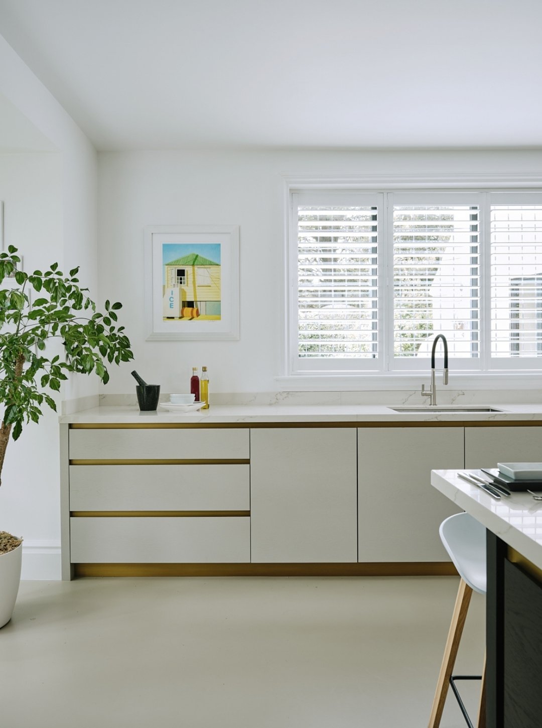
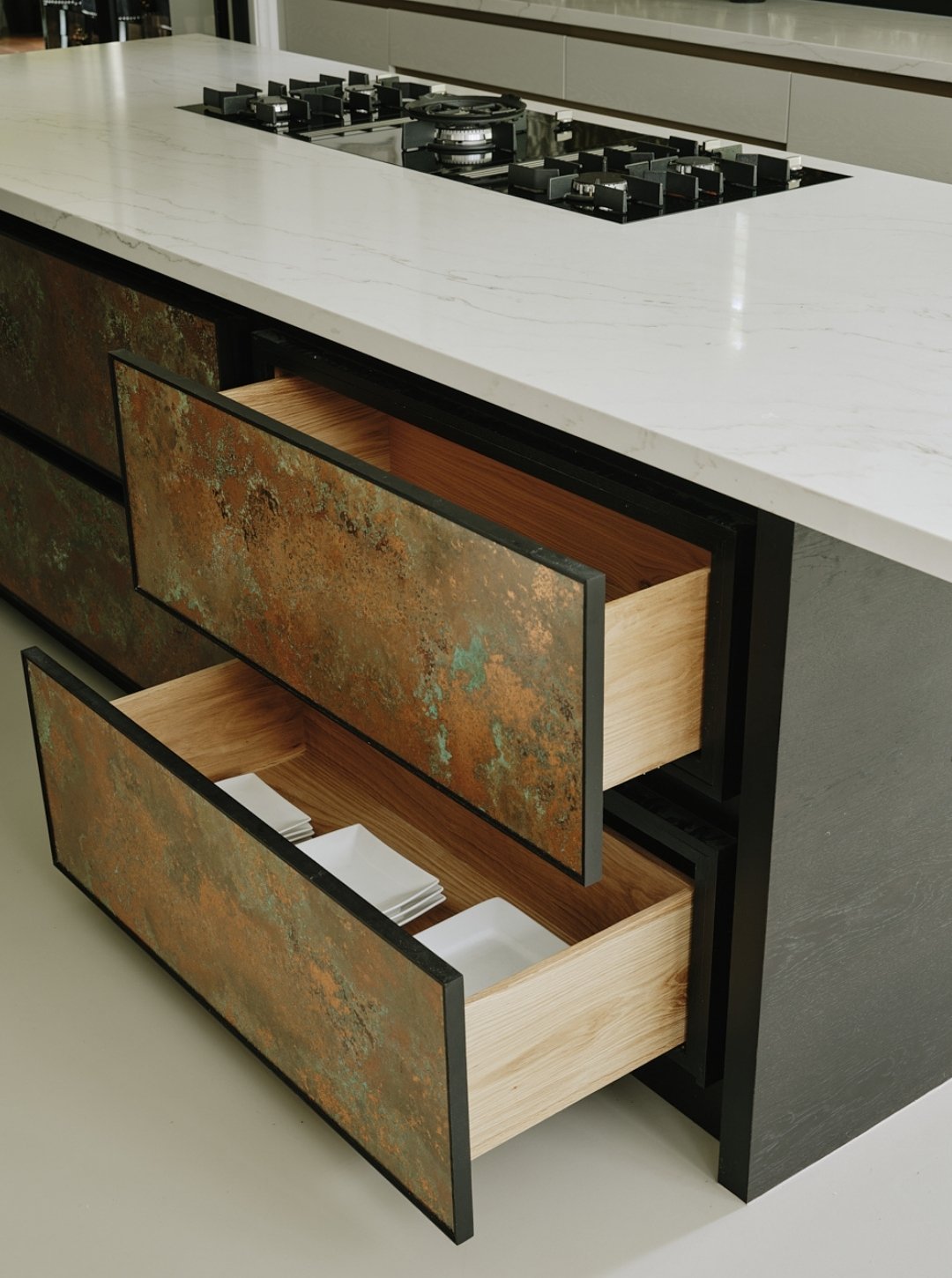
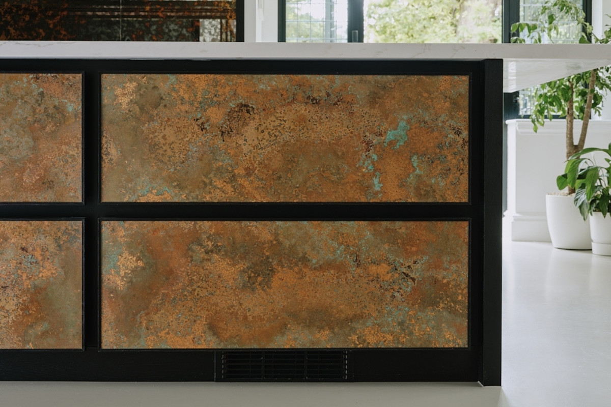
Extensive building work was required to create the light-filled, open-plan space that now exists. To divide the large space into smaller areas of activity, Charlie designed a screen in black-stained oak and aged brass to frame the kitchen. From this vantage point, the eye is automatically drawn to the striking mirrored splashback embellished with aged copper. It provides a stunning backdrop to the island, another talking point thanks to the verdigris copper panels edged in black-stained oak on one side and the black-stained oak cupboard doors surrounded by aged brass on the other.
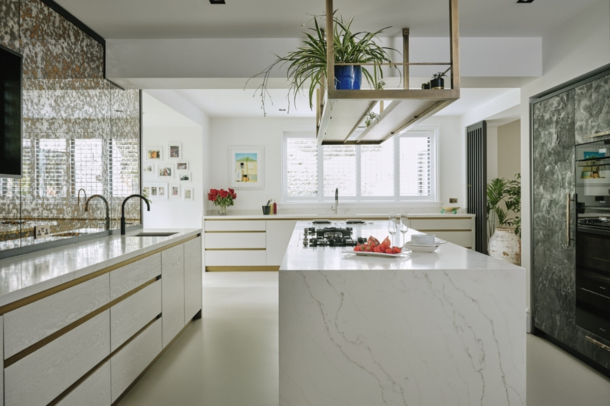
To pull the various metallic elements together, Ledbury Studio’s design included an aged-brass rack over the island. This creates a small space to display beautiful objects.
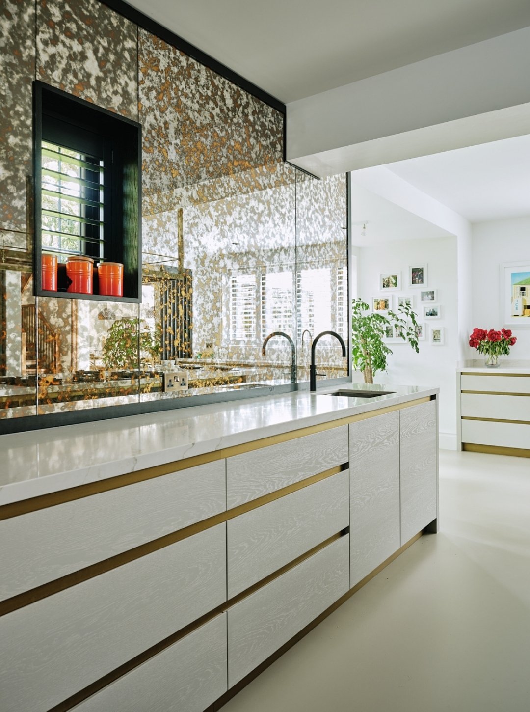
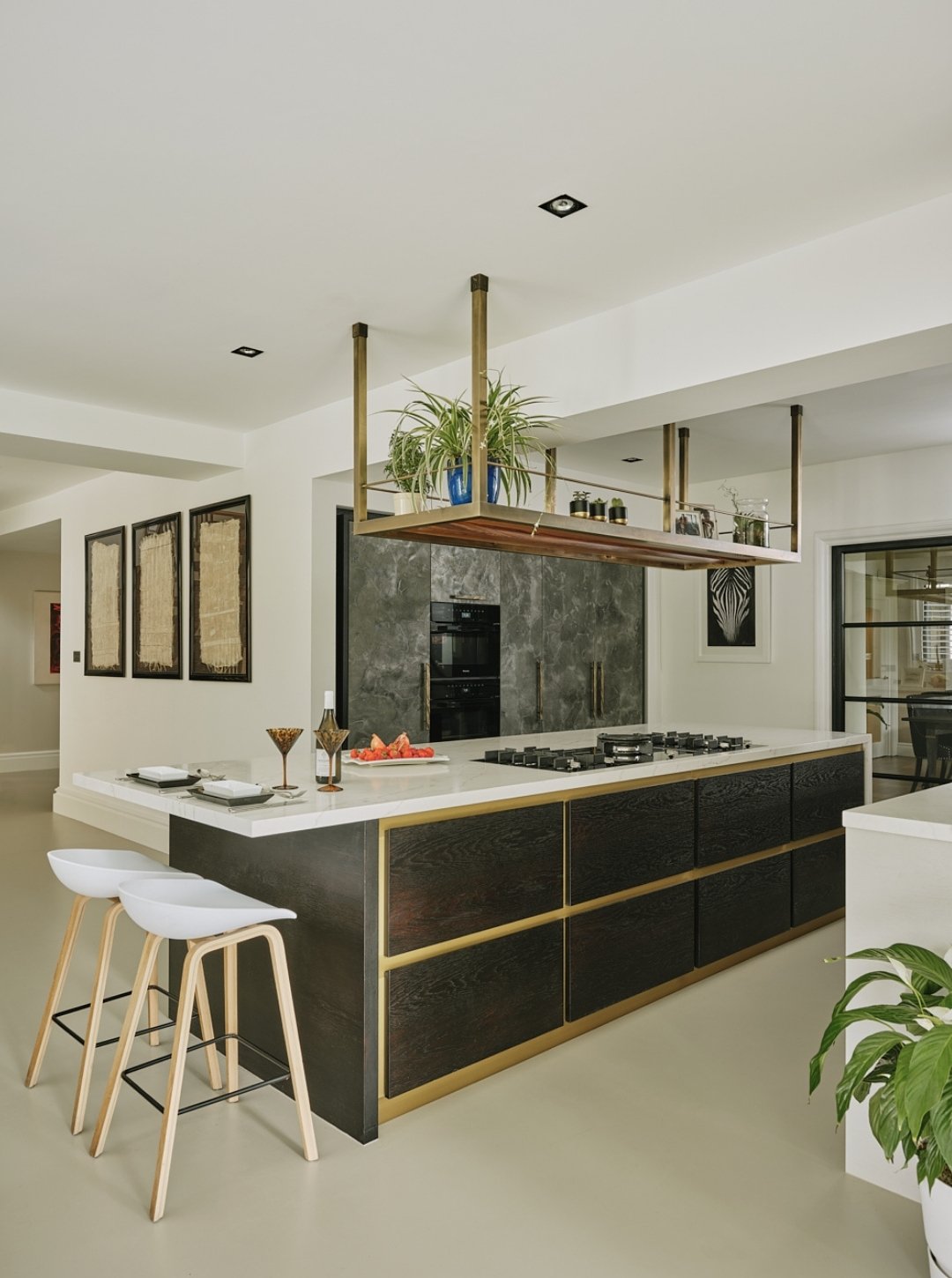
Injecting a neutral note is the poured concrete flooring and the base cupboards that run in an L-shaped configuration to the island. Made from oak and painted white to allow the beauty of the grain to shine through, the cupboards are topped with a pale quartz worktop and feature patinated brass surrounds and kickplates to coordinate with the other cupboards in the kitchen.
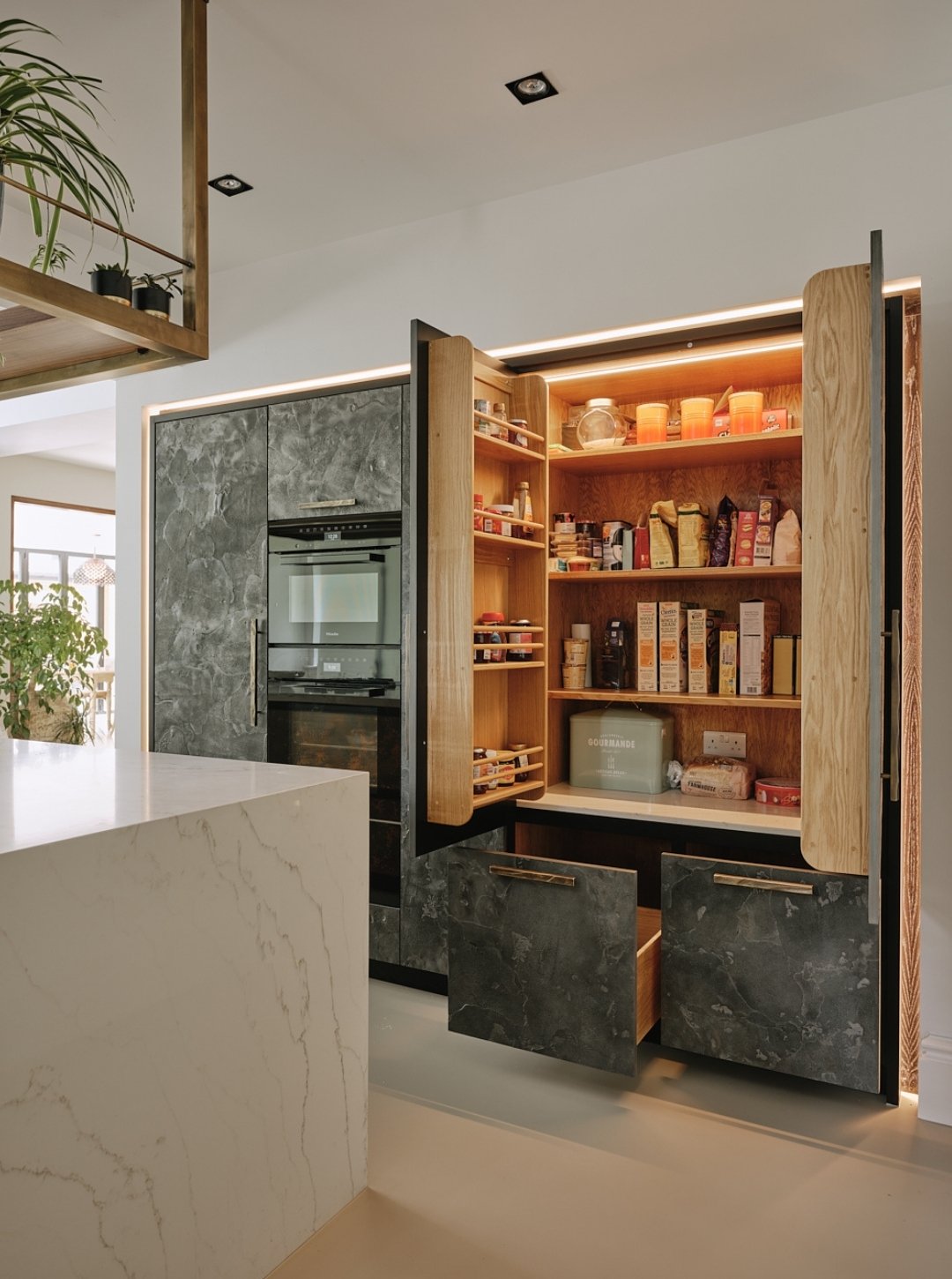
Also sharing the space is a bank of built-in tall cupboards illuminated by an LED surround. They incorporate a large larder for food storage, ovens and a fridge, and the cupboard fronts are made from liquid metal in a specialist shagreen finish. Aged-brass handles unify the look. "Every Ledbury Studio kitchen is truly unique and this one was no exception," says Charlie. "Our clients were thrilled with the result, and in particular, with the range of materials used."
Ledbury Studio kitchens start from £70,000.
About Ledbury Studio
Ledbury Studio is a new and exciting design studio, showcasing Charlie Smallbone’s latest kitchen designs. Small and personal, Ledbury Studio has been established to explore and develop the interface between kitchens to cook and work in, and kitchens to live in. The company offers something very different in the world of kitchen design, something not found elsewhere. Combining exquisite materials and artisan craftsmanship, the new kitchen collections are striking and innovative and the culmination of Charlie Smallbone’s history at the forefront of cutting edge kitchen design.
If you’d like to feature your product news here, get in touch to find out more.
If you’d like to become SBID Accredited, click here for more information.
What was the client's brief?
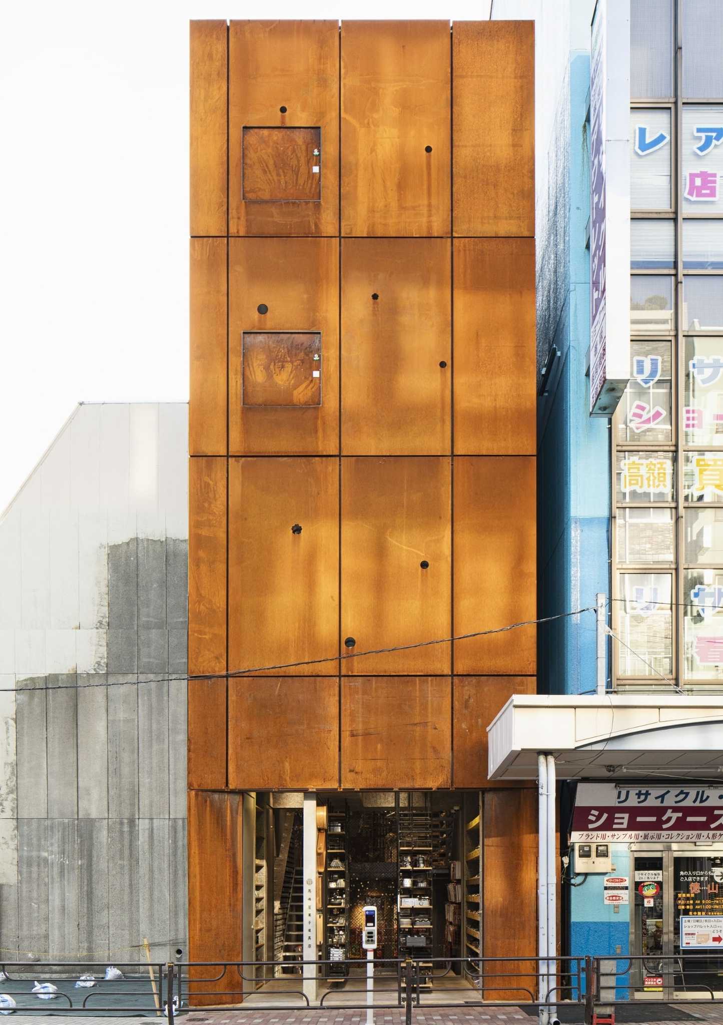
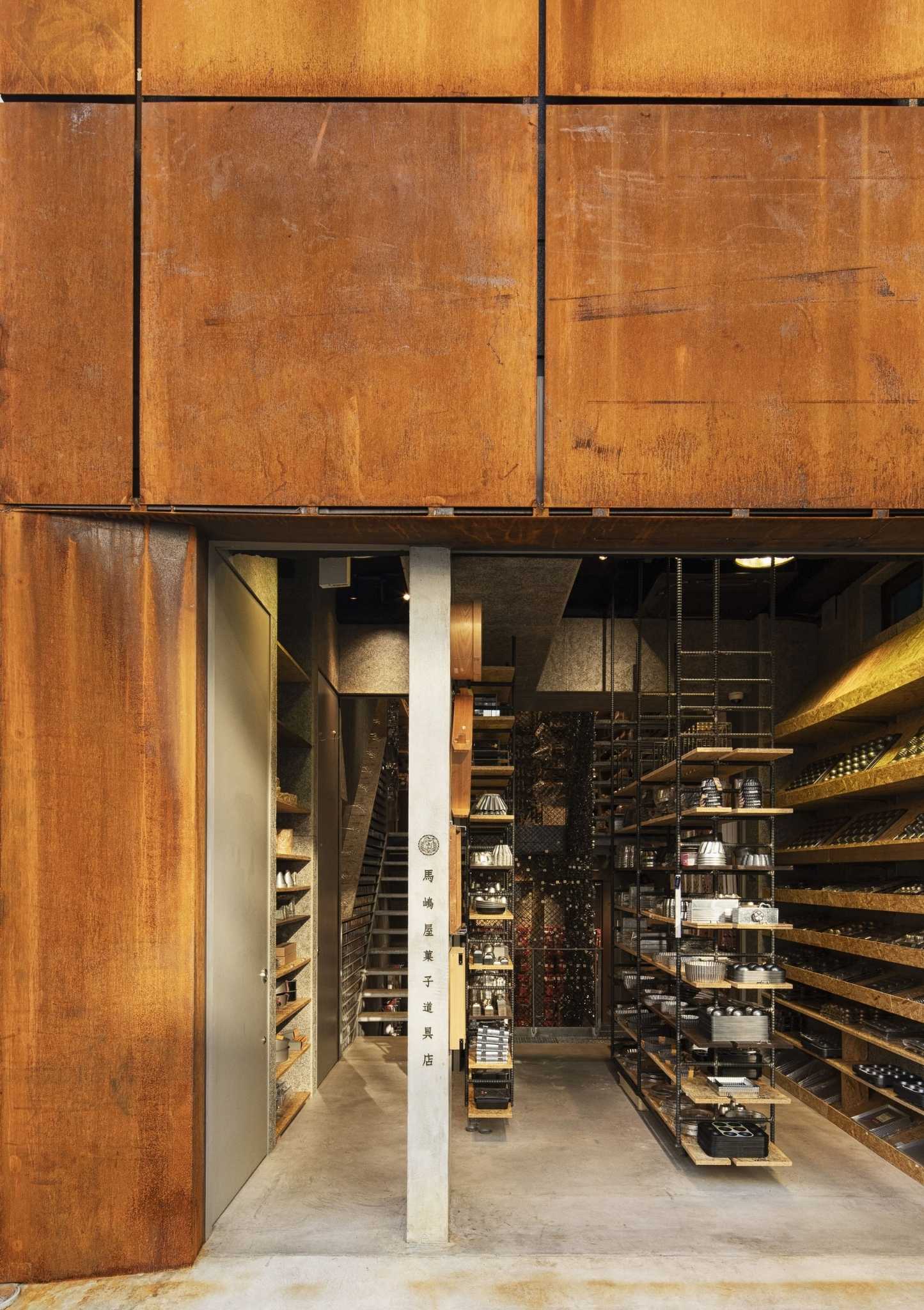
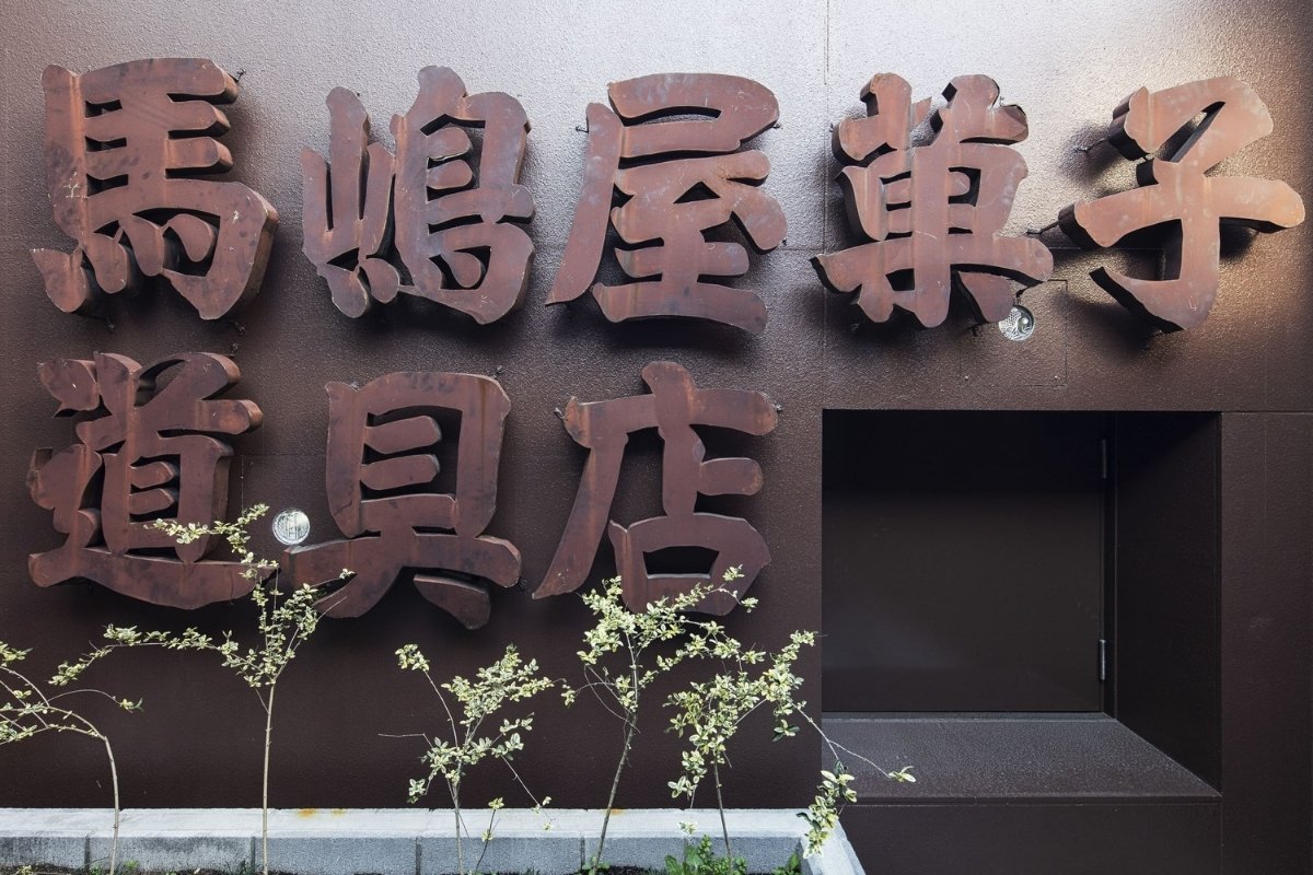
Founded in 1951, the company Majimaya has been selling confectionery tools in Kappabashi for over 70 years. There were 3000 different types of molds that I needed to showcase with the design.
What inspired the design of the project?
The design is rooted in the client's enthusiasm to continue selling confectionery tools in the same place for the next 100 years.
What was the toughest hurdle your team overcame during the project?
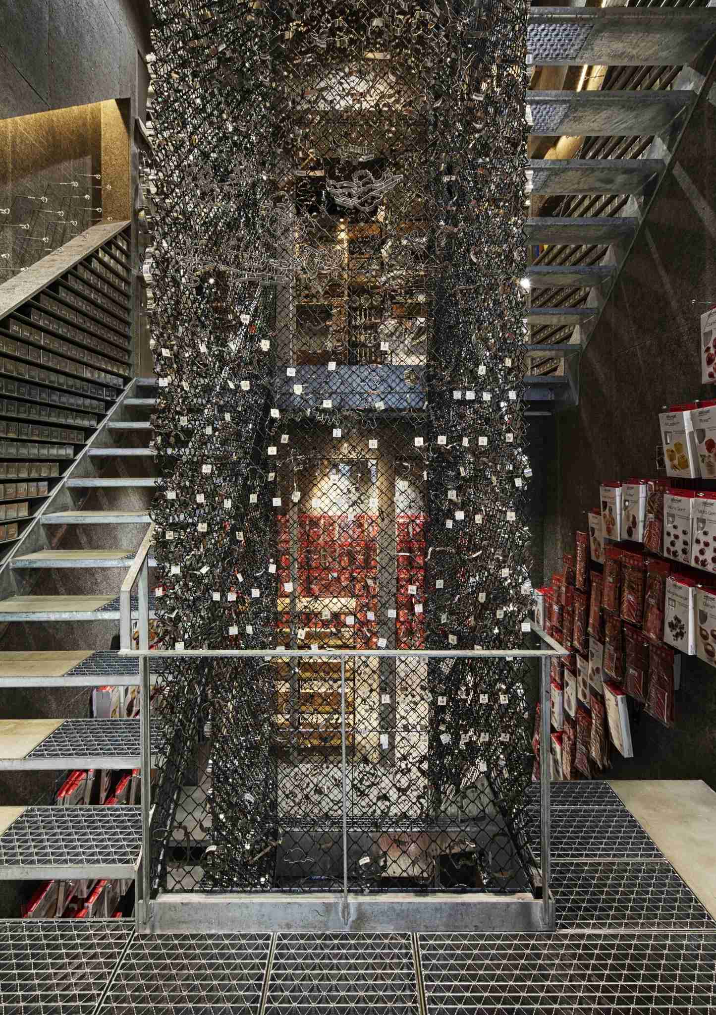
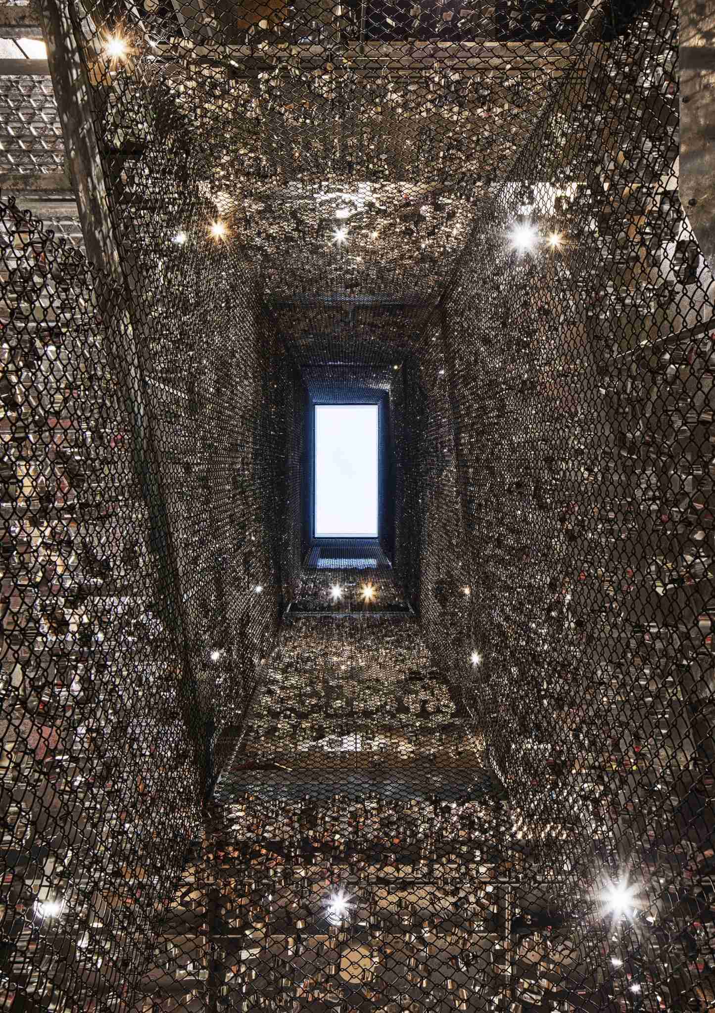
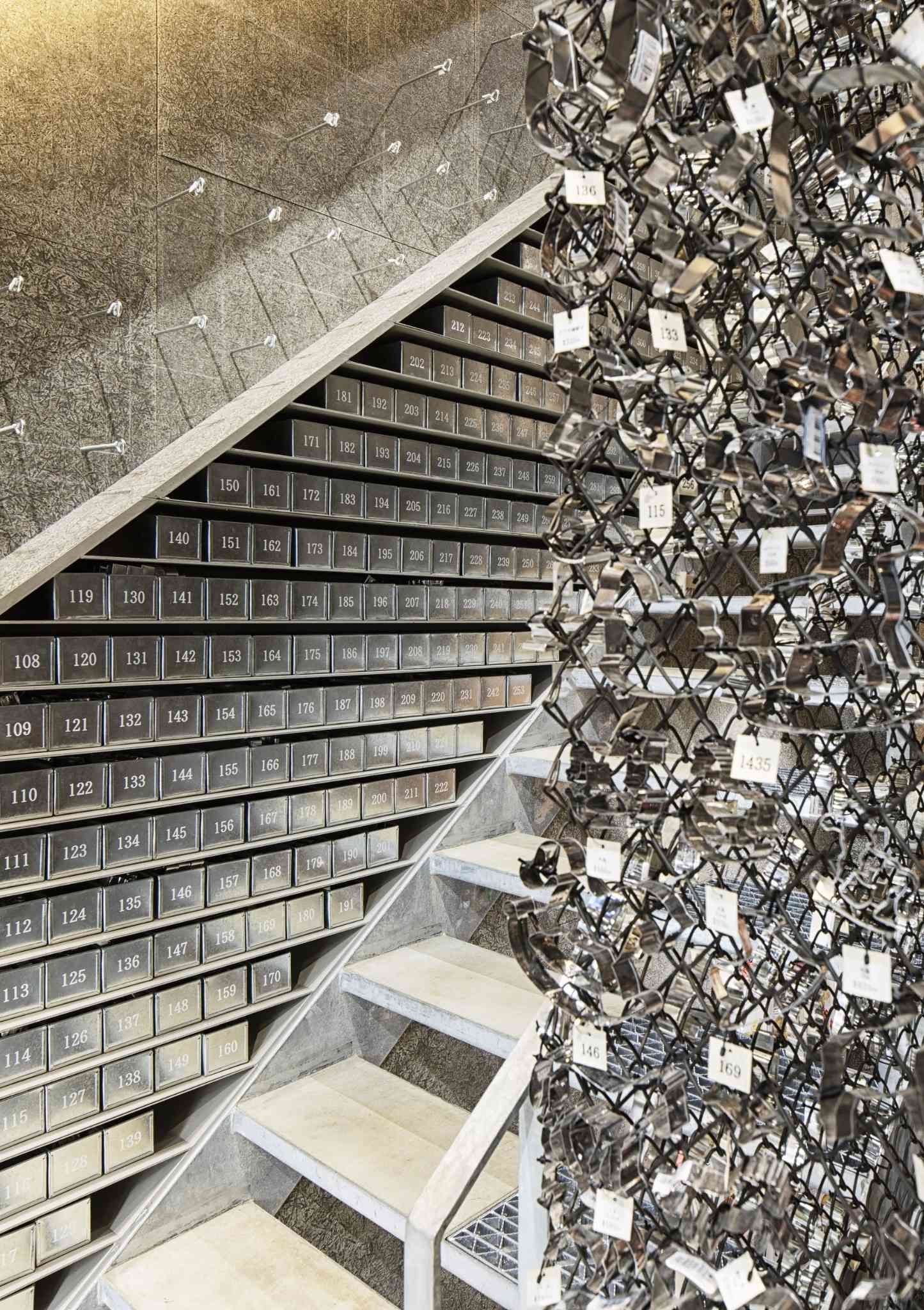
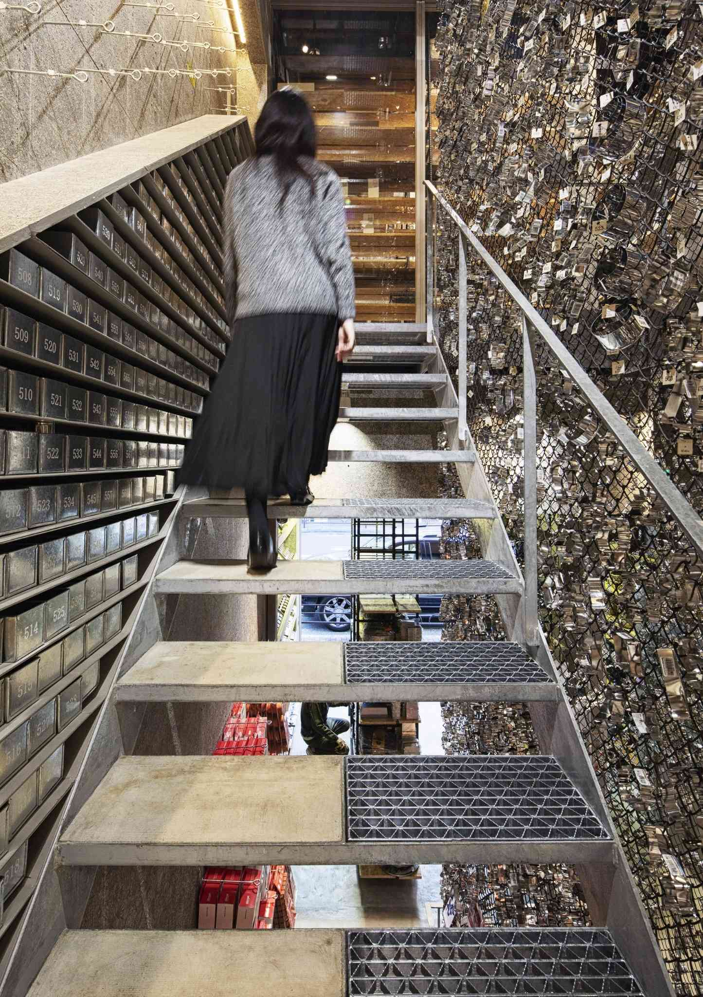
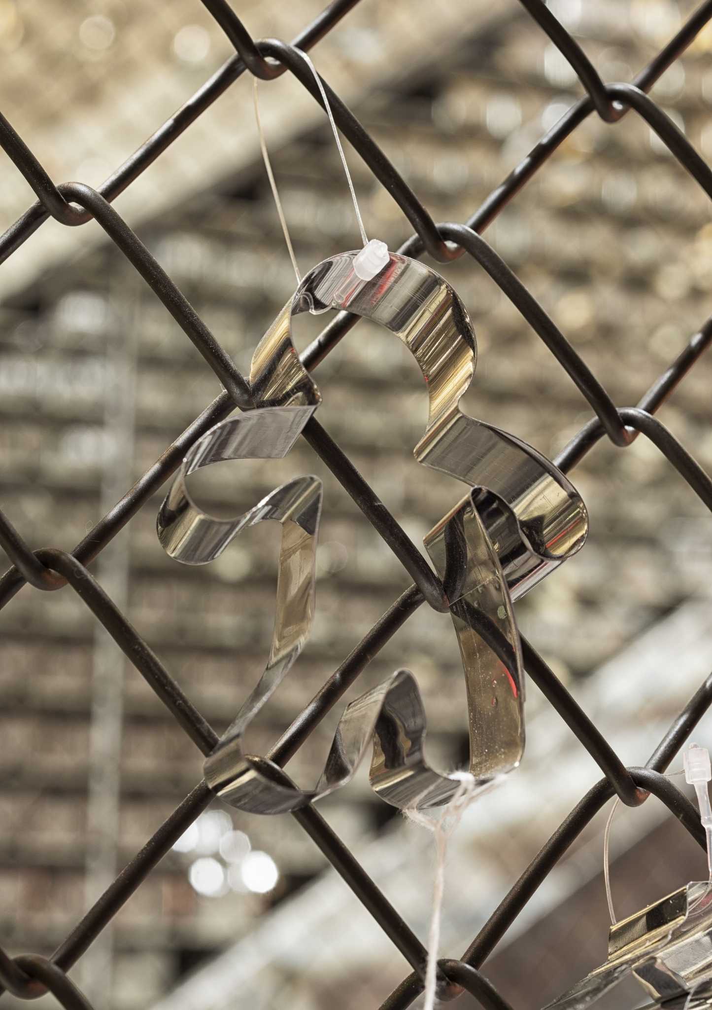
The main problem I had to solve was the limited space. I suggested setting up the evacuation stairs and protective fences in a way for them to display 3000 molds, right in the center of the building. In addition, I also arranged 3000 tin boxes there. By linking the display with the number printed on the box, it was made easy for the customers to choose one themselves and take out the required number from the stock.
During the planning of the building, all floors were connected by split-level floors, and while choosing molds, customers were guided to move up and down subconsciously. This solved the unique problem of arcade area, which is a stress-free place for customers to move up and down inside the building.
What was your team’s highlight of the project?
3,000 confectionery tools molds in the middle that were installed together with the client.
Why did you enter this project into the SBID Awards?
I thought it could be an inspiration for arcade shopping buildings all over the world.
Questions answered by Masahiro Yoshida, Representative, KAMITOPEN.
With the much-anticipated AW22 living and dining collection from Sofa.com that has launched on the 5th September, we have taken this opportunity to look back and share insight from the last 12 months. As we seek to identify trends spotted by our trade team, we can unveil the design and fabric preferences from their elite group of interior designer clientele.
Bestselling Fabrics:
The ever-popular collection of cotton matt and smart velvets has now been overtaken in sales volume by the brushed linen cottons - a collection made from 63% cotton and 37% linen offering a stylish and durable upholstery solution. The collection contains a mixture of neutrals and greys, blue and green fabrics with Taupe, Alabaster and Charcoal proving to be most popular.
Other recent launches have also captured the imagination with the Brushstroke fabric collection, already registering as our 8th bestselling line as the tactile nature of the fabric seems to be a requirement that many designers look for.
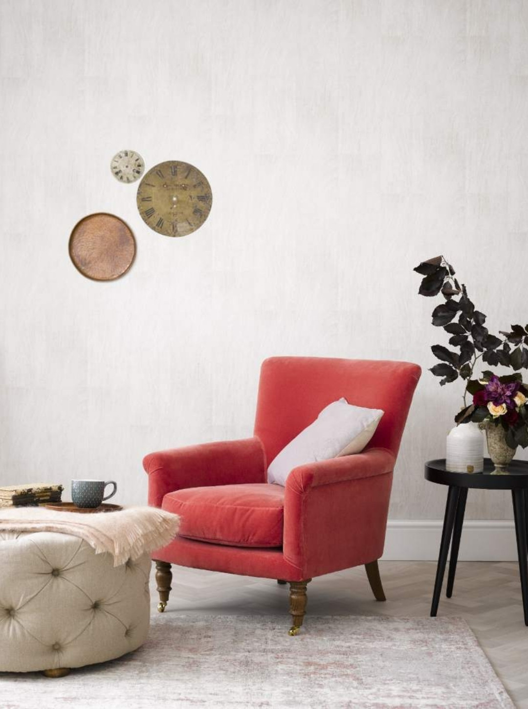
Bestselling Colours:
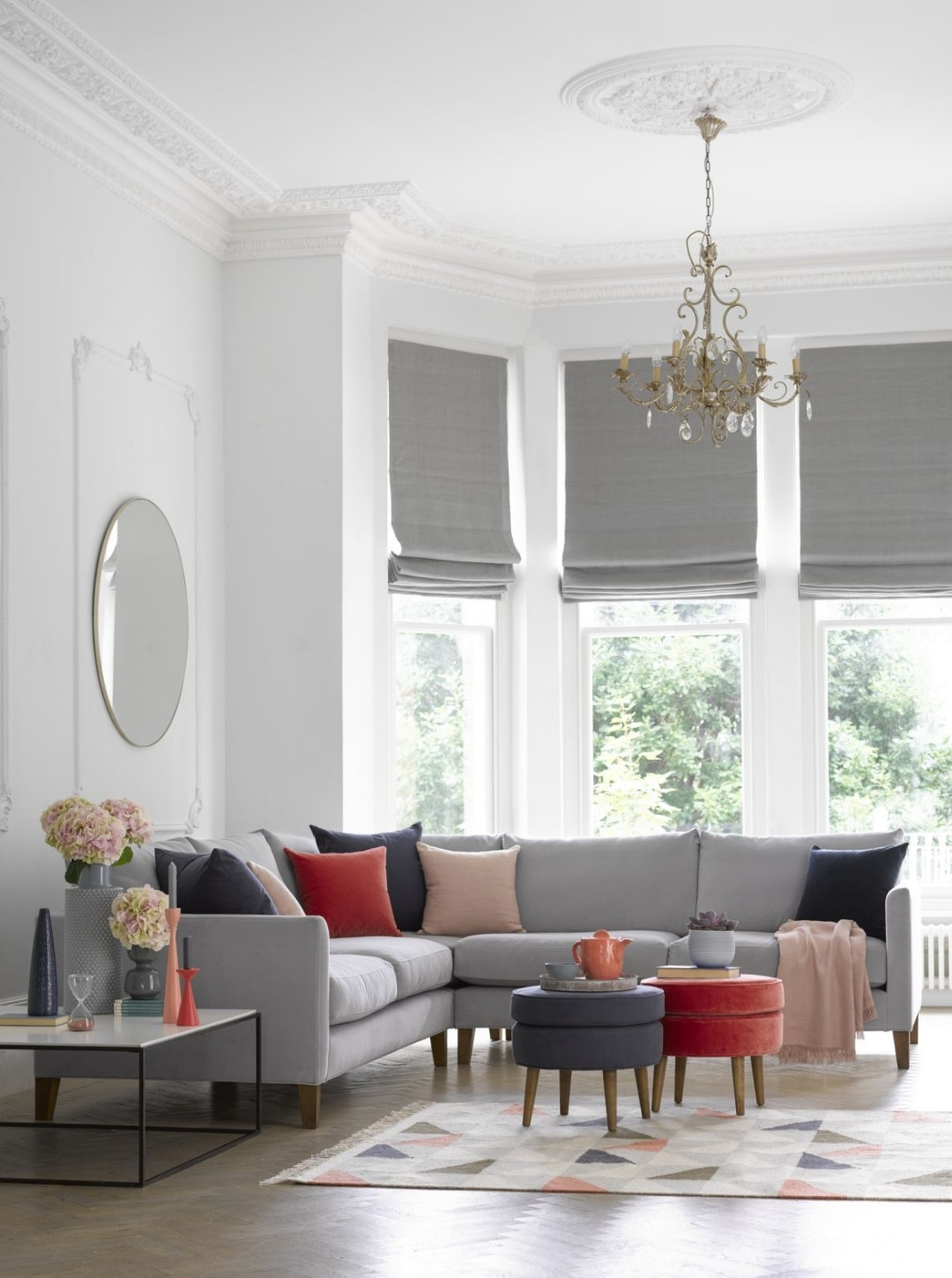
Our overall top sellers reflect a return to a pared back palette of neutrals. Overtaking the jewel toned velvets popular for the past few seasons are Pumice, Clay, Taupe, Alabaster and Armour.
Interestingly, the summer months have encouraged designers to opt for custom coverings with an increase in COM orders.
Upcoming fabric launches for AW22 include the Heathland Weaves collection as well as range extensions for Smart Velvets, Boucle, Vermeer Linen and Silky Jacquard Weaves. Available in a selection of neutrals, Heathland Weaves cater for a growing desire amongst designers to utilise greys and pared-back autumnal tones and fabric compositions that are as hard-w earing as they are stylish.
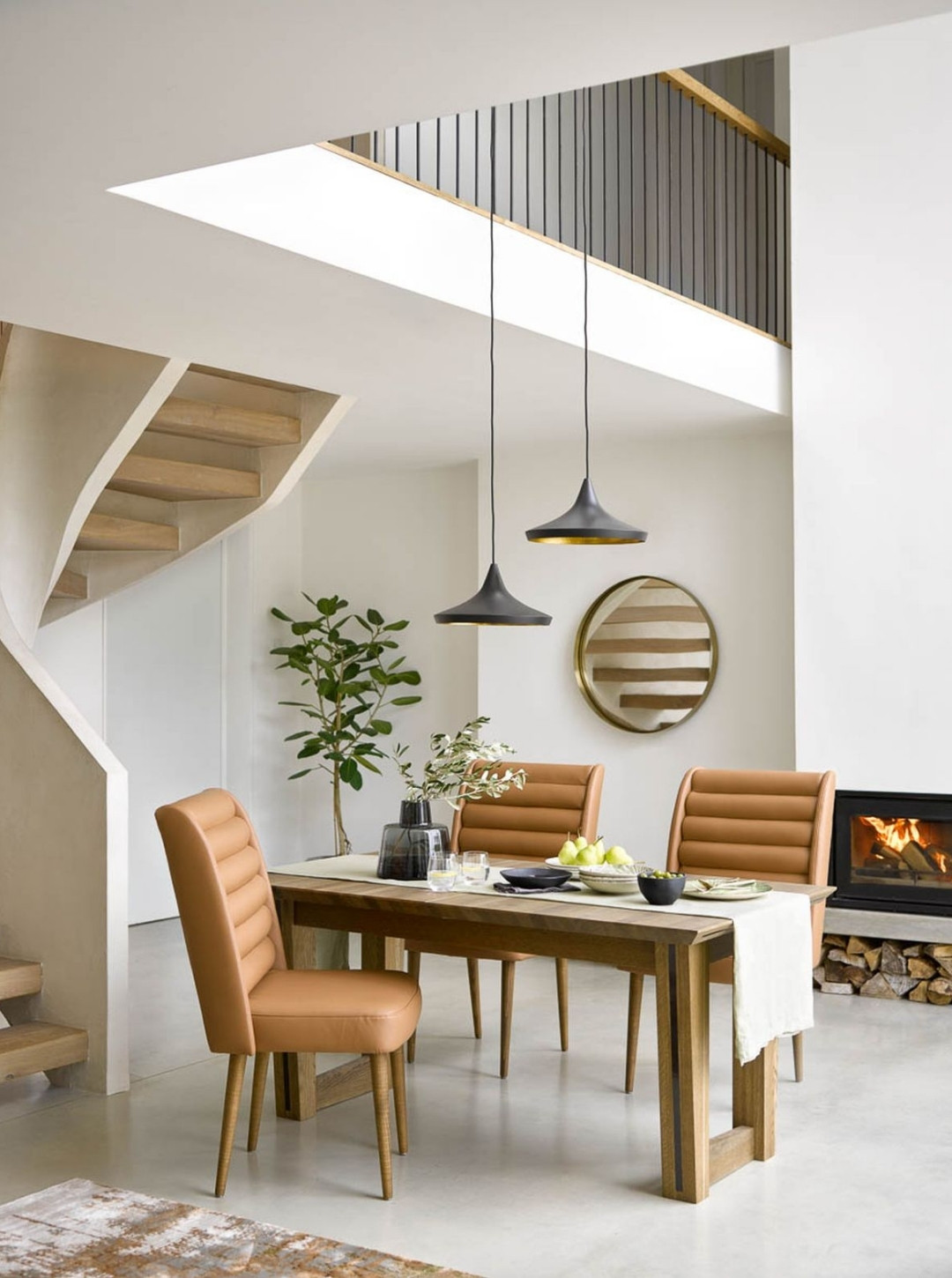
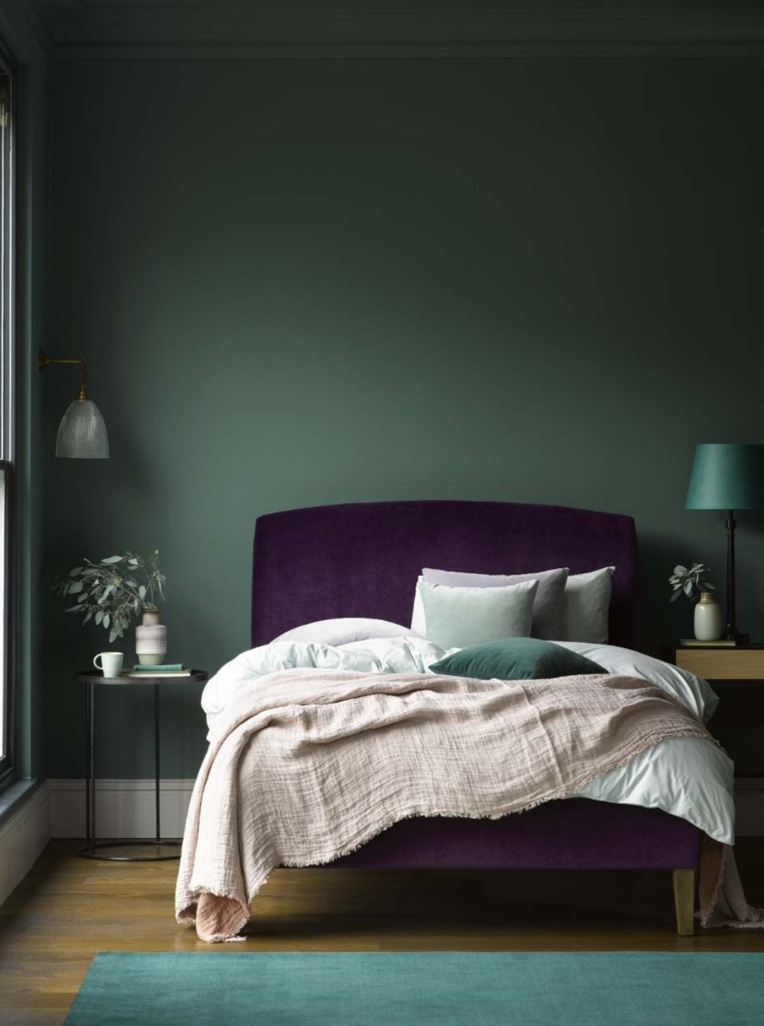
Bestselling shapes:
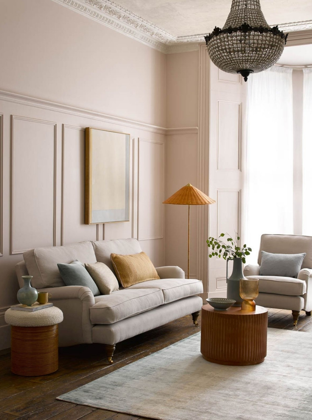
Delving deeper into the data the trade team have been able to identify the most popular pieces across the board. The modular Cohen has led the way for 2022, its contemporary styling and generous proportions proving popular across an array of design projects. Bluebell remains the perennial favourite, its timeless, classic design offers versatility for traditional and modern schemes.
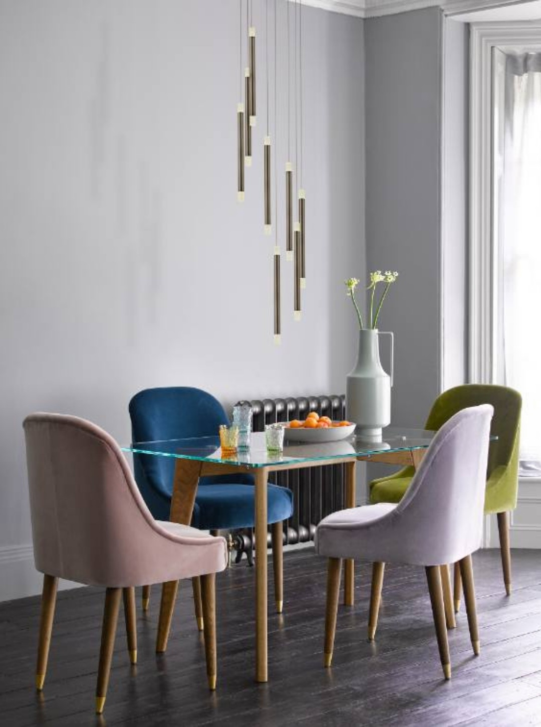
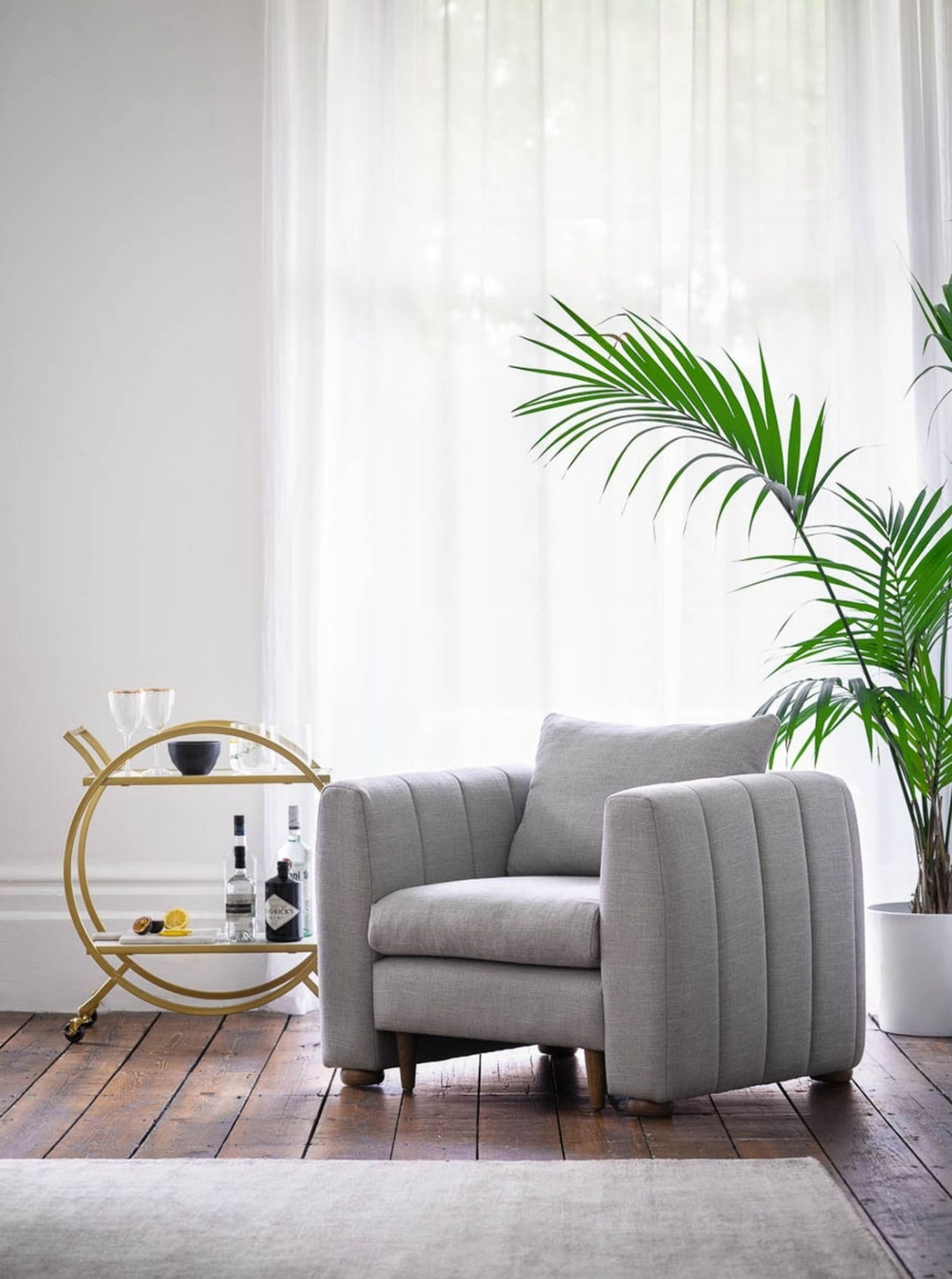
Bestsellers in each category include the Izzy modular sofa, Alderney armchair, Thea bed, Arabella dining chairs, and Kingsley table.
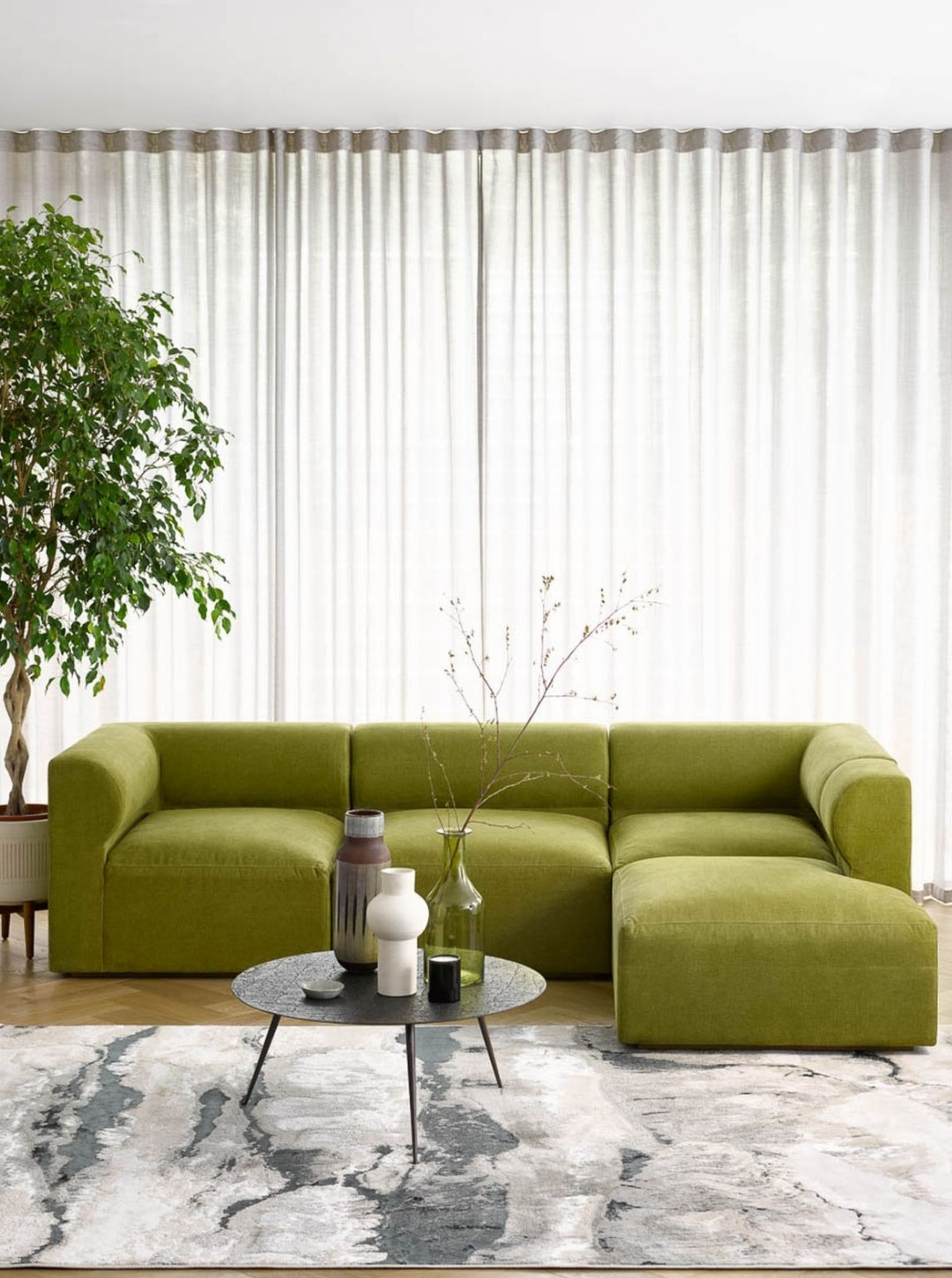
Ever adapting to the needs of our designer clientele base, the sofa.com team are proud to be at the forefront of delivering the highest quality furniture, fulfilling each order to exacting specifications.
The trade team at sofa.com is on-hand to assist with any queries – please visit www.sofa.com/trade for more information.
About sofa.com
Passionate about outstanding interiors, sofa.com offers a diverse and design led collection of made-to-order sofas, armchairs, beds, footstools and home accessories. With an extensive range of styles and over 100 fabrics to choose from, as well as the option to upholster in your own fabric, the customisable nature of sofa.com’s products make each piece easily adaptable to any interior style – perfect for interior designers and specifiers looking for stand-out pieces for upcoming projects.
If you’d like to feature your product news here, get in touch to find out more.
If you’d like to become SBID Accredited, click here for more information.
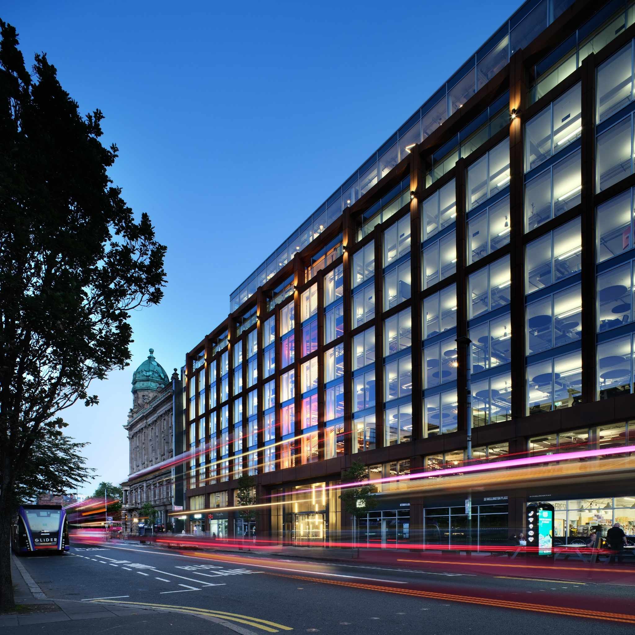
PwC, a renowned professional services provider, has made a significant investment in the city of Belfast by relocating its offices to Merchant Square. The move to the city centre comes from a desire to not only support the growth of the company, but to signal its confidence in the area and encourage other businesses to take a similar initiative.
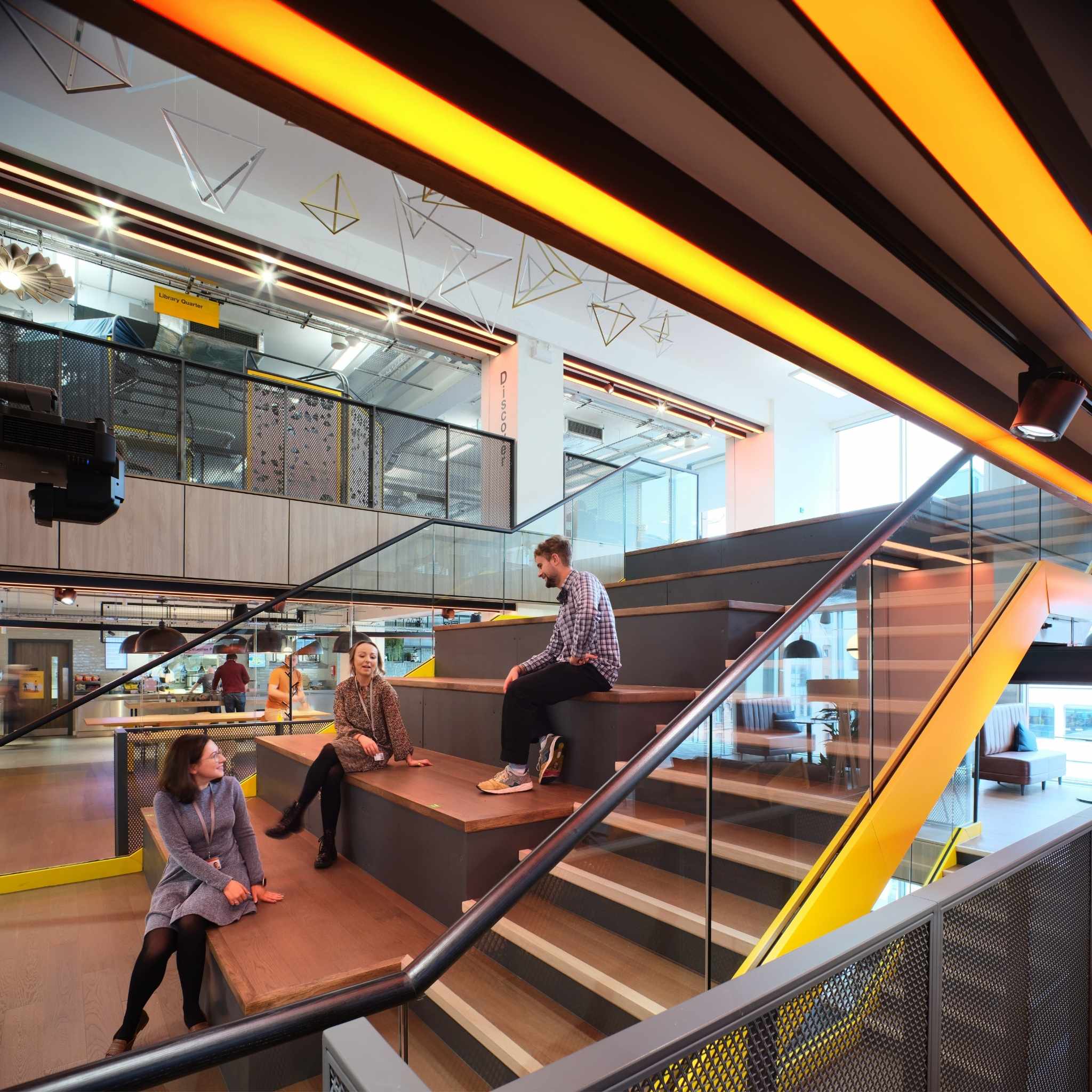
The new workplace is spread across 200,000 sq ft over nine floors and provides the regional hub for around 3,000 employees. The building is an amalgamation of three existing structures with a dramatic feature staircase linking floors four, five and six. The hope is that the new office will help to increase employee numbers over the next few years, meaning the design needed to have versatility as well as longevity. To meet both of these requirements, a wide range of KI furniture was specified by the lead interior designer, BDP.
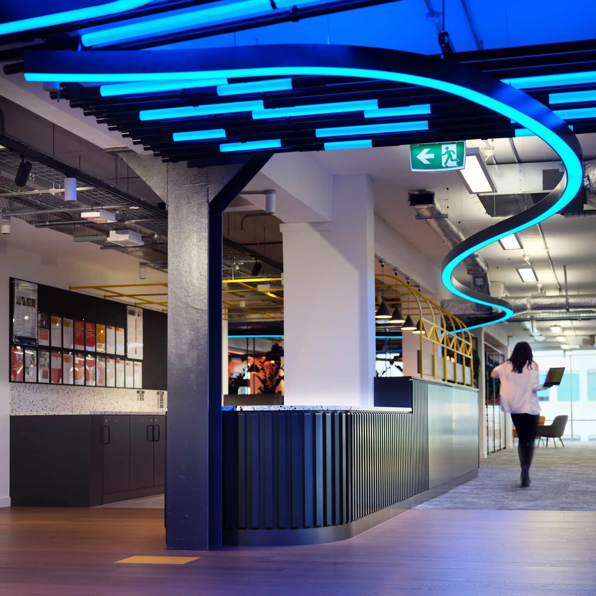
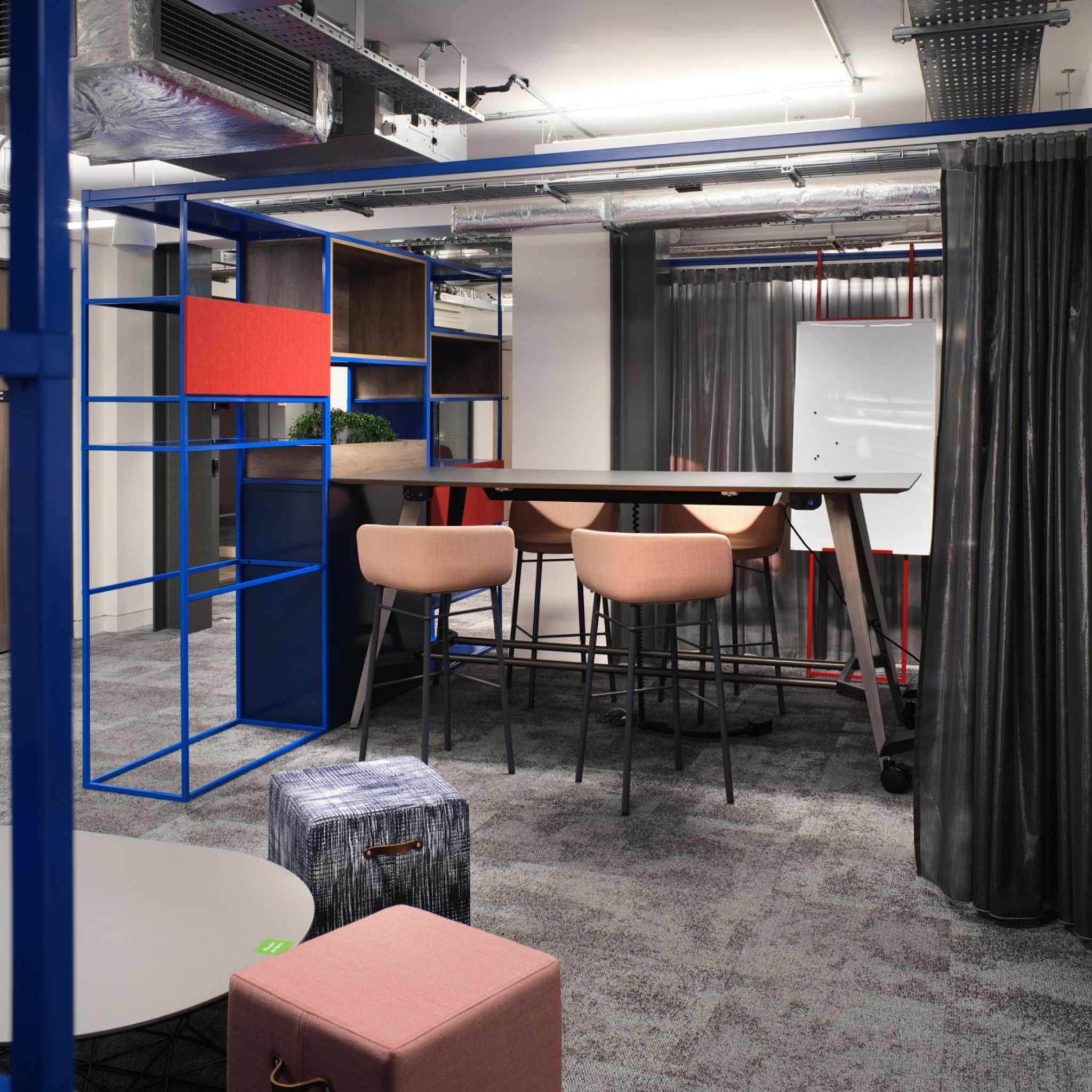
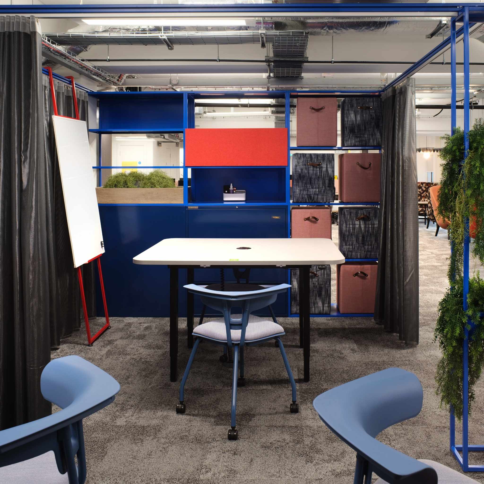
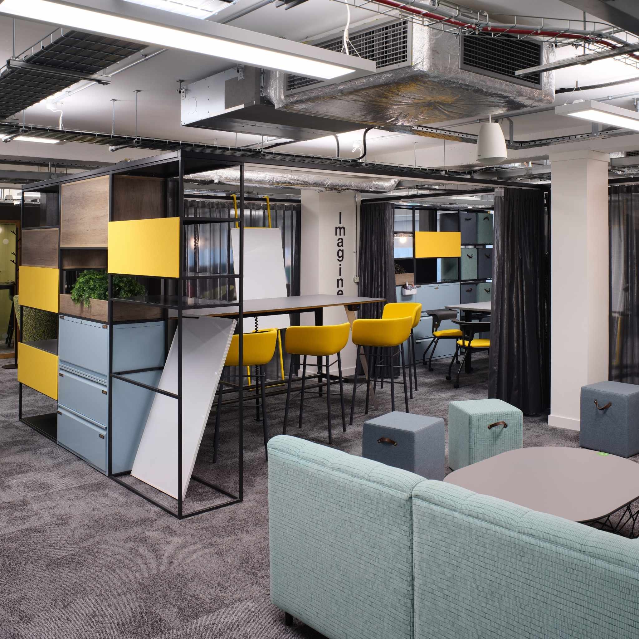
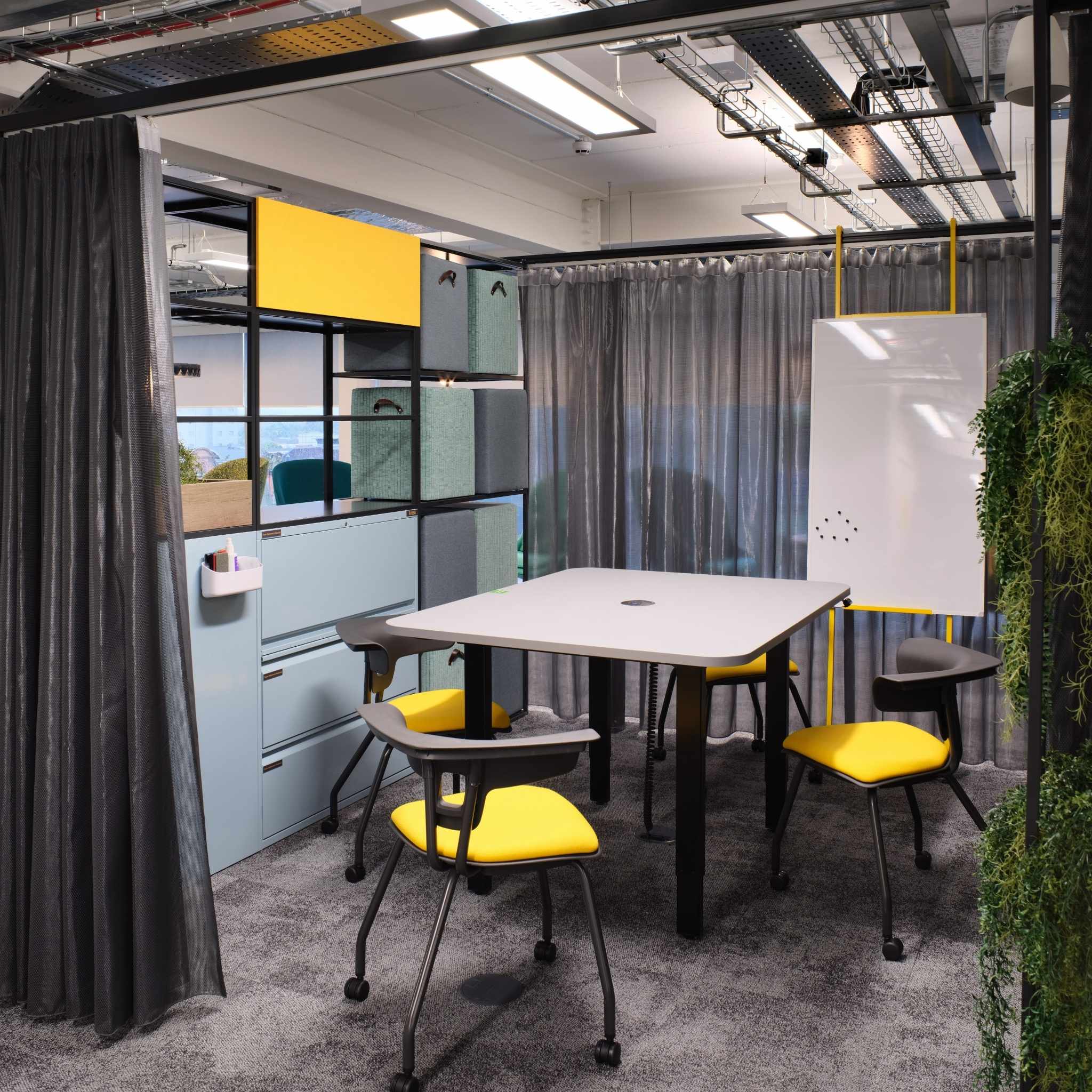
On four of the levels, KI’s Colonnade system is being used to create user-controlled, open-plan spaces which the teams can quickly customise depending on the immediate need. Each Colonnade comprises 800 Series cupboard and drawer units integrated with 800 Series Shelving. Semi-sheer Kvadrat Acoustic Drops curtains feature on each open side of the structure and divide up the space for meeting or work settings. To maximise the system’s flexibility, Colonnade Cube stools were also chosen as they can be neatly stored away within the unit’s structure. The stools are upholstered in a variety of fabrics and colours to best complement the Colonnade units.
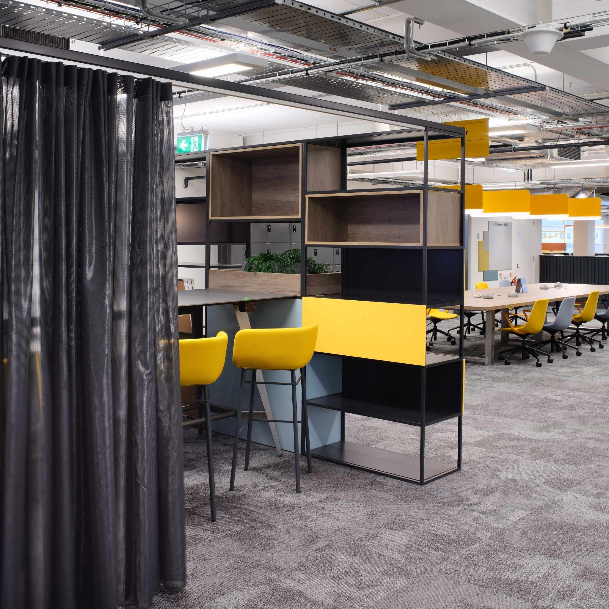
Moveable easels hook over the overhead gantry rails at any point and these are accessorised with magnetic backed whiteboards which also store away neatly in the open shelving when they are not being used.
Two different colour schemes were specified for the Colonnade systems, one of which uses vibrant colours that echo the shipbuilding heritage of Belfast. Bright yellow powder coated easels pay homage to the nearby Harland and Wolff cranes, whilst bright blue and red powder coats emulate well-established maritime engineering colour schemes.
Annabelle Hadlow, project architect at BDP, said: “Materials and furniture specification is always important to PwC. We have a fantastic understanding of its design aspirations and how the offices reflect the cities in which they are located whilst providing functional and flexible spaces. For Merchant Square, the furniture was crucial in achieving the right, characteristic design and the right levels of adaptability across all floors.”
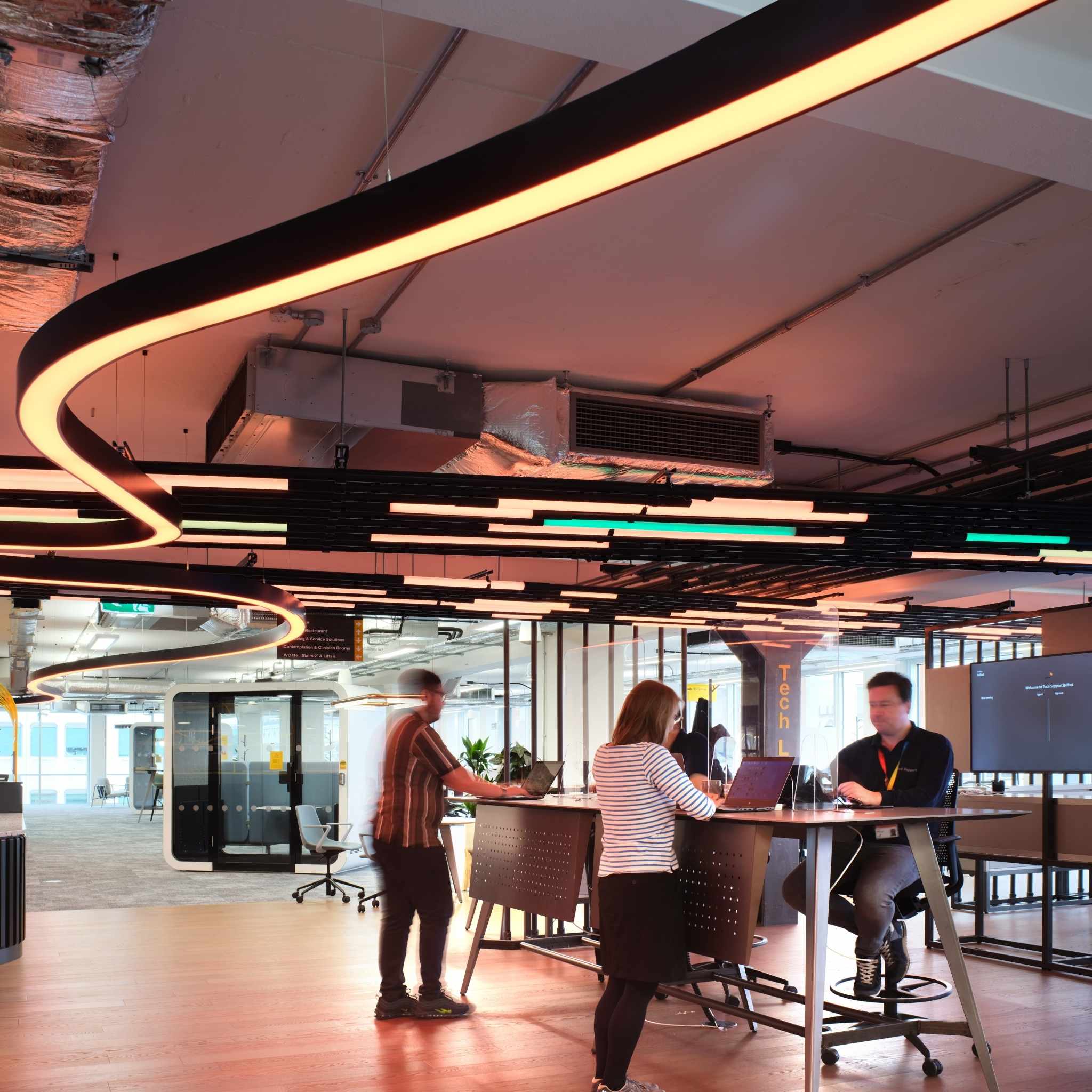
Throughout the office space, a variety of other KI designs provide seating and tables to support both the impromptu and more focused work practices that are required. These include Zig poseur height tables and Work2.1 Sit-Stand tables in a variety of finishes such as graphite Fenix tops on raw steel, black and yellow under-structures. These tables provide ideal settings for dropdown work and casual collaboration.
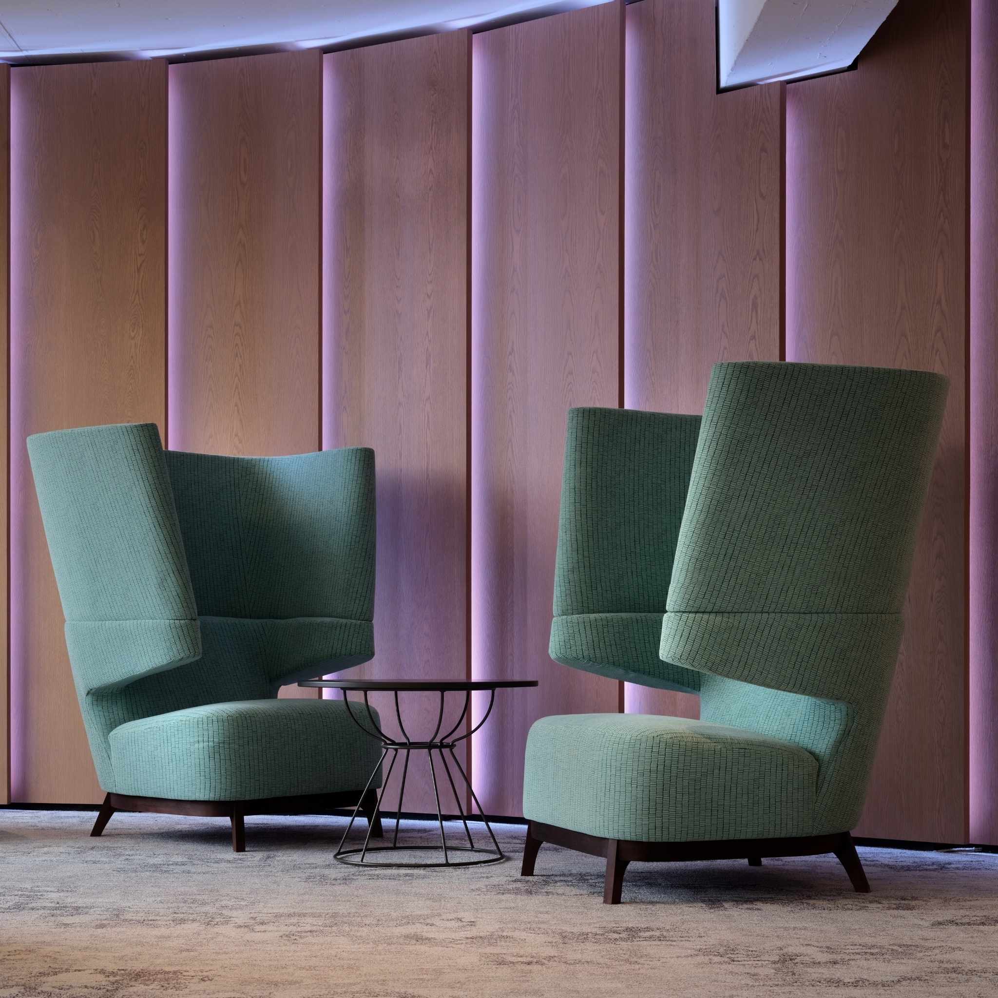
KI’s Take5 high back armchairs adorn multiple areas and are upholstered in a variety of fabrics and colours. Ruckus chairs on castors are located around collaboration tables and inside the Colonnades. The innovative design of the Ruckus is also ideal for sit-stand tables, allowing a person to either sit in the chair or perch on its backrest, depending on the height setting of the table.
Throughout the building are 800 Series personal lockers fitted with RFID wireless lock technology which can be remotely monitored and controlled by the facility management teams. Some larger versions are also located in the basement area to provide cloak and leisure storage. Other specifications of matching 800 Series cabinets, recycling units, and tambour cupboards - a PwC standard - can also be found in the back office service areas.
About KI
KI’s furniture helps the world’s leading organisations create happy, healthy, high performing working and learning environments. Bringing together good design, advanced engineering and sustainable resources, KI’s products are durable, flexible and offer excellent value.
If you’d like to feature your product news here, get in touch to find out more.
If you’d like to become SBID Accredited, click here for more information.
This week’s instalment of the Project of the Week series features a renovated soft and subtle hotel design by 2021 SBID Awards Finalist, Elkus Manfredi Architects.
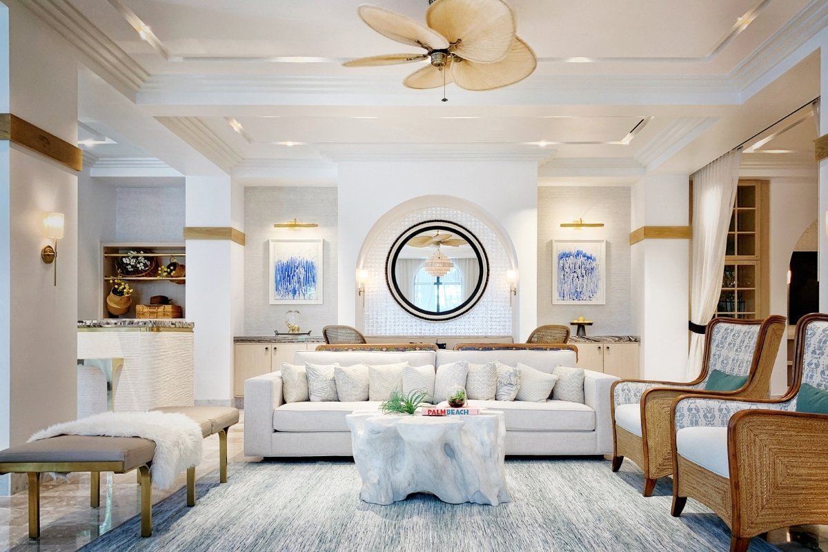
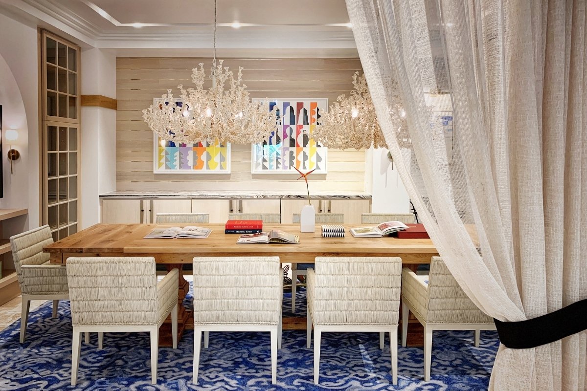
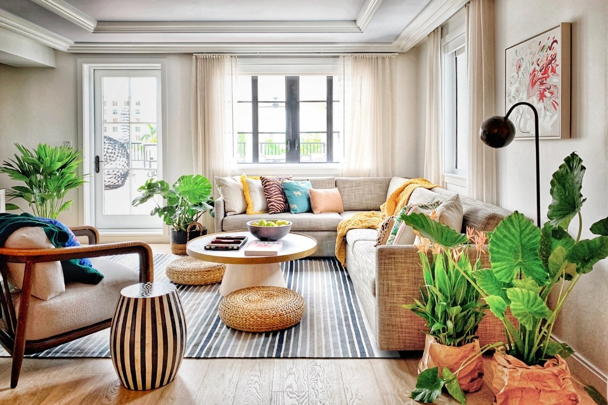
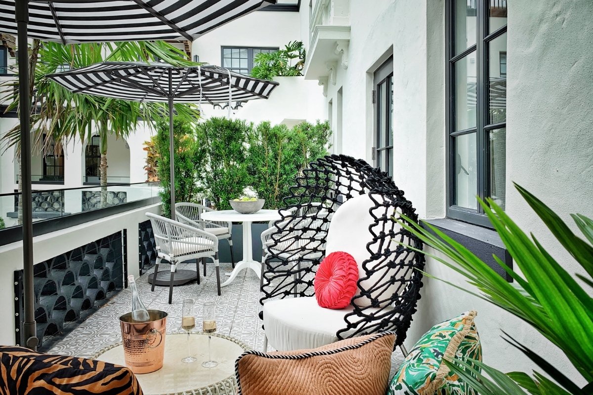
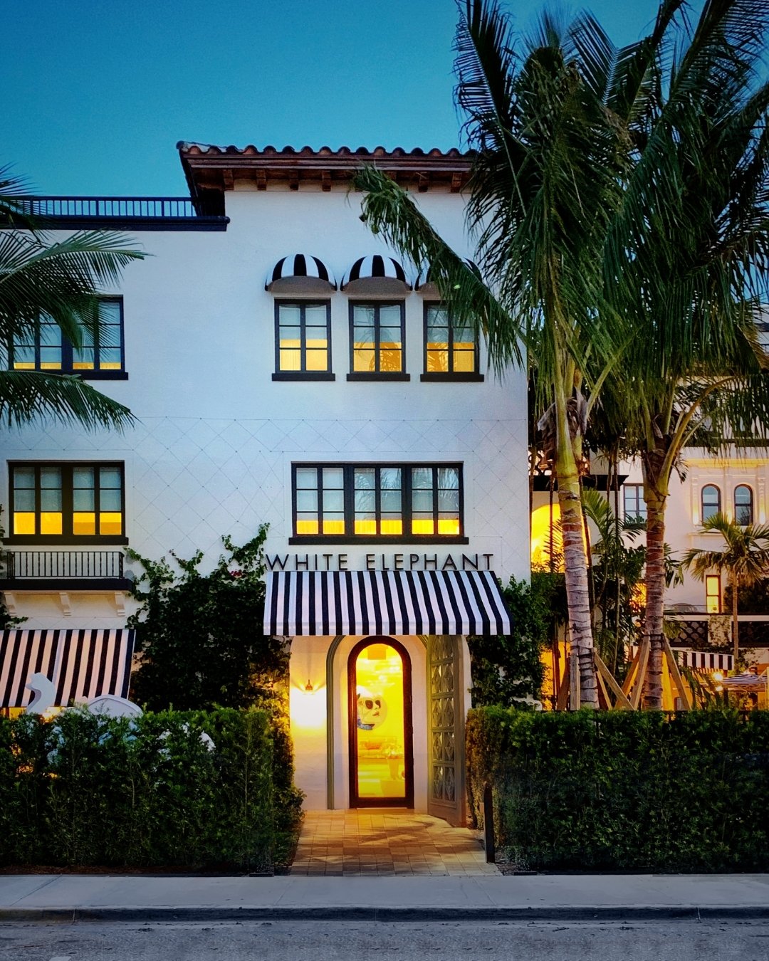
The design of the intimately scaled, 32-key White Elephant Palm Beach is a contemporary interpretation of Mediterranean revival architecture that lovingly honours its history while introducing a new design voice to Palm Beach. Airy, casually elegant, and gracious with a touch of wit, White Elephant Palm Beach debuts a fresh aesthetic for Palm Beach that is deeply attuned to today’s global guest.
White Elephant Palm Beach opened in 2020 in the former Bradley Park Hotel, built in 1924 and designated a historic landmark by the Landmarks Preservation Commission of Palm Beach in 1980. Now owned by New England Development, the hotel underwent a “down to the bones” reimagining by Elkus Manfredi Architects, which was responsible for the comprehensive design vision, including exterior and interior architecture, furnishings, landscape, and art curation. Sister hotel to Nantucket's legendary White Elephant, White Elephant Palm Beach reflects the same meticulous standard of service while capturing the essence of contemporary Palm Beach.
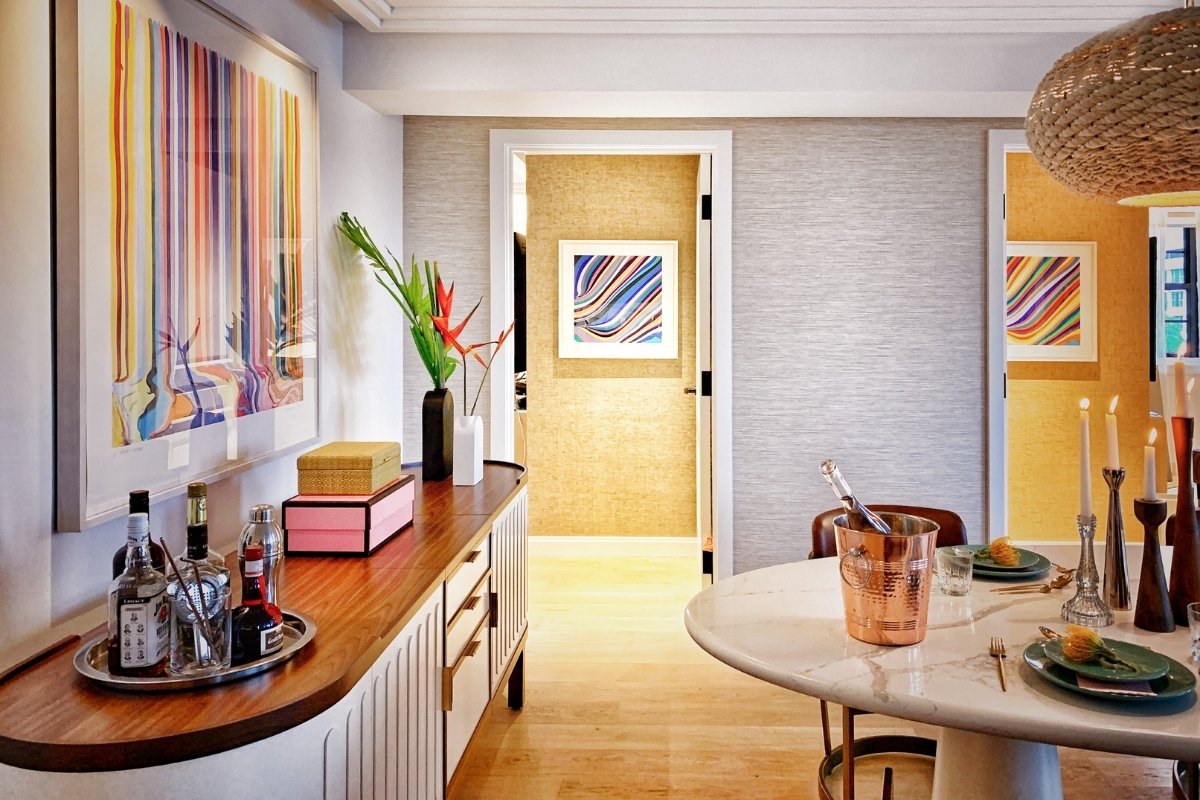
The hotel’s collection of museum-quality original art, specifically curated for this project, is found in public spaces, guestrooms, and even bathrooms, adding another dimension of authenticity to the personal, layered experience that White Elephant Palm Beach offers its guests.
SBID Awards Category: Hotel Public Space Design
Practice: Elkus Manfredi Architects
Project: White Elephant Palm Beach
Location: Florida, United States
What was the client's brief?
New England Development asked Elkus Manfredi to create a new perspective for the emerging wave of international travelers to Palm Beach, a design that would embrace the unique history of Palm Beach and the architectural significance of the Bradley Park Hotel, while introducing a new aesthetic – soft, subtle, intimate – that is a departure from the grand, strong, colorful aesthetic generally associated with Palm Beach. The hotel also needed to embody the service promise of its sister, White Elephant Nantucket.
What inspired the design of the project?
In a gesture that captures the playfulness of the brand, the client named their first White Elephant hotel, located in Nantucket, in response to an islander’s initial fears (later assuaged) about the prospect of a new hotel on his island. The inspiration for the design of that hotel’s sister was the result of that brand mixed with other elements, which all together produced the very singular and serendipitous alchemy that is the White Elephant Palm Beach. Major inspirations included:
- The once-in-a-lifetime opportunity to restore and modernize the Bradley Hotel’s classic Addison Mizner-influenced Mediterranean Revival architecture was a foundational inspiration.
- We wanted to embrace the DNA of the brand by bringing a fresh new design perspective to Palm Beach. So instead of leaning into the typical patterned, strong Palm Beach aesthetic, we developed a very textural, neutral palette to create a soft-spoken, elegant, more contemporary aesthetic that gently embraces the guest.
- The idea of continuously surprising and delighting guests is another central inspiration. Designers layered subtle, unexpected design surprises for the guest at every turn in the hotel.
- The collection of original art specifically curated for the hotel – and found everywhere, including corridors and bathrooms – was another high-impact and inspiring layer of the design.
What was the toughest hurdle your team overcame during the project?
- Restoration and redesign of the building needed to be accomplished while satisfying the historic criteria of both the Landmarks Preservation Commission of Palm Beach and the National Park Service.
- Working in a hundred-year-old landmarked property required creative, flexible design schemes that could accommodate the surprises that inevitably come with opening up century-old walls.
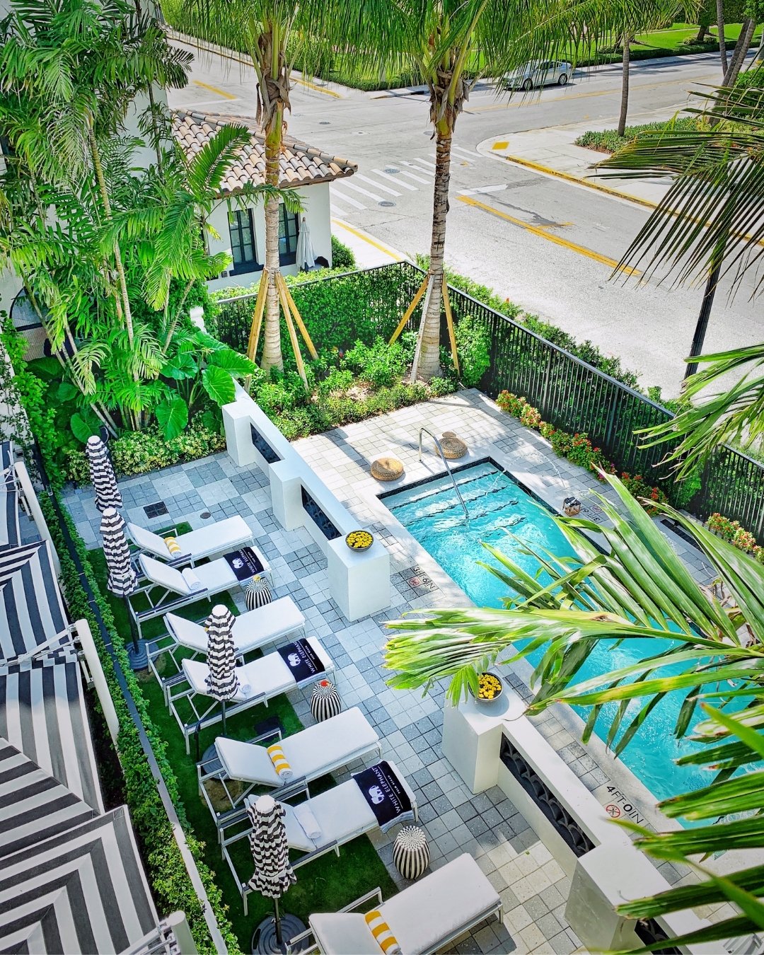
- The original center axis of the hotel’s design was a focus of the historic preservation agencies responsible for reviewing the plans in light of the building’s designation as a historic landmark. While designers moved the main entry off-center to allow the full activation of the courtyard with a pool, lounging area, and an indoor/outdoor restaurant, they maintained elements of the original axis and incorporated them into the new design in homage to the history of the building.
What was your team’s highlight of the project?
The reaction and recognition from guests. As an example, one guest wrote: “Amazing stay all the way. Great rooms, fantastic amenities and super friendly staff. Well done White Elephant Palm Beach, our new home away from home. We will come back and surely enough we will recommend this hotel to all our friends and family.”
Why did you enter this project into the SBID Awards?
From the start, the client tasked us with designing for a new wave of travelers to Palm Beach – to bring new perspectives and clientele to the resort destination. So rather than being driven by the classic Palm Beach aesthetic, the design introduces a global point of view to this American resort that we believed would resonate with SBID’s international audience.
Questions answered by Elizabeth Lowrey, Principal and Director of Interior Architecture, Elkus Manfredi Architects.
Premium bathroom retailer, C.P. Hart, works with architects, interior designers, and developers on a diverse range of residential and commercial projects, including new builds with distinctly modern aesthetics and high-end hotels inspired by classic British style.
C.P. Hart recently designed and supplied the luxury bathroom of Victoria Rise, an early Victorian property located in South London. Discover the inspiration, design, and featured products below.
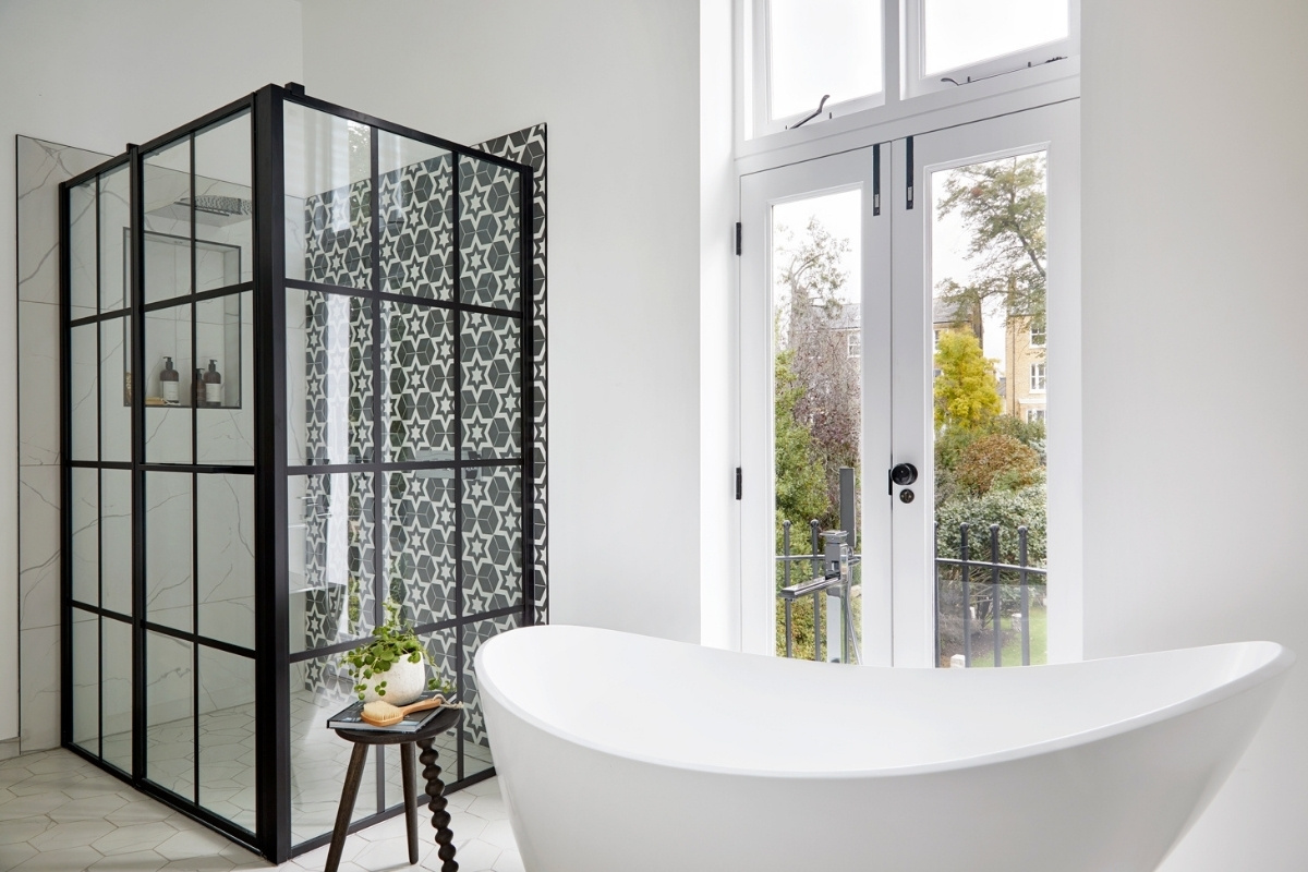
The primary bathroom of Victoria Rise was once a small space comprising of a bath, with no shower, and a WC tucked tightly into the corner. C.P. Hart maximised the area by moving the entrance door, allowing the layout to be reimagined while creating room for a large walk-in shower. The new shower, enclosed with a Drench crittall-style matt black frame, features a Gessi shower system from the Tondo 300 range – a customisable private wellness collection that offers a spa-like experience.
“The client brought us an image of an eye-catching black and white hexagonal tile,” the C.P. Hart design team recall. “It sparked the idea for a bold monochrome scheme, which would also make the most of the original black cast iron fireplace.”
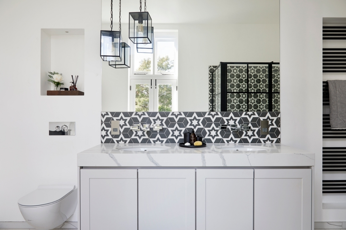
C.P. Hart’s exclusive Elter freestanding bath is complemented with a chrome bath and shower mixer from Italian maker, Gessi, coordinating with the basin mixers from the brand’s Eleganza collection. The C.P. Hart team designed the made-to-order double vanity basin unit to conceal pipework and incorporate the client’s desire for a marble top.
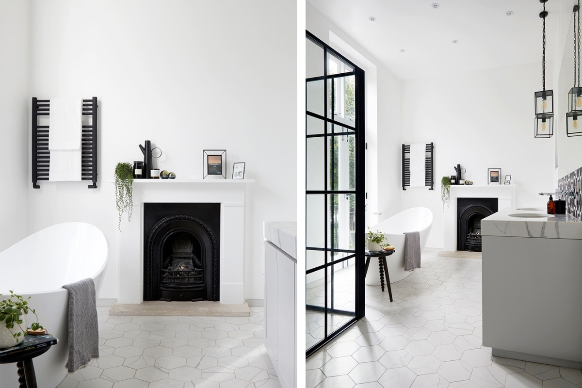
C.P. Hart transformed the limited space into a light and open bathroom that promotes wellness and relaxation, with a design that’s bold yet elegant, with a modern, linear style. “I wanted the client to be able to lie back and look out at the garden and sky,” the team explain, placing the freestanding bath adjacent to the statement floor to ceiling windows.
Discover more of C.P. Hart’s Recent Projects.
About C.P. Hart
Leading bathroom retailer C.P. Hart has an outstanding reputation for the best in design and innovation, with products sourced from designers and manufacturers worldwide, many exclusive to C.P. Hart and unable to be purchased elsewhere. C.P. Hart has 16 showrooms across the UK, including its impressive flagship at London’s Waterloo.
If you’d like to feature your product news here, get in touch to find out more.
If you’d like to become SBID Accredited, click here for more information.
This week’s instalment of the Project of the Week series features a industrial artists' house design by 2022 SBID Awards Finalist, Clara Lleal Interiorista.
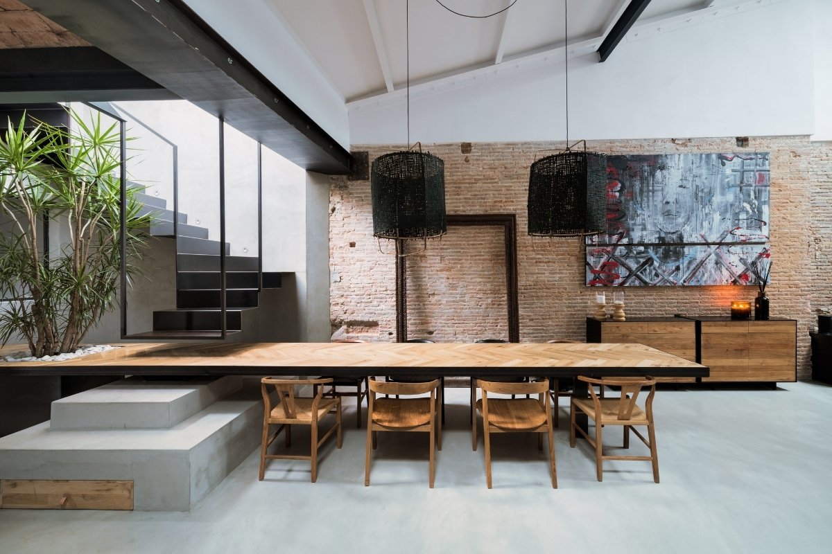
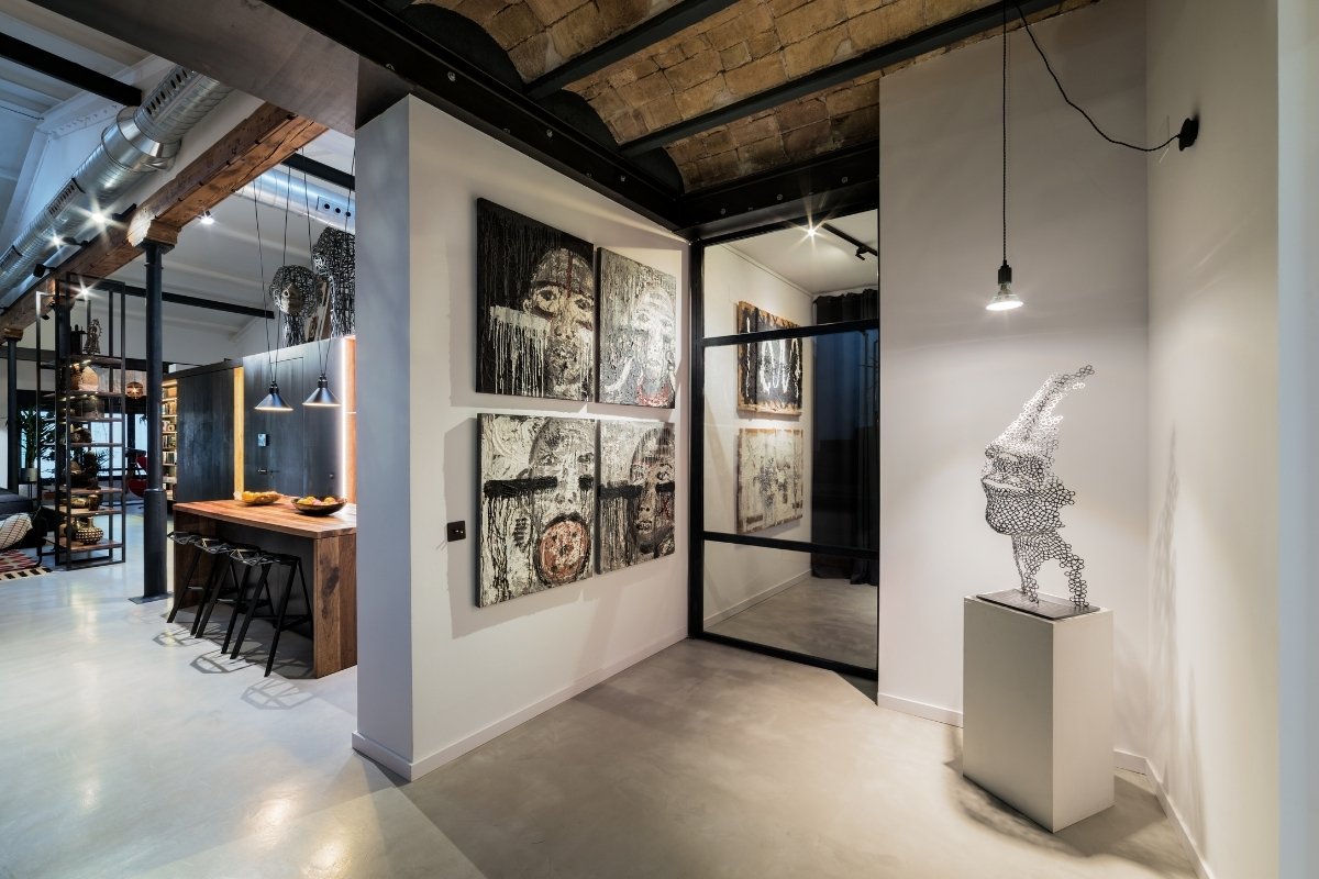
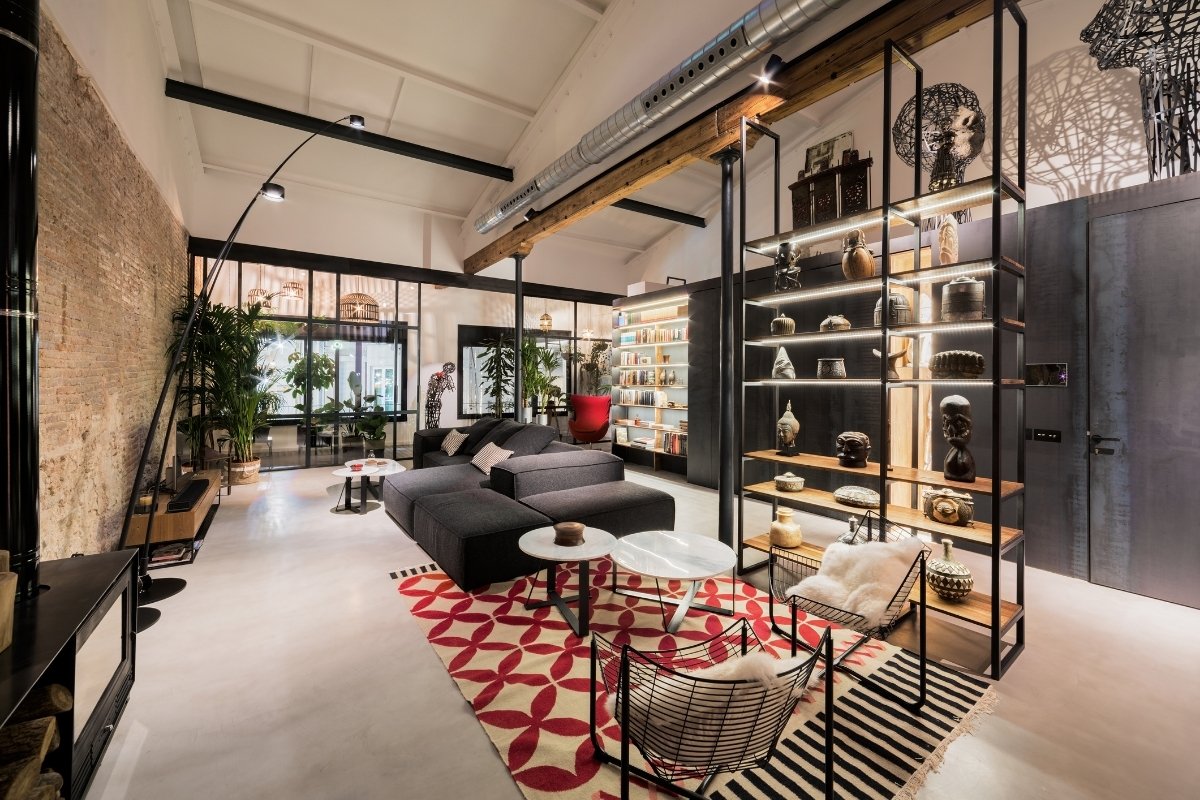
House located in the historic centre of Badalona, a city near Barcelona. One of the challenges when it came to the layout of the project was to strategically place the sculptures created by the owner of the house himself, the artist and sculptor Juanma Noguera. In short, an Art Gallery house.
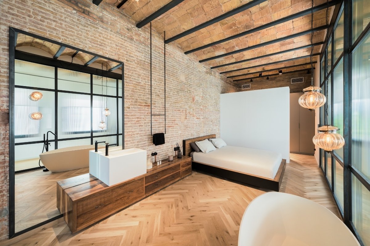
In terms of general aesthetics, the idea was to give the whole space an industrial atmosphere, maintaining and recovering the building's original materials. The solid brick walls were uncovered, the vaulted iron-beamed ceilings were respected, and areas with the original hydraulic pavement were maintained. The materials used subsequently also follow this industrial premise, concrete, black iron sheet, herringbone floor of recovered wood, and teak wood furniture to break the cold of the greys.
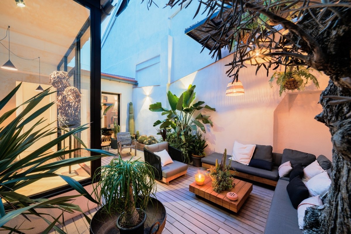
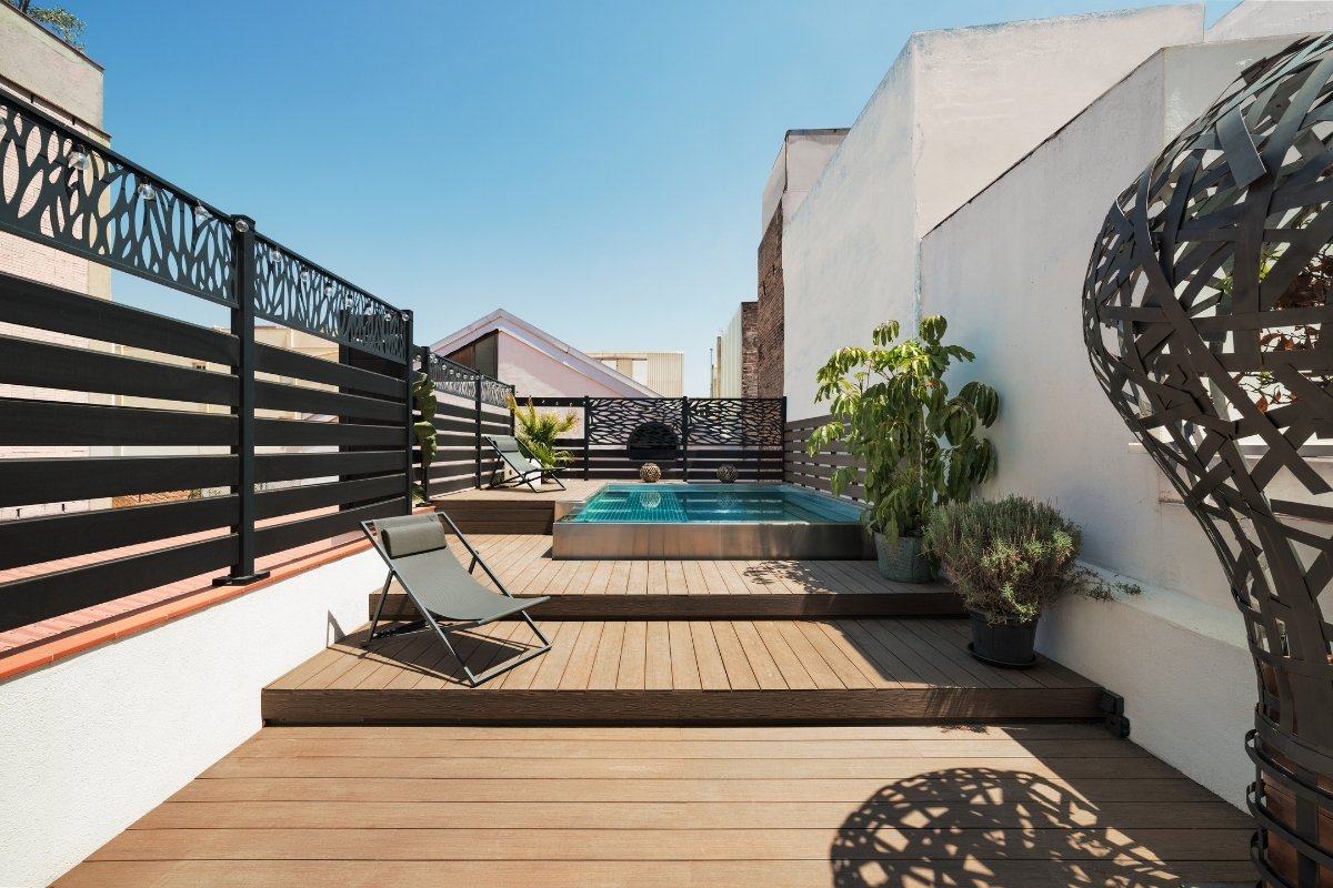
Gaining maximum natural light was also one of the objectives of this project. Several skylights were opened in ceilings, and an inner courtyard was located at the back of the house.
SBID Awards Category: Residential Apartment Under £1M
Practice: Clara Lleal Interiorista
Project: Art Gallery House
Location: Badalona, Spain
What was the client's brief?
The main request of the client, who is the sculptor and painter Juanma Noguera, was that his sculptures and paintings would be part of the overall design of the house. In other words, when thinking about the layout and design, we also thought about placing the sculptures in strategic places so that they could be observed and at the same time beautify the space.
What inspired the design of the project?
The construction of the house dates back to the 19th century, coinciding with the industrial period in Catalonia. Therefore, the house has many architectural elements typical of that period, which we wanted to maintain and even restore. The walls were chipped to leave the brickwork exposed, the original cast iron columns were restored, the hydraulic mosaic floor tiles of Mediterranean origin were kept, and the Catalan vaulted ceilings were left exposed. In short, we wanted to recover the industrial essence of the house and give it value.
What was the toughest hurdle your team overcame during the project?
The spaces were very large and there was a risk that they would not be welcoming, which was of paramount importance to the client. With the combination of materials such as teak wood and dark colours, a cosy atmosphere was definitely achieved.
What was your team’s highlight of the project?
One of the main challenges was to gain natural light. It can be said that in an area of 200 square meters there was only one window. Skylights were opened in the roof and in the inner courtyards, as many openings as possible were made so that the house would be bathed in light. We wanted to convey the feeling of well-being and warmth that natural light provides. In addition, from the beginning we wanted to include a lot of natural vegetation that can only live with light.
Why did you enter this project into the SBID Awards?
Because I had seen SBID award-winning projects that really seemed high level to me, so I thought it would be good to participate.
Questions answered by Clara Lleal, Creative Director, Clara Lleal Interiorista.
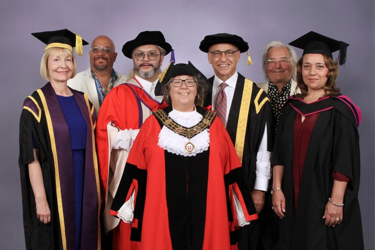
Interior Designer and Educator, Hans J. Galutera, has been awarded the honorary degree of Doctor of Design by Solent University, Southampton on Friday 15 July, recognising his outstanding contribution to the design industry.
Hans J. Galutera is a globally renowned interior designer with experience in the art and science of enhancing interior spaces especially the space of retail and hospitality venues to achieve a safer, healthier and more aesthetically pleasing architectural interior design.
His experience extends to maritime hospitality design including onboard Royal Caribbean International’s Enchantment of the Seas - the first ever lengthening project of a ship cut in half and re-joined to create revenue generating spaces for the second biggest cruise line of the world.
His other projects include, signature restaurants created for celebrity chefs such as Michel Roux on Celebrity Cruises Specialty Restaurants and Michael Schwartz on Oasis of the Seas and Allure of the Seas just to name a few.
His Penthouse Suite designs include the award-winning Celebrity Cruises Reflection of the Seas which was recognised by the Society of British and International Design annual awards event at the House of Lords in London, UK.
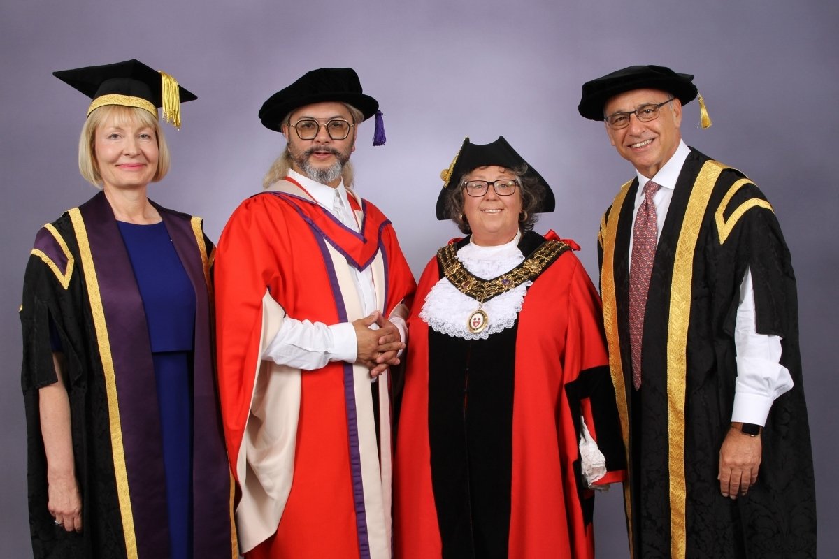
His outstanding contribution to the world of design has been recognised by the International Council for Caring Communities, not-for-profit organisation that has Special Consultative Status with the Economic and Social Council (ECOSOC) of the United Nations.
Hans is also an educator and frequent speaker at conferences and universities around the world. In 2012, he was appointed New York Chapter President of the International Interior Design Association (IIDA), a global organisation supporting design professionals, industry affiliates, educators, students, firms and their clients with a network of 15,000+ members across 58 countries. In addition, he is a current Board Member for New York 11 Plus, a not-for-profit corporation.
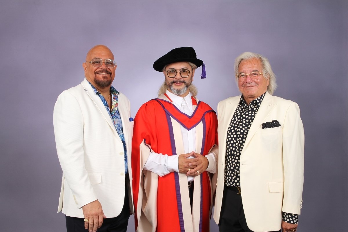
Commenting on the award, Hans says: “I am humbled and privileged to receive this honorary doctorate, its significance greatly speaks to and helps inspire me for what I am challenging myself to pursue as my next steps in career and life.
You, the Graduates, determine your future and life balance, whether it be career advancement, physical and mental wellbeing, and a core with spirituality and kindness. Congratulations again and be proud as the new standards and bearers of the future of design with work and hopefully you can make it play!”
About Hans J. Galutera
Hans J. Galutera - Founder and CEO of HG DesignWorks LLC, a Manhattan Interior Design Studio specializing in maritime interior architectural design, is one of the Board of Directors of Education for the State of New York. Hans is a frequent contributor for international lifestyle and design industry magazines. His expertise has allowed him to be judge and juror for prestigious organizations and publications.
If you’d like to feature your product news here, get in touch to find out more.
If you’d like to become SBID Accredited, click here for more information.
This week’s instalment of the Project of the Week series features a modern and contrasting kitchen design by 2022 SBID Awards Finalist, Extreme Design.
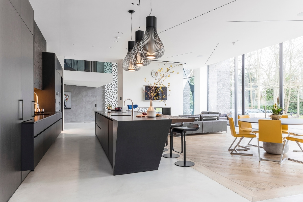
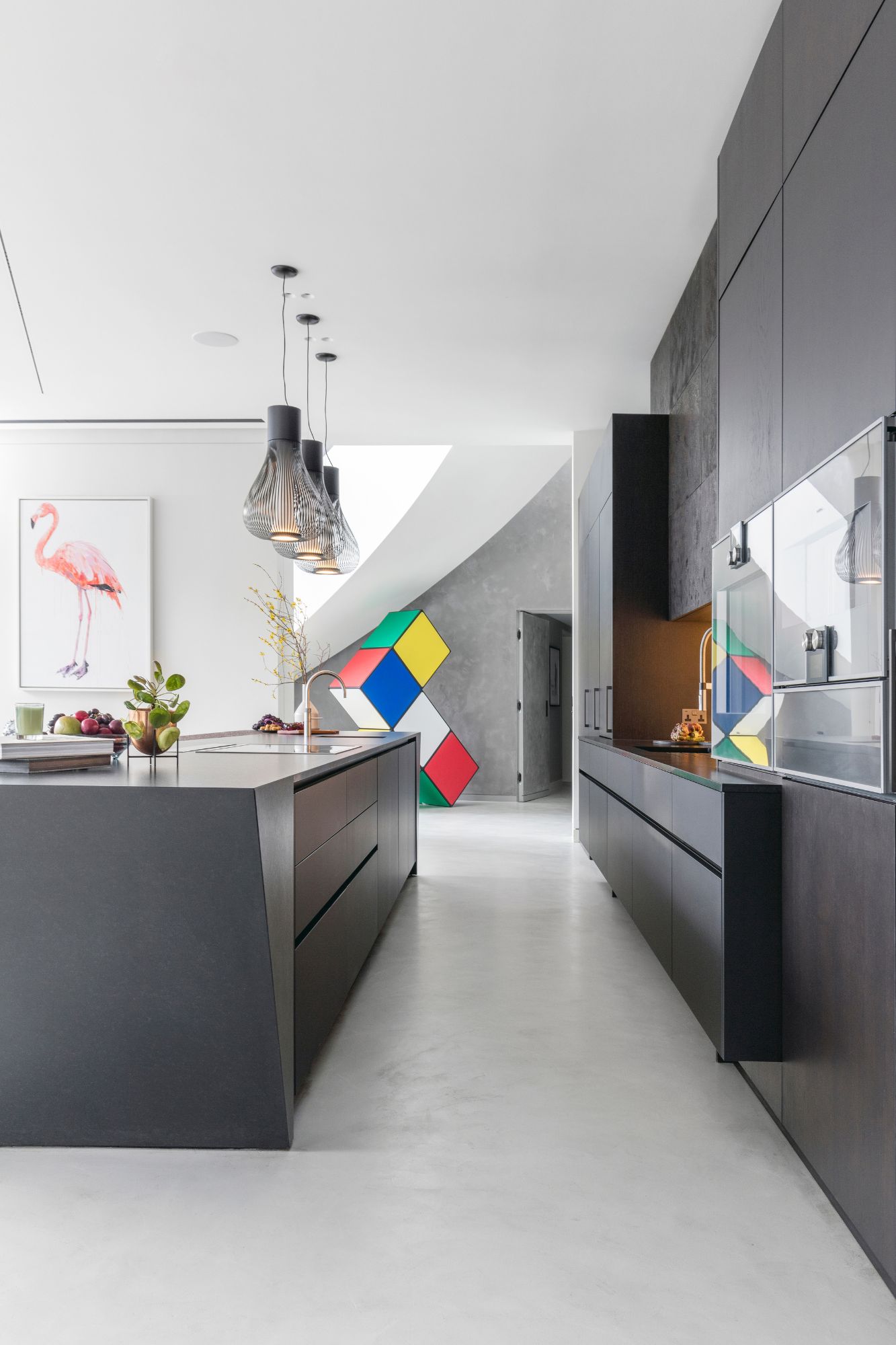
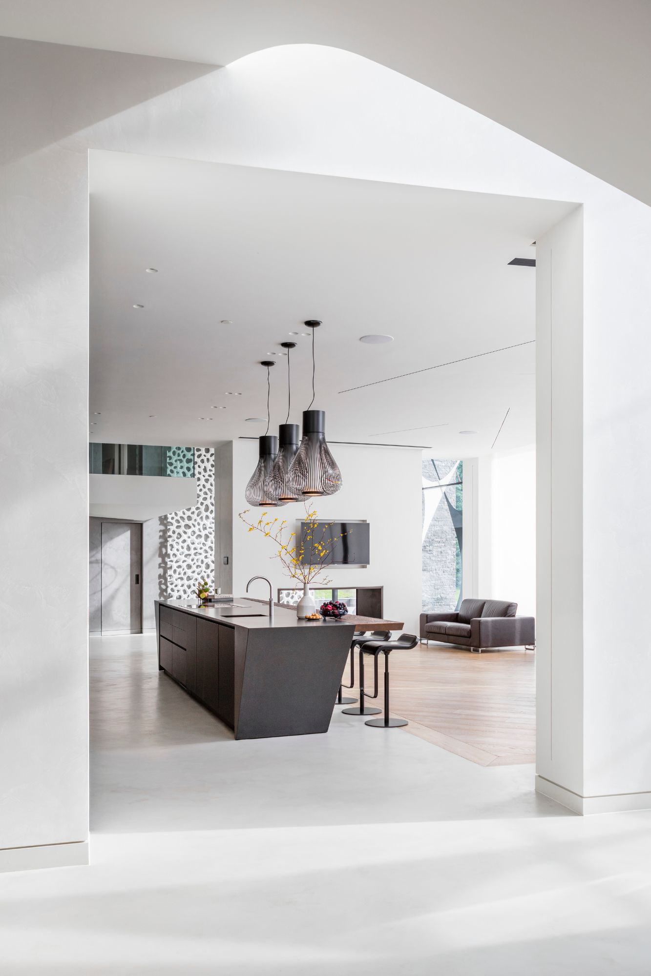
The monolith kitchen sits within a newly built private residence on the outskirts of London. Our clients purchased the original property in 2010 with a bold vision to replace the existing structure with a new unique and ambitious dwelling.
After being introduced to the project in 2017, Extreme were commissioned to create a kitchen design that not only compliments the architectural cues of the property but also reflects the client’s vision that was to run throughout every detail of the interior.
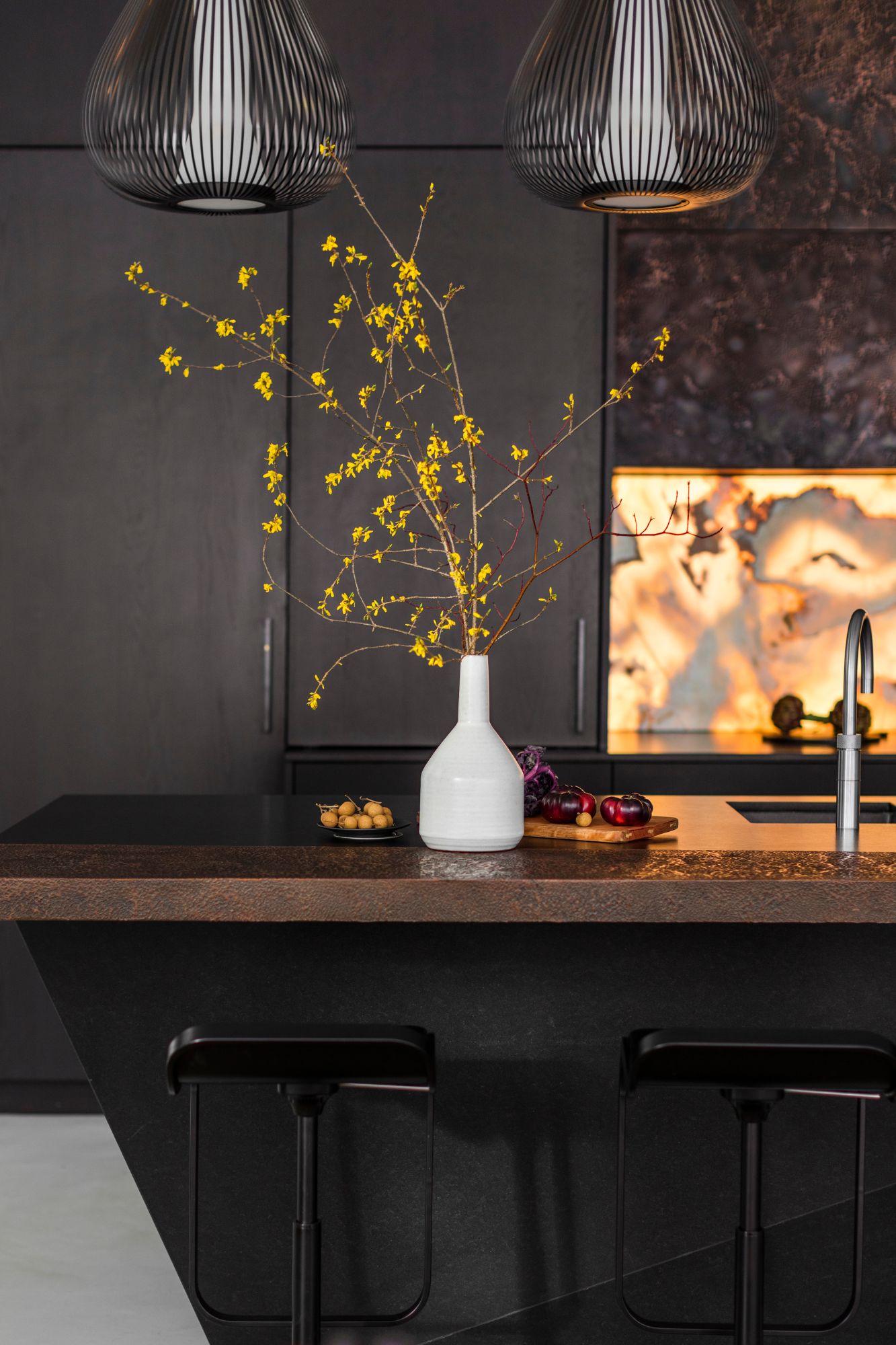
The angular shapes of volcanic rock formations and contrast of glowing lava flowing through fractures within the earth’s surface had formed the basis of the client’s bold design narrative. Inspired by geographical features, they wanted the kitchen design to not only reflect this distinctive concept but also be a welcoming and warm environment for the family.
SBID Awards Category: KBB Design
Practice: Extreme Design
Project: Monolith
Location: London, United Kingdom
What was the client's brief?
For this client, it was clear that their love of art would be present in every detail of their newly built home. Drawing influence on architectural cues of the property, such as poured concrete, monolithic columns and organically shaped metal, the client wanted this unique kitchen to stand as a piece of art in its own right, whilst also becoming a pleasant environment for the family to enjoy every day.
What inspired the design of the project?
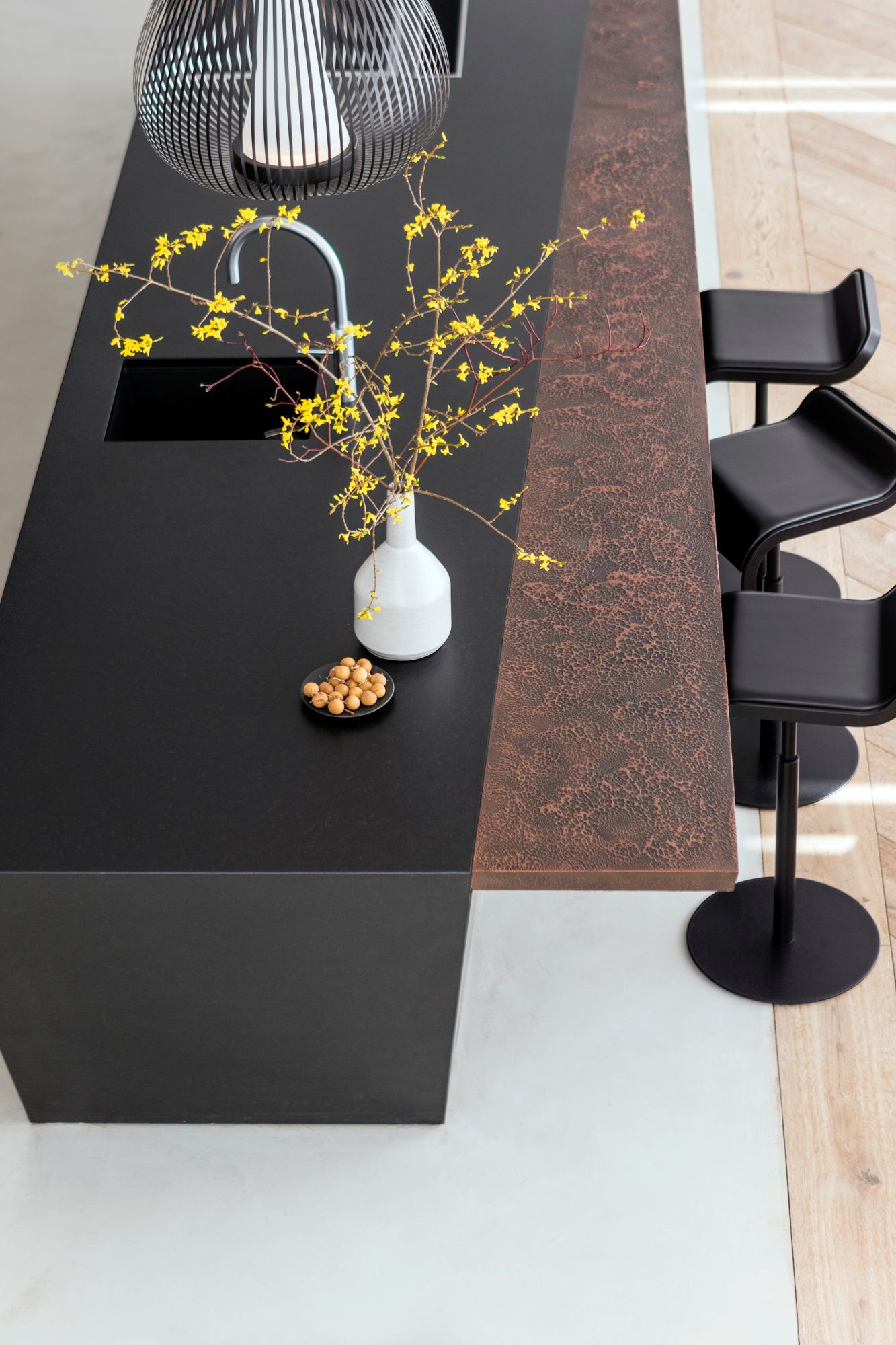
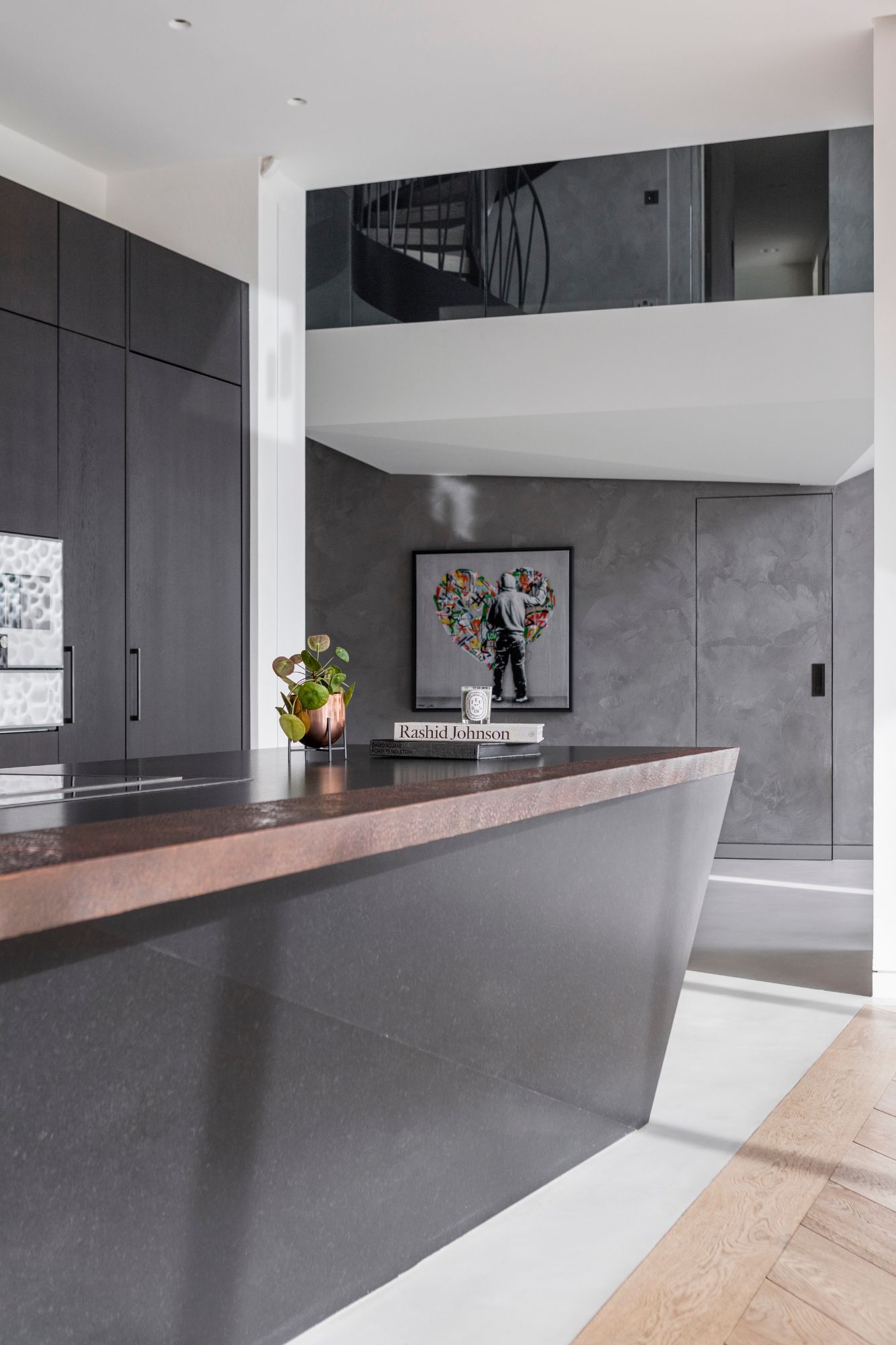
Extreme’s unique approach to design gave us the freedom to design every element of the client’s kitchen, creating an environment with its own identity that works harmoniously with the rest of the home. The angular shapes of volcanic rock formations and contrast of glowing lava flowing through fractures within the earth’s surface had formed the basis of the client’s bold design narrative. Inspired by geographical features, they wanted the kitchen design to not only reflect this distinctive concept but also be a welcoming and warm environment for the family.
What was the toughest hurdle your team overcame during the project?
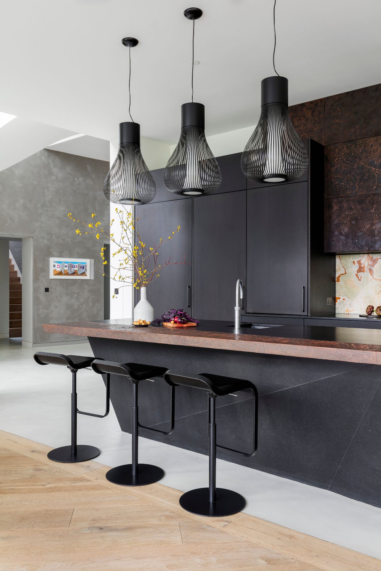
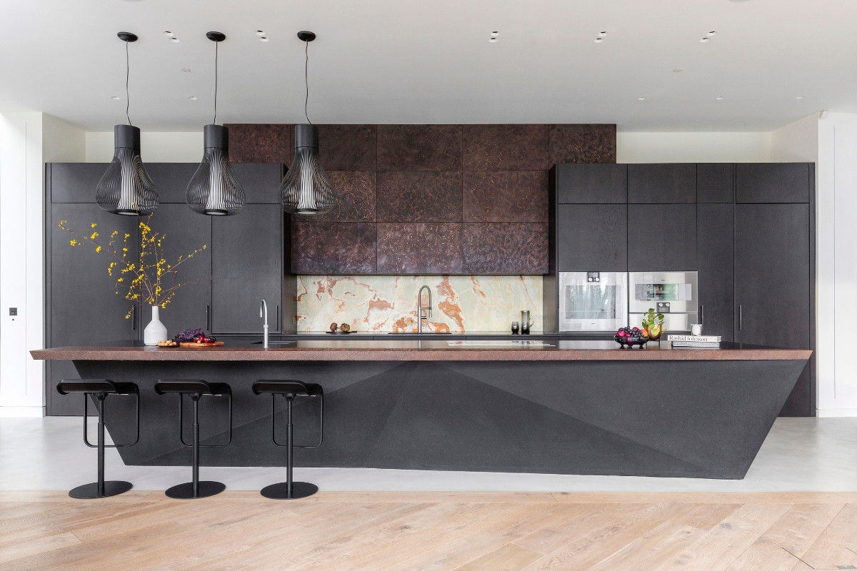
Our ultimate challenge was to bring the angular stone island and floating breakfast bar detail to life. Starting with a conceptual sketch the island as designed to feature angled stone sides and back panel which also had to be calculated and engineered to work as a support to the cantilevered breakfast bar.
What was your team’s highlight of the project?
Our favourite aspect of the project was working with such a bold design brief that allowed us full creative license to create an entirely original design. Drawing upon the properties architectural cues and introducing geographical elements into the project allowed us to elevate the design and create a living space which not only fulfilled the clients’ requirements of a warm and welcoming environment, but also showcased specialist skills in the stone angular features and array of beautiful materials and finishes.
Why did you enter this project into the SBID Awards?
The SBID awards represent outstanding achievements and celebrates design creativity and excellence worldwide. The awards are a great opportunity to bring recognition to those within the design industry. At Extreme, it is our vision to make an impact on design in this country and the awards are a fantastic opportunity to showcase our work.
Questions answered by Jade Jones, Design Manager, Extreme Design.
Focus SB, a leading international premium electrical accessories brand presents its debut collection of innovative traditional style control switches, featuring low voltage technology.
Developed to meet demand from luxury smart home integrators and IoT technology and design consultants, the attractive push button Control switches by Focus SB can be configured in a variety of ways to suit functions required, whether programmed for lighting and shading controls or used with inline dimming packs, and can be finished to match across one of the widest ranges of electrical wiring accessories available in the luxury construction markets in UK, China and the Middle East today.
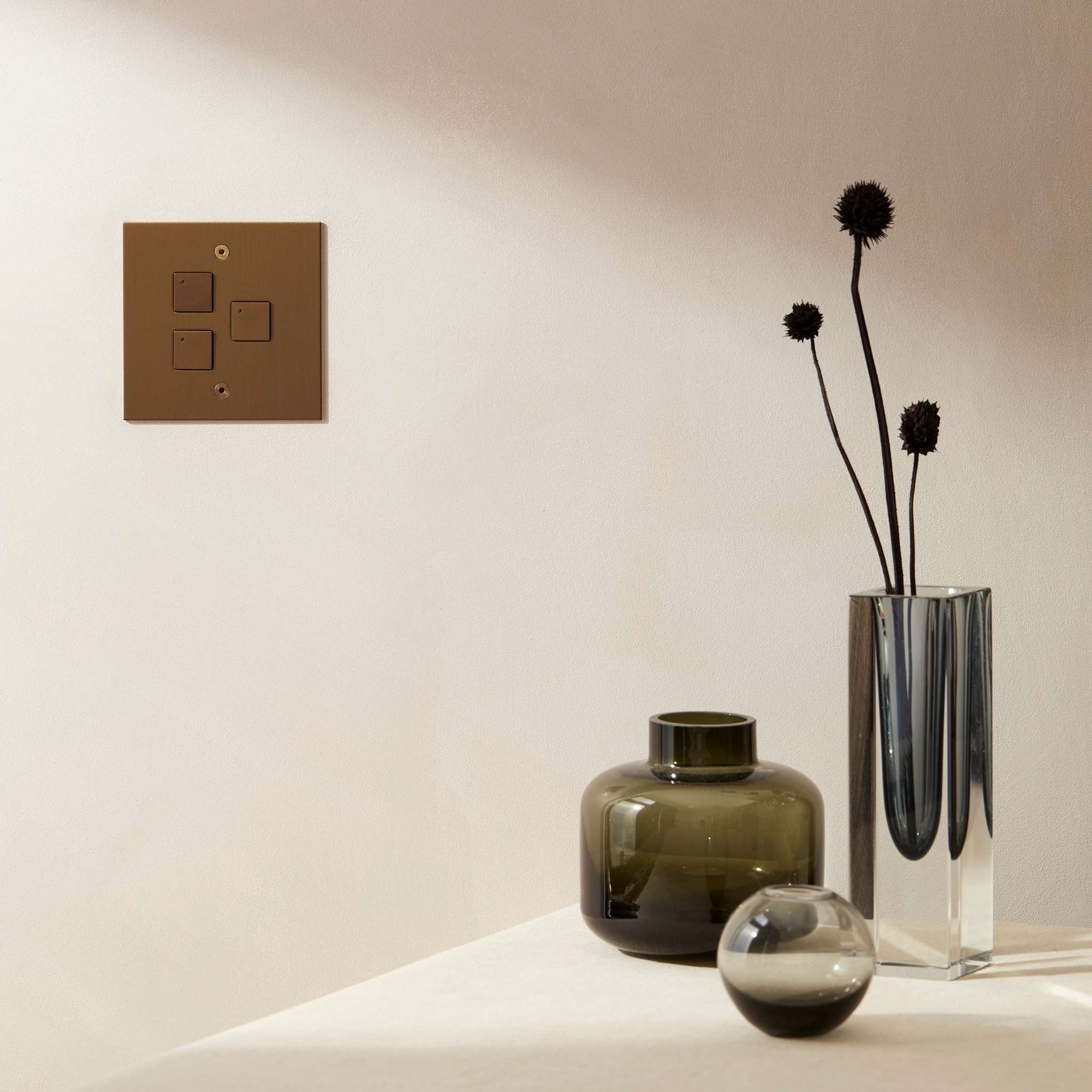
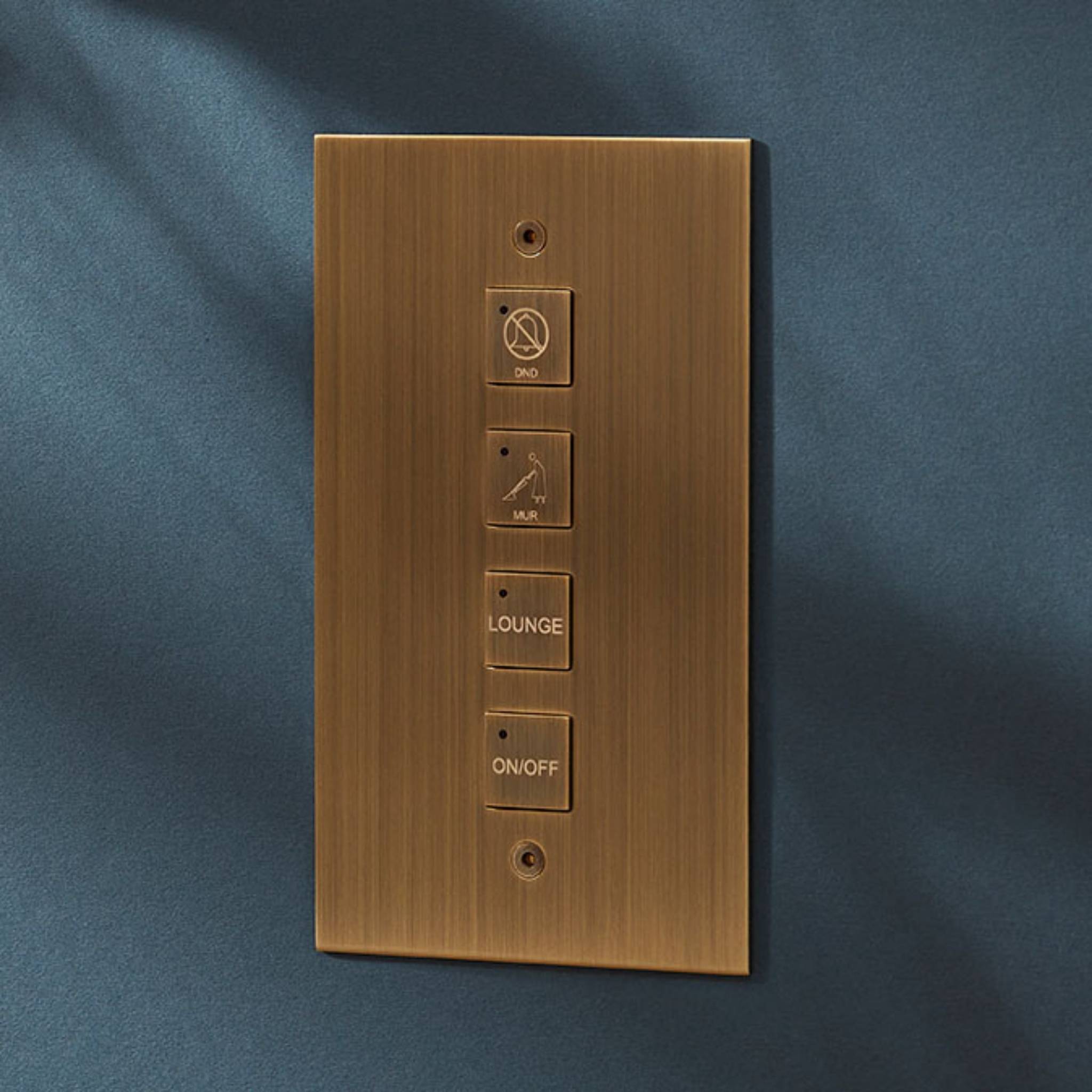
Designed to allow space for several switches on one faceplate, the ‘Control switches by Focus SB’ collection, handcrafted and finished in the UK, offers a proprietary system interface solution with a traditional aesthetic. Compatible with inline dimmers, lighting controls and home automation, with the advantage of providing a low voltage option available in component form and LED indicator switch options, Focus SB’s control switches offer flexibility and style for multi-function programming including audio, selection of lighting scenes, turning lights on and off when entering or leaving a property, raising or dimming lights, opening and closing blinds, curtains and shutters.
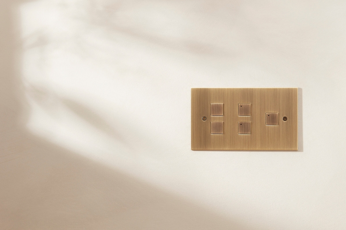
Available as complete products or in button, grid and plate component form, with the option to include LED switch functionality and custom text via the company’s in-house bespoke laser marking service, designers can choose up to four circular or square buttons on a single and a maximum of eight buttons on twin vertical or horizontal plates, offering a simple to use smart solution with the convenience of configuration flexibility paired with a superior finish.
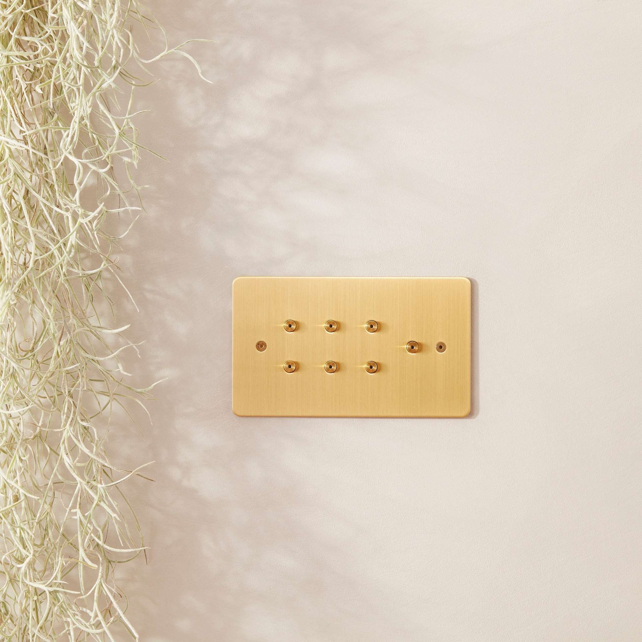
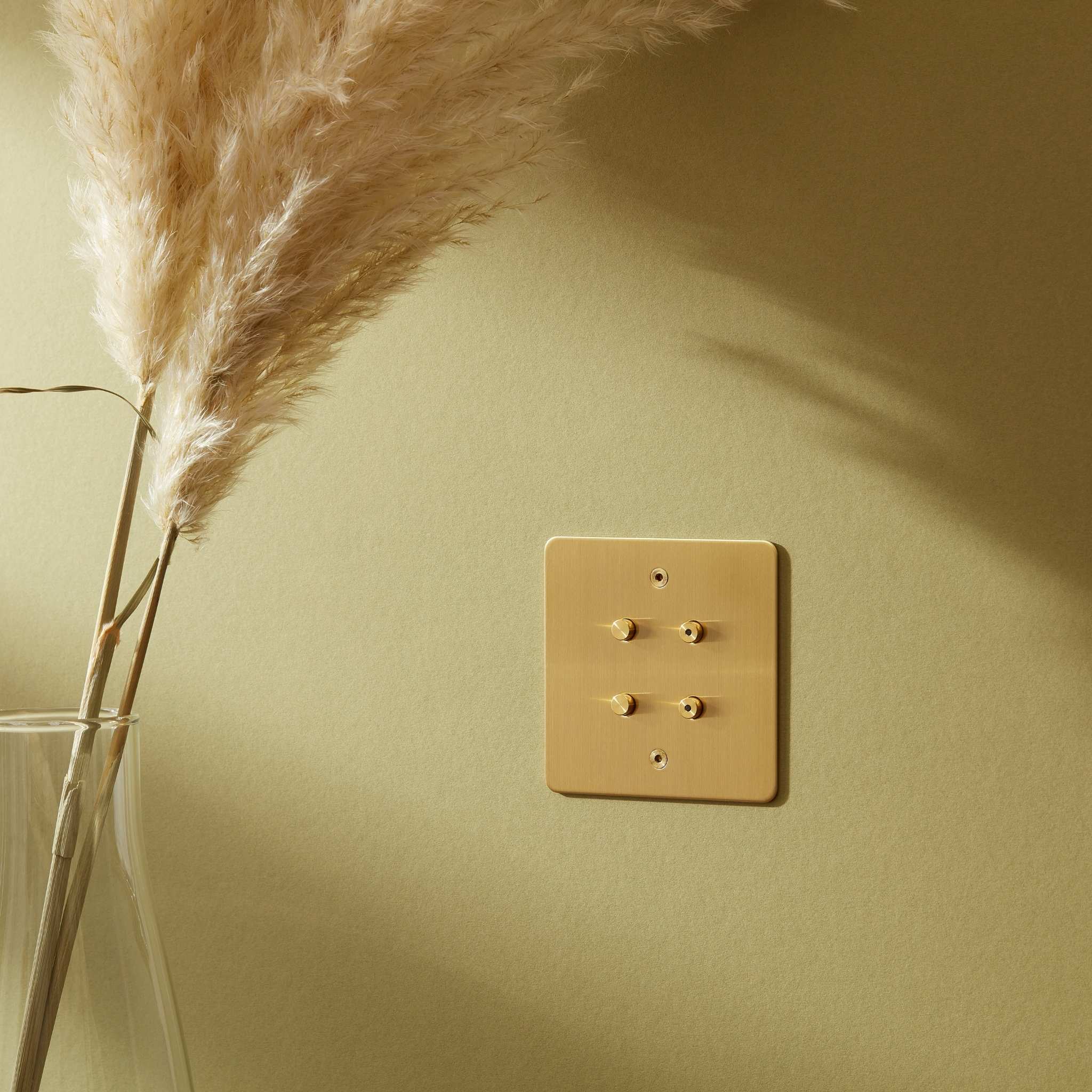
Showcasing unparalleled craftsmanship, Focus SB’s modern control switches are manufactured from high quality metal base materials and offer the same functionality solutions as the company’s innovative retractive (momentary action) switches. The control switches can be finished to match across the company's electrical accessories products enabling designers to complement metal accents and hardware throughout an interior scheme.
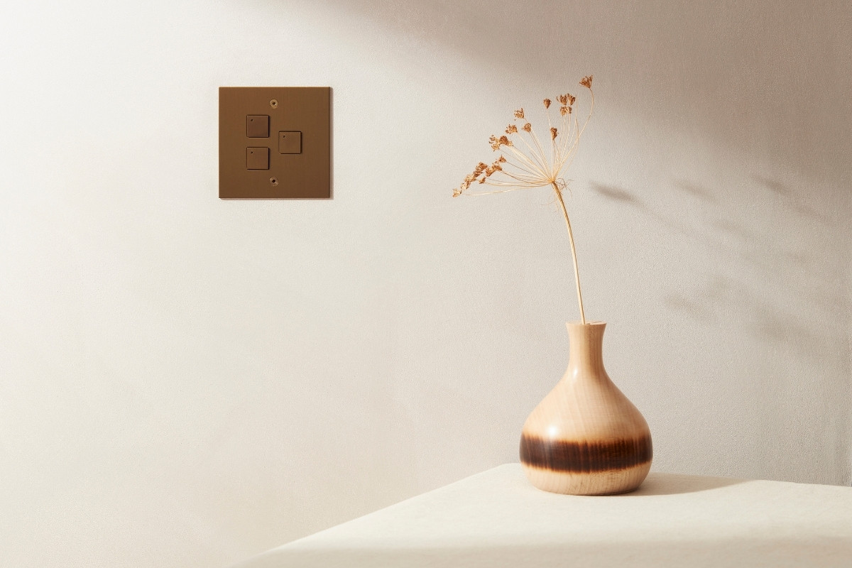
Offered with Classic and True Edge faceplate styles as standard, this latest collection from Focus SB features smaller terminals better suited to low voltage control cables, with LED indicator programmable options in red, green and blue that work independently from the switches, and a voltage (V) terminal to enable selection of the system voltage with OFF (20-48V) and ON (5-20V).
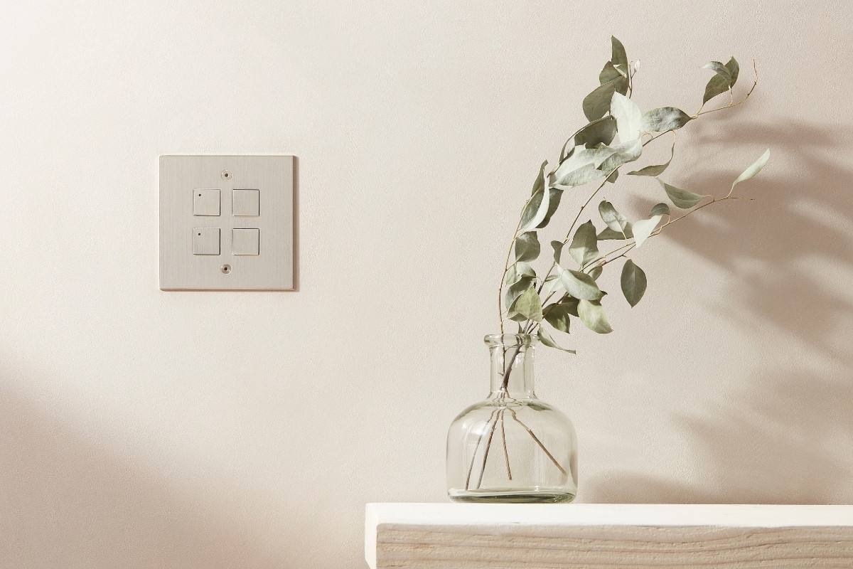
Unique to the Focus SB luxury brand every component is designed, manufactured, tested, finished and hand assembled in-house by the company’s experienced engineers and artisans in East Sussex, UK.
Contact Focus SB for more information, request 2022 brochures, or to enquire about the company's bespoke product presentation and project support services.
About Focus SB
Focus SB® is an award winning innovative British manufacturer renowned for the design, development and specialist hand finishing of premium electrical wiring accessories, blending traditional artisan techniques with the latest technology; specified for world class hospitality and leisure resorts, prime residential developments, heritage buildings, royal residences, superyachts and commercial projects both domestically and internationally.
If you’d like to feature your product news here, get in touch to find out more.
If you’d like to become SBID Accredited, click here for more information.
