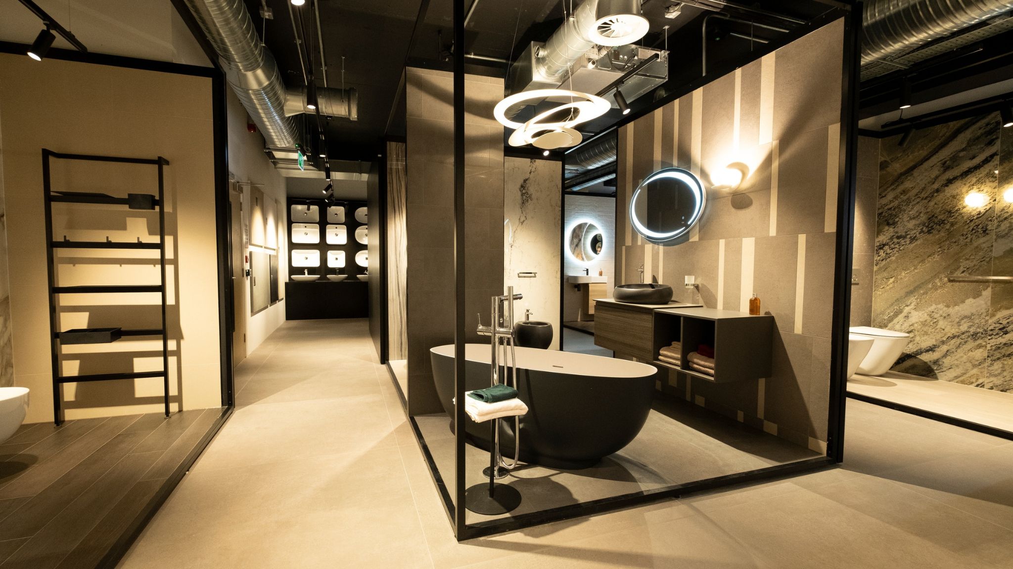
RAK Ceramics PJSC one of the largest ceramics brands in the world, announced the opening of its first global Design Hub in London. Located at 100 St John Street, in the heart of London's design quarter for designers, architects and developers, the RAK Ceramics Design Hub is one of the largest in the area, with 7,276 square feet over two floors.
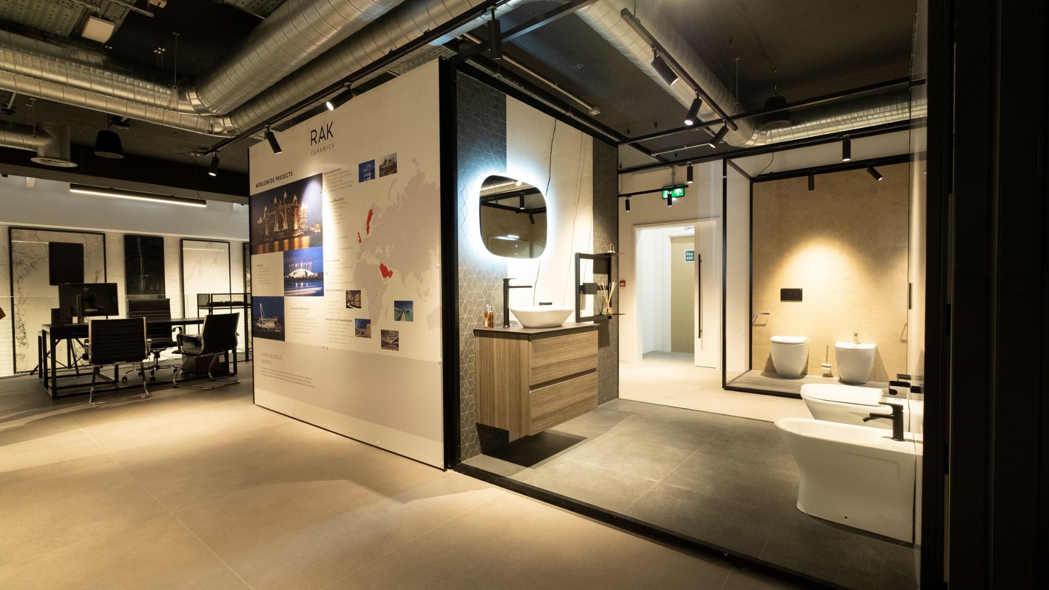
The space allows visitors to explore limitless design possibilities for their projects and showcases a wide range of RAK Ceramics bathroom ranges, kitchen taps, and brassware. The location also offers meeting facilities and a dedicated area showing the brand's extensive range of tiles, including mega slabs, which can be used for cladding, tiling, surfacing, and as unique decorative pieces.
The RAK Ceramics Design Hub will be an interactive and immersive environment designed to inspire creativity and includes a working kitchen display, working tap display, Virtual Worlds 4D Theatre and a Grab and Go sample area.
Abdallah Massaad, Group CEO, RAK Ceramics said "London is the obvious choice to launch our first global Design Hub concept. The UK is an increasingly important market for RAK Ceramics, and London is home to many of the world's leading designers, architects, and project specifiers. The RAK Ceramics Design Hub is a unique concept where the design community can experience the innovative possibilities of our products.”
Many signature products will be displayed, including a new collection from world-renowned fashion designer ELIE SAAB along with products from designers Maurizio Scuttella, Debiasi & Sandri, and Patrick Nourget.
Commenting on the design hub concept, Leonardo De Muro, VP of Marketing & Communications, RAK Ceramics said: "The RAK Ceramics Design Hub is a unique concept in our retail portfolio which allows us to bring together the design community, showcase unique products, and create a brand experience that is both inspiring and informative."
The official launch of the RAK Ceramics Design Hub took place on May 24, 2022, during the Clerkenwell Design Week. To celebrate its opening, designers Maurizio Scuttella, Federico Sandri, and Patrick Nourget hosted a series of special talks at the RAK Ceramics Design Hub.
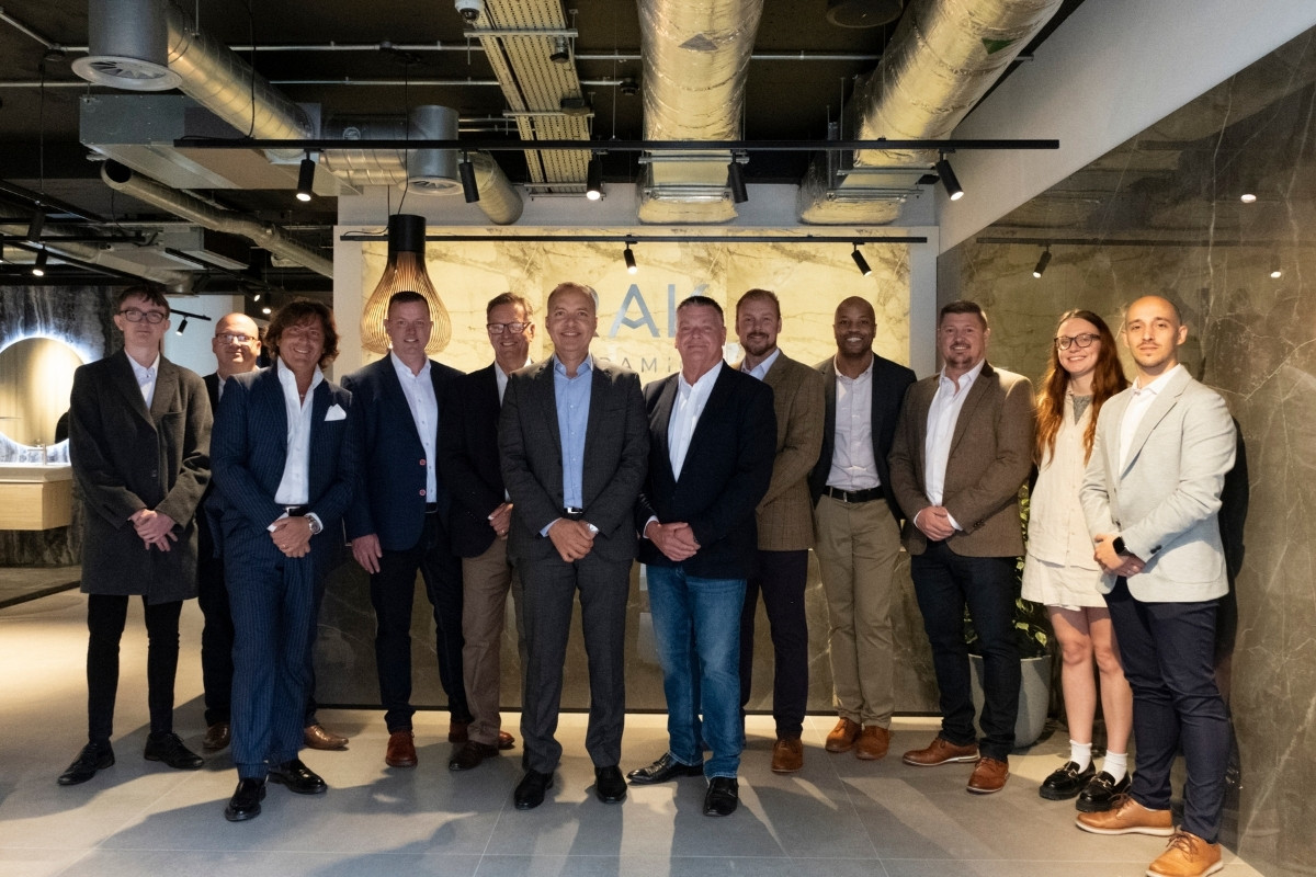
Commenting on the opening, Alvin Biggs, Managing Director, RAK Ceramics (UK), said: "We are proud that London has been selected as the location for RAK Ceramics' first global Design Hub, and we look forward to welcoming the international design community to showcase RAK Ceramics' global product innovations."
About RAK Ceramics
RAK Ceramics is one of the largest ceramics’ brands in the world. Specialising in ceramic and grès porcelain wall and floor tiles, tableware, sanitaryware and faucets, the company has the capacity to produce 123 million square metres of tiles, 5 million pieces of sanitaryware, 24 million pieces of porcelain tableware and 1 million pieces of faucets per year at its 22 state-of-the-art plants across the United Arab Emirates, India and Bangladesh.
Founded in 1989 and headquartered in the United Arab Emirates, RAK Ceramics serves clients in more than 150 countries through its network of operational hubs in Europe, Middle East and North Africa, Asia, North and South America and Australia.
If you’d like to feature your product news here, get in touch to find out more.
If you’d like to become SBID Accredited, click here for more information.
There is a saying in China - ‘Children’s money is money earned most easily’. This is an interesting expression that has held true even through the recent upheaval of Covid, where we see that in many up-and-coming consumer territories, for example, in Asia, spending on children’s lifestyle and luxury products has gone through the roof.
As one of the worlds’ premier manufacturers of children’s furniture, with a presence in 77 countries, Dragons of Walton Street serves as a barometer for international trends in children’s luxury. We believe that for today’s savvy interior designer, there is a unique opportunity act in partnership with HNW parents to create elevated spaces for their children. Here are the key trends which are motivating parents to invest in interior design for their children.
Metamorphosis and Long Life
The practice of creating hardwearing furniture for children and furniture which has a dual-use is well-established. Amazing carpentry feats of the Georgians and Victorians in this vein included cots that convert to sofas and tables and chairs that become highchairs. These pieces were so well made that years after their creation, exhibited pieces still look sturdy enough to go nine rounds with a bowl of Cheerios. These days, the demands placed on children’s design pieces to ensure they have longevity built into their DNA is usually as much down to space-saving needs as it is to ensure that the planet is used as gently as possible.
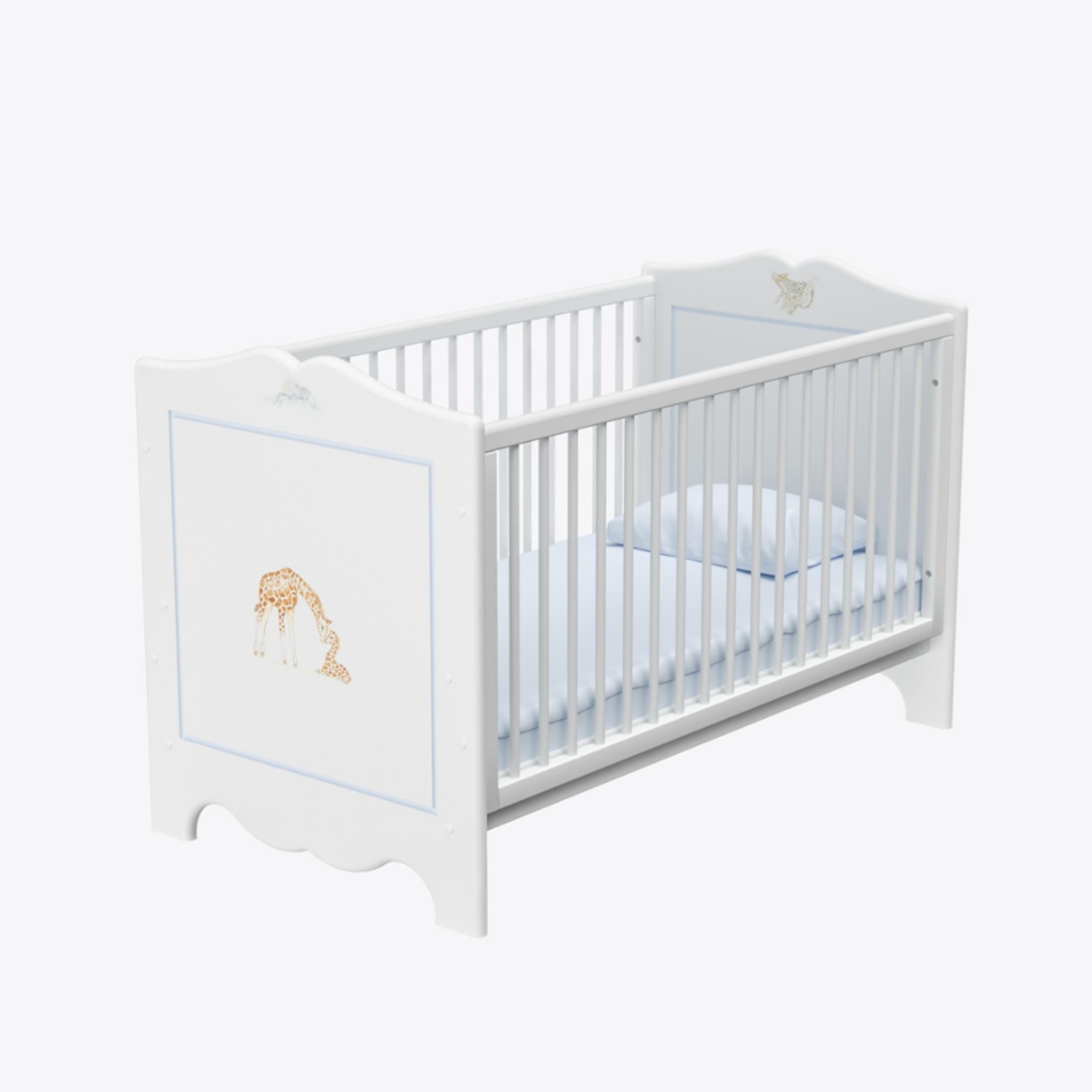
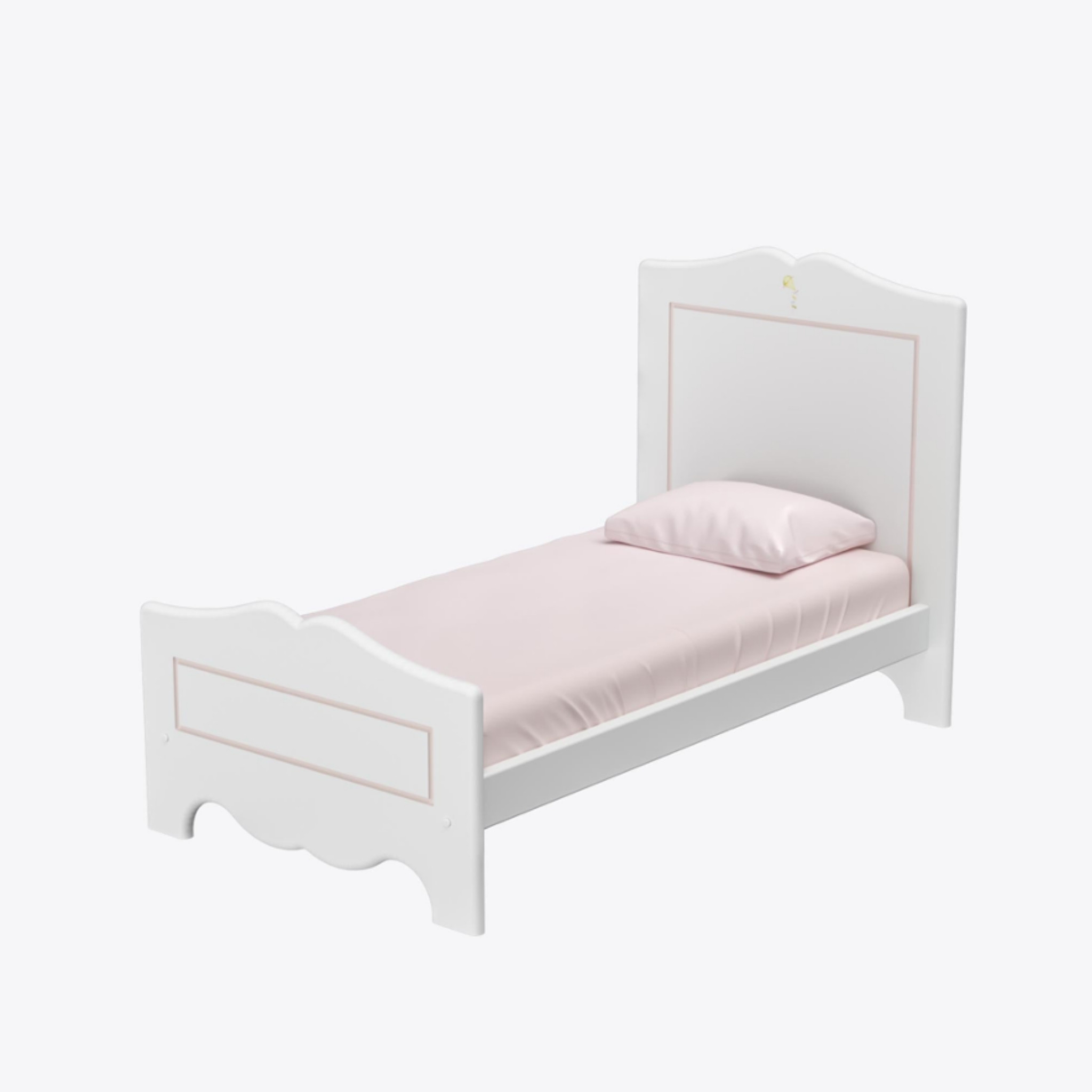
Dragons of Walton Street has been at the forefront of the long-life children’s furniture movement long before it was on trend and in fact one of Dragons’ most popular key furniture pieces is the Dragons’ Cot Bed. Its major USP is that it is built with such an attention to detail that it will last through a cycle of at least 5 babies. Right on the metamorphosis trend, the Dragons Cot Bed transforms into a toddler bed, which will serve children up to four and a half years.
The idea is that generations of children would benefit from the bed, which appeals event to a HNW clientele as they wish to ensure that furniture pieces may be passed down to others, rather than ending their lives in a landfill.
Re-imagine and Re-use
Companies which truly care about the environment now take ownership for the life cycle of their products well past the point of sale. This has re-invented the luxury game – for example, brands like Mulberry are vanguards of this ethos with their strategy of offering lifetime repairs for over 10,000 bags a year and maintenance of a materials and hardware archive which goes back 35 years. Similarly, Dragons of Walton Street recently launched its ‘Earth Matters’ campaign. This service guarantees that Dragons will repaint and resell any children’s furniture pieces bought from Dragons. This service has been particularly well received by interior designers, as families with young children have been particularly receptive to any inventive initiatives around sustainability and their children’s furniture choices.
Murals – The Ideal Non-Polluting Wall Treatment
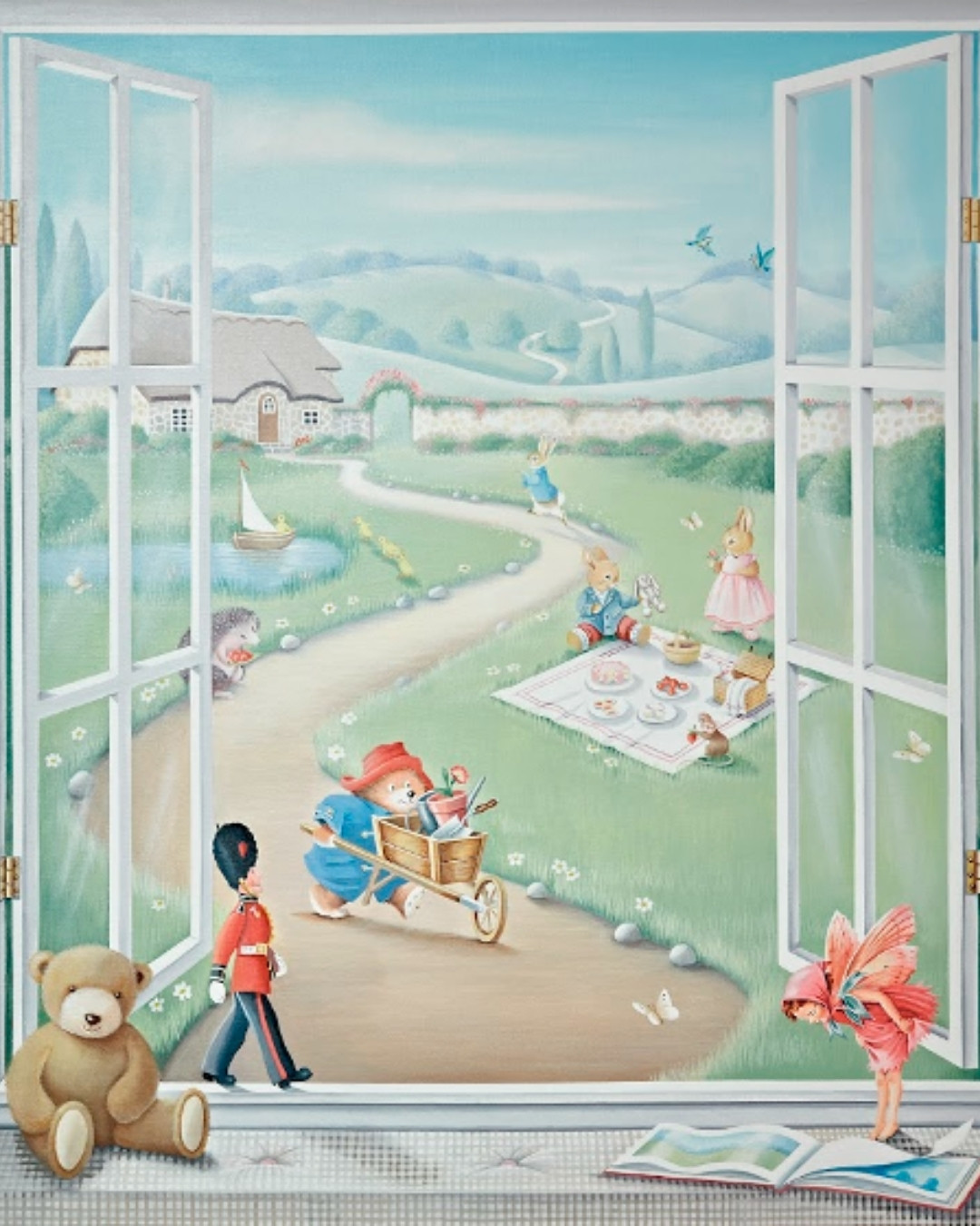
Wallpaper is wonderful. However, in many cases they are not the most sustainable – or healthy – choice for childrens’ rooms. Children can spend endless hours in rooms with wallpapers, which designer may utilise for an opportunity to add drama one simply cannot achieve with paint alone. It is worth noting, though, that not all wallpapers are created equal and that a child’s skin is constantly absorbing various substances from the air into their respiratory system and skin, including from decorative finishes. In some cases, if the chemicals being given off from these finishes are nauseous allergies may develop as well as skin irritations, nausea, headaches and asthma attacks.
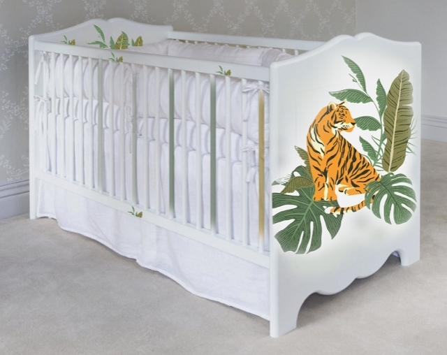
Dragons’ world-famous mural service offers clients an opportunity to create spectacular wall effects for children with non-toxic paint. Also, only limit to what may be painted is the imaginations of designer and parent. From Monaco to Marrakesh, there is barely a major city where a Dragons’ mural has not been used to add serious wow factor.

Furniture as Art
As interior designers working with clients with high expectations, you’ll be aware that ‘uniqueness’ is a value which is often strived for amongst your clientele. This value also extends to children’s bedrooms and indeed accounts for why Dragons’ out of this world themed beds are a big hit with the parent and child who has everything.
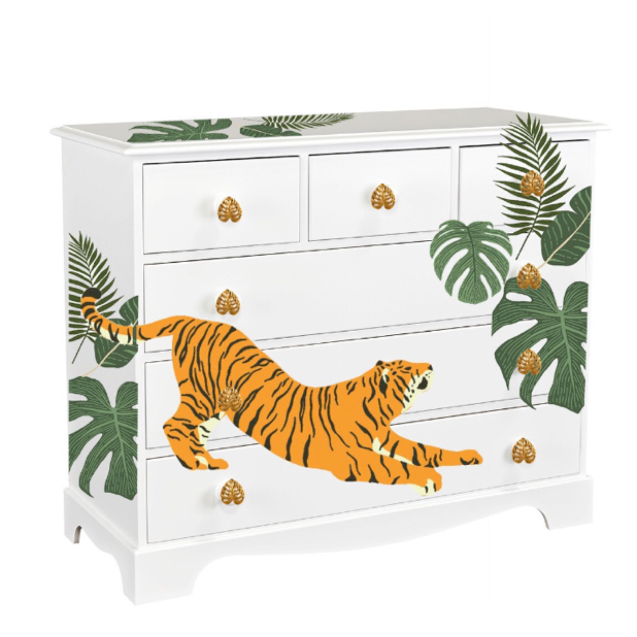
Two other extremely popular solutions for those seeking something extra special is bespoke hand painted furniture with one-of-a-kind motifs and having self-sourced furniture pieces painted by Dragons.
Want to source a playset which would be at home in the Amazon? In this below example an interior designer briefed Dragons to take a fresh jungle approach, using a large-scale motif which makes a bold and dramatic impression. One of Dragon’s interior designers ran with the idea and undertook a collaborative process with Dragons’ in-house artists, who created detailed sketches before a delighted client signed off.

About Dragons of Walton Street
Dragons has been hand painting children’s furniture for over 40 years since our founder Rosie Fisher opened her doors on Walton Street in the heart of Knightsbridge, London in 1979. Now located at 150 Walton Street in the heart of Chelsea, London, our luxury children’s furniture continues to be predominantly built by British master carpenters and lovingly hand painted at our Studio in West Sussex.
If you’d like to feature your product news here, get in touch to find out more.
If you’d like to become SBID Accredited, click here for more information.
You’d be forgiven for thinking that the owner of an Edwardian villa in the New Forest would be looking for a classic kitchen to match her house. In fact, nothing could have been further from the truth. Her reason for approaching Ledbury Studio in the first place was because she was looking for something a world away from the standard Shaker look.
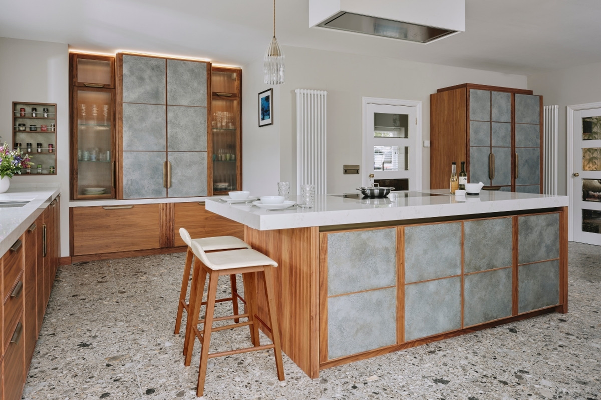
“When I first met our client, not only was she undertaking a big move from the Midlands to the New Forest, but she was also embarking on a sizeable kitchen project too,” recalls Charlie Smallbone, founder of Ledbury Studio. “She knew she’d be spending most of her time in her new kitchen, as it was roomy enough for both a large island with breakfast bar, a separate dining area, and plenty of tall cupboards for storage.”
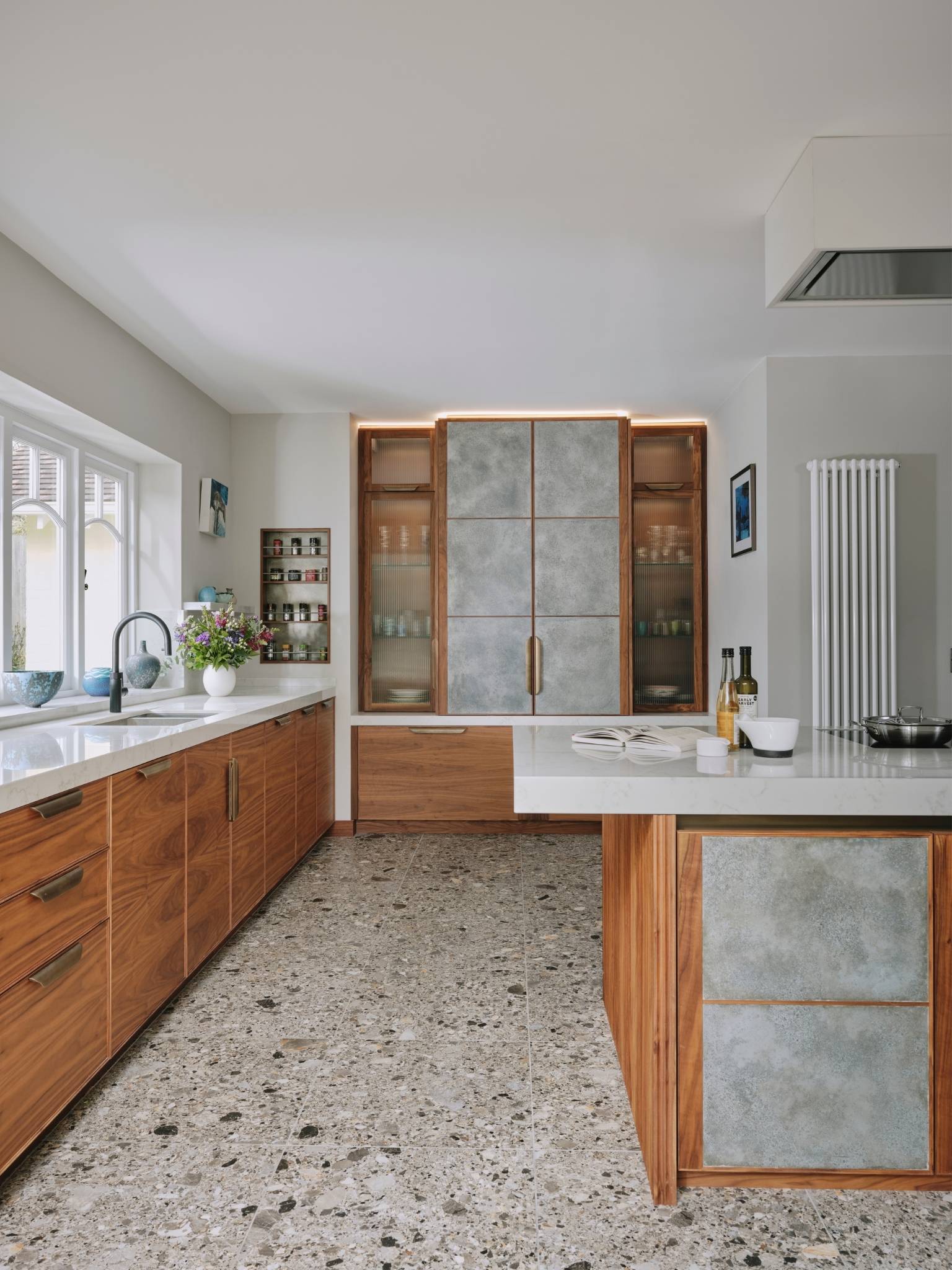
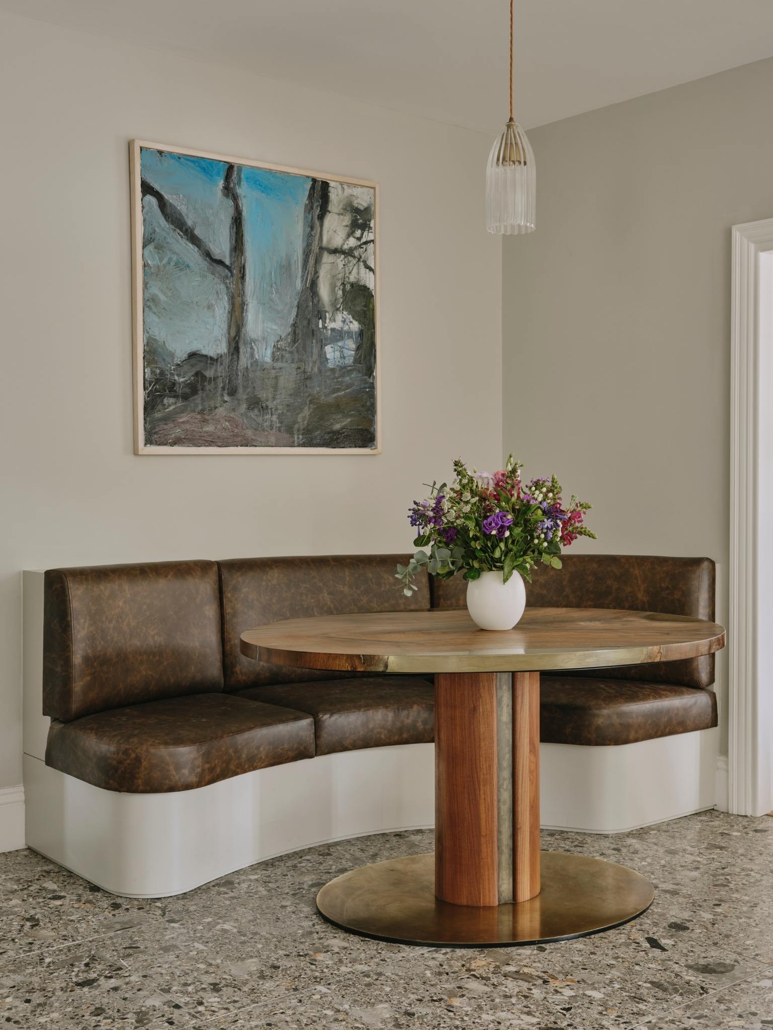
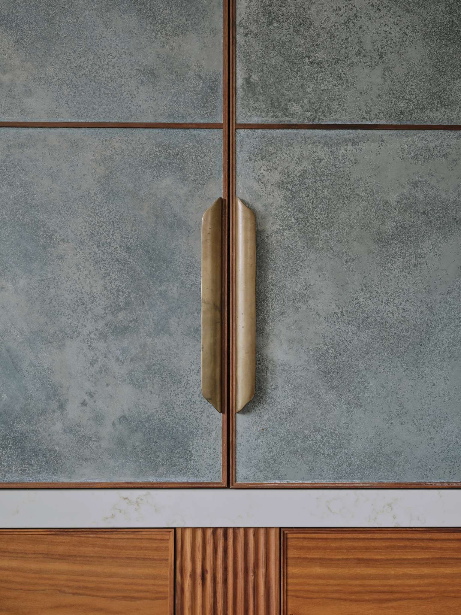
To bring the required contemporary aesthetic to the room, Charlie designed furniture that combined beautiful book-matched walnut veneer with hand-patinated zinc panels. The zinc panels are edged in the same walnut and the cupboards feature aged-brass handles. This juxtaposition of timber and metal is a signature feature of the Metallics Collection from Ledbury Studio, giving Charlie’s kitchens their unique look and feel.
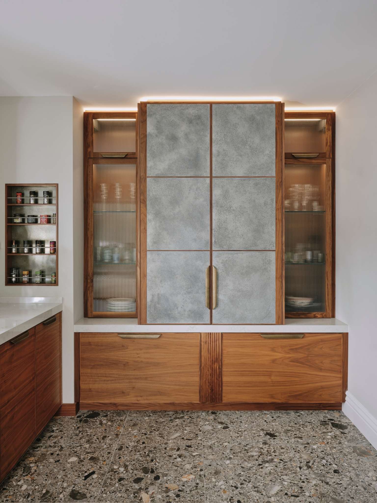
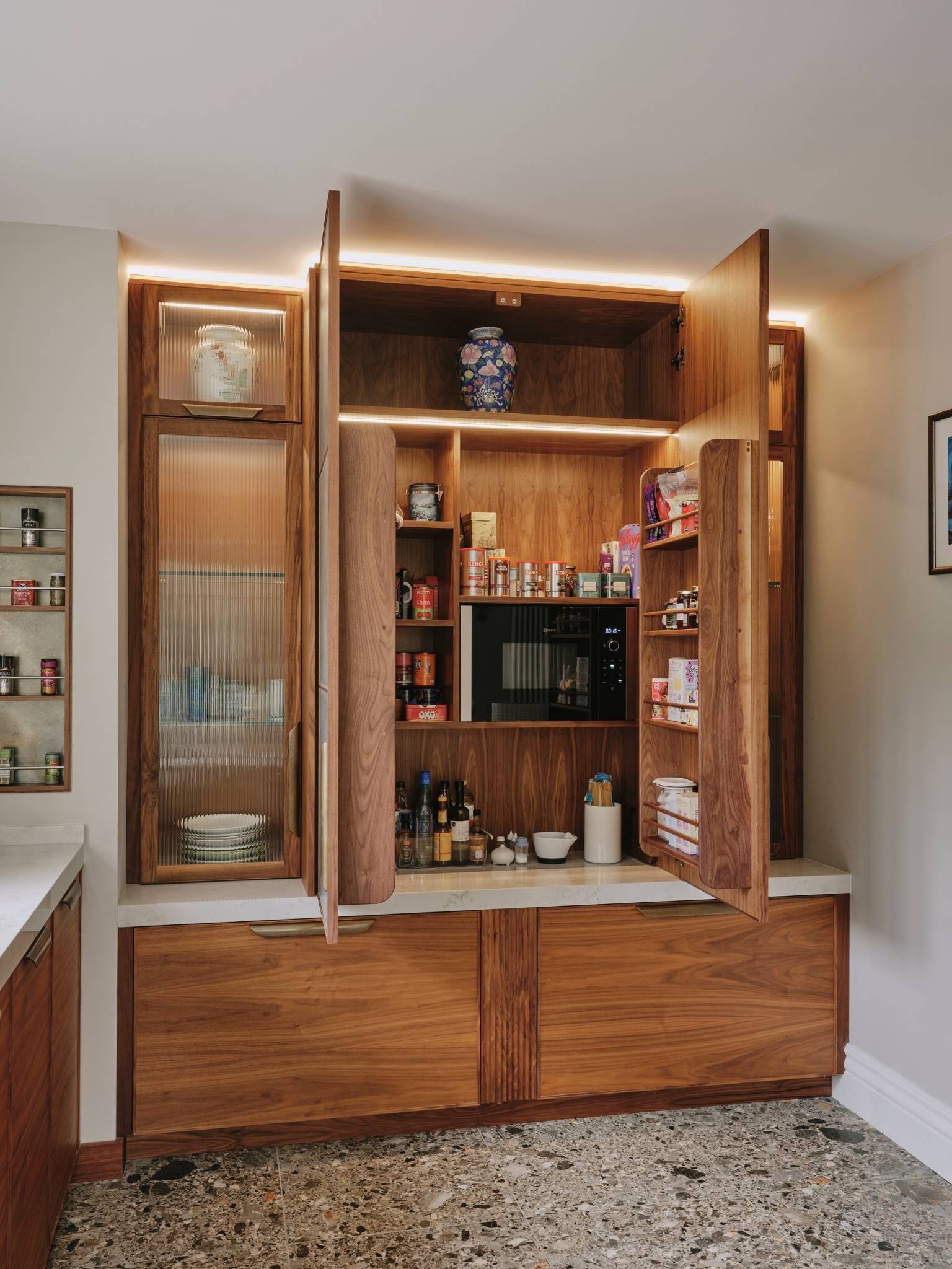
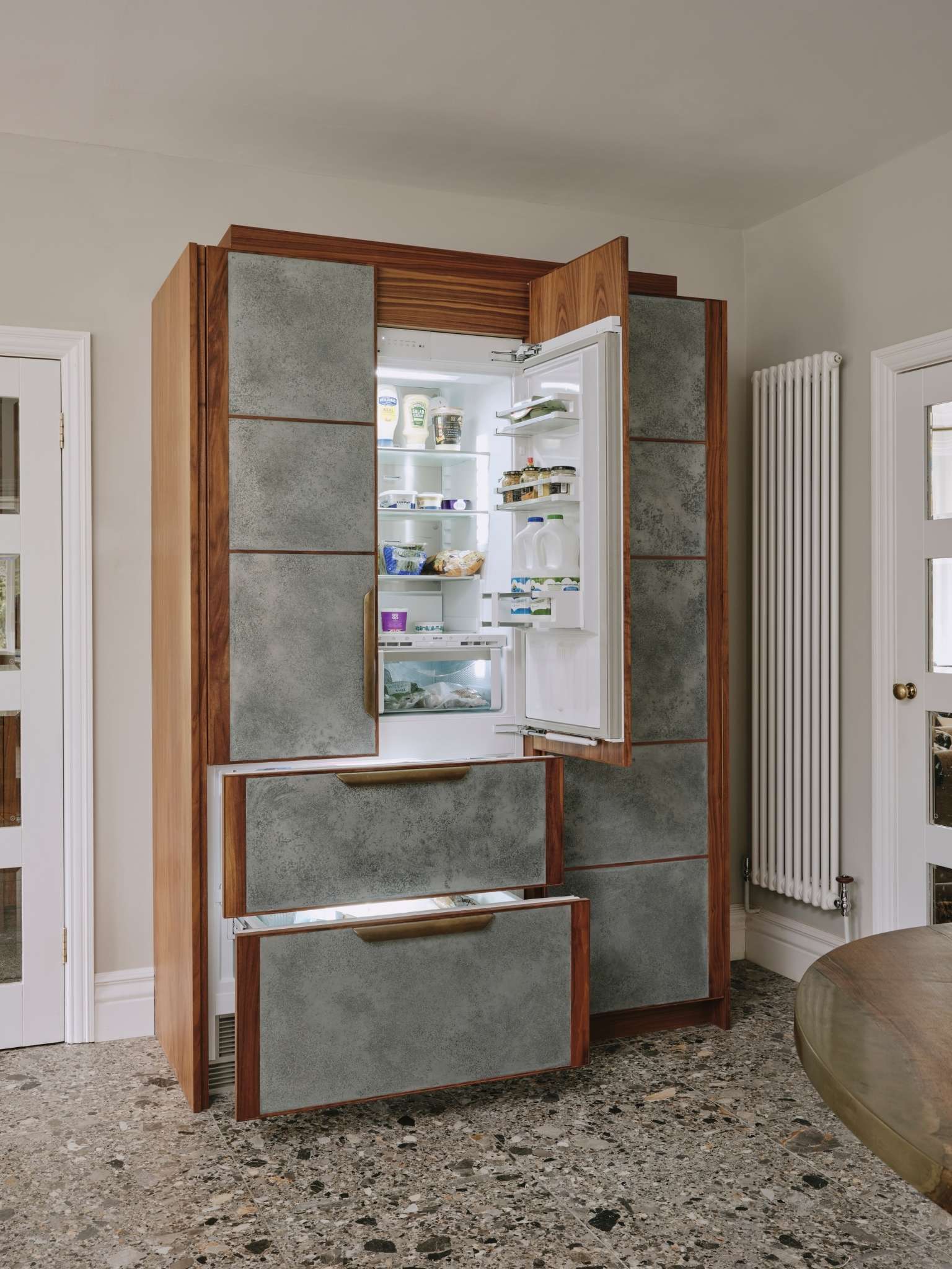
The stunning island – topped with an Ambre quartz worktop – is an obvious focal point, but you also can’t ignore the imposing Housekeeper’s Cupboard behind it. Charlie designed this piece of furniture to mimic the cupboards beloved of the original residents of Victorian and Edwardian homes, so it seems fitting that there is a contemporary version in this house. It has space inside for the microwave and breakfast items, with pan drawers below and fluted-glass cupboards on either side lit from within to create a display. There is also a tall larder next to the fridge with pull-out freezer drawers, and sufficient cupboards and drawers elsewhere in the kitchen to keep it clutter free without any need for wall cabinets.
“What’s so pleasing about this kitchen is that one of the pieces I designed for it has already become one of our client’s most treasured possessions,” says Charlie. “The bespoke walnut table was made from a single piece of walnut, which we then embellished with aged brass. We designed a banquette seat also made from wood and upholstered in leather. The banquette needed to be durable enough for the other important member of the household, my client’s gorgeous Dalmatian, to be able to lounge in comfort too!”
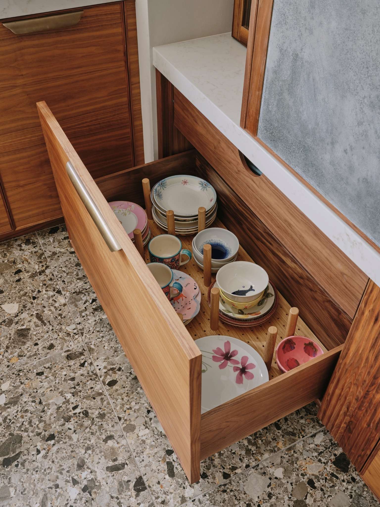
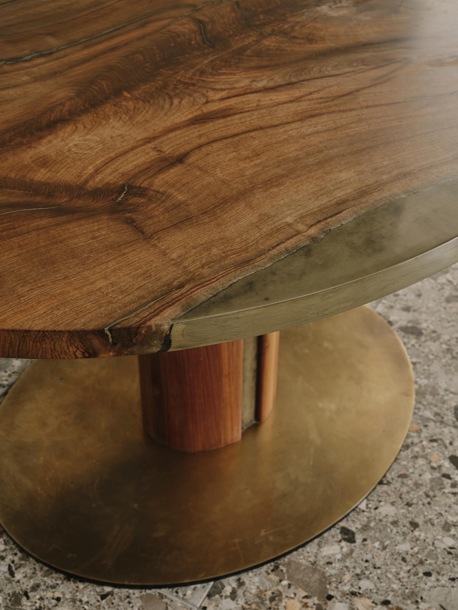
Bringing the whole design together – and adding an additional contemporary feel – is the chic terrazzo floor. Again, it’s a great hardwearing choice for a dog owner, and the shades of grey perfectly play off the tones of the zine panels above. Both homeowner and her canine companion are delighted with their new kitchen!
Ledbury Studio kitchens start from £50,000.
About Ledbury Studio
Ledbury Studio is a new and exciting design studio, showcasing Charlie Smallbone’s latest kitchen designs. Small and personal, Ledbury Studio has been established to explore and develop the interface between kitchens to cook and work in, and kitchens to live in. The company offers something very different in the world of kitchen design, something not found elsewhere. Combining exquisite materials and artisan craftsmanship, the new kitchen collections are striking and innovative and the culmination of Charlie Smallbone’s history at the forefront of cutting edge kitchen design.
If you’d like to feature your product news here, get in touch to find out more.
If you’d like to become SBID Accredited, click here for more information.
The SBID International Design Awards finalists for 2022 have been revealed, boasting an impressive shortlist of award-worthy entries across Interior Design, Product Design and Fit-Out. From the design scheme, materials used and products specified through to the final fit-out installation, the SBID Awards champion design standards across the supply chain in the design, procurement and execution of outstanding interiors!
To complete the third and final stage of judging, the online Public Vote is now open! Worth an influential 30% of the final scores, it's your chance to sway the results and decide which finalists you think deserve to take home a prestigious SBID Award! You can only vote once per category, so choose wisely and vote for your favourite designs!
Voting closes at 5pm (BST) on 24 August
Interior Design Awards:
CGI & Visualisation
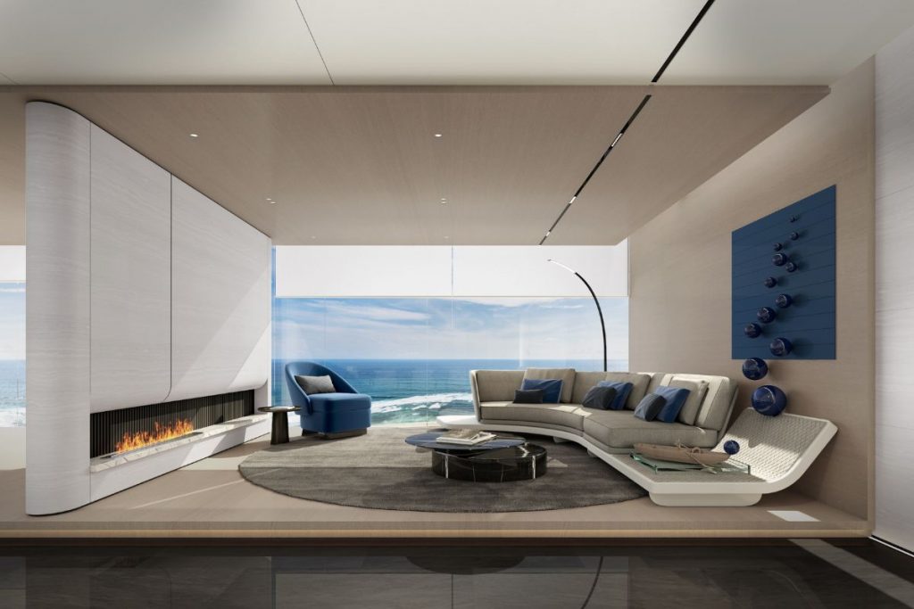
Explore the 2022 SBID Awards Finalists for the CGI & Visualisation category! This category rewards skill and innovation in the use of visual design software and includes both residential and commercial renders. The shortlisted entries include any interior design visual or CGI that has been created on a visualisation programme, including AutoCad, CAD, 3ds Max, InteriCAD and Vectorworks.
Club & Bar Design
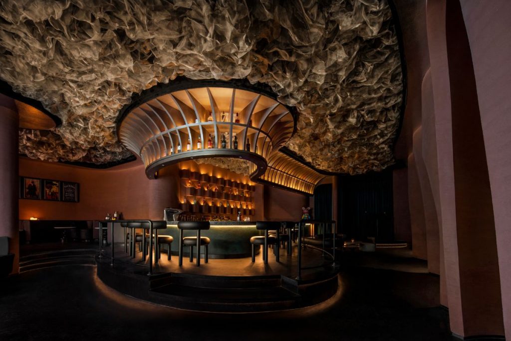
Explore the 2022 SBID Awards Finalists for the Club & Bar Design category! The shortlisted entries include nightclubs, private members clubs and bars with judges looking for functionality, compliance and fit-for-purpose design.
Healthcare & Wellness Design
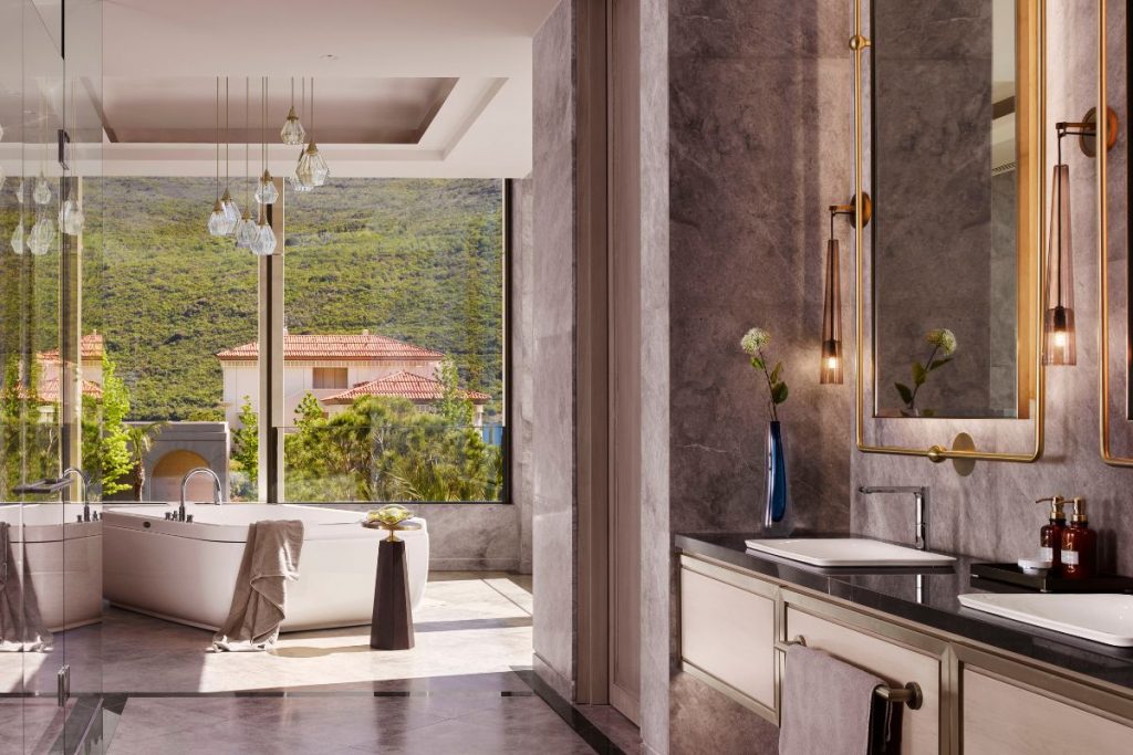
Explore the 2022 SBID Awards Finalists for the Healthcare & Wellness Design category! From interiors of hospitals, healthcare facilities and care-related properties (including gyms, spas and wellbeing centres), the finalists adopt innovative approaches to healthcare environments.
Hotel Bedroom & Suites Design
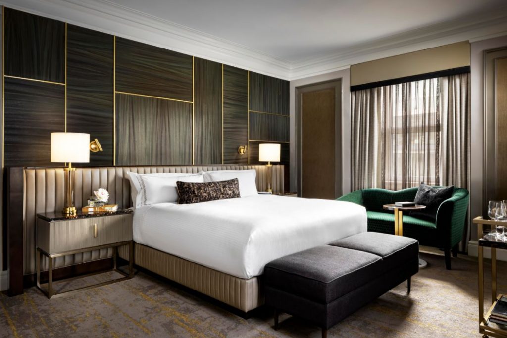
Explore the 2022 SBID Awards Finalists for the Hotel Bedroom & Suite Design category! The shortlisted projects include both new builds and restorations for commercial hotel designs, showing high levels of creativity, innovation and consideration for the target clientelle.
Hotel Public Space Design
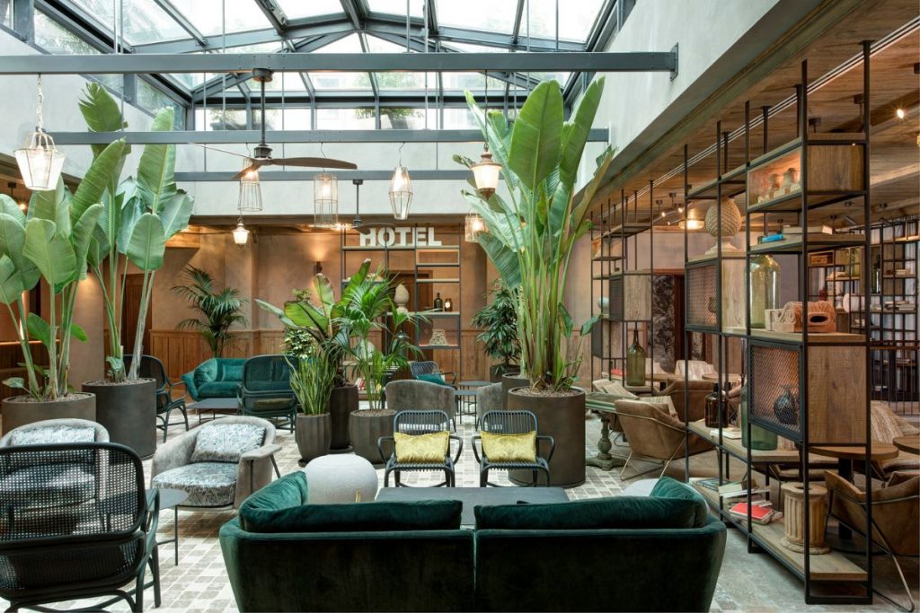
Explore the 2022 SBID Awards Finalists for the Hotel Public Space Design category! This category includes designs for lobbies, spas, ballrooms, meeting rooms and other public facilities within hotels. Shortlisted projects show the creativity and innovation required to provide unique and memorable guest experiences!
KBB Design
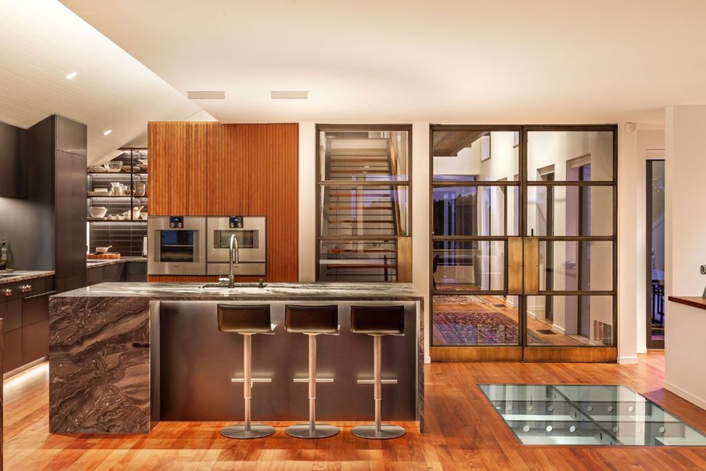
Explore the 2022 SBID Awards Finalists for KBB Design! The finalists in this category include the latest interior designs for the kitchen, bedrooms and bathrooms within residential spaces, considering user lifestyles, personal tastes and trends to execute the client brief.
Office Design Over 2,000 SqM
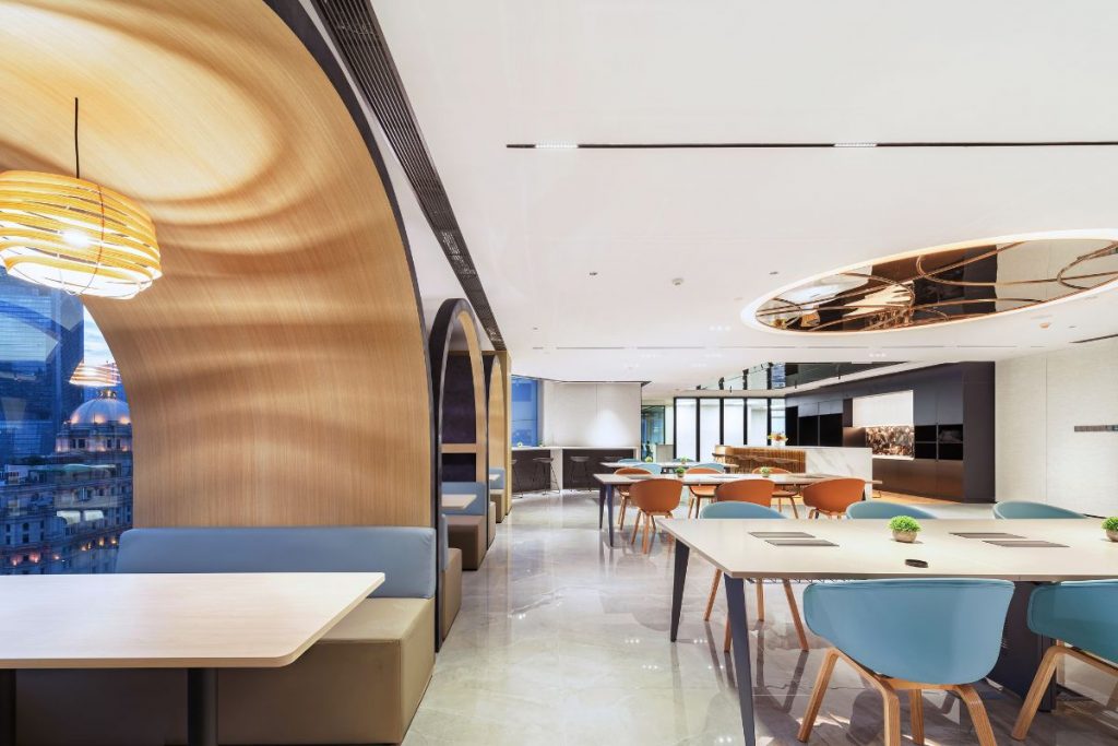
Explore the 2022 SBID Awards Finalists for the Office Design Over 2,000 SqM category! Showcasing inspiring workplaces with contemporary design concepts to curate effective working environments that meet the needs of both the client and the employees!
Office Design Under 2,000 SqM
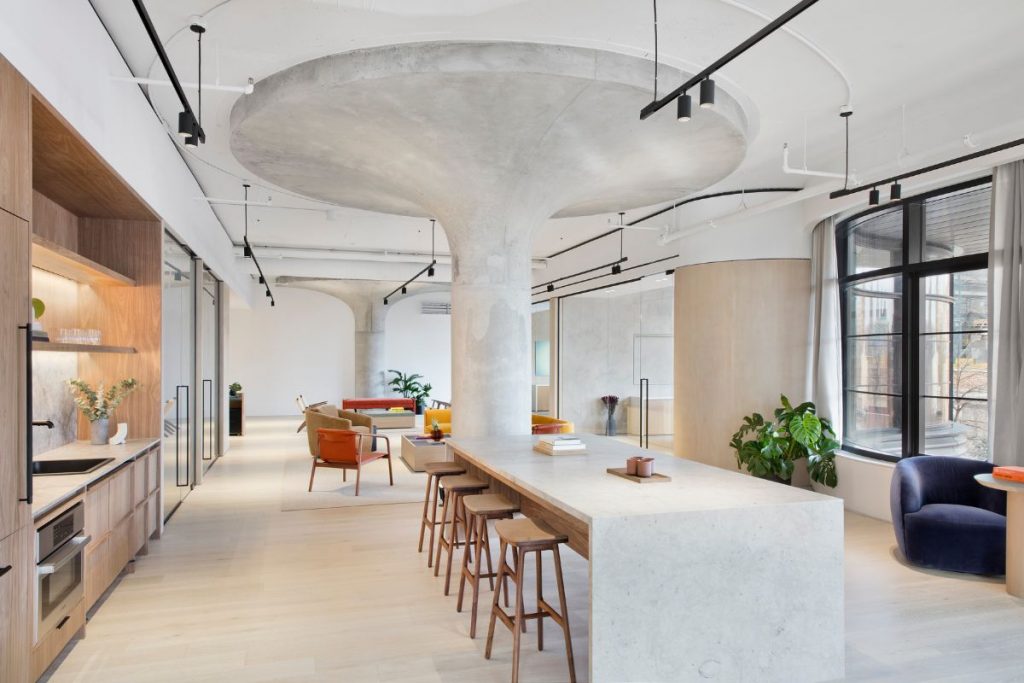
Explore the 2022 SBID Awards Finalists for the Office Design Under 2,000 SqM category! Showcasing inspiring workplaces with contemporary design concepts to curate effective working environments that meet the needs of both the client and the employees!
Property Development Asia Pacific
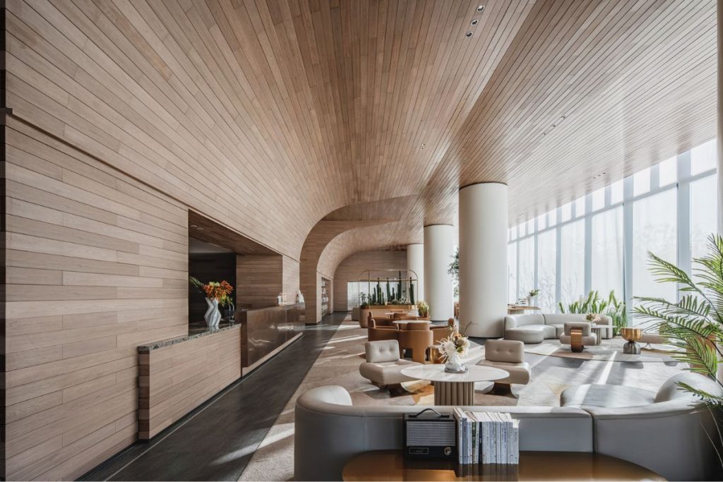
Explore the 2022 SBID Awards Finalists for the Property Development Asia Pacific category! Including the most innovative residential and mixed-use developments, sales centres, marketing suites in the Asia-Pacific region.
Public Space
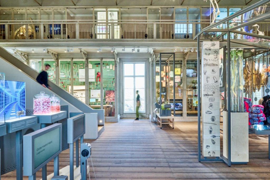
Explore the 2022 SBID Awards Finalists for the Public Space Design category! Dedicated to the exceptional interiors for public spaces created as a service for the community; from airports, libraries, schools and museums, to universities and religious buildings!
Residential Apartment Over £1M
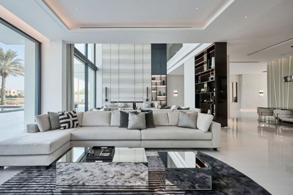
Explore the 2022 SBID Awards Finalists for Residential Apartment Over £1M! This premium design category highlights the wow-factor for high-end residential projects with an overall value exceeding £1 Million!
Residential Apartment Under £1M
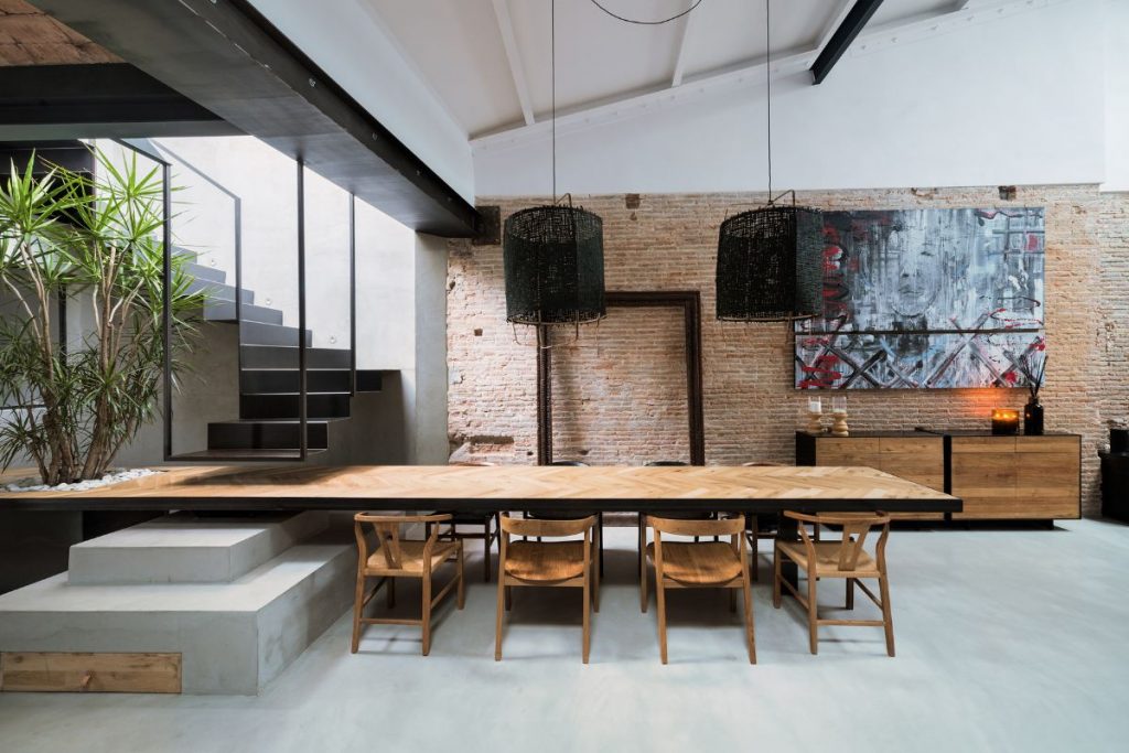
Explore the 2022 SBID Awards Finalists for Residential Apartment Under £1M! With an overall value of under £1 Million, the finalists are recognised not only for achievement for the budget, but also on intuitive functionality and aesthetics.
Residential Budget Up To £50k
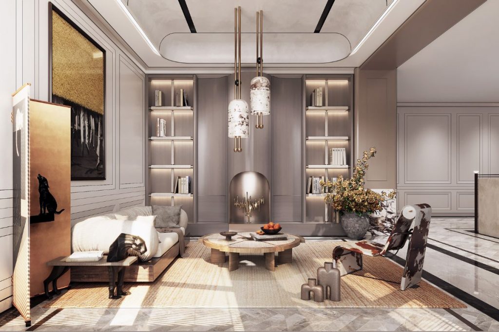
Explore the 2022 SBID Awards Finalists for Residential Budget Up To £50K! The finalist projects in this category have delivered the best interior design solutions to meet the client’s brief on a limited budget!
Residential House Over £1M
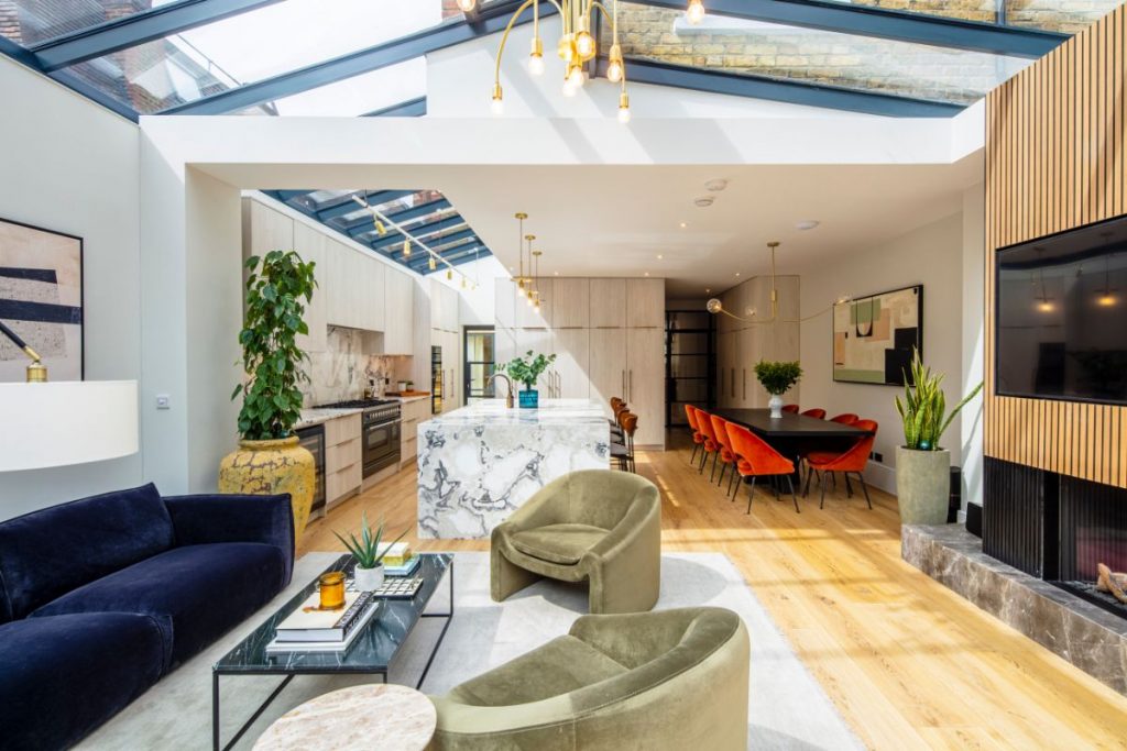
Explore the 2022 SBID Awards Finalists for Residential House Over £1M! This premium design category highlights the wow-factor for high-end residential projects with an overall value exceeding £1 Million!
Residential House Under £1M
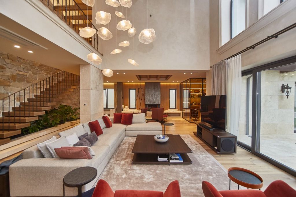
Explore the 2022 SBID Awards Finalists for Residential House Under £1M! With an overall value of under £1 Million, the finalists are recognised not only for achievement for the budget, but also on intuitive functionality and aesthetics.
Restaurant Design
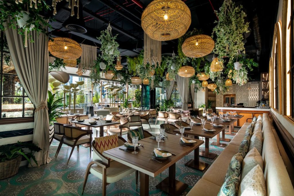
Explore the 2022 SBID Awards Finalists for the Restaurant Design category! Looking for the latest innovations in hospitality, the finalist designs for restaurants and cafes consider functionality, compliance and creativity to create engaging dining experiences.
Retail Design
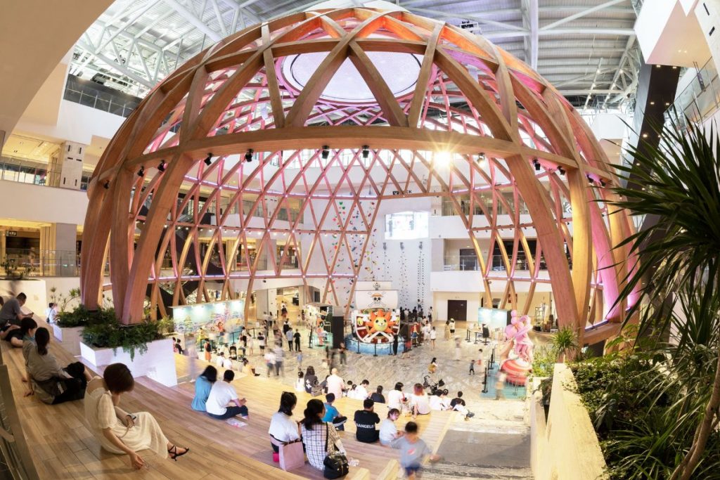
Explore the 2022 SBID Awards Finalists for the Retail Design category! Highlighting the latest commercial trends, the finalist designs include retail outlets, shopping centres, pop-up shops and showrooms with the innovation and functionality to create safe and engaging customer environments.
Show Flats & Developments
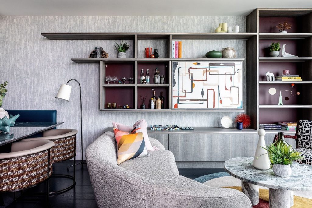
Explore the 2022 SBID Awards Finalists for Show Flats & Developments! This category is for marketing suites and show homes with designs focusing on functionality, aesthetic and ability to interpret the developer’s vision and engage potential consumers.
Product Design Awards:
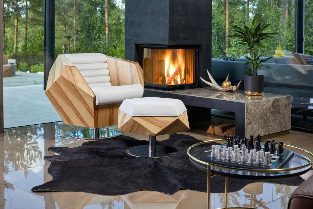
Explore the 2022 SBID Awards Finalists for the Product Design categories! Boasting finalists across the sectors, the product design awards showcase interior solutions from accessories and furniture to floors, surfaces, sanitaryware and more!
Fit Out Awards:
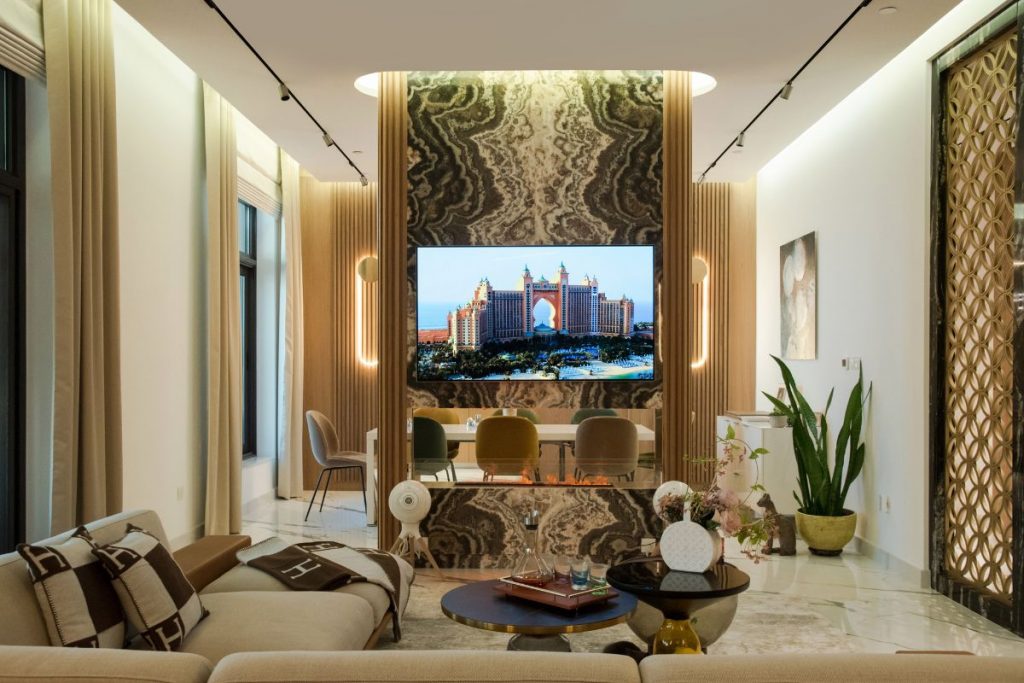
Explore the 2022 SBID Awards Finalists for the Interior Fit-Out Design categories! This award is bestowed upon the fit-out specialists and contractors operating across the commercial and residential sectors for providing superior services in the execution of outstanding interior design projects!
Voting closes at 5pm (BST) on 24 August.
Visit www.sbidawards.com to find out more!
In this week's interview with SBID Awards Product Design judge and Chief Executive at Scott Brownrigg, Darren Comber talks about the power of innovative design thinking, its role in future proofing our environments, changing and enriching our lives. He also shares what role the sustainable aspect will play in his judging process.
How important is innovative design thinking when it comes to the future of our built environments?
Innovative design has the power to help address the climate emergency, future proof our built environment, and ultimately enrich lives. We need holistic, culture-led approaches that look beyond aesthetics and current trends in order to create spaces that people choose to be in. The pandemic has caused a significant shift in our thinking; people want to occupy spaces that have been designed with sustainability in mind, and flexible enough to suit their needs. Inclusive spaces that can support a range of communities and cultures are fundamental.
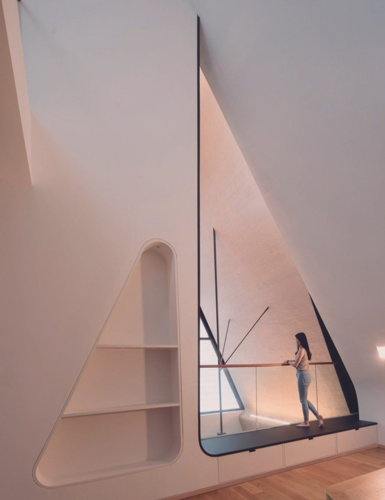
Why is the power of good design so important? How does this impact our lifestyles and ultimately, enrich our lives?
The vast majority of people engage with the built environment in one way or another, and can therefore experience the benefits of good design. It’s not just about new innovations, but thinking critically about how we do things already – and looking for opportunities to make them better.
Good design could play a crucial role in addressing key challenges we face today, such as the rise in the cost of our energy bills. By changing our mind set on what’s considered the norm, we can improve the quality and efficiency of our homes. Residential planning in the UK often discourages predominantly north facing apartments in favour of dual aspect or south facing aspects. But maybe this should be challenged? South facing apartments often feature smaller windows as a means to manage excess heat gain. If we were to embrace north facing residential design innovatively, it could be a simple way to create comfortable living environments that cost less to light, heat and cool. With bigger windows and better connections to the outdoors.
It can also help us reduce the embodied carbon of our buildings – our design for CABI Headquarters features a stunning exposed steel and concrete interior which saves resources, is sound absorbent, assists with cooling and requires little maintenance. The internal layout is also extremely flexible to reduce need for future fit-out.
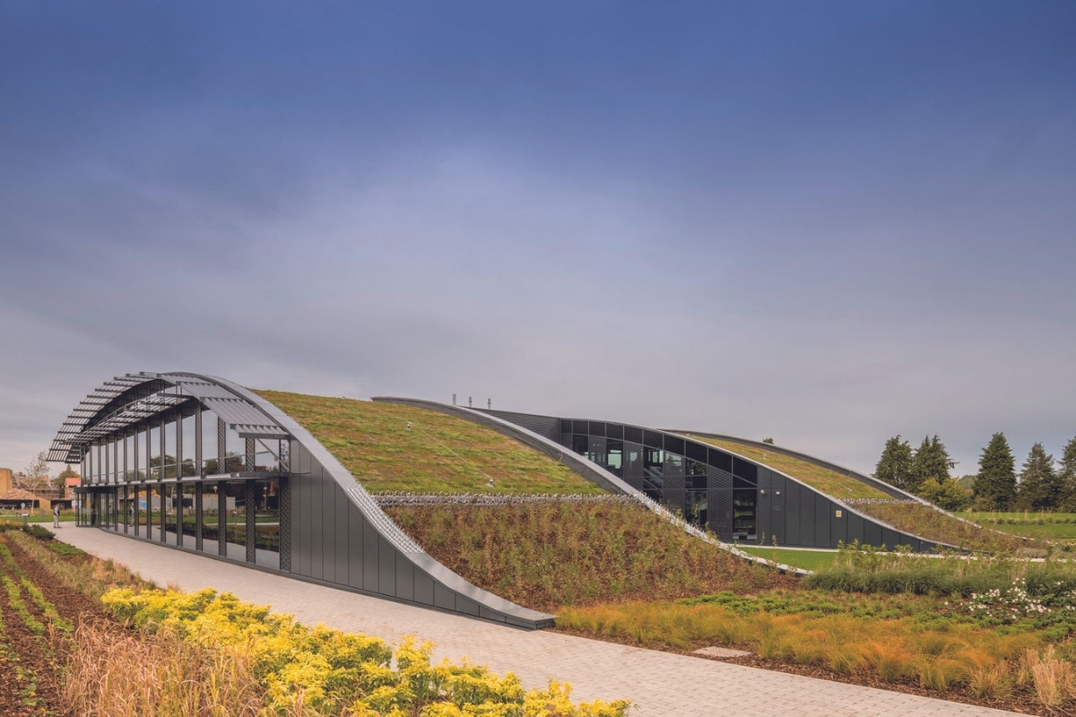
Scott Brownrigg are members of the UK Green Building Council and adopt a sustainable building approach. How can the design industry continue to address the environmental impacts of its operations, and will this ethos influence your judging process?
Sustainable solutions can be perceived as the expensive option, so it is up to us to promote the benefits of sustainable design and demonstrate long-term value to our clients and that good sustainable design does not ultimately cost more, but actually less. Sharing knowledge, collaboration and open debate is key to moving the industry forward – ultimately the whole consultancy team needs to be on board and aligned when it comes to meeting the sustainability goals of the project. These goals need to be embedded in the concept and thought about at every stage of the building process; during construction, operation, and what happens once the design reaches end of life. Whole life cycle cost and carbon assessments can help us make more informed decisions when it comes to the design, and the materials and products we specify.
We can also strive to meet benchmark sustainability and wellbeing standards such as Passive House and WELL Certification as we design. Our fit out of EQT Partners London Headquarters was the second London office to achieve a WELL Building accreditation, having successfully tackled issues such as a lack of natural light, poor acoustics, and fitting a variety of functions into a limited space. Challenges we are keen to see addressed during the judging process.
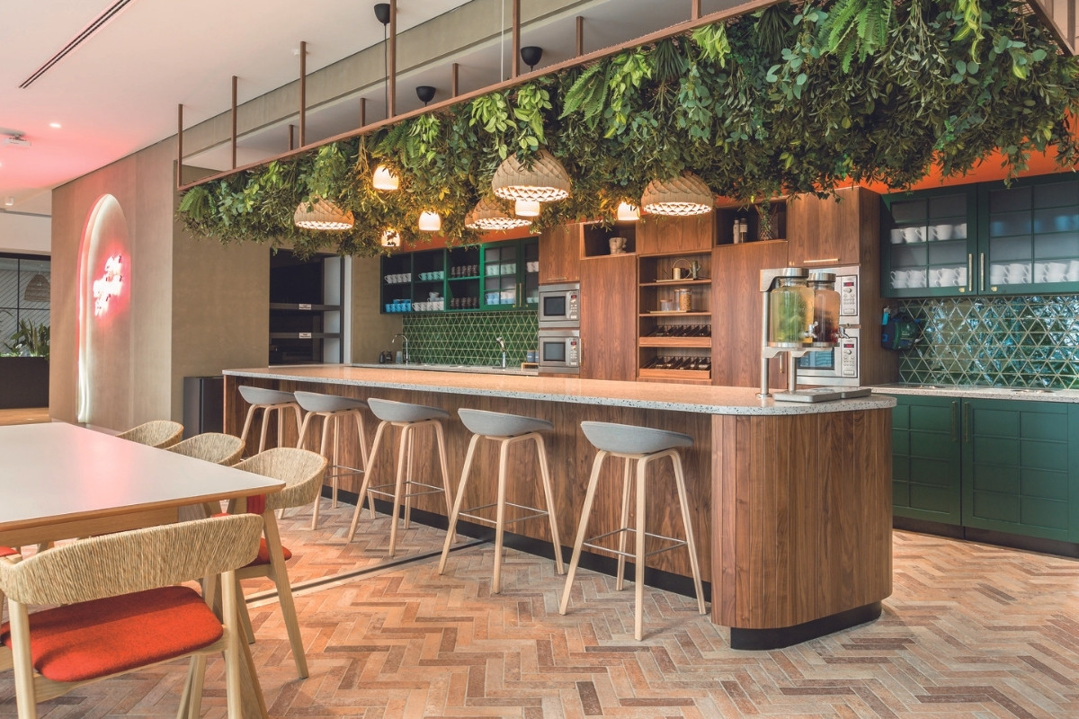
Why is product innovation so essential for the interior design sector, and how can we expect the relationship between manufacturers and designers to evolve going forward?
Interiors tend to have a shorter lifespan than the fabric of the building, changing with occupant need and aesthetic requirements often leads to the interior design being changed many times across the lifespan of a building. Product innovation is therefore crucial in helping us to improve sustainability of the spaces we create. We need to make sure that materials sourced are as sustainable as possible, taking into account the embodied carbon required to make, transport and when the time comes, to reuse, recycle or readapt at end of life.
A much closer relationship between designers and the whole consultancy team is required in order to ensure the design is sustainable, affordable and fit for purpose – fulfilling client (and often, their end user) ESG goals and commercial requirements. We will reach a point where we will need to know the embodied carbon associated with every nut and bolt in order to meet these goals, and the manufacturers buy-in to this process is crucial. With digital twins, we already have the ability to monitor and store data such as predicted lifespan and embodied carbon associated with the building structure – using the same technology for our interior components could help us increase the long-term sustainability and financial viability of our designs too.
Finally, what advice can you give to designers entering the SBID Awards?
The scheme needs to clearly demonstrate its concept and what’s special about it. This should be impactful and easy to explain in no more than 30 seconds. Blue sky thinking is great but we also need innovation that can be implemented – we want to see schemes that are logistically viable yet set new standards of design. All while keeping sustainability and designing for the life cycle of the project in mind.
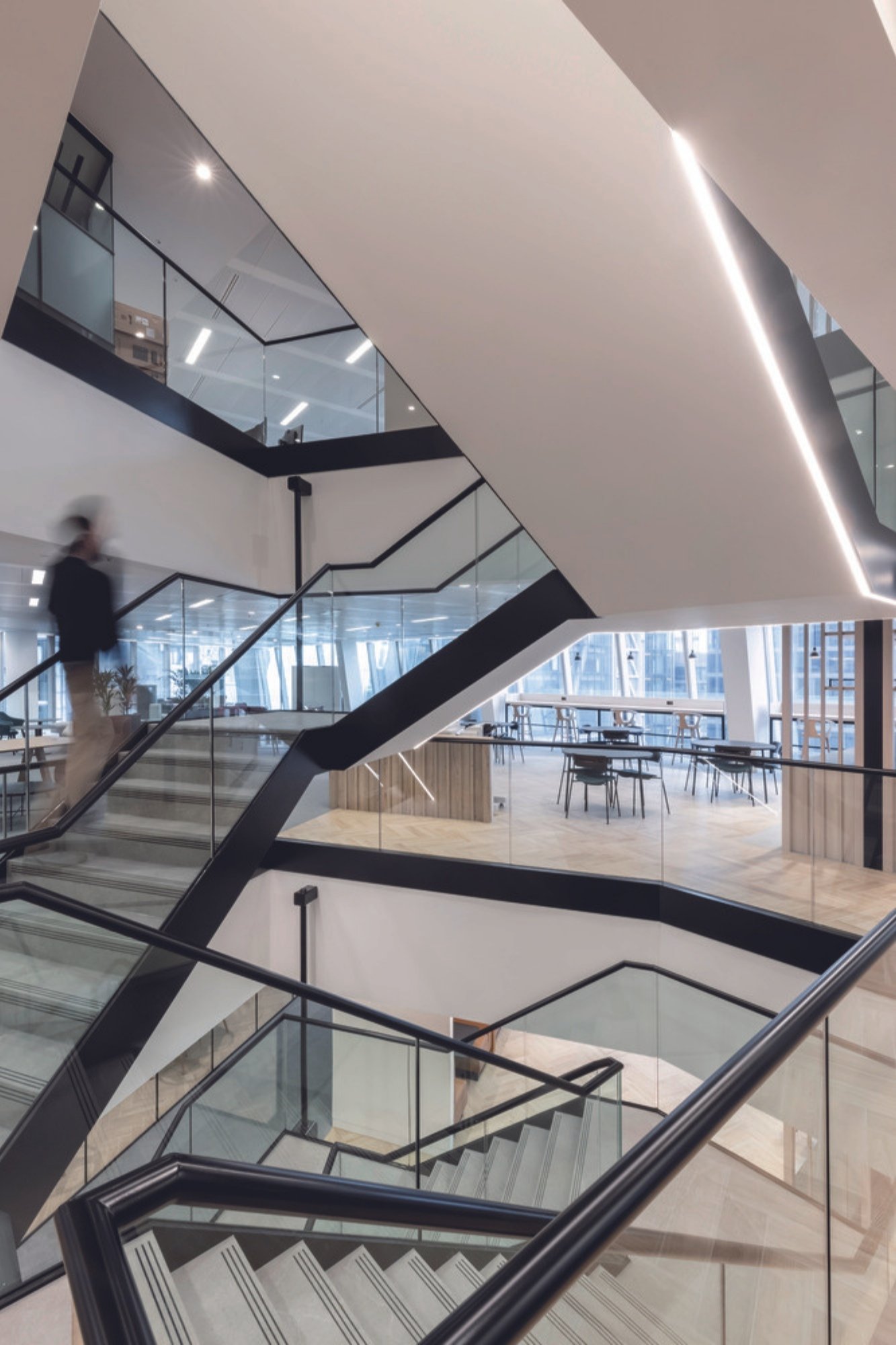
Cover image: Strata House © Khoogj.
Questions answered by Darren Comber, Chief Executive, Scott Brownrigg.
Darren has Strategic Board responsibility for the quality of design across the practice and has been at the forefront of many of the practices high-profile projects within the UK and internationally. With experience in a broad range of sectors including commercial, education, residential, hospitality and retail, Darren instigates a fresh enthusiasm for modern architecture, innovative ideas and a sensitive concern for the environment. More recently he has been working on how to encourage vitality back into our Cities, creating alternative uses for empty retail units and how to provide healthy destinations that support new existing and businesses.
Material Source Studio has opened its doors, offering architects and designers in the North West the opportunity to immerse themselves in ‘beautifully useful’ products and materials. CDUK is proud to announce its partnership with the Studio which will include a CDUK exhibition area showcasing a diversity of products including Corian® Solid Surface and the recently launched sustainable surface, PaperStone®.
CDUK
CDUK is a leading supplier of surface materials and complementary products. With over 40 years’ experience the company understands customer needs and continues to provide design solutions based on market intelligence. Building on decades of product experience, CDUK understands the value of collaboration and working with fellow creative partners to take products directly to market. With an ambitious programme of growth and development, joining Material Source Studio shows how CDUK is diversifying and tapping into new audiences while continuing to provide high quality design products, expert training, and support.
Material Source Studio
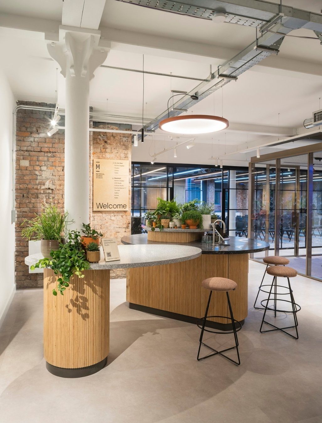
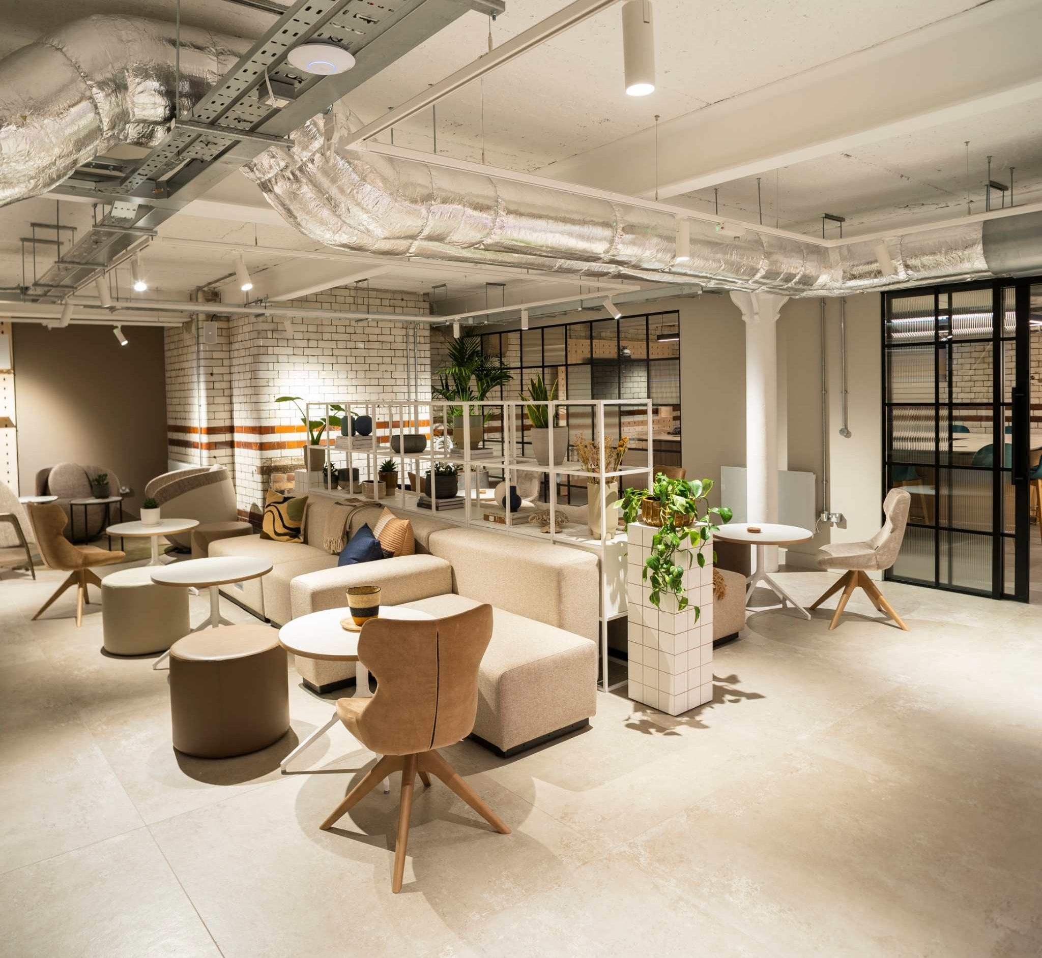
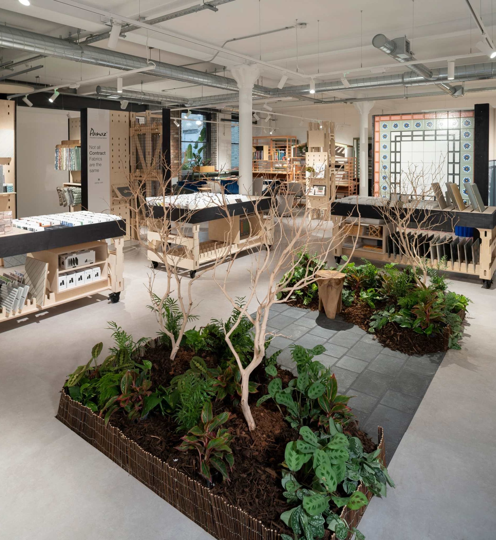
Material Source Studio is the first of its kind in the UK, the 15,000sqft studio is situated in the Grade II listed Hanover Building in NOMA. Set across two levels, it features a wealth of inspirational exhibits and interactive displays from 35 leading brands operating in the commercial interiors and built environment sectors. It also includes an 60-seat theatre, a CPD area, a 300+ book library, 7 meeting spaces, a co-working hub and a podcast studio. Plus, an internal garden and a fully mature, 6-metre tree, spanning both floors.
The space is enhanced further with a seasonally-changing Gallery, opening with two exhibitions as part of the Material Source Studio Presents series. “From the Ground up: A preview” comprises a celebration of innovation in biomaterial development, and “Coo Birds by May Wild Studio” features the local studio’s signature Coo Bird sculptures, inspired by Manchester’s pigeon population.
Fusing the creative acumen of Darren Clanford with the operational experience of Michael Rogan, Material Source Studio was a venture born out of a fervent desire to support and champion the North West’s creative communities. The addition of David Smalley as commercial director bolstered the vast amounts of experience both Darren and Michael bring to the table.
A word from the founders
"With Material Source Studio, we’ve had nothing but support from the design community of the North. And, for this, I can’t thank them enough. It's kept us positive through a pretty tough transformation over the past two years.
“The Studio has been designed by the team at Material Source led by Darren, the partners and the A&D community. I’d like it to be used by everyone as a place to work, meet and, also, socialise. Something we’ve all missed lately.
"I personally can’t wait for the talk series we'll be running in our Theatre space, especially the sessions focused on how we can influence the wellbeing of everyone who walks through our door. After being empty for almost 50 years, it will be great to see the Hanover Building alive again”, comments Michael Rogan, operations director and co-founder of Material Source Studio.
Vicki Richmond, Marketing Director, CDUK: “We are incredibly excited to be joining Material Source Studio as a partner. The space offers the perfect backdrop to showcase our offer and allows our customers to not only look at but also touch our products, something which has been very difficult over the course of the pandemic. For us, taking our products directly to our customers is essential to how we work, especially when supporting specifiers and architects and designers unlock their design potential.
Our exhibition pod at the Studio will be supplemented by events and workshops throughout the year which encourage learning and participation from our loyal existing customers and potential new ones.”
Inside the Studio
Best in the business: 35 built environment brands showcase their products to visitors Making up the Studio’s core offering are bespoke partner PODs – created by neighbouring design and build studio, Tim Denton - and showcasing paint, tiles, flooring and wallcoverings furniture, lighting and smart solutions, fabric, bathroom accessories, plants and acoustic panels.
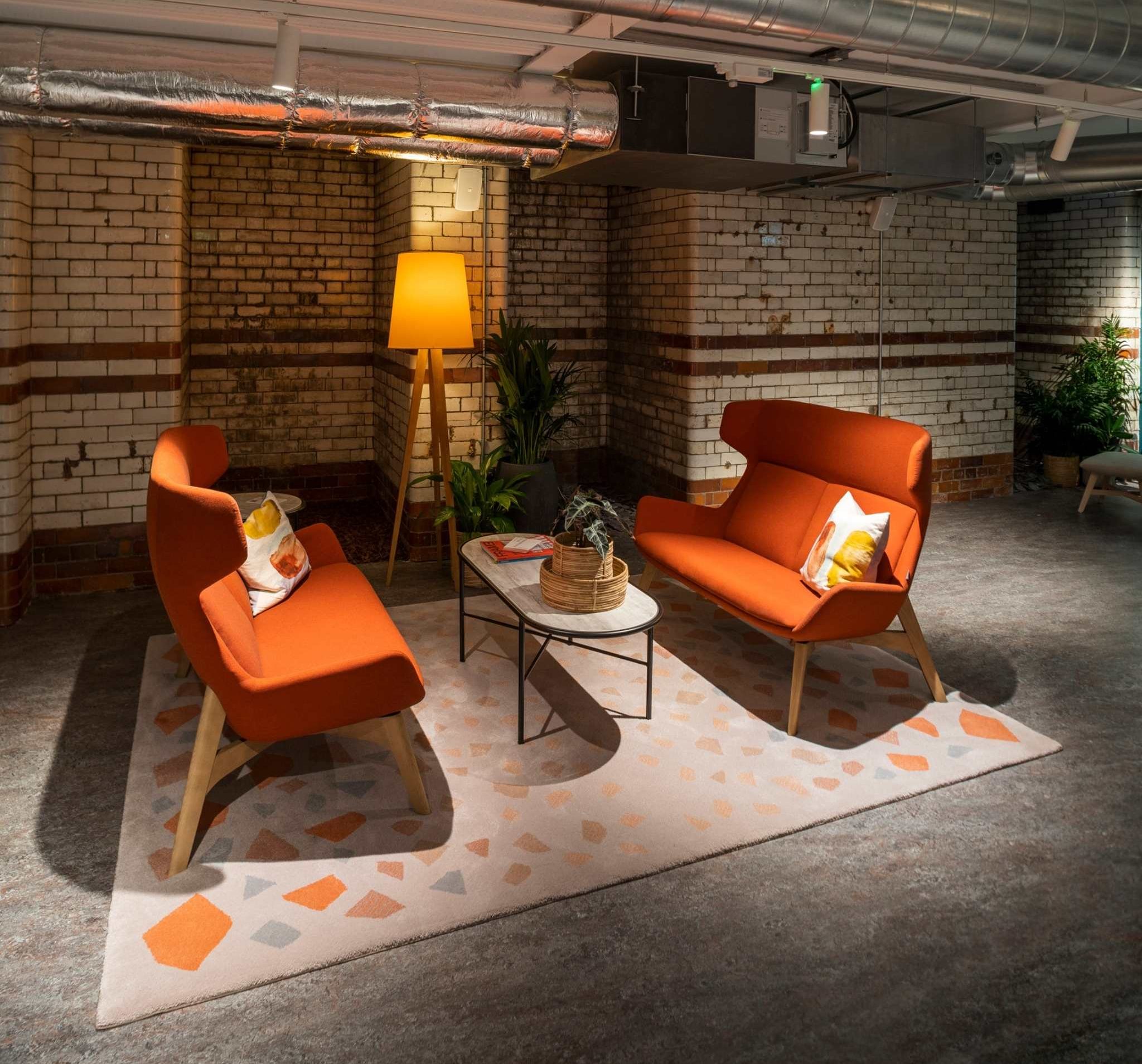
In addition to the interactive PODs, products from all partners are featured in-situ throughout the space, offering further inspiration to visitors. The entire scheme has been developed by creative director, Darren Clanford, who carefully curated a unique ambience for every zone.
“When serving a design driven audience, it goes without saying that the interiors of Material Source Studio needed to be aspirational. Working with products and materials from the best built environment brands in the business allowed us to create a versatile palette of dynamic, on-trend schemes.
“Spanning a range of ‘zones’, from our 60-seat theatre, to the podcast studio, never-before-seen bespoke pieces from our partners are featured throughout, illustrating the extensive capabilities of each and every one”, comments Darren Clanford, creative director and co-founder of Material Source Studio on the design of the space.
The Studio’s opening hours are 10am – 6.30pm Monday to Friday (closed weekends and bank holidays), and it operates an open-door policy. Events will be advertised on materialsource.co.uk, where you can also find out more information on all partners.
About CDUK
CDUK is a supplier of surface materials and complementary products to the specification market in the UK and Ireland, including architects, interiors designers, kitchen designers, fabricators and contractors. Having built a strong reputation as the exclusive distributor of Corian® Solid Surface in the UK and Ireland, CDUK now offers an extended range of services as well as products from a number of leading brands.
We are a family owned business with over 40 years’ experience. We support our customers through a journey, as their design partner, from sourcing the best products and materials to helping them unlock their full potential through expert advice and technical knowledge. Our team of industry experts also provides technical advice, sampling and bespoke training courses for designers, manufacturers and fabricators.
If you’d like to feature your product news here, get in touch to find out more.
If you’d like to become SBID Accredited, click here for more information.
In this week's interview with SBID Awards Product Design judge Co-Founder & Director of Accouter Group of Companies, Stella Gittins discusses the power of design, Accouter's journey towards becoming a B-corp and talks about the increasing consumer focus on the ethical and sustainable sides of business.
How would you define the power of design?
Design has the power to influence the future, whether that be through innovation, sustainability impacts or the drive for change. Design has the ability to re-imagine what we think we know, and for me, the power of good design is the unity of beauty and functionality. It is courageous in its input and modest in its output, and good design is never out of fashion.
Accouter have recently applied to become B-Corp certified. What will this important certification mean for your business and your clients?
As a future-focused collective, we realised how much difference we could be making on eco and social levels. The first lockdown taught us that even taking small steps to make a change will eventually lead to a more significant impact on healing the planet. Becoming more eco and socially conscious for many in the team was an essential drive for change. So instead of sustaining and maintaining our performance, we prioritised plans to regenerate and commence a never-ending journey towards 'sustainability'.
According to Forbes in 2021, "Generation Z ('97-'12) along with Millennials ('81-'96) are more likely to make purchase decisions based on values and principle." Therefore, commercially we must also be future-proofing ourselves as an industry as the more sustainably conscious generations start to hold the purse strings. Obtaining our B Corp accreditation through initiatives with our teams, customers, supply chain, the wider community and by being transparent and accountable will undoubtedly build that critical trust factor within our business and clients for the future.
When thinking about the future of interior design, what are the key factors driving industry development?
We have lived through, and are still living through, a significant period of re-adjustment that brings a new meaning to and re-orientating our life perspectives. Affiliation with nature and well-being has become a fundamental concept in our way of life. So much so, we have already noticed this drive for change in how we can design a space that incorporates elements for a positive mental and well-being outcome.
Likewise, sustainability is a key focus for industry development. I recently read that 22 million pieces of furniture are thrown away every year in the UK. The shocking stats made us think, “we can do better.” Customers increasingly want a product sourced from ‘responsible’ suppliers and are interested in full traceability on the supply chain offering ‘responsible’ products. Much like our clients, we are investing in the future. Our dedicated ‘Eco-Warrior’ team are directing their efforts on measures that deliver the biggest impacts, with an emphasis on minimising any destructive environmental impact.
When it comes to product specification, how far do environmental considerations influence your design process and buying decisions?
Increasingly, we are actively educating our supply chain on the B Corp Movement. Although we have just started this journey, we are actively on a mission to collect data from our supply chain and environmental credentials of the products we are procuring, intending to deliver on our ambition to source 100% from responsible suppliers.
Launching this year, we will use the Environmental Icons to badge products within our BoxNine7 Curated Furniture Packages service and Bazaar’s e-commerce range. The Environmental icons cover everything from ethical design, FSC Timber and fillings to recyclable packaging. Not only does this influence our design process, but it provides our clients with clarity surrounding terminology and confidence in what they are buying. Our new badging process will assist in educating us all, and over time we are looking to achieve 100% traceability across the AGC collective.
Finally, what advice can you give to designers entering the SBID Awards?
My advice would be not to hold back in your entry and share as much as you can about your project. We have been on such a journey the last couple of years, and we need to celebrate the successes we’ve all had during this time!
Questions answered by Stella Gittins, Co-Founder & Group Director, Accouter.
Stella Gittins is the Co-Founder of AGC, London’s fastest-growing portfolio of international award-winning Interior Design companies. Creating the benchmark in luxury living, the Accouter Group of Companies which is home to Accouter Design, A. LONDON and BoxNine7, delivers world-class interior architectural and furnishing services to the global property market and private clients. With 15 years of experience mentoring and directing diverse teams within the field, Stella has spent 7 years building AGC which has been voted one of the best places to work in property on multiple occasions. Taking a lead creative role for the Group, Stella is responsible for all aspects of brand and design and has published four bespoke publications that discuss every corner of luxury life.
This week’s instalment of the Project of the Week series features a spacious feng shui-inspired house design by 2021 SBID Awards Finalist, 7K Design.
SBID Awards Category: Residential House Under £1M Design
Practice: 7K Design
Project: Circle of Life
Location: Ontario, Canada
What was the client's brief?
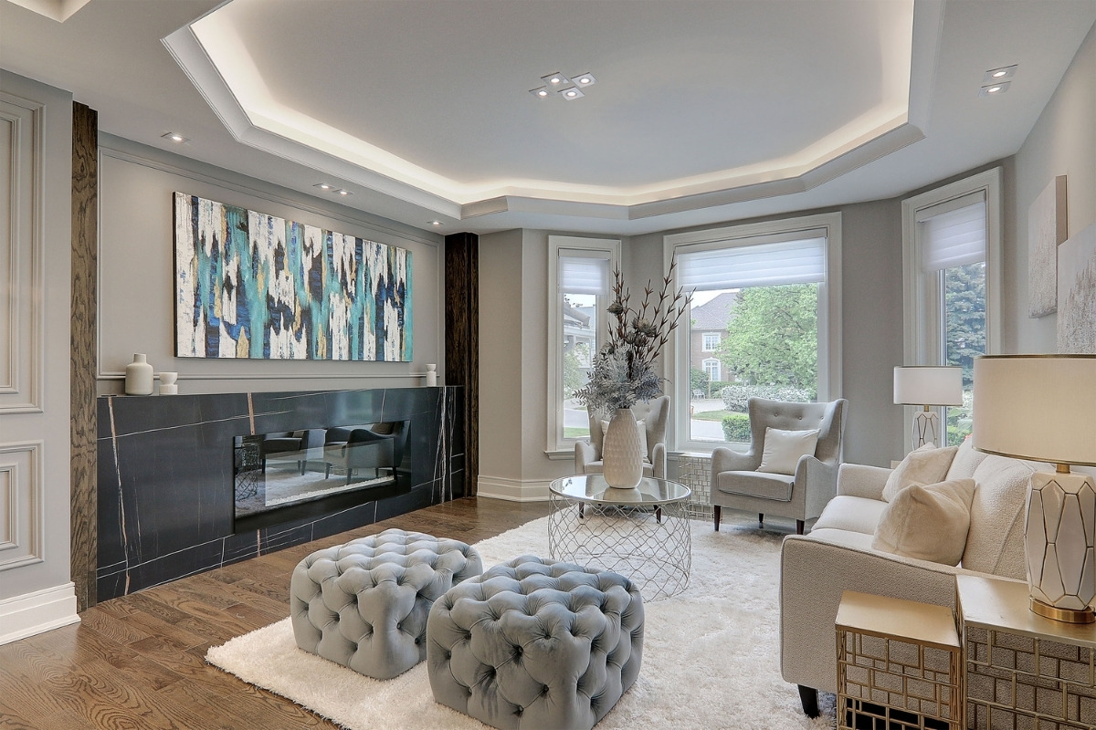
The client wanted to change the lifestyle of their home because it had not been changed in over 20 years. Their home was not built with the intention of maximizing space functionality and flow. The client desired a change and wanted to revitalize their spaces not just to make them more practical and flow better, but also to ensure that each space was created with feng shui in mind to bring the family good fortune.
What inspired the design of the project?
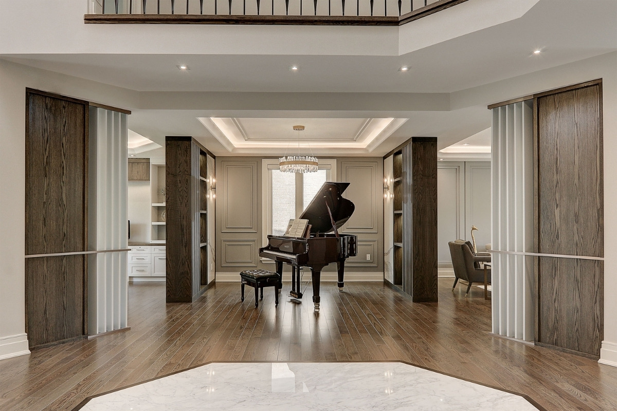
As the circle was an important cultural symbol, feng shui was an important component that we wanted to incorporate into the design. It represents yin and yang harmony, as well as the balance of nature.
What was the toughest hurdle your team overcame during the project?
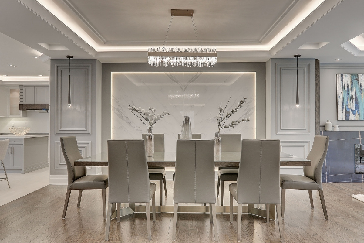
There are precise feng shui principles for each house, and we must incorporate those criteria into our design while still maximizing space, flow, and staying within budget.
Feng shui goes beyond comfort and aesthetic. We had to have a very good understanding of what elements to bring into the space without causing the project's integrity to be disrupted.
What was your team’s highlight of the project?
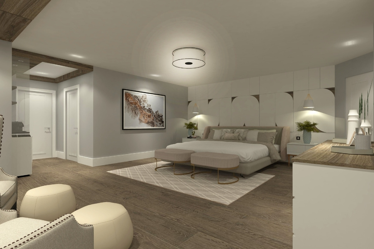
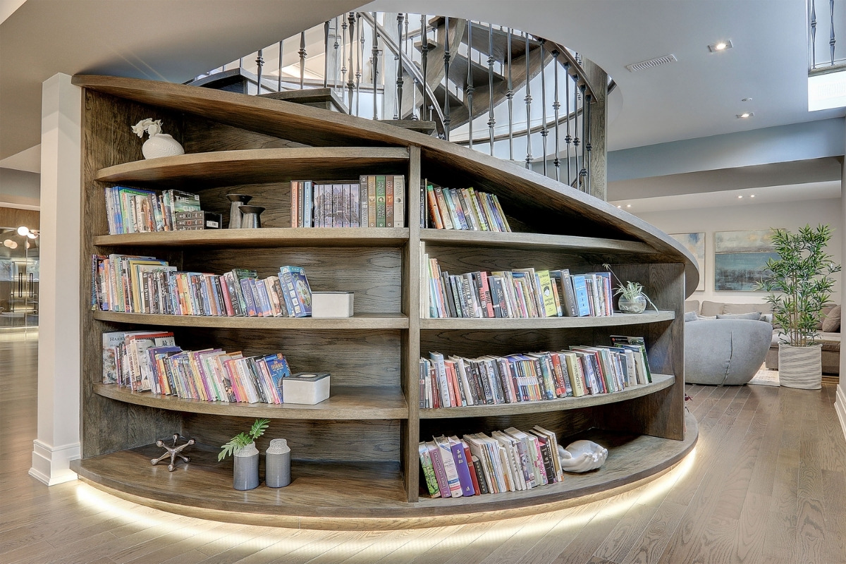
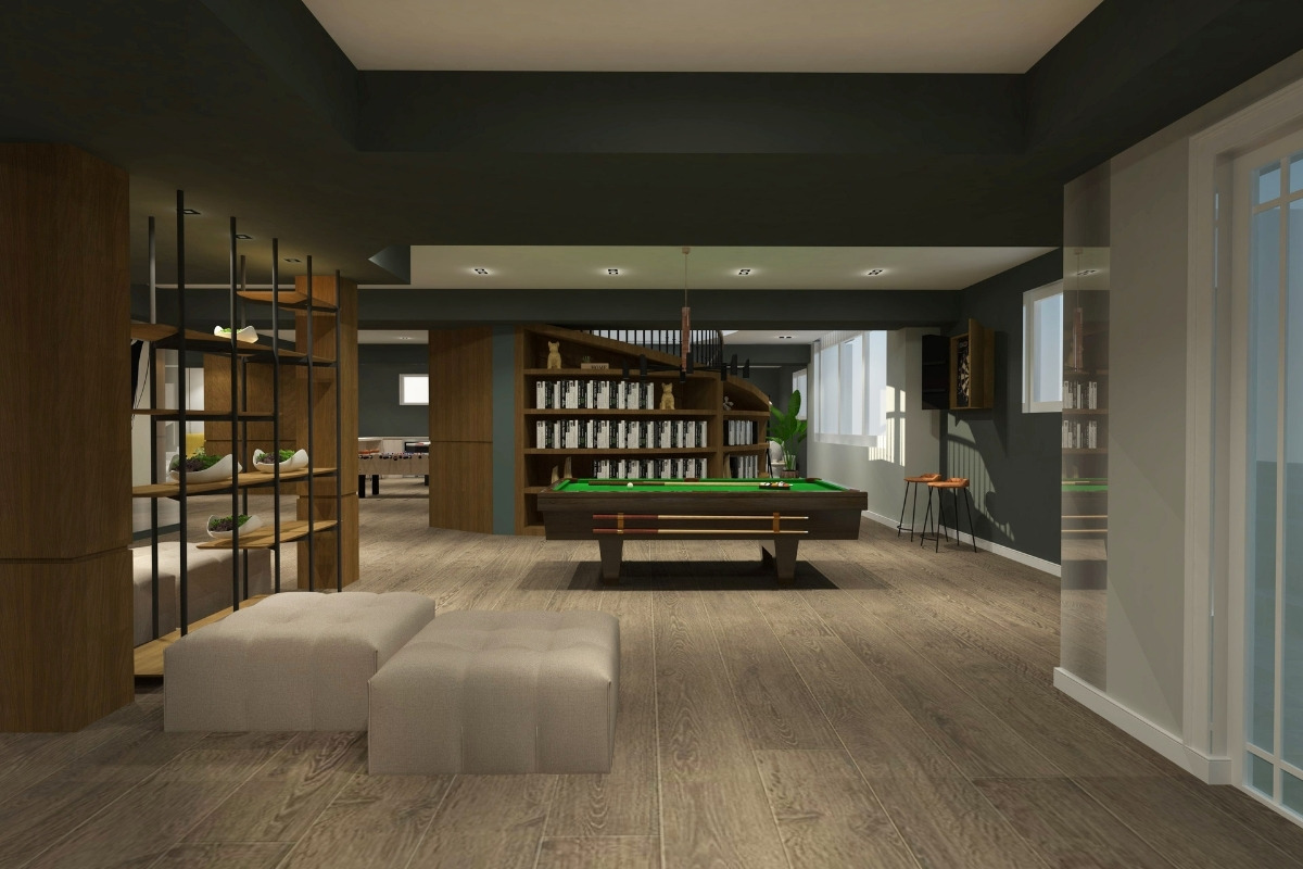
The team’s highlight of the project is designing the custom spiral stair bookcase. The bookcase incorporates important elements of feng shui: the garden that signifies the growth of life, and the book case signifying growth through knowledge.
Why did you enter this project into the SBID Awards?
We are hoping that SBID will aid in raising awareness of the importance of incorporating cultural identity into designs.
Questions answered by Fianne Zi-Yan Yu, Principal Designer & PM, 7k Design.
The project is developed in an old house in the neighborhood of Palermo. A complete reorganisation of the space was carried out, generating two accesses to two spaces of different uses that complement each other according to the hours of operation of the restaurant.
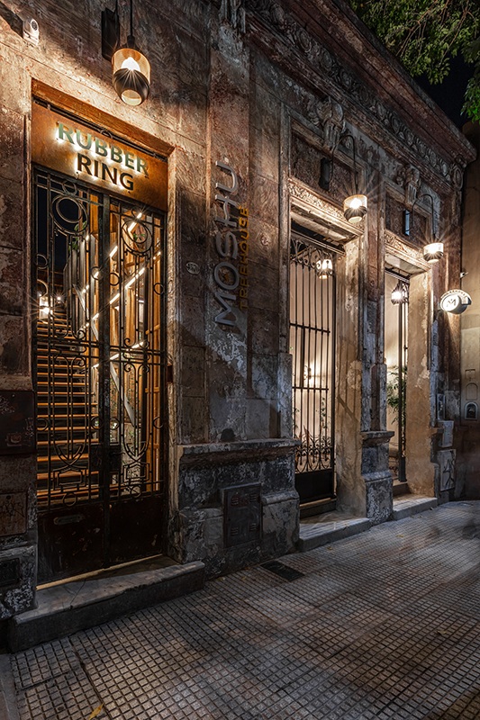
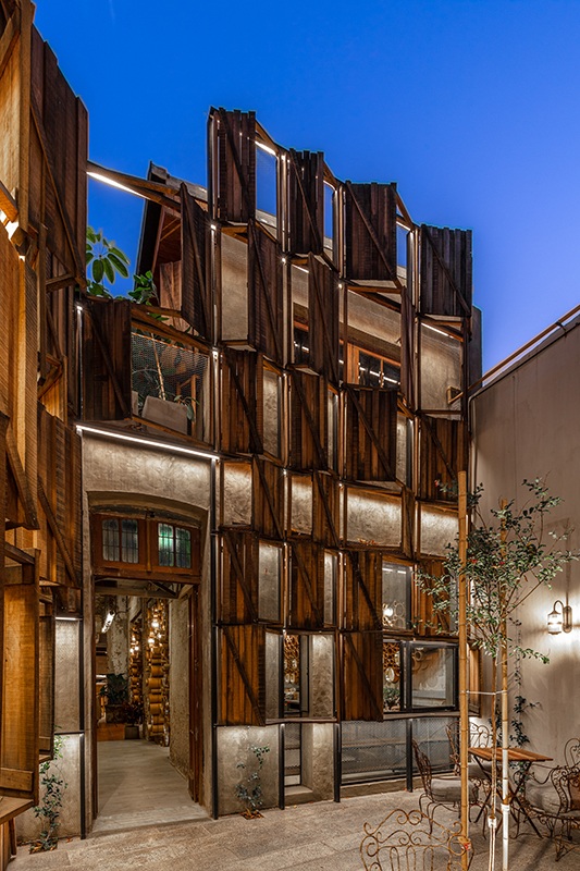
Considering the history of the old houses of Buenos Aires, the courtyards have always been a space of congregation. So the first great design strategy was to create an access courtyard immediately after the façade as a symbol and blow of effect. This allowed to have a new façade of its own language, and as a consequence to preserve the old style of the main façade. From the point of view of operation, the patio is fundamental for the take away model and also explores outdoor post-covid use.
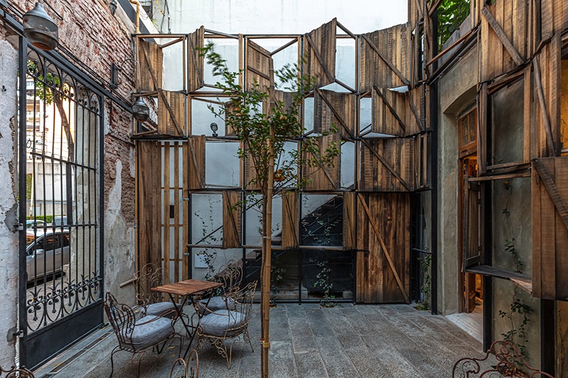
The proposed language was the result of a deep analysis of the elements that define the gastronomic proposal, a proposal that boasts of a type of American pastry. Hence the reference to the old way of "cooling the cake by the window" and its corollary proposal to use multiple windows on the façade of the entrance courtyard.
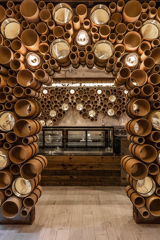
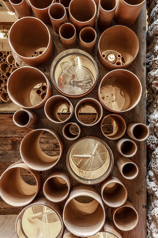
Another determining element has been the abstract representation of cakes built by cardboard cylinders, as a system of "skins" that cover certain areas such as the entrance arches and the bar back, a place that attracts all eyes in the purchase process.
These "cakes or cakes" also include two traditional symbols of pastry, the strainer and the whisks, both elements we condense into a single piece as a symbol.
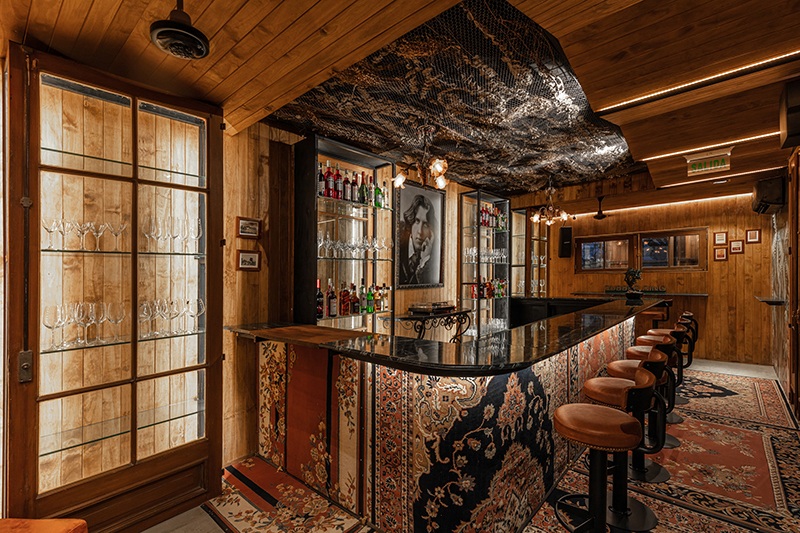
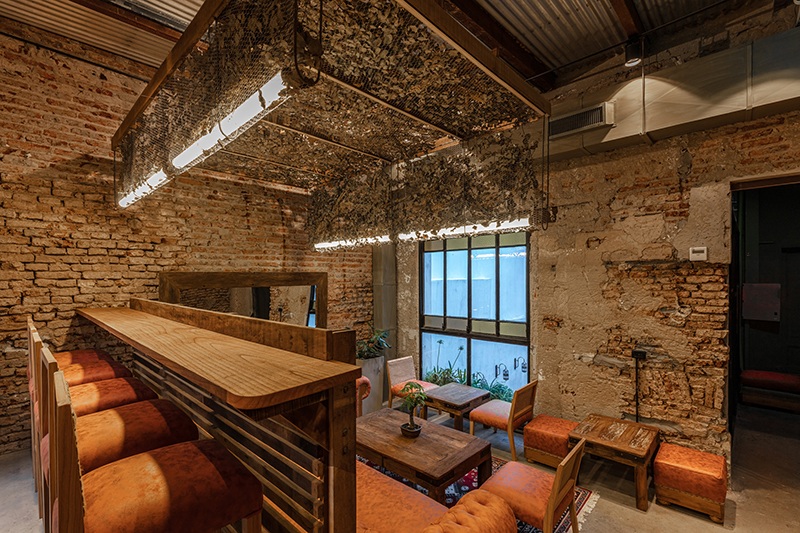
The language of interior architecture is a vernacular composition of the typical demolished industrial style. From this word "demolished" started the idea of using elements that simulate an "under construction" area, that is, scaffolding woods, construction irons, metal fabrics. All neutral materials that make up a universe of constructive sieves and background a demolished house where dry vegetation takes possession of an old house that seems to be in a state of abandonment.
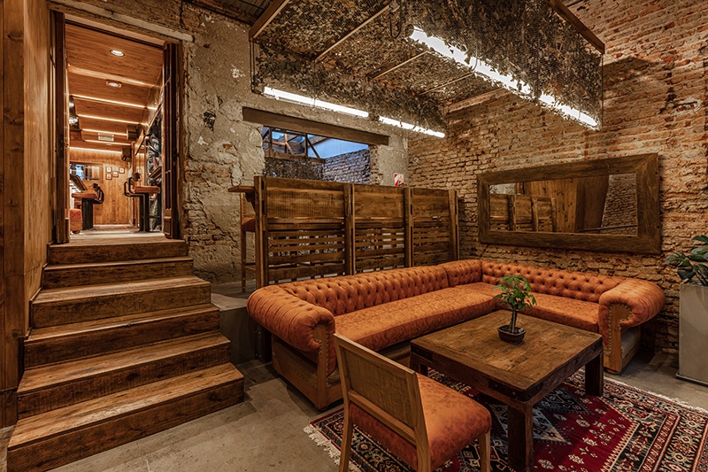
Lighting has become a distinctive element built with wooden structure supports and surrounded by dry vegetation, as a poetic act of how vegetation can take an abandoned wooden scaffolding structure.
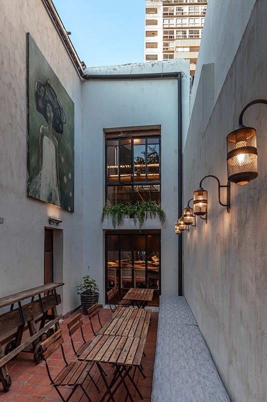
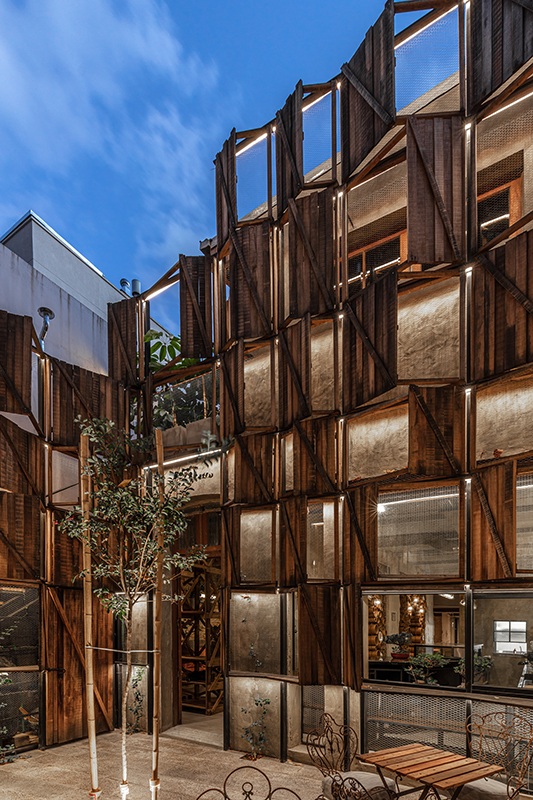
On the first floor, crossing the symbolic wooden windows and a large vegetation that climbs through them, we find a private room where the high cocktail bar takes presence. We emulate through the symbolic Lagerstroemia tree in the center of the courtyard and the use of wood around the courtyard the idea of the house in the tree. Hence its name Moshu treehouse.
About Hitzig Militello Arquitectos
Hitzig Militello architects carries out commercial projects, fundamentally interior design, locally and regionally in Latin America, as well as in Europe, the Middle East and the USA. With a special focus on the hospitality industry (gastronomic and hotel) as well as the development of spaces for tech startup workspaces. They came to position themselves as true creators of brand identities, obtaining international recognition for their concepts and executed work.
If you’d like to feature your project here, get in touch to find out more.
If you’d like to become SBID Accredited, click here for more information.
Wellness design creates spaces that combine form and function for positive mental and physical health. Newmor wallcoverings contribute to creating commercial environments which promote wellbeing through colour, pattern, and texture. Their wallcoverings are also low VOC and contribute to better indoor air quality, as well as enhancing the acoustics of the interior space.
Here are three projects that place wellbeing at their heart:
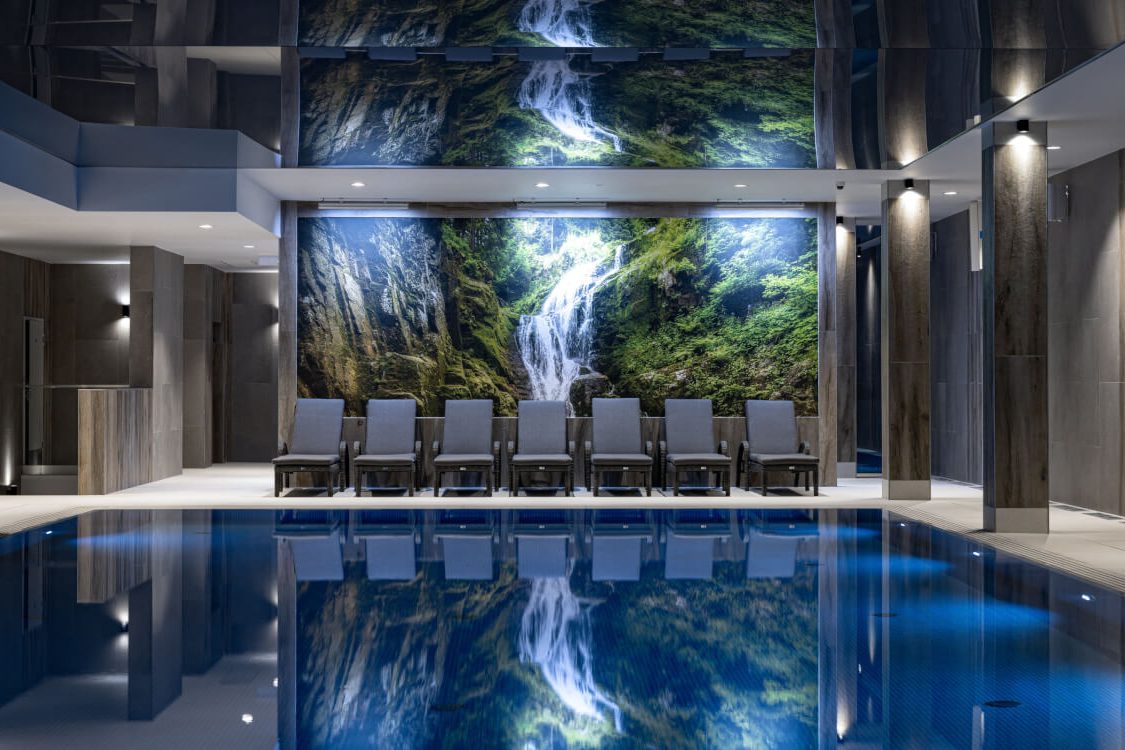
Platinum Mountain Hotel & Spa is a 5 star hotel and wellness centre in the magical alpine ski village of Szklarska Poręba in Poland. The interiors reflect the hotel’s wellness ethos – comfort, style, and connection to the world outside are beautifully reflected in the organic materials, biophilic design, and cosy accents.
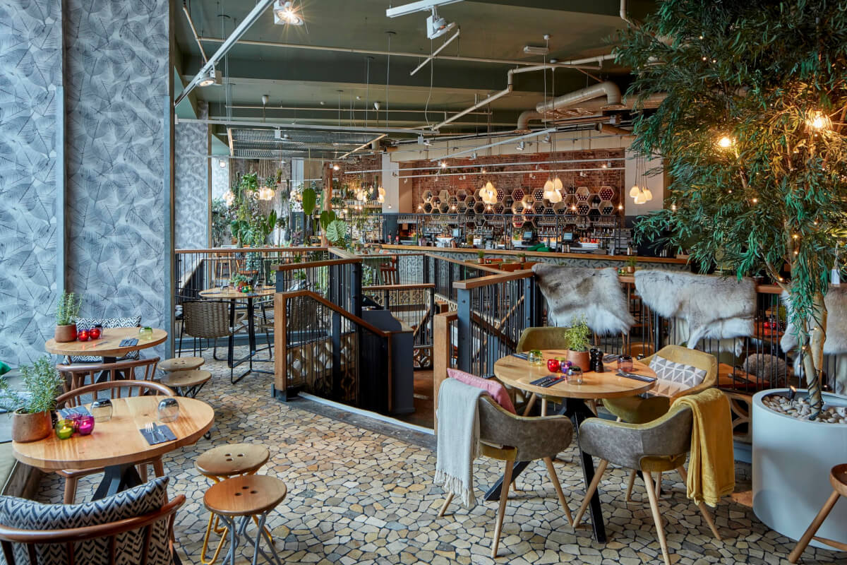
The Folly bar and restaurant is a botanically inspired city haven located in the heart of London. The large-scale skeletal leaf pattern in neutral tones sits alongside a vast collection of plants. Raw wood furniture, stone flooring, sheepskin rugs, and garden-themed ephemera enhance this whimsical uplifting interior.
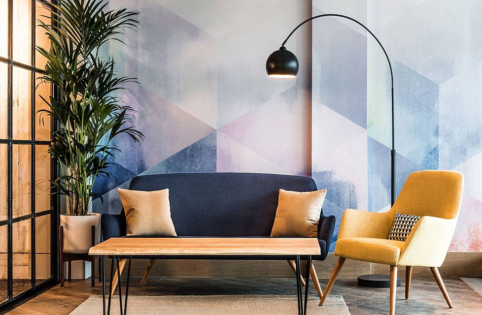
My Lounge is a laidback oasis located in London Gatwick Airport. The clever use of design scale, colours effects and tactile surfaces create a welcoming space, contrasting with the sterile airport environment. Separate formal and informal dining and seating options ensure visitors of all ages feel at home.
About Newmor
Newmor specialise in commercial quality wide-width fabric-backed vinyl wallcoverings, which are manufactured in their own facility in Wales. Their products can be found all over the world in hotels, bars and restaurants, healthcare, education, cruise, and leisure installations.
Newmor work in collaboration with a vast array of artists and designers to promote British design to an international audience. This includes painter and fashion designer, Iona Crawford; interior design duo 2LG; weaver Ptolemy Mann; artists Stephen Walter and Lois O’Hara; and design duo The Patternistas.
If you’d like to feature your product news here, get in touch to find out more.
If you’d like to become SBID Accredited, click here for more information.


