This week’s instalment of Project of the Week series features a daring yet cosy apartment design by 2021 SBID Awards Finalist, IDA SRL & RS Interiores.
Take a tour!
This week’s instalment of Project of the Week series features a daring yet cosy apartment design by 2021 SBID Awards Finalist, IDA SRL & RS Interiores.
Take a tour!
SBID Awards Category: Residential Apartment Under £1M
Practice: IDA SRL & RS Interiores
Project: Casa Elena
Location: Distrito Nacional, Dominican Republic
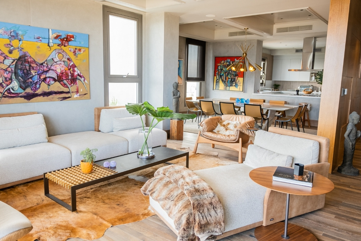
Our client was looking to design their home, an apartment with earthy tones. They had not thought of any style or hadn't stumbled upon ideas that they would have liked in detail.
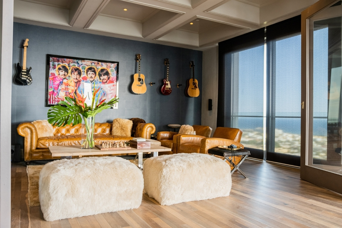
The inspiration for this design came from my clients own personality, once we sat down to talk about them, I had the picture in mind of what their home would look like. A sleek super simple yet edgy design, industrial yet comforting spaces.
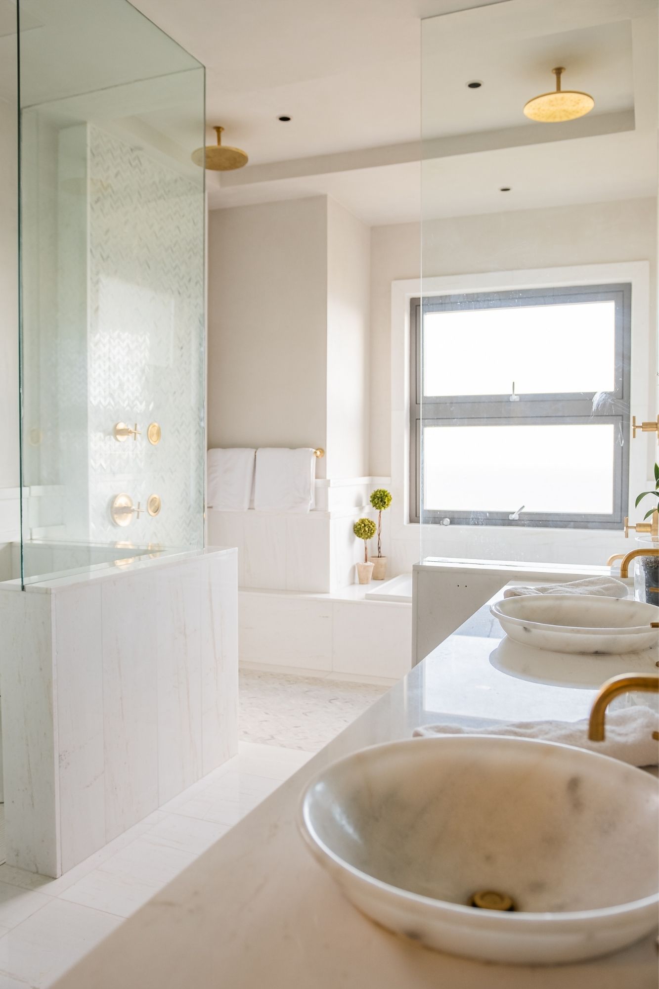
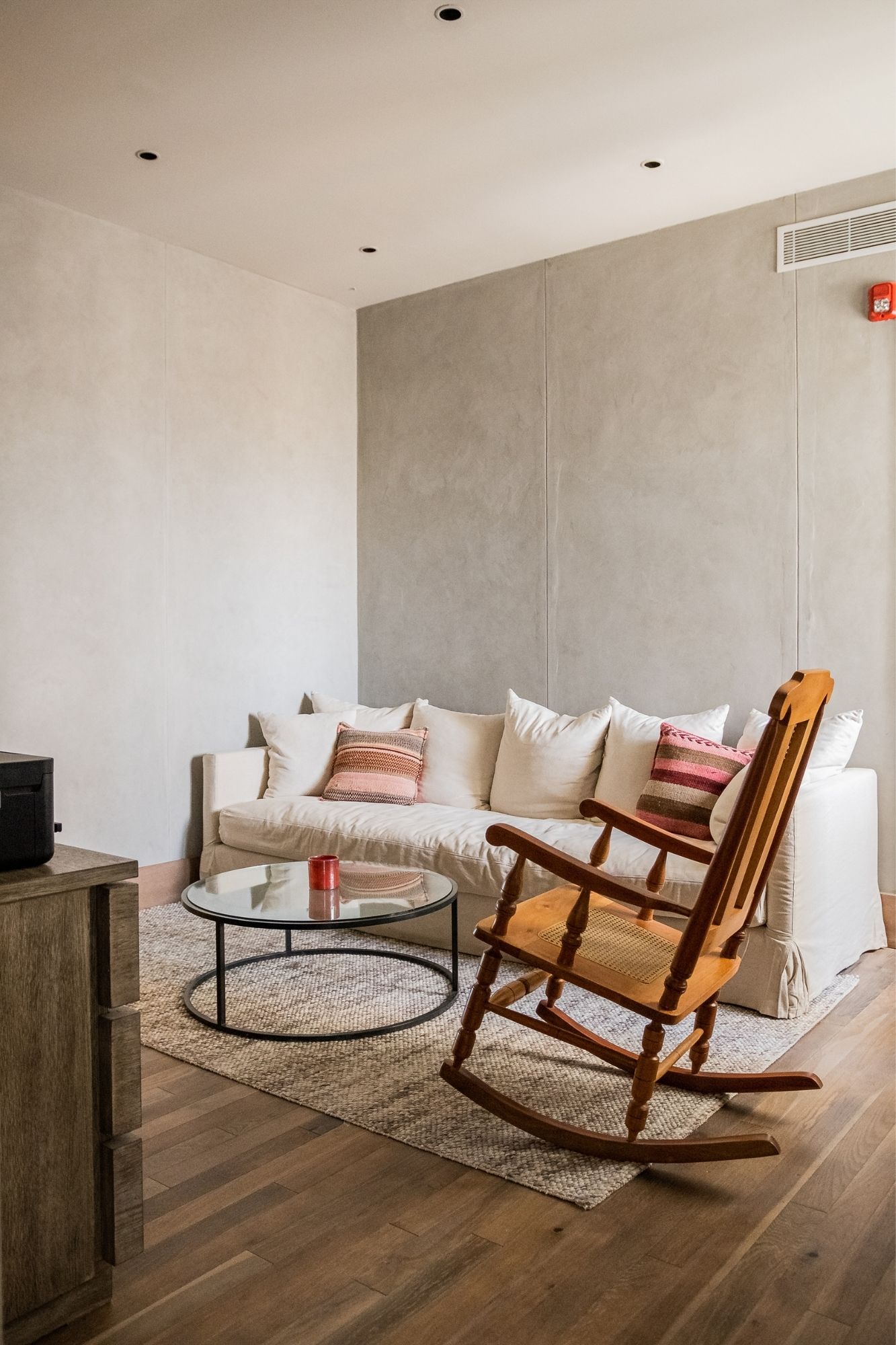
The hardest hurdle to overcome was choosing the correct colour tones, shades of neutral and nude colours to go along with such a daring yet laid back design concept.
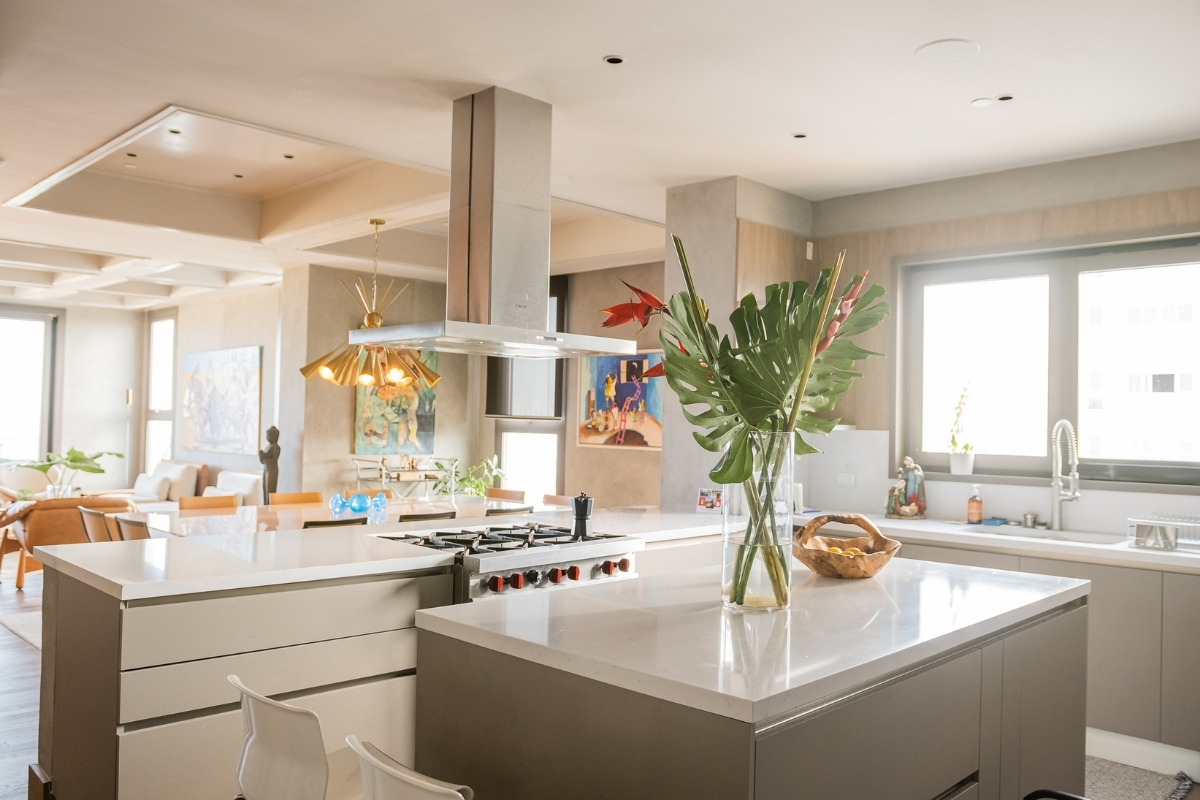
I just loved the way everything came together, from the textures, colour tones and overall furnishings.
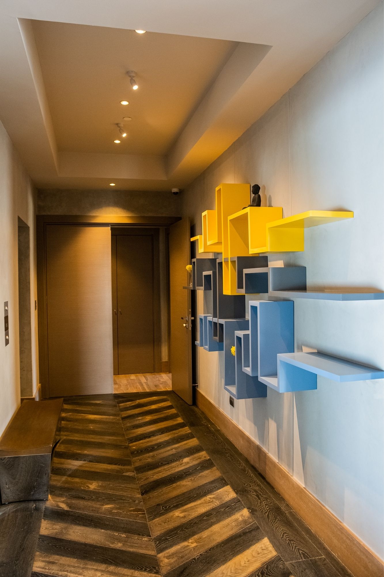
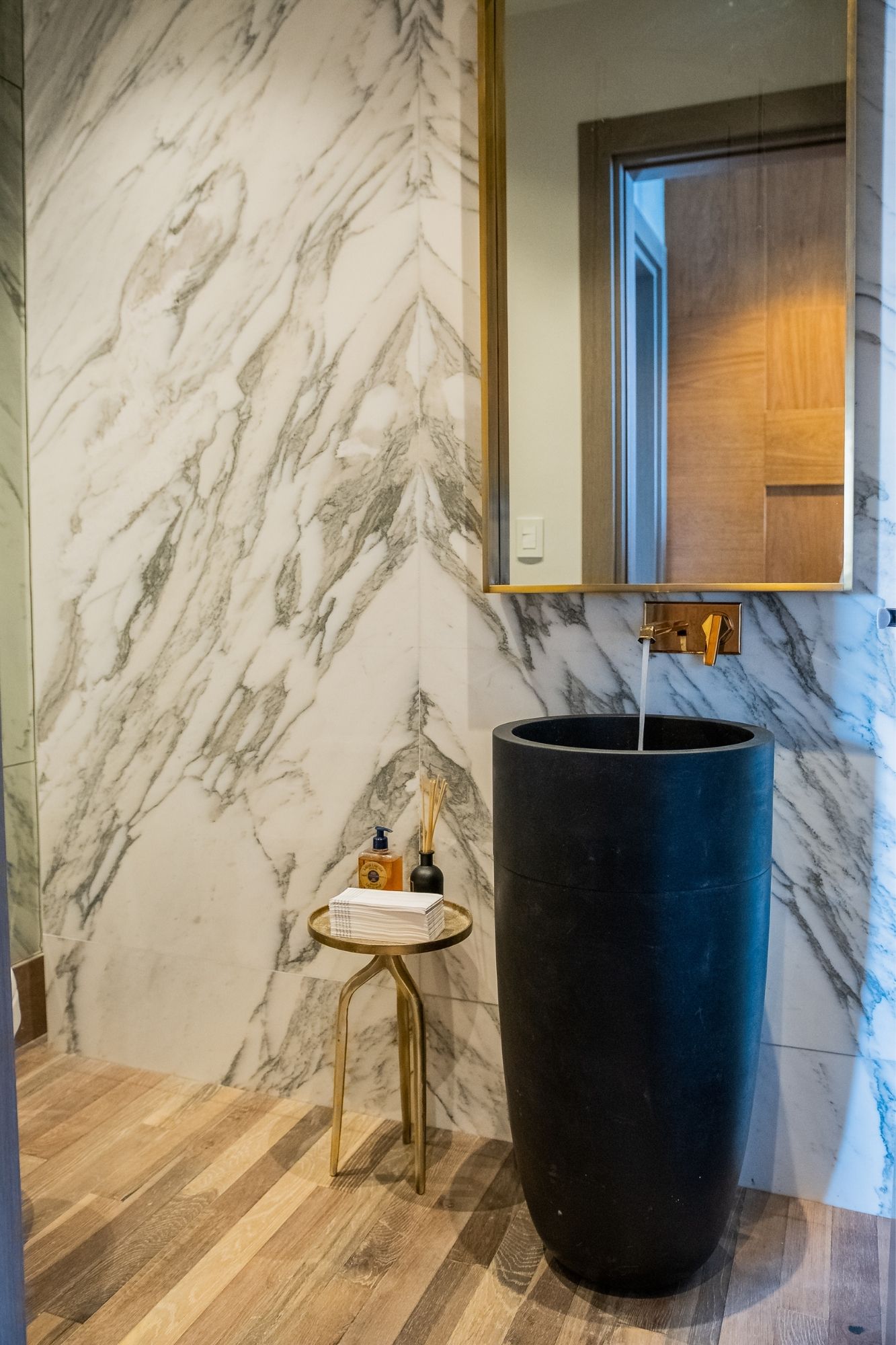
I have been an SBID Member and former winner for a few years now; I believe in the community, we are a group of professionals in design who support each other and push each other to be better - this is why I enter the SBID awards each year.
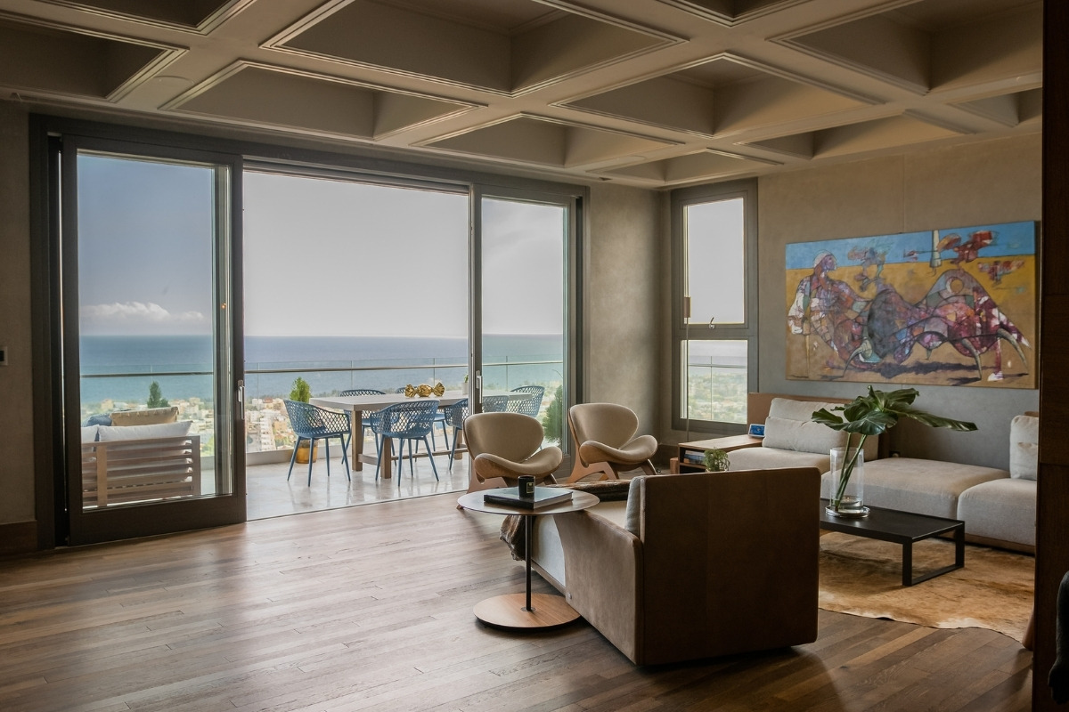
Questions answered by Rosadela Serulle, Head Interior & Lighting Designer, IDA SRL & RS Interiores.
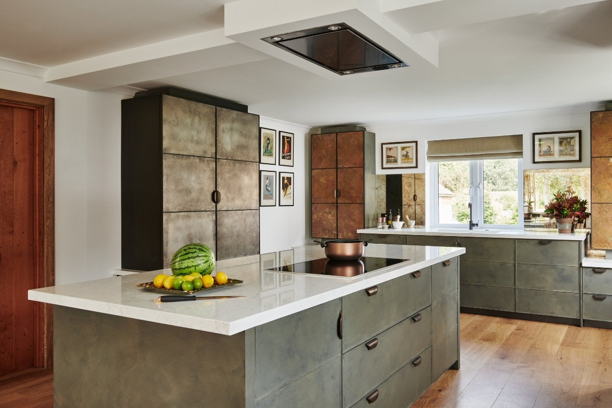
What strikes you about this West Sussex kitchen on first glance is the sheer number of finishes and techniques on display. Testament to the craftsmanship and skill involved in creating it, the space has been transformed from its previous incarnation. “When I first visited the house, the kitchen was dated but the room as a whole was bursting with potential,” remembers Charlie Smallbone, founder of Ledbury Studio. Here, he reveals how he channelled his client's love of antiques and eclecticism to turn it into a sociable space designed for serious cooking.
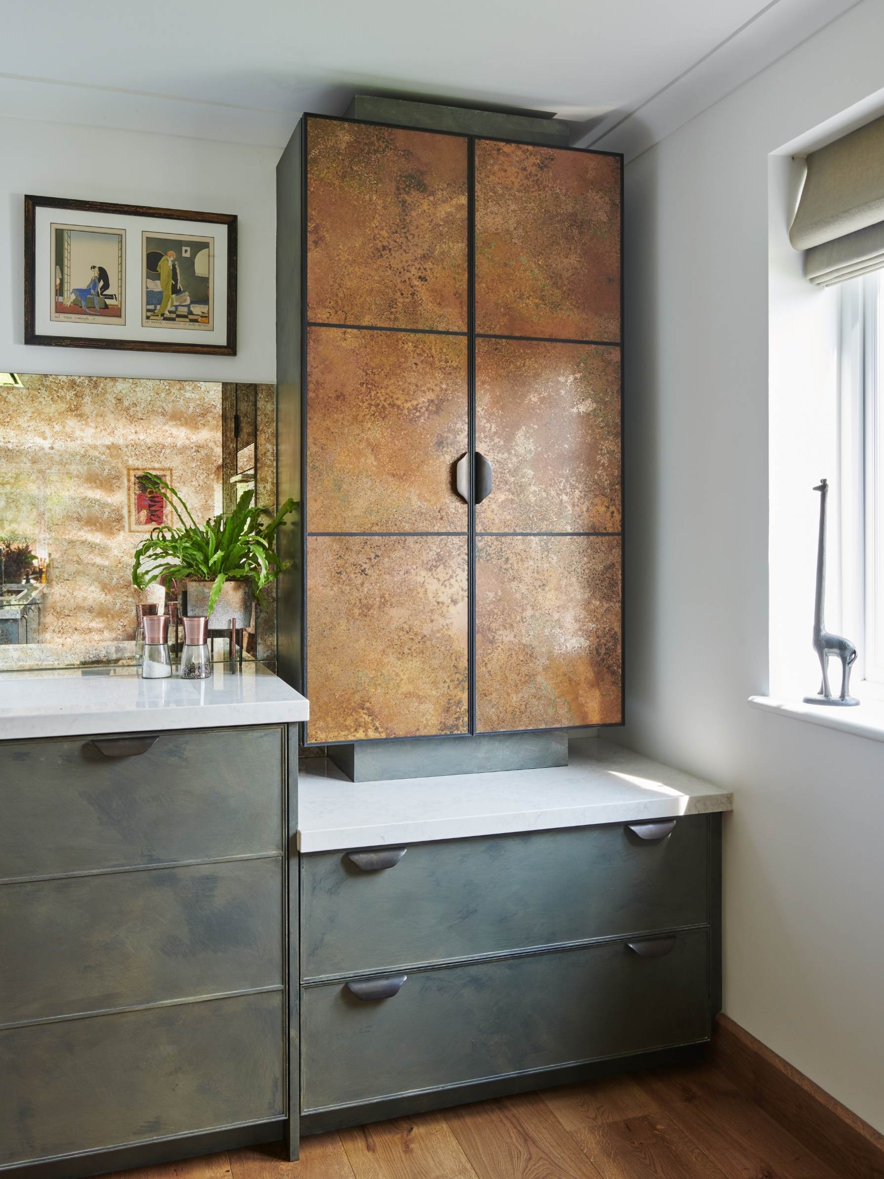
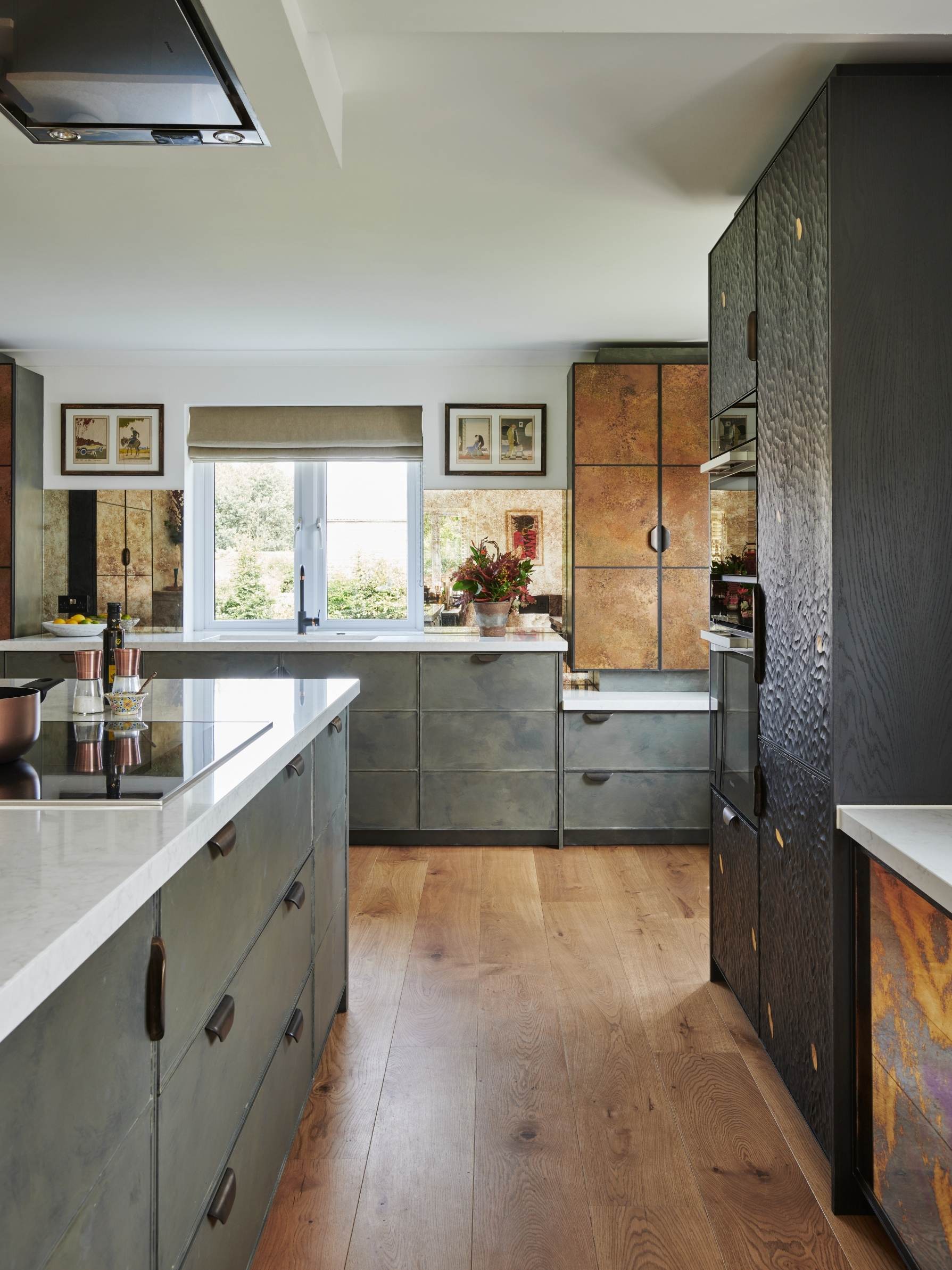
The couple are keen on entertaining, but the kitchen also has to function as an ad-hoc office, as our client's partner works from home. And then, because our client works in an auction house and loves antiques, they wanted us to take an eclectic approach to the design with a rich mix of materials and finishes. In this case, less is not more! My brief was to create the feel of freestanding furniture, rather than of a fitted kitchen – so it looks like somebody has gone out and bought lots of lovely pieces. As such, the kitchen we designed for the couple is a beautiful, informal, living, dining and kitchen space that ticks all boxes.
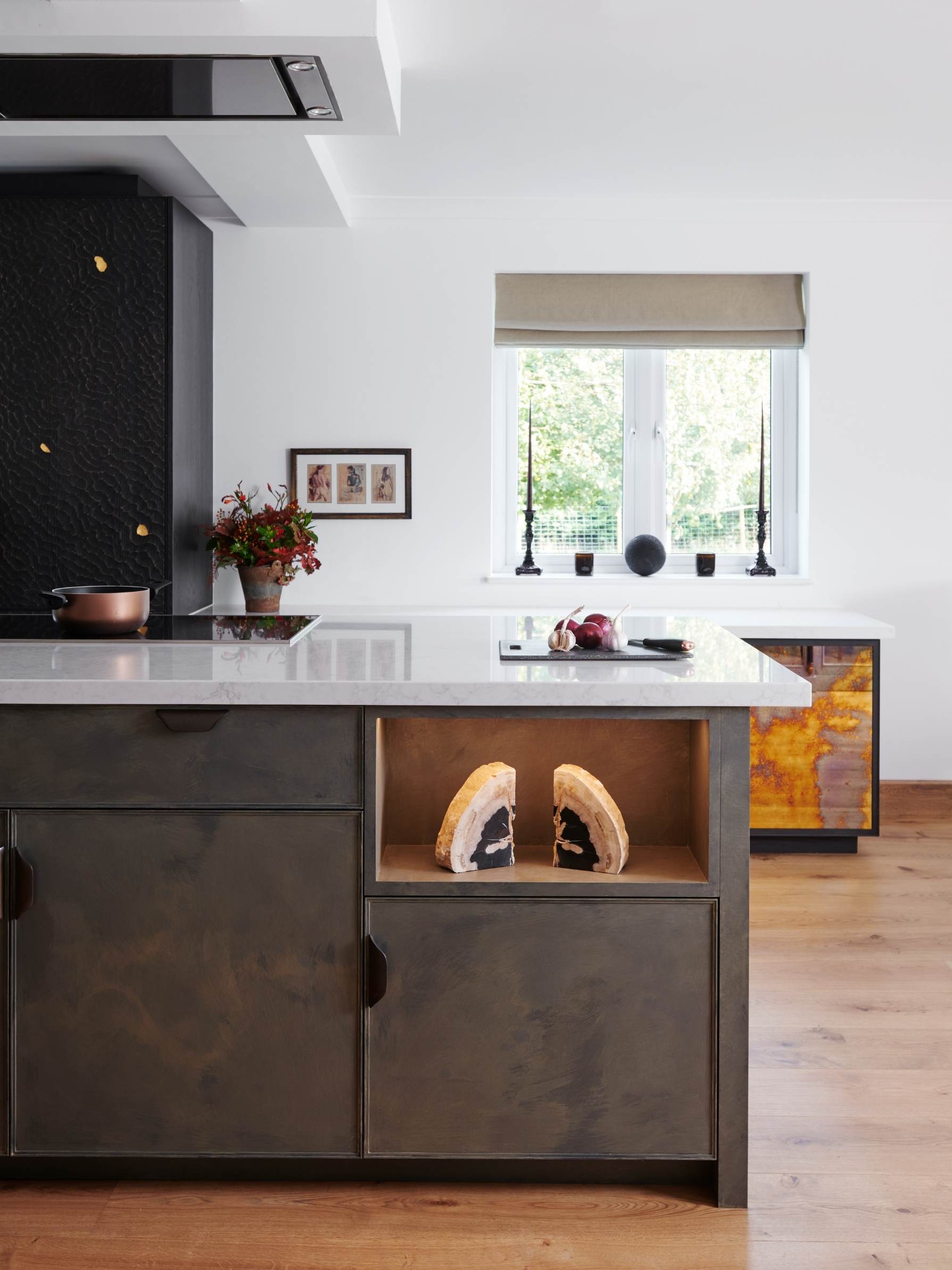
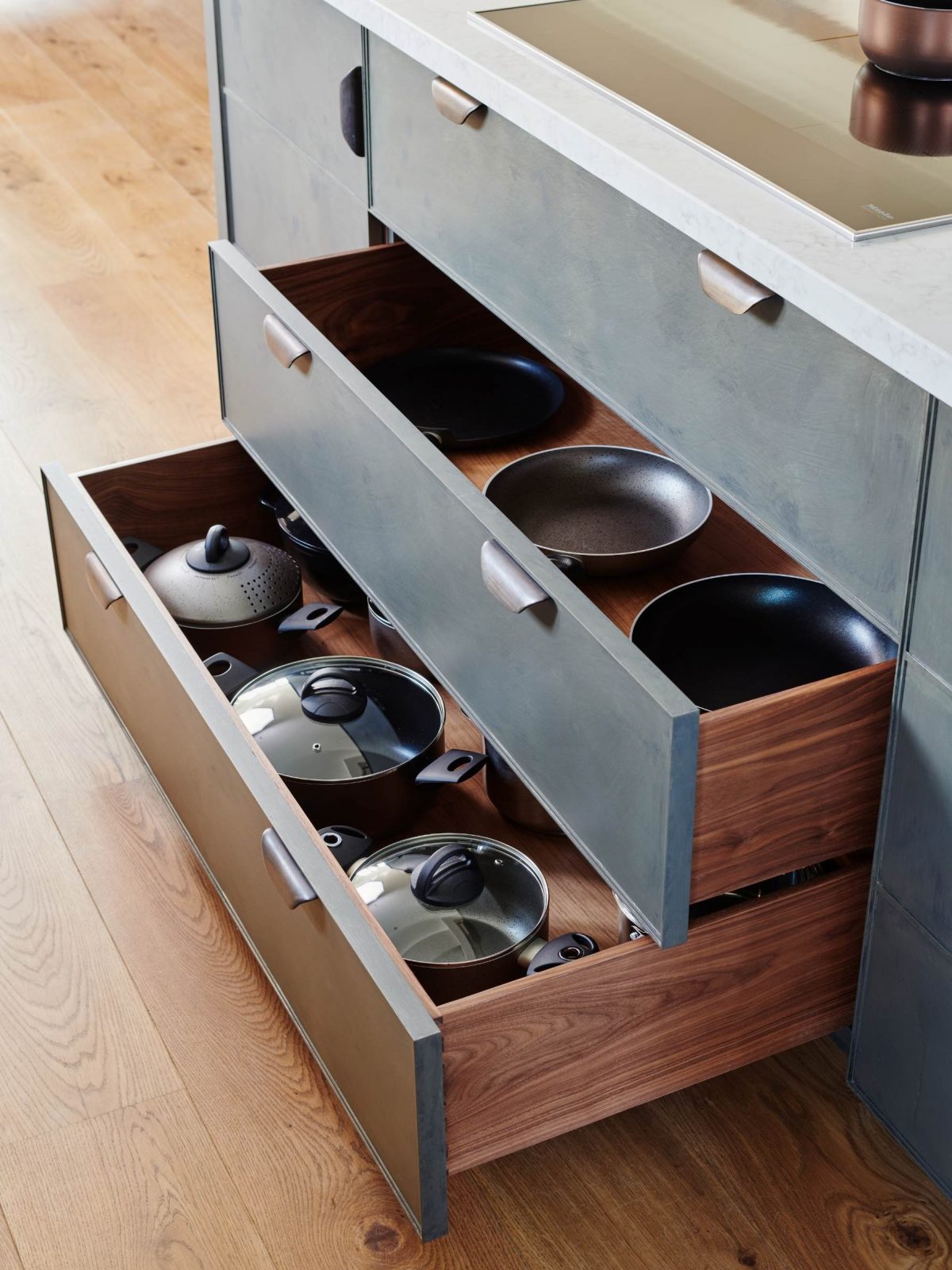
When the couple visited our Notting Hill showroom, they instantly fell in love with our signature Metallics Collection copper-fronted cabinets. Naturally, we integrated two into the design — either side of the window for a lovely framing effect. The copper is a living finish that will mature over time, developing a rich patina.
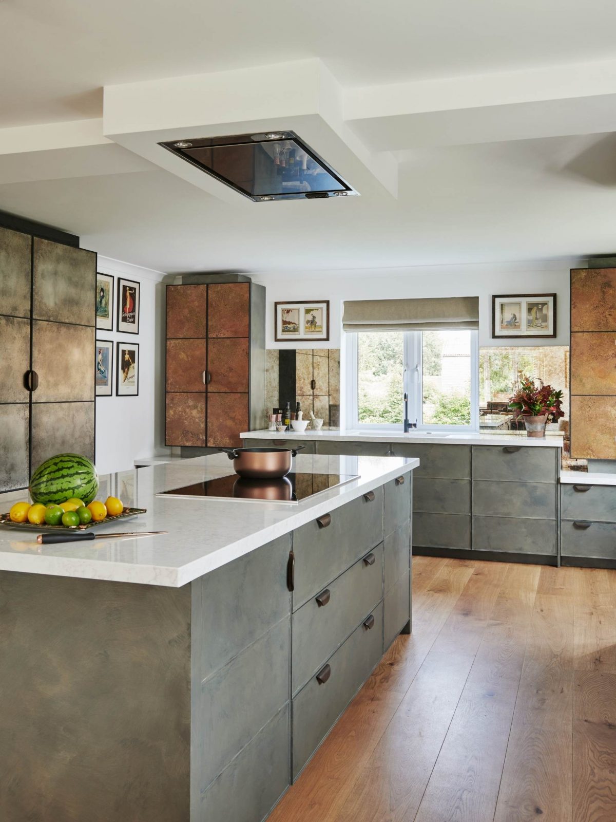
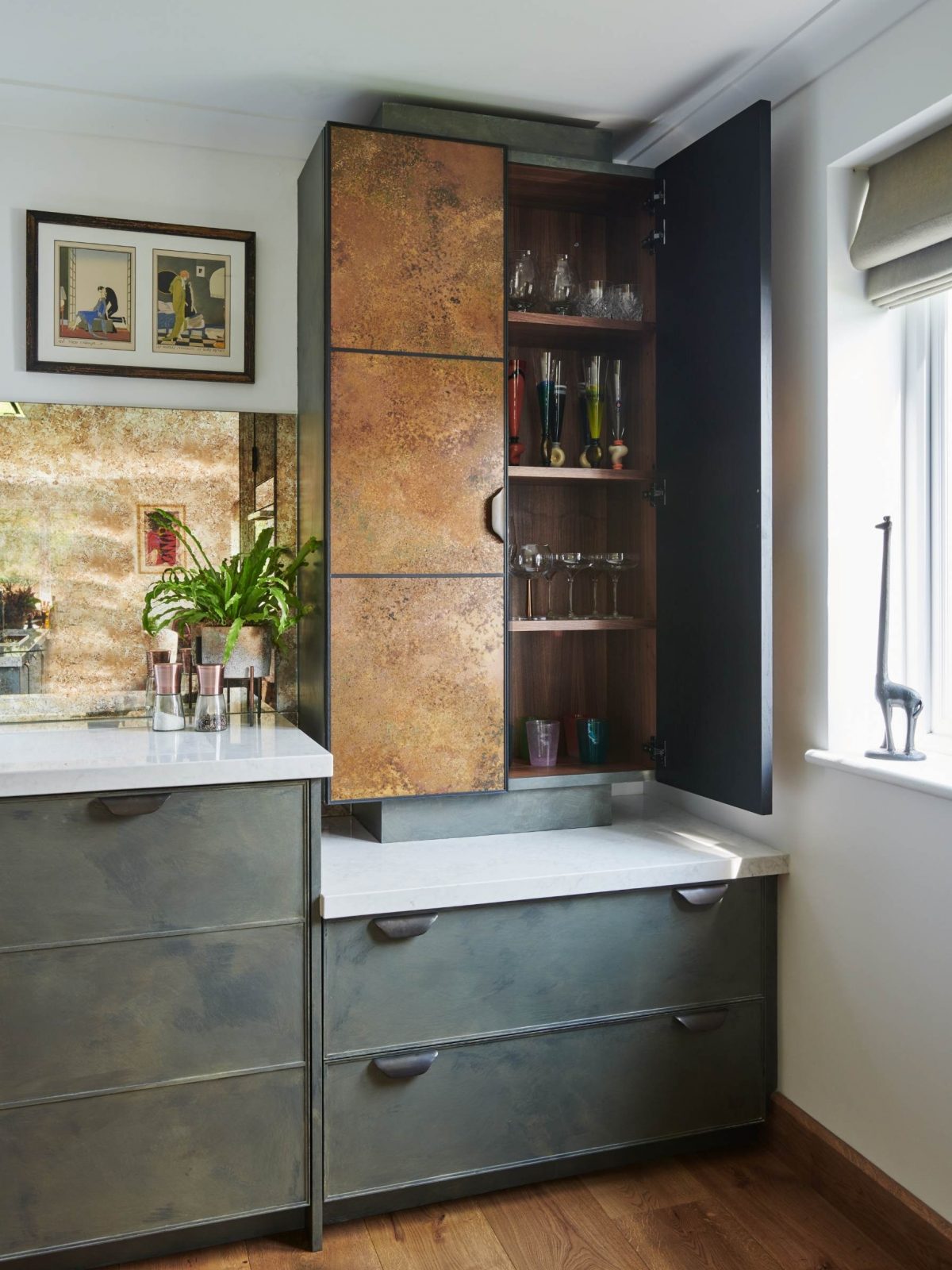
The painted cabinets were given a primer in our workshops and then hand painted in situ by our artist Emma, in close collaboration with the client. The beautiful burnished paint effect was inspired by the grey-green elements in a favourite copper vase. There are four hand-painted layers, one of which is a tinted pearlescent. This makes the paint shimmer, so the colour isn’t flat, and it’s this that unites all the finishes in the kitchen.
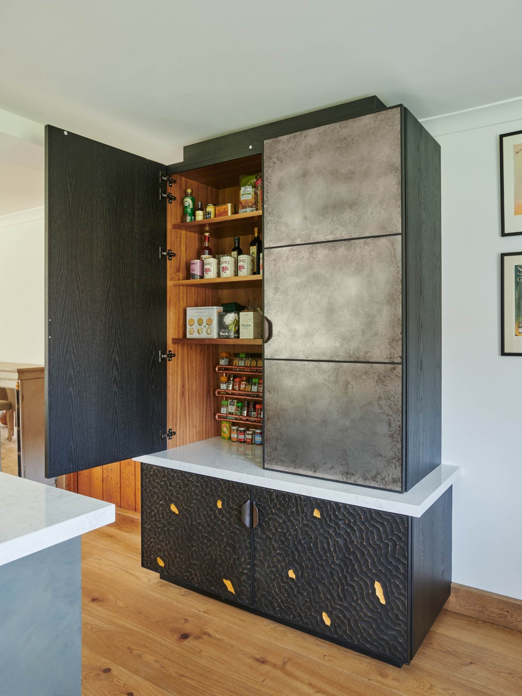
This tall freestanding piece acts as a breakfast cupboard housing a coffee machine, toaster, kettle and all other breakfast paraphernalia. It has the aged-pewter finish on the doors, over which we've put a protective finish so that fingerprints don't mark it and the surface is easy to clean.
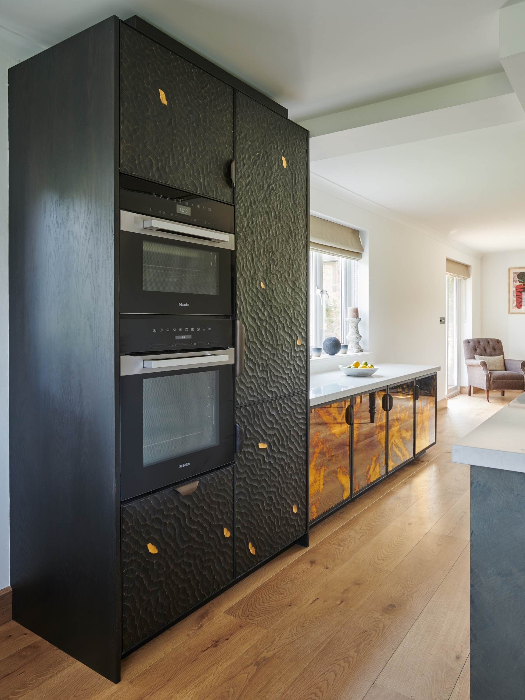
The cabinets below the breakfast cupboard feature a pattern we call Choppy Water. Solid oak panels were carved and then stained dark to create the effect. If you look carefully, you’ll see that it’s been finished with gold-leaf appliqué, which injects a dash of glamour into the kitchen. Both the wood and the appliqué are protected by a 5% sheen lacquer. The Choppy Water finish has also been used on the appliance housing opposite.
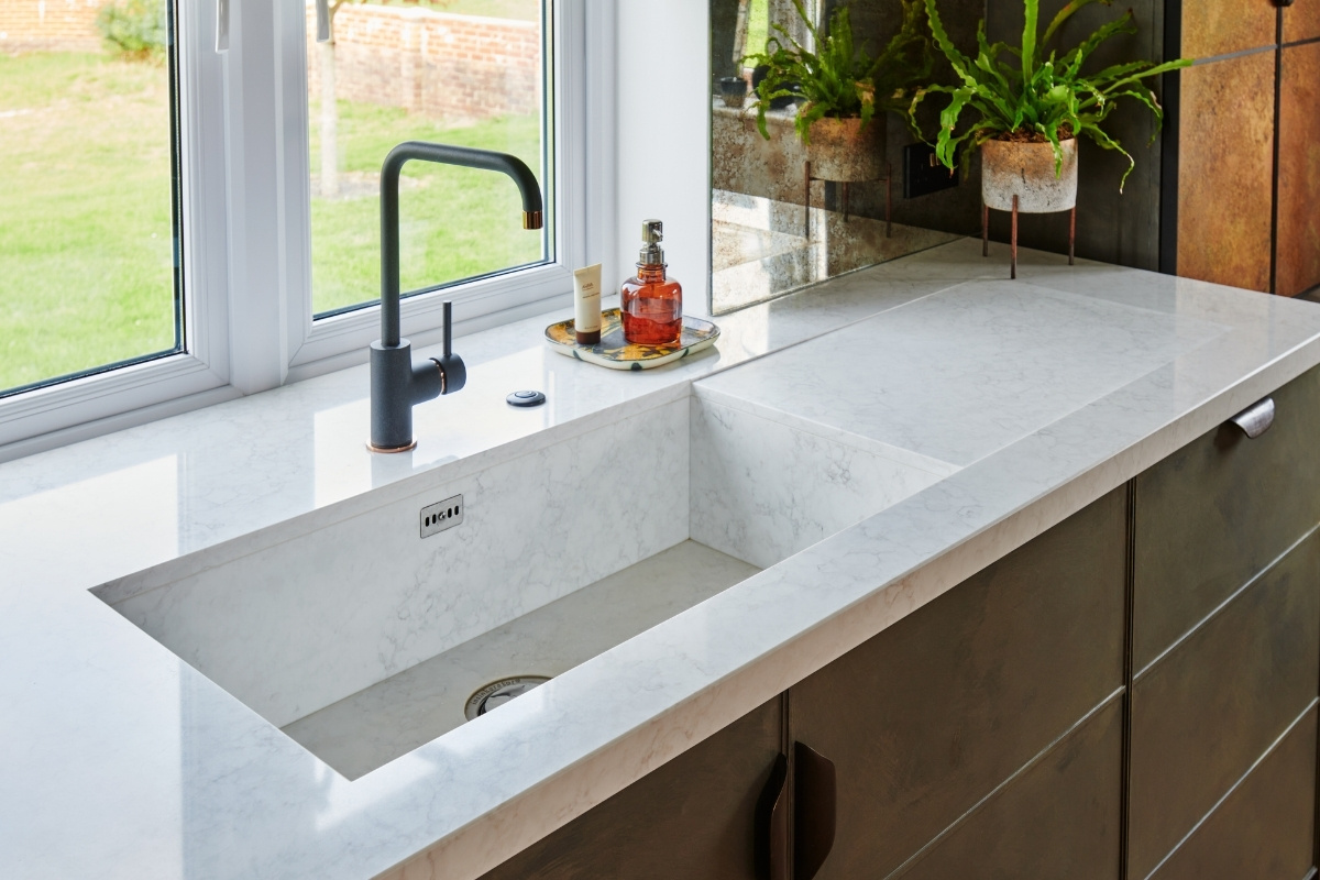
We used the same work surface throughout, which is a man-made quartz called Arabesque from Stone Italiana. It is a very practical solution — non porous, hard wearing, resistant to heat and scratching, and does not require sealing. What’s more, it allowed us to seamlessly incorporate a sink, also in Arabesque. Losing the join lines between the worktop and the sink lends the kitchen a sleek look.
Ledbury Studio kitchens start from £50,000.
About Ledbury Studio
Charlie Smallbone needs little introduction. The founder of iconic brand Smallbone of Devizes, he has been pushing the boundaries of kitchen design for over 40 years. Charlie’s latest venture, Ledbury Studio, was born of his desire to harness the beauty of original materials whilst creating practical kitchens that exude style and elegance.
If you’d like to feature your projects here, get in touch to find out more.
If you'd like to become SBID Accredited, click here for more information.
Timeless elegance is guaranteed with Versilia Marble from RAK Ceramics, a porcelain tile that will bring an air of luxury to any setting.
Inspired by the natural, effortless beauty of marble, with all the practical advantages that porcelain brings to interiors, Versilia Marble displays striking grey veining set against a neutral white backdrop for instant attention.
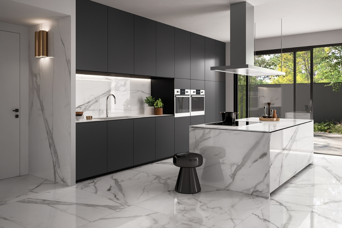
Durable, straightforward to install and easy to care for, this revised classy marble surface is the ideal choice for worktops, wall surfaces and floor coverings. The high gloss finish gives the material the edge, even when used over compact spaces where reflecting light equals the illusion of spaciousness.
Tapping into the continental trend for worktops with a slim profile, Versilia Marble is 9mm thick and in measurements from 60x120cm per tile. The Mega Slab format allows for greater consistency when used over large areas, with less need for grout lines and a seamless finish.
About RAK Ceramics
RAK Ceramics is one of the largest ceramics’ brands in the world. Specialising in ceramic and grès porcelain wall and floor tiles, tableware, sanitaryware and faucets, the company has the capacity to produce 123 million square metres of tiles, 5 million pieces of sanitaryware, 24 million pieces of porcelain tableware and 1 million pieces of faucets per year at its 22 state-of-the-art plants across the United Arab Emirates, India and Bangladesh.
Founded in 1989 and headquartered in the United Arab Emirates, RAK Ceramics serves clients in more than 150 countries through its network of operational hubs in Europe, Middle East and North Africa, Asia, North and South America and Australia.
If you’d like to feature your product news here, get in touch to find out more.
If you’d like to become SBID Accredited, click here for more information.
In response to the changing pressures on kitchen-living environments to keep them tidier and more organised, The Myers Touch Design Studio are increasingly designing kitchen pantries and larders in a range of custom solutions, so homeowners can hideaway dry foods and small appliances whilst keeping them accessible to the main kitchen space.
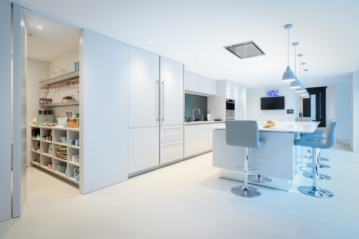
“A truly great kitchen will include great storage for all your family food preparation, cooking and entertaining requirements. We love the re-emergence of the pantry; that tucked away place to arrange and carefully store food, from flour and potatoes to hams and jams. Away from the harm of underfloor heating and tempted pets, these well-ventilated rooms can be as simple as a dark cupboard or as elaborate as a glass-framed minikitchen. Visibility of goods, and easy access are crucial, as is flexibility, allowing for those 3-for-one offers on extra-large boxes of cereals! Even better if you can include a fair-sized worktop for storing plated buffet food when entertaining" - Keith Myers, Director of The Myers Touch.
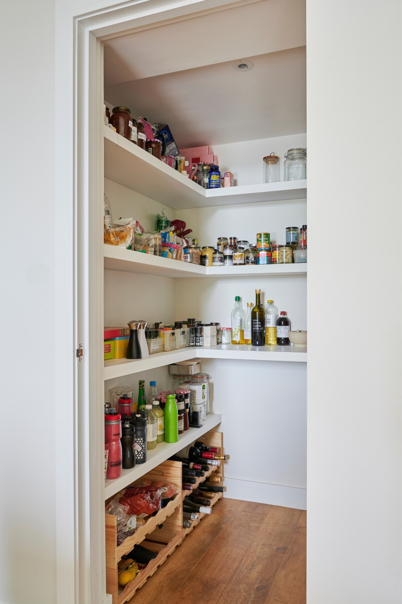
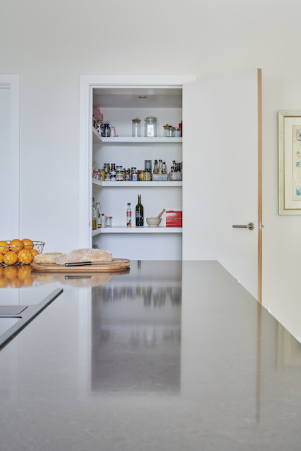
Traditionally a staple in every British household, larders and pantries designed by The Myers Touch range in sizes and styles. From freestanding units and pantry solutions opened via pocket doors, to large walk-in pantries and larders featuring floor-to-ceiling shelving and box storage, pantries and larders are increasingly seen by consumers as a modern essential in a new kitchen. Even within smaller kitchen spaces that don’t have the space for a walk-in larder, tall cabinets with multiple drawers, pull-out drawers and shelves are a popular option for organising supplies and keeping worktops and cabinetry clutter-free.
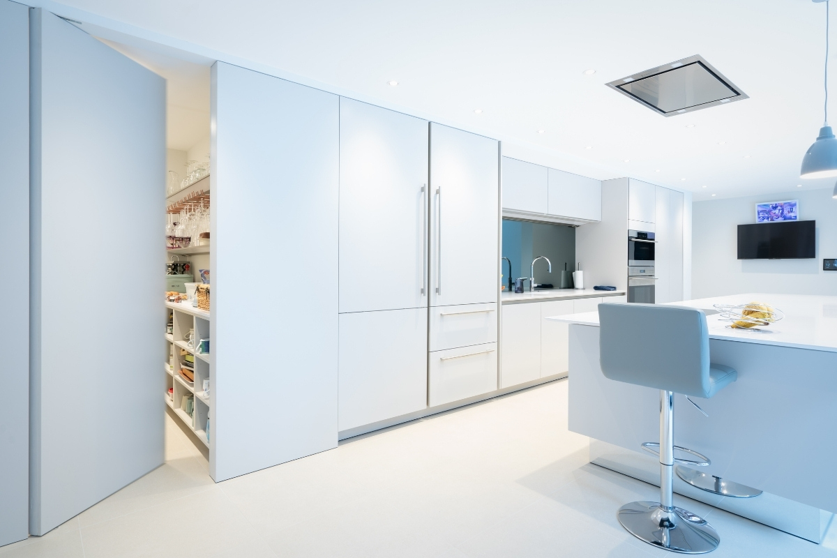
Bespoke pantries and larders are also a chance for their design team to truly reflect a customer's personality within a scheme. From colourful interiors that contains internal wicker storage baskets, shelving and marble countertops to pull-out drawers that store spices, sauces, dry foods and pet foods, many customers are embracing their hidden pantry or larder as a statement piece within their kitchen.
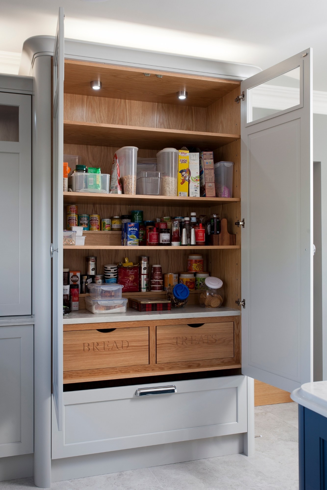
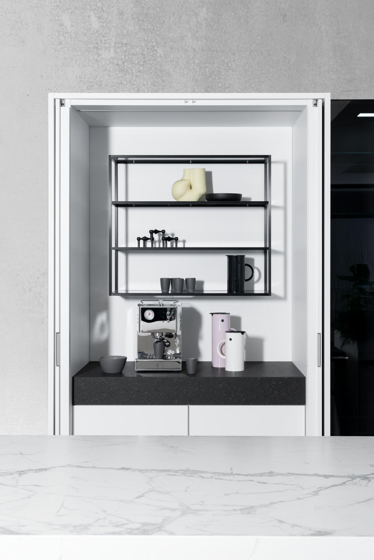
"By incorporating both bespoke and SieMatic’s multi-award winning ‘Multimatic’ modular storage system within our pantries and larder spaces allows our design team to truly customise storage systems within our kitchen spaces. The Multimatic multi-functional aluminium system includes a comprehensive range of interior fittings for drawers and cabinets that gains around 30% more storage space. The flexible shelving system also provides easy storage for even tall objects such as bottles or chopping boards" - Helena Myers, Director of The Myers Touch.
The Myers Touch unique, holistic approach formula is to explore and apply a personal and bespoke ‘Design’ for a customer based on their ‘Life’ desires. Based on this formula, their design team carefully choose a range of cabinetry, materials, lighting, appliances and seating solutions to precisely match a client’s brief that brings ‘Light, Space & laughter’ into the finished design.
About The Myers Touch
The Myers Touch specialises in the holistic design of luxury kitchens in the Winchester area, creating truly bespoke living spaces that offer far more than conventional cooking environments. Established in 2003 and based in Winchester, they enjoy long-standing partnerships with the iconic German manufacturer SieMatic and other leading brands including Gaggenau, Wolf, Sub-Zero, Miele and Siemens.
If you’d like to feature your project news here, get in touch to find out more.
If you’d like to become SBID Accredited, click here for more information.
In this week's interview with 2021 SBID Awards winners of the Flooring & Floor Coverings category, IVC Commercial, the designer shares details about the winning project, discuss the company's journey to becoming zero impact by 2040 and sheds light on the key considerations for specifying floors for different environments - commercial and residential.
SBID Awards Category: Flooring & Floor Coverings
Practice: IVC Commercial
Entry: Studio Moods
We invest heavily in design and product development and pride ourselves on creating high performance flooring for commercial interiors. Entering awards are a key part of communicating our story of innovation to the design community. SBID’s stature makes the awards a must. To be recognised gives the entire company a lift and supports conversations around new technologies to a wider audience. In short, it is testament that the solutions we produce are recognised as among the best in the industry.
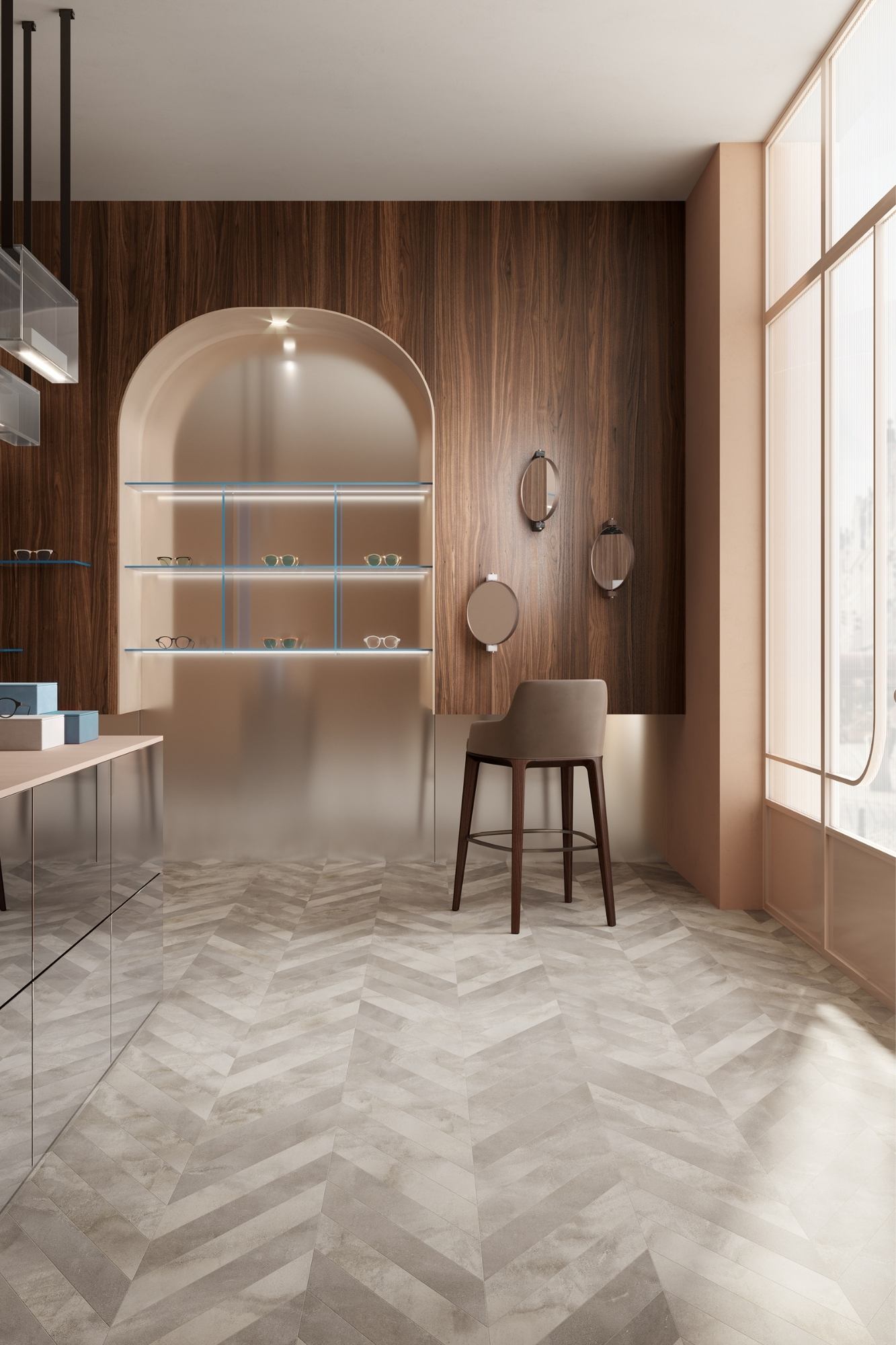
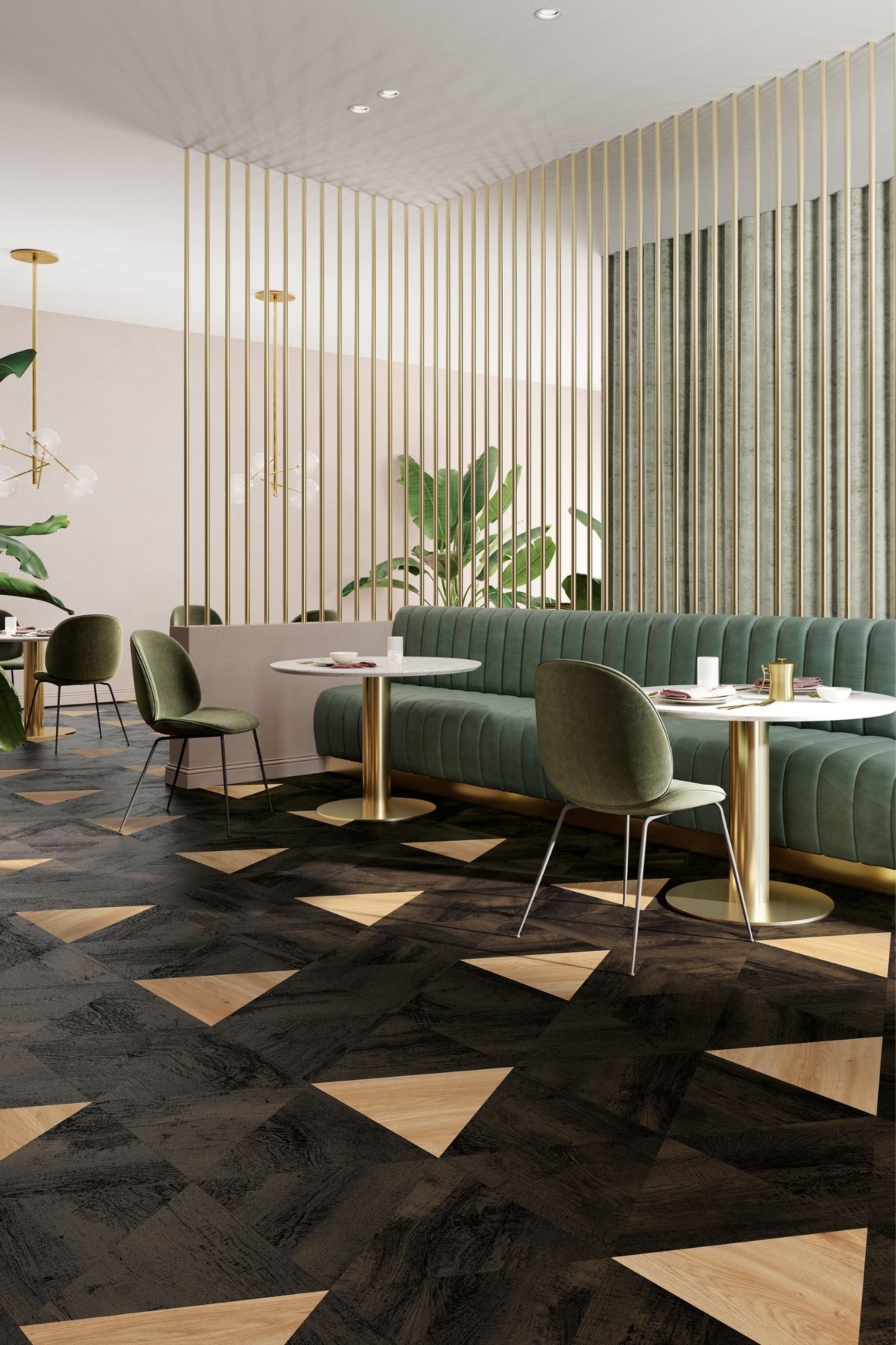
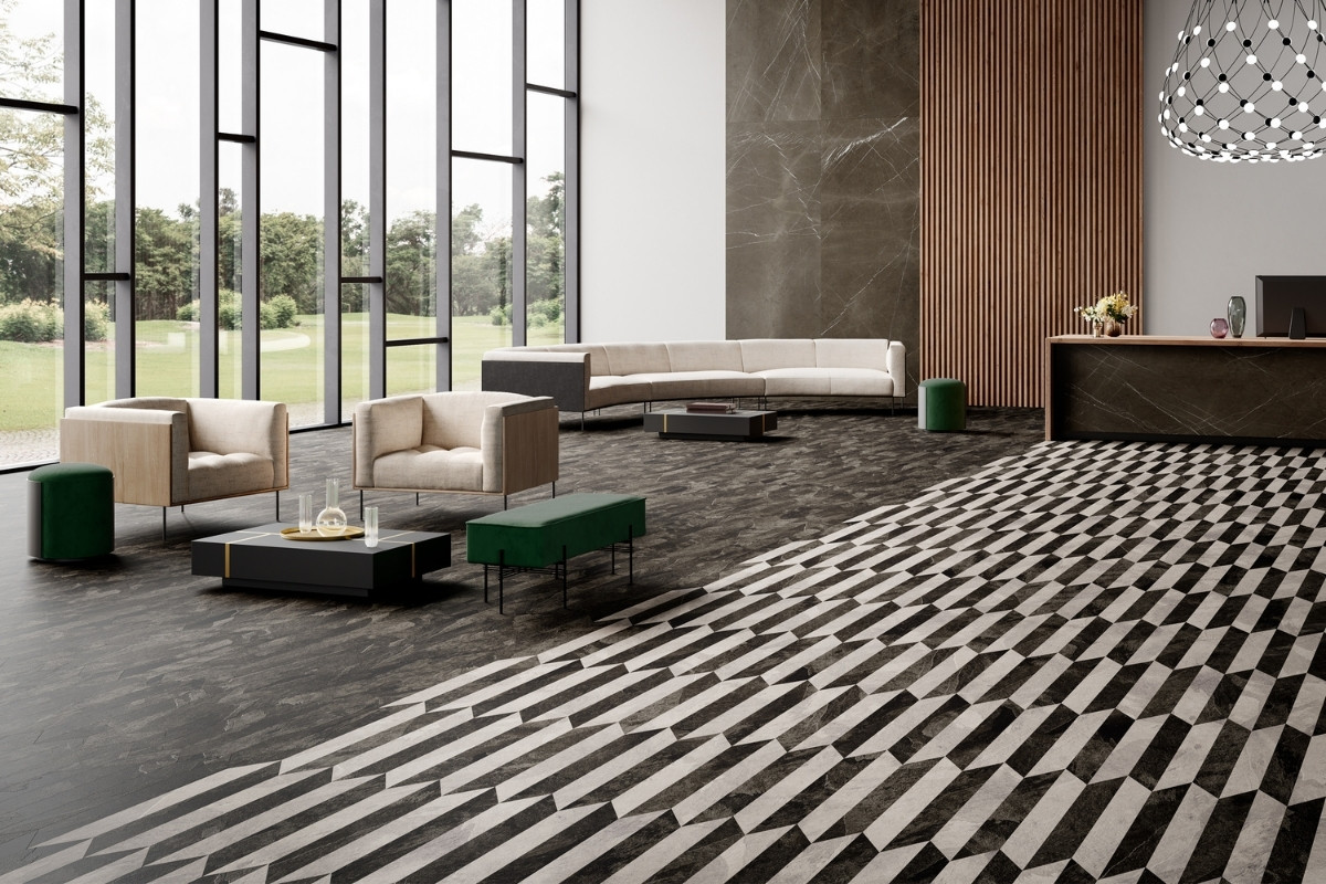
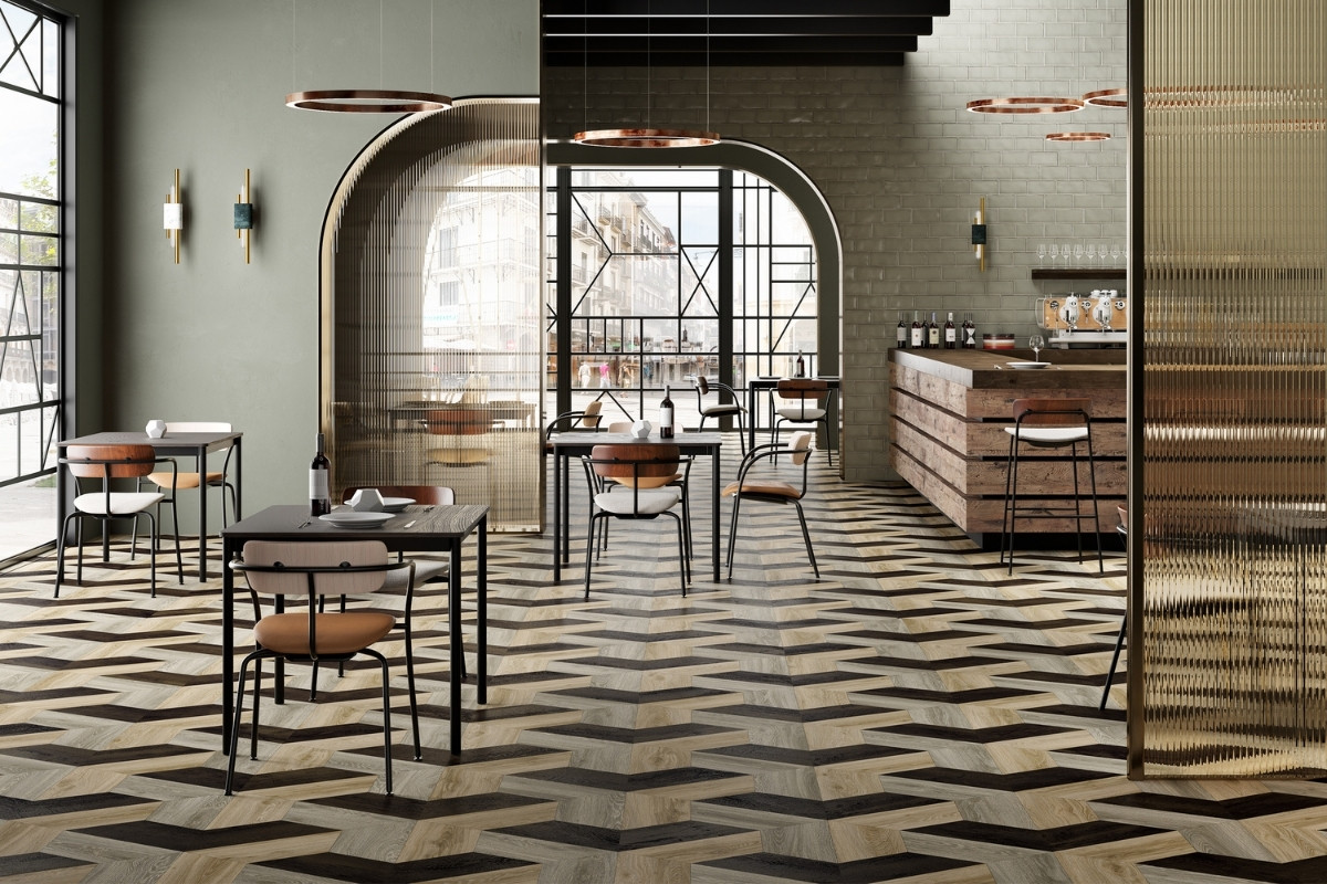
Studio Moods gives designers the flexibility to achieve a truly bespoke floor, which I believe is its strongest asset. The floor is available in a variety of geometric, tessellating shapes and various wood, stone and colour effects. By choosing a personalised combination from these building blocks, designers can create a unique and exclusive design. Ultimately, Studio Moods makes bespoke flooring more accessible. The floor’s performance and recycled content also add to the many benefits of this collection.
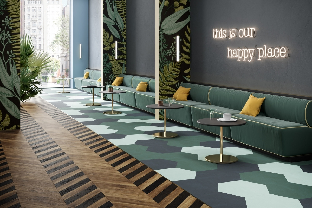
Our Journey to 2040 is a road map to reducing our footprint with the ambition to become zero impact. It influences the actions we take not only in development and design but also in manufacturing, installation and end of life. This manifests itself in many ways: the recycled content of products and research into materials that are easier to recycle, more efficient manufacturing, loose lay installation and post-use recovery and recycling.
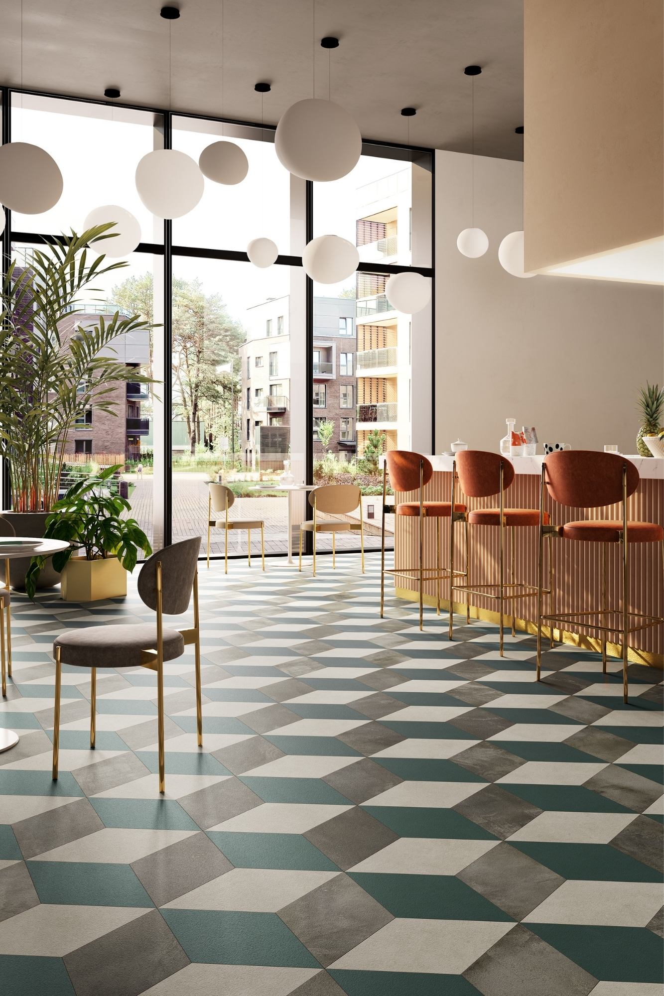
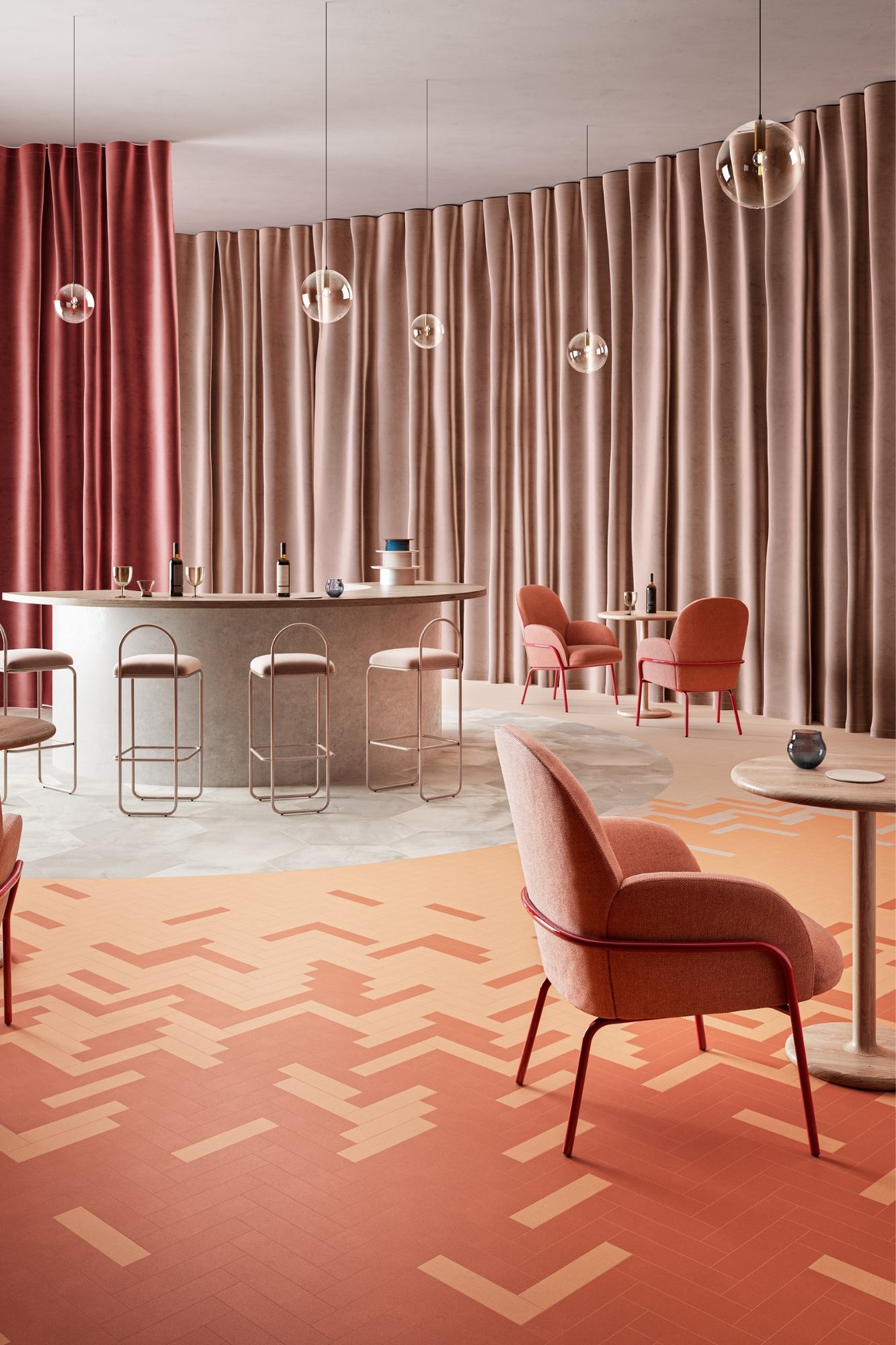
At IVC Commercial we specialise in flooring for commercial environments, but we are part of IVC Group – with residential brands including Moduleo and Leoline. Key is the ability of flooring to respond to the challenges of the project in question. Broadly, providing durability and remaining easy to maintain are two of the priorities. Specifically, it can be acoustics – particularly important in a growing number of environments – comfort and the ability of the floor to respond to design intentions. In the majority of the projects, it is a combination of this factors that determine the suitability of the floor for the space in question.
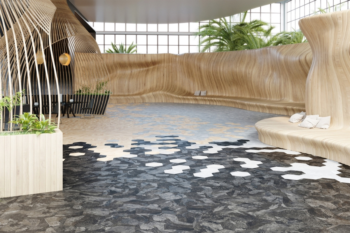
Based in Belgium, our research and development team is always busy working on new designs and innovations and we’ve already launched some fantastic new products to the market since we won the award for Studio Moods. Our new Imperfection carpet tile collection – inspired by the Japanese world view of wabi-sabi – is our first to be made from ECONYL®, a yarn that’s made from nylon waste including old fishing nets. It also features a 94% recycled content acoustic backing, so it’s a carpet tile that performs well for the environment, looks fabulous and improves comfort – maybe it’s even another winner! Of course, there’s plenty of exciting developments in the pipeline too.
I’d encourage young designers to be solution and client oriented and to take inspiration from lots of different sources. As an example, for our own product design we look to fashion and global trends as key sources, so it’s best to be open minded. With solutions for specific challenges you may be encountering on projects, it’s always worth talking to your flooring supplier as your default flooring option might not always be the best one for the job in question. We’re always more than happy to talk flooring at any stage of the project and might even be able to suggest a better solution to meet your needs.
Questions answered by Alison McLaughlan, UK head of marketing, IVC Commercial.
IVC Commercial is a global player in the design and manufacture of flooring solutions including Carpet Tiles, Luxury Vinyl Tiles (LVT) and Heterogeneous Vinyl for use in business, public and private environments.
As the commercial division of IVC Group, we’re focused on improving the productivity and wellbeing of users in spaces through innovative solutions that are easy to implement and affordable. Accountable for our actions, we design and make floors responsibly in Belgium, developing a circular approach to the future of flooring.
This week’s instalment of Project of the Week series features a modern high-tech office and urban farm design by 2021 SBID Awards Finalist, Wolter & Yu.
Within a factory in an industrial district of Hong Kong is the future of farming - a high-tech urban aquaponics farm, sustainably growing high quality vegetables and flowers.
Part office and part grow room, the design takes the concept of flexibility and mobility to the extreme: Ceiling-mounted, bi-folding glass panels create a private meeting room when needed, but opens up the whole room for other needs. Dry erasable paint, is applied across the entire office wall, facilitating the free flow of ideas. Height-adjustable desks and ergonomic chairs create comfort for employees, behind HDTVs displaying operational metrics.
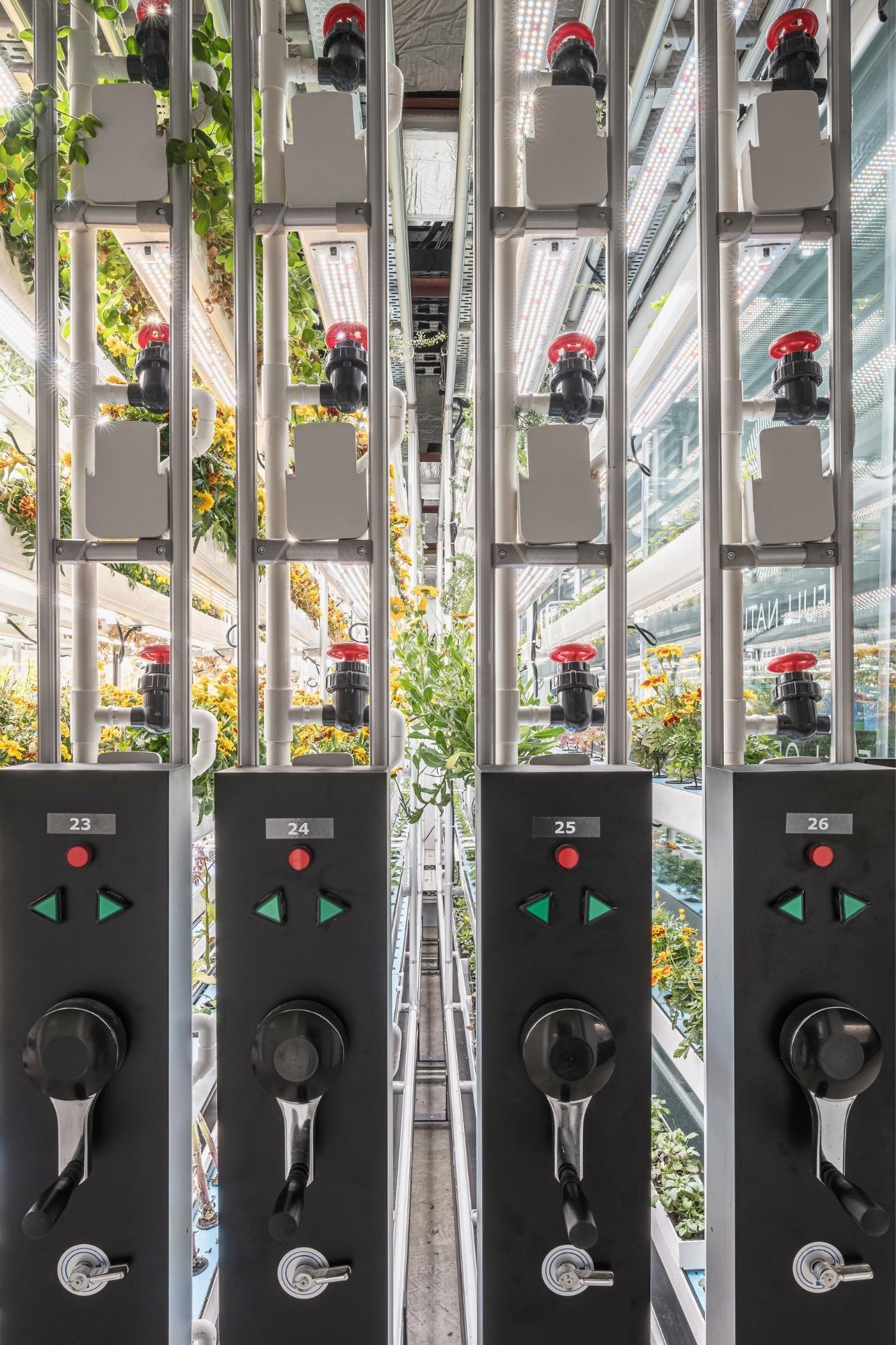
The plant room uses 3D printed plant walls mounted onto movable archival track shelves to create dense vertical grow farms. Nutrient rich water from a fish tank and electricity to power perpendicular panels of light are funnelled across the ceiling and down each movable shelf. This allows the farm to adjust the distance between each light panel according to the requirement of different types of vegetation, while excess water is filtered and returned to the fish tank, creating a closed ecosystem. The result is a sustainable, compact, flexible office and urban farm design. You can view a virtual tour here.
SBID Awards Category: Office Design
Practice: Wolter & Yu
Project: Full Nature
Location: Hong Kong, Hong Kong S.A.R.
The brief for Full Nature was to convert a 180sqm unit in an old high-rise factory building in Hong Kong, into a high-tech urban farm that specialises in growing sustainable, aquaponic vegetables and edible flowers. The office is divided into 4 areas: 1. Entrance corridor, pantry & print zone; 2. Office Area (work zone & meeting zone); 3. Farm / Grow Area and 4. Washrooms & Shower.
The design responds to the client’s objective to find ways to improve sustainable farming. While aquaponics uses fewer resources compared to traditional farming, the design is a multidisciplinary approach to create use space more efficiently by introducing flexibility for both the company and the product. More importantly, we created a scalable modular system for the grow area by tackling product as well as spatial design.
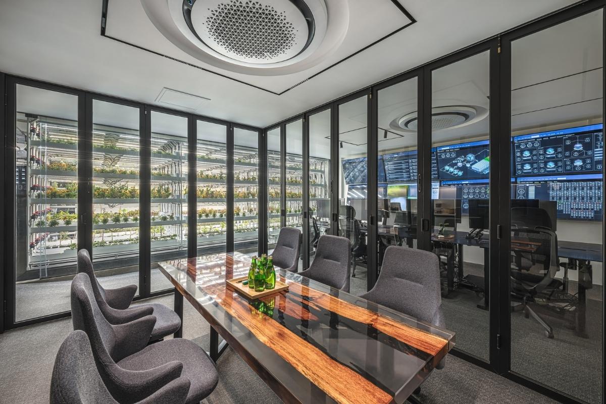
The words flexibility and mobility really drove the concept – instead of creating spaces that are dedicated to hosting clients and visitors, or plant rooms with corridors between each rack of plants planted in soil, we sought an intersection of design: hospitality, office and coworking, product, agriculture, and technology. For example, by using 3D printing to create vertical pockets of vegetation, we reduced the amount of soil needed, vertical water pipes mean no excess water would pool in one area but not another, and the amount of light and electricity required to run the whole farm was significantly reduced. It is definitely an unconventional project. We ventured into a collaboration where Full Nature had the urban farming know how, and we brought in our design knowledge, to create a comfortable office design that was also doing something good for our planet.
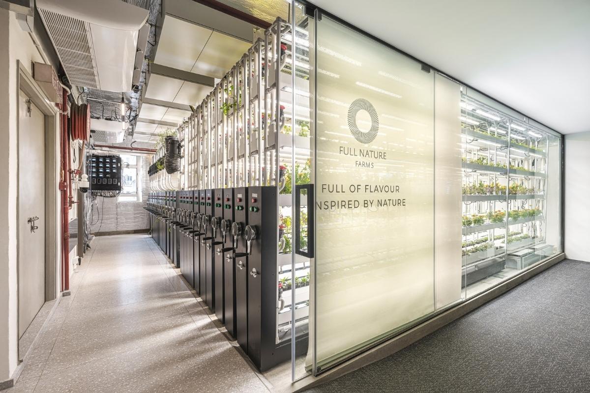
Definitely space – one of the biggest tasks was to increase as much production as possible, without the detriment to the office and its employees. We wanted people to also feel happy to work there, and for guests to come in and feel in awe of the product. So we used only glass to divide the office room from the plant room: Every day you are going to work in an industrial building but no view, but you get greenery and bright warm light coming through while you work! The other difficulty was when we were designing the movable track system – trying to get water and electricity connected to long heavy shelves that move is very difficult and took some trial and error. We created prototypes with 3D printing to test out our ideas until we found a solution that worked.
The nature of the project is unique, current and forward-thinking. It’s not every day a client who wants to improve farming approaches you and says ‘I want to increase efficiency of my office and farm, but also make it look good!’ It’s a project that responds to current global issues, sustainability, limitation of resources and space. When we first started talking about this project, we found it was so well received amongst industry leaders but also the general public, so it’s a great feeling to have our design doing something good for our city, and having the great response to it afterwards.
The esteemed SBID awards is well known, well regarded and well received. We wanted to share our experience and work with other designers and industry leaders. Being an SBID finalist is an honour, and we look forward to entering other interesting projects in the near future!
Questions answered by Christina Yu, Lead Designer, Wolter & Yu.
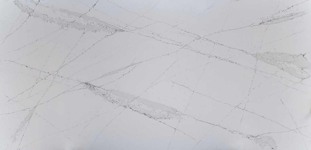
The evolution of Silestone® has inspired Ethereal, a collection of white canvas surfaces with intricate marble look patterns which recreate the natural beauty of the sky.
In addition to kitchen and bathroom applications as a worktop or splashback, Silestone® is also ideal for more ambitious interior design projects where interior cladding, furniture cladding and flooring is required. Ethereal is perfect for both commercial and residential projects where a modern yet timeless aesthetic is desired.
Silestone® Ethereal features HybriQ+® technology, meaning that in the production process 99% of reused water from the production processes is used, along with 100% renewable electric energy. What's more, a minimum of 20% recycled raw materials are used in the material composition, alongside mineral raw materials, helping to provide an eco-friendly solution for luxury architectural or interior design projects.

Silestone® by Cosentino, the leading global hybrid mineral surface for the world of architecture and design, is excited to introduce its second collection worldwide under its new corporate image. The new Silestone® emblem and character has given rise to the Ethereal collection, which is supported with a major campaign featuring entrepreneur and international fashion icon, Cindy Crawford.
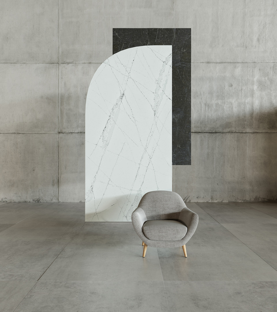
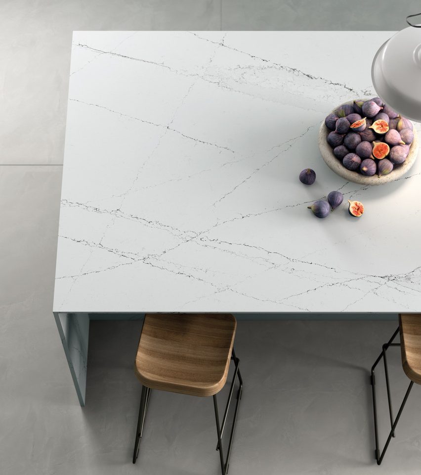
Ethereal by Silestone® represents a quantum leap in terms of design, innovation and sustainability, in line with the transition that Silestone® is undergoing externally and internally with the development of the cutting-edge HybriQ® and HybriQ+® technologies. This evolution of Silestone® has inspired Ethereal, a collection of white canvas surfaces with intricate marble look patterns which recreate the natural beauty of the sky, perfect for both commercial and residential projects where a modern yet timeless aesthetic is desired.

This marble-inspired collection consists of four colours, namely Ethereal Dusk, Ethereal Haze, Ethereal Glow, and Ethereal Noctis. Each colour showcases a deep, fine veining on a white foundation and thanks to HybriQ+® technology, they have been developed with at least 20% recycled raw materials, helping to provide an eco-friendly solution for luxury architectural or interior design projects.
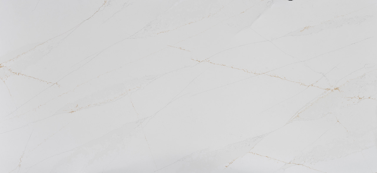
Ethereal Glow is simply pure, classic elegance. Its golden and grey veining merges with a tinged white foundation, with veining running through the entire design to bring an accent of colour to every corner. Inspired by the sunset and its igneous colours and glow, it is an evolution of Silestone®'s internationally acclaimed and widely popular Eternal Calacatta Gold colour.
Ethereal Dusk showcases an urban look in which the bluish tone of its veining brings a modern and avant-garde touch to any space. It symbolises a unique, unforgettable and personal sunrise, with feelings of peace, solemnity and tranquility.
Ethereal Haze includes a dynamic range of grey tones to emit plenty of personality. It takes inspiration from the way the wind moves the clouds over the mountains, with the result both calm and characterful thanks to an interplay of gradients which blend into pure neutrality.
Ethereal Noctis is synonymous with sophistication. The tinged white foundation is broken up with short grey and black veins, providing contrast, depth, simplicity and modernity, inspired by the darkness after sunset.
About Cosentino
Cosentino Group is a global, Spanish, family-owned company that produces and distributes high value innovative surfaces for the world of design and architecture. It works together with its clients and partners to provide with solutions that offer design and value, and inspire the life of many people.
Silestone® is a hybrid surface made from premium natural minerals and recycled materials. Manufactured with the exclusive and innovative HybriQ® technology, a more sustainable approach to architectural surfaces.
If you’d like to feature your product news here, get in touch to find out more.
If you’d like to become SBID Accredited, click here for more information.
Since 1922, Lalique’s creations have been produced in Wingen-sur-Moder, in the heart of the Northern Vosges, in a lush green setting beside a village of some 1600 souls. It is here that the glittering material crystallizes in a continuous ballet of fire that has been orchestrated by generations of expert hands.
René Lalique’s glassworks in Wingen became known as the "Verrerie d’Alsace" (V.D.A). His dream was to bring beauty into the home. He therefore chose to manufacture "utility glassware": dinner services, plates, bowls, etc. in series, but always to a high standard of quality, an attribute that was already part of the company’s signature style.
After a difficult period during the Second World War and the Liberation, when the glassworks was destroyed, the company took a new direction on the initiative of René’s son, Marc, with a focus on crystal and an approach inspired by a combination of innovation and tradition.
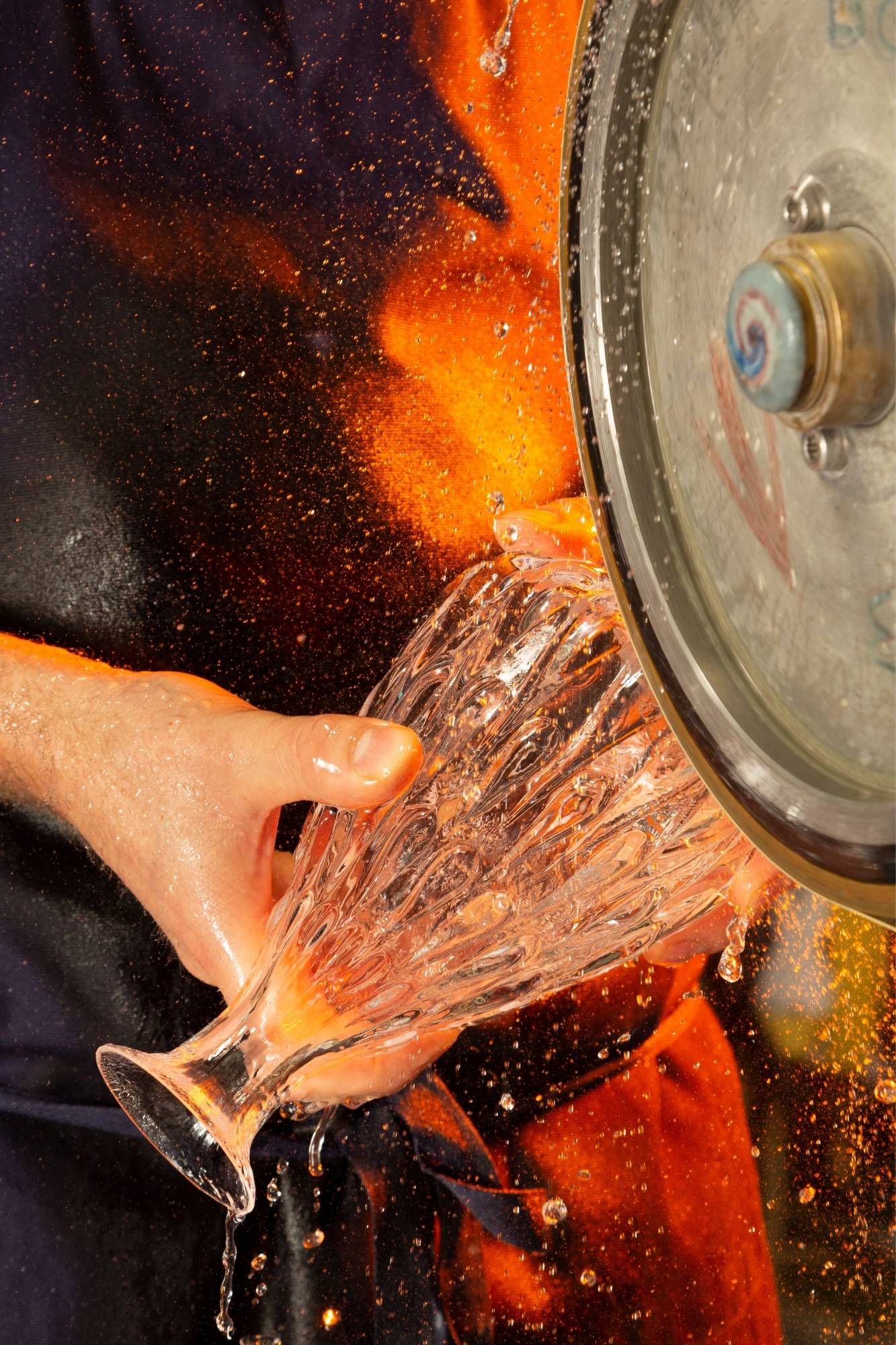
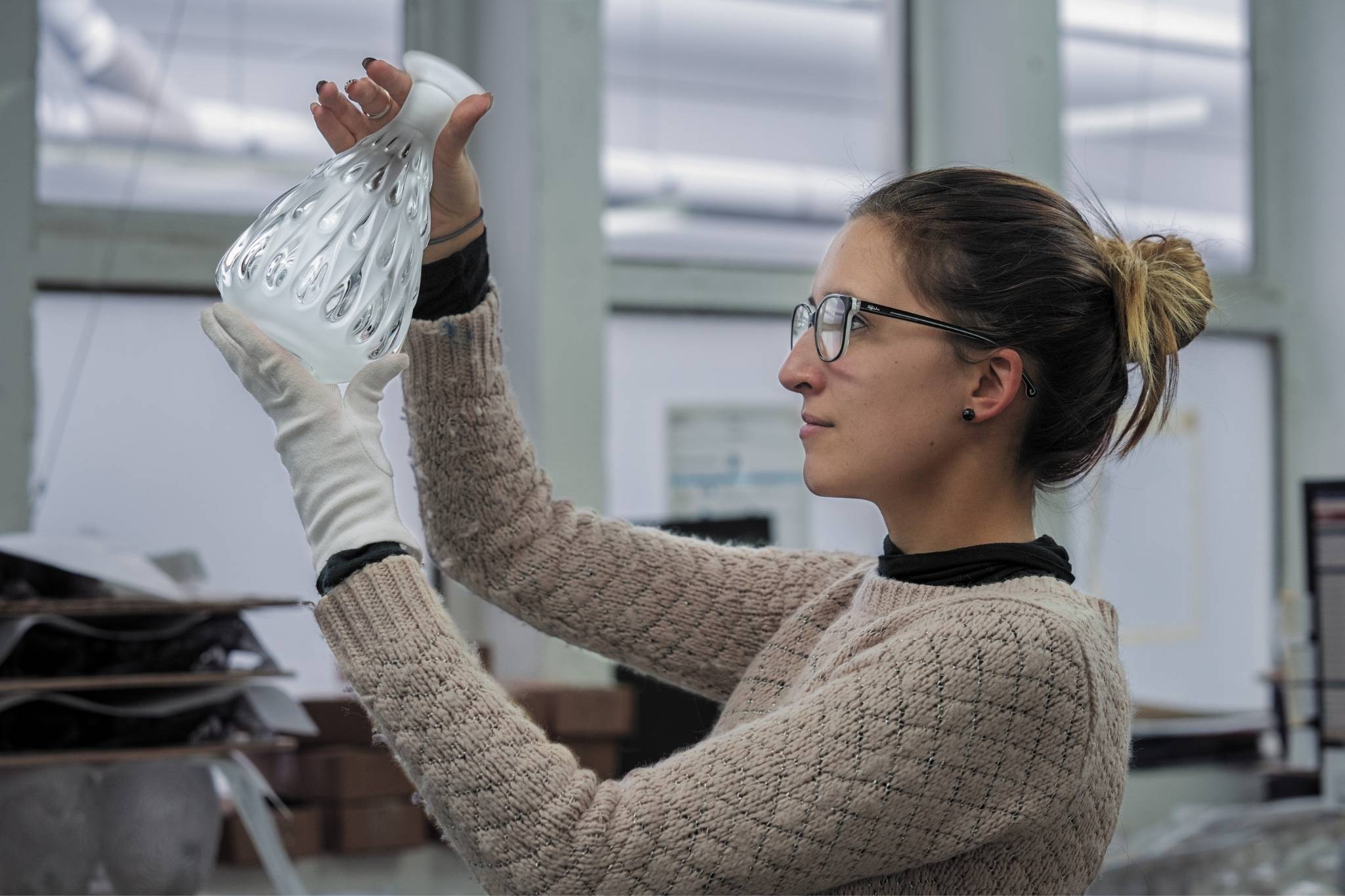
Although the factory has been constantly modernized over the years, the artisans’ techniques have remained unchanged: material is worked by hand, it is moulded, the molten crystal is "gathered" like honey, and pressed or blown. Once cooled, it is cut, sanded and polished. This is the Lalique artisans’ trademark: the famous satin-polished finish of the crystal, which generates an effect that combines light and shadow.
In 2022, Lalique crystal is sparkling in all areas, from decorative objects to interior design, perfumery, art, jewellry and the hotel and restaurant industry.
To celebrate its centenary in style, in March the Wingen-sur-Moder factory has produced an exceptional bottle containing a new Lalique fragrance, and a beautiful spirit decanter.

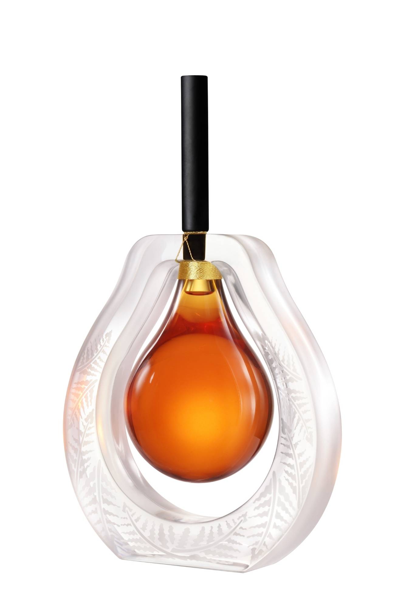
The bottles will be exceptional because of the number produced, with only ten signed and numbered pieces throughout the world. The Fusion flacon is also exceptional on account of its extreme virtuosity. In a centenary year which honours their craft, Lalique’s master glassmakers have pushed their expertise to its absolute limits. “Parison” is the name given by master glassmakers to the glob of glowing material they pick up with a blowpipe from a fountain of molten crystal. The Lalique Design Studio, under the direction of Marc Larminaux, worked in close collaboration with the master glassmakers to create this tribute to their expertise.
The parison bottle is elongated by a slender black satin-polished crystal stopper, evoking the blowpipe used in workshops. A clear crystal frieze recalls a mailloche, the curved piece of wood used to give the crystal a round shape.
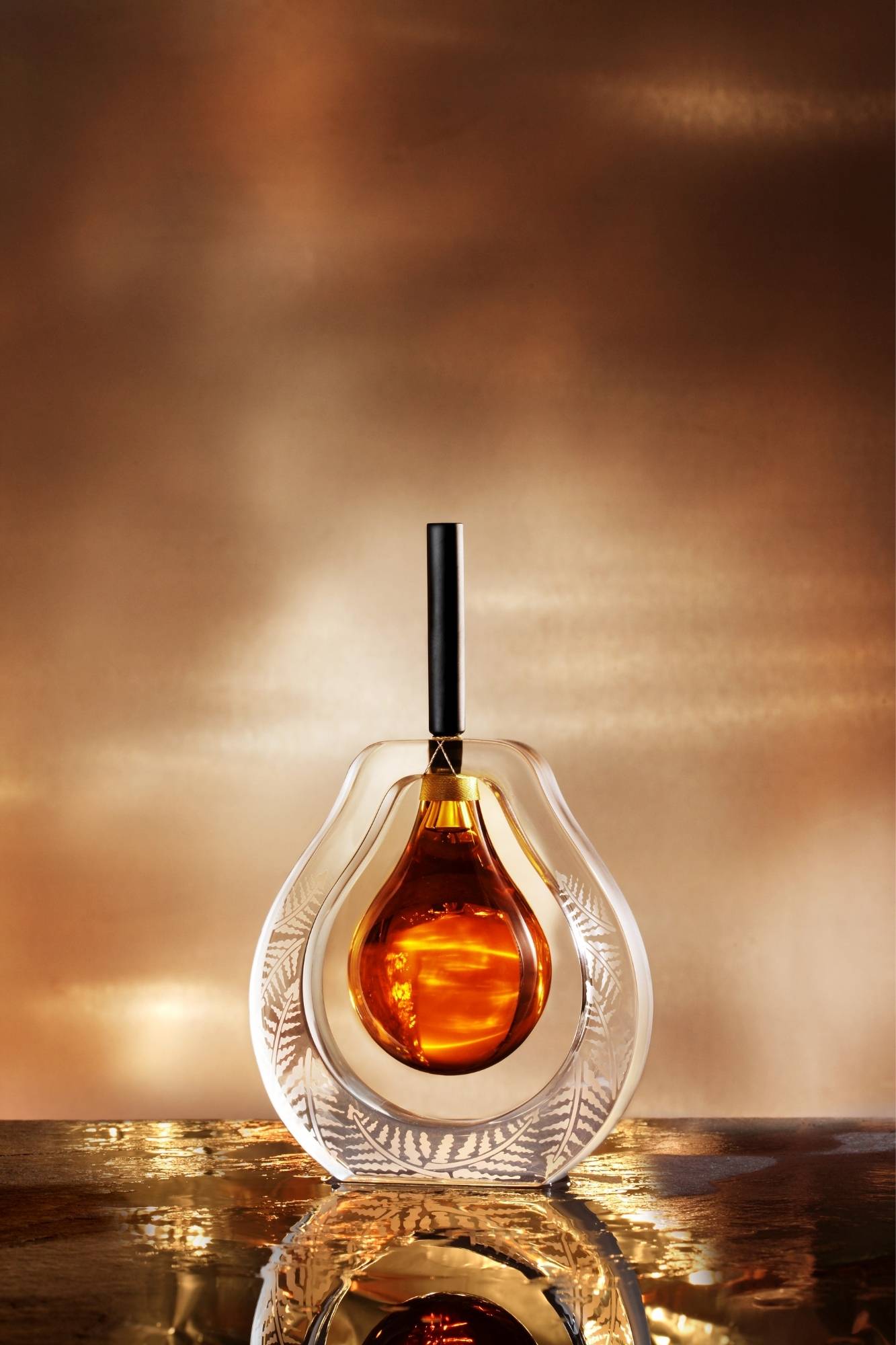
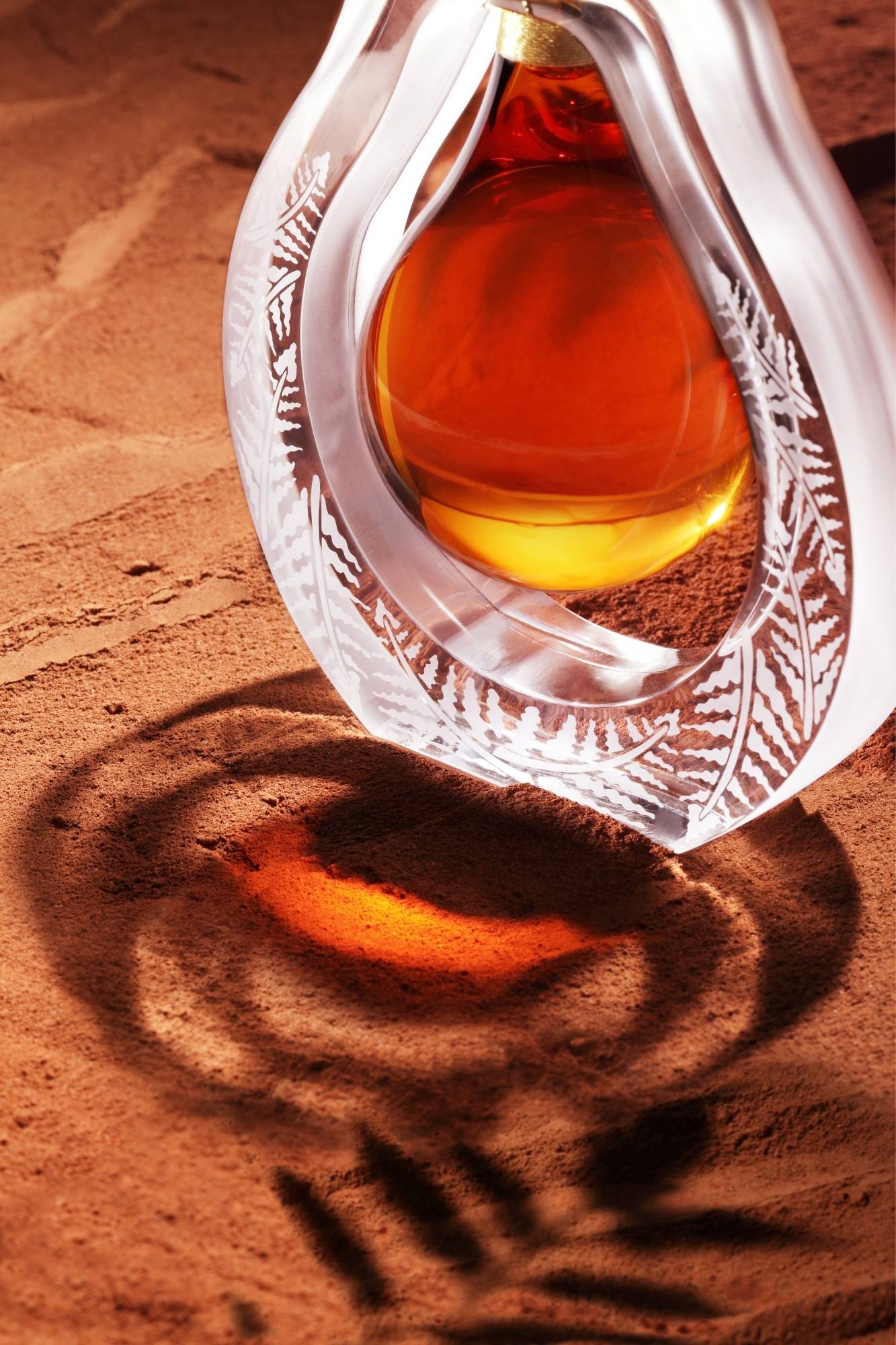
This decorative element contains a delicate fern motif, a plant favoured by René Lalique in his designs, and a reference to the manufacture of crystal: distilled fern ashes are used to obtain potash. Potash is essential to glassmakers as it is used not only to lower the melting temperature of the crystal, but also to give it density, sonority and brilliance. In a graphic and poetic style, the fern has a polished satin finish – a signature of the Lalique crystal workshop – on a clear crystal background. The production process for this extraordinary bottle began in the hot-glass workshop, and involved seven people, the largest team ever to work on a single piece. One particularly challenging aspect was the precise coordination necessary between the artisans, as the bottle is made up of two parts: the “parison” in amber crystal and the mailloche in clear crystal.
In the cold-glass workshop, no less than 11 artisans worked to achieve perfection. The cutting and sanding operations were entrusted to one master glassmaker. A second, specialized in polishing, worked on creating the contrast between transparency and the satin finish. Each stopper was then polished and ground by a third pair of hands.
It was a considerable challenge to create ten copies of the Fusion flacon. Not least because the crystal had to be worked in different colours – clear, black and amber – all with different physical and chemical properties, making the piece extremely fragile to handle at each stage of production.

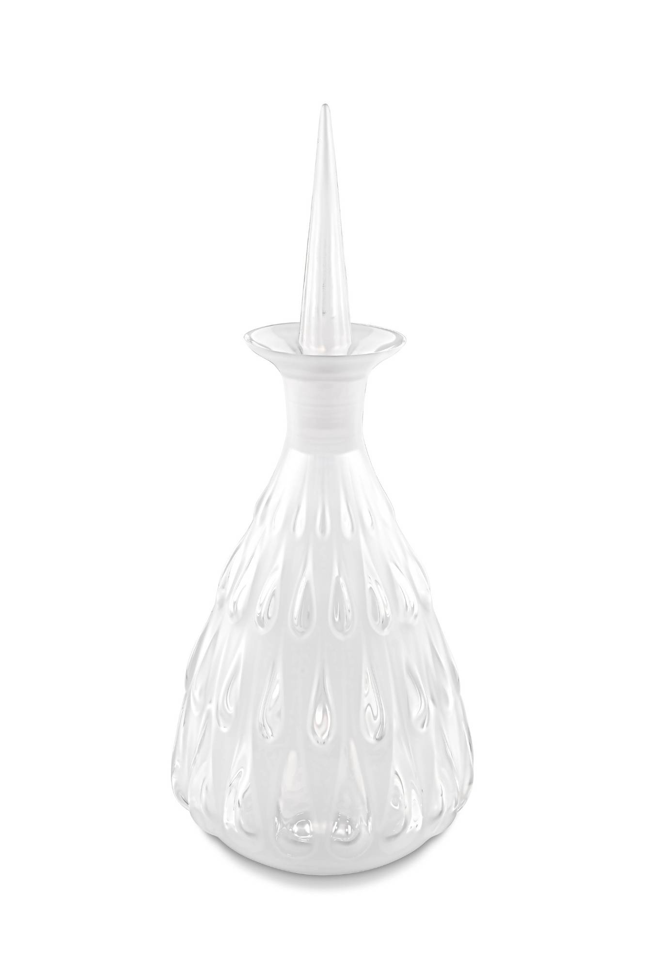
As a tribute to the history of Lalique and to mark the centenary of its Alsace factory, an original design was chosen from the company archives for a white glass decanter produced in 1922, the year in which the first furnace in René Lalique’s glassworks was lit. In 2022, one hundred years after its first edition, the Water drop decanter has been recreated in satin-polished crystal, the signature Lalique style that reflects the artisans’ unique expertise.
Designed to highlight the colour and aromas of the finest spirits, the Water drop decanter is an exceptional object that will enrich the company’s collections. The first challenge for the five Lalique artisans working together on the piece in the factory’s hot-glass workshop was to “gather” the right quantity of crystal: the decanter has a very thin neck and the drops that cascade down the sides have to be uniform. Precision and meticulous care are required during the preforming of the material, which is then blown into a steel mould.
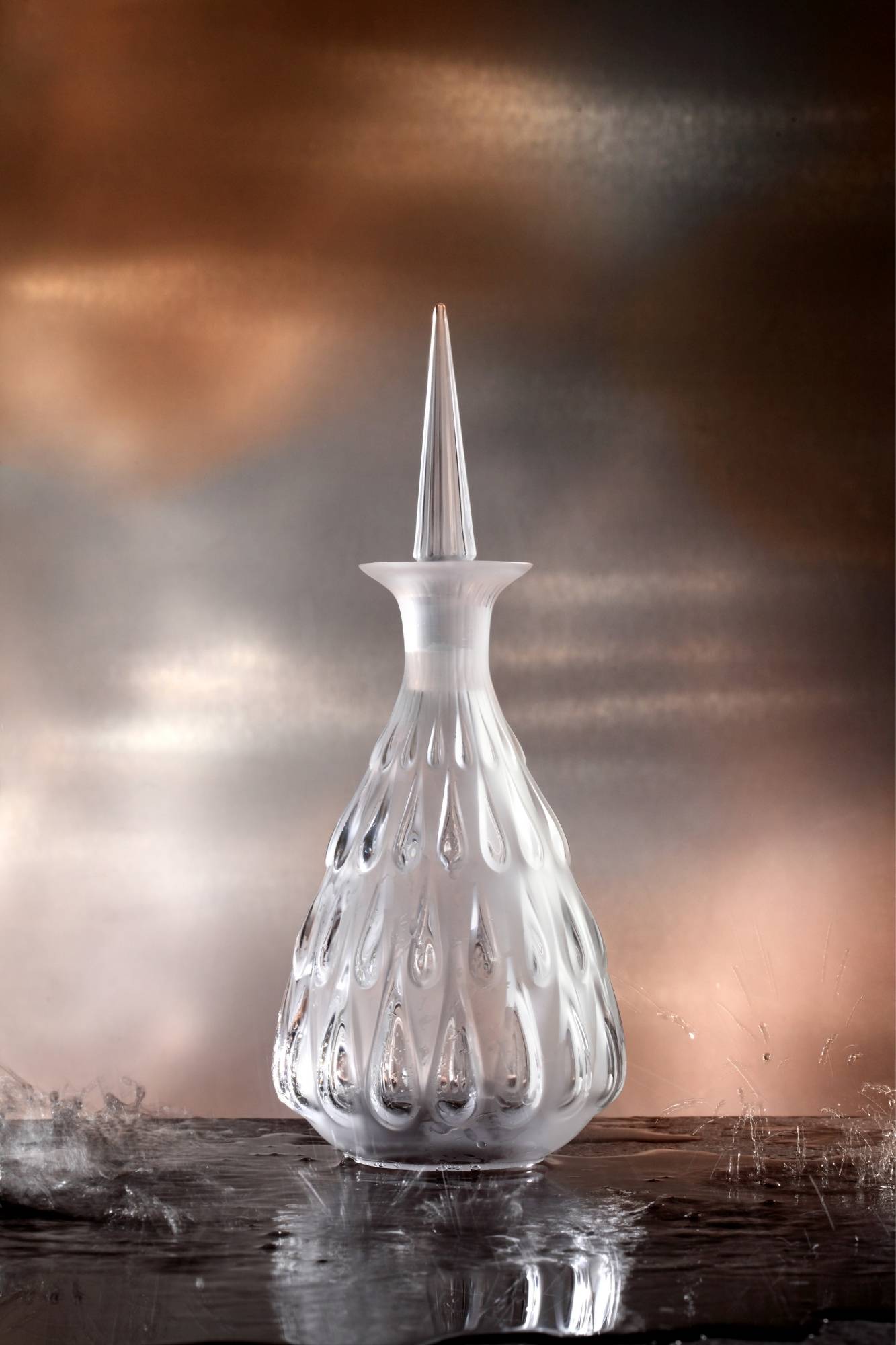

When the piece had cooled, the artisans in Lalique’s cold-glass workshops began by cutting the decanter’s neck – another delicate technical step, as the diameter of the opening must accommodate the perpendicular stopper perfectly. The latter is formed in a steel mould into which the glassmakers press the crystal. The lightly fluted sides rise to a peak eight centimetres high. After a quick series of cuts to remove any last creases or imperfections created during the firing of the crystal, the virtuosity of Lalique’s artisans can be exercised. The Water drop decanter is entirely satin-finished, with subtle gradations in the droplets, which are polished in stages.
The realism is striking: the depth of the crystal plays with the light, and the droplets come to life. In a final display of dexterity, after three hours of cold work on this anniversary decanter, the Lalique signature and the edition number are engraved by hand on the underside.
Thanks to the play of light, the drops of water that trickle down the carafe seem both ephemeral and eternal, in an elegant design full of delicate contrasts. This collector’s model was given new life with a demonstration of the Wingen-sur-Moder artisans’ precious expertise.
About Lalique
Lalique is a French glassmaker, founded by renowned glassmaker and jeweller René Lalique in 1888. Lalique is best known for producing glass art, including perfume bottles, vases, and hood ornaments during the early twentieth century.
If you’d like to feature your product news here, get in touch to find out more.
If you’d like to become SBID Accredited, click here for more information.
In this week's interview with 2021 SBID Awards winners of the Interior Fittings category, Finfort, discuss the complexity of their product, share tips on creating convenient and consumer-focused products, as well as the key considerations to have in mind when approaching the specification of security solutions.
SBID Awards Category: Interior Fittings
Practice: Finfort
Entry: FinBolt Triple Door Set
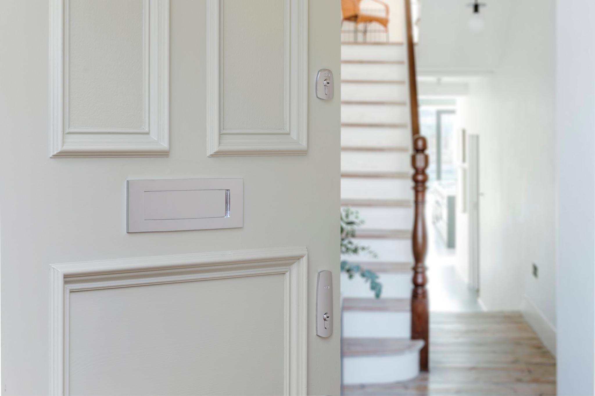
Entering the ‘SBID Awards’ was without a doubt, the best decision Finfort made in 2021! The ‘SBID Awards’ recognise and celebrate the value of design and innovation - so having launched our innovative range of elegant high security door locks with automatic deadbolts in 2020, we were naturally very keen to be part of it. The awards also provided the perfect opportunity for us to proudly showcase our exciting new designs to the interior design industry.
We were thrilled to discover our FinBolt Triple Door Lock set won the SBID Product Design Award for the interior fittings category. Not only did the award help boost our credibility as authentic and trusted innovators, but it also demonstrated the high-end quality of our products whilst providing an invaluable level of media exposure. This really helped us gain traction as an emerging brand.
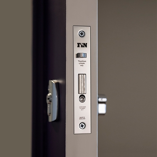
The FinBolt lock is a major innovation in door security, combining ultra-safe convenience and beautiful craftsmanship. The award winning FinBolt Triple Door Set makes it possible to secure a door at multiple points, with independently operating locks which automatically deadbolt every time the door is closed. With the FinBolt lock, busy homeowners never need to worry about whether they’ve locked their doors properly again! Once the door is closed, it’s totally secure - without ever needing to turn a key! Not only is it functional, but it’s aesthetically pleasing, with the FinBolt Triple Door Set proving high security doesn’t have to mean ugly! FinBolt’s visible door furniture is boastfully sleek, elegant and complimentary of any door. We think it’s this combination of beautiful aesthetics and unparalleled functional delivery that makes this a standout product.
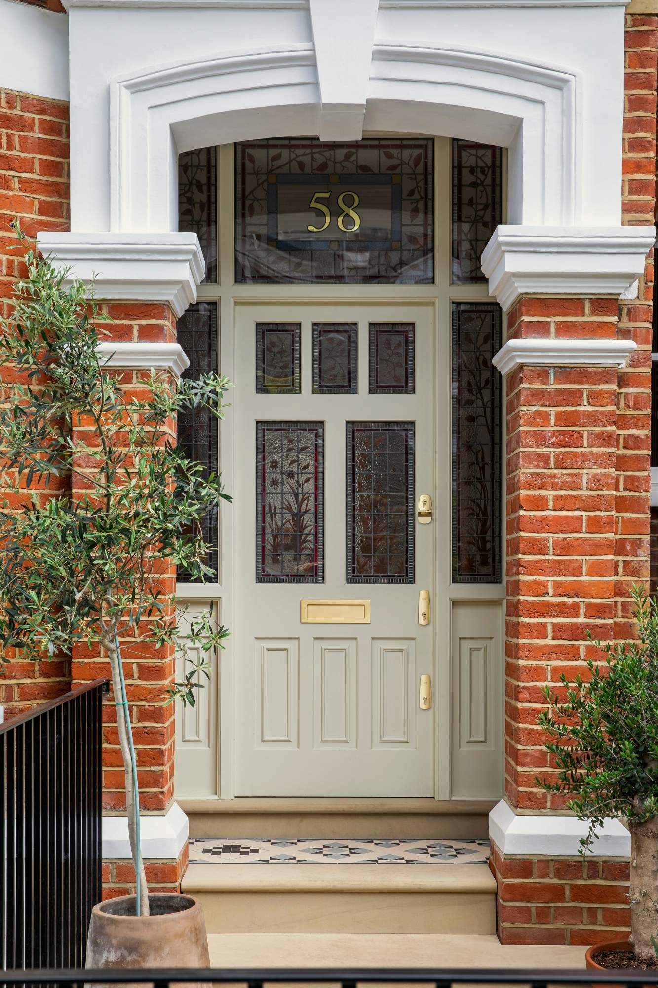
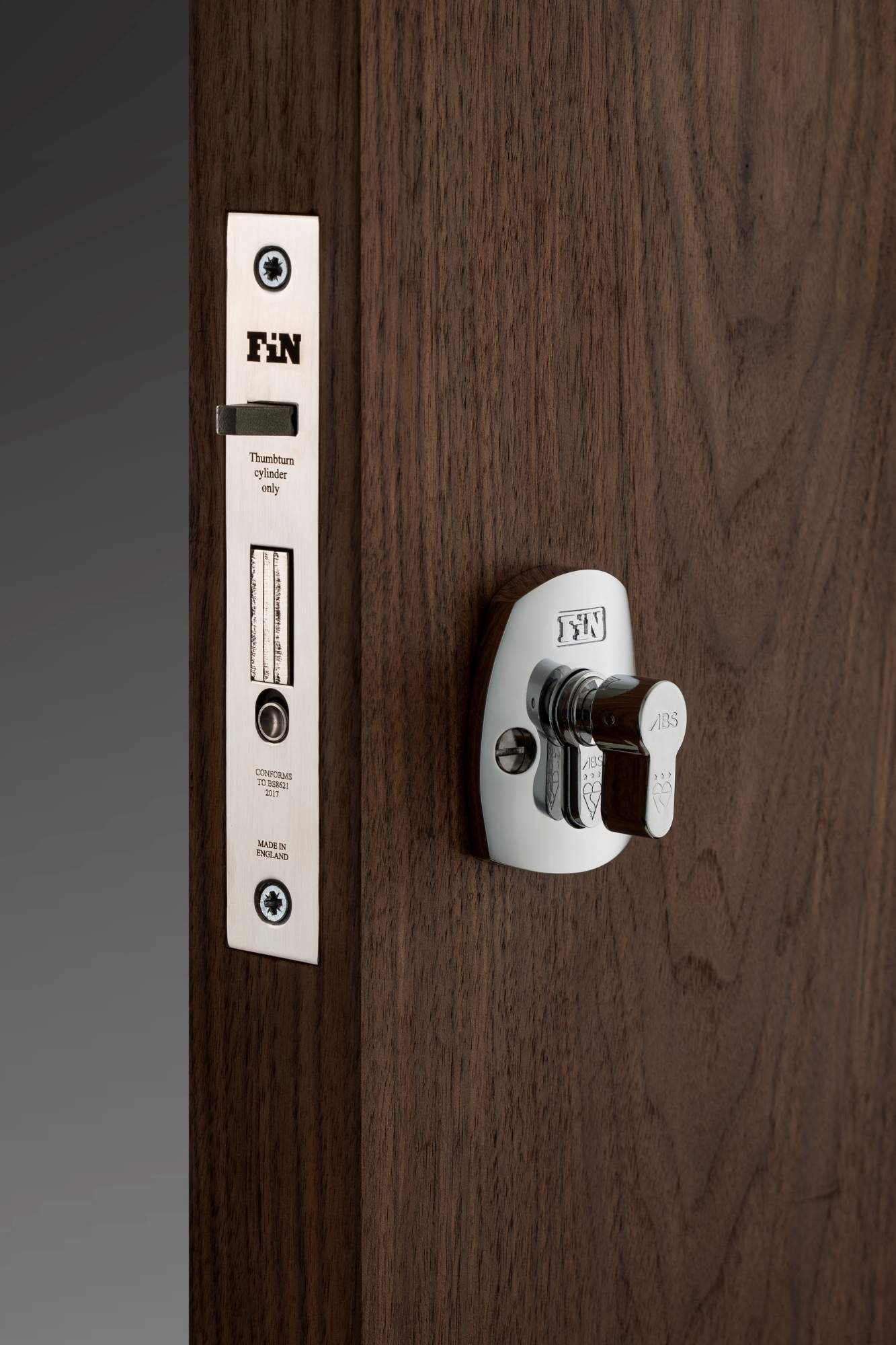
As with all our products, we’re proud to start with the needs of the consumer. In this case, a need for convenient high-end security was our starting point. When our co-founder (and architect) Timothy Finn couldn’t find a recessed automatic deadbolt for a client who was always too busy to lock his door properly, he engaged his passion for engineering and set about designing it himself!
Product development involved several iterations of designing, patent application, prototyping and testing to ensure the product worked flawlessly and also conformed to the rigorous British standards. We’re particularly proud that the FinBolt is manufactured in the UK, leveraging expert craftsmanship and the very best of British engineering.
We will also always be committed to refining our designs to perfection, so we sought technical feedback from 100s of locksmiths, by exhibiting prototypes at the Master Locksmith Association Expo Trade Shows in 2019, and we were both thrilled and honoured to receive their ‘Best Product Award’. We were grateful to have also collaborated with The Guild of Architectural Ironmongers, who provided valuable input on the technical challenge of offering bespoke finishes!
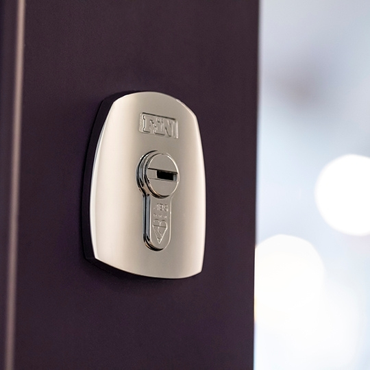
Ultimately, key to producing an effective security mechanism is a consistently reliable automatic deadbolt – something we’ve managed to achieve through our patented ‘trigger and bolt’ balanced action, together with a high-security cylinder and key registration.
It’s simple…high-security, user convenience and an aesthetic fit.
There are several high-security door locks available on the market (look for the ‘British Standard’ certification); however, very few deliver the convenience of automatic locking whilst fitting the aesthetics of a classic British door. Think about the average homeowner for a moment – busy people with busy lifestyles. There’s little value in installing high-security manual locks which require specific effort to secure, each and every time you want to leave the house. It’s inevitable that you’ll forget at some stage, leaving your home and its contents vulnerable. Furthermore, your door can set the aesthetic tone for the rest of your home, so door furniture and finish is critically important. Even a slight mismatch of colour will ruin the overall impact and leave homeowners frustrated. This is why all six FinBolt finishes have been perfectly colour matched to the extensive M. Marcus Heritage Brass Ironmongery range for a stunning and perfectly matched finish.
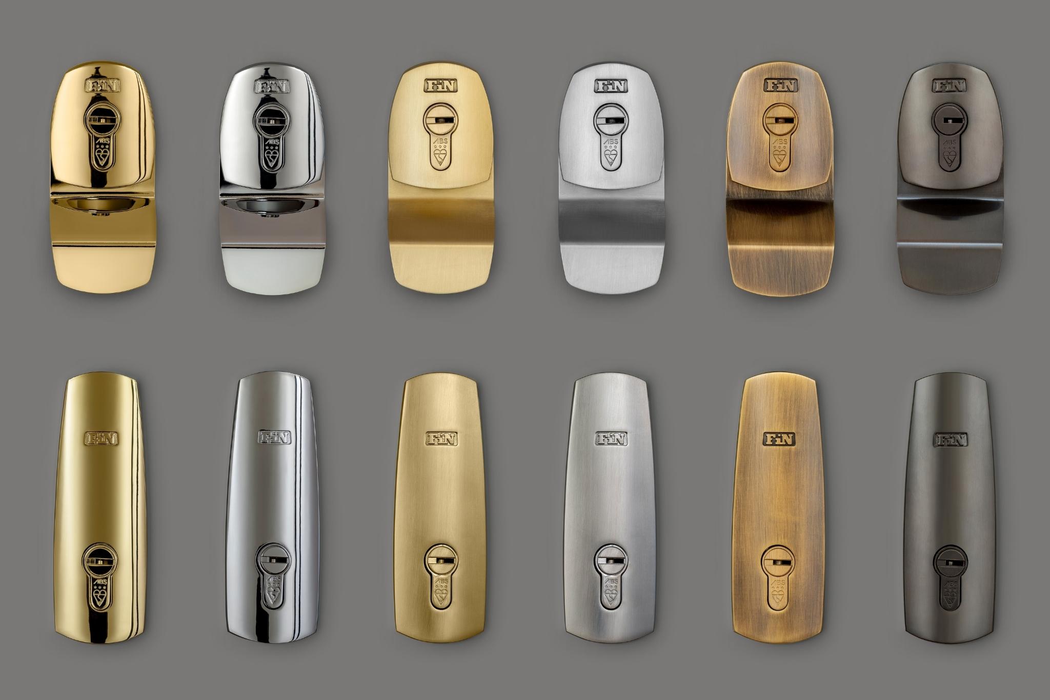
Since the SBID Awards last October, we’ve been collaborating with Avocet ABS (our cylinder supplier) to increase the range of standard finishes we can offer to our customers. The FinBolt Triple Door Set with 3 star kitemarked cylinders from Avocet ABS will shortly be available in 6 finishes, which includes the very popular Antique Brass and Matt Bronze. We’re very excited to now be seeing our ethos of bringing security and style together, coming to fruition!
We also have two new product designs underway: a fire-tested automatic deadbolt lock for apartment doors, and a high security lock case that integrates the FinBolt automatic deadbolt with smart handles, combining the ease of smart keyless entry, with mechanical automatic deadbolting!
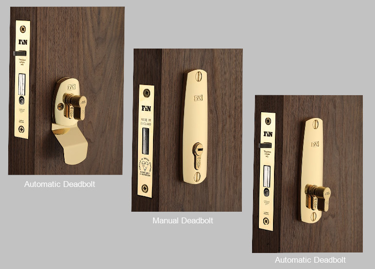
Keep the needs and wants of the ultimate end-user at the forefront of your mind, whilst aiming for that perfect balance between function and aesthetics! There will always be an appetite for convenient, beautiful designs which enhance people’s lives. Product design (especially highly technical design) can be arduous and requires tenacity to really challenge the status quo and find better, aesthetically pleasing solutions which ultimately satisfy the consumer.
Questions answered by Timothy Finn, Founder, and Hilary Duggan, Co-Founder, Finfort.
Established by Timothy Finn & Hilary Duggan, Finfort is a disruptor within the security industry and strives to design the most innovative, highest security, beautiful door locking solutions in the UK.
This week’s instalment of Project of the Week series features a modern industrial office design by 2021 SBID Awards Finalist, JN Interior Designs.
SBID Awards Category: Office Design
Practice: JN Interior Designs
Project: ‘Uber Cool Offices’ Uxbridge
Location: London, United Kingdom
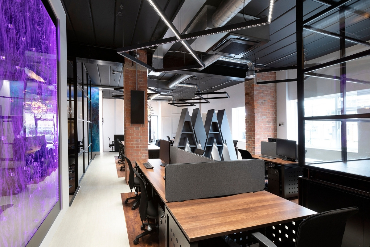
The brief was to design a really funky and cool space to attract the best/most talented people to work for this new and exciting tech finance company.
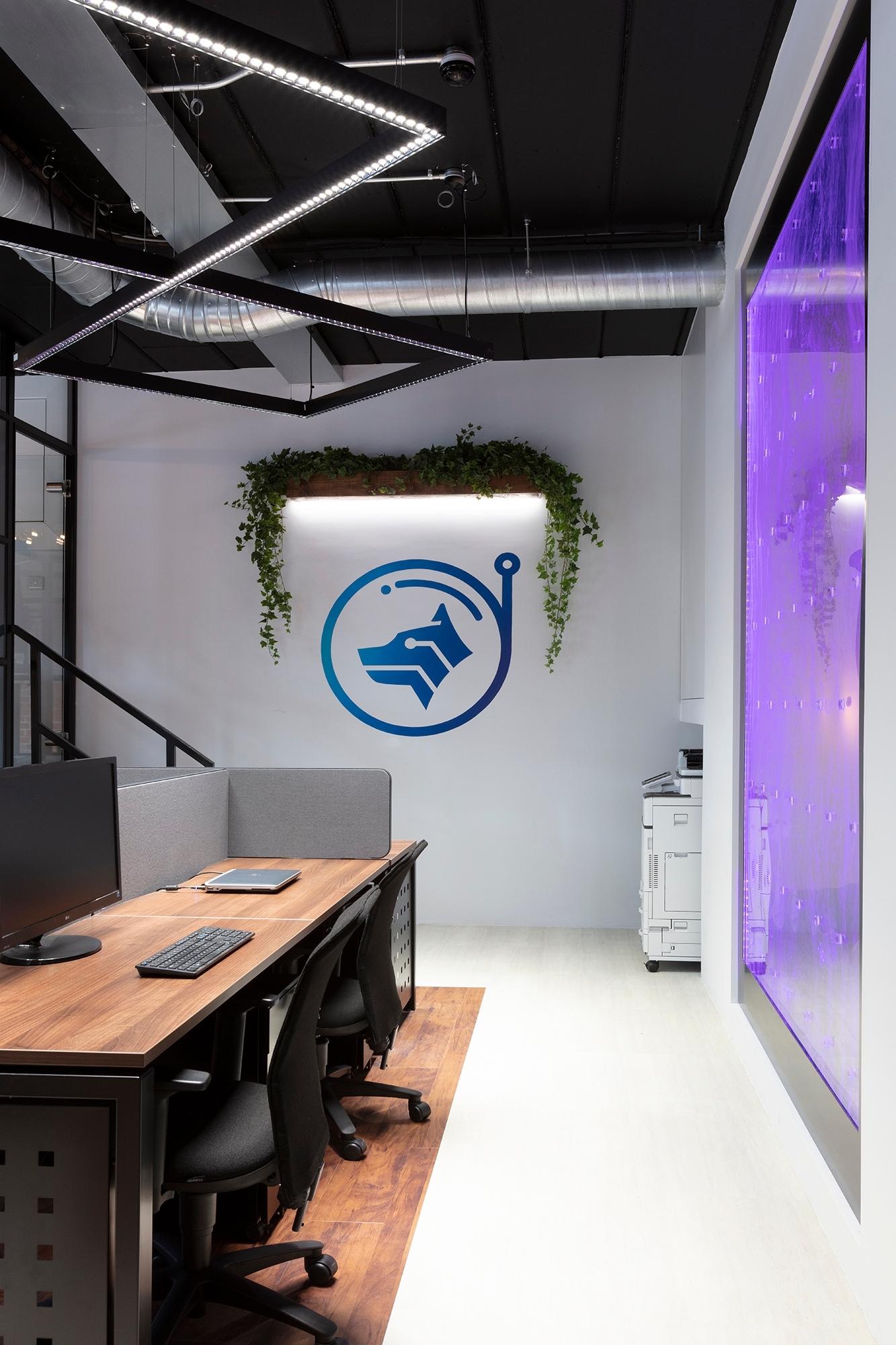
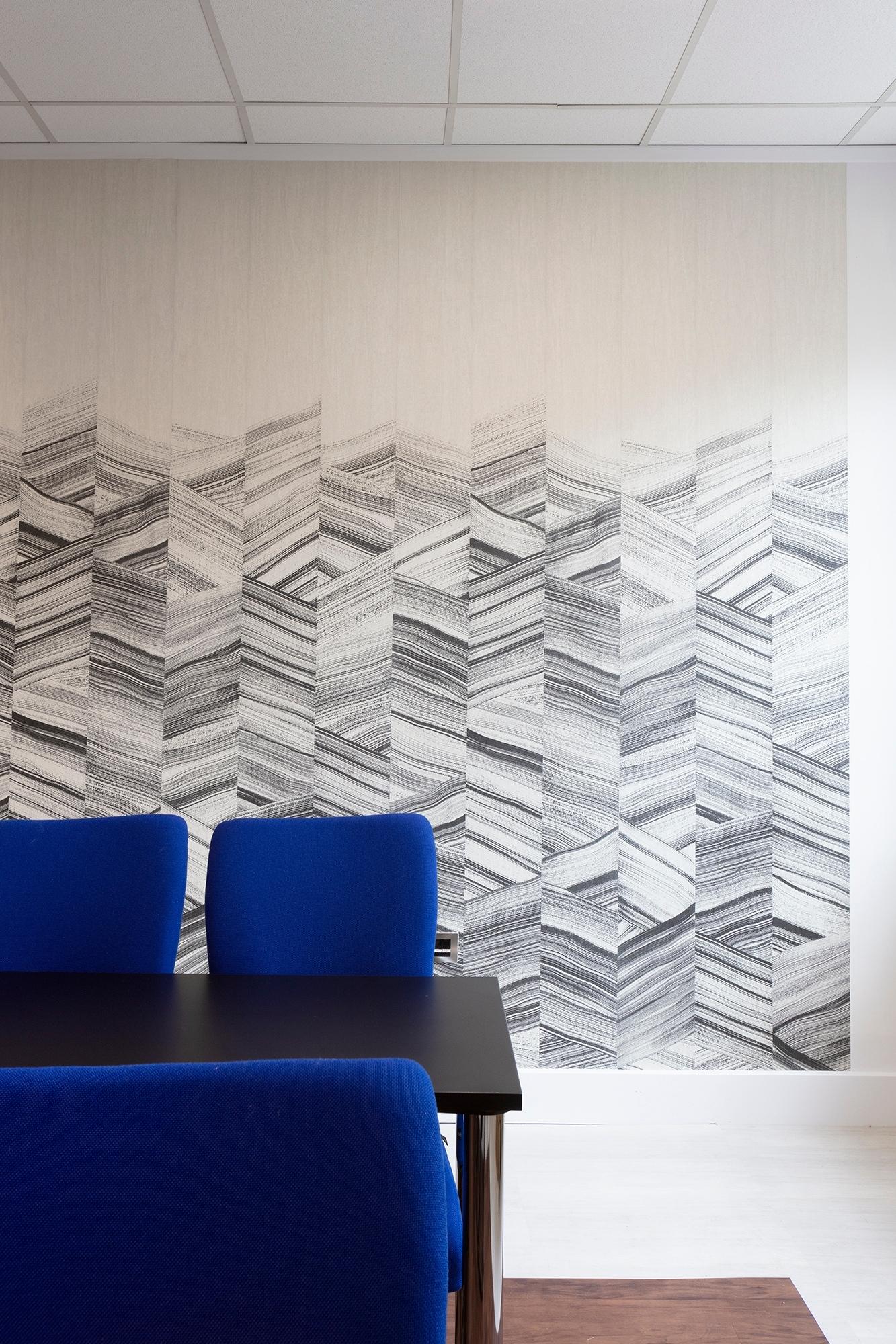
When I looked at the initial space it was your typical office style set of rooms, although in bad need of repair and renovation. However there were some unique features that caught my eye such as the exposed brick pillars. There was a false ceiling in place, part of which was falling down so I could see there was a huge expanse of room above it. This gave me the inspiration to take down the false ceilings and create a really high loft style industrial type design which also made a small space seem much larger.
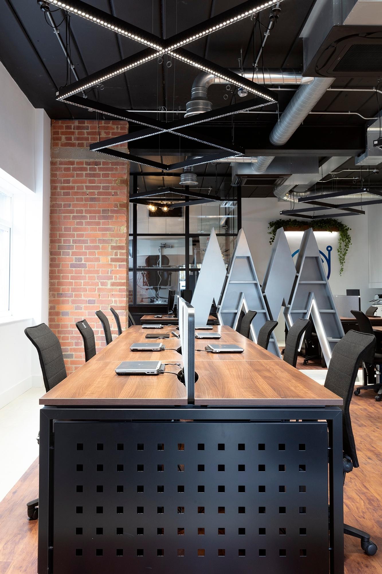
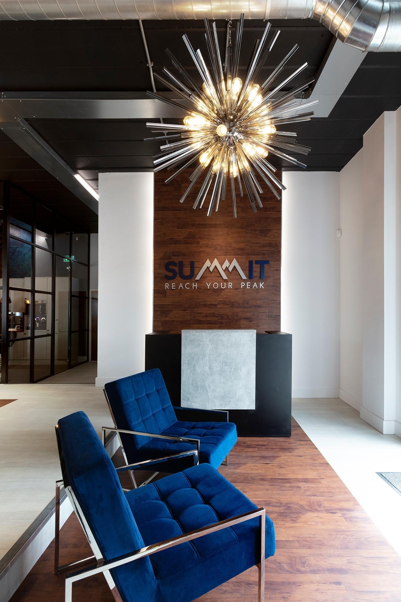
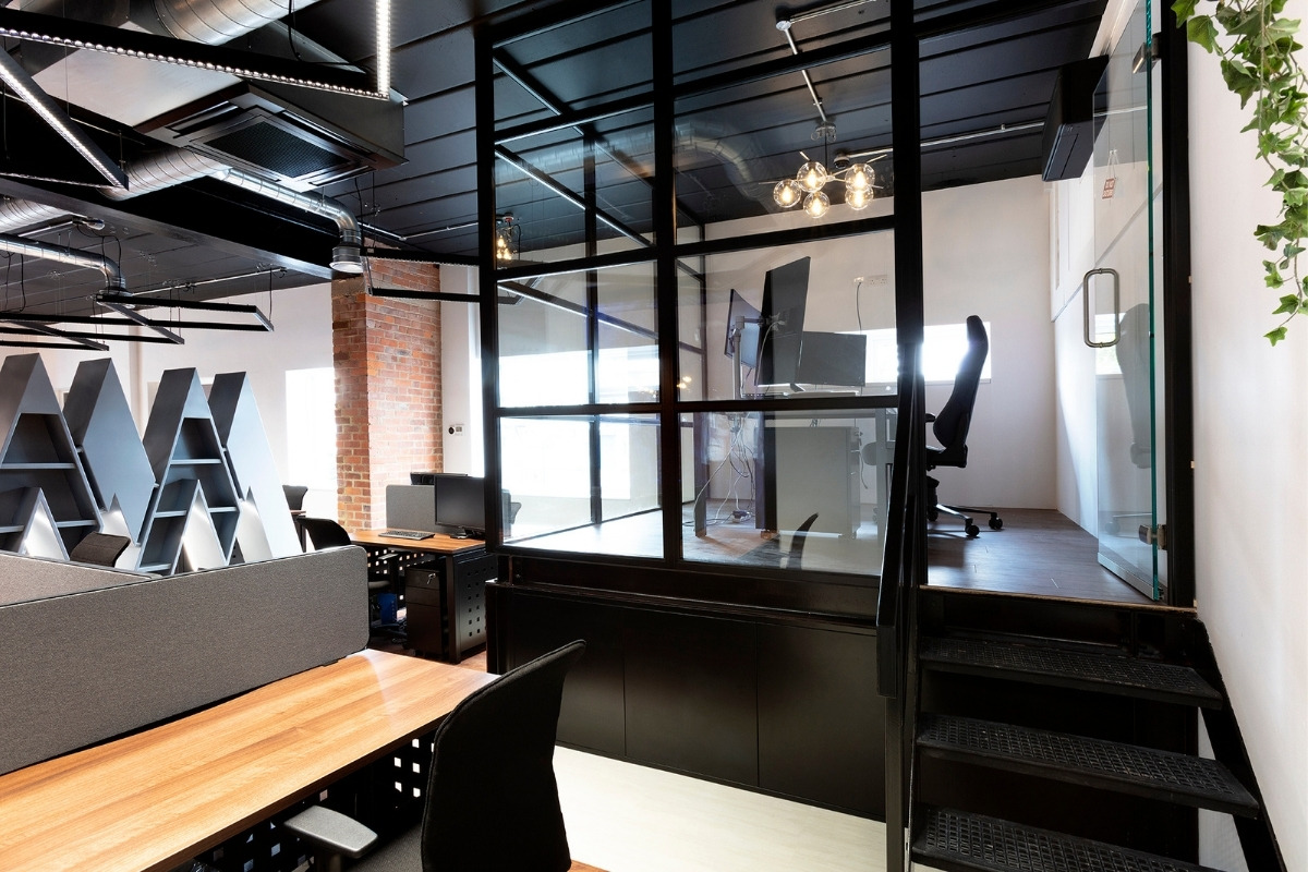
The main office space was not huge so there was a lot to fit in to a small area to not only make it look nice but function for both now and a future expanding business. Removing the false ceiling created an amazing airy space and meant that additional design and storage features could be incorporated, such as a separate mezzanine office with pull-out filing and storage units underneath.
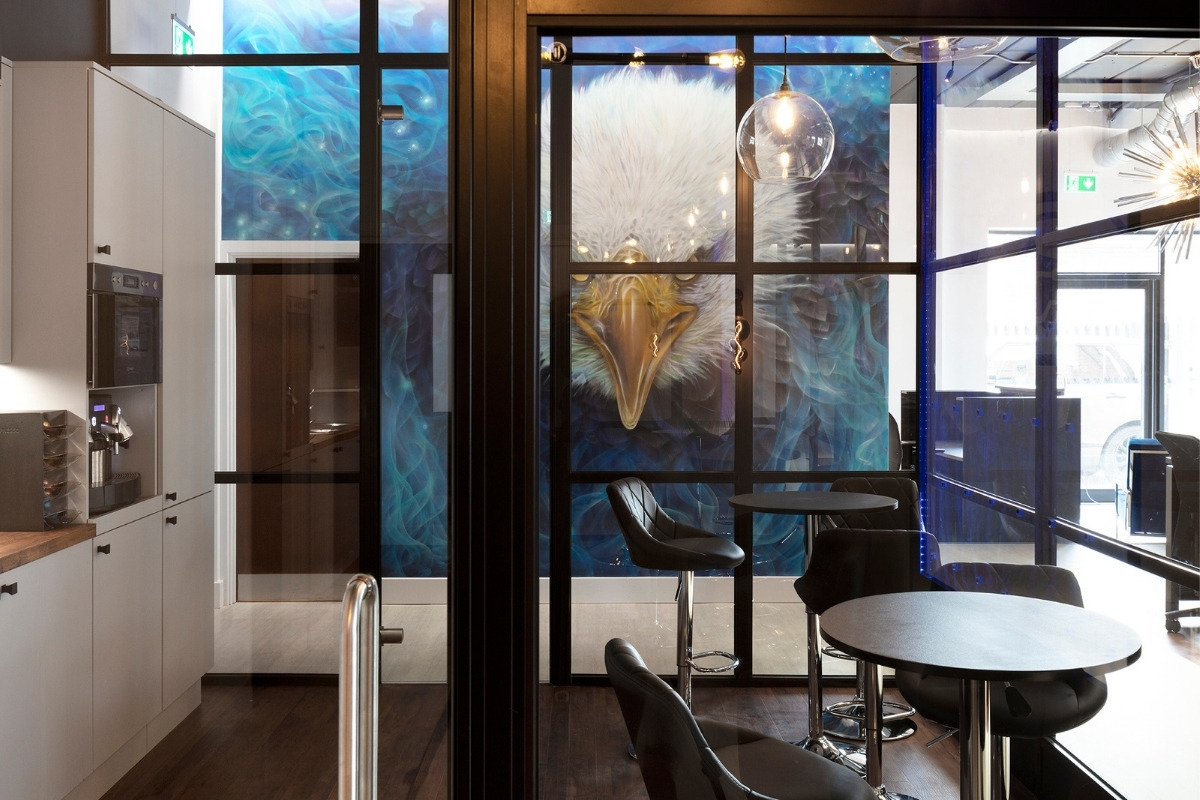
Seeing the design features come together; such as the Floor-to-ceiling glass partition walls, graffiti art mural and a 3m high bubble wall go in, as these elements set the tone for a really funky creative work space.
The SBID Awards are one of the most prestigious global interior design Awards and to receive recognition from being chosen as even a finalist is a real honour. Therefore, I wanted to enter the awards as I was extremely proud of the finished project and the hurdles we overcame to deliver a successfully designed space that my client was amazed with and truly exceeded his expectations for what could be done with the space.
Questions answered by Jennifer Neill, Owner, JN Interior Designs.