This week’s instalment of Project of the Week series features a stunning and unique restaurant design by 2021 SBID Awards Finalist, Bishop Design by Paul Bishop.
SBID Awards Category: Restaurant Design
Practice: Bishop Design by Paul Bishop
Project: Carna
Location: Dubai, United Arab Emirates
What was the client's brief?
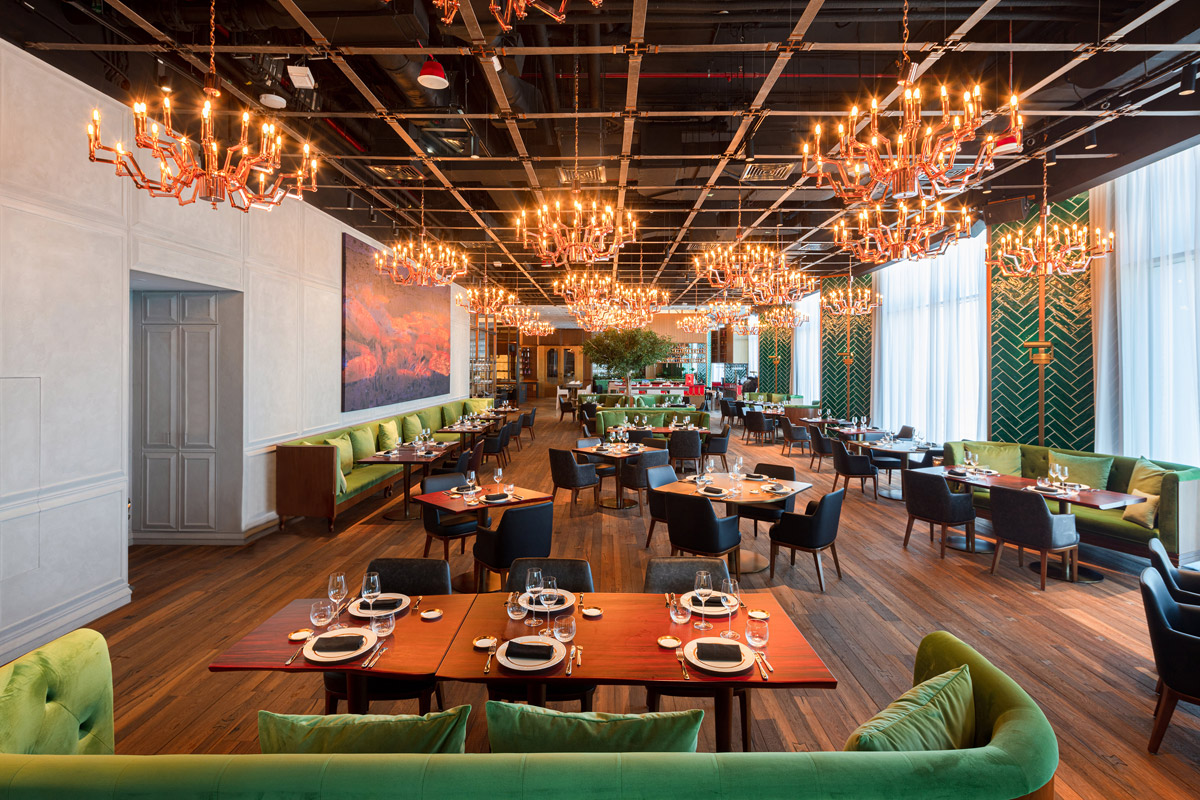
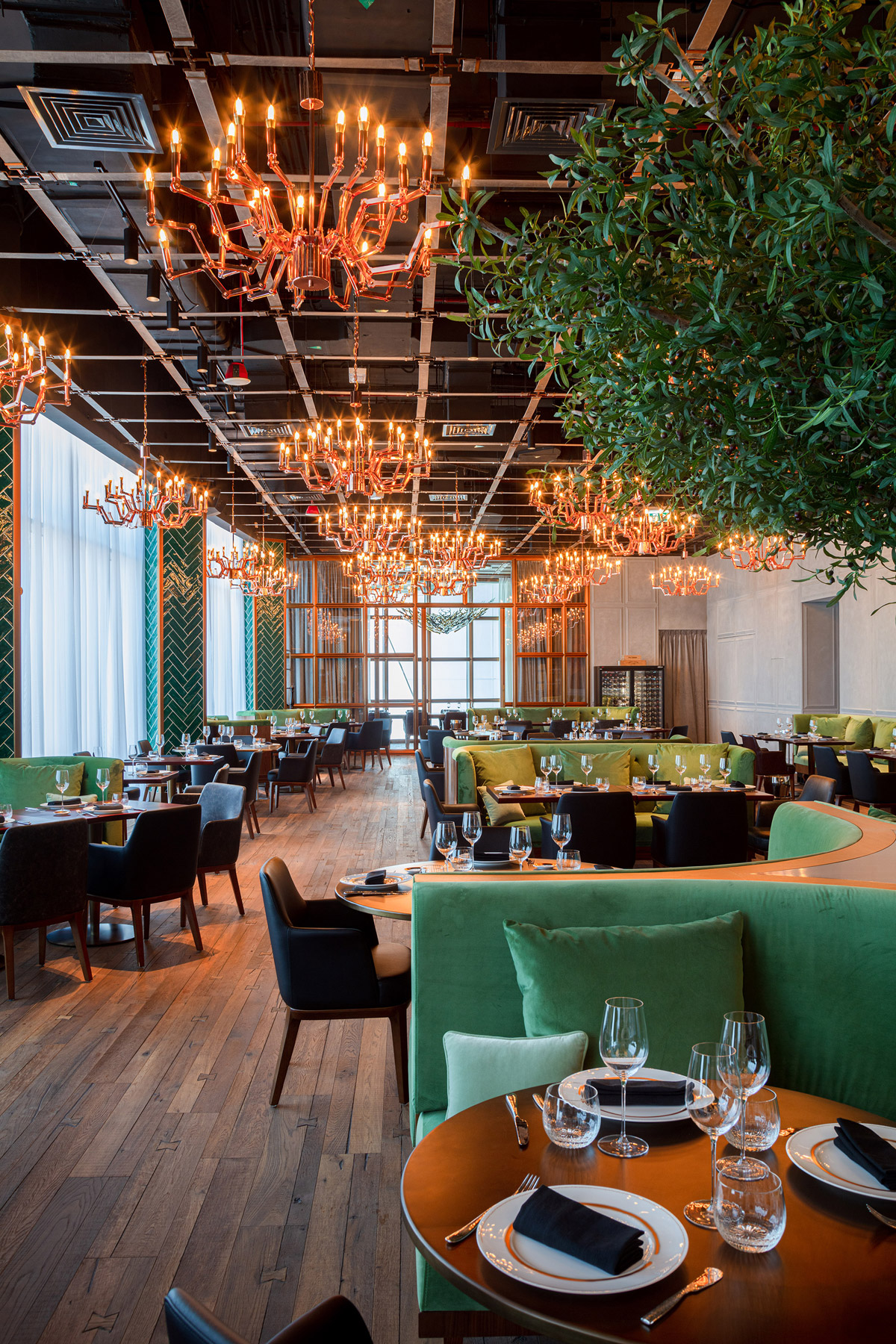
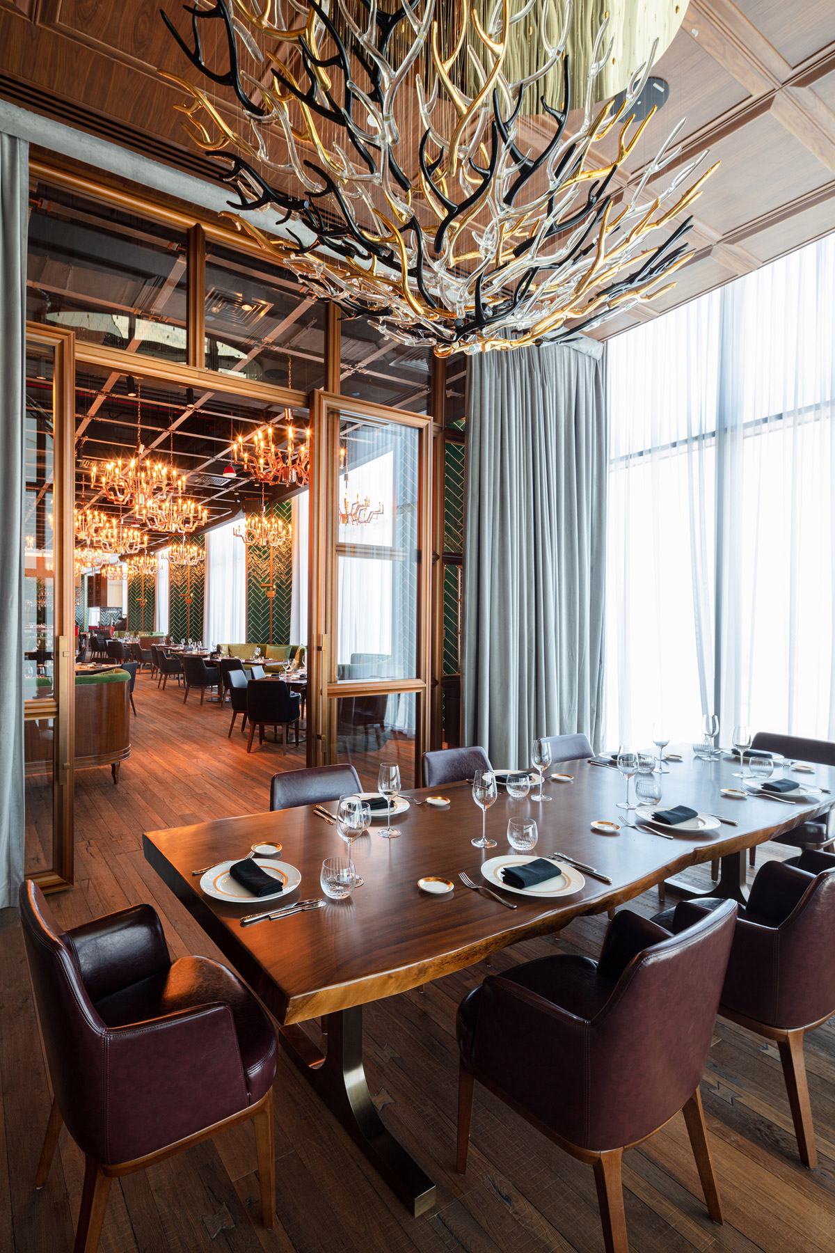
The brief for Carna was simple, yet the end result is breath taking. Discovered on the 74th floor SLS Hotel & Residences, Carna was to be a contemporary steakhouse and immersive meat experience.
What inspired the design of the project?
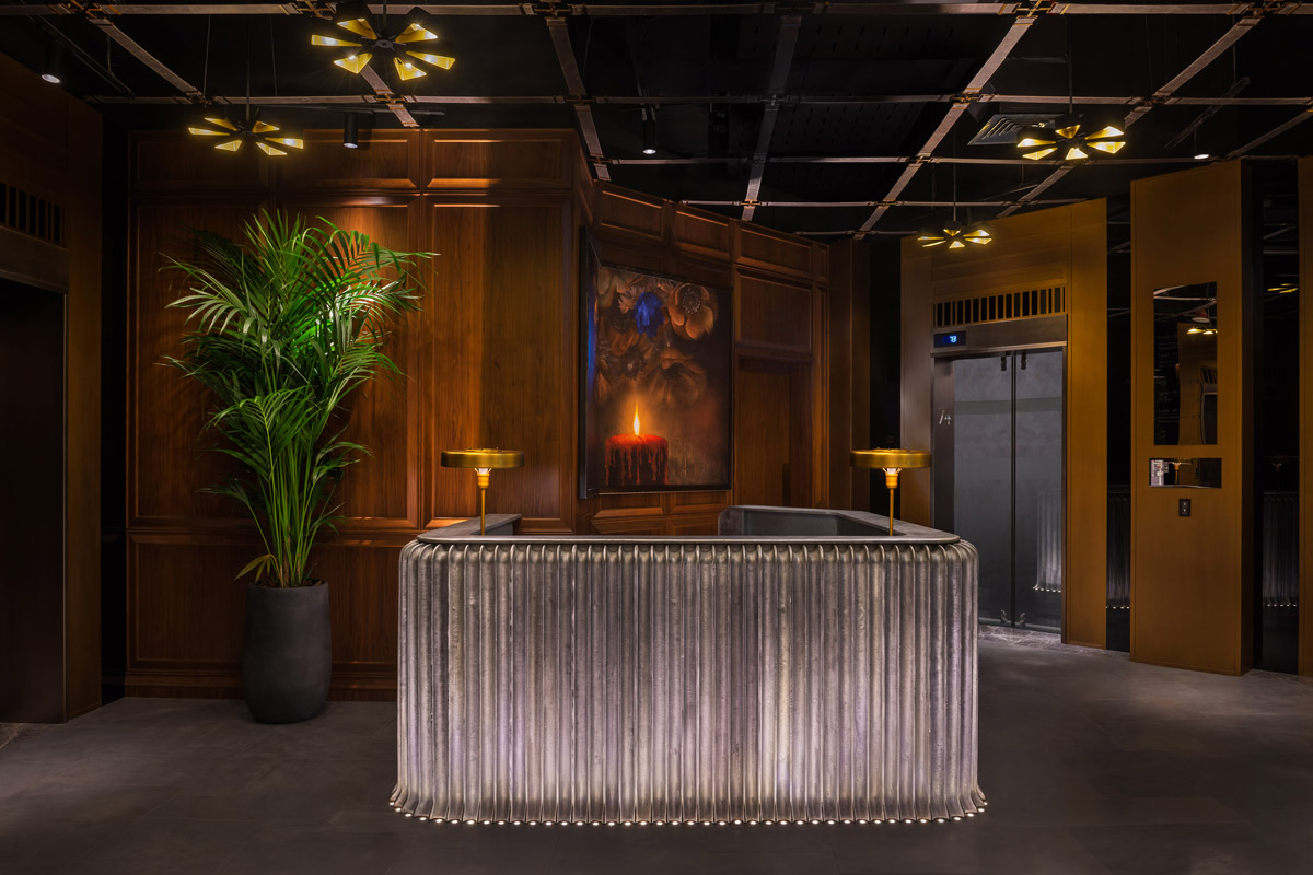
Meat is art, from preparation through to first taste, and it’s this story we aimed to capture through the interior. We appreciate the butcher to be a respectable symbol of society; a community monarch. They satisfy the most famished, and bring their unique skills to the table to fulfil the deepest of cravings. Their ancient trait is passed down through generations, and it’s this authentic craftsmanship that seethes through every crevice.
What was the toughest hurdle your team overcame during the project?
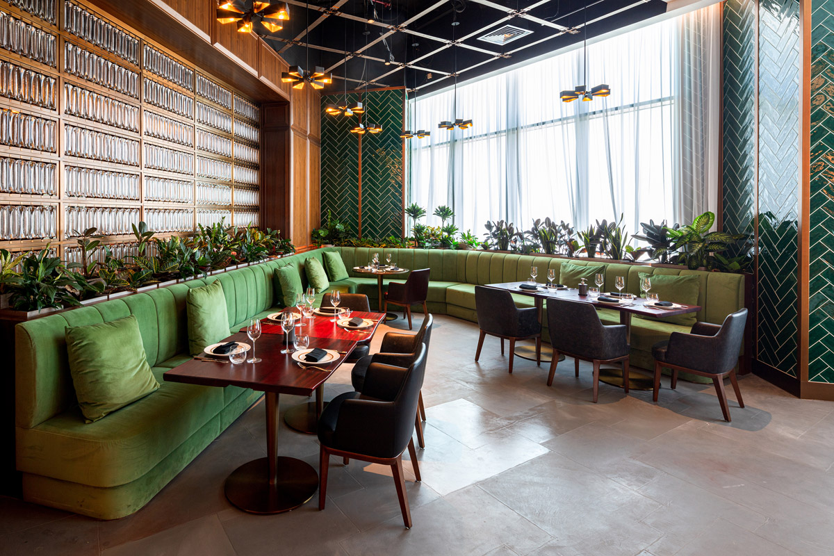
The sheer volume of space is jaw-dropping, and posed challenges at the onset, yet no corner has been left untouched. It’s strong, sensual and tantalizing of all the senses.
What was your team’s highlight of the project?
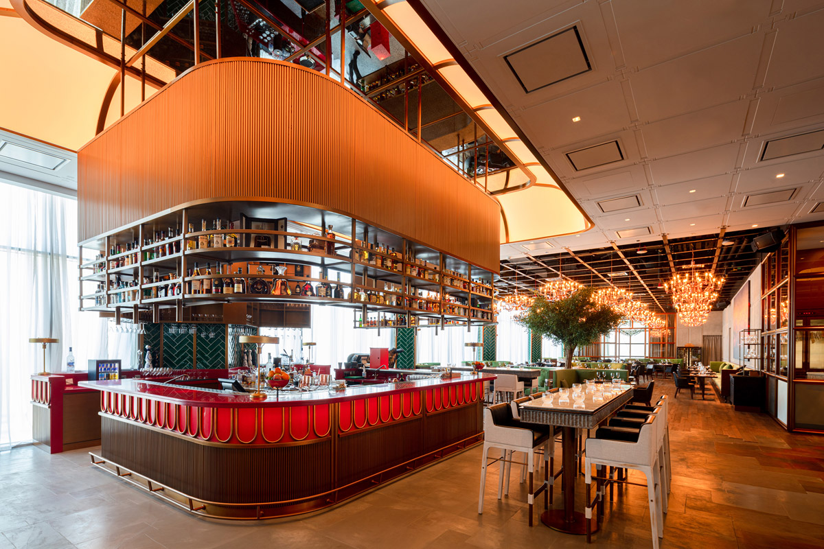
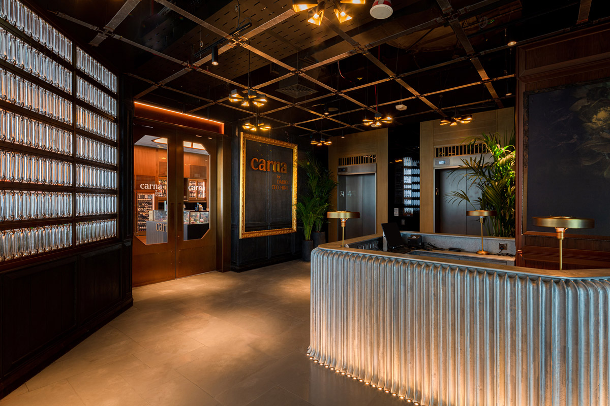
On the left resides a theatrical bar where seductive red provides a colour bomb to an architectural wardrobe otherwise dressed in shades of green and brown. Hand cut green tiles provide the backdrop to a magnificent showcase of rustic brass finishes which elegantly display the bar's liquor sensations.
Why did you enter this project into the SBID Awards?
The SBID Awards celebrate the best in design and it is events like this that continuously motivate our team to create iconic experiences all over the world.
Questions answered by Paul Bishop, Owner and Founder, Bishop Design by Paul Bishop.
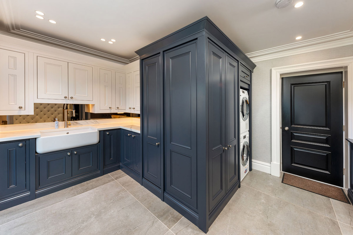
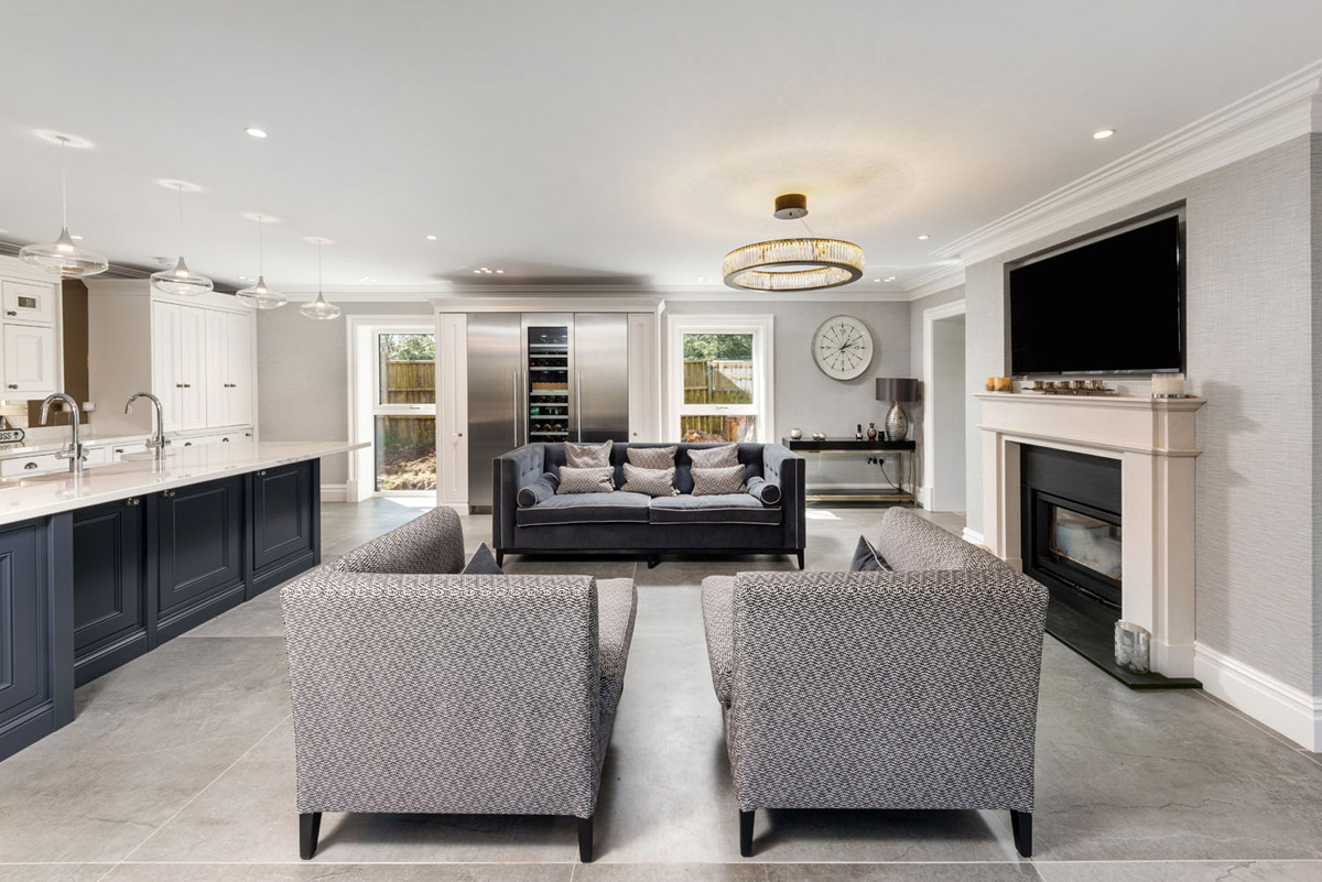
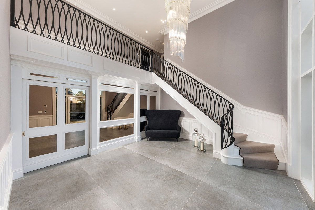
When it comes to choosing a durable, hardwearing, easy-clean, low-maintenance flooring solution for a large family home, Dekton® is the ideal solution. For Michael Stephenson and the team at HG Design Solutions, who were tasked with designing the interior of this large Northumberland family home, Dekton® Soke 8mm x 1420mm x 1420mm floor tiles were the perfect choice for the entire downstairs layout, including the open-plan kitchen-living area, dining room, utility and grand entrance hall.
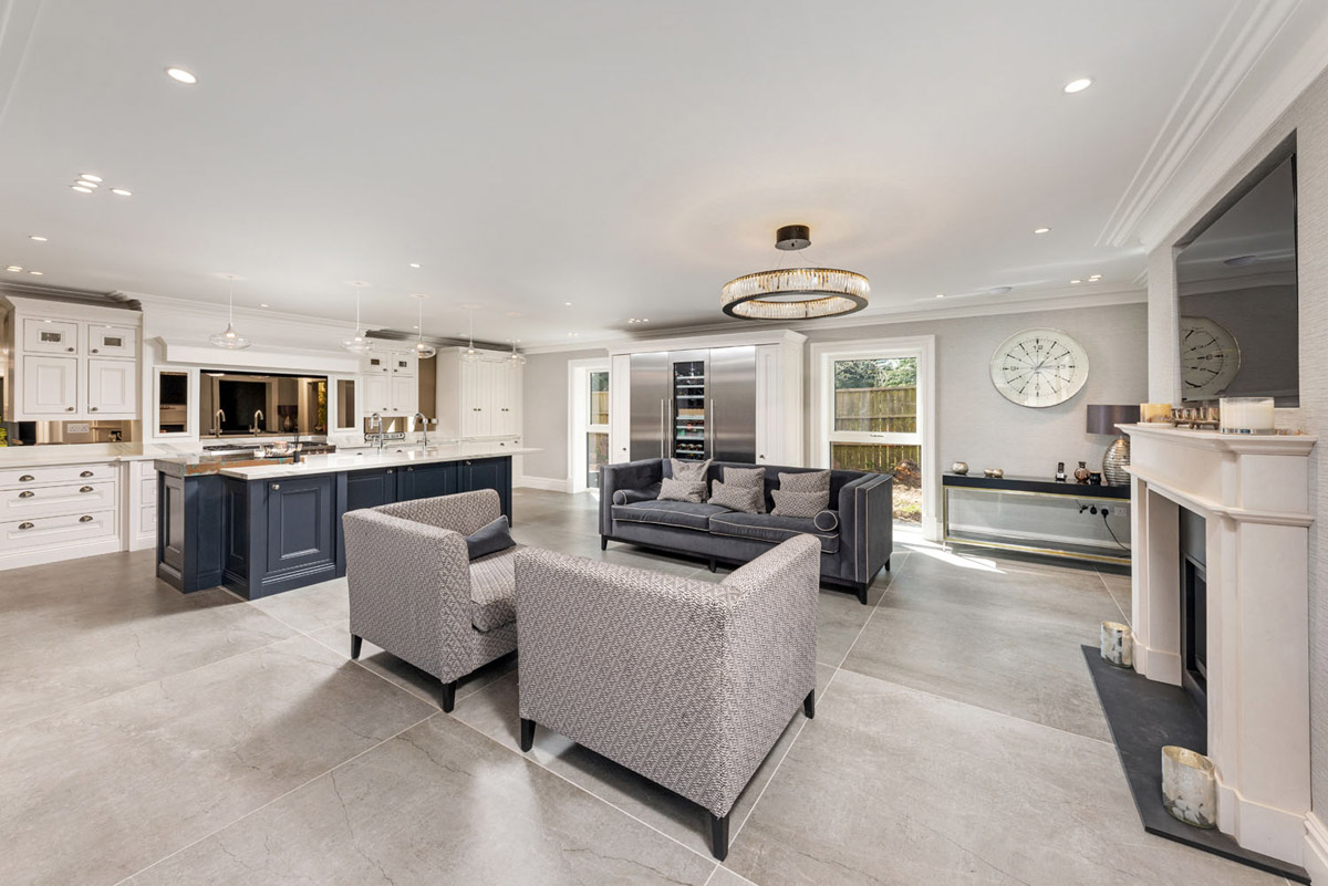
Created in collaboration with Shaun Ramsey Construction, the project involved applying Dekton® Soke flooring throughout the downstairs of the property and out into the garden area, creating a seamless finish and flow throughout the entire house and garden. Part of the Dekton® Industrial Collection, the Soke tiles are inspired by classic cement floors with realistic veining and a statement grey finish that beautifully complements the traditional style of this home’s interior décor.
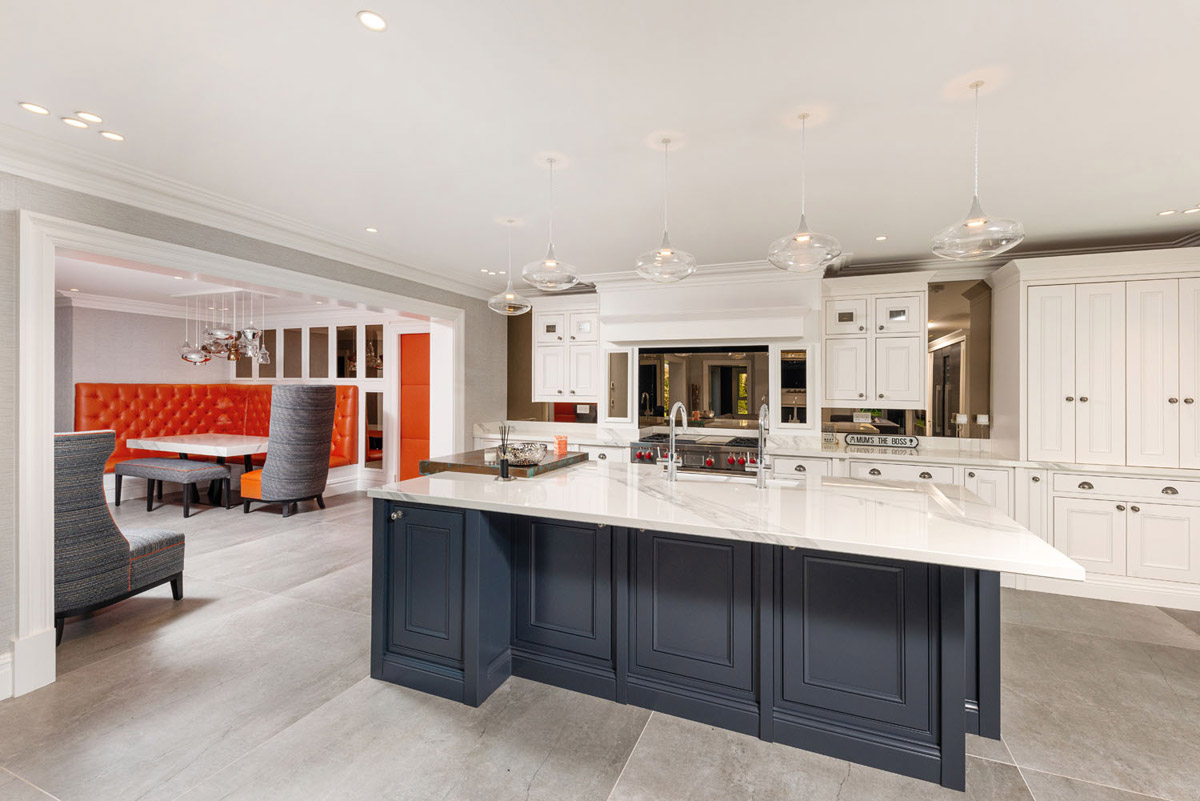
Highly resistant to UV rays, scratches, stains and thermal shock, Dekton® is the ideal choice for homeowners looking for a durable, hardwearing solution for floors, worksurfaces and wall cladding both indoors and out. What's more, carbon neutrality has been achieved for the entire life cycle of Dekton, so homeowners can rest assured that their surface of choice is sustainable and helps build a better future.
Dekton® was also selected for the kitchen worksurfaces as well as for the table in the dining area that flows effortlessly from the open-plan kitchen-living space. Dekton® in Olimpo was specified from PWS Worksurfaces and as part of the Stonika Xgloss Collection, it offers a luxurious Carrara marble look and feel with grey veining on top of a cool white background.
Michael Stephenson, Director and Founder of HG Design Solutions, explains the process behind the design, “We introduced the client to Dekton and it was after he and his wife came to the Darlington centre to view the materials that they agreed on Soke for the flooring and Olimpo for the worksurfaces and table top, as these were the perfect choice in terms of durability and style.”
The marble look of the Dekton® worksurfaces create wonderful contrast against the burnt orange banquette seating and wall colour within the dining area, which provide a pop of colour and add further personality to the design. It also looks stunning in the utility room with its rich, dark navy painted timber cabinetry and white wall units for a nautical look.
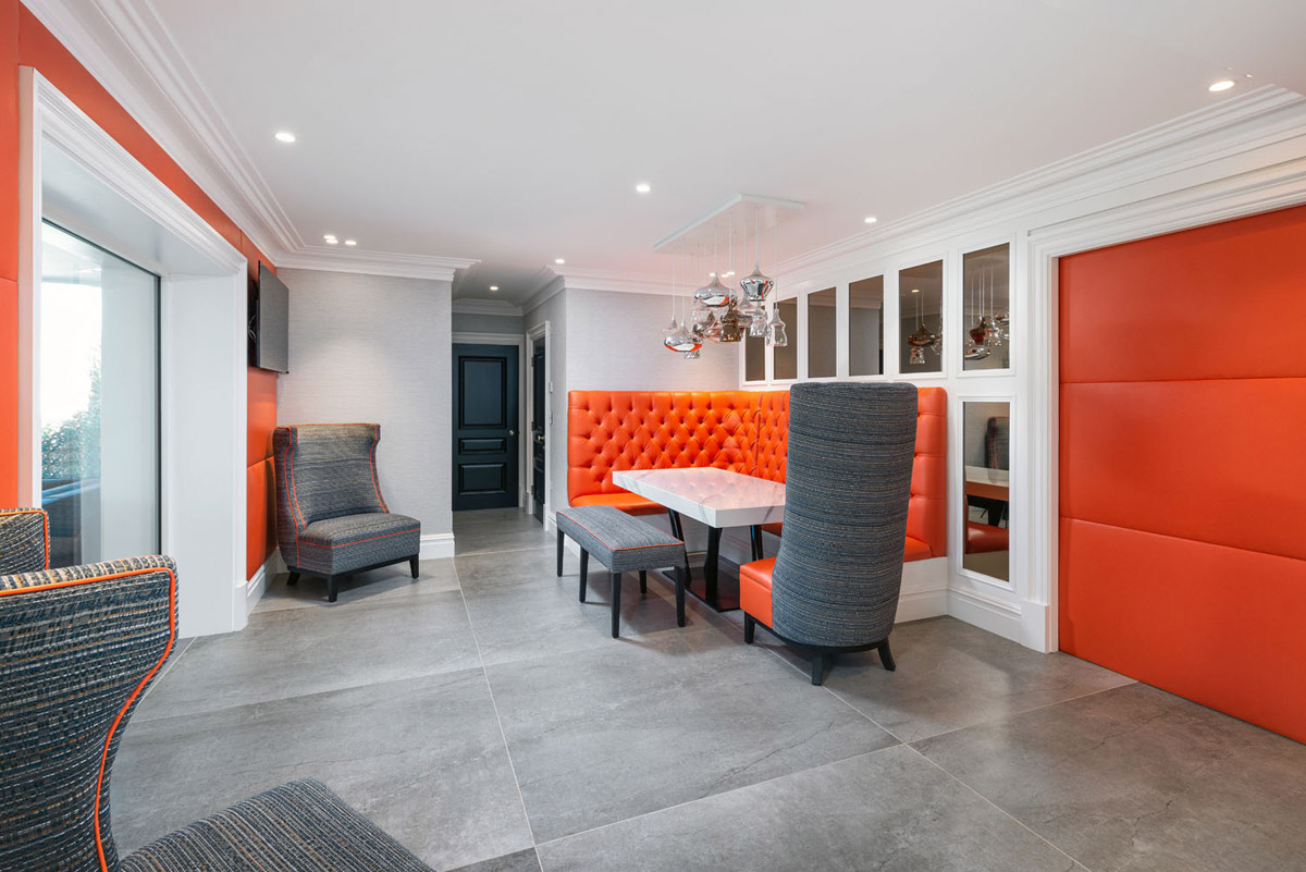
Dekton® by Cosentino is available in a range of designs, from industrial inspired to marble look.
About Cosentino
Cosentino Group is a global, Spanish, family-owned company that produces and distributes high value innovative surfaces for the world of design and architecture. It works together with its clients and partners to provide with solutions that offer design and value, and inspire the life of many people.
Dekton is Cosentino's innovative, ultra-compact and high-performance surface that offers endless design possibilities for outdoor and indoor spaces.
If you’d like to feature your product news here, get in touch to find out more.
If you’d like to become SBID Accredited, click here for more information.
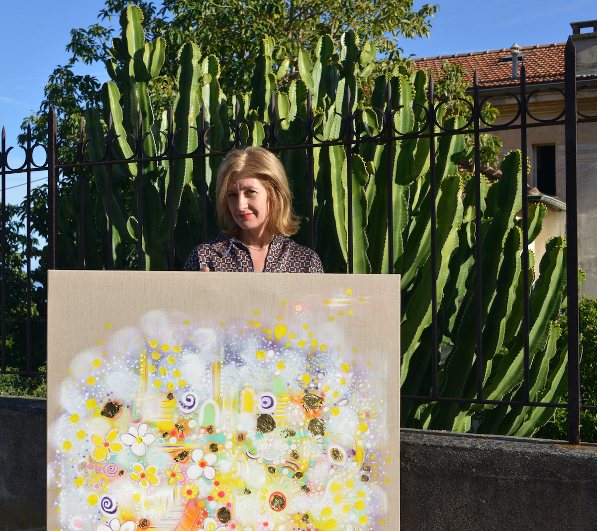
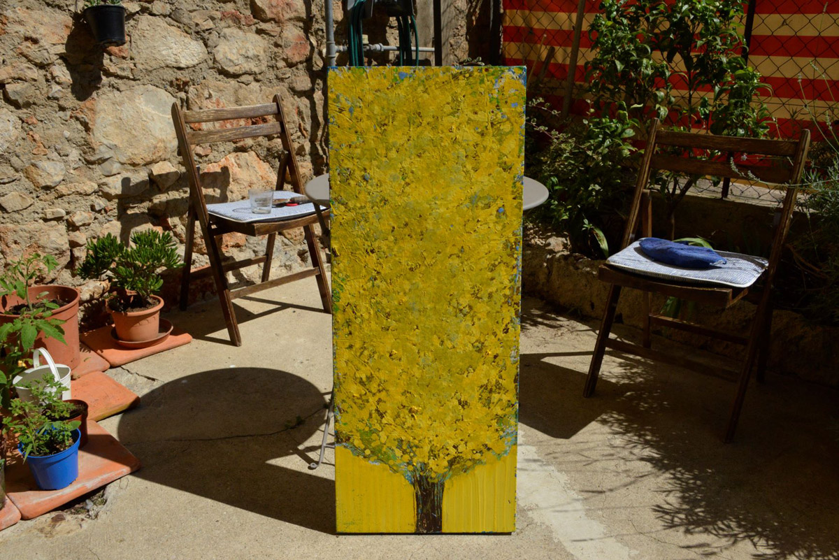
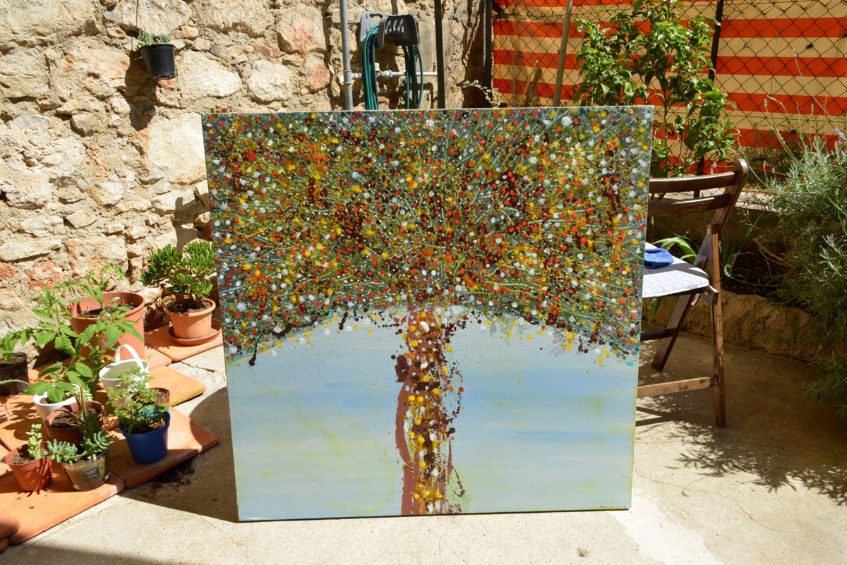
SBID member Kay Hare Art creates unique art pieces by mixing different eco-friendly materials and using unusual techniques. Her art brings liveliness and positivity to the overall ambience of interiors, inspiring the clients and shaping their awareness to make more environmentally conscious choices. The oil on linen paintings reflect dream landscapes with natural gemstone diamonds and gold leaf.

What are the origins of your brand?
The paintings are not so much a brand as each one is quite different and as I work to the specification they do change. However, the roots lie in nature. I am inspired by trees and especially enjoy long walks getting lost in the woods. I love all the seasons and find beauty in the cold, wet weather of winter with frosty mornings. All my time spent outdoors is absorbed on a subconscious level and then translated into oil paintings. I work quietly alone in my studio with the paintings almost meditations in themselves often detached from reality.
How do you work with interior designers?
I work on commission and enjoy the challenge of turning abstract ideas into a plan I can discuss clearly with clients. I enjoy offering paintings I already created. If these are not quite to the style ie. the right colours or often the right size, I will go to length to sketch out what I think the client wants, sometimes it being watercolour on paper. Once the client is happy we decide on a deadline and I make sure to stay in touch throughout the working period. Providing weekly and sometimes daily updates.
What value does your sector add to the interior design industry?
I think I bring much more than just the painting. I often suggest ideas that the client has not thought about. I am keen on working with local materials and can often suggest more environmentally conscious ways of doing things. Working with nature and natural colours can really enhance an environment as well as remind people that the natural world is precious and something we have to take care of. I like my paintings to radiate positivity and I like to bring my own enthusiasm to the project, hopefully uplifting others and providing inspiration.
How do your services/offering enhance an interior designer’s projects?
I am quite direct when I am working with clients as I find this approach saves time and money. I also like to recommend other services or sometimes artists that perhaps may work better or as well as my own work. I am disciplined enough to know right from the start if the project is something realistic or not. I can bring to the table many past projects and the experience of thirty years of working on commission. My outlook generally is a Pollyanna mindset that anything is possible, however, we do have a responsibility to be aware of our carbon footprints and find economical, non-polluting, and eco-friendly ways of working that can still be luxurious and comforting.
What are the latest trends you’ve noticed in your client’s requests?
I think the trend is very much in the natural world and it should be. We all have to monitor our consumption habits, choose biodegradable products, be accountable for our travel habits and conscious of our environments. How can we work harder to sustain an organic world? We can use more organic products and this can be hinted at through fabrics, prints, and décor generally. Encouraging eco-friendly environments through the way buildings are designed and then running this theme through to the interiors can influence and shape an individual's awareness and an entire community. Making natural product-based materials and overall styles that hint at the salvaged, second-hand market is important to influence and support the younger generation who will have to embrace more sustainable ways of living without giving up on beautiful interiors.
If you’d like to feature your product news here, get in touch to find out more.
If you’d like to become SBID Accredited, click here to find out more.
In this week's interview with 2021 SBID Awards winners of the Restaurant Design category, design command share their tips on designing hospitality interiors with user experience in mind and talk about using natural materials in interior design projects.
SBID Awards Category: Restaurant Design
Practice: design command
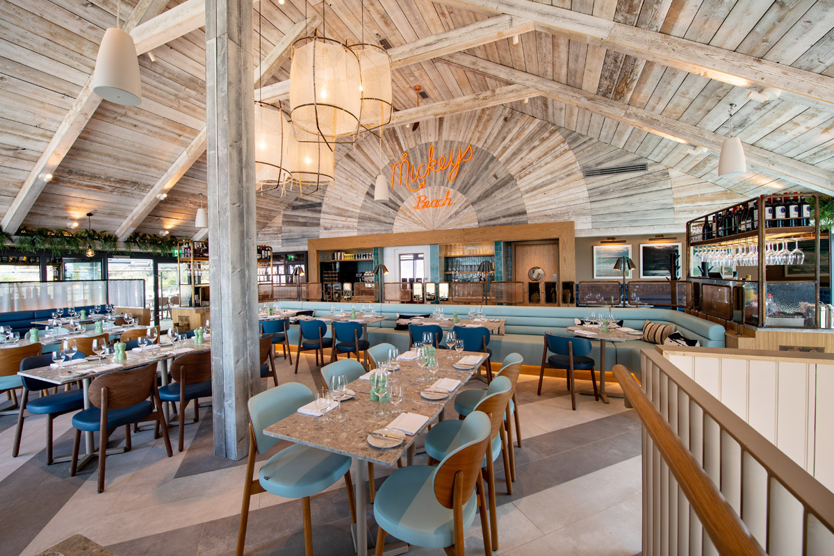
Entry: Mickeys Beach Bar and Restaurant
How important is it to enter the SBID Awards & receive industry recognition for your work? What are the benefits?
Extremely important for us as an Interior Design Company that mainly specialise in hospitality design. To receive the recognition after the difficult years or 2020 and 2021 is an amazing achievement. Being recognised by SBID Awards introduces you to new contacts and you feel like part of a hospitality family.
What do you think made this particular design an award winner?
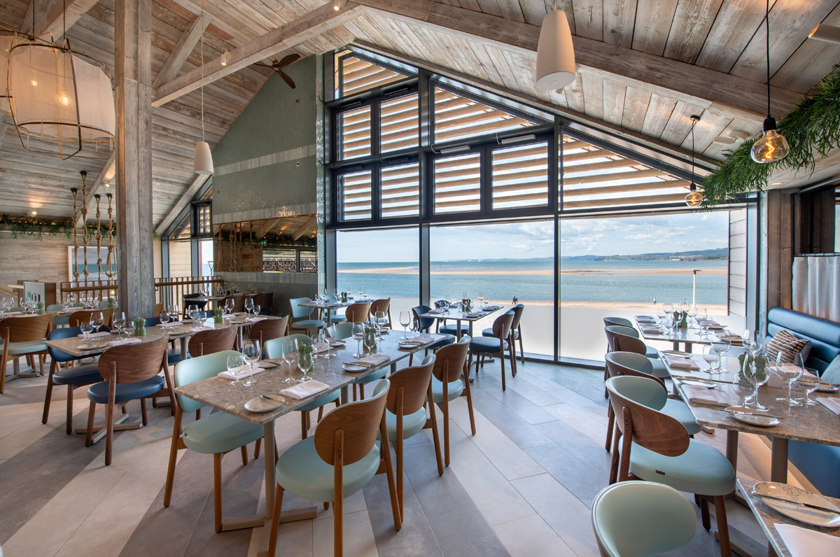
We didn’t follow current trends and mainly focused on reflecting the amazing views and this was the inspiration for all ff&e selections and the colour palette. We think this made this restaurant's interior design unique.
When working on a hospitality project, how do you incorporate the end user’s experience into the overall vision and functionality of the interior?
The Interior has to be both captivating and a comfortable place to dine. Equally important is how it works operationally for staff as they use the space on a daily basis and we want to have an interior that they are proud to showcase.
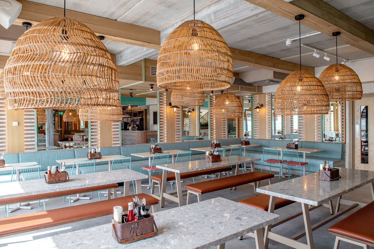
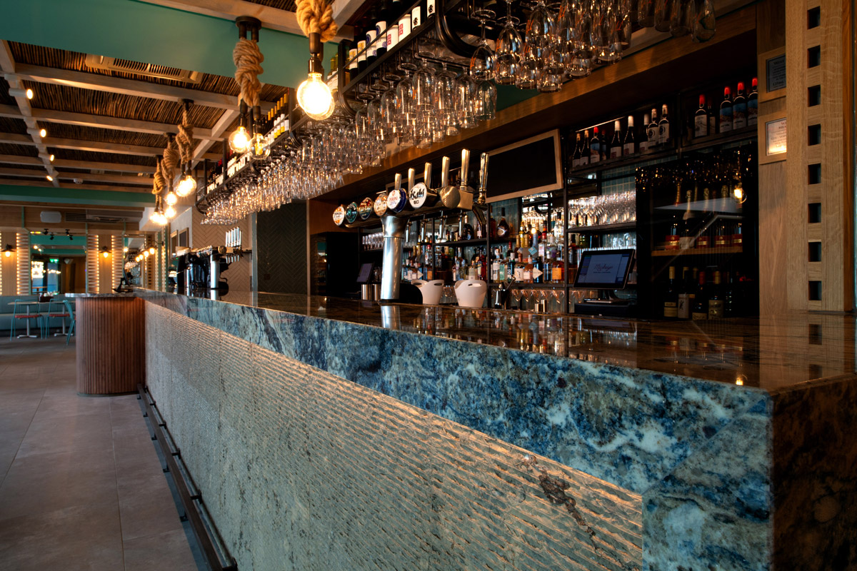
Do you often work with natural or unconventional materials, such as stone, rope, reclaimed timber? What made you choose these materials, and are there any particular considerations when working with them?
We like to work with natural materials on most of our projects as we find they add more contrast and interest overall, whilst also being environmentally friendly.
We wanted to reflect the coast and surroundings as much as possible and chose a range natural materials to express this throughout. When choosing these materials it is important that you apply them to the correct areas within the space.
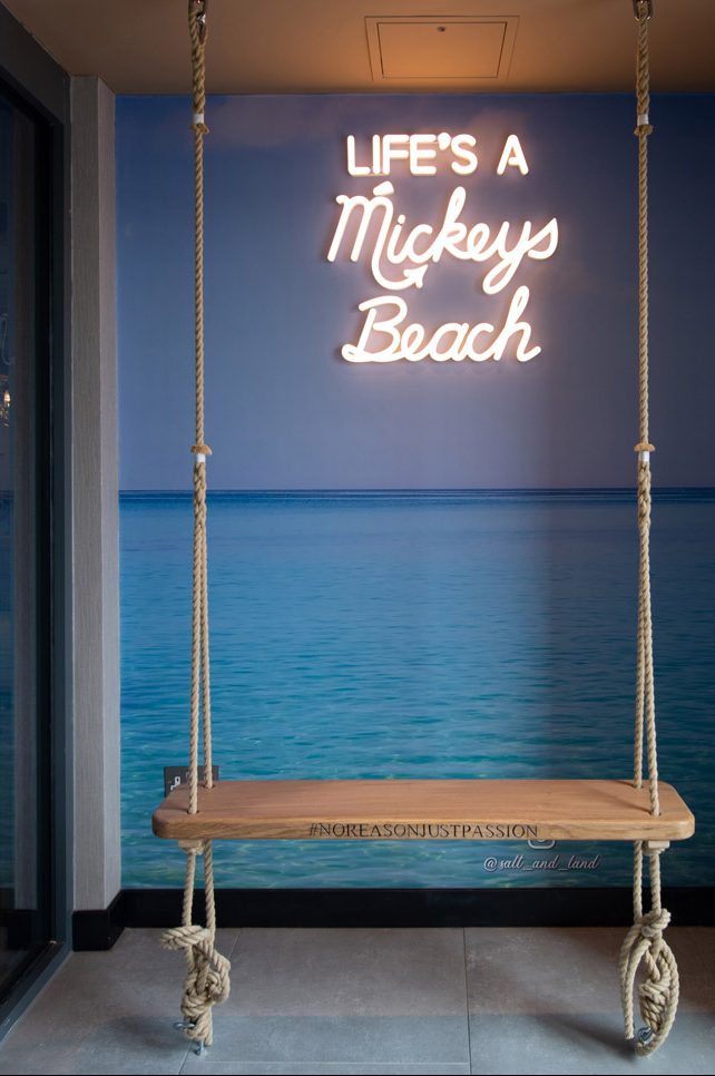
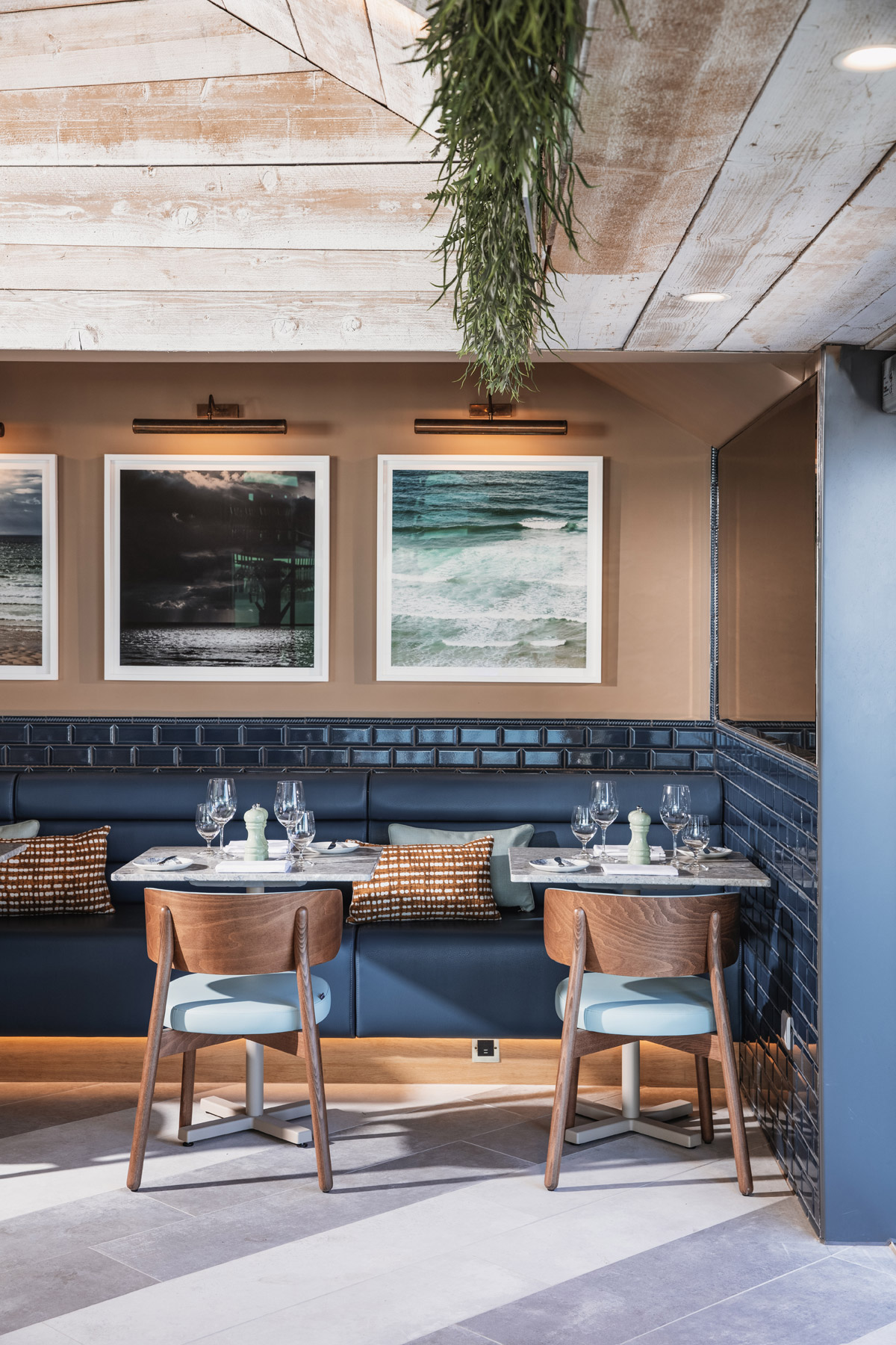
Now that you’ve won an SBID Award, what are the next steps? Is there anything new you are excited to be working on?
It was a big surprise and we are still taking it all in and looking forward to new opportunities in hospitality design for 2022. We are looking forward to working on new restaurant and hotel designs. I began my career in hotel design and am excited to bring that passion full circle.
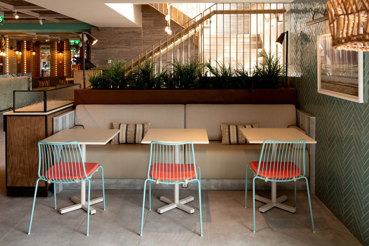
What advice can you give to young designers starting out in the design industry?
Always believe in yourself and no matter how much experience you have never dismiss an idea - it could be the best one for that particular project.
Questions answered by Clare McDonald, Founder & Creative Director, design command.

Design Command is a multi-award winning London & Hertfordshire based Interior Architecture Studio founded in 2013 by Clare McDonald. Clare brought over 13 years expertise in hotel and restaurant interiors to projects across Europe; designing 5 star hotels and over 50 restaurants, as well as student hotels, high-end residential schemes and boutique offices. Design Command has quickly grown to several designers working on hospitality projects throughout the UK and abroad - offering the experience and flair to realise your design ambitions.
This week’s instalment of Project of the Week series features a luxurious and warm bathroom design by 2021 SBID Awards Finalist, Crimson Park Design.
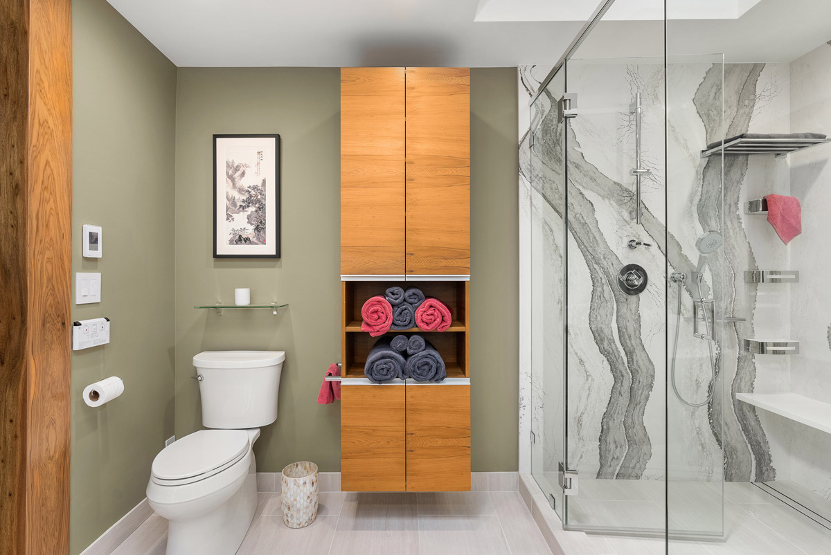
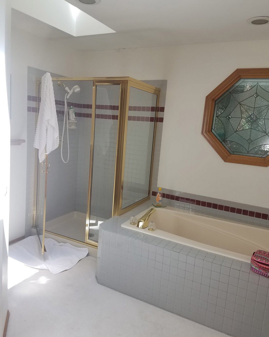
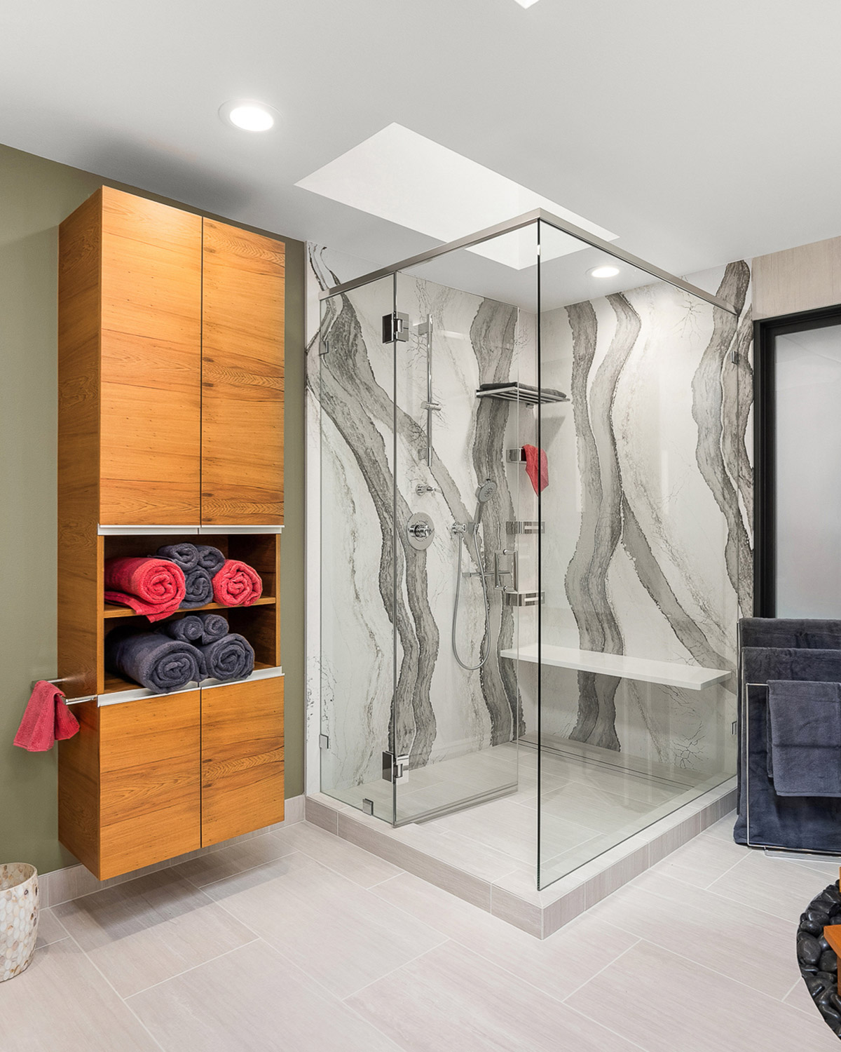
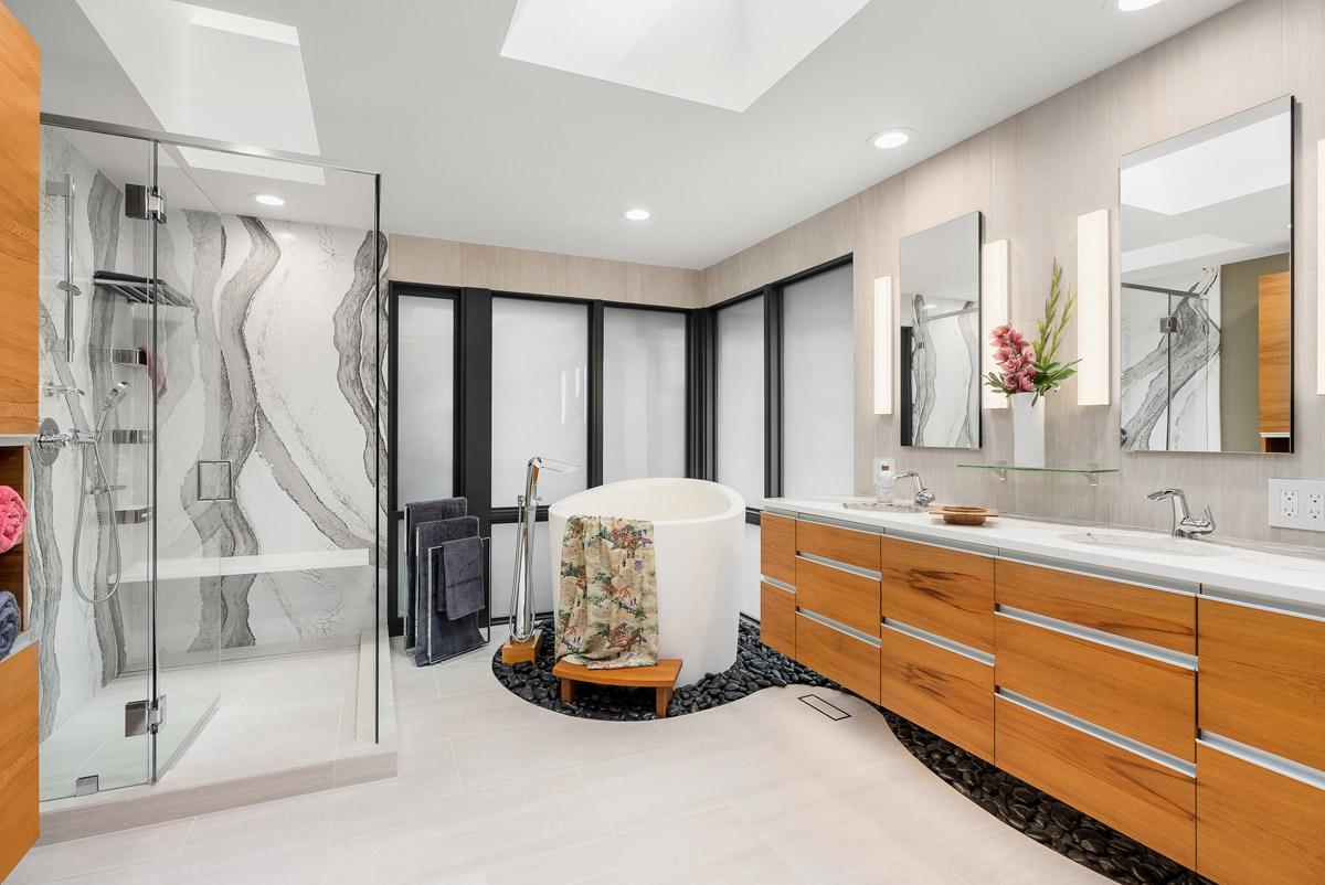
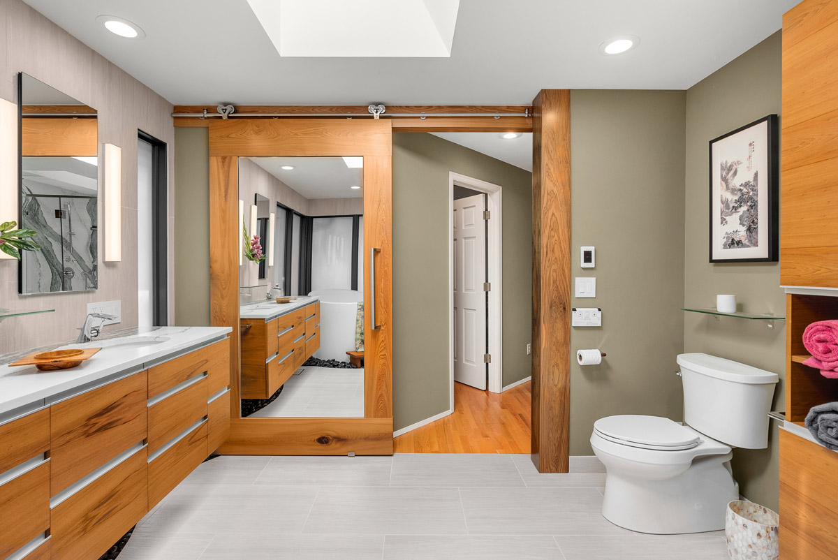
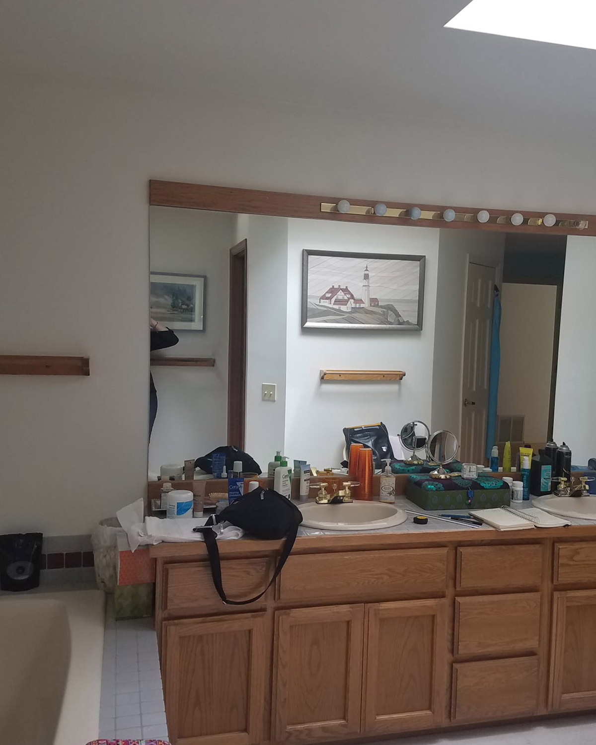
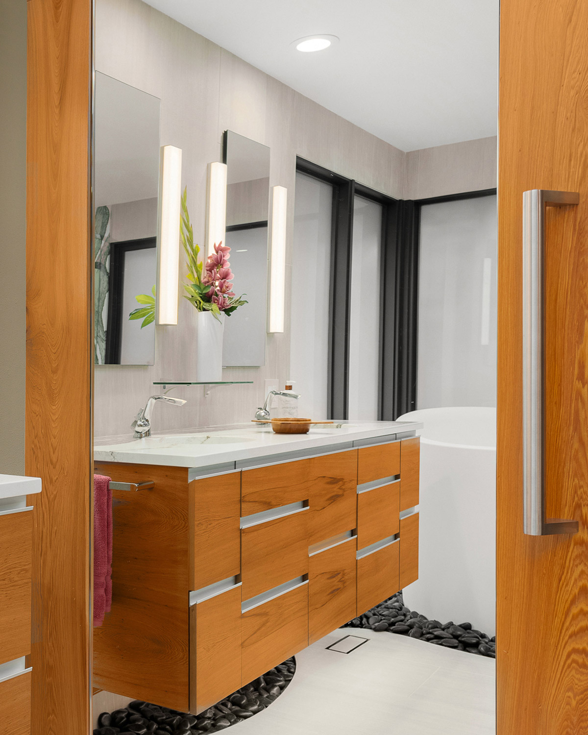
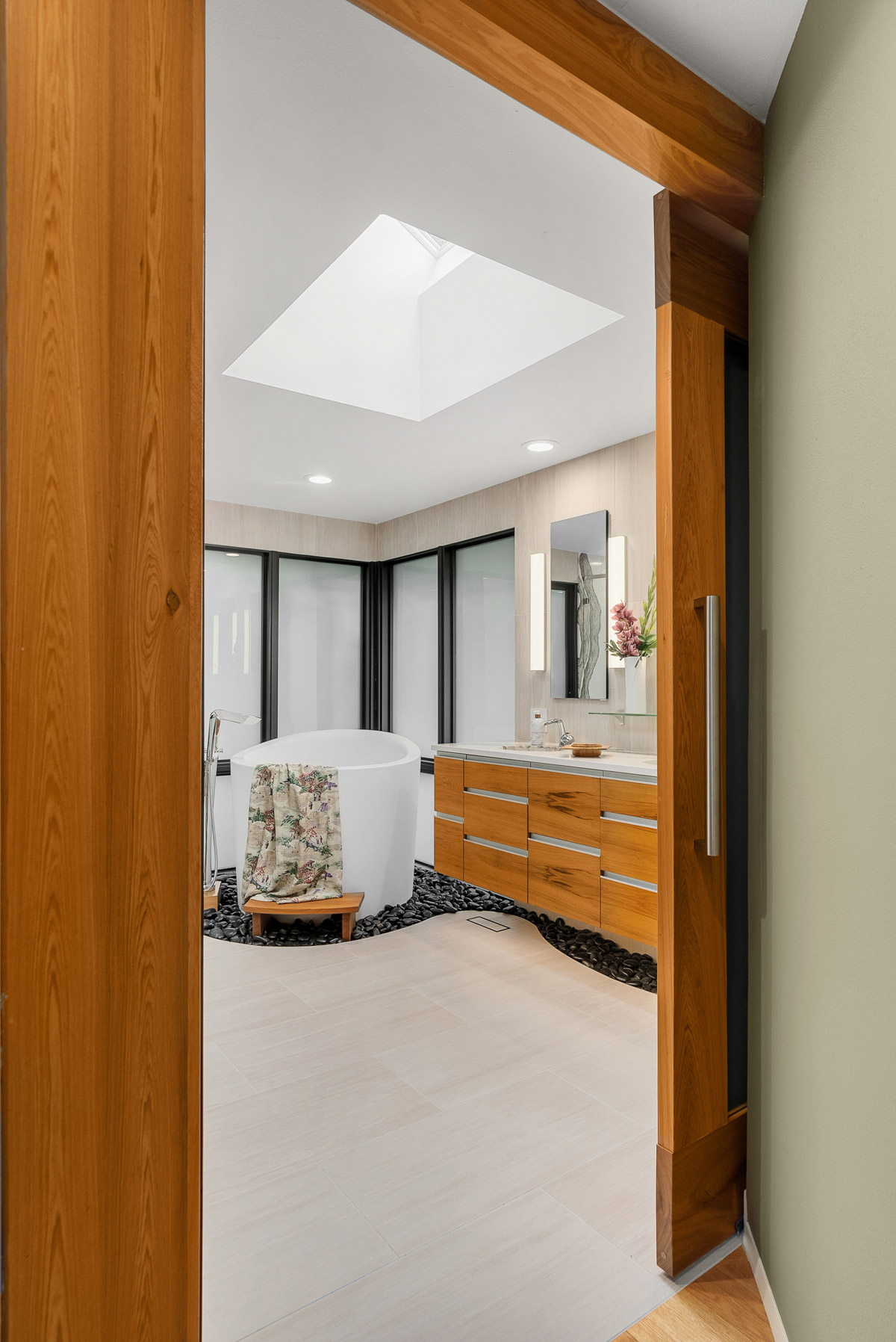
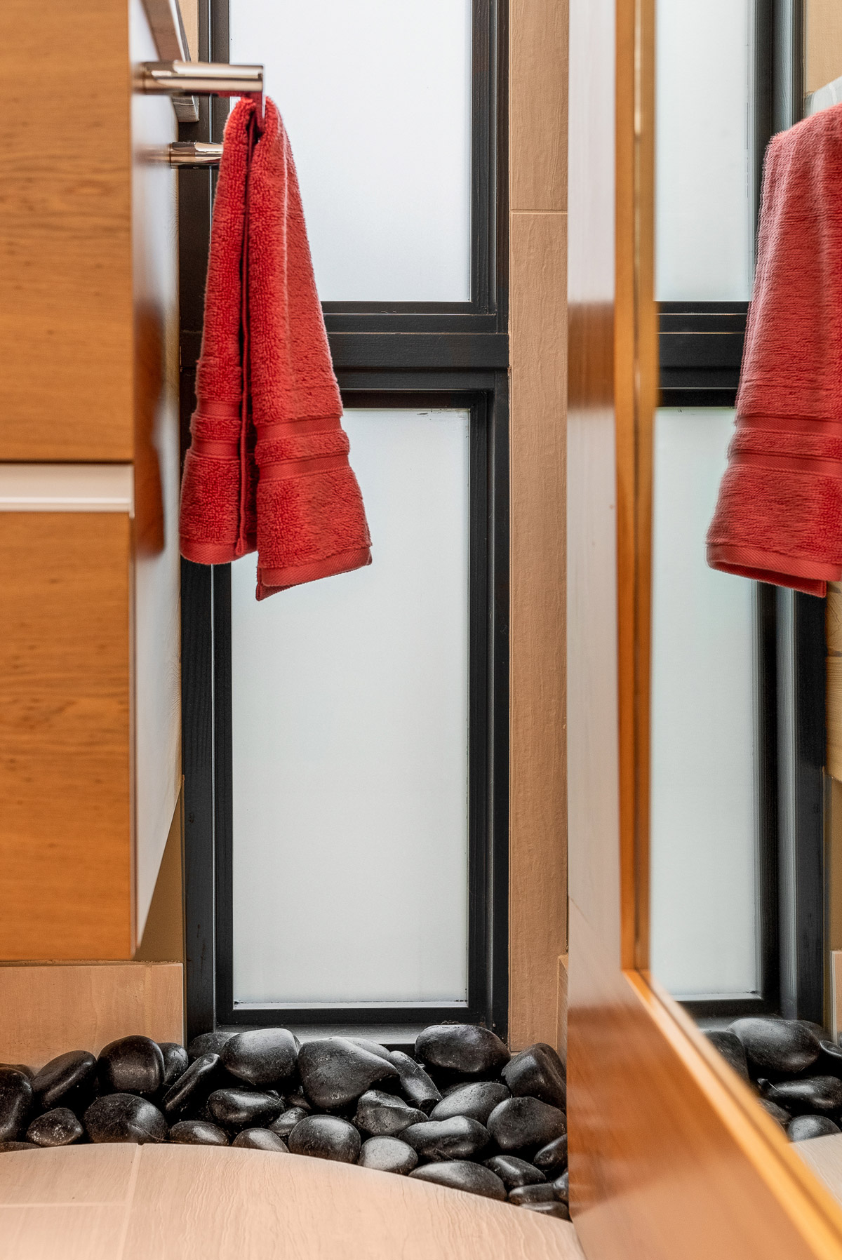
An 80’s-era ensuite bathroom in Bellevue, WA, USA is opened up to solve outdated design and inefficient geometry. Featured are custom Sinker Cypress vanity, linen cabinet, and a 48” wide barn-style door with header and column, also of Sinker Cypress. A white ofuro-style tub, backed by new floor-to-ceiling glazing, sits in a stream of black polished river stones extending along the East wall under the vanity. Full slab, sumi-e-esque quartz lines the shower. Large field, textured Italian porcelain tile runs, offset, from West to East and up the wall behind the vanity. “When I walk into my bathroom I feel like a queen.” – Client, M. Chandler.
SBID Awards Category: KBB
Practice: Crimson Park Design
Project: Chandler Bath Oasis
Location: Washington, United States
What was the client's brief?
- Update bathroom design and create a spa feel
- Clean and bright without being sterile
- Plan for future aging-in-place
- The bathroom has to be warm. Always.
- Sufficient storage - (items to be stored were inventoried to assure sufficient storage)
- Plenty of outlets at vanity
- No handles or hardware to bump into, or catch on clothing
- A bench large enough to sit on and to hold clothes
What inspired the design of the project?
I wanted to create a space that would allow my client to feel that her bathroom is a place of refuge; a place where she can begin and end her day at an arm’s length from the stress of life; a place to feel refreshed. I was fortunate enough to be given the creative freedom to incorporate some of my artistic sensibility into the design. After having As-Builts created, I began to sketch conceptual shapes in plan view, with the goal of keeping the main plumbing sites relatively intact. I like to work with organic shapes, and Mary gave me a bit of a free hand in coming up with design elements. In my art I tend to use circles, spirals, and other curving lines. I let instinct guide my pencil to create lines that would soften the space and hard angles that draw the eye around the room. I, then, scaled the concept back to reality and budget, keeping one curving line for the black river rock stream. The tile was cut to my hand drawn line that had been translated to a template by the CAD tech.
What was the toughest hurdle your team overcame during the project?
The most challenging part of the project was tackling the angle of the bedroom-to-bath transition hallway relative to the opening of the bathroom, in order to enclose the space, reducing the draft. I designed the Sinker Cypress header and column to properly catch the bespoke sliding door. It took a couple of iterations but I’m pleased with the result, which is a monolithic, yet in-scale, practical and user-friendly design element, warming the space both literally and aesthetically.
What was your team’s highlight of the project?
The highlights of any project for me are the joy of problem solving and collaboration with the client, craftsmen, and contractors through the design and build process; seeing all of the components come together as I envisioned; and delighting my client. A happy client is the best reward.
Why did you enter this project into the SBID Awards?
When the Chandler Bath Oasis was complete, I felt that something special had been created. I wanted to put it out into the world to gauge the response. I aimed high when entering the SBID Awards; it is clear that the SBID recognizes design excellence. I appreciate the thoughtfulness I sense from the organization, and the sense of community that the SBID works to create. Crimson Park Design is incredibly honoured to be recognized as a finalist by the SBID, validating my instinct about the strength of my design, and the work of my partners.
Questions answered by Shelli Park, Principal, Crimson Park Design.
Canadian luxury handmade furniture and lighting brand Gabriel Scott has launched the LUNA KALEIDO collection, the second chapter in the brand’s best-selling Luna lighting range.
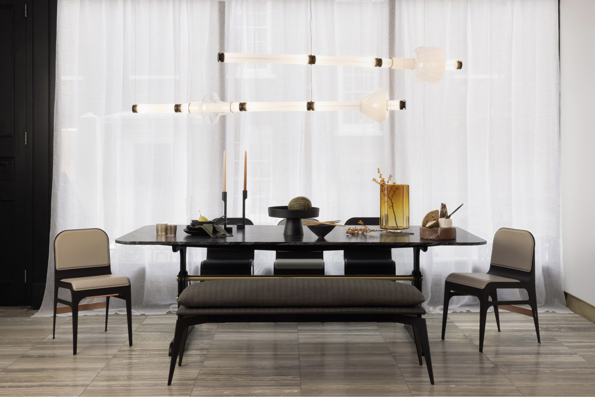
The customisable modular series includes two stackable glass lighting fixtures: a horizontal chandelier and a vertical pendant. The mouth-blown glass beads can be ‘strung’ together in any order to create a bespoke glowing piece of jewellery for residential, hospitality and commercial projects.
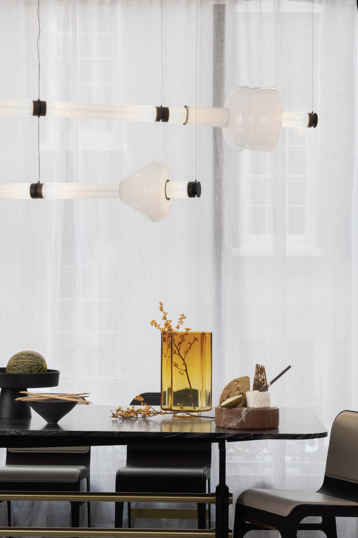
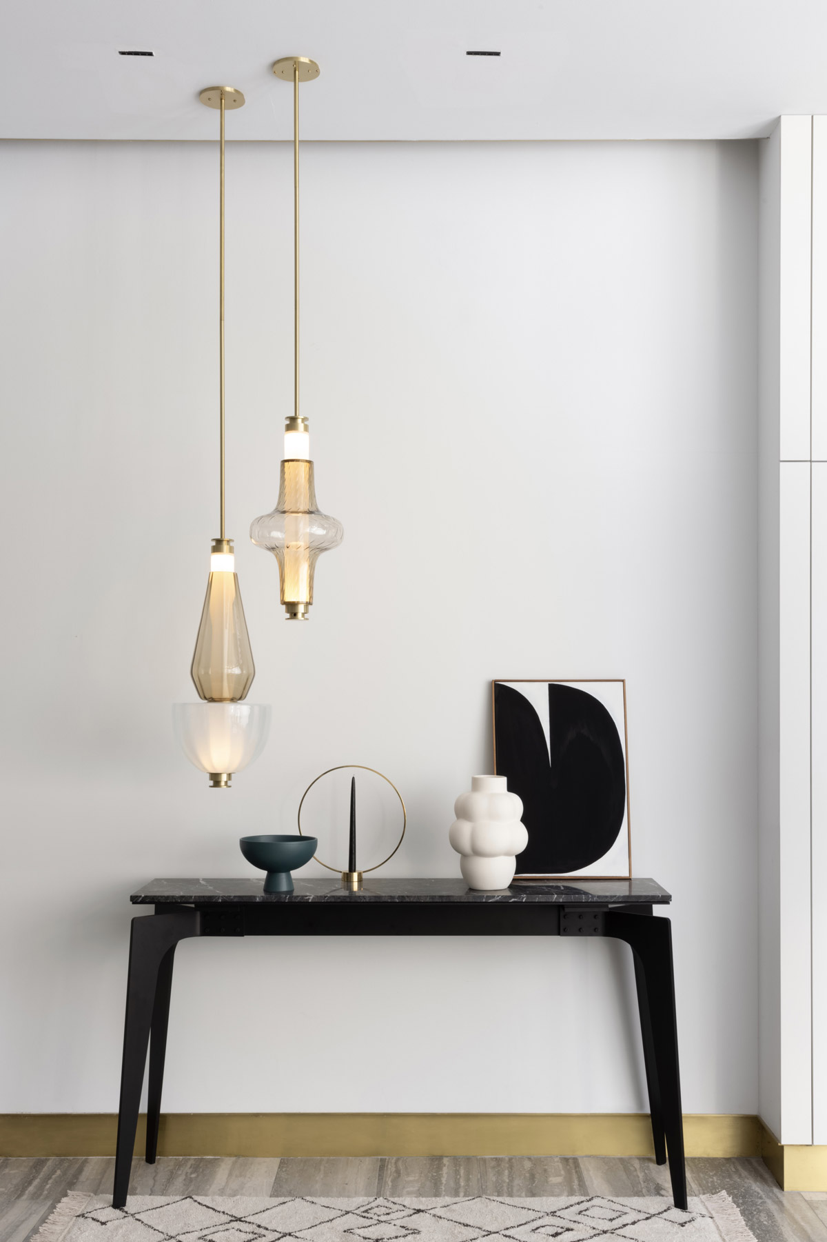
The lights are available in seven new shapes, all named after constellations (Dorado, Lyra, Aras, Cygnus, Orion and Carina). The collection is inspired by a kaleidoscope, which comes from the Greek words for kalos (beautiful), eidos (form), and skopeo (to look at). Like a kaleidoscope, the glass shapes have been designed to offer infinite interpretations of tone, shape and refracted light. When stacked, the lights become a glass mosaic with varying tones and patterns. Each colour and texture distorts light in a different way. When looking through the glass, the distortion creates magical optical illusions. Soft iridescent colours, including pinks, blues and greens, are fused with clear glass to create a sophisticated colour spectrum. The lights are available with six different surface textures including Smooth, Gridded, Regadines, Bubbles, Lines and Dots.
Founder and Creative Director Scott Richler comments, “We are delighted to be extending our existing LUNA series, which was launched in 2019 and is already popular with architects and interior designers alike. We work very closely with our makers at our Montreal production studio to ensure that each mouth-blown pendant and chandelier is made to the highest standards. Each piece will add a sense of enchantment to any interior design scheme.”
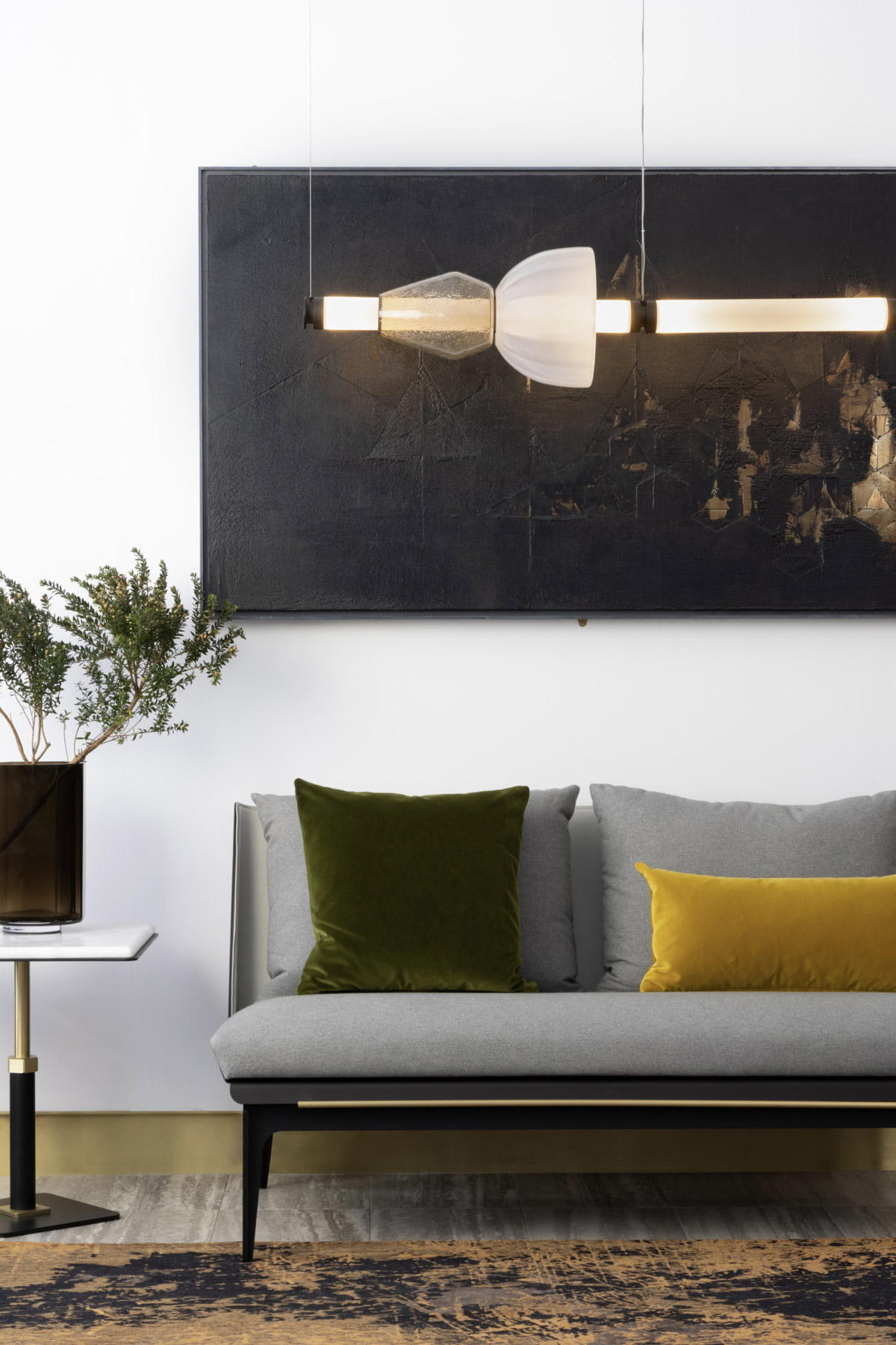
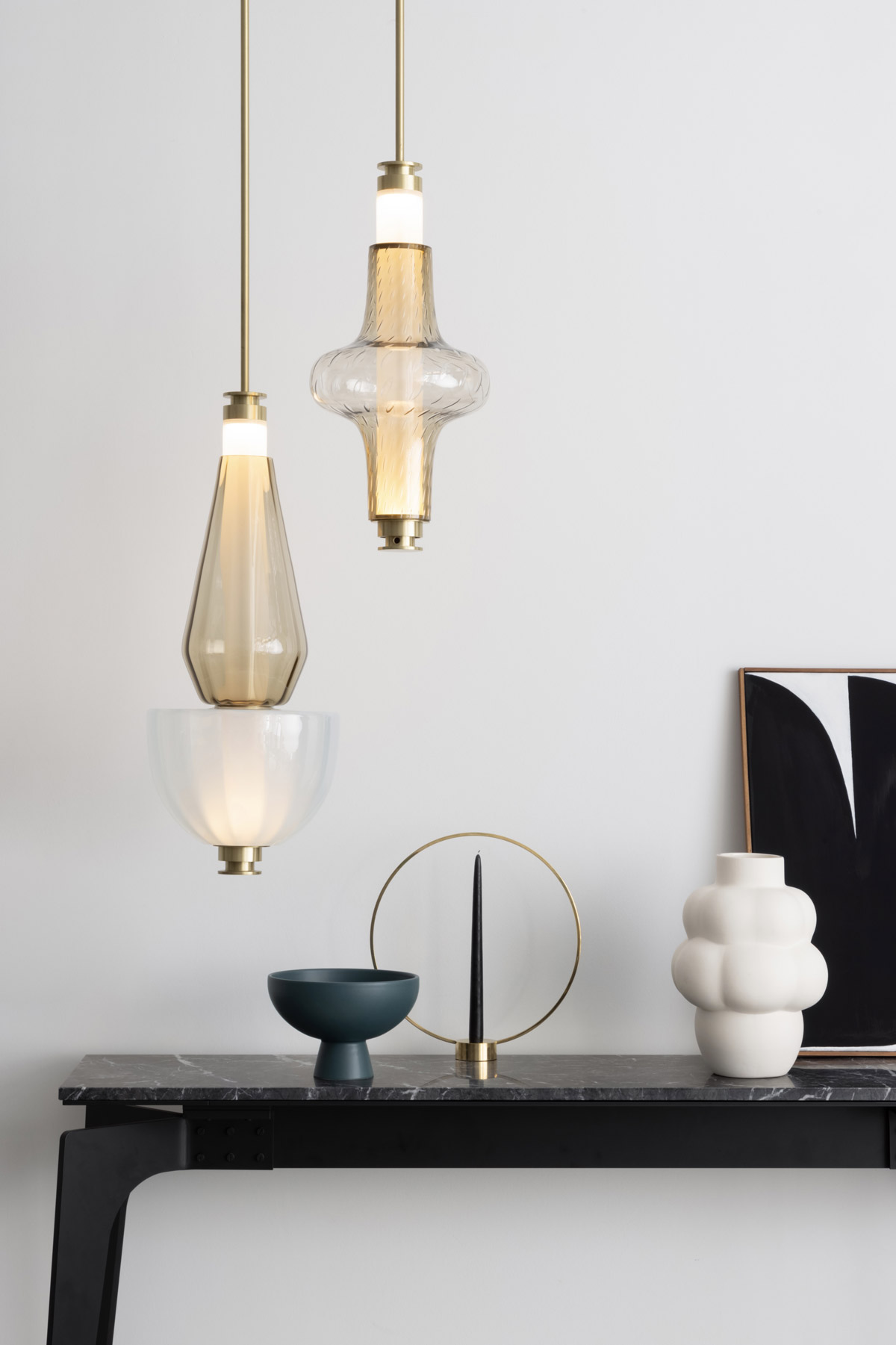
The LUNA series is inspired by a lunar halo and is a glamourous reference to the moon’s diffused light and soft glow. The LUNA series is currently available in satin brass, satin nickel, satin copper, satin bronze and black steel. Existing glass options include blue, California pink, yellow, smoked amethyst, smoked bronze and smoked grey.
The KALEIDO collection is available to purchase online and at Gabriel Scott’s New York and London showrooms.
About Gabriel Scott
Gabriel Scott was founded in Montreal, Canada, in 2012. Scott Richler was working as an architect and was often tasked with specifying high-end custom furniture for clients. He realised there was a market for bespoke, contemporary and customisable furniture and lighting fixtures crafted using a holistic approach that would be specifically aimed at designers and architects who need control over every detail of a building’s design.
If you’d like to feature your product news here, get in touch to find out more.
If you’d like to become SBID Accredited, click here for more information.
Silvio Denz, Chairman and CEO of Lalique SA: "Our collaboration with Zaha Hadid began a little more than two years ago with the creation of the Visio and Manifesto vases, two outstanding works of art which marked the inception of the Crystal Architecture collection. This collection was born of a passion for beauty, a quest for excellence, and the will to combine the expertise of our master-glassmakers with the creativity and rare talent of an architect and designer of world renown.
Today we are proud to present the latest addition to the collection: the Fontana bowl, a superb piece with the fluid and mineral lines, the sense of constant movement, that are so expressive of the style of Zaha Hadid and enhanced by the contrasting satin and polished finishes characteristic of Lalique. The thought of Zaha Hadid designing this project is a particularly moving one for me, and I would like to pay homage to her memory.
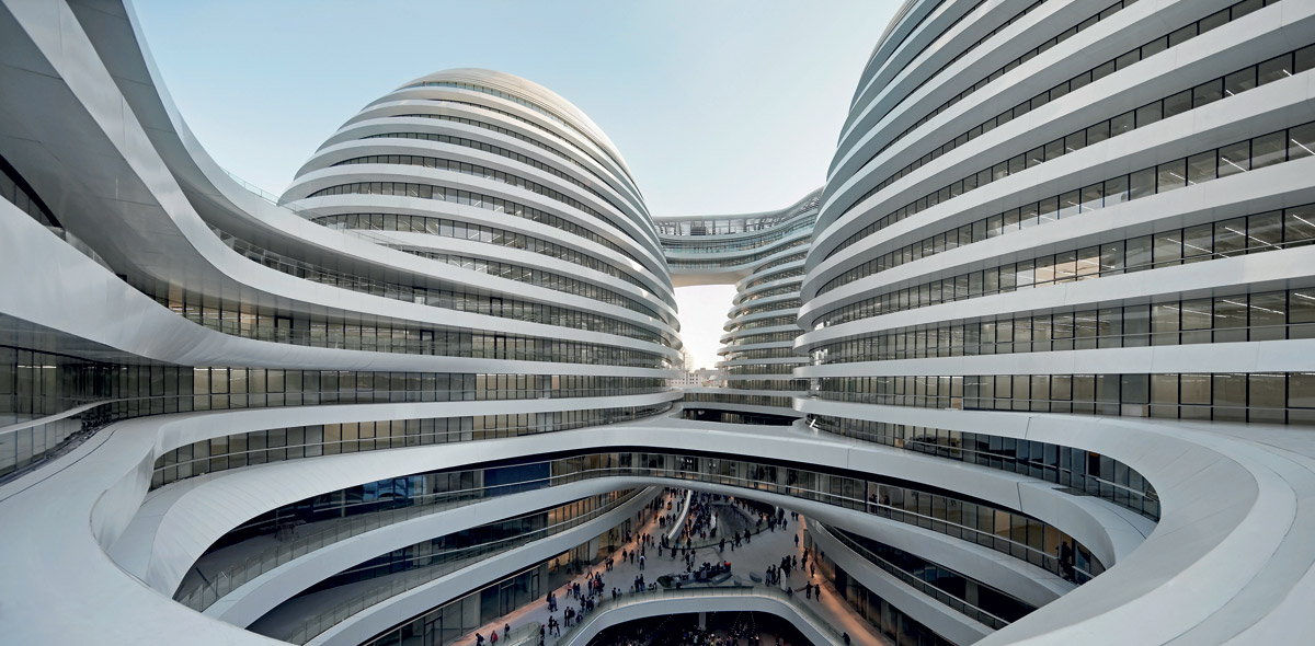
She was a pioneering figure in the world of architecture, the first woman to win the Pritzker Architecture Prize. The death of Dame Zaha Hadid on 31 March 2016 was a cause of immense sadness. Regarded as one of the great architects of her day, she created works that shaped and transformed spaces and landscapes the world over. Zaha Hadid and her architectural heritage will continue to inspire generations to come. Lalique is truly honoured to have had the opportunity to work with this outstanding artist."
FONTANA - the mineral bowl
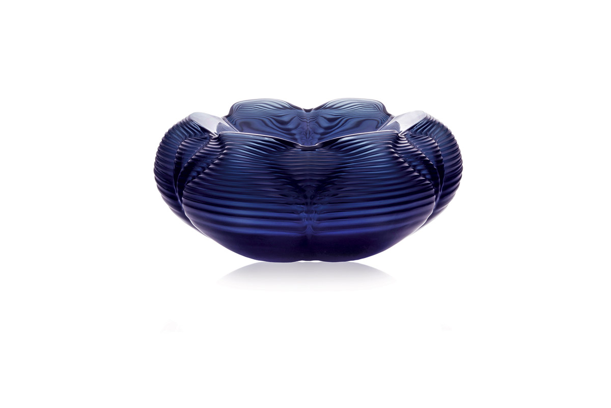
Fontana expresses the powerful dynamism of water. Informed by the continuity and rhythms of waves in motion, delicate undulations envelop the surface. The design’s formal composition conveys a purposeful solidity, whilst the vase’s materiality embeds lightness and refraction within the complexity of a fluid dynamic. Fontana translates the intrinsic beauty of natural systems by continuing a narrative defined by their unrivalled logic and coherence.
The FONTANA bowl is presented in plain crystal, black and midnight blue. All these pieces are available numbered and signed and accompanied by a certificate of authenticity.
VISIO & MANIFESTO vases
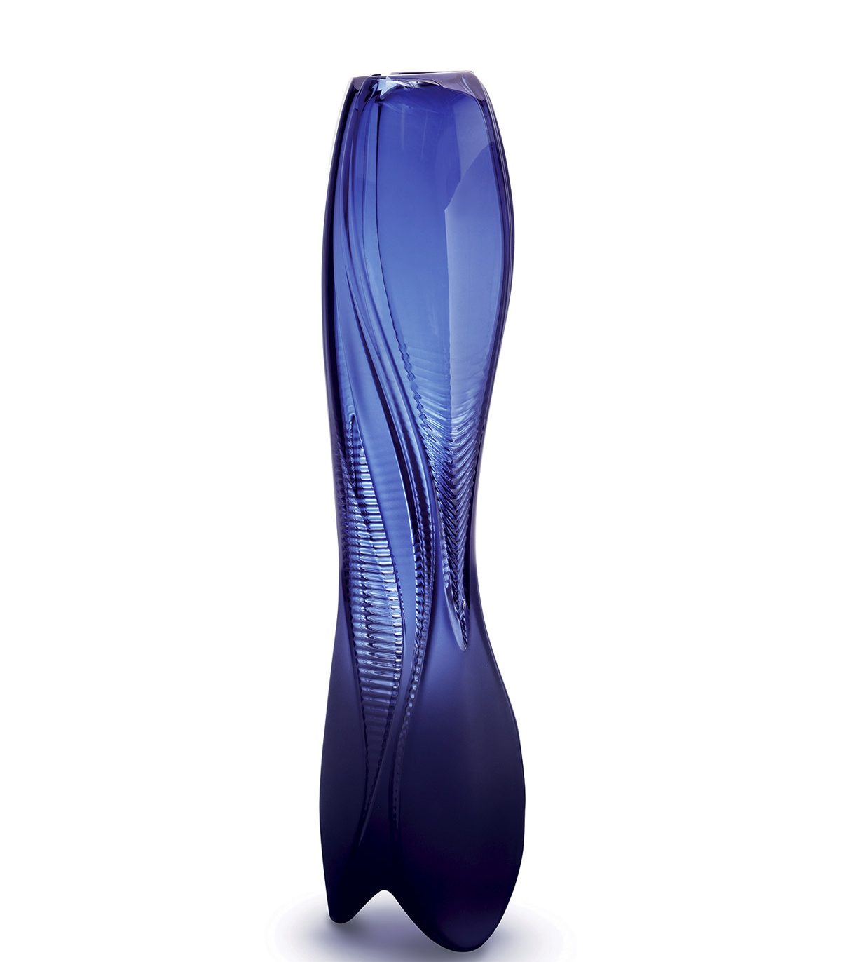
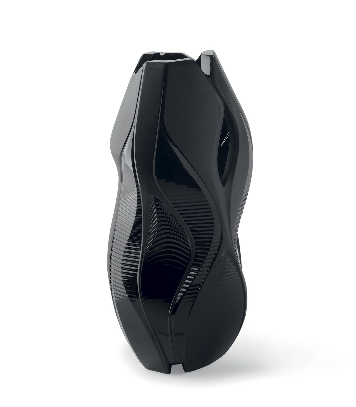
A sensory and tactile experience through sensual curves, the particular velvety touch of a satin finish, and a design both contemporary and timeless. This Midnight Blue colour was close to the heart of Zaha Hadid. It suffuses the Visio and Manifesto vases, which complete the Crystal Architecture by Zaha Hadid collection.
About Lalique
Lalique is a French glassmaker, founded by renowned glassmaker and jeweller René Lalique in 1888. Lalique is best known for producing glass art, including perfume bottles, vases, and hood ornaments during the early twentieth century.
If you’d like to feature your product news here, get in touch to find out more.
If you’d like to become SBID Accredited, click here for more information.
In this week's interview with 2021 SBID Awards winners for the Fit Out Contractor of the Year – Residential category, ALTER EGO, the designers discuss creating interiors that perfectly align with the clients' desires and blending the architectural style of the residence into its interior design.
SBID Awards Category: Fit Out Contractor of the Year – Residential
Practice: Alter Ego Project Group
Entry: Oiseau Bleu
How important is it to enter the SBID Awards & receive industry recognition for your work? What are the benefits?
We are absolutely delighted and honoured to become a winner of the SBID Awards in the Fit Out Contractor of the Year - Residential category. Receiving recognition from one of the most prestigious and renowned awards in the global design industry brings not only status and global promotion but also inspiration for new incredible projects and hopefully the future victories.
What do you think made this particular design an award winner?
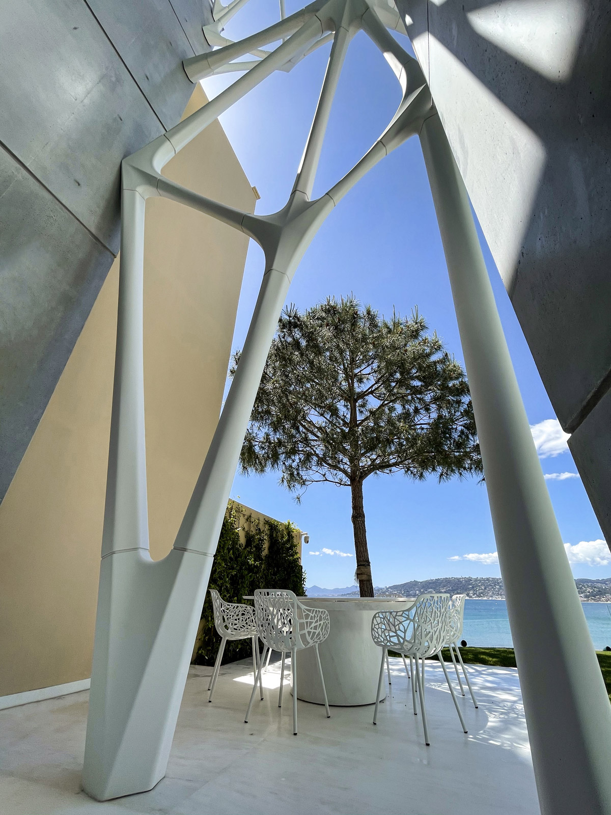
This project on the Cote d'Azur is an example of successful synergy when the wishes of the Client and their willingness for innovative ideas coincided with our creativity and experience in the realization of unique and complex turnkey projects.
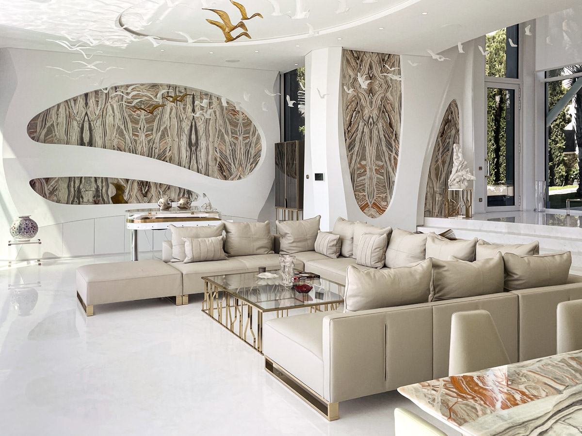
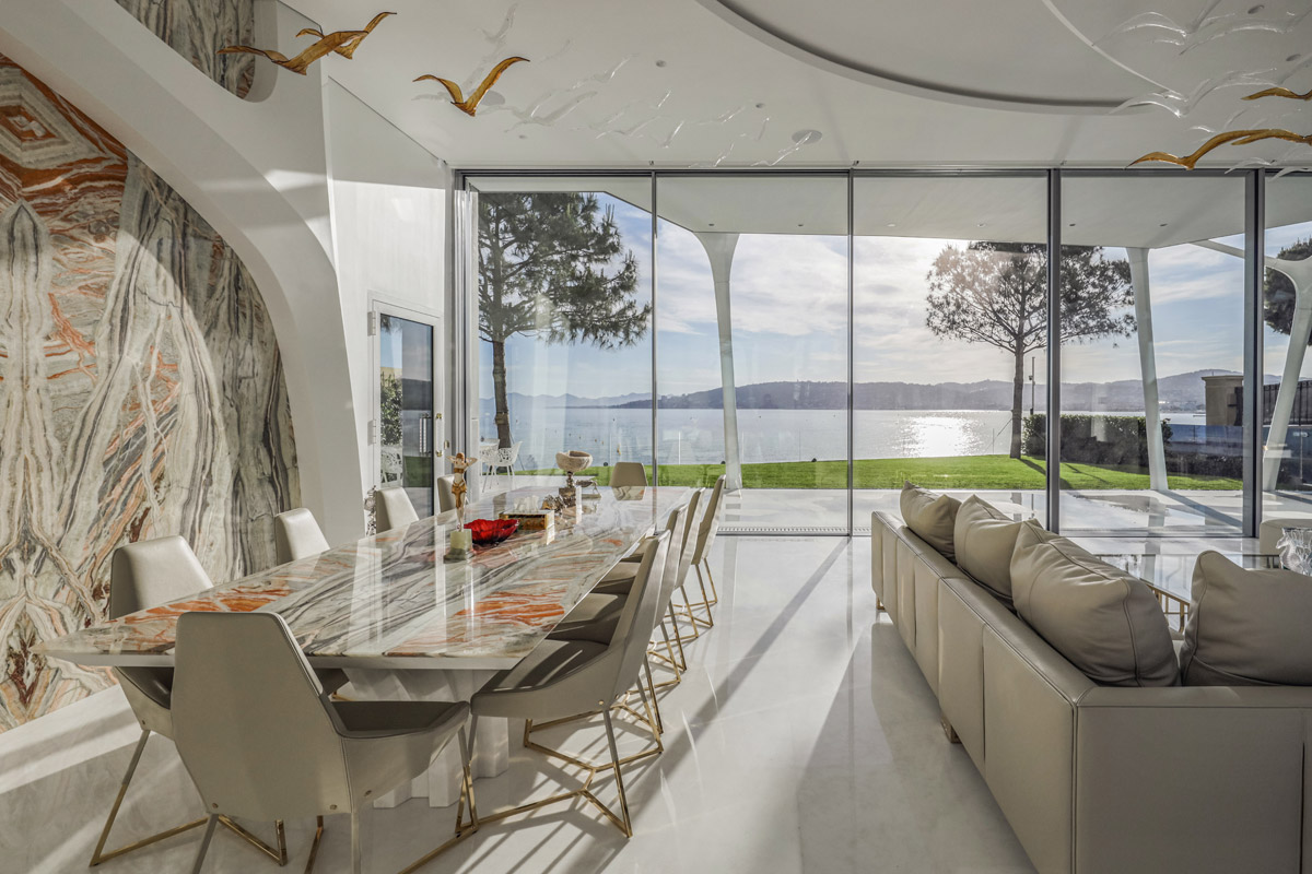
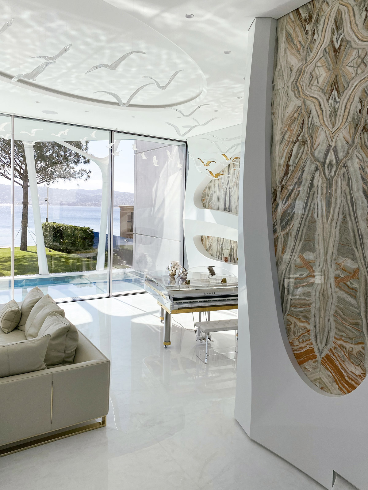
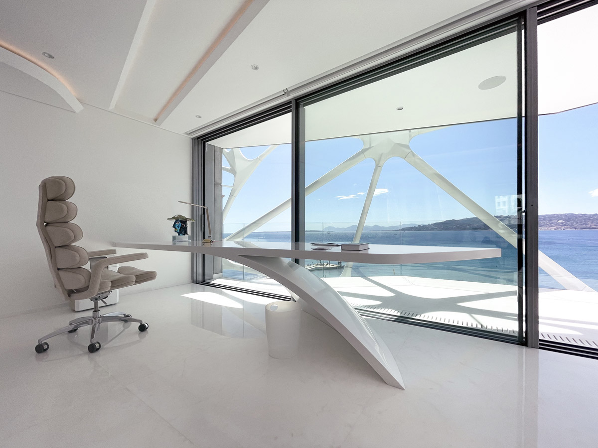
One of the customer's key desires was a house exposed to nature so in this coastline villa we implemented the concept of a space with blurred boundaries, open to light and air. The seascape of the French Riviera inspired our team and became the main visual component of the interior. From certain angles it seems transparent. Each room faces picturesque views from panoramic windows.
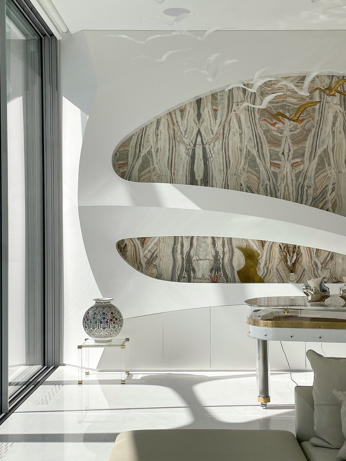
A high point and best illustration of the concept is a sophisticated light composition - a flock of glass birds "hovering" in the central room of the villa. These bespoke pendants of different shapes and sizes were created according to our designer’s sketches by outstanding glass artisans. The functional content of the house and all storage systems are designed to create a feeling of completely unfurnished space, where nothing distracts from the purity of lines and the beauty of proportions.
The exterior of the residence is an architectural statement in itself. How far did this inspire the design of the interior?
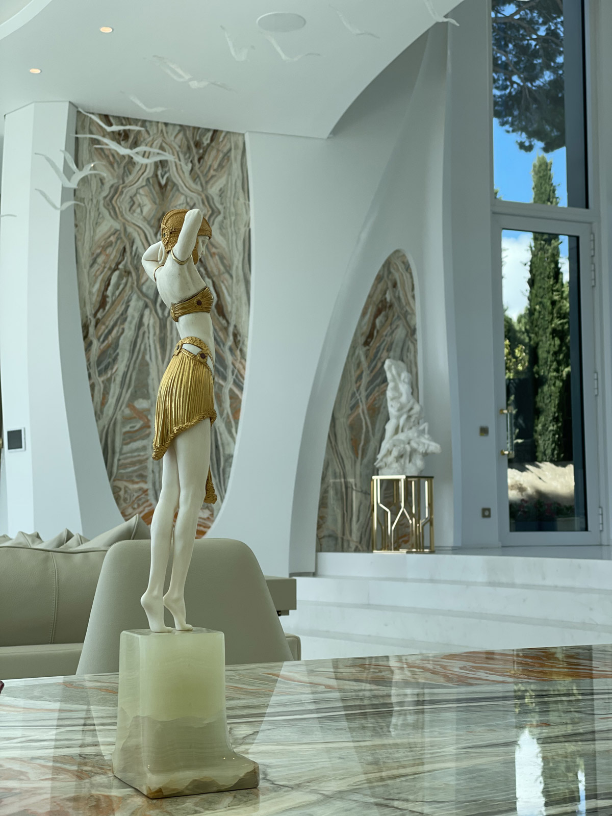
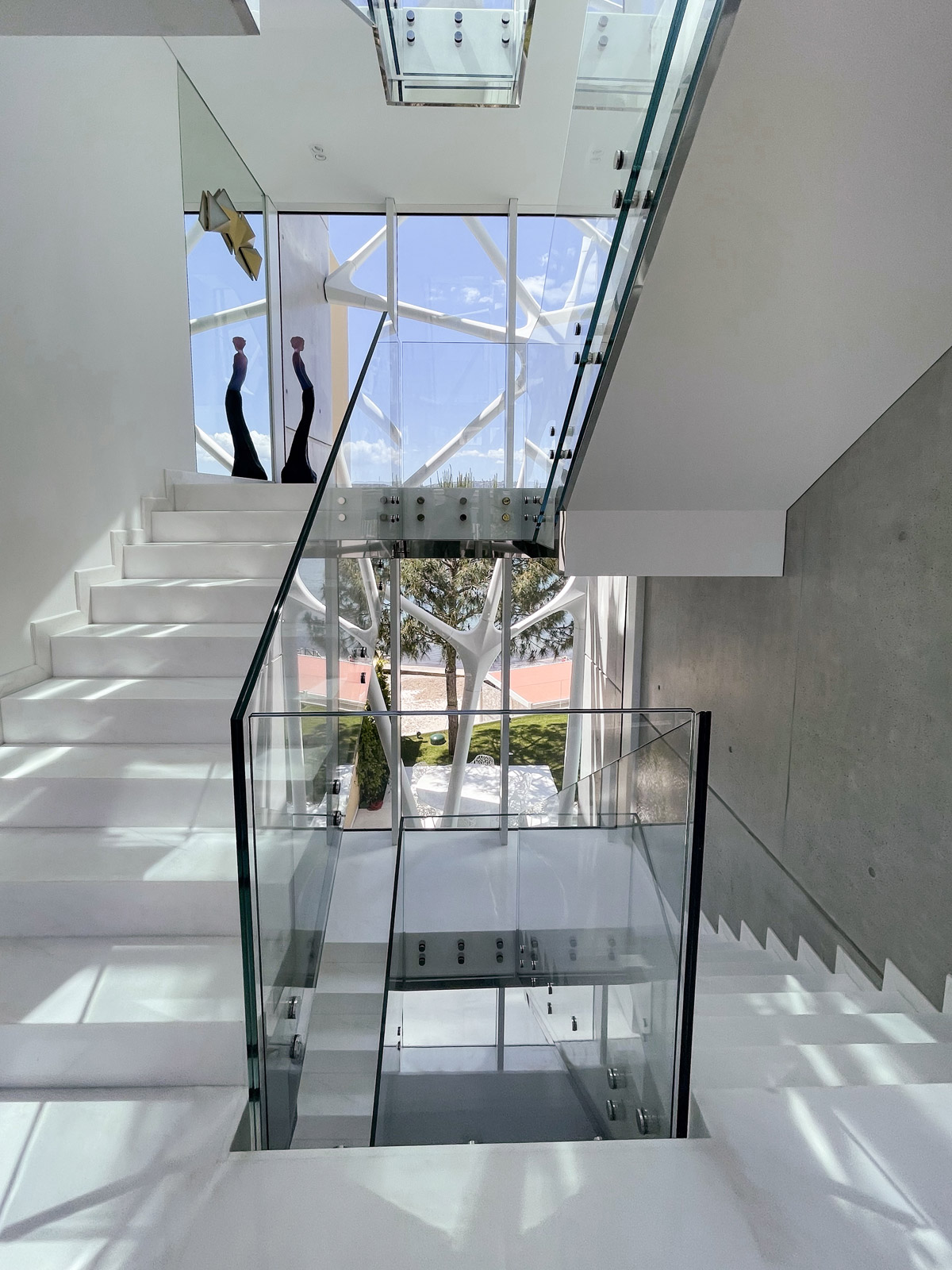
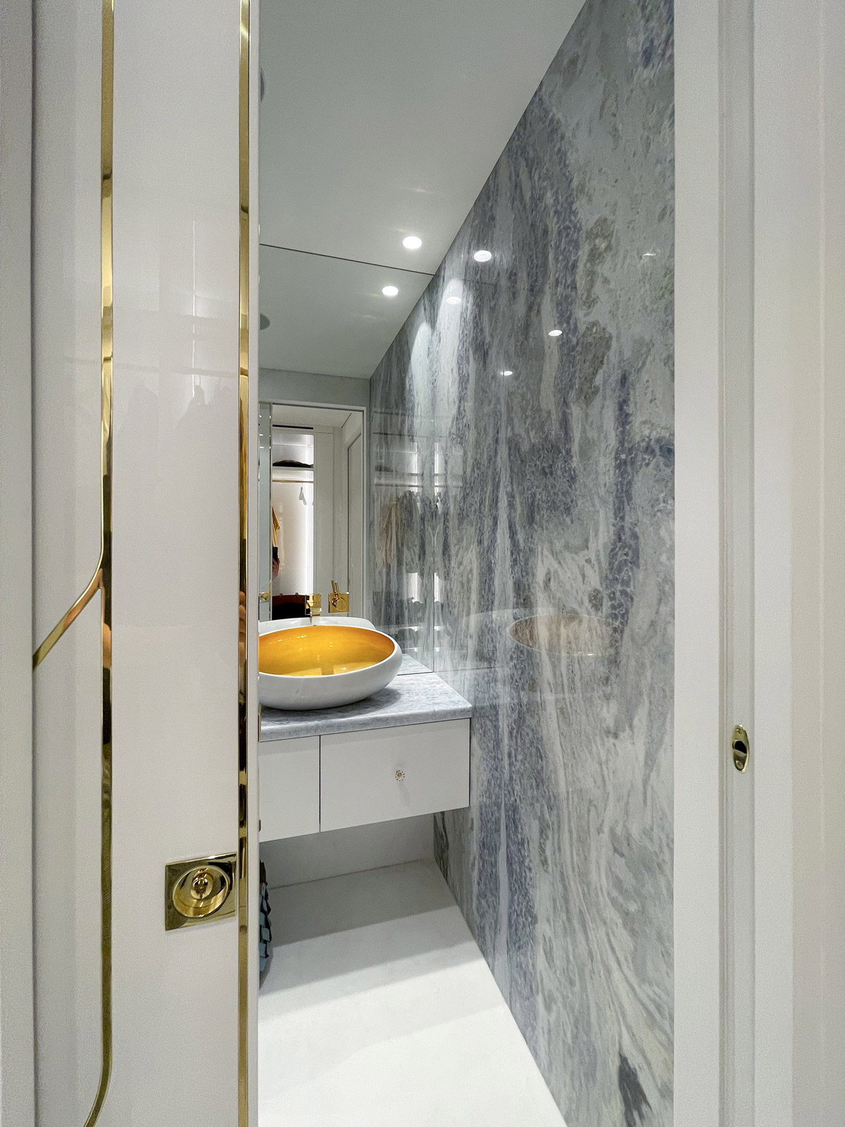
A good interior is always a consequence of high-quality architecture. The villa blends perfectly with the surrounding landscape and the design solutions correspond to the context of the place. Bionic forms present in façade design, inside the house turn into large-scale arches, the curved wall panels set up a unique plasticity of the space and create a feeling of perfectly smooth surface. The decorative effect is enhanced by Onyx Rainbow inlay of extraordinary colours and patterns, perceived as stunning pictures created by the nature itself. A mesmerizing Calcite Blue picked up as the main bathroom finishing material captivates the observer with the charm of its sugary tones that, on one hand, suggest the perception of ethereal beauty and, on the other, symbolise freshness and clarity. White colour, prevailing in the interiors, acts as a joint background, emphasizing the continuity of spaces.
When taking on a turnkey project, what is your approach to establishing a successful design scheme that achieves the client's vision/brief?
Our first responsibility and aim are to hear and understand the client properly. We do our best to ensure that our architectural or interior design concepts hit the customer’s wishes on the first try. This is a very ambitious goal, but there is no other way to start working on a complex, unique project.
Accurately hitting the client's wishes on the first try means that an invisible connection has been found, a person has been heard and understood, and understood not only at the conceptual level, but at the level of further interaction - we already know which project timeline to build, which team will be most effective in working on this project, which contractors will be able to meet the client's expectations, and much more.
How to achieve such an understanding from the first minutes? It is probably easier to answer how to be a human…
But there are simple ingredients: experience, good education, wide vision, and most importantly – passion for what you do.
Now that you’ve won an SBID Award, what are the next steps? Is there anything new you are excited to be working on?
Among new directions for the company’s development, we could highlight the sphere of hospitality. Our deep knowledge and many years of experience in private premium sector are highly demanded by hotel developers, allowing them to embody the principles of unique comfort and exclusivity in commercial hospitality projects.
Due to the change of travel conditions, that we are witnessing now, people’s requirements for a hotel are also changing, as they often have to spend more time there. So, new boutique hotels more often make use of the experience of bespoke residential construction, creating the most comfortable and thoughtful living conditions for their guests. And we are very pleased and excited to cooperate with developers in this industry.
What advice can you give to young designers starting out in the design industry?
Starting work with a potential Customer it is important to place the person in the centre stage, to hear and understand them. Therefore, in order to more accurately determine their concerns, interests, hobbies, favourite places and preferences, designers should listen to the Client more than talk about themselves.
Do not focus only on your ideas and sources of inspiration, always put the interests and wishes of the client first, and do not forget that the ideal interior is always created exactly for a specific customer and takes into account the smallest details, like a tailored suit, made exactly to measure.
Questions answered by Julia D. Lantieri, Founder and CEO and Vyacheslav Labzin, Architect and Creative Desirctor, ALTER EGO Project Group.
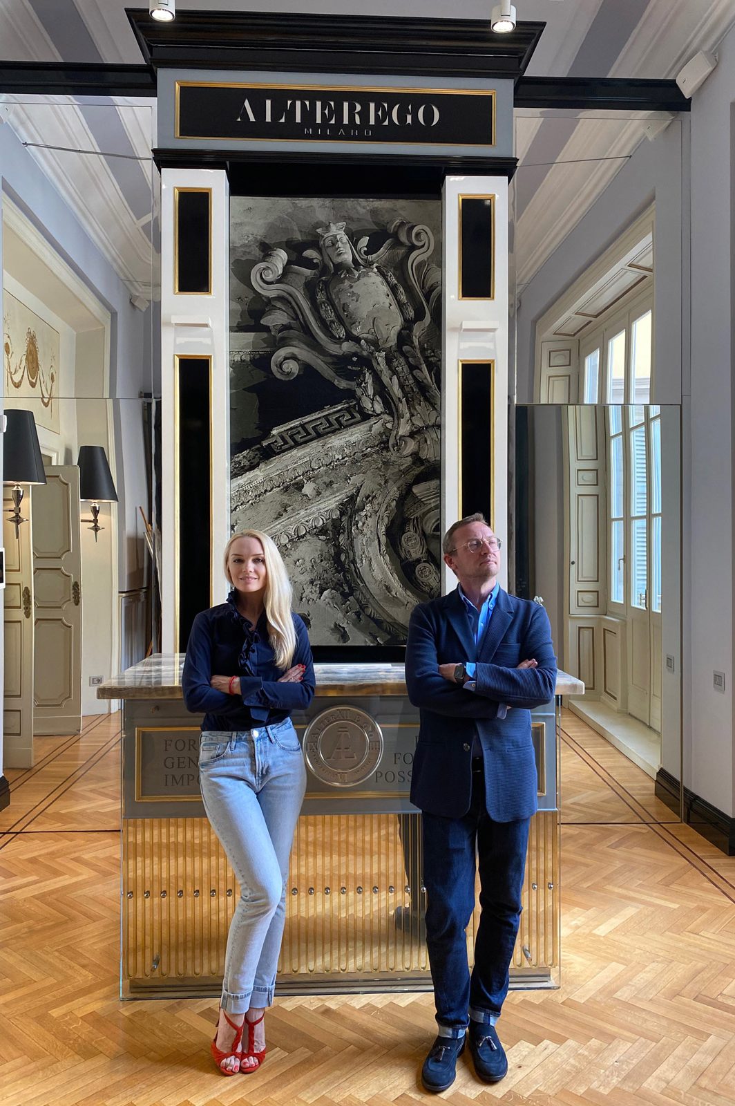
Julia's managerial talent and degrees in political science, economics, architecture and design, as well as an MBA, made it possible to turn a team of the best professionals into a global company, implementing projects in all corners of the world and gaining recognition from the professional community.
Vyacheslav graduated from MARKHI (Moscow Academy of Architecture) in 1996. Since 2007, he has been Chief Architect and Head of ALTER EGO Project Group creative department. A winner of prestigious awards, architect with extensive experience, author of over 500 spaces, member of the Union of Architects, photographer and graphic artist - Vyacheslav realised his talents and creative ideas in large-scale, high-status projects around the world.
This week’s instalment of Project of the Week series features a light luxurious show home design by 2021 SBID Awards Finalist, Elicyon.
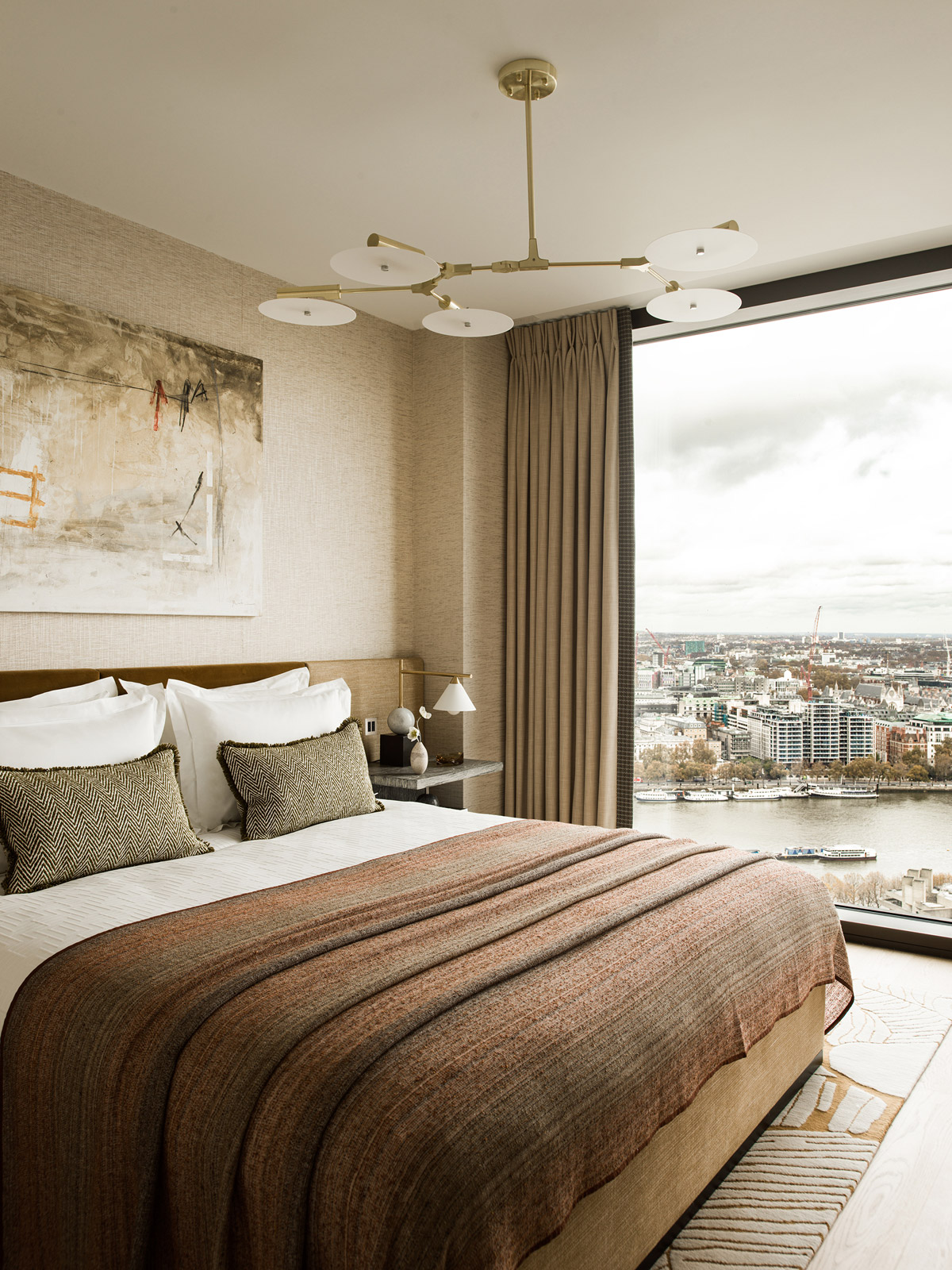
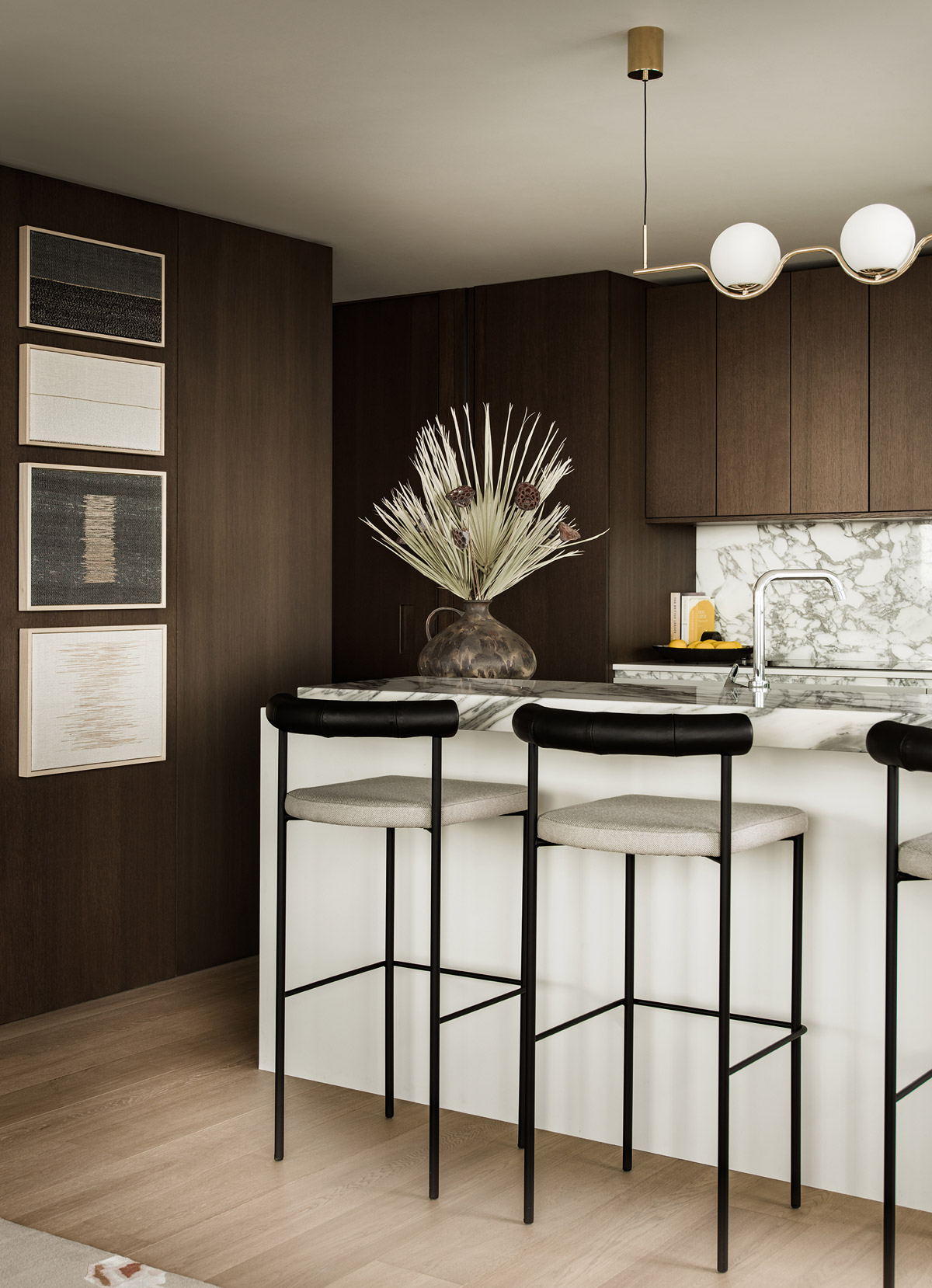
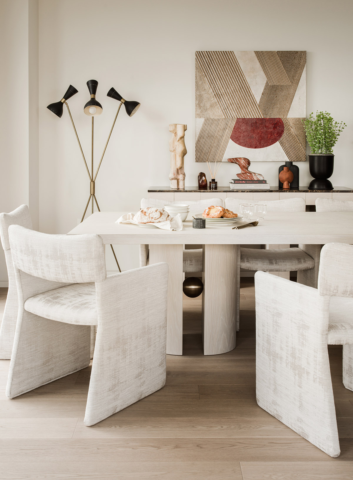
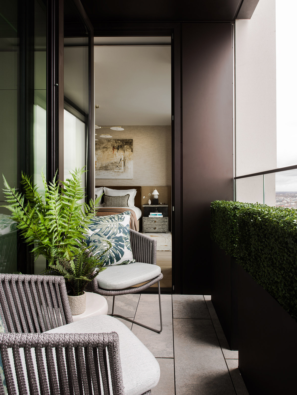
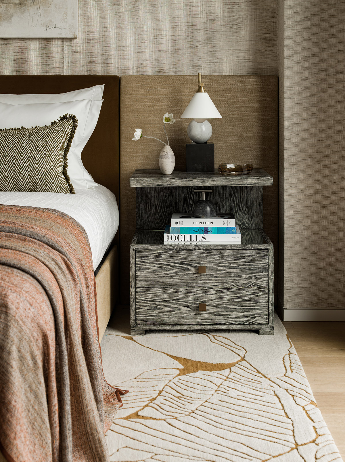
Elicyon designed the three-bedroom show apartment situated on the 31st floor of One Casson Square, one of Southbank Place’s tallest and most striking landmark buildings. The floor to ceiling windows that wrap around the property, led to a brief that focused on enhancing these incredible city views influenced by the location and history of the site. To complement the abundance of natural light, a warm sandy colour scheme was adopted interspersed with darker autumnal accent colours of burnt oranges, mustards and rusts, creates a space that is rich, warm and heartening. The rich, woven, and natural textures of linens, cottons, and boucle wool, add to this overall natural theme, contrasted with details in blackened metal and leather adding an extra dimension of interest and a touch of luxuriousness to the space. The furniture throughout is bespoke and highly detailed design making each piece feel timeless, and seamlessly incorporated within the space; a clear but subtle harmony flowing throughout.
SBID Awards Category: Show Flats & Developments
Practice: Elicyon
Project: Project Arch
Location: London, United Kingdom
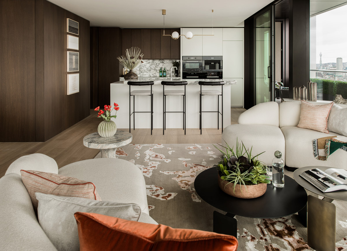
What was the client's brief?
This was a show apartment on the 31st Floor of One Casson Square, the three-bedroom apartment had views of the city skyline via wrap around, floor to ceiling windows. The client wanted us to draw on these views and inject some soul into the apartment by looking at the area’s industrial skyline. Being a show apartment, the brief inevitably was to create a space that would have wild appeal whilst at the same time being visually exciting.
What inspired the design of the project?
The project was inspired by the area’s history as a centre of manufacturing, Art and craft, with the space featuring a range of bespoke furniture and specially commissioned artwork reflecting that heritage. A palette of ivory burnt orange and ochre, gold, teal, and sandy tones was chosen to create a warm ambience. ‘We wanted to subtly reference the vibrancy, eclecticism and culture of the area
and its history as the home of woollen cloth manufacturing, potting, and weaving,’ said Charu Gandhi, Elicyon Founder & Director.

What was the toughest hurdle your team overcame during the project?
If we had to think of one, then the planning and logistics of installing for a project on the 31st floor of a building – in order to ensure the installation would run smoothly large pieces of furniture had to be manufactured in smaller sections to fir the dimensions of the lifts.
What was your team’s highlight of the project?
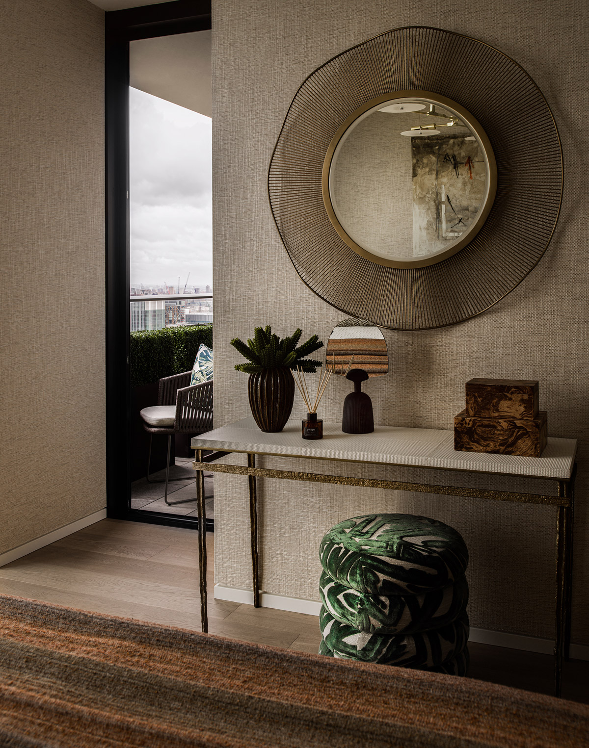
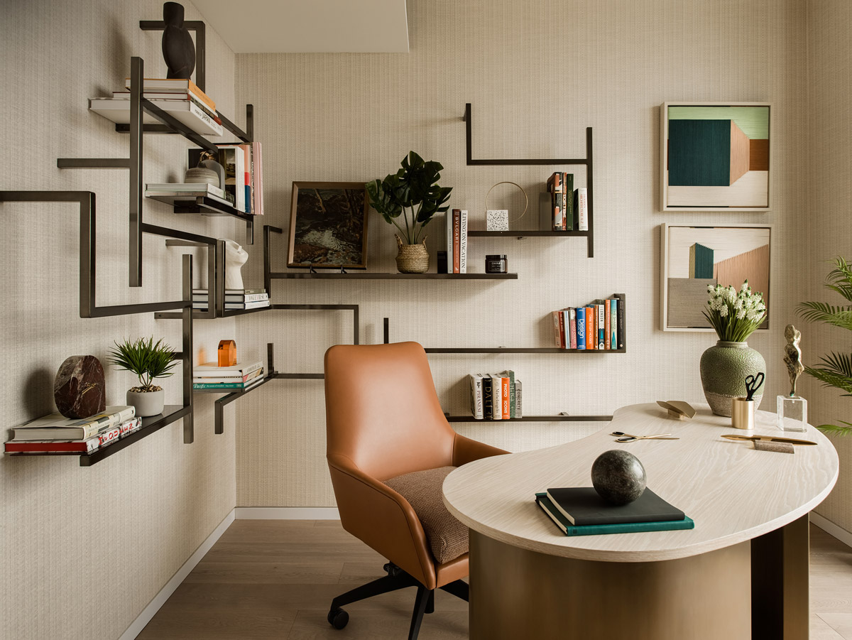
We used some eclectic and contemporary furnishings, as well as designing our own tailor-made pieces. The entrance console table was spotted by the team during their last sourcing trip to Paris and is by Portuguese furniture maker Jose Leite de Castro. A retro modular joinery piece in the study meanwhile spans two walls and was designed in the 60s. It accompanies a freestanding desk and tub chair to provide a beautiful space to work from home.
Why did you enter this project into the SBID Awards?
SBID is the most well-regarded and prestigious design community within our industry, and so to be recognised and accredited by such an establishment is to achieve support and acknowledgment from a well-respected and reputable platform.
Questions answered by Charu Gandhi, Director, Elicyon.
Photos Credit: Patrick Williamson
The SBID Awards is open for entries - it's time to submit your designs to be evaluated by the this year's distinguished experts on the judging panel. Read the SBID Awards' entry checklist to prepare your submissions and get key tips to ensure your entry is ready to impress!
Save money and submit by Wednesday 31 May to avoid late entry fees!
1. Review the full list of entry categories
The SBID Awards comprises 28 different entry categories across Interior Design, Product Design and Fit Out. These categories cover projects and products for commercial and residential interiors, giving all sectors the chance to showcase their best work and gain recognition within their field.
You can submit the same design into more than one category (if applicable), so make sure you've checked the full list of entry categories that could apply to your submission, and consider entering multiple to increase your chances of being shortlisted!
ENTRY TIP: The new clone feature allows you to easily duplicate your entries!
2. Read the entry guidelines carefully
Be prepared! Review the entry guidelines to make sure you're eligible to enter, ensure you can provide all the information and imagery required to meet the entry conditions, and that you clearly understand the submission process. Here, you'll find all the vital information about the tiered entry system and a breakdown of the entry fees, along with key deadlines and advice on entering!
ENTRY TIP: Provide a link to supporting video content when prompted - video footage can be a powerful medium to better showcase your projects or products to the judges!
3. Register on the online entry portal
The SBID Awards new entry portal makes it easy to manage, edit and submit your entries into this year's SBID Awards. Following the simple, step-by-step entry form, you can upload the required information or imagery and save your progress for later.
ENTRY TIP: With new flexible submissions, you can edit your entry even after submitting (until the final entry deadline) so if you're running out of time for the next entry rate, why not submit and continue editing later?
4. Complete your submission before 5pm on 30 June 2023
Have you provided all the details for your entry? You are now ready to submit! Before you do, we recommend you review last year's shortlisted entries to compare how your entry measures up, and ensure you are using the best imagery and descriptions to showcase your designs to the judging panel (and the public)!
SBID MEMBERS: To redeem your free submission and discounted rates provide your membership number when prompted!
Entries for the SBID International Design Awards 2022 are open!
View this year's SBID Awards judging panel for 2022 here.
To find out more about entering, visit www.sbidawards.com
