This week’s instalment of Project of the Week series features a creative apartment design by 2021 SBID Awards Finalist, TEN DESIGN.
SBID Awards Category: Residential Apartment Under £1M
Practice: TEN DESIGN
Project: Living in This Quadrant
Location: Beijing, China
What was the client's brief?
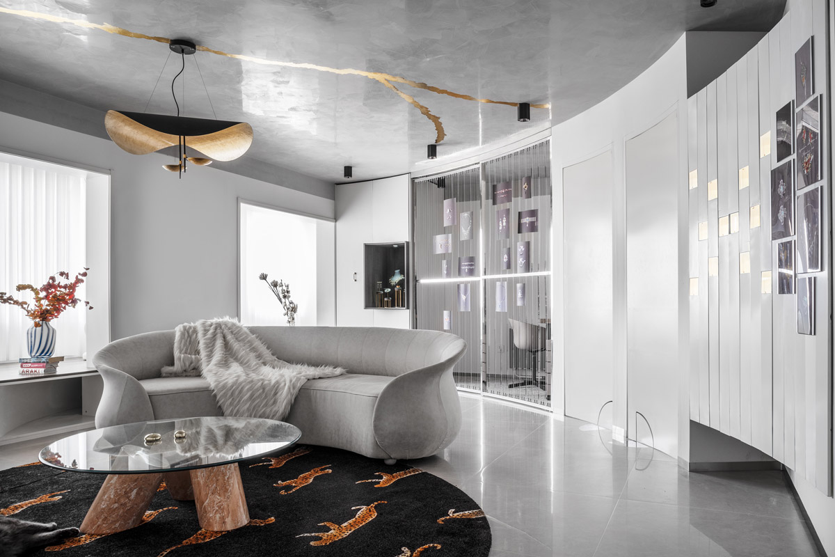
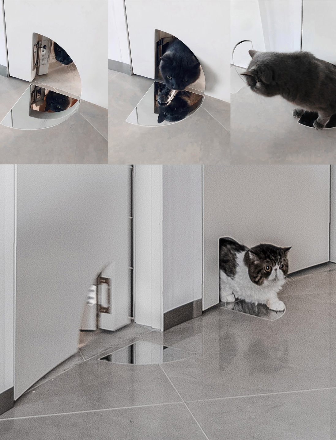
Living in This Quadrant project was designed for a young jewellery designer, aiming to create a space for the owner to work and live in, as well as serve as a playful space for two cats.
What inspired the design of the project?
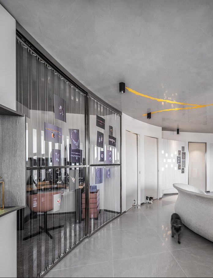
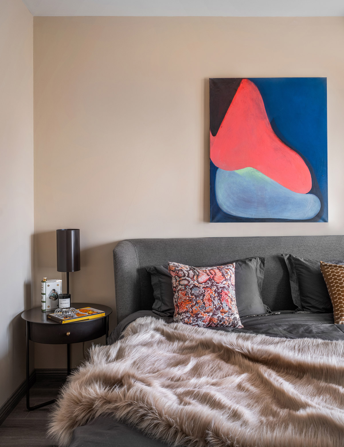
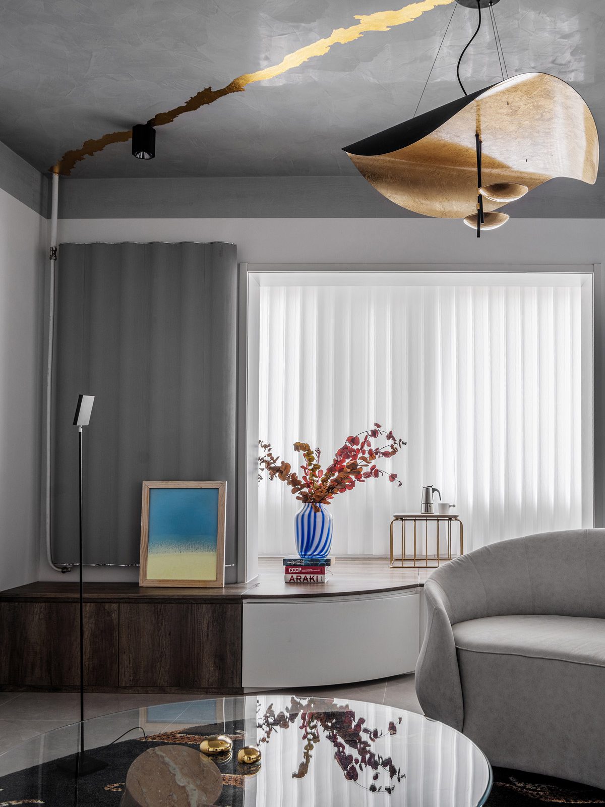
Having seen the jewellery design manuscripts and personal collections all over the house, we decided to borrow the mellow and full shape of gems, and the inlaying processing technique of jewellery as the design concept, penetrating the whole house with the element of a quarter of a circle (arc).
What was the toughest hurdle your team overcame during the project?
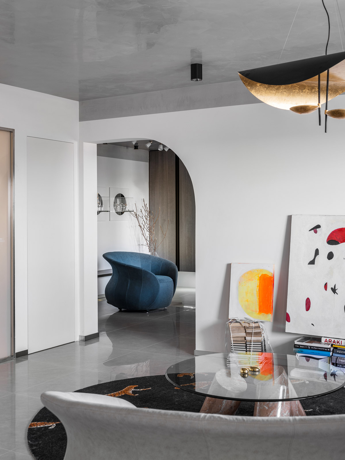
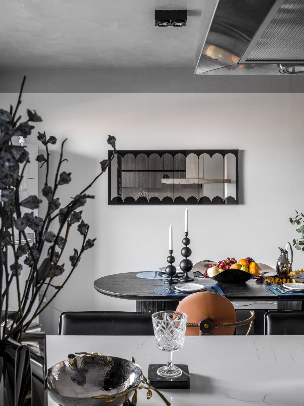
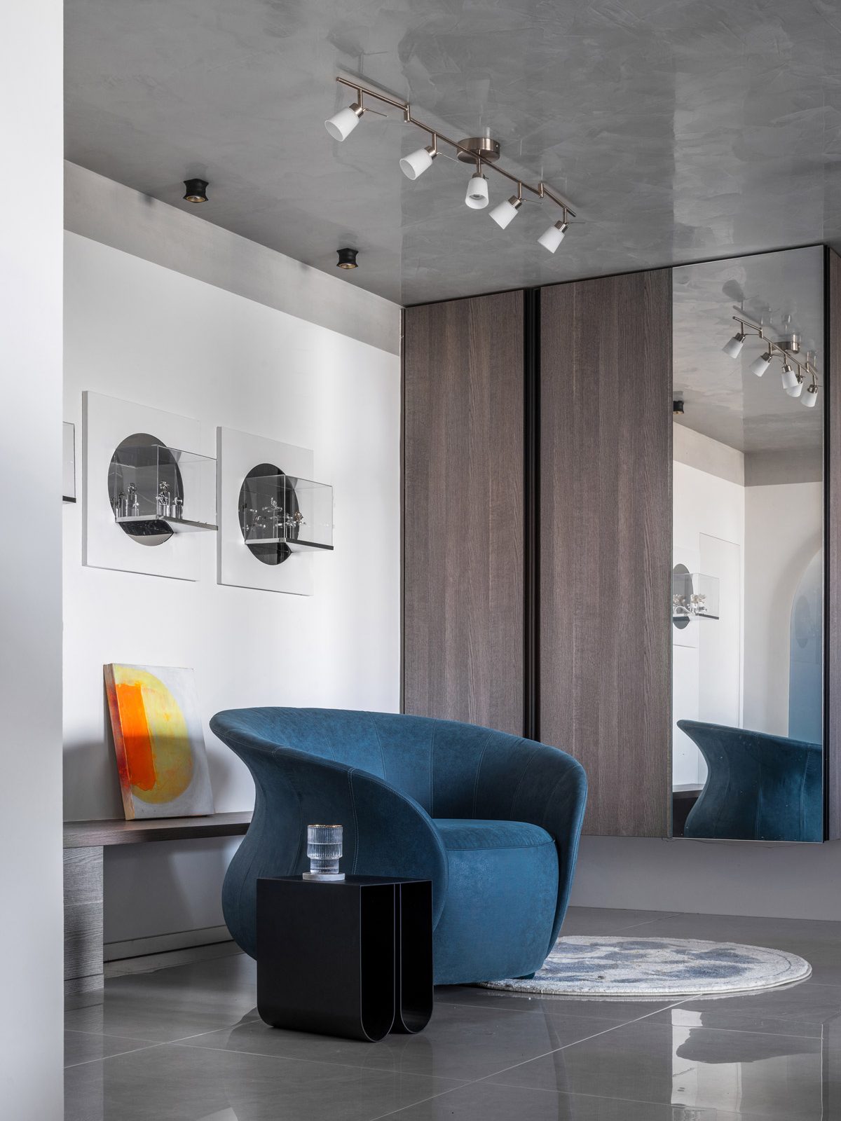
The space with an exceptional arc structure plays the role of a display and extends the space, while creating a soft, romantic atmosphere. The open kitchen, dining room and jewellery display are placed in the entrance area. In the soft, light, grey toned space warm wood materials and arc elements combine to create an open space for reception with personalized features.
What was your team’s highlight of the project?
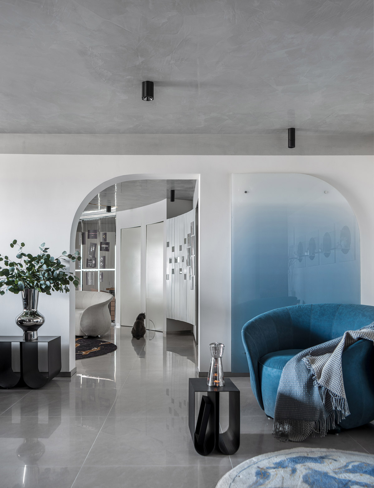
In this space, the formerly square living room is cut into a quarter of a circle. Drawing a half circle around the living room the design integrates the storage cabinet, work area and jewellery display wall into a quarter of a circle.
Another highlight of this design is the paradise created for the owner's cats. A couch and storage cabinet are placed by the window with the best views, while the original partition wall is opened to form a corridor of light, where the owner stays with the cats. The arc-shaped passage in the living room couch becomes a secret base for the cats. We designed quarter-circle shaped cat doors in the master bedroom and communal bathroom doors with inlaid stainless steel panels on the floor, so that the pets can come and go freely.
Why did you enter this project into the SBID Awards?
The SBID is an influential award that attracts a large number of participants each year. We believe that achieving superior results at SBID is a testament to our work.
Questions answered by TEN DESIGN.
In this week's interview with 2021 SBID Awards Overall Winner, Angel O'Donnell, the practice's co-founders reflect on their journey in the interior design industry and discuss their approach to incorporating local influences and culture into their designs.
London-based interior design studio Angel O’Donnell has created award-winning interiors for private homes, luxury show apartments and vast, mixed-use developments around the world. The studio prides itself on not having a signature style. That way, they can create beautiful and ownable designs that are 100% tailored to each client’s wants and needs.
SBID Awards Category: Overall Winner
Practice: Angel O'Donnell
Entry: The Dumont
How important is it to enter the SBID Awards and receive industry recognition for your work?
Hugely important. Without question. We’ve said it before to our followers on Insta: the SBID is a lobbying titan and we’re thrilled to number among its members.
It’s a much loved and deeply respected organisation. How could it not be? In your own words you ‘represent, defend and promote professional interior designers in the UK and in 71 countries worldwide’. Affirmations don’t get much stronger than that.
And, yes, it’s lovely to be recognised by your peers and role models. The SBID always attracts a stellar judging panel packed with industry luminaries at the top of their game. So, naturally, when they give your work the thumbs-up, it’s seriously validating. And people do regard you differently afterwards, there’s no doubt about it. Clients love it, too, which is always a good thing when you’re pitching for increasingly bigger and splashier creative opportunities.
What do you think made The Dumont an overall award winner?
Tough question. We’re still pinching ourselves that our project received that honour. The competition, as always, was fantastically strong.
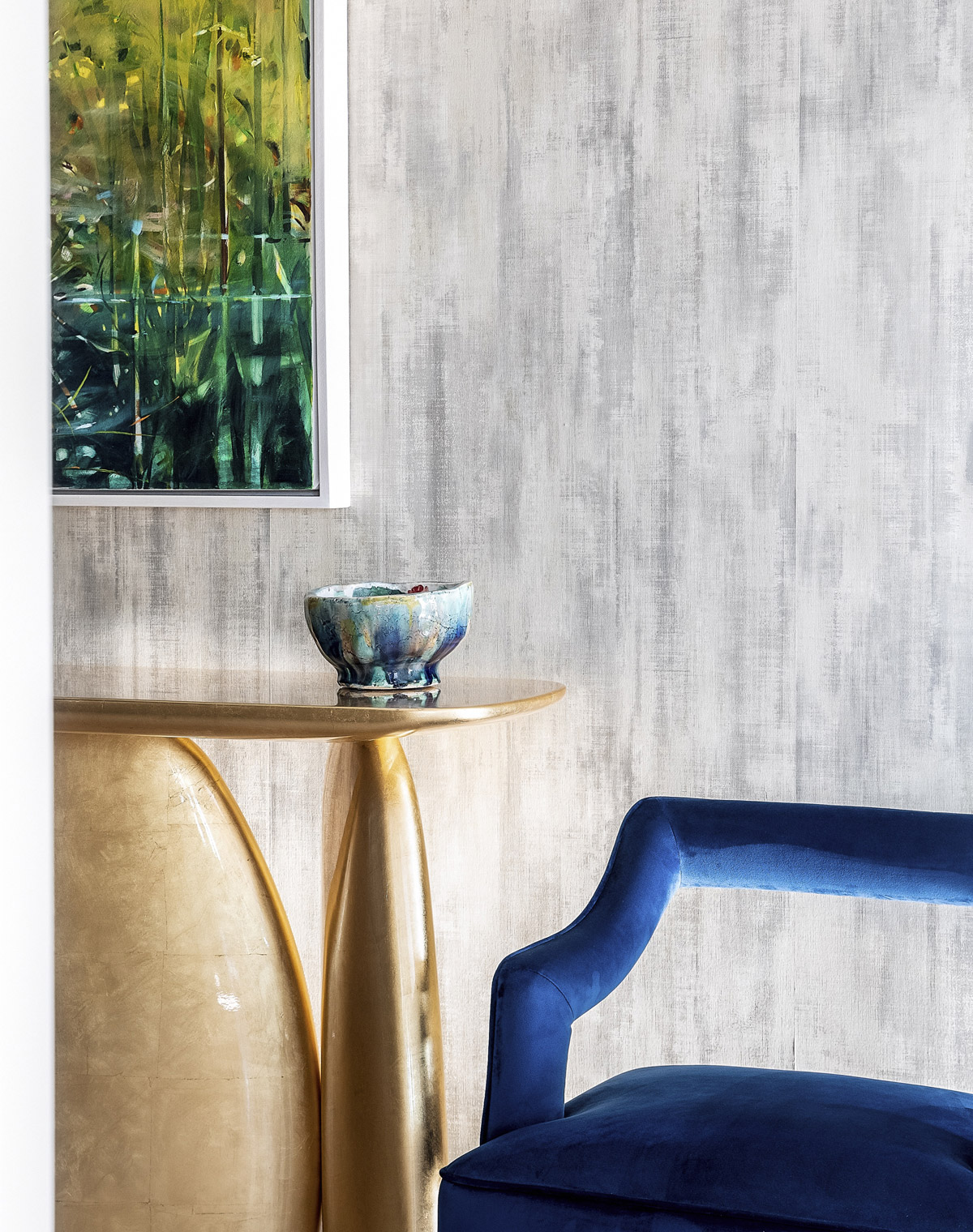
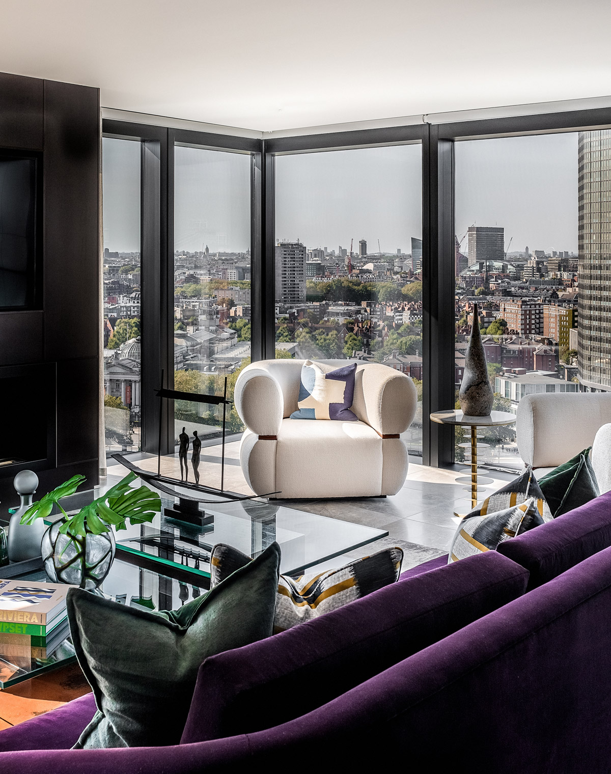
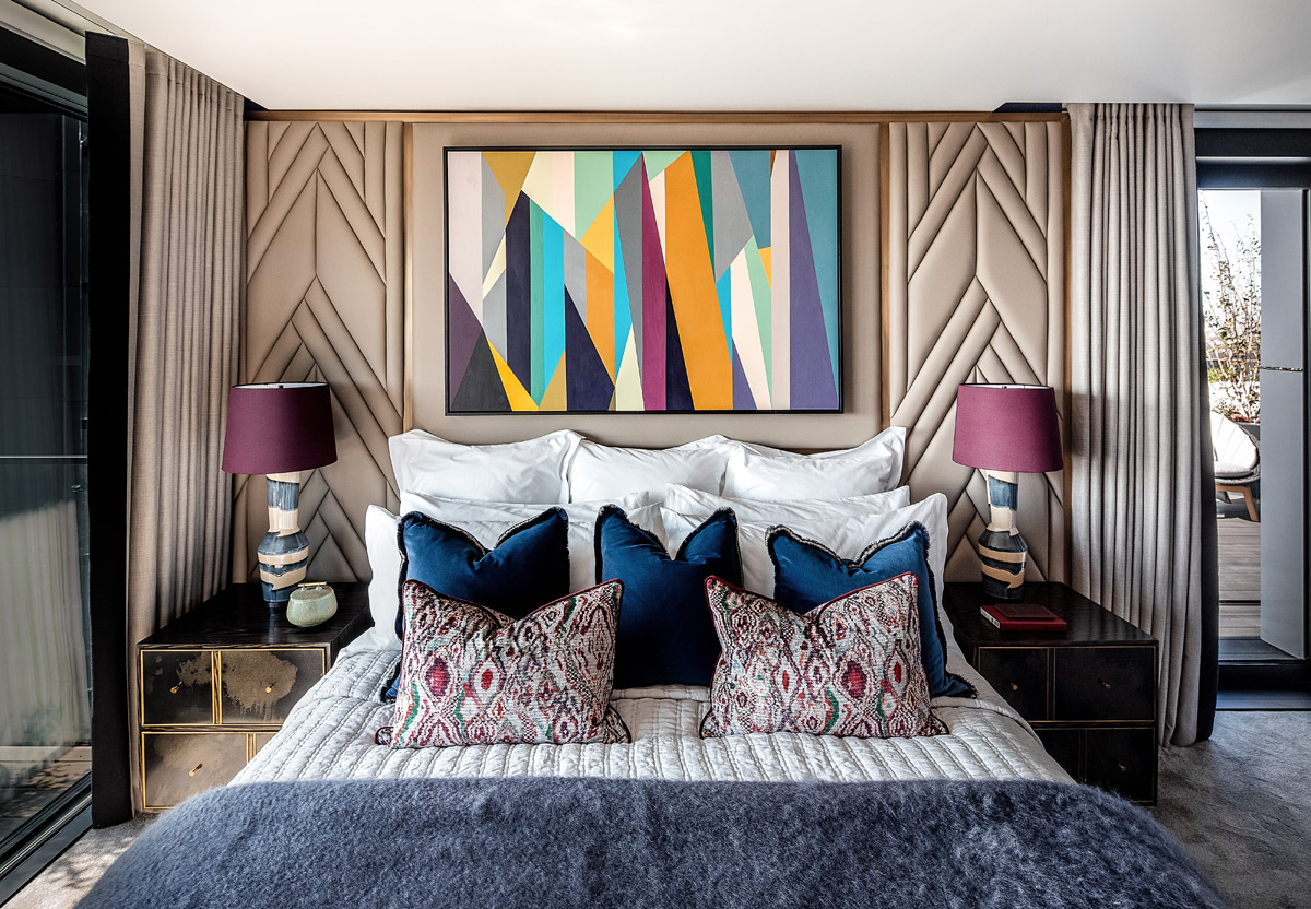
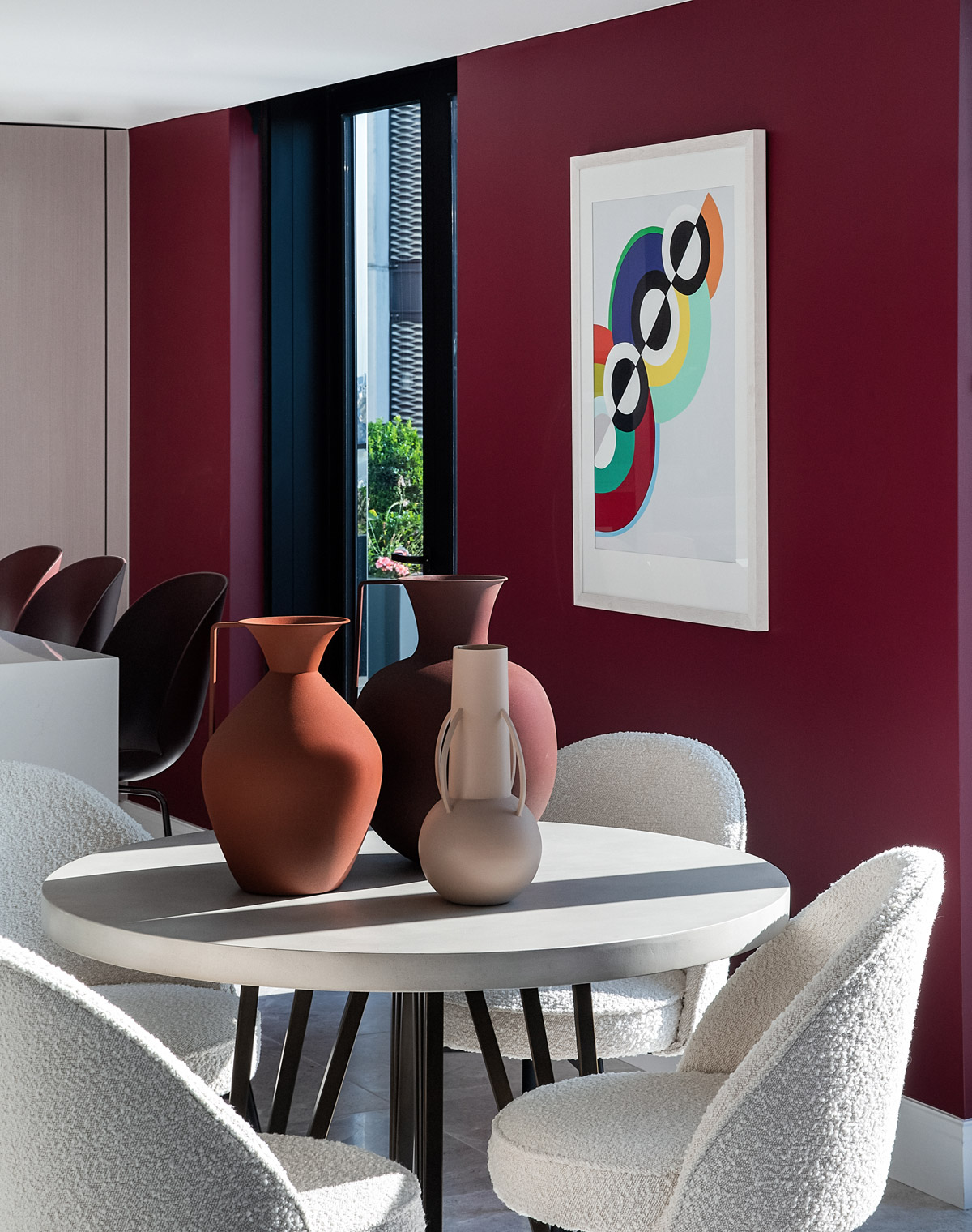
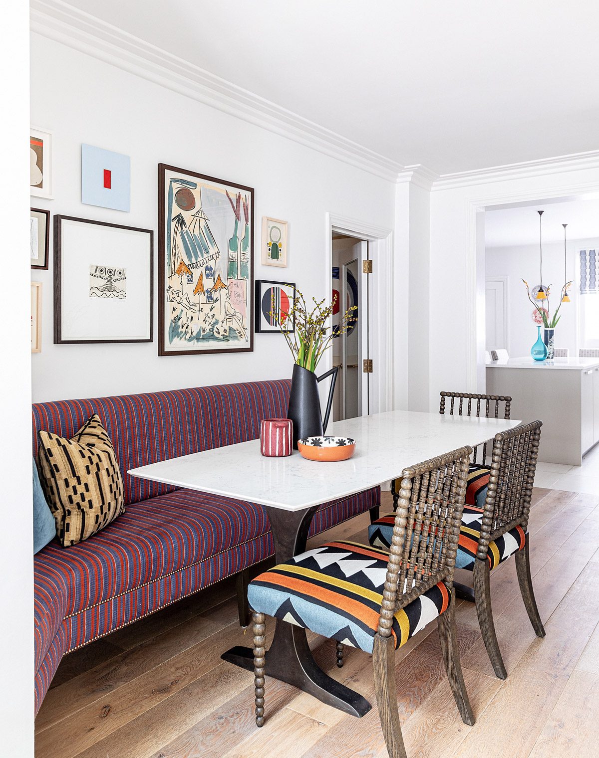
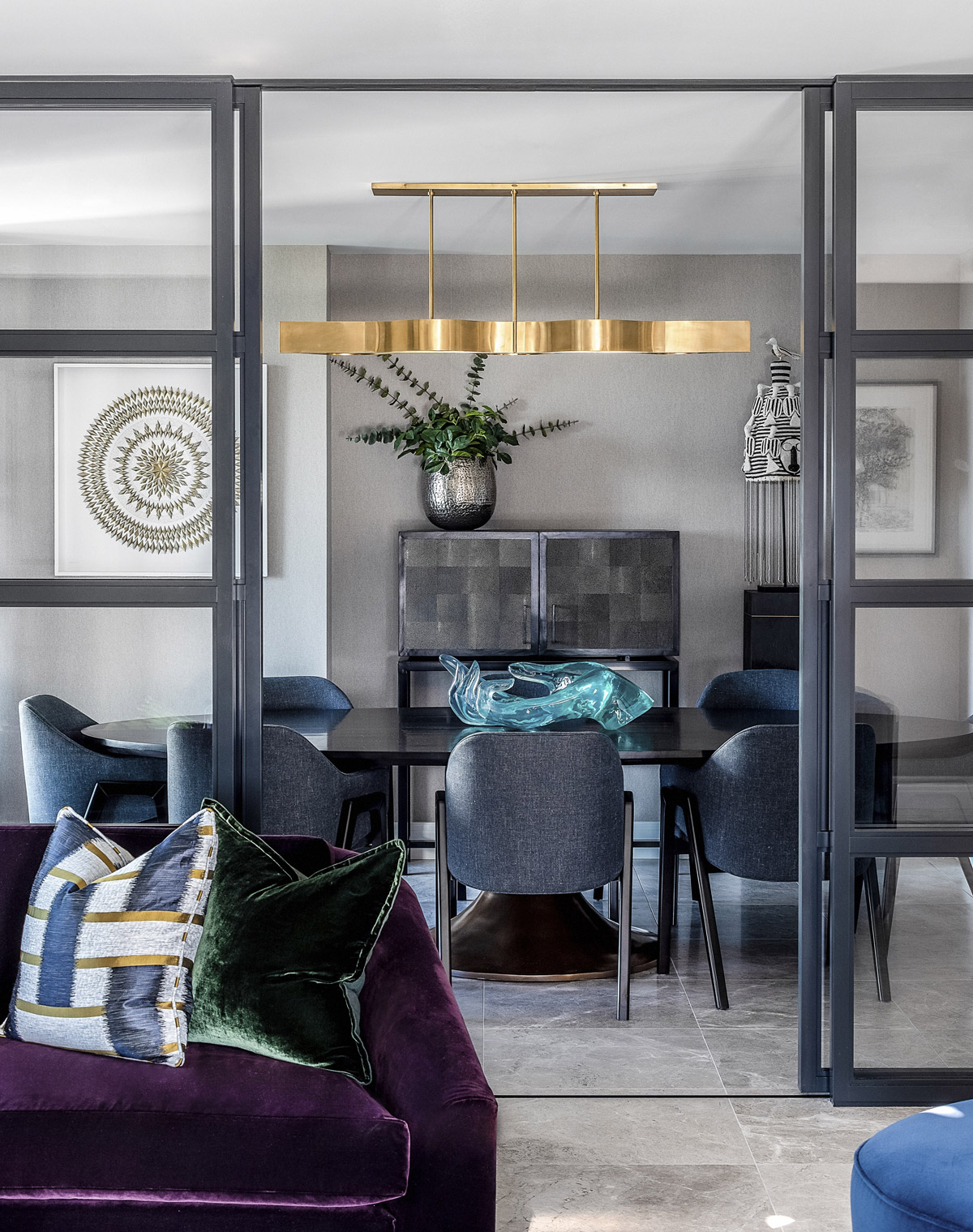
Our guess is that The Dumont has something for everyone. The design manages to blend a lot of elements: earthy pigments with calm neutrals, densely textured fabrics with smooth glass and metal finishes, kaleidoscopically bright art with delicate objet. On paper, it sounds like a heady mix. But in reality, these things come together like old buddies: happily and without friction.
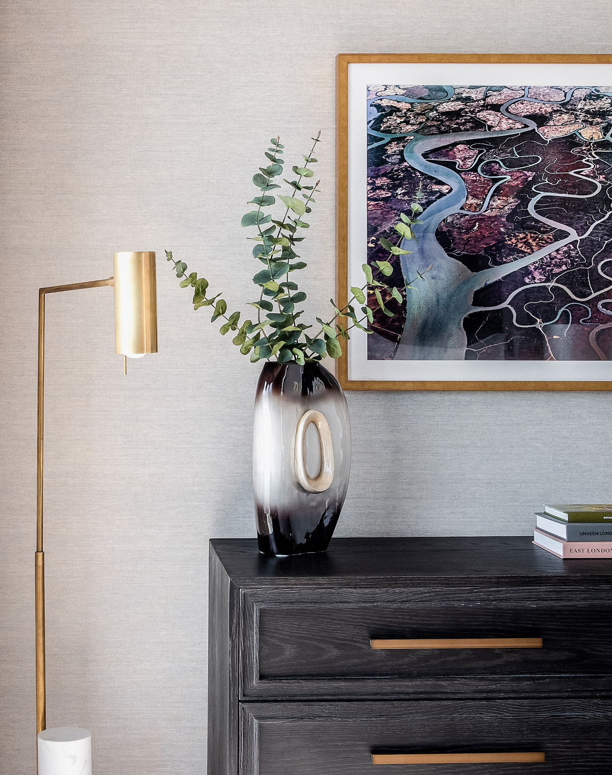
The judges may have also appreciated just how much was bespoke. Everything from wool-bouclé swivel chairs and curved velvet sofas to plushly padded upholstered walls and a bronze-clad fireplace was designed in-house.
The artwork, too, was a major part of our design. We lavished our client’s home with specially commissioned acrylics, hand thrown ceramic bowls, delicate origami, metal sculptures – even an intricately beaded African ceremonial crown.
That said, there’s a playfulness to these pieces. Nothing takes itself too seriously. We always want our designs to feel relatable. Luxurious, yes, but also accessible. We think a lot of people can imagine themselves living in the rooms we design.
When working on a new residential project, how do you incorporate local influences, artistry and culture from the surrounding area into your design?
We’re always careful when we take inspiration from an area. We don’t want to get swept up in lots of stimuli, no matter how fabulous, as this would drown out a client’s needs and wants. We also don’t want to create anything pastiche-y or thematic. So, we tend to think abstractly about our surroundings. For instance, in The Dumont, our client wanted us to create an interior that could echo the vibrancy, artistry and culture of London. Dizzying as that brief was, it prompted us to fill mood boards with lots of colour and pattern. To collaborate with local craftspeople. And to think about artists from around the world to reflect the capital’s rich melting pot. It wasn’t a literal interpretation by any means, but it nailed the brief.
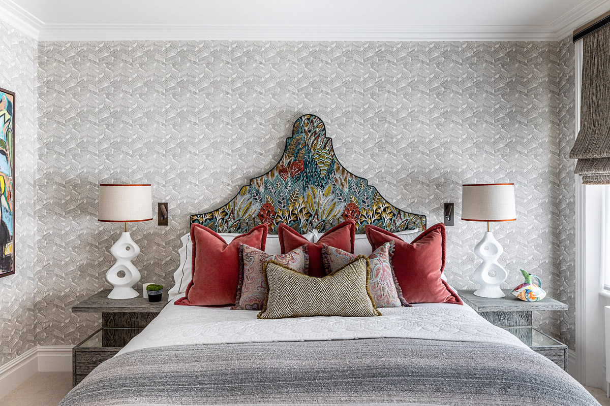
More recently, we were tasked with creating a quintessentially British pied-à-terre in the heart of Chelsea. We set about defining what ‘quintessentially British’ means to us and concluded that it’s about craftsmanship and the assemblage of unique and creative pieces. With this interpretation in place, we worked on producing a series of lively and vivacious rooms, filled with expressive prints, rich hues and beautiful detailing.
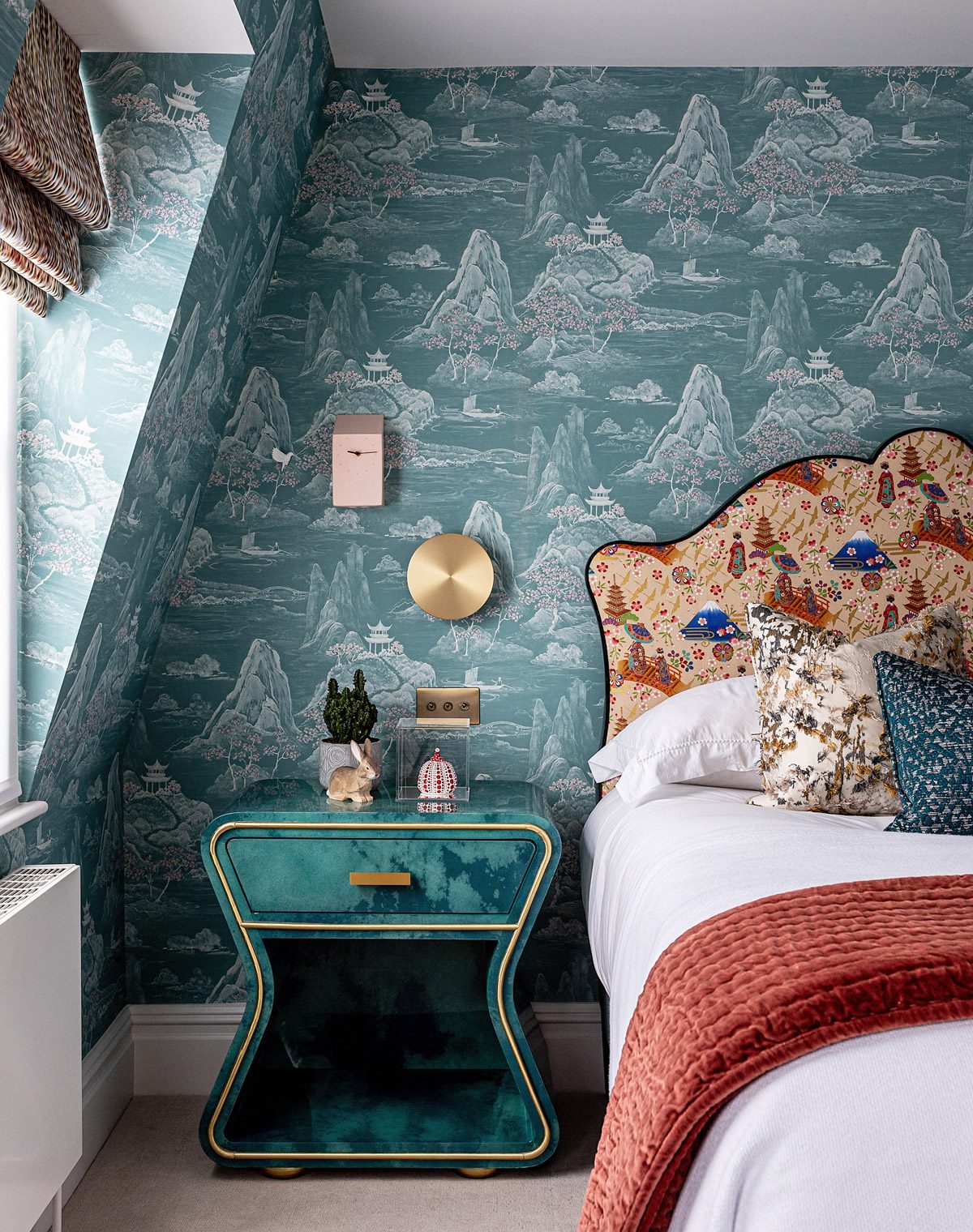
The bedrooms were treated to handmade Savoir Beds. Other rooms featured sculptural lamps inspired by the late great Barbara Hepworth. Walls were filled with artwork by an exciting mix of British talent, including an original Damien Hirst giclée print on aluminium, and an explosive figurative oil on canvas by rising star, Jack Penny. There were also whimsical pieces, like a pale pink cuckoo clock and prints of early 19th century botanical drawings of Japanese Sago Palms. It was like nothing we’d ever done before, and the result was fantastic.
Tell us a bit about your journey in the interior design industry. What have been the most rewarding takeaways since launching Angel O’Donnell?
We’ve been travelling very fast, on a vertiginously steep trajectory, for just over three years now. And what we’ve learned is just how much there is to learn. Always. We never stop. Every pitch, client, project, building, problem, solution, collaboration, challenge, creative block, creative breakthrough – it’s different every time. And yes, it can keep us awake at night – but the end result always makes it worthwhile.
We’ve grown stronger as a team – and we’ve grown our team. We’re now responsible for people’s livelihoods and creative fulfilment, which is daunting but also incredibly rewarding. There’s lots to be thankful for. Every project we win and every design we install gives us a buzz. We don’t take any of it for granted – especially those landmark moments when you’re pronounced overall winner at the SBID. That blew our minds. What a fantastic accolade. Even better that it coincided with our 3rd year anniversary.
Now that you’ve won an SBID Award, what are the next steps? Is there anything new you are excited to be working on?
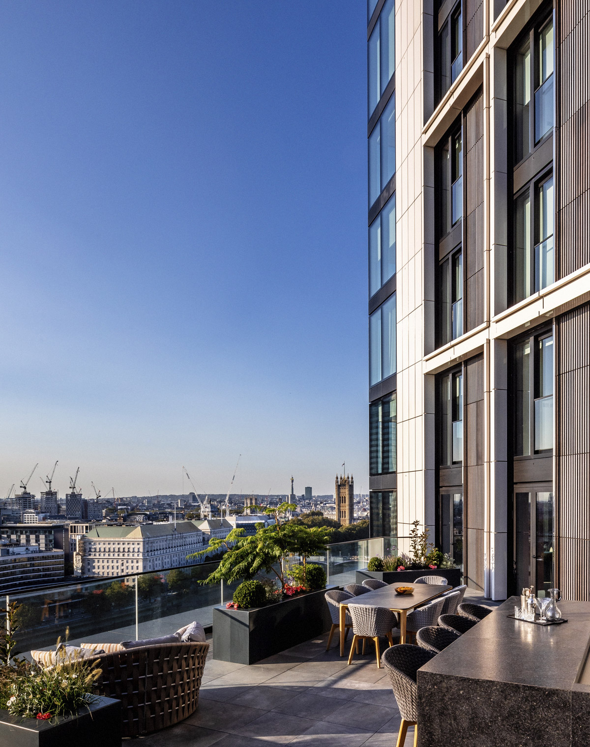
Our next steps will be to continue nurturing our team and looking after our clients. Beyond that, we’ll be working on two 2,500sq ft apartments in The Corniche, Albert Embankment. We’re super excited to see how this iconically curvaceous building will influence our designs. Also, we have what can only be described as a culturally epic project waiting in the wings. Frustratingly, we can’t reveal more than that right now. But as soon as we’re given the green light, you won’t be able to stop us from telling you all about it.
What advice can you give to young designers starting out in the design industry?
When we’ve interviewed young designers in the past, the ones that have stood out to us have had a strong sense of self. They’re still teachable – we should all be that – but they’re not daunted by others who have been in the profession a long time.
To have conviction in your decisions is a powerful thing. To stand by a design choice can often open people’s eyes to new ideas and encourage them to take leaps of faith. That’s when great things happen between creatives and clients.
Of course, everything’s a balance. There’s no point digging in your heels when the people you’re presenting to are shaking their heads in disbelief. Designs have to be bought. It’s a business like any other.
But be confident. Don’t be swayed by trends. And drink in as much design – from as many disciplines – as your senses can handle morning, noon and night. Interior design is a beautiful, forever burgeoning craft. It’ll never stop evolving. And neither should you.
If any aspiring designers reading this want to show us their work, please do. We’re always happy to meet new talent.
Questions answered by Richard Angel and Ed O’Donnell, Co-founders, Angel O’Donnell.
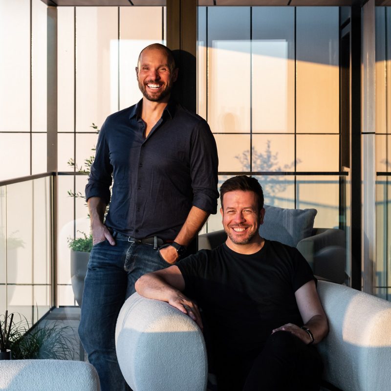
For over two decades Richard Angel and Ed O’Donnell have created elegant and inviting interiors for both private clients and developers; their partnership is rooted in a deep respect for each other’s skills, and is built on a mutual desire to deliver an authentically personal and in-depth service to their clients. From full interior fit-outs to more specialised requirements, such as sourcing bespoke artwork and objet, they provide a complete interior design service.
This week’s instalment of Project of the Week series features a CGI design of a transformable restaurant-bar venue by 2021 SBID Awards Finalist, 4SPACE Design.
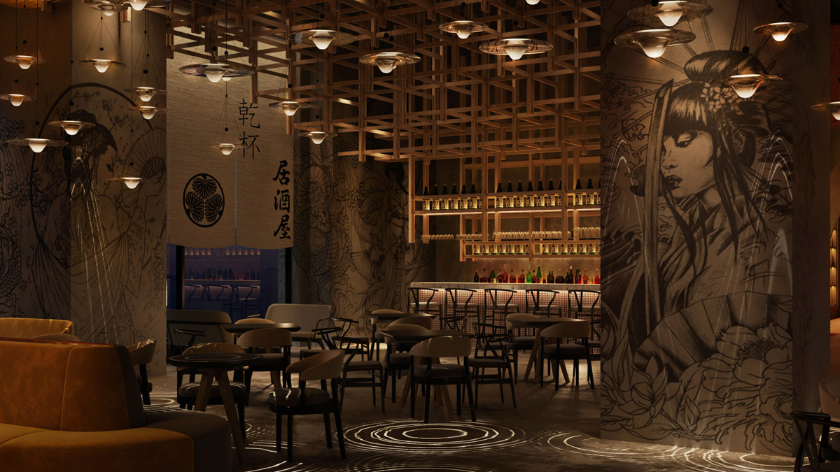
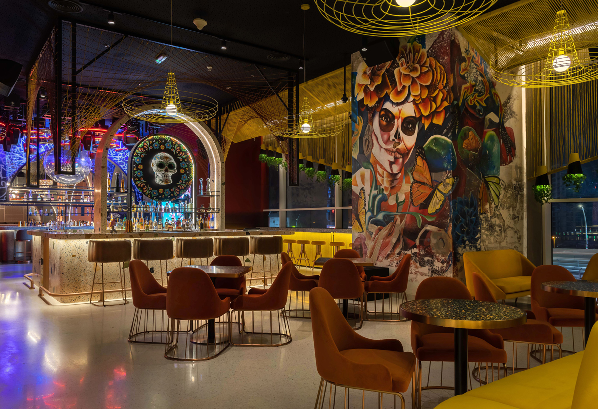
PAPA Dubai is an exciting 1,580 square meters dining and entertainment destination in the vibrant Atrium complex, the epicenter of riverside Al Habtoor City. PAPA Dubai will take its visitors on an extraordinary culinary and mixology journey through nine glorious bars, each themed with a unique concept. Comfort and soul food are at the very heart of the dining experience. The fascinating bars have been developed in collaboration with Moscow and Dubai's top bartending figures.
The venue transforms from a sophisticated and immersive dining experience to a chic nightlife venue with DJs and entertainment as evening moves to night. From a quiet dinner with friends to one of the city’s best vibes - feel the energy of this unrivalled sensory-driven experience. PAPA Dubai will host some of the world's most courageous bartenders vying to show off their avant-garde skills throughout the year.
PAPA Dubai is made up of little ‘boulevards’ including the Rum Station, Champagne Avenue, Gin Point, Vodka Lane, Tequila Road, Mezcal Street, Sake Alley, Wine Square, Whiskey Square, and a VIP Lounge called High gate. Each of the nine distinctive bars has been carefully considered and designed by inimitable 4SPACE in a collaboration with Papa's founder Natalia Freys.
SBID Awards Category: CGI & Visualisation
Practice: 4SPACE Design
Project: PAPA Bar
Location: Dubai, United Arab Emirates
What was the client's brief?
To design a dining and entertainment destination as a Sensory experience, an urban playground of avant-garde cocktails, world-class cuisine, and irresistible beats.
- 9 bar concepts with avant-garde mixology under one roof and to host world’s top bartenders.
- Space with a mood that changes with its visitors, from a quiet spot with friends to a non-stop party venue offering hand-selected music by its internationally-renowned DJs.
- A venue which is able to evolve as the energy rises and the tempo picks up.
What inspired the design of the project?
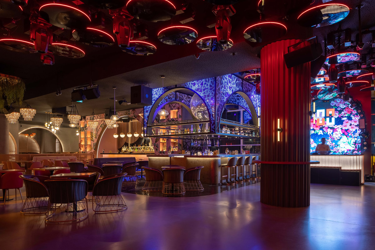
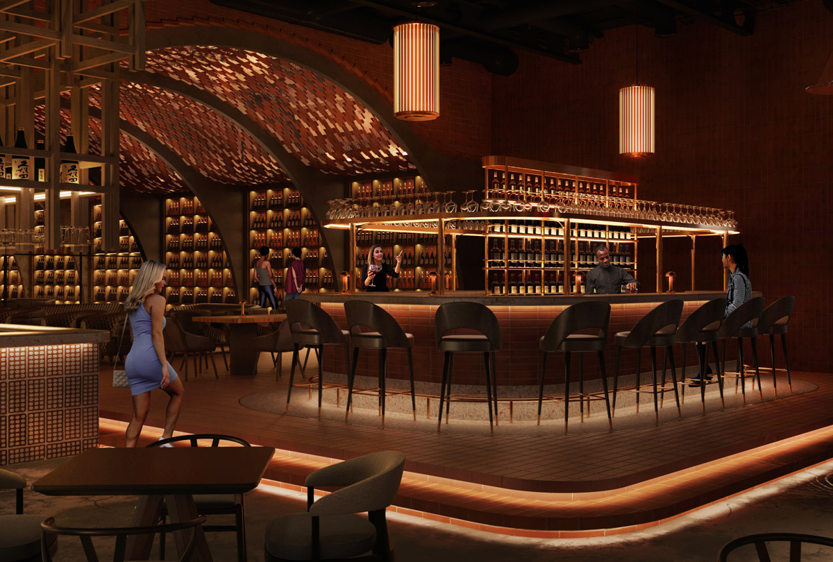
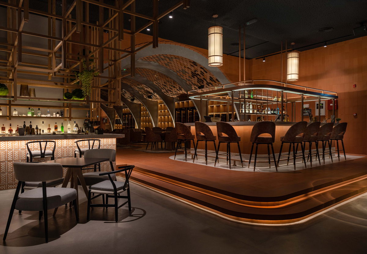
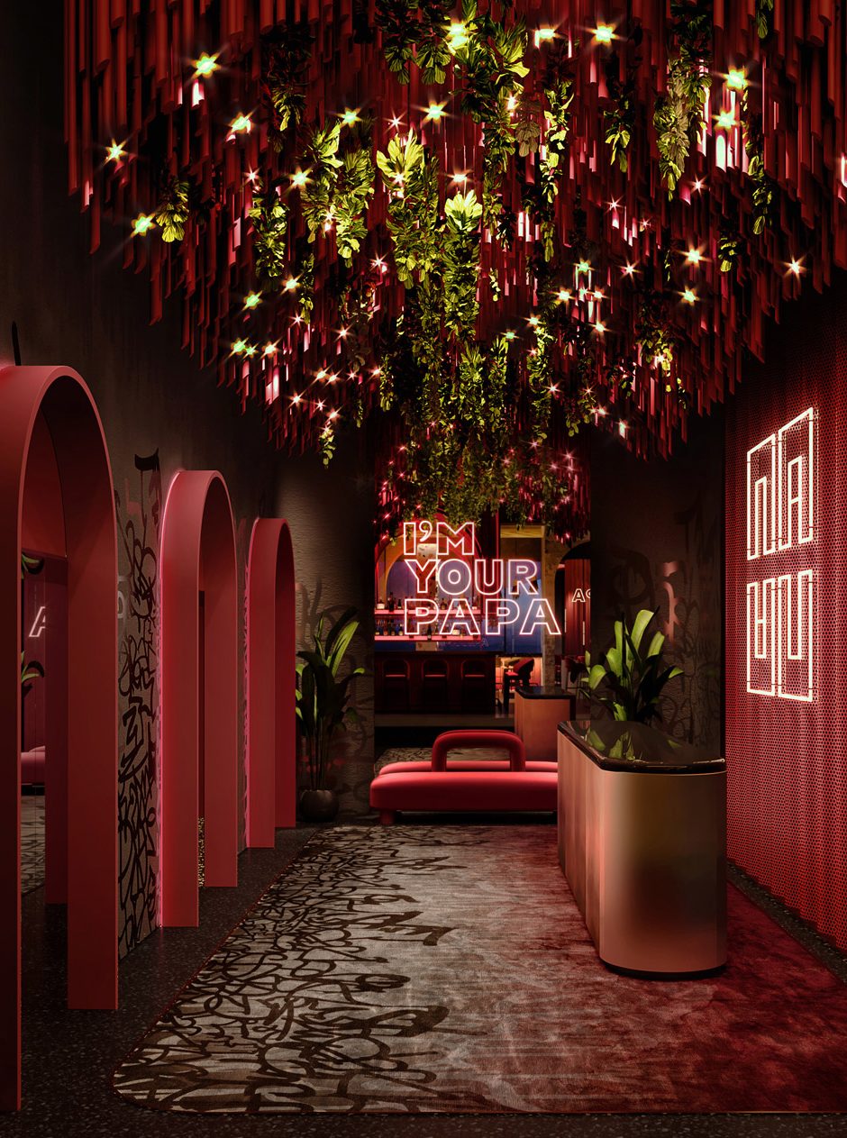
The Arched boulevard. To create a cohesive Bar-village feel and to achieve one narrative that wraps around the venue, archways in different finishing are used throughout the expansive space. They create a unified design between each of the bars to form little ‘boulevards’.
What was the toughest hurdle your team overcame during the project?
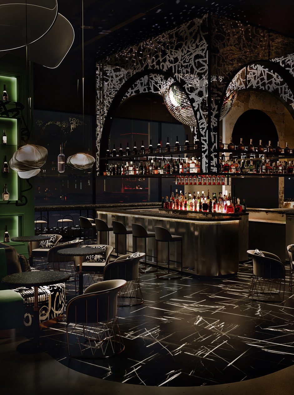
4SPACE allowed two months for the design and another five months for the fit-out and transformation. There were various challenges because of the sheer variety of materials required for each bar, the complex mechanical, electrical, and plumbing (MEP) requirements, and the acoustic challenges that take the bars from soulful eateries to exciting night venues.
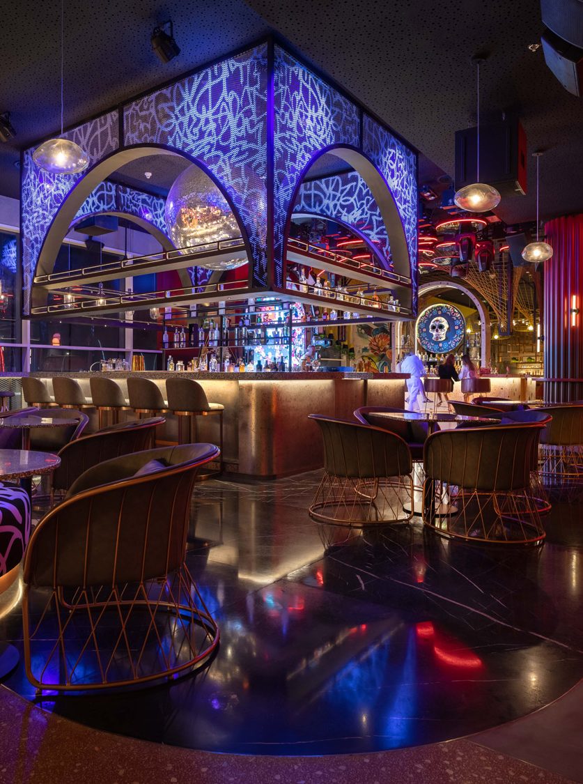
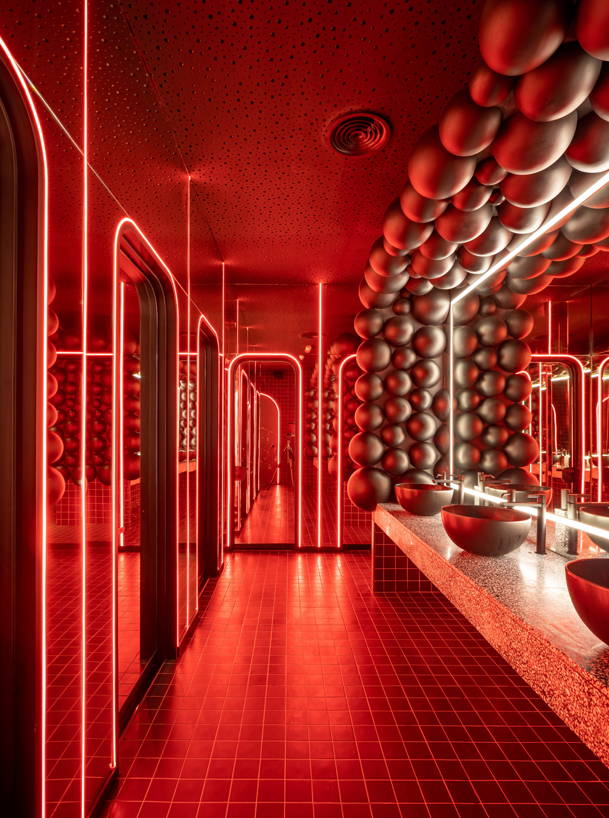
Another challenge that 4SPACE had to overcome are the different terrazzo surfaces that were designed and installed throughout Papas. Cleverly, designers sourced authentic materials and graffiti artists to allow for fully cohesive individuality. The piece de resistance is the nine thoroughly different concepts within one narrative.
What was your team’s highlight of the project?
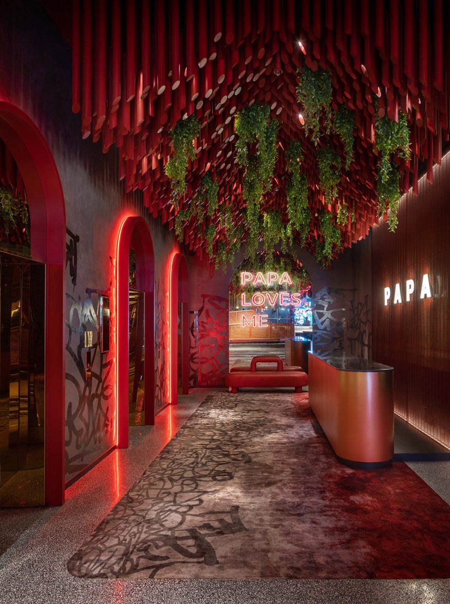
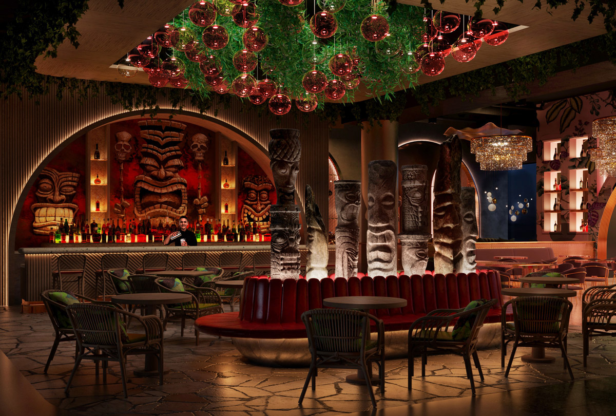
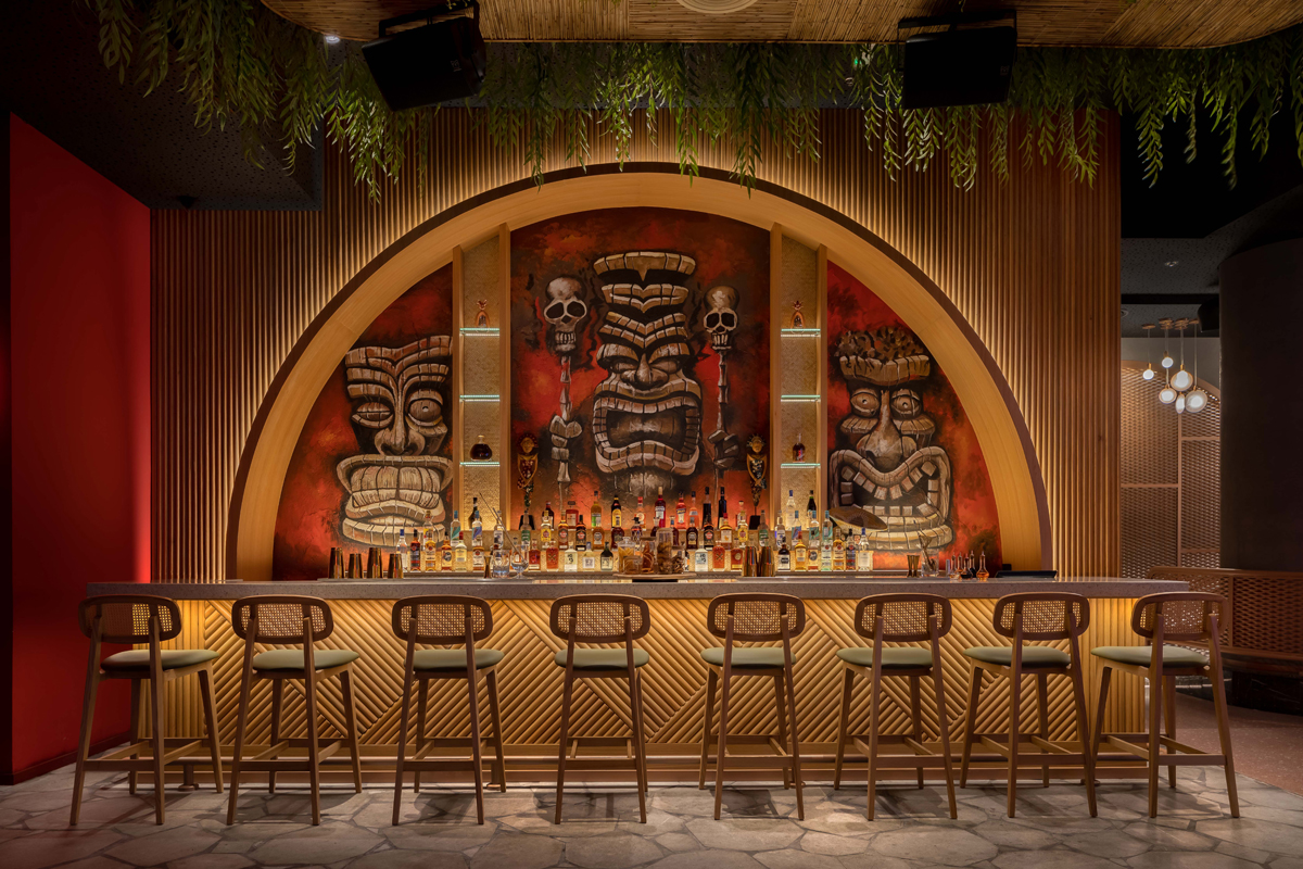
The Entrance. It has an impressive, eccentric entrance with red pipe and greenery installation that hangs from the ceiling and customized carpet below.
The transformation. The venue is designed with the ability to transform. As the evening draws to a close, you can dine in style at a chic restaurant. As night time falls over the city the restaurant metamorphoses into an elegant party venue.
Integrated into the design are both architectural lighting and entertainment lighting, providing the ability to have 5 different scenarios of the lighting ambience based on time and experience required.
Why did you enter this project into the SBID Awards?
We've been participating in the SBID Awards yearly and it has been our practice ever since. We trust SBID for its ethics and transparency. We believe that through the SBID platform, our designs gain global recognition and give us the chance to connect with peers, press, and potential clients around the world. We became part of the international design community with new audiences on a global scale.
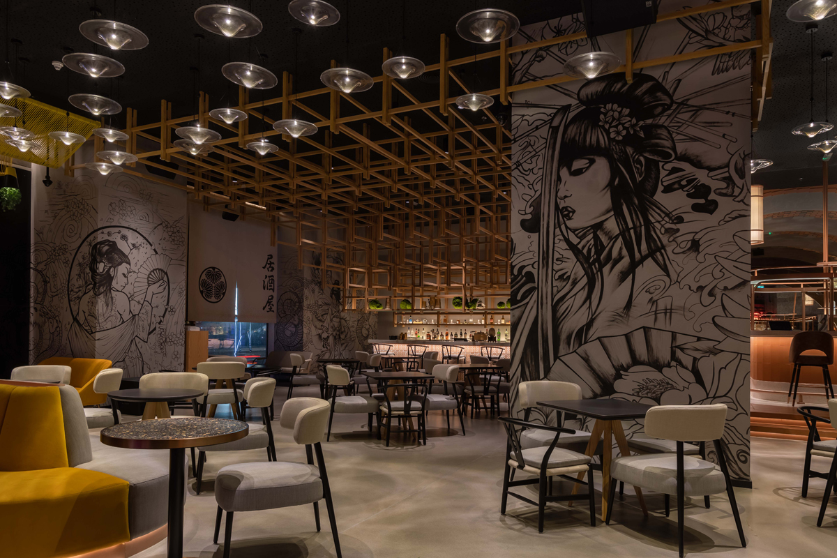
The CGI project and photos from the completed venue, compared:

Questions answered by Mr. Firas Alsahin, Co-founder and Design Director, 4SPACE Design.
The Society of British and International Interior Design (SBID) is back with its industry-acclaimed interior design awards for 2022.
The SBID continues to champion the most skilled and talented designers from around the world in the 2022 edition of the SBID International Design Awards.
Taking place on Friday 21 October at a new luxury venue, InterContinental London Park Lane, the 13th annual ceremony will celebrate and showcase excellence across Interior Design, Fit Out and Product Design to its impressive international audience.
With award categories spanning both the commercial and residential sectors, SBID welcomes entries from all corners of the professional design community, who work together to drive industry standards and produce the exceptional interior environments that shape the way we live, work and play
Judging panel
Equipped with an assembly of expert judges, the judging panel features a host of revered industry figures from some of the most exciting companies at the forefront of design, media and business. With Global Digital Director of Architectural Digest, David Kaufman; Executive Editor for ELLE DÉCOR (US), Ingrid Abramovitch; Dean and Professor of Architecture at Harvard Graduate School of Design, Sarah Whiting; and CEO of Rigby & Rigby, Iain Johnson (to name a few), entrants have a unique opportunity to showcase their work on the SBID Awards’ global stage and exhibit designs directly to an audience of distinguished professional peers, press and potential clients.
Entry dates
The entries to the SBID Awards 2022 is now open with reduced Early Bird rate of £250*. SBID invites designers to take advantage of the discounted entry fees and submit your entry before 14 March 2022.
Entries will close at 5pm (BST) on 23 May 2022. Click here to find out more.
*excluding VAT and one-off admin fee.
Are you an SBID member?
SBID members receive exclusive benefits into the SBID International Design Awards, including 1 x free entry and discounted entry fees. Find out more
Click here to discover the last year's SBID Awards winners!
To enter, visit sbidawards.com for more information.
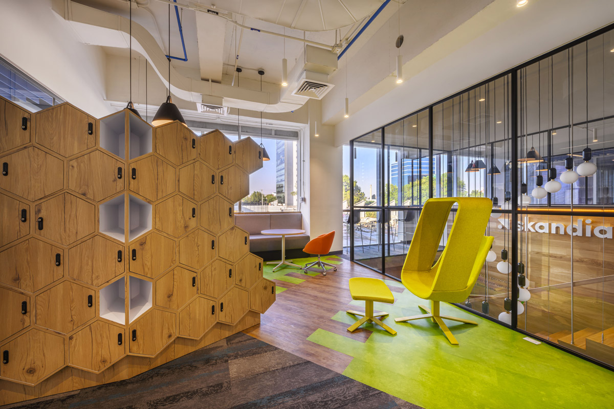
Skandia is an insurance company founded in 1855, with current operations in Europe, Latin America, Asia and Australia. The systematic work environment has evolved in the same way as people and their ideas, which drives the creation of strategic environments where creativity flows and concepts of collaboration and innovation multiply. Simultaneously, the demand for workspaces that encourage social interaction, contemplation and transdisciplinarity increases.
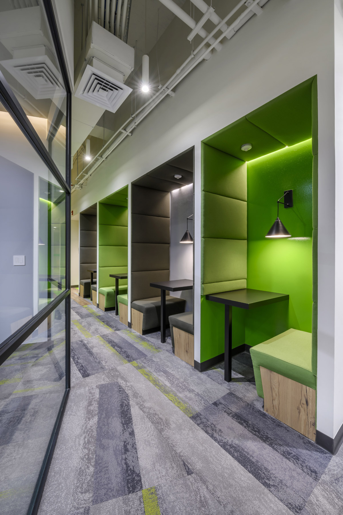
The present project succeeds in increasing creativity and productivity within a framework of comfort, and the collaborative work in the organization becomes more visible through areas that inspire effective communication between everyone to strengthen the pride of working there. Spaces that integrate and promote both working and recreational life are designed with solutions that allow people to create the environments they need and choose the workspace that improves their individual experience of habitability.
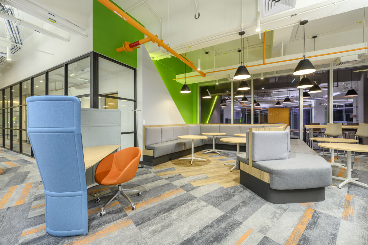
Spaces with natural lighting, fresh and air-conditioned. Application of acoustic materials in interiors and open areas. Lightweight and transparent materials. Integration of dynamic and functional furniture. Open-door privates. Different types of Boardrooms and Casual Collisions (informal meeting spaces) between work teams that facilitate interaction. Balance between workspaces and common areas, suitable for appropriate technological connection between all users.
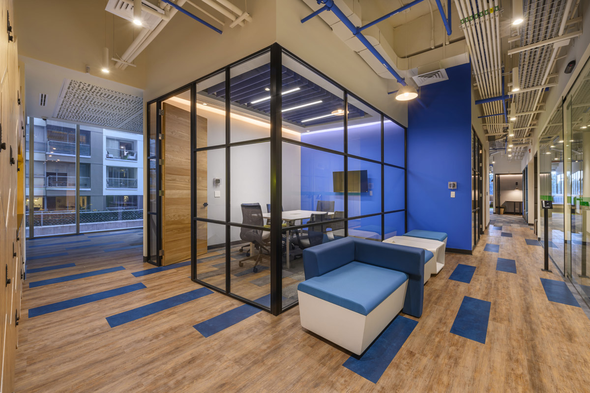
Skandia is equipped to meet every need that may arise within the workspace, surrounded by colour accents in functional spaces specially designed for efficiency and productivity. Workstation trains rotate at different orthogonal angles, following ceiling planks and apparent slab with coloured accents on the carpets. The colon of the space responds to the colour theory, adopting the combination of neutral and warm tones to uplift concentration and productivity, with details in green, blue and yellow to energize the people who inhabit it.
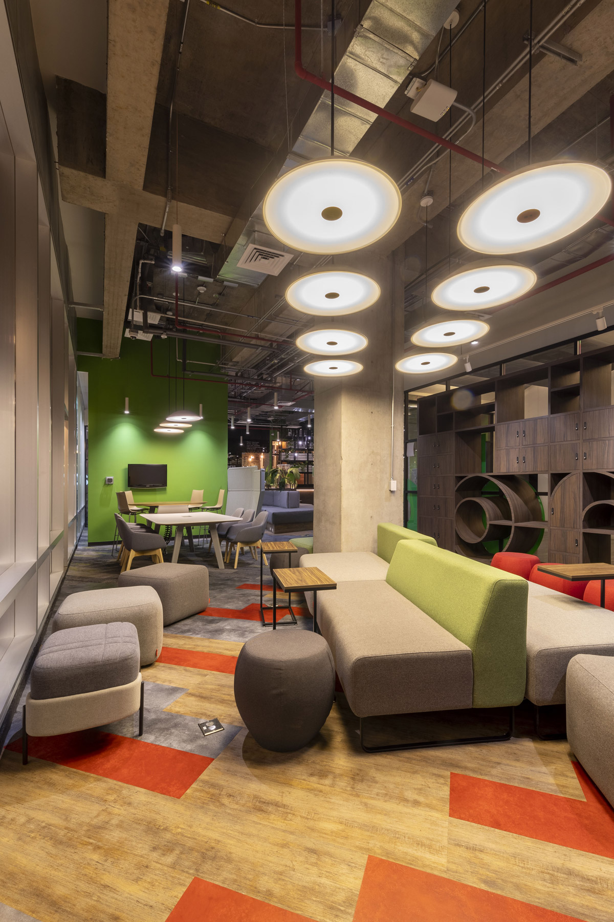
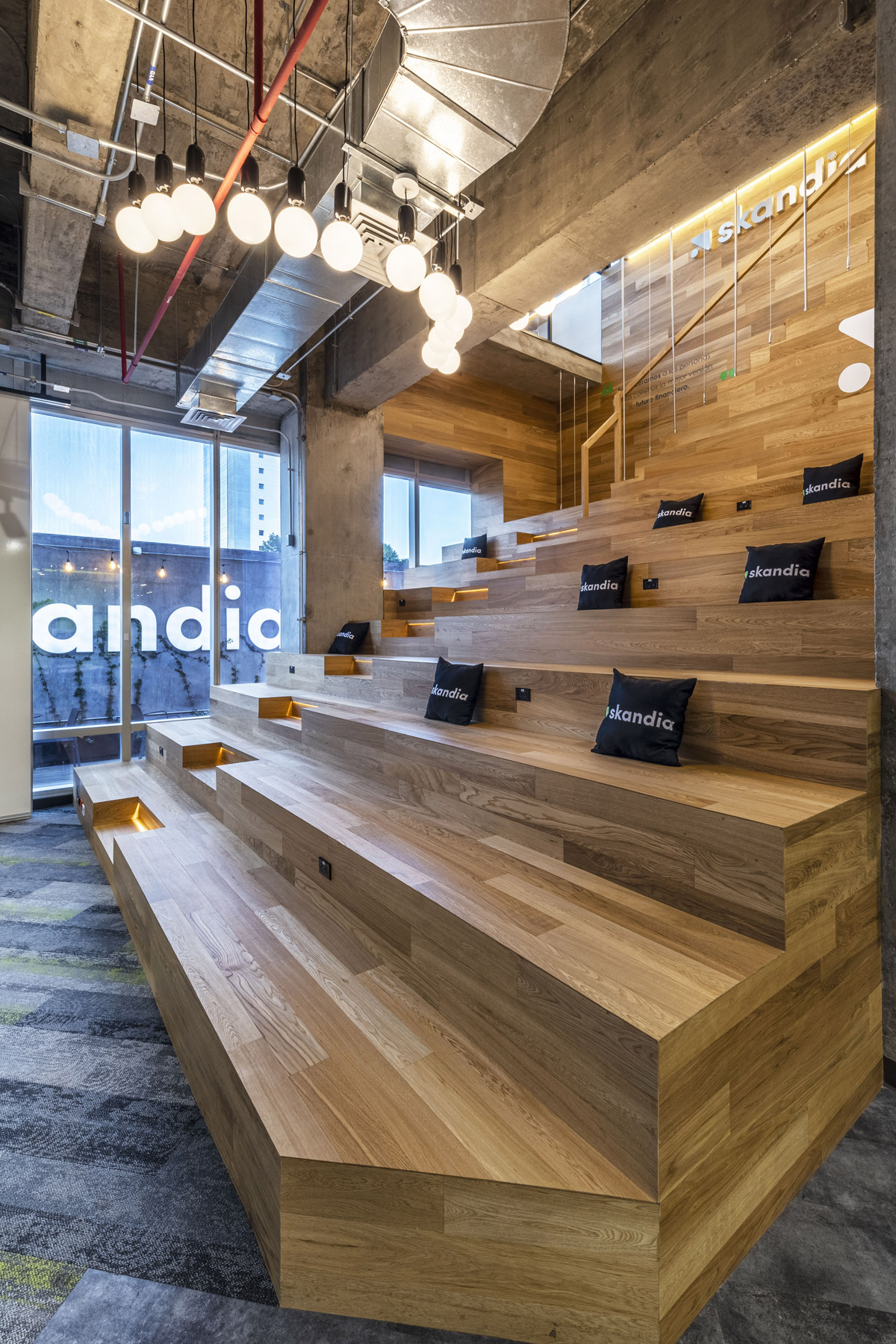
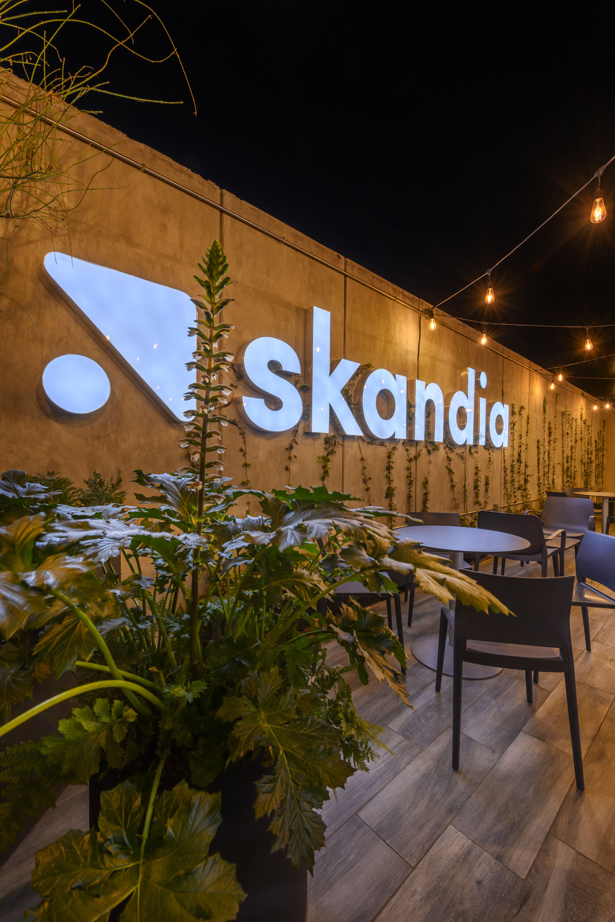
Game tables, TV screens and seating spaces were installed. As well as the University space, adapted with dynamic furniture, moving walls, front-bleachers and high-tech equipment to facilitate communication and videoconferencing. The Work Café was designed with a bar on the ground floor to enjoy the terrace, accompanied by some cabins, benches, tables and chairs.
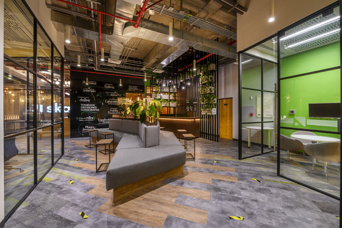
Skandia redefines the concept of traditional offices, based on clear objectives of socialisation, creation, agility, connection and inspiration that strengthen the trust between collaborator and client relationships. By offering an iconic, productive, natural environment of social interaction and well-being, the highest standards of quality in infrastructure and service are met, and the barriers of the common functional and habitual are surpassed with spaces designed to increase work performance through comfort and versatility.
About spAce
spAce have structured a new way of looking at architecture: intending to be the best if not the biggest, they have integrated an interdisciplinary staff of highly talented and compromised professionals. spAce take into account the importance of research and technology development, then they include them both in their method of thinking and working, always seeking after SUSTAINABLE solutions which not only RESPECT environment but actually help to improve the natural habitat. spAce have created various lines of business, both interior and exterior. No matter it is a small space, a large building, campus, offices, shops or housing settlement, they do know that to achieve a great solution they have to begin from the inside. This is the basis of their philosophy: designing from inside out.
If you’d like to feature your news or stories with SBID, get in touch to find out more.
If you’d like to become SBID Accredited, click here for more information.
Kohler, leading global brand, features eight additions to its smart home portfolio at CES 2022, focusing on enhancing wellbeing and making it easier for people to find peace of mind.
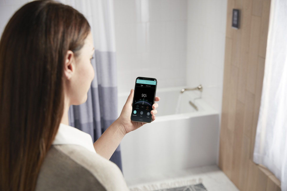
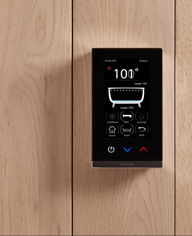
PerfectFill smart bathing technology is a smart drain, digital/app controller and bath filler. PerfectFill draws a bath to a preferred temperature and desired depth with a simple voice command or through the KOHLER Konnect app, reducing time spent monitoring the bath as it fills. Previously demonstrated as concept technology, PerfectFill will be available for purchase in May 2022.
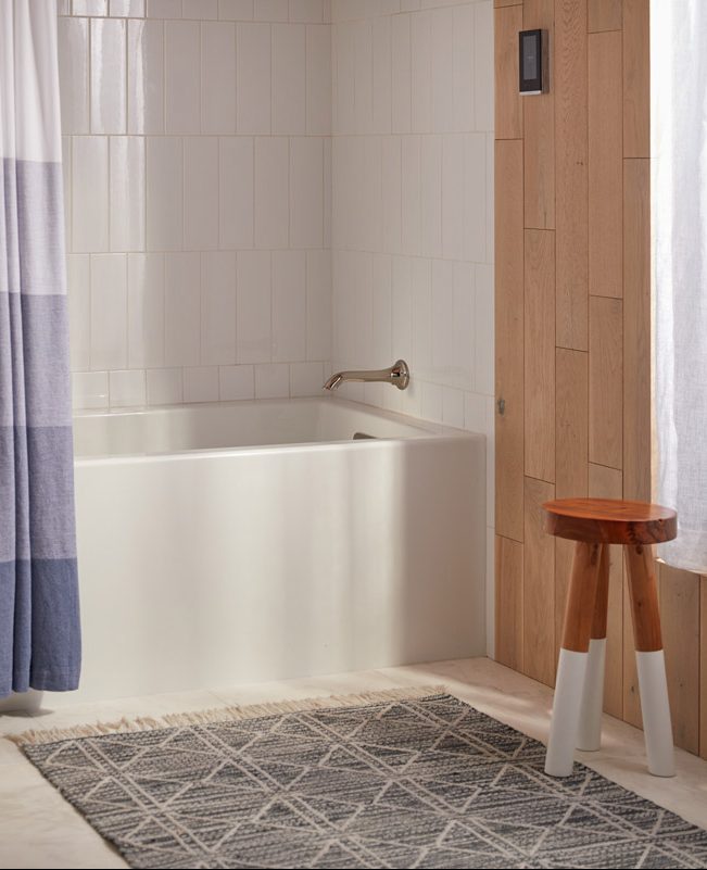
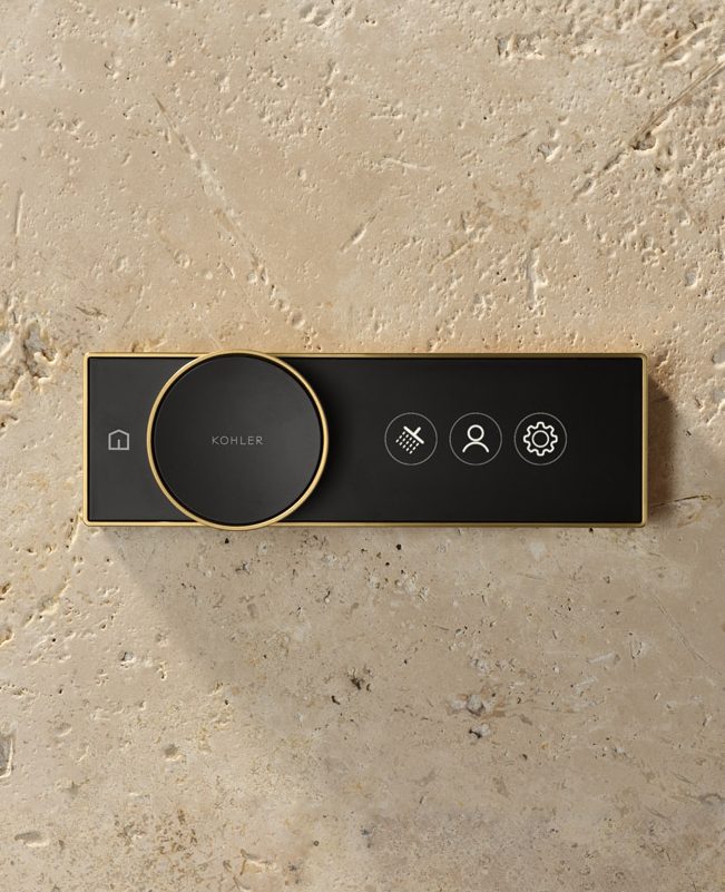
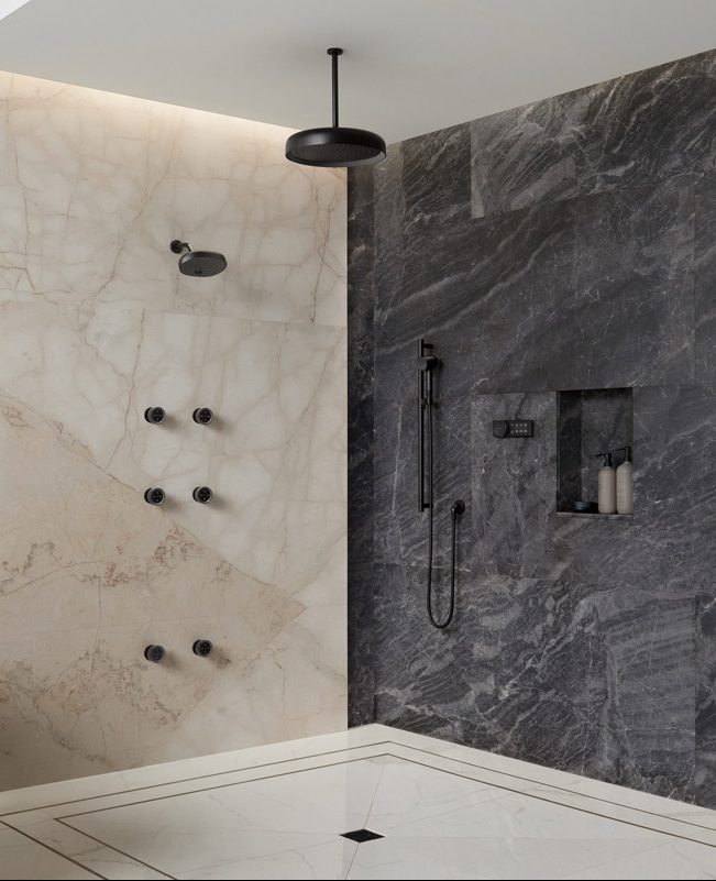
Anthem Valves and Controls – digital valves can operate multiple outlets, integrate into the KOHLER Konnect app, can be paired with voice assistants, and offer the unique functionality of independent temperature and flow control in each outlet. Paired with the immersive sprays of the Statement showerheads, hand showers, rain heads and body sprays, Anthem upgrades the shower through innovative technology and engineering.
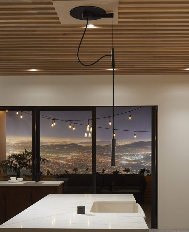
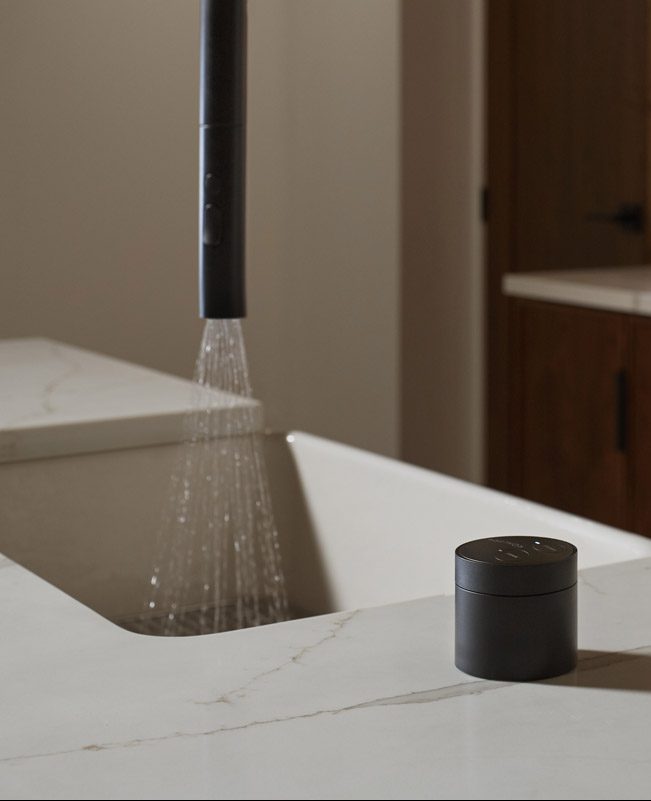
Purist Suspend – ceiling-mounted kitchen faucet featuring a remote puck that manages activation, temperature and volume, and a fully adjustable hose with 180-degree rotation.
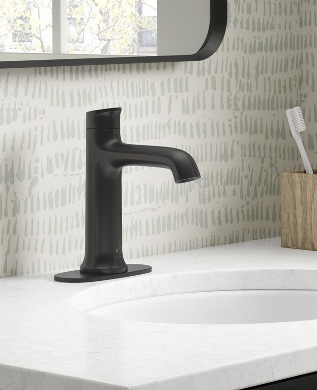
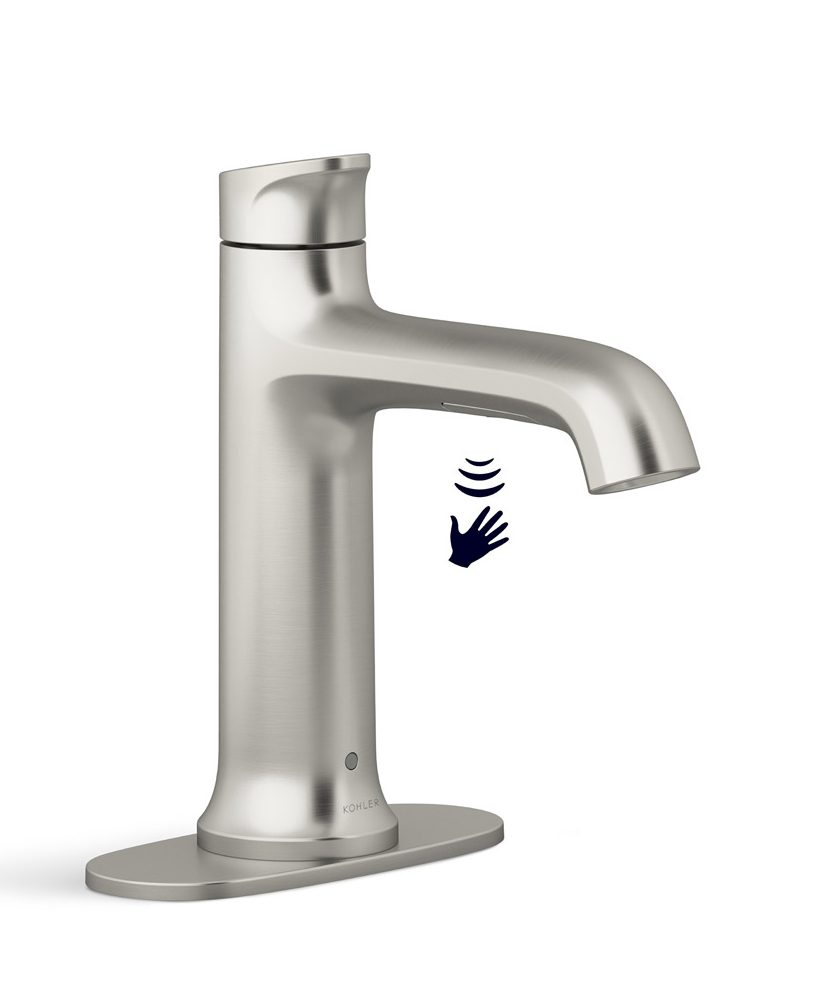
Touchless Residential Bathroom Faucet – New category for Kohler, these faucets function with a simple wave of the hand, offer temperature control and operate by battery, offering an easy tech upgrade.
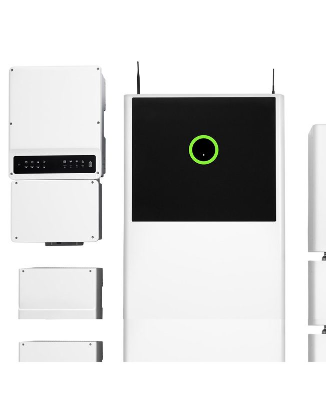
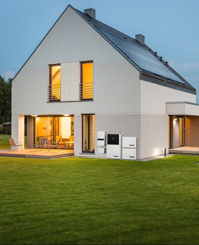
Kohler Power Reserve – a modular home energy storage system that pairs with solar power systems to provide homeowners with access to solar energy regardless of the weather, time of day or status of the grid.
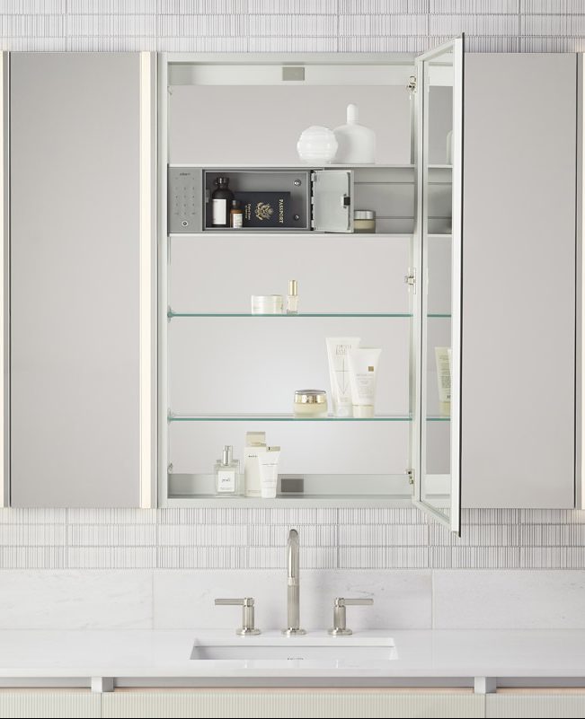
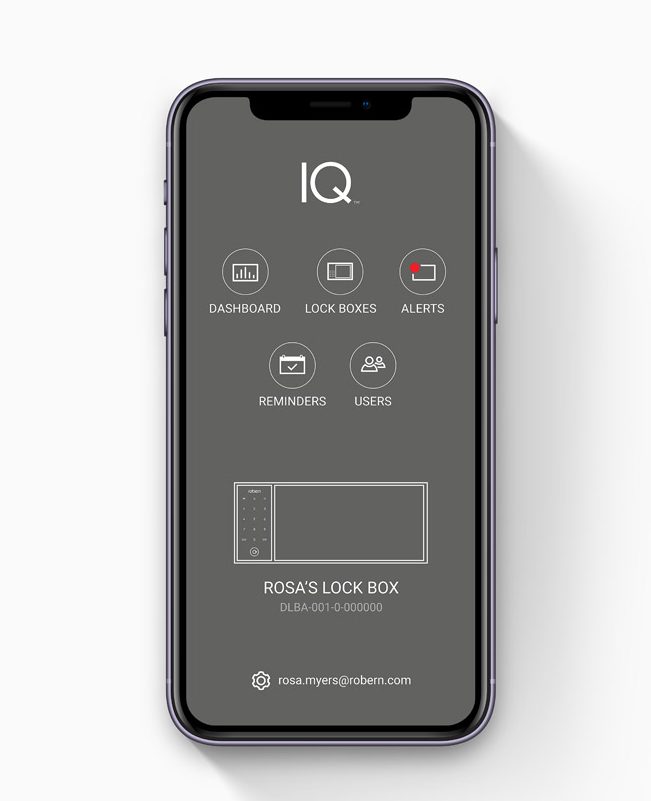
Robern IQ Digital Lock Box – a smart lock box that offers a compact way to securely protect valuables, medication and personal items. Digital Lock Box is equipped with a touchpad panel as well as an app to set and protect your password and ensure that your items are secured.
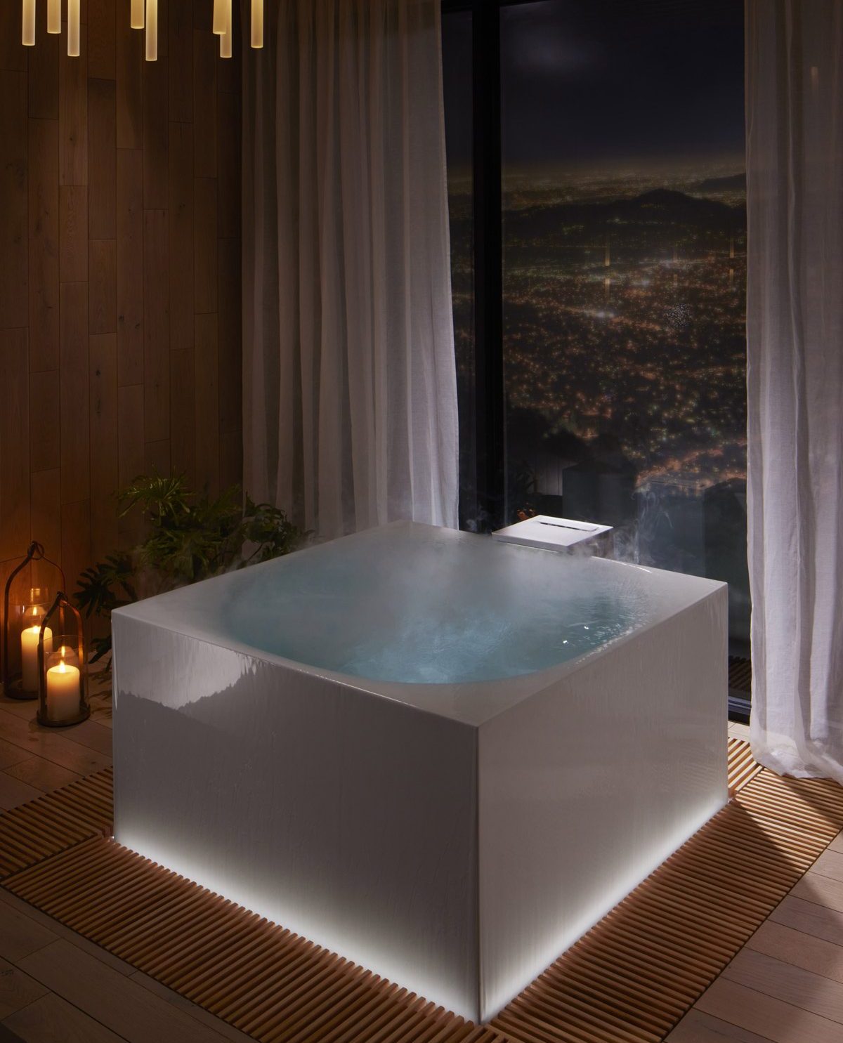
Additional featured products coming to market in 2022 include Stillness Bath, a multi-sensory bathing experience inspired by Japanese forest bathing, and H2Wise powered by Phyn, smart water monitors designed to detect leaks and track household water usage.

About Kohler
Founded in 1873, Kohler Co. is a global leader in the design, innovation and manufacture of kitchen and bath products; luxury cabinetry, tile and lighting; engines, generators, and clean energy solutions; and owner/operator of two, five-star hospitality and golf resort destinations in Kohler, Wisconsin, and St. Andrews, Scotland.
If you’d like to feature your product news here, get in touch to find out more.
If you’d like to become SBID Accredited, click here for more information.
In this week's interview with 2021 SBID Awards winners for the Outdoor Product Design category, Belgard, discusses key industry changes, gives advice for designing outdoor spaces and introduces more of their innovative outdoor products.
SBID Awards Category: Outdoor Product
Practice: Belgard
Entry: Artforms/Artex
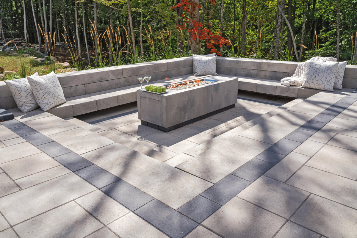
How important is it to enter the SBID Awards & receive industry recognition for your work? What are the benefits?
Joe: We certainly appreciate the visibility that comes from receiving international industry recognition for our work. Beyond marketing opportunities, an award of this magnitude is very exciting for Belgard because it validates our approach to design, as we are transforming our portfolio to be much more design centric. It is also important to us to tell the story behind our products.
It’s recognition like the SBID awards that will help us connect to local architect and design communities across the world. This is helpful as we look to launch the Artforms system in Europe next year.
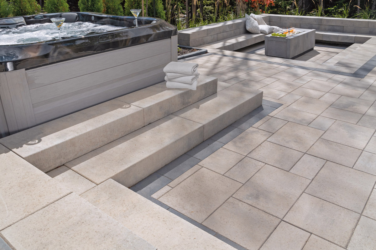
What do you think made this particular design an award winner?
Joel: From a research and development perspective, Artforms’ design is a game changer. It is the first modular concrete panel system that can be used in a variety of applications for outdoor living spaces. The modularity of the system offers simplicity and a modern design that contractors around the world are looking for today.
Joe: The innovative approach behind the flexibility and versatility of Artforms directly aligns with current outdoor living design trends. It provides a clean, contemporary look, which was historically very expensive and time consuming to achieve, in a new, more cost-effective way.
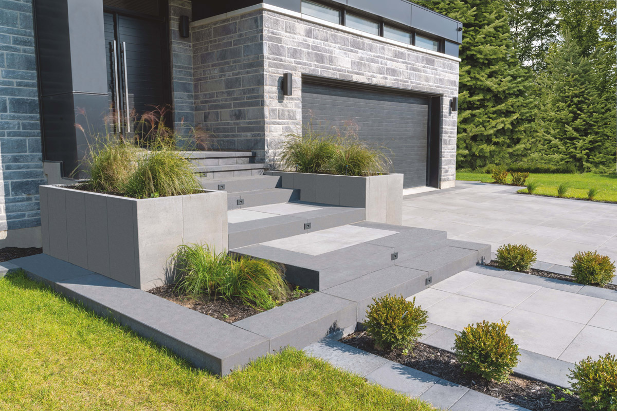
What was the design concept behind the Artforms modular panels? What does the solution aim to achieve?
Joel: The thought process behind the Artforms concept was to create larger format panels that can be installed vertically to maximize efficiency. The modular design also achieves the simplicity that aligns with ongoing trends in outdoor living design.
Previous techniques needed to achieve a more modern, linear aesthetic were extremely labor intensive. Artforms modular design provides the ideal aesthetic result in a fraction of the time and cost.
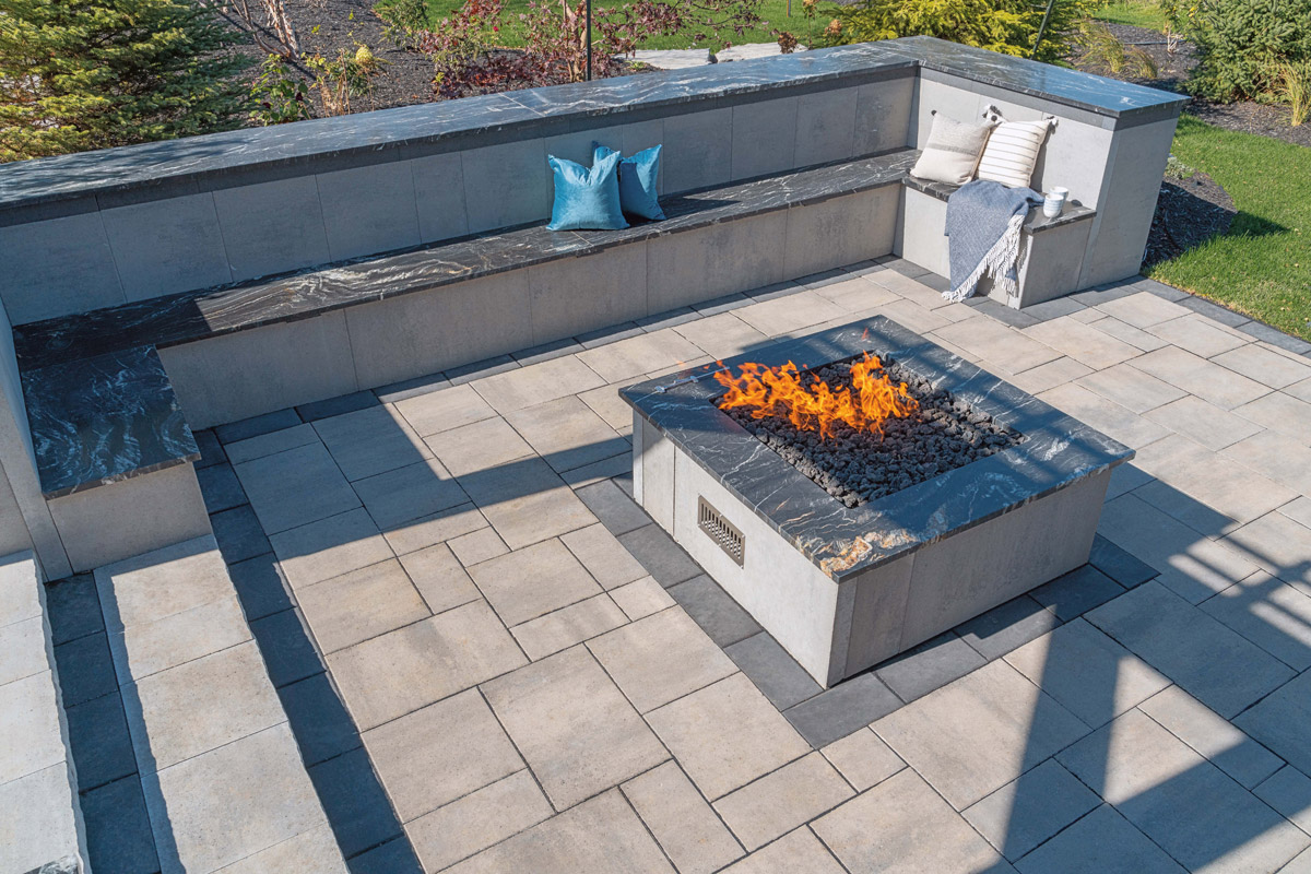
With the burgeoning trend of indoor-outdoor living on the rise, what advice can you give designers when approaching outside spaces as an extension of the interior environment?
Joe: My advice for designers approaching outdoor spaces is that it’s critical to consider the connection with the home and how both spaces function together. People often look at it as separate environments, but the best designs blur the line and make a physical and visual connection with the exterior. When you look at materials especially, if you’re able to pull interior materials outdoors or vice versa to make sure it ties into the architecture and flow of the home, that is where we see the most success. Artforms goes a long way toward achieving that. With interior design trending more modern, Artforms extends that flow to the exterior.
Joel: Interior design trends tend to move faster when compared to outdoor living design, which usually adapts as it follows slowly behind interior trends. We saw the trend of larger format and concrete design becoming more popular and were able to predict this now ideal modular design bleeding into the backyard. The concrete look is popular indoors, with many iterations of porcelain tile with a concrete look that can be easily matched to Artforms in outdoor spaces.

Now that you’ve won an SBID Award, what are the next steps? Is there anything new you are excited to be working on?
Joel: Artforms as a system, has a few next steps as we roll out a variety of applications, parts and new finishes/textures that are easily integrated into this system for personalized configurations. These additional compatible features allow the modularity to extend into the whole outdoor space with one comprehensive design. One example is the privacy panel that is part of the Artforms ecosystem.
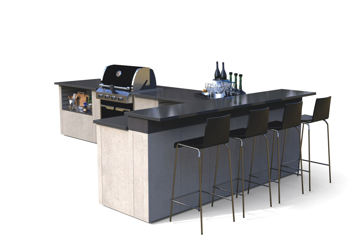
Belgard continues to make outdoor living spaces more efficient and functional, especially with the increased interest from homeowners. We want to be able to offer all the products and features to outdoor living spaces complete and feel like “home.” Our new Elements line of products fills this need. In addition to our modular outdoor fire features and grill islands, Elements is also a collection of stainless appliances and fixtures including cooking, storage, bar and sink accessory features that make outdoor living areas – specifically kitchen and dining spaces – feel complete.
Looking at what’s next, we’re excited to share our patented system with select communities in Europe within the next year. Artforms is currently available in the United States, Canada (Artforms/Artex), and Belgium (Moodul Creation).
What advice can you give to young designers starting out in the design industry?
Joe: Designers often get caught up on the artistic side of design or focus too much on products, creating a narrowed approach. My advice for young designers would be to not prioritize your personal goals. Understanding the consumers’ needs and lifestyle is critical, and you can work from that point to create the perfect design. If you can integrate new ideas, that’s great, but only if it’s the right fit. There is no need to push a certain look at the expense of the consumers.
Questions answered by Joe Raboine, Director of Residential Hardscapes, and Joel Remillard, R&D Hardscape Group Leader, Belgard.


Since 1995, Belgard's locally made and nationally backed products have transformed thousands of residential and commercial properties across North America. They strive to improve our products by spending more than 20,000 hours in research and development every year. Perfecting new products keeps them aligned to current design trends and places Belgard on the cutting edge of manufacturing techniques and technologies.
This week’s instalment of Project of the Week series features a luxurious villa design by 2021 SBID Awards Finalist, Todd Interior Design.
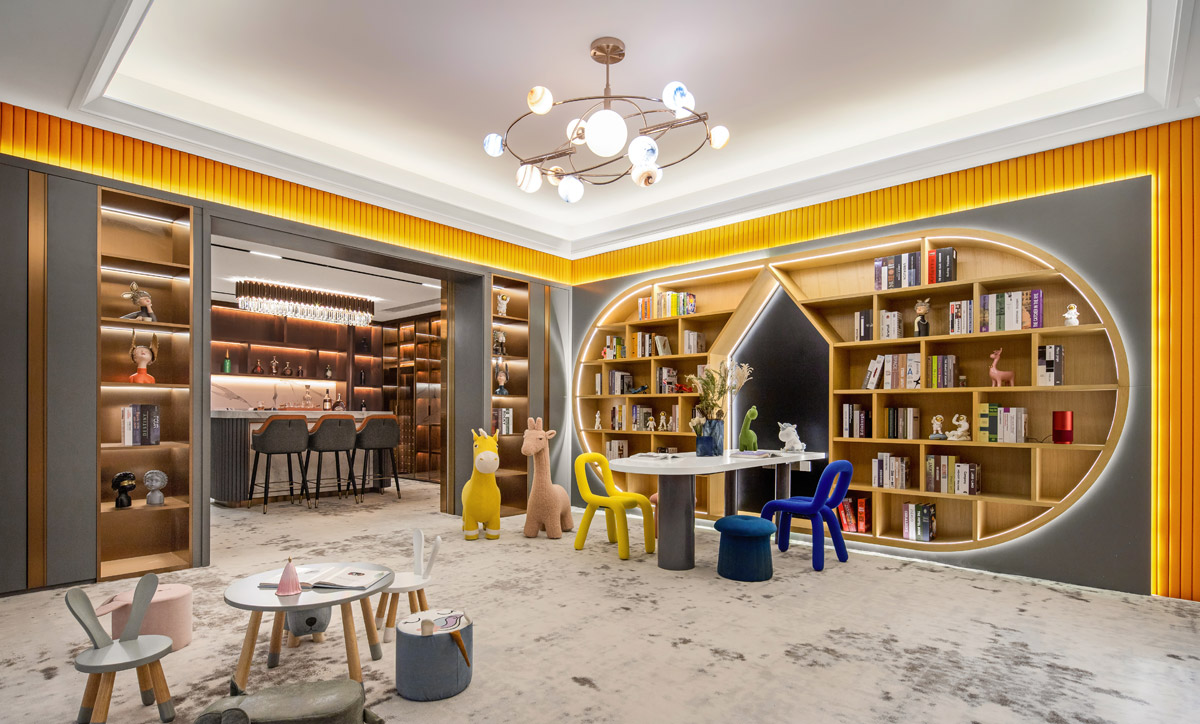
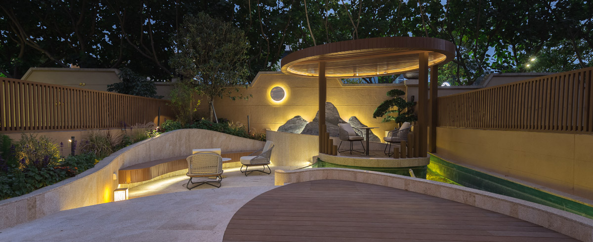
Residential space has always been a complex place because, according to our team's understanding, the family life is divided into three layers: one is material life, the other is spiritual life, and the third is soul life. Material life is food and clothing, spiritual life is academic literature and art, and soul life is religious belief.
Cantonese architecture and interior design take the Lingnan culture as the basis, and then refine the modern space language and integration techniques to create the rest of the design. Lingnan culture has been a window of communication between Chinese and Western civilizations since ancient times, and it has developed a school of its own. The so-called design style comes from the local culture, customs, characteristics and aesthetic standards. The furniture in the project is given priority to with coriaceous material and bright colours to make the space appear less depressing.
SBID Awards Category: Residential House Under £1M
Practice: Todd Interior Design
Project: Inherit the Modern and Elegance
Location: Guangdong, China
What was the client's brief?
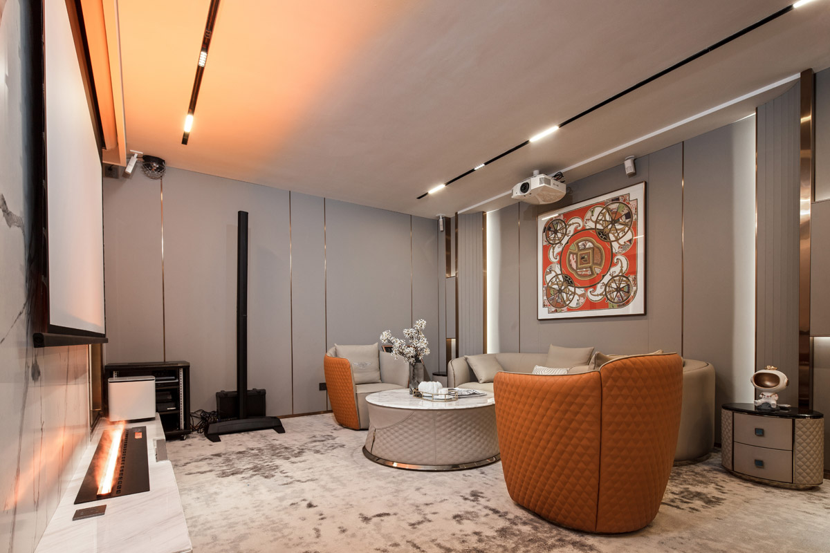
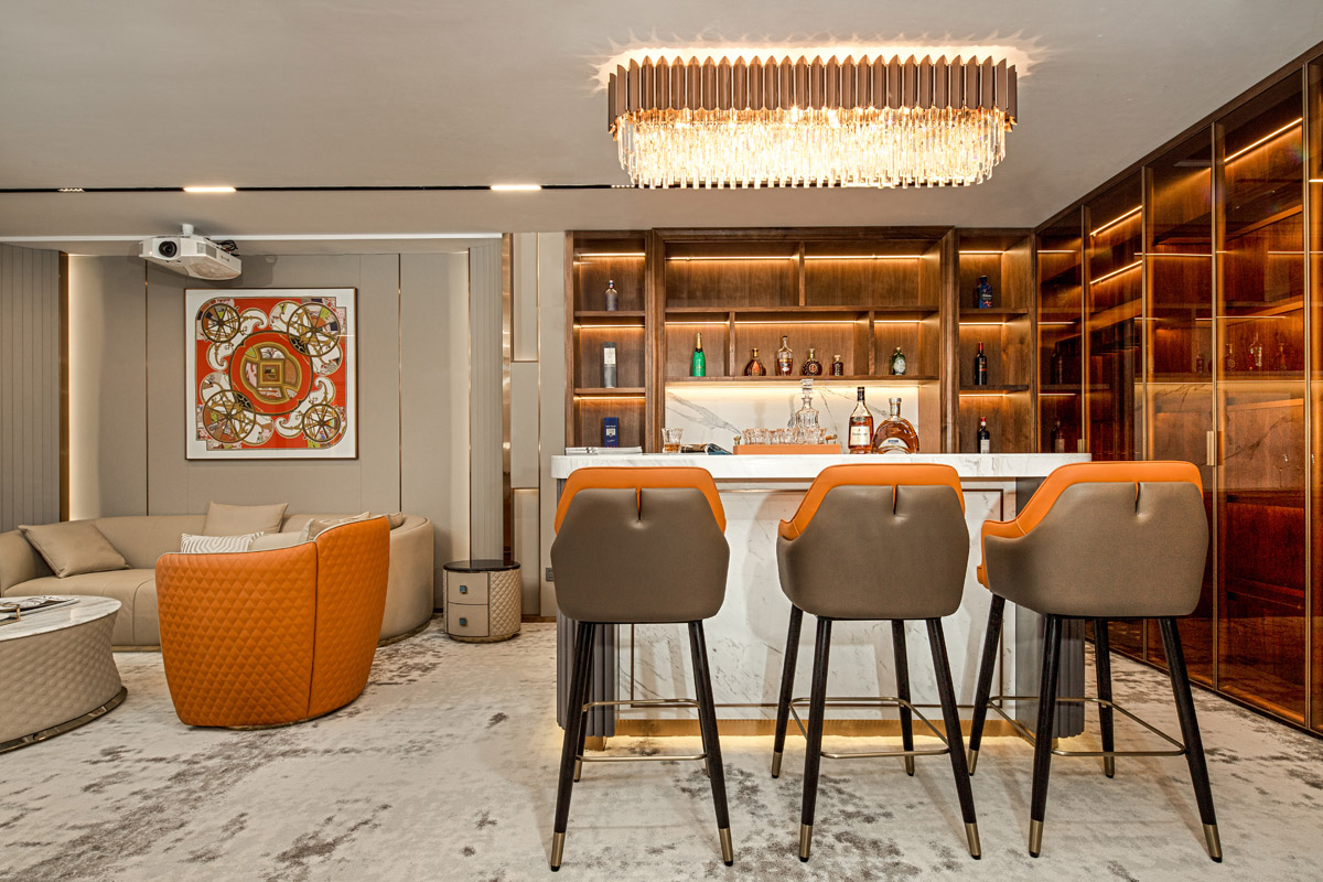
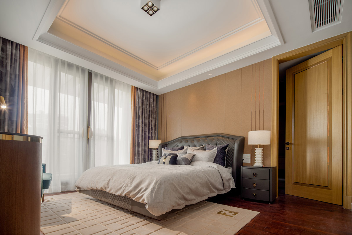
The owner of this villa told us that he wanted to achieve a calm and atmospheric interior design effect and use as many big brand furniture pieces as possible to increase the overall luxury feeling.
What inspired the design of the project?
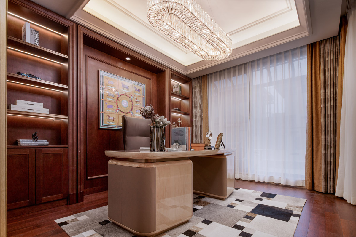
The design inspiration comes from the traditional interior design favoured by aristocrats, which is inherited with modern elegant elements and forms the effect presented in this project.
What was the toughest hurdle your team overcame during the project?
During the implementation of the project, the biggest obstacle our design team encountered was the little time reserved for the project. We only had four months from the design approval to the project delivery. Fortunately, we did it.
What was your team’s highlight of the project?
One of the highlights of the project is the collocation of many big brands of furniture, that brings the luxury of the interior space to the international luxury standards.
Why did you enter this project into the SBID Awards?
SBID Awards is a well-known international awards, and we are looking forward to participating in it. It is a great encouragement for our design team that our project has been listed as a Finalist.
Questions answered by Toni Wu, Creative Director, Todd Interior Design.
Concrete LCDA introduce a new Panbeton collection of surface panels, consisting of five new designs, two of which were made in collaboration with Neri & Hu and Jean-Philippe Nuel.
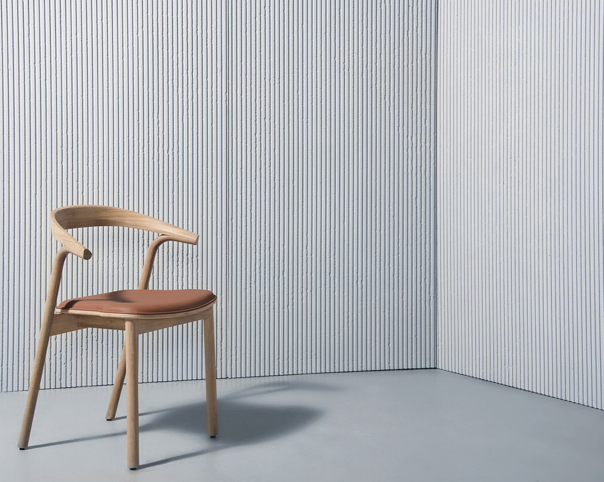
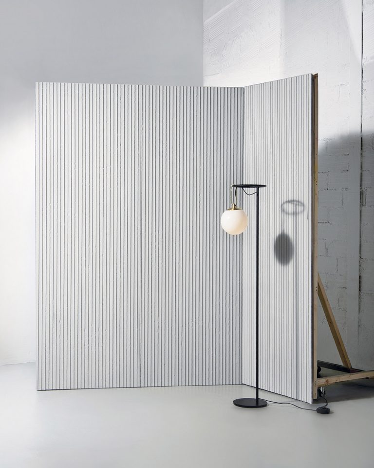
Panbeton Gèn by Neri & Hu
The Chinese character 亘 “gèn” is composed of two lines at the top and bottom, with the character for “sun” nestled in between. The horizontal strokes, one representing the heavens above and the other representing the earth below, allude to the infinite extension of the horizon, embodying the notion of a spatial and temporal continuity. The design for the panel is composed by a series of well-proportioned raised lines that could appear to extend infinitely across a surface, drawing a direct connection between landscape and dwelling, ground and sky.

Panbeton Graphite by Jean-Philippe Nuel
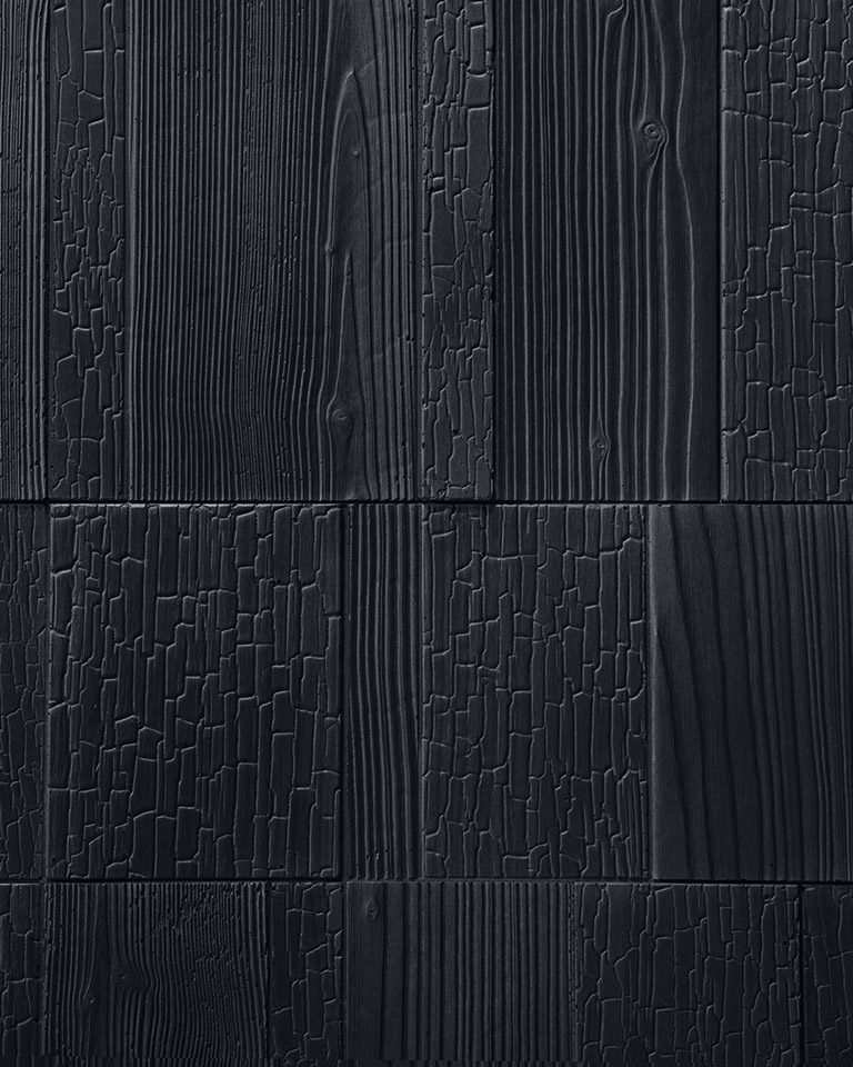
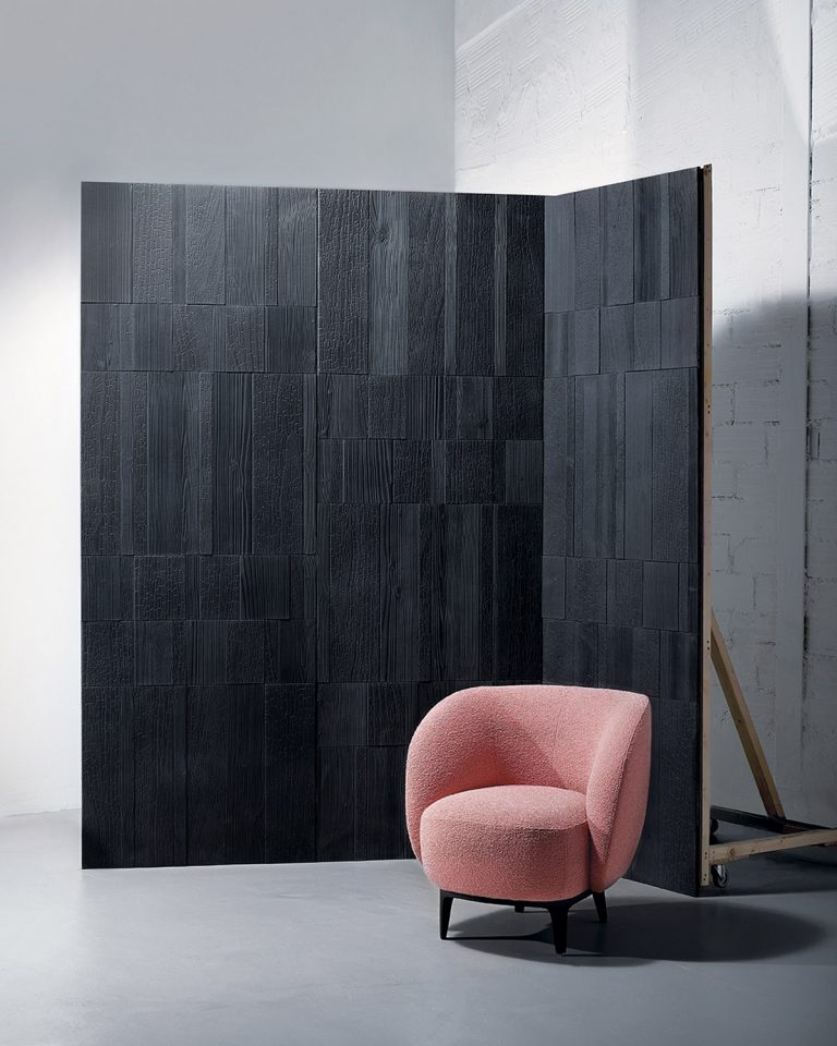
Studio Jean-Philippe Nuel has created a new model of ultra-lightweight, high-performance fibre-reinforced concrete panels for Concrete LCDA, called “Graphite”.
Continuing along the same lines as the Chevrons and Timber panels – the one derived from the imprint of Haussmann wood flooring, and the other influenced by wooden formwork slats – Graphite retains a woody touch, as it draws its inspiration from the graphic designs created by different species of wood as they burn. Because depending on whether you burn Douglas fir, Accoya, oak or pine, the surface of the wood will take on a cracked, flaky texture, long grooves or smooth, tight curves.
In architecture, charred wood is traditionally used in exterior cladding, as it provides natural protection to the wood. This Japanese technique is known as “shou sugi ban”. It involves charring the surface of a board, deep down, until a superficial layer of charcoal forms, which will protect the material from the effects of weather.
“The Graphite panels do more than just use charred wood: they feature a graphic composition which plays with the textures of the different finishes, almost like inlays. This way, the panels take a contemporary, creative approach to reinterpreting a secular tradition.”
The result of this assembly is a concrete panel with a flowing geometric design which can be extended length-wise and height-wise like wallpaper. This cladding will add character and a strong identity to any room it adorns.
Panbeton Lines, Striation & Rugged by Studio LCDA
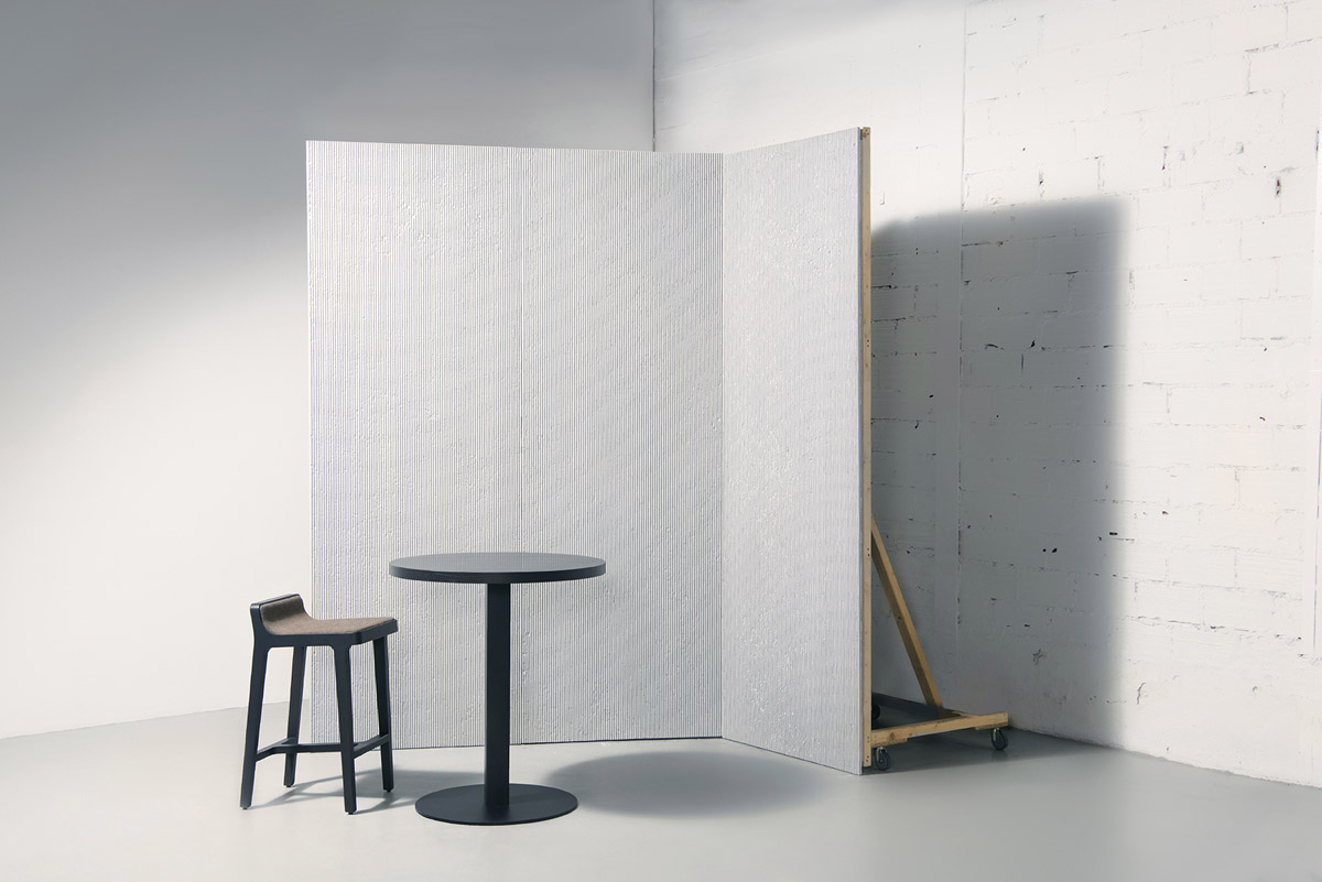
The Brutalism Collection is adding three new models by Studio LCDA: Panbeton® Striation, Lines and Rugged.
As a new tribute to the Brutalist architectural style, this collection refers to the concrete used in buildings, to the raw material which reveals the traces and texture inherent to its installation.
Studio LCDA utilizes a language based on simple geometric shapes, repetitive modules and linear forms. “We wanted to let the concrete express its fundamental nature and its streamlined and pulled-out variations, making it possible to fully appreciate its minerality and its imperfections.”



About Concrete LCDA
Revitalised by three young entrepreneurs with complementary skills, LCDA (set up in 2003) became Concrete LCDA in 2011. The company is now the leader in Europe in the contemporary furniture and fibre-reinforced concrete interior fittings sector.
If you’d like to feature your product news here, get in touch to find out more.
If you’d like to become SBID Accredited, click here for more information.
In this week's interview with 2021 SBID Awards winner for the Office Design category, 4SPACE Design talk about how they ensure a design for a commercial space represents the company's ethos and explain their process of integrating lighting into workplace designs.
SBID Awards Category: Office Design
Practice: 4SPACE Design
Entry: BE
How important is it to enter the SBID Awards & receive industry recognition for your work? What are the benefits?
Winning an award and being acknowledge by the SBID Awards gives us untold recognition in the field of interior design. Receiving such praise is a testament to the team’s exemplary hard work and commitment to being the best firm in Dubai. The accolade allows us to build trust with our clients, both current and new. The international award gives us the opportunity to promote our award-winning name globally.
What do you think made this particular design an award winner?
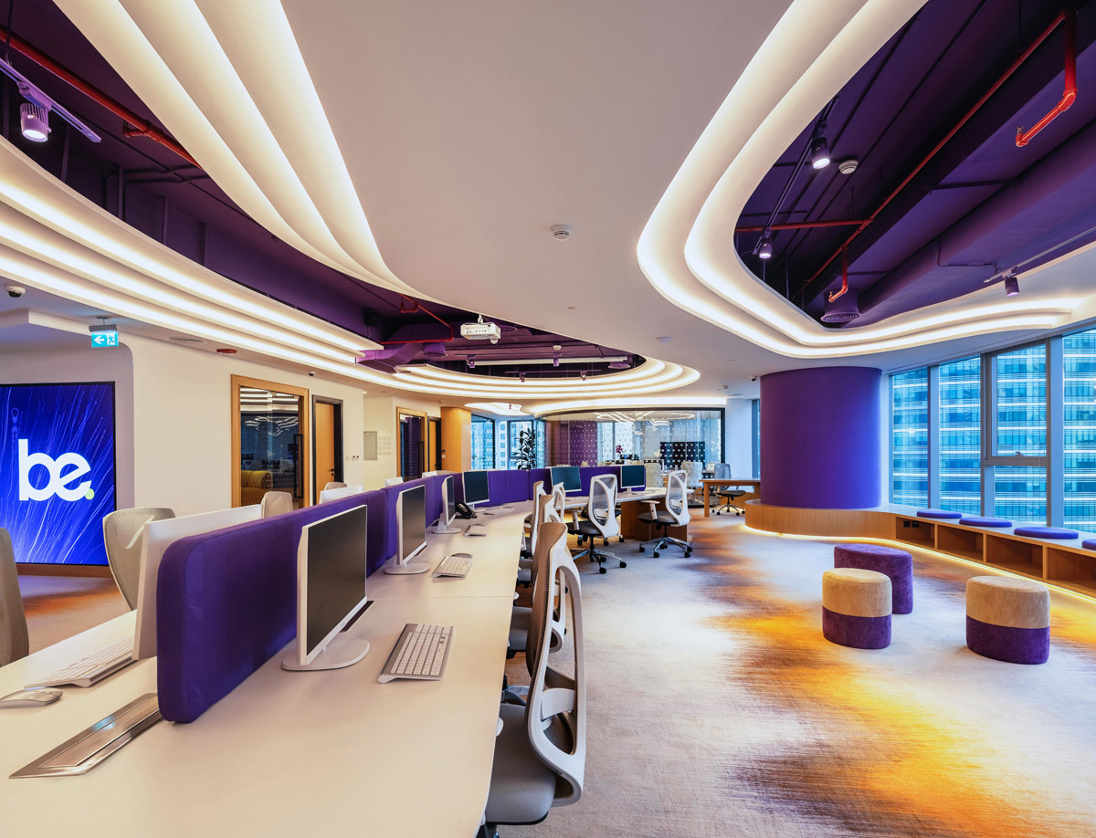
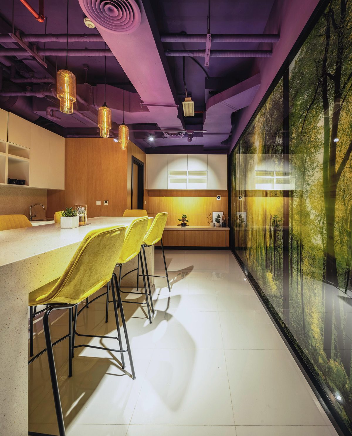
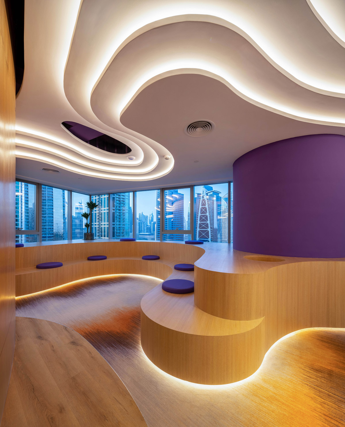
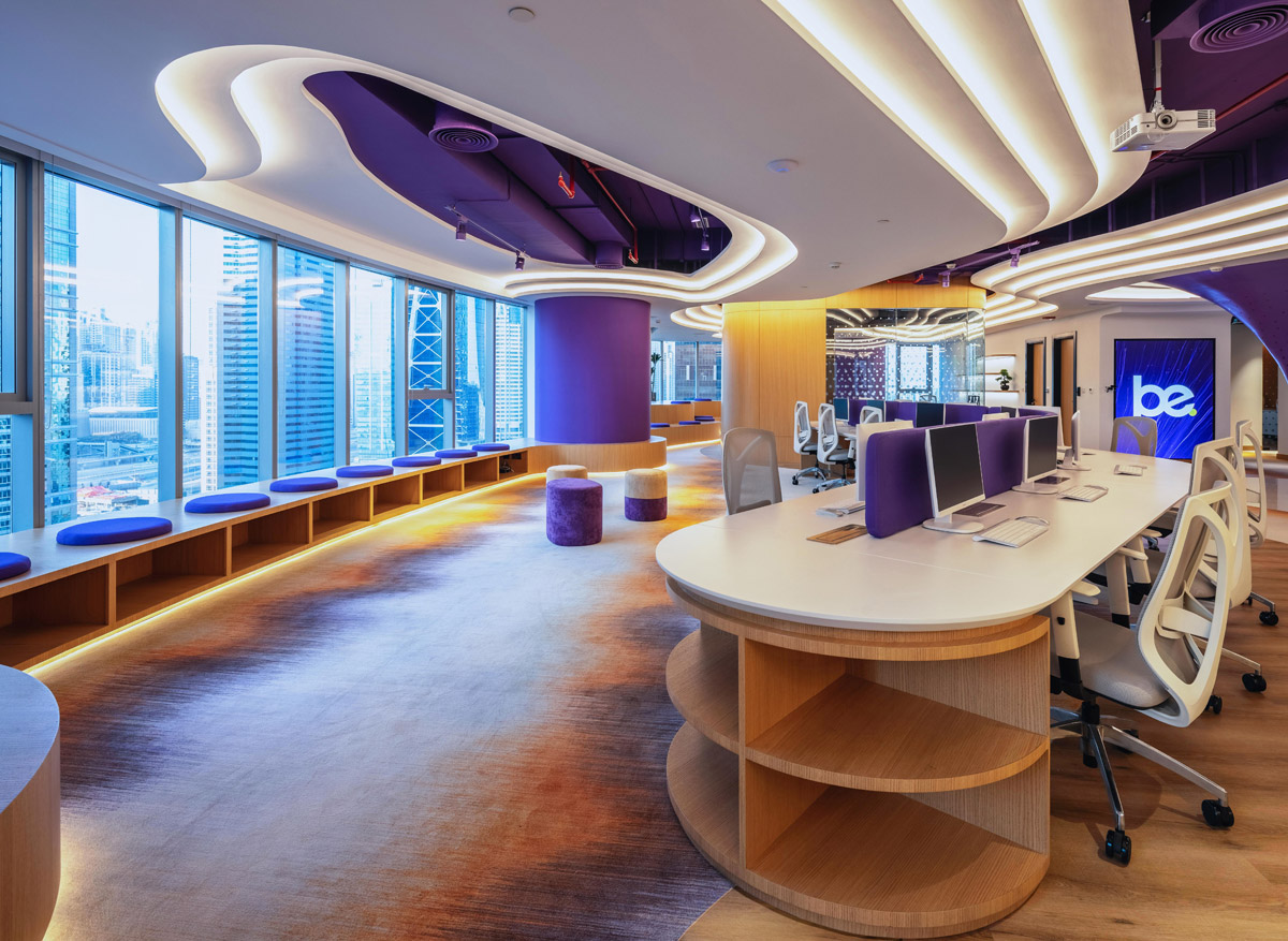
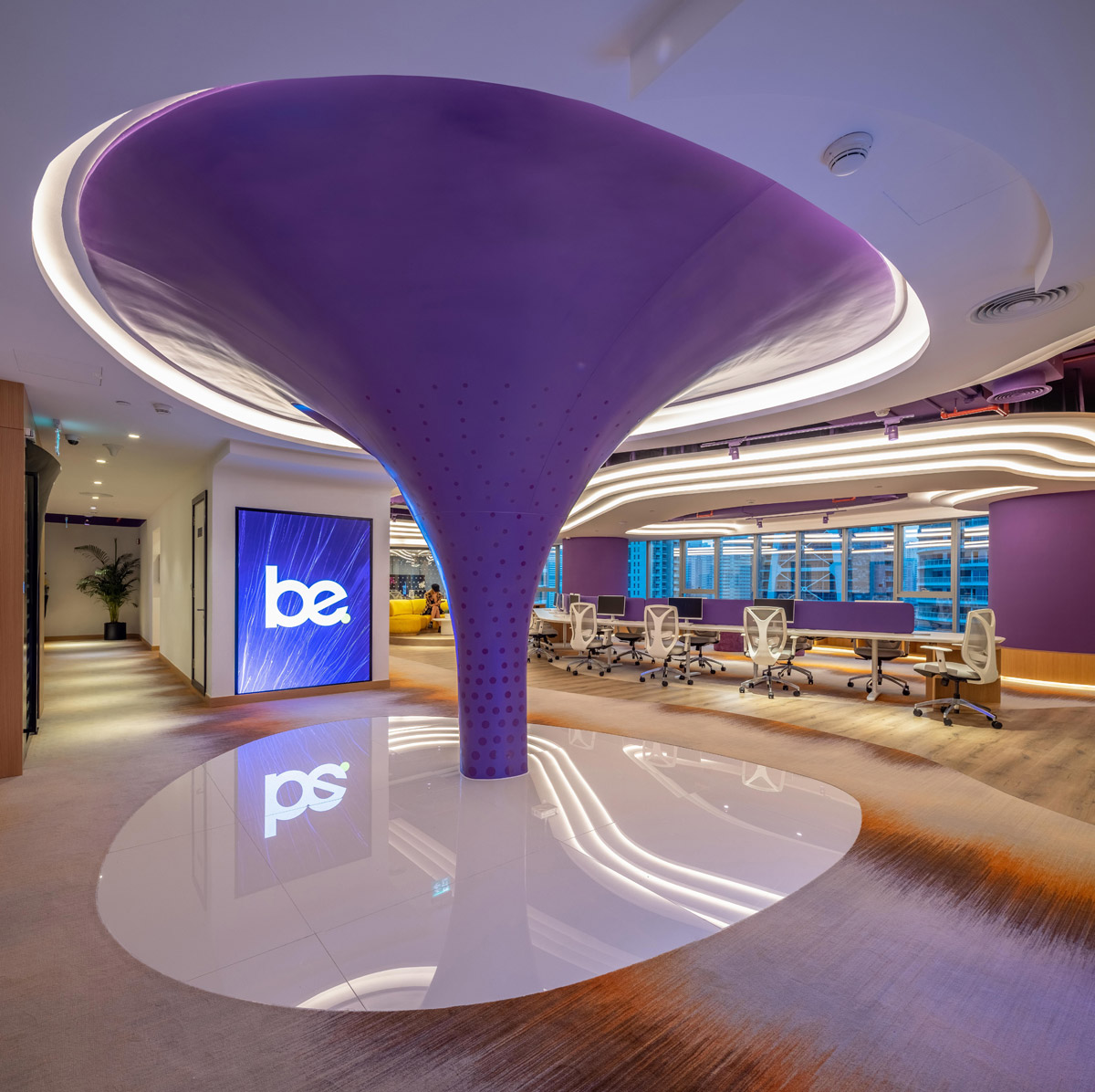
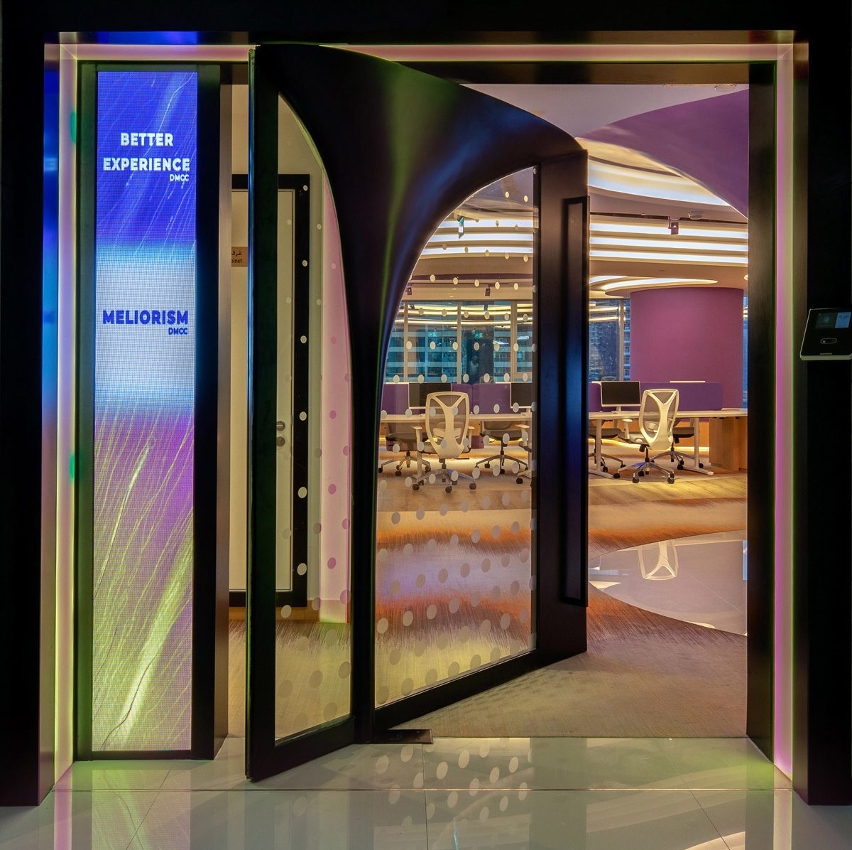
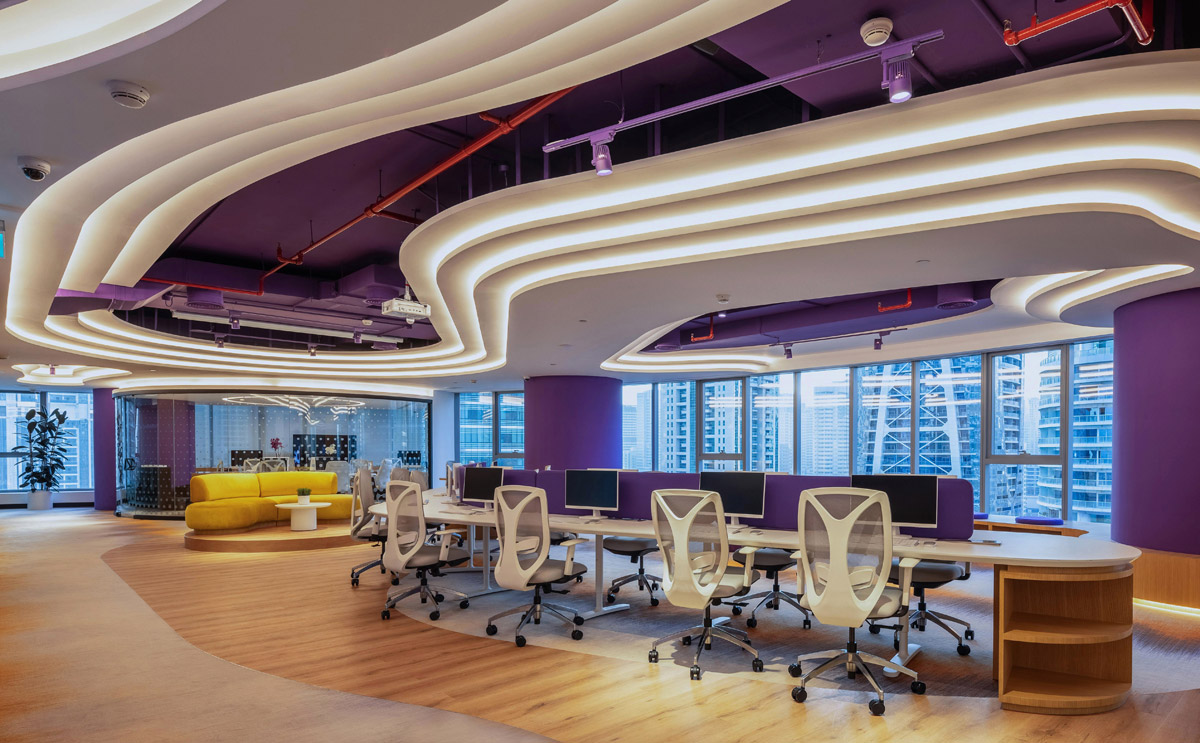
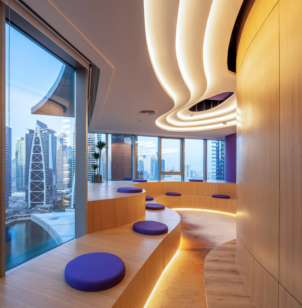
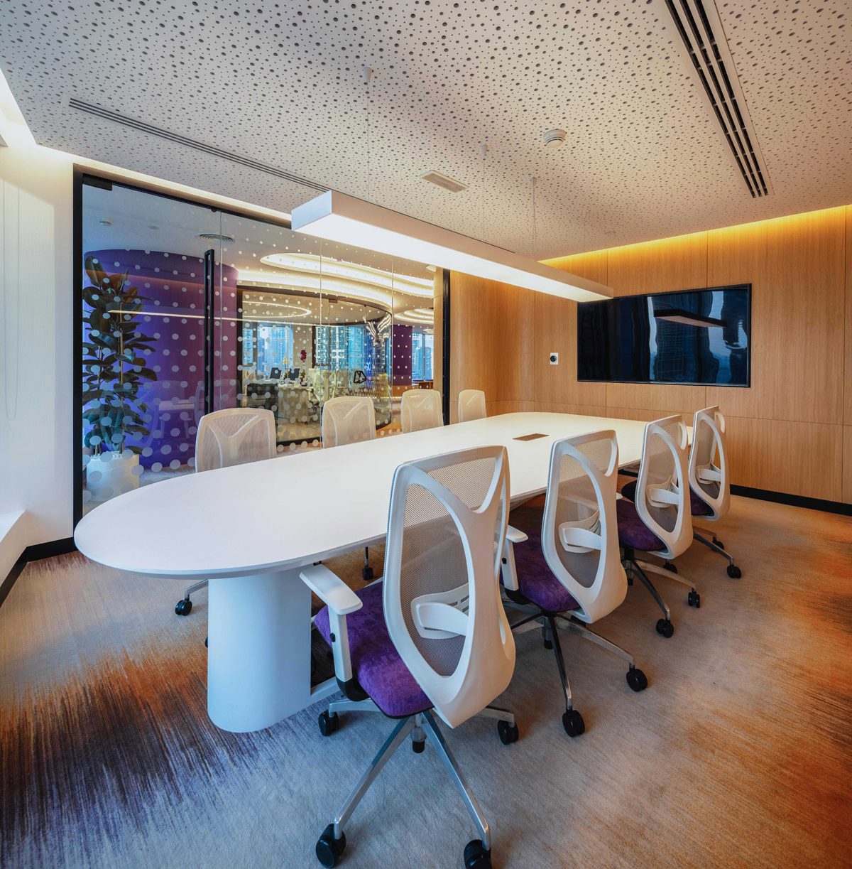
Designing spaces for the innovative and forward thinking team at the BE Meliorism office allowed us to weave the personality of the brand into the interiors. The minimalist and sleek lines of the furnishings allowed us to be creative with the use strong colours throughout the office. BE Meliorism is tech reliant and the designs embrace the futuristic core of the business. Open plan spaces allow for ample natural light whilst clever screening affords the idea of privacy.
When designing for commercial office spaces, the interior becomes an extension of the company’s visual identity. How do you capture and communicate a company’s brand ethos through interior design?
As a team, we reviewed the brands guidelines and spoke to the owner and the staff to understand the company vision and its core values. We used this vital information and chose and translated the inspirations into the design. Various design elements give good ambience to the space by underpinning the company values
What are the key considerations when specifying lighting solutions? How do you integrate lighting design into your projects, and specifically for working environments?
Life in the office was studied to understand how many users there would be throughout the day and into the night during any given 24-hour time period. We were careful to provide the necessary function with beautiful aesthetics so not to detract from the overall design.
Now that you’ve won an SBID Award, what are the next steps? Is there anything new you are excited to be working on?
We want to continue to support SBID over the coming years. We have lots of exciting projects in the pipeline throughout the rest of 2021 and into 2022. The projects are diverse and cover unimagined F&B venues, entertainment, virtual reality and metaverse. Excitingly, we are exploring many possibilities of designing spaces; we are bearing witness to a new world of tech, design and a major shift from the real economy to the digital economy, which have all accelerated since the global pandemic.
What advice can you give to young designers starting out in the design industry?
Be brave and soar high, strive higher and be patient. Be bold, innovative, and sustainable. Leverage your effort for exponential growth, find ways to navigate the digital jungle to market yourself across different platforms.
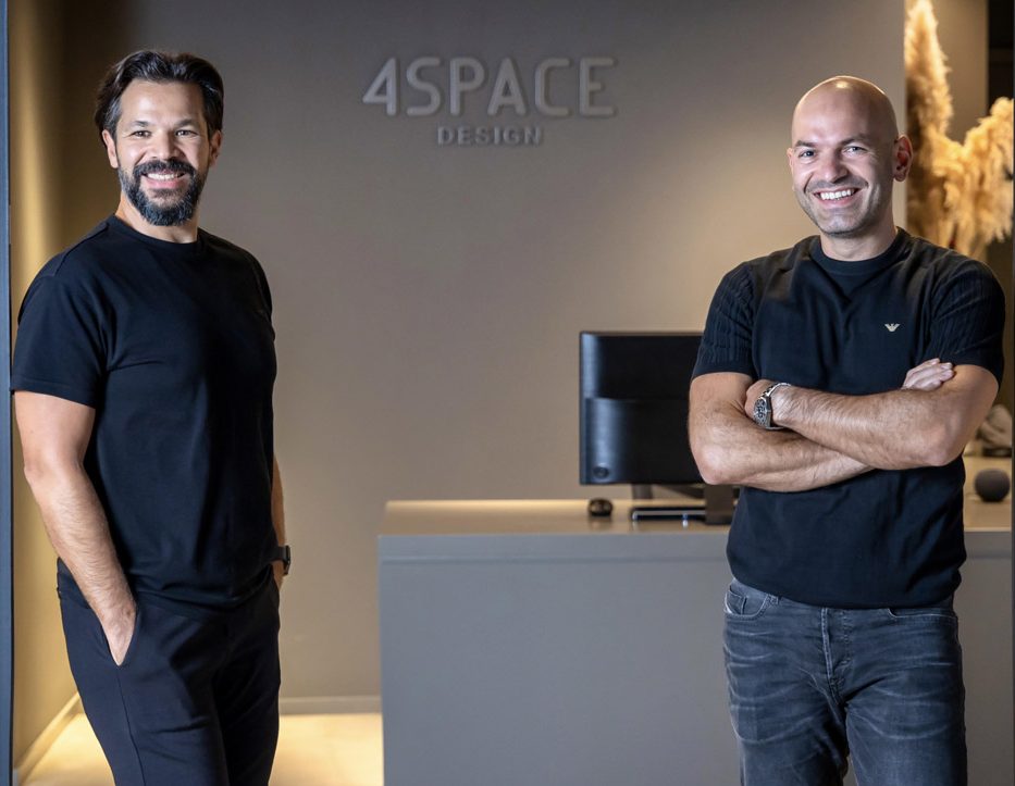
Originally established in Damascus in 2001, founders, Firas Alsahin and Amjad Hourieh, moved their practice to Dubai to be at the centre of this vibrant market. The emirate’s booming growth in the commercial sector was an impetus for the firm to explore all the opportunities in the design industry, creating noteworthy projects in the UAE.
