In this week's interview with 2021 SBID Awards winner for the Residential Apartment Over £1M category, IAIA - Idea Art Interior Architects, Darine Jabeili talks about creating personal designs and maximising and manipulating natural light in interiors.
SBID Awards Category: Residential Apartment Over £1M
Practice: IAIA - Idea Art Interior Architects
Entry: The Shadow Box
How important is it to enter the SBID Awards & receive industry recognition for your work? What are the benefits?
The SBID awards offer an international benchmark for design around the globe, featuring work from world renowned architects and designers. Entering the SBID Awards is opening a gate to international exposure and a chance to connect with many other professionals in the field.
What do you think made this particular design an award winner?
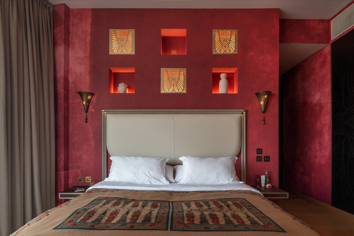
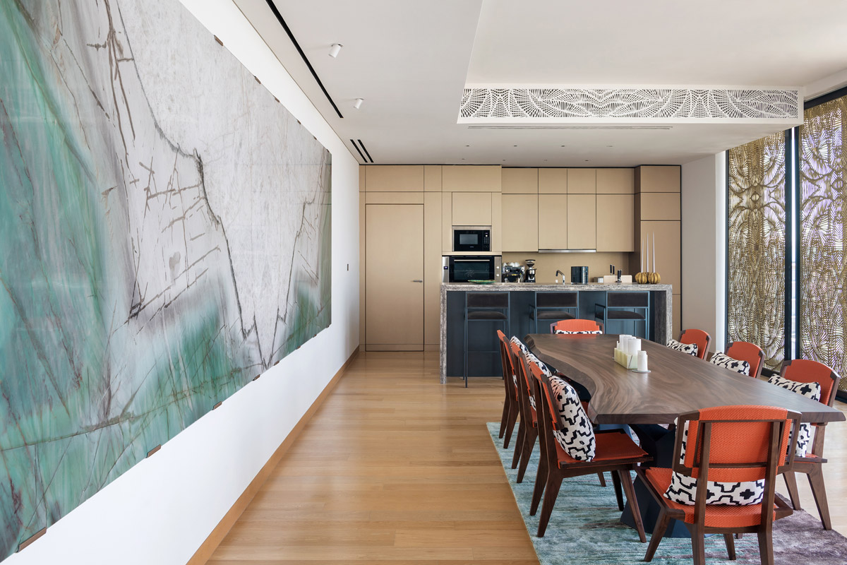
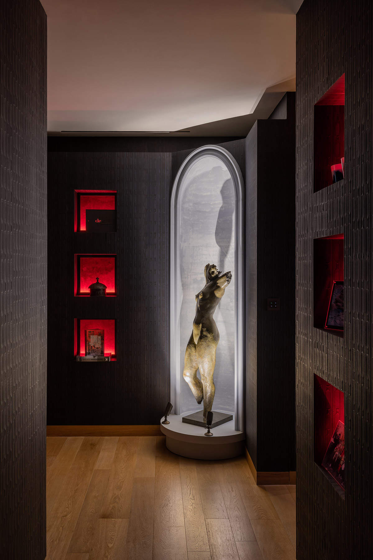
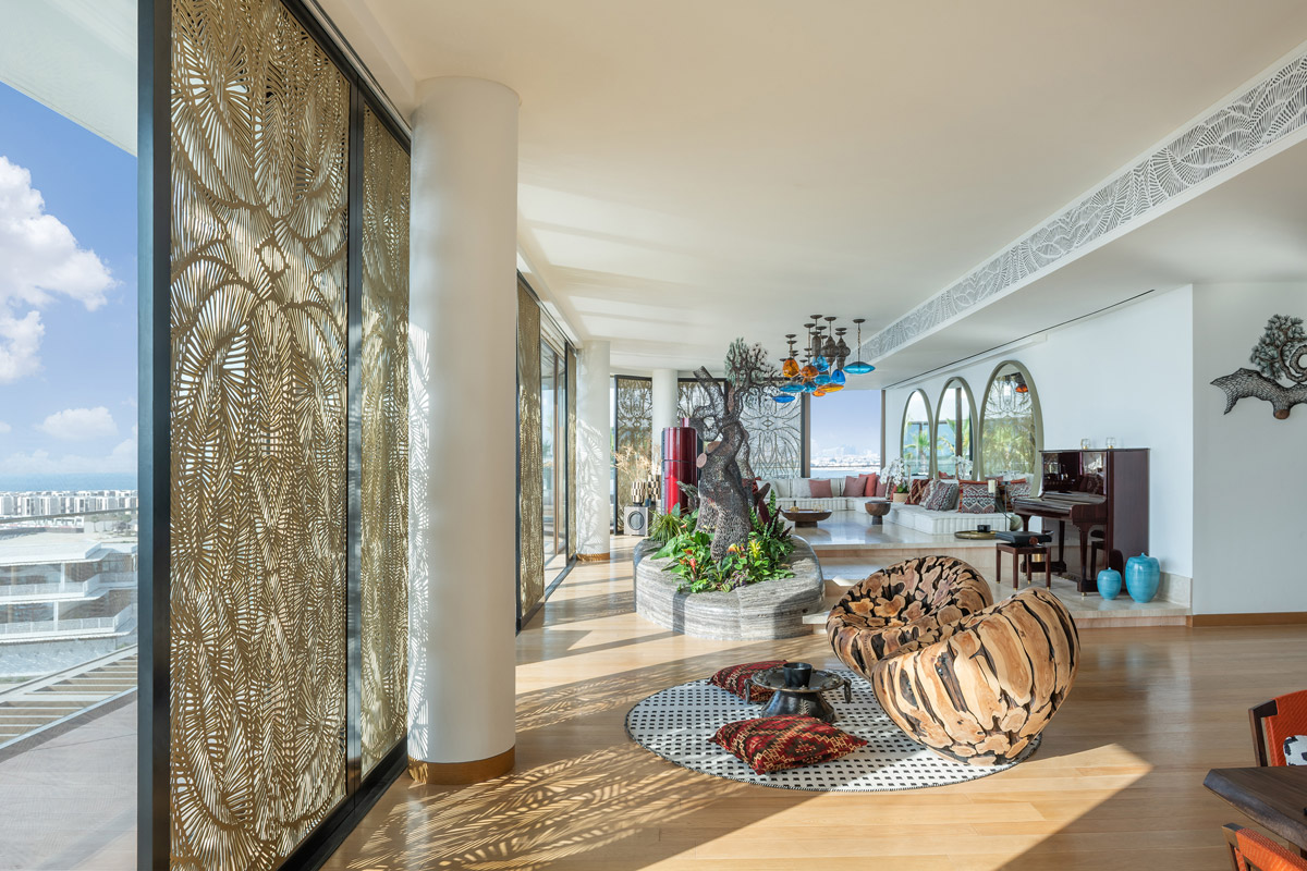
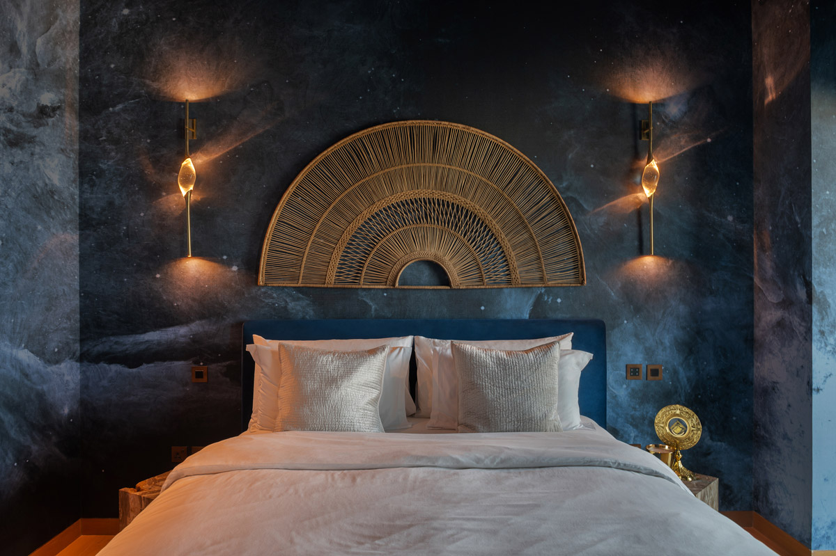
The unconventional client’s lifestyle led us to sit with them on endless discussions to guide our design and adhere to their best needs. This penthouse was created for a young and sophisticated couple with their own understanding of aesthetics and design. Coupled with the clients’ desires, daylight was delicately directed into the space, creating different scenarios and ambiances.
What inspired the design scheme of the luxury penthouse? How do you ensure the end result of an interior design is unique and personal to the client and their lifestyle?
Design is a process. In fact, it is a constant growth starting with a conversation with the client.
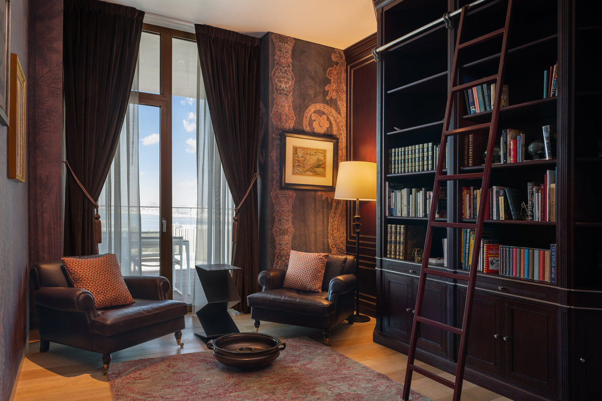
We always make sure, to sit down with our clients and understand their intentions and aspirations. The conversation gets personal, and we dive deep into their lifestyle and habits. We then brainstorm on many ideas and iterations that we think would suit the client and start working on developing them. Throughout the development phase, we discard some of the ideas, develop others and come up with new ones along the way. This process is what we love the most about our work, because it gives life to the project, and challenges us to outwork ourselves every time.
What are the key considerations when it comes to utilising or maximising natural light within interiors? Why is this important?
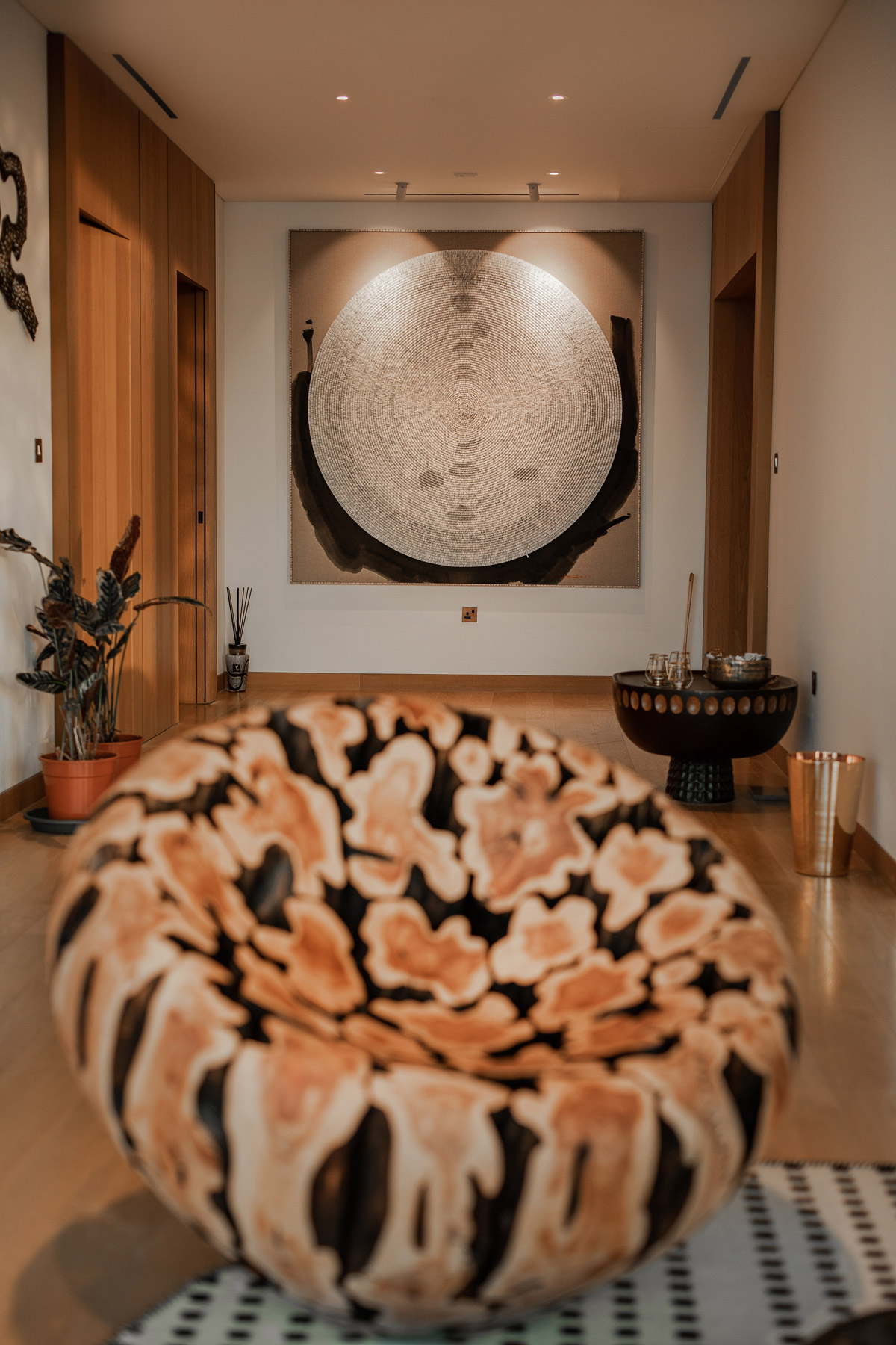
Whether we are designing spaces in the city or in remote locations, nature and the environment of the project are crucial. We, humans, are designed to live with Nature and be a part of it. One major natural component is: Natural Light. We study each space according to the depth of the slab, the ceiling height, and the openings proportions, leaving no room for deep or dark spaces with low natural light. We also work on the play of shadow and light in a space, by designing artefacts that respond to different scenarios of light.
Now that you’ve won an SBID Award, what are the next steps? Is there anything new you are excited to be working on?
We are happy to have landed the SBID Award this year, and for a project that we love. We are working on numerous projects which we are very excited about. One of our current projects is the interior of a residential apartment combining the four natural elements of Nature: Water, Earth, Fire and Air. The elements come together to sculpt the spaces and generate immersive design features in the apartment.
What advice can you give to young designers starting out in the design industry?
The design industry requires talented and self-driven leaders who are patient and enthusiastic. For all the young designers we advise that they never lose the spark and the curiosity to explore beyond the market and trends. Break the mould, and do not conform to what the industry has implemented.
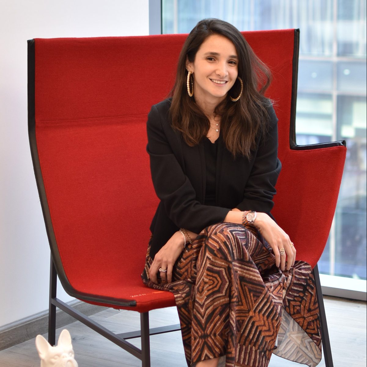
Questions answered by Darine Jabeili, Head of Design Department, IAIA - Idea Art Interior Architects.
Founded in 1994, IDEA ART preserved its philosophy of creating bespoke projects by implementing an out-of-the-box thinking and creating designs that are exceptional without exception. This philosophy has served numerous of local and international clients expanding their presence and projects over the entire MENA region and Western Africa.
This week’s instalment of Project of the Week series features a light and airy spa design by 2021 SBID Awards Finalist, Bishop Design by Paul Bishop.
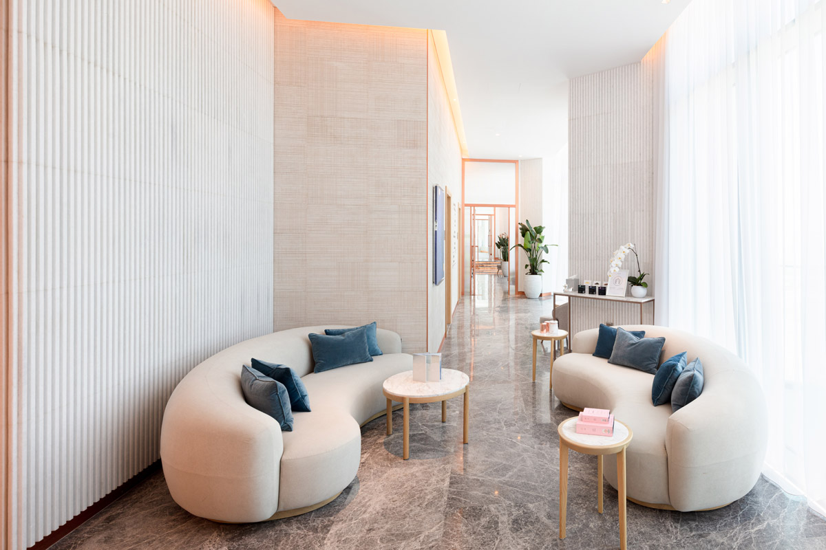
Traditional ideologies of a spa have been abandoned, where functional expectations remain but are orchestrated in new forms - using natural materials in modern manners which gives this offering a unique edge, whilst never forgetting the most crucial of factors - serenity. The design approach has been heavily focused on introducing natural materials yet integrating them in a way to appeal to a contemporary new age, reflective of the SLS brand. Our methodology of tone-on-tone applications, with teases of pink and references to the sky, elevate an immersive getaway experience. Light palettes mix with darker shades, greenery and plenty of light to create a feeling of openness; allowing guests to fully surrender to tranquillity.
SBID Awards Category: Healthcare & Wellness Design
Practice: Bishop Design by Paul Bishop
Project: Ciel Spa
Location: Dubai, United Arab Emirates
What was the client's brief?
Serenity and exclusivity were to come hand in hand at Ciel, the spa offering on the 69th floor of SLS Hotel & Residences in Dubai. The concept itself was an inherent part of SLS properties across the world, however it was up to us to enhance the offering. Still respecting the previous designs, but evolving the Ciel brand as a refreshed and new identity.
We conceptualized the narrative to focus on the view, and the notion of being high up in the clouds. This would lead us to orientate the space to capture the exterior perspectives, and that fascinating Dubai skyline.
What inspired the design of the project?
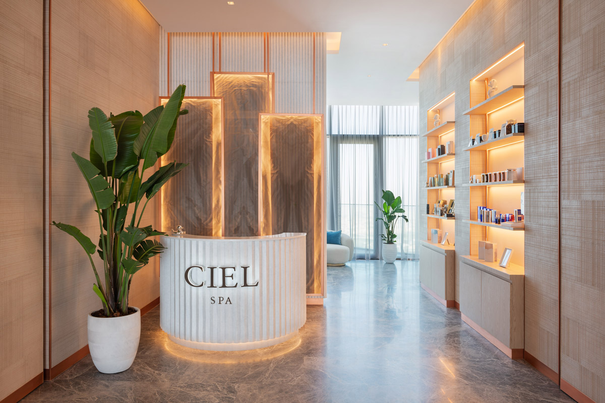
Nestled in the hustle and bustle of Dubai’s Business Bay, Ciel Spa offers a hideaway for those seeking out more peaceful moments. Our inspiration for the spa became rooted in celebrating the natural beauty of raw, soft tone materials; much like the essence of a spa would. Welcoming guests stands a fluted concierge desk that is complimented by rose tinted lighting, an oversized planter and contemporary retail display which creates a softness yet contrasts to the space through a harder material selection.
Key characteristics within are the ephemeral pink tone on tone colour palettes. These hues signify the mystical skylight moods that edge our environment. These soft shades balance beautifully with textures and accessories within.
What was the toughest hurdle your team overcame during the project?
Operational requirements called out for independent Female & Male entities, where each area would have its own jacuzzi/wet zone, treatment rooms and relaxation zones. Despite these individual areas, we were also challenged to create a neutral zone for couple treatment rooms which required intelligent consideration towards spatial planning. Besides from functional aspirations, we were given freedom to explore aesthetics and determine how users should interact with the space.
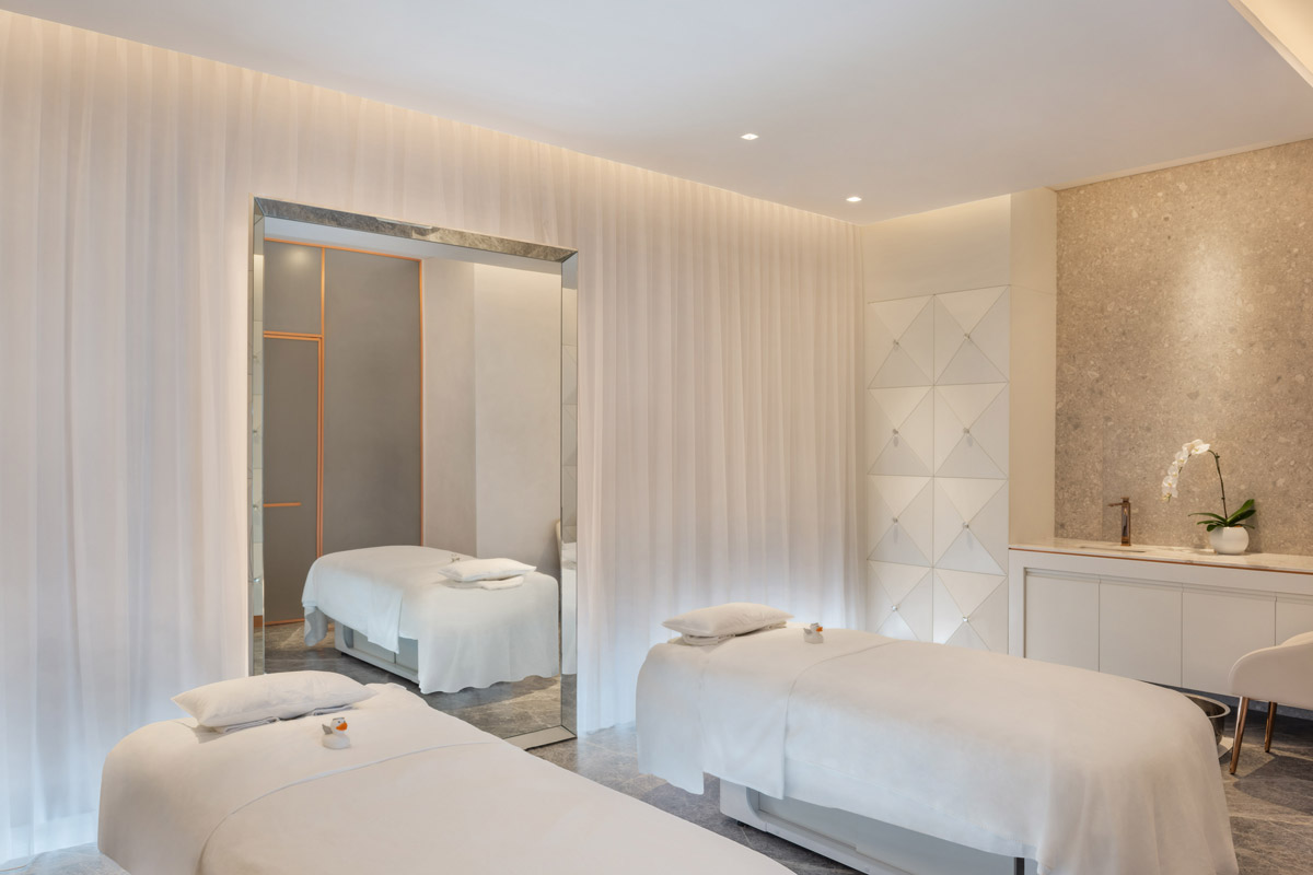
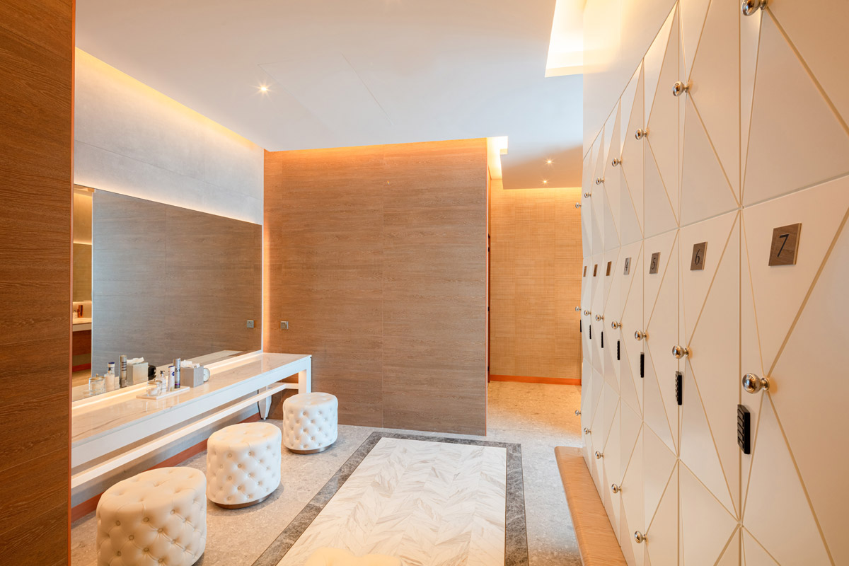
Treatment rooms offer both couple and individual offerings, where we decided to derive certain aspects from existing Ciel outlets yet evolve them for our Dubai venture. Storage facilities are three dimensional pyramids with diamante handles, a subtle reference to the luxury sentiments of the hotel and a reminder of the exclusivity which guests are treated with. White illuminated sheer curtains elegantly surround the back walls, intervened with an extravagant oversized bevelled mirror in the centre. These areas are ever so slightly moodier than the otherwise light and airy spa environment to create an intimate retreat for those seeking out something a little more personalized and private - a sense of escapism.
What was your team’s highlight of the project?
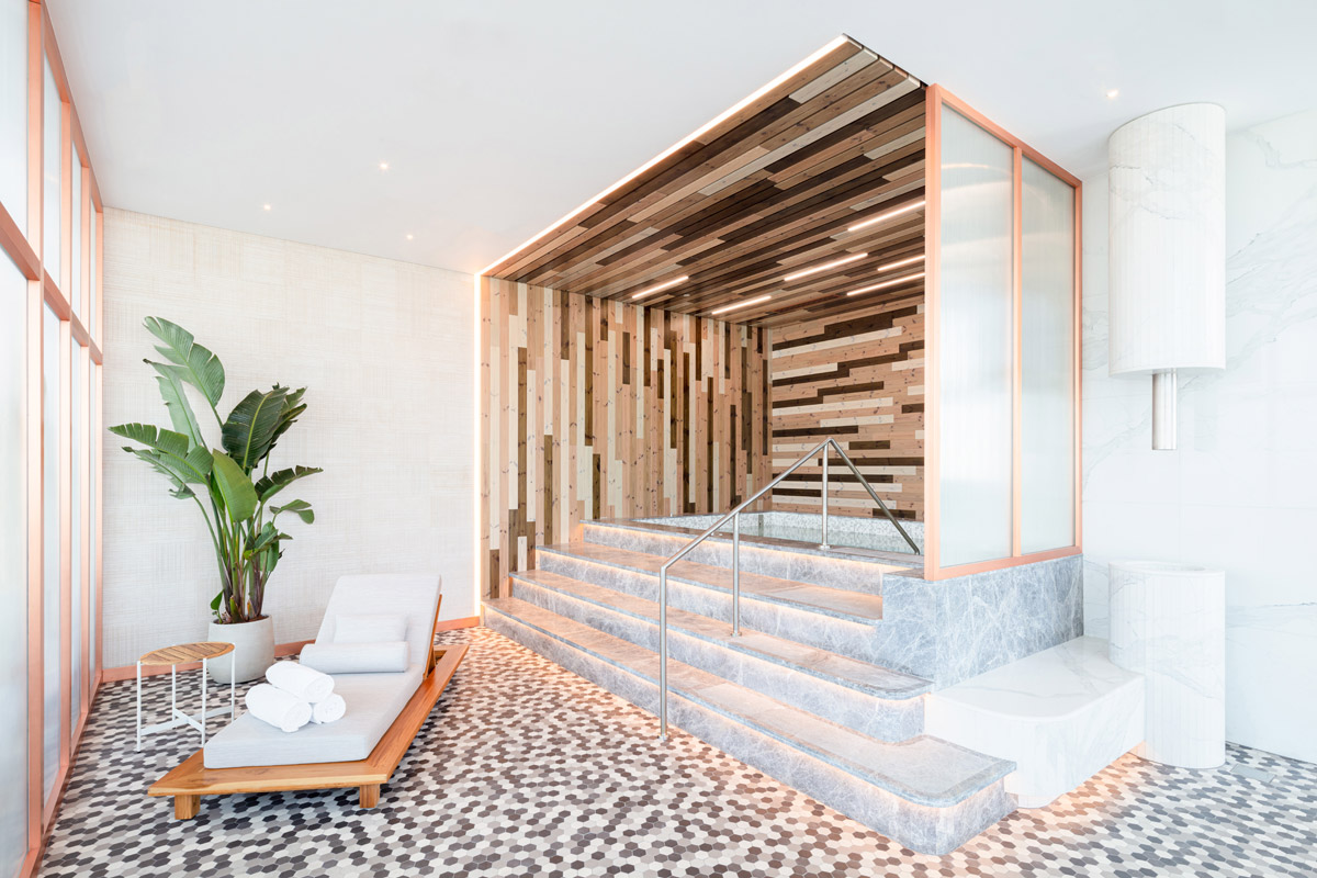
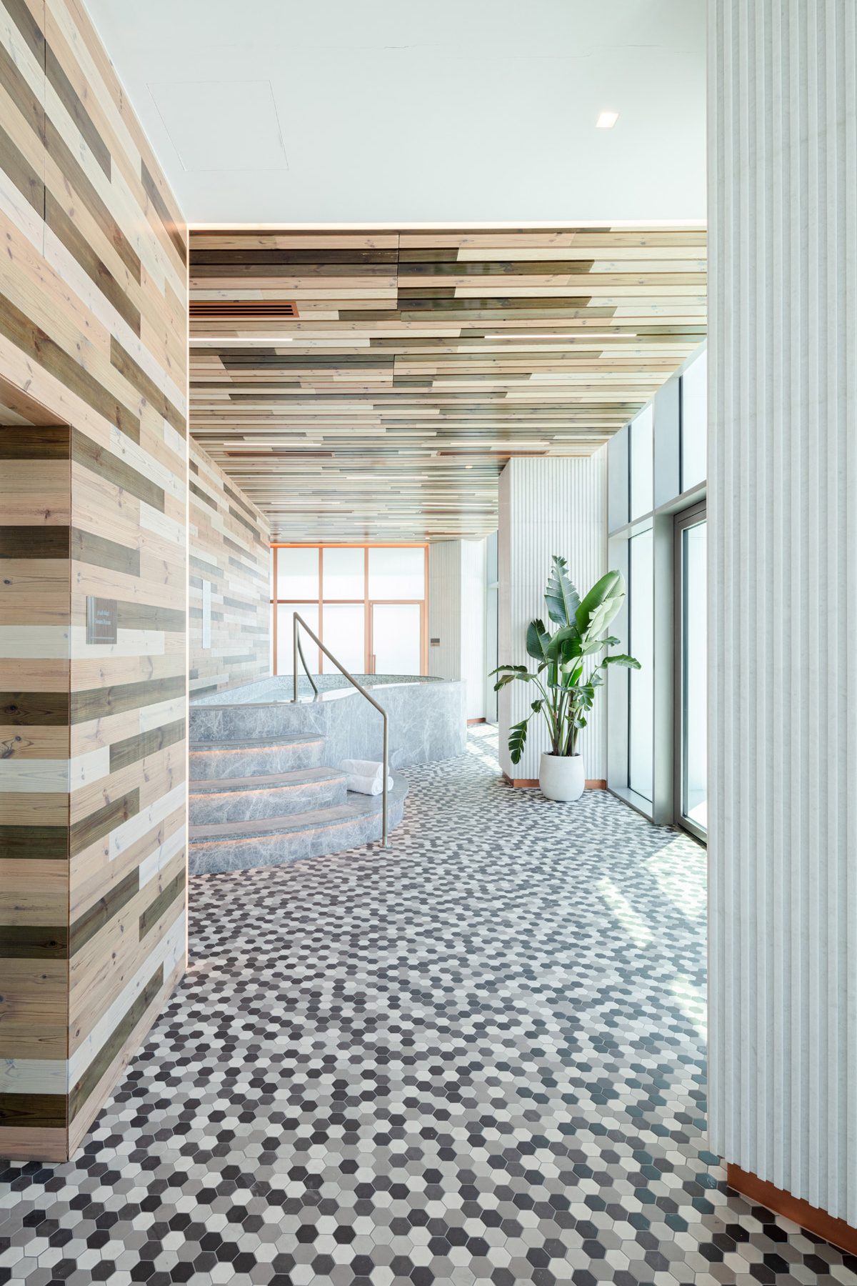
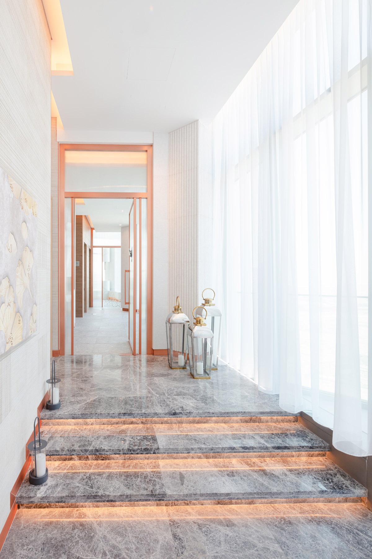
At the heart of the spa is our wet zone. Grey stone steps lead guests up to the jacuzzi pools, where differing shades of natural wood panels are manipulated to form a beautiful backdrop to the relaxation that’s about to take place. These spaces were choregraphed to provide unobstructed views of the city. Flooring in these areas is an eclectic array of muted monochromatic mosaic tiles, encouraging feelings of movement, taking simplistic elements but combining them in a way that becomes much more visually interesting. Biophilia is introduced to contribute to the overall calmness that flows through the space, and an abundance of natural light is always evident.
Why did you enter this project into the SBID Awards?
Each year Bishop Design feel very fortunate at having the chance to submit our latest works to the SBID Awards, and 2021 is no different. We would like to take the time and say thank you to the prestigious awarding team, as well as the esteemed panel of judges, for their time and consideration. It is events like these that continuously motivate our team to create iconic experiences all over the world.
Questions answered by Paul Bishop, Owner & Founder, Bishop Design by Paul Bishop.
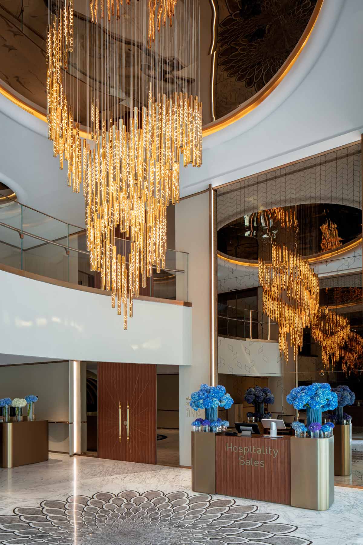
Sans Souci, Czech designer and creator of glass lighting and architectural installations, introduces lighting installation in the centre of Burj Al Arab’s new lobby in Dubai. The stunning chandelier was adapted from Sans Souci’s signature Symphony collection and is comprised of 210 crystal tubes, weighing around 450 kilograms.
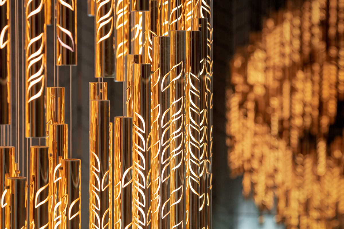
The installation seamlessly integrates heritage craftsmanship with the latest nano-technologies. Using cutting-edge techniques, each glass tube was coated in gold and engraved with a unique leaf motif taken from the luxury hotel’s wallpaper.

Designed by KCA International for Jumeirah Group, the newly renovated Exit Lobby features the magnificent spiral chandelier as the bespoke centrepiece for the interior. The installation’s design plays with light to create a glowing piece of art in the heart of the new space.
“Burj Al Arab is a globally recognised symbol of Dubai and luxury so we were delighted to work on this project” commented Elie El Khoury, Managing Director of Sans Souci Middle East. “We wanted to create a unique installation for the new interior that embodies the opulence of this iconic hotel.”
Jiří Krišica Head of Design at Sans Souci, added “The core design for this piece is taken from our Symphony collection and we then worked with the design team to create a truly unique chandelier that highlights the stunning interiors of the hotel. The final effect is an installation that plays with light and shade, creating a beautiful focus for the space.”
Burj Al Arab’s new Exit Lobby opened in October 2021. This installation adds to the list of Sans Souci’s projects in the Middle East which includes the W Hotel The Palm, Waterfront Market, Central Park Towers in Dubai or Al Rayyan Hotel in Doha.
About Sans Souci Lighting
Sans Souci Lighting is a bohemian designer and producer of decorative lighting fixtures, glass objects and architectural features. Shaped by impeccable design and desire for modernity, they value, above all, innovation and technology. Never afraid to challenge the rules, they strive to be the leader in the field of lighting originals and a luxury brand for those seeking beauty and inspiration.
If you’d like to feature your product news here, get in touch to find out more.
If you’d like to become SBID Accredited, click here for more information.
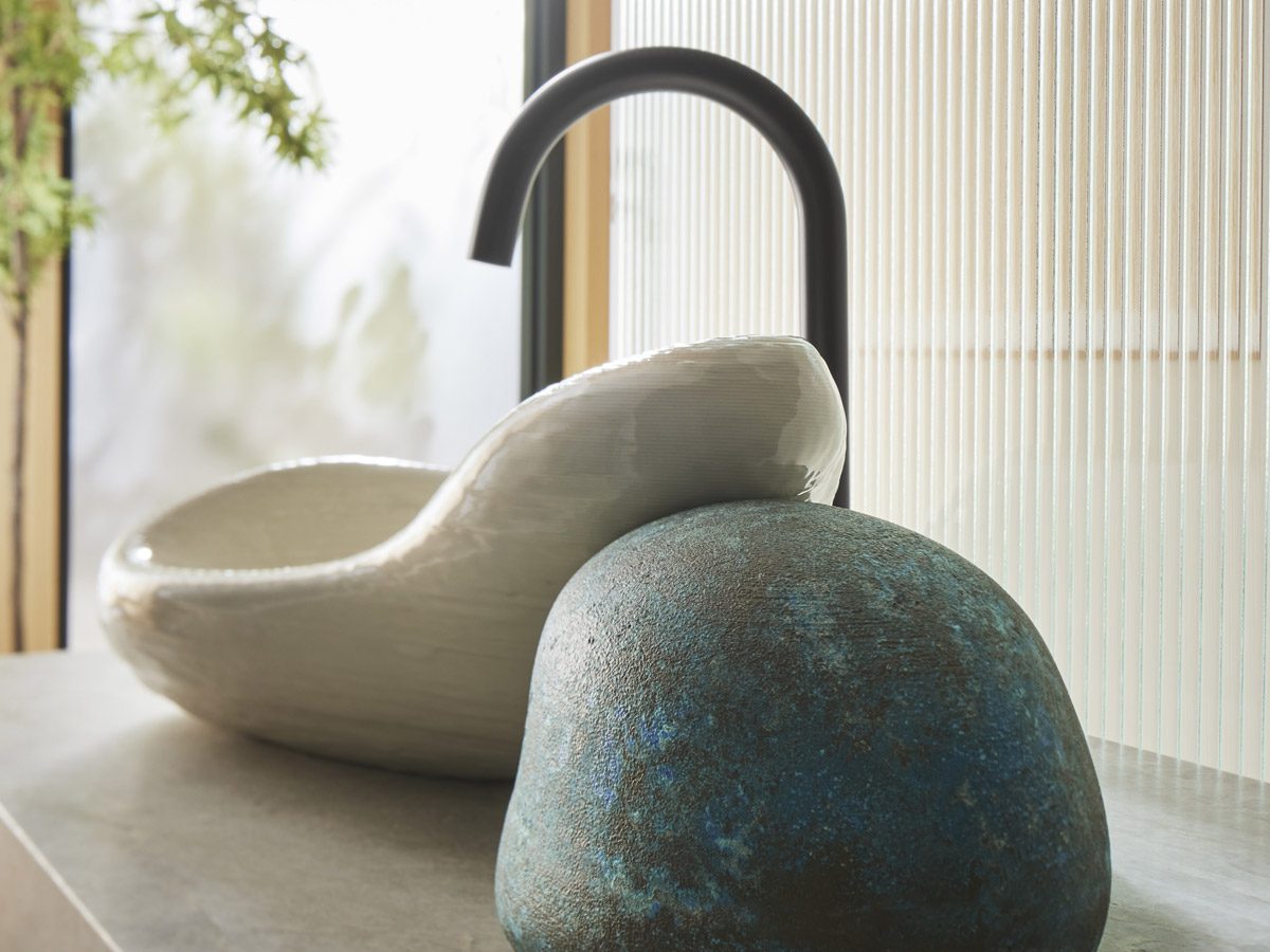
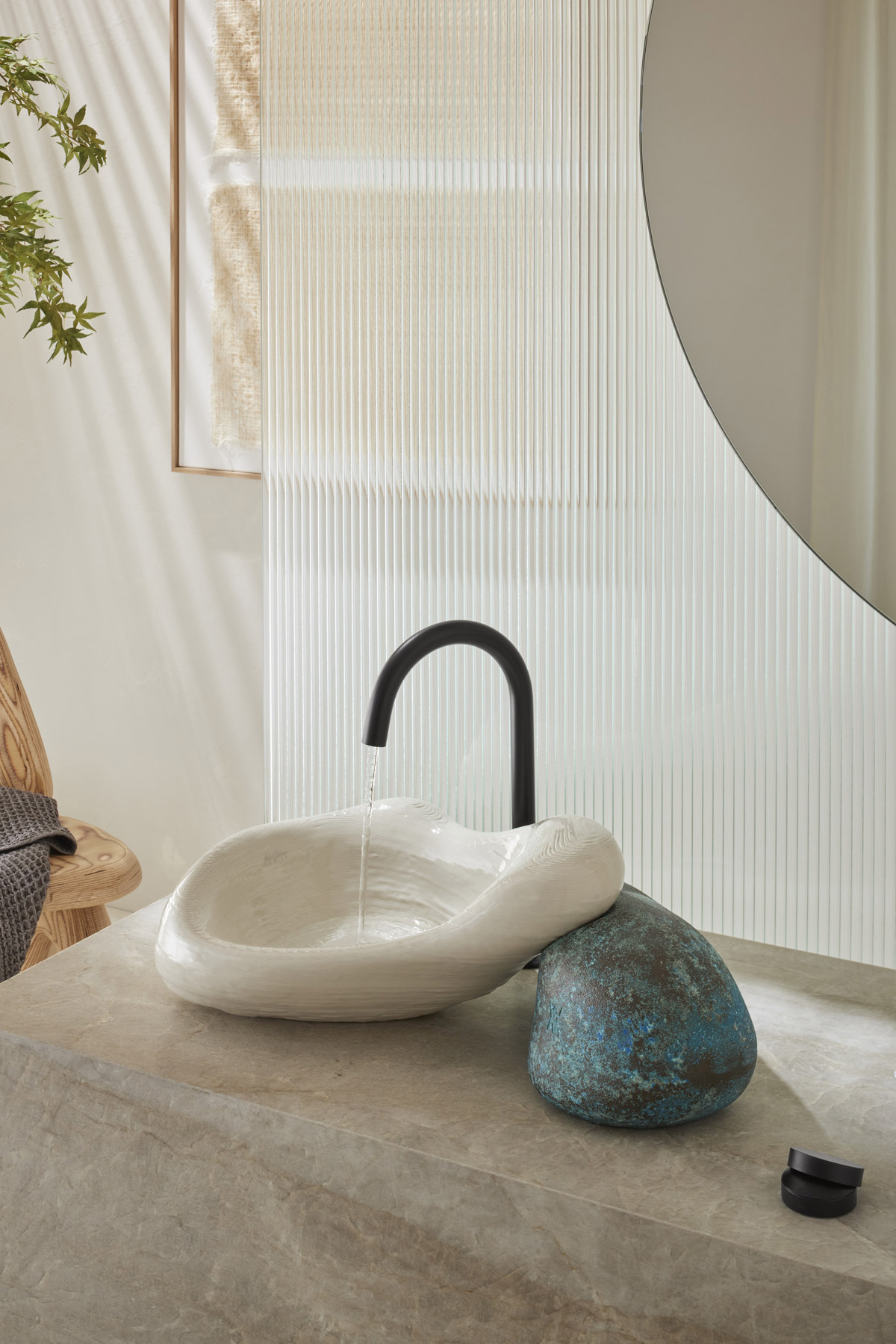
Kohler, a leading global kitchen and bath brand, showcases its long-standing innovation and design leadership through a custom-created installation by New York-based artist Daniel Arsham, entitled “Stone Flow” at Design Miami/ 2021. Stone Flow explores the KOHLER x Arsham collaboration’s experimental phase and uses giant rocks to emulate the design of the innovative sink, Rock.01.
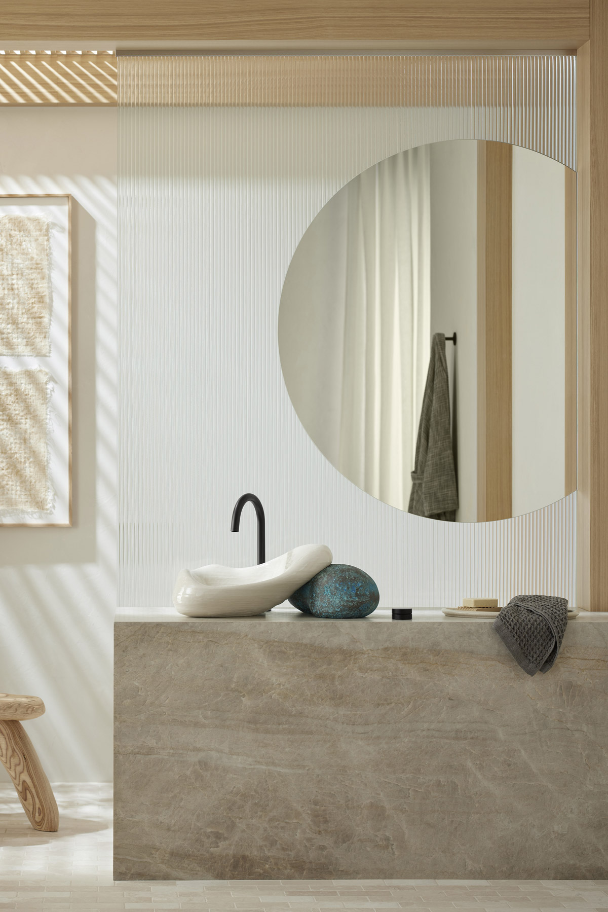
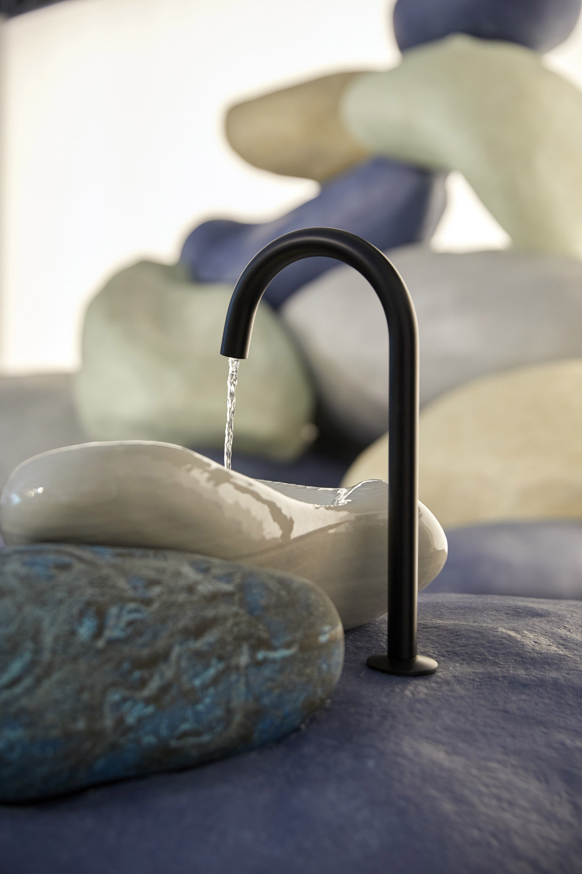
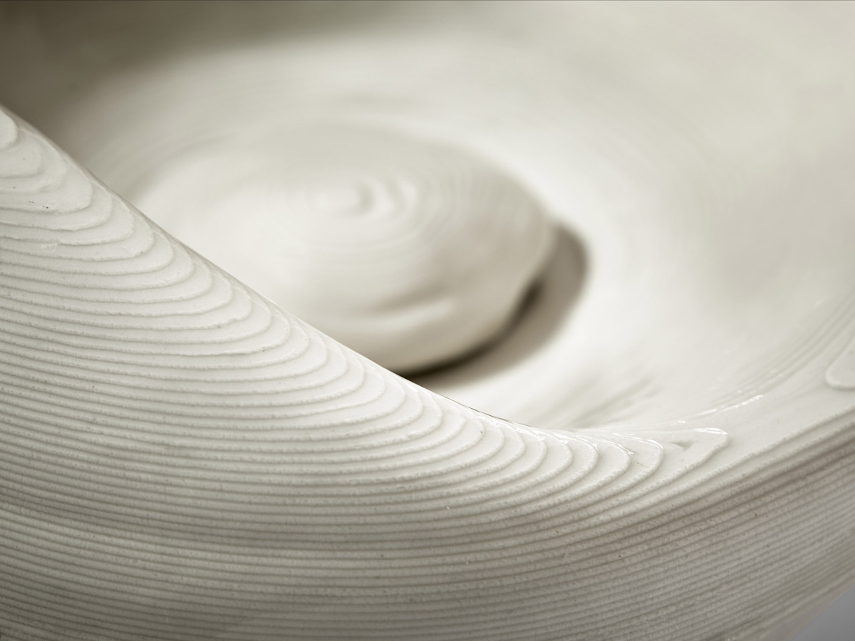
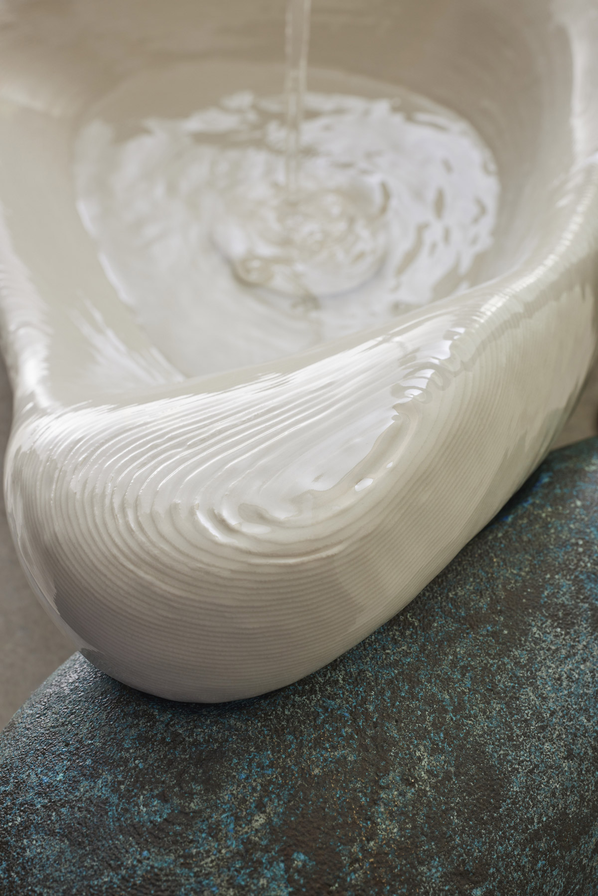
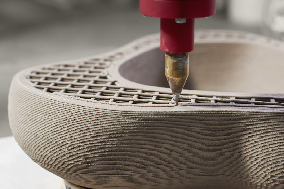
With a series of stone-like objects and forms, Arsham unveils a further exploration of his design process, which plays with organic forms found in nature. The 3D-printed Rock.01 crafted in Kohler, Wis., debuted within the Stone Flow installation in December last year and has been available for purchase since in an edition of 99. The one-of-a-kind, limited-edition sink brings together creative innovation and expert craftsmanship from Kohler and Arsham.
Within Design Miami/ 2021 Kohler presented a Design Talk, “Design in the Now: How technology and craft meet the cultural moment” on Thursday, Dec. 2 with Daniel Arsham, artist-designer; Marc Benda, Cofounder Friedman Benda; David Kohler, President and CEO Kohler; and Samuel Ross, artist-designer and moderated by Wava Carpenter, Curatorial Director Design Miami.
Additionally, Kohler features other innovative and design-forward global collections in its activations in Miami. Among them, the Occasion faucet collection that was inspired by the high fashion and effortless glamour of the Golden Age of Hollywood, offering both charm and elegance within the bathroom.
In celebration of Design Miami/ 2021, Kohler has made a contribution to DigDeep, a nonprofit working to bring clean water to families on the Navajo Nation. Access to safe water is at the centre of Kohler’s work to preserve the planet and support the well-being of individuals and communities around the world. Reliable access to water is not only crucial for life, but for enriched lives and the pursuit of education and art.
About Kohler
Founded in 1873, Kohler Co. is a global leader in the design, innovation and manufacture of kitchen and bath products; luxury cabinetry, tile and lighting; engines, generators, and clean energy solutions; and owner/operator of two, five-star hospitality and golf resort destinations in Kohler, Wisconsin, and St. Andrews, Scotland.
If you’d like to feature your product news here, get in touch to find out more.
If you’d like to become SBID Accredited, click here for more information.
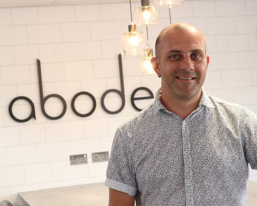
In this week's interview with 2021 SBID Awards winner for the Kitchen Product Design category, Abode, Design Manager Paul Illingworth answers questions on the company's approach to projects and the technical features and functionality of their award-winning tap filter - Swich.
SBID Awards Category: Kitchen Product
Practice: Abode
Entry: Swich
How important is it to enter the SBID Awards & receive industry recognition for your work? What are the benefits?
As a premium manufacturer, we are proud of our products and want to make it as easy as possible for our customers to understand their features and benefits, so entering the SBID International Design Awards is a great way to raise the profile of our brand on a global stage. To be recognised by SBID and its panel of leading industry experts is a great achievement for Abode, acknowledging Swich for its outstanding examples of technical innovation, aesthetic creativity and fit-for-purpose functionality. There is something truly special in knowing that the talents of every member of our team, from product developers to marketing and sales, are recognised and celebrated by the international design community and the entire Abode family.
What do you think made this particular design an award winner?
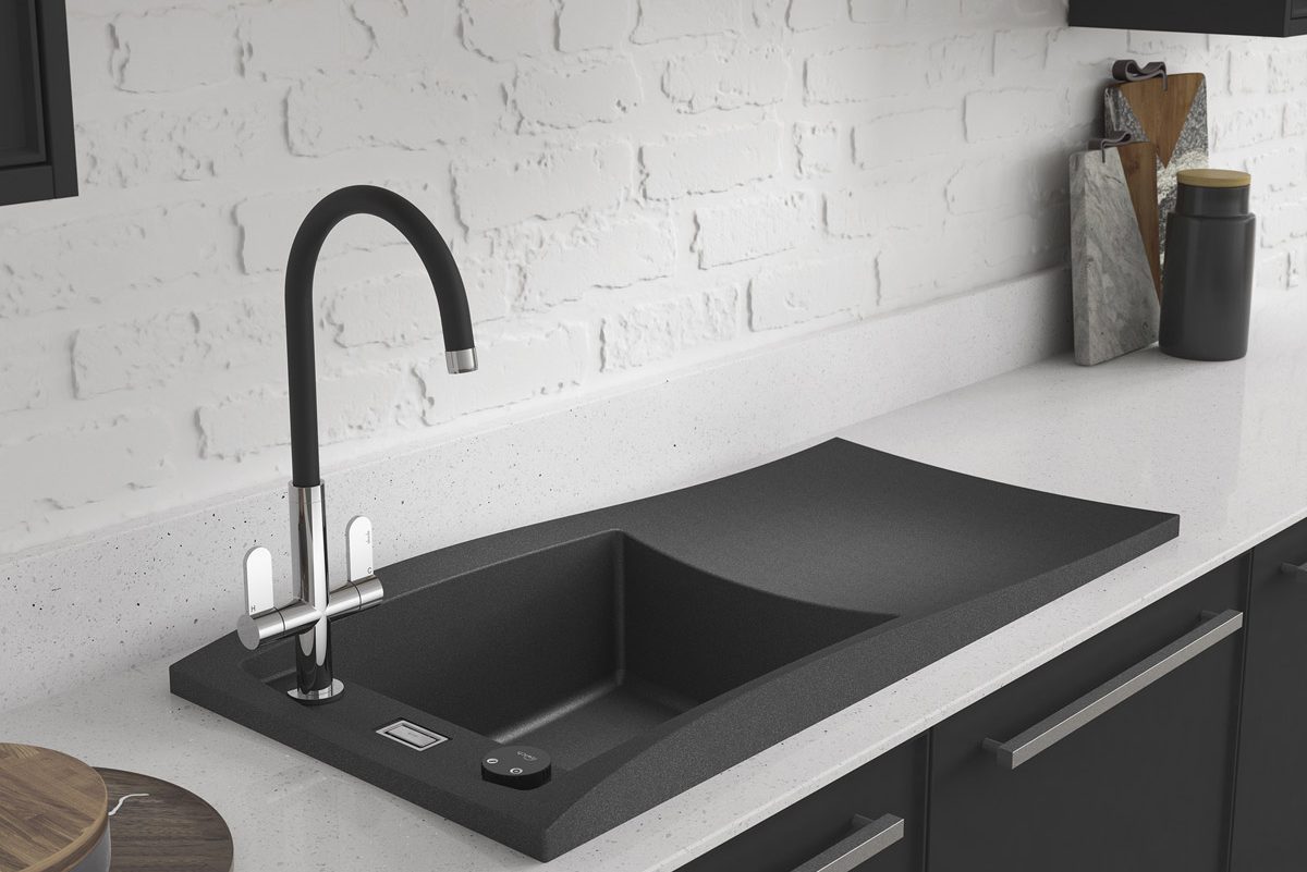
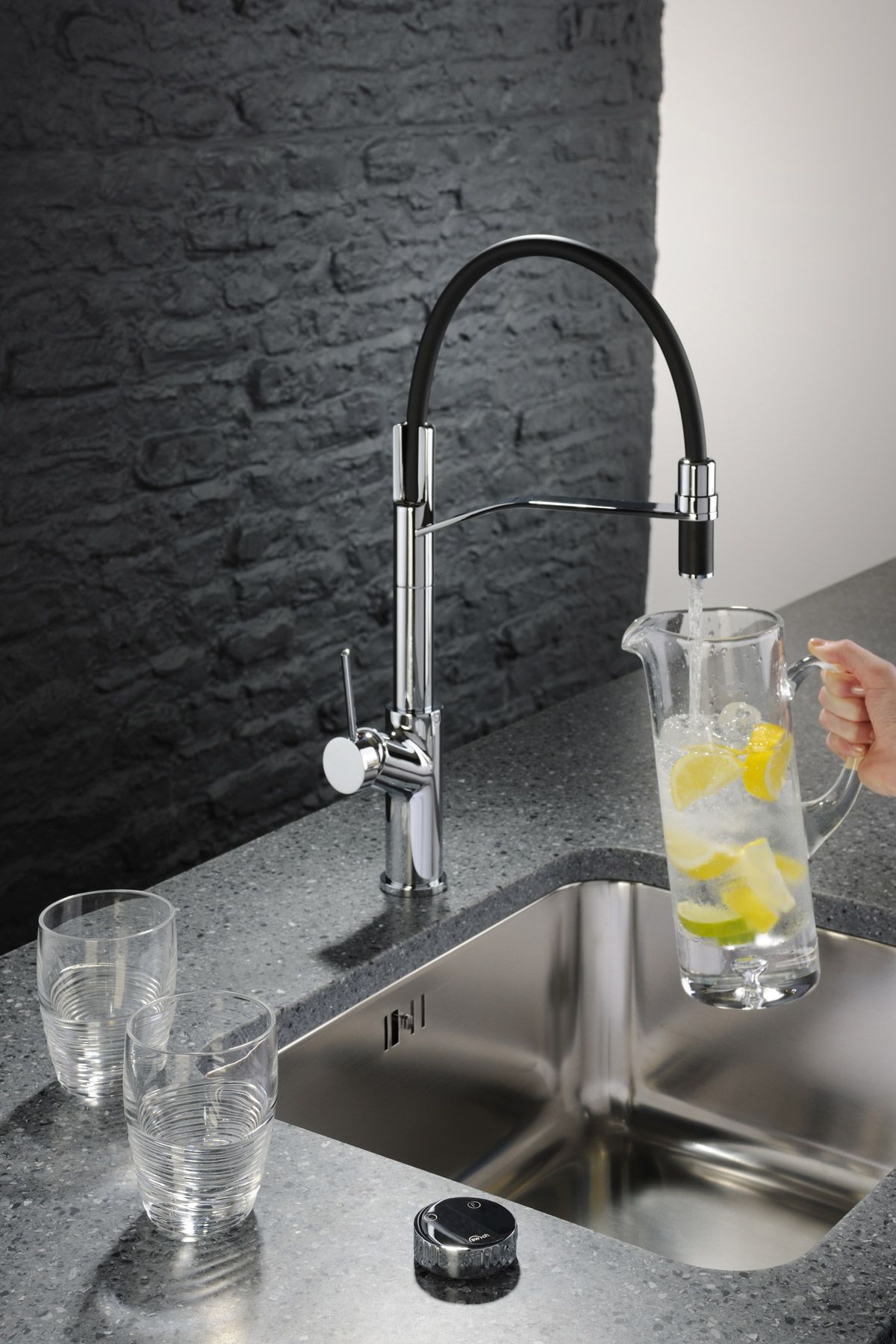
For me, I think the versatility and ease of use of Abode Swich makes this product an industry game changer for the modern home. It’s a revolutionary design solution that will transform a new or existing kitchen tap into a filtered water tap that delivers a constant supply of crystal clear filtered water! The exclusive and patented Swich water filter system is a discreet yet ultra-luxe device, which is easy to use and install, either retro-fit in an existing kitchen or add to a new kitchen design. Swich works in conjunction with a normal kitchen mixer tap to improve the overall taste, appearance and quality of your drinking water without compromising on style. For the first time, our customers are not restricted to the style of tap they can have in their kitchen and now, they can enjoy fresh filtered tap water while removing the need for a countertop water purifier or bottled water, which we all know is harmful to the environment.
How has Abode evolved, while managing to stay innovative and keep product designs aligned with client demands and trends?
We are strong believers in the power of feedback, so we are in constant contact with our network of retailers up and down the country to ensure that we are developing the very best products with the right functionality. We are highly creative with a strong ‘can do’ attitude and believe in taking care of every member of the Abode family, which is reflected in our high level of customer service and our development of hero product lines with full marketing support.
Could you tell us about the design process behind Swich, and what inspired the concept for this particular solution?
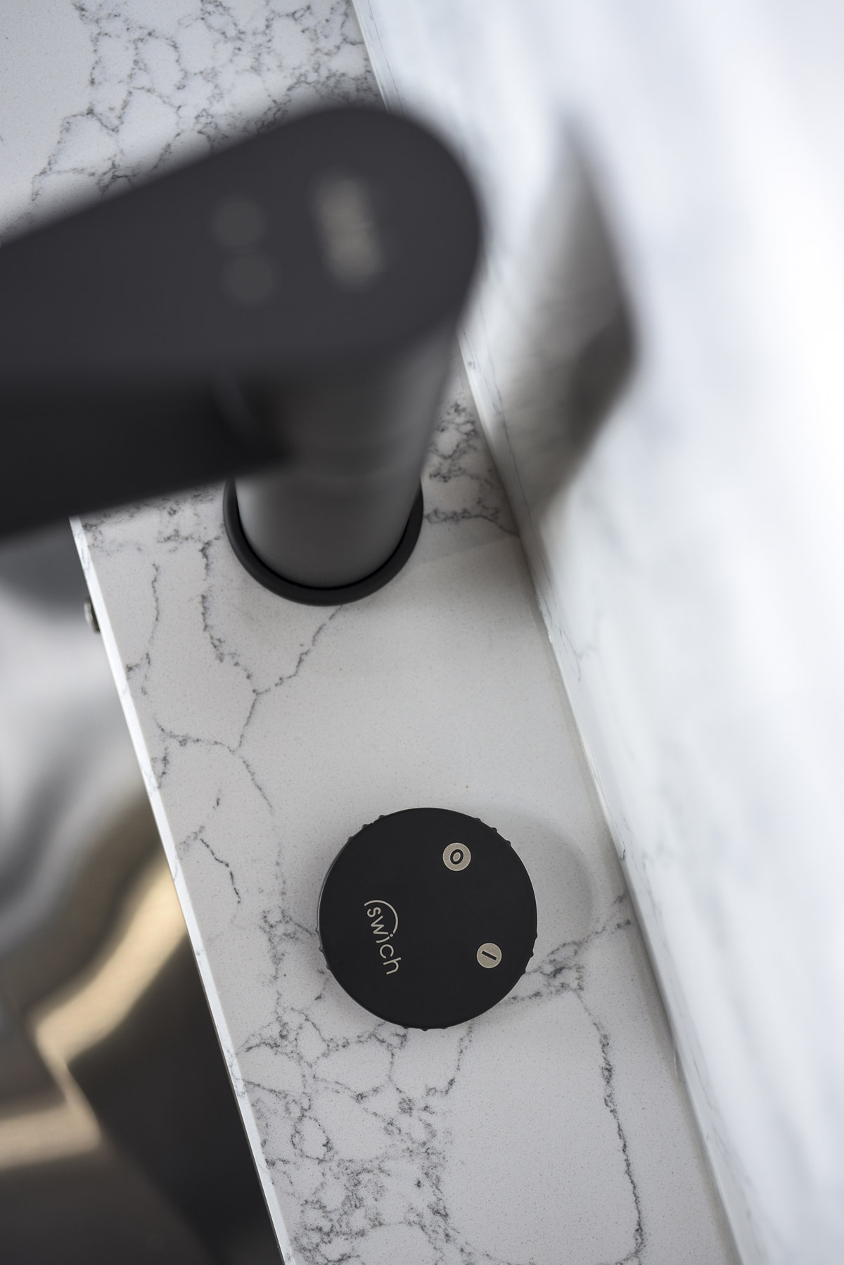
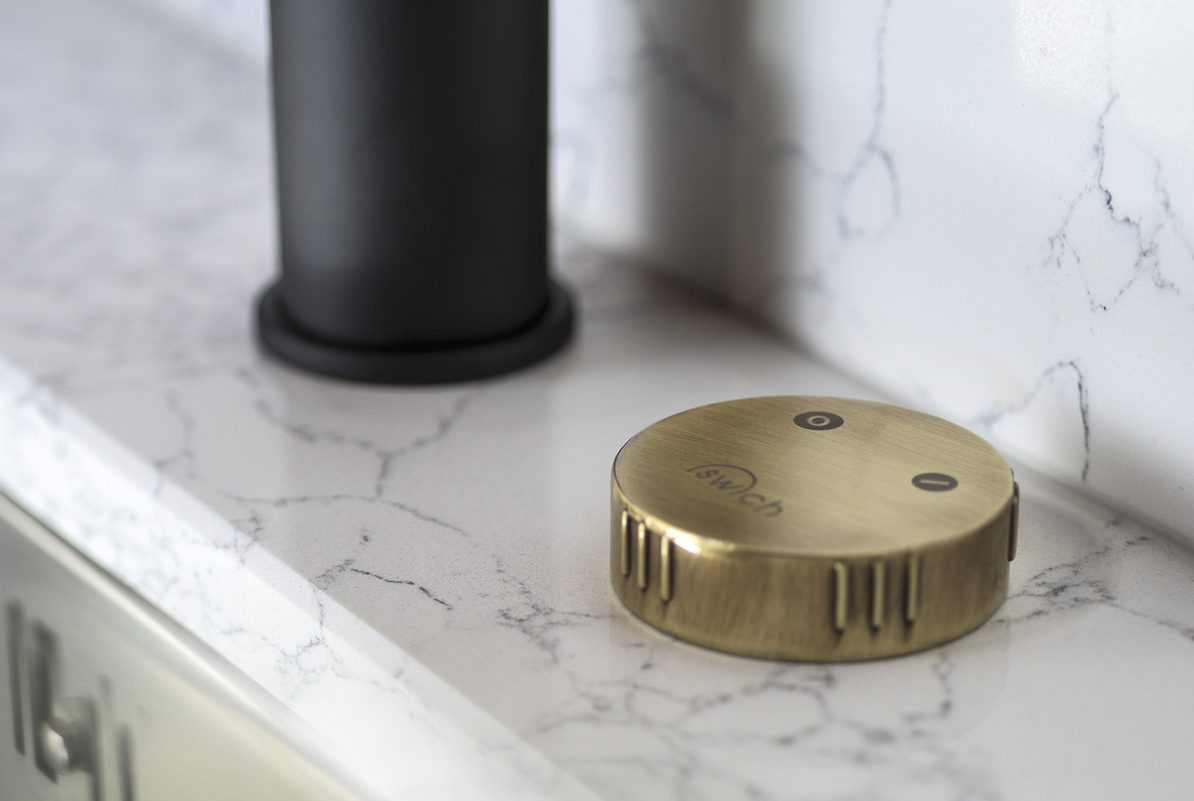
Our new product development team track lifestyle trends worldwide, as well as focus on the UK market in order to create a concept that seized key consumer concerns with a simple, failsafe solution – using the philosophy of ‘If you can dream it, we can do it’. With that in mind, we wanted to tick the boxes of reducing waste, saving space, enhancing cooking alongside boosting home hygiene as the open-plan kitchen absorbs many of the functions of the living and dining area. Like a Swiss army knife that combines multiple functions in a single unit, we wanted something which could be universal, minimal and super-easy to use. This is why we decided to make Swich available in four high fashion finishes – Brushed Brass, Matt Black, Brushed Nickel and Chrome – simply turn the Round or Square control handle to indicate the type of water supply you wish to channel through the tap. Providing immediate access to both the domestic water supply and Abode-safe water, via the Swich filter cartridge, customers can enjoy clear refreshing results, every time!
Now that you’ve won an SBID Award, what are the next steps? Is there anything new you are excited to be working on?
We are celebrating 20 years in business in 2022 and are eagerly preparing for KBB 2022 with new products and innovations to introduce to the market. We are investing heavily in every aspect of our business as we want to be in an excellent position for the next 20 years onwards.
What advice can you give to young designers starting out in the design industry?
Always keep your portfolio up to date, take pride in your work and never be afraid to ask questions. There is no such thing as a silly question and you never know where the answer might take you in terms of inspiration. It is so important to feed your imagination so make sure you take time out to enjoy pursuits you are passionate about and be curious – look at innovations and trends in other industries to keep developing your design ideas and stay abreast of current affairs to anticipate future client and consumer needs. My approach to design has certainly become more subtle over the years and I think that as one matures you start to gather a wider appreciation for the design likes and dislikes of others and these automatically filter into your work, whereas I think the younger version of myself, designed more selfishly. I still probably get the greatest joys from solving annoying or fiddly design problems with the simplest solutions, these are the daily successes - in between the big product launches.
Established in 2002, Abode has a team with extensive knowledge of sinks, taps and the kitchen & bathroom industry. Abode is part of the Norcros plc group of companies, a leading supplier of high quality and innovative kitchen and bathroom products.
This week’s instalment of Project of the Week series features a minimal sales gallery design by 2021 SBID Awards Finalist, A.RK Interior Design.
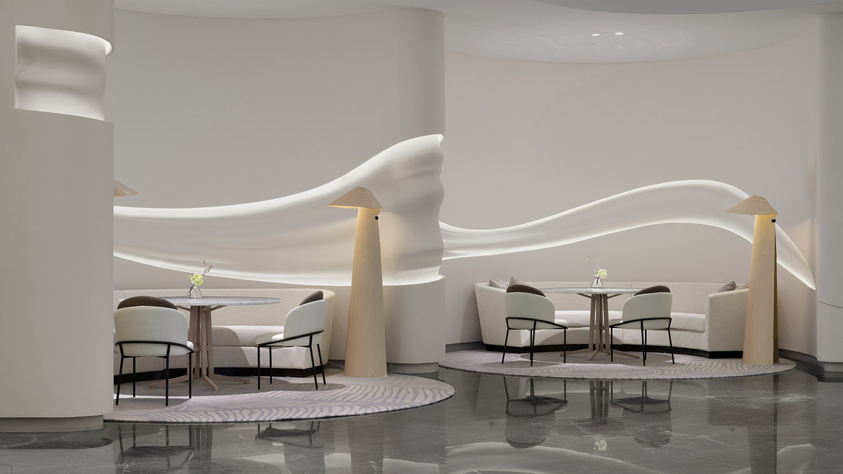
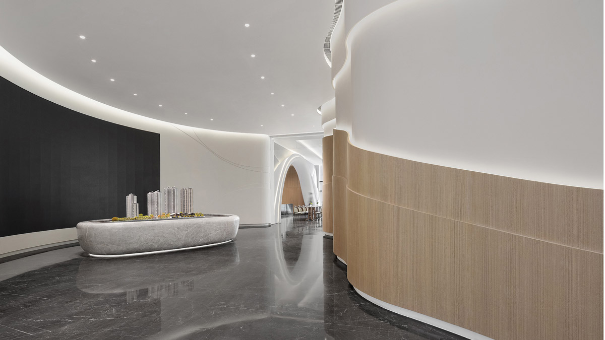
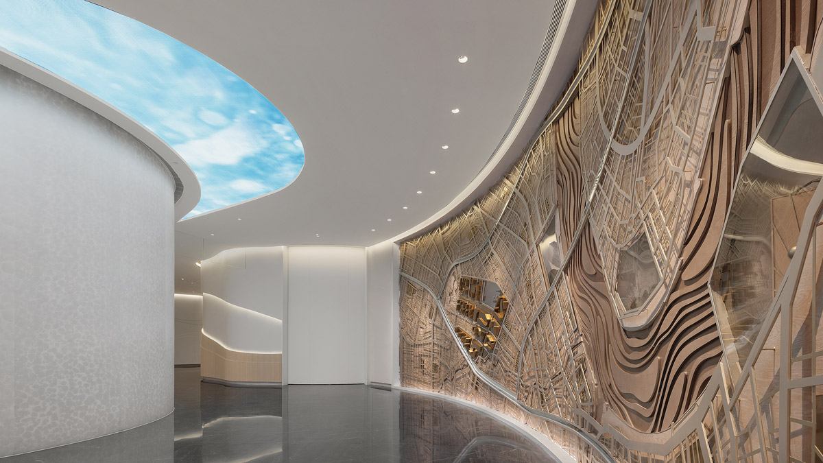
Park Vera is by far the most iconic of Rainbow City’s project in Shanghai. It is also the last lot of residential development in the district of Ruihong, Shanghai. Shui On Land’s vision was 20 years in the making. Their aim for Park Vera gallery is to use this sales gallery to showcase their commitment to the community, transforming and developing this district into the most sought after postal code in Shanghai.
The interior of the sales gallery for the residential development Park Vera is designed to reflect the journey taken over 20 years to bring about this dramatic transformation. Design inspiration has evolved through the years and one might say they have come full circle. Targeted for younger demographics whose life ethos is very much different from their parents - they seek personal fulfilment and socialising is a very important part of their lives, their manner is filled with enthusiasm and creativity.
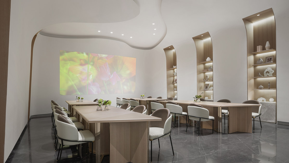
For inspiration for this project designers looked to one of the happiest regions in the world - Scandinavia. To pursue contentment and well-being is the Danish way of life and here A.RK Interior Design inspire to inject some Lagom and Hygge into our lives.
SBID Awards Category: Property Development Asia Pacific
Practice: A.RK Interior Design
Project: Park Vera Sales Gallery
Location: Shanghai, China
What was the client's brief?
Being the apex and the last lot of development for Rainbow City (mix-development), the client’s goal and wish was to put their best foot forward, to instil the buyer’s confidence in their development and to have bragging rights of having one of the best residential development in this area.
What inspired the design of the project?
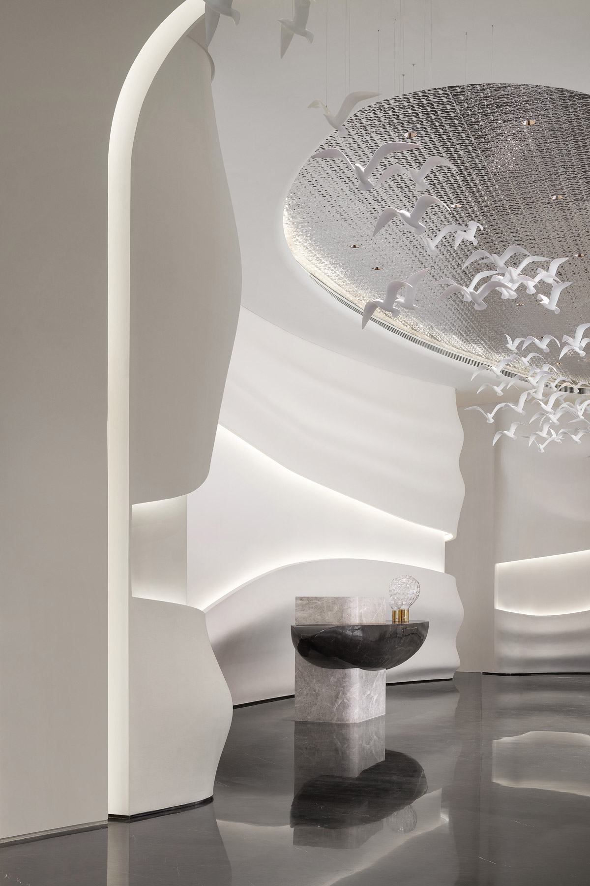
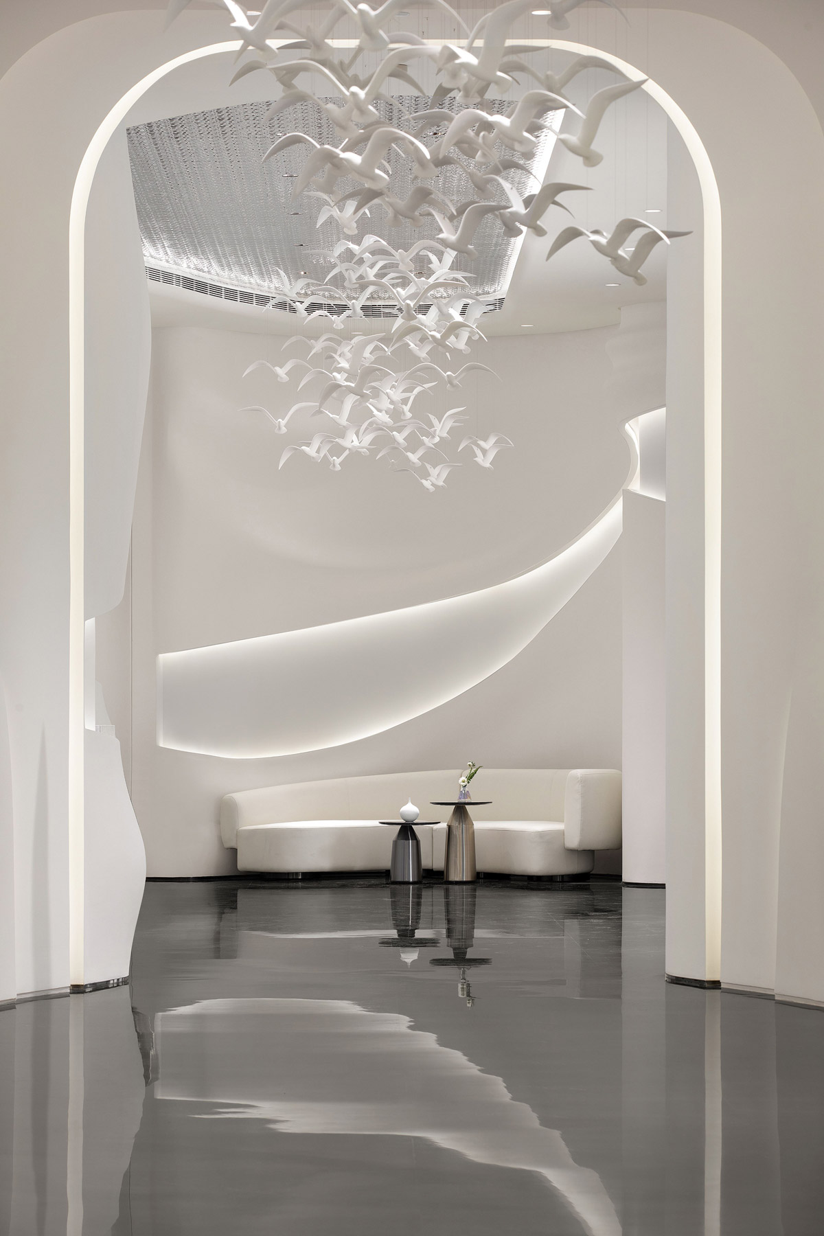
We looked at the demographics and the evolving needs of the population and gave the client a couple of design concept proposals. Finally settled with a Scandinavian theme, we injected elements of Danish lifestyle concept of ‘hygge’ and Swedish way of life ‘lagom’ to showcase simplicity and minimalism, embracing the Scandinavian mentality that moderation and happiness are intertwined.
The extensive presence of seagulls in this sales gallery reflects the developer’s pursuit of perfection, as inspired by Jonathan Livingston Seagull, a Richard Bach book.
What was the toughest hurdle your team overcame during the project?
We have to say the pandemic was the biggest hurdle we faced during this project. With a design team in Singapore and the project in Shanghai, we had to pull all the stops and get used to travel and working with restrictions of not being able to supervise the build in person. The client's design team was very understanding and has come to quickly realise that working remotely might be the new way forward. The availability of technology hugely alleviated the lack of in-person consultation.
What was your team’s highlight of the project?
Going above and beyond solving design challenges, the highlight of this project speaks volume of the inter-city, cross border collaboration that was only possible with technology and the trust given by our clients. The shared visions that the client and designer team have is only possible with a multi-disciplined teams that work well and have the same end-goal in mind.
Why did you enter this project into the SBID Awards?
SBID awards is one the industry’s most respected and sought after accolade. Being part of this prestigious award raises the credibility of our company and our brand. This award will also further enhance our standing with our client.
Questions answered by Agatha Teng, Creative Director and Partner, A.RK Interior Design.
The fashion house of Dolce & Gabbana put Sicily on the fashionista map and spread the island’s crafts worldwide by incorporating iconic Sicilian images in its bold prints like the colourfully decorated horse cart, ripe lemons and oranges. This was an early inspiration for the interior design concept created for the hotel by The Hickson Design Partnership (THDP), a London-based interior designer and architectural practice with a team of 50% British and 50% Italian designers.
Historical Influences
Giardini Naxos, founded in 734 BC by colonists from Chalcis in Euboea, and was the first Greek colony in Sicily. Ancient Naxos was destroyed in 403 BC, and the centre that rose in its place in the Middle Ages as a fishermen's village. In the late 19th century elegant villas were built, used as holiday mansions by the upper classes.
The Greek heritage that remains in Sicily can be seen in the architecture of a few very important buildings. The Temple of Concordia today is a popular seaside-resort, offering more than 40 hotels, and a great number of vacation homes. Throughout the year the island plays host to numerous artistic, cultural, and religious events. Sicilians love a celebration!
The ancient Phoenicians and Greeks brought their artisanal traditions to the island, creating amphorae, kraters, kylixes, and other typical ancient wares and the technique of laying bright, saturated colours have been introduced into Sicily during the Muslim conquest.
The Hotel
The building presents most of the room facing the sea allowing the Mediterranean light to enter from the big windows and the guest can enjoy the salty air from the guestroom balcony. It sits at the feet of Etna volcano and near to Taormina.
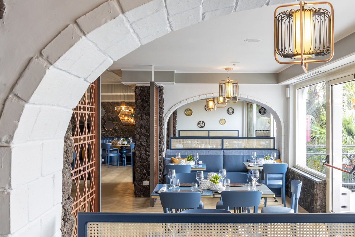
Detailed local research guided the narrative of the entire concept project, commencing with the refurbishment of the main public areas, lobby and lobby bar, guest check in, Restaurants Panarea & Sciara, and creating a new Pool Terrace and Fluido bar.
The Design Concept
The interior design concept was inspired by the natural beauty of the volcanic beaches, the sea, mount Etna’s super-natural presence and the features of the island of Sicily and the ambition was to bring them into the centre of the hotel. By adding local decoration, artworks and colours the goal was to add character, a deep sense of authenticity and a refined and resort-based palette of natural tones with touches of colours of the sea.
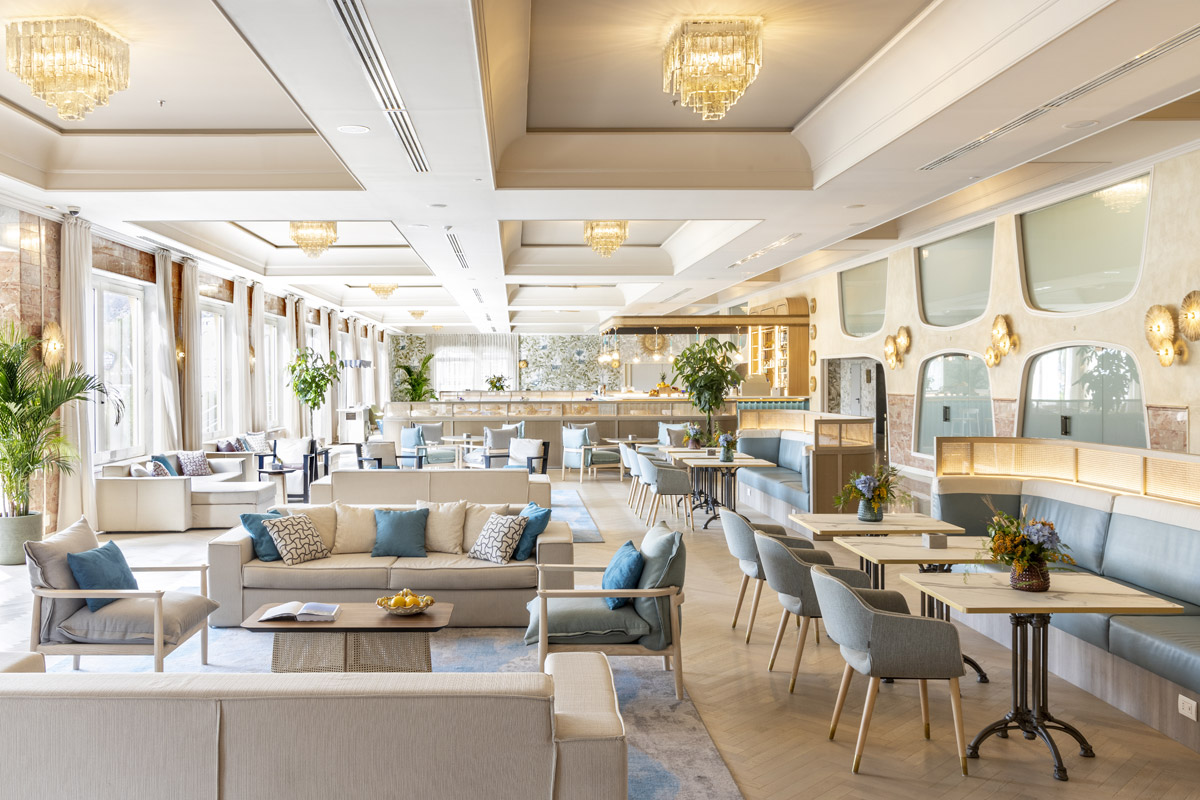
Quintessenza Lobby Bar
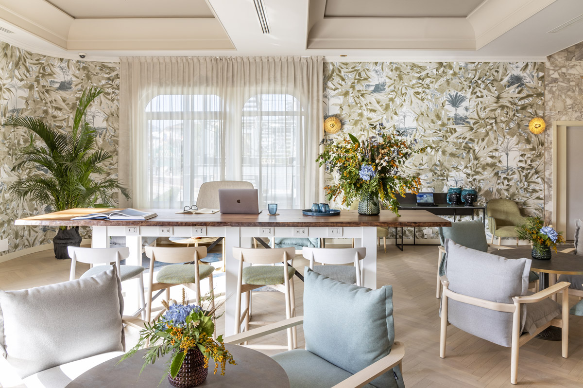
The lobby was a large open space of over 700sqm meters, previously decorated in a heavy baroque style, the concept from the outset was to re-activate this space, giving it a new heart and focal point – and to be appealing to both guests and to walk-in locals.
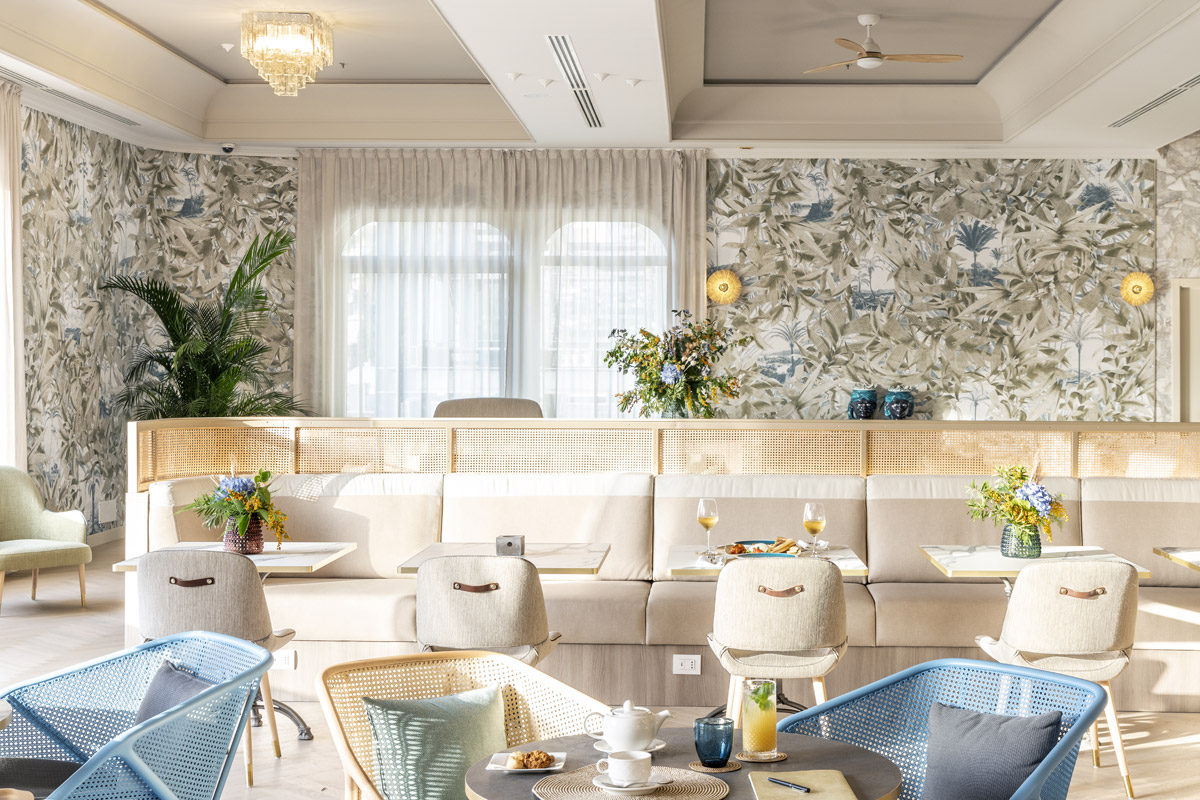
From the outset THDP considered adding a new lobby bar to the centre of the space, being both a visual anchor but also dividing the space and making it feel more intimate. With the new layout smart workers and leisure guests can meet using a polyvalent area which can host all, thanks to the different typology of seating. The style is elegant, Mediterranean with sea colours and Taormina’s stone colours melting indoor and outdoor colour palette.
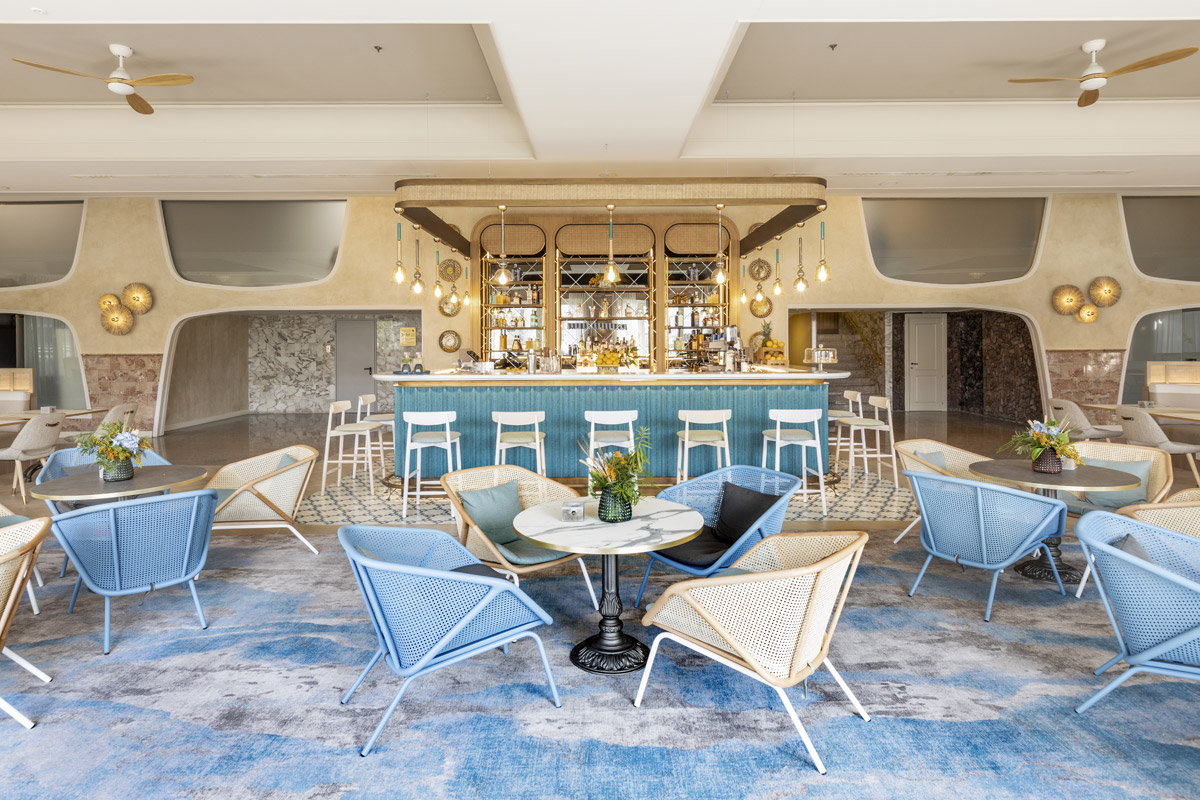
The bar utilizes local materials to create a new feature in the centre of the lobby space, the bar top from local company Nero Sicilia is a made from volcanic lava stone extracted from the quarries of mount Etna glazed in cracked white glass. The bar fluted and curved front is formed from woven faux leather by Natutex, the rear bar features antique mirror with the joinery finished in Italian Oak and Rattan.
The seating in the Quintessenza features two room divider style banquet seating, fitted with USB and power outlets it’s the perfect place to work and relax, the backs of the banquets are finished in woven faux leather by Naturtex. The bar offers a range of seating options from the bar stools facing the bar from Gervasoni to the lower relaxed armchairs are from Miniforms and Torre 1961. The tables and banquets were manufactured to THDP’s design by Riabita. The new highly decorative wall covering is by Janelli & Volpi.
The Check-in
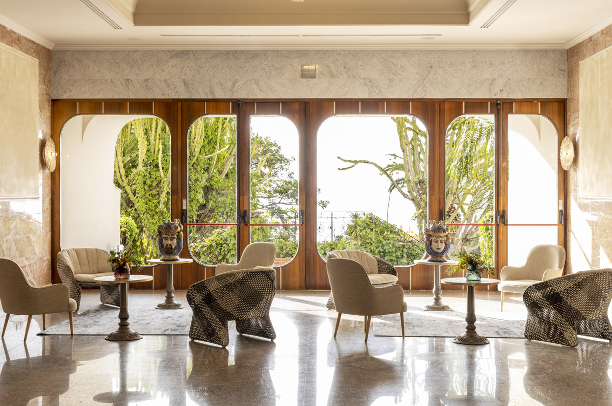
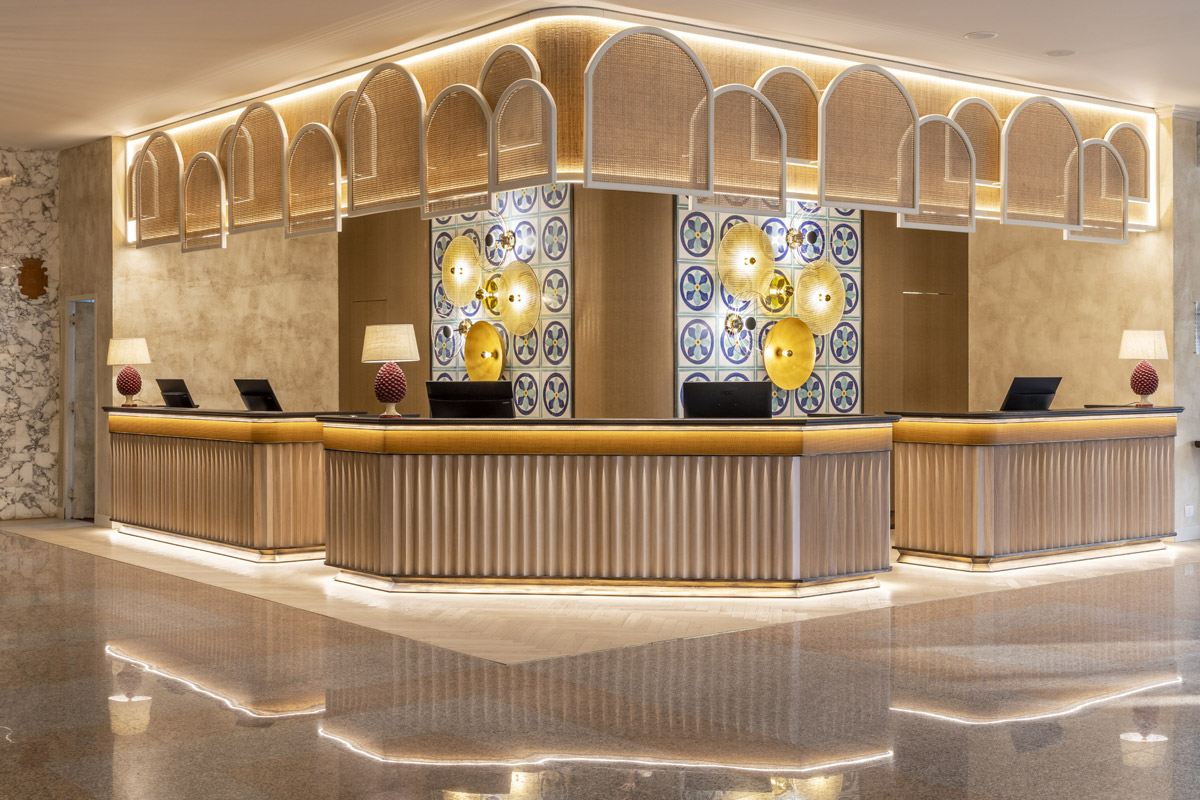
The reception has been inspired by the Sicilian attitude of welcoming and it has been translated in three large reception desks, the feature rear wall is tiled with hand painted local tiles by La Fauci, the accent decorative lights are from Aromas del Camp and are of copper and rattan, thus from the very beginning of their journey the guest is surrounded by an authentic and local experience.
The reception desks are finished in dark grey lava stone by Nero Sicilia, with a façade of woven faux leather by Naturtex adding warmth and texture, the fronts of the desks feature oak panelling mimicking the fluted effects of classical columns of the Temple of Concordia.
New desks, headings and rear artwork and tiling by La Fauci were all custom designed by THDP.
Panarea Restaurant
The Panarea Restaurant is the place in the morning for breakfast but easily converts during the day to host lunches, special events and dinner in the evening. The layout of the restaurant focuses on the new buffet counters which are aligned to the show cooking area - allowing guest to admire the chefs preparing their dishes to order. The restaurant has materials, features, and shapes that reminds guests of antique craftsmanship, incorporating hand painted tiles in the niches at the entrance with traditional motifs from La Fauci.
The buffet counters are cantered into the new restaurant and are closable during evening set up and special events with a custom designed screening. The counters feature built in an invisible heating and cooling elements which allow all the dishes to be moved around and swapped around to offer maximum flexibility to the hotel. During events the buffet counters can be stripped back and closed off - giving the restaurant less of a ‘breakfast’ space feel and more of a space for fine dining.
The buffet area has screens featuring irregular but geometric shapes hanged from the ceilings that recall ancient Greek terracotta jars. The artisan tributes continue on the walls covered with a braided woven leather cowhide effect inspired by ancient Greek sandals.
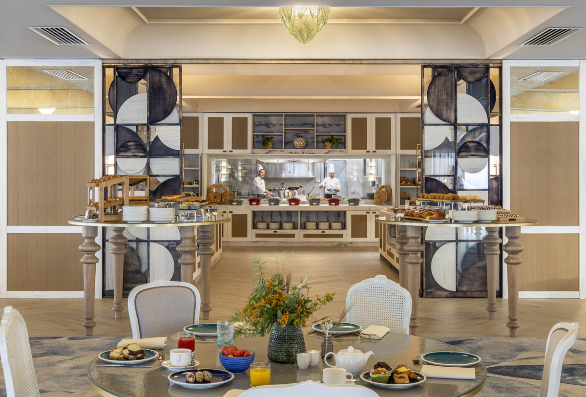
The new seating offers relaxed arrangements with a mix of table sizes, featured in fabrics reflecting the colours of the sea, visible from the restaurant. THDP also designed high tables, which can be used in the morning for breakfast to display local pastries and in the evening a high table dining experience. The adjustable tables made by Riabita, who also carefully prepared all custom furniture for the project and project managed their execution on site.
The custom designed carpeting by THDP is made by Ulster Carpets, the ceiling lighting are re-purposed light fittings from a hotel in Milan owned by the client – made in Murano.
La Sciara Restaurant
The word “Sciara” is a local term, used in Sicily in the Etna area to indicate the accumulations of volcanic ‘waste’ that form on the surface or on the sides of the mountain. The term gives it name to the fine dining restaurant at the hotel, where the interior concept is intense and reflects power and wonder of the volcanoes spilling lava – dark intense with touches of blue & red - recalling colours of the sea at night, foreboding, dark yet attractive and welcoming.
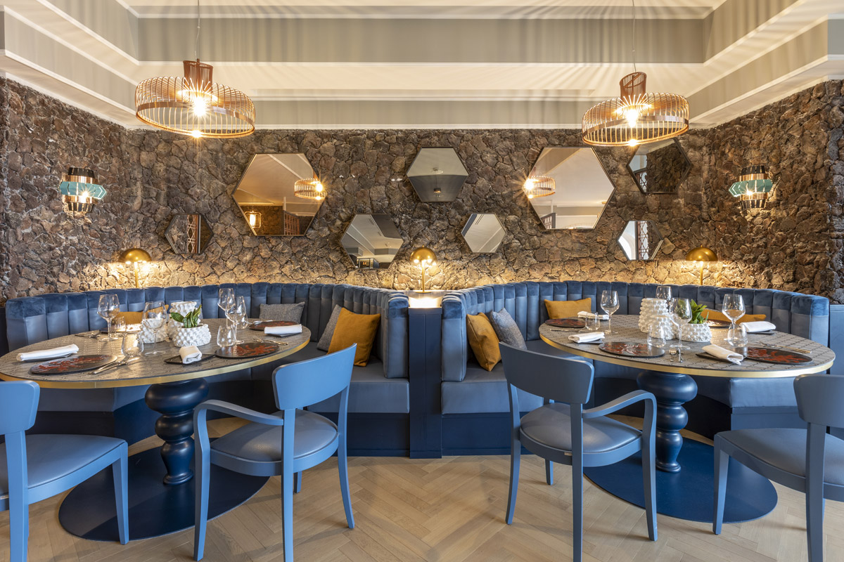
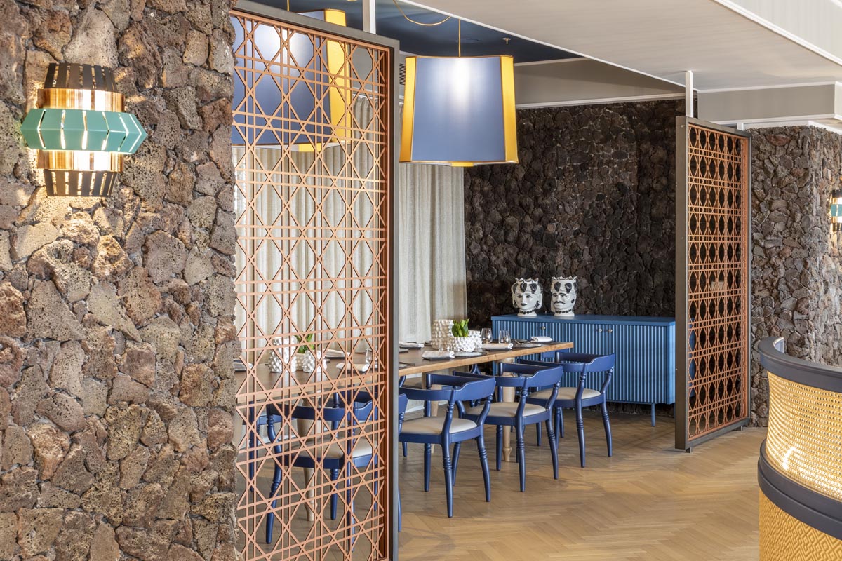
The walls were finished with rough hewn lava stones, giving a raw and natural feel, to compliment this toughness the seating by contrast is curved and flowing and features 4 signature tables finished in enamelled lava stone by Nero Sicilia, the booths too are curved and help give the restaurant a centering. There are screenings in copper tones which feature so the design of super scaled rattan, adding a sense of privacy whilst not robbing the restaurant of its sea and pool views. The flooring is stained Natural Oak laid in a herringbone design by Havwoods. The copper-coloured feature lighting is from Utu, the hexagonal mirrors by Sovet.
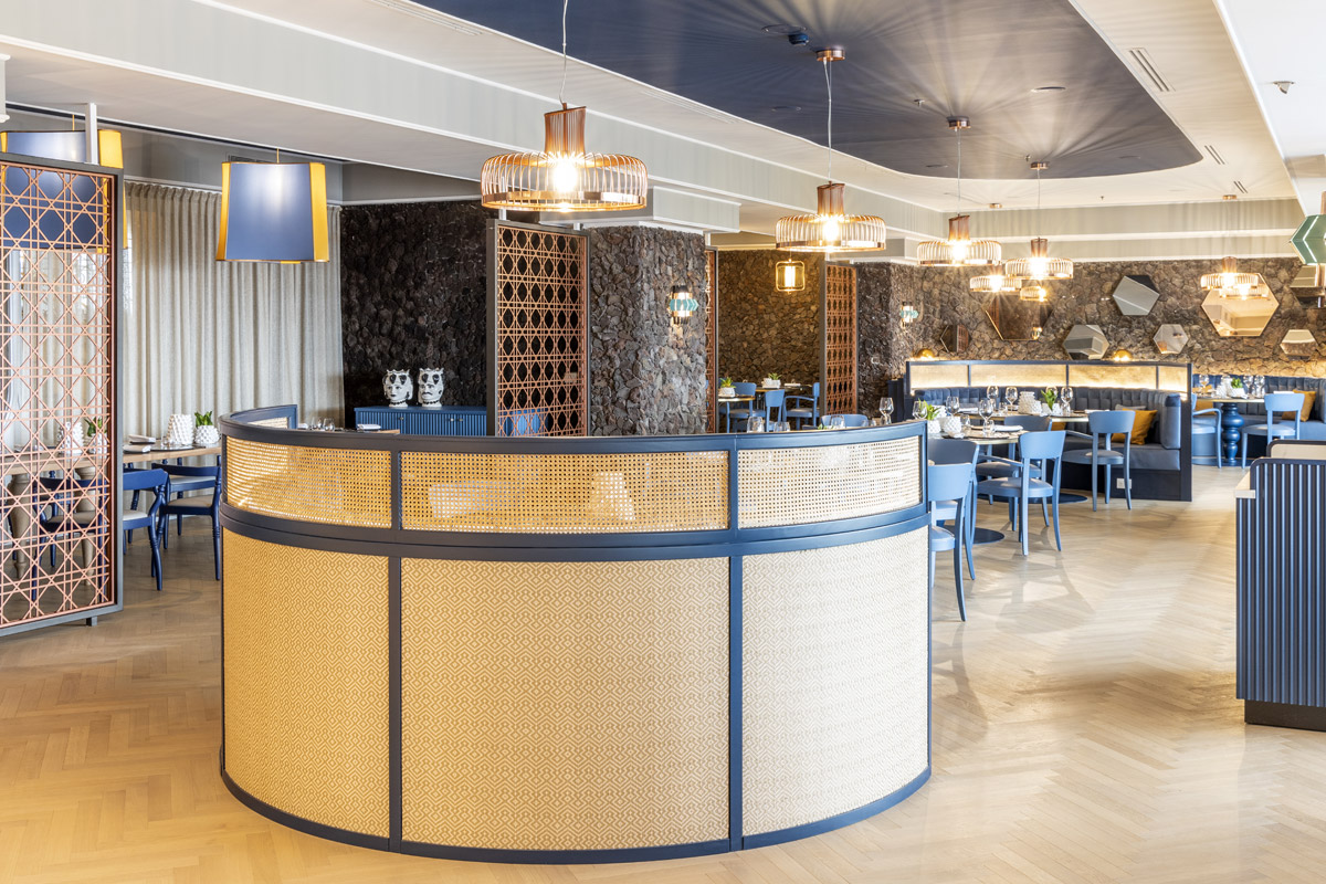
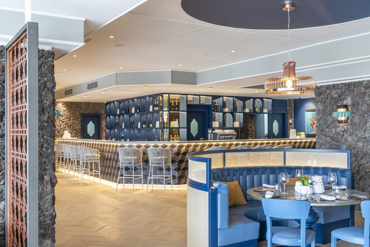
The bar, show kitchen and wine display area were all uplifted, with lava stone from Nero Sicilia used for both the bar top and front, and in a glazed motif for the table tops.
Fluido Pool Bar & Pool Terrace
The Fluido Bar is located on the pool terrace, just outside La Sciara Restaurant offering breathtaking panoramic views of the Mediterranean sea and the unique grey volcanic sandy beaches. The pool Bar is characterized by a contemporary, indoor meets outdoor styled residential look and feel. The walls are finished in a cement-coloured panels by Cosentino, the bar top is white Dekton and the bar front is feature tiles in raw and glazed lava stone by Nero Sicilia.
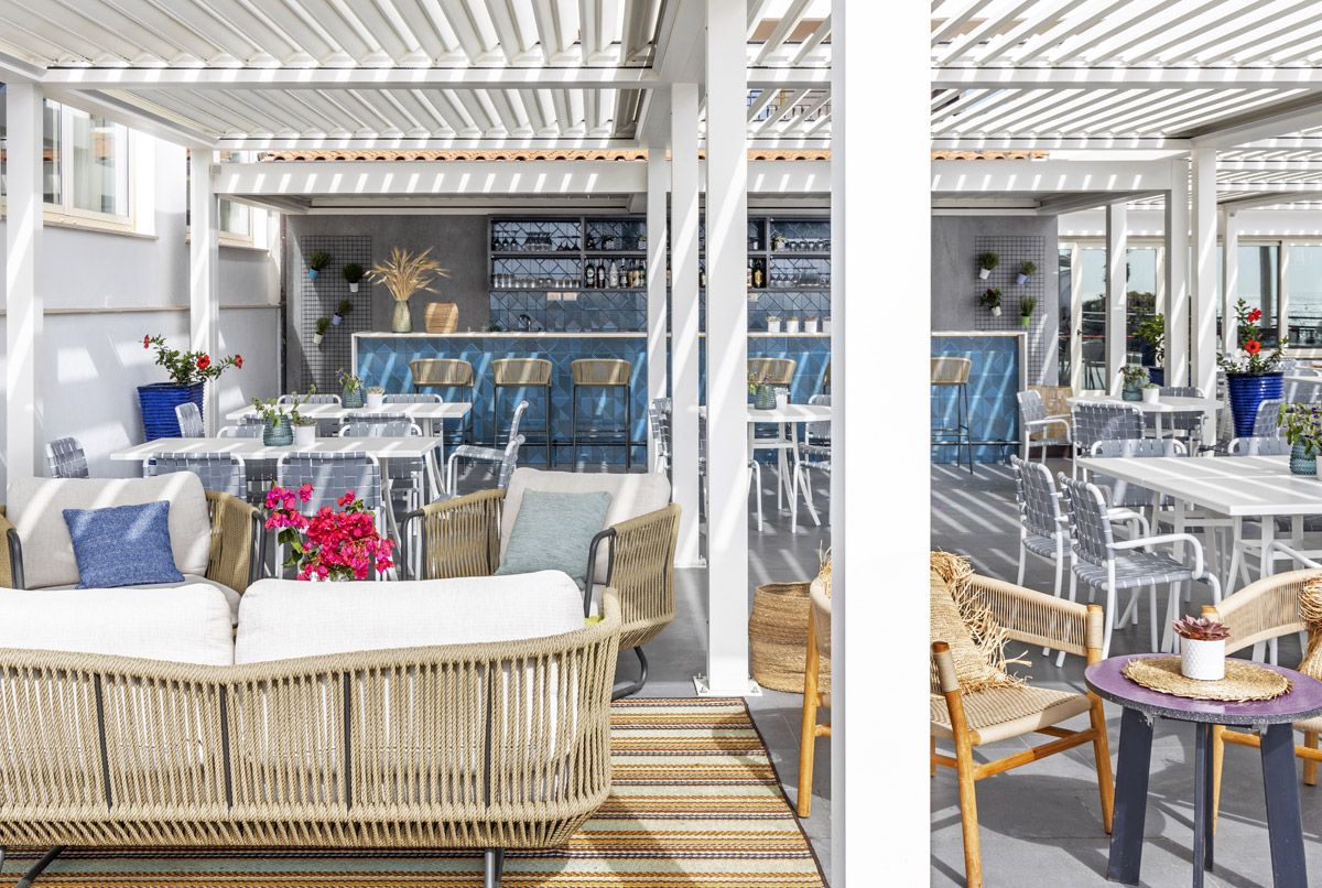
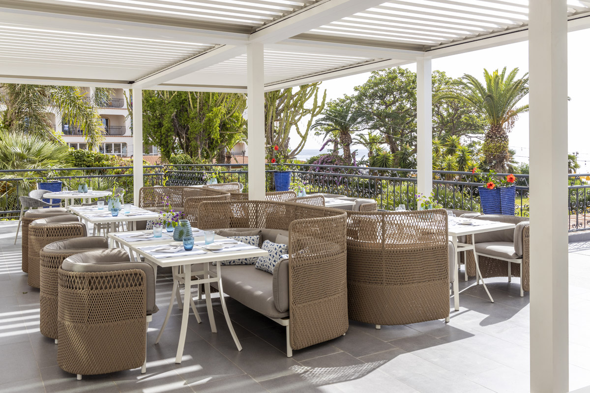
The bar serves pre-dinner aperitives with signature cocktails, open to guests and locals, the ambition is to become a destination bar for the hotel adding to its local night scene. The seating is part dining, part informal lounge sofas with outdoor furniture by Etimo & Varaschin. The flooring is a grès tiling from Gruppo Florim, who also provided the surround to the pool and its interior. Large ecru umbrellas offer shade to the guests during the summer times. THDP created a warm garden style lighting effect, selecting outdoor weathered wall fittings by Aldo Bernardi & suspended light by Faro Barcelona. The large pergola and pavilions are custom designed and supplied by Corradi.
About THDP
THDP was founded in 2005 by partners and couple Italian Architect Manuela Mannino & British Interior Designer Nicholas J. Hickson. The studio is based in south east London and Italy and has a team of 10 people between the two countries. The studio designs hotels, restaurants, and residences internationally, focusing on the south and east part of Europe and Italy. THDP aim to be flexible and able to react to the fast-moving waters of the hospitality sector, prioritizing authentic narrative based on local research and curated selections of artisans, local companies and talented artists. This work is reflected in the guests experience that will be dotted with details to discover during their stay.
THDP's approach springs from an endless creative curiosity, enthused by the founders to every team member, each one of them a true passionate designer and a talented focused team, who is integral part of the successful accomplishments of our projects.
If you’d like to feature your news or stories with SBID, get in touch to find out more.
If you’d like to become SBID Accredited, click here for more information.
BOLON is proud and honoured to share that they have introduced a collaboration collection, together with the influential architect and designer, Patricia Urquiola. The Swedish design company has for a long-time admired Patricia’s designs.
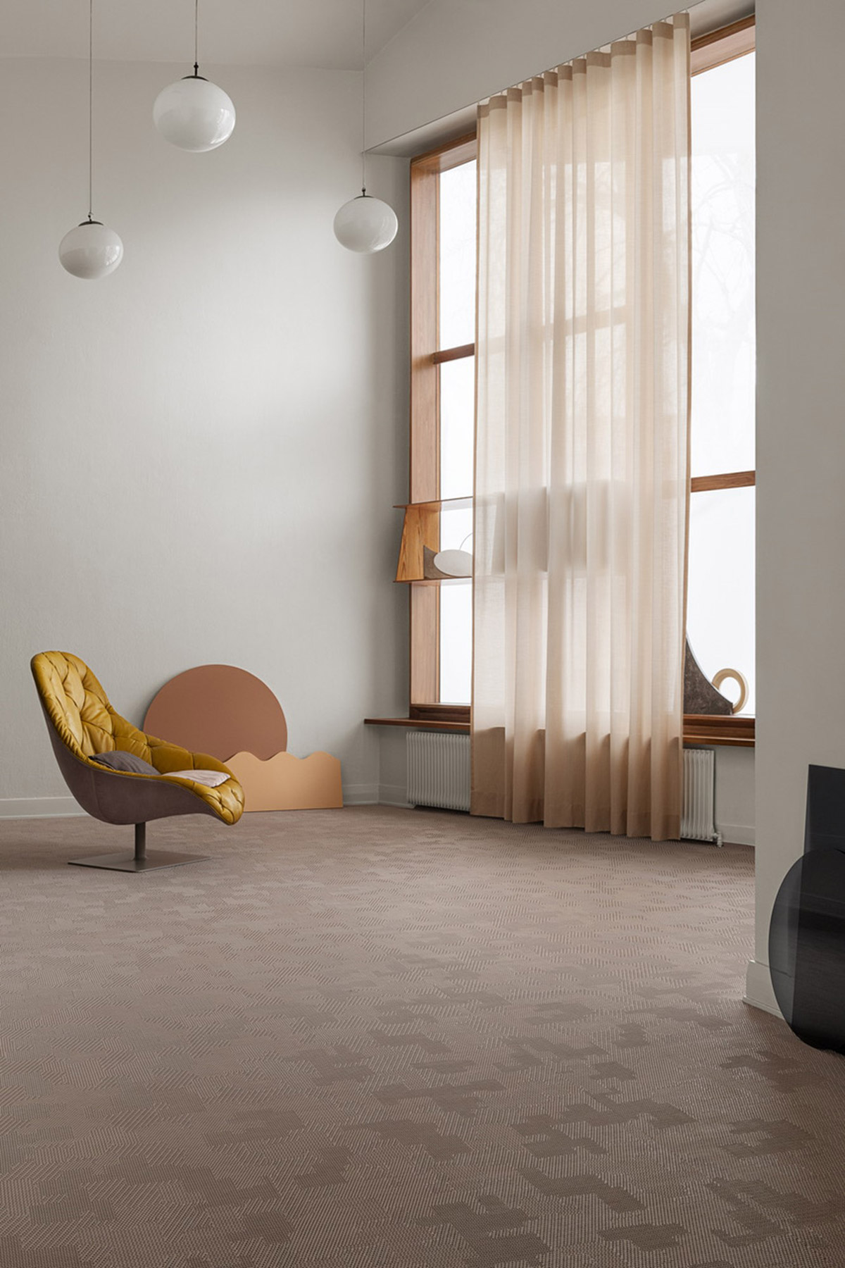
"For many years both me and Marie have dreamt of doing something together with Patricia. Her aesthetic appeals to us and it really is a dream come true to introduce the BOLON by Patricia Urquiola collection to the world. Her great sense for colours is something that reflects the collection and it’s a new palette that we haven’t worked with before, which is a great complement to our existing range. We are proud to add Patricia to our portfolio of BOLON friends", says Annica Eklund, Chief Creative Officer at BOLON.
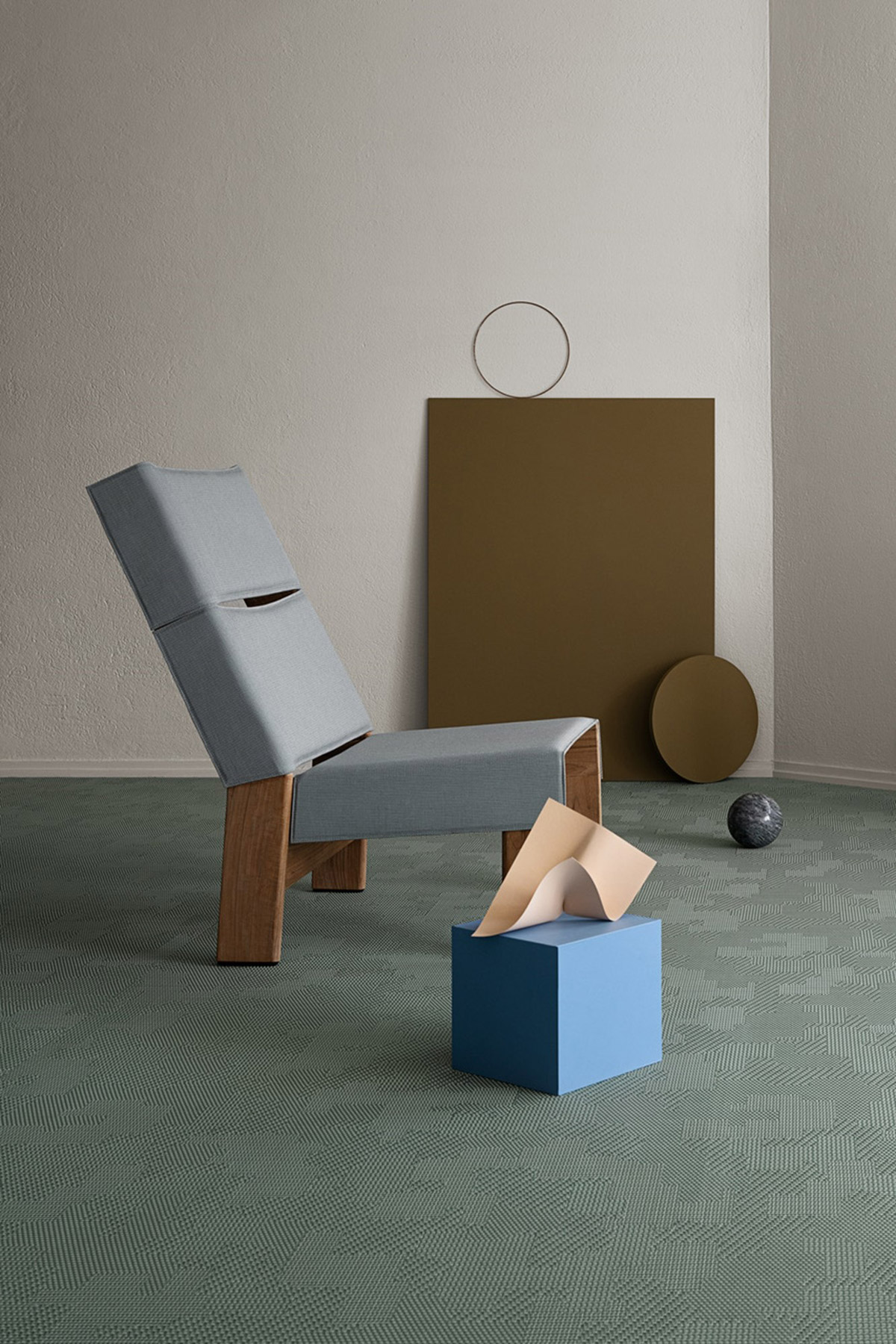
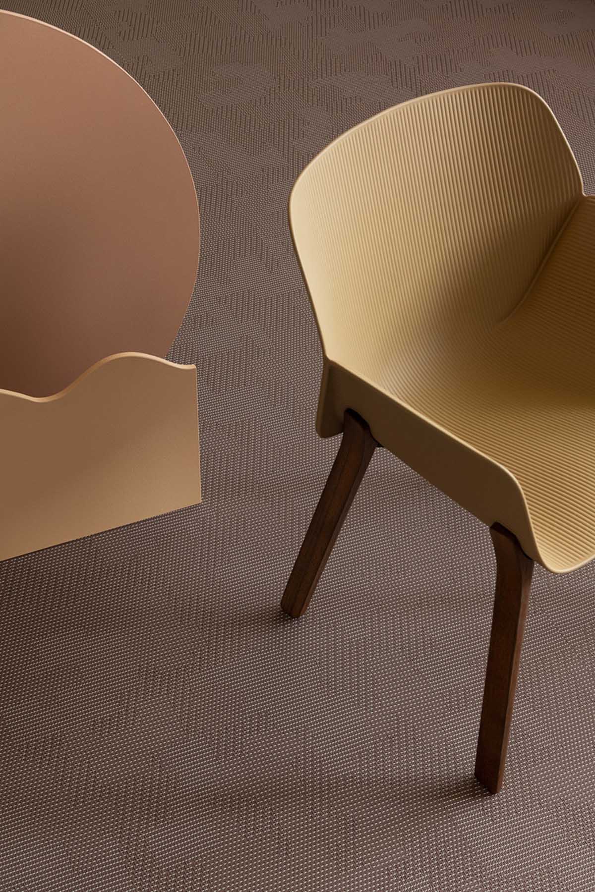
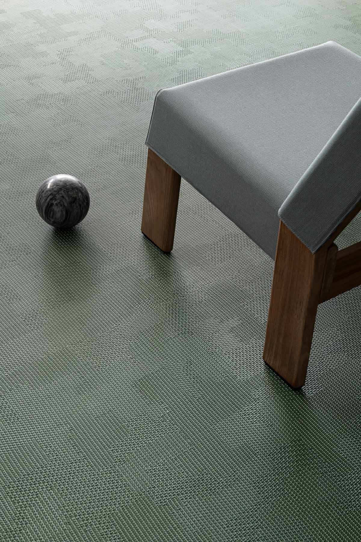
While working on the collection, Patricia found a resemblance between the weaving technique of Bolon flooring and the Japanese tradition of Sashiko stitches. By developing, experimenting and combining Bolon with Sashiko, the colours, patterns and designs came naturally. BOLON by Patricia Urquiola is a high-end design collection with soft colours, characteristic stitching details and patch-like patterns.
"Sashiko means craftsmanship, a sense of materiality. When we started to work on this collection, we wanted to give the flooring a more authentic feel. We started researching as we do for all textiles but applied the approach to weaving techniques. We wanted to communicate cosiness, a feeling of warmth and Sashiko came up as the leading concept for the collection. I think it worked out really well", says Patricia Urquiola.
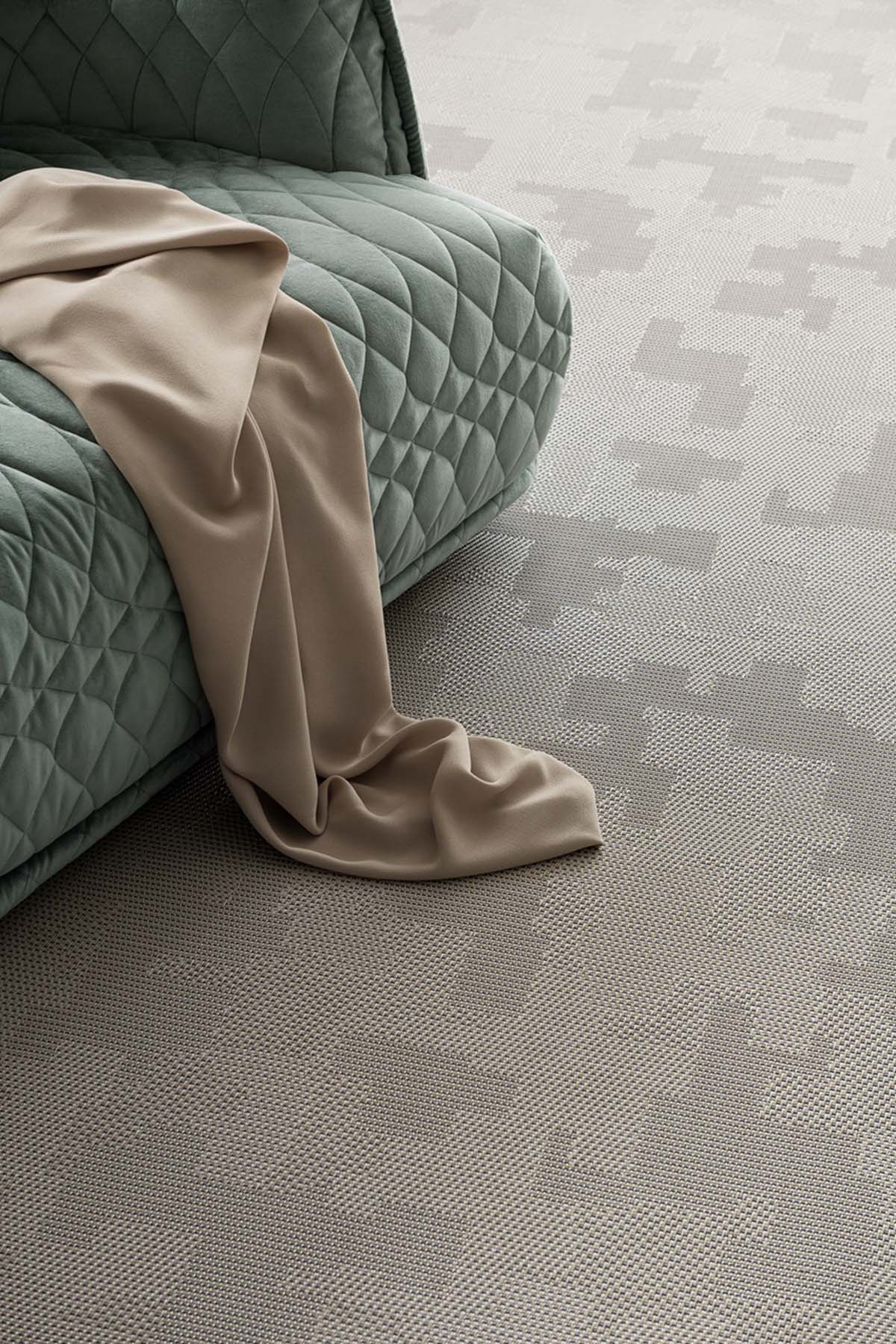
BOLON by Patricia Urquiola consists of one design that comes in four colours; grey, beige with blue details, a clay coloured pink and a calm green. The flooring comes in roll, is made in Sweden, contains recycled material, is easy to maintain, has a high-performance classification 33 Heavy commercial and a 15 years warranty.
The collection is available from the 7th of September 2021 worldwide, and is a perfect flooring for office spaces, hotels or other areas with room for crafted details. The characteristic three-dimensional look of BOLON flooring adds a tactile feel to any interior with the highest technical performance in every square meter.
About Bolon
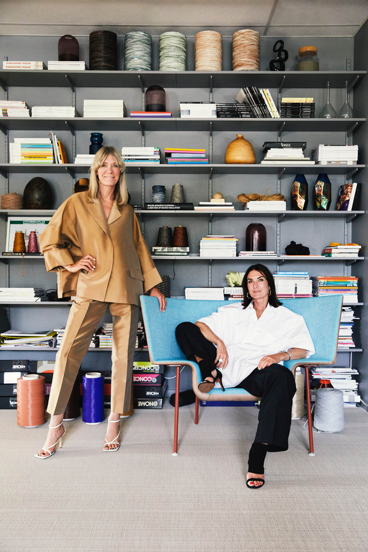
Bolon is a Swedish design company that makes innovative flooring solutions for public spaces. It is a third-generation family business run by sisters Annica and Marie Eklund. Under their leadership, Bolon has transformed from a traditional weaving mill into an international design brand with clients such as Armani, Google, Four Seasons Hotels, Chanel, Adidas, Apple and Missoni. With a strong commitment to sustainability, Bolon designs and manufactures all its products at a facility in Ulricehamn in Sweden. The company is recognised worldwide for its award-winning flooring and its collaborations with some of the world’s most acclaimed innovators and creatives.
If you’d like to feature your product news here, get in touch to find out more.
If you’d like to become SBID Accredited, click here for more information.
In this week's interview with 2021 SBID Awards winner for the Lighting Design category, REPUBLIC OF II BY IV partners, Dan Menchions and Keith Rushbrook answer questions on the winning experience, the creative process behind designing the Boga Collection, and what's in store for the company's future!
The internationally renowned interior design practice, II BY IV DESIGN was founded in 1990 by Dan and Keith - both dreamed of a creative firm that was deeply rooted in design and guided by a passion for constant innovation. "Continually travelling the world, we seek out art, architecture, fashion, theatre, food and culture to fuel our imaginations, while inspiring globally celebrated designs."
SBID Awards Category: Lighting
Practice: REPUBLIC OF II BY IV
Entry: Boga Collection
How important is it to enter the SBID Awards & receive industry recognition for your work? What are the benefits?
The SBID Awards are regarded as one of the most prestigious accolades in the interior design industry representing talent and design excellence across all corners of the industry.
Being named a finalist for a SBID Award is a notable achievement but being a category winner has made our studio tremendously excited and thrilled. We are truly honoured to receive this recognition, especially considering the products of all the other finalists.
The benefits of receiving an SBID are vast but most notably the acknowledgement and exposure within the international design community. It gives immense credibility to our product to win a world class award.
What do you think made this particular design an award winner?
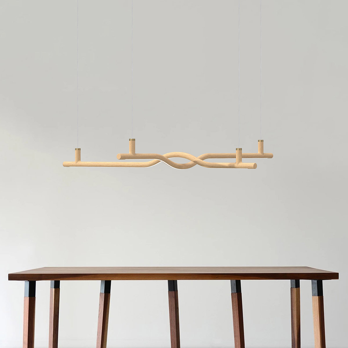
The simplicity of the design. It is truly a study in form and shape. It’s elegant and refined. The purity of the design comes from a simple line. Our design team didn’t want to overcomplicate it. Sometimes less is more and it’s important to keep it simple.
Having said that, the design is only as strong as those who manufacture it. So, we celebrate hollis + morris’ true craftmanship and their team for fabricating this product. It’s a true partnership and we share this great accolade with them.
Our team wanted to evoke emotion, we hope everyone who sees the fixture is inspired and curious by the design.
Tell us about the creative process behind the Boga Collection - what inspired the design, and how did you approach bringing the initial concept to life to ensure it functions effectively?
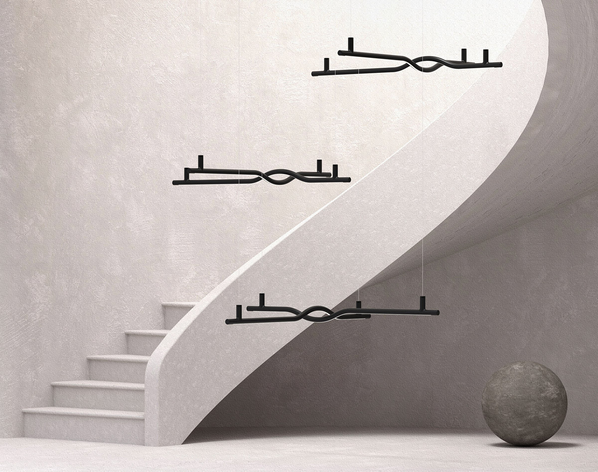
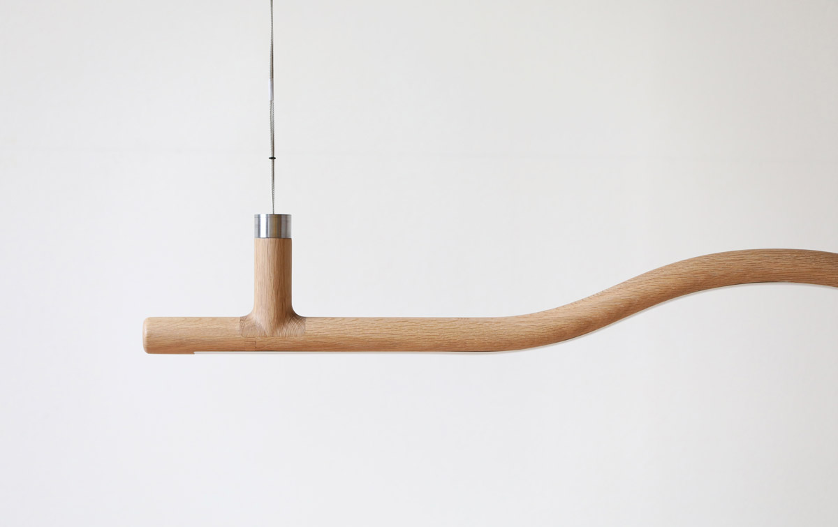
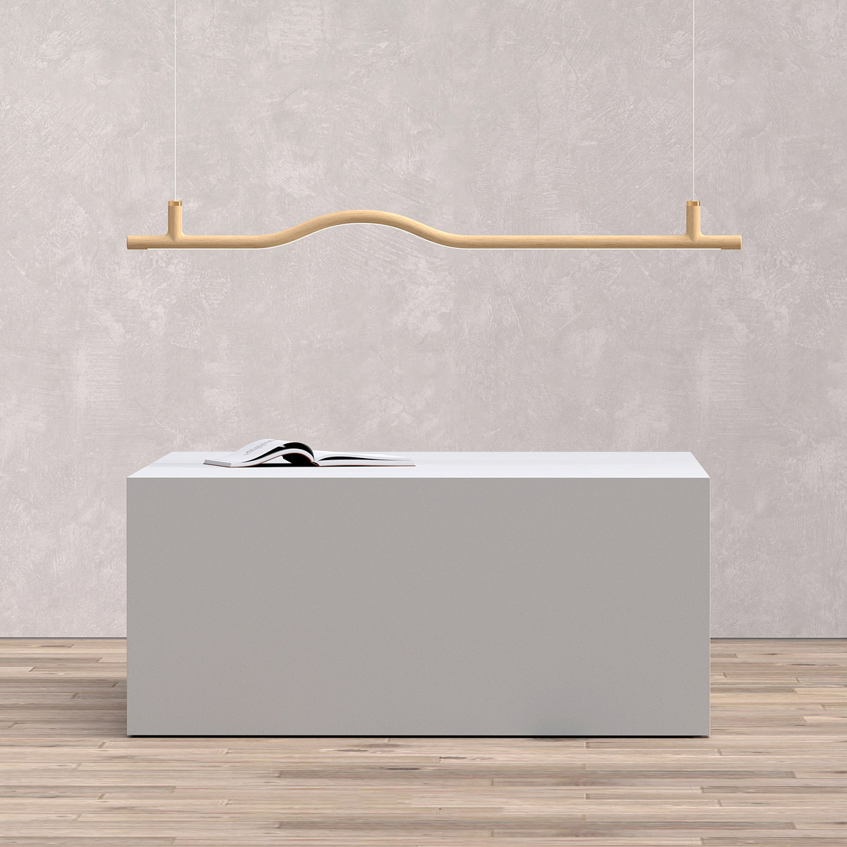
Boga, which takes its origins from the Old English word “bow” was inspired by the wonders of how wood can be transformed. The bow in archery is so powerful and we wanted to emulate that with a lighting fixture.
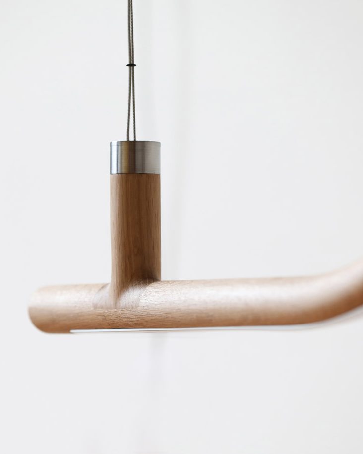
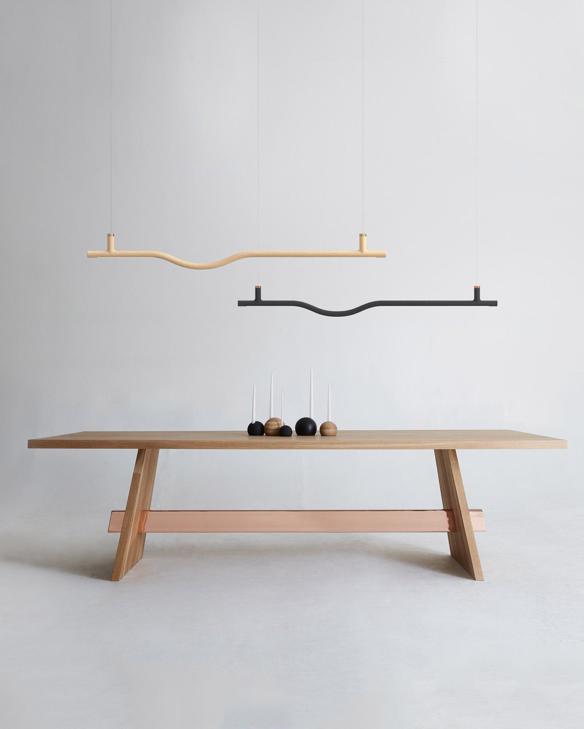
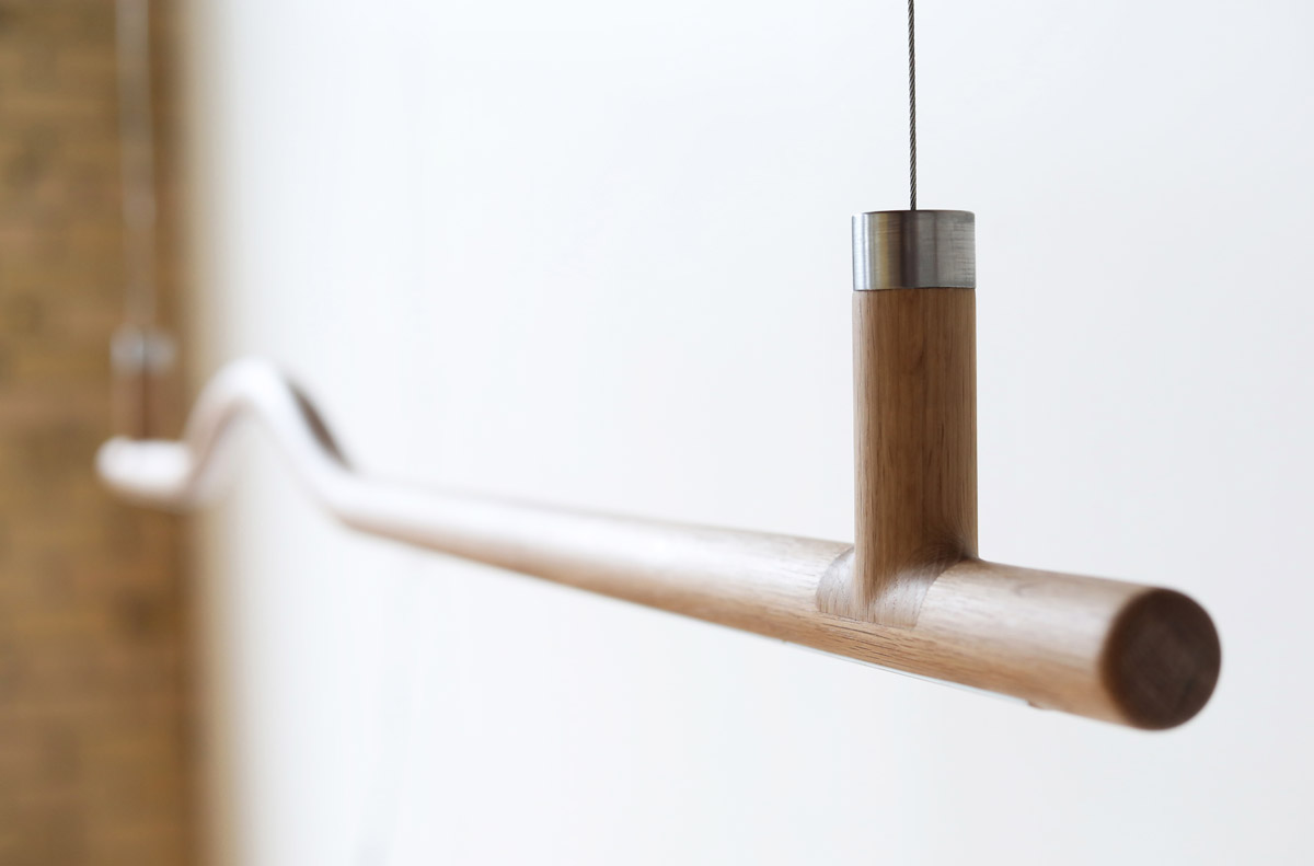
Inspired by narrow natural wood material, the Boga Collection pendants maximize the surface area available to emit light, delivering glow with absolutely no shadowing. The substantive solid wood frame supports its elongated scale and lends to its striking yet whimsical presence. Customizable, and dimmable from cool to warm tone, with wood finishes offered in primarily natural ash, walnut and black stain, the Boga Collection is an elegant complement to any residential, hospitality or commercial interior.
As for bringing this concept to life, we had to ensure to was structurally sound. So, we 3D printed small samples then a full-size model once we had our design perfected. Each pendant is milled out of one natural wood piece using 5-axis CNC technology to follow the natural curve of the wood grain. The design teams focused on creating a pendant that embodies a natural wood grain finish that flows into the piece with intentional joinery resulting in a pristine and clean aesthetic.
What are the most important considerations when designing lighting solutions? How far does II BY IV’s background in interiors influence the products you design?
First and foremost, it must be able to be fabricated. You can’t create a super complex design that will only make it to the prototype stage. Also, you must keep in mind finances. The cost of fabrication directly leads to retail price. We keep in mind fabrication in order for it to be affordable or what we like to call ‘affordable luxury’. We wanted this piece to have a mass market appeal with a high-end look.
The materiality is a huge consideration as well. For all our projects, we factor in the environmental aspects. Minimizing our carbon footprint is very important to our studio so we ensure it is locally sourced and fabricated.
Our background of over 30 years in interiors definitely influences and contributes to how we approach the products we create. We think about how specifiers and the public can use it in their spaces. Ensuring the product can have as many applications as possible.
After all, light is so very crucial to a space, without lighting there is no design.
Now that you’ve won an SBID Award, what are the next steps? Is there anything new you are excited to be working on?
We are always planning our next steps at REPUBLIC of II BY IV. We have more lighting lines being developed with local and international manufactures, working with existing, well-known brands as well as completely new brands. We are also launching a brand-new wallcovering line.
Our studio has a lot planned for 2022 so be sure to follow us to stay up-to-date! @republicofiibyiv
What advice can you give to young designers starting out in the design industry?
This is such a great question and many thoughts come to mind but the one that sticks out the most is, dare to be yourself. Authenticity is what lasts in this industry. Don’t just follow the trend, start the trend.
It’s imperative to have your own point of view on design and always push the envelope. Be willing to take risks and dare to be different. You need to stand out in this business.
Focus on materials that do not harm the environment and don’t just design for the sake of designing. Always design with a solution in mind. Add your clever take to the design and be mindful of the craft. Celebrate as much as possible and look for inspiration everywhere.
Questions answered by Dan Menchions and Keith Rushbrook, Partners of II BY IV DESIGN and REPUBLIC of II BY IV, proud members of SBID for over a decade.
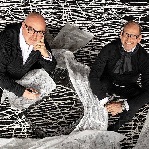
Established by Dan Menchions and Keith Rushbrook and credited with countless awards and esteemed publications, II BY IV DESIGN is distinguished by a balanced approach that captures the essence of each client’s vision. From concept to execution the entire team believes in delivering the highest level of design excellence.
This week's instalment of Project of the Week interior design series features an arty biophilic Oriental restaurant design by 2021 SBID Awards Finalist, Deckora Design.
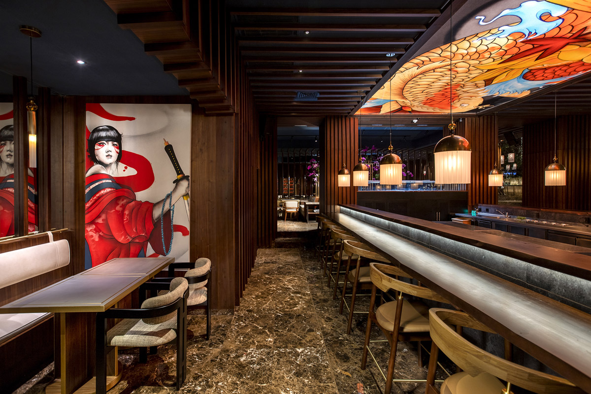
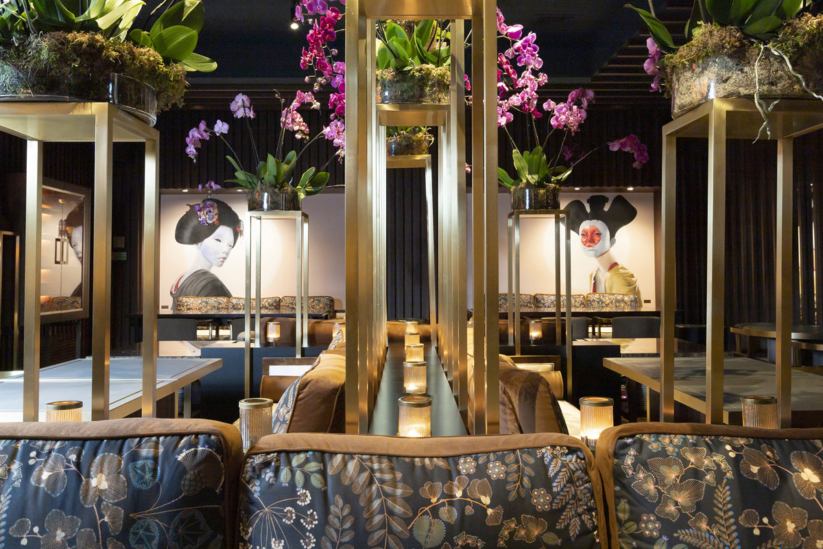
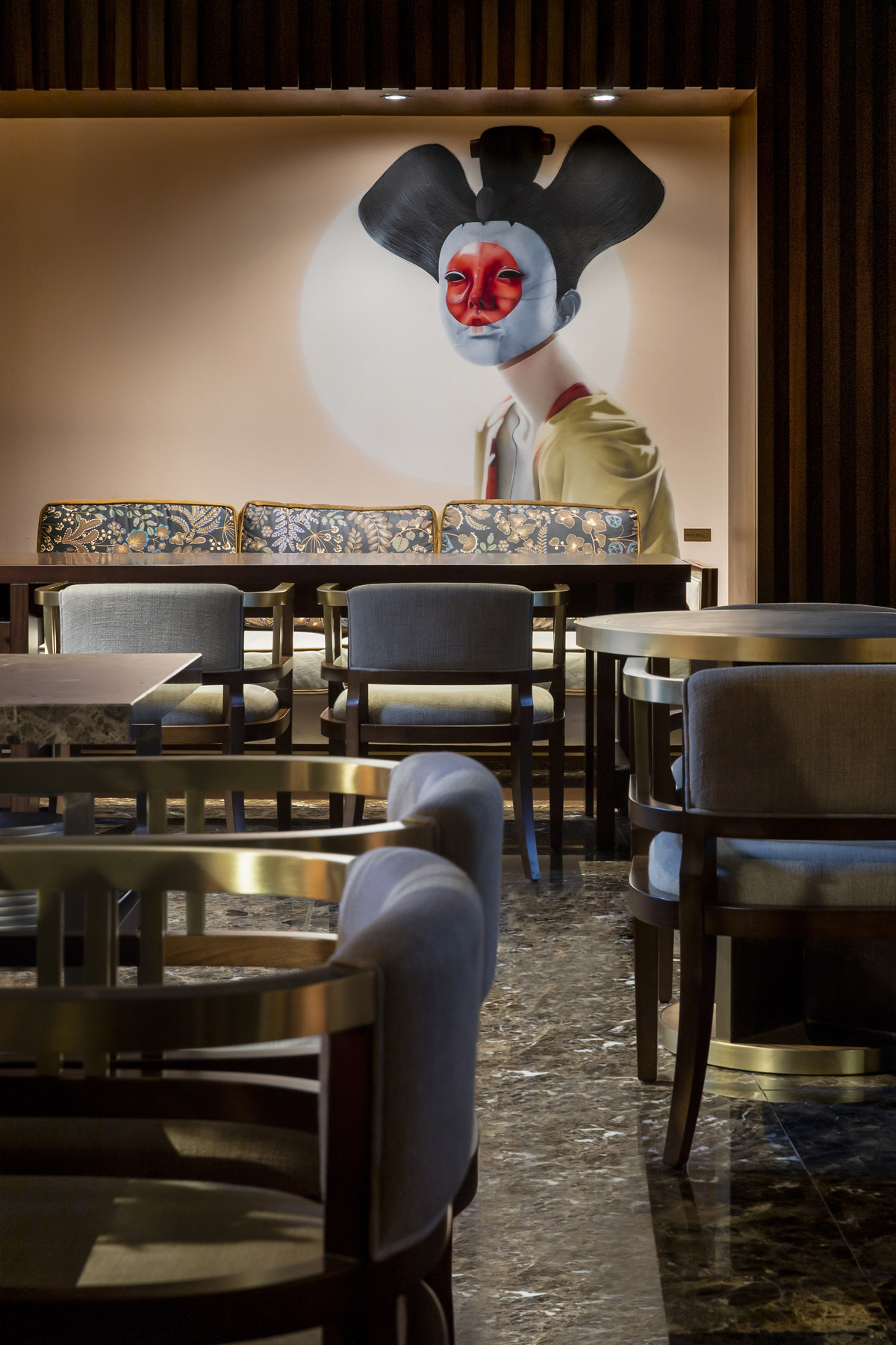
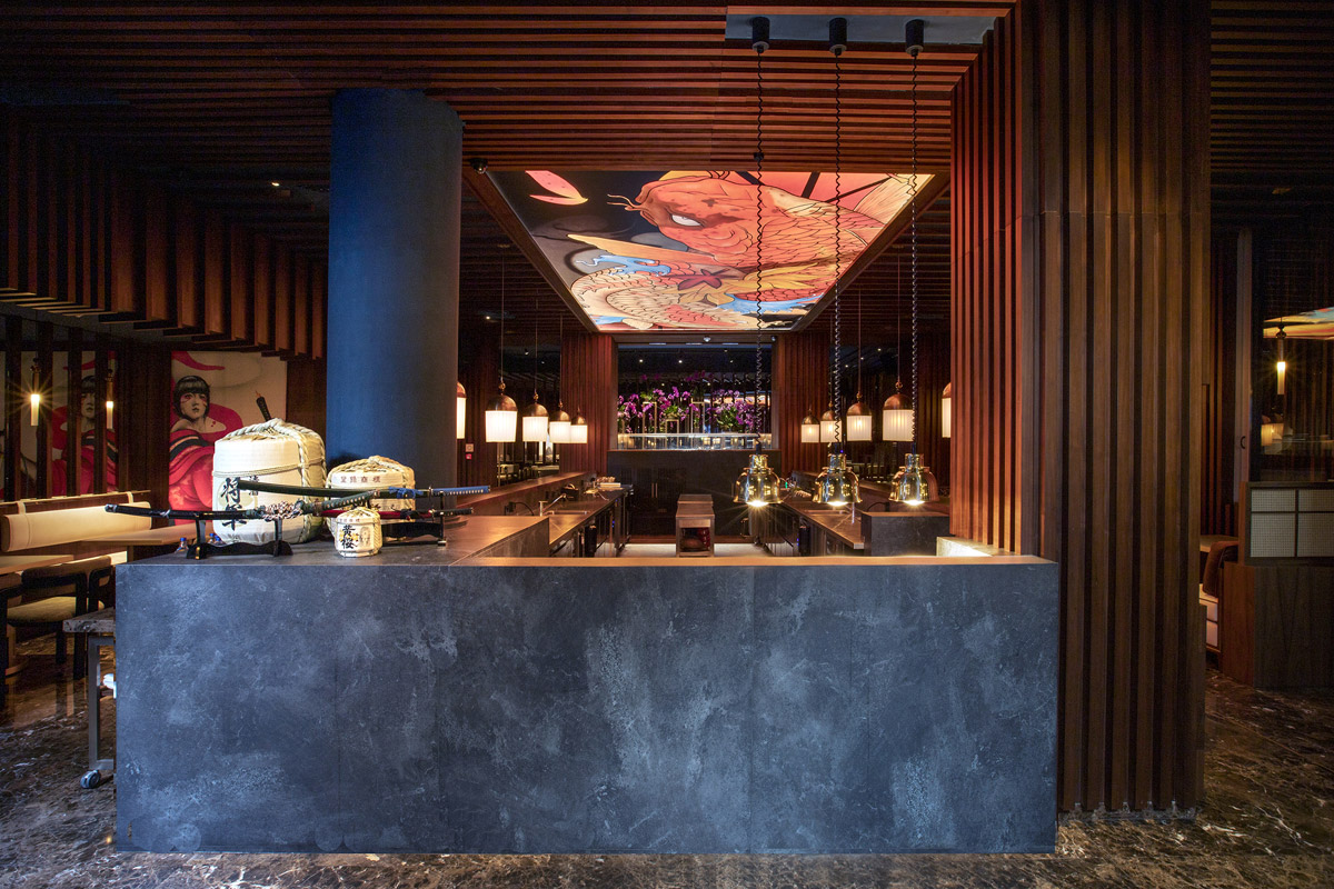
Yakuza is the most buzzed-about Asian restaurant of Lisbon set at the ground floor of Hotel AVANI AVENIDA and offering the best selection of creative sushi in town. Deckora Design assisted the wider Minor hotel group in shaping a refined yet eccentric environment featuring fine walnut details, polished stone superficies
and hand-painted art murals.
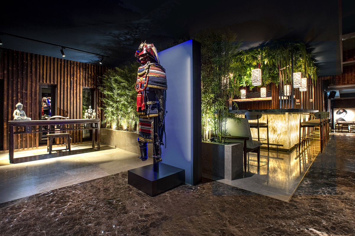
The original commercial space, situated amid a dense urban context in the back yard of a busy high street, represented a challenge of great complexity for the designers due to the lack of natural light. The tailored made labour of Deckora Design’s team transformed a difficult space into the trendy Oriental restaurant of the Portuguese capital where art and biophilic design play a crucial role.
SBID Awards Category: Restaurant Design
Practice: Deckora Design
Project: Yakuza Restaurant
Location: Lisboa e Vale do Tejo, Portugal
What was the client's brief?
The brief is the creation of a cosy yet seductive interior where dark fittings, comfortable furniture and warm lighting contribute to a truly unique experience for the guest.
What inspired the design of the project?
The project's holistic approach, rooted in systematic design research, is considering all aspects of the environment: from architecture and lighting, to furniture and art. The concept was a modern and irreverent reinterpretation of the Japanese restaurant. The overall emblematic proposal shows how good quality design, and the successful transformation of a space, can have a successful impact and provide an authentic experience that goes beyond dining.
What was the toughest hurdle your team overcame during the project?
Yakuza Restaurant represented a great challenge, starting from the location situated amid a dense urban context with lack of natural lighting. Deckora Design delivered a flawless design enhancing the intrinsic characteristics of the property. The design team managed to exceed the expectations of the different stakeholders by respecting budget constraints and demanding deadlines during a world pandemic. The final outcome satisfied the client's complex brief and requirements, integrating motifs and key elements of the pre-existing Yakuza brand into a new, unique and innovative concept.
What was your team’s highlight of the project?
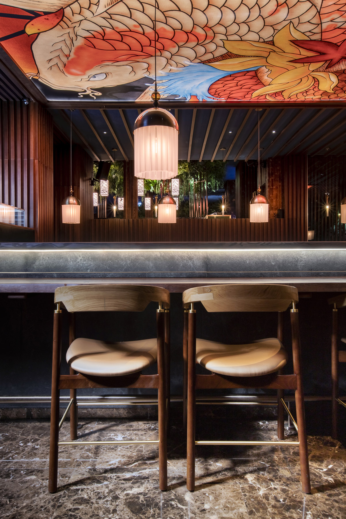
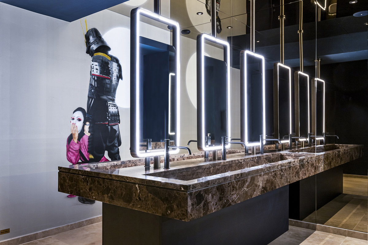
Art played an important role in the project; we commissioned hand-painted murals from the local artists. Art is also present in the main highlight of the project and the main attraction of the commercial space - the sushi counter, a 5x10 meters rectangular central artefact representing the beating heart. The austerity of the walnut louvers and the rigorous central slate are juxtaposed to the playfulness of the backlit ceiling canvas. This distinctive piece of art, hand painted by the urban artist Smile, is characterised by vibrant tones and portrays a huge Japanese koi, providing indirect lighting to the entire room.
Why did you enter this project into the SBID Awards?
The SBID Awards is one of the most influential and well organised awards in the Architecture and Interior Design industries. Being part of this programme is definitely something to be proud of, and being a finalist is already a great reward for us after the great amount of care and time our project required. I also believe that getting personally involved, contributing to the community and being exposed to the work of other colleagues is an important part of our professional development.
Questions answered by Camilla Degli Esposti, Director, Deckora Design.
