With over 20 years experience applying this intricate ancient wisdom to the modern built environment, Founder of Feng Shui Agency and classically trained Feng Shui master, Sarah McAllister shares her expert insights on applying feng shui principles in interior designs to create authentic wellness spaces.
Classical Feng Shui and its impact on wellbeing
Classical Feng Shui originated in ancient China and is one of the 8 Brocades of Traditional Chinese Medicine - if someone were chronically unwell despite acupuncture or herbal remedies, then the advice of the local Feng Shui master was sought out to see if sick earth chi might be the cause of their malaise.
Fast forward to the 21st century and Feng Shui is once again being acknowledged as a powerful energy medicine and is the perfect complement to the boom in Wellness Architecture and Wellness Real Estate. Wellness design cannot be complete without considering the subtle energies of the land and the built environment that contribute to our overall spiritual, mental and physical wellbeing. While the energetic and intuitive dimension to feng shui creates luminous spaces that FEEL fantastic, there is also a very pragmatic methodology to feng shui recommendations. Each direction has an energetic link to a part of the body and an internal organ so in the case of persistent conditions it is wise to consider if the environment is indeed affecting you.
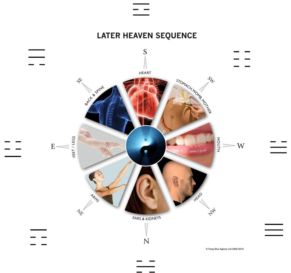
Classical Feng Shui and Interior Design
Some architects say feng shui is just common sense, and while there are very pragmatic aspects of feng shui that can be likened to good ‘ergonomics’ there is a huge amount of robust methodology, which can only be understood when properly trained. Classical Feng Shui has unique time-tested techniques that accurately identify and reduce potential problems. From Form School & Dowsing to advanced Flying Star and Hexagram "Chi-calculations", 24 Heaven Stars, 8 Mansion, Sam Hap Water and Sang Set methods, there is a technique to assess every type of space from a small apartments to large family homes, whether opulent mansions or the planning of an entire wellness community, spa resort, hotel, hospital or industrial complex – entire cities can be designed with feng shui principles.
Natural Form & Topology
How your home or business property sits in the landscape has a huge influence on how smooth your life or business will be, and whether or not you encounter more than your fair share of obstacles and what the key aspects of your life ‘story’ might be so far. The career and relationship prospects and to a certain extent, the health and finances of occupants can be read and subsequently improved, if there is scope to make modifications.
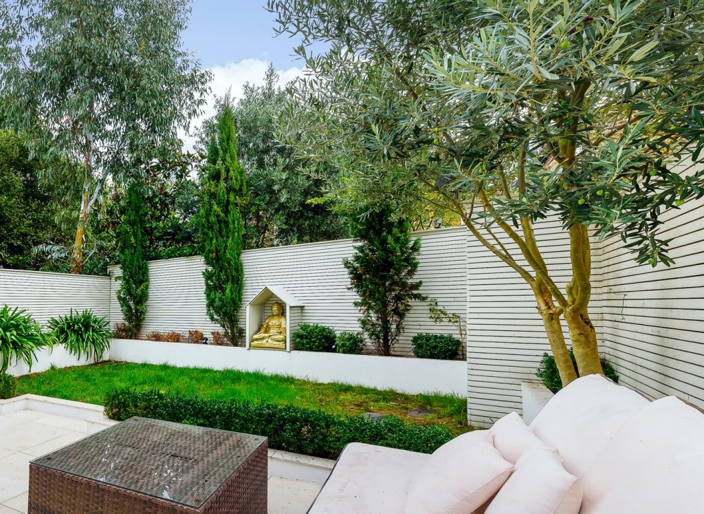
Even in townhouses with small gardens or apartments with no outdoor space, the influence of feng shui still weaves its chi as all buildings hold the resonance of the orientation - whether N-S or E-W etc. each configuration has a unique feeling and quality of energy. One can argue that it is even more important to implement feng shui measures in city homes, so that they can have as much connection with natural energy as possible within the urban setting.
Emotional Health and The Five Elements in Design
It is quite remarkable how powerfully colour influences our moods and emotions and Feng Shui Five Element Theory helps us make wiser choices around design shapes, texture and colour for the best harmony, or whatever experience you wish to create. Not everyone wants harmony and restfulness, especially in an office space – they might want something more dynamic (lime green, striped/bamboo pattern – wood element) or inspirational (reds, purples, geometric – yang fire element). Those seeking a more restful mood will want to use warm blues and wave patterns (water element) or soft pinks, mauves, lavenders (yin fire element). Not only can Feng Shui design help to promote emotional balance, but it also helps occupants to have much deeper sleep, which is a fundamental factor for overall good health.

Natural Life-force Energy
Feng Shui is primarily concerned with how to observe, protect and strengthen ‘chi’ or life force energy. Many other wisdom traditions, not just the Chinese, have words describing the animating force of life – in Japan it is known as ‘ki’ , in Ayurvedic tradition it is referred to as ‘prana’, in Cherokee Shamanic traditions ‘the spirit that moves through all things’ and even in the West we have terms such ‘orgone’ (Wilhelm Reich) and the Latin term Genus Loci, meaning ‘spirit of place’ also indicates that space has a spiritual or energetic quality.
Bespoke Feng Shui Design & Retrofitting Wellness
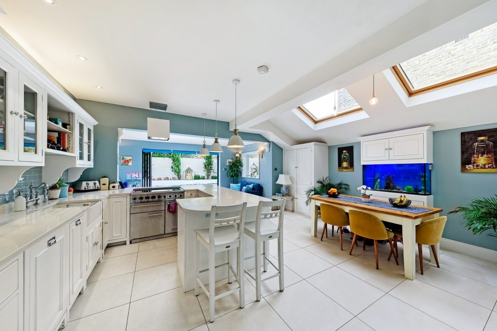
Even if you didn’t have wellness architecture or feng shui considered in the original design, you can usually retrofit key aspects by removing outdated systems or materials and replacing with much healthier substances and systems for water and air purification for example. Some feng shui cures can be added into an existing property or specific changes made to the landscaping that improves the chi circulation. Colours and interior layouts can be very powerful especially when combined with the unique Chinese astrology of the occupants. At the end of the day, the proof for all this theory is largely qualitative rather than quantitative, and those who are open minded enjoy distinct benefits from implementing principles of Feng Shui.
About the Author
Sarah McAllister is a classically trained Feng Shui master qualified in Environmental Psychology. Sarah sits on the Wellness Architecture Initiative of the Global Wellness Institute. Her love of nature and deep experience of Wilderness Spirit Philosophy helps her create environments with a deep connection to the natural world. Her projects range from residential eco builds and £25m luxury mansions to award-winning urban spas, boutique hotels and wellness resorts.
If you'd like to become SBID Accredited, click here to find out more.
Why do designers need Professional Indemnity Insurance?
Professional Indemnity Insurance provides financial protection against client non-payment or negligence disputes. If you’re alleged to have provided inadequate advice, services or designs, PI insurance covers legal costs and expenses incurred in your defence, as well as any damages or costs that may be awarded.
The partnerships support members with the insurance solutions they need to provide their professional services with peace of mind. As a large membership organisation of interior designers, SBID professionals have varying needs and requirements right across the UK. Having access to a dedicated team with their wealth of specialist knowledge, experience and advice is vitally important in supporting its members in business; offering additional security and protection in the course of their professional duties.
Holding valid Professional Indemnity Insurance is a condition of Accredited membership for SBID Designers.
To find out more about SBID's professional accreditation for interior designers, click here.
Project of the Week
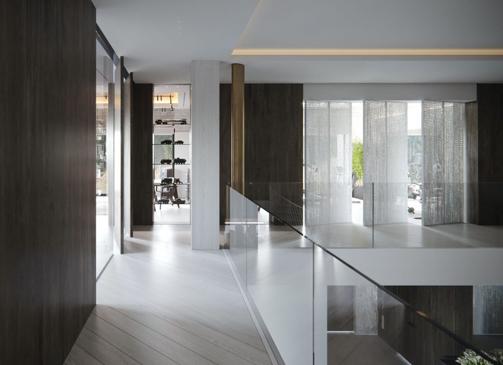
This week's instalment of the #SBIDinspire interior design series features a residential design by 2020 SBID Awards Finalist J.Lykasova Studio. ONYX is a modern minimalistic interior of a spacious residential house for a family of three.
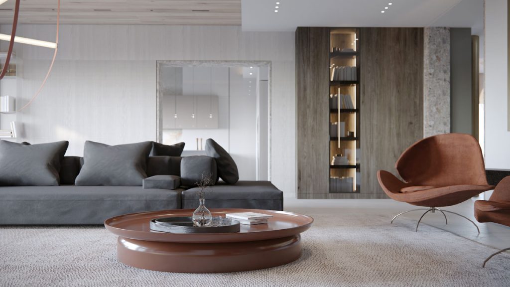
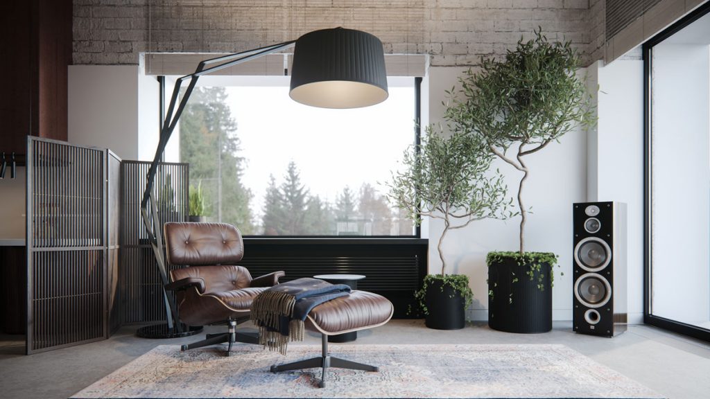
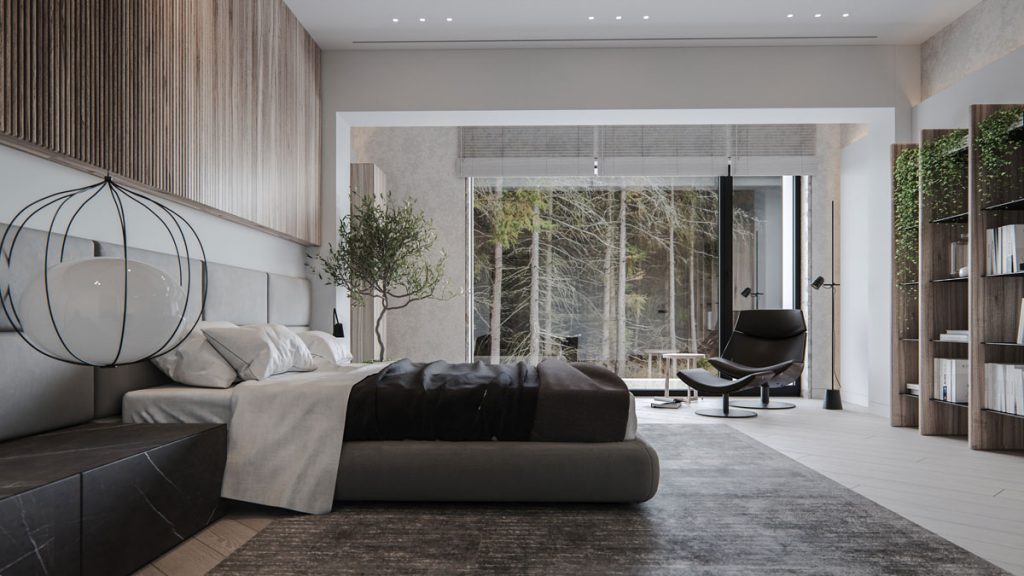
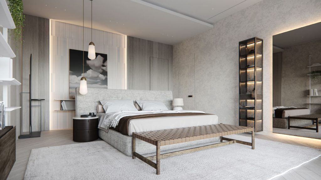
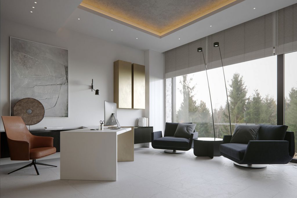
The concept is based on soft, timeless minimalism. A blend of wood, concrete, stone and metal balanced by neutral shades makes a background for artistic architectural forms. The rhythm of the space is driven by a sequence of gypsum panels, drop-down zonal lightning, and laconic brass columns. Bronzed mirrors expand the apartment, reflecting the play of lines and shapes and filling the rooms with air.
Natural materials in geometric shapes softened by chic design elements and décor create a calm and peaceful atmosphere, just what the clients were looking for.
SBID Awards Category: Residential House Over £1 Million Sponsored by Schneider Electric
Practise: J.Lykasova Studio
Project: ONYX
Location: Minsk, Belarus
What was the client's brief?
The clients were looking to create a calm and peaceful home that would become a real temple for their family, a place full of loving and positive energy. Soft pastel palette with bits of terracotta, mustard or bordo was their colour choice. The couple preferred sophisticated decor pieces to hyped well-known replicas and expected to have lots of mirror surfaces in the rooms.
As for the interior style, they opted for modern minimalism. ‘We would like to have a timeless minimalistic interior, calm and warm, yet with a twist! We don’t want it to be yet another featureless interior from a magazine, so we are looking forward to unconventional solutions that would make it distinctive and personalized.”
They also paid particular attention to functionality expecting to have a functional home, where everything is in its place. They loved the idea that less is more, yet wanted their home to be cosy and comfortable so that it did not feel empty and uninhabited.
What inspired the design of the project?
Actually, our clients, a married couple, are the major source of inspiration for this project. Regardless of their senior positions at work and corresponding responsibilities, they still take good care of their wellbeing and mental health. They work out a lot, they travel a lot and they never stop learning. Their vision of aesthetics and beauty resonated with us from the very start.
The homeowners wanted to have a stylish minimalist interior, yet bring in comfort and warmth along with unconventional interior solutions that would make their home truly special. So, we got inspired by the minimalistic concept: clean lines and forms and modern furnishing materials. The onyx stone seemed to reflect this idea in the best way: the texture and colour gradient of this natural material became a perfect foundation for designing a chic, lightweight and sophisticated interior.
What was the toughest hurdle your team overcame during the project?
Probably, one of the biggest challenges we came across was the slight difference in taste. Initially, the clients sincerely leaned towards the classic vibe, regardless of the initial brief for the minimalist interior, and so wanted to use corresponding finishing and decor items, such as mirrors. However, our vision of the space was different - we saw a minimalistic, yet classy interior in it. So, it took us some time to prove that rough materials such as concrete and aged metal can look truly noble and stylish. But we succeeded!
What was your team’s highlight of the project?
Our clients rely on our vision completely, so it’s easy for us to collaborate with them on this project. When they wanted to change some of the aspects, e.g. the staircase, we discussed potential alternatives and shared the updates. Funny enough: they preferred the initial version after all.
Why did you enter the SBID Awards?
SBID Awards provide a great opportunity to gain invaluable insights into the industry trends, exchange professional experience and get feedback from a community of passionate architects and designers. We learn from each project presented by other nominees. All that inspires us to explore new directions and master our expertise so that we can continue creating exceptional projects for our customers.
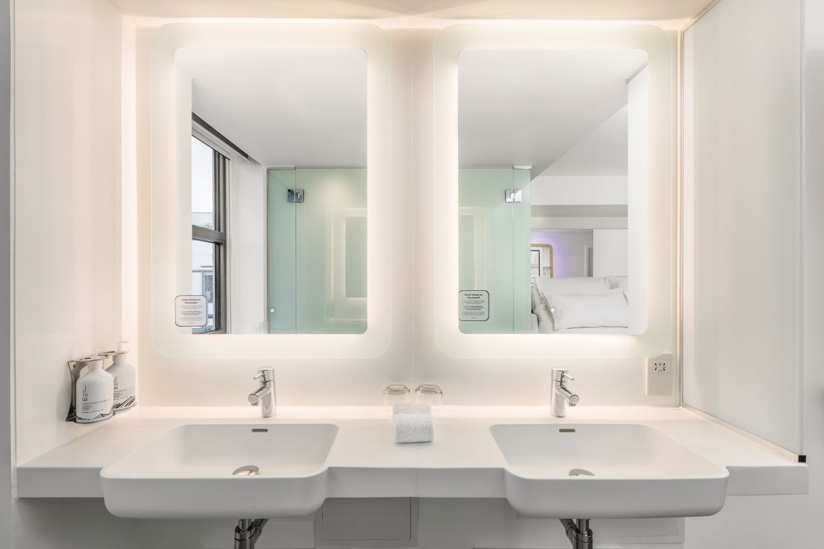
Scotland’s very first YOTEL, centrally located in Edinburgh’s bustling Queen Street, perfectly combines contemporary modern interiors with the classic design of the city’s famous Old Town architecture. Its playful ‘cabin’ style rooms feature bathrooms using a bespoke solution and innovative solid surface material Surfex® exclusively from Roca.
YOTEL Edinburgh is the brand’s first city centre opening in Europe. Its premium location is perfectly placed, allowing guests to experience all of the city’s historic charms and top attractions within walking distance of the hotel. The sleek and modern interior is testament to the ethos of the brand; creating an innovative, smart hotel for tech-savvy travellers.
The hotel has 276 compact cabin rooms, inspired by the feeling first class travel provides in terms of luxury and comfort. Each room is equipped with YOTEL’s signature features including luxury bedding, relaxing mood lighting and Smart TVs. This helps to enhance the smart experience YOTEL is renowned for and evokes contemporary style and convenience. The rooms are designed to have a modern feel, and its minimalist white interior highlights the brand’s close attention to detail.
During the launch, YOTEL Edinburgh General Manager Stuart Douglas said, “The main purpose of the cabin rooms at YOTEL is to provide guests with functionality, practicality and above all, high quality. The uncompromising design of the rooms and bathrooms ensures guests have the essential elements of luxury hotels but redesigned into a compact, smart space.”
Working closely alongside YOTEL at the design stage of the project, Roca created a bathroom solution that closely aligned with the brand standards. This included the Gap wall-hung WC and a bespoke vanity unit, in addition to bespoke washroom countertops for the public areas of the hotel.
Manufactured in Poland, the bespoke units were made using Roca’s innovative Surfex®, a malleable solid surface material formulated from a combination of minerals and resins. The unique properties of Surfex allow it to be poured into a production mould, enabling complex designs with no joints or seams. The materials properties also permit ‘on-site’ changes to the finished product, catering to different guestroom sizes and configurations. At YOTEL Edinburgh the advantages of Surfex were harnessed to create a wash basin bowl with an integrated unit that maximises countertop space, providing ample storage space for toiletries and grooming products.
The addition of The Gap wall-hung WC further complemented the design aesthetic. Created by renowned industrial designer Antonio Bullo, The Gap features modern and stylish lines whilst delivering both a compact and functional bathroom solution.
“We worked in close partnership with the YOTEL team to deliver a bespoke solution that fitted their requirements and those of their guests,” comments Jon Bond, Head of UK Projects at Roca. “The end result is a bathroom that seamlessly integrates the modern feel of the cabin rooms, with the contemporary ethos of the YOTEL brand.”
About Roca
Roca began in 1917 as a manufacturer of cast iron radiators at its factory in Gavà, near Barcelona. From humble origins, the company has grown into a global business driven by a firm focus on improving the quality of life for its customers. Roca began producing innovate new designs, products and materials to provide the complete bathroom solutio. Today, Roca manufactures at 78 facilities around the world and is active in over 170 markets.
If you'd like to become SBID Accredited, click here to find out more.
SBID Accredited Designer, Portview strive to positively contribute to the creation of legacy-defining spaces that work for people, businesses, communities, owners, and investors. Sustainability is an extension of this and has been driving real change across the construction industry over the last decade. The next ten years will undoubtedly see this ramp up even further as the industry aims to reduce emissions, future-proof projects and slow the rate of climate change.
To reach the ambitious targets set out by The Paris Agreement and the UK Government's goal of achieving net-zero emissions by 2050, the way construction and fit-out projects operate is going to have to evolve.
"While governments and clients have a central role to play, construction companies and specialists have the opportunity to lead this process," says ProZero Environmental and Quality Manager, Lisa Trainor. "As interior fit-out specialists, we can integrate sustainability into our approach while ensuring quality, budget control and delivery."
Here are some of the lessons that Lisa and the rest of the Portview team have learnt about making the construction industry more sustainable:

ENGAGING EARLY
Companies of all shapes and sizes want to create sustainable buildings, but the planning and execution involved can be complicated and time intensive. Reaching a BREEAM excellent or outstanding rating relies on implementing sustainable working practices at every stage of a project. This includes resource efficiency, waste management and using the right building materials and techniques, but it also means effectively engaging all stakeholders. By setting out sustainability goals at the start of the process and maintaining an ongoing dialogue, we can ensure clients, architects, and contractors can consider sustainability at every stage. This includes things that can often get overlooked, such as sourcing low VOC products or using electric rather than diesel-fuelled forklifts onsite.
BUILDING EXPERTISE
It feels like the whole world has taken a crash-course in sustainability over the last decade, and we have seen a considerable leap in expertise among our industry and clients just within the last five years. There is still a lot of progress to make, and continuing to build in-house capability is critical.
"Clients and investors are increasingly knowledgeable about BREEAM, LEED or WELL. However, they still need practical knowledge and insights into making these goals a reality," says Lisa. "While expert consultants will always have a role to play, having in-house expertise is increasingly emerging as a key differentiator for clients. They want specialists that can provide value throughout the process, from sourcing materials to issuing commissioning certificates and providing aftercare."
HIGHLIGHTING THE OPPORTUNITY
Sustainability is often still seen as a tick-box, regulatory exercise by many in the construction and fit-out world. And while it is undoubtedly the case that the prospect of increasingly heavy financial penalties is a significant motivating factor, we are finding that a growing number of clients are taking a more positive view. Achieving a BREEAM 'outstanding' rating requires additional cost, such as paying to conduct thermographic surveys or making sure that all materials are fully recyclable. But the long-term benefits are likely to be significant in terms of reduced utility costs, future-proofed businesses, increased tenant demand and increased wellbeing for employees and communities. Again, engaging stakeholders early is often critical in elevating sustainability from a regulatory requirement to an exciting opportunity.
HOLDING YOURSELF ACCOUNTABLE
The practical challenges of transitioning to a low-carbon economy touch every part of modern life, from the way we heat our homes to the lacquers and glues we use to finish a fit-out. Sustainable design has become a niche market over the last decade, but it will only become more important and mainstream. Companies in the construction and fit-out space also need to start holding their own operations to the same standards their projects are judged by. For example, we've pledged to use only low-VOC paints and reduce our carbon footprint by 30% by 2030.
"This is not only an essential part of making sure we practise what we preach," says Lisa, "it will also help us to attract and retain talent from younger generations who may not currently see the construction and fit-out sector as a potential career choice."
UNDERSTANDING YOUR SYSTEM
Choosing the right materials and construction techniques is an integral part of sustainable design and creating local systems that support wellbeing and the environment. On the one hand, this means considering such factors as sun orientation, implementing high-efficiency electrical, plumbing and HVAC systems, as well as using more renewable energy. But it's also important to be aware of the broader local environment in which our buildings exist. This includes design choices such as using trees, plants, and grasses native to the area or installing stormwater management strategies.
Buildings also play a role in our social systems. A commercial building's average lifespan is 25-30 years, which presents some challenges for sustainable design. Either these buildings must be made with completely recyclable materials so that they can be cleanly dismantled, or the initial designs need to be flexible enough to accommodate future changes of use. The UK government is encouraging the latter through the introduction of Class E permitted development rights.
There are many other ways that projects can be more sustainable that are unique to their local contexts. For example, we have developed several closed-loop solutions that reduce waste and benefit the local community.
We are part of recycling schemes for Correx, Plasterboard and Armstrong Ceiling tiles. Used materials are collected from our sites and re-manufactured; reducing raw materials, carbon waste and skip space.
We donate waste wood from our projects to a local college's carpentry department within our local community, providing a new use for materials that would otherwise be destined for landfill. We also work with The Turnaround Project, who have created a workshop out of the wood we've donated. We've also recently partnered with Tools for Solidarity – who take our old tools, refurbish them and send them to Tasmania and Malawi.
Developing these solutions not only helps to reduce the impact of every job we complete, but it helps to strengthen community relationships, allowing us to lead the sustainability conversation from the front.
MAKING SUSTAINABILITY 'NORMAL'
Part of what makes the challenges of sustainability so intimidating is their scale. The narrative around the topic is often focused on the bigger picture, and goals like the UK achieving net zero emissions by 2050 can feel daunting. As with any large project, it can be difficult to know where exactly to start. In reality, seemingly small wins can begin to create the momentum for change when taken together. Organisational leadership has a really important role in educating stakeholders and making sure that construction and fit-out companies lead by example and hold themselves to account. Effective education drives changes in behaviour that help contribute to the larger goal of transitioning to a low-carbon economy.
"Although it may seem small, an onsite worker stopping to quickly check whether a paint is low VOC before applying it shows that people are beginning to think differently about the way they work," says Lisa.
The construction and design industry is at the heart of making our towns and cities more sustainable. By taking a proactive approach to driving change rather than reacting to it, we can help clients create amazing, future-proofed spaces with social and environmental benefits that ripple outwards. We can also help them differentiate themselves in a crowded market and make sustainability the norm.
Discover the latest sustainable products for interior design, here.
If you'd like to become SBID Accredited, click here to find out more.
Project of the Week
This week's instalment of the #SBIDinspire interior design series features a public space design by 2020 SBID Awards Finalist NBBJ. The client for this project wanted to create a world-class campus that would attract and retain the very best students and academics.
SBID Awards Category: Public Space Design Sponsored by Sans Souci
Practise: NBBJ
Project: American International University
Location: Jahra, Kuwait
What was the client's brief?
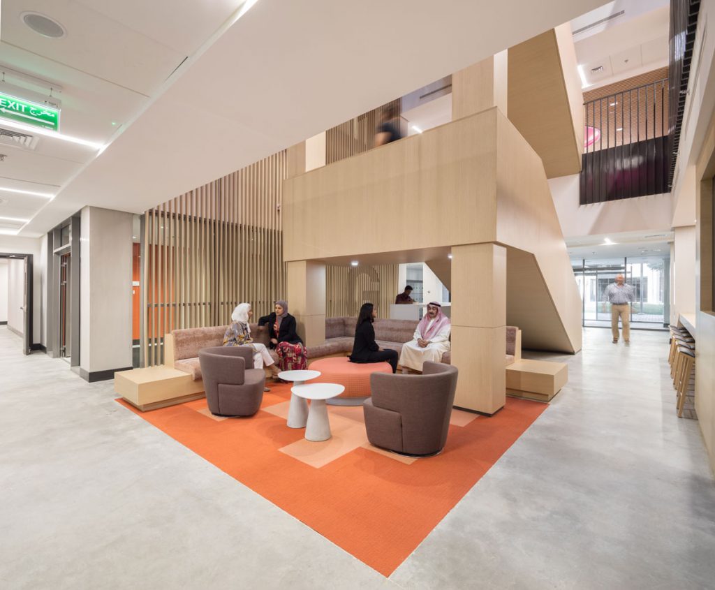
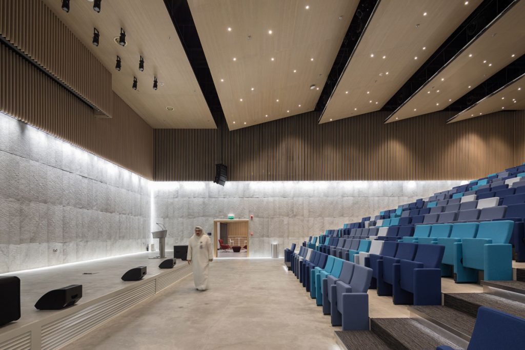
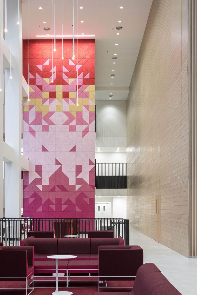
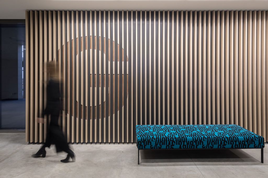
Armed with the client’s vision, the design team crafted a concept inspired by a young group of Kuwaitis, dedicated to rebuilding their natural landscape after decades of upheaval through the planting of 350,000 trees. The interior design embodies the attributes of these desert trees through the exploration of warmth, pattern, canopy, and dappled light. The campus’ interstitial spaces pull from the qualities of middle-eastern seed pods (vibrant colours, unique forms and textures) resulting in environments that promote creative thinking and informal collaboration. These spatial elements combine to form a campus that feels established and firmly focused on the country’s future leaders.
What inspired the design of the project?
The client wanted to create a world-class campus that would attract and retain the very best students and academics. A series of key design drivers was established to enable a strategy to achieve this from a spatial standpoint. These four design drivers were the primary inspiration for the final design of the campus:
Fostering Community: The Student Union offers a mix of environments that encourage this community of commuters to stay on campus and foster connections.
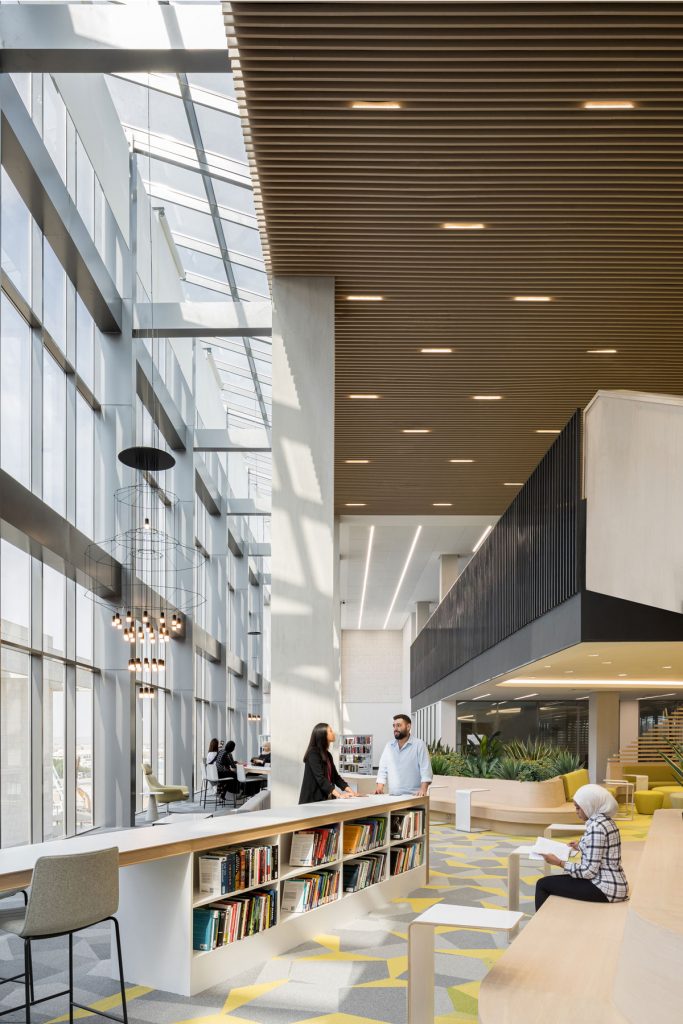
Oasis for learning: In response to the region’s harsh climate, the library serves as a campus destination that is fueled by natural light, plantings and comfortable learning environments.
Flexibility and Adaptability: The project was designed to use space efficiently while being ready for change. AIU is designed with the future in mind, able to adapt to support an evolving curriculum.
Wellness: The college is inspiring a cultural shift centred around physical fitness by opening an on-site fitness and health centre. Additionally, the feature stairs throughout the campus encourage movement.
What was the toughest hurdle your team overcame during the project?
Accelerated Schedule: The client bought out the University rights from another group. Once this was purchased, the shell and core of the building were already being constructed. In order to open for the autumn 2019 school year, the interior fit-out schedule needed to be accelerated. From visioning through Stage 4, the design team only had 20 weeks to execute the project. The scope included full interior design and FFE services.
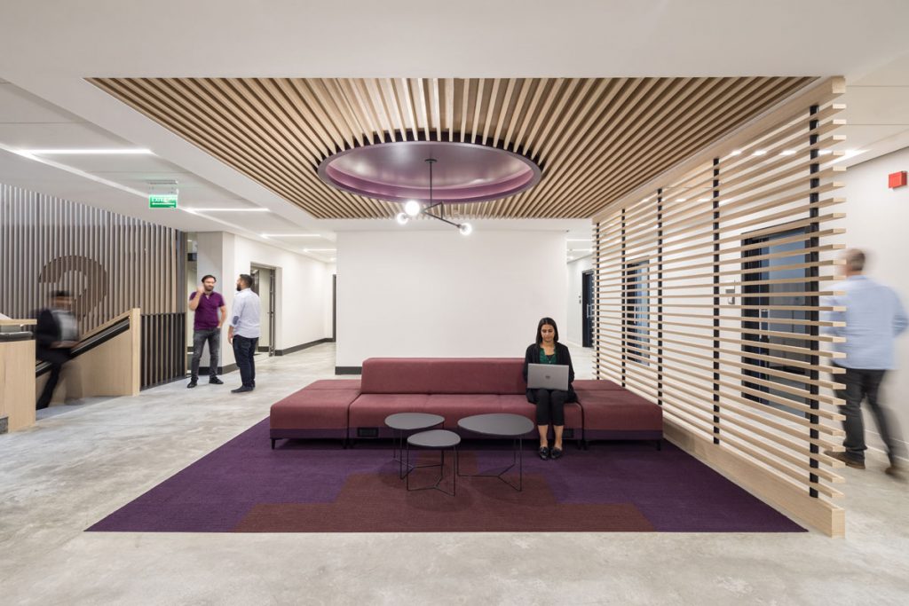
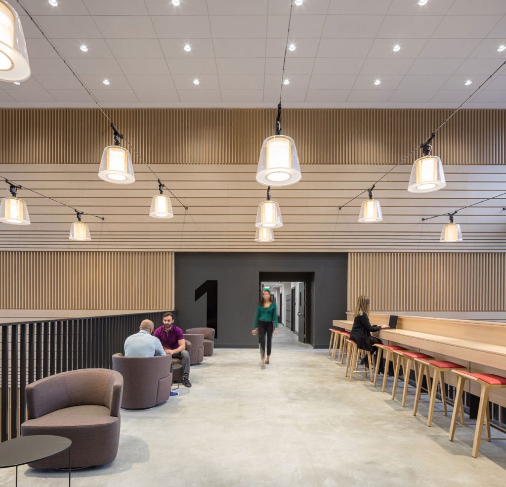
Commuter Culture: The location of the University is located one hour from Kuwait City. The University’s competitors are located in the heart of Kuwait City. Being a commuter campus, we took this obstacle and turned it into opportunities to foster campus community and provide amenities; this was paramount to the project's success. Amenity highlights include a 2-story library, collaboration hubs in student focused areas and a large work cafe to provide opportunities to learn and connect.
Unique Methods: As our scope did not include someone from our design team full time on site during construction, high expectations for quality needed to be met in working with local fabricators. As a result, we were able to add site visits to ensue craftsmanship and quality were appropriately met.
Flexibility and Adaptability: During the design process, Stage 1 - Stage 5, there wasn’t an established curriculum. The project was designed to use space efficiently while being ready for change. AIU is designed with the future in mind, able to adapt to support an evolving curriculum.
What was your team’s highlight of the project?
It was incredibly rewarding to see student use (and love!) the space the way our design intended — from social interactions in the cafe to learning in the classrooms.
The built-in banquettes in the cafe were designed with larger groups in mind. The week our team visited for photography, bespoke banquettes designed to hold four-to-six students had eight students crammed in laughing and enjoying a meal together. Our client also told us that during student tours, the design has greatly helped with recruiting and retaining students.
Why did you enter the SBID Awards?
As the SBID International Design Awards is one of the most prestigious global interior design award programs, we thought it was the perfect platform to showcase a project we are proud of — that makes a difference in the lives of young people and creates a welcoming environment for the leaders, creators and innovators of tomorrow.
New to the market, Paragon Studio was founded in 2020 in Bath, where all its products are designed. Manufactured in the UK & Europe, the SBID Accredited Supplier designs high-end, sustainable gym equipment for private, residential and superyacht gyms across the globe. With years of experience in the luxury fitness sector, Paragon Studio meets the increased demand for customisation and bespoke gym design with its extensive collection.
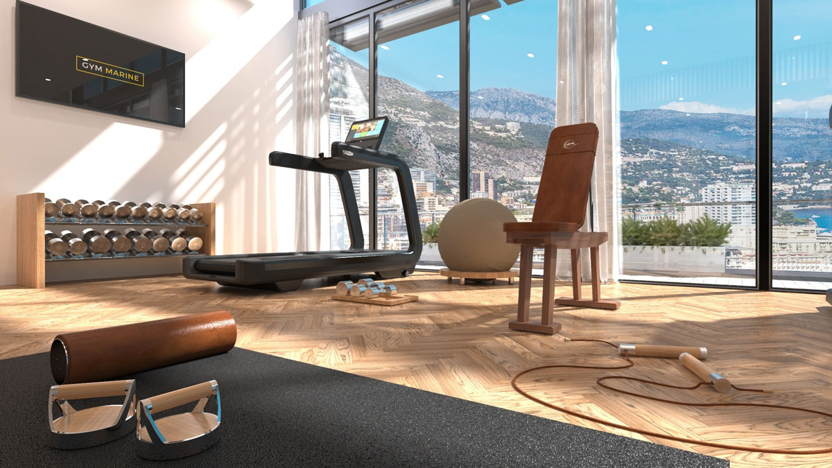
The company ethos of 'form follows function' ensures all products meet the highest standards of quality, whilst boasting an exquisite design aesthetic. Understanding that luxury gym products are made for real people and not museums, its equipment stands up to the challenge of everyday use. The collection has been carefully crafted and rigorously tested to guarantee long-lasting durability.
The British company offers its customisable gym products using sustainable, natural materials. With its origins in the Superyacht and hospitality sectors, Paragon Studio understands that the identity of a boat or hotel is part of the whole experience and enjoyment of a space. Its ability to customise products with logos and monograms, whilst matching materials used throughout the rest of the space offers interior designers complete ease of design specification.
Similarly, when it comes to home gyms, working alongside designers and architects, Paragon Studio is able to customise and incorporate the same colours, finishes, materials and handle patterns used in the rest of the design scheme, ensuring seamless integration so the gym becomes an extension of the overall design rather than an obvious add-on.
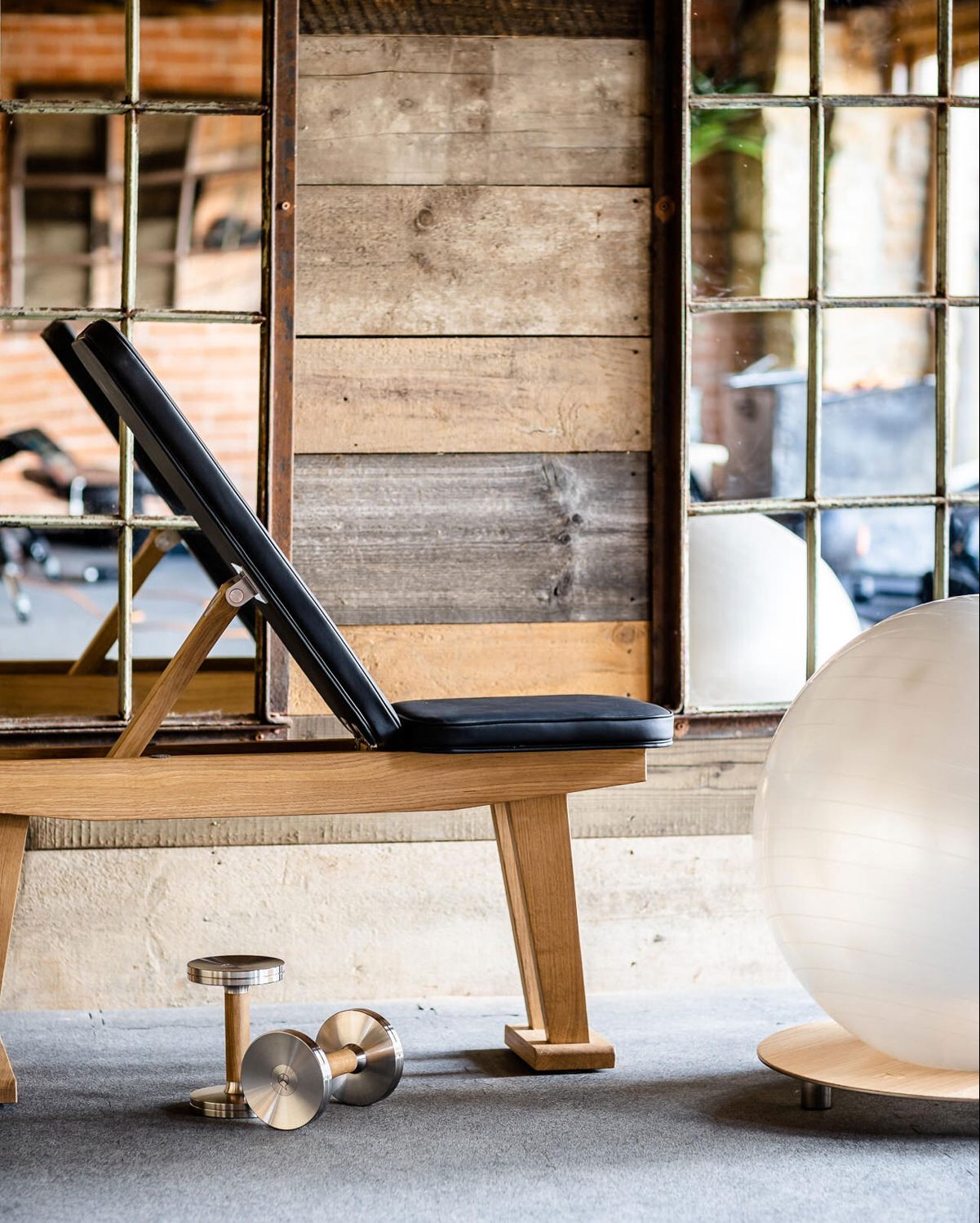
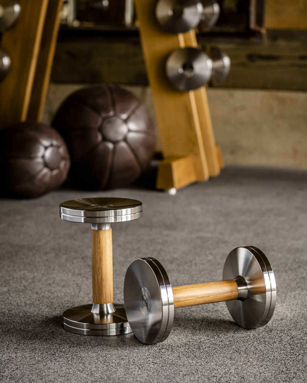
Using only the finest and sustainably sourced materials, the entire collection is plastic-free, manufactured in the UK & Europe. Every product is made-to-order preventing any surplus of stock or wastage of materials. Reducing waste further, the whole collection comes with a lifetime warranty for mechanisms and structural integrity. Repairing products rather than simply replacing them, Paragon Studio offers a full refurbishment service to ensure equipment continues to look and perform beautifully.
All wood components are FSC Certified and locally sourced where possible. Unlike synthetic alternatives, wood's natural grain and quick-drying properties offer unparalleled grip - essential for handles and storage. With its natural antibacterial properties, easy maintenance and a warm-to-touch surface, the collection includes a range of standard wood options including Oak and the ever-popular American Walnut. However, products can be customised with any wood specifications if required.
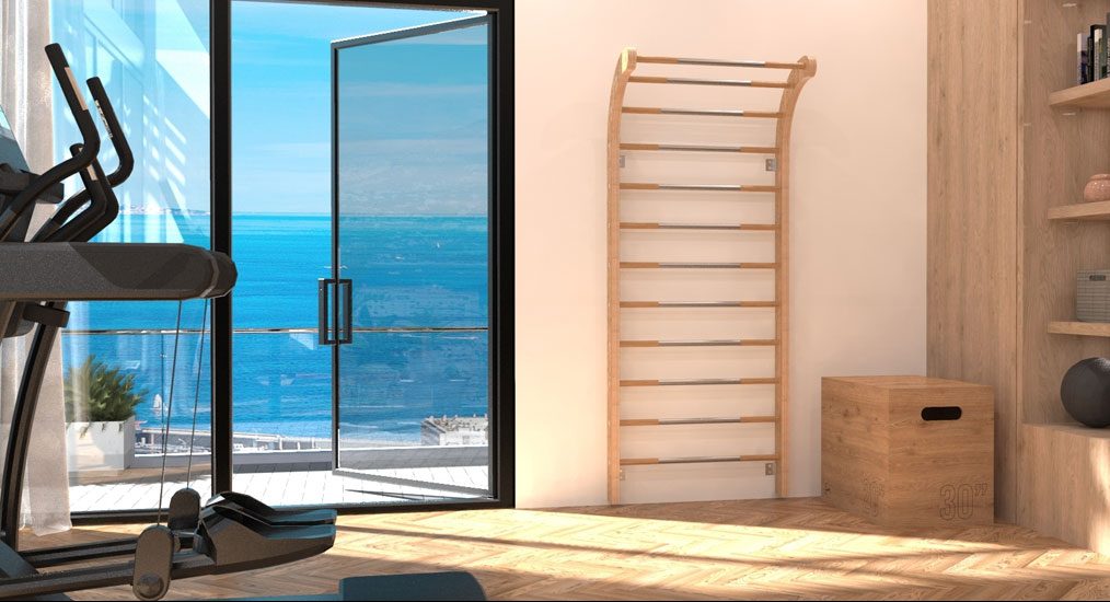
Where possible, Stainless Steel is sourced from recycled steel billets in line with the company's sustainability ethos. Resistant to corrosion and extremely hard-wearing, Paragon Studio only uses the highest quality stainless steel across the range - including offering the option of 316 marine grade Stainless Steel components for use on superyachts. Alongside the classic steel finish, products are also available in bronze.
The collection comprises benches, barbells, dumbbells, wall bars, boxing equipment, storage solutions and accessories - including exercise balls, rollers, skipping ropes, push-up handles, and plyo boxes.
Discover more sustainable products for interior design, here.
If you'd like to become SBID Accredited, click here to find out more.
Episode Twelve
Telling Stories: Creating Narratives in Hotel Design with Nicholas Hickson
In this Digital Discussion, SBID CEO & Founder, Dr Vanessa Brady OBE is joined by Nicholas Hickson, Founder and Creative & Technical Director of THDP Design.
With over 34 years of experience in interior design, Nicholas has worked on high-end interior residential and commercial projects both internationally and within the UK. Nicholas has extensive experience with hotel interior architecture, schematic planning, FF&E selection, as well as custom design and procurement strategies, with a unique contemporary approach.
An award-winning design practice, THDP specialises in creating concepts that evolve into compelling hotel spaces. At the core of its creative approach, THDP works to uncover and represent the underlying story behind each project.
In this discussion, Nicholas discusses the breadth of projects he has worked on across Europe, and how THDP came to exist.
Authenticity is at the core of THDP's design approach, whether it be the culture, location or history of the space. Nicholas describes what the creative process looks like for the design practice and how he is able to transform and revitalise commercial spaces by intentionally incorporating the context in which they exist. He explains how narrative building is an essential part of the design process involving collaboration and research that is bespoke for each project.
Tune in to the whole conversation to discover more.
Showcase your products to this year's esteemed SBID Awards' judging panel for Product Design categories, comprising some of the world's most innovative and inspiring interior design practices to review the latest developments in product design. The judges include Head of Interior Architecture at Zaha Hadid Architects; Head of Interior Design at Harrods Interior Design; Director of Interior Design at IHG, CEO & Founder of Katharine Pooley Ltd, and Studio Director of Wimberly Interiors (to name a few!).
Product Design Judges:

A hugely experienced interior designer within the high-end hospitality sector, Tony leads a team within SHH’s hospitality arm. He is a creative interior design professional with 20 years’ experience in leading prestigious high-end hospitality, restaurant and residential schemes globally. A client-facing creative and technical designer with an extensive knowledge of the Interior Design process.
"I very much look forward to being part of the 2021 judging panel of the SBID awards. SBID provides a great platform for recognition to businesses who wish to showcase their work to a talented global audience by bringing together high standards of work from across the world." - Antony Duesbury

Carolina has more than a decade of experience on the design and implementation of high-end interior design and architecture projects in London and around the globe. Trained as an architect, she established her own architectural business in her native country Brazil before moving to London 15 years ago. Her passion for design excellence and extensive knowledge in the luxury global market, makes it possible for her to transform any client’s aspirations into a truly bespoke luxurious space. Her architectural background gives her a combination of creative design skills with a wide range of technical knowledge. She is the Creative Director at the award-winning luxury design studio Casa Forma’s and is responsible for delivering leading-edge residential schemes for international high net worth individuals and property developers.

David Chang, founder of David Chang Design Associates International (DCDA) and registered Professional member of NCIDQ, ASID, SBID and IIDA, has over 25 years of experience in hospitality and high end residential interior design and management experiences in North America and Asia. In 1998, David founded DCDA in Vancouver, Canada, and expanded to China market in 2006, established firms in Guangzhou, Beijing and Taipei, to provide exclusive upscale design services on landmark projects for local top developers. David's innovative works have won numerous design awards in the UK, Italy, Canada and China.

Dr Ning is the President of Wanda Hotels & Resorts. During his tenure at Wanda, he has led the design, construction and operation management of over 100 upscale and luxury hotels. Under his leadership, these hotels have won many prestigious international design awards, including the SBID Awards, Gold Key Awards, IIDA-Best of Asia Pacific Design Awards, Hospitality Design Awards and many more.

Dr Garaj is Head of Brunel Design, where he also teaches on the Professional Design Studio module, a part of the MSc Integrated Product Design programme. He has co-ordinated a number of live project briefs across design fields, with organisations including Cancer Research UK, NHS, Pan Macmillan, Help for Heroes, Friends of the Elderly, Corney & Barrow, Shell, Ibis and BT. Dr Garaj’s research is aimed at design, development and evaluation of innovative systems, products and services, with the focus on digital and digital-physical domains and the application of the latest technologies.

Gary is an architect with a passion for sustainable architecture and has over 30 years continually sought to bridge academic research, teaching and practice to create a sustainable future. In his role as Principal Lead for Science and Technology at HOK, his aim is to deliver a sustainable future not only in the science and technology but across all sectors of the construction industry. Gary has collaborated and led sustainability with a number of leading practices including Wilkinson Eyre, Bennett’s Associates and Hopkins Architects. These collaborations have delivered award winning sustainable buildings across a range of sectors from Higher Education, Academic Research, Residential mixed use, Office and Cultural Buildings.

Henry is Director of Design at InterContinental Hotels Group. He is responsible for creating the interior design and guest experience for IHG’s Kimpton and Hotel Indigo brands across Europe. Since joining IHG in January 2015, Henry has worked across some of IHG’s most celebrated and award-winning design projects and has led the teams responsible for the design of all new Hotel Indigo properties over the last 5 years, as well as working on more than 20 refurbishment projects across IHG’s existing hotels.

Herbert has extensive experience of working on complex mixed-use developments on challenging sites. Along with a strong awareness of stakeholder aspirations, he has a proven ability to convert constraints into opportunities. Herbert is a graduate of Westminster University and the Architectural Association in London, and the National University of Singapore. He joined DMA in 1999 as a Project Architect and was appointed a Partner in 2008.
"What a year it’s been since the last SBID Awards. A year where we have all had to learn new ways of working, living and socialising. This creates new needs and requirements for designers to contemplate. I am eager to see this year’s new products and how they may address some of our recent lifestyle changes, products that will bring us joy and lift our spirits!" - Herbert Lui

Kar first worked with Zaha Hadid Architects in 1985 following his studies with Zaha Hadid at the Architectural Association. After completing his studies in the UK and USA, Kar worked on projects around the world for Kohn Pederson Fox and Louis Vuitton Malletier, with a focus on interior architecture, commercial developments and retail design before re-joining ZHA as Head of Interior Architecture in 2014. His residential interiors, in particular, have won numerous awards and have been widely published.

Katharine is one of the most sought-after interior designers working internationally today. Recently named ‘British Interior Designer of the Decade’, ‘International Designer in Asia of the Year’, and ‘Entrepreneur of the Year’, her design ethos is both highly respected and uniquely far reaching. Her eponymous Knightsbridge Design Studio was established over 15 years ago and continues to create unmatched luxury interior designs for landmark commercial and residential projects in London and Worldwide for the most discerning clients. Overseeing her team of 47 interior designers and architects, Katharine immerses herself in every detail of her client’s complex project.

With over 17 years’ experience in the luxury interiors industry Letitia heads-up Harrods Interior Design, a multi-disciplinary bespoke design service by Harrods. In her previous role within the Harrods Home buying team, Letitia worked on redeveloping the home and furniture offering to provide carefully curated products that hero provenance, craftsmanship and heritage in helping to shape Harrods Home into the exciting design hub it is today. Letitia and her team of design experts travel the world in search of beautiful designs, the latest trends and the highest quality fabrics and products. Letitia’s design ethos centres around two key factors: relevance to the client and their lifestyle, and harmony of the design with its surrounding environment.

As Studio Director of Wimberly Interiors London, Rachel brings more than twenty years of hospitality expertise and leadership to the team. Known for her pragmatic design approach, she has been at the helm of some of the world’s most celebrated projects. Rachel’s acute eye for detail has been cultivated from extensive experience in the design industry. Having worked previously as a contract manager and with more than a decade’s experience in design management, she possesses the vision and foresight to create successful, innovative and authentic projects of enduring value for clients, supported by a unique and in-depth understanding of technical nuances and processes.
"An unparalleled opportunity to celebrate and support design talent, innovation and excellence, I am delighted to be representing Wimberly Interiors as a judge at this year’s SBID Awards. Alongside esteemed industry peers, I am looking forward to seeing where the past year in design has taken us – not just in the UK, but globally." - Rachel Johnson

Sharon is Founding Partner of Oliver Burns, a multi-award-winning architectural interior design studio that thoughtfully designs the world’s finest homes. Working across an exclusive portfolio of international turnkey projects, the team has a world-class reputation for bespoke commissions, super-prime developments and elegant spaces that are synonymous with a luxury lifestyle. The concept of ‘Thoughtful Luxury’ underpins their approach. It is reflected in their designs, from the concepts they develop, through to the thoughtfully layered details they create with artisans and craftsmen. This approach ensures that all of their projects are thoughtfully designed, thoughtfully built and thoughtfully finished.

Stella is the Co-Founder of AGC, London’s fastest-growing portfolio of international award-winning Interior Design companies. Creating the benchmark in luxury living, the Accouter Group of Companies which is home to Accouter Design, A. LONDON and BoxNine7, delivers world-class interior architectural and furnishing services to the global property market and private clients. With 15 years of experience mentoring and directing diverse teams within the field, Stella has spent 7 years building AGC which has been voted one of the best places to work in property on multiple occasions. Taking a lead creative role for the Group, Stella is responsible for all aspects of brand and design.
"The SBID Awards is an opportunity for the industry’s creative community to stage their courageous minds. I look forward to exploring beautiful, useful and respectful ideas which are so seemingly simple yet intricate as a process. I am proud to represent the iconic SBID as a judge and play a part in honouring great designers with these prestigious accolades." - Stella Gittins

Terry joined Richmond International in 2002 with a background in leisure and retail consultancy. He has travelled the world and was based in the Far East and Middle East during the early years of his career. Now a Director of Richmond International, Terry is responsible for the company management, liaising with clients and has a very hands-on role throughout the design process. Terry has steered a range of Richmond International’s most notable projects with multinational brands and independent owners that have been honoured with awards and accolades across the hospitality design space, including Richmond International’s successful cruise ship design projects.
"The SBID is a respected name within the Interior Design Industry that supports designers and artists. It is an honour to be invited to be part of their distinguished judging panel. This is a unique opportunity to review and assess other talented designers in associated areas of Interior Design, and to have a personal involvement in celebrating and rewarding their creativity and vision to achieve design excellence. I am also looking forward to being enlightened with new ideas new solutions." - Terry McGillicuddy

Tim is the founder and leader of Blacksheep, with 25+ years hospitality design experience, launching the studio in 2002. With a background in hospitality and interior design lead him to establish a design agency specialising in hospitality, food and beverage with the aim of bringing a new perspective to the industry. The agency was founded on the belief that a designers responsibility went beyond just interior design; that tailored experiences positively change hospitality businesses, brands and people from within.

Trevor became the Managing Director of Areen Design in 1989. The group now employs over 350 people across 6 offices, worldwide. As a director of each Areen Group company, Trevor drives the strategic growth of the Group by fostering the skills and specialisms of each company. At Areen Design, he leads over 120 interior designers, architects and procurement specialists in delivering fast-paced, large scale projects in some of the world’s most challenging regions. From luxury private residential complexes, to international airports and city hotels, Areen Design ensure that every project is carefully considered from initial concept through to turn-key delivery.
Entries for the SBID International Design Awards 2021 are open!
View the Interior Design & Fit Out judges or click here to view the full SBID Awards judging panel.
To find out more about entering, visit www.sbidawards.com
Specialising in residential interiors, Diego Correa, SBID Accredited Designer & Founder of Diego Correa Interior Design, shares his approach to successfully integrating art within interior design schemes to capture the client's narrative and enhance interior environments.
Art as a form of communication
One of the most important things I have learned regarding understanding art is a comment made by an art curator friend, who said: “Diego in art there is such thing as multiplying by Zero”.
He explained, "When artworks are being displayed in a room, if you place them incorrectly, for example, a very strong piece next to a subtle one, or two very bold pieces too close to each other, it will be very difficult if not impossible to appreciate them. The tension will be too strong between both pieces, hence each of them will annul the other: Multiplied by Zero."
Since then, when working with artworks either in a gallery, residence or in a public space this awareness has helped me to be attentive to what the artwork tries to say and how the setting can help to allow that communication between “it” and the viewer to be possible and even enhanced.
And that “setting” in a home is its interior design.
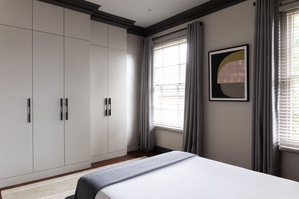
Specifying artwork with purpose & meaning
The first step to making it right when placing artwork in a home is to understand the relation of the owner with art: Is it decorative? Is it an intellectual/passionate relation with its meaning and expression? Is it pride for having many pieces he/she have accumulated? or Is it the display of a well-shaped collection?
All reasons are valid but every one of them will demand a different approach to positioning. Other important aspects include: dimensions, theme, technique, fragility and very importantly the story you want to tell; not just about your artwork, but about yourself too.
Due to the fact that interior design is going to generate a visual, intellectual and emotional response in the occupants and visitors alike, it will become the frame in which the artwork will sit, hopefully comfortably, and tell its very own story with freedom and easiness.
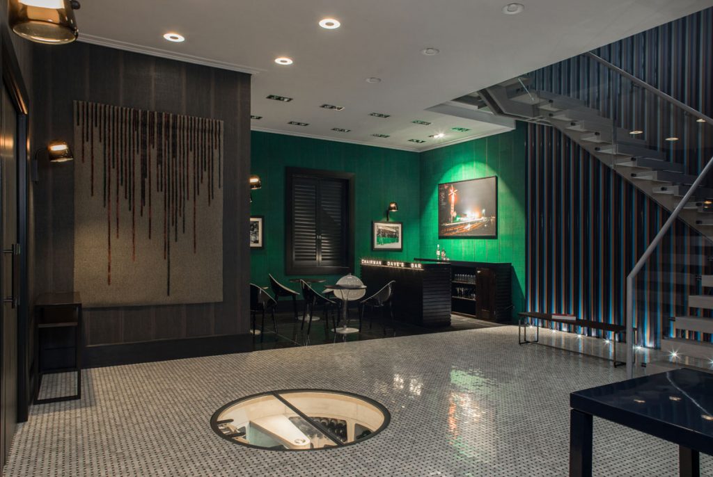
Interior design as a frame to enhance artistic works
If you are lucky enough to have one of Monet’s waterlilies or a Rothko (let’s dream) you want to be able to immerse yourself in the expansion that these artworks offer, one of beauty and nature, the other of eternity so the position chosen for them has to be one that allows contemplation, that removes distractions, with the right lighting and a space from which you can imagine, think and feel.
Art helps us to appreciate the tangible and intangible from different perspectives allowing ourselves to expand our horizons while we enjoy it visually; Interior design has the duty to understand this, incorporating them wisely, thoroughly and sensitively in the design scheme and flow of the space. We cannot forget that Interior design can be either the frame that enhances communication or the zero-multiplying factor; for an art lover, the latter should not happen.
About the Author
Founder of Diego Correa Interior Design, Diego specialises in residential projects. With 14 years in the interior design industry and a degree in architecture, his approach stems from a combination of his professional training and experience together with his ethics and vision.
Want to submit your own content? Click here to find out more.
