Set to celebrate another year of global design excellence across the interior design industry, the Society of British and International Interior Design (SBID) has officially opened its 12th edition of the SBID International Design Awards for 2021.
Since it launched, the SBID Awards has received over 3000 incredible entries from 1000+ companies in 85 countries and continues to grow! Having firmly established itself as one of the most prestigious interior design Awards in the global design calendar, the Awards represent the outstanding achievements, dexterity, mastery and quality services that go on to inspire the creativity of this diverse and ever-evolving creative industry.

What's new for 2021?
Alongside 17 specialist Interior Design categories spanning commercial and residential sectors, the SBID Awards 2021 continues in its quest to champion and challenge industry-wide design standards, expanding entry categories to encompass added specialisms in Product Design and Fit-Out Design.
With the introduction of new design categories, also comes an exciting panel of expert judges to lend their unparalleled knowledge and expertise to this year’s extraordinary international jury; featuring Property Services Lead for the Department for Education; Creative Director at Amazon; Interior Design Principal at Walt Disney Imagineering Asia; Editorial Director at WGSN; Global Store Design Manager at Tiffany & Co.; Design Director at Starbucks Coffee Company EMEA; and Director of Major Programmes at the British Council. Inviting entrants from around the world, the SBID Awards presents an exceptional opportunity to showcase professional work to a host of renowned industry leaders and the wider design community on its inclusive and international stage.
In its ambition to reunite the industry, the SBID International Design Awards 2021 will open its doors once again for a global celebration of design talent. Offering unique and inventive event experiences, the annual awards programme suitably culminates in a captivating ceremony at London’s latest luxury lifestyle destination, Nobu Hotel Portman Square on Friday 22nd October 2021.
The Awards’ entries for 2021 will close at 5pm (BST) on Wednesday 30th June, with ‘Early Bird’ entry rates ending on 31st March. Download the full entry guidelines for all information about entering this year’s SBID International Design Awards. Members of SBID can also take advantage of exclusive entry benefits, from discounted entry fees to complimentary submissions. Click here to find out more.
Click here to discover the last year's SBID Awards winners!
To enter, visit sbidawards.com to find out more.
With newly adapted lifestyles and shifting consumer attitudes towards how our interior environments should feel and function, SBID hosts an insightful webinar and panel discussion with global design experts on the opportunities and challenges facing the interior design and architecture industry in 2021. From the design and business implications of Covid-19 restrictions, to leveraging global opportunities overseas.
Discover unique global insights on the future of the interior design profession with SBID founder, Vanessa Brady; global principle of HBA Residential, Chris Godfrey; senior associate at Zaha Hadid Architects, Bidisha Sinha; co-founder of Albion Nord, Ben Johnson; and founder of Design Haus Liberty, Dara Huang.
- Top challenges and opportunities facing the UK / global interior design industry in 2021.
- Growing interior design businesses in the aftermath of COVID-19.
- Building long-term trust and relationships with clients in the Chinese and Asian markets.

Chris Godfrey | Global Principle of HBA Residential
Chris has over 23 years experience creating highly considered and finely crafted interiors for the residences of the most discerning clients. Chris cultivated his holistic design approach; combining Architecture and Interior Design to create beautifully conceived and exquisitely delivered residences for clients who appreciate the value of design excellence. In 2018 he received the coveted Master of Design Award from SBID and is also an award-winning Royal Institute of British Architects (RIBA) Chartered Architect.

Bidisha Sinha | Senior Associate at Zaha Hadid Architects
Bidisha finished her first degree in New Delhi before moving to London for her Masters at the Architectural Association. She has had an architectural career spanning over 18 years, delivering projects in India, UK and Hong Kong. In her role within Zaha Hadid Architects, over the last 15 years she has personally delivered projects which have made a positive difference to the revitalization agenda of the programs that were associated with them.

Ben Johnson | Co-founder of Albion Nord
Equipped with a First-Class Honours degree in Interior Design, Ben began his career at Candy & Candy, followed by Heatherwick Studios, and quickly built a strong foundation of experience in high-end residential design, public spaces and retail projects around the globe In 2010, Ben joined design practice 1508 London, leading a studio of 40 interior designers and appointed Creative Director and Partner in 2014. In 2017, Ben co-found Albion Nord, building an impressive of portfolio of both international and domestic residential projects.

Dara Huang | Founder of Design Haus Liberty
Dara Huang is the founder of Design Haus Liberty; an international architecture, interiors and design practice established in London in 2013, with global offices in both London and Hong Kong. She holds a Masters degree in Architecture from Harvard University and started her career at Herzog de Meuron, Basel and Foster + Partners, London. In the company’s short time, Dara has received numerous awards and honours including Property Weeks 40 under 40, BBC China's 100 Women, and Prestige Hong Kong’s 40 under 40.
From Zoomtable panel discussions and online interviews, to Accredited CPD webinars, SBIDPro provides access to exclusive industry content. Email pr@sbid.org to get involved and share your professional views on the interior design profession!
Nicholas J. Hickson and Manuela Mannino, founders of THPD, lead us on a trail that winds through the new tendencies of Hotel Design.
The hotel and tourism industry rest on an ever-changing canvas and today more than ever – also considering the pandemic period – the customer and traveller requirements express themselves through novel brushstrokes.
“If we were to identify the new directions our work is heading in, the necessity to conceive and design projects as authentic travel experiences and stone narrators of the place housing them, that is to say, destinations worth admiring and living would be the at the first place” – Nicholas Hickson says.
New frontiers of hotel design open up and the positions that recently come out during “Designing New Hospitality” – the digital conference fostered by Elle Décor Italia – seem to meet Hickson’s philosophy. “Emotional hotels” capable of offering stories, experiences and emotions and “story-teller interiors” wherein the city itself may be to some extent retained and enclosed are – according to the industry experts surveyed last January by Il Sole Ventiquattrore – the new hôtellerie avant-garde (Pierotti, Paola).
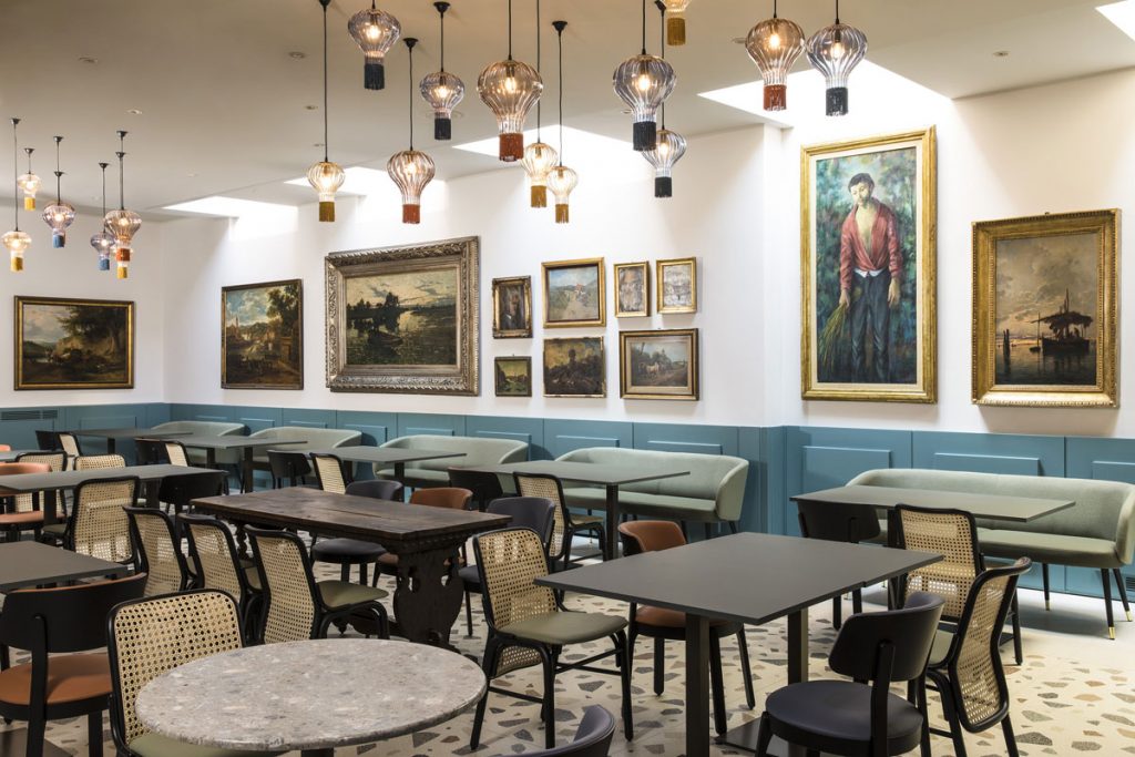
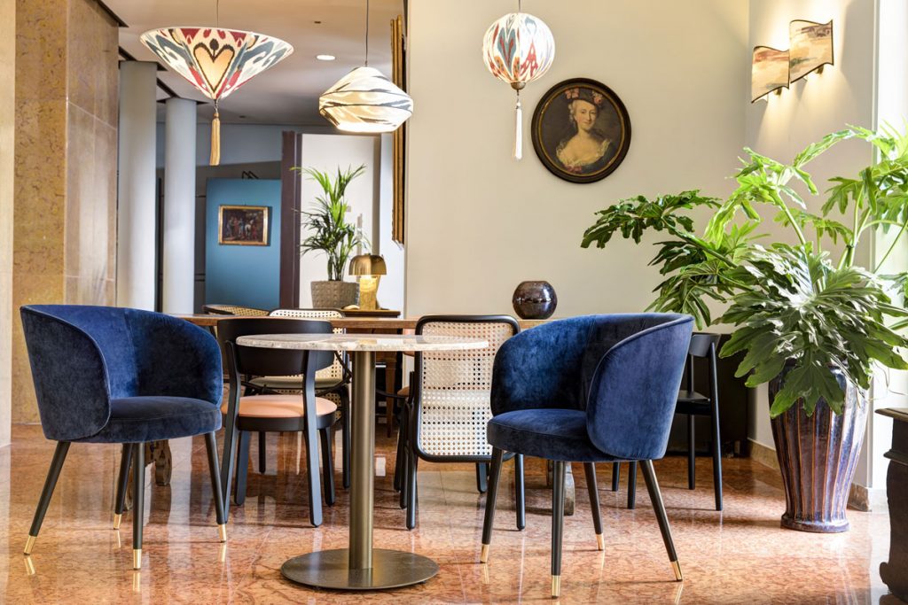
Today, according to THDP, hotels are places of enchantment for travellers and local inhabitants, rather than mere ports of passage. Modern sanctuaries far from the hectic pace of the city or refined niches where divorcing from reality, contemporary hotels are the background to unique experiences and places to appreciate the rare flair of the inside spaces. Two fundamental reference models may be cited. The Indigo Verona Grand Hotel Des Arts, largely inspired by the Arena di Verona theatre and based on Romeo and Juliet second act, and the Hilton Frankfurt City Centre, where the welcoming atmosphere of Manhattan – the New York district that lends its name to Frankfurt city – informs the magnificent construction.
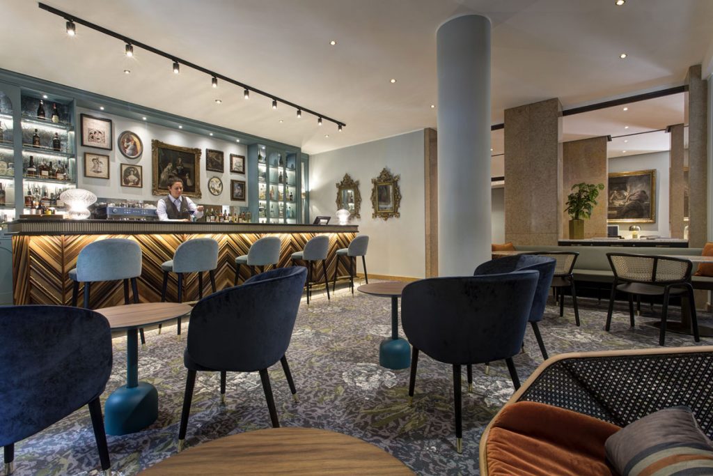
“Designing the Indigo Verona Grand Hotel Des Arts has been just like writing poetry ” – the architecture Mannino explicates.
Upon entering, the reception and the hotel lobby feature an evocative counter inspired by the stone masonry of Juliet’s renowned balcony in Via Cappello. And not only that. “The rear panels behind the newly designed reception take cues from the staggered wings of the theatre. Given the renown of Verona’s signature Roman arena, it would have been a pity not dedicating him a tribute…” – the architecture Mannino explains.
The burnt bronze and the deep indigo blue colours are complemented by terrazzo sophisticated finishes, thus rendering the whole place a postcard-worthy spectacle to be admired in every single detail. The lightning is entirely made in Italy and conceived to enhance the Roman arches on the reception pod front. “The café façade is a homage to the Hotel Des Arts – namely the hotel prior to becoming Indigo – and consists of frames in varying shades”. The most precious Italian marble completes the ambience with a further hint of elegance. “The selected furnishings feature soft shades of blue and aquamarine with rattan and orange hues, manufactured by the Italian firms Miniforms and Tehkne”. The former hotel’s art masterpieces and the mirrors have been carefully tended and maintained, with the intention of providing the atmosphere with modern touches.
“We wanted them to merge with works already part of the heritage of the hotel, belonging to Classical periods and mid-century. Sustainability is a priority for us and recycling is a valuable resource we have at our disposal. We wanted to give the existing works new life rather than throwing them away”. And the resulting effect is astounding.
Indeed, GlobalData’s “Luxury Hotel Market to 2024” 2020 report has revealed an upward tendency as regards the tourism industry sustainability. Paperless counters, refillable dispensers and recycled materials are trends likely to gain increasing popularity over the next years, thus leading to greater competition in the market. A further aspect highlighted by GlobalData’s report is the key role technology will play in the near future as a consequence of the pandemic restrictions, as luxury hotels are expected to redefine their design towards a more contactless experience, (GlobalData, November 2020).
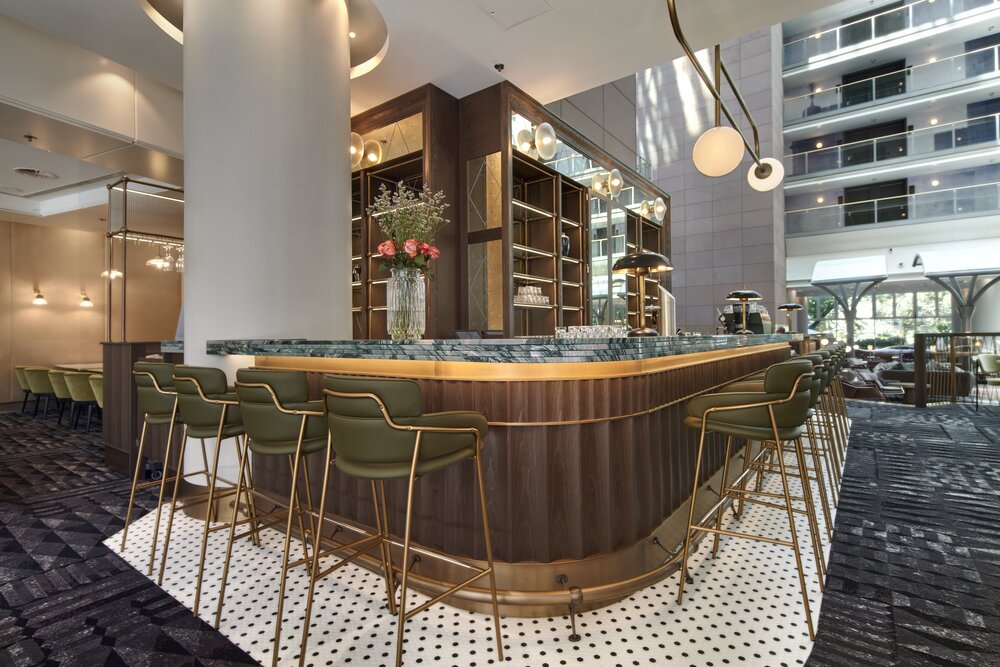
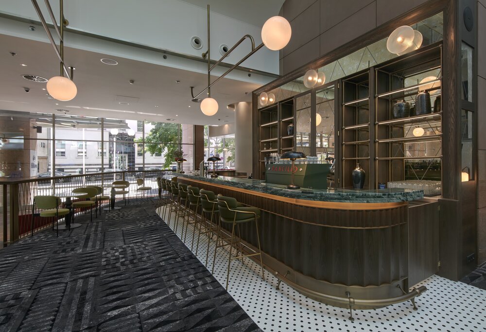
“The new Hudson Yards Bar at the Hilton Frankfurt Centre resembles a typical New York café, with brass gantry shelving, custom counters, brass foot stops and a Rancilio coffee machine realized ad hoc” – Hickson explains. The ideal place for relaxing during the day or in the evening. “The bar is designed to work day and night. We have installed swing doors so that, besides hosting a ‘day’ focus section for coffees and sweet treats, the night discloses an unedited set-up, with cocktails and liqueurs”. The guests find themselves wholly immersed in the New York atmosphere, albeit with a local food menu. The spaces combine urban and chic vibes, with green marbles and brass elements. To top it all, a parquet reminiscent of the asphalt colours. “We have worked with a four-colours palette: we wanted the guests to feel as though they were standing at the very heart of Manhattan.”
Article written by Stella Manferdini.
We hope you enjoyed this look inside the hotel design sector. To read about how Heritier Founder, Julien Bonzom, is pushing the boundaries of product design click here.
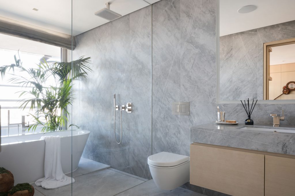
C.P. Hart delivered superior quality bathroom schemes for London’s iconic Grade II listed Centre Point, formerly a 1960s office building. Located on Tottenham Court Road, this landmark 34-storey tower development has been transformed into 82 high-end residential apartments.
The Specification
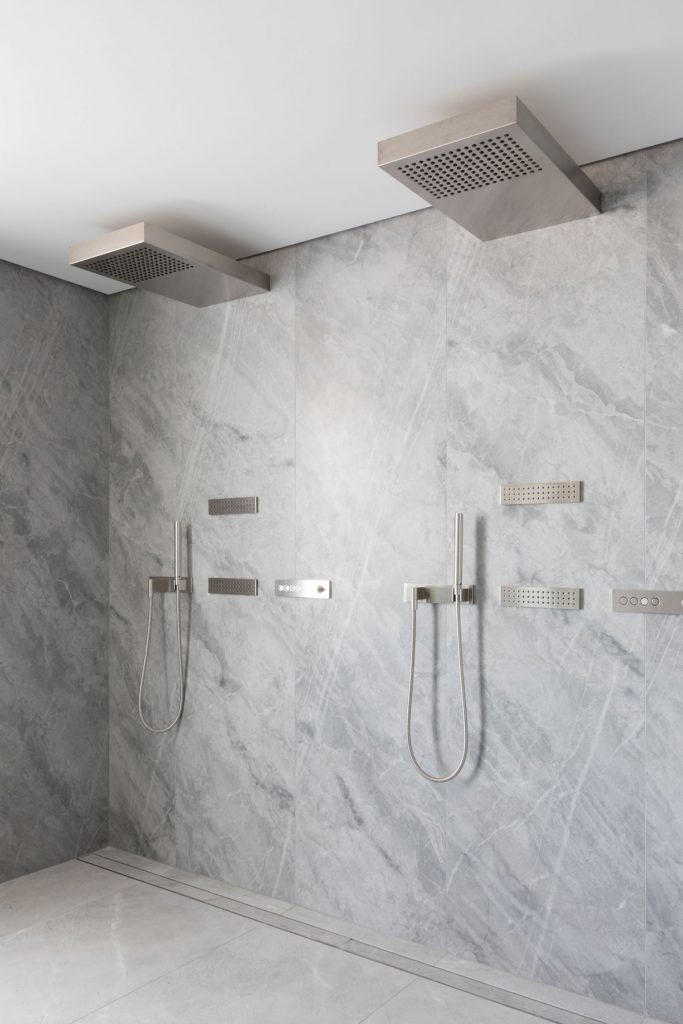
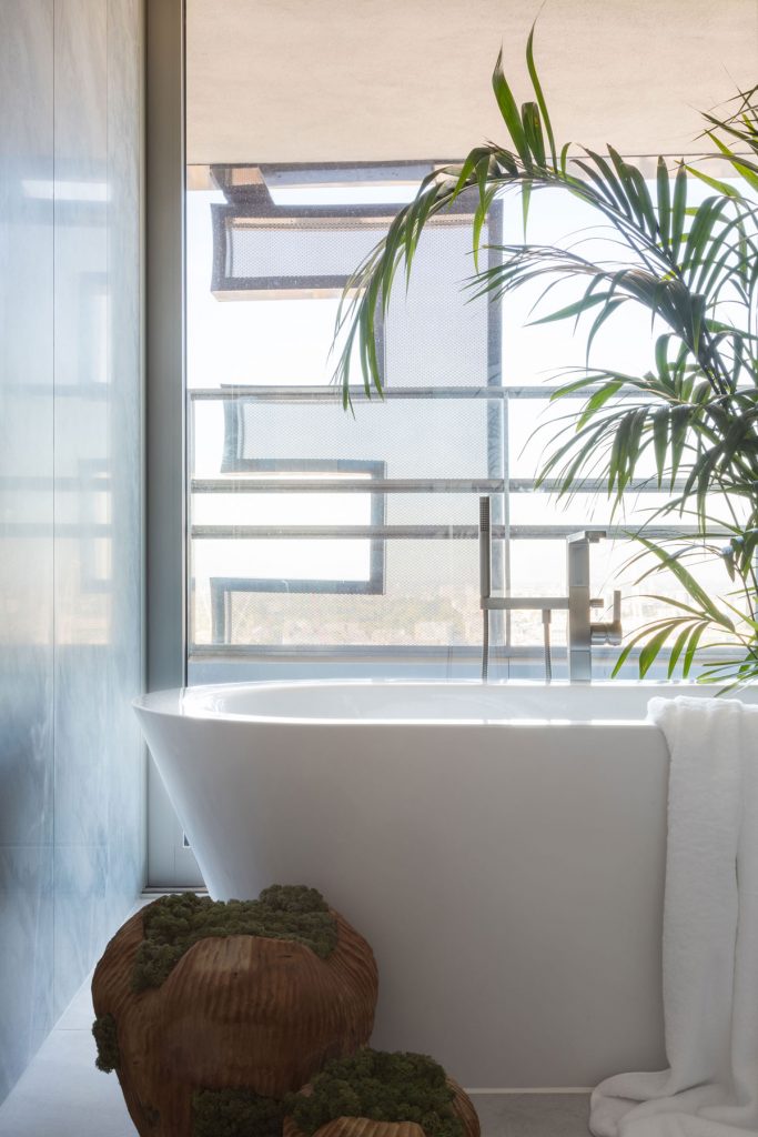
C.P. Hart worked in close partnership with Conran & Partners as they managed the planning and completion of the shell and core, interior design and complete apartment fit-outs. Drawing from its long-standing relationships with Europe’s most highly regarded bathroom manufacturers, C.P. Hart supplied vanity units and sanitaryware from Dornbracht, paired with the brand’s Lulu brassware range in Platinum Matt finish; WCs from Duravit and Vola; freestanding baths from Bette; and Bleu de Savoie marble stone walls.
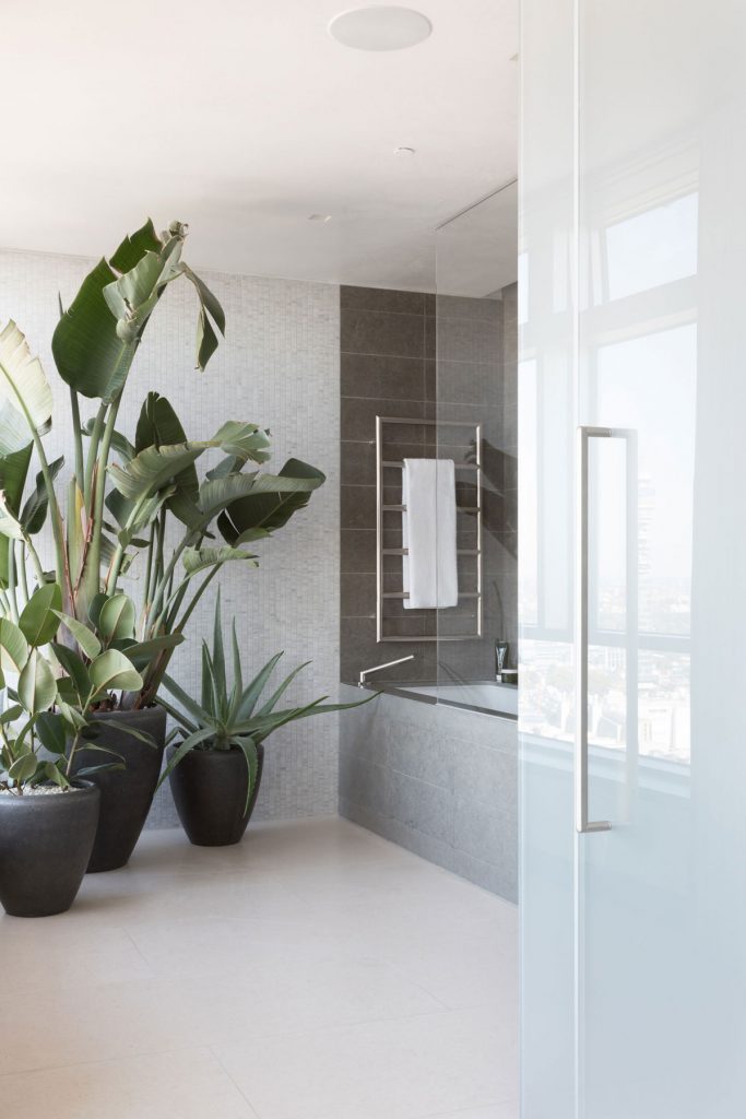
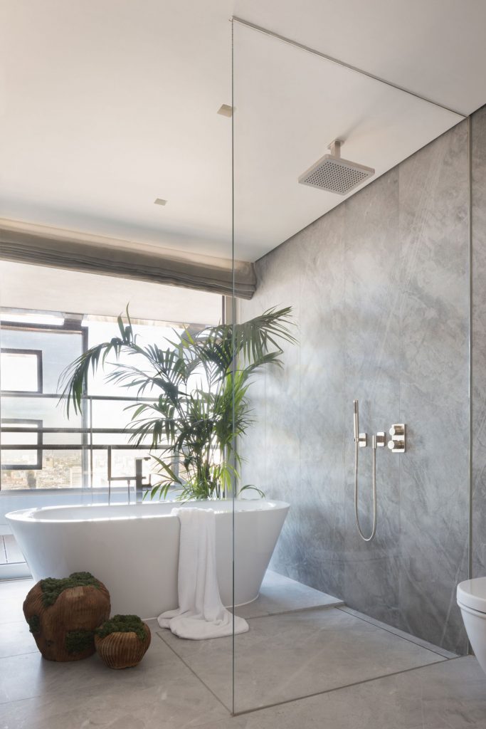
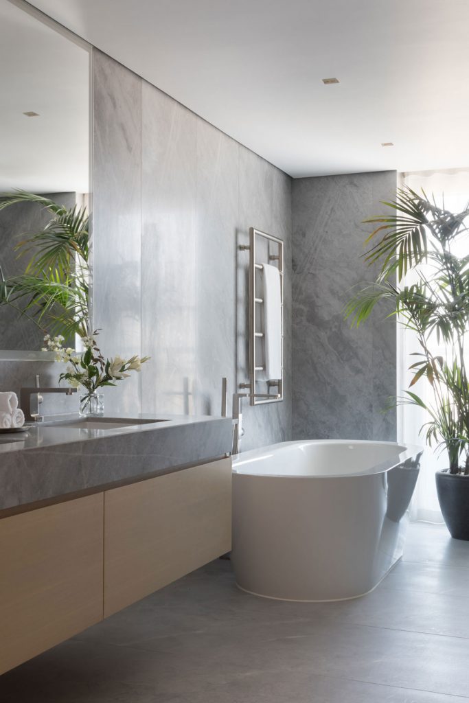
The team also supplied a comprehensive range of products for the building’s accessible rooms, providing specialist advice to ensure the highest possible level of comfort for any user.
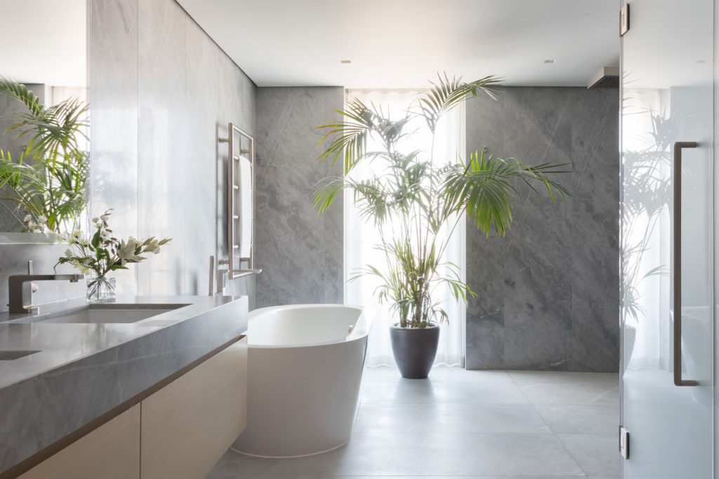
The Result
One of the most exciting developments in London, Centre Point has breathed life into Tottenham Court Road. The individualistic and cleverly designed bathrooms complement the bold and imaginative residential scheme that Centre Point has become. All parties involved have been delighted by the bathroom product selection, certainly a factor in attracting instant attention from potential new owners.
If you'd like to become SBID Accredited, click here to find out more.
In this SpeakEasy digital discussion, Legendary designer, and founder of Ledbury Studio, Charlie Smallbone sat with SBID CEO & Founder Dr. Vanessa Brady OBE, to discuss the world of kitchen design. With over 40 years in the industry, Charlie places the emphasis of his designs in smooth functionality and space.
Filmed in The Ledbury Studio showroom in Notting Hill, Charlie takes us through some of the materials that are used, as well as giving insight into how each step in the creative process is carefully considered. From inception, Ledbury Studio was intended to offer a truly bespoke experience, working very closely with the client to create a custom final product.
Vanessa and Charlie reflect on the evolution of kitchen design, discussing how the collaborative process of working with a client has transformed over time. “We always like the process of working with people that are sensitive and passionate about the designs that they’re doing” Charlie explains, “because, they’re going to live in them at the end of the day.”
Tune in to the whole conversation to discover more.
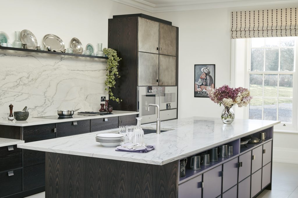
Project of the Week
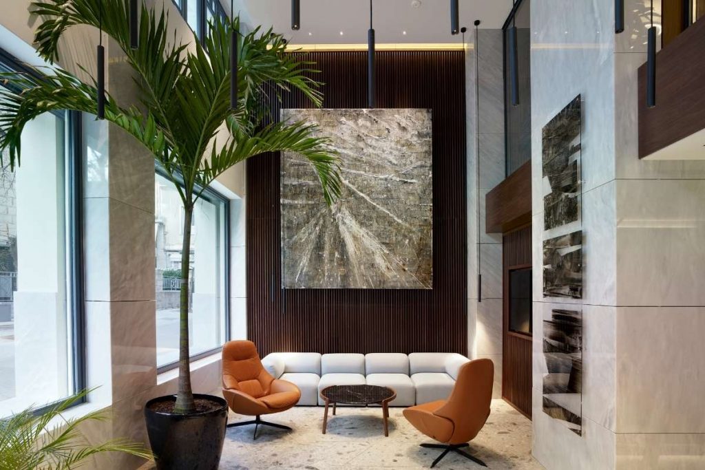
This week's instalment of the #SBIDinspire interior design series features an office design by 2020 SBID Awards Finalist Urban Soul Project. The architectural design of the Prodea office, a 3500 sqm building, had three main goals: to intervene in a pre-war building with a listed façade while maintaining its significant decorative features, to convert it in order to meet the highest standards of modern office spaces and to meet the design specifications of LEED and WELL, two of the most prominent international design standards for buildings.
SBID Awards Category: Office Design Sponsored by Schneider Electric
Practise: Urban Soul Project
Project: PRODEA
Location: Athens, Greece
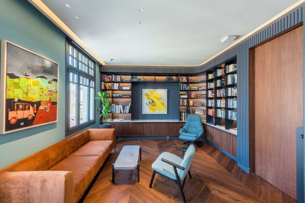
What was the client's brief?
The client’s quest was to renovate the building in a way that highlights its unique characteristics, respects its identity and its legacy. At the same time, it should represent PRODEA’s profile as a company, its character and its values: respect and learn from the past, looking towards the future. The brief was to create a state-of-the-art building in the shell of an old one.
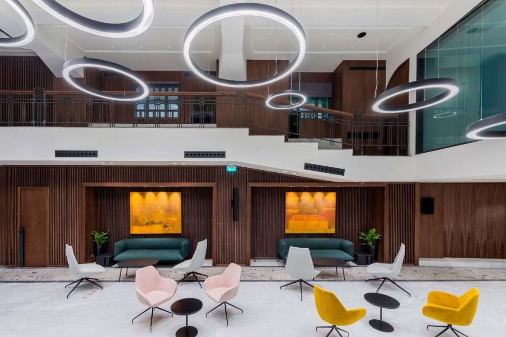
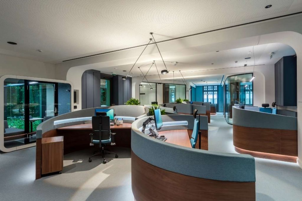
PRODEA HQ comprises of a basement, ground floor, mezzanine, two typical floors, two setback floors, a terrace and a rooftop overlooking Acropolis. The interior of the building was modified to achieve an integrated rather than segmented operation, highlighting at the same time its distinctive features, such as the marble staircase with the handrail, the old elevator with the wooden booth and the plaster decorations of the ceilings. The new opening creates an atrium that allows visual communication between floors. An innovative organic model of cluster desks has been implemented in the open-plan area. The design approach is defined by a balance between contemporary and timeless features in the arrangement, layout, materials, innovative technology applications, creating an environment both aesthetically exceptional and technologically advanced.
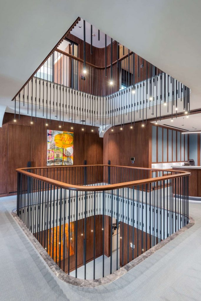
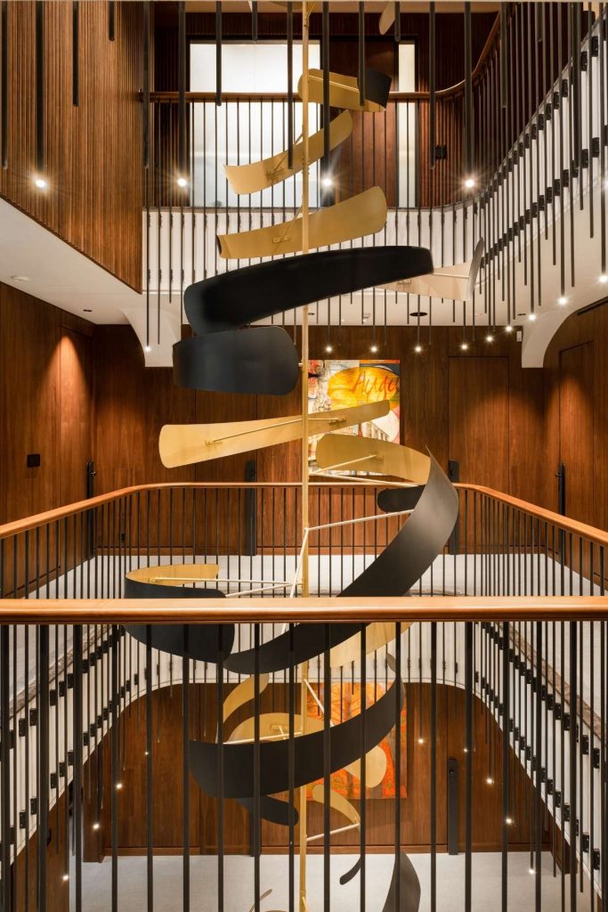
What inspired the design of the project?
The guide through the whole project was the building’s existing architectural characteristics. We listed them and we tried to emphasise them and reproduce them by using modern materials and simplified contemporary forms. We also introduced a system of organic forms that define the circulation, the open offices setting and all additions made to the building.
What was the toughest hurdle your team overcame during the project?
The main hurdle we faced while working in this building was the process of embodying new technologies in an existing structure without disrupting it. The building’s design and the standards specified by LEED and WELL certifications demanded a large variety of new technologies and in many cases, we had to be very creative in order to combine them with the building’s dimensions and materials.
What was your team’s highlight of the project?
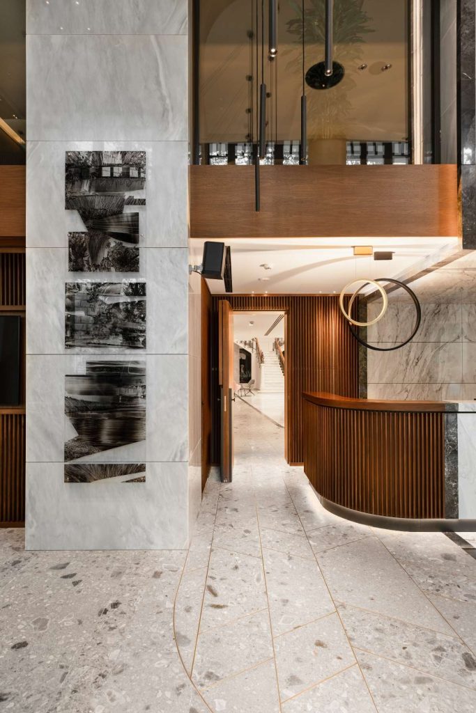
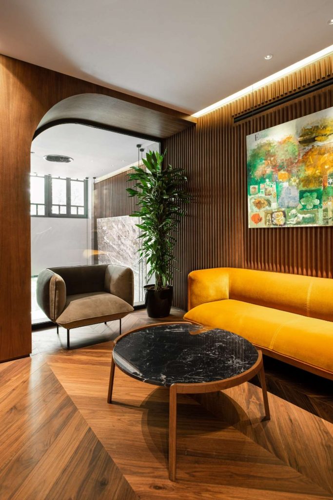
The project in its entity was a highlight for our office since it was our most demanding project so far. However, were we to point out a highlight during its progress, we would point out the week when the artworks were added in the building. The artwork selected is a statement for the relationship between PRODEA and the Contemporary Greek Art and artists, which in certain cases were commissioned to create art especially for the company. This allows for the artwork to be integrated into the architectural design, rather than constitute a post hoc addition.
Why did you enter the SBID Awards?
The reason we presented PRODEA HQ in the SBID Awards is that they are among the most prestigious international awards. Their presence among the participations was already an honour, let alone a distinction. SBID Awards offer the opportunity to present our work to a wide international audience among many other projects of very high standards and qualities.
Questions answered by Urban Soul Project.
We hope you feel inspired by this week's design! Let us know what inspired you #SBIDinspire.
If you missed the last instalment of Project of the Week, featuring a client-focused office design, click here to see more.
Project of the Week
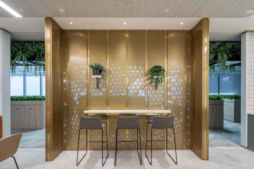
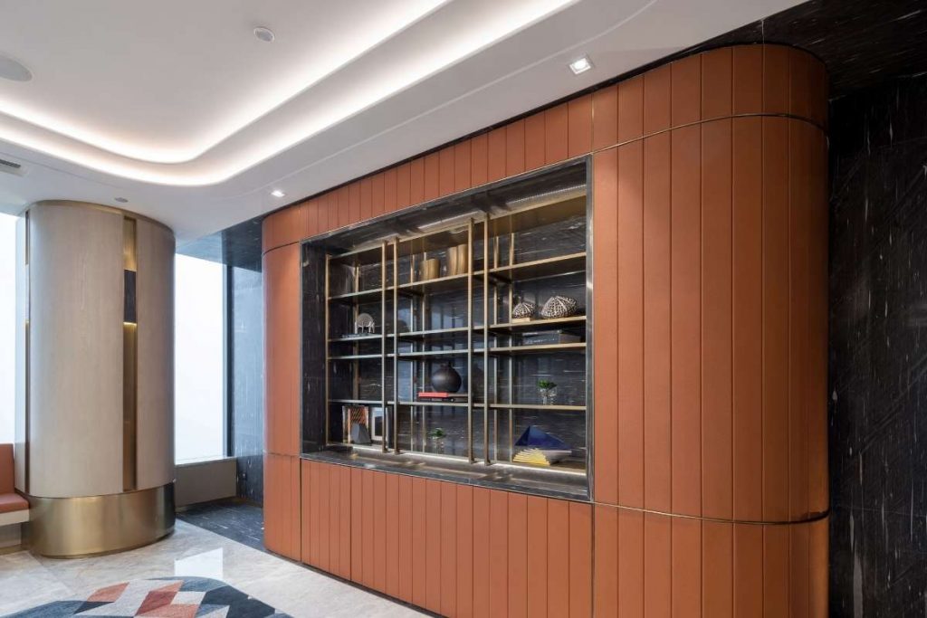
This week's instalment of the #SBIDinspire interior design series features an office design by 2020 SBID Awards Finalist SHH Architecture. Luxury interior and architecture design practice SHH has completed new top floor headquarters for leading Chinese developer, KWG Group holdings, in Shanghai, China. The 32,500 sq ft project unfolds over two floors in a twenty-storey building at an office campus just west of the city centre of Shanghai. The premises have been designed by SHH to be client-focused, making a strong first impression, while reflecting the quality of KWG’s existing offices in Guangzhou and Hong Kong.
SBID Awards Category: Office Design Sponsored by Schneider Electric
Practise: SHH Architecture & Interior Design
Project: KWG Headquarters Shanghai
Location: Shanghai, China
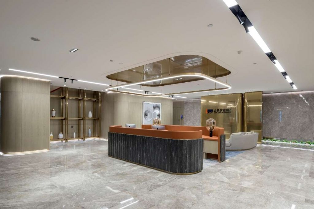
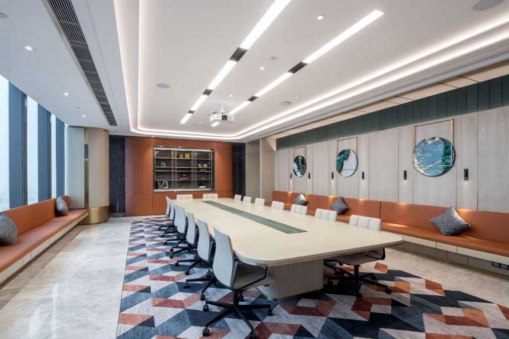
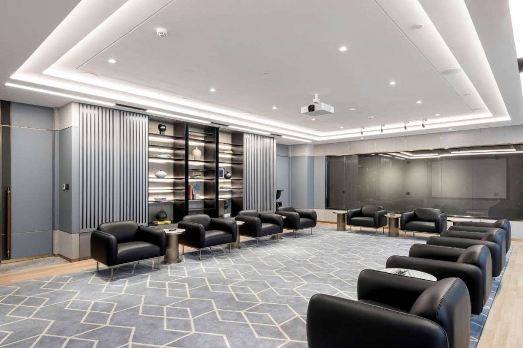
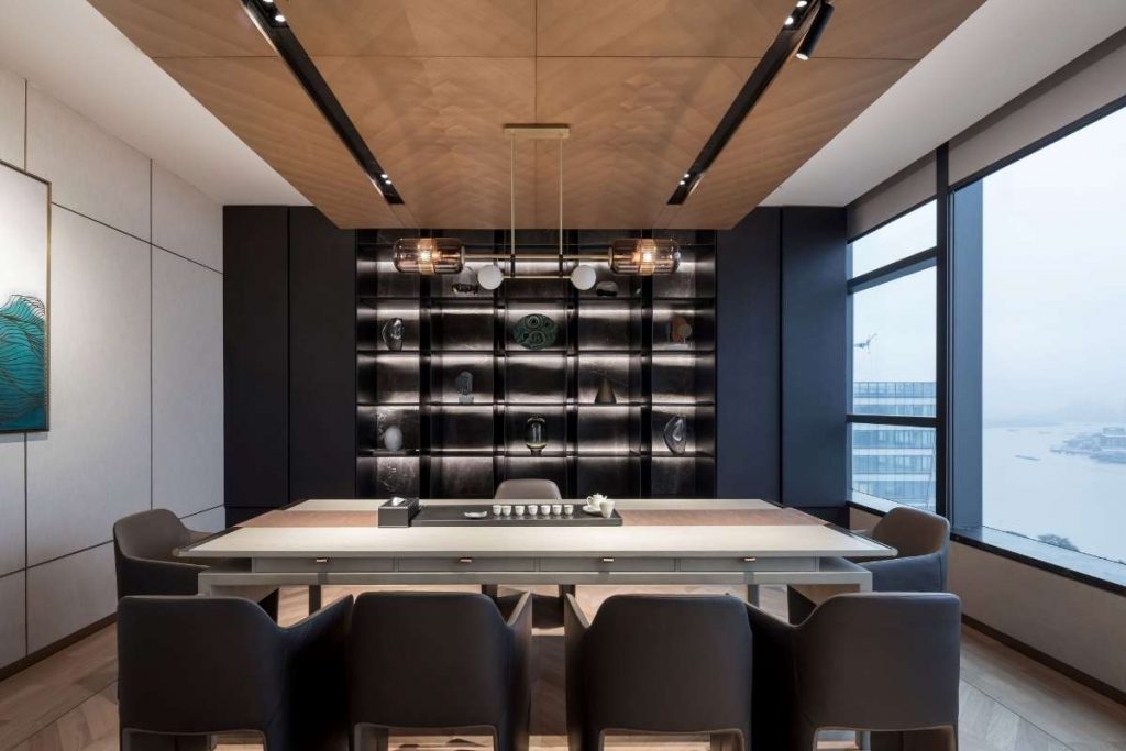
The office space on level nineteen provides the main reception, boardroom and meeting rooms boasting views over the Huangpu River. Cellular offices for senior staff are located around the perimeter of the floor with uninterrupted river views. Level twenty is largely dedicated to executive facilities including VIP offices and suites for the company CEO and President. It also accommodates smaller areas of general workspace, a secondary reception and lounge, along with an additional breakout area.
The design is sophisticated and welcoming throughout. The materials palette includes timber, stone, leather, fabrics, laminate glass, mesh and brass highlights. Suspended from ceilings are feature planters with integrated lighting which define circulation routes and provide visual interest at a high level.
What was the client's brief?
The brief formulated by KWG called for a solution that would make a statement about the company’s design-led approach to their property developments and impress this upon their clients as the company expanded into the Shanghai market. Accommodating executives, senior management, building professionals and designers this messaging was also important for staff, instilling a sense of collective pride and confidence within them all.
What inspired the design of the project?
KWG are one of the top ten developers in Mainland China and their portfolio consists of commercial office developments, five-star hotels, luxury residential developments and shopping centres. So the occupants of and visitors to this office might be involved in any of these market sectors. Our design approach was to cross boundaries and create a hybrid of hospitality, hotel and workplace in terms of character. This was achieved through the use of quality materials and thoughtful detailing set alongside functional efficiency and consideration for how company employees inhabit and use the space.
What was the toughest hurdle your team overcame during the project?
This project is just one of more than half a dozen we have undertaken with the client. Having worked so many times with them we have established a great understanding with each other and there are very few hurdles that we have to overcome as a result. If there was one particular challenge with this project it was time. The design and development of projects in China is so much quicker than what we’re accustomed to in the UK. KWG set a very ambitious programme for completion, however, our designers rose to the occasion and delivered what was required of us on time.
What was your team’s highlight of the project?
In all honesty, the highlight is working with the people at KWG. As a group, they understand design and appreciate what it can contribute to the quality and success of a project. We have developed a mutual respect between us and as a result, the whole process is really enjoyable. It’s been a meeting of minds and characters. A number of us at SHH have had the good fortune to travel to China on multiple occasions to meet directly with KWG and visit construction sites. And I think we’re all sorely missing these face to face encounters with the current travel restrictions that are in place.
Why did you enter the SBID Awards?
SBID provides a great platform for recognition to practices that wish to showcase their work to a talented global audience by bringing together high standards of work from across the world.
Questions answered by Brendan Heath, Director of Hospitality & Commercial Interiors, SHH Architecture.
We hope you feel inspired by this week's design! Let us know what inspired you #SBIDinspire.
If you missed the last instalment of Project of the Week, featuring a classically modern kitchen design, click here to see more.
Project of the Week
This week's instalment of the #SBIDinspire interior design series features a residential design by 2020 SBID Awards Finalist Cronin Kitchens. The New Zealand kitchen design company was tasked with creating a modern, open-plan kitchen for a family holiday home.
SBID Awards Category: KBB Design Sponsored by Garrett Leather
Practise: Cronin Kitchens
Project: Queenstown Kitchen
Location: Queenstown, New Zealand
What was the client's brief?
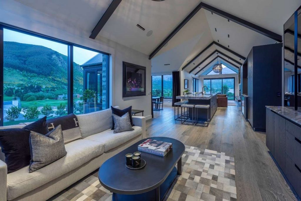
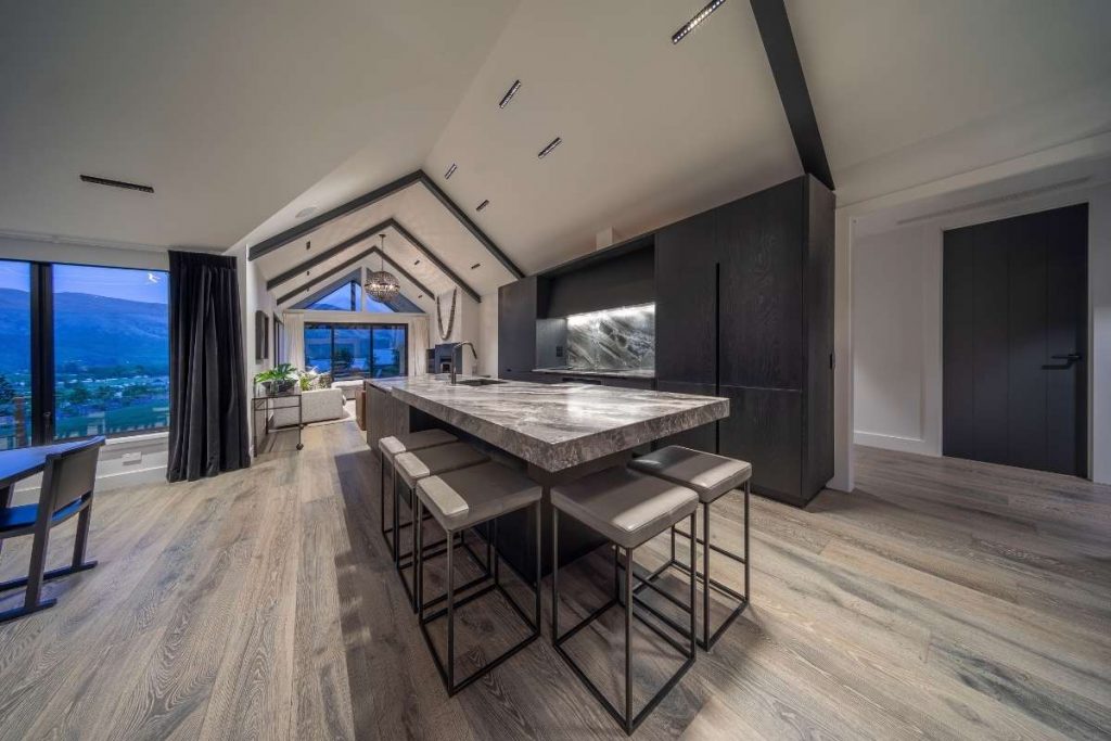
The client was looking to create a classically modern, family kitchen that would sit at the heart of a new holiday home. The kitchen would include an island large enough to accommodate seating for up to five people, along with a separate drinks preparation and storage area.
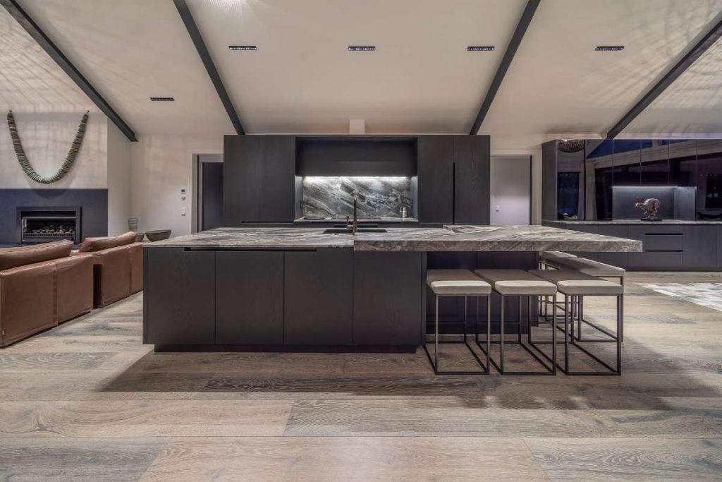
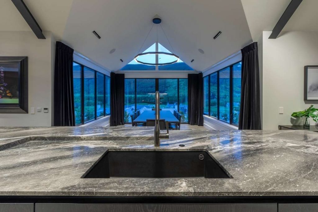
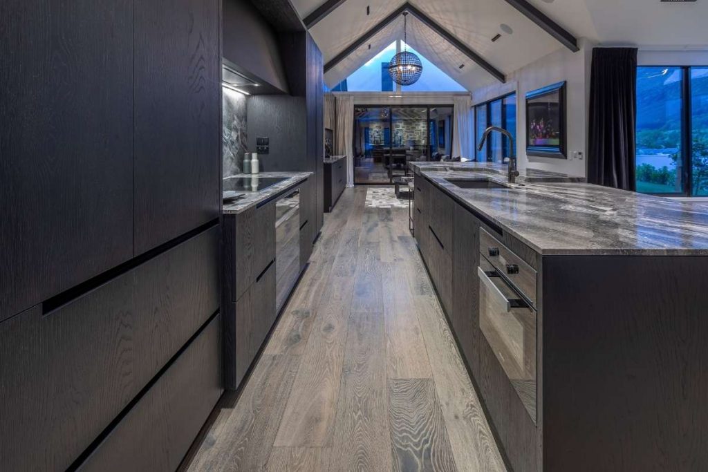
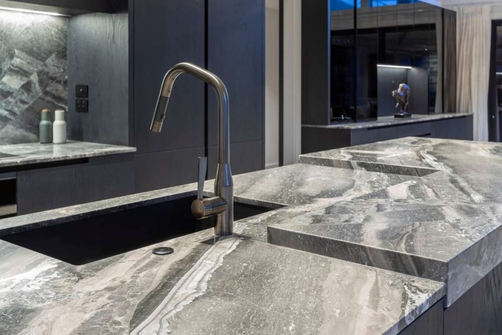
Working with a deceptively small area, a cantilevered, L-shaped element was seamlessly integrated into the marble benchtop – raised slightly above the rest of the benchtop to demarcate the seating area. For continuity, the same marble was used in the cooking zone and for the splashback, above which sits a custom, acid-etched glass extractor box. Two columns of black-stained oak cabinetry containing the pantry and integrated fridge/freezers flank this area.
Adjacent to the kitchen, a custom built-in sideboard was installed, containing the requested drinks station, plus storage for crockery, etc. Matched in the same black-stained oak cabinetry, this unit is fronted with smoked, black-glass doors, which bring an additional dimension to the space.
What inspired the design of the project?
The project was inspired by modern design, and the goal was to design a kitchen that would appear larger and grander than its footprint would allow. The overall palette is dark and moody, and we worked closely with the interior designer from the outset, so these hues could be complemented in the rest of the living space.
What was the toughest hurdle your team overcame during the project?
I only visited the house for a final inspection once the house was completed. The design and detailing of all of the cabinetry needed to be highly detailed and very specific. The kitchens design is such that the overall dimensions are not too critical, it does not fit between walls or go up to the ceiling like all of my other designs do.
What was your team’s highlight of the project?
The oak frame that surrounds the cooking area, I used 38mm thick oak panels to give the kitchen a more classic aesthetic. I extended a panel over the top of the cooking area to create a box-like surround. This connects the pantry on the left to the integrated fridges on the right making the kitchen appear more substantial then it is.
The raised seating bench which is wide on the front side of the kitchen to maximise seating but is also checked out on the inside of the kitchen to give plenty of practical working space, either side of the sink.
The visual symmetry, the centre of the islands cabinetry is centred on the dining rooms cathedral-like peaked ceiling. On the front of the Island, there are 3 doors on either side of the centre, 6 doors in total. This is also the line where the benchtop steps up from thin to thick. It is also the centre of the tap, sink, hob and extractor.
Why did you enter the SBID Awards?
This is the first time I have entered the SBID Awards. In New Zealand we have lots of good kitchen designers, we really only have one Kitchen Design Awards though. This year I had multiple kitchens that I was very proud of, two of which made the SBID finals. I really wanted to give all of these kitchens an opportunity to be judged by International judges and compared with other designs outside of New Zealand.
Questions answered by Morgan Cronin, Owner/Director/Designer, Cronin Kitchens.
We hope you feel inspired by this week's design! Let us know what inspired you #SBIDinspire.
If you missed the last instalment of Project of the Week, featuring a residential design inspired by its surrounding harbour views, click here to see more.
Project of the Week
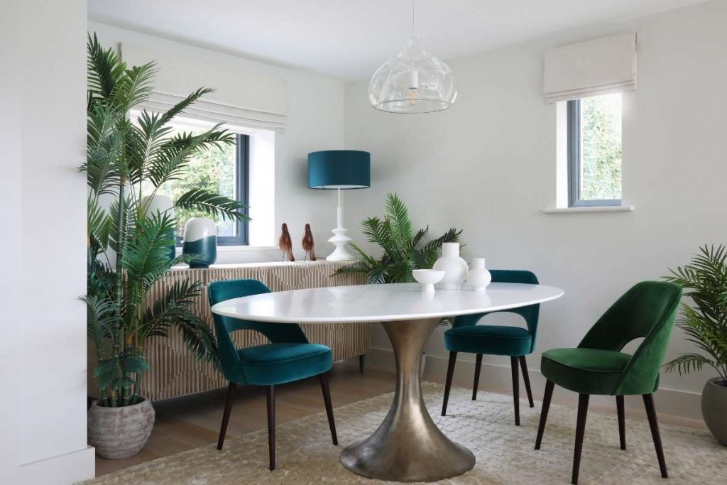
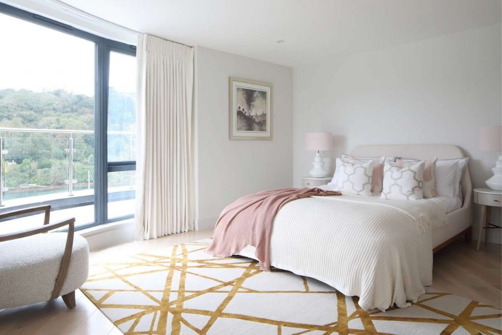
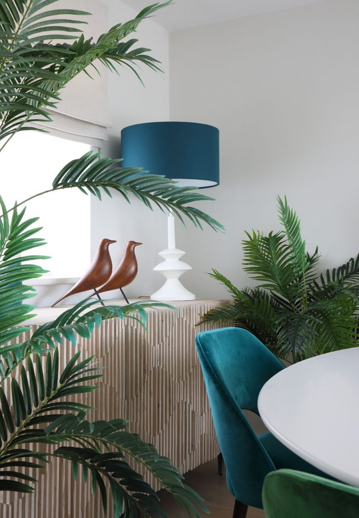
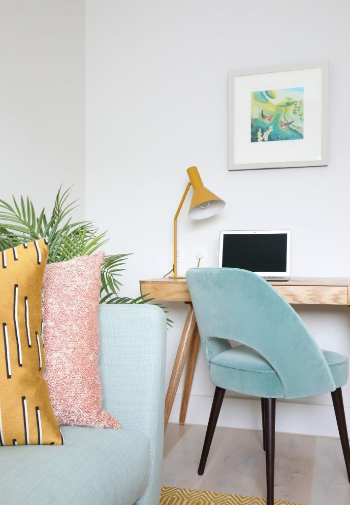
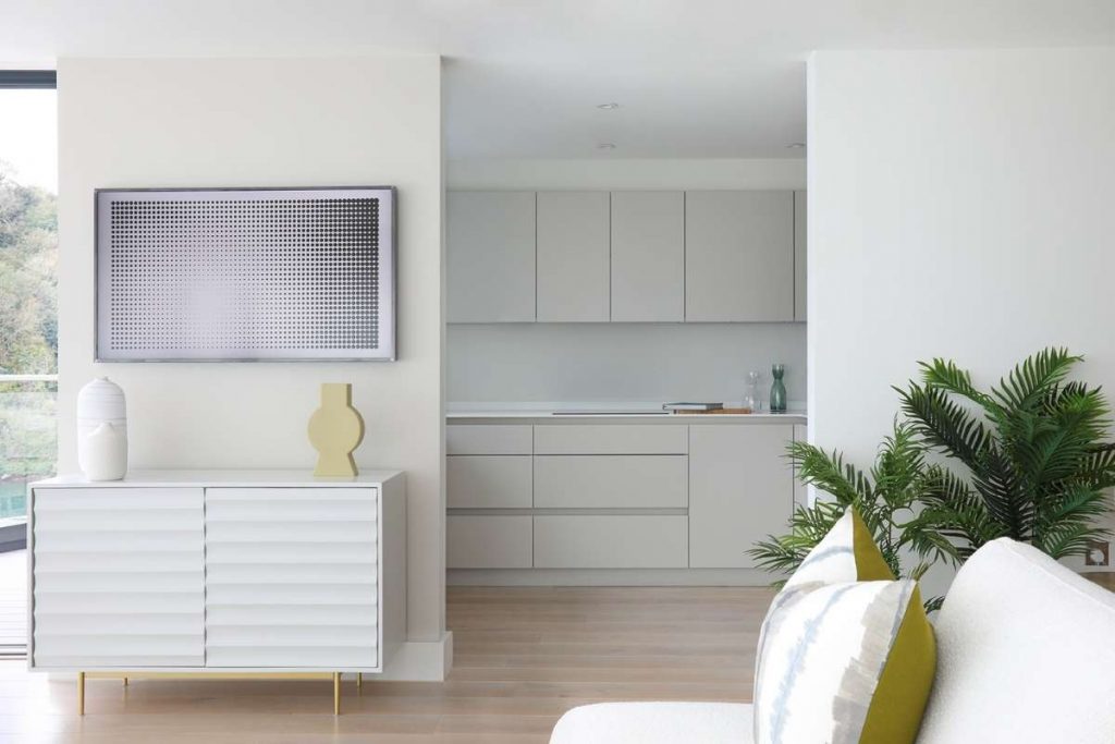
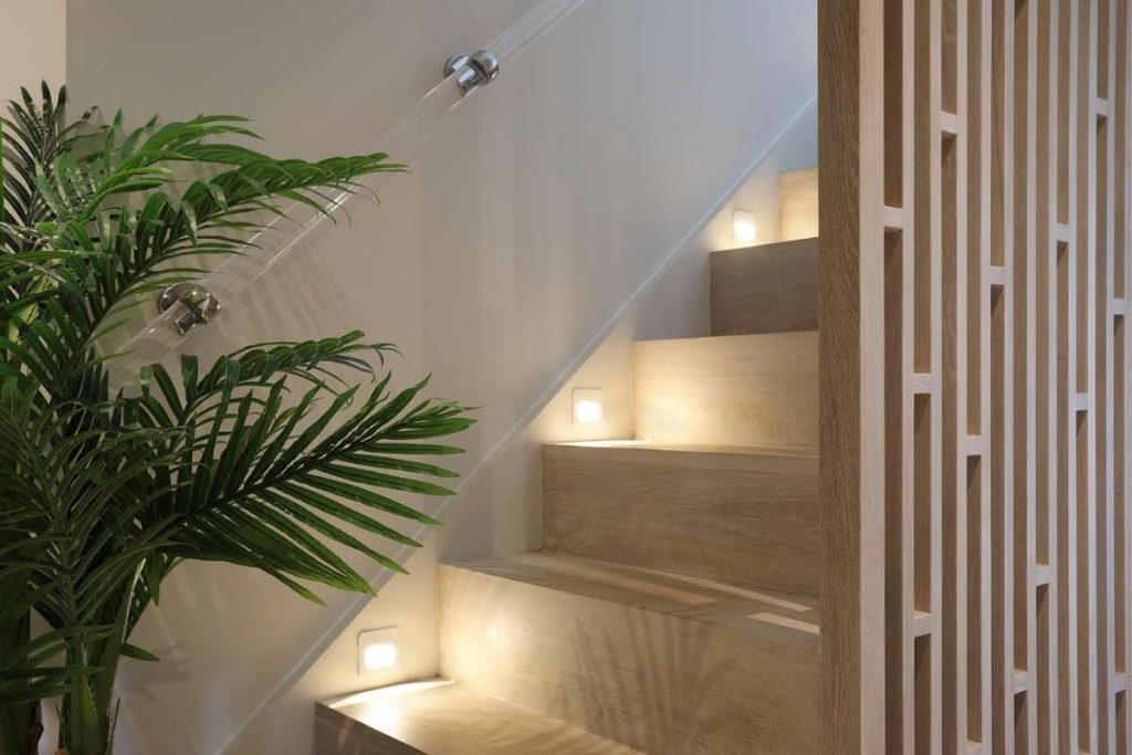
This week's instalment of the #SBIDinspire interior design series features a high-end residential design by Barclay Interiors. The principal concept for the interior was to use the surrounding estuary and unspoilt harbour of the River Yealm as inspiration. The curvature of the building, floor to ceiling glass and open plan living space, allows for the most incredible view, a key element of the design. Barclay Interiors was involved in all aspects, from flooring and walling finishes to lighting layouts, from joinery design to staircase detailing. Each space was furnished in line with the chic, modern concept that was desired, whilst also introducing splashes of colour and texture to ensure the space felt like home.
Practise: Barclay Interiors
Project: Devon Project
Location: Newton Ferrers, Devon
Photography credit: James Balston Photography
What was the client's brief?
The brief was to design a fully practical yet modern and aesthetically chic interior for her re-location to Devon. When our client decided to move to Devon, she wanted a complete change in surroundings, both from an exterior perspective (city life to harbour life!) and also from an interior angle. Modernity, simplicity and elegance were at the pinnacle of my clients brief and it was this in addition to the surroundings that inspired the concept.
Photography credit: James Balston Photography
What inspired the design of the project?
As mentioned above, the main source of inspiration came from the surroundings, namely the River Yealm and Estuary. The view was at the forefront of all space planning decisions and the colours that infiltrated into the space from the outdoors led to choices in colour palettes and finishes. Timber flooring, a cladded staircase and a bespoke decorative screen were designed specifically to add warmth and sophistication to my client's entrance hallway whilst allowing for maximum amounts of natural light to bounce through the space, once again relating to the exterior surroundings.
Photography credit: James Balston Photography
What was the toughest hurdle your team overcame during the project?
Some contractors can be a little anti-change so this was the biggest hurdle; however, after substantial hand-holding and clear guidance, a collaborative effort was achieved.
Photography credit: James Balston Photography
What was your team’s highlight of the project?
As with all of our projects, we are lucky in that visually our role is extremely rewarding. Seeing the design come together on the final days of installation and seeing how we achieved the conversation between the surroundings and the interior so well, felt quite magical.
Photography credit: James Balston Photography
Questions answered by Megan Loughborough, Senior Designer, Barclay Interiors.
We hope you feel inspired by this week's design! Let us know what inspired you #SBIDinspire.
If you missed the last instalment of Project of the Week, featuring a Manhattan Hotel Design with Central Park views, click here to see more.
Project of the Week
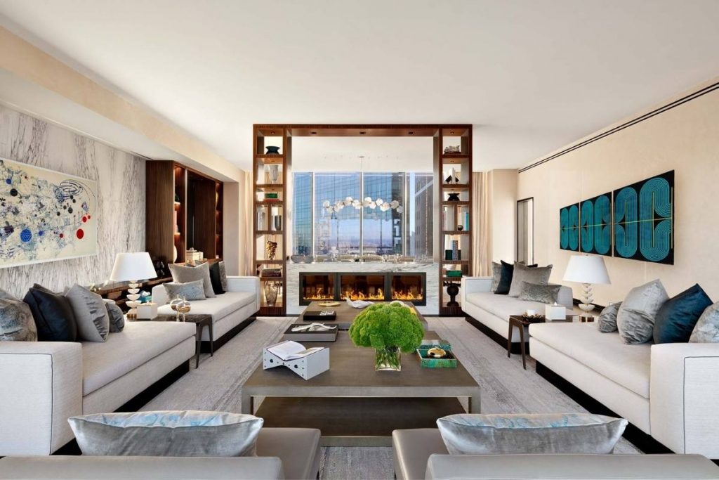
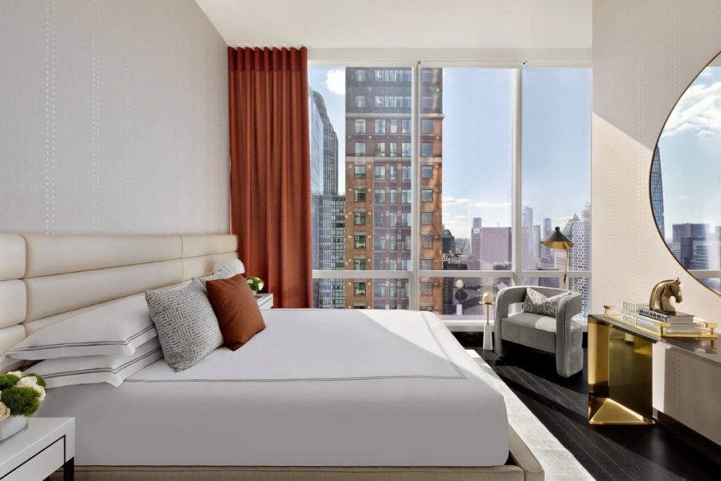
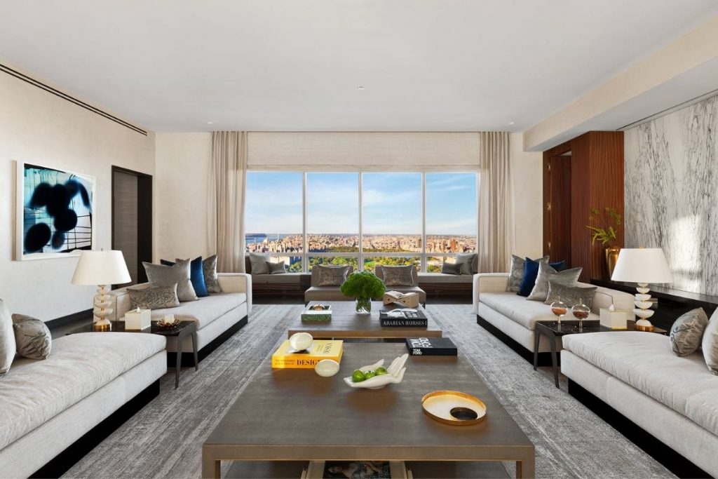
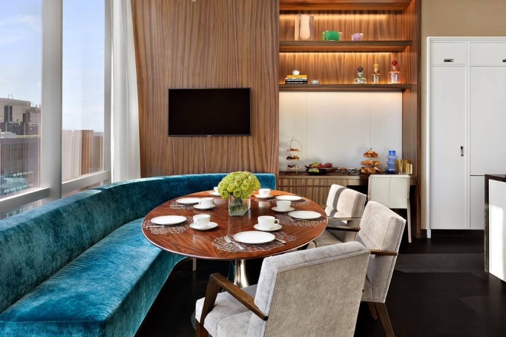
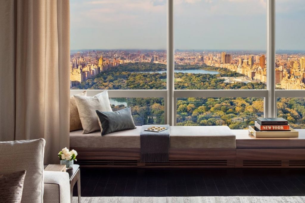
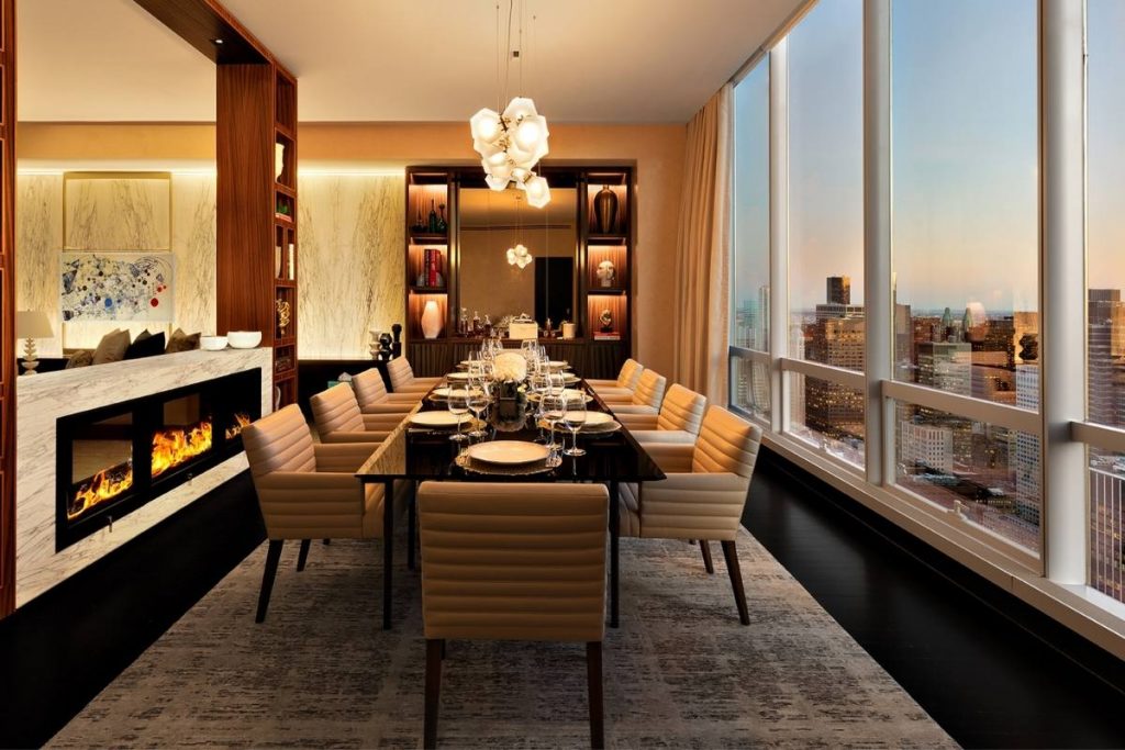
This week's instalment of the #SBIDinspire interior design series features a design by SBID Awards Finalist, Jeffrey Beers International. For the Manhattan Sky Suite, Jeffrey Beers designed and decorated the interiors to frame the incredible wide views of Central Park. With the wonderful scale of the open living room and dining room, they were able to play with grand and stately furniture, such as a 10 person dining room table with wide and plush dining chairs. The mix of warm and cool tones paired with contemporary arts as well as rich wood finishes make the home a home but do not disrupt the wonderful and impressive open layout.
SBID Awards Category: Hotel Bedroom & Suites Sponsored by Schneider Electric
Finalist: Jeffrey Beers International
Project: Park Hyatt's Manhattan Sky Suite
Location: New York
What was the client's brief?
New York City hotels are renowned for their speciality suites, but nothing in the city measures up to this new suite's overwhelming sense of luxury and unparalleled views of Central Park and the Manhattan skyline.
What inspired the design of the project?
When it came to the hospitality design, we imagined that the suite was a private residence. We first created a separation of space between public areas (the living room and dining room) and the private space (bedrooms and bathrooms). We then favoured open-plan living for the public areas. With careful attention to layout, materials, and art we created fluidity between your kitchen, dining area, and living room. The overall effect is warm and social; a perfect destination for entertaining.
What was the toughest hurdle your team overcame during the project?
One of the questions we were faced with was how to separate the dining space from the living room space without disrupting the overall open plan of the main area. We, therefore, custom-designed an open shelving unit to act as a divider between the living area and the dining area. As well as integrated lighting, the shelving unit has a custom double-sided glass fireplace that looks modern and yet feels warm and inviting.
What was your team’s highlight of the project?
To create a warm and sophisticated master bedroom, we chose naturally beautiful architectural materials. We used fumed eucalyptus wood millwork panels to create a dramatic backdrop for the headboard. The centre has upholstered panels with antique brass metal reveals and integral light grazes to give it a bit of softness while remaining sophisticated.
Why did you enter the SBID Awards?
We entered the SBID awards because of the international connection to the global design industry.
Questions answered by Jeffrey Beers, Founder & CEO, Jeffrey Beers International.
We hope you feel inspired by this week's design! Let us know what inspired you #SBIDinspire.
If you missed the last instalment of Project of the Week, featuring a luxury hotel design, click here to see more.
