Following the previous collaboration between architectural bureau IK-architects and Norwegian developer Predio, creating HG-31 attic apartment in Oslo, architects continued their cooperation and presented another renovated attic apartment - a brutalist two-story apartment, inspired by Tom Ford’s style in Oslo.
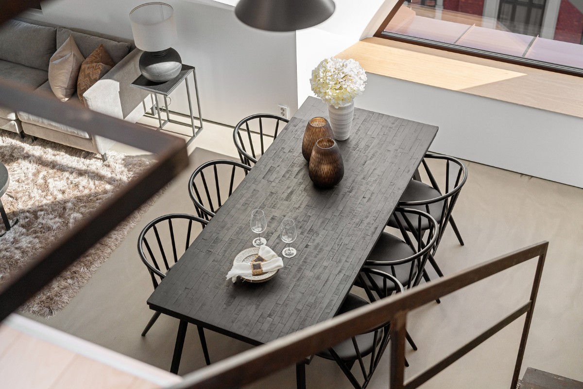
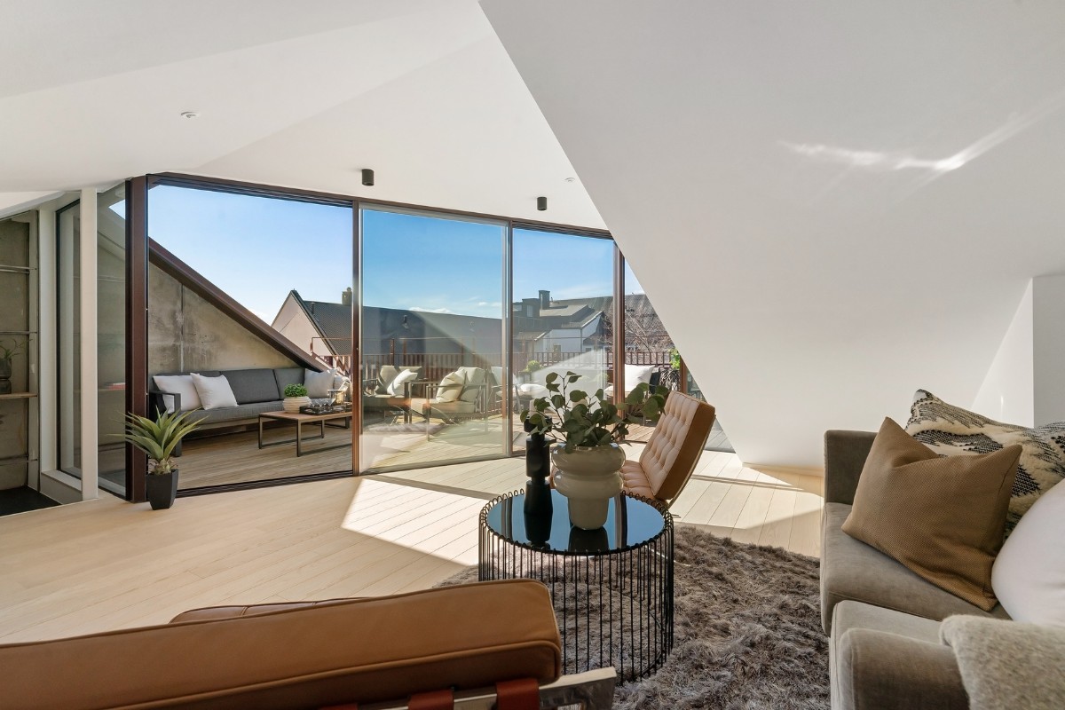
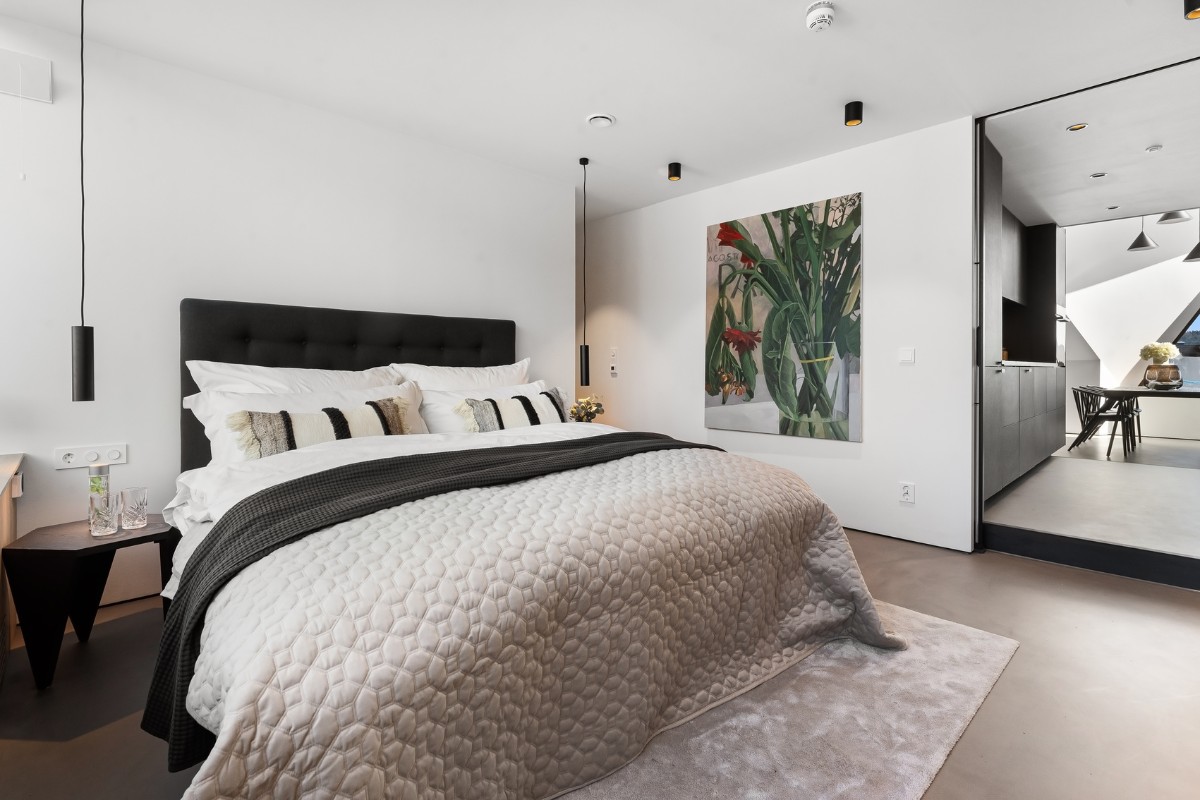
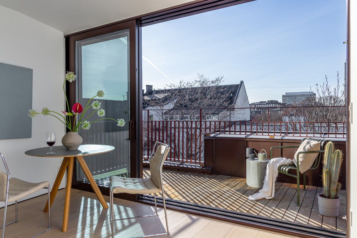
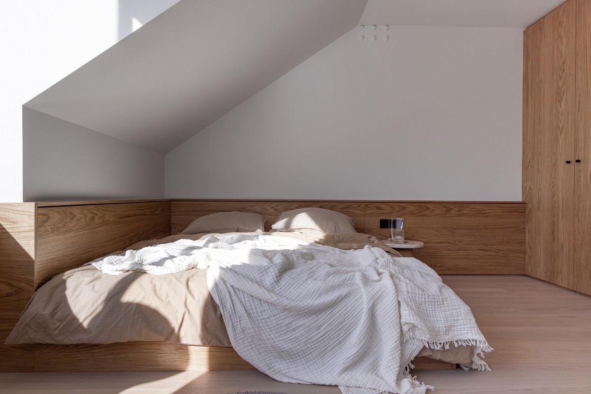
The apartment has two floors and thoughtful zoning, which separates the public area from the private area. This is a full-fledged one-bedroom apartment for a young person or a couple without children, with a large kitchen-living room, a bedroom, a bathroom, and a wardrobe hidden behind the head of the bed.
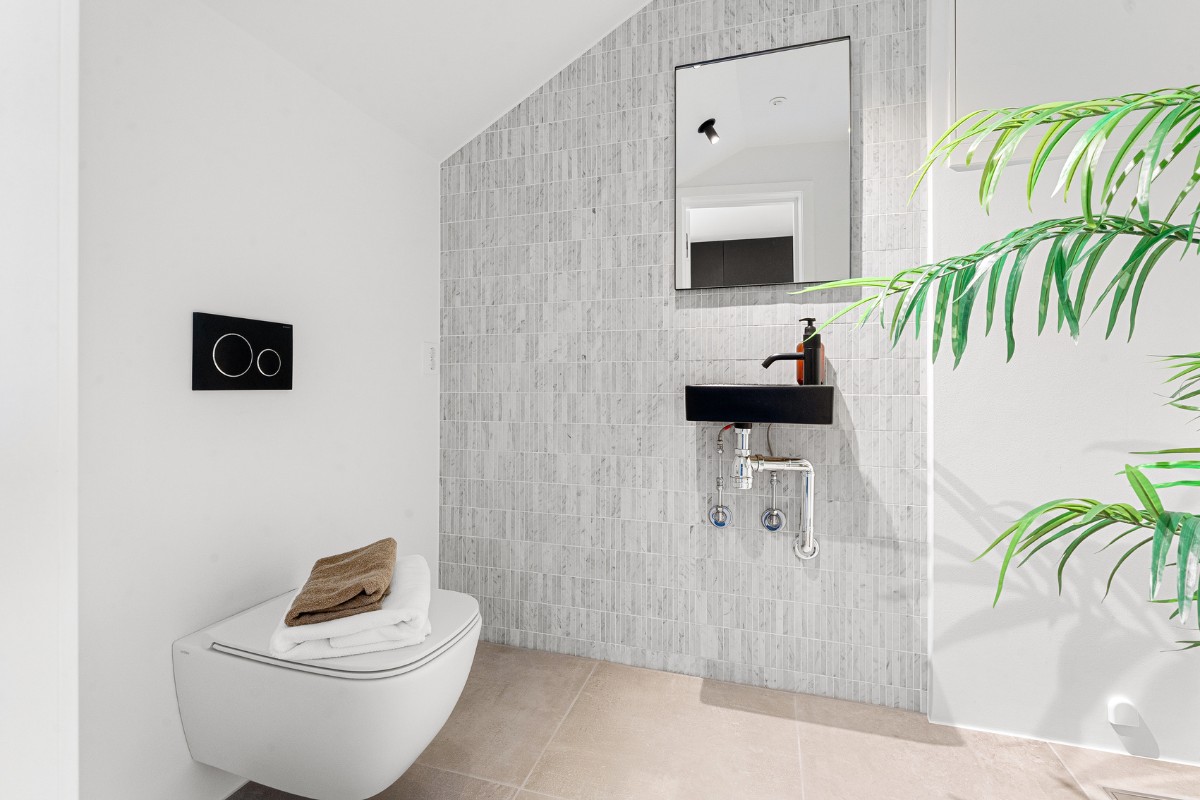
The interior design was inspired by Tom Ford’s timeless appeal - the style of the apartment could be described as classic simplicity with a hinge of brutalism. In the apartment, which is a renovation project of an abandoned attic, architects managed to preserve the original, authentic structure of the concrete wall, which was later adapted to the interior in the brutalist style.
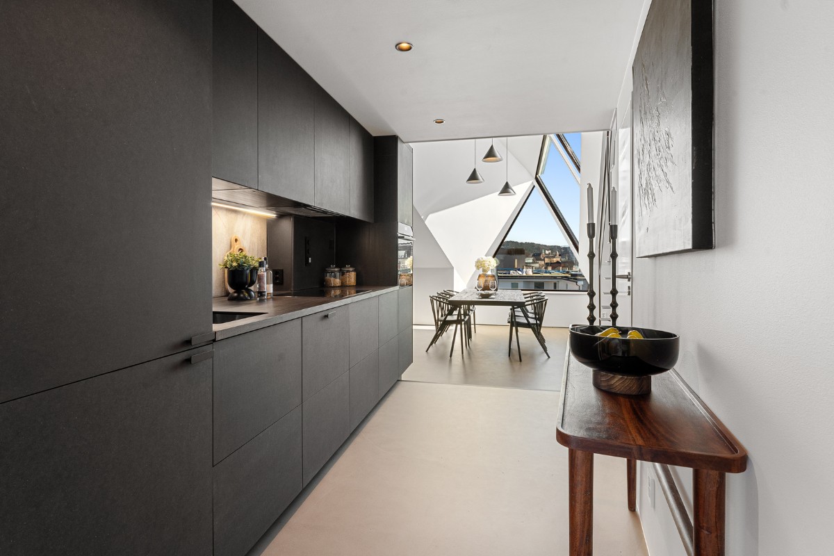
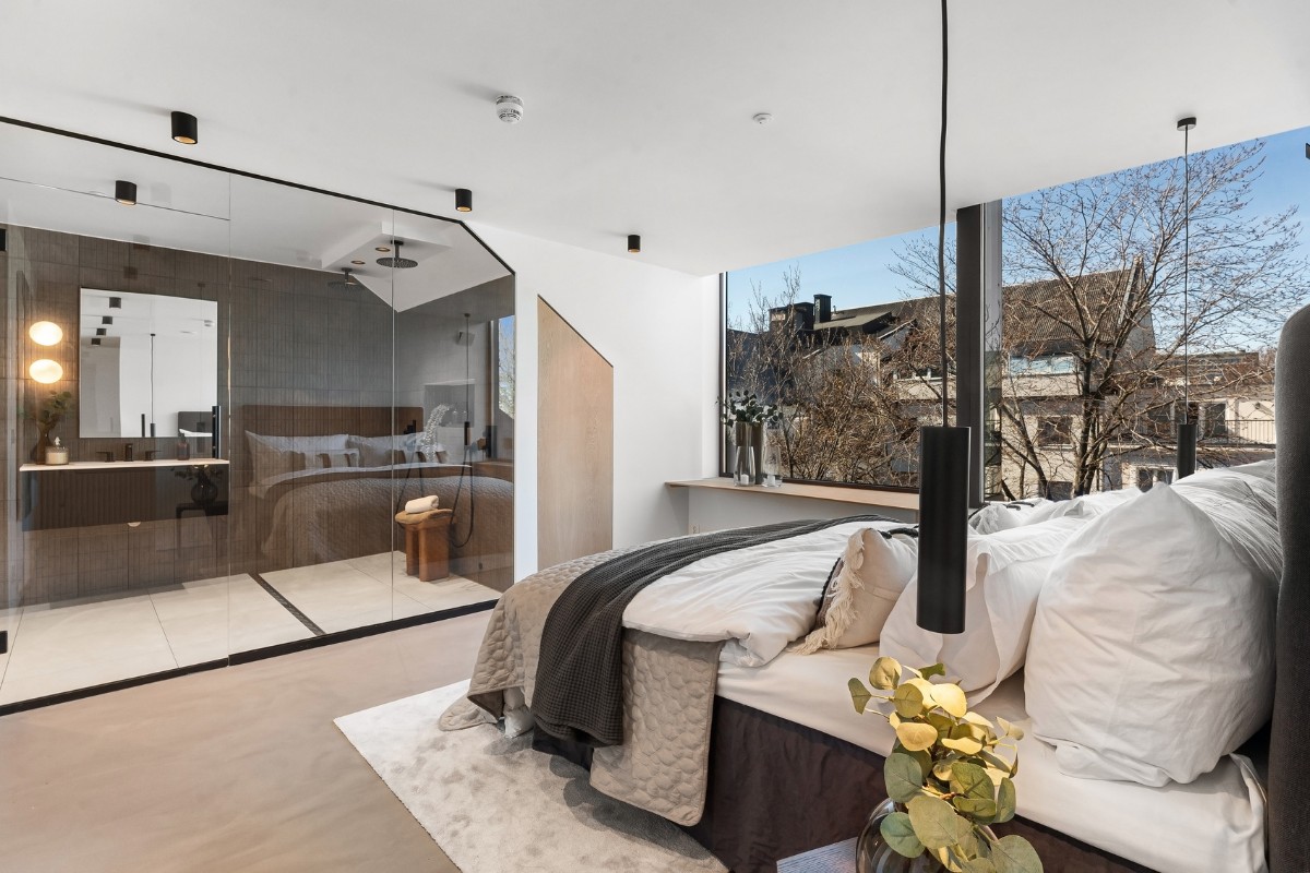
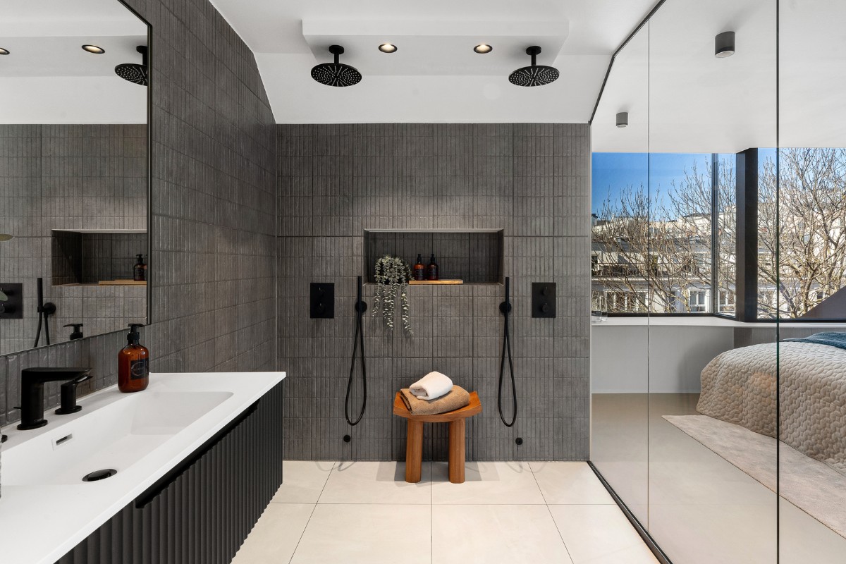
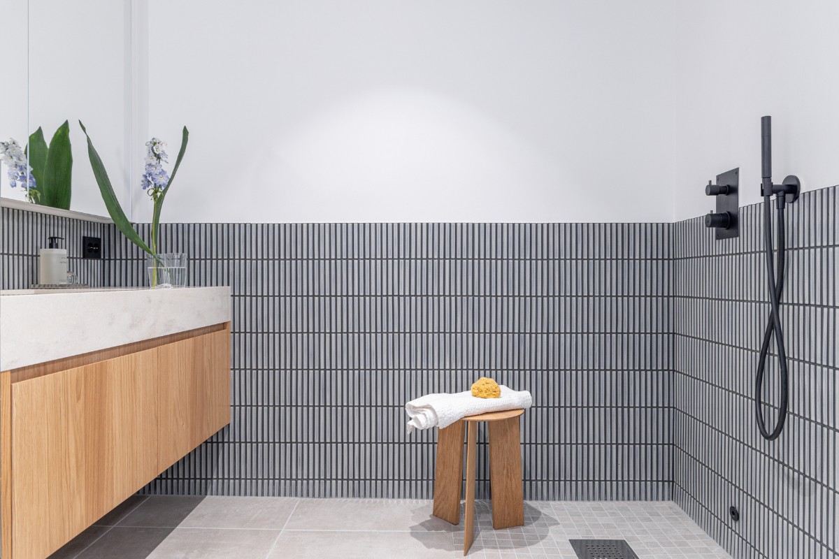
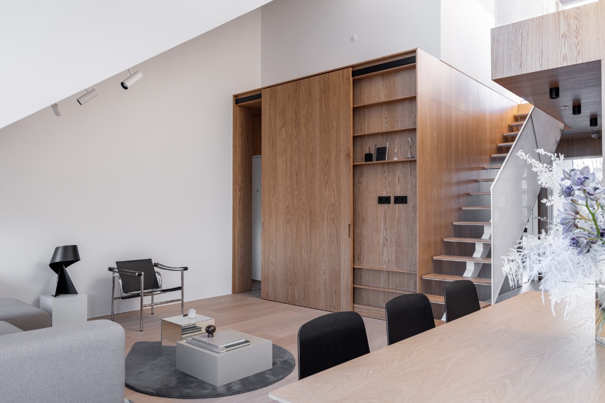
According to the client's brief, the team mounted a glass wall between the bedroom and the shower, delineating an additional attraction area. As in the HG-31 project, a sliding system was created in the form of a dark monolithic box, which hides the entire kitchen, its technical part, sliding facades that hide the entrance door.
The architects faced the task of creating a bright, cosy and pleasant interior that would organically implement an element of brutalism. Even though the interior contains many dark colours, due to a well-thought-out design strategy, the interior itself is not dark. It combines warm wood, red metal and chairs, and the sky-blue colour of the art piece on the wall. The stairs from the first to the second level are made of raw black metal, covered with a matte transparent varnish, and on the first floor, and MicroCement is used for the floor covering.
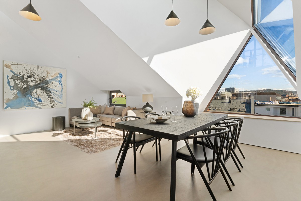
“In the project, we used a concrete wall, a concrete floor and raw black metal, which plays well in contrast with the wooden elements. In my opinion, it is this unusual concrete approach that distinguishes the apartment from the classic wooden Scandinavian style”, shares Kateryna Yarova, chief architect of IK-architects.
This project is a great example of two amazing teams, Predio and IK-architects, working together to create a modern, stylish, and practical living space in the historic centre of Oslo. This realization is not only a testament to high quality but also an embodiment of the aspiration to improve the quality of life in cities through sustainable development and the enhancement of design and functionality in real estate.
The Ukrainian architectural bureau IK-architects has been developing design projects for more than a decade. They specialise in Scandinavian design, minimalism, and blending different styles and trends.
Predio is a Norwegian development company that specialises in lofts conversions in Oslo. They carefully choose the best locations in the city to create luxury apartments, penthouses, and townhouses geared towards being great property investments. Predio's goal is to enhance urban living through sustainable development and their expertise in residential and commercial real estate. IK-architects has teamed up with Predio for several years now.
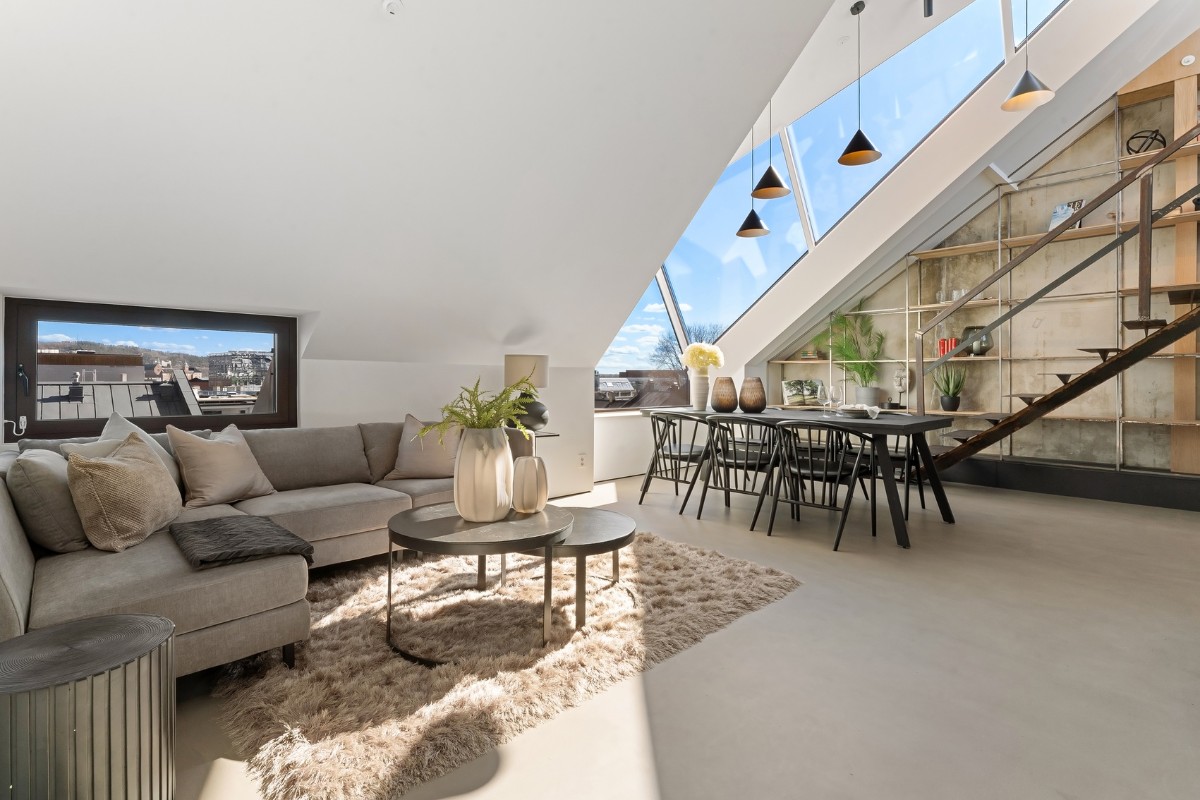
The following project was accomplished in collaboration between leading Predio architects and IK-architects designers. Before, they have also made HG-31 attic apartment in Oslo together.
Developer company Predio
Svein Stokke, Andrii Soloviov, Andriy Ponomarenko
Interior design by IK-architects
Kateryna Yarova, Khrystyna Stavytska
Location: Oslo, Norway
Built area: 87 m²
Completion year: 2022 (The year of construction is 1988)
Construction: COWI
Furniture manufacturing: Lachma
Client: Private
Status: Completed
Cost: £350,000
About IK-architects
Good design is not visible, good architecture is imperceptible – it's just a comfortable state and space for the user; but this is a colossal effort and knowledge for the designer.
If you’d like to feature your news or stories on SBID.org, get in touch to find out more.
If you’d like to become SBID Accredited, click here for more information.
This week’s instalment of the Project of the Week series features a sophisticated holiday home design by 2023 SBID Awards Finalist, Clare Williams Interior Design.
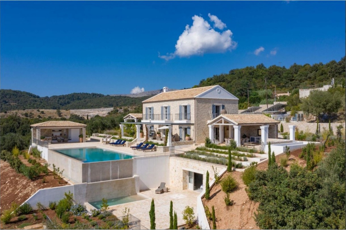
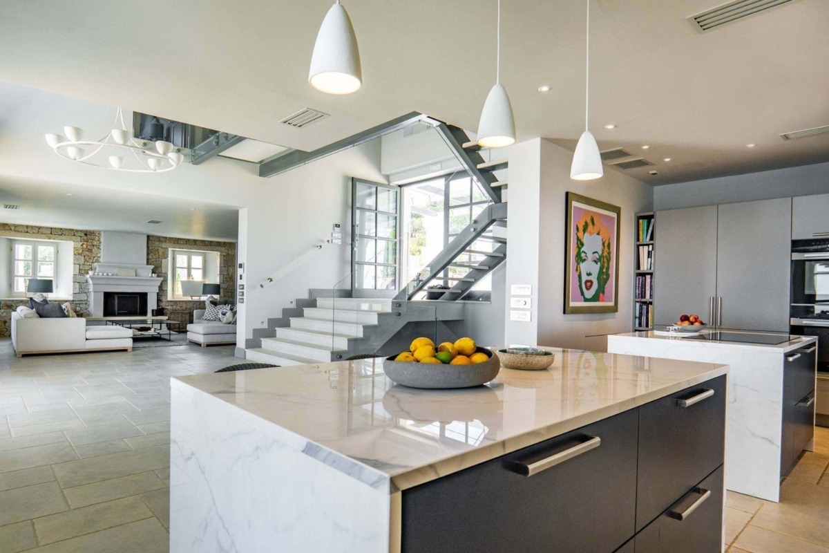
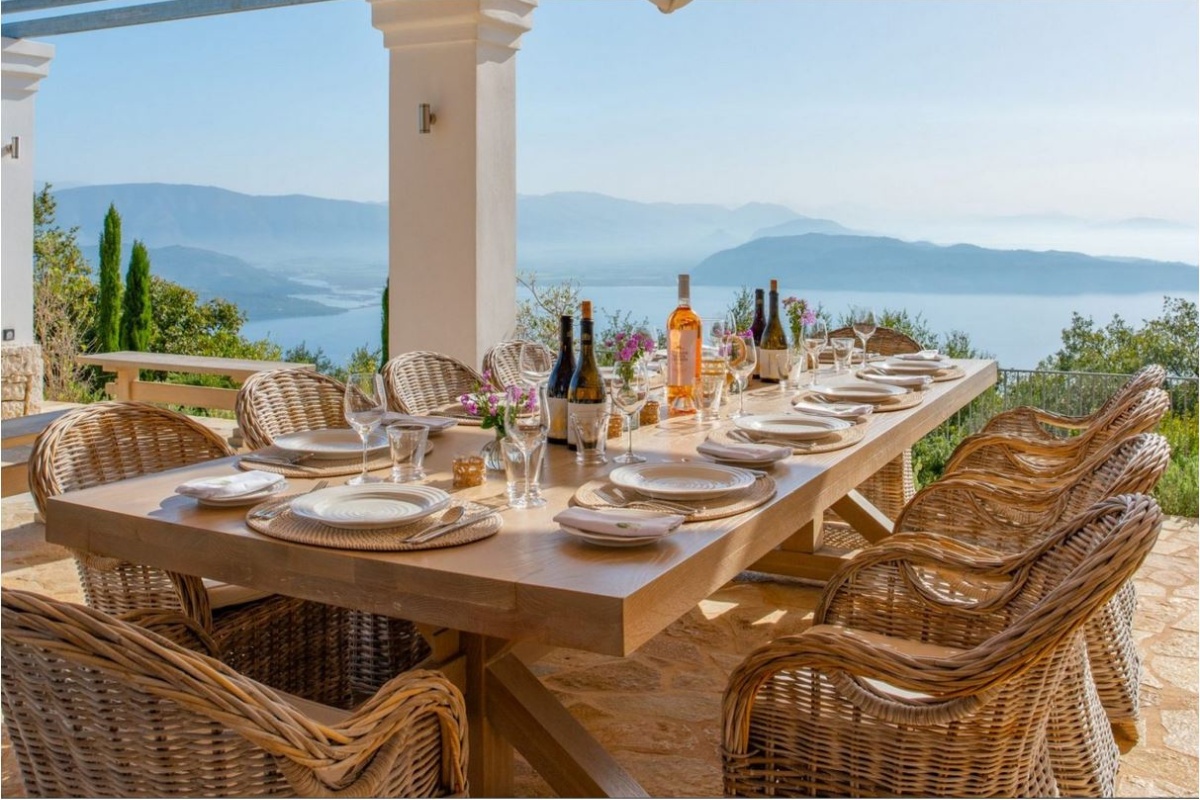
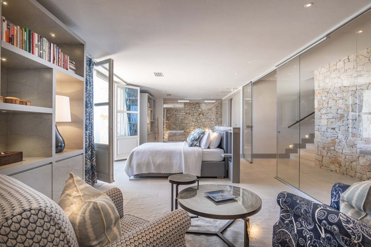
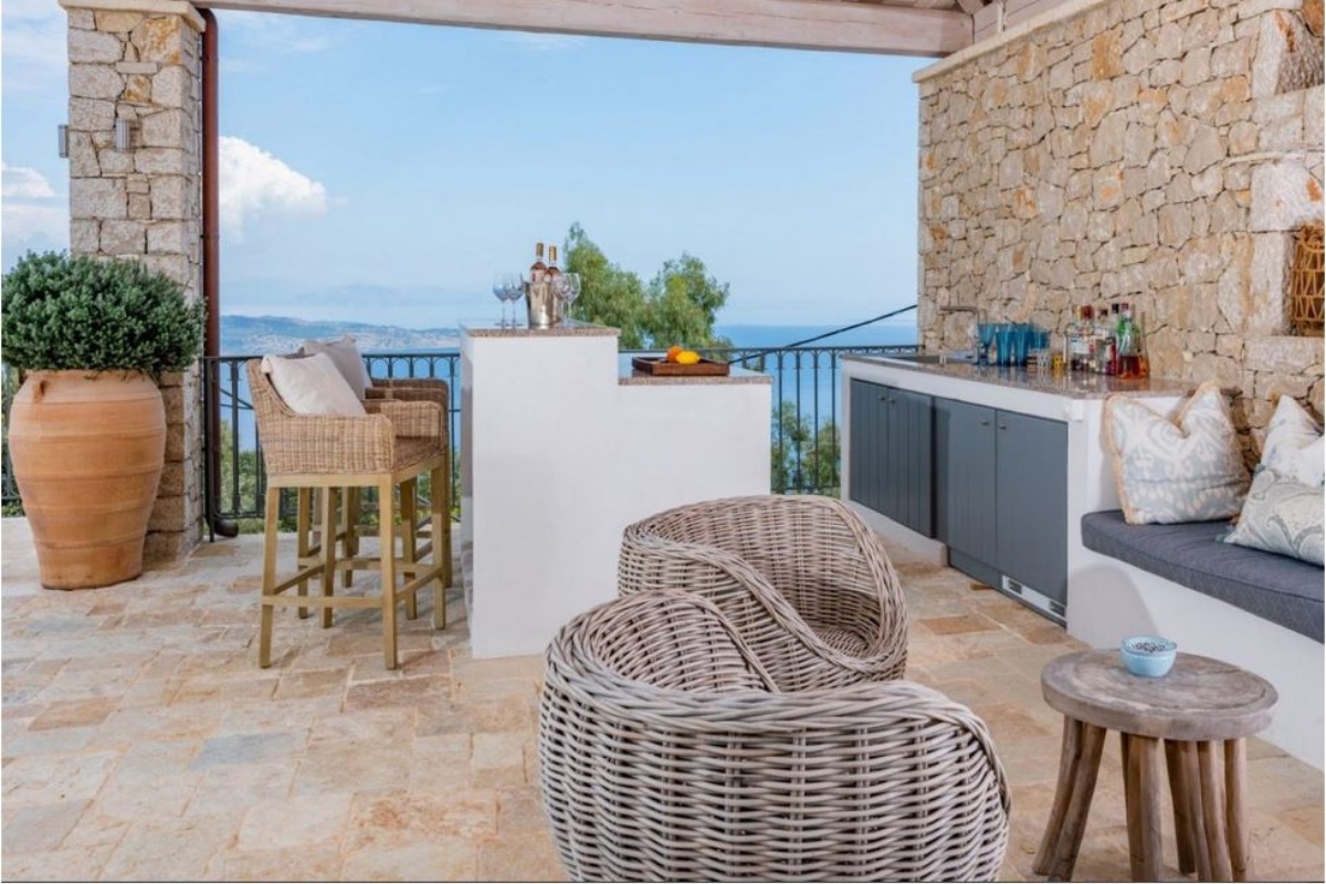
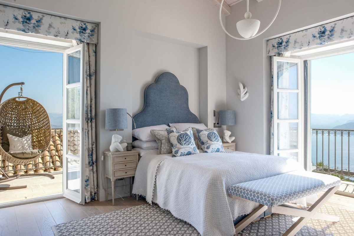
Clare Williams Interior Design was commissioned to design, conceptualise and complete this magnificent, luxury family villa in Corfu, Greece. The client wanted this plot of land to transform into a well-built, sophisticated holiday home where guests can relax and enjoy the idyllic coastal surroundings and breath-taking views. Modern spacious interiors, bespoke joinery, sculptural furniture, elegant fabrics, natural local materials, local craftsmanship and beautiful outdoor finishes all add character to this family villa.
SBID Awards Category: Residential House Over £1M
Practice: Clare Williams Interior Design
Project: Luxury Corfu Villa Project
Location: Corfu, Greece
What was the client's brief?
Clare Williams Interior Design was briefed by her client to design and build a luxury, residential Villa on a plot of land in Corfu, Greece. The plot of land chosen for the Villa boasted stunning, unobstructed views of the surrounding Grecian landscape and Ionian Sea, stretching as far as the eye could see.
The design brief required Clare to create a modern and sophisticated holiday home that reflects the surrounding natural beauty of outstanding bays and white pebbled coves on the North East Coast of Corfu. The clients wanted a home they could use for the primary function of rest, relaxation and family enjoyment. The client’s family will spend the summer in this villa and wanted the space to feel different to their busy city lives.
What inspired the design of the project?
To bring the interiors of this Villa to life, Clare developed her design concept by considering the surrounding natural beauty of outstanding bays and white pebbled coves and sweeping vistas that lent themselves to an idyllic theme of blues, whites and greys that are carried throughout the interiors and can be seen in the furnishings, fabrics, art, accessories and more.
What was the toughest hurdle your team overcame during the project?
Working on an international project can always bring unexpected hurdles. We wanted to ensure we were incorporating sustainable elements into the home wherever possible and therefore used local craftsmen and businesses to complete the kitchens, bathrooms, bespoke joinery, tiling and more. We are thrilled with the outcome but adds slight difficulty overcoming language barriers and learning to work with new contractors.
What was your team’s highlight of the project?
Bringing to fruition my client’s dream of a family home is definitely a highlight of the project. There is always great excitement delivering your carefully curated design concepts and seeing it all come to life. This project took place during the difficult period of COVID19, so it was a rewarding achievement when it was all completed successfully.
Why did you enter the SBID Awards?
Entering the SBID Awards is a great opportunity to communicate with the industry, past clients and potential clients. Design awards also create a productive conversation about what design is doing well and how it can improve not just aesthetically but socially too.
What has being an Award Finalist meant to you and your business?
To be announced as an award finalist by the SBID judges for our ‘Luxury Corfu Villa’ is wonderful news and we are thrilled they feel we have created meaningful interiors with design, sustainability and our clients in mind. It is so important to celebrate our studio’s hard work and the wonderful spaces we are so fortunate to create for our lovely clients.
Questions answered by Clare Williams, Founder of Clare Williams Interior Design.
This week’s instalment of the Project of the Week series features a modern and industrial KBB design by 2023 SBID Awards Australasian Region Winner, Du Bois Design.
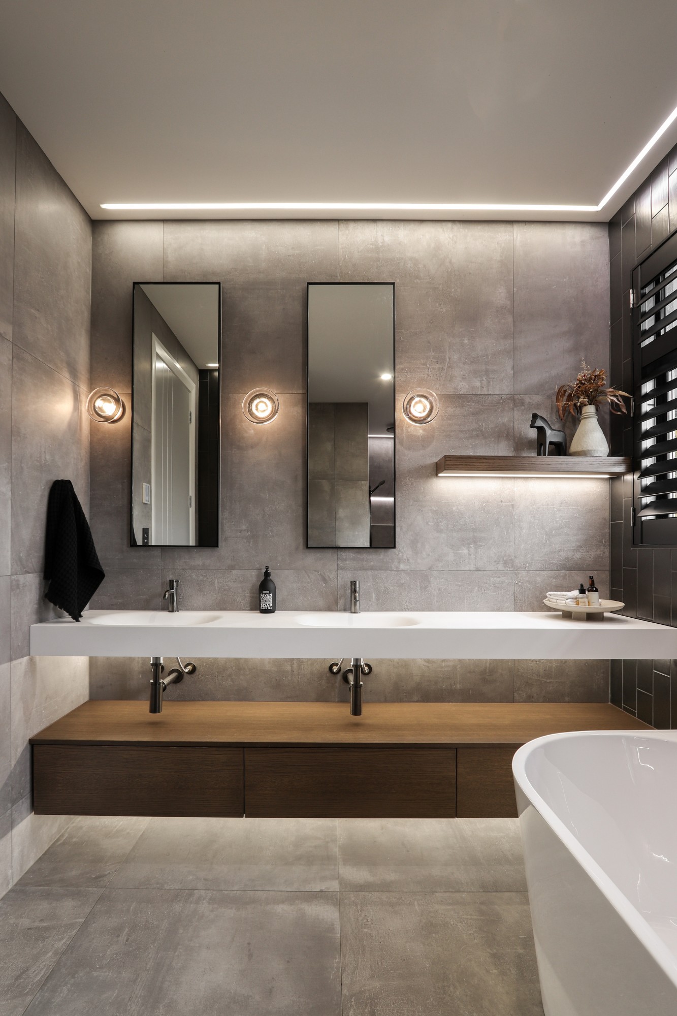
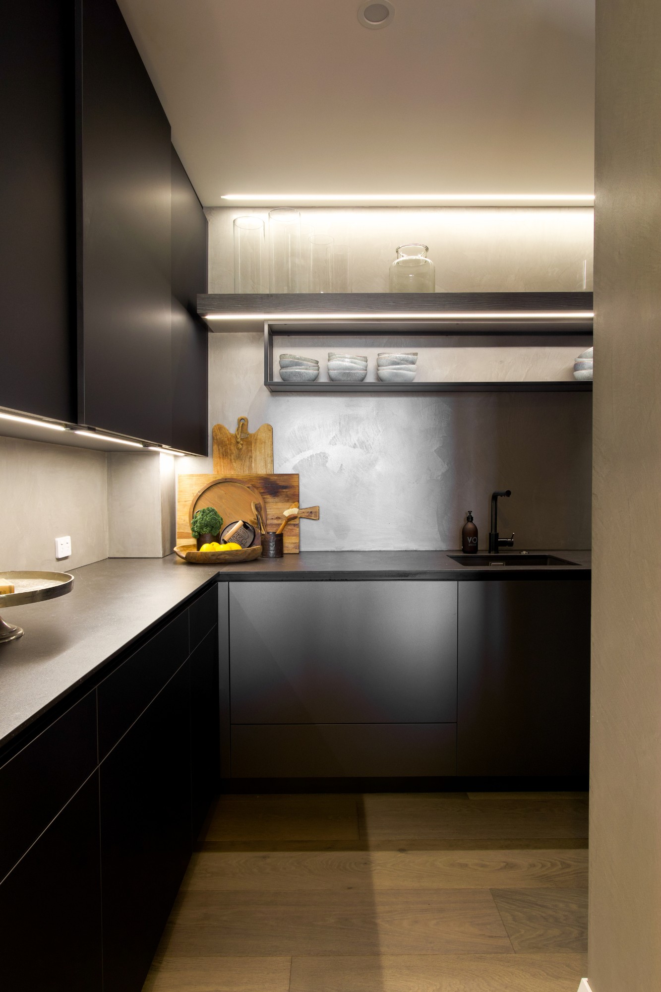
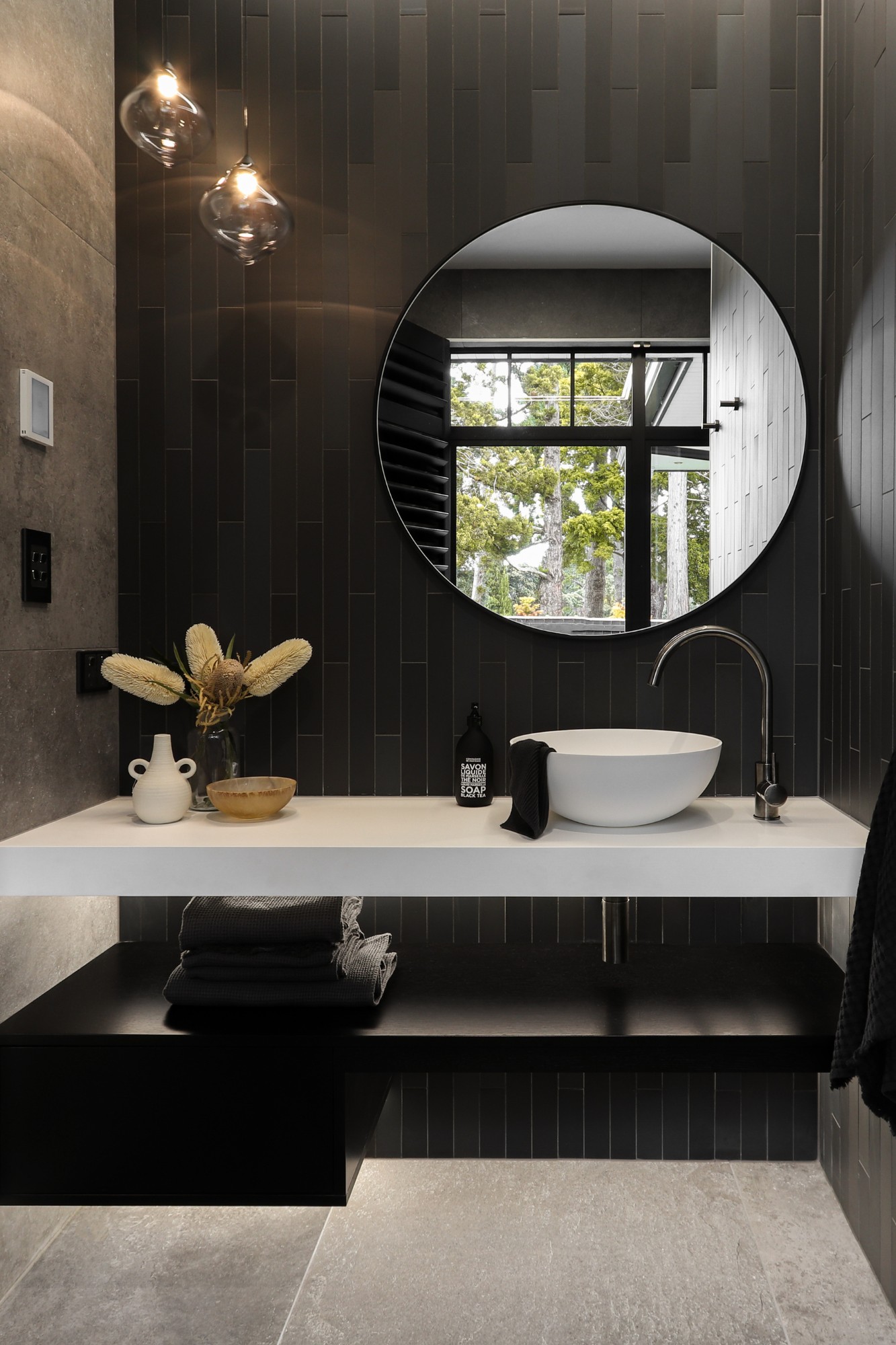
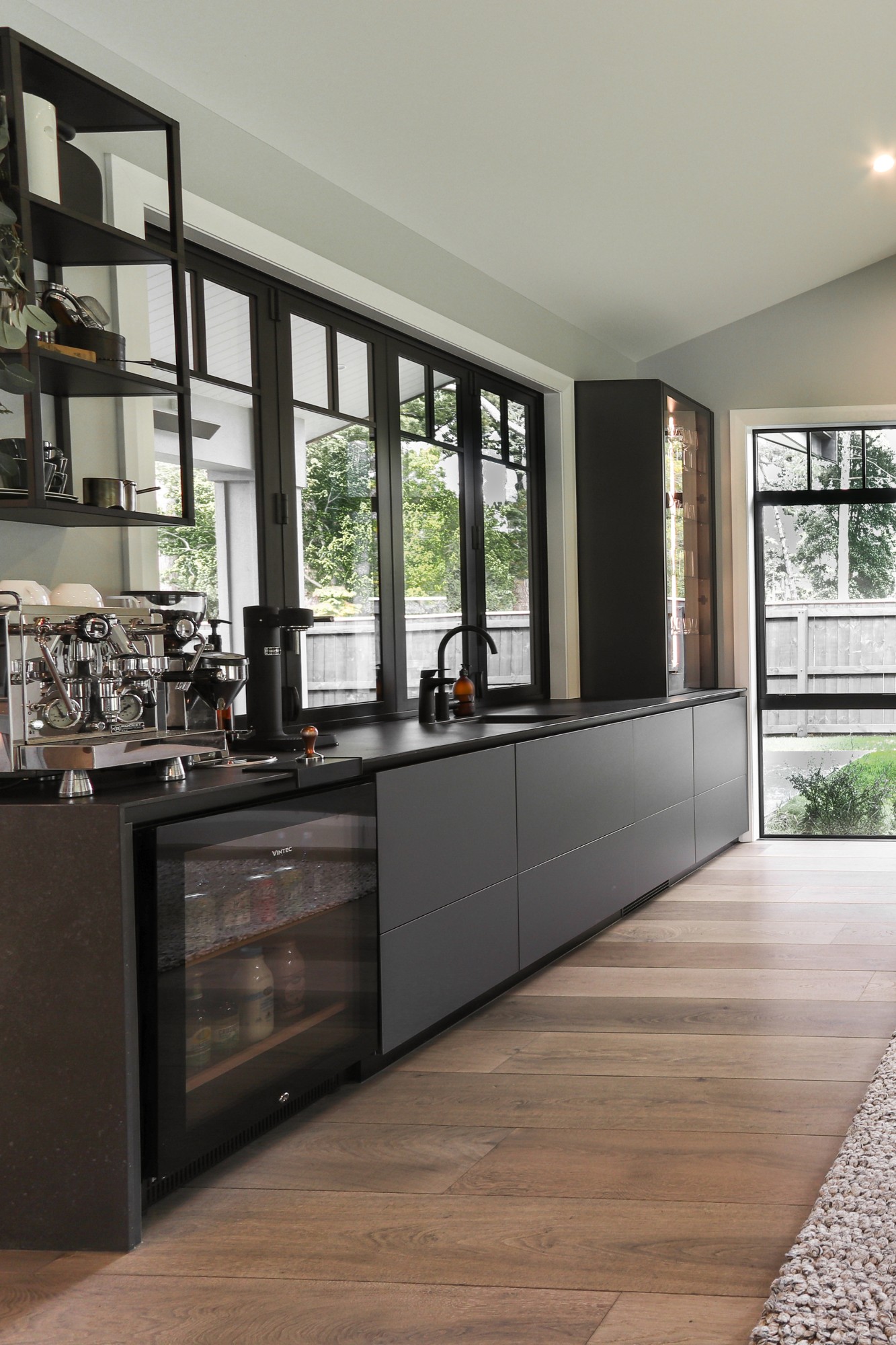
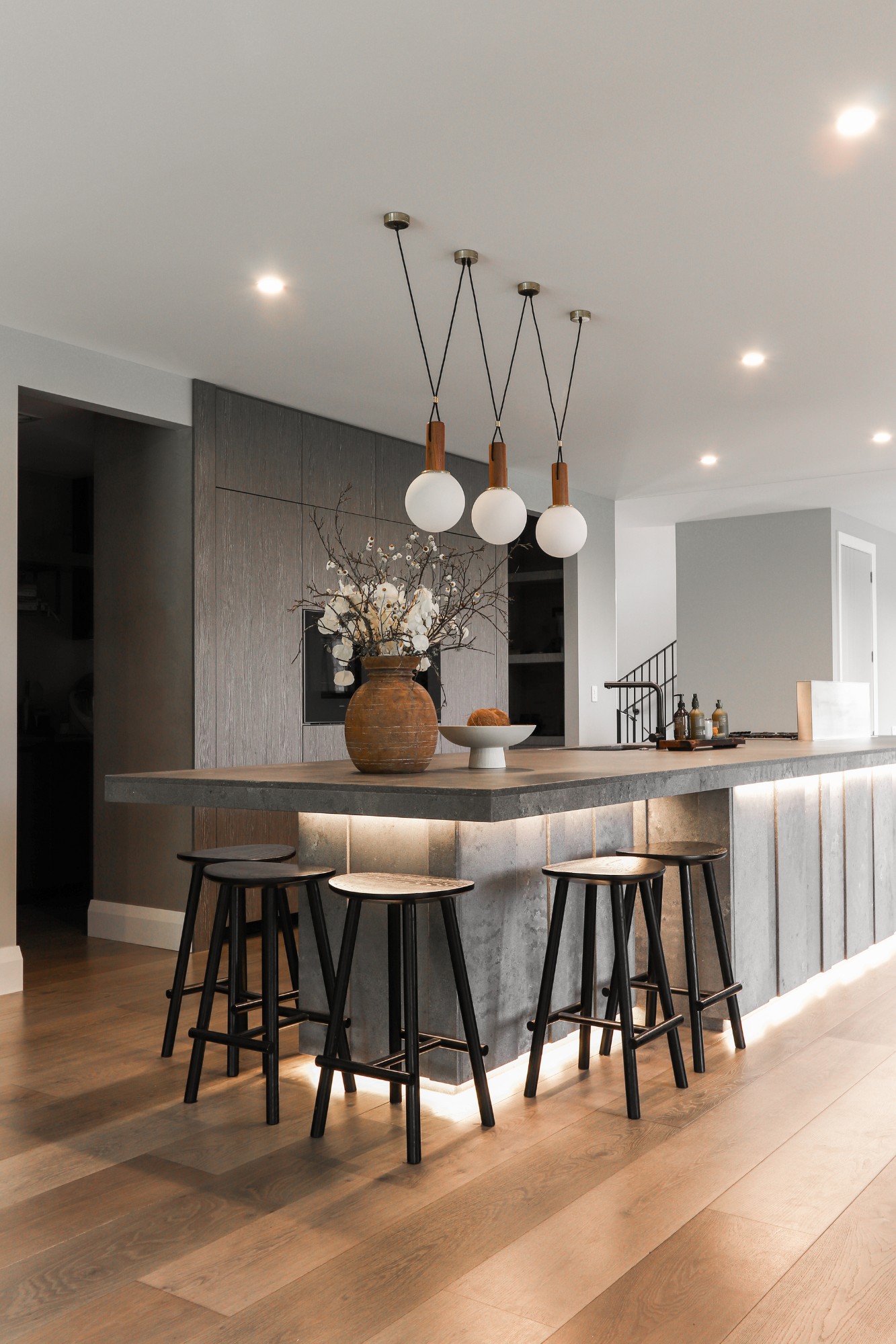
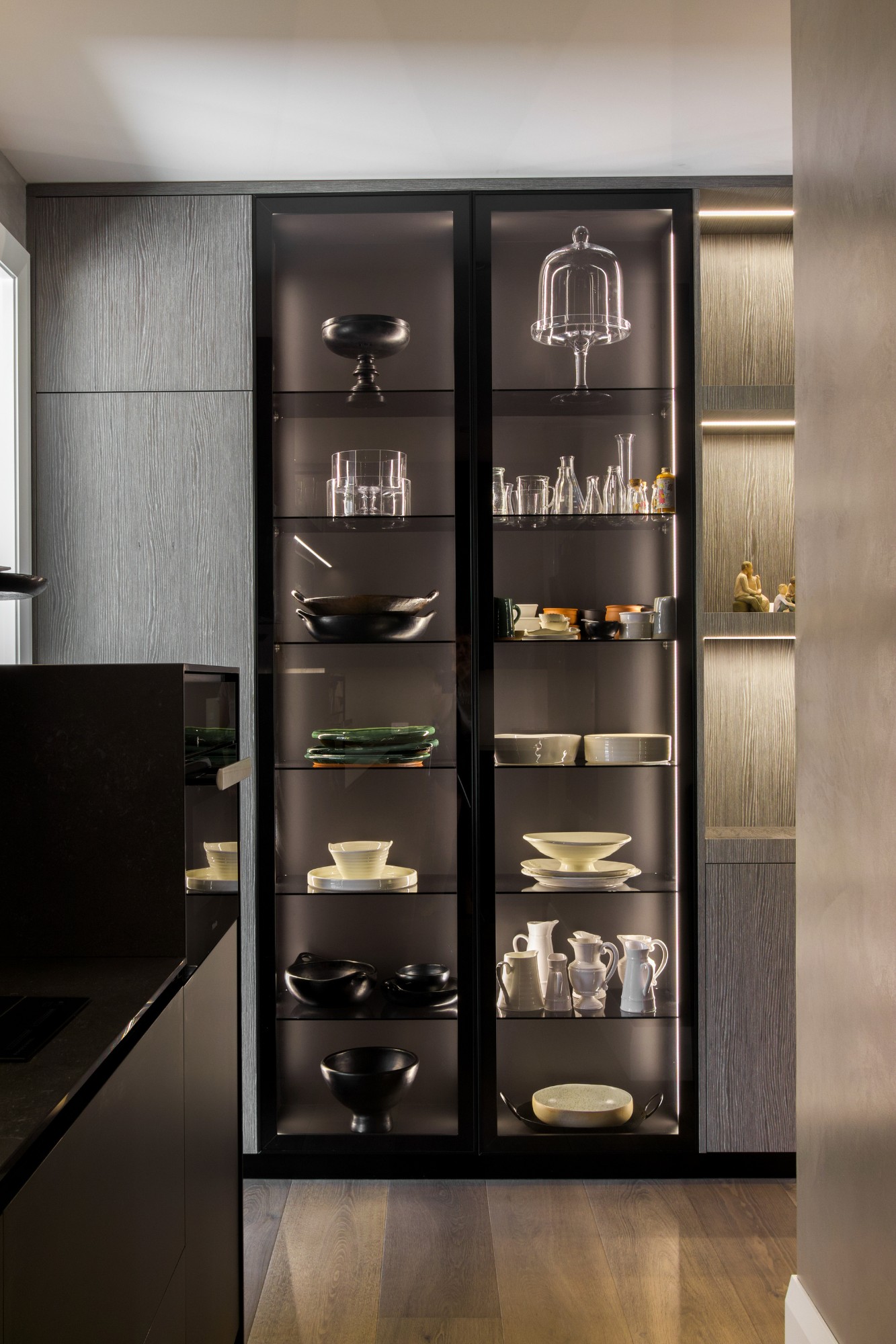
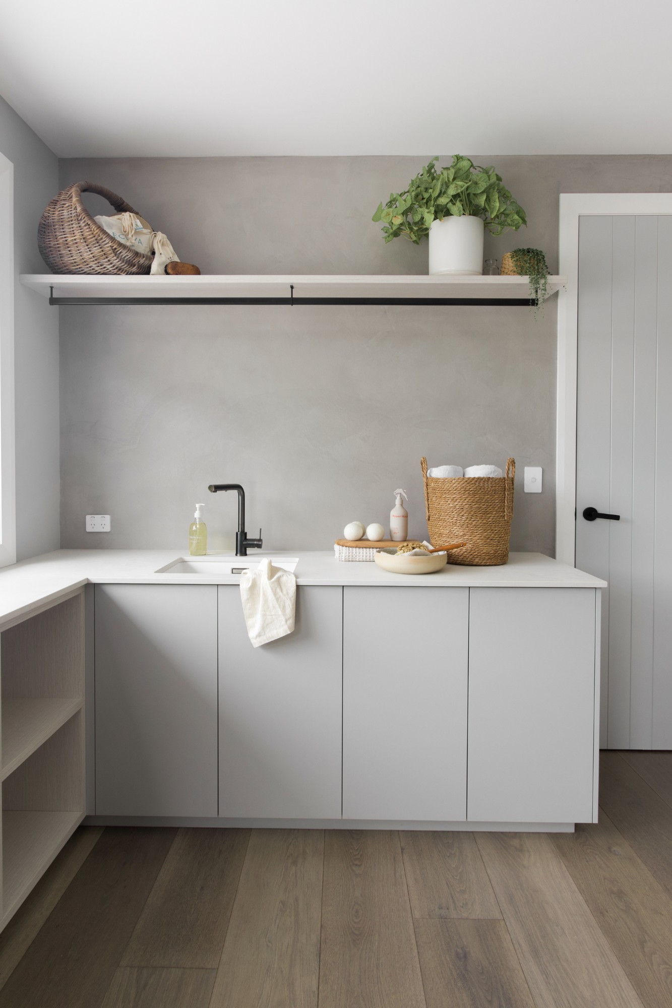
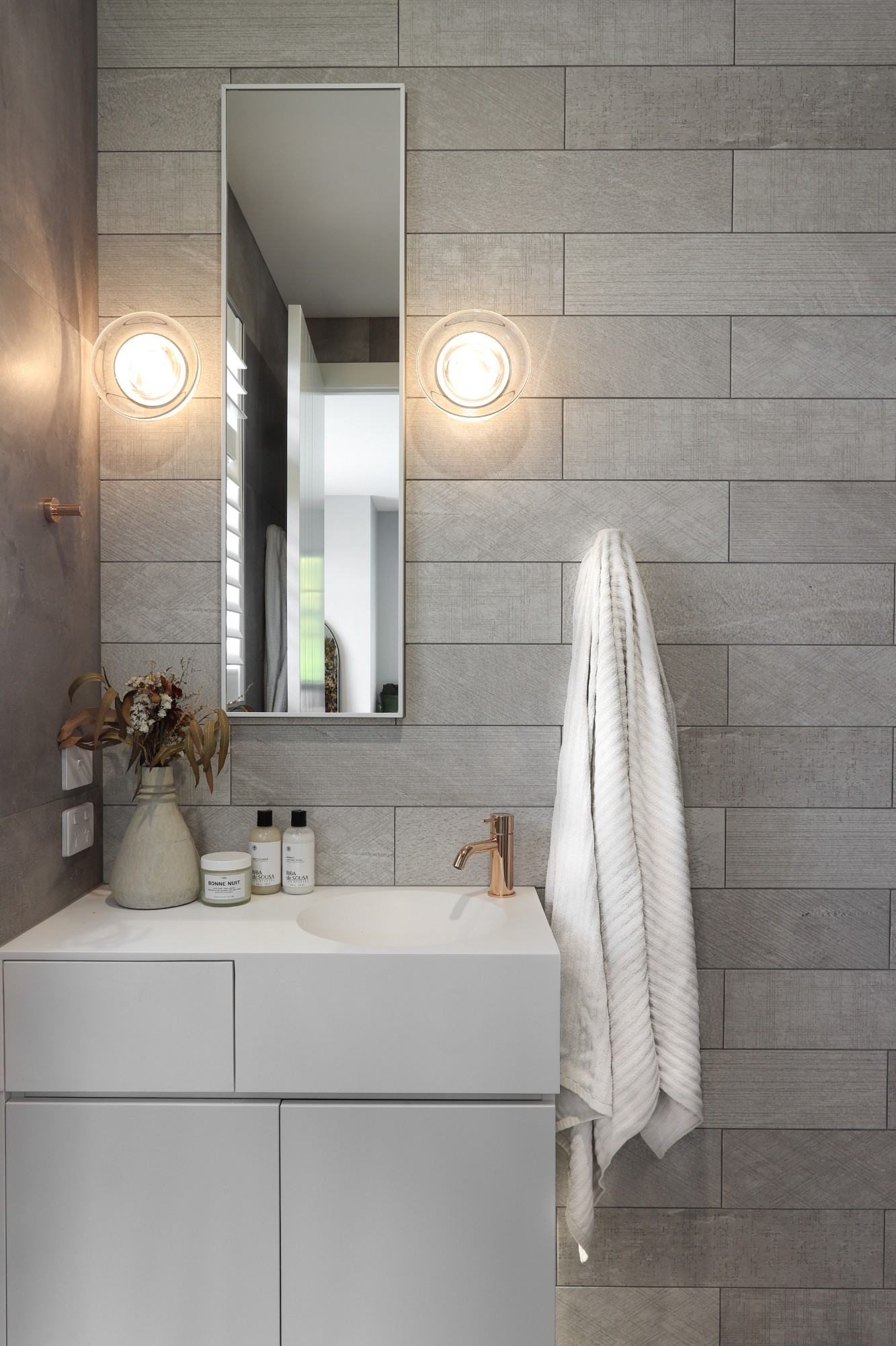
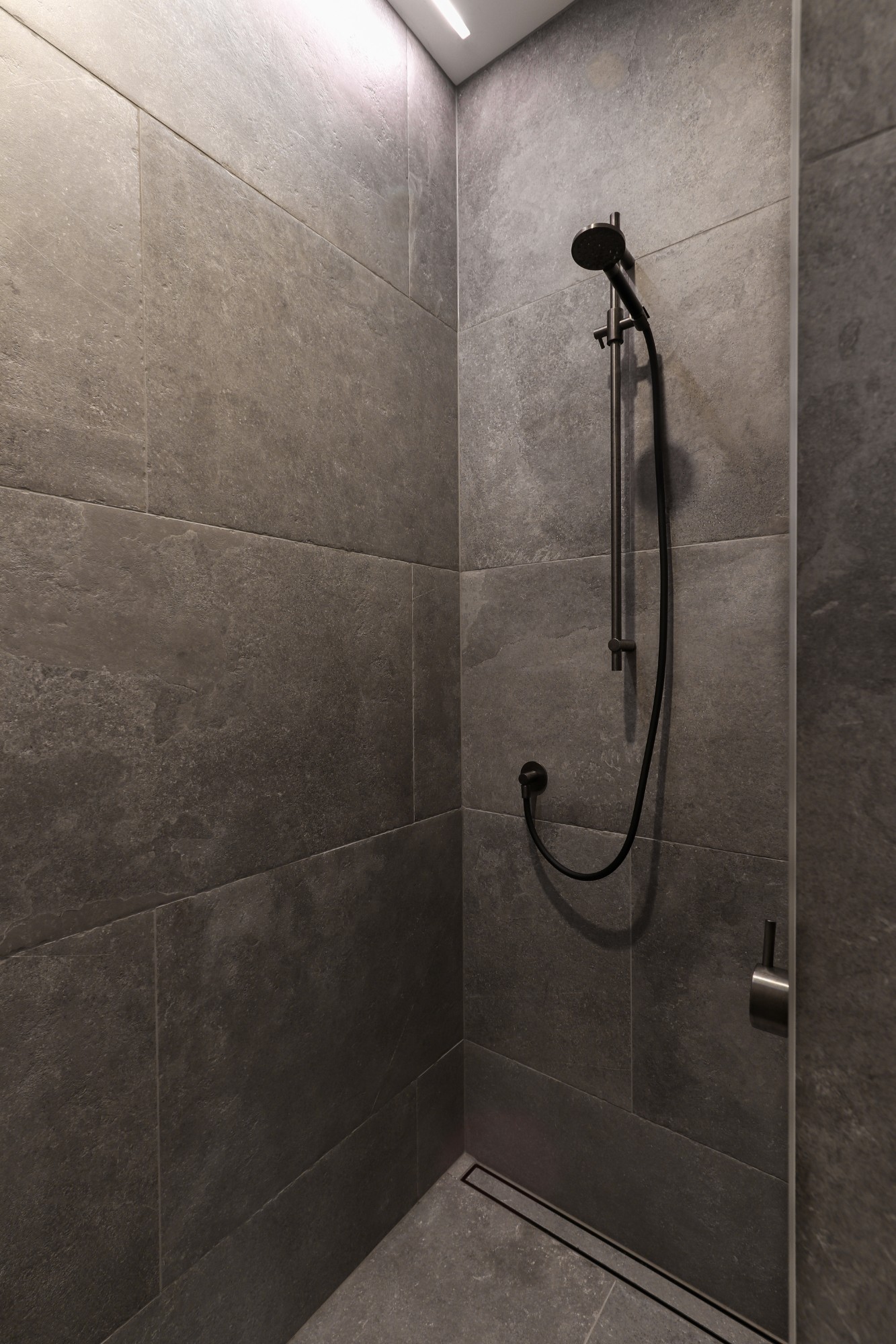
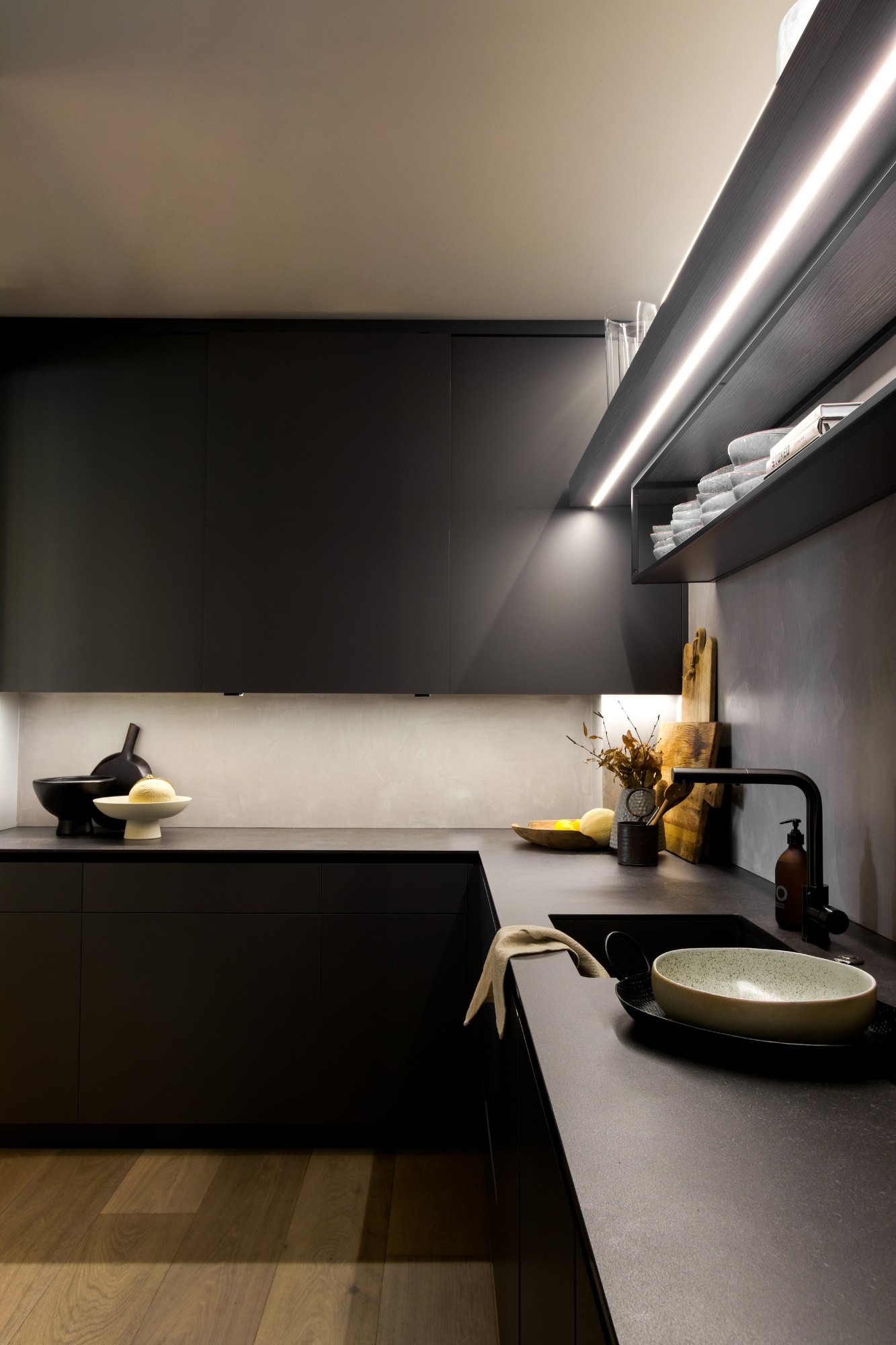
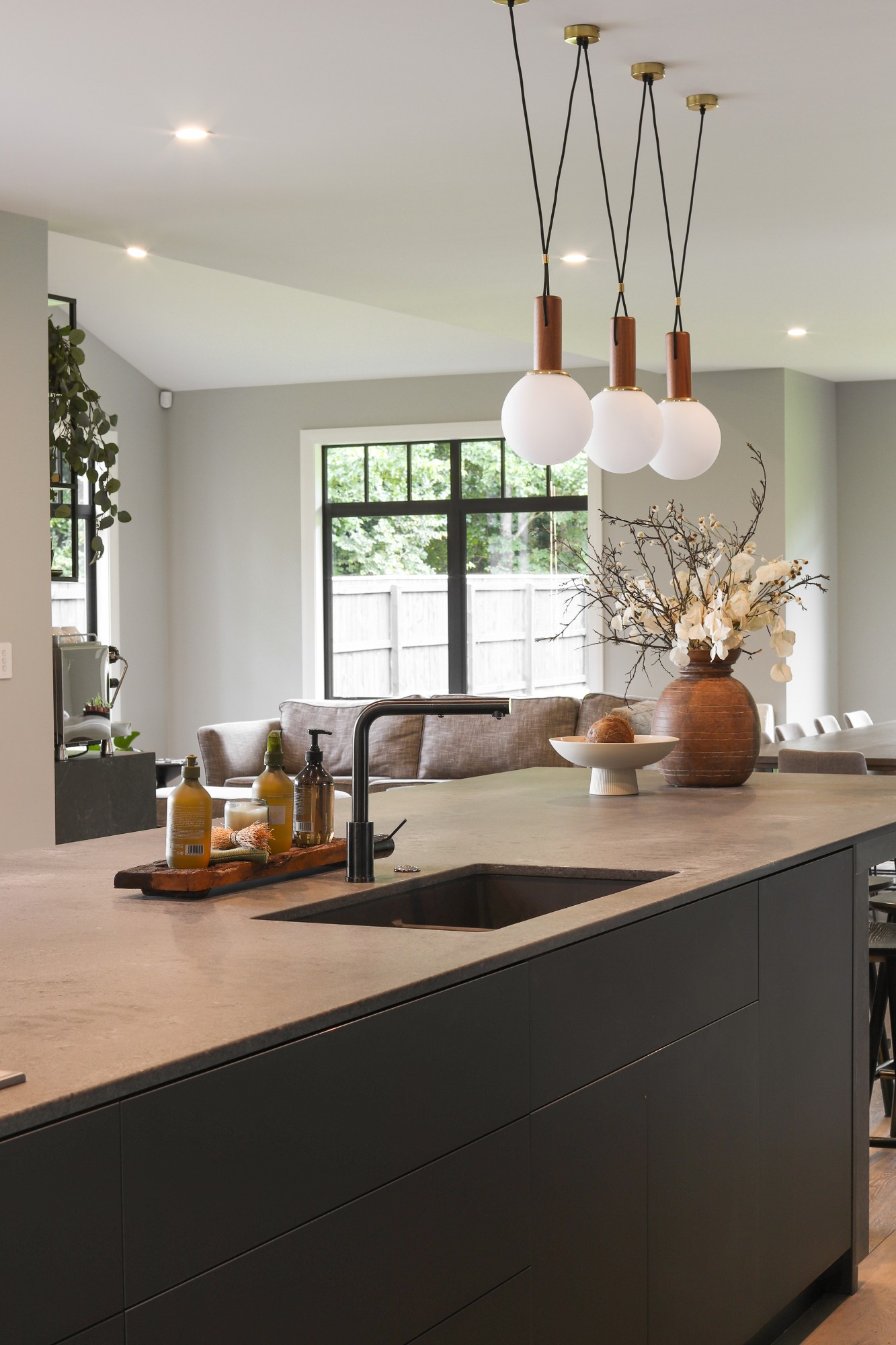
New Zealand based designer Natalie Du Bois of Du Bois Design was commissioned by her clients to conceptualise and detail the interiors of a 562-square-metre new build – a six-hour drive away. The Whanganui project involved the creation of a kitchen and generous scullery for frequent entertaining, alongside a bar that connected to the living area as well as a laundry and five individual bathrooms in keeping with the modern-industrial theme.
SBID Awards Category: KBB Design
Practice: Du Bois Design
Project: Whanganui Kitchen and Bathrooms
Location: Whanganui, New Zealand
What was the client's brief?
I was retained as the interior specialist for the construction of a new home in Whanganui, Aotearoa, overseeing the spatial interior and design of various spaces, including the kitchen, scullery kitchen, bar, laundry room, and bathrooms.
My clients, a family of five, desired a meticulously planned kitchen that would cater to their needs. They also wanted a sizable scullery that could function as a secondary kitchen for entertaining purposes and provide their teenage daughter with a dedicated area for her baking endeavours. It was crucial that the scullery could comfortably accommodate multiple users at any given time.
This family with three teenage children, often entertained and desired a modern-industrial aesthetic to align with the contemporary architecture of their residence.
Considering the turnover of both visitors and overnight guests, it was essential to incorporate five bathrooms for convenience, as well as a spacious and well-planned laundry area that catered to the busy family lifestyle.
What inspired the design of the project?
When designing this interior, I was inspired by a Brutalist approach, emphasising voluminous proportions throughout the home. I merged rough-textured plastered walls with dramatic lighting, applying a neutral colour palette consisting of black, white, and grey. Ultimately, my design choices were driven by my clients' specific needs, lifestyles, and personalities.
What was the toughest hurdle your team overcame during the project?
Overall, the project progressed relatively smoothly, and I thoroughly enjoyed working with the clients. The trades faced some challenges in adhering to unconventional design details, such as the panelling around the island. However, they persevered, ensuring that the project remained true to its specifications, albeit a costly and meticulous process.
What was your team’s highlight of the project?
Currently, I work independently without a team. The most gratifying aspect of my work is witnessing my clients' genuine satisfaction with the final outcome and knowing that I played a role in creating it. Additionally, seeing the project come to fruition after months of hard work is an incredibly rewarding experience.
Why did you enter the SBID Awards?
In 2000, as a young designer working in London, I won my first interior design competition. After residing in London for five years, I immigrated to New Zealand, and winning this prestigious award has greatly enhanced my professional reputation in the country over the past 23 years.
SBID stands out to New Zealanders as a highly competitive and challenging awards platform. Competing against designers from other countries amplifies the rewards of participating.
I decided to enter the Whanganui project into the SBID awards after winning the supreme kitchen design accolade at the National Kitchens and Bathroom Association Excellence in Design awards for 2022 in New Zealand. I wanted to aim higher and see if this project could receive international recognition through such a reputable awards platform. I took on the challenge and submitted not only the kitchen but also the five bathrooms, bar area, and scullery, hoping to showcase the complexity, scale, and individual design flair present in each room while demonstrating their interconnectedness.
What has being an Award Finalist meant to you and your business?
Last year, my SBID project was a finalist, and I hope to achieve even greater success this year. New Zealand may be a small country, but the competition within the industry is fierce, constantly pushing us to improve. Participating in SBID reflects that drive for self-improvement.
Being selected as a finalist provides an excellent opportunity to promote my unique and distinctive work, setting me apart from my peers. Clients can feel more confident and trust that I can offer them an exceptionally high standard of design. It also fosters greater respect within the interior design community and among my colleagues. Personally, it is incredibly humbling to know that my design work has caught the attention of esteemed international judges. The international opportunities and exposure that accompany being a finalist have tremendous benefits.

Questions answered by Natalie Du Bois, Founder of Du Bois Design.
The luminous dome-shaped window, reminiscent of a crystal, which opens up endless possibilities for natural light to flow, plays a pivotal role in transforming the attic space HG-31 in the heart of Oslo into a true architectural gem. This unique renovation project is the result of the joint efforts of the development company Predio and the Ukrainian architectural firm IK-architects.
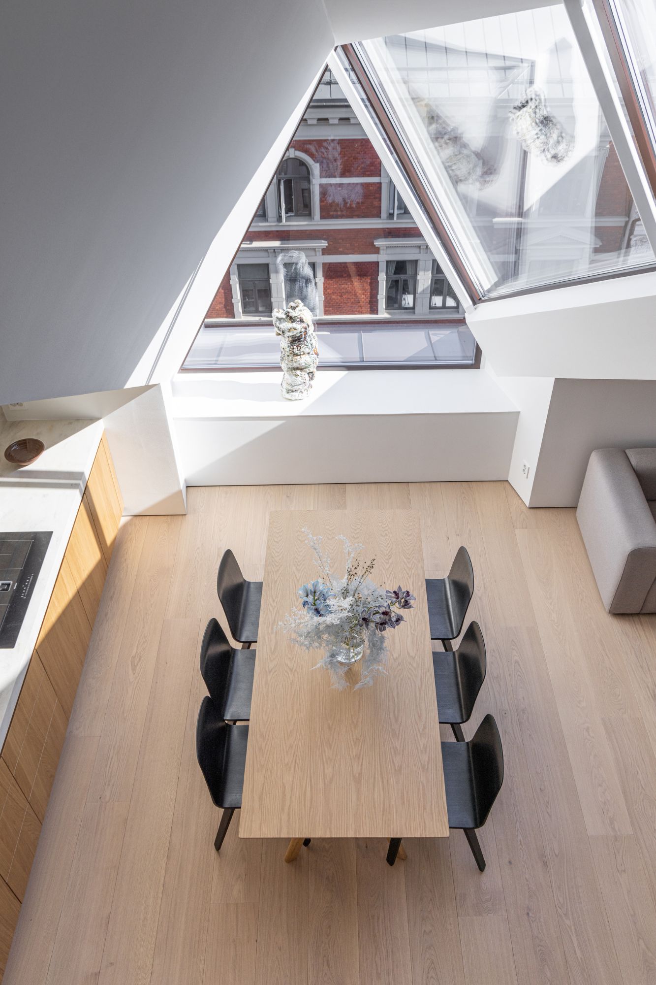
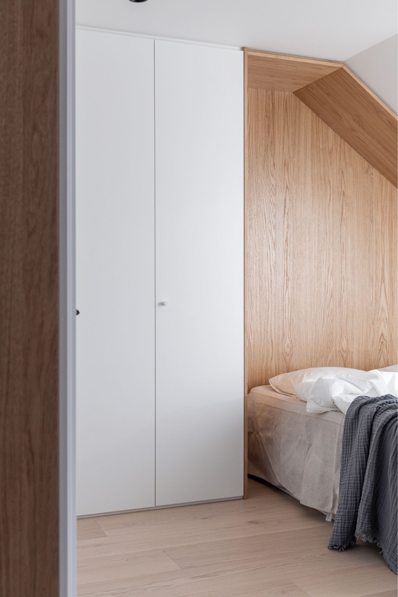
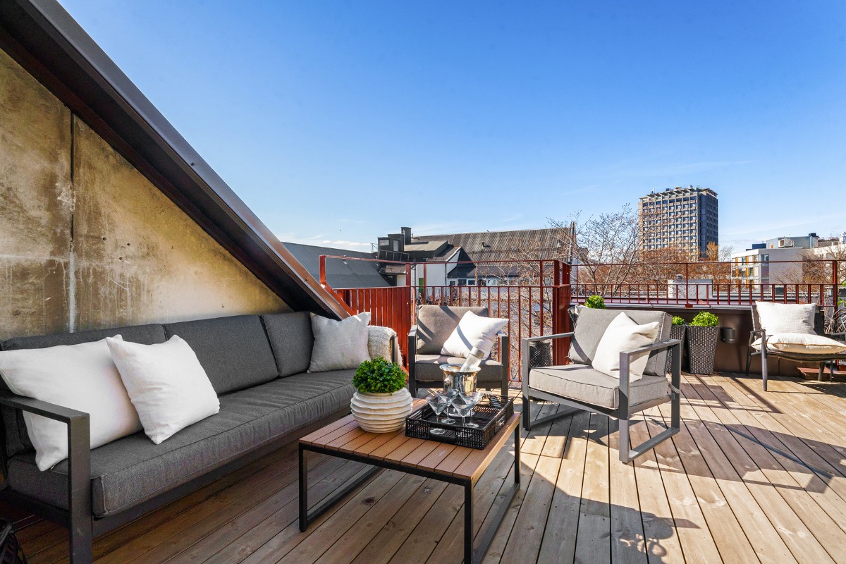
One of the main goals of the project team was to create a functional and cosy space that would allow residents to infuse their personal elements into the interior. Through carefully thought-out planning, the lower level of the apartment is divided into two main zones: the public zone (with a foyer and a kitchen-living area) and the private zone (with two bedrooms and a bathroom). In the central part of the upper level, there is a mezzanine - a relaxation area and an open terrace, perfect for barbecues and relaxation with incredible views of the city and the fjord.
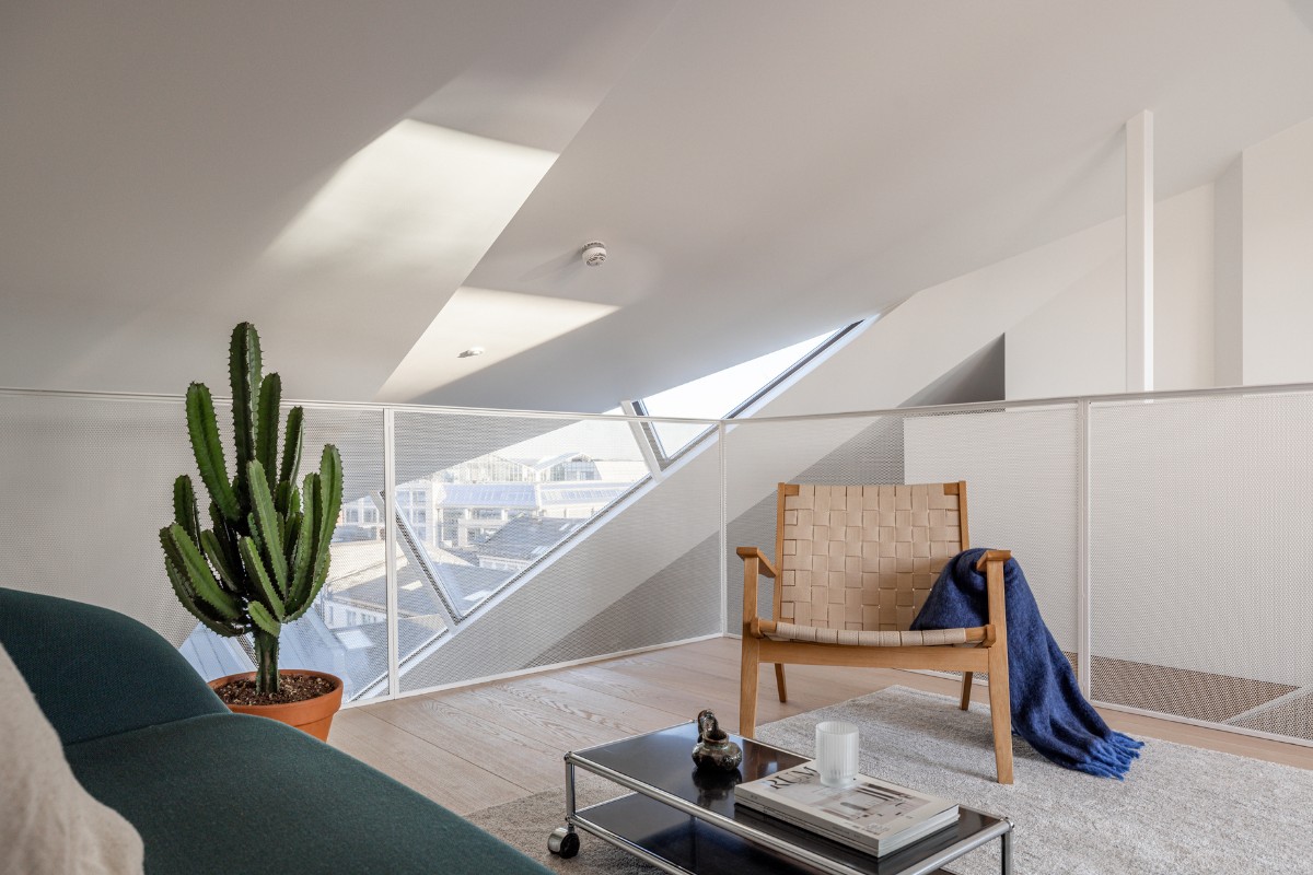
However, the main highlight of the apartment is the polygonal window, which became a key architectural element. Its crystal-like form not only adds uniqueness and sophistication to the space but also allows abundant natural light to enter, giving the living space a distinctive character. Moreover, this window opens up breathtaking views of the historic part of the city and the modern residential quarter.
In the HG-31 project, a strong emphasis was placed on using natural materials such as parquet flooring and wooden decorative elements. These details add warmth and a natural feel to the apartment, as well as unify all the rooms into a single, organic space.
This project serves as a shining example of collaboration between two outstanding teams - Predio and IK-architects - who have combined their knowledge and creative talents to create a modern, stylish, and functional living space in the historic heart of Oslo. This realisation is not only a testament to high quality but also an embodiment of the aspiration to improve the quality of life in cities through sustainable development and the enhancement of design and functionality in real estate.
Development company Predio focuses on loft conversions in Oslo. The capital's best locations are selected for new developments, and luxury apartments, penthouses and townhouses that are outstanding property investments are built with design, specification and purpose in mind.
Predio aims to improve the quality of life in cities through sustainable development, through deep knowledge and experience in residential and commercial real estate development.
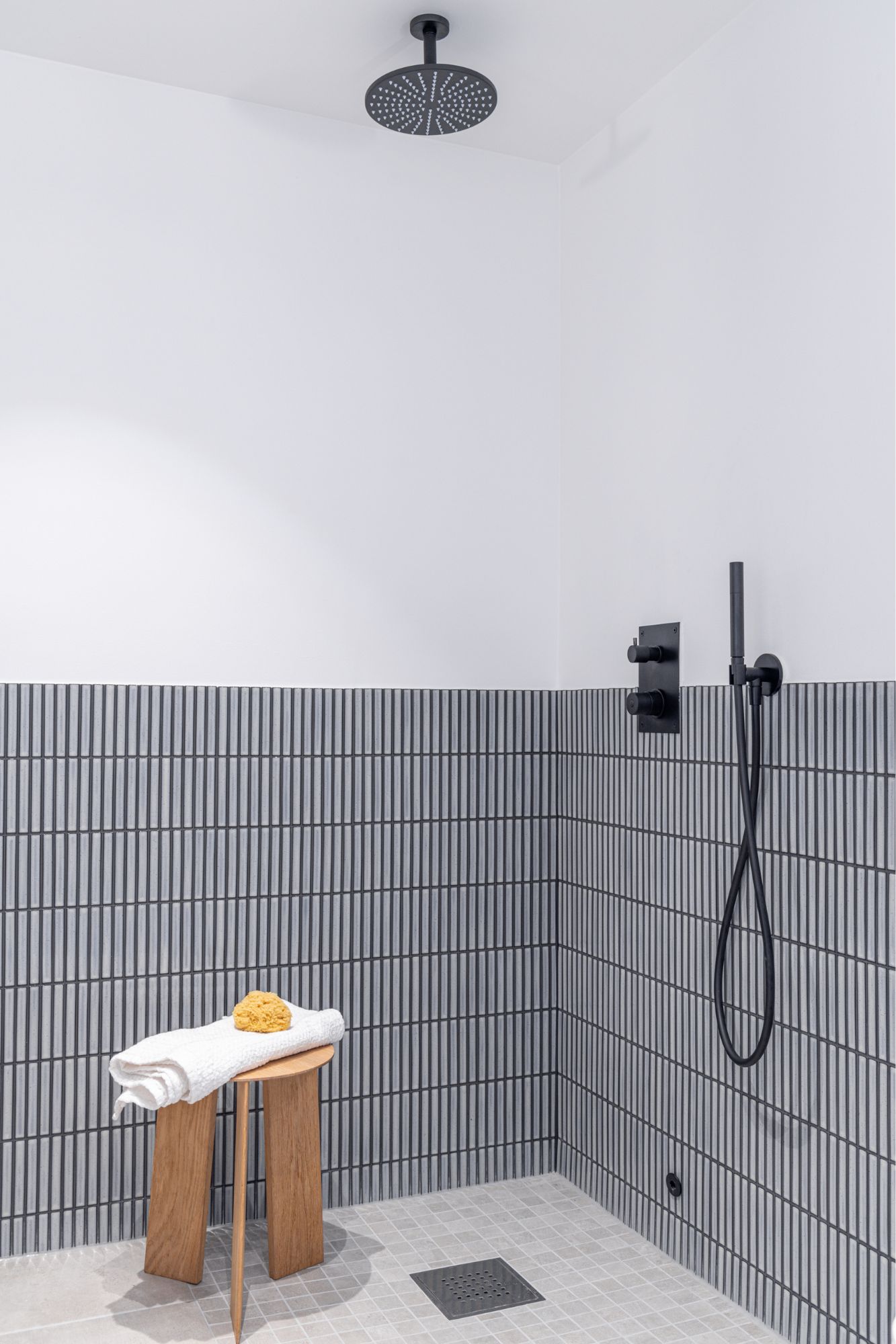
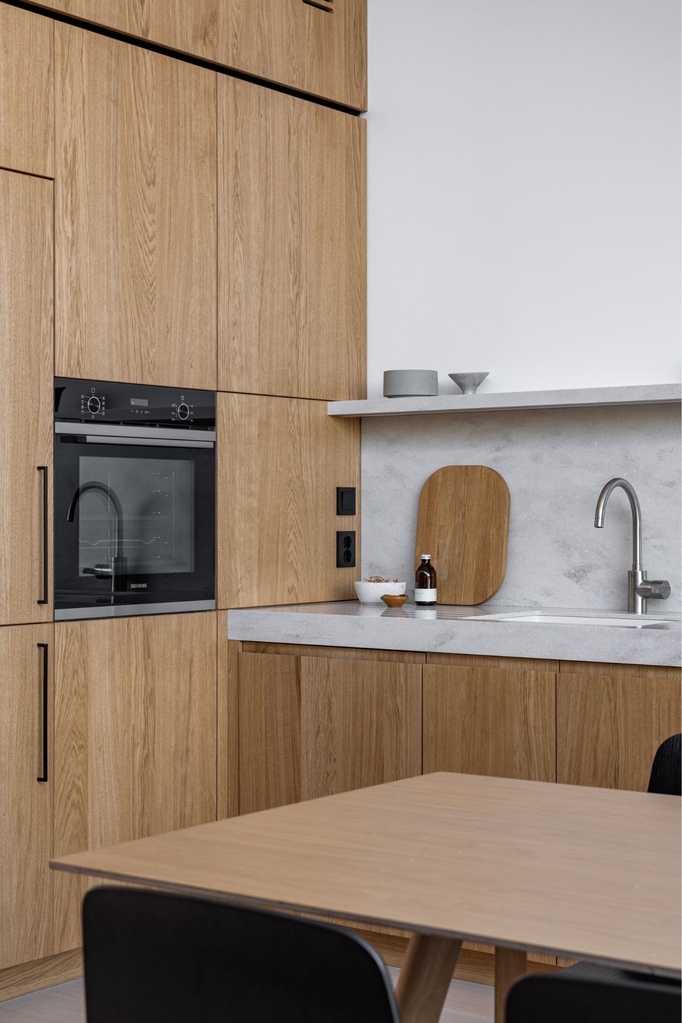
The Ukrainian architectural bureau IK-architects has been developing design projects for more than 10 years. Key stylistic trends: Scandinavian design, minimalism, eclectic combination of current styles and trends. IK-architects has been cooperating with Predio for several years. The HG-31 project was created in collaboration between leading Predio architects and IK-architects designers.
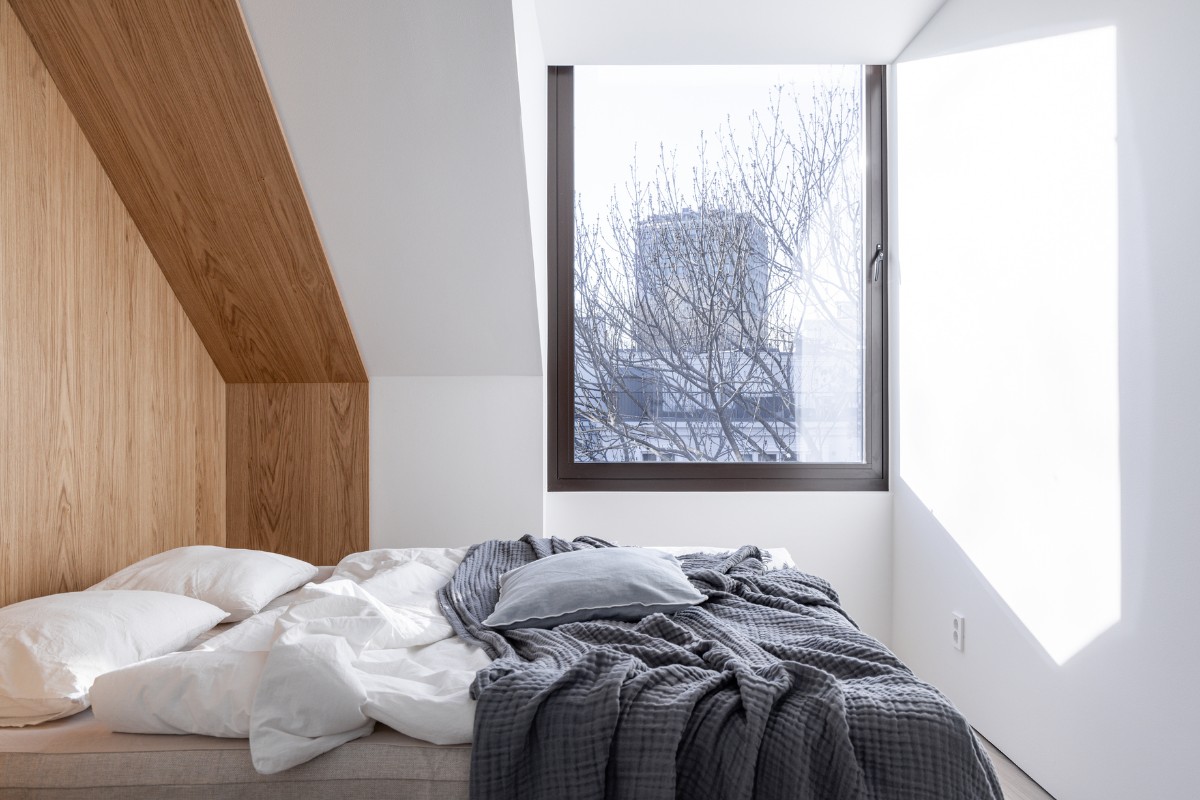
Developer company Predio
Svein Stokke, Andrii Soloviov, Andriy Ponomarenko
Interior design by IK-architects
Kateryna Yarova, Khrystyna Stavytska
Furniture manufacturing Lachma
Construction physics - COWI
Year: 2022
Location Oslo, Norway
Area: 87 m2.
The year of construction is 1988
About IK-architects
Good design is not visible, good architecture is imperceptible – it's just a comfortable state and space for the user; but this is a colossal effort and knowledge for the designer.
If you’d like to feature your news or stories on SBID.org, get in touch to find out more.
If you’d like to become SBID Accredited, click here for more information.
This week’s instalment of the Project of the Week series features a tropical and elegant beach house design by 2023 SBID Awards Finalist, Studio IDC.
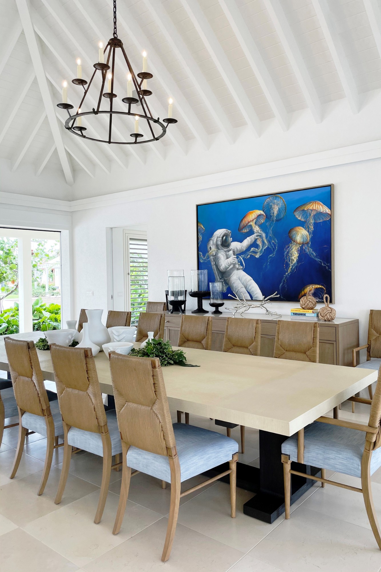
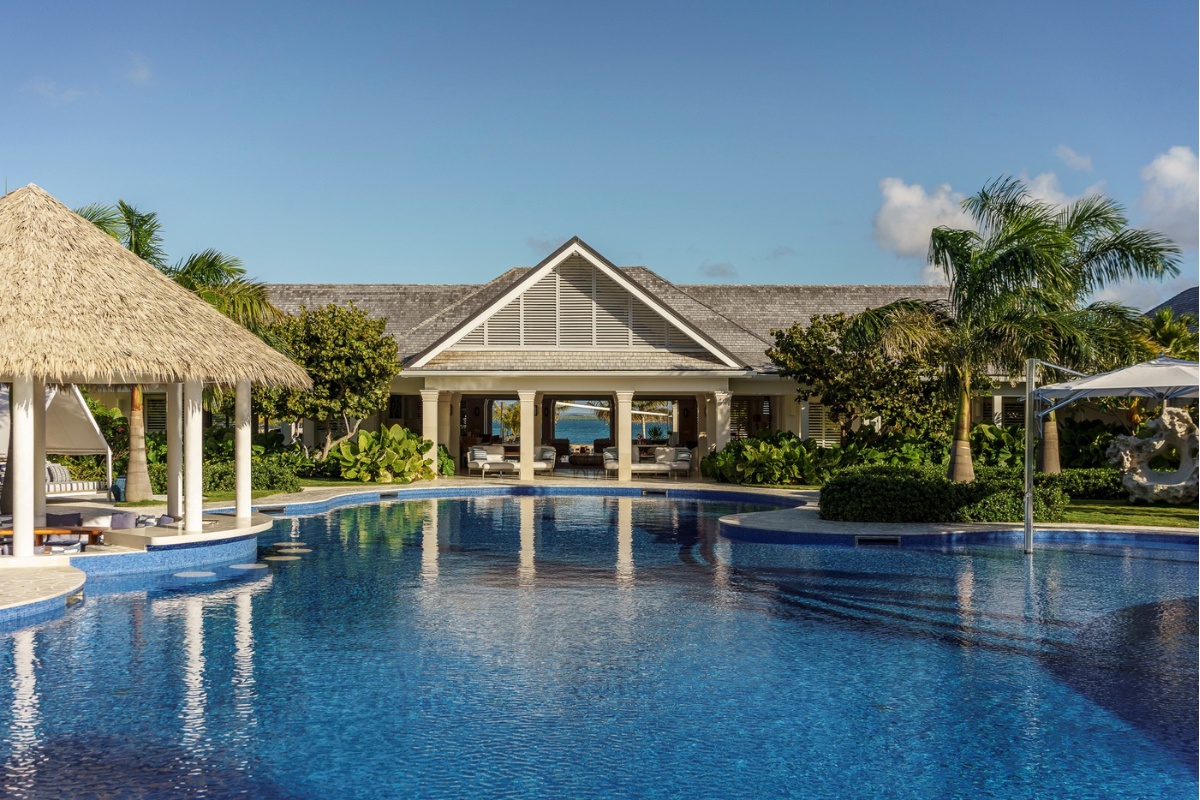
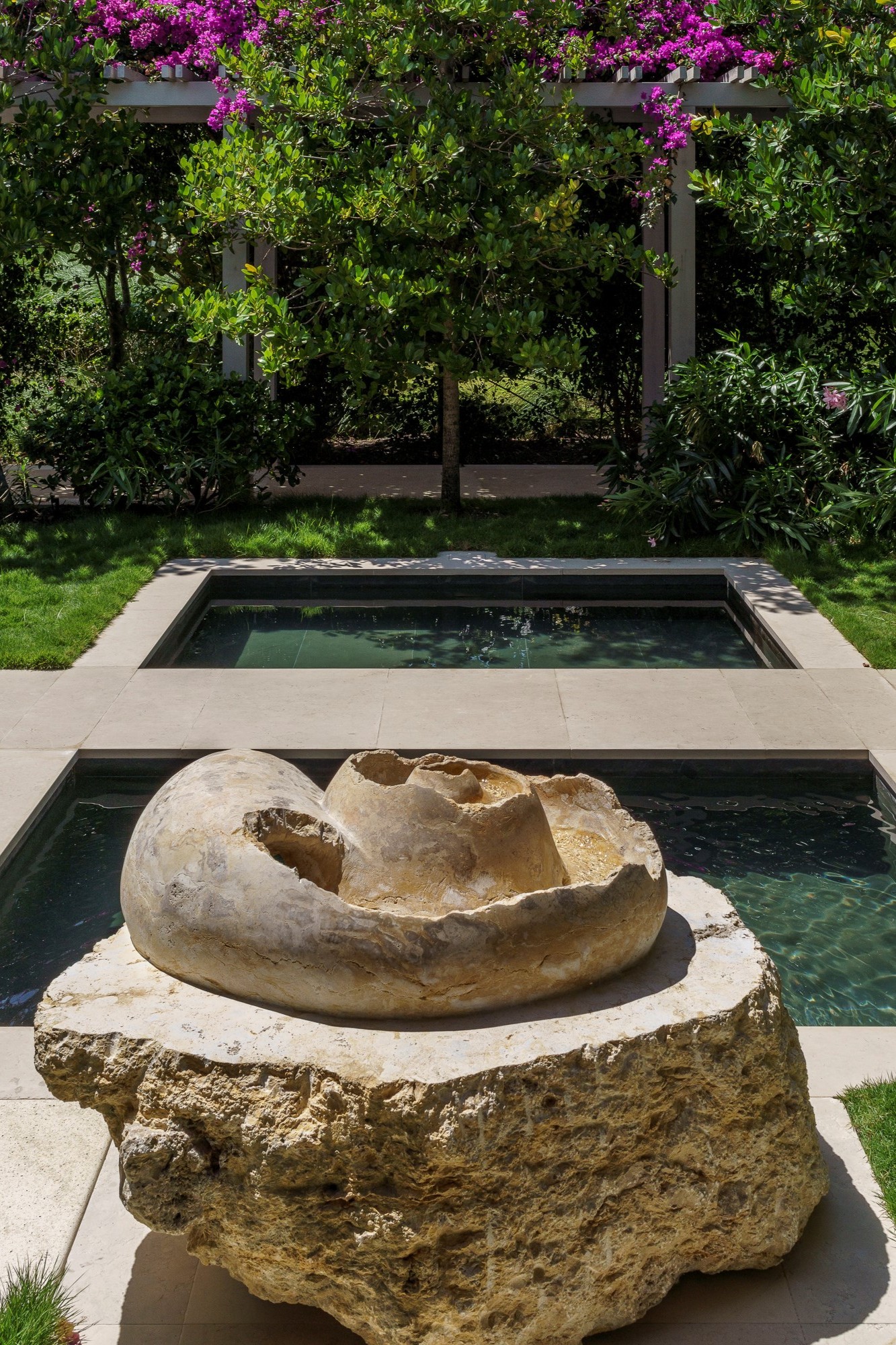
Studio IDC was commissioned by a private client to design the interiors and exteriors of Tŷ Compton Estate, an eight-bedroom, 23,000-square-foot luxury private residence/rental property on Jumby Bay Island, Antigua. Intentionally blurring the lines between the interior and exterior, the Studio IDC design team curated a neutral, textured, and layered backdrop accented by a crisp colour palette to evoke the surrounding tropical landscape. The property captures the essence of its idyllic Caribbean location while incorporating every amenity imaginable.
SBID Awards Category: Residential House Over £1M
Practice: Studio IDC
Project: Tŷ Compton Estate, Jumby Bay Island
Location: Jumby Bay Island, Antigua
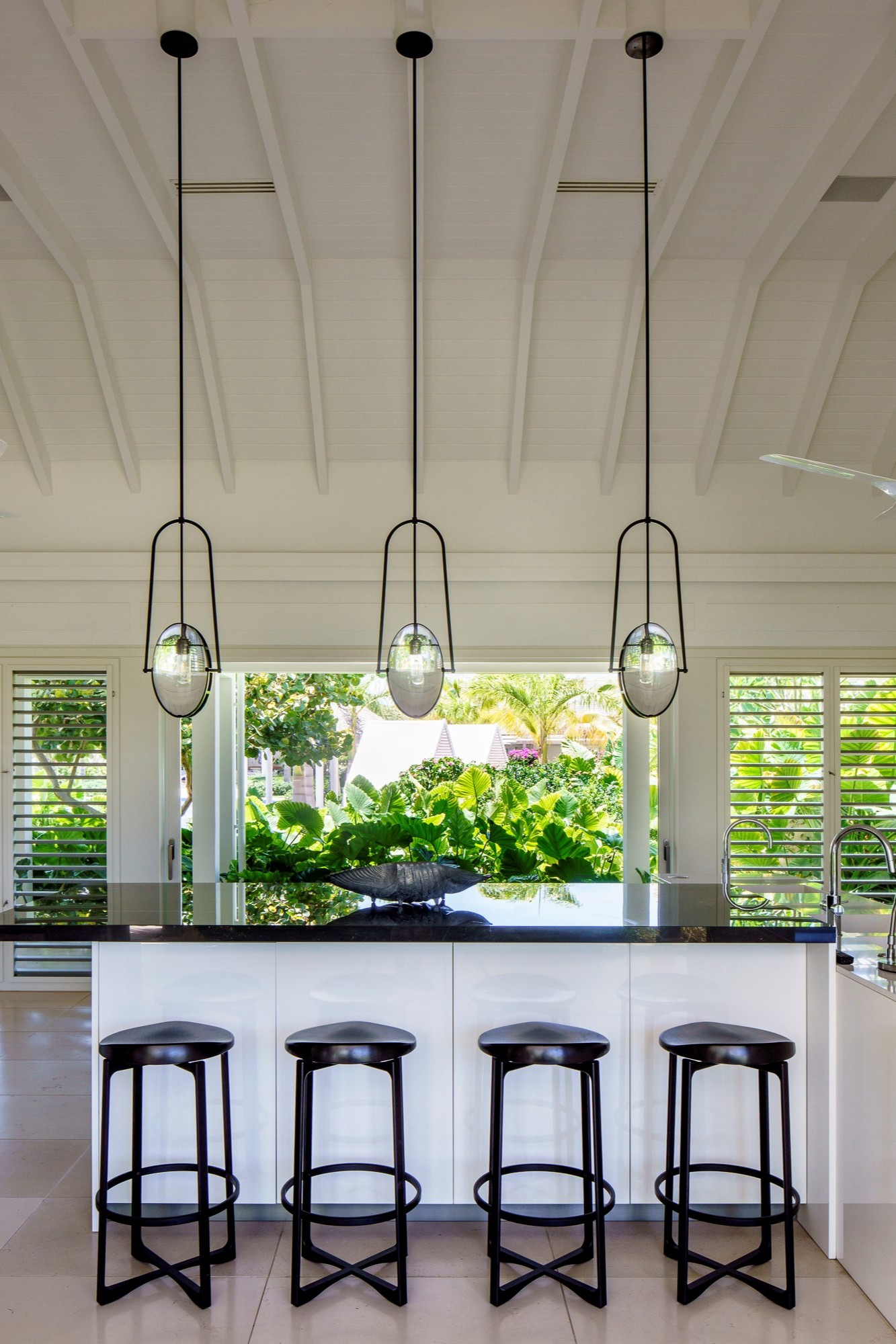
What was the client's brief?
Tŷ Compton is an eight-bedroom, 23,000-square-foot luxury private residence/rental property on Jumby Bay Island, Antigua. The clients wanted a family property that could also be utilised to generate rental income. They envisioned a private compound that could function like an all-inclusive resort and offer one-of-a-kind guest experiences. This included two equal primary bedroom suites in the main home, plus multiple sleeping arrangements within each of the three cottages.
The clients have excellent taste yet gave our design team a great deal of leverage on the design direction. There was a lot of collaboration with clients and other contractors on the project for its overall success. Strong opinions on colour did surface: They loved a mix of blue hues and wanted a unique, elegant, and sporty beach house that would be “a cut above.” Their vision also encompassed a love of sports and play, as well as a desire to create spaces that encouraged connection throughout the property. They also envisioned the design to be unique but true to the island’s natural beauty with an earnest, pristine commitment to sustainability.
The clients have a large family and valued entertaining, requested seating for 16 individuals or more, along with multiple gathering spaces. We accommodated this with a stunning custom-designed suar wood dining table for alfresco dining and a custom interior Liaigre dining table for 16 surrounded by beautiful dining chairs by Gregorius Pineo. Other lounge seating that can comfortably bring together large groups was also addressed throughout the property. Their feedback on fulfilling their requirements has been a glowing success.
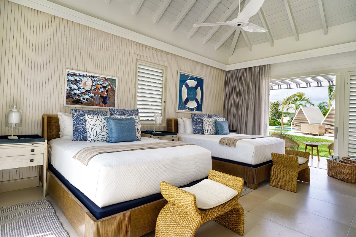
What inspired the design of the project?
The overarching concept was always there: innately taking into the geography, topography, and natural surroundings of Jumby Bay. However, the design direction evolved as we unfolded our clients’ needs, preferences, and openness to mixing elements that might not initially be considered together. The top-tier finish materials, lighting, furnishings, and artwork really come together for something quite special.
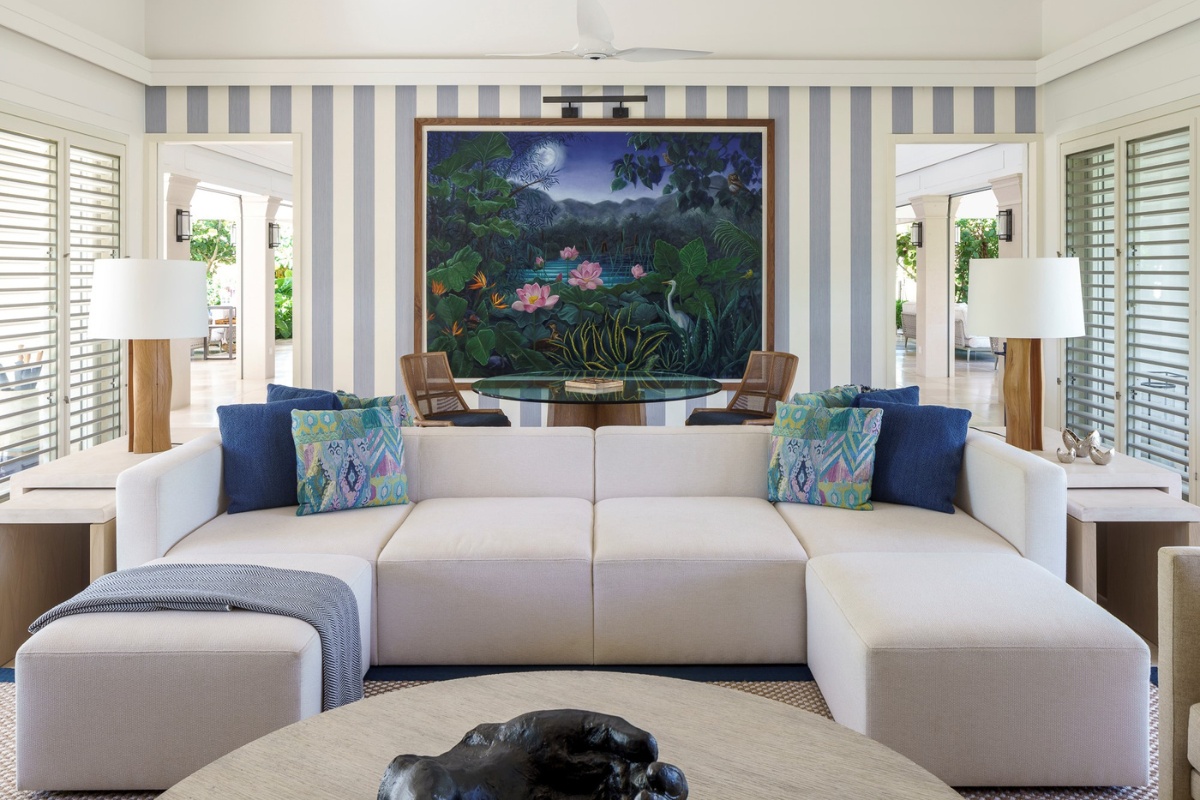
What was the toughest hurdle your team overcame during the project?
We worked through the construction and design process during the pandemic. This was an interesting adjustment with limited face-to-face client contact and a lot of stop-and-go on the project site. Shipping was also a significant hurdle during this time! However, our many years of experience in the Caribbean allowed us to handle obstacles and workroom closures professionally and smoothly, ultimately delivering an incomparable design that delighted the clients. Tŷ Compton was a joy to work on!
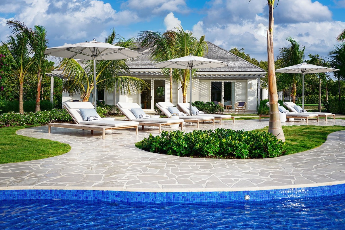
What was your team’s highlight of the project?
Stephanie Tyler, President of Studio IDC, and I were fortunate enough to greet and reveal the property to our clients after years of working remotely to bring this dream to life. Due to the pandemic, our clients did not get to visit the project site nearly as much as they would have given “normal” circumstances. That said, having that initial walk-through and seeing their faces was the most incredible feeling! It was the kind of moment a designer dreams of. So much overwhelm in the best of ways. Not something that we will ever forget.

Why did you enter the SBID Awards?
At Studio IDC, we are dedicated to design and pushing the boundaries of interior innovation. Participating in the SBID Awards aligns perfectly with our commitment to excellence and showcasing our creativity. The SBID Awards is a globally recognised platform that reflects our ethos of design excellence and meticulous execution. It’s not just about recognition but also about sharing our story of redefining luxury and creating living spaces that resonate with people. For us, entering the SBID Awards was a natural choice – an opportunity to let our design philosophy shine internationally, inspiring others and propelling the industry forward.
What has being an Award Finalist meant to you and your business?
Being chosen as a finalist in the SBID Awards is a great honour for Studio IDC. It is a special moment that recognises not only our design accomplishments but also our culture and relationships – it’s like a resounding endorsement of the trust our clients put in us. We’re absolutely over the moon celebrating this outstanding achievement.
Questions answered by Todd Tyler, Chief Creative Officer at Studio IDC.
This week’s instalment of the Project of the Week series features a home design with a members club atmosphere by 2023 SBID Awards Finalist, Sonia b design.
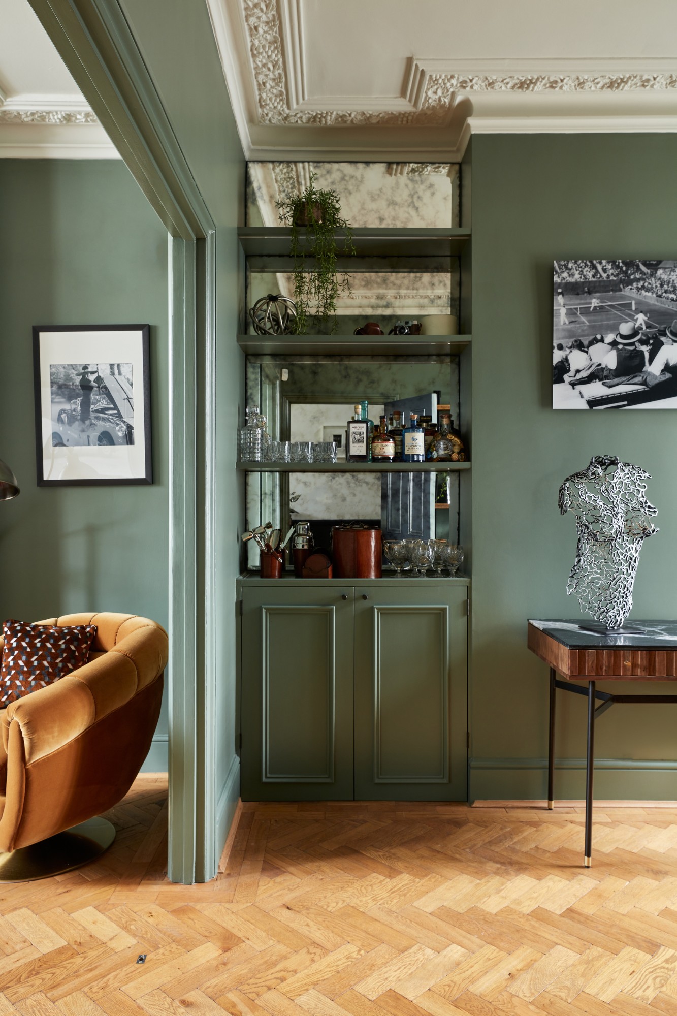
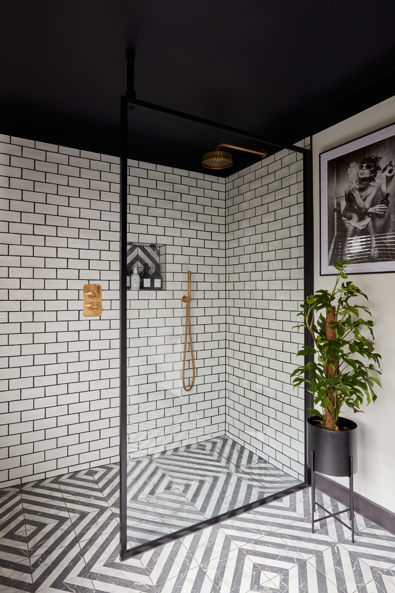
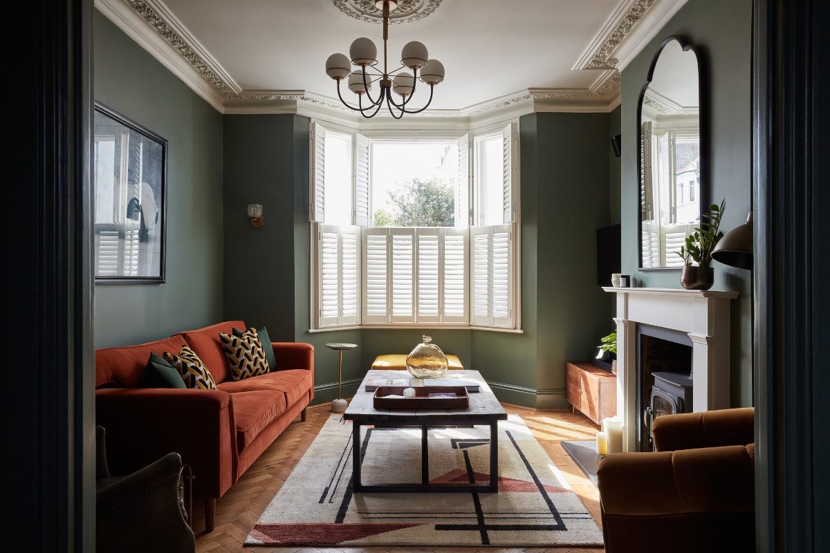
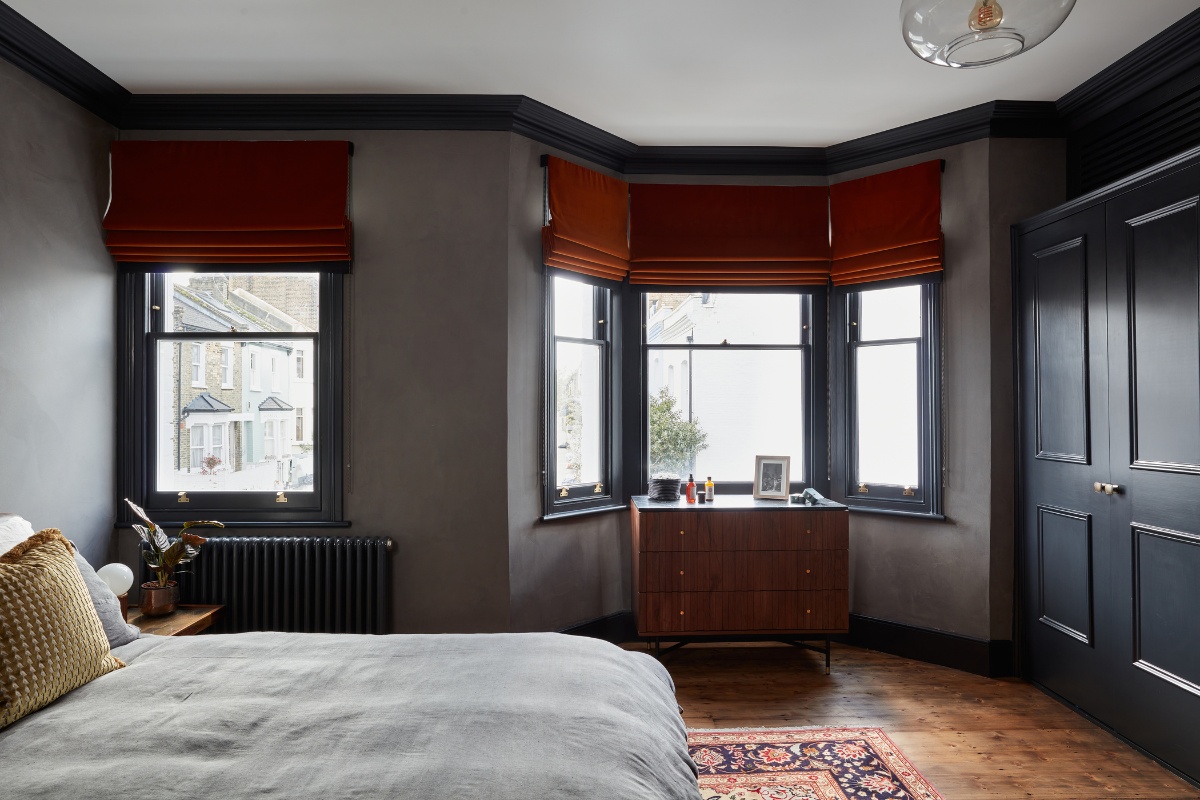
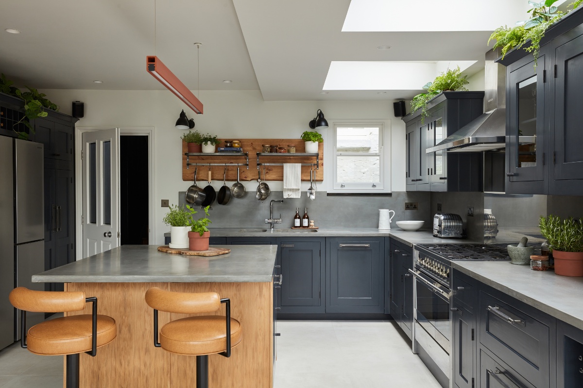
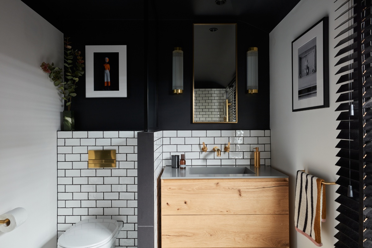
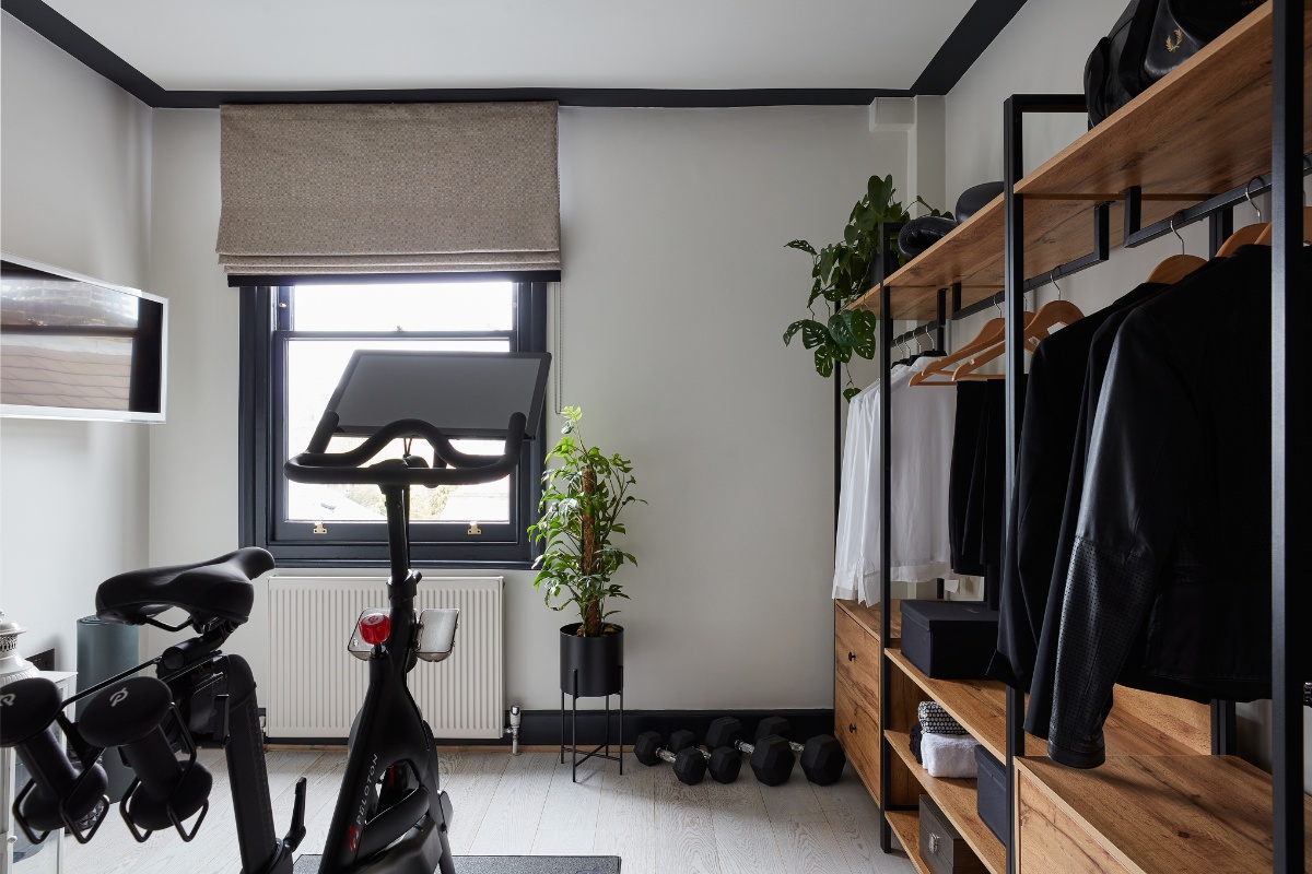
Sonia b design was commissioned to create a members club atmosphere while optimising the space for a young professional. The scope included space planning, internal restoration, bespoke joinery, and sourcing. Each room was designed with its own personality, featuring moody aesthetics in entertaining spaces, bathrooms and bedrooms, balanced by a light and sharp design in the kitchen and gym. Preservation, restoration, and repurposing played a significant role in this project, ensuring the conservation of period features while integrating modern textures and elements, and donating replaced elements during the renovation process.
SBID Awards Category: Residential House Under £1M
Practice: Sonia b design
Project: The Club House
Location: London, United Kingdom
What was the client's brief?
The home, previously a family house, was refurbished in preparation for the new owner, a young professional to move into the home. The brief was to create a members’ club atmosphere and therefore bringing hospitality design into a home while focusing on the comfort of a home which has been a truly exciting design journey. Beyond the aesthetics, the home was designed to accommodate for the client’s storage, entertainment and fitness needs where several entertainment spaces and a gym / dressing were created. The choice of materials and fabrics was also driven by the need to be suitable for regular visits from the owner’s niece and nephew.
What inspired the design of the project?
The client who is a member of a worldwide members’ club, thoroughly enjoys the ambiance it offers, and we aimed to echo its diverse atmospheres within the home, inspired by different club buildings as well as bars and restaurants that inspired us and feature the atmosphere we were looking to create. The bathroom design draws from the client's New York travel memories. The home's overall ambiance evokes a sophisticated British members' club feel. Meanwhile, the kitchen, boasting large bifold doors to the garden, embraces a Mediterranean design, incorporating abundant greenery to create a seamless indoor-outdoor connection.
What was the toughest hurdle your team overcame during the project?
“Surprises” that often come with period properties and were uncovered during demolition, which required substantial additional work and sourcing. Thankfully Building Control were extremely helpful which enabled us to progress promptly with the additional works required. Despite the challenges and the extra work required, the team completed the project on time.
What was your team’s highlight of the project?
We conducted routine site visits with the client, allowing him to observe the ongoing progress. On a particular occasion, even though the house was still a work-in-progress and not entirely finished, the client's genuine excitement shone through as he saw the vision gradually coming into reality. It was a truly rewarding and encouraging for the team. Another notable moment was during a subsequent meeting held in the house a few days after the handover, where the client had already entertained relatives and was beginning to feel truly settled. The house felt like a well lived-in home already and that was a real joy to see.
Why did you enter the SBID Awards?
As a distinguished accrediting body for interior designers in the United Kingdom, SBID serves as a benchmark, recognising the industry proficiency in its awards program both in the UK and internationally. I wanted to share the work we do as a small practice and feel extremely proud and grateful to see our work recognised by a panel of respected industry experts.
What has being an Award Finalist meant to you and your business?
It is an honour to be a finalist for the SBID awards. It is a fantastic boost to always seek for new challenges. It is a recognition of the hard work and care that goes in our designs and for our clients. Very importantly, it is a recognition of teamwork where suppliers and specialists we collaborate with show the same level of hard work, support, care and play a key role in every project. A big thank you to the team involved in this project.
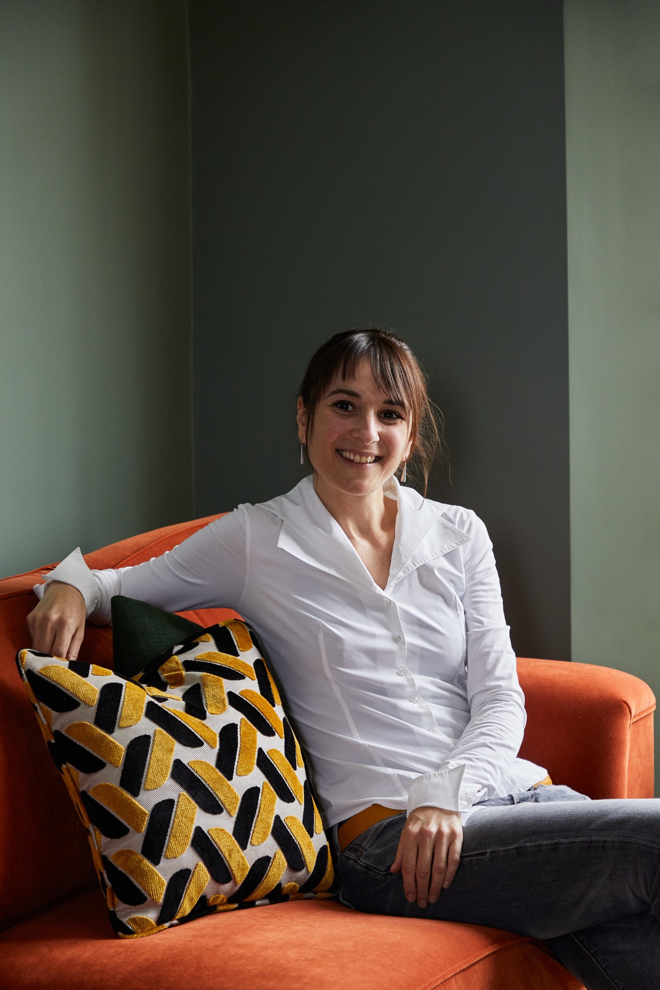
Questions answered by Sonia Bourruel, Founder of Sonia b design.
This week’s instalment of the Project of the Week series features a sophisticated family home design by 2023 SBID Awards Finalist, Chatelaine Interiors & Atelier NM.
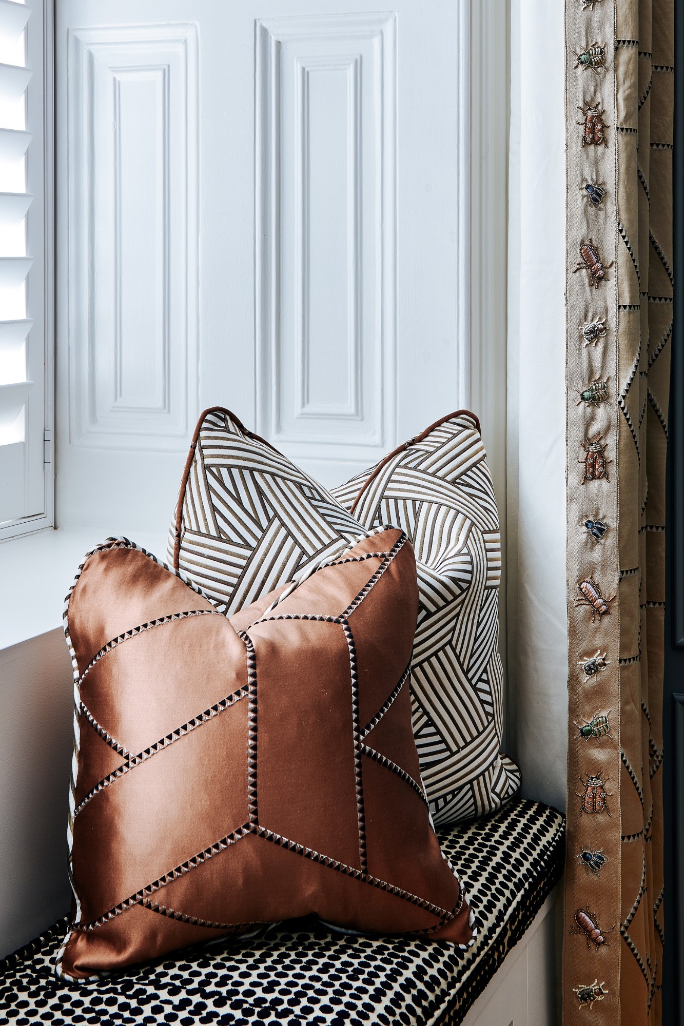
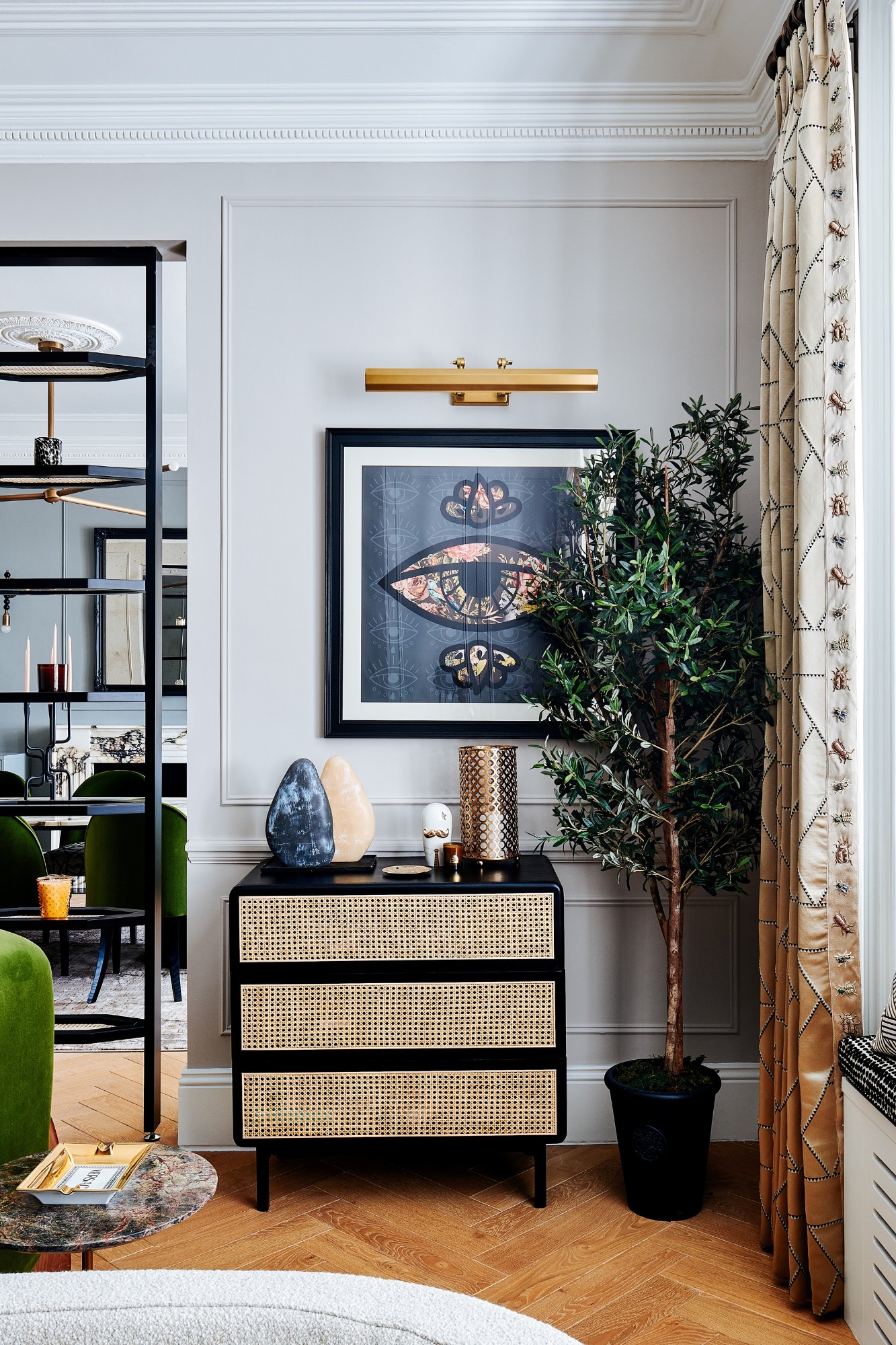
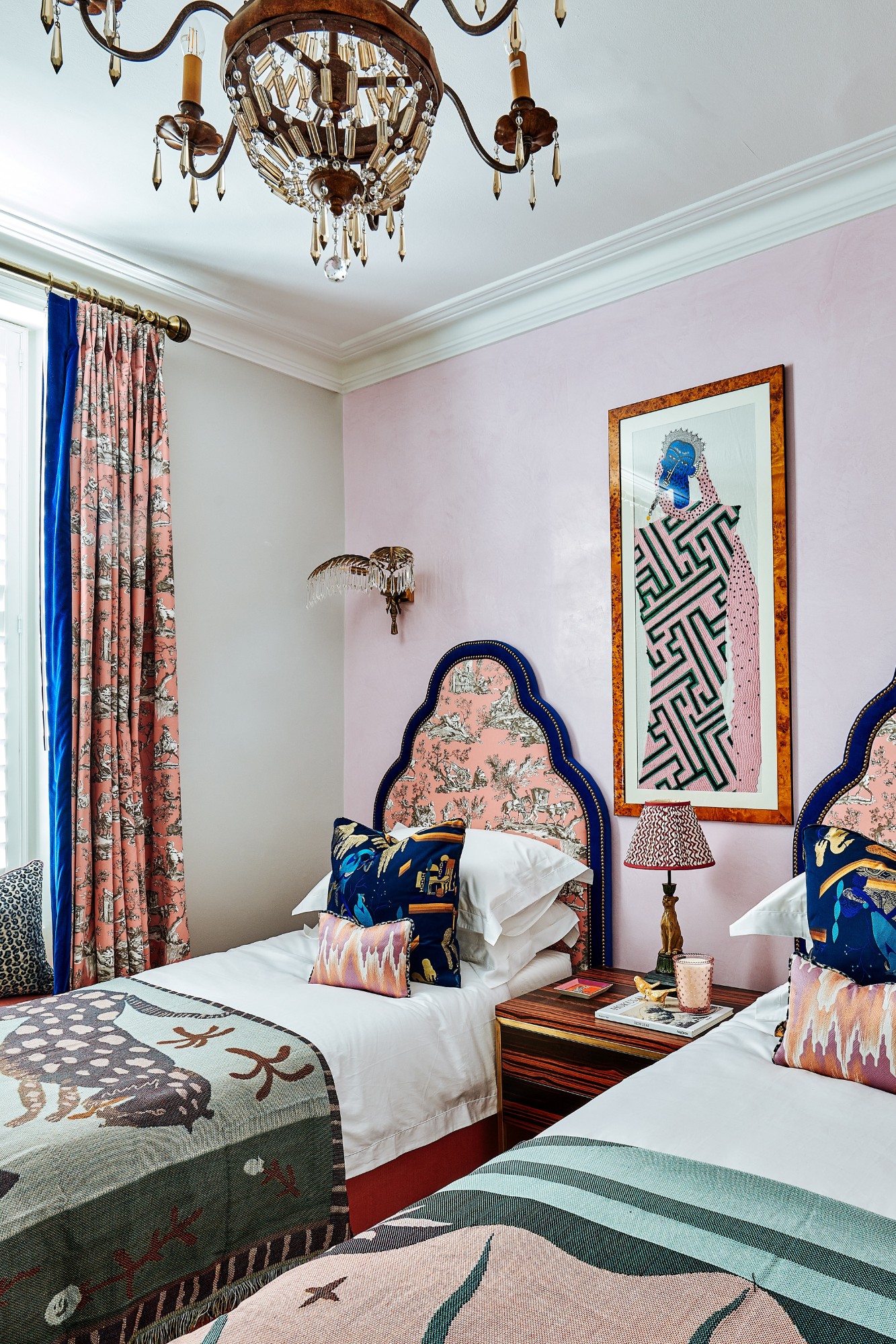
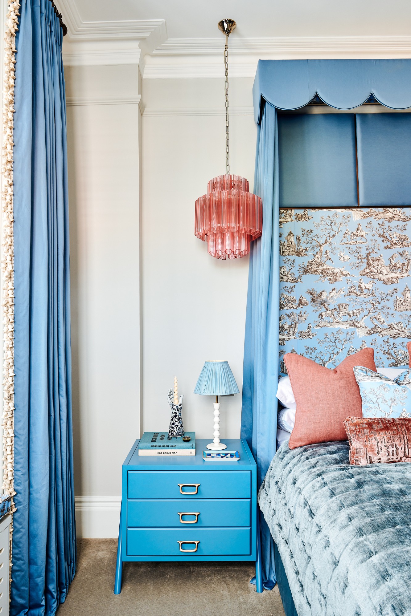
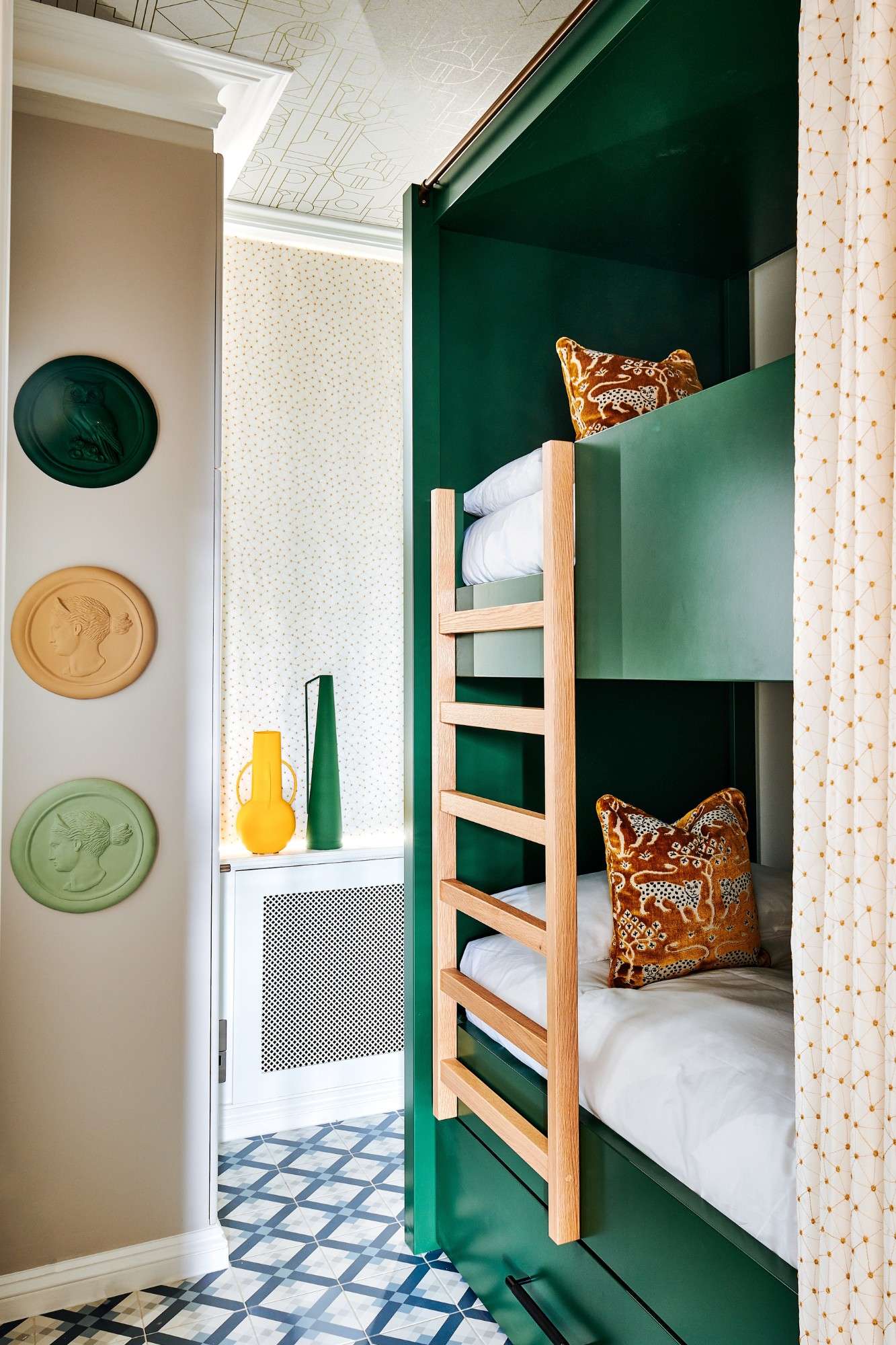
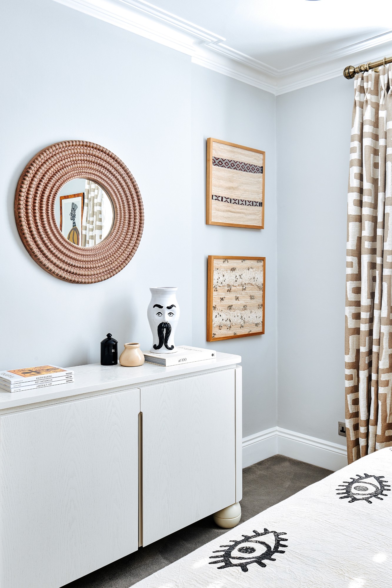
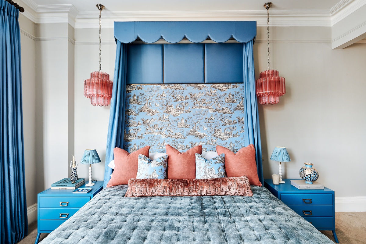
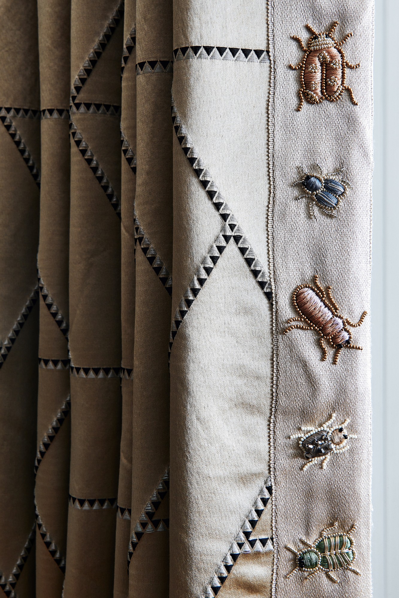
Chatelaine Interiors & Atelier NM were commissioned to create a contemporary residence nestled in the prestigious enclave of Kensington for an international family. Embracing the spirit of sophistication, Atelier NM redeveloped the interior of the property. Their vision was to seamlessly blend modernity with timeless touches, as clean lines and neutral palettes intertwine with gilded accents to evoke a sense of opulence. Luxurious velvets and meticulously crafted furniture grace the interior, exuding bespoke elegance. This home showcases high-end living through its light-filled open spaces and wonderfully crafted soft furnishings by Chatelaine Interiors.
SBID Awards Category: Residential Apartment Over £1M
Practice: Chatelaine Interiors & Atelier NM
Project: Palace Gate
Location: London, United Kingdom
What was the client's brief?
Chatelaine Interiors & Atelier NM were commissioned to create a contemporary residence nestled in the prestigious enclave of Kensington for an international family.
What inspired the design of the project?
The client’s amazing sense of style! She is sophisticated, adventurous and not afraid to take risks. She also wanted to pay homage to the amazing Victorian property with timeless interiors.
What was the toughest hurdle your team overcame during the project?
The toughest hurdle would be trying to preserve the original features. The building is very tightly managed by a board, passionate about the existing fittings. Therefore, we had to be very careful to try and preserve them or recreate them when needed.
What was your team’s highlight of the project?
How all the fabrics came together beautifully. Each room has a its own theme and the soft furnishing tells the story of the them elegantly and subtly.
Why did you enter the SBID Awards?
We decided to enter the SBID awards specifically as our core values align very closely. These awards are a fantastic opportunity to showcase our creativity and design work. Within the industry the SBID awards hold a significant amount of recognition and being recognised is such an honour. Additionally, the idea of having experienced judges evaluate our work was a major draw for us. We wanted to tell our design stories in a way that resonate with people, stirring emotions and contributing to the evolution of interior design.
What has being an Award Finalist meant to you and your business?
Being an SBID award finalist is profoundly meaningful for both Chatelaine, Atelier NM and our respective teams. It validates our hard work, creativity, and commitment to exceptional design. It reinforces our vision, pushing us to strive for bespoke excellence. For our businesses, it enhances our credibility, attracts new clients, increases our media attention and motivates us.
Questions answered by Stephanie Douthwaite, Founder of Chatelaine Interiors, and Najwa Mroue, Founder of Atelier NM.
This week’s instalment of the Project of the Week series features an inviting hotel space design by 2023 SBID Awards Finalist, Franklin Ellis / Sweeney Ellis in association with IHG Interior Design Dept.
The client’s brief was to convert the former Modernist style 1950’s House of Fraser store (previously Dingles and prior to 1973, Colson’s) located within the City Conservation Area in the centre of Exeter into the defining hotel of the city.
SBID Awards Category: Hotel Public Space Design
Practice: Franklin Ellis / Sweeney Ellis in association with IHG Interior Design Dept
Project: Hotel Indigo Exeter
Location: Devon, United Kingdom
What was the client's brief?
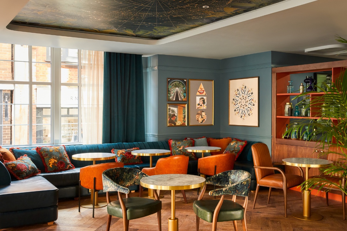
The clients brief was to create a unique and stunning IHG branded boutique hotel with a destination rooftop bar, restaurant and an urban spa and sports bar. This was to be achieved by converting a 1950s House of Fraser store which was perfectly situated on the High Street in Exeter within viewing distance of the magnificent Exeter Cathedral.
What inspired the design of the project?
As an IHG Hotel Indigo, it was essential that the design narratives were based on the people and culture of the City together with the unique history of the building. The design Inspiration was greatly informed by the incredible story of Mrs Colson who opened her milliners shop High Street in Exeter in 1782 and over 100 years later the store was listed under the description Colson & Company drapers, silk mercers, milliners, costumiers, mantle makers, ladies’ & children’s outfitters, furriers, hosiers & undertakers, 33 & 34 High St”
Following bombing during the war, the Colson’s building was largely rebuilt in the 1950s in a 1930’s modernist style with horizontal fenestration and banding detail and these elements resonate in the overall design.
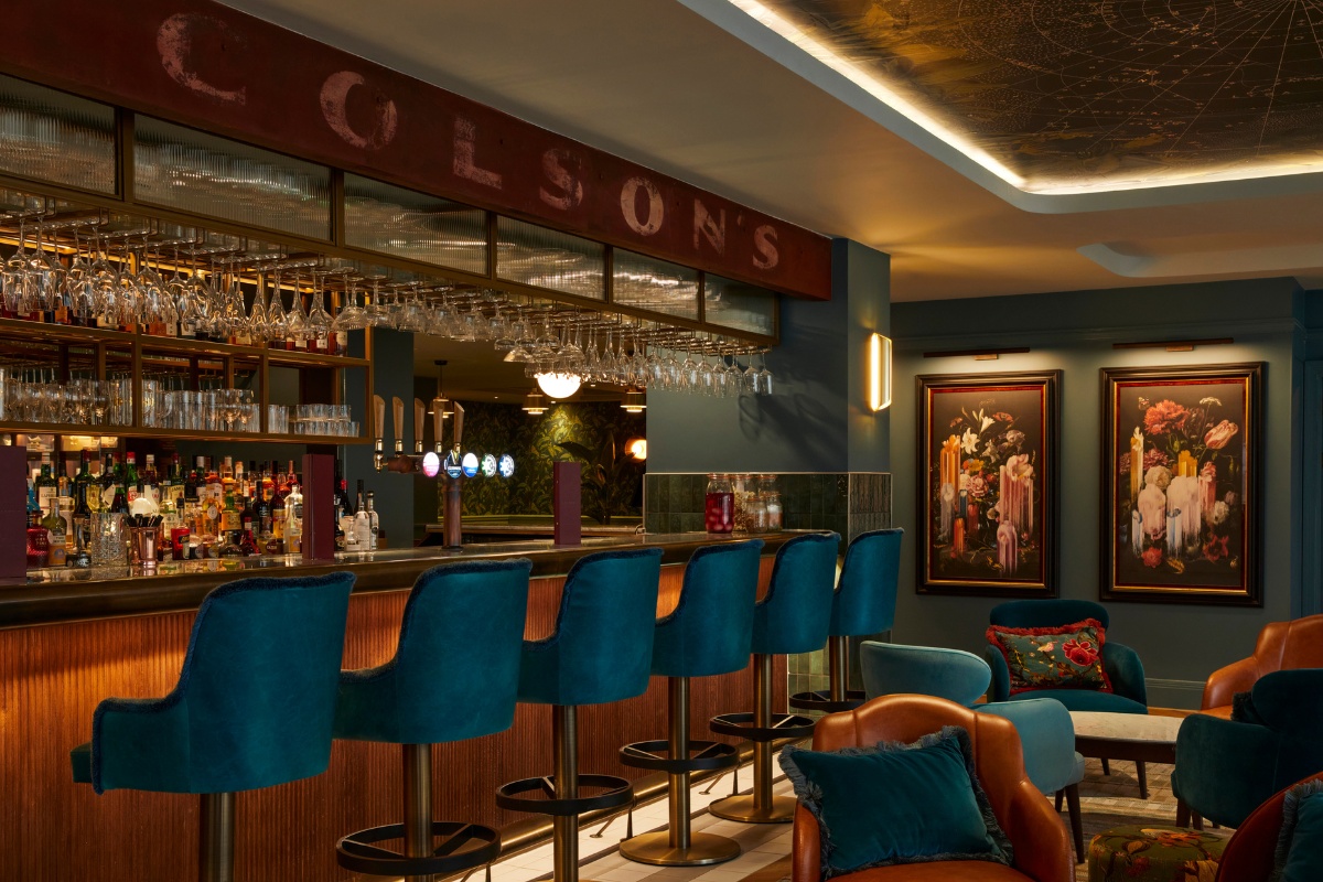
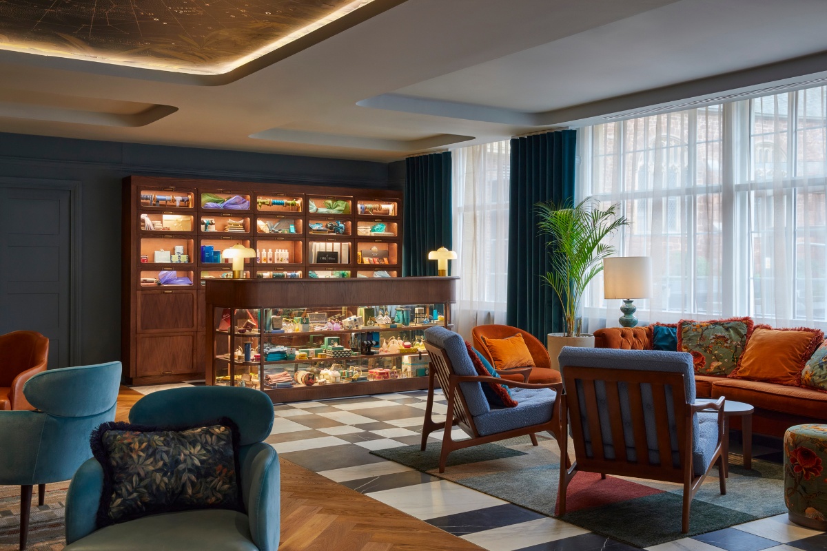
From the outset it was important to celebrate the heritage and affection the general public had for the former Colson Department Store. The reception area leans in to the haberdashery element of the buildings history reimagining display elements and utilising salvage items from site such as the Colson Store sign now positioned above the bar.
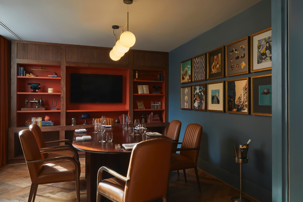
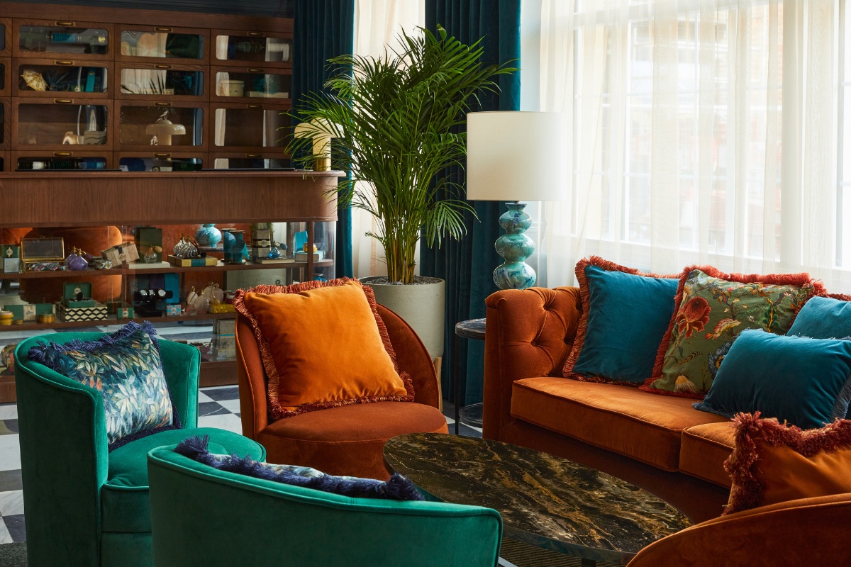
The Narrative 1 Guestroom celebrates the colour, forms and textures found within the wonderful building including the pneumatic tube cash carrier retrieved during the conversion which is echoed in the headboard and corridor room number light design. A glass fronted wardrobe with bespoke wallpaper prints and labelling, captures the retail elements of the store. The connection to Mrs Colson and her milliner skills are reflected in the bespoke artwork and quirky floor mosaic slogans in the bathrooms.
The Narrative 2 guestroom design leaned into Exeter’s rich heritage of fascinating architecture and detailing. One of the best examples of the quirky local ingenuity is ‘The House That Moved number 16 Edmund Street (or the Merchants House). Dating back to 1430 the house if one of the oldest surviving structures in Exeter and it was painstakingly moved 90 metres up the street to make way for a new road.
The design narrative focuses on all things that can move or are not what they seem. The wardrobe and bathroom door are concealed withing painted timber panelling and the paint colour is moved off the traditional line. Scissor lights and desk and a rocking chair combines with quirky artwork adding to the story. The décor is deliberately layered to capture the historic references of culture and architecture in Exeter.
The Cathedral site has been the heart of Exeter since Roman times and the current building has the longest unbroken stretch of stone ceiling vaulting anywhere in the world. There is also an astronomical clock in the north transept dating back to the 15th century thought to be only one of four in England which has been captured in the design of the furniture in the rooms. The design narrative gains inspiration from the fascinating design details in and around the Cathedral Green and uses brass and timber with sumptuous celestial colours fabrics to give a rich decadent feel.
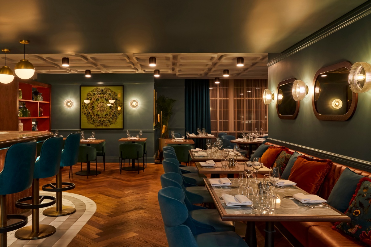
The rooftop bar was to designed to put the focus on the magnificent cathedral which is in full view from the bar and external terrace. A crafted bespoke wallpaper by Elegant Clutter takes inspiration from the colours of the surrounding landscape and intricate details on the Cathedral stonework. The bar was designed to have a more contemporary feel with ribbed tiles to the bar front echoing the stone vaulted ceiling enhanced by rich gold tones and a modern terrazzo and velvet finishes palette.
The Urban Spa takes inspiration from the local landscape in particular the sea and moors. The aim of converting the basement was to create a light and airy feel using natural materials and tactile surfaces. Low level lighting and soft calming geometry combine to create a unique spa experience offering hydro pools, sauna and steam room together with treatment rooms.
The Sports bar is nestled in the basement access by a separate external staircase and its décor is playful whilst appearing mature and timeless.
What was the toughest hurdle your team overcame during the project?
The project design commenced during the Covid lockdown and initially we were unable to visit site. However modern technology allowed us to virtually walk around Exeter and the building assisting the formation of the design narratives. The deep building plan form was complex being laid out over several split levels with four very different external facades. IHG’s suggestion of removing the existing centrally located escalators and lifts to create a lightwell provided the perfect inspiration for the guestrooms by unlocking the floor plan. Using the building irregularities to our advantage, which we managed to create unique guestroom layouts for the 104 rooms. This led to a huge variety of guestroom shapes and sizes which proved very challenging to the contractor and the styling, ordering and placement of FF&E.
What was your team’s highlight of the project?
The project was complex and challenging in many ways but equally thrilling and exhilarating for all the team involved. Seeing the individual design elements come together from the basement spa and sports bar to the breathtaking rooftop bar and terrace was incredibly satisfying. Rarely do we have such a variety of building constraints that test and push the agility and flexibility of the designers on site and in the design studio.
Why did you enter the SBID Awards?
The SBID awards are a great platform for designers to showcase their work and provide inspiration for other design professionals but they are also a tremendous encouragement for young talent.
What has being an Award Finalist meant to you and your business?
Being an award finalist is an incredible achievement for our design team and the wider project team including the client, architect, brand holder IHG, contractor and other collaborators. Being an Award Finalist enables all who were involved to be recognised for their unique abilities and the part they played in crafting and delivering the project. With regards to the business, we aim to continue creating designs with storytelling, passion and sustainability at the forefront. We are always looking to exceed our clients aspirations creating unique experiences for all.
Questions answered by Denise Ellis, Director at Sweeney Ellis Design.
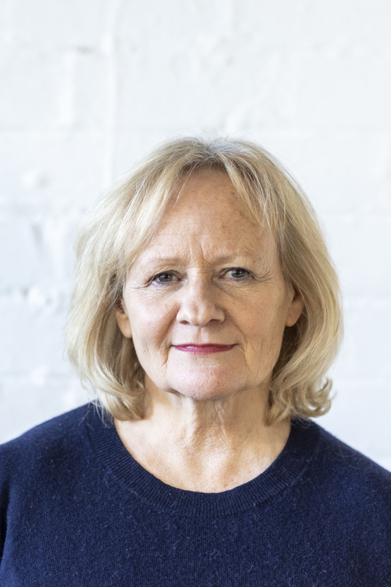
Miruna Clarke-Zait, Senior Architect & Interior Designer at Noviun Architects has given her insights into the industry.
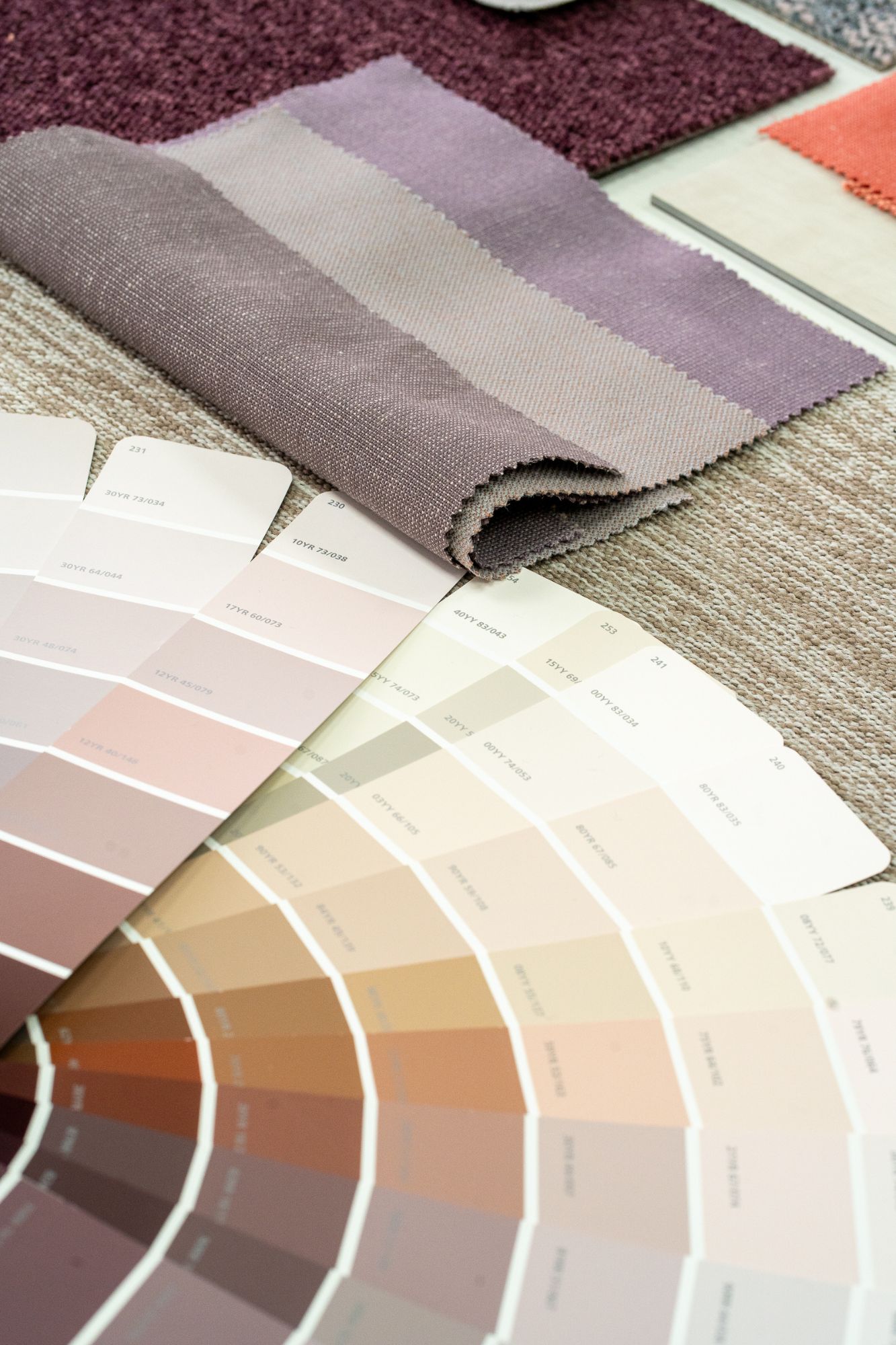
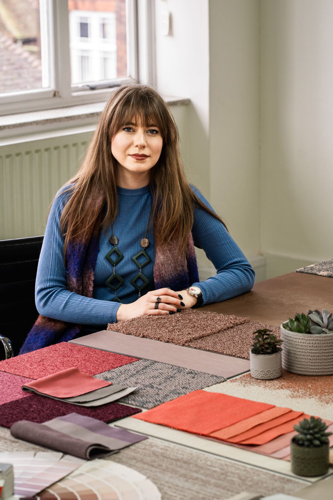
Upon completing my Architecture degree at University of Kent in 2012, I started my first year out at Rummey Design, an interdisciplinary landscape and urban design practice in Kent, following a couple of internships with Guy Hollaway Architects and Charlier Construction. Having secured a position with HNW architects in 2015, prior to graduation, I was encouraged to commence Part III early and thus I became registered and chartered in 2016. Throughout my career as a Project Architect and Senior Architect, I covered multiple sectors: education (colleges, SEN, higher education), residential (affordable and student halls), blue light (fire station design) and commercial interiors which culminated with my registration as an Interior Designer. With a keen eye for research, I co-wrote the West Sussex Fire and Rescue Design Guide based on international papers on decontamination procedures and, within the last eight years I developed an interest in biophilic design, colour psychology and colour theory. I have mentored over 15 architectural assistants, have been CPD coordinator and continued academic presence through crits, mock interviews, Part III workshops, RIBA student mentoring and employers’ evenings. I joined Noviun Architects in January 2024 to lead the education and commercial interiors sector.
Why did you want to work in the interior design profession?
With a rather unusual background in Mathematics, Science and Computer Coding, with NASA aerospace engineering competition awards for orbital and lunar settlements, I pursued the BA (Hons) Architecture degree at University of Kent. I always enjoyed drawing and was passionate about design. I wanted to be an Interior Designer to start with, however, I was encouraged to pursue Architecture due to its versatility. Fifteen years later, I am now a registered Interior Designer as well. Interior design is fascinating as light, colour and textures are so powerful in transforming a space. I will always remember Richard Meier’s Ara Pacis museum in Rome and how beautiful the travertine walls looked under the natural light that was grazing the wall.
Which elements of your profession do you enjoy the most?
I enjoy close liaison with clients, stakeholders and contractors to meticulously transform briefs into reality and take pride in creating long established relationships built on professionalism and transparency.
What has been your most memorable career highlight from the past year?
There were, in fact, two: Horsham Fire Station and Training Centre (Platinum House) was completed last autumn, after nearly four years of intense teamwork, and the fit-out for Novuna Vehicle Solutions was amongst four other finalists for “Workplace Fit-out of the Year” for Insider Media South-East Property Awards 2023 (both of which were projects at my previous practice).
What are your favourite types of projects to work on and why?
Refurbishments and fit-outs re-imagine a space and transform the environments in which people learn or work. Of course, it is easier to build new and, sometimes, it is unavoidable; nonetheless, challenges are great. I also enjoy seeing the excitement of clients when the design takes shape and it is extremely rewarding when one is able to give something back to the community – be it the fire service or an educational building, it is about transforming lives. I really enjoy projects where there is research involved, because I am a firm believer that science and design can go hand in hand.
What are the most challenging aspects of working in interior design?
The approach to design and moving away from logo colours – a lot of the time the marketing/branding becomes the palette and that isn’t the right solution. It happens very often in schools, colleges, universities, offices. I have myself fallen into that trap before, however, having discovered colour psychology, my approach has shifted completely. I am determined to create designs that are timeless and which focus on behaviour, as trends are always short lived. Timeless designs are sustainable designs, they mitigate the need for change and reduce waste.
What do you wish you knew before working in the field?
Being a perfectionist and my own biggest critic, that it is ok if you do not know everything and that it really takes time to become comfortable and confident in your design choices. The gut feeling never lies.
If you could give one tip to aspiring designers, what would it be?
To be diligent and tenacious; whilst design flair is innate, building a career takes time. To always consider the emotional response when designing a space. I do not mean the subjective reaction; I mean the subliminal impact of their colour combinations and choices because, as designers, we are liable for the legacy we leave behind.
How do you see the interior design industry evolving in the year ahead?
There is an increased focus on neurodiversity and a growing understanding that the way people are wired, coupled with different personalities results in varied solutions to the ideal environment. It is about having the option to retreat to a quiet space to concentrate, whether you are neurotypical or sensitive to sound and feeling overwhelmed, to move away from the one size fits all.
What does being an SBID Accredited Interior Designer mean to you?
Having a dual qualification is exciting, as it offers a wider range of opportunities. Whilst my email footer has got longer, having four awarding bodies, it is an acknowledgement of the type, relevance and quality of work undertaken to date. I look forward to being able to attend industry events and awards as a Senior Architect and Interior Designer, it is an ace in the sleeve.
About Noviun Architects
As designers, social responsibility and collaboration defines what we do. Our background and expertise in the education sector has cultivated a people-centred approach applied across all sectors. We aspire to positively integrate user experience and human well-being, alongside the latest technology, to design sustainable spaces that create a positive impact on individuals, communities and the environment. The curation of individual dialogue, into a cohesive architectural narrative, distinguishes each of our projects. Our design process is not pre-determined, but organic responding to our engagement with clients, occupants and stakeholders.
If you’d like to feature your news or stories on SBID.org, get in touch to find out more.
If you’d like to become SBID Accredited, click here for more information.
This week’s instalment of the Project of the Week series features a fresh and airy living area design by 2023 SBID Awards Finalist, Victoria Moshchynska Interior Design & Styling.
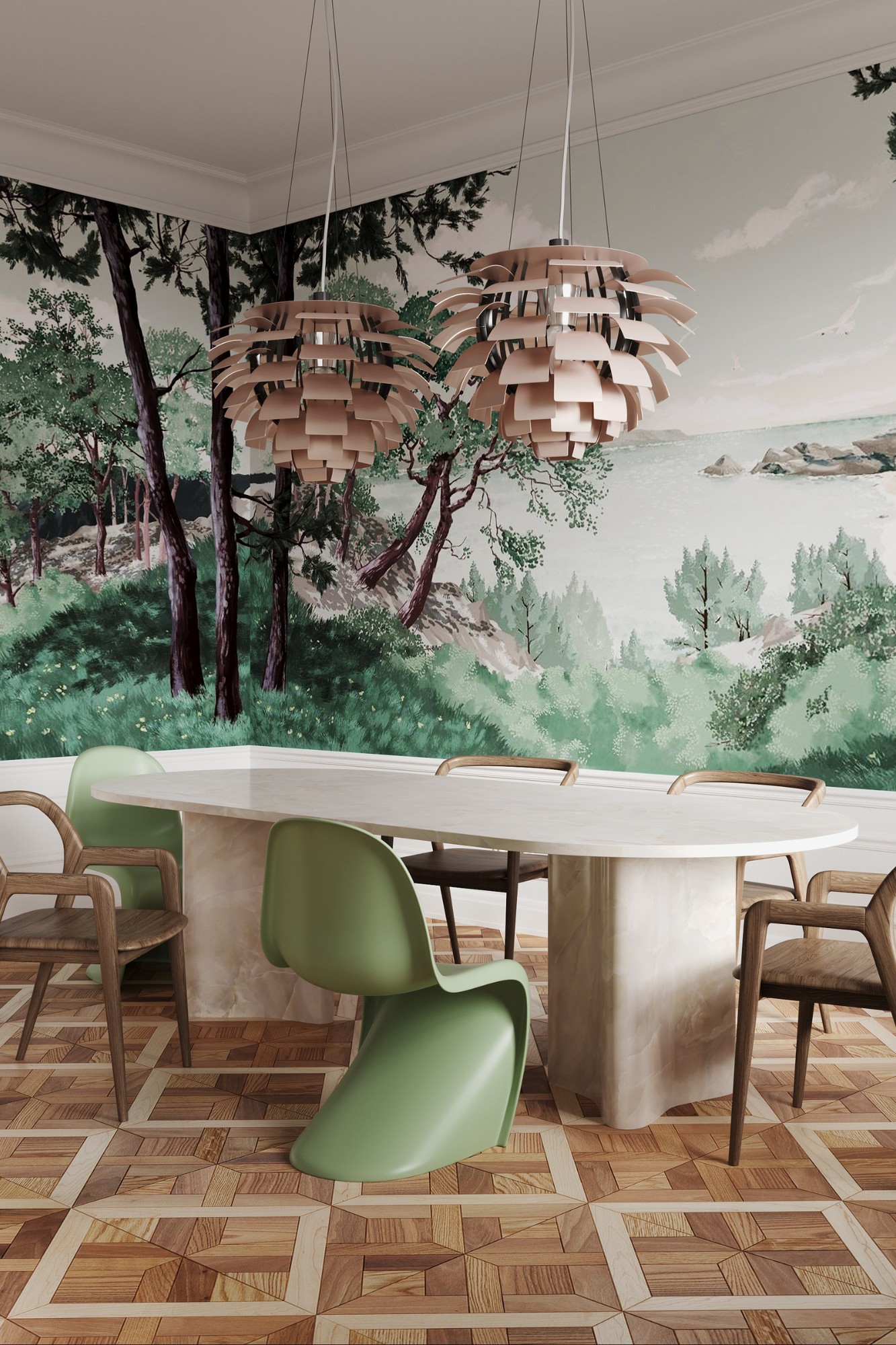
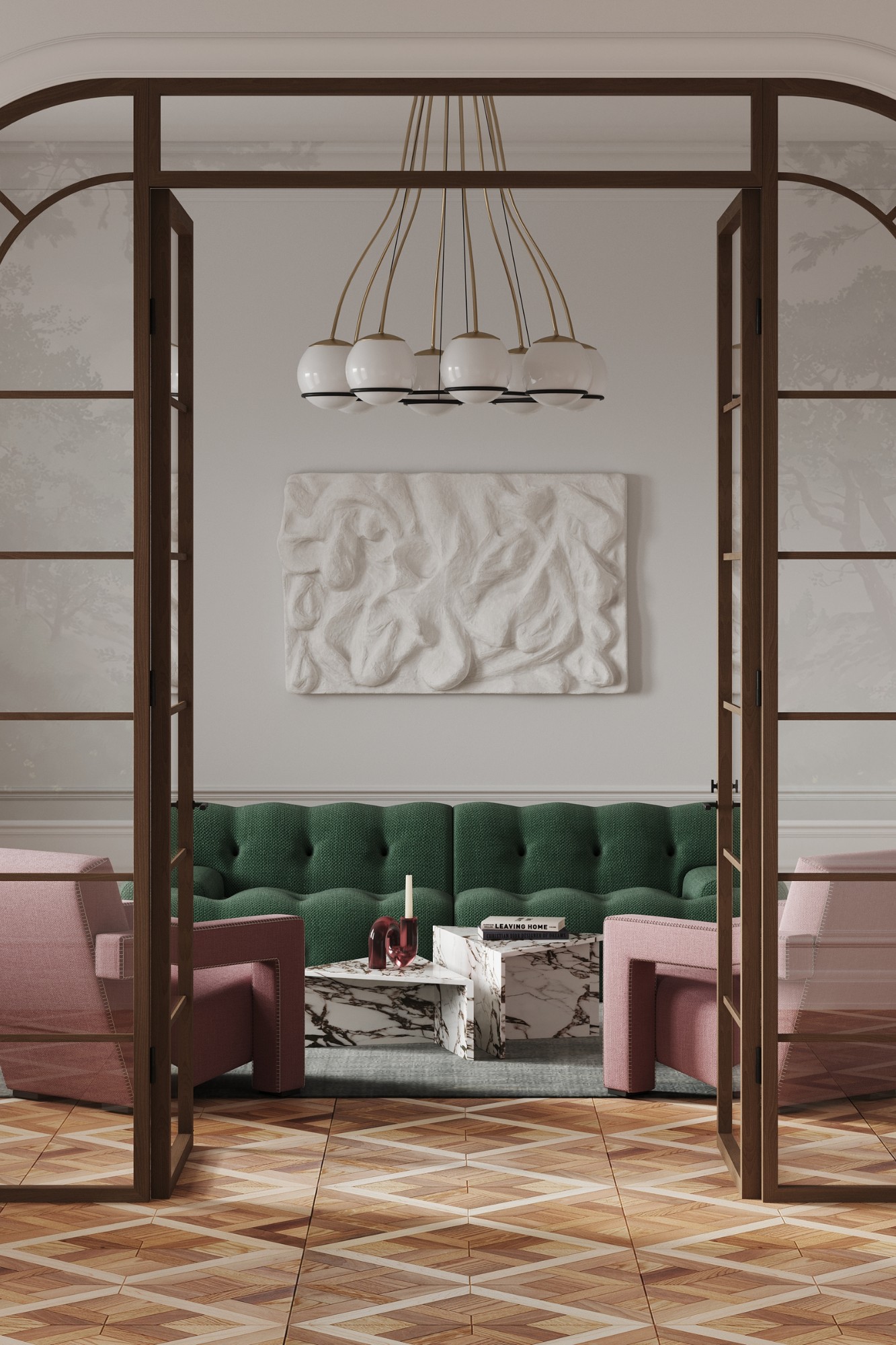
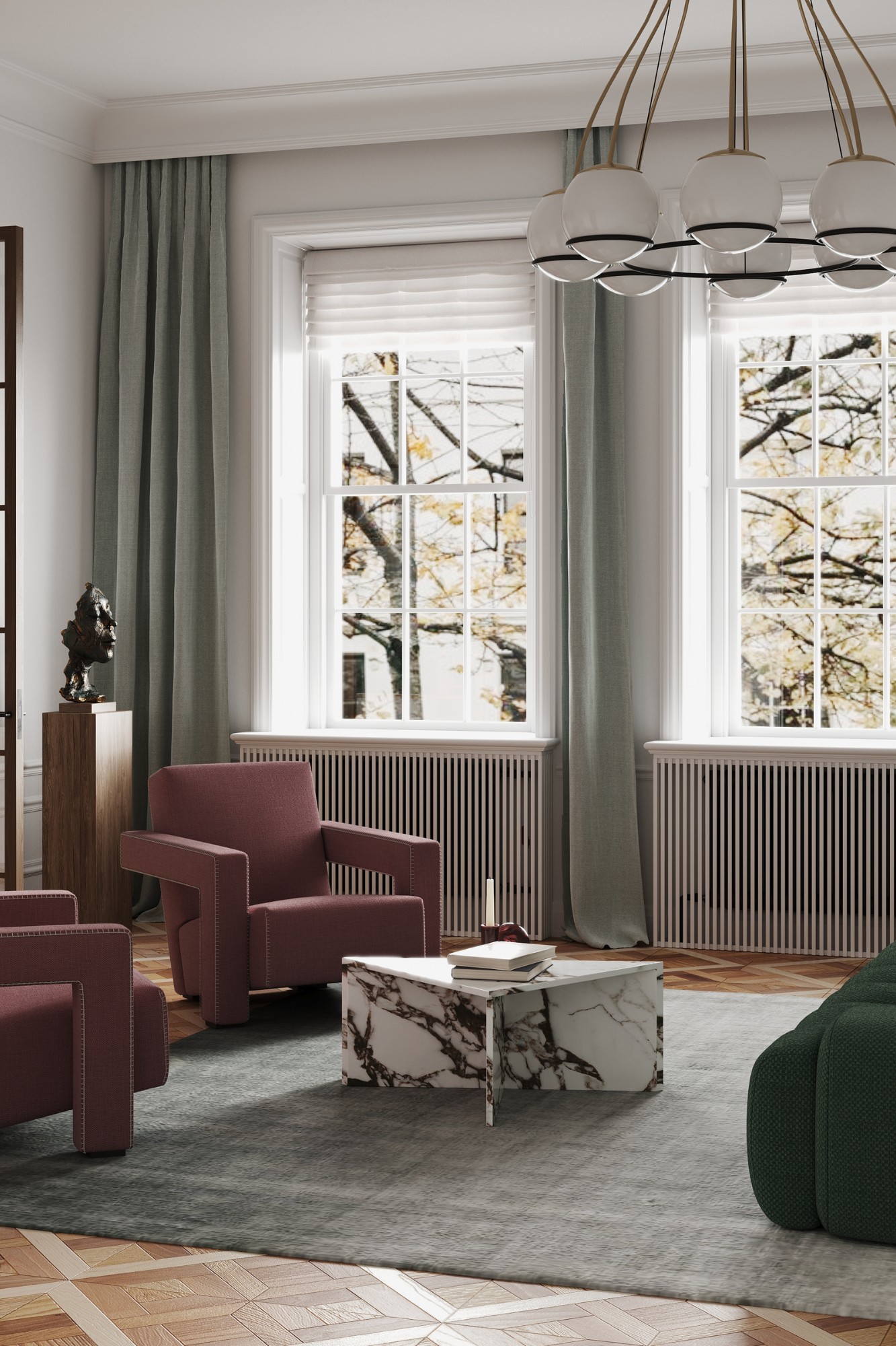
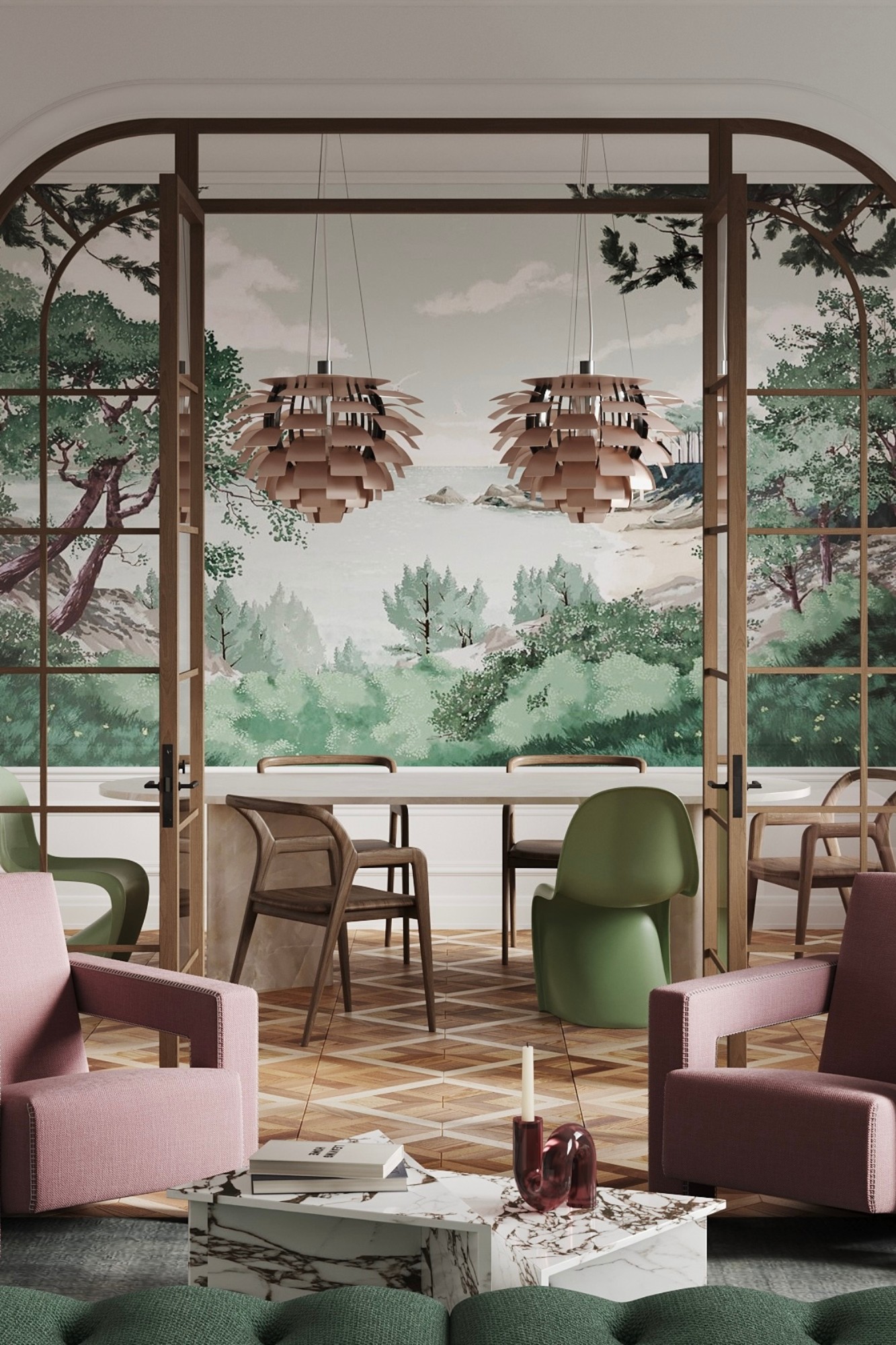
Victoria Moshchynska was commissioned to renovate Living area of an apartment in Chelsea. The goal was to create a fresh contemporary interior which would combine French and British vibes and would remain relevant for a long time. By emphasising the traditional part of the space and adding modern iconic pieces of design Victoria created a fresh and airy interior where her client could enjoy calmness after her hard working day.
SBID Awards Category: Residential Budget Up To £50,000
Practice: Victoria Moshchynska Interior Design & Styling
Project: Chelsea Apartment
Location: London, United Kingdom
What was the client's brief?
I was asked to renovate the living room without any structural changes. The client wanted the space to be divided into 2 areas - dining area and lounge area. Her main idea was to have a fresh contemporary interior that would be trendy but also stay relevant for a long time. The budget was limited.
What inspired the design of the project?
The apartment is situated in a historic building in Chelsea, London. This beautiful area is one of my favourites. I like the combination of traditional British architecture and the French vibe of the small brasseries around. I wanted to keep this mood inside the apartment. The apartment is located in the traditional Centre-London building, with high ceilings and wooden floors. So, we agreed to mix classics with a contemporary style to keep this truly London vibe but at the same time to add freshness.
What was the toughest hurdle your team overcame during the project?
The toughest hurdle for the team working with heritage buildings in London is always the process of alterations permission. We agreed that we would do a minimum of changes that need approval. Because our budget was limited, we had to determine the main design anchors to spend on. And so, we did. The glass doors with wooden frames were aimed to separate the space for two zones and to add more texture to the space.
What was your team’s highlight of the project?
I saw these beautiful scenic wallpapers that show the landscape of the French region Brittany and I immediately fell in love with them! The interior design concept was built around those wallpapers. They led us to the colour palette of this interior. Deep green and pale pink became the main ones. Being used for the furniture fabrics they create this fresh and airy space, it feels like being outside. In order to create a long-living interior I mixed a few iconic pieces of design from different times: chairs from Cassina and Vitra, very french-looking Artichoke lamps from Louis Poulsen, etc.
Why did you enter the SBID Awards?
I moved to London from Ukraine last year because of the war. Starting from scratch in your 40th is not easy. New country, new audience, etc. SBID Awards gives me the opportunity to meet the British interior design society, show my work and make myself known.
What has being an Award Finalist meant to you and your business?
It is the second time in a row my project became a finalist of the SBID Awards. It means that my professional experience is recognised by the British interior design society. And for my future clients it means that the standards of my work are high.

Questions answered by Victoria Moshchynska, Founder at Victoria Moshchynska Interior Design & Styling.
