 31st October 2022 | IN COLOUR | BY SBID
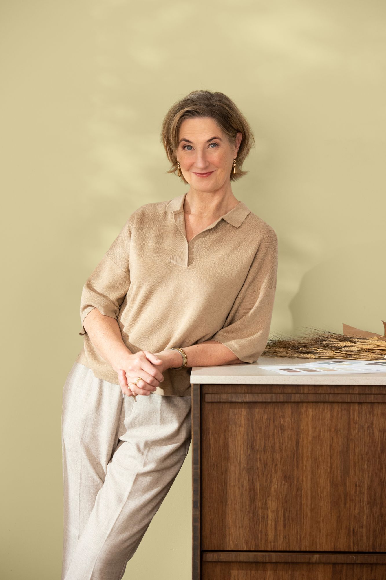
The annual unveiling of the Dulux Colour of the Year is a culmination of months of trend analysis from visiting exhibitions and design fairs, as well as keeping an eye on the social, cultural and economic trends to decipher the tones that capture the moment. We caught up with Heleen Van Gent, Creative Director Global of AkzoNobel’s Aesthetic Centre that is responsible for coming up with the Colour of the Year, to find out more about her role and the process behind choosing the famous Dulux Colour of the Year.
What is The AkzoNobel Global Aesthetic Centre?
Based in the Netherlands, the AkzoNobel Global Aesthetic Centre is our hub for colour trend analysis, colour research and design and art direction. For the past 30 years, the team has worked year-round, translating social trends into colour trends for the 150 countries where AkzoNobel operates.
How long have you worked at AkzoNobel and what was your path to your current role?
I have worked at AkzoNobel for just over 13 years and I am the Creative Director of the Global Aesthetic Centre.
My journey started in the magazine industry in the Netherlands. I had worked in partnership with AkzoNobel on a project and this gave me my first glimpse of the Global Aesthetic Centre. From then on, I knew that this was the job for me.
I have always had an interest in making the everyday beautiful and helping people introduce wonderful things into their living environment. I think the effect colour can have on your mood and emotions is often underestimated. A lick of paint is an excellent and relatively inexpensive way to make a tremendous impact on our lives.
Who was involved in choosing this year’s colour?
Aside from our team at the Global Aesthetic Centre, we bring together a panel of design experts from across the globe. Each member brings with them insights from their culture, way of living and how they see the year ahead.
To ensure objectivity, we look to design experts who are connected to AkzoNobel in some way but are not key customers. This is important as we need to obtain their honest professional opinions and insights to ensure that the colour chosen works in all the countries we operate in.
Why is ColourFutures such an important part of the AkzoNobel calendar?
When designing the Colour of the Year we try to capture the moment in just one colour, which, as you can imagine, isn’t a simple task. It takes almost a whole year to design the final colour, with input from all global outposts of AkzoNobel before a final decision is made. While the process is largely confined to the Global Aesthetic Centre, we do see it as a team effort for the whole company and professional panel.
What is the process for choosing the Dulux Colour of the Year?
The process of choosing the Colour of the Year is constant. Our in-house team and the design experts we work with are out visiting exhibitions and design fairs, as well as keeping an eye on the social, cultural, and economic trends. We then come together for a three-day session where we discuss what we’ve seen and share what we believe will be influential over the coming year.
We start the three-day process by asking the team questions like what keeps them awake at night or what makes them happy (since they are just as much consumers as anyone else).
This helps us to get to the root of the issues that the world is facing today. This year, we were inspired by Mother Nature fighting back – with floods and drought featuring heavily in current affairs and nature being used to inspire popular interior designs.
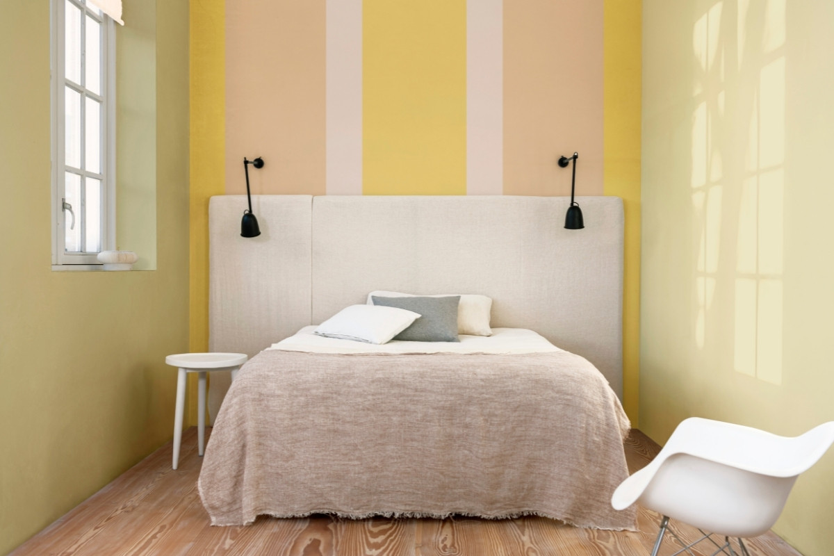
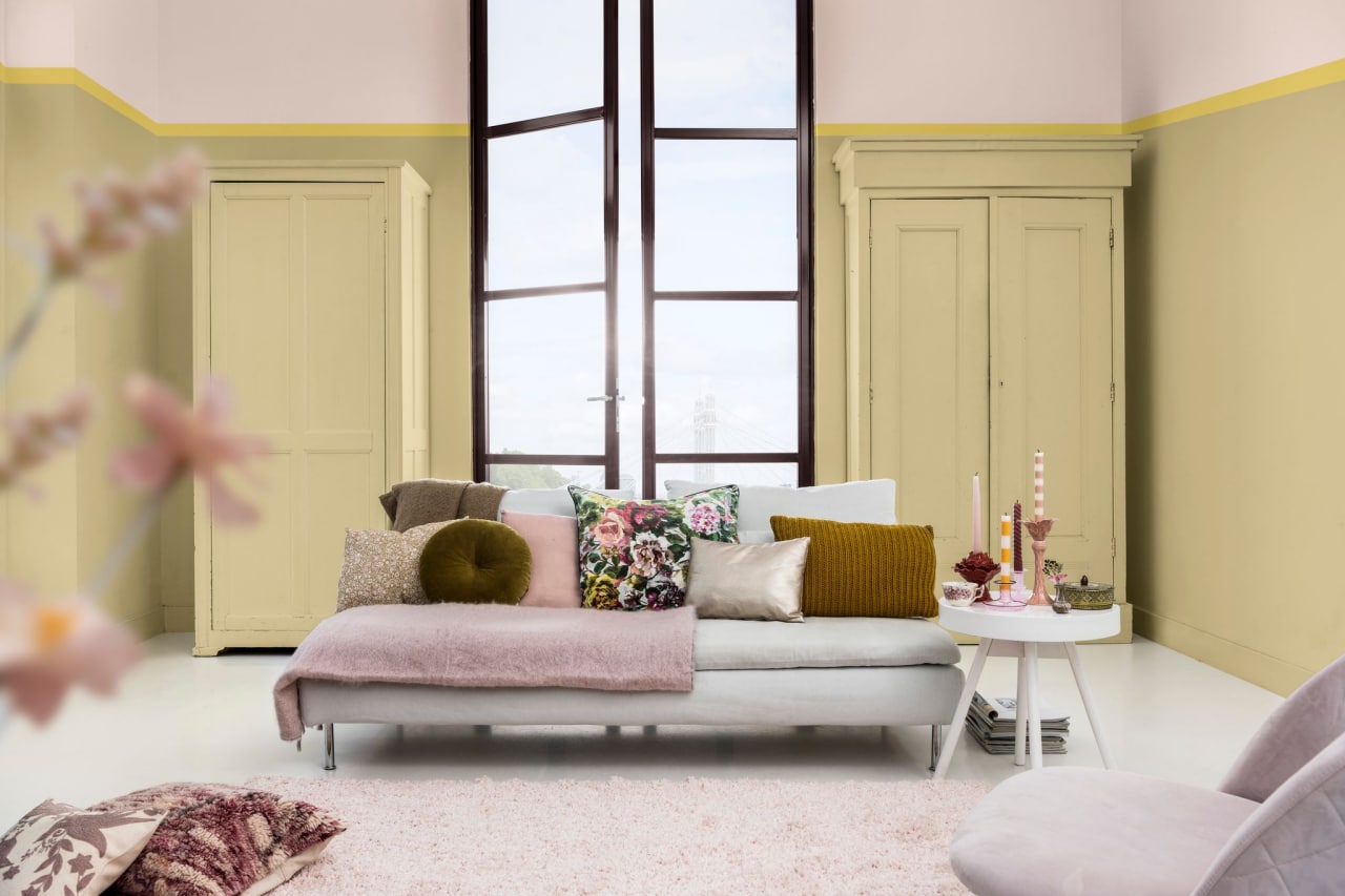
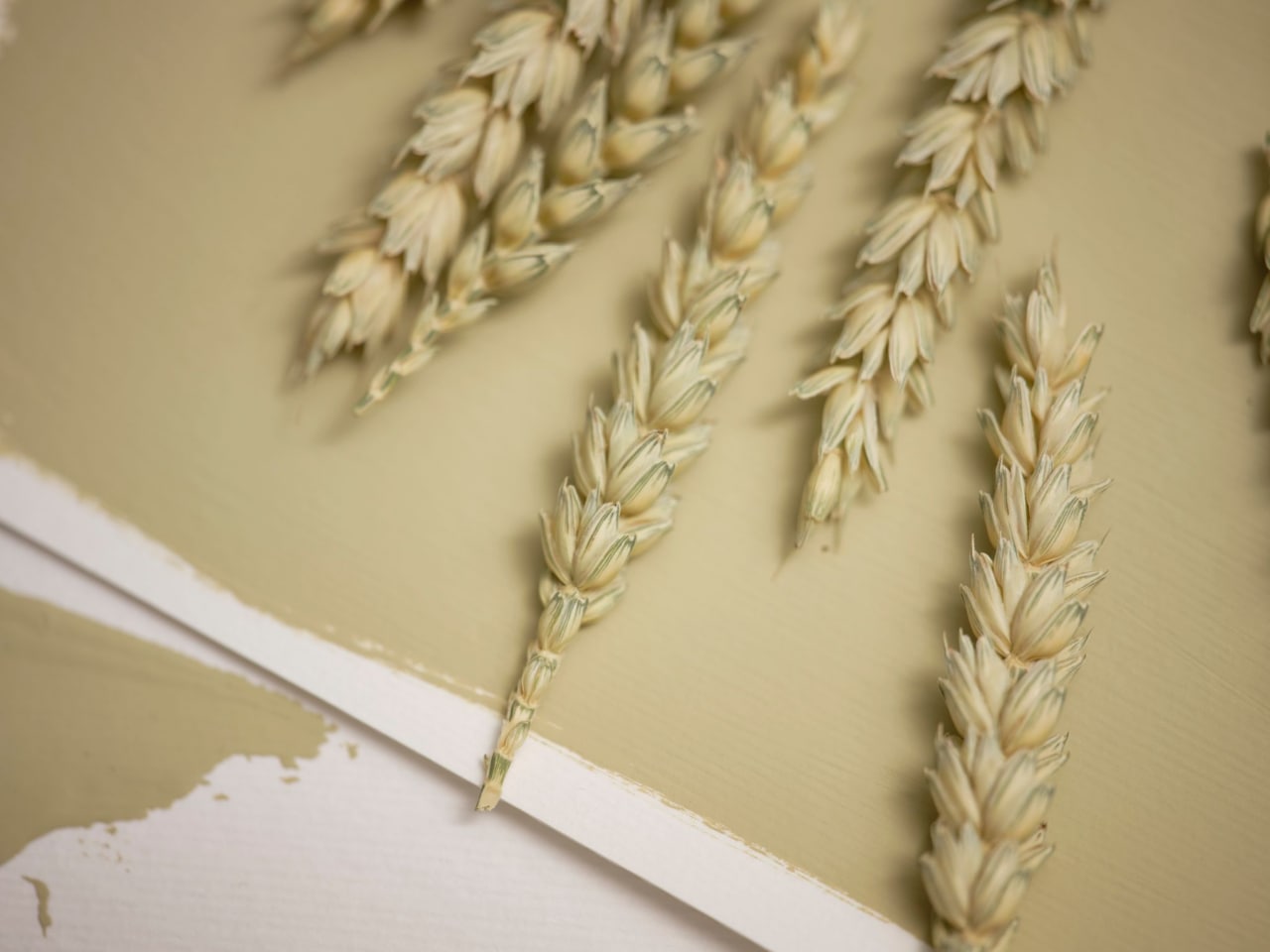
The discussions also led us to see that yellow was dominating. We therefore knew that this would be the base of our Colour of the Year 2023 – we just didn’t know the exact shade. Based on this insight, we came up with Wild WonderTM: a positive, glowing natural tone that connects us with nature. We see this colour as a soft gold with hints of green inspired by fresh seed pods and harvest grain.
Our discussions also help us create the four colour palettes that we launch alongside the Colour of the Year – identifying complementary shades that are all inspired by the same insight and behavioural trends. This year our four colour stories are:
- Lush palette – has a mental health focus with colours inspired by plant-filled habitats of gardens, forests and woodlands
- Buzz palette – inspired by collective thinking, celebrating diversity and adding joy, unity, and connectivity
- Raw palette – draws from bio-inspiration and what nature can teach us and reflects on the richness of resources that nature offers
- Flow palette – focuses on the cycles of life and brings a feeling of fluidity, freshness and equilibrium
Where do you see the colour being used in practice?
We make sure that the Colour of the Year and its complementary palettes can be used in any setting – from the domestic home through to commercial premises across education, healthcare, hospitality, office and residential sectors. For example, this year’s Buzz palette with its rich, diverse and joyful colours is perfectly suited for the hospitality sector. We think a hotel room or lobby painted in this bright palette will be sure to bring a smile to someone’s face.
Flow on the other hand has more subtle and timeless colours that perform well in the education sector. Both early year education settings, up to teenagers and university students can benefit from this palette thanks to its roundness and friendliness.
What was your favourite moment from this year’s Colour of the Year process?
This answer is twofold. The first moment is when we’ve settled on a story. This is no mean feat, as we have to make sure that everyone is on board and aligned with the vision.
The second moment is our “country call” where we present our new colour palette, way of thinking and messaging map to our AkzoNobel colleagues around the world. This is an opportunity for them to push back if they think the colour might not work in their region which always makes me nervous. However, when I saw everyone nodding their head and buying into the colour story, I knew we’d cracked it and found something that resonates with everyone.
For more information about Dulux’s Colour of the Year, please visit: www.duluxtrade.co.uk/COTY23
To download the ColourFutures™ 2023 Specifier Brochure, click here.
Questions answered by Heleen Van Gent, Creative Director, AkzoNobel’s Global Aesthetic Centre.
About AkzoNobel
AkzoNobel deliver the sustainable and innovative solutions that our customers, communities – and the planet – are increasingly relying on. As experts in making coatings, chances are you’re only ever a few meters from one of their products. Active in over 150 countries, they’ve set their sights on becoming the global industry leader. It’s what you’d expect from the most sustainable paints company, which has been inventing the future for more than two centuries.
If you’d like to feature your product news here, get in touch to find out more.
If you’d like to become SBID Accredited, click here for more information.
